BTW, this one hasn't been in the article for the required one week. Maybe we should suspend this nomination until the higher resolution version is uploaded and a week has passed. O.J. (talk) 23:19, 28 April 2012 (UTC)[reply]
Comment That doesn't appear to be a sufficient source for the image, the website listed has a whole list of what appears to be copyrighted images from news sources, not government sources, but this picture isn't listed. If it's a military photograph it should be available on the appropriate .mil website with credits? Where exactly did you download this image? — raekyt 00:44, 30 April 2012 (UTC)[reply]
Secondly when viewing the original it appears to be just a blown up web graphic, not the original at all. Clearly someone took the small image and expanded it in a graphic program to be larger pixel wise. So back to Speedy Close and without better sources it will be nominated for deletion in short order. — raekyt 00:46, 30 April 2012 (UTC)[reply]
And we'll go ahead and throw in a Strong Oppose even though it doesn't meet size requirements since it's just a blown up small image and it does not have any EV for Helmand Province, Helmand Province isn't defined by recent United States military actions in the area, so a photograph of solders in a dusty area is has ZERO encyclopedic value for the article. — raekyt 00:51, 30 April 2012 (UTC)[reply]
Comment: I agree fully with Raeky's analysis. J Milburn (talk) 09:55, 1 May 2012 (UTC)[reply]
Voting period is over. Please don't add any new votes. Voting period ends on 30 Apr 2012 at 15:22:31 (UTC)
Original – An engraving by Paul Revere depicting a white-washed, pro-American version of the Boston Massacre. This image (or a cropped version) is commonly included in history textbooks.
Support. Good reproduction of what is probably the first American "propaganda" poster. Clegs (engage in rational discourse) 10:28, 22 April 2012 (UTC)[reply]
Voting period is over. Please don't add any new votes. Voting period ends on 27 Apr 2012 at 09:46:12 (UTC)
Original – Hammersmith Bridge in South-West London
Reason
It's high resolution, detailed, aesthetically lit at dusk, and taken from a location that gives probably the most complete view of the bridge (short of taking it from a boat on the Thames, but I'm not sure the angle would be as good).
Support as nominator --Ðiliff«»(Talk) 09:46, 18 April 2012 (UTC)[reply]
Question - What's that streak of motion blur halfway across the bridge? Crisco 1492 (talk) 10:36, 18 April 2012 (UTC)[reply]
A bus. It's a panorama of four segments with a 2 second exposure each. Ðiliff«»(Talk) 10:49, 18 April 2012 (UTC)[reply]
3/4 Support (if possible); if this comes down to the wire, full support. I'm not big on the bus in the image, but it's to be expected unless the bridge were closed down. Crisco 1492 (talk) 10:53, 18 April 2012 (UTC)[reply]
Other Question Given the curvature of the Thames there, isn't the other bank of the river best for fitting the most of the bridge into the picture? I'm asking because you mention the location gives the most complete view. - Blieusong (talk) 16:44, 18 April 2012 (UTC)[reply]
Good question, but no, I found that it wasn't better on the other side. One big reason is that the other side of the bridge has lots of trees which obscure the view. I took this a little earlier in the evening and had to push a few small trees and shrubs out of the way and had to very carefully position the camera so that all the bigger trees were not in front of the bridge. And if you look at the curvature, you see that it quickly curves away from the bridge anyway, limiting the view of the near-side even more. I also tried the same bank of the Thames as this photo except on the other side of the bridge, but there is a high wall that makes setting up a tripod almost impossible (and there's an ugly pontoon in the foreground too). I tried, I really did. :-) Ðiliff«»(Talk) 17:21, 18 April 2012 (UTC)[reply]
Oops... I thought you were on the other side (south)... I don't know how I zoomed in from the coordinates! That's why I had doubts... :) (I shouldn't, given your contributions). I was actually thinking about that place with the high wall as well after a glance at Google map. - Blieusong (talk) 19:52, 18 April 2012 (UTC)[reply]
Weak oppose Good quality, and nice timing, but not a very eye catching picture imo. Maybe framing is tight on the sides. The subject itself is a bit dark, which diminishes EV a little, hence my oppose. - Blieusong (talk) 19:52, 18 April 2012 (UTC)][reply]
Support. <jaw drops> That's gorgeous. The bus is a little weird looking, but the picture is so good it doesn't matter. Clegs (engage in rational discourse) 07:14, 20 April 2012 (UTC)[reply]
Support This bridge is a very beautiful bit of civil engineering, and I think this twilight long exposure shows this up really well.TehGrauniad (talk) 12:29, 20 April 2012 (UTC)[reply]
Support Very impressive... Although, it would be more preferable if the bridge was slightly more illuminated (to allow us to view the color of the bridge and stuff,) I don't think that is a big deal in this case. Dusty777 17:14, 20 April 2012 (UTC)[reply]
Reluctant oppose due to the streaked car lights. Unless streaking is an intentional artistic effect then I'd prefer to see the normal look of the cars. Pine(talk) 07:12, 21 April 2012 (UTC)[reply]
Whether it's intentionally 'artistic' or just the inevitable consequence of a long exposure, does it matter? You would need a photo taken in daylight to see the cars clearly (and they would be far more distracting IMO). Ðiliff«»(Talk) 04:50, 23 April 2012 (UTC)[reply]
Weak oppose It is a good illustration of a black forest town, and the resolution is really good. But... the composition looks really snapshotty. There's too much sky, the low angle makes the image get bogged down in the untidy things at street level. Also as an aside, does WP have a policy on censoring things like number plates? Aaadddaaammm (talk) 17:46, 22 April 2012 (UTC)[reply]
Oppose and speedy close due to resolution and scratching Crisco 1492 (talk) 23:08, 22 April 2012 (UTC)[reply]
Comment. may as well close this instance per WP:SNOW. On a side note, if this were uploaded larger and restored, it would be perfect for next April Fool's Day. Clegs (engage in rational discourse) 13:12, 23 April 2012 (UTC)[reply]
Speedy Close Per the low resolution. Dusty777 17:56, 23 April 2012 (UTC)[reply]
Support tbh, I'm not so convinced about its EV - why do we need to see its skull? But it's technically great and overall pretty striking. Aaadddaaammm (talk) 17:38, 22 April 2012 (UTC)[reply]
Support Good detail, striking portrait. Love the bizarre addition of shoe peeking out from under the dress--what insane anatomy must the artist have imagined that would have made that possible? Calliopejen1 (talk) 02:46, 23 April 2012 (UTC)[reply]
Voting period is over. Please don't add any new votes. Voting period ends on 30 Apr 2012 at 11:48:51 (UTC)
Original – Francisco Goya's The Second of May 1808, Oil on canvas, 266 cm × 345 cm (105 in × 136 in). It depicts the beginning of the Dos de Mayo Uprising, when the elite Mamelukes of the French Imperial Guard are ordered to charge and subdue the rioting citizens.
Reason
Striking painting, high EV. Complements our FP of The Third of May
Voting period is over. Please don't add any new votes. Voting period ends on 1 May 2012 at 18:30:16 (UTC)
Original – Peppercorn Class A1 Pacific on the Watercress Line running from Alresford to Ropley station. Taken during the Great Southern Steam Gala.
Reason
It is of a high technical standard, with good contrast and colours. The main subject is in focus, it has good composition and has no highly distracting or obstructing elements.
Oppose The composition and colours are great. But the white steam is blown and the front of the engine dark. Plus it is too low resolution. Colin°Talk 19:53, 23 April 2012 (UTC)[reply]
Neutral I like the picture, just the front of the engine is too dark. Pteronurabrasiliensis 16:48, 24 April 2012 (UTC)[reply]
Oppose with regret. The composition and colours are indeed fine. Too bad the image it too small and has poor dynamic range. Purpy Pupple (talk) 05:55, 26 April 2012 (UTC)[reply]
Voting period is over. Please don't add any new votes. Voting period ends on 2 May 2012 at 14:40:55 (UTC)
Original – The Farnsworth House in Plano, Illinois, was designed by Ludwig Mies van der Rohe in 1945 and completed in 1951. The 1,500-square-foot (140m²) house is widely recognized as an iconic masterpiece of International Style. It was designated a National Historic Landmark in 2006 (the year this picture was taken), and currently operates as a house museum.
Reason
Good depiction of the Farnsworth House by Ludwig Mies van der Rohe, as it looks nowadays (2006) over half a century after it was built (1945-51). The choice of the season is advantageous in depicting the building and its transparency, while still representing its relation to nature. It is remarkable how much the vegetation changed compared to earlier images.
Support as nominator --ELEKHHT 14:40, 23 April 2012 (UTC)[reply]
Weak oppose - The tree is in the way. I'm assuming there's no other angle, but if there is this should be considered a full oppose Crisco 1492 (talk) 15:39, 23 April 2012 (UTC)[reply]
Oppose - Low in resolution and the peculiar shape of the tree is much more dominant in the photograph to do justice to the architectural masterpiece. Sanyambahga (talk) 18:55, 23 April 2012 (UTC)[reply]
Low in resolution!? It is over 6000px wide! I think your browser zoom may be set funny :) - ZephyrisTalk 23:46, 23 April 2012 (UTC)[reply]
The wikipedia page of the linked image features only the 1024px version, although I now found the 6000px version on commons. Sanyambahga (talk) 05:31, 24 April 2012 (UTC)[reply]
Comment - the weather conditions are unfortunate; this is an image of a grey/white building on grey/white snow under a grey/white sky. A blue sky and green grass would present the grey/white building far better, while also reducing the dominance of the tree in the foreground (which I like for setting the house into its context). - ZephyrisTalk 23:46, 23 April 2012 (UTC)[reply]
Oppose. The white house blends into the white snow to the point that the tree is the only thing I really see. Clegs (engage in rational discourse) 10:39, 25 April 2012 (UTC)[reply]
Oppose. It's too white and monotonous. It all blend together (as Clegs said) I don't know what the picture is supposed to be focusing on. Gupdoo3 (talk) 16:05, 1 May 2012 (UTC)[reply]
Support as nominator --Tomer T (talk) 12:59, 23 April 2012 (UTC)[reply]
Oppose. No EV for Antanarivo. This could be any shanty town in any country on any continent. Clegs (engage in rational discourse) 13:24, 23 April 2012 (UTC)[reply]
That could be done; although the article is already illustrated enough and has its own FP. Clegs (engage in rational discourse) 09:11, 26 April 2012 (UTC)[reply]
While it is true this is not the best picture for Antananarivo, there are some details that are not the same in every shanty town. For example, the slope of the roofs of houses here seem to be much steeper than in, say, Soweto. Purpy Pupple (talk) 00:02, 27 April 2012 (UTC)[reply]
Oppose on composition. Numerous cut-off dwellings, everywhere. Now, a panorama would be interesting... Crisco 1492 (talk) 13:27, 23 April 2012 (UTC)[reply]
Voting period is over. Please don't add any new votes. Voting period ends on 2 May 2012 at 10:01:34 (UTC)
Original – Image and size comparison of the Galilean moons of Jupiter, from top to bottom the moons shown are Io, Europa, Ganymede and Callisto.
Reason
Very high detail image, well presented, gives a straight-forward representation of the moon's sizes, colourful and in a artistic layout with Jupiter's red spot shown in detail.
Support as nominator --Robo37 (talk) 10:01, 23 April 2012 (UTC)[reply]
Oppose due to size concerns (for space, 1500px is nothing) and blurriness on Jupiter. Crisco 1492 (talk) 13:28, 23 April 2012 (UTC)[reply]
Weak oppose – can't comment on technical aspects, but the educational value does not appear to be well-substantiated. It's actually really hard to compare sizes with this arrangement. Are they just randomly arranged? Is there another purpose? Also this arrangement doesn't lend itself to easy recognition of which is which, it has to be explained. Grandiose(me, talk, contribs) 18:52, 24 April 2012 (UTC)[reply]
Comment, NASA is said to have arranged the image so I don't much about it's history, but they seem to be arrange in order of orbital distance, with the closest to Jupiter pictured at the top and the furthest at the bottom. Personally I think adding details to the picture itself, albeit in lables or subheading, would ruin the beauty of the image. The distinct look of the moons gives encyclopedic by itself, as you can quickly identify IO with having a volcanic nature and sulfuric atmosphere, Europa's having thick icy surface and Ganymede as smooth and rocky without having to read much into the details.
Voting period is over. Please don't add any new votes. Voting period ends on 2 May 2012 at 06:12:45 (UTC)
Original – Rembrandt's The Jewish Bride, dating from around 1665 to around 1669. Christopher White described it as "one of the greatest expressions of the tender fusion of spiritual and physical love in the history of painting".
Reason
High resolution, notable painting, good for Valentine's day
Oppose very low EV. There is nothing educational here. An image depicting a Jewish marriage or other traditions would increase the EV. --GoPTCN 11:36, 29 April 2012 (UTC)[reply]
How is there "very low EV" when the painting has its own article? What could represent the painting better than the painting itself? Crisco 1492 (talk) 23:22, 29 April 2012 (UTC)[reply]
Voting period is over. Please don't add any new votes. Voting period ends on 5 May 2012 at 06:17:22 (UTC)
Original – Panorama of the Fraser Valley looking northwest from eastern Abbotsford.Version 2 – different crop; higher resolution; more faithful colours.
Reason
The image adds significant value to the accompanying article and is one of the best images on Wikipedia of the place. It is a complement to the other panorama in the article since it is from the opposite direction. The technical aspects of the image (resolution, etc) are good.
Oppose Squished version. It's misrepresenting the scene as well as creating artefacts in the image. Weak Oppose Original. It's a nice enough scene but there are obvious stitching lines in the image where, I'm guessing, the soft edge of one frame meets the sharp central part of the next frame. And I like panoramas as much as anyone, but I find it a bit too wide and not tall enough. I like to see more foreground/context in panoramas. Ðiliff«»(Talk) 07:09, 26 April 2012 (UTC)[reply]
I re-stitched it with greater attention to detail. Please take a look at Version 2, which is a taller, narrower crop with more foreground. I have also posted the raw panorama output for reference. Compared to Original the colours of Version 2 are more drab but more faithful. It is true there is a faint dark stitching line visible about 60% from the left - I'm not too sure what causes it since I used manual exposure at the same settings for all frames. Perhaps it is due to vignetting. But as far as I can see, the sharpness is uniform (though not too sharp, the fact that it's 14,872 × 3,249 pixels should make the resolution acceptable). And of course I agree that the Squished version shouldn't be an FP (and since Version 2 is not as wide, there's no need for the Squished version). In any case I have taken the liberty of replacing the image in Fraser Valley with Version 2 and I hope that you will reconsider your vote. Purpy Pupple (talk) 23:32, 26 April 2012 (UTC)[reply]
I prefer the composition of Version 2, but I'm afraid it's still got a lot of issues. There are still quite a few areas where the image goes from being relatively sharp to quite blurry along the seam line. You say you used manual exposure on all the photos but what about autofocus? Did you set it to manual or let it autofocus? Cameras often misfocus from frame to frame. You might not notice it so much with a single photo but when you try to stitch one sharp image with one blurry one, the transitions look very obvious. Either that or you didn't use a fast enough exposure and some of the frames are blurry from camera shake. Also there are actual stitching artefacts. In Version 2, look for the large darker tree in the centre of the frame. Follow it downwards towards the houses, and slightly to the right. There is a really obvious white 'tear' in the panorama, misalignment of the images, along with one of the problems with focus in the stitching seams along the roofing of the houses. Ðiliff«»(Talk) 06:44, 27 April 2012 (UTC)[reply]
The lens is a manual focus lens so focus is not an issue. But the shutter speed was only 1/200 s for handheld shots equivalent to 216 mm focal length so it is probable that there is some blurriness due to camera shake. I see the white tear that you mention now... it is because of parallax issues; the vantage point of the shot was such that I had to reposition slightly between shots so that leaves would not obscure the frames at the sides. For the distant objects the long focal length means that a slight shift would not matter but clearly it is disastrous in the foreground. Purpy Pupple (talk) 22:02, 27 April 2012 (UTC)[reply]
Withdraw since the vantage point is close to where I live, I shall try to take a better panorama. Purpy Pupple (talk) 21:12, 29 April 2012 (UTC)[reply]
Support as nominator --Tomer T (talk) 15:36, 18 April 2012 (UTC)[reply]
Over-illustrated article, and low DOF, but still stunning enough for a support. Aaadddaaammm (talk) 15:50, 18 April 2012 (UTC)[reply]
Maybe article is over-illustrated, but this photo is the best illustration of the caterpillar in the article. Tomer T (talk) 18:21, 18 April 2012 (UTC)[reply]
Question - Was the background removed after the image was taken? It's hard to image pure black occurring naturally. 23:05, 18 April 2012 (UTC)
comment - Not happy with the lights (flash?); so many reflections on the body and excessively on the stem. Prefer a natural background (I assume this black background is the result of artificial lights) but its OK under the life cycle section. Don't happy with the butterfly picture in the info box too. Jkadavoor (talk) 05:12, 19 April 2012 (UTC)[reply]
Changed the infobox picture. Not sure if it's better, take a look. Tomer T (talk) 06:37, 19 April 2012 (UTC)[reply]
Much better. I like these type of wing details even though this one has some other issues. I didn't see a near perfect picture of this species in the category. Thanks; we really need high quality works. Jkadavoor (talk) 07:32, 19 April 2012 (UTC)[reply]
Support I actually find the black background quite encyclopaedic. JJ Harrison (talk) 23:49, 19 April 2012 (UTC)[reply]
Weak Support Weak Oppose The picture without a doubt, fits the criteria. I am a little concerned over the encyclopedic value... Bald Eagle already has 10+ pictures for a relatively short article, and this picture doesn't really contribute that much more then the other pictures... I dunno, maybe it's just me, but I don't think it really passes as far as the EV goes. Dusty777 18:08, 23 April 2012 (UTC)[reply]
Really? I personally find it a rather long article, but I agree with you. Pteronurabrasiliensis 16:54, 24 April 2012 (UTC)[reply]
Neutral I'd say the lead article of Bald Eagle should be a FP, if anything. Also the image doesn't really strike me as much as some of the other that article has. Pteronurabrasiliensis 16:54, 24 April 2012 (UTC)[reply]
Support I find it the most striking image in the Bald Eagle article. Sanyambahga (talk) 08:06, 28 April 2012 (UTC)[reply]
Support - A little bright, but I love it Crisco 1492 (talk) 23:07, 24 April 2012 (UTC)[reply]
(it doesn't look bright to me). JJ Harrison (talk) 22:27, 25 April 2012 (UTC)[reply]
Weak Support I do have a couple of suggestions. Firstly, if possible, the background would have been nicer, and more would be in focus if you were lower to the ground - lying prone is best. Secondly it'd be better if the focus was on the eye. Since the depth of field is thin, and you now have dozens of autofocus points, a single spot focus point in AI servo on the eye is what I'd recommend (if you didn't do that already). JJ Harrison (talk) 22:27, 25 April 2012 (UTC)[reply]
Thanks. I did do most of what you suggested though. I was as near to the ground as I could be, but at St James's Park, the banks are fairly raised against the pond, and with 'just' 200mm, the angle is inevitable. I have since upgraded to the 70-300mm lens which, despite the lesser aperture, seems able to separate the background better with the longer focal length. You're obviously spoilt with your lens/1.6x effective crop factor combination. :-) I was also trying to focus on the eye, but the bloody ducks don't keep still. It's funny how a single side-on photo like this gives the illusion that they're posing just for us. Ðiliff«»(Talk) 04:54, 26 April 2012 (UTC)[reply]
Yep, I understand getting really low isn't always possible. As far as keeping the focus point on the eye goes, that shouldn't really be that difficult, especially at 200mm full frame - I manage to do so with 1120mm effective often enough. Just blast a few frames in burst mode and pick the good one. I would probably go with a single, expanded AF point or maybe zone AF for a duck on the water. I'd use all 61 points for any birds in flight. JJ Harrison (talk) 00:42, 27 April 2012 (UTC)[reply]
Support, fit for framing on the lodge wall. Daniel Case (talk) 16:29, 26 April 2012 (UTC)[reply]
Support - very nice. Kaldari (talk) 06:48, 27 April 2012 (UTC)[reply]
Support excellent representation of bird and habitat, good detail. Would be interesting to know if it sounds any different than its North American ancestors. --ELEKHHT 21:53, 28 April 2012 (UTC)[reply]
Support- My favorite part of this image is the water. It looks so clear and pure. Gupdoo3 (talk) 16:14, 1 May 2012 (UTC)[reply]
Promoted File:Wood Duck 2, St James's Park, London - April 2012.jpg --Makeemlighter (talk) 00:22, 4 May 2012 (UTC)[reply]
Weak Oppose- If this image had more of a contrast between the duck and the background, this would be a great image. Gupdoo3 (talk) 16:15, 1 May 2012 (UTC)[reply]
Support as nominator --Tomer T (talk) 12:42, 25 April 2012 (UTC)[reply]
Support - Top of the creature is a little OOF, but not to the point of being a deal-breaker Crisco 1492 (talk) 15:03, 25 April 2012 (UTC)[reply]
Support although I don't prefer a top view in such cases. I think we have to capture a subject how we see them; so from a side or with some inclinations. Less chance that we lean above and stare flat on it. Just my thoughts in an artistic point of view. - Jkadavoor (talk) 04:47, 26 April 2012 (UTC)[reply]
Just a comment: these caterpillars like stinging nettles, so if you encounter them in a field of nettles you are very likely to view them from above and not from the side :-). --Quartl (talk) 09:38, 26 April 2012 (UTC)[reply]
Wow! I understand; that plant is very common here. :) -- Jkadavoor (talk) 15:21, 26 April 2012 (UTC)[reply]
Support Thanks for nominating my image. --Quartl (talk) 09:38, 26 April 2012 (UTC)[reply]
Oppose Out of focus/soft and white balance is off. Not a deal breaker by itself, but the flash is harsh too. JJ Harrison (talk) 10:41, 30 April 2012 (UTC)[reply]
Support as nominator --Tomer T (talk) 12:50, 25 April 2012 (UTC)[reply]
Support and like the angle of view. -- Jkadavoor (talk) 04:49, 26 April 2012 (UTC)[reply]
Weak Oppose per busy background Crisco 1492 (talk) 06:05, 27 April 2012 (UTC)[reply]
Oppose f22 has left everything soft, the white balance is off (too green). Busy background is normal for this sort of shot. JJ Harrison (talk) 10:39, 30 April 2012 (UTC)[reply]
Comment Just seen this, thanks very much for nominating my pic but it is probably not bright enough for FP. I will have another go in Oct/Nov as this one pops up every year.--Stu Phillips (talk) 23:12, 3 May 2012 (UTC)[reply]
Support as nominator --Tomer T (talk) 16:05, 25 April 2012 (UTC)[reply]
Weak support technically the image is quite good. However, I would like to see its accompanying article expanded. Since it only appears in one tiny stub, the EV cannot, at present, be considered outstanding (although it is indeed a valuable addition to the said article). Perhaps it can also be put in the blue cheese article since that has only one image at the moment. Purpy Pupple (talk) 06:03, 26 April 2012 (UTC)[reply]
Support as nominator --Tomer T (talk) 12:04, 26 April 2012 (UTC)[reply]
Oppose Doesn't come close to the existing mushroom FPs in quality, looks washed out from a flash and specimen looks a bit tattered. — raekyt 02:16, 27 April 2012 (UTC)[reply]
Support as nominator --Tomer T (talk) 13:26, 25 April 2012 (UTC)[reply]
Comment the image has strong encyclopedic potential, but the blue pimpernel article doesn't seem to mention the orange form so currently its encyclopedic value is debatable and I cannot support it until the article is expanded. Purpy Pupple (talk) 06:37, 26 April 2012 (UTC)[reply]
I've add to the article information about color variants of this flower, including info about the orange form. BTW, I'd be glad if someone can check if the addition was done correctly, because I don't have much experience in writing and expanding articles in English. Specifically, I'm not sure the references to scientific articles were done correctly. Tomer T (talk) 10:37, 26 April 2012 (UTC)[reply]
Checked. All good. Julia\talk 19:42, 26 April 2012 (UTC)[reply]
Support It all seems to check out to me. JJ Harrison (talk) 00:28, 27 April 2012 (UTC)[reply]
Support-- Passes all the checkmarks for me Crisco 1492 (talk) 05:48, 27 April 2012 (UTC)[reply]
Weak Support- The focus is a bit too spread out, but otherwise good. Gupdoo3 (talk) 16:17, 1 May 2012 (UTC)[reply]
Weak support—technical quality is not as high as it could/should be, but it definitely checks out with the other criteria, especially it is a great illustration of the subject for encyclopedic purposes. —Ynhockey(Talk) 10:49, 4 May 2012 (UTC)[reply]
Promoted File:Lysimachia monelli (habitus).jpg --Dusty777 22:52, 5 May 2012 (UTC)[reply]
Alternative 1 - A rendering of Buddhabrot iterated to 20,000
Support as nominator --Tomer T (talk) 19:20, 27 April 2012 (UTC)[reply]
Comment there are many Buddhabrot renders, of which there are some very high quality ones. For example, the Alternative 1 is of the exact same thing with the same number of iterations, except at a much higher resolution of 8000x8000 (albeit lossy); a smaller PNG version with alpha channel also exists. Purpy Pupple (talk) 22:26, 27 April 2012 (UTC)[reply]
Support a striking image that has decent resolution. Perhaps a full body portrait would have better EV showing that he is fully covered in tattoos but this picture is, in its own right, a fine portrait that shows his personality. Purpy Pupple (talk) 05:57, 26 April 2012 (UTC)[reply]
Support A good image to show errant children as to what the Boogeyman looks like. Saffron Blaze (talk) 11:27, 26 April 2012 (UTC)[reply]
Weak support While I have to admit that I would prefer a full body shot (or something showing more than just the face, considering that he's the "most tattooed person"), the quality is still good. If this passes, perhaps next year's April 1 POTD? SpencerT♦C 19:19, 29 April 2012 (UTC)[reply]
Support per nom. Tomer T (talk) 14:40, 25 April 2012 (UTC)[reply]
Weak support – won't jusge all technical aspects, but seems to have a good EV, photograph captures all the lake and there doesn't appear to be anything missed out; we have nothing like it. Grandiose(me, talk, contribs) 15:02, 25 April 2012 (UTC)[reply]
Support Fascinating! Dusty777 18:56, 25 April 2012 (UTC)[reply]
Support there is some image noise but without a doubt this the sheer amazingness of the image outweighs any technical deficiency. Purpy Pupple (talk) 06:05, 26 April 2012 (UTC)[reply]
Support There's what appears to be chroma noise visible at 100%, but am surprised at that given the low ISO. However, that's pixel-peeping a 12MP image so not really fair. It is a remarkable photo and valuable to have. Colin°Talk 11:51, 26 April 2012 (UTC)[reply]
Comment - Not very big on the cacti trees at the (viewer's) right edge of the frame. In thumbnail view they look clipped. Wouldn't the photographer have been able to go about 200 metres (660 ft) to the right for better framing? Crisco 1492 (talk) 23:32, 28 April 2012 (UTC)[reply]
Comment on comment: Wrong continent for cactus. Are you talking about the trees? Rmhermen (talk) 07:35, 30 April 2012 (UTC)[reply]
Support Agree with the nominator. JJ Harrison (talk) 10:46, 30 April 2012 (UTC)[reply]
Support Captures the monastery well, good level of detail. --ELEKHHT 22:04, 30 April 2012 (UTC)[reply]
Support - Wonderful picture. Clear and very informational. Places monastery in context. Great composition! MathewTownsend (talk) 03:41, 1 May 2012 (UTC)[reply]
Support as nominator --Tomer T (talk) 16:44, 29 April 2012 (UTC)[reply]
Oppose. Although the scene is quite nice and the image is very valuable in illustrating the Sands of Samar, the image is plagued with several issues: significant and noticeable JPEG compression artifacts; poor sharpness; what appears to be a wavy horizon (esp. on the left); and low overall resolution (only 536 pixels of height). Purpy Pupple (talk) 20:29, 29 April 2012 (UTC)[reply]
Oppose I would have supported from the thumbnail, but Purpy Pupple said why not. JJ Harrison (talk) 10:44, 30 April 2012 (UTC)[reply]
Oppose - I agree with those that object. I can't articulate my objections, except that those large, stretched out (panorama)s are hard to made pleasing and informational to the viewer. All the mounds are hard to distinguish from each other. MathewTownsend (talk) 03:37, 1 May 2012 (UTC)[reply]
Oppose per compression artifacts. Great scene though, any chance there's an uncompressed version somewhere? -RunningOnBrains(talk) 06:15, 2 May 2012 (UTC)[reply]
Weak oppose the present placement of the image in the article does not contribute a lot to the article. I would probably support it if it was the leading image of an article or had a prominent placement other than being in a gallery. Thistles are rather common flowers so it really has to stand out to deserve FP status. For example there are many nice photos of other Cirsium species: 1, . 2. Also, I am dubious about the species: the cirsium article lists Cirsium horridulum as the yellow thistle, but this flower is clearly purple/pink. Is it another one of those flowers that change colours drastically? Purpy Pupple (talk) 20:53, 29 April 2012 (UTC)[reply]
Oppose Depth of field too shallow. Jujutacular (talk) 18:49, 6 May 2012 (UTC)[reply]
Not promoted --Dusty777 18:03, 8 May 2012 (UTC)[reply]
Support as nominator --Tomer T (talk) 19:12, 29 April 2012 (UTC)[reply]
Support technically sound; interesting subject; good EV as leading image in article; clean composition. Too bad the base of the tower is obscured. Purpy Pupple (talk) 21:02, 29 April 2012 (UTC)[reply]
Oppose With the bottom half of the tower obscured by a hill and trees the EV is dramatically reduced. — raekyt 01:00, 30 April 2012 (UTC)[reply]
Oppose Technicals mostly: oversaturated, soft and noisy. JJ Harrison (talk) 10:43, 30 April 2012 (UTC)[reply]
Comment- I can't decide what to vote. It looks good overall, but it has problems with composition (as per Purpy Pupple, alliteration totally intended) and coloration (as JJ Harrison said). — Preceding unsigned comment added by Gupdoo3 (talk • contribs) 16:20, 1 May 2012 (UTC)[reply]
Oppose A communications tower? It's mundane. It's not colorful. It's not visually interesting. The composition is poor. The trees at the base clash with the tower. etc. Dr. Morbius (talk) 17:40, 1 May 2012 (UTC)[reply]
...which isn't to say we wouldn't feature a photo of a communications tower. Any subject could have a featured picture. -RunningOnBrains(talk) 06:12, 2 May 2012 (UTC)[reply]
I agree, this is a very interesting and unique communications tower, and definitely worthy of having a FP, it's just unfortunate that the picture was taken from this vantage point. unobstructed views can be had, and that's why I can't support this image. — raekyt 06:44, 2 May 2012 (UTC)[reply]
Comment: I added an alt (which isn't in the article). Is it any better? Tomer T (talk) 09:21, 2 May 2012 (UTC)[reply]
Thank you Tomer T for nominating this picture that was made by me. But the technical achievement of this picture does not dignify the FP requirements. My photographic skills 2008 was not as good as they get in the later years ;-) --– Wladyslaw (talk) 17:20, 3 May 2012 (UTC)[reply]
Beautiful setting though. Nicely seen and captured. Saffron Blaze (talk) 15:14, 4 May 2012 (UTC)[reply]
Comment I have moved this image to be the lede image at SN 1006, as it is sharper and larger than the previous infobox image. -RunningOnBrains(talk) 17:14, 30 April 2012 (UTC)[reply]
Support impressive colors and good EV. Pine(talk) 10:27, 1 May 2012 (UTC)[reply]
Support as per Pine. Gupdoo3 (talk) 16:25, 1 May 2012 (UTC)[reply]
Voting period is over. Please don't add any new votes. Voting period ends on 10 May 2012 at 10:23:20 (UTC)
Original – The images's description page reads, "NASA created these two images to exhibit high-resolution global composites of Moderate Resolution Imaging Spectroradiometer (MODIS) data. The land surface data were acquired from June through September of 2001. The clouds were acquired on two separate days--July 29, 2001, for the northern hemisphere and November 16, 2001 for the southern hemisphere. The images were rendered in Electric Image and composited in Adobe Photoshop in late January, 2002."
Support as nominator --Pine(talk) 10:23, 1 May 2012 (UTC)[reply]
Oppose I'd like to support, but for the life of me I don't understand why NASA either didn't make these composite images all-day or at least realistically portray the night. As it stands, its simultaneously night over both the Atlantic and South America in the image on the left and night over East Asia, Australia and the Pacific in the image on the right, while Europe and North America are enjoying lots of sunshine. As such, the image's EV is fairly limited I'm afraid. Nick-D (talk) 08:53, 2 May 2012 (UTC)[reply]
When the satellite took the pictures for the composite, they probably preferred taking the pictures when the sun was shining on that part of the Earth. The pictures wouldn't have any value at all if only one picture was light and the other was dark. Hence the difference as far as the daytime-nighttime shadow goes. In other words, pictures for both of the composites were taken at different times, so the shadow is going to be at a different spot in both pictures. Dusty777 17:47, 4 May 2012 (UTC)[reply]
Support Every picture has a slight technical flaw, the rest of the picture is in good shape, I don't think it matters too much... Heck, what is a little noise among editors? Dusty777 01:18, 4 May 2012 (UTC)[reply]
Weak support has nice artistic quality and acceptable EV, but there seems to be some blur on the front edge of the bird, especially noticeable around the beak. Pine(talk) 07:31, 5 May 2012 (UTC)[reply]
Promoted File:Puffinus gravis - SE Tasmania.jpg --Makeemlighter (talk) 20:22, 12 May 2012 (UTC)[reply]
Support as nominator --WPPilot 23:50, 4 May 2012 (UTC)
Oppose. I'm not convinced that this is "among Wikipedia's best work." There isn't much detailed information about what we're seeing that convinces me of the EV, and technical quality is lacking at full size. Pine(talk) 07:54, 5 May 2012 (UTC)[reply]
Opppose. Looks like just another seaside town with a long pier seen from a distance. Nice job, but nothing special. Daniel Case (talk) 02:49, 6 May 2012 (UTC)[reply]
Opppose Nice pier, but the quality is not quite FP level. All buildings on the right hand side are tilted leftwards. --ELEKHHT 13:13, 10 May 2012 (UTC)[reply]
Voting period is over. Please don't add any new votes. Voting period ends on 13 May 2012 at 15:07:49 (UTC)
Original – Broadway Tower, a folly in the English county of Worcestershire. The "Saxon" tower was designed by James Wyatt in 1794 to resemble a mock castle, and built for Lady Coventry in 1799. Broadway Tower sits on the edge of the second highest point in the Cotswolds overlooking the village of Broadway and the Severn Vale. From the top of the tower, on a clear day, as many as 16 English counties can be identified.
Reason
A recent high quality image that places the tower in context of its surroundings offering both scale and perspective. FP and VI at Commons.
Support Impressive.--GoPTCN 15:55, 4 May 2012 (UTC)[reply]
Still prefer Saffron's photo. The already featured pic is not so striking and has a low resolution.--GoPTCN 11:28, 7 May 2012 (UTC)[reply]
Comment We have Not for voting - Already featured a featured version of Broadway Tower already. Do we need another? 86.145.90.103 (talk) 18:21, 4 May 2012 (UTC)[reply]
Comment Do you consider the current FP superior to the nominated image? Saffron Blaze (talk) 18:45, 4 May 2012 (UTC)[reply]
Comment Each has their merits. I wasn't sure of the protocol with regards to similar pictures (namely, same subject, composition, angle etc.) and didn't know if a delist & replace may be more in order. 86.145.90.103 (talk) 00:15, 5 May 2012 (UTC)[reply]
Support - I find this one better Crisco 1492 (talk) 23:56, 4 May 2012 (UTC)[reply]
Comment if we're talking about this being better than the existing FP, then this is the wrong venue, it would be a D&R nomination, since we already have a FP for this very same subject, I'd have to Oppose on redundancy grounds, that replacing this nominated image on this one tiny page from the previous FP (Which is used in at least 21 pages here and many others elsewhere) seems a bit premature. On this page this nominated image is on only had 14 edits in all of 2011, the fact noone has noticed the replacement of the image so far isn't surprising. If you want to convert this nomination to a D&R then there may be arguments for the replacement of the previous FP, but as it is now, I think the replacement of the image on Broadway Tower by the photographs creator is probably more controversial then helpful. The previous image has some pretty good merits, and has strong in it's technicals, the new proposed image is a little less ideal lighting and a bit more cluttered with the trees without foliage, seems a bit distracting. — raekyt 04:09, 5 May 2012 (UTC)[reply]
Support; because both images are taken in very different angles. So I think there is no need to delist one; and both collectively describe the subject well. -- Jkadavoor (talk) 04:52, 5 May 2012 (UTC)[reply]
Support agree with Jkadavoor about the different angle. Pine(talk) 07:40, 5 May 2012 (UTC)[reply]
Oppose per Raeky. We do not need to have two FPs of this subject. If you feel that this one is stronger, then please open a D/R nomination. Ending up with two very similar FPs of the same subject on the grounds that both are used on different articles to show the same thing is just plain messy. J Milburn (talk) 12:47, 5 May 2012 (UTC)[reply]
Oppose The already featured photo is better on essentially all accounts, and two images of exactly the same object are not necessary. This photo itself is not FP-worthy, IMO.-- mcshadyplTC 00:04, 6 May 2012 (UTC)[reply]
But that is only 1.4 MP whereas this is above 11 MP. Jkadavoor (talk) 09:25, 7 May 2012 (UTC)[reply]
Makes one question the entire opinion especially given that it comes from someone that has only had two other edits across all of wikimedia this year. Last time it was from someone that hadn't made an edit in a year that decended out of the heavens to disparage one of my images. Not much different than an IP that drops in after only a few edits on Wikipedia to address concerns over process. Regardless, I won't be submitting this image to D&R. I reiterate my position that subjecting FPs, and in this case the 2007 POTY, to D&R is distasteful and only pits images and people against each other. Saffron Blaze (talk) 08:16, 10 May 2012 (UTC)[reply]
Support. I don't see the issue here at all. Both images are good, and they're aesthetically quite different. We have two FPs each of the US Capitol, the Eiffel Tower, the Tower Bridge, the Golden Gate Bridge, as well as certain animal species. D&R is for situations in which the current image is clearly inferior (or no longer used). Chick Bowen 00:48, 12 May 2012 (UTC)[reply]
Oppose I know it's a JJ Harrison (TM), who is probably one of the most skilled photographer around, but that one lacks details, is very noisy where it matters, and was hopelessly NRed around the bird in my opinion. - Blieusong (talk) 17:26, 4 May 2012 (UTC)[reply]
Weak oppose has good sharpness but the dark colors on the bird seem to have a bit of noise, and it doesn't seem to me that this meets the standard of being "among Wikipedia's best work" in particular the criteria "illustrates the subject in a compelling way." Pine(talk) 07:37, 5 May 2012 (UTC)[reply]
Voting period is over. Please don't add any new votes. Voting period ends on 13 May 2012 at 01:23:57 (UTC)
Original – Final of the Challenge Réseau Ferré de France–Trophée Monal 2012, épée world cup tournament in Paris. Fabian Kauter (right) performs a Flèche on Diego Confalonieri.
Reason
High technical quality, good pose and EV, featured at Commons
Support InterestingGoPTCN 15:56, 4 May 2012 (UTC)[reply]
Support All per nom. Excellent action shot, obvious EV to me. - Blieusong (talk) 17:28, 4 May 2012 (UTC)[reply]
Support It was clear to me when I have nominated this file for FP on Commons it was one of the best shot of fencing we have. --PierreSelim (talk) 06:25, 5 May 2012 (UTC)[reply]
Support Outstanding photo with strong EV Nick-D (talk) 10:47, 5 May 2012 (UTC)[reply]
Comment Picture has not been in article Flèche (fencing) for the required 7 days per criteria 5. Nomination should be suspended until May 9th.Dusty777 22:43, 5 May 2012 (UTC)[reply]
Oops, my mistake. I meant it has not been in Flèche (fencing) for seven days. I knew it linked to 2 articles, but I forgot about the other. Dusty777 23:19, 5 May 2012 (UTC)[reply]
Marked as a recent addition above, in case it may influence reviewers' decisions. Crisco 1492 (talk) 23:21, 5 May 2012 (UTC)[reply]
Support; regardless of its use in the lower-traffic article, I'm happy that this is a high-EV photograph for the article on the sport. A great picture, definitely FP materail. J Milburn (talk) 13:00, 6 May 2012 (UTC)[reply]
Support as nominator --Tomer T (talk) 16:21, 4 May 2012 (UTC)[reply]
Support. Nice portrait, and excellent detail. Ðiliff«»(Talk) 18:37, 4 May 2012 (UTC)[reply]
Support One of the best portrait photos we have IMO, particularly in terms of composition and posture. Brandmeistertalk 18:39, 4 May 2012 (UTC)[reply]
Support Her expression is priceless. Saffron Blaze (talk) 19:51, 4 May 2012 (UTC)[reply]
Weak support - Amazing picture, but the whites are a little blown around the edges (lighting too harsh?) On her sleeve it looks fairly bad. Crisco 1492 (talk) 23:47, 4 May 2012 (UTC)[reply]
Comment agree with other comments about the subject's expression and posture, but something about the texture of the clothes seems strange, especially at the lower left. Pine(talk) 07:44, 5 May 2012 (UTC)[reply]
The suit is not new. I can see some wear and scuffs but nothing unusual for this type of woven fabric. Saffron Blaze (talk) 21:28, 6 May 2012 (UTC)[reply]
Support after Saffron Blaze's explanation. Pine(talk) 09:54, 7 May 2012 (UTC)[reply]
Oppose Overall, image is not striking to me. Quality is not bad but not great. The expression is awkward. Would much prefer an action shot such as this. (Applies to original and alt). Jujutacular (talk) 18:42, 6 May 2012 (UTC)[reply]
A rare and nice 1915 picture of important opera perfomer, by a notable photographer, from a classic opera. Quality is fairly high. A featured picture in Commons.
Support as nominator --Tomer T (talk) 12:19, 5 May 2012 (UTC)[reply]
Oppose it's a painting not a photograph and it's scanned from a book so you see the half-toning, so it's pretty poor quality. Does not come close to our other painting FP's quality. — raekyt 13:13, 5 May 2012 (UTC)[reply]
File's description page says otherwise. Tomer T (talk) 15:45, 5 May 2012 (UTC)[reply]
Then it's a photograph that's been painted over, color photography didn't exist in 1915, and that doesn't change the fact that it's very poor quality and obviously a scan from a book. — raekyt 15:59, 5 May 2012 (UTC)[reply]
Of course it did, and this photographer is one of the pioneers of color photography. Already in 1908 he made a color photograph of Lev Tolstoy. Check the facts instead of saying inaccurate things. And I didn't say it isn't a scan from a book - but read what Dmitry Rozkhov wrote on FP nomination page: "Negatives have been lost, so this scan perfoms the best quality we can get". Tomer T (talk) 16:03, 5 May 2012 (UTC)[reply]
A scan from a book means there was something that was photographed/scanned to produce the book, so it's not inconceivable that prints exist, if it's a photograph (if it is its VERY poor quality, far poorer then contemporary images we have from even earlier), and being a scan from a book probably means it can never be a FP here. I'm sure other photographs of this person exist, and it's not inconceivable that we can get high quality scans of those. Just because this may or may not be the best example of this particular image, does not mean it's FP worthy. — raekyt 16:15, 5 May 2012 (UTC)[reply]
Weak support - I think the image is fairly good, and I'd support something that doesn't have as much half-toning. Crisco 1492 (talk) 10:19, 6 May 2012 (UTC)[reply]
Oppose. Prokudin-Gorski's original plates survive, so I see no reason to feature a half-toned version of an image. Chick Bowen 00:45, 12 May 2012 (UTC)[reply]
Patrick Gruban on Flickr, cropped and downsampled by Pine
Support as nominator --Pine(talk) 08:03, 5 May 2012 (UTC)[reply]
Question - Why downsize? Couldn't we use a denoise filter? Crisco 1492 (talk) 09:00, 5 May 2012 (UTC)[reply]
Feel free to try a denoise filter and add the result as an alt. You may want to crop the left of the image if you an alt so that the image is centered. The denoise tool that I have produces results that I don't like very much. Pine(talk) 09:19, 5 May 2012 (UTC)[reply]
Oppose -- The tilt is disturbing, image quality is on the lower side. A denoising filter will much probably affect the detail too much. Alvesgaspar (talk) 22:46, 6 May 2012 (UTC)[reply]
Support as nominator --Jkadavoor (talk) 07:32, 11 April 2012 (UTC)[reply]
Question:Is this one a male or female?--Gauravjuvekar (talk) 13:05, 11 April 2012 (UTC)[reply]
Male ("On the underside, the forewings are similar but the black edging to the veins much broader, the upper two interspaces beyond the postdiscal transverse band tinged with yellow"). The underside is much similar; but the upperside is different. Jkadavoor (talk) 06:18, 12 April 2012 (UTC)[reply]
Comment - Gender needed, and is that jpg artefacting over the wings? Crisco 1492 (talk) 13:26, 11 April 2012 (UTC)[reply]
I think they are wing scales. "The white colour in the butterfly family Pieridae is a derivative of uric acid, an excretory product. Bright blues, greens, reds and iridescence are usually created not by pigments but through the microstructure of the scales. This structural coloration is the result of coherent scattering of light by the photonic crystal nature of the scales." Further, they have warning colors. Jkadavoor (talk) 06:18, 12 April 2012 (UTC)[reply]
Support -- Quite nice indeed. Crisco 1492 (talk) 07:49, 12 April 2012 (UTC)[reply]
Support Nice species and composition. Brandmeistertalk 12:07, 14 April 2012 (UTC)[reply]
Comment White balance is too blue in the foreground and on the subject. JJ Harrison (talk) 05:39, 16 April 2012 (UTC)[reply]
Is the edit is OK or I misunderstand your words? Jkadavoor (talk) 06:42, 17 April 2012 (UTC)[reply]
I think you might have uploaded the wrong thing with the edit - it seems identical to the original. JJ Harrison (talk) 11:38, 17 April 2012 (UTC)[reply]
Hmmm; it seems I don't know what to do; could anybody can help me on this? Jkadavoor (talk) 15:13, 17 April 2012 (UTC)[reply]
I just noticed on this computer the orig and edit do look the same but at work they were quite different. Saffron Blaze (talk) 08:41, 21 April 2012 (UTC)[reply]
Which one?Dusty777 18:21, 30 April 2012 (UTC)[reply]
Prefer Original but very slightly.:After positioning the images in different tabs and flicking between them, the leaf colour actually feels natural in the original image but the red spots on the butterfly feel natural in the edit as compared to the yellow spots. The shadow of the butterfly on the leaf looks unnaturally bright in the edit so I prefer the original. Having said that, the red spots may also look natural in the original, just not feel that way.--Gauravjuvekar (talk) 14:48, 12 May 2012 (UTC)[reply]
Promoted File:Common Jezebel Delias eucharis edit by kadavoor.jpg --Dusty777 17:28, 15 May 2012 (UTC)[reply]
Support as nominator --Champlax (talk) 08:41, 6 May 2012 (UTC)[reply]
Comment - Striking indeed, but noisy at full size. Crisco 1492 (talk) 10:14, 6 May 2012 (UTC)[reply]
Noisy is expected shooting in moonlight, isn't it? Aaadddaaammm (talk) 09:36, 8 May 2012 (UTC)[reply]
Oppose agree with Crisco that this has technical issues. Pine(talk) 09:56, 7 May 2012 (UTC)[reply]
Oppose. Appears to be a strange combination of excessive noise reduction and poor focus (the foreground leaves seeem sharper than the background). Shame, as it's an impressive view. Ðiliff«»(Talk) 13:13, 8 May 2012 (UTC)[reply]
Weak oppose The scene is spectacular, but agree that it is out-of-focus. -RunningOnBrains(talk) 06:26, 10 May 2012 (UTC)[reply]
Support as nominator --Dusty777 00:34, 6 May 2012 (UTC)[reply]
Oppose this is washed out, contrast too high and i believe cropped... full image? — raekyt 01:17, 6 May 2012 (UTC)[reply]
It appears that the picture is cropped, but neither the original or the cropped version has any higher EV then the other. I believe the technical flaws can be excused due the the rather exceptional EV in this case. Dusty777 17:39, 7 May 2012 (UTC)[reply]
I'm sure we'd need to make quality exceptions, but I'd like to make sure we have the best we can get... ;-\ — raekyt 18:32, 7 May 2012 (UTC)[reply]
I agree. If you come across any pictures that are better quality, let me know. Dusty777 17:59, 8 May 2012 (UTC)[reply]
Support In comparing the two it is obvious they are both cropped as aspects are missing from each. Google backs this up. Regardless, the nominated picture seems to show more of the important detail. EV is not in question. Saffron Blaze (talk) 00:42, 7 May 2012 (UTC)[reply]
Is this just a still from the video of the incident? If so they may be different frames... I agree EV is not in dispute, but finding the _best_ image or maybe better the video should be the goal? — raekyt 00:57, 7 May 2012 (UTC)[reply]
Indications are it is a photograph, and Google shows nothing significantly superior to this one. Saffron Blaze (talk) 01:19, 7 May 2012 (UTC)[reply]
The image is a great representation of Chaplin's iconic The Tramp character, taken to promote one of his most famous and acclaimed short films. Quality is not amazing, but I believe it is acceptable and the encylopedic value of the image makes up for this possible short-coming.
Oppose I think the focus is a little out on the insect, and the amount of detail on it is very small. JJ Harrison (talk) 22:45, 10 May 2012 (UTC)[reply]
Support good detail on the insect. The top of the insect seems slightly out of focus but with something this small I think this can be forgiven. Pine(talk) 08:11, 16 May 2012 (UTC)[reply]
Voting period is over. Please don't add any new votes. Voting period ends on 14 May 2012 at 19:25:48 (UTC)
Original – Map showing Rome and Carthage at the start of the Second Punic War and the theatre of the Punic Wars.
Reason
Verifiable map; admittedly in broad strokes but given the complexity of the relationships between Carthage and others and Rome and others it's useful to have a map that gives the general overview. Scalable SVG format; fairly aesthetically pleasing but more importantly quite a lot of information in it that would be hard to convey in any other form.
Support as nominator --Grandiose(me, talk, contribs) 19:25, 5 May 2012 (UTC)[reply]
Comment The legend's breaking title is a bit cumbersome, is it possible to pack it into a single line and decapitalize "b" in "beginning"? Brandmeistertalk 20:12, 5 May 2012 (UTC)[reply]
Unfortunately not, without shrinking the text to amongst the smallest on the map, which looks exceedingly odd. I certainly could decapitalise "beginning" but I thought (and think) it makes sense to leave it in title case. It's of no great concern of mine, however, so I'll change it if others think that would be a good idea. Grandiose(me, talk, contribs) 21:03, 5 May 2012 (UTC)[reply]
Comment Are the lines of latitude and longitude really necessary? They're more of a distraction than anything else (to me, at least). Makeemlighter (talk) 00:35, 7 May 2012 (UTC)[reply]
They're useful in comparing this map to other maps and they're in Shepherd's original work; I'd be hesitant to remove them. I realise the viewer may be more familiar with where Europe is (and what scale it's on) than they were, say, with the map of Japan I did a couple of weeks ago, but I don't want to let that bias (maybe?) our international presentation. I faded them a bit when I made the map and that's something I can do a bit more if you're like. Grandiose(me, talk, contribs) 08:47, 7 May 2012 (UTC)[reply]
I agree with Makeemlighter that those lines are distracting. Maybe you could make them lighter shade, and possibly removing the coordinate labels on two of the sides (or at least bottom, where anyway below the legend are of little use) might also help. --ELEKHHT 01:06, 8 May 2012 (UTC)[reply]
Update – given the above comments I didn't think anyone would object to fading the long/lat lines (and labels, but only slightly for readability considerations). If anyone does I'll revert and upload it as an edit. Makeem, Brand, does that work better? Grandiose(me, talk, contribs) 09:21, 8 May 2012 (UTC)[reply]
Sorry, I meant Elekhh and Makeem. Grandiose(me, talk, contribs) 18:01, 8 May 2012 (UTC)[reply]
Yes, significantly better, although I still think the coordinates on both sides of the frame are too much. Also some of the labels unnecessarily overlap with the coastlines (Balearic, Corcyra). The two-way scale bar is a bit weird: I would delete the 100-50-0 part. And another detail: the Danube confused me a bit, as is not clear which one it is. I think Shepherd's choice to distinguish it from its tributaries by using a thicker line was a good one, worth to be replicated (it was indeed a major barrier at the time). --ELEKHHT 13:17, 9 May 2012 (UTC)[reply]
Made the suggested tweaks with the exception of the duplicate long/lat labels which are conventional so I reduced their fontsize instead (weren't visible in thumbnail anyway). Grandiose(me, talk, contribs) 13:32, 9 May 2012 (UTC)[reply]
Seems we have a thumbnailing backlog (or other issue); might just be worth waiting for a few hours before reviewing this set of changes (I changed the scale, gov, I swear!). Grandiose(me, talk, contribs) 13:38, 9 May 2012 (UTC)[reply]
Seems that the servers are really slow. Only now I see some changes, but still not sure if I see the last version or the preceding one. In what I see, the Danube is wrong (as is shown running straight, instead of coming from north and turning east), but maybe is what you already corrected with the edit summary "Got myself confused there". Otherwise is looking good. --ELEKHHT 12:55, 10 May 2012 (UTC)[reply]
Well, it wasn't – but I think I've got it now. The version on Commons (if you click through) appears to be working. Grandiose(me, talk, contribs) 14:34, 10 May 2012 (UTC)[reply]
Thanks, all good now in this regard. --ELEKHHT 23:57, 10 May 2012 (UTC)[reply]
Support This is a clear and high quality map Nick-D (talk) 11:52, 10 May 2012 (UTC)[reply]
Support - Very clear, high EV. Neutralitytalk 15:41, 10 May 2012 (UTC)[reply]
Comment: There are a number of unusual cartographic choices here. I'd recommend that consideration be giving to revisiting these choices:
Why "Spain" rather than "Hispania" (given that we're using "Illyria", "Numidia", etc.)?
The break-up of the "Mediterranean Sea" text label looks odd. The word "Sea" is all by itself, without an obvious connection to "Mediterranean" except to map readers who already know that it's regarded as a single body of water.
The same type of text label is used for geographic areas (e.g., "Spain") as for mountain chains. Are these intentionally being treated as equivalent concepts?
Corsica, Sardinia and Sicily are labeled in UPPER CASE ONLY, and the Balearic Islands are labeled in Mixed Case. Any reason for this?
Some rivers are shown and named, and other rivers (including ones that are apparently of equal importance) are shown but not labeled. Was there a system behind this?
A few settlements are shown and labeled but are neither within the Carthaginian sphere nor the Roman sphere. Were they truly in neither? Is there a reason that they had to be on the map?
Is there a reason that the text labels for Rome and Carthage are unitalicized, in addition to being in larger type?
L. Trasumennus, a tiny lake in central Italy, is the only labeled lake on the map. This is already a crowded part of the map- did it need a separate label?
Some of the text labels (e.g. Agrigentium, Turdetanians, Umbria, Samnia) look uneven and a bit sloppy.
The short answer in almost all cases is that I copied William R. Shepherd's approach in the original, however, there are specific answers:
Well, there's certainly possible confusion with the as-yet anachronistic provinces of the same name; the others don't have such similar modern equivalents. Not entirely convinced either way.
I'm sorry but I'm unconvinced here. The reader is likely to think either there is a single body, the "Mediterranean Sea" or two, one "Mediterranean" and the other "Sea" – I think all readers would quickly abandon the second viewpoint. The break is common in other maps that include the Mediterranean (example) and it allows the text to be a lot larger.
Well, they represent sweeping generalisations of area (like Illyria) of contextual rather than specific interest. I don't see a particular problem in grouping them together – I don't think, for example, that the reader is likely to think of Spain as a mountain range or even if they considered "The Alps" and area that this would be a problem;
Yes – Corsica, Sardinia and Sicily were Roman possessions at the time and the Balerics were not. Specifically Sicilia and "Corsica et Sardinia" were Roman provinces at this time.
Presumably Shepherd made the inevitable value judgment about which to label based on some measure of significance. Is this important?
They were not in either to the satisfaction of Mr Shepherd. I've been unable to die down definite histories for all of them, although Numantia was definitely independent. As to why they were picked I assume because of their importance to the narrative in one way or another. I believe Marseilles allied with Rome during the war; Epidamnos important in a concurrent Illyrian war.
Presumably because an increase in size was (and I believe is) insufficient to demonstrate that they has a special status.
I think (and Shepherd presumably did) the Battle of Lake Trasimene warrants some location – the map is used in a role where that is useful.
"Uneven and a bit sloppy"? Blame the SVG renderer; they are all single lines of text. Practically speaking there is nothing I can do; I find text at 90 degrees impossible to read and in these cases there wasn't space to have it horizontal. Of course FPC map candidates do their best to be aesthetically pleasing (it helps draw the reader in) but it's not of primary importance. See below
It's the Latin name for Corfu, I've added a translation.
Hope this resolves most of the issues. Grandiose(me, talk, contribs) 18:58, 10 May 2012 (UTC)[reply]
Regarding (9.) SVG rendering, indeed is a pity that in the article some of the text looks really messy, and is not the small text but the larger one (i.e. Italy). Did you use only fonts supported by Wikimedia renderer? Another thing I noticed in article layout, is that a lot of space is lost for the margins (displaying coordinates) which at the standard 200px width makes the map even smaller. That would be another argument to get rid of some of the coords (up to you, and I promise this is the last time I'm suggesting so). Also generally maps should be without frame as they are framed again with the thumb display. Not sure what's the best solution here, taking it out or just making it thinner. --ELEKHHT 23:57, 10 May 2012 (UTC)[reply]
Well, in response I've changed the typeface – that isn't strictly true, I hadn't declared one (thus leaving it to your system and/or Wikimedia's) which ought to be correct procedure but in the circumstances I thought it est to deviate to a font that the renderer has. Unfortunately the rendering hasn't updated and you can't click through (yet). Grandiose(me, talk, contribs) 08:36, 11 May 2012 (UTC)[reply]
Weak support This is a well done map, and following several correction looks quite good at 1000px size. As I am not historian, I am simply assuming historic accuracy, as probably since the 1920s original there hasn't been any major discovery about that period. Unfortunately is not very impressive at the size displayed in the articles, although this might be related to the SVG rendering. I noticed this is a general problem with SVG maps, which at small size tend to look inferior to JPGs.--ELEKHHT 22:24, 12 May 2012 (UTC)[reply]
Voting period is over. Please don't add any new votes. Voting period ends on 11 May 2012 at 22:54:49 (UTC)
Original – The Shifen waterfall in Pingxi District, Taiwan. According to the Wikipedia article, "The falls' total height is 20 meters (66 feet) and 40 meters in width, making it the broadest waterfall in Taiwan."
Support but the caption is lousy. I hope "According to the Wikipedia article" won't appear in the article. Matthewedwards : Chat 06:35, 3 May 2012 (UTC)[reply]
Nevermind, I hadn't noticed that "caption" was replaced by "file description" with this edit. But still, the file description is at its bare minimum and leaves a lot to be desired. There's no geotagging, no real description other than the name of the waterfalls and the town they're in. Matthewedwards : Chat 06:39, 3 May 2012 (UTC)[reply]
Weak support. It's a nice photo but there seems to be quite a lot of posterisation, particularly on the water. Bad post processing? Ðiliff«»(Talk) 16:36, 3 May 2012 (UTC)[reply]
Support Has good EV, since no other pictures are in article. No major technical flaws. Dusty777 17:40, 3 May 2012 (UTC)\[reply]
Qualified support I like it, but I think it could be even better with some more of the left cropped out, as the darkness there is a little distracting. Daniel Case (talk) 02:46, 6 May 2012 (UTC)[reply]
Comment I like the left part because it shows the interesting footbridge. MathewTownsend (talk) 12:42, 17 May 2012 (UTC)[reply]
Promoted File:ShiFengWaterFall_002.jpg --Dusty777 17:27, 17 May 2012 (UTC)[reply]
Comment Do you happen to have another picture of the snake? This picture is kinda alright, but the composition is poor. The snake isn't the center of the picture. Also, it is poorly placed in the article (pictures in a gallery at the bottom of an article seldom contribute much encyclopedic value.) Dusty777 17:58, 8 May 2012 (UTC)[reply]
Oppose Sorry, sky's too overexposed, snake's too underexposed. -RunningOnBrains(talk) 06:21, 10 May 2012 (UTC)[reply]
Oppose Don't like the angle. You can't really see the front of the car, (which is how most people identify cars and IMO contributes the most EV) the hood of the car is dark, so you can't really see any details, and the numerous reflections are kind of distracting (In an auto show, that is kind of unavoidable, so that isn't that big of a deal, but it's still distracting). Dusty777 16:59, 9 May 2012 (UTC)[reply]
Well, the Aventador J differentiates from the Lamborghini Aventador primarily in the removal of its roof and the front is overall quite similar to the Aventador, albeit with a strikingly different lower frontal spoiler. Purpy Pupple (talk) 05:46, 13 May 2012 (UTC)[reply]
Oppose Audi logos on bonnet, blotchy appearance from probably-lots-of noise reduction, depth of field is shallow. JJ Harrison (talk) 22:42, 10 May 2012 (UTC)[reply]
Oppose while I would really want to support a good photo of the Aventador J on the grounds of its sheer rarity (only one was ever produced), this photo has far too many technical deficiencies (as mentioned by Dusty777, JJ Harrison, and earth 8845) to garner my support. Purpy Pupple (talk) 05:46, 13 May 2012 (UTC)[reply]
Support Very nice encyclopedically; would prefer there was no reflection on the left-hand image, but it's not a big deal. -RunningOnBrains(talk) 21:18, 5 April 2012 (UTC)[reply]
Support Edit 2, Oppose Edit 1. The whiter background is a nice improvement, but Edit 1 gives it a poor, green-screened effect.-RunningOnBrains(talk) 21:13, 12 May 2012 (UTC)[reply]
Comment. Needs a size reference. A scale would be ideal; a statement on the image page would be sufficient. Spikebrennan (talk) 21:05, 9 April 2012 (UTC)[reply]
Weak support. The white background could be whiter, but overall great quality photo. -- King of♥♦♣ ♠ 17:08, 10 April 2012 (UTC)[reply]
Support original, not crazy about super-white version. I wouldn't object to the background being brightened, but I don't see the benefit of the floating-in-space composition. Chick Bowen 15:30, 11 April 2012 (UTC)[reply]
Comment White balance is off on the original (too magenta). JJ Harrison (talk) 22:51, 11 April 2012 (UTC)[reply]
Any preferences? Does anyone care to fix the white balance?Makeemlighter (talk) 00:41, 16 April 2012 (UTC)[reply]
I do have the RAW file for this and can try and fix this later today. --Jovian Eyestorm 17:14, 16 April 2012 (UTC)[reply]
Would be better for you to do it from RAW, of course. I was about to make the change this afternoon, but the file is currently protected because it's due to appear on the Commons main page on Thursday. I've asked for it to be temporarily unprotected until the change is made. Julia\talk 17:44, 16 April 2012 (UTC)[reply]
It seems stupid to make such a small white balance fix and have to upload it as a separate file, but it looks like that's how this is going. Julia\talk 21:36, 16 April 2012 (UTC)[reply]
Please review these files. I am leaning towards the version with WB corrected in photoshop. I am not keen on uploading a new file with correction and would prefer overwriting the current version on commons. But, sometimes rules can be very irritating, especially when one trying to do something constructive. If admins on commons refuse to unprotect the file, then I would suggest that we wait till it automatically loses protection (as long as this wait is tolerable to the admins over here). --Jovian Eyestorm 02:56, 17 April 2012 (UTC)[reply]
Suspend until this gets worked out. Makeemlighter (talk) 00:05, 20 April 2012 (UTC)
Does the updated original work for everyone?Makeemlighter (talk) 21:59, 20 April 2012 (UTC)[reply]
Voting period is over. Please don't add any new votes. Voting period ends on 11 May 2012 at 23:40:41 (UTC)
Original – Bashi-Bazouk by Jean-Léon Gérôme. The bashi-bazouk were irregular soldiers of the Ottoman army noted for their lack of discipline. For this painting Gérôme dressed a model in his studio with textiles he had acquired.
Reason
Amazing portrait, almost photorealistic when viewed at thumb size (and of great quality when viewed at full size)
Voting period is over. Please don't add any new votes. Voting period ends on 11 May 2012 at 23:50:01 (UTC)
Original – A depiction of the rape of Tamar, as depicted by Eustache Le Sueur. Tamar, daughter of David, was a biblical character raped by her half brotherEdit – Trimmed black space, careful to avoid clipping the image any more than necessary
Reason
High quality, visually striking, by a notable artist.
Comment I'm not sure whether the black border is a part of the painting, probably not. Btw, the biblical text doesn't mention the knife. Brandmeistertalk 10:24, 3 May 2012 (UTC)[reply]
I trimmed the blackspace. Cannot say what is in the Bible, although we should note that most works have at least some artistic license. Crisco 1492 (talk) 12:07, 3 May 2012 (UTC)[reply]
Support trimmed version. As to the other, I'm afraid that's going to be the case in most paintings. (See, for instance, the various depictions of the story of Judith.) Gotta put that art history degree to some use, no?--Ser Amantio di NicolaoChe dicono a Signa?Lo dicono a Signa. 13:52, 3 May 2012 (UTC)[reply]
Comment The artist misunderstood the topic; I afraid. Here it seems that Amnon threatens to kill her if she doesn’t cooperate; but there is less chance that a Jewish girl of that time gives more value for her life than her virginity. According to the narrative in 2 Samuel 13, she was raped by her half-brother Amnon, not threatened; so this image is not well describing the topic. Just my thoughts. Jkadavoor (talk) 05:03, 5 May 2012 (UTC)[reply]
I have difficulty imagining a rape without either violence or the implied threat of violence. As noted above, when artists adapt scripture they generally have to use artistic license in their interpretation (note how many versions of The Last Supper there are, for example). Crisco 1492 (talk) 05:21, 5 May 2012 (UTC)[reply]
I think it was just by physical force; my opposition is on the knife part and Amnon's expression. I respect the artist's freedom if it does not hurt the subject's(here Tamar's) dignity. :) Jkadavoor (talk) 16:05, 5 May 2012 (UTC)[reply]
Perhaps, although needless to say we cannot know how it happened exactly. Even modern documentation of events (except those specifically about said events) omit details. Crisco 1492 (talk) 23:18, 5 May 2012 (UTC)[reply]
Agree. And the art is 'visually striking'; no doubt. The posture of all three persons are interesting. Jkadavoor (talk) 03:56, 6 May 2012 (UTC)[reply]
Support as nominator --Paolo Costa 13:25, 8 May 2012 (UTC)[reply]
Question - What is on its wings about four spines down? Is that dust? Crisco 1492 (talk) 15:41, 9 May 2012 (UTC)[reply]
I really have no idea. Maybe some dust, could be. --Paolo Costa 04:18, 10 May 2012 (UTC)[reply]
Support Dust or not it really is quite striking from thumbnail through to full res. Saffron Blaze (talk) 10:11, 10 May 2012 (UTC)[reply]
Support this is a nice composition, with the subject well detached from the background, while in natural habitat. Valuable as the only image of this subspecies we have. Good level of detail. Were you just outside Tapo-Caparo National Park? --ELEKHHT 13:03, 10 May 2012 (UTC)[reply]
I must have been inside the NP, since I was heading from Canaguá to Guaimaral, and both towns are part of it. BTW, the file is geotagged. --Paolo Costa 20:28, 10 May 2012 (UTC)[reply]
Support - Dust not that big of an issue when we have such a fine, detailed image of a butterfly Crisco 1492 (talk) 15:16, 10 May 2012 (UTC)[reply]
Support has some focus problems on the back of the wing but the main body of the insect is clear. With small objects like insects I think we can be a little more forgiving about focus issues. Pine(talk) 08:13, 16 May 2012 (UTC)[reply]
Promoted File:Marpesia zerynthia.jpg --Julia\talk 15:59, 19 May 2012 (UTC)[reply]
Support as nominator --Paolo Costa 13:29, 8 May 2012 (UTC)[reply]
Question - Why is one a vibrant yellow and the other a duller green? Is there a colour difference between sexes? Crisco 1492 (talk) 15:36, 9 May 2012 (UTC)[reply]
Says so in the article: "There are two female forms: one is similar to the males, while the other is yellowish/greenish white." — raekyt 02:38, 10 May 2012 (UTC)[reply]
Support Awesome capture of a (presumably) hard-to-catch scene. Depth-of-field is a little shallow, but the focus is in the right place. -RunningOnBrains(talk) 06:15, 10 May 2012 (UTC)[reply]
That article is over-illustrated as it is though, so probably not. — raekyt 18:20, 10 May 2012 (UTC)[reply]
Support - Was going to link sexual dimorphism above but thought it applied only to size differences. Very nice. Crisco 1492 (talk) 15:15, 10 May 2012 (UTC)[reply]
Support has focus problems but I think these can be forgiven for small objects like insects and I'm guessing that this is a difficult shot to get. Pine(talk) 08:17, 16 May 2012 (UTC)[reply]
Promoted File:Colias dimera copulating.jpg --Julia\talk 16:09, 19 May 2012 (UTC)[reply]
Support as nominator --ArildV (talk) 20:43, 9 May 2012 (UTC)[reply]
Weak oppose I'm just not "wow"ed by it; the lighting isn't great, and the clouds in the background don't agree with the sunny side which is seems slightly overexposed. I'd support the same shot with either better lighting or a clear sky (preferably both), but the two together detract from the "wow" too much.-RunningOnBrains(talk) 06:19, 10 May 2012 (UTC)[reply]
Comment hasn't been in the article for a week, and that's a requirement. Tomer T (talk) 11:54, 11 May 2012 (UTC)[reply]
Oppose - The lighthouse is tilted in the image. Sanyambahga (talk) 06:20, 12 May 2012 (UTC)[reply]
Voting period is over. Please don't add any new votes. Voting period ends on 20 May 2012 at 11:29:24 (UTC)
Original – Pit Bike events are the ideal entry level discipline for those who wish to compete in off-road motorcycle racing.
Reason
It is the best example on this subject that the encyclopedia has to offer, and the compromise on focus adds to the live, exciting feel of pit pike racing.
Support as nominator --Tomer T (talk) 17:06, 10 May 2012 (UTC)[reply]
Oppose Sorry, looks cut off rather willy-nilly — Crisco 1492 (talk) 15:23, 11 May 2012 (UTC)[reply]
It's kind of an awkward angle: not high enough to see the streets, not low enough to see the facades of buildings. Chick Bowen 00:43, 12 May 2012 (UTC)[reply]
Comment: You mention "Good illustration of bear's cultural significance among Native Americans", but in Arikara people and in the image caption there, there is no description how the bear is culturally significant. SpencerT♦C 01:15, 21 May 2012 (UTC)[reply]
Looks like a geranium leaf. — raekyt 09:09, 14 May 2012 (UTC)[reply]
Comment. Only added to the articles dew and leaf on enwiki a couple of days ago. TenOfAllTrades(talk) 15:57, 14 May 2012 (UTC)[reply]
Weak Support It looks like an impressive picture. It does contribute some encyclopedic value in Dew, but I don't see much in Leaf, due to its placement past the bottom of the article. Per TenOfAllTrades, I would recommend suspending the nomination until May 19th, so that the picture can be in both linked articles for seven days. Dusty777 16:57, 15 May 2012 (UTC)[reply]
Weak support- Minimal EV but excellent resolution. Bzweebl (talk • contribs) 03:18, 18 May 2012 (UTC)[reply]
Oppose blurry at full size. Pine(talk) 09:32, 19 May 2012 (UTC)[reply]
Not promoted --Dusty777 17:24, 21 May 2012 (UTC)[reply]
Voting period is over. Please don't add any new votes. Voting period ends on 22 May 2012 at 19:12:17 (UTC)
Original – Thurston Lava Tube in Hawaii Volcanoes National Park, Hawaii. The step mark, more visible on the right wall, indicates the depth at which the lava flowed for a period of time.
Reason
Good quality, impressive and high educational value for lava tube
Support as nominator --Tomer T (talk) 19:12, 13 May 2012 (UTC)[reply]
Oppose I really don't like the sodium vapor lamp lighting; it takes away from the EV by making it look completely different than it would in natural light. -RunningOnBrains(talk) 01:35, 16 May 2012 (UTC)[reply]
Comment: Wouldn't it look entirely undifferentiated black without lights? 75.41.109.190 (talk) 14:19, 16 May 2012 (UTC)[reply]
I wasn't looking for a photo with no lighting (that would be silly), I wanted one with white lighting; as it stands now you can't tell the actual color of the walls. I know they're black, but a FP is supposed to show that they're black. That's the EV criterion. -RunningOnBrains(talk) 00:26, 18 May 2012 (UTC)[reply]
75.41.109.190: The photographer could e.g. light paint the walls with a flash to provide white light in this case. JJ Harrison (talk) 01:44, 18 May 2012 (UTC)[reply]
Comment There's an odd bluish tinge on tree and monkey. Brandmeistertalk 12:10, 14 May 2012 (UTC)[reply]
Support The tinge is just cooler light in one direction vs another and is fairly normal in some circumstances in my view. JJ Harrison (talk) 07:37, 17 May 2012 (UTC)[reply]
Oppose- The tree seems to be more prominent than the monkey. Bzweebl (talk • contribs) 03:15, 18 May 2012 (UTC)[reply]
Support clear photo Pine(talk) 09:40, 19 May 2012 (UTC)[reply]
Voting period is over. Please don't add any new votes. Voting period ends on 22 May 2012 at 08:37:54 (UTC)
Original – Reza Abbasi's Two Lovers, tempera and gold on paper. Dating from 1629-30, this work shows two people in an embrace.
Reason
High technical quality, interesting image as it is a depiction of homosexuality from a region (Persia, now Iran) where such acts are now banned and carry the death penalty.
Comment It is not a homosexual image, you can see a breast and wide female hip of person in brown clothing at the front. Brandmeistertalk 10:51, 13 May 2012 (UTC)[reply]
Stricken. I seem to recall seeing it on the MET webpage but can't find it anymore. — Crisco 1492 (talk) 10:59, 13 May 2012 (UTC)[reply]
Support good photo of the work, although I'm not fond of the work itself Pine(talk) 06:56, 20 May 2012 (UTC)[reply]
Above support added by Pine. — Crisco 1492 (talk) 09:46, 19 May 2012 (UTC)[reply]
Signed now, thanks. Pine(talk) 06:56, 20 May 2012 (UTC)[reply]
Voting period is over. Please don't add any new votes. Voting period ends on 23 May 2012 at 08:14:11 (UTC)
Original – Glenn McGrathAM (b. 9 February 1970), former Australian cricket fast-medium pace bowler and one of the top bowlers in cricket history. McGrath is also co-founder and Chairman of the McGrath Foundation, a breast cancer support and education charity; he is wearing pink, the Foundation's official colour.
Reason
We have lots of FPs of baseballers, but I don't believe we have any cricketers - I think this can help start to redress the balance. This is a well composed and engaging image with high technical standards of one of the world's best cricketers (now retired), giving it high EV. Amongst other things, McGrath holds the world record for the highest number of Test wickets by a fast bowler, and also holds the overall record for the most wickets in the One Day Cricket World Cup. As pictured here, he is now Chairman of the Board and an ambassador for the McGrath Foundation, a charity he founded with his deceased first wife Jane, and which is now Australia's most recognised breast cancer support and education charity. If promoted I'd propose it be used as a POTD lead in to National Breast Cancer Awareness Month or on Pink Ribbon Day.
Yeah, I have to agree, the image quality is not what I would expect... Is this significantly cropped from a larger image? Ðiliff«»(Talk) 20:38, 14 May 2012 (UTC)[reply]
It is close to a one-to-one crop from a bigger image taking out some extraneous surrounding detail. Did some NR of the background where it was showing up on the dark trees, but the subject was masked out, so hasn't had noise reduction applied to him at all, and the bokeh is genuine if you're questioning that (the trees in the background are about 30m away, so it gives a different appearance to the fake backgrounds in studio shots which is what you may be comparing it to). I think detail is pretty good. --jjron (talk) 07:58, 15 May 2012 (UTC)[reply]
The detail is reasonably good for a 1:1 crop, but not really good enough for a featured picture IMO. Ðiliff«»(Talk) 08:19, 15 May 2012 (UTC)[reply]
Oppose. Good composition but image quality is sub-par. Ðiliff«»(Talk) 08:19, 15 May 2012 (UTC)[reply]
Weak oppose - Seems a little soft, just a little. — Crisco 1492 (talk) 11:43, 15 May 2012 (UTC)[reply]
Weak oppose - McGrath throughout his cricketing career has been known for his unerring accuracy and a 195cm tall lean athletic figure. He took his retirement not so long ago in 2007, but this image depicts him transformed into a fat old grandfather. Sanyambahga (talk) 08:29, 16 May 2012 (UTC)[reply]
I don't disagree with your oppose, but your reasoning seems to be that he doesn't look like he did when he was an elite sportsman five years ago... This isn't supposed to be a historic photo at his peak, it's contemporary. Ðiliff«»(Talk) 09:48, 16 May 2012 (UTC)[reply]
Comment Great to have a portrait like this. Please would you consider adding the commons:Template:consent with relevant parameters? --99of9 (talk) 07:52, 21 May 2012 (UTC)[reply]
For a time we were eager to see more food photography, and this seems like an excellent candidate. Nice framing, background and technical quality, with obvious EV.
Support - Looks nice, don't think we need other kinds of food here. — Crisco 1492 (talk) 11:45, 15 May 2012 (UTC)[reply]
Support as nominator at Commons. I think also the picture on the article Bleu de Gex should have become featured, and I have no idea why it drew so little attention. Tomer T (talk) 10:46, 16 May 2012 (UTC)[reply]
Support per my comments at Commons nom. Daniel Case (talk) 17:45, 16 May 2012 (UTC)[reply]
Weak Oppose It is an excellent portrait of the cheese, I like the composition... but it is just barely out of focus on the left side of the cheese (It appears it focused on the cutting board). Dusty777 21:16, 16 May 2012 (UTC)[reply]
Comment Size reference? I have no idea how large this specimen is, or whether it is of typical size. Spikebrennan (talk) 14:11, 18 May 2012 (UTC)[reply]
Voting period is over. Please don't add any new votes. Voting period ends on 24 May 2012 at 16:57:02 (UTC)
Original – The Battle of Spottsylvania[sic] by Thure de ThulstrupNot for voting: previous version (see unsuccessful FPC nomination)
Reason
As regular FPC participants know, longtime contributor and image restorer Adam Cuerden has retired from Wikipedia. However, he has continued his image restoration work and posts them now to his DeviantArt site. He recently contacted me to offer any restorations that he hadn't already uploaded for Wikipedia articles, and this one here is a real gem. The colors are vibrant and lifelike, and you can make out the texture of the paper when viewed full-size. This replaces another restored version of this image (also done by Adam), at right.
Support as nominator --—howcheng {chat} 16:57, 15 May 2012 (UTC)[reply]
Support large image, agree with nom about being better than the previous image. Pine(talk) 08:22, 16 May 2012 (UTC)[reply]
Query: I'm intrigued that the file claims copyright for the restoration. Has the creator of the work ever justified this claim? The central test has always been one of originality, so I can't help but think this sits uncomfortably with "restoration" and specifically one which does not alter the character of the original. Grandiose(me, talk, contribs) 11:16, 16 May 2012 (UTC)[reply]
In the UK (Adam is Scottish), one can claim "sweat of the brow" copyright, which is what the CC-BY license applies to. —howcheng {chat} 16:16, 16 May 2012 (UTC)[reply]
Yes, sorry, I knew that. While we're here, though, the original work needs a US tag (1923 would probably be uncontroversial). Grandiose(me, talk, contribs) 16:29, 16 May 2012 (UTC)[reply]
Question What is the reference for the colours in this restoration? It's much darker than any other versions. Yomanganitalk 12:25, 18 May 2012 (UTC)[reply]
Not being the restorer, I can't say for sure, but my guess would be that if you're playing with the curves tool in Photoshop or GIMP and you get the clouds to be white and the Confederate and US flags to be the right colors, the rest should be reasonably accurate. —howcheng {chat} 16:00, 18 May 2012 (UTC)[reply]
Update: I asked Adam and he says he consulted a reference book of L Prang & Co. prints. —howcheng {chat} 16:14, 18 May 2012 (UTC)[reply]
It seems that the answer is "educated guess" which would be my argument for leaving it unrestored. Yomanganitalk 16:57, 18 May 2012 (UTC)[reply]
Support a fantastic restoration by Adam --Guerillero | My Talk 17:31, 18 May 2012 (UTC)[reply]
Promoted File:Battle of Spottsylvania by Thure de Thulstrup.jpg --Jujutacular (talk) 00:04, 26 May 2012 (UTC)[reply]
Support as nominator --Pine(talk) 08:26, 16 May 2012 (UTC)[reply]
Oppose Not bad as a depiction of the space in front of the Gallery, and nice composition and light conditions. But the strong optical distortion of the neoclassical façade is disappointing, as is the lack of detail at this resolution. --ELEKHHT 10:16, 16 May 2012 (UTC)[reply]
Oppose per ELEKHH. The actual subject is only 580px by 300px. Colin°Talk 19:35, 17 May 2012 (UTC)[reply]
Support- Clear and appealing image with good EV. Bzweebl (talk • contribs) 03:09, 18 May 2012 (UTC)[reply]
Oppose. Too much lens distortion that serves no real benefit. —howcheng {chat} 18:50, 24 May 2012 (UTC)[reply]
Voting period is over. Please don't add any new votes. Voting period ends on 25 May 2012 at 08:37:22 (UTC)
Original – "The Warriparinga wetlands in the City of Marion, South Australia were opened to the public in December, 1998. Designed to filter stormwater that flowed into the Patawalonga, it was stocked with native fish and surrounded with native plant species."
Support as nominator --Pine(talk) 08:37, 16 May 2012 (UTC)[reply]
There's a role for contre jour but I'm not sure this is it--in this case, it's just resulted in a lot of black in the middle of the image. This certainly wouldn't have been my choice. I'll have to oppose. Chick Bowen 01:58, 18 May 2012 (UTC)[reply]
Oppose- Picture is dark and isn't very revealing. Bzweebl (talk • contribs) 03:07, 18 May 2012 (UTC)[reply]
Oppose. Backlighting is not a good choice for this photo. —howcheng {chat} 18:51, 24 May 2012 (UTC)[reply]
Very good representation of the library, with good level of detail. The few tourists in the image provide a scale of reference, while not obscuring the subject excessively.
Support as nominator --ELEKHHT 10:08, 16 May 2012 (UTC)[reply]
Support I saw this image before, beautiful and adequate quality imo. Brandmeistertalk 10:15, 16 May 2012 (UTC)[reply]
Weak Support I think it could be improved with a NR in the sky. JJ Harrison (talk) 07:48, 17 May 2012 (UTC)[reply]
Support Great image. High EV. Fantastic detail. Colin°Talk 19:30, 17 May 2012 (UTC)[reply]
Weak support- Good EV, moderate detail. Bzweebl (talk • contribs) 03:05, 18 May 2012 (UTC)[reply]
Weak support Can only support. But I think like JJ that NR would improve it a lot (I'm ready to give a 16bit tiff to someone skilled enough for selective NR. Can't do that in Gimp which I don't use anymore, and don't know how to do that in Lightroom). Also not too keen on the noon lighting, but had no choice. If someone comes with a better one... Finally, I may have a look at the WB (compare with [1]) before the nom period is over. Don't u agree? - Blieusong (talk) 16:35, 18 May 2012 (UTC)[reply]
Lightroom is pretty good at keeping detail with NR but noise can be re-introduced by applying sharpening. So if you have any sharpening on, make sure you turn up the Masking slider, which restricts the sharpening to just the edges of objects. Hold down ALT as you slide and you'll see the mask. If it masks out the sky then you know that you aren't sharpening it. Similarly, when saving the jpg, avoid the sharpening options there as they can produce noise in your sky. Finally, make sure you use a decent quality level on the jpg (like 90) as lower levels can cause noise due to jpg artefacts.
Personally, I don't think the noise levels are bad (they could be improved) and considering this is a 36MP image, using noise as a reason not to give full support is just insulting and shameful. WP's FP standards only require a measly 1000px on the shortest edge, and nobody would be complaining about noise if this image was downsampled. Colin°Talk 18:33, 18 May 2012 (UTC)[reply]
You're right. I'm fine with noise which isn't so intrusive (had a look again and it wasn't as bad as in my souvenirs). But I now remember this was processed with Canon's DPP. Will reprocess with Lr4 and fix the WB in the process (it's not so pink-yellowish in reality, and this lowers EV imo). - Blieusong (talk) 20:42, 18 May 2012 (UTC)[reply]
And thanks for the tips by the way - Blieusong (talk) 20:47, 18 May 2012 (UTC)[reply]
LR4 can do selective NR. The brush tool has a NR slider. So you can paint the sky and selectively NR that portion only. But I suspect the other tips will achieve what you want as LR is pretty clever. Colin°Talk 21:01, 18 May 2012 (UTC)[reply]
The "alt" key tips is great... Thanks a lot (I'm new to LR, this helps me for saving pictures taken at higher ISO). - Blieusong (talk) 17:53, 19 May 2012 (UTC)[reply]
I'd like to add that I tend to do selective noise reduction in Photoshop rather than Lightroom, because it allows me to control the selection better than 'painting' the NR into the image. With Photoshop, you can select the entire sky area much quicker using the 'magic wand' tool, then feather the selection with an appropriate width. I tend to use Lightroom mainly for the kind of processing that will affect the histogram because once you've converted to JPEG, you run the risk of posterisation and blown highlights, but this isn't an issue with noise reduction so much. Ðiliff«»(Talk) 14:55, 22 May 2012 (UTC)[reply]
Can't afford photoshop :( and I avoid using Gimp since it doesn't handle 16bit / channel, and this breaks my workflow. Maybe I could add a last step to my workflow and selectively NR the sky in Gimp after a conversion to 8bit tiff before uploading to Wiki. - Blieusong (talk) 16:30, 22 May 2012 (UTC)[reply]
Diliff, I hope you're not editing JPGs in Photoshop -- surely they should be at the very end of the chain. Blieusong, if you have children at school or college (even primary/infants school) then you can get Photoshop for £190 and the whole Design Standard suite for £235. Lightroom is cheaper too -- you are effectively paying the upgrade price. Colin°Talk 17:27, 22 May 2012 (UTC)[reply]
Editing JPGs in Photoshop isn't a big deal if it's detail-related (such as cloning, NR etc). If it's making wholesale histogram-changing levels adjustments, then yes I agree, stick to lossless 16bit files. Converting to JPG should be the last step as a rule of thumb, I agree, but if you know how the editing will affect the end product then you can tread lightly without causing problems. :-) Ðiliff«»(Talk) 17:59, 22 May 2012 (UTC)[reply]
Support agree with other comments about noise but I think the pros greatly outweigh the cons for this image. Pine(talk) 09:23, 19 May 2012 (UTC)[reply]
I'm ready to upload a new version of it, but wonder if this isn't against the rules over here (I'm not frequent reviewer here, and since a few people have already voted). It has cooler WB and slightly less noise. I didn't want to NR too much to preserve the many details of the façade. As a bonus, it's also bigger (63 megapixels, decide to provide full size version). So if no one is against by tomorrow, I will go ahead. Thanks!- Blieusong (talk) 17:53, 19 May 2012 (UTC)[reply]
You can add it as an alternate image in this nomination, although I'm not sure that people will have enough time to consider which version they prefer, so there may be discussion after the close about which version is better. Pine(talk) 07:15, 20 May 2012 (UTC)[reply]
Found issue with my last pic. Will try to fix tomorrow (was too busy today) - Blieusong (talk) 21:33, 20 May 2012 (UTC)[reply]
Decided to overwrite current version, since it's already used in a few articles elsewhere, and the changes are likely to be for the better. Feel free to revert if you don't like. - Blieusong (talk) 21:56, 21 May 2012 (UTC)[reply]
Support. Excellent composition and clarity. Ðiliff«»(Talk) 15:06, 22 May 2012 (UTC)[reply]
Support - I take the above supports as confirming the technical aspects, and I'm personally confident in the contribution of this photograph to the article; gives a good look at her and even a bit of what her performance style might be like. Also it has a certain ability to draw me in, which can only be good. Grandiose(me, talk, contribs) 16:01, 19 May 2012 (UTC)[reply]
Support as nominator --Tomer T (talk) 10:50, 16 May 2012 (UTC)[reply]
Support - I remember inserting the image in Battle of Waterloo reenactment, then I seem to have forgotten about it. — Crisco 1492 (talk) 03:52, 17 May 2012 (UTC)[reply]
Support good depiction Pine(talk) 09:18, 19 May 2012 (UTC)[reply]
Question. This is a nice image as others have said, but I'd like some clarification. Given we're voting on EV for historical reenactments, what evidence is there to suggest that peasant women would have been standing so close to the line of fire in such a battle? Highly unlikely I would have thought. --jjron (talk) 08:04, 20 May 2012 (UTC)[reply]
Because the image is used in the Historical reenactment article, rather than the original battle(s), then I suppose it only has to be representative of historical reenactments, rather than of actual battles. I have no idea, but there's no reason to suggest this is unrepresentative of reenactments. Grandiose(me, talk, contribs) 14:16, 20 May 2012 (UTC)[reply]
But surely a good reenactment is representative of the actual battle ... --jjron (talk) 15:38, 20 May 2012 (UTC)[reply]
Further to which, I have some additional concerns having now looked at the Commons FPC nom where it was suggested that the regiment represented by the reenactors didn't actually fight at Waterloo. --jjron (talk) 15:43, 20 May 2012 (UTC)[reply]
It's worth noting that glaring historical inaccuracies are not unusual among military reenactors. A minority go to extraordinary lengths to get things right, but most aim for 'close enough' (see Historical reenactment#Categories of reenactors. For instance, the average military reenactor (like the gents in the photo here) seems to be a healthy middle aged man, while most soldiers are in their teens or early 20s, and in pre-modern periods had high rates of disease. As such, this image is a perfectly good example of military reenactors, which is how it's being used. It's a poor depiction of what the Battle of Waterloo would have looked like, but it's not in that article. Nick-D (talk) 00:01, 21 May 2012 (UTC)[reply]
Yeah, that is my feeling too - I think this is representative of Historical reenactments, since they are rarely totally accurate either. JJ Harrison (talk) 00:04, 21 May 2012 (UTC)[reply]
That's a good argument. I'm not sure I'm totally convinced mind you, but well argued nonetheless (and note that I wouldn't really expect them to be acted out strictly by young canon-fodder sporting 19th century lifestyle diseases or the like). I was inclining towards opposing, but that's staved it off for the time being at least. Hmm, given that though, I'm thinking maybe the image page and perhaps article caption should at least note the most obvious inaccuracies, even as a way of highlighting that these historical reenactments are often historically inaccurate, and to add to the EV of this particular image ... --jjron (talk) 10:49, 21 May 2012 (UTC)[reply]
That sounds sensible. I doubt that the people in the photo are in fact 'solders' as the original uploader said: all of those who are visible are middle aged and, um, a bit on the chunky side. I'd change the caption to call them "reenactors" or similar. Nick-D (talk) 10:56, 22 May 2012 (UTC)[reply]
Support High quality and good EV. Nick-D (talk) 00:01, 21 May 2012 (UTC)[reply]
Support. Nicely done. -- King of♥♦♣ ♠ 03:42, 22 May 2012 (UTC)[reply]
Oppose not a very clear photo. Pine(talk) 09:33, 19 May 2012 (UTC)[reply]
Comment. If I'm not mistaken this and the one above are taken with a phone camera. Unfortunately this type of device is not going to produce images of sufficient technical quality to be regarded as Featured Pictures. However it appears some of the images you are providing are both quite well composed and good contributions to Wikipedia, so please don't be discouraged from contributing if they do not succeed in gaining FP status. FWIW I think I prefer your photo File:Sonamarg 11.jpg to the image you have nominated. --jjron (talk) 18:07, 19 May 2012 (UTC)[reply]
Jjron, I made a similar comment on this contributor's talk page about the EV of his contributions and suggested that he try the same shots with a higher quality camera. Pine(talk) 07:20, 20 May 2012 (UTC)[reply]
Oppose - Good composition, but technical aspects are too lacking. — Crisco 1492 (talk) 01:29, 22 May 2012 (UTC)[reply]
Support good illustration. Tomer T (talk) 17:09, 19 May 2012 (UTC)[reply]
Oppose. Quite nice in some ways, but it's illustrating soldering iron however the soldering iron is significantly cutoff compromising EV. In terms of EV in soldering, I personally can't see that any soldering is taking place; also it's buried well down in that article without so much as an image caption. In terms of technicals, there is substantial artifacting throughout the image, particularly in darker and OOF areas. --jjron (talk) 18:40, 19 May 2012 (UTC)[reply]
What would you expect to see if soldering is taking place that you don't see in this image? Pine(talk) 07:18, 20 May 2012 (UTC)[reply]
I don't know how this type of soldering iron works (and aren't finding out much from this image or its five word image page description), but with a traditional soldering iron I'd expect to see solder for starters if soldering was taking place. I might be hard of seeing, but I honestly can't see any solder in relation to the soldering iron in this image. Surrounding elements appear to have been soldered, although the details there are largely blown out; this is another slight technical issue, but one I chose to overlook given the difficulty of lighting such reflective material. --jjron (talk) 07:59, 20 May 2012 (UTC)[reply]
As I understand it this type of soldering rarely uses additional solder because the components are so small... All the solder that is needed is already on the component.
Oppose since we don't seem to be sure of what we're looking at, but a better caption might help. Pine(talk) 03:51, 21 May 2012 (UTC)[reply]
Voting period is over. Please don't add any new votes. Voting period ends on 27 May 2012 at 17:17:19 (UTC)
Original – The fire salamander (Salamandra salamandra) is probably the best-known salamander species in Europe. It is black with yellow spots or stripes to a varying degree; some specimens can be nearly completely black while on others the yellow is dominant.
Reason
Great resolution, quality and EV. Excellence. You may argue that the focus isn't perfect on the eye, but it's really neglectible to me.
Oppose - EV would be much higher with a natural background. — Crisco 1492 (talk) 13:53, 21 May 2012 (UTC)[reply]
Technical illustrations for identification purposes take the organism out of the natural and present on no background. This image would be a good example of the organism, therefore I Support it. EV is plenty high enough if you view it on those grounds I think. Animal/Plant identification keys if an image is shown MOST OFTEN show the organism without any distracting backgrounds. For a photographic/artistic standpoint I can see your point, but for a biological identification and therefore illustration of the species for an article, no background is acceptable. — raekyt 22:37, 21 May 2012 (UTC)[reply]
I see your argument and don't deny that these images have a certain value, and even that 'no background' can be acceptable, even at FPC. But I have to agree with Crisco that I prefer animals in their natural habitat than in 'isolation' like this for Wikipedia. After all, habitat is an important part of the species for EV. Remember this is Wikipedia, not Wikispecies, where your argument would be very much stronger. FWIW, I find the use of this image of an isolated salamander in Salamander (legendary creature) oddly jarring. --jjron (talk) 12:00, 25 May 2012 (UTC)[reply]
Support. I don't find it that important that it be in its natural habitat. -- King of♥♦♣ ♠ 00:31, 22 May 2012 (UTC)[reply]
Support. Very good quality. A well annotated picture with plenty of EV. --Avenue (talk) 22:20, 22 May 2012 (UTC)[reply]
Voting period is over. Please don't add any new votes. Voting period ends on 28 May 2012 at 08:53:53 (UTC)
Original – The flowers of Apricot are 2–4.5 centimetres (0.8–1.8 in) diameter, with five white to pinkish petals; they are produced singly or in pairs in early spring before the leaves.
Reason
Apricot tree in full bloom, white flowers have covered the branches and have made them to sail.
Support as nominator --Tomer T (talk) 11:36, 19 May 2012 (UTC)[reply]
Weak support. Good composition but lousy image quality for a D700. Lots of jaggies. Not sure if post-processing is the cause of this. Ðiliff«»(Talk) 08:14, 20 May 2012 (UTC)[reply]
Oppose. Changed my mind. It seems like overly aggressive noise reduction has ruined the image quality of this. Ðiliff«»(Talk) 10:30, 21 May 2012 (UTC)[reply]
Weak oppose agree with Diliff that this has issues when viewed at full size, especially visible on the base of the windshield. I don't think that we can call this "among Wikipedia's best work". Pine(talk) 04:05, 21 May 2012 (UTC)[reply]
Support as nominator --Tomer T (talk) 11:16, 19 May 2012 (UTC)[reply]
Comment seems to be a valuable image, but I can't help but think the perspective is rather distracting - the two front walls are supposed to be in line, I assume (don't know what the terminology is for that sort of distortion). Grandiose(me, talk, contribs) 19:55, 19 May 2012 (UTC)[reply]
I'd be interested to see what this would look like taken with a single frame (no stitching) and a tilt-shift lens, but given the design of the building (the extreme elongation of the wings) it seems hard to avoid some kind of noticeable perspective distortion. Even a painter struggled with that issue. Chick Bowen 03:34, 20 May 2012 (UTC)[reply]
Support good EV for the article, sharp image, and I find the perspective issue to be more interesting than problematic. Pine(talk) 04:01, 21 May 2012 (UTC)[reply]
Oppose, as I expect such an image of a huge building to be of higher resolution; this seems to be a stitched panorama, so probably downsized. It needs an English file description as well. — Crisco 1492 (talk) 13:55, 21 May 2012 (UTC)[reply]
Oppose. The angle is a little too wide (try taking a few steps back), and there is not enough breathing room on the sides. -- King of♥♦♣ ♠ 00:30, 22 May 2012 (UTC)[reply]
Support as nominator --Tomer T (talk) 13:57, 19 May 2012 (UTC)[reply]
Support. I'll take the existence of his article, albeit rather on the short side, as evidence of sufficient EV. --jjron (talk) 14:14, 20 May 2012 (UTC)[reply]
Struck my support per valid concerns raised below (this is why these things are open for a week). Maybe I should have inspected it closer before my original vote, but we also have to be careful not to 'punish' images just because they're very high-res. --jjron (talk) 11:03, 24 May 2012 (UTC)[reply]
Question what are the white specks that are all over the image? Pine(talk) 04:08, 21 May 2012 (UTC)[reply]
Because the resolution is so high, that's a visible texture of the paper. Tomer T (talk) 08:41, 21 May 2012 (UTC)[reply]
Support - To Pine, that looks like the grain of the paper to me. — Crisco 1492 (talk) 07:23, 21 May 2012 (UTC)[reply]
The "grain" looks kind of suspect to me, are we sure this wasn't applied post-scan? Aaadddaaammm (talk) 09:38, 21 May 2012 (UTC)[reply]
I'd suggest asking Archaeodontosaurus, although I do believe we have several FPs from the editor already. — Crisco 1492 (talk) 13:52, 21 May 2012 (UTC)[reply]
Support. Captures him well. -- King of♥♦♣ ♠ 00:27, 22 May 2012 (UTC)[reply]
Oppose"Because the resolution is so high, that's a visible texture of the paper" - sorry, but I have to disagree. The texture is visible only outside the oval and in the dark background, not in the face, for instance. Also, the texture repeats, so it's definitely faked. Very strange compression artifacts/noise/grain in the face, too. --Janke | Talk 05:23, 22 May 2012 (UTC)[reply]
These are changes in the texture. Tomer T (talk) 05:52, 22 May 2012 (UTC)[reply]
I confirm that backroung is "textured" to make the whole more coherent. The person himself is not touched by me. The negative has been retouched by the author of the picture, what is visible on the upper lip, the collar of the shirt etc. ... I opted to make no changes, including the small white dots. Thank you for your interest in this "figure" historic. --Archaeodontosaurus (talk) 06:16, 22 May 2012 (UTC)[reply]
Oppose for now after the explanation about the texture, I'll change to support if the faked background texture is removed. I think that the faked texture is misleading to viewers. Pine(talk) 19:49, 22 May 2012 (UTC)[reply]
Oppose. Editing of historical photographs should be documented, with either a link to the original (if its home is stable and permanent) or the original uploaded as well. Chick Bowen 18:08, 24 May 2012 (UTC)[reply]
Also, why is this tagged with a CC license? What exactly is released as CC--the editing job? This needs an assertion of the copyright status of the underlying image. It would be PD in France as 70+ years post mortem auctoris, but not necessarily PD in the US. Chick Bowen 18:15, 24 May 2012 (UTC)[reply]
They say a picture paints a thousand words. You could write a book about this one (in fact, I suspect there are already). Highly detailed; impeccable USGS source; SVG format; strong EV in both articles.
Support as nominator --Grandiose(me, talk, contribs) 22:34, 23 May 2012 (UTC)[reply]
Support ordinarily I think you should wait a week after replacing an image in its most use before you nominate the image for EV, but because it's an SVG version of the same thing I'll support. Good EV for the geology article. Pine✉ 06:35, 25 May 2012 (UTC)[reply]
Oppose. I would love to support a good geological map of this area, but this one does not show enough detail IMO. I don't see a good reason for omitting the drainage network shown in the source map; the remaining physical landmarks (roads, peaks) are far too sparse to show clearly where many of these geological features are. There is a much more detailed map available from the USGS here, including the digital GIS database used to create it. --Avenue (talk) 21:48, 25 May 2012 (UTC)[reply]
I've restored the drainage network, which somehow got omitted when uploading (hid the layer accidentally, perhaps). My version has ~250 marked areas, the more detailed one is really, really detailed. Accordingly I believe the file nominated fills the required criteria of being among Wikipedia's best work and contributing significantly. Not only is the more complex map not on Wikipedia, but even if it were I think there'd be a place for both. Could you clarify which criterion you believe this nomination fails? Grandiose(me, talk, contribs) 22:12, 25 May 2012 (UTC)[reply]
Ah, it is much better with the drainage shown. That was my main reason for opposing initially, so I've struck my opposition for now. The comparison with the other USGS map was in response to the "highly detailed" claim in the nomination statement. I certainly agree that there's room on Wikipedia for both (and I've uploaded the other one to Commons here). I'm still leaning towards opposing, but I need to give this more thought. --Avenue (talk) 16:13, 26 May 2012 (UTC)[reply]
Okay, I'm ready to oppose again, for insufficient EV, technical quality, and resolution (FP criteria 1, 2, and 5). The file description is a bit light too.
While it might seem that a geological map would naturally have great EV in an article on the geology of that area, I think the EV here is only moderate. The text makes no direct reference to the map. The article's lede does give an overview of deposits currently exposed in the park, but the map's palette does not help the reader distinguish the two main rock types discussed there (metamorphic vs granitic). It doesn't follow typical conventions for geological maps, but instead strongly contrasts the various intrusive suites in the park. This could be very valuable in an article on the intrusive suites of Yosemite National Park, but seems less suited to a general article on the park's geology which does not distinguish these suites at all. In contrast, a map derived from this one does have good EV in our article on Cathedral Peak Granodiorite, where it nicely shows the extent of that formation. The nominated map also omits most glacial deposits (unlike the more detailed one I mentioned above), so it doesn't really help illustrate the article's Glaciations section. It doesn't seem to have high EV in our Yosemite National Park article either.
The map's quality seems sub-par in some respects. I know that there is a potential exception to FP resolution requirements for SVG files, but this file is a vectorised version of File:General geologic map of Yosemite area.png. That file is only 746x646 pixels, and the quality of this SVG file suffers accordingly. Many of the shapes have an overly jagged, polygonal look, and some inaccuracies also seem to have crept in where the low-res source image is unclear. For instance, Saddlebag Lake is shown as having two outlets, implying that water runs uphill from it into Lundy Canyon to the north,[2] and the road to the Visitors Center is shown as a dead end rather than a loop. Labels are carelessly placed, with the overprinting of "Tenaya Lake" by "NATIONAL" being perhaps the worst example. These issues become clear when comparing the 2000x2000px enlargement of this SVG file against our 1409x1793 pixel jpg version of the map (which I uploaded a couple of days ago).
The map is well sourced, and may even be among our best geological maps. But it has too many problems for me to support it. --Avenue (talk) 11:54, 28 May 2012 (UTC)[reply]
Voting period is over. Please don't add any new votes. Voting period ends on 28 May 2012 at 20:00:45 (UTC)
Original – Map of pre-Second Punic War Mediterranean
Reason
See the previous nomination for further details – I tweaked several things during that nomination, and had some problems with the rendered (which now appear sorted). I'm more than happy to respond to anything said in the previous nomination, but I felt that I've attended to it all in some fashion (I would have let that nomination run, had the rules allowed it).
Support as nominator --Grandiose(me, talk, contribs) 20:00, 19 May 2012 (UTC)[reply]
Support per my comments at the last nomination: this is a clear and accurate map with strong EV. Nick-D (talk) 00:34, 20 May 2012 (UTC)[reply]
Question when I click on the image to view it full size, the different occupied areas aren't colored. Is this a technical problem? Pine(talk) 04:10, 21 May 2012 (UTC)[reply]
Your browser is responsible for rendering the "full size" preview (only nominal with an SVG, which is infinitely scalable); obviously I'd to resolve that issue for most browsers but a mask was the only practical way of doing the coloured areas. "This image rendered as PNG in other sizes" should give the correct result. Was there something you were trying to check? On my display, the preview on the file page is only a fraction smaller. Grandiose(me, talk, contribs) 08:50, 21 May 2012 (UTC)[reply]
I have the same problem with firefox and IE. I don't understand your explanation - I've never had anything similar to this with other svgs... Aaadddaaammm (talk) 09:36, 21 May 2012 (UTC)[reply]
Normally your browser would render the SVG the same way the Wikimedia servers do (but I regularly notice typeface changes, for example). Masking is by far the best way of achieving the coloured areas and it is a shame that for some reason browsers don't reflect this. However, the "This image rendered as PNG in other sizes" should achieve the same end. Grandiose(me, talk, contribs) 09:53, 21 May 2012 (UTC)[reply]
I can't see it in chrome either. JJ Harrison (talk) 09:08, 22 May 2012 (UTC)[reply]
Update: reimplemented as a single unit to avoid this problem. (Also slightly decreased the stroke on the border, which was an implied proposal of the last FPC.) Grandiose(me, talk, contribs) 12:53, 22 May 2012 (UTC)[reply]
Support after the change. Pine(talk) 19:47, 22 May 2012 (UTC)[reply]
Weak support per previous nom. --ELEKHHT 22:41, 24 May 2012 (UTC)[reply]
Oppose for the following reasons:
Why have only some of the named cities their modern name despite the fact that some of the others also still exist in modern times?
No possibility to see the difference between The Alps and Illyria.
Some Rivers have no names given on the map.
The in this case irrelevant Bay of Biscay is named but the important Adriatic, Ionian, Ligurian and Tyrrhenian seas aren't.
No highlighting of the capitals Carthage and Rome.
Map seems as if there were, except of Carthage and Rome only barbarian tribes in the world. And with this fact comes the questions why cities like Epidamnus and Barca are named?
Not clear if Venetia stands for a tribe.
Ligurians and Turdetanians, why not their original names Ligures and Turdetani?
Why are the Turdetani named but all others are Celtiberians?
Why is the Iberian Peninsula named Spain, a modern name but the Balkans named historically Illyria and Gaul didn't even has any name or tribes?
So far for my reasons why I oppose this map to become a featured picture. --Bomzibar (talk) 10:17, 28 May 2012 (UTC)[reply]
I've uploaded a new version which addresses some of your concerns. On the first point it is impractical to include all the modern names for the places listed on the map. I could go through and remove those that there are but I think this would be a grave mistake. They're useful as far as we can include them and removing them would worsen the map in an attempt to get a consistency that isn't worth having.
On the second point, there isn't one. They are both marking out extra geographical areas, or so I believe. On the third I have named some more; I couldn't find the name of the river – definitely in the original – but I would if I could. On the fourth I have removed the offending "Spain" label. On the fifth point the capitals were highlighted (bigger typeface and no italics) but I have changed their mapmarker to make this even clearer. On the sixth, I think the most important point is that the map's value is in showing the basis for Punic War. Details of other areas is very, very difficult to come by (there are plenty of examples of maps like this (run a Google image search for "Second Punic War map" and none of the first hundred (as far as I can see) show anywhere else in the Western Mediterranean. The justification for cities I ran through on the previous nomination, but it comes down to Mr Shepherd's discretion a bit, and I was going for verifiability.
On the seventh I've made it a bit bigger so it is more similar to other regional labels. On the eighth, it's not my place to go changing the original like that; it's clearly a personal choice. There's nothing about the current way which is wrong or misleading. The ninth Mr Shepherd had to draw the line somewhere; presumably he thought that the Turdentians were important in understanding the story of the war whereas others weren't. On the last point, I have removed the offending label. Grandiose(me, talk, contribs) 12:46, 28 May 2012 (UTC)[reply]
Ok thank you Grandiose, for me it's still no featured map but I change my vote from oppose to Neutral. --Bomzibar (talk) 14:17, 28 May 2012 (UTC)[reply]
I fimly believe that the map Is among Wikipedia's best work – among the best examples of a given subject that the encyclopedia has to offer and adds value to an article and helps readers to understand an article and should be promoted on that basis. Grandiose(me, talk, contribs) 18:12, 28 May 2012 (UTC)[reply]
Do Neutral votes count in en:Wiki and hinder the positive outcome of this candidacy? --Bomzibar (talk) 19:34, 28 May 2012 (UTC) If, my whole voting should be withdrawn if not everything stays as it is. --Bomzibar (talk) 19:35, 28 May 2012 (UTC)[reply]
I do not think so; I was replying for the benefit of other reviewers who may read your opinion (as well they should). Grandiose(me, talk, contribs) 20:52, 28 May 2012 (UTC)[reply]
Support as nominator --Tomer T (talk) 12:59, 21 May 2012 (UTC)[reply]
Weak support the hat and shadow over the eyes are less than ideal, but this is pretty good otherwise. Pine(talk) 21:37, 21 May 2012 (UTC)[reply]
Neutral. The expression doesn't really do it for me. Technically excellent, however. -- King of♥♦♣ ♠ 00:27, 22 May 2012 (UTC)[reply]
Oppose. Not a fan of the lighting/shadows or the composition. Ðiliff«»(Talk) 10:44, 22 May 2012 (UTC)[reply]
Support. I don't personally mind the lighting too much, though I do feel it is a legitimate objection. Otherwise seems excellent. J Milburn (talk) 11:13, 22 May 2012 (UTC)[reply]
Support - Lighting is fine to me. — Crisco 1492 (talk) 08:37, 23 May 2012 (UTC)[reply]
Oppose Shadows, composition, expression all not the best. --Avenue (talk) 09:36, 23 May 2012 (UTC)[reply]
Comment He appears to have a glowing halo around him, anyone know what that's all about? -RunningOnBrains(talk) 23:20, 23 May 2012 (UTC)[reply]
I see what you mean. I think that might be a slight motion blur because I can't think of any other explanation. Pine✉ 10:14, 24 May 2012 (UTC)[reply]
My theory is that someone made a selection around Mr Hopkins, set the feathering, and then used levels or curves to brighten him. —howcheng {chat} 19:30, 25 May 2012 (UTC)[reply]
Agreed, I can see the result of some sloppy selection around him, particularly the ear on the right side (his left). But rather than using levels to brighten him, I think they've blurred the background. You can see some posterisation near his ear too, suggesting a gradient that's a little too perfect. Well, was before becoming posterised anyway. Posterisation tends to appear when you apply level adjustments to an area with a subtle gradient. Ðiliff«»(Talk) 19:56, 25 May 2012 (UTC)[reply]
Oppose as this manipulation really detracts from the quality of the photo. -RunningOnBrains(talk) 20:34, 25 May 2012 (UTC)[reply]
Oppose. Not liking the shadow caused by the brim of the hat. —howcheng {chat} 18:57, 24 May 2012 (UTC)[reply]
Oppose Harsh lighting and shadow on eyes. --ELEKHHT 22:44, 24 May 2012 (UTC)[reply]
Support as nominator --Tomer T (talk) 11:21, 19 May 2012 (UTC)[reply]
Support It is of good quality and size for a panorama.--Hipposcrashed (talk) 20:11, 19 May 2012 (UTC)[reply]
Weak Support. Pretty good, a nice scene, no immediately apparent stitching errors. I find the heavy contrast between cloud shadows and sunlit areas is a little distracting unfortunately. Appears a little overprocessed perhaps also - highly saturated. Anyone else get that problem in the Loch Torridon article of this image overlapping the images of the ships? That probably needs to be addressed, especially as that is clearly the highest EV article. --jjron (talk) 14:10, 20 May 2012 (UTC)[reply]
I moved the nominated picture to the lead spot in Loch Torridon to address your concerns about the overlapping. Dusty777 18:03, 22 May 2012 (UTC)[reply]
Support while I don't find this image to be especially interesting, it does its job. Pine(talk) 03:54, 21 May 2012 (UTC)[reply]
Support. Good landscape photo. -- King of♥♦♣ ♠ 00:28, 22 May 2012 (UTC)[reply]
Support Looks good. EV is really only valuable in Loch Torridon, as Wester Ross doesn't really say anything about the loch. Dusty777 18:03, 22 May 2012 (UTC)[reply]
Regretful Oppose The surrounding Torridon Hills - seen here in the background - are of considerable geographical significance and reputation. Considered to be one of the most beautiful and unspoilt parts of Scotland (see the article) they are more of a destination than the Loch itself. This photo does a reasonable technical job of framing a large area of both Loch and hills but the postcard-style sunshiney over-saturation just does not convey the characteristics nor atmosphere of this stunning and unique landscape. Plutonium27 (talk) 22:04, 22 May 2012 (UTC)[reply]
Support Beautiful countryside (admit bias here) captured well and in great detail. The clouds moving over the sky, casting shadows on the hills, is very much a feature of the countryside. Wrt oversaturation, I've no idea what processing the creator has done but I've taken photos just as saturated without any processing: sometimes Scotland's sky, lochs and hills really do come alive with colour. More commonly, not. Sadly. Colin°Talk 18:02, 25 May 2012 (UTC)[reply]
Support- Excellent resolution and great colors. Bzweebl (talk • contribs) 23:10, 17 May 2012 (UTC)[reply]
Oppose Great shot, but the plumage looks tatty, and I think the wings have been clipped, compromising EV too much in my view. JJ Harrison (talk) 01:41, 18 May 2012 (UTC)[reply]
Support A bit of motion blur but overall very nice catch IMO. - Blieusong (talk) 07:51, 19 May 2012 (UTC)[reply]
Weak support lots of blur on the wings but the body and head are clear. Good action shot. Pine(talk) 09:13, 19 May 2012 (UTC)[reply]
Support. Beautiful! -- King of♥♦♣ ♠ 00:32, 22 May 2012 (UTC)[reply]
Oppose Per J Milburn. The wings and some of the body are out of focus. That compromises the EV considerable IMO. Dusty777 18:14, 22 May 2012 (UTC)[reply]
Support. Defects in plumage and motion blur on the wings are outweighed by excellent pose and isolation from background. --Avenue (talk) 21:15, 25 May 2012 (UTC)[reply]
Voting period is over. Please don't add any new votes. Voting period ends on 30 May 2012 at 18:55:14 (UTC)
Original – This image illustrates the difference between bitmap and vector images. The bitmap image is composed of a fixed set of dots, while the vector image is composed of a fixed set of shapes. In the picture, scaling the bitmap reveals the dots while scaling the vector image preserves the shapes.
Reason
An excellent demonstration of how SVGs work; it meets all the FPC - and, fittingly, it's an SVG itself!
Oppose for now because when clicking on the image sizes like 1000px the image displays on a black background. Pine(talk) 21:32, 21 May 2012 (UTC)Support simple but effective image, the problem appears to be with the browser. Pine(talk) 03:42, 22 May 2012 (UTC)[reply]
Looks right for me? Sure this isn't your browser/computer? — raekyt 22:32, 21 May 2012 (UTC)[reply]
It's from the recent Firefox editions. — Crisco 1492 (talk) 00:45, 22 May 2012 (UTC)[reply]
v 12 fixes that, or at least for me it did. It was annoying to have transparent images on that black backgroundMatthewedwards (talk · contribs) 01:46, 22 May 2012 (UTC)[reply]
Striking my oppose because this appears to be a browser problem. Pine(talk) 03:42, 22 May 2012 (UTC)[reply]
Support. Great illustration. Pine, I suggest you take back that oppose because the black background is a natural feature of how MediaWiki displays transparent backgrounds. If you transclude it at an image size like 1000px, there is no such problem. -- King of♥♦♣ ♠ 00:25, 22 May 2012 (UTC)[reply]
Or Firefox. I stand corrected. -- King of♥♦♣ ♠ 04:12, 22 May 2012 (UTC)[reply]
Support - Somewhat simple, sure. Educational? Definitely. — Crisco 1492 (talk) 00:45, 22 May 2012 (UTC)[reply]
Oppose. A good concept, but the realisation here is flawed on several fronts. With terminology, why would you choose to say "outline" rather than "vector"? It's not widely used and doesn't even gel with the image caption here or, more importantly, in the article. I'd also be inclined to say "raster" rather than "bitmap". In fact I can't help but wonder that this wasn't originally conceived as a comparison of computer fonts rather than graphics, or was somewhat incorrectly modified from a source that did so, as it uses the imagery of enlarging fonts and the 'outline' term is more commonly used with fonts. I'm also not particularly thrilled with the bitmap image examples given in the diagram. Yes, jpg, gif, and png are modified forms of bitmapping, but aren't true literal bitmap image formats as they involve various types of compression coding; no true bitmap examples are stated. I also think the image could be easily improved to make it easier on the eye. The two boxes are different widths - why? Why is there only one enlargement for the bitmap but two for the outline/vector? It's inconsistent. I'd also say the starting figures (the small 'S's in this case) should be identical sizes instead of the outline one being bigger (and the bitmapped one should probably be less obviously jaggy to start with), and the finished figures should have the same size and placement (as shown the bitmap just shuffles to the side while the vector soars up the screen, with no logical reasoning). Additionally, just on a layout point, the descriptive words (bitmap and outline) should probably be the same width as the boxes instead of overlapping either end, and I'd really question the non-standard use of all-caps, which is in contravention of MOS:CAPS guidelines. --jjron (talk) 13:42, 22 May 2012 (UTC)[reply]
All of those are minor issues that won't really affect a reader's comprehension of the image. Interchangeable 18:36, 22 May 2012 (UTC)[reply]
But are serious concerns to being recognized as a FP, I agree with jjron here and will have to Oppose as his views are similar to my own objections but alot more comprehensive.. lol. — raekyt 19:01, 22 May 2012 (UTC)[reply]
I've fixed most of the problems in a new version. Interchangeable 21:48, 22 May 2012 (UTC)[reply]
Certainly a big improvement in the new version, well done. While I'm not sure it's got enough for me to support, and still has some niggles to me, I am reconsidering my oppose. Incidentally, given the major changes, it should really have been uploaded as an alternative image, rather than just overwritten the original, as technically the votes preceding mine relate to the previous version not this new one (not that I imagine anyone would object to the changes). --jjron (talk) 13:35, 25 May 2012 (UTC)[reply]
Support new version, an excellent illustration of the difference between raster and vector images. -RunningOnBrains(talk) 18:21, 23 May 2012 (UTC)[reply]
Oppose I think the image is understandable when you already know the difference. If you just imagine you have no idea what a vector image is, I think you'd still be confused after. It's a hard thing to put into an image – the concrete suggestion I can make is that the shaded area between "zoomed out" and "zoomed in" areas isn't clear that that is what they are. The vector "S" also seems to change colour. Grandiose(me, talk, contribs) 22:26, 23 May 2012 (UTC)[reply]
That's the point of the caption. I'll fix the vector S in a short time. Interchangeable 01:26, 24 May 2012 (UTC)[reply]
Come to think of it, is it really necessary to list the file types? I think we could get by just fine if the smaller captions read "Fixed dots" and "Fixed Shapes" or something similar. Interchangeable 15:12, 24 May 2012 (UTC)[reply]
Well one of my original objections was about the file types. Hmm, not that I can see saying 'fixed dots', etc would help, I don't think that's standard or particularly clarifying terminology. Personally I'd just omit that stuff completely. Image page description and captions would need to be updated to match new image. --jjron (talk) 13:38, 25 May 2012 (UTC)[reply]
Images. We could do this with something other than an s, but that's a lot of work. Interchangeable 15:06, 24 May 2012 (UTC)[reply]
FWIW, this image is used in the actual vector graphics article. While I don't think it's quite FP standard, it's arguably a better illustration for images than the nominated version, which does seem more font based. --jjron (talk) 13:46, 25 May 2012 (UTC)[reply]
(Late) Oppose I've explained SVG to enough people to know that this isn't a particularly useful image. In my experience, it doesn't help explain what an SVG is or how SVG differs from bitmap. Makeemlighter (talk) 19:49, 30 May 2012 (UTC)[reply]
Not promoted --Dusty777 17:38, 31 May 2012 (UTC)[reply]
Oppose I don't think that this painting has enough EV. It's not the lead image in the article and I don't think it adds a lot of EV in its current context. Just because it's a large portrait of a famous person doesn't mean that the image has high EV. Pine✉ 06:21, 25 May 2012 (UTC)[reply]
I had initially not planned to usurp the lead image, but I do think this one is better. As such, it is now lede. — Crisco 1492 (talk) 06:32, 25 May 2012 (UTC)[reply]
Support now that the image is used in a way that adds more EV. Pine✉ 21:34, 26 May 2012 (UTC)[reply]
Support - wonderful picture, well reproduced, and a much more interesting pose than the heroic stance in the former one in the article's lead - Peripitus(Talk) 10:52, 26 May 2012 (UTC)[reply]
Support Has good EV. Good technical quality. Dusty777 15:37, 27 May 2012 (UTC)[reply]
Oppose - A notable movie perhaps (in that it represents the first celluloid outing for what is a currently popular subject - albeit IMO one suffering from meme-fatigue) but the poster is not. The design is a basic, derivative style typical of contemporary pulp culture and the graphics undistinguished. Also, whilst I can appreciate that movie posters may have been distributed with no printed info whatsoever (I don't know if that was ever the case) as it stands this looks like just a poster, not a movie poster. When the fact that its for a movie is crucial to its status. Plutonium27 (talk) 21:43, 22 May 2012 (UTC)[reply]
I understand, although admittedly do not agree, with most of your comments. However, I must admit that insisting that the words "movie", "film", or something similar is on the poster seems a bit much. — Crisco 1492 (talk) 22:59, 22 May 2012 (UTC)[reply]
* I was thinking of the standard cinema printed credits that would to show this was indeed distributed to publicise a movie. Plutonium27 (talk) 13:12, 26 May 2012 (UTC)[reply]
Question What is the source for the "Employee(s) of United Artists" credit? Yomanganitalk 00:10, 23 May 2012 (UTC)[reply]
My default for when there is no artist credited directly: credit the distributor. — Crisco 1492 (talk) 00:36, 23 May 2012 (UTC)[reply]
Sloppy. "Unknown" is a very prolific and versatile artist. Yomanganitalk 00:51, 23 May 2012 (UTC)[reply]
I find "Unknown" sloppier when there is a reasonable idea of the employ of the creator (for example, "Employee of United Press" would be better than simply "Unknown". — Crisco 1492 (talk) 00:54, 23 May 2012 (UTC)[reply]
"Unknown, possibly employee(s) of United Artists" would be better here. White Zombie went through several abortive distribution deals before it got to UA and their other in-house created promotional material usually has "Released through United Artists" or something similar on it somewhere. Yomanganitalk 01:11, 23 May 2012 (UTC)[reply]
Voting period is over. Please don't add any new votes. Voting period ends on 31 May 2012 at 01:25:59 (UTC)
Original – Poster shows a soldier in a trench holding a grenade. Text: And you? Subscribe to the 7th War Loan at the k.k. pr. Öst. Creditanstalt f.H.u.G.. Published by Wien : Gesellschaft für Graphische Industrie. Poster measures 95 by 63 centimetres (37 × 25 in).
Reason
High resolution and technical quality, Austria-Hungary is underrepresented in our WWI collection
Support Looks good. Compensates for the under-representation. Dusty777 03:11, 22 May 2012 (UTC)[reply]
CommentSupport - the file looks good, but the supporting documentation needs some work (quick point: "*Poster:" needs a linebreak):
In terms of Has a descriptive, informative and complete file description I'd like to see a clear transcription, translation, and explanation.
In terms of licencing, there are two author-life-based expiries, of which only the latest is needed (can't think what the other adds). The surrounding "I, the copyright holder of this work, hereby publish it under the following licences" box doesn't make much sense: you can't publish something under an expired licence – unless you specifically want to recognise your own work on the file (not sure what jurisdiction you're under, even less so whether it's a sweat-of-the-brow one).
If those points are corrected I'd be happy to support, although "underrepresentation" plays no part in that decision. Grandiose(me, talk, contribs) 18:08, 23 May 2012 (UTC)[reply]
What's missing? Contextual information on war bonds?
For the third point, I'm in Indonesia (no idea how that works for sweat-of-the-brow) and I release the image as PD (since I don't really care for sweat-of-the-brow copyrights, as a Canadian). As the image was first published in Austro-Hungary, I decided to play it safe and give both a US and PD-75 tag. — Crisco 1492 (talk) 23:06, 23 May 2012 (UTC)[reply]
Yes, some links to the government agency (or whatever it is) offering the war bonds and to the war bonds itself would be useful - extra to the translation because you typically don't link in quotes. Ont eh licencing, you aren't achieving what you think you are. If you want to release whatver rights you have, a PD-self tag is essential; label this "restoration" or something to make it clear. The life+75 tag subsumes the life+70 one; all countries for whom 70 years is enough 75 years is also sufficient; get rid of the latter. The "you may select" outline should also go; there's nothing to choose, the file is in the public domain. It's really designed for dual GFDL/CC licences. Grandiose(me, talk, contribs) 15:56, 24 May 2012 (UTC)[reply]
Something like what we have now? (Linked Creditanstalt, added a rough date for the poster, fixed tags) — Crisco 1492 (talk) 16:44, 24 May 2012 (UTC)[reply]
Tweaked the description; hope that's OK; otherwise, much better and happy to support. Grandiose(me, talk, contribs) 18:10, 24 May 2012 (UTC)[reply]
Comment for our English-speaking audience, is it possible to provide a translation of the name? Buckshot06(talk) 22:59, 23 May 2012 (UTC)[reply]
Title is "And you? Subscribe to the 7th War Loan" (taken from first two lines of the poster). — Crisco 1492 (talk) 23:06, 23 May 2012 (UTC)[reply]
Thanks Crisco 1492. Question is, should the name of the file be changed or the English-language translation inserted somehow? Buckshot06(talk) 02:14, 25 May 2012 (UTC)[reply]
English language titles are not required, only that the titles are "readable". As noted above, there is a translation on the file description page. — Crisco 1492 (talk) 02:25, 25 May 2012 (UTC)[reply]
Not promoted --Dusty777 18:04, 31 May 2012 (UTC)[reply]
Voting period is over. Please don't add any new votes. Voting period ends on 31 May 2012 at 02:00:05 (UTC)
Reason
Arguably one of the greatest and most infuriating things to have come out of the digital revolution is the "screen of death", which has been as much a symbol of our ongoing effort to perfect our digital technology as the computer, internet, and other digital products and services have been a monument to our technological progress. Here, we have the famous Blue Screen of Death unique to Microsoft related products, whose software could be said to have jump started the PC revolution so many years ago. In difference to the fact that this is a frustrating, if iconic, piece of our ongoing digital revolution history and the quest for better digital hardware and software, I am hereby submitted for Featured Picture consideration the Windows XP version of the Blue Screen of Death. Note that this is an .SVG vectorized image, and therefore while not ostensibly at the 1000px minimum needed to qualify for FP status it should not be an issue given the ability of .svg files to be resized.
Oppose. I do not really feel that this meets WIAFP#3. Further, I'm hardly sold on this being public domain- it's a screenshot of a block of text. That isn't the same as a screenshot of a single word or phrase, as we would with a logo; it's more comparable to scanning a short newspaper article, which is certainly not something that would be acceptable. J Milburn (talk) 11:16, 22 May 2012 (UTC)[reply]
Oppose Per J Milburn. Dusty777 18:07, 22 May 2012 (UTC)[reply]
Oppose although to be honest I had considered this for April Fools. Instead I used it to scare administrators / people who visit the pages of administrators throughout the project in one fell swoop. *cackle* — Crisco 1492 (talk) 08:32, 23 May 2012 (UTC)[reply]
Not promoted --Dusty777 18:09, 31 May 2012 (UTC)[reply]
Voting period is over. Please don't add any new votes. Voting period ends on 31 May 2012 at 10:48:38 (UTC)
Original – A panoramic view of the village of Abbotsbury in Dorset, as viewed from the south-west.
Reason
It's very high resolution, detailed and aesthetically pleasing, showing clearly both the surrounding landscape and the village itself, from the best available vantage point at St Catherine's Chapel.
Support as nominator --Ðiliff«»(Talk) 10:48, 22 May 2012 (UTC)[reply]
Support good EV, clear photo, large image. What camera did you use? Pine(talk) 19:44, 22 May 2012 (UTC)[reply]
Support Very nice. Camera type should be in the metadata (see Commons page) — Crisco 1492 (talk) 08:36, 23 May 2012 (UTC)[reply]
Actually because this is a stitched panorama, the Camera metadata seems to be stripped. It's a 2x8 segment panorama taken with a Canon 5D Mk iii and 70-300mm f/4-5.6L lens at about 90mm. Ðiliff«»(Talk) 09:56, 23 May 2012 (UTC)[reply]
(In case u don't know the tool) I use Exiftool to copy EXIF from an image to another afterwards when they get lost in the process (for example when I have to call enblend manually). You could copy the EXIF from one of the source image to the panorama. My guess is that u keep same settings for the source pics, so it's relevant. Hugin, which I use, copies these EXIF data, and adds the resulting FOV in a free comment field, but only calls Exiftool. - Blieusong (talk) 11:46, 23 May 2012 (UTC)[reply]
Support Nice lighting and conditions. Very sharp and all... the MKIII delivers :) - Blieusong (talk) 11:50, 23 May 2012 (UTC)[reply]
Support Lovely picture and great detail. In addition to the existing geoposition, I think it would be useful if you could describe your position in the image-description page and also in the article picture caption (e.g., "Panorama of the village, as viewed from the south-west at St Catherine's Chapel.", if those details are all correct). Colin°Talk 08:17, 24 May 2012 (UTC)[reply]
Voting period is over. Please don't add any new votes. Voting period ends on 31 May 2012 at 14:21:54 (UTC)
Original – The village of Kimmeridge as viewed towards the sea from the northern hills
Reason
It's detailed and interesting, showing clearly, as per the Abbotsbury nom, both the surrounding landscape and the village itself from a nearby vantage point. It should be noted that the panorama is not tilted or warped, these are the slopes of the land - the horizon is just visible in the background behind the sea cliffs and it is horizontal.
Support as nominator --Ðiliff«»(Talk) 14:21, 22 May 2012 (UTC)[reply]
Oppose There is no doubt that this excellently shows the village, and what a nifty little village it is, but I have to object on some technical grounds, the horizon is very wonky and doesn't look natural with that slant, theres some pretty serious distortion from such a large panorama, (I presume a fish-eye lens?). The overcast sky is less than ideal. It's not necessary to have large distortions in panorama's and in landscapes like this I think it's not good. Excellent illustration for the article but I don't think it matches the quality of some of our other panorama FPs. — raekyt 19:08, 22 May 2012 (UTC)[reply]
-Sigh-. You obviously didn't read my explanation with the nomination. It was taken as a panorama with a telephoto lens at 300mm, not even close to fisheye. The total angle of view is somewhat similar to a 50-100mm lens, I would guess, which is close to what our eyes perceive naturally. What you perceive as pretty serious distortion is actually the natural slopes of the surrounding countryside. As I said, hunt for the faint horizon behind the cliffs and you'll see that it's not significantly distorted. Ðiliff«»(Talk) 10:03, 23 May 2012 (UTC)[reply]
No retraction or response? Ðiliff«»(Talk) 16:00, 28 May 2012 (UTC)[reply]
Support Good image of the village, and I like the sheep. The only distortion problems that I see are on the far left and far right foreground, which don't distract from the principal subject of the photo. Gray skies are normal and even predominant in some places in the world so you could say that they're more typical and encyclopedic than a clear blue sky for a location. The slanted skyline may be the natural form of the land in this area. Pine(talk) 19:40, 22 May 2012 (UTC)[reply]
Support - As Diliff says above, it's not warped. I agree, as evidenced by the trees being straight. — Crisco 1492 (talk) 08:40, 23 May 2012 (UTC)[reply]
Support I think this is a good example of a picture that should be FP on WP but might struggle on Commons. At first glance it doesn't strike you as a particularly eye-catching picture. But it does "illustrat[e the] article content particularly well". It shows the location of Kimmeridge just inland of the coast, depicting it as a small village surrounded by farmland. The detail is such that every house, car and sheep can be clearly seen. There's enough resolution available to crop on just the village if one wanted to. One negative is that the sea and horizon are faint. Colin°Talk 08:00, 24 May 2012 (UTC)[reply]
Support Not a picture postcard weather but a outstanding and excellent shoot of this picturesque scenery. --– Wladyslaw (talk) 18:14, 24 May 2012 (UTC)[reply]
Support Well captures the village setting. --ELEKHHT 22:36, 24 May 2012 (UTC)[reply]
Comment: There seems to be a dark blur just right of the tower at the sea cliff on the right side of image. Rmhermen (talk) 03:10, 25 May 2012 (UTC)[reply]
That looks like shrubbery as far as I can tell. Pine✉ 06:24, 25 May 2012 (UTC)[reply]
Actually, I see what he refers to but I'm not sure what it is. It's actually mostly in the sea above and to the right of the shrubbery and is quite diffused, but it's more of a darkening than blurring. I guess it's probably a blending artefact as I didn't intentionally burn that area. It's so minor that I'm not that bothered about fixing it though. Maybe when I have a moment. Ðiliff«»(Talk) 09:36, 25 May 2012 (UTC)[reply]
OK maybe I see what you're talking about. Could it be the result of a fingerprint on your lens? Pine✉ 08:31, 26 May 2012 (UTC)[reply]
No, don't think so. It's not in any of the original constituent photos so it must be a blending artefect as I mentioned. Ðiliff«»(Talk) 09:02, 26 May 2012 (UTC)[reply]
Strangely it's probably more visible at thumbnail than at full res. It could be something like smoke from a small fire behind the ridgeline, but not if it's not visible in the original individual file/s. --jjron (talk) 07:29, 27 May 2012 (UTC)[reply]
Promoted File:Kimmeridge, Dorset, UK - May 2012.jpg --Makeemlighter (talk) 20:07, 31 May 2012 (UTC)[reply]


.jpg)
.jpg)
.jpg)


.jpg)


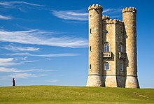

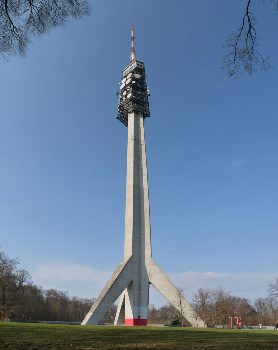


.jpg)
.jpg)


.jpg)
.jpg&action=edit§ion=T-1)
.jpg)
 Done:--Gauravjuvekar (talk) 14:42, 11 April 2012 (UTC)
_whitened.jpg)
_editMMK.jpg)


.jpg)


 is used in the actual vector graphics article. While I don't think it's quite FP standard, it's arguably a better illustration for images than the nominated version, which does seem more font based. --jjron (talk) 13:46, 25 May 2012 (UTC)


