Original - The tiger (Panthera tigris) is a mammal of the Felidae family, the largest of four "big cats" in the genus Panthera. Native to much of eastern and southern Asia, the tiger is an apex predator and an obligate carnivore. Reaching up to 4 metres (13 feet) in total length and weighing up to 300 kilograms (660 pounds), the larger tiger subspecies are comparable in size to the biggest extinct felids. Aside from their great bulk and power, their most recognizable feature is the pattern of dark vertical stripes that overlays near-white to reddish-orange fur, with lighter underparts.
Reason
clear well focused and it meets the FPC criteria and should be featured.
Oppose. Unsharp, low resolution (and only depicts part of the animal). Pstuart84Talk 18:02, 20 May 2008 (UTC)[reply]
Neutral- An excellent image, but the whole animal should appear, not just the upper torso. ~Meldshal42Hit meWhat I've Done 19:29, 20 May 2008 (UTC)[reply]
Support-Excellent image showing facial details in closeup. Look at the clarity around eyes and mustaches. Good lighting and no special effects. --gppande«talk» 08:38, 21 May 2008 (UTC)[reply]
Oppose per Pstuart84. Mfield (talk) 15:42, 21 May 2008 (UTC)[reply]
Oppose regretfully. I don't know what it is about this image, it's not out of focus, but it's not quite in focus either. Wish is was, 'cause it's a great pose. Clegs (talk) 17:51, 21 May 2008 (UTC)[reply]
Weak oppose, regretfully. Good lighting, good pose, and I have gotten over my distaste for head-only animal portraits. But the focus isn't quite up to the standards of other FP animal portraits: , , , for example.
Oppose The image is a bit thin, and after seeing this in comparison, I'm afraid I can't support. SpencerT♦C 22:17, 22 May 2008 (UTC)[reply]
Oppose It meets the requirements, but the resolution is STILL an issue. I would love to see this at higher resolution. Crassic! (talk) 22:20, 24 May 2008 (UTC)[reply]
Not promoted MER-C 10:50, 27 May 2008 (UTC)[reply]
I found this a few days ago and come back to it today; having looked at it a little long, I have decided to place it here for FOC status because I feel the map does a good job of showing just how many things had to be assembled across the U.S. to make the Manhattan Project a success. As you may have guessed, this image appears in the article Manhattan Project, it was created by User:Fastfission in Adobe Illustrator and released under the terms of the GNU Free Documentation License. Be forwarned that this is a .png image, not a.jpg image, so take that into account if you have a slow connection.
Nominate and SupportTomStar81 (Talk) 03:35, 23 November 2006 (UTC)[reply]
Oppose, the map is clear, but it lacks a certain complexity and wow factor to warrant featuring for me. Plus: As stated in the image upload instructions the peferred (and technologically superior) format for this kind of illustration is SVG. Benefits of SVG include easier editing, including translations of text labels (there are more Wikipedias than just the English one), and high quality printing (SVG provides infinite resolution). --Dschwen 08:38, 23 November 2006 (UTC)[reply]
I didn’t create the map, I just nominated it, but I will keep that in mind from now on. TomStar81 (Talk) 10:01, 23 November 2006 (UTC)[reply]
Oppose I'm sure this map does a good job in illustrating the complexity of Manhattan Project. But to reach FP standards it is needed a much higher degree of refinement and sophistication. The meaning of the symbols should be explained in the map or, at least, in the picture caption. Alvesgaspar 09:30, 23 November 2006 (UTC)[reply]
What exactly is not clear about the image? If you can describe in better detail the kind of caption you have in mind I may be able to do something about it. TomStar81 (Talk) 10:01, 23 November 2006 (UTC)[reply]
The map uses three different symbols to represent the cities, but its meaning is not explained. Alvesgaspar 10:43, 23 November 2006 (UTC)[reply]
The size of the circles is meant to show the amount of importance a certain city or cite had in the project. For Example, Washington, D.C., as the capital of the United States, was responsible for the implimentation and ultimately the green light for using the bomb. hanford Enginering in Richland manufactored plutonium for the Fat Man bomb, Oak Ridge in Tennessee manufactured uranium for the Little Boy bomb, and Los Alamos assembled the bomb. Wendover, noted as being part of Project Alberta, was assigned the task of delivering the nuclear weapons. Monticello and Uravan were both involved with the element Vanadium, which had fissile capabilities. I think Chicago may be noted for Enrico Fermi and his first succsessful nuclear reactor, and to be honest I am not sure about the other cites mentioned on the map (though I have my suspitions). I will look into the other cites and see if I can tie down there role more effeciently. TomStar81 (Talk) 21:34, 23 November 2006 (UTC)[reply]
Neutral. There is nothing wrong with this image, but it should be in SVG. NauticaShades 10:22, 23 November 2006 (UTC)[reply]
Oppose per Dschwen. Needs to be in SVG. User:Sd31415/Sig 13:46, 23 November 2006 (UTC)
Oppose. Yes, it should be in SVG. But even then, I would oppose it. There's nothing wrong with it as such, it does its job, but it's just not very interesting. Stephen Turner (Talk) 20:30, 23 November 2006 (UTC)[reply]
Oppose, nothing eyecatching or especially informative about it: it tells me that there were several sites, but it doesn't even tell me what they did. A good improvement would be to use symbols that indicated the purpose of each location, such as encrichment facilities, or testing sites. Night Gyr (talk/Oy) 01:19, 24 November 2006 (UTC)[reply]
Comment: I had never really thought of this as being that exciting an image (just a generic map), but one could imagine putting a little more effort into it and making something special (i.e. a map which gave more information about the sites). Anyway it would be pretty easy to convert it to SVG, just as a matter of course. I don't thing SVG support was implemented when I first uploaded it. --Fastfission 01:33, 24 November 2006 (UTC)[reply]
Oppose - I'd prefer a different format --Puma5d04 05:35, 24 November 2006 (UTC)[reply]
Oppose - There is really nothing about this map to recommend it for Featured Picture - it is rather ordinary. (1) It is difficult to read except at the highest magnification. (2) It is not particularly pretty or striking. (3) It does not tell a story or present a new angle on an article. (4) It does not use the semi-official map colours. MapMaster 15:17, 26 November 2006 (UTC)[reply]
Oppose unless it is in SVG. - Mailer Diablo 19:19, 28 November 2006 (UTC)[reply]
Not promoted Raven4x4x 03:07, 1 December 2006 (UTC)[reply]
I came across this image while browsing wikipedia and thought it it was worth a nomination for FP.
Nominate and support. - Windsok 04:47, 5 November 2006 (UTC)[reply]
Weak oppose original. Not a bad shot but there's just too much grain for me. --Tewy 04:51, 5 November 2006 (UTC)[reply]
Weak support edit 1. Much better now that the grain has been reduced. --Tewy 16:57, 5 November 2006 (UTC)[reply]
Support Edit 1. Great colors and composition. I'd also bet it was a pretty difficult shot to take. --Fir0002 07:38, 5 November 2006 (UTC)[reply]
Support Edit 1. This is a great picture, and the edit fixes most of the quality problems. NauticaShades 07:49, 5 November 2006 (UTC)[reply]
Oppose. This is quite good as far as the picture is concerned, but the actual leopard looks to be a bit awkward or startled. It's hard to put into words, but there's something about it that just doesn't feel right to me. The colours also don't particularly appeal. --jjron 15:02, 5 November 2006 (UTC)[reply]
Support edit 1. Nice, sharp, informative, and looks good. -Gphoto 22:23, 5 November 2006 (UTC)[reply]
Support Edit 1. Natural, good composition, quality, and colors. –MT 23:44, 5 November 2006 (UTC)[reply]
Support Edit 1. Looks pretty good to me. Sharp, clear, good composition. Diliff | (Talk)(Contribs) 20:12, 6 November 2006 (UTC)[reply]
Support edit 1 — Well done. Everything that needs to be said about the photo has already been said, so I'll just leave my support and be on my way. ♠ SG→Talk 21:47, 6 November 2006 (UTC)[reply]
Support Edit 1 Very good! Jellocube27 02:27, 7 November 2006 (UTC)[reply]
Support Edit 1 Great image, with good quality. Hello32020 02:52, 7 November 2006 (UTC)[reply]
Support Edit 1 Great photo! 149.135.45.222 06:24, 7 November 2006 (UTC)[reply]
The above "support" vote is mine. I didn't realise I wasn't signed in... Ackatsis 06:25, 7 November 2006 (UTC)[reply]
Support Edit 1 Quite nice. InvictaHOG 07:00, 8 November 2006 (UTC)[reply]
Support Edit 1 looks great. --ZeWrestlerTalk 01:02, 9 November 2006 (UTC)[reply]
Perhaps, but we can't assume he did. I have left a message about about the issue on his talk page at WB. --KFP (talk | contribs) 01:47, 21 November 2006 (UTC)[reply]
Support Edit 1 per all above. This is a great picture, especially when enlarged. User:Sd31415/Sig 03:23, 23 November 2006 (UTC)
Support edit 1 Very imposing pic...but kind of worried about the copyright status. JumpingcheeseCont@ct 23:40, 24 November 2006 (UTC)[reply]
Support edit #1, but please give it a licensing tag before it goes on the Main Page. --Slgr@ndson (page - messages - contribs) 23:50, 24 November 2006 (UTC)[reply]
Support edit 1 per quality of picture versus original. Sharkface217 23:47, 30 November 2006 (UTC)[reply]
Image was deleted because of unknown source/photographer. --KFP (talk | contribs) 20:42, 1 December 2006 (UTC)[reply]
Aerial view of Washington DCEdit 1: Cropped and color corrected.
About as good a photographic representation of an entire city you can get.
Nominate and support. - Noclip 21:07, 25 November 2006 (UTC)[reply]
Comment Very nice composition but a little pale in the buildings section of the photo. also the road which is partially shown in the lower right kinda distracts. --Midnight Rider 01:09, 26 November 2006 (UTC)[reply]
Weak Support Edit 1 is nice but that damn building with the red roof on the right which is at a wierd angle to the picture still distracts. It really stands out from the rest of the buildings so I think the angle is somewhat important. But then again its just me. --Midnight Rider 01:15, 27 November 2006 (UTC)[reply]
Also that tall pointy building really stands out from the rest. That's even more distracting! (j/k) --Bridgecross 19:17, 27 November 2006 (UTC)[reply]
Comment Uh, there's no source info. Abstaining until that's clarified. Staxringoldtalkcontribs 22:12, 26 November 2006 (UTC)[reply]
Source info added. howcheng {chat} 20:57, 27 November 2006 (UTC)[reply]
Support per quality of picture. Sharkface217 23:43, 30 November 2006 (UTC)[reply]
Support As someone who drives through this picture everyday I am quite impressed with all the features of Washington D.C. this captures. You have the Washington Monument, the Ellipse, The White House, and the Smithsonian all in one picture. Excellent Work. -- immunity 06:43, 1 December 2006 (UTC)[reply]
Where do you see the Smithsonian? You are peobably confusing it with the Department of Commerce? The SI should be somewhere below the camera. --Dschwen 08:43, 1 December 2006 (UTC)[reply]
Oppose both. The edit looks like a bad slide scan, at least the original has natural looking colors. But this pic doesn't show downtown Washington, it shows only a tiny fraction. I'd expect Pennsyvania Ave. to be on such a picture, and the Mall in its entirety. --Dschwen 08:46, 1 December 2006 (UTC)[reply]
Support edit 1 So people finally decided to vote on this pic? Just kidding, but very impressive pic. One of the best aerial shot I've seen. JumpingcheeseCont@ct 20:44, 1 December 2006 (UTC)[reply]
Oppose - Small and blurry. The angle is also very poor, making the subject unclear. —Cuiviénen 02:33, 2 December 2006 (UTC)[reply]
Comment - To clarify some misperceptions: this is not the "entire city" or even all of downtown. It's a small fraction of Washington. There's no one building in D.C. called the "Smithsonian". The Smithsonian Inst. includes over a dozen bldgs. None are in this shot. Pennsylvania Ave is in this shot, although you can't actually see the pavement because of the angle. I'm undecided about the FP status. I don't think it illustrates Washington particularly well. Such an aerial photo would include the Capitol, the Lincoln Memorial, the Jefferson Memorial, the Potomac & Anacostia Rivers, National Cathedral, and possibly RFK Stadium among with other notable sites. It only just barely meets the size requirement. OTOH, its a very pretty shot and, considering the near impossibility of entering DC airspace post-9/11, a rare one. --dm(talk) 04:18, 2 December 2006 (UTC)[reply]
Pennsylvania Ave is in this shot, yeah, but only the boring part, not the downtown section. I'm sure with some digging more US armed forces photography of DC can be found. If anyone can enter that airspace its them, right? Anyway, a really nice shot would be taken from above east of the capitol looking west with a strong telelens, that might contract the mall enough to cram everything into one picture. --Dschwen 09:58, 2 December 2006 (UTC)[reply]
Something like this only looking in the opposite direction and better quality (and maybe nicer weather). --Dschwen 10:02, 2 December 2006 (UTC)[reply]
Approximately like mall.jpg this, maybe moved back a little and compensated by zooming in more. --Dschwen 10:09, 2 December 2006 (UTC)[reply]
Oppose Too small, too little detail, bad colors, nothing interesting in background. Ugly! I would not even use this to illustrate Washington D.C.. -- Petri Krohn 01:49, 3 December 2006 (UTC)[reply]
Not promoted Raven4x4x 02:46, 3 December 2006 (UTC)[reply]
The map is divided in 3×3 sheets with the dimension 55x40 cm (height×width) because they were used in the printing process to transfer it onto a wood carved stamps. The notes on the map in Latin were translated by Olaus himself into the Italian and German language. Historia de gentibus septentrionalibus (Rome, 1555) is a much larger commentary on the map.
Support. - Mgm|(talk) 12:51, 24 November 2006 (UTC)[reply]
Support. I can't find any compression artifacts or faults in the scan.--HereToHelp 19:01, 24 November 2006 (UTC)[reply]
Support Very enc., quality scan, and always nice to add an image that's not another animal or panorama. --Bridgecross 19:48, 24 November 2006 (UTC)[reply]
Support 100% enc. (Personal memory: This image is familiar, it was a wallpaper in the room that housed the optical printer I used to work with in the 1980s - you can see the compass rose and the ship & monster behind the printer...) --Janke | Talk 20:36, 24 November 2006 (UTC)[reply]
Support Wonderful chart, nice documentation. Alvesgaspar 21:52, 24 November 2006 (UTC)[reply]
If you mean at upper left corner, no, that's the southern tip of Greenland. Mid-left are the Hebrides. They didn't have GPS in those days... --Janke | Talk 16:14, 25 November 2006 (UTC)[reply]
Support per all above. User:Sd31415/Sig 14:06, 25 November 2006 (UTC)
Support looks pretty awsome. --Iriseyes 17:12, 25 November 2006 (UTC)[reply]
edit1 lightened
Support - What do you all think about lightening it? Would it take away from the "old-look" which is surely encyclopedic in this case? A version with this tonality might be more pleasant on the main page (has full dynamic range, but a bit less muddy): Debivort 18:19, 25 November 2006 (UTC)[reply]
support the original: great image. Sotakeit 19:01, 25 November 2006 (UTC)[reply]
Tentative Weak Oppose this version - I'm not convinced this is as good as it could be; to my eyes it looks just a little gloomy. Support lightened version by Debivort. Also, does anyone know if it's possible to get hold of the text from the box at the bottom left? I think it would make a relevant addition to the article and/or caption, but it's too small to read in the scan. --YFB¿ 02:19, 26 November 2006 (UTC)[reply]
Comment re brightness. The first version of Image:Carta Marina.jpeg is in a brighter version.link, 3.2 MB I think the colors of that version look better, but it is in a lower resolution, 2508×1857, compared to the other that has 5016×3715. / Fred-Chess 12:02, 26 November 2006 (UTC)[reply]
Support: nice map, and nice image of it. – b_jonas 16:26, 26 November 2006 (UTC)[reply]
B-25 Mitchell mass production line in Kansas City in 1942.
High resolution full colour picture taken during World War II. I've only seen a few colour pictures from WWII, and this one is certainly one of the cleanest and largest. Public Domain as a work of the US Government taken by Alfred T. Palmer on October 1942.
Support. A little nosiy, but very encyclopedic and historically significant. NauticaShades 10:02, 24 November 2006 (UTC)[reply]
Support Per Nautica, but the resolution is great for a historical photo. Leon 11:16, 24 November 2006 (UTC)[reply]
Support This is over 50 years old? Wow! It's a great picture for that time. | AndonicOTalk | Sign Here 11:38, 24 November 2006 (UTC)[reply]
Support very historically significant, and per nom a rare color photograph given the time period.--Mike 15:55, 24 November 2006 (UTC)[reply]
Support. Considering the time period, the quality is excellent (per above). --HereToHelp 18:49, 24 November 2006 (UTC)[reply]
Support per above --antilivedT | C | G 21:41, 24 November 2006 (UTC)[reply]
Support Good quality image for the time, and historically significant. Hello32020 01:23, 25 November 2006 (UTC)[reply]
Support I am all about WWII, and apparently so is this picture. TomStar81 (Talk) 01:45, 25 November 2006 (UTC)[reply]
Support per all above. User:Sd31415/Sig 14:05, 25 November 2006 (UTC)
Support excellent quality for that era. Archibald99 23:56, 25 November 2006 (UTC)[reply]
Support - better quality than a lot of the USGov work taken with modern equipment! --YFB¿ 02:21, 26 November 2006 (UTC)[reply]
Support – b_jonas 16:29, 26 November 2006 (UTC)[reply]
Support Quality and historic without LOSING that quality! Staxringoldtalkcontribs 22:14, 26 November 2006 (UTC)[reply]
Support Superb quality for a 64yo color image and has historical importance.--Dakota 23:58, 26 November 2006 (UTC)[reply]
Weak oppose Ok good picture for being 60 years old, but among the FSA-OWI collection it doesn't really stand out. See [2], [3], [4] for better examples with industrial themes. (All images are also available as larger resolution tiffs.) ~ trialsanderrors 00:45, 27 November 2006 (UTC)[reply]
Party popper? No, I'm kidding. Thanxs for the the research into colour photos during WWII. However, how does that warrant a vote of weak oppose? The photos you suggested are not "better" in my opinion because they are not that pleasing to the eye (noise, blown highlights) and have questionable values to specific articles. Be cool and follow the bandwagon. ^_^ JumpingcheeseCont@ct 01:10, 27 November 2006 (UTC)[reply]
Thanks but no thanks, not that my !vote will change the outcome anyway. If you spend some time looking at the FSA-OWI images you know that this example isn't in the top fifty; its color palette is too muted. Seemingly the sole reason for promotion is the astounding resolution, but that's something most FSA-OWI color photos share. ~ trialsanderrors 01:23, 27 November 2006 (UTC)[reply]
I looked at a couple of the pics and it seems that this example has the most vibrant colours. From the small sample of pics I saw, all the of them are of considerable poorer quality: muted colours, scratches on the original transparency, scattered jpeg artifacts, and so forth. I didn't see them all, but I sure did not see any of the "top fifty". I'm sure that high resolution isn't the only reason the pic is impressive. ;) JumpingcheeseCont@ct 01:37, 27 November 2006 (UTC)[reply]
Just a quick run-through: [5], [6], [7], [8], [9], [10], [11], [12], [13]. Jpeg artifacts are irrelevant, the images can be converted from the lossless tiff at 100%, as is the case with this one. Manipulating 100MB tiff files is a bit too taxing for my computer, or I would post an example. ~ trialsanderrors 02:02, 27 November 2006 (UTC)[reply]
Thanks for finding all the very nice pictures. I especially like the first one. However, the colour still seems a little washed out...probably due to the lighting. The reason the picture of the B-25 turned out so nice was probably due to the intense factory lighting, with provided enough light for the early colour film to register the colour correctly. However, you seem to have found a very nice source of WWII pictures and I suggest you upload them onto Wikipedia or Commons. =) JumpingcheeseCont@ct 04:09, 27 November 2006 (UTC)[reply]
commons:Category:FSA-OWI. Fell free to help categorizing. Only about 1/5 of the collected FSA-OWI images have cat markers as of now. ~ trialsanderrors 06:14, 27 November 2006 (UTC)[reply]
Thanxs for pointing that out. I added the category to one of the pics so far... =D JumpingcheeseCont@ct 07:09, 27 November 2006 (UTC)[reply]
Support Very good quality and interesting subject matter.--Geoffrey Gibson 01:48, 27 November 2006 (UTC)[reply]
Oppose Hate to be the lone voice of dissent, but neither the composition (background planes get foreshortened into nothing) or the color balance (very brown) really do it for me here. Additionally, the image is only used to illustrate the airforce base and the specific plane being assembled – both of which could be better shown by other images. I believe many of the images on the FSA-OWI page linked by trialsanderrors are superior in both composition and subject matter.Spyforthemoon 18:30, 27 November 2006 (UTC)[reply]
I found the pic on FAS-OWI and somehow it looks much duller and muddier that the version that is currently being proposed. [14] The uncompressed TIFF file is over 100mb, so I didn't get to view that file. However, all the pics on FAS-OWI seems washed out...different scanning technique? JumpingcheeseCont@ct 04:14, 29 November 2006 (UTC)[reply]
Oppose. I like this image, but it neither illustrates the plane nor the airport well. howcheng {chat} 21:00, 27 November 2006 (UTC)[reply]
Uhhh because it's neither an airport nor to illustrate planes? It's a factory of WWII planes... --antilivedT | C | G 04:12, 28 November 2006 (UTC)[reply]
And yet it is used to illustrate the articles on the plane and the airport... --Dschwen 15:41, 28 November 2006 (UTC)[reply]
Support Minor faults in composition are more than made up for with historical value. HighInBC(Need help? Ask me) 22:30, 27 November 2006 (UTC)[reply]
Oppose. Ack Howcheng. So old means historic value? Its an ok picture, but not an overwhelming one. The old color pics from above are much more stunning. I fail to see what the picture illustrates, apart from a hangar full of yellow planes. No details on the planes nor the construction process are visible. --Dschwen 15:41, 28 November 2006 (UTC)[reply]
Comment There are quite a number of B-25 related images at the FSA-OWI collection. (Not a search term, so this link will have to do.) I like this picture of the "Sunshine assembly line" better than the one under discussion. It actually gives an impression of the assembly process. ~ trialsanderrors 00:26, 29 November 2006 (UTC)[reply]
As I mentioned above, the exact colour photo from FAS-OWI of the B-25 is of considerable poorer quality than the FP candidate.[15] According to the pic's description on the Commons, the uploader got the pic from the same source. However, pic looks substantially different...is the TIFF file cleaner? I kind of expect the same muddy picture but in much high resolution. I've contacted the uploader for clarification. JumpingcheeseCont@ct 06:36, 29 November 2006 (UTC)[reply]
It shouldn't, but of course if the picture here was converted from the uncompressed tiff it's imaginable that the uploader also increased contrast. ~ trialsanderrors 07:42, 29 November 2006 (UTC)[reply]
Actually I checked last night and it is clearly lightened. ~ trialsanderrors 20:23, 29 November 2006 (UTC)[reply]
Support per quality of picture. Sharkface217 23:44, 30 November 2006 (UTC)[reply]
Support What a great photo. Spebudmak 19:21, 1 December 2006 (UTC)[reply]
Promoted Image:B25-mitchell-assembly.jpgRaven4x4x 02:44, 3 December 2006 (UTC)[reply]
View through the scope of a sniper rifle.NOT FOR VOTING: Same team, different angle
I found this just now, it apparently got placed on the page sniper while I was not looking, but I like it a lot. The view is unique, so I thought I would place it here. This comes from commons.
Nominate and SupportTomStar81 (Talk) 04:21, 24 November 2006 (UTC)[reply]
OpposeSupport — We don't have many (any?) other photos like this. Quite sharp and detailed in the scope. ♠ SG→Talk 07:45, 24 November 2006 (UTC)[reply]
Eh, what was I smoking when I supported this image? ♠ SG→Talk 02:39, 25 November 2006 (UTC)[reply]
Commment, what's with the sky? Why is it completely white? grenグレン 08:55, 24 November 2006 (UTC)[reply]
Comment. I'm tempted to support this, but is it a genuine photo or is it a mock-up? Stephen Turner (Talk) 09:04, 24 November 2006 (UTC)[reply]
It looks to be a genuine photo, the second shot is of the same sniper team but from a different angle. As for the sky, it appears from this angle to be a mostly cloudy day, thats my take on it. TomStar81 (Talk) 10:08, 24 November 2006 (UTC)[reply]
Weak Support. Very interesting picture, but the white sky is somewhat distracting. NauticaShades 10:01, 24 November 2006 (UTC)[reply]
Oppose - Nice idea, but I believe it can be better executed. Alvesgaspar 10:04, 24 November 2006 (UTC)[reply]
Oppose per Alvesgaspar. There is a halo around the scope, you can best see it against the mountain. I would say the sky is blown, but since no one has said it I ask instead: is there something I'm missing? | AndonicOTalk | Sign Here 10:07, 24 November 2006 (UTC)[reply]
Support on the basis that the white sky be filled in with some neutral color. Otherwise very unique and interesting picture. JumpingcheeseCont@ct 10:12, 24 November 2006 (UTC)[reply]
Support Great picture, shows how scopes work. Gphototalk 15:11, 24 November 2006 (UTC)[reply]
Oppose - blown sky, and ridgeline to left of scope looks fake. Debivort 17:28, 24 November 2006 (UTC)[reply]
Oppose. I'm not sufficiently convinced that this isn't partially faked, or at least heavily manipulated. A few things look not quite right about it. Stephen Turner (Talk) 17:41, 24 November 2006 (UTC)[reply]
Oppose. Per above, this is a great idea but the execution leaves something to be desired.--HereToHelp 19:03, 24 November 2006 (UTC)[reply]
Weak Oppose - The picture definately helps the sniping article, but it's a very unattractive image. --Iriseyes 17:14, 25 November 2006 (UTC)[reply]
Oppose - I'm sure it can't be impossible to get a better shot than this - until then we'll have to do without a sniperscope FP. It seems genuine to me, just not all that well-executed. --YFB¿ 02:25, 26 November 2006 (UTC)[reply]
Oppose We can do better. At the very least, I'd argue this doesn't really show how a scope works. We have no comparable non-scoped image there to see magnification. Staxringoldtalkcontribs 22:16, 26 November 2006 (UTC)[reply]
It would be really, really hard to achieve that as the depth of field will have to be extremely large to have both the scope and non-scope part of the image in focus. It is currently taken in f/8 and even at f/16 both won't be in focus at the same time, and any smaller aperture will reduce the sharpness of the image by diffraction. Unless a composite image is made, I don't think it's technically feasible. --antilivedT | C | G 09:46, 28 November 2006 (UTC)[reply]
Support per quality of picture. Sharkface217 23:45, 30 November 2006 (UTC)[reply]
Not promoted Raven4x4x 02:42, 3 December 2006 (UTC)[reply]
Professional storyteller Mike Mann drew upon life experiences for his tales as part of the lineup of entertainers during the June 26, 2004, Hiawatha Light Rail opening. Transit officials estimated 30,000 people took advantage of free entertainment and train rides for the Hiawatha Line inaugural in Minneapolis, Minn.; United States.
Some 30,000 people attended the opening of the Hiawatha Light Rail in Minneapolis, Minn.; United States in 2004. Storyman Mike Mann stood out from the crowd. His neatly trimmed grey beard, crisp white shirt with black vest, and straw hat presented an appealing and gentle demeanor. But it was his eyes that drew me to the storyman. I engaged him in conversation and asked Mann to tell me a story. Which he did, to an audience of one. I snapped this picture of Mann as he spun a tall tale from childhood.
Photo Qualities
(1.) This informal portrait of a gentleman captures human character in rich detail. (2.) The exposure achieves a good balance between capturing shadow detail of the face yet avoids loss of detail in the sun-lit background. (3.) This is a documentary photo that helps capture the historic day of light rail opening in Minneapolis, Minn.; United States. (4.) Photo and caption place the storyman in context of this public event. (5.) Caption helps draw the viewer into the focal point of the photo: the subject's eyes. (6.) Photo includes action in the form of a gesture, which adds to the context of storytelling.
Nominate and support. - Fishdecoy 02:07, 24 November 2006 (UTC)[reply]
Let's consider this photo for just the Documentary photography. Subsequently, I have re-cast the caption. Moreover I pulled the image from the Storytelling page. Fishdecoy 15:53, 25 November 2006 (UTC)[reply]
Support per nom.--Mike 04:24, 24 November 2006 (UTC)[reply]
Oppose, as poetic and nice a story as this caption is, I don't really see the encyclopedic value in the picture. There's nothing about the image that distinctively shows that there's storytelling going on--there's no audience, and he's not even talking. It's a good picture technically, as far as I can tell, but even after reading the caption, it's still just a picture of some guy. Night Gyr (talk/Oy) 04:58, 24 November 2006 (UTC)[reply]
Oppose. Night Gyr said it exactly. Stephen Turner (Talk) 09:05, 24 November 2006 (UTC)[reply]
Oppose. Somewhat unencyclopedic, a few blown highlights, and cramped. NauticaShades 09:59, 24 November 2006 (UTC)[reply]
Support - There are very few FP of people, something that I don't really understand. This one is a quite expressive portrait of a story teller that "captures human character in rich detail". Alvesgaspar 10:02, 24 November 2006 (UTC)[reply]
Weak Support I would support if the hat and the badge were not cut off. Good picture overall. | AndonicOTalk | Sign Here 12:30, 24 November 2006 (UTC)[reply]
Oppose. For a picture of a storyteller I'd expect to see an audience. For a portrait I'd prefer a lower DOF. This lacks in enc. and the caption almost reminds me of the Golden Retriever nomination. How are you supposed to tell a person's character from a picture? That sounds like pseudo-science to me. --Dschwen 16:47, 24 November 2006 (UTC)[reply]
Oppose - not technically stunning, and not really helping its article; Dschwen's right about the retriever. --YFB¿ 02:28, 26 November 2006 (UTC)[reply]
Oppose. Not particularly special - his face is in shadow due to the hat, thus obscuring his eyes more than would be preferable. In addition, his hat is cut off at the top. Bobtalk 11:36, 26 November 2006 (UTC)[reply]
Oppose per Night Gyr and Dschwen. Pstuart84 20:52, 26 November 2006 (UTC)[reply]
Oppose Seems like a perfectly nice guy, but does little to show the subject of the article and not even technically stunning. Staxringoldtalkcontribs 22:17, 26 November 2006 (UTC)[reply]
Oppose, picture fails to bring out the meaning of the article it is related to. - Mailer Diablo 19:15, 28 November 2006 (UTC)[reply]
Oppose. This is an amazing photograph technically, but it fails to have a clear subject. --Tewy 00:11, 29 November 2006 (UTC)[reply]
Comment I agree with the technical comments above, but I have no idea why this was taken out of the storytelling article and put into the documentary photography article. Maybe from the picture alone I can't tell that it's a storyteller, but in the context of the article it's very believable, which is good enough for good picture status. For documentary photography we have tons and tons of more relevant pictures in the public domain, starting with Migrant Mother, which was PotD a couple of days ago. ~ trialsanderrors 16:30, 29 November 2006 (UTC)[reply]
Not promoted Raven4x4x 02:42, 3 December 2006 (UTC)[reply]
Nominate and support. - Gphototalk 00:18, 24 November 2006 (UTC)[reply]
Oppose. I don't necessarily see the encyclopedic nature of this picture. The subject is the ride, but with it being exposed for that length it takes away from the subject. -- dhp1080(u·t·c) 03:49, 24 November 2006 (UTC)[reply]
Oppose — You nominated this image to illustrate exposure (photography) and motion blur, yet it appears in neither article. As such, I will vote for it based on the article it IS in: fair, which it illustrates rather poorly, due to the extended exposure time. ♠ SG→Talk 07:48, 24 November 2006 (UTC)[reply]
Oh, and even if you were to add it to those articles, I'd still oppose. The image seems to be tilted at a dizzying angle, and isn't as sharp as it could be. ♠ SG→Talk 07:49, 24 November 2006 (UTC)[reply]
Weak Support. It is now in those two articles, but I think the composition is a little messy. NauticaShades 09:58, 24 November 2006 (UTC)[reply]
Oppose. Agreed that composition is a little messy. Photo is simply not aesthetically pleasing. It could have been approached from a better angle. Krowe 12:41, 25 November 2006 (UTC)[reply]
Oppose - Composition; the other pic at motion blur has fewer distracting elements but still isn't perfect. --YFB¿ 02:31, 26 November 2006 (UTC)[reply]
Oppose. I tried nominating this image a while back, and it wasn't nominated because the subject was cut off. I have to say, I agree with that reason for opposition, and this image suffers from the same problem. --Tewy 00:17, 29 November 2006 (UTC)[reply]
Not promoted Raven4x4x 02:42, 3 December 2006 (UTC)[reply]
Australian Pelican, Lakes EntranceEdit 1, by Fir0002 - rotation
A nice portrait of an Australian Pelican, taken at Lakes Entrance, Australia.
Note: Obviously, there is consensus for promotion of this image. However, the decision on which version is unclear. Voters, pelase clarify your votes. Alternatively, a third edit could be made that is rotated, but no overly bright.
Support Self Nom. --Fir0002 06:03, 10 November 2006 (UTC)[reply]
Support due to a lack of objections to it --Ineffable3000 07:06, 10 November 2006 (UTC)[reply]
Support Great picture (but I'm fairly sure it needs a small anticlockwise rotation - Adrian Pingstone 08:57, 10 November 2006 (UTC)[reply]
Support Either Great pose! • Leon 11:13, 10 November 2006 (UTC)[reply]
Support Another excellent shot from Fir002. --Bridgecross 14:47, 10 November 2006 (UTC)[reply]
Support, impressive. - Mailer Diablo 18:59, 10 November 2006 (UTC)[reply]
Support. Sharp and encyclopedic. But per Adrian Pingstone about the rotation. --Tewy 23:59, 10 November 2006 (UTC)[reply]
Weak support either. The original is sharp and very nice, but tilted. Edit 1 is a little to bright (compared to the original), but not tilted. So both have their own problems that I think could be fixed in a third edit, if that's not too much trouble to create. --Tewy 05:55, 22 November 2006 (UTC)[reply]
(Would support a third edit that's rotated and not so bright). --Tewy 19:03, 24 November 2006 (UTC)[reply]
Support Wow, an excellent picture! I agree with Arpingstone about the rotation, just don't make it ruin the quality of the picture. Michaelas10(Talk) 10:26, 11 November 2006 (UTC)[reply]
Comment I've uploaded an edit with rotation from my original file. I had forgotten to save the editing I had done to make the original version (Image:Pelican lakes entrance02.jpg) so Edit 1 my look a little different in terms of color/lightness etc. Hopefully this is not too much of a problem, but if it is I can easily rotate Image:Pelican lakes entrance02.jpg or try edit "Edit 1" to look more like it. Sorry if that is all a bit confusing. --Fir0002 11:33, 11 November 2006 (UTC)[reply]
Support Original. Or a rotation of the original, as edit 1's feathers are too white, in my opinion. NauticaShades 17:48, 11 November 2006 (UTC)[reply]
Support - lovely. Either original or edited version (fir0002 can pick). Stevage 13:05, 13 November 2006 (UTC)[reply]
Support either version Exellence at it's best. | AndonicOTalk | Sign Here 20:58, 14 November 2006 (UTC)[reply]
Support either I can barely tell the difference, let alone decide which is better (maybe that makes me a heathen). Terri G 14:22, 15 November 2006 (UTC)[reply]
Support either Gmip 18:51, 16 November 2006 (UTC)[reply]
Support Definitely support for great picture, impressive. Daniel5127(Talk) 03:32, 17 November 2006 (UTC)[reply]
...So much for consensus... ;-) --Tewy 05:55, 22 November 2006 (UTC)[reply]
Support. I delegate my authority to the closer for the choice of the version to promote... Alvesgaspar 21:34, 24 November 2006 (UTC)[reply]
Support Awesome! Mike 22:10, 24 November 2006 (UTC)[reply]
Support original, I don't see any improvment after rotation. wtfunkymonkey 06:55, 26 November 2006 (UTC)[reply]
Support original I don't think the rotation improves the image. In edit 1, the light adjustment is just too bright. —The preceding unsigned comment was added by Krowe (talk • contribs) .
Support original per Krowe. --Yarnalgo 01:21, 29 November 2006 (UTC)[reply]
support- A third edit, with original rotation, the second one is not dynamic enough-with the horizontal line across it comes off as a snapshot, very static- but without the glare of the first, which is a bit bright.Resonanteye 08:17, 29 November 2006 (UTC)[reply]
Support either version per quality of picture. Sharkface217 23:46, 30 November 2006 (UTC)[reply]
Promoted Image:Pelican lakes entrance02.jpgRaven4x4x 06:34, 3 December 2006 (UTC)[reply]
Packaged food aisles of Fred Meyer in Portland, OregonEdit 1 - Colour correction and slight counterclockwise rotation
I saw this image when I came across the Supermarket page and was stunned by it. It gives a perspective that a) most people never see and b) gives a lot of information on the scene. It is difficult to appreciate a supermarket from any other angle you would usually see a photo from. Also, it is visually impressive with the rows upon rows of neatly stacked and shelved items; caught my attention straight away. The quality is great with no artefacts or blurriness, and is 2800x1853. Cheers.
Weak support. Very nice, but a touch blurry. --Pharaoh Hound(talk) 12:56, 26 November 2006 (UTC)[reply]
Support - Wow. That's an awsome picture, although I agree that it's a bit blurry per Dark Side of the Spoon. --Iriseyes 16:57, 26 November 2006 (UTC)[reply]
Oppose. The grain and blurriness take a lot away from it. Certainly an interesting picture, but not a featured picture. Imaninjapirate 18:54, 26 November 2006 (UTC)[reply]
Support as per DarkSideOfTheSpoon. --SonicChaotalk 20:54, 26 November 2006 (UTC)[reply]
Weak support Lots of "wow" factor...but maybe a little too overwhelming. JumpingcheeseCont@ct 22:03, 26 November 2006 (UTC)[reply]
Support I really like this method of displaying a great variety of item. My one question, and this is a serious one. Can a photo that is basically 100's of copyrighted logos be free-liscensed? Sorta Campbell's Soup Cans to the extreme. Staxringoldtalkcontribs 22:11, 26 November 2006 (UTC)[reply]
I would argue that the logos in this picture are "incidental" as they are not the subject of the photo. Thereby they would not be copyright restricted. This would be the same as if we had a picture of a person with branded clothing - the picutre is about the person not the clothing so it is ok. Wittylama 23:14, 26 November 2006 (UTC)[reply]
Support I like it! It makes a refreshingly different FP imho. StephenFalken 22:12, 26 November 2006 (UTC)[reply]
Oppose, lots of little spots of glare and burriness. It's a cool shot in concept, but the technical issues throw it off for me. Night Gyr (talk/Oy) 01:22, 27 November 2006 (UTC)[reply]
Oppose as per Night Gyr. I especially noticed problems by soda on black left by the pole. I do like the idea. grenグレン 06:56, 27 November 2006 (UTC)[reply]
Support Edit 1 - I like this picture. Despite some minor technical flaws I think its quality and encyclopedic interest justify its promotion to FP. Alvesgaspar 14:59, 27 November 2006 (UTC)[reply]
Weak Support Edit 1. As others have mentioned, this image has flaws but it is an unusual and interesting view of supermarket shelves. Diliff | (Talk)(Contribs) 15:25, 27 November 2006 (UTC)[reply]
Support Unique subject matter, visually & cognitively arresting. I don’t think minor focus flaws overwhelm its strong points. Spyforthemoon 18:12, 27 November 2006 (UTC)[reply]
Support original version. I think it's better than 99 cents. The only things that bug me are the pillars in the back row, but that's a minor distraction. It captures the essence of a hypermarket extremely well. ~ trialsanderrors 19:03, 27 November 2006 (UTC)[reply]
Yeah, I like the original more too. I think it is because it seems more realistic of supermarkets with those horrible yellow lights. DarkSideOfTheSpoon 06:41, 28 November 2006 (UTC)[reply]
Don't most supermarkets have fluorescent lighting which tends to be quite a cool color? In any case, unless the colour tint is extreme, the eye usually compensates for it, so a neutral color balance is usually closest to what you see. Diliff | (Talk)(Contribs) 08:00, 28 November 2006 (UTC)[reply]
The edited version has a bit too much of a natural light flavor for my taste. Also, the original reminds me of the horrible beige/yellow shelves Walgreen uses, and I'm guess Fred Meyer too. ~ trialsanderrors 08:24, 30 November 2006 (UTC)[reply]
Weak Support Edit 1. Reasonable quality. NauticaShades 07:21, 28 November 2006 (UTC)[reply]
Support Very interesting picture that catches the eye. Very worthy FP. --Tobyw87 08:12, 28 November 2006 (UTC)[reply]
Weak Support Edit 1, vastly improved by the color correction. Robotsintrouble 10:23, 28 November 2006 (UTC)[reply]
Support Edit 1 I wish my cupboard looked like that. | AndonicOTalk | Sign Here 11:51, 28 November 2006 (UTC)[reply]
Oppose, because of the noise and blur. Great shot, but the technical issues are a big minus.--ragesoss 16:21, 28 November 2006 (UTC)[reply]
Weak support edit 1, interesting picture, colour correction surely helps a lot. - Mailer Diablo 19:13, 28 November 2006 (UTC)[reply]
Weak oppose, blur. Redquark 20:02, 30 November 2006 (UTC)[reply]
Support per quality of picture. Sharkface217 23:42, 30 November 2006 (UTC)[reply]
Oh so close, but oppose (both). I love the composition and it's wonderfully encyclopedic, but it's just not sharp enough for FP. It should be possible to take essentially the same photo, but with better focus, so this one cannot be FP.--DaveOinSF 05:12, 1 December 2006 (UTC)[reply]
Very Weak Support edit 1. Very blurry especially at the back near the soda. I'd like to see it sampled down to maybe 85% of its current resolution for better quality. --frothTC 18:57, 3 December 2006 (UTC)[reply]
Support Edit 1. Although some technical issues, very interesting subject --Fir0002 00:29, 4 December 2006 (UTC)[reply]
Promoted Image:Fredmeyer edit 1.jpgRaven4x4x 04:07, 4 December 2006 (UTC)[reply]
I saw a hawk's eye FPC which was pretty nice (with some reflections). But this photo was one of my favorite for a long long time (even before I came to wiki) and the quality is also great. It shows perfectly the cat's eye and even the cat's hair. I'm pretty sure some people will comment on the focus, but that's not a matter for me. It appears in the Cat article and the author is jefras.
Nominate and support. - Arad 03:17, 29 November 2006 (UTC)[reply]
Oppose. Yes, the focus is an issue for me. The only part that's not blurry is the hair above the eye, and I'm sure there are better ways to depict that. This eye image is also a shame, because it's just one problem away from being really good. --Tewy 03:29, 29 November 2006 (UTC)[reply]
Weak oppose Very stunning picture, but the focus is off. Otherwise a very nice picture. Is there a version which focuses on the eye? JumpingcheeseCont@ct 05:14, 29 November 2006 (UTC)[reply]
Support-weakly-If it was called "cat's fur" it would be a sure thing.
Oppose. Out-of-focus. Other than that, it's pretty nice. --Pharaoh Hound(talk) 14:13, 29 November 2006 (UTC)[reply]
Oppose Being a bit blunt, what is the point of putting this up for FP when most of the pic is out of focus! - Adrian Pingstone 16:44, 29 November 2006 (UTC)[reply]
Oppose, out of focus. - Mailer Diablo 03:51, 30 November 2006 (UTC)[reply]
Support per quality of picture. Sharkface217 23:41, 30 November 2006 (UTC)[reply]
Weak Oppose. The eye is unfortunately not in focus. NauticaShades 07:20, 1 December 2006 (UTC)[reply]
Support. Great picture, although if someone could photoshop the eye so it is less blurry it would be a bit better. Ilikefood 01:32, 7 December 2006 (UTC)[reply]
Not promoted Raven4x4x 07:15, 7 December 2006 (UTC)[reply]
Though the article that this image is made for is small, this picture clearly shows the viewer what an iDog is. Also, it shows the iDog in use, as 6 of its 7 LED lights are flashing;
this picture is currently used in the iDog article.
This is first ever FP nomination. And it is of my own work, so please help me as much as possible by using constructive criticism. =)
Oppose, a lot of the subject is out of focus and blurry; looks like some of it was camera jitter. Did you use a tripod? Night Gyr (talk/Oy) 00:57, 28 November 2006 (UTC)[reply]
Comment, the new version has the same depth of field issues as the last version. Only part of the dog is in focus; the far ear is entirely out of focus. Night Gyr (talk/Oy) 02:57, 28 November 2006 (UTC)[reply]
Comment. Yeah, I'm gonna see if I can get some better shots of the dog, with its whole body in focus.--i♥nymarble.wondermyPhotos 03:57, 28 November 2006 (UTC)[reply]
Oppose focus issues n under-exposed. --antilivedT | C | G 04:08, 28 November 2006 (UTC)[reply]
Oppose. This is actually a tricky subject. You have to get a decent exposure, while still shoing the glowing LED's. Use a tripod, and a smaller apperture. Check the white balance. This dog is supposed to look white, but in the picture it is brownish. Try different lighting, maybe daylight with an overcast sky? Might be too bright for the LEDs to show though. --Dschwen 11:11, 28 November 2006 (UTC)[reply]
Oppose. No "wow" in this bow-wow. ;-) --Janke | Talk 17:14, 28 November 2006 (UTC)[reply]
Oppose Per above --Fir0002 00:30, 4 December 2006 (UTC)[reply]
Oppose per focus and darkness issues as well as the odd angle of the shot which is not ideal in my opinion. Cat-five - talk 09:06, 4 December 2006 (UTC)[reply]
Not promoted Raven4x4x 07:15, 7 December 2006 (UTC)[reply]
This image barely meets the size requirements (if it even does..), however, it is illustrative and stunning. I think more could be done with it than has been done, but I am no expert in birds, hawks, or such. My eye for artifacts is not very good, but while there appears to be some in the iris, the image overall is very clear and I haven't seen many macro images of the sort on Wikipedia or elsewhere. If the following, from Hawk, can be ascertained to be true for Buteos as well, it would make a better caption than the current one:
Hawks are believed to have vision as good as 20/2, about eight times more acute than humans with good eyesight. This is because of many photoreceptors in the retina (Up to 1,000,000 per square mm, against 200,000 for humans), a very high number of nerves connecting the receptors to the brain, a second set of eye muscles not found in other animals, and an indented fovea which magnifies the central part of the visual field.
Weak oppose The iris itself, which is the apparent subject, doesn’t seem to be in focus. At the large size, the detail in the reflections becomes distracting. Spyforthemoon 18:49, 27 November 2006 (UTC)[reply]
Oppose. Poor quality and doesn't really illustrate the concept of high acuity as there is nothing particularly special about the eye of hawk in this view. Diliff | (Talk)(Contribs) 19:46, 27 November 2006 (UTC)[reply]
Oppose. I find the reflections very distracting. Stephen Turner (Talk) 20:24, 27 November 2006 (UTC)[reply]
Oppose - too small, grainy at full resolution and the reflections are very distracting. -- CountdownCrispy(? 20:27, 27 November 2006 (UTC)[reply]
Oppose The reflection is too distracting, shame because the image is so good otherwise. HighInBC(Need help? Ask me) 00:41, 28 November 2006 (UTC)[reply]
If someone were feeling ambitious, they could blur the reflection and then reconstruct the iris's underlying texture. But that's a bit of work, and the resolution isn't so high. --Interiot 03:57, 29 November 2006 (UTC)[reply]
Weak oppose. It's a shame about the reflection. --Tewy 00:04, 29 November 2006 (UTC)[reply]
Question What is the white stain in the right part of the eye? Doesn't look like a reflection. Alvesgaspar 20:42, 30 November 2006 (UTC)[reply]
It looks like the reflection of a coffee cup lid. HighInBC(Need help? Ask me) 22:59, 30 November 2006 (UTC)[reply]
Support If someone could dampen the reflections and make the eye look a bit clearer, it would be perfect. Otherwise, it definitely deserves featured status. Ilikefood 01:34, 7 December 2006 (UTC)[reply]
Not promoted Raven4x4x 07:15, 7 December 2006 (UTC)[reply]
Dave Matthews with Boyd Tinsley on violin and Butch Taylor on keyboards
I'm nominating an old image that I took of Dave Matthews Band playing in Melbourne, Australia just to mix things up a bit as portrait/celebrity/concert photography is pretty lacking in WP:FP. This is obviously not a technically and aesthetically perfect image - there is a bit of noise. I have reduced it significantly already - it was shot at ISO1600 - but I think reducing it much more may remove some detail in the process and lets face it, concert photography almost always has grain due to the lighting available. That said, I think it is a pretty good example of its kind. It doesn't come across as a completely static image as it shows Dave Matthews doing a little dance with his guitar, although it is difficult to capture the energy and atmosphere in a single shot. An alternative is showing the entire band, although the composition is a bit messier.
weak support. I really like the colors and the movement you can see in the image, but the composition is a bit off - I think there's a bit too much space above Matthew's head. Mrmaroon25 13:09, 27 November 2006 (UTC)[reply]
Fair enough, but the space above is head is to show two other band members. If I cropped to show just Dave Matthews, it would look a bit odd - you'd see only half a torso behind him. Perhaps it would have been ideal if I were a little lower and had one band member on either side of him or something instead. Diliff | (Talk)(Contribs) 13:25, 27 November 2006 (UTC)[reply]
Comment. Pretty decent quality for a concert shot. I'm just wondering about the license, is it ok to take pictures at a concert and post them as free on the web? Aren't those showbiz type of guy usually pretty strict about pictures and the assocoated rights? Anyway, I have no clue, just asking. --Dschwen 22:24, 27 November 2006 (UTC)[reply]
I'm not sure about the licencing to be honest. I do know that Dave Matthews Band has been fairly tolerant toward bootlegging audio in the past. I assume photography is also tolerated as plenty of people bring cameras and take snapshots at concerts, although it is possible a line is crossed when the images are of commercial and salable quality. Diliff | (Talk)(Contribs) 23:26, 27 November 2006 (UTC)[reply]
Weak Oppose. The nominated photo is good quality for a concert shot, but leaves out Carter, Leroi and Stefan. The alternative is more promising, but I'm not sure Butch should be in the photo, since he isn't an "official" band member. Assuming unofficial band members are included, then Tim and Rawhawn should probably be included too. In any case I like the alternative better than this one. -- Moondigger 01:20, 28 November 2006 (UTC)[reply]
Well, I could only photograph the members that happened to be on stage (and in the frame in this case!). Tim and Rawhawn were not touring in Australia so that was not possible. Besides, the band lineup tends to be a bit fluid so it should not be expected for all the unofficial band members to be on stage at any one time. Really, this is a photo of Dave Matthews himself with some backing members, rather than trying to be a complete band shot, but admittedly it is in the band article, not the article on Dave himself, so your comments are valid. I assume you're a bit of a fan too? Or did you just read the article comprehensively? ;-) Diliff | (Talk)(Contribs) 09:14, 28 November 2006 (UTC)[reply]
No, I'm a fan... and not to get too off-topic, but I prefer the live lineup without Butch for most songs. I think they just sound better without the keys most of the time. I realize I'm in the minority on that, though. Back on topic, I would probably support the alternative shot you linked to if it were nominated, even though Butch is in it. :) -- Moondigger
Support This is a good shot, nice colors well composed. I am going to buck the trend of people not supporting modern portraits. -Ravedave(help name my baby) 18:07, 29 November 2006 (UTC)[reply]
Support. Yeah, what the heck, composition, colors, notability all FP level. --Dschwen 19:20, 29 November 2006 (UTC)[reply]
Oppose. The composition of this shot is not feature-worthy in my opinion. Pstuart84 19:55, 29 November 2006 (UTC)[reply]
Oppose unless the goal is to convey that a DMB concert consists of DM in the spotlight and a bunch of clerical workers in the semi-darkness. ~ trialsanderrors 20:18, 29 November 2006 (UTC)[reply]
What does that mean? They're obviously musicians in the background and don't look remotely like clerical workers - does the equipment not give it away? ;-) IMHO a featured picture doesn't have to define the subject of the article. An aspect (as long as it is significant) is enough. In any case, the DMB concert I photographed DID consist of this very scene, so I don't your point. Diliff | (Talk)(Contribs) 23:24, 29 November 2006 (UTC)[reply]
Well the keyboarder could quite as well type on a typewriter and the violinist, I guess it was just an unlucky moment that he's waiting for his cue, but nevertheless they're both in the shadows looking like men at work (no pun intended) rather than musicians playing in a band. On the other picture there is actually eye contact, and the band is lit. I've never been to a DMB concert, so I don't really know if the atmosphere is usually one of "Dave and some hired hands" or if they're actually playing as a band. I'm assuming it's the latter, which is why I'd rather go with the other picture. But of course I might be wrong. ~ trialsanderrors 00:32, 30 November 2006 (UTC)[reply]
Oppose Good level of noise and decent sharpness for a concert shot, however I don't feel the timing was all that good. The "little dance" Dave Matthews is doing just looks like an awkward pose, and it would have been nice to have his eyes open/visible. Did you take any other photos (excluding the alternative)? As I agree with you that we should have concert/portrait images as FP's --Fir0002 00:57, 4 December 2006 (UTC)[reply]
Neutral I won't vote oppose right now to avoid a pileon but on technical grounds alone I don't think this image is even eligible to go up for FP since the copyright status is so up in the air. Cat-five - talk 01:12, 7 December 2006 (UTC)[reply]
Not promoted Raven4x4x 07:14, 7 December 2006 (UTC)[reply]
The missing square. When the four quadrilaterals rotate about their centres, they fill the space occupied by the small red square. However the total area of the figure appears to remain unchangedThe missing square (Edit 1). When the four quadrilaterals rotate about their centres, they fill the space occupied by the small red square. However the total area of the figure appears to remain unchanged
This is a simple variation of the Missing square paradox, popularized by Sam Loyd and Martin Gardner. I made this puzzle more than twenty years ago (in wood) and haven’t found yet any written reference to it. However, and because its principle is quite simple, I believe it might be hidden is some 19th century puzzle book. The aim of this animation is to puzzle the reader, not to explain the apparent paradox. For a full explanation see the article.
Animation created by Joaquim Alves Gaspar
Nominate and support. - Alvesgaspar 00:24, 27 November 2006 (UTC)[reply]
Oppose most of the animation is pointless and confusing. I don'tknow If I ould support it with those extra frames removed, though. —The preceding unsigned comment was added by 70.48.179.120 (talk • contribs) .
Oppose, the twirling is pointless and imparts no information while taking up a lot of time. Night Gyr (talk/Oy) 01:14, 27 November 2006 (UTC)[reply]
I see, this image is the very definition of unencyclopedic. Not only is it misleading, it's deliberately deceptive, as the twirling takes up a lot of time distracting you while quickly flashing away from the reconfigured, larger square. A proper encyclopedic image would reveal the secret behind the illusion, rather than perpetuate it.
Info The comment about the animation being deliberately deceptive is wrong, the animation is absolutely honest (better to see the article). The square grid, which serves as a reference, is not reconfigured in any way. The truth is the difference between the sides of the original and the final squares is so small that it is quite difficult to perceive without a careful measurement. Maybe the rotation of the quadrangles is superfluous, the reason for it is to show how the pieces should be oriented in the new geometry (by the way, its size is not altered during the rotation...). Alvesgaspar 08:46, 27 November 2006 (UTC)[reply]
It's misleading because the simplest, easiest, and most direct way to show the changes would be a simple two frame animation between the two orientations involved. Every other frame just serves to confuse things like a bit of magician's misdirection. We're not here to replicate tricks on the reader, we're here to pull back the curtain in a quick and direct way. Night Gyr (talk/Oy) 10:25, 27 November 2006 (UTC)[reply]
Oppose, This annimation is deceptive to make you think the the squares in each configuration are the same size, but in truth the square that revels the open area in the middle is actually bigger than the other. Stanthejeep 04:10, 27 November 2006 (UTC)[reply]
Oppose. For the reasons stated above. --Dschwen 07:50, 27 November 2006 (UTC)[reply]
The new version is an improvement. But for me the image lacks a certain wow factor. This is just to plain to me to make it FP for me. --Dschwen 13:19, 27 November 2006 (UTC)[reply]
Support. I don't agree that it is unencyclopaedic.. The whole purpose of the image is to visualise the illusion. Sure, it isn't necessary to animate it, but it might confuse people more if it wasn't, as the difference in the geometry in the 'before and after' arrangements is so similar. In any case, if anyone is confused by the image, they are probably going to read the article, which is the purpose of the image in the first place. A good point is made that it could be enhanced by showing exactly HOW the illusion works. Perhaps by fading in and out an overlap of the original shape at the end? Diliff | (Talk)(Contribs) 10:03, 27 November 2006 (UTC)[reply]
Thank you for the suggestion, but it won't work. The difference between the sides is too smal (0,4%) to be perceptible with a naked eye. Alvesgaspar 10:48, 27 November 2006 (UTC)[reply]
What about zooming in on a corner? It might not be elegant or simple, but it might work.. Diliff | (Talk)(Contribs) 10:51, 27 November 2006 (UTC)[reply]
That's probably the best way to do it but that would make the animation too long. --frothTC 21:50, 3 December 2006 (UTC)[reply]
Info and Support - Here is a new version of the animation, more sober and clear than the original. This time I think that the way the illusion works is perceptible. PS: I insist nominating this animation because I believe that puzzles (specially geometric puzzles) are one of the best ways to introduce young (and not so young) people to the pleasure of mathematics. Alvesgaspar 12:38, 27 November 2006 (UTC)[reply]
oppose - my great worry about this animation is that the slight increases in the perimeters (the very most important part of understanding the supposed paradox) may appear as bugs in the animation - similar to the one pixel misalignment we saw in early versions of the animated vernier calipers. If the animation relies on a 1px difference to explain the trick (and therefore justify its enc'ness), I'm worried too many people will miss it, and come away thinking geometry is bogus. Debivort 16:56, 27 November 2006 (UTC)[reply]
Comment I'd rather see a diagram that shows how the lines of pixels pulled off each edge have equal area to the empty square in the middle. Night Gyr (talk/Oy) 20:31, 27 November 2006 (UTC)[reply]
And then all the fun will be lost! The main objective of this animation (as I said above) is to fool, deceive, ... puzzle people. A diagram showing how the area of the little square is distributed along the perimeter of the big one would be just boring. Alvesgaspar 21:50, 28 November 2006 (UTC)[reply]
Understanding the cause behind a famous illusion would be boring? We're about the joy of knowledge, not deception. Night Gyr (talk/Oy) 21:19, 29 November 2006 (UTC)[reply]
Weak support the edited version. I like the fact that in the thumbnail version the change in overall size is not apparent, while in the full-sized version it becomes noticeable. Would it be posible to draw a 1px white box around the smaller sqaure to indicate the increase in size? ~ trialsanderrors 04:00, 28 November 2006 (UTC)[reply]
Weak Support Edit 1 I think it is enc, and it is interesting. | AndonicOTalk | Sign Here 11:58, 28 November 2006 (UTC)[reply]
Oppose again even if this annimation clearly showed the solution to the illusion it's not worthy of being a featured picture since it's not a picture and when you know the trick, it's not very interesting. Stanthejeep 16:49, 28 November 2006 (UTC)[reply]
First you complanined that the animation was deceptive, now you complain that once you know the trick the interest is lost... Alvesgaspar 21:18, 28 November 2006 (UTC)[reply]
Support edit 1. Encyclopedic, clean, interesting. Redquark 20:01, 30
Oppose You can see the square get bigger and smaller. So how is it interesting? Warhol13 19:25, 2 December 2006 (UTC)[reply]
I'm sorry but I can't help. Interest is always inside people's minds, not outside. It depends on education, inclinations, culture, experience ... Alvesgaspar 20:52, 2 December 2006 (UTC)[reply]
Comment. Perhaps change "seems to remain unchanged" in the caption to "appears to remain unchanged"? maybe that would make it more obvious that the area is in fact changing. --frothTC 21:50, 3 December 2006 (UTC)[reply]
Support Edit 1. Very interesting --Fir0002 00:29, 4 December 2006 (UTC)[reply]
Support edit 1- Very encyclopedic and informative. Interesting little parlor trick. --Lewk_of_Serthiccontribtalk 02:42, 5 December 2006 (UTC)[reply]
Support Edit 1, interesting animation -Advanced 19:53, 5 December 2006 (UTC)[reply]
Support Original, but maybe someone could mark the corners like in edit 1 and then up the framerate so it doesn't look like it is not fully loaded. Maybe make the spin a bit smoother... Ilikefood 01:37, 7 December 2006 (UTC)[reply]
Not promoted although this was a close one. Raven4x4x 07:14, 7 December 2006 (UTC)[reply]
Vernier caliper (Wiki brand)Vernier caliper (Wiki brand )- Edit 1Vernier caliper, vector version with legend in the svgVernier caliper, ivector version with legend in description, larger labels, removed self-references.
This is a difference to my animation below: Using the caliper. It is adressed to those who prefer a static image to better understand the way the verniers are used to interpolate readings. I tried to produce a svg version, with no success (maybe someone can help).
Created with CorelDraw by Joaquim Alves Gaspar
Nominate and support. - Alvesgaspar 00:14, 14 November 2006 (UTC)[reply]
Weak Oppose Absolutely *beautiful* image, but
I don't know if I can fully support it until someone creates an .svg given its "flatness" and the quality of e.g. wasp morphology and Giza pyramid complex.
I think it's confusing having multiple 1s and 2s; could you have forked pointers?
I think the 3D effect on the fastener at the left of the retainer doesn't suit.
I don't really care about 3. but I think svg is probably necessary • Leon 01:20, 14 November 2006 (UTC)[reply]
Info Here is a new version. As for the svg, I'll wait for someone to help. Alvesgaspar 09:02, 14 November 2006 (UTC) es todo mentira jajajajajaj[reply]
Weak Support Edit 1 • Leon 11:25, 14 November 2006 (UTC)[reply]
Support either SVG I've just traced the diagram in Inkscape. Original is encyclopedic but the legend is not obvious and I have added it in to the image itself to be more obvious. (PS to author: are the markings grey or black? It look a bit dark now, hope it's fine with you). --antilivedT | C 11:54, 14 November 2006 (UTC)[reply]
Support either SVG. Thank you for your help, seems perfect now . I have a lot to learn about Inkscape! The scale markings are black. Alvesgaspar 12:28, 14 November 2006 (UTC)[reply]
Just noticed the pointer doesn't show... The svg file displays fine on Firefox but doesn't render properly to png on WP? Any inputs or help? --antilivedT | C 11:56, 14 November 2006 (UTC)[reply]
Comment. This seems a bit odd to me. The other nomination seems is getting support, and now this nomination which is basically the same image is probably also getting support. That's the edit bonus which was mentioned by someone else before, where people just choose between versions instead of judging the image itself. Here one flaw (the file format) was fixed, and now everyone will support. Anyways, milking two FPs out of a color change and a handful of numbers seems kind of unfair to the other contributors. --Dschwen 13:31, 14 November 2006 (UTC)[reply]
The reason I traced this is because IMHO this is better at illustrating a vernier caliper than the animated one. I have no idea how it works after watching it dozens of times and it's the discussion in the FPC that told me that you are supposed to read the lined up value on the vernier. This one doesn't attempt to show you how to use it (rather confusingly) and the operation of the vernier caliper is better told as text. --antilivedT | C 21:05, 14 November 2006 (UTC)[reply]
Well, you didn't nominate the picture, and I certainly appreciate any high quality bitmap to SVG conversion. I'm rather puzzled about the original nominator and the apparent FP fixation. Good work is always welcome, in fact every picture should be clear and illustrative to its article. Does this mean every good picture should be nominated for FP status? Twice? --Dschwen 21:39, 14 November 2006 (UTC)[reply]
oppose per Dschwen. I've already supported the animated version which is more illustrative anyway. Debivort 18:52, 14 November 2006 (UTC)[reply]
Strong Support SVG I think the two images illustrate different things. Both are aesthetically great images; they both explain beautifully different aspects of the article. I think it's just like featuring both Michigan State University and History of Michigan State University -- "Vernier Caliper" and "Using a Vernier Caliper". Kudos for elegance. • Leon 22:41, 14 November 2006 (UTC)[reply]
Support SVG(no legend) 4th image Exactly what a featured diagram should be. HighInBC(Need help? Ask me) 01:34, 15 November 2006 (UTC)[reply]
Oppose I prefer the animated version. I only oppose because the other nomination is ongoing. If it were to fail, then I would change my vote on this picture to support... -Glaurung 06:51, 15 November 2006 (UTC)[reply]
Comment Per Dschwen - Wikipedia is about peer review, which this image has certainly benefitted from. Is the problem not that rather than the FP candidates process being used to select FPs, it is being used to improve images (which, though a good thing, is not the point of the FP candidates process)? Pstuart84 22:02, 15 November 2006 (UTC)[reply]
It's very desirable that the candidacy process improves images; that's what happens on WP:FAC. The only reason FPC typically doesn't is because photographs often can't be improved. Redquark 01:05, 16 November 2006 (UTC)[reply]
True, and apart from cropping no edit can really improve the quality of a picture, at most it can improve perceived quality. That's why constructive criticism is important. If a picture has serious flaws there is not much point in doctoring around to get it through FPC. Rather point out flaws and give advice how to get a better result in a reshoot. --Dschwen 13:07, 16 November 2006 (UTC)[reply]
I have noted your points - thanks for their clarity. I would simply refer users to Picture Peer Review - Pstuart84 17:45, 20 November 2006 (UTC)[reply]
Support. With some changes:
Remove the text from the image:
Text should be stored as text, easier to machine read, copy and paste etc.
Easier to translate (don't have to recreate the SVG).
Also, what does INOX TEMP mean? Or is that supposed to be "index"? ed g2s • talk 17:00, 19 November 2006 (UTC)[reply]
Addressed in SVG#2. ed g2s • talk 17:11, 19 November 2006 (UTC)[reply]
Info This is a replica of a real caliper, with the brand removed. I'm not sure what INOX TEMP means, it might be "inox tempered [steel]". As for the "WIKITEK" and "WT" it is, of course, a joke (not a self-reference, for sure...). Alvesgaspar 19:33, 19 November 2006 (UTC)[reply]
If the image is being used elsewhere, they wouldn't want to Wikipedia reference on it, and we are supposed to be providing reusable content. Anyway, it is only a minor issue. ed g2s • talk 14:10, 20 November 2006 (UTC)[reply]
Requiring further input
Obviously the SVG versions are most popular, but no-one has specified their preference between the two. We'll need some clarification before deciding here. Raven4x4x 05:34, 25 November 2006 (UTC)[reply]
Weak Support of second SVG without the legend, I'd support new version of same image without the legend tags. wtfunkymonkey 06:51, 26 November 2006 (UTC)[reply]
Comment I think all support votes, except the last two, go to the first svg version (the one with legends). Ths last version came in late in the process and has only two. Alvesgaspar 11:33, 26 November 2006 (UTC)[reply]
Support SVG w/ legend, but I think the one without is superior and gets a strong supportLeon 22:28, 27 November 2006 (UTC)[reply]
Support SVG version As an illustration of a vernier caliper. I'm not sure why the SVG file type is better than any other, but everyone else seems to think so. One thing though, the scale lines seem a bit blurred. Terri G 14:13, 15 November 2006 (UTC)[reply]
The blurring only occurs in the bitmap versions (jpg, png, etc.), because the picture was converted from a vectorized drawing. The lines appear perfect when the picture in opened in svg format. Alvesgaspar 14:55, 28 November 2006 (UTC)[reply]
I support the one with the legend in the picture. Terri G 18:48, 27 November 2006 (UTC) (moved to make it clear I'd made the edit). 149.155.96.6 14:30, 28 November 2006 (UTC)[reply]
Great image! 20:58, 10 March 2007 (UTC)
Promoted Image:Vernier caliper.svgRaven4x4x 07:19, 7 December 2006 (UTC)[reply]
Nominate and support. - Petri Krohn 05:05, 30 November 2006 (UTC)[reply]
Comment great photo, but it seems a bit dusty. I'll try and remove some of that stuff.--Andrew c 05:14, 30 November 2006 (UTC)[reply]
Neutral. It's a bit too dark for my liking. Would it be possible for someone to catch a color shot of this? - Mgm|(talk) 09:28, 30 November 2006 (UTC)[reply]
Note that the picture shows damage to many of the buildings. In modern pictures many of buildings have been repaired or rebuilt. It is not known whether this damage is the result of centuries of decay, or the work of graverobbers. -- Petri Krohn 00:00, 1 December 2006 (UTC)[reply]
Comment the edit seems to have made the shadows on the buildings darker - in my mind the opposite direction they should go. It seems a curves tweak to lessen the total contrast would be most useful. -Spyforthemoon 22:41, 30 November 2006 (UTC)[reply]
Support Incredible picture. Sharkface217 23:38, 30 November 2006 (UTC)[reply]
Support The color picture will have to wait a couple of years until the funding cuts have reduced the Cliff Palace back to rubble. ~ trialsanderrors 04:07, 1 December 2006 (UTC)[reply]
Support Edit 1. Encyclopedic, historically significant, and good quality. Perfect. NauticaShades 07:48, 1 December 2006 (UTC)[reply]
Support edit 1. Excellent. howcheng {chat} 01:03, 2 December 2006 (UTC)[reply]
Support original. The contrast on the edit is maybe a little too much. I like the feel of the original, giving a better sense of the historic nature of this photo.--DaveOinSF 05:27, 2 December 2006 (UTC)[reply]
Oppose way too much of the image is wasted on the cliff --frothTC 06:08, 3 December 2006 (UTC)[reply]
I'm sorry, but I find the Cliff an important feature about the photo. It really puts the village in a geological context. It's difficult to imagine that people built this place so long ago and lived there with this huge imposing rock over their heads.--DaveOinSF 18:54, 3 December 2006 (UTC)[reply]
It's not a good FPC because you're right, the cliff needs to be there taking up most of the image, but it's inappropriate for a featured picture's subject to be dwarfed by its context. The edit does do a good job of eliminating that oppressive blurriness but there's still a lack of detail. Also the scratches on the image (I assume this is a scanned photograph) are still visible. --frothTC 20:04, 3 December 2006 (UTC)[reply]
Well, it's hardly dwarfed, and including the context adds to the encyclopedic nature of the photo, not detracts from it.--DaveOinSF 22:55, 3 December 2006 (UTC)[reply]
I do not think it is a "scanned" photograph. It is most likely produced from the original glass plate negative. The correct phrase would br "digitized", not "scanned". --Petri Krohn 23:12, 3 December 2006 (UTC)[reply]
Support Great subject, historical value, technically great for the time. HighInBC(Need help? Ask me) 21:15, 3 December 2006 (UTC)[reply]
Support Edit 1. Per HighInBC --Fir0002 00:49, 4 December 2006 (UTC)[reply]
support either - the cliff, by the way, is critical to the image. Debivort 08:43, 4 December 2006 (UTC)[reply]
Support either, impressive photo. - Mailer Diablo 11:16, 4 December 2006 (UTC)[reply]
Promoted Image:Mesa-Verde---Cliff-Palace-in 1891 - edit1.jpgRaven4x4x 05:37, 8 December 2006 (UTC)[reply]
Support. - Mgm|(talk) 09:32, 30 November 2006 (UTC)[reply]
Support - because subject is so interesting. A bit smaller than I'd like though = good thing it's 1200x800 and not 800x1200 Debivort 20:14, 30 November 2006 (UTC)[reply]
oppose - sorry - I should have realized the cross-bar texture was an artifact. Debivort 22:28, 2 December 2006 (UTC)[reply]
Support per quality of picture. Sharkface217 23:39, 30 November 2006 (UTC)[reply]
Oppose 1. I actually thought there were wires wrapped around the rods, but it's just aliasing. This needs to be in higher resolution with all those sharp-contrasted diagonals. 2. Looks static, so really doesn't express "kinetic" very well. 3. No wow. ~ trialsanderrors 04:22, 1 December 2006 (UTC)[reply]
Object some of the rods look weird.--DaveOinSF 05:06, 1 December 2006 (UTC)[reply]
Weak Support. The quality is good, but the size and the confusing aspect of the picture detract from it. NauticaShades 07:38, 1 December 2006 (UTC)[reply]
Oppose. Great composition and interesting subject. But lots and lots of pixellation along the horizontal bars. It takes away from the pic at full size for me. Would definitely support if this were fixed in a larger version. tiZom(2¢) 14:35, 1 December 2006 (UTC)[reply]
Weak oppose due to technical issues (probably as a result of downsampling?). howcheng {chat} 01:05, 2 December 2006 (UTC)[reply]
Oppose for small resolution and anti-aliasing on horizontal bars. Both of these make me think that User:Rklawton, the photographer, has a higher resolution copy sitting around somewhere. I might support a max-resolution copy of this, with no anti-aliasing. SnurksTC 08:49, 3 December 2006 (UTC)[reply]
It's aliasing- antialiasing refers to various techniques to try to reduce those industry-termed "jaggies" --frothTC 21:39, 3 December 2006 (UTC)[reply]
Oppose per aliasing on bars. If a larger version is available without aliasing then I may weak support, though it is a little dark in spots. HighInBC(Need help? Ask me) 21:17, 3 December 2006 (UTC)[reply]
oppose. noticable aliasing that could be antialiased smoothly into the sky. Also kind of boring --frothTC 21:39, 3 December 2006 (UTC)[reply]
Comment Isn't this a three-dimension work of art and thus used under {{Statue}} instead of being free? Hbdragon88 06:00, 7 December 2006 (UTC)[reply]
Not promoted Raven4x4x 05:36, 8 December 2006 (UTC)[reply]
Strong oppose. This appears to be an improperly tagged screenshot of a television show. Ineligible for FP status and deletable on the Commons. - Mgm|(talk) 09:34, 30 November 2006 (UTC)[reply]
A screen shot, huh? With a vertical res of 1200px? That must be some helluva HDTV. And why does the EXIF info say it was taken with a Canon 20D? Maybe the author can comment on the circumstances this picture was taken. --Dschwen 10:05, 30 November 2006 (UTC)[reply]
You can tell from this photo: that Rklawton saw David Newell live somewhere. -Ravedave(help name my baby) 15:35, 30 November 2006 (UTC)[reply]
Weak Support - Excellent resolution, but I don't like the picture very much. Still, I don't see much wrong with it. --Iriseyes 17:32, 30 November 2006 (UTC)[reply]
Oppose. Not very striking close-up. I don't like the way the left ear is cut off and a finger sticks into the frame. Redquark 19:59, 30 November 2006 (UTC)[reply]
Oppose - nice but unstriking. Debivort 20:17, 30 November 2006 (UTC)[reply]
Comment Can someone find a modern portrait of an american/european online anywhere that might actually pass FPC? I don't think they exist. -Ravedave(help name my baby) 21:24, 30 November 2006 (UTC)[reply]
It is a problem, but I think portraits like those done by Annie_Leibovitz would pass easily if their copyright issues were solvable. Debivort
I just checked out Annie's article. Do you really want a portrait of David Newell that includes his bare ass? Rklawton 01:03, 1 December 2006 (UTC)[reply]
Wikipedia isn't censored... ;) NauticaShades 07:29, 1 December 2006 (UTC)[reply]
Annie Leibovitz also probably makes $10,000 a picture. I was talking amateur photgraphy.-Ravedave(help name my baby) 03:48, 1 December 2006 (UTC)[reply]
In all honesty, I think this is a better portrait for Wikipedia than many of Leibovitz's portraits. Wikipedia needs pictures of the subject, not works of art which happen to contain the subject. I really do think that if we're looking to Leibovitz as an ideal, we have our priorities wrong - see Criterion 5: "It is important that the encyclopedic value of the image be given priority over the artistic value of the image. While effects like black and white, sepia, oversaturation, and abnormal angles may be visually pleasing, they often detract from the accurate depiction of the subject."
Weak Support, this is an excellent composition, very natural looking, it focusses on the face so the cropping of the ear doesn't bother me. The lighting is pretty good, the DOF is ok, only the overall sharpness is not optimal. --Dschwen 07:40, 1 December 2006 (UTC)°[reply]
Oppose per Redquark JanSuchy 16:51, 2 December 2006 (UTC)[reply]
Support A good, attractive photo that illustrates a notable subject, and illustrates it well; an image which, as called for, 'adds significantly to an article'. Many FP candidates, while beautiful, are images in search of an article; this one, as well as being attractive, high-quality and well-shot, fills a genuine gap, which otherwise might well attract a dubiously-justified 'fair use' image. Good, free images of living celebrities are one of the rarest things on Wikipedia; we need more portraits of this quality, and should recognise them when they come along. (My only reservation: I'd be even happier if it was a bigger celebrity.) TSP 05:35, 4 December 2006 (UTC)[reply]
Oppose per Debivort. - Mailer Diablo 11:17, 4 December 2006 (UTC)[reply]
Oppose per Debivort. --Bridgecross 14:23, 4 December 2006 (UTC)[reply]
Not promoted Raven4x4x 05:35, 8 December 2006 (UTC)[reply]
To anyone just joining this discussion, please read below to find out why using this big version is a bad idea. -- mattb@ 2006-12-04T02:53Z
Comment - I'm going to remain neutral on this one, but I feel obliged to point out that the rendering isn't perfect... There are a few glitches that I'd like to get around to fixing sometime; mostly manifesting themselves in the form of routes that are seemingly disconnected from the rest of the network. -- mattb@ 2006-11-30T05:44Z
This seems like a serious issue, since I'm guessing the data was gathered by crawling across links that should connect all the sub-networks? Debivort 20:24, 30 November 2006 (UTC)[reply]
Theoretically. It is possible for there to be some isolated nodes because of the way the data was generated, but it's very unlikely. The isolated nodes that exist on this image are mostly just a rendering glitch, not so much a problem with the data. -- mattb@ 2006-11-30T22:32Z
Comment I'm going to go all Swiss on this one too, although I like the hi-res version a lot. It would be more interesting if some of the paths or nodes were labeled to give a sense of what is being illustrated. --Bridgecross 14:34, 30 November 2006 (UTC)[reply]
Consider that this map has over 40k nodes on it, and then you might understand why I didn't label them. Labelling the nodes would produce an unreadable mess. It might be neat to identify a few major backbones and label them, but that's difficult and has limited accuracy due to the way BGP works and the way the data was collected. -- mattb@ 2006-11-30T15:36Z
one way this could be addressed would be to show a zoomed-in inset in the black peripheral space that shows labeled nodes. Something like the pair of images seen at [21] except with the bottom set labeled. Debivort 20:30, 30 November 2006 (UTC)[reply]
I'm going to oppose it, I'm afraid, even if no-one else wants to! It's pretty, but I've no idea what I'm meant to learn from it. Of course, I'm happy to change my vote later if someone can convince me it contains some information. Stephen Turner (Talk) 15:38, 30 November 2006 (UTC)[reply]
You're not meant to learn much from it. It's just a clever way of visualizing how the routes on the internet interconnect. I could make a scaled down 'educational version' with a lot of nodes labeled, but it would look far less interesting. -- mattb@ 2006-11-30T16:40Z
Matt, I'm afraid you aren't defending your image sufficiently. One should be able to learn a lot from all FPs, and yours could be one of them! How the routes connect is of profound importance in understanding the topology of the internet and how it operates. It is popular to know that actors belong to a small-world "6 degress from Kevin Bacon" network, but many fewer people know the internet has a very similar power-law structure. I think we could easily address Stephen Turner's concerns with a nice caption. Debivort 20:24, 30 November 2006 (UTC)[reply]
If I was trying to defend my picture, I wouldn't have pointed out its major flaw; something you may or may not have noticed on your own. Again, I hope to redo this with the flaw (blackened routes) fixed. Perhaps that would be a better time for a FPC discussion. As for Stephen Turner's objection, my ears are wide open to any suggestion you may have as far as captioning or labeling goes. What sort of label would you consider sufficiently informative yet not obtrusive to the aesthetic of the visualization? -- mattb@ 2006-11-30T21:05Z
As above: one way this could be addressed would be to show a zoomed-in inset in the black peripheral space that shows labeled nodes. Something like the pair of images seen at [22] except with the bottom set labeled. Debivort 20:30, 30 November 2006 (UTC)[reply]
Well, that's doable. I'll keep it in mind for the future. -- mattb@ 2006-11-30T22:28Z
I uploaded a new version of the big map (not thumbnailed here because MediaWiki won't resize it). The invisible routes are fixed, and there's a zoombox type of thing to show the detail in a small portion of the map. If you like this sort of thing, I'll make a smaller version. Let me know. -- mattb@ 2006-12-01T00:06Z
weakStrong Support big mapweak oppose - I would eagerly support a version in which the disconnected sub-networks were attached. Debivort 20:24, 30 November 2006 (UTC) I'll support a version in which the zoomed in region is farther from the center so that the "zoom swath" is less obtrusive, and would suggest 1) it be made slightly more transparent and 2) the assymetric glowing dropshadow on the blowup part be removed, and 3) a zoom in region be chosen that has a bit more node diversity, like a more highly connected hub in addition to low-degree nodes. Forgive my pickiness, but it's very close to perfect. PS - I had thought it was illustrating the web, but with the IPs, I'm guessing it's the physical internet? Debivort 02:29, 1 December 2006 (UTC)[reply]
I'll tweak things some tomorrow and try to address your concerns. I'd like to leave in the drop shadow in some form because otherwise there is no definition between the zoomed patch and the rest of the image (black background on both). I'll try to pick a region that's a little more dense, but as you zoom in a lot of the definition is removed since I'm not rendering edges in the zoomed area that aren't connected to any nodes visible in that area. This makes it much more obvious that the paths ARE actually connected to nodes, and not just random lines criss-crossing everywhere. As to your question, this shows some of the routes between various IPs in class C space. What that actually means in physical terms is a little fluid; especially for some of the larger routers and back bones. A route detected via the data collection method may or may not be totally representative of the physical connections between routers (many routers have multiple interfaces and therefore multiple IPs). The reasonably sized data set should overcome some of these difficulties, but in a roundabout way I merely mean to say that this is one way of visualizing routes on the internet. There really is no perfect way to show all the possible routes a packet can take since these change constantly (even, for example, from packet to packet within one stateful connection like TCP).
I'll also ask you to consider letting me make a scaled down version of the big image. While it's superior from a resolution point of view, it's so large that MediaWiki will not generate thumbnails, so it's sadly not usable in articles (browsers would have to download the full size ~10 MiB image). -- mattb@ 2006-12-01T03:27Z
Okay, look at it again... I've uploaded yet another (big) version. -- mattb@ 2006-12-01T05:24Z
This addressed all my concerns - it's great! I just hope the scaled-dwon version will retain the legibility of the enlarged IPs - maybe the target of the zoom in region will need to be shrunk a little bit? Debivort 06:29, 1 December 2006 (UTC)[reply]
Support - it looks a lot like an artificial brain, something long predicted. Great colors, too. Rklawton 20:26, 30 November 2006 (UTC)[reply]
SupportWeak Oppose per debivort, this could change if the disconnected lines were fixed. I'd also like to see 1) some legend on the image. 2) further explanation (what the 'white puffballs' might be, why a line's classification might be unknown...). 3) Labeling some major points might or might not be a good idea too. I think this has a ton of potential, but isn't there yet. Most things either fixed or rescinded. There is enough potential content in this image to make an article. -Spyforthemoon 22:30, 30 November 2006 (UTC)[reply]
I don't like legends on images. It makes it necessary to translate the image text in order to use it on another WP and it can just as easily be done through a caption. The puffballs may mean different things; I would have to be very careful about assigning them any particular significance. As for "unknowns"; those are either reserved private network IPs that are somehow being used for internet routing (yes, this actually happens) or IPs that ARIN didn't have much (or any) information on. -- mattb@ 2006-12-01T00:09Z
Support per quality of picture. Sharkface217 23:40, 30 November 2006 (UTC)[reply]
Support per above. Is it possible to make a svg version since it's generated from point to point connection and nothing but a huge bunch of lines anyways? --antilivedT | C | G 10:55, 1 December 2006 (UTC)[reply]
SVG is conceivable, but I'd have to write the software to render it myself. I'll keep that in mind for the future. -- mattb@ 2006-12-01T13:34Z
Comment - Allright, I've uploaded a new version of the scaled down copy. Fortunately MediaWiki will thumbnail this one. I've tried to preserve the zoom effect while keeping it reasonably unobtrusive. -- mattb@ 2006-12-01T16:51Z
Oppose I don't see what is nice about this image. What determines the length of a given line segment? What do the different colors mean? Which "part" of the internet is depicted? Is this a map of where the data is actually flowing or where the data _could_ flow potentially? Ultimately the issue is that it isn't clear what is to be learned from this image, and also it looks like a big fireworks display.Spebudmak 19:13, 1 December 2006 (UTC) Oops, I didn't see the summary on the actual image page in which these issues are addressed. Sorry. I'm changing my vote to Neutral. Spebudmak 19:18, 1 December 2006 (UTC)[reply]
Support I like it, although I feel a better caption to explain the photograph is in order. TomStar81 (Talk) 05:42, 3 December 2006 (UTC)
Supportimage:Internet_map_4096.png, while it provides very little technical information it does give a view of the internet not otherwise possible. HighInBC(Need help? Ask me) 21:21, 3 December 2006 (UTC)[reply]
Weak support. Although it would take forever to render, svg is really the ideal format for this. And it seems that other than the nice aesthetic effects, it would be just as easy to make an svg out of this as drawing the lines render-time. Still a great image though. Good enough for FPC, though not front-page worthy IMO --frothTC 21:43, 3 December 2006 (UTC)[reply]
I'm rather baffled by statements like this one. What use is featuring an image if it can't be used in any articles (or really, on any Wikipedia page)? At 9 MiB, the 4096x4096 image is too large to be thumbnailed, and an SVG version would most likely crash the renderer MediaWiki uses. I appreciate wanting the best quality possible, but you have to make some sort of compromise when dealing with a massive data set (with 40k nodes and 71k edges, this image represents less than a third of the data available and less than one percent of all the class-C networks). I feel I should reiterate that it is a bad idea to promote the 4096x4096 version to featured status. It will not be thumbnailed, so whatever pages it is used on will require the browser to download all ~9 MiB of the full image. Please consider the 1280x1280 resolution image, since it can be resized for other pages. -- mattb@ 2006-12-04T00:22Z
Support Big version. That's pretty cool, any idea what the large spiky white balls are? 1995?!! imagine what it must be like now! --Fir0002 00:31, 4 December 2006 (UTC)[reply]
No, early 2005. Ravedave mis-captioned the image. Plus that isn't the whole internet; it's somewhere between a fifth to a half a percent of all the class C networks. -- mattb@ 2006-12-04T02:41Z
Support big version- Does a nice job illustrating the basic architecture of the internet. --Lewk_of_Serthiccontribtalk 01:49, 4 December 2006 (UTC)[reply]
Support the big version - Good job at illustrating its subject, looks like featured quality. Hello32020 02:46, 4 December 2006 (UTC)[reply]
'Support Small version - Oppose Large version - even the thumbnail takes forever to load. PPGMD 05:40, 4 December 2006 (UTC)[reply]
Oppose both. This image is either too simple (only half a percent?) or too complicated (all this to illustrate the principle?) to explain the internet. --Janke | Talk 14:49, 5 December 2006 (UTC)[reply]
Oh come on, at least pick one objection and go with it. Which is it? Too simple or too complicated? If I rendered, say, one percent of the class C networks at these resolutions you'd see nothing but an indecipherable mass of color. How is that useful or neat to look at? I've said from the outset that this is nothing but a unique rendering of how routes interconnect and therefore how data can make it from node A to nodes BCDEFGH. Vote how you will, but don't expect this image to be more than it was intended to be. You cannot glean how the internet works in any detail from a simple image. The intention was merely to provide a rather abstract and interesting visualization of some internet routes, not as a replacement for an explanation that would take a fairly hefty textbook to elaborate. -- mattb@ 2006-12-05T17:32Z
I stand by both objections: the image is too complicated just to explain the principle, and too simple to give an idea of the immensity of the web. Here's a third: If it is just an "abstract and interesting visualization", as you say, then I oppose because of the low enc. Sorry, but that's how I see it. --Janke | Talk 23:38, 6 December 2006 (UTC)[reply]
Well, I can respect your opinion. -- mattb@ 2006-12-07T01:41Z
Support smaller version - Aesthetically pleasing, Good job of illustrating the internet. Advanced 19:26, 5 December 2006 (UTC)[reply]
Comment I created a GIF version from the original at Image:Internet_map_4096.GIF. The file size is 2.87 MB and the only difference I can see is the zoom box at the bottom. Could this be fixed? Mahahahaneapneap 19:16, 6 December 2006 (UTC)[reply]
MediaWiki won't thumbnail that either; it seems to be a resolution cap, not a file size cap. So the gif version poses the same usability issue as the large png version. -- mattb@ 2006-12-06T19:22Z
Promoted Image:Internet map 1024.jpg. I'll promote the smaller version. There's a link to the big version in the image description page, and we don't want the big version crashing people's computers when they open it from the main page... :) Raven4x4x 05:34, 8 December 2006 (UTC)[reply]
A Sparkler on Guy Fawkes night. Sparklers burn at up to 2000° F (1100° C)
Good illustration of a sparkler. Has blown highlights, obviously, but thats the point. Appears on Sparkler. Created by Gabriel Pollard - User:Nzgabriel.
Oppose: non-descriptive file name (that can be fixed), but doesn't really show the sparkler to advantage, so low enc. --Janke | Talk 07:37, 30 November 2006 (UTC)[reply]
Oppose Most of the lines are blurred, I'm sure it's possible to take a less blurry sparkler pic - Adrian Pingstone 16:50, 30 November 2006 (UTC)[reply]
Support great photo, it really brings the viewer inside the subject. The blur highlights the 3-D aspect of a sparkler. Rklawton 20:29, 30 November 2006 (UTC)[reply]
Support per quality of picture. Sharkface217 23:40, 30 November 2006 (UTC)[reply]
Do you mind clarifying what you mean?NauticaShades 07:23, 1 December 2006 (UTC)[reply]
Weak Oppose. It needs a better file name, and this is relatively low quality for a common subject. NauticaShades 07:23, 1 December 2006 (UTC)[reply]
Oppose, ack nautica, common subject, easily reshootable, must be perfect, this one isnt. An the filename... --Dschwen 07:43, 1 December 2006 (UTC)[reply]
WeaK Oppose - This has some room for improvment, and will need to be exceptional due to it's subject matter being so common. It shouldn't be too hard to improve this picture's quality. wtfunkymonkey 02:28, 3 December 2006 (UTC)[reply]
Oppose Per above --Fir0002 00:30, 4 December 2006 (UTC)[reply]
Oppose Per all of the above, it's a great subject but there are major flaws with the shot, even though I don't think something as a filename should be held against it since that's something that can be easily changed at will. Cat-five - talk 08:53, 4 December 2006 (UTC)[reply]
Thats just a tiny fraction of my oppose. And while it can be changed, it creates unecessary work. Anyway I thought it should be mentioned, maybe the uploader notices it, and gets the message. --Dschwen 08:29, 6 December 2006 (UTC)[reply]
Weak Support It could be better if someone fixes up how it gets kinda grainy when it is at full size. Otherwise, great photo. Ilikefood 01:30, 7 December 2006 (UTC)[reply]
Not promoted Raven4x4x 05:31, 8 December 2006 (UTC)[reply]
This curious looking fish is one of the many cultural rarities of Japan. Being the only delicacy forbidden to the Emperor of Japan, the fish's toxins are traditionally not entirely removed, so that the experience of consuming the fish is enhanced by a slight tingling of the tongue. This image captures the fish as presented in a public market. It highlights the prevalence of culture in Japan, and the slightly under prioritized physiological need of survival. Besides capturing this interesting delicacy, the image presents a myriad of local and universal human curiosities.
Fugu
Chris 73 (by User:Iamorlando)
Nominate and support. - iamorlando 00:04, 30 November 2006 (UTC)
Comment Seems to be flash-heavy. It distracts from the subject, IMHO. --humblefool® 00:28, 30 November 2006 (UTC)[reply]
Oppose Cool subject but they have the fish-version of red-eye -Ravedave(help name my baby) 01:25, 30 November 2006 (UTC)[reply]
Oppose A cool topic but the fish seems a bit shiny and this makes the picture hard to interpret. Also the stuff around the fishes distracts from the topic a bit. --Midnight Rider 03:40, 30 November 2006 (UTC)[reply]
Oppose As the photographer of the subject I like the picture, but I think it its not good enough to be featureworthy. For me it is sometimes difficult to make out the features clearly. Also, iamorlando, for my taste the nomination looks too much like it was signed by me, so I added your signature to the nom. -- Chris 73 | Talk 08:14, 30 November 2006 (UTC)[reply]
Oppose per above. Also, I have to say that for being so deadly, cooked fugu doesn't taste much different than other whitefish. The sashimi version was tasty, but not worth dying for. :) howcheng {chat} 01:09, 2 December 2006 (UTC)[reply]
Strabismus surgeryEdit 1, rotated per spikebrenan and froth
Although, it's obvious it might not be very pleasing to many eyes, the quality and encyclopedic value of this image is certainly enough to make if FP. It's the most informative image of Strabismus surgery and other eye surgeries that we have. It's used in Strabismus surgery article and Eye surgery. Created by: User:Bticho.
Nominate and support original. - Arad 12:38, 1 December 2006 (UTC)[reply]
For me, the edit kills the composition, although that is the right way it should be, i prefer the original. --Arad 21:45, 4 December 2006 (UTC)[reply]
Comment I'd love to oppose, but that would be a bit biased. I think I'll skip this one, because I can't stand looking into that wide open eye. Brrr... How can you stomach it Arad? | AndonicOTalk | Sign Here 13:58, 1 December 2006 (UTC)[reply]
lol. I said it, it's not pleasing to many eyes. I don't like it, it really has a ewww factor but this is an encyclopedia and as result, we'll see pictures like this. But i can promise you, this is not my Desktop background. ;-) --Arad 19:30, 1 December 2006 (UTC)[reply]
Support. Illustrates the article perfectly. It might not be appropriate for the main page, though, but that's not a requirement for featured pictures. — BRIAN0918 • 2006-12-01 14:19Z
Support. Per great quality shot and encyclopedic value (and ewwwww factor!) :o) Would love to zoom out to see what the instruments look like, but I feel that might take away from the composition... tiZom(2¢) 14:49, 1 December 2006 (UTC)[reply]
loool, i love comments like this. --Arad 19:30, 1 December 2006 (UTC)[reply]
Support. Wow! Awesome. High enc, and a picture not everybody can easily take (subtle pun intended). The caption (on the image page) needs a little attention though, I can understand only half the words. Sounds like smurfal smurfus muscle being smurfed following pre-smurfment of smurfyl smurfes. A Smurfo locking smurfeps is grasping the smurfor smurf of the muscle, while a Smurfson-Smurfi scissors does the cutting. The eyelids are being held by a Smurf smurfum to me. --Dschwen 15:34, 1 December 2006 (UTC)[reply]
That's true and funny. --Arad 19:30, 1 December 2006 (UTC)[reply]
Support edit 1 - this is my new desktop background! Oh wait ...yugh. Debivort 20:14, 1 December 2006 (UTC)[reply]
Weak support Support original Great and stunning pic, but might be too graphic for the front page. It's not that pleasing to the eye (hehehe, eye)...so there might be a problem with criterion #7. Nonetheless, this pic deserves to be a FP. JumpingcheeseCont@ct 20:34, 1 December 2006 (UTC)[reply]
Support - Ouch! Yes, support, great shot, now can I stop looking at it?!? SteveHopson 20:49, 1 December 2006 (UTC)[reply]
Support, I agree that it's unpleasant, but it's quality nontheless. --RandomOrca2 20:56, 1 December 2006 (UTC)[reply]
Support! It has high resolution, high quality, fairly descriptive, and pleasing to the eye: "This page highlights images that the Wikipedia community finds beautiful, shocking impressive, and/or informative." —The preceding unsigned comment was added by SINFUL OCTOPUS (talk • contribs).
Weak support original only. Lovely...it's got enc, but it's not as sharp as I'd like, and there's some noise on the instruments, etc. --Tewy 23:35, 1 December 2006 (UTC)[reply]
There's no real reason to rotate it, and the edit seems upside-down. --Tewy 01:03, 5 December 2006 (UTC)[reply]
Support Complaints about unpleasantness are irrelevant, it's extremely illustrative and of high quality Leon 04:32, 2 December 2006 (UTC)[reply]
irrelevant, but it's fun trying to out snark eachother. —The preceding unsigned comment was added by Debivort (talk • contribs).
Comment Nice quality, encyclopedic, but do you really want that staring back at you on the front page? --Dgies 05:16, 2 December 2006 (UTC)[reply]
Support — Dgies, Wikipedia isn't censored, so there is no problem displaying a highly encyclopedic image on the front page. ♠ SG→Talk 06:03, 2 December 2006 (UTC)[reply]
Yeah yeah I know. So in principle it's fine. That doesn't affect my gut reaction though. --Dgies 05:38, 3 December 2006 (UTC)[reply]
Support. Detailed and sharp, though PotD might want to give it a miss. NauticaShades 09:24, 2 December 2006 (UTC)[reply]
Comment You mean it can be nominated, but not appear on the main page? If that's the case, I'll weak support. | AndonicOTalk | Sign Here 11:29, 2 December 2006 (UTC)[reply]
Comment It can appear on the main page; History of Erotic Depictions was article of the day recently, illustrating that wikipedia is not censored for minors!!! Even so, that is not a criterion for featuredness Leon 11:57, 2 December 2006 (UTC)[reply]
Support per nom JanSuchy 16:52, 2 December 2006 (UTC)[reply]
Support an extremely rare, extremely useful, and amazingly well-captured shot! Jellocube27 17:05, 2 December 2006 (UTC)[reply]
Support. Eye-catching, aye aye! High enc. and a subject not easy to find with a free license makes me support. --Janke | Talk 21:17, 2 December 2006 (UTC)[reply]
Support - First time I saw it, I thought it was a bit gruesome. However, it is a great picture and it is a picture of something that is not commonplace. Overall, I think it is a pretty good picture. Chrislk02 (Chris Kreider) 23:36, 2 December 2006 (UTC)[reply]
Support and comment-- may I suggest inverting the image so that the eyebrow is above the eye rather than below it? Spikebrennan 03:37, 3 December 2006 (UTC) (update: I support either version but my preference is Edit 1)-- isn't the patient laying on his back on a table, so the surgeon could be standing either at the patient's side or facing the top of the patient's head, as the situation dictates? I don't know anything about surgery.)[reply]
*Weak support -- Great encyclopedic, however as spikebrennan pointed out the eyebrow below the eye is a bit disconcerting --frothTC 06:06, 3 December 2006 (UTC)[reply]
Support, with a suggestion of the "the ratio and resolution of this image makes it suitable for desktops" message. Because who wouldn't want this as their desktop image? SnurksTC 08:38, 3 December 2006 (UTC)[reply]
Why has the name of the image been changed? It was perfectly named for english wikipedia, where it was uploaded by Bticho, and should have been reuploaded with the same name on Commons too. The article I was editing, Eye surgery now has an image with a french name?!! Any reasons???? EyeMDT|C 13:01, 3 December 2006 (UTC)[reply]
Answer Yes, indeed it was replaced by the French name. Because It's much more faster and efficient if we have 1 image (if the licence is free) on commons which can be used on all Wiki projects. If we want to have 1 Insertion Du Muscle CO.jpg for each language, first of all, no one has the time to upload a pic for dozens of languages on wiki. So it is a much wiser idea to upload all free licence image on commons for access of all projects. The french name is not a big problem either. I hope i had answered your question. --Arad 19:29, 3 December 2006 (UTC)[reply]
Weak support all: It's intuitively difficult to identify the orientation of the face with only one eye visible out of all the parts of the face. So rotation isn't going to help. --frothTC 19:42, 3 December 2006 (UTC)[reply]
Support original Ugh, but it teaches me. HighInBC(Need help? Ask me) 21:13, 3 December 2006 (UTC)[reply]
Comment The image should stay as it is unrotated since it shows the procedure from the surgeon's viewpoint. ~ trialsanderrors 00:42, 4 December 2006 (UTC)[reply]
We aren't discussing if it should stay or not, we are discussion if it should be featured or not. HighInBC(Need help? Ask me) 00:56, 4 December 2006 (UTC)[reply]
Ahhhh, I agree. HighInBC(Need help? Ask me) 01:08, 4 December 2006 (UTC)[reply]
Very weak Support It reminds me of the time I saw a documentery on eye surgery. I still think it shouldn't be on the mainpage if possible. | AndonicOTalk | Sign Here 01:12, 4 December 2006 (UTC)[reply]
Support edit 1 so that's what my surgery looked like (and why I can't judge an FP candidate to save my life). --Bridgecross 14:21, 4 December 2006 (UTC)[reply]
Neutral on original, oppose edit 1. ~ trialsanderrors 19:57, 4 December 2006 (UTC)[reply]
Support either, and I look forward to reading through the apoplectic comments when this appears on the Main Page. GeeJo(t)⁄(c) • 22:00, 5 December 2006 (UTC)[reply]
Support and RE5PECT for all doctors makin' that tough job. - Darwinek 23:26, 5 December 2006 (UTC)[reply]
Support That looks painful. Lovely sharp hi-res image, though. Good job! - Clevedon-Tom 20:41, 7 December 2006 (UTC)[reply]
Promoted Image:Desinsertion du muscle CO.jpg (It seems to me that the original got slightly more support.) --KFP (talk | contribs) 17:56, 8 December 2006 (UTC)[reply]
Sunrise at Manara, Israel with the misty Hula Valley below.
Taken by beivushtang, feb. 2006
Nominate and support. - Beivushtang 14:18, 2 December 2006 (UTC)[reply]
Oppose Lovely picture, but... it could be shot almost anywhere there's a valley, thus low enc. --Janke | Talk 14:35, 2 December 2006 (UTC)[reply]
Oppose per Janke JanSuchy 16:46, 2 December 2006 (UTC)[reply]
Weak Support an absolutely gorgeous picture, but not very useful. Jellocube27 17:09, 2 December 2006 (UTC)[reply]
Comment Try getting a higher res and nominate it on Commons. In wikipedia, the encyclopedic value is important, but in commons, they don't care about that and they're going to love this one (I think). ;-) --17:29, 2 December 2006 (UTC) — Preceding unsigned comment added by Arad (talk • contribs)
Oppose, concurring with whatsisname directly above me. Pretty, but what exactly is this supposed to illustrate?Spikebrennan 03:35, 3 December 2006 (UTC)[reply]
Oppose. Absolutely captivating, beautiful photo but limited encyclopedic value. Again as per "whatshisname" try on commons --frothTC 06:04, 3 December 2006 (UTC)[reply]
Oppose Yeah nice effort, but even on aesthetics I think it could have been improved if it was taken infront of the person on the bench, with only the valley in the frame. --Fir0002 00:10, 4 December 2006 (UTC)[reply]
Oppose. Per all above. --Tewy 04:35, 4 December 2006 (UTC)[reply]
Nom didn't say anything o_O --frothTC 07:39, 4 December 2006 (UTC)[reply]
Yes, could you please clarify? --Tewy 00:25, 5 December 2006 (UTC)[reply]
Sharkface supported 5 pictures in three minutes. I doubt there was much of an in-depth inspection. ~ trialsanderrors 07:13, 5 December 2006 (UTC)[reply]
We should do a Turing test on him... --Dschwen 20:33, 5 December 2006 (UTC)[reply]
Maybe Sharkface has super fast internet connection and super fast reflex in looking at pics! ;) JumpingcheeseCont@ct 09:01, 9 December 2006 (UTC)[reply]
Ciudad de las ciencias nocheEdit 1 - Fixed the grain and blur and keeping the high res. by AradEdit 2 by Fir0002, sharpening/noise reduction
This is a renomination of an image which failed to become FP because it needed a half-support.
A high quality photo which also represents the modern architecture (and it was a nominee for architecture portal photo). A good choice for FP and Pic of the day.
Author: Chosovi. It appears in Ciutat de les Arts i les Ciències article.
Nominate and support. -Arad 17:04, 2 December 2006 (UTC)[reply]
Oppose for the same reasons as before - it's still poorly focussed, motion-blurry and grainy. There should be nothing to prevent someone from taking a better-quality shot than this; all they'd need is a tripod and some patience. What justifies renomination, apart from the fact that you didn't like the votes you got last time? --YFB¿ 17:11, 2 December 2006 (UTC)[reply]
This is about the image not me, or why I renominated this. There's no rule stating renomination must have a very good reason. If you want my reason, the reason is within months no one got a better shot, which means, this is probably the best shot we can get. And I think it's good. If you don't like it, that's fine, just oppose it. Plus I'm not the author of this image and i get nothing from the FP statue of this photo. This is wikipedia and I do what I want within the laws of it, YummyFriutBat. So please, just state your opinion. Thank you very much. --Arad 17:18, 2 December 2006 (UTC)[reply]
I see you've been to Spain. So if you ever go there again (you're much closer to Spain than I am) please take the time and take a better shot. --Arad 17:27, 2 December 2006 (UTC)[reply]
Yes, I have been to mainland Spain, but it's quite a big place and I was only there for a week. If I should happen to be in Valencia then yes, I would try to take a better shot than this and in all honesty I don't think it would be that difficult, as the centre has clearly been designed (and lit) to be extremely photogenic. I don't think this photo does it justice and, as has been said many times before, we don't need to have a FP of everything. I meant no offence when I asked why you'd renominated it, I was just trying to understand your reasoning as the image hasn't changed and neither has the building, as far as I know (i.e. it's just as replaceable as it was before). --YFB¿ 18:48, 2 December 2006 (UTC)[reply]
For the record, I'm going to be in Valencia in about four weeks time, but no guarantees I'll be able to replicate this shot. If I do find the time to be there at dusk, I'm confident I'll be able to take a comparable/better shot. Diliff | (Talk)(Contribs) 21:01, 2 December 2006 (UTC)[reply]
YESS! Diliff's going to take a shot. That's going to be interesting 15MB image. So even if this one gets FP, Diliff is going to supersede it :-D. --Arad 21:47, 2 December 2006 (UTC)[reply]
Weak oppose either edit, oppose original. I think the technical problems are minor, but things like the blur simply aren't excusable for featured pictures, and can't be completely removed in any edit. --Tewy 18:33, 2 December 2006 (UTC)[reply]
Oppose all three because the lack of sharpness and despite the beatiful composition and colours. Alvesgaspar 21:23, 2 December 2006 (UTC)[reply]
oppose - I don't think I voted on this one last time, but it also seems to have compression artifacts near the high contrast borders. Debivort 22:24, 2 December 2006 (UTC)[reply]
Oppose again. Same reason - the building is blurred on on the far left side. Wittylama 22:45, 2 December 2006 (UTC)[reply]
Oppose all. Renomination is too early, and the pic is substandard, especially for a reproducible shot. --Dschwen 13:03, 3 December 2006 (UTC)[reply]
Oppose. Any credit goes to the architects of the building. I'd like to see a better picture, anyone want to venture into the spanish WP and see if anyone lives there? :) --frothTC 19:38, 3 December 2006 (UTC)[reply]
Support Edit 2 per all the work done to clean it up. I would oppose the first version and Edit 1, but Edit 2 really shines. Sharkface217 04:57, 4 December 2006 (UTC)[reply]
Oppose all per Alvesgaspar. - Mailer Diablo 11:14, 4 December 2006 (UTC)[reply]
Not promoted Raven4x4x 05:56, 10 December 2006 (UTC)[reply]
Oats, barley, and some products made from themEdit 1 by Fir0002Edit 2 by Fir0002
Very high-res collection of cereals, grains, and breads. PD as a work of the US Gov't.
Nominate and support. - humblefool® 20:15, 23 November 2006 (UTC)[reply]
support, makes me hungry Analoguekid 21:11, 23 November 2006 (UTC)[reply]
Oppose Funny looking specks in the bowl of oats, and jpeg artifacts in the grain (lower left corner). It also has some grain (and I don't mean the edible one) :-) | AndonicOTalk | Sign Here 21:23, 23 November 2006 (UTC)[reply]
Oppose, chopped through the bowl at left means we can't see the whole thing and just throws it off. Night Gyr (talk/Oy) 01:16, 24 November 2006 (UTC)[reply]
Support - Best thing since sliced bread =) Puma5d04 05:40, 24 November 2006 (UTC)[reply]
Support - Mgm|(talk) 12:53, 24 November 2006 (UTC)[reply]
Support Original - Mmmmmmmm... Gluten-containing carbohydrates based substances for fuel forcarbon based life forms... --antilivedT | C | G 04:22, 25 November 2006 (UTC)[reply]
Support, very nice pic, straight to the point. --themarble 19:21, 25 November 2006 (UTC)[reply]
Oppose - I like the subject matter and the exposure, but the composition is poor (seems a bit arbitrary, things cut off all over the place) and the lighting is a bit sickly. --YFB¿ 02:33, 26 November 2006 (UTC)[reply]
Oppose edit 2, a bit too bright. Weak oppose edit 1, the lighting is much better but the composition still does nothing for me, I'm afraid. --YFB¿ 00:16, 10 December 2006 (UTC)[reply]
Support Either edit. Oppose Original. Agree with YFB on the lighting, I think my edits address this. Otherwise I personally think the composition is fine and certainly the idea is good.
Support edit 1 or original - composition is fine for me as well. Debivort 17:31, 26 November 2006 (UTC)[reply]
Oppose per AndonicO and Night Gyr. Pstuart84 20:55, 26 November 2006 (UTC)[reply]
Support original, I don't like the colours for the other two. - Mailer Diablo 19:16, 28 November 2006 (UTC)[reply]
Oppose per AdonicO JanSuchy 21:02, 29 November 2006 (UTC)[reply]
Moved to 'further input required'. Raven4x4x 03:14, 1 December 2006 (UTC)[reply]
Oppose edit2, too bright, the flour looses structure. The other two are ok, not spectacular (which would actually warrant an oppose). The arrangement could be nicer, I particularly don't like the edge running through the top left portion of the image. And the whole shot looks like it's zoomed in to far. --Dschwen 01:26, 2 December 2006 (UTC)[reply]
Oppose, compression artifacts galore, strong glare on the small french loaf, the tablecloth is kind of inappropriate to the "all natural" subject --frothTC 19:06, 3 December 2006 (UTC)[reply]
Support Edit 1. Weak Support Edit 2. Oppose Original, poor colours Advanced 19:58, 5 December 2006 (UTC)[reply]
Oppose - Nice pictures but not extraordinary. Alvesgaspar 09:02, 7 December 2006 (UTC)[reply]
SupportEdit 1 or 2, but on edit 2 the flour *looks* like blown a highlight even though it isn't. drumguy8800CT 08:11, 8 December 2006 (UTC)[reply]
Support original.--Húsönd 22:20, 8 December 2006 (UTC)[reply]
Support edit 1, edit 2's high contrast is distracting. Noclip 16:27, 9 December 2006 (UTC)[reply]
Not promoted . I don't think any of the edits truely has consensus. Raven4x4x 06:00, 10 December 2006 (UTC)[reply]
I am nominating this diagram because it portrays a relatively sophisticated process in a clear and aesthetically pleasing manner (much much more clearly than could be done with text alone). Furthermore, avian flu is a hot-topic in the news and as the subject of this illustration, it should generate significant interest in the articles on the technologies portrayed.
Technically: it is very high resolution. No compression artifacts - JPG but I doubt we will get a vector version, as a wikipedian was not the creator.
Nominate and support. - Debivort 21:05, 3 December 2006 (UTC)[reply]
Support This is a clear diagram producing a wealth of information. Very few jpeg artifacts. HighInBC(Need help? Ask me) 21:10, 3 December 2006 (UTC)[reply]
Oppose. Basically the textbook example of what not to make into a jpeg. Also this picture is worth the thousand words that appear all over it- and that could explain it just as well outside of an unneccessary, almost 2MB image --frothTC 21:35, 3 December 2006 (UTC)[reply]
Comment. I simply don't know whether this picture is the best way to present the information it contains, but I'm in favour of novel types of FP (i.e. not just panoramas and satellite photos) and would not oppose this simply because of its file format (though I understand why SVG is a desirable format). Pstuart84 22:24, 3 December 2006 (UTC)[reply]
Oppose This is very well done but in order to view this I have to: 1. Click through to the image description page. 2. Click on the image to get it in full view. 3. Wait for it to download and shrink to fit into the browser window. Once it's shrunk it's readable but doesn't look very good – the text looks aliased. If I expand it I can't read it without scrolling because the image size is bigger than my screen resolution. So the image pretty usurps the job of an encyclopedia but makes it more cumbersome for the user to access the information. The images are all well done and should be used separately with accompanying text as copy text in the article. ~ trialsanderrors 00:26, 4 December 2006 (UTC)[reply]
Oppose per Trialsanderrors. (User • Talk) 01:32, 4 December 2006 (UTC)[reply]
Oppose. great hand-out, but as an illustration for an article I'd rather see this one chopped into smaller pics and have the text in the caption. Fileformat is just wrong, too. --Dschwen 12:34, 4 December 2006 (UTC)[reply]
Weak Oppose - sorry, but this really should be either PNG, or if possible SVG, but definitely not JPG. —Vanderdecken∴ ∫ξφ 17:52, 4 December 2006 (UTC)[reply]
I'm just going to go on the record once here with my opinion about JPG/SVG/PNG. I'm not trying to start a debate about this particular nomination - just sharing my broader thinking:
1) I believe SVG is an inferior format, on multiple platforms, in multiple browsers, with images generated from multiple graphics programs, it routinely suffers from a) failing to render text in thumbnails, b) taking too long to render full size, c) scaling text size inconsistently with image size, and d) changing fonts from the original design. Whether being able to translate the text or modify the vectors outweighs these problems is a matter of opinion; I believe the technical problems trump the wikiability.
2) PNG vs JPG boils down to quality vs size. JPG can be made of sufficiently high quality to display illustrations with no or extraordinarily minor artifacts, such as this image. Sometimes JPGs like this are too large. Obviously PNG addresses this, and is my format of choice.
3) When we do not have access to the source image, greater tolerance should be shown in format preference, just as is shown for technical quality of historic photos (for which there is no access to the source subject).
4) I believe people often use technical justifications for opposing nominations when they actually oppose for some other reason. It is extraordinarily easy to fall back on "blown highlights," "needs to be SVG," or "DOF too shallow" when one really means "another boring landscape," "too much text in the diagram / not pretty enough," or "another boring bee on a flower." I believe this is often done (perhaps unconsciously) to spare the feelings of the nominator. Fine, but this will inevitably reduce the efficacy of the FPC process to get us images that we do like.
5) Thank you for humoring the rant. Debivort 18:18, 4 December 2006 (UTC)[reply]
SVG is superior to raster graphics for diagrams and symbols because the data can easily be represented with a few lines of XML instead many kilobytes of data to define individual pixels. Also SVG is perfectly scalable- thumbnails are wikipedia's fault and it'll be fixed eventually --frothTC 19:10, 4 December 2006 (UTC)[reply]
Until it's fixed, it remains an inferior format for wikipedia. Debivort 19:46, 4 December 2006 (UTC)[reply]
And until then you plan to chase off SVG and instead pile up images which are actually inferior? Well, I cannot disagree more on 1) but you hit it right with 4). --Dschwen 21:40, 4 December 2006 (UTC)[reply]
I don't believe I've chased off anything. Like I said, 1) is a matter of opinion (rather than actually anything) - it's how each of us evaluates wikiability vs bugginess. If SVG becomes not buggy, the question will be moot. Debivort 21:55, 4 December 2006 (UTC)[reply]
It's not a matter of opinion; SVG is the ideal data type for these types of things. --frothTC 20:32, 5 December 2006 (UTC)[reply]
I'm not sure what you are arguing. It may be "ideal" theoretically, but by your own statements, it is implemented poorly here. Surely that should lead us to consider alternatives until it is fixed. Debivort 21:06, 5 December 2006 (UTC)[reply]
Wouldn't it (in cases where the rendering bugs are noticable) be a reasonable compromise to upload both, the original SVG and a PNG rendered the way its intended to look, and crosslink them on their image pages? Its additional work, but atleast the sourcecode of the image (SVG) gets preserved and we can switch to it as soon as the bugs are fixed. --Dschwen 08:03, 6 December 2006 (UTC)[reply]
A very good idea. I just hope people will be tolerant of the PNG component when it is explained that SVG is buggy - as they have indeed on some occasions. Debivort 13:33, 6 December 2006 (UTC)[reply]
Not promoted Raven4x4x 02:28, 11 December 2006 (UTC)[reply]
Nominate and SupportTomStar81 (Talk) 05:38, 3 December 2006 (UTC)[reply]
Oppose. It's just not a very interesting or beautiful image. --frothTC 06:02, 3 December 2006 (UTC)[reply]
Oppose. Not remarkable among aircraft photos (which are nearly universally attractive), and this one is at the absolute bare minimum resolution, which doesn't help. SnurksTC 08:45, 3 December 2006 (UTC)[reply]
Support Agree that it's a little boring, but it's enc. as well. | AndonicOTalk | Sign Here 20:55, 3 December 2006 (UTC)[reply]
Oppose Not the best of wikipedia. HighInBC(Need help? Ask me) 21:11, 3 December 2006 (UTC)[reply]
Weak Support It would be too boring for me, though the way the exhaust distorts the background is oddly beautiful. Beyond that, it is relatively significant. --Lewk_of_Serthiccontribtalk 01:35, 4 December 2006 (UTC)[reply]
Don't vote support per nom if you don't even know what it means --frothTC 07:41, 4 December 2006 (UTC)[reply]
Oppose, not impressive enough. FPs are supposed to be the best that WP has to offer. - Mailer Diablo 11:13, 4 December 2006 (UTC)[reply]
Oppose. In complete vacuum, this image would probably make it, but it's fairly average when compared with the other free photographs of aircraft that are out there. GeeJo(t)⁄(c) • 23:41, 5 December 2006 (UTC)[reply]
Support Interesting picture. That's all there is to it! BookswormTalk to me! 18:36, 9 December 2006 (UTC)[reply]
Not promoted Raven4x4x 02:28, 11 December 2006 (UTC)[reply]
Nominate and support. - Mkdwtalk 09:45, 4 December 2006 (UTC)[reply]
Oppose, way to small. Please read the requirements before nominating, thanks! --Janke | Talk 10:40, 4 December 2006 (UTC)[reply]
Oppose The requirements are "the picture should be of sufficiently high resolution to allow quality reproductions. While larger images are generally prefered, images should be at least 1000 pixels in resolution in width or height to be supported, unless they are of historical significance or animated". This picture is 300 by 459 pixels - Adrian Pingstone 11:08, 4 December 2006 (UTC)[reply]
Comment I think it would be great to have a high-res photo of this, especially at twilight. Such a photo would ideally include the entire footprint of the building that juts out into False Creek, which is currently cropped off on the right. Also, the photographer should think about whether they want to crop all of BC Place, or none of it. Currently it's only half shown, at the left of the image. Spebudmak 19:42, 6 December 2006 (UTC)[reply]
The Wankel cycle. The "A" marks one of the three apexes of the rotor. The "B" marks the eccentric shaft, turning three times for every revolution of the rotor.edit 1: without jittering
This animation does an excellent job in explaining how the Wankel engine works. I would not have been able to understand the engine without the aid of this animation. It is labeled and highlights each step of the cycle.
Oppose for now. A lot of static (?) along the black lines and the text. If this could be fixed, then I'd support. tiZom(2¢) 01:36, 4 December 2006 (UTC)[reply]
Oppose the way it is now. A lot of dithering all over the place. Also aren't all the stages happening simultaneously? Why does each stage name light up like that? --frothTC 01:47, 4 December 2006 (UTC)[reply]
Comment - Well, I think it makes it simpler to show the rotation one step at a time. Besides, the sparks show up on each rotation, so you know it's constant. But still the dithering (yeah, dithering, that's the word...not static!) is a problem. Oh and also, if someone's going to fix this up, be sure to close the lines on the left side - the way it is now, it looks like some exhaust could seep into the intake! :o) tiZom(2¢) 02:18, 4 December 2006 (UTC)[reply]
Comment Here is the source for the file if someone knows how to modify it: [23]
Support per above points nom. Sharkface217 04:54, 4 December 2006 (UTC)[reply]
Comment It is not really dithering, it is caused by the jitter option of povray, which is sometimes useful to improve antialiasing and is enabled by default, but introduces random variations from one frame to the other. Considering the lines on the left side, I don't know if it is possible to close them; I'm inclined to think it is a feature of the engine: if there is space on the right side there must be space on the left side. --Bernard 09:57, 4 December 2006 (UTC)[reply]
Question In the article it is explained that there is a single ignition per rotation. Then, why are the plugs sparking when there is no ignition? Alvesgaspar 11:16, 4 December 2006 (UTC)[reply]
It is one ignition per rotation of the eccentric shaft (B), and three ignitions per rotation of the rotor (A). --Bernard 12:00, 4 December 2006 (UTC)[reply]
Support Does an excelent job of illustrating a difficult concept. revised version is clean and attractive. I agree only highlighting one of the ignitions helps clarity, but perhaps the caption could elaborate? -Spyforthemoon 20:43, 4 December 2006 (UTC)[reply]
Comment I'm inclined to support, but there are two things that befuddle me: 1. From the looks of it, the excentric shaft (B) rotates, but the gear remains static. So is the gear disconnected from the shaft? And 2. I'm also befuddled by the fact that in one case the spark plugs ignite the chamber and in two cases nothing happenes. I wonder if the colors could be applied to all chambers, the A, B and text labels be removed, and the explanation be provided in the caption: "Intake (light blue), Compression (dark blue), ignition (dark red), Exhaust (light red)". ~ trialsanderrors 23:31, 4 December 2006 (UTC)[reply]
Weak oppose, center shaft rotation isn't obvious, and that causes confusion. Night Gyr (talk/Oy) 06:59, 9 December 2006 (UTC)[reply]
Strong Support: I've never supported anything before but I find this excellent animation commentworthy. This should definately be a featured picture in the near future.
Not promoted Raven4x4x 06:32, 12 December 2006 (UTC)[reply]
A fantastic picture of space ship one provided by NASA. A truly worthy FP.
Nominate and support.--Tobyw87 10:51, 11 December 2006 (UTC)[reply]
Speedy oppose -- this image is not PD, the APOD website credits it to Scaled Composites, which means it is copyrighted and probably unfree. Not everything on APOD is a NASA work, as the tag warns. Night Gyr (talk/Oy) 14:25, 11 December 2006 (UTC)[reply]
Mine oppose is speedier than thine -- per night gyr :) --frothTC 15:16, 11 December 2006 (UTC)[reply]
Aaaaaaand... it's gone. Pic deleted, someone delete the nom. —Vanderdecken∴ ∫ξφ 17:15, 11 December 2006 (UTC)[reply]
Just a note, the image that was the subject of this FPC was deleted, at the request of the uploader following some concerns raised by another user. Because of the doubt around this type of image, and the fact that there is currently no appropriate place for the image, the uploader thought that it would be best if the image were deleted. This FPC should probably be delisted shortly but I'll let the FPC regulars handle that. --bainer (talk) 05:20, 12 December 2006 (UTC)[reply]
The following discussion is an archived debate. Please do not modify it. Subsequent comments should be made in a new section.
Hi, I shot this photo myself this past summer and added it to the page Cultural Diversity. I don't often toot my own horn, but I like this photo very much and am submitting it to be a featured picture. I think that photo is great for a featured picture because it is a great illustration of an abstract concept and rarely would anyone get an opportunity for such a distinctive photo.
Nominate and support. - Jeff 18:48, 10 December 2006 (UTC)[reply]
Comment: This illustrates only race, not culture. Its current article is not very apt. Redquark 19:00, 10 December 2006 (UTC)[reply]
Oppose So that means that diversity comes from the color of somebody's skin and not the content of their character, right? And I don't think it is featured picture quality. Sharkface217 19:10, 10 December 2006 (UTC)[reply]
Oppose too politically correct ;) and blurry.drumguy8800CT 19:23, 10 December 2006 (UTC)[reply]
Neutral now that I see that its *cultural* diversity and not just diversity, I'll go neutral on it. However these children are all of a very similar culture, the word we're looking for here is "racial" diversity. drumguy8800CT 19:26, 10 December 2006 (UTC)[reply]
Oppose. Not enough depth of field, so only the black kid is in focus. Stephen Turner (Talk) 19:30, 10 December 2006 (UTC)[reply]
Oppose, unless diversity is synonymous with skin color. I'd rather see a juxtaposition of cultures than just skin tones. Walk around New York City for a while and I'm sure the perfect sort of scene will catch your eye. Night Gyr (talk/Oy) 21:05, 10 December 2006 (UTC)[reply]
Oppose per everyone else. --YFB¿ 01:55, 11 December 2006 (UTC)[reply]
Oppose Is a picture of three different races together so impressive and shocking? Just kidding, but the pic doesn't really illustrate much. Tolerance maybe? JumpingcheeseCont@ct 09:16, 11 December 2006 (UTC)[reply]
Oppose Agree with Night Gyr, I don't think that mixing skin colour is that exciting. Alvesgaspar 09:29, 11 December 2006 (UTC)[reply]
Oppose Ruled out for me because the distant (white) child looks crowded out - Adrian Pingstone 15:00, 11 December 2006 (UTC)[reply]
Comment Racial diversity isn't a bad thing... --frothTC 15:23, 11 December 2006 (UTC)[reply]
Support-All that has to be said. BookswormTalk to me! 15:35, 11 December 2006 (UTC). Please don't use the term "races" it is such an idiotic idea. We are all humans. We are all the same, regardless of skin colour. BookswormTalk to me! 15:37, 11 December 2006 (UTC)[reply]
Oppose. Weird composition. What is that distracting black arc? Spikebrennan 18:05, 11 December 2006 (UTC)[reply]
The above discussion is preserved as an archive of the debate. Please do not modify it. Subsequent comments should be made in a new section.
This photochrom from the 1890s displays a view of the square from the dome of St. Isaac's Cathedral towards Marie Palace. Behind the palace, the capital of the Russian Empire is seen all they way to the Trinity Cathedral.
Photochrome is a colorizing process combining photography and color lithography. It was especially popular in the 1890s, when the technique was used to create a color print from a black and white photo negative, using between four and fourteen lithograph stones, made from rocklike substances, to colorize the print with several different inks.
I believe the image significantly improves our article about St. Isaac's Square. It is downloaded from the website of the Library of Congress. As my previous nomination was criticized for small resolution (150 K), I downloaded 27 M image, but Commons would not allow me to upload the image that big :( All reasonable edits to the picture are welcome.
Nominate and support. --Ghirla-трёп- 16:48, 5 December 2006 (UTC)[reply]
Weak support if the size (and possibly detail) can be improved. Anyone want to download the original image and do a better job at scaling it? (and compress it with jpeg to help the file size) --frothTC 20:33, 5 December 2006 (UTC)[reply]
Comment This is also part of a whole batch of images at the LoC. I'll try post a link to a quick survey later. (Here is a nice one from Versailles). Although I think this one is pretty solid and representative of the collection. I also think size is ok. The original is twice as big but also has a lot of grain we don't need. ~ trialsanderrors 23:27, 5 December 2006 (UTC)[reply]
Set of clickable thumbnails here. This might be partial though, there doesn't seem to be a portal to this set. ~ trialsanderrors 05:36, 8 December 2006 (UTC)[reply]
It was me who uploaded most of these images to Wikimedia in 2004 and 2005. At the time, it appeared to me that the nominated image was the most impressive. --Ghirla-трёп- 08:27, 8 December 2006 (UTC)[reply]
Those are the direct links to the Library of Congress originals. I was looking for a description of the set at the LoC website but couldn't find one. Do you know the provenance? ~ trialsanderrors 19:44, 8 December 2006 (UTC)[reply]
Only from the "notes" section of the image description on the LoC website: "Title from the Detroit Publishing Co., catalogue J--foreign section, Detroit, Mich. : Detroit Publishing Company, 1905." --Ghirla-трёп- 19:52, 8 December 2006 (UTC)[reply]
They have some information in the overview of the Detroit Publishing Company Collection, which contains all these coloured photochrom pictures. "The company obtained the exclusive rights to use the Swiss "Photochrom" process, later known as Aäc, for converting black-and-white photographs to color prints. Photochroms were made by a photomechanical process using multiple lithographic stones. A separate lithographic stone was required for each color in the final print. A minimum of four stones were used for each print, and occasionally as many as fourteen stones were used. This process permitted the mass production of color postcards, prints, and albums for sale to the American market." I couldn't find anything more specific than that. On Commons they should be in the photochrom pictures category, where most need a lot more colour adjustment than this one. --Para 20:08, 8 December 2006 (UTC)[reply]
Support per nom. (User • Talk) 03:52, 6 December 2006 (UTC)[reply]
Weak oppose. It's nice, but if it is meant to illustrate photochrom, there are a number of others on Commons where I like the composition much better (like this one). As an example of photochrom, I also think the larger sizes (with grain intact) are better; being lithograph-based, it's a different kind of grain than in old photographs (at least, it seems that way to me) and it brings out the character of the medium. As an image of St. Isaac's Square, it's not outstanding and probably wouldn't pass muster without the exotic photochrom aspect.--ragesoss 03:47, 9 December 2006 (UTC)[reply]
Support It's a good picture. The nomination really sums it up. Sharkface217 19:35, 10 December 2006 (UTC)[reply]
Support Wow, over 100 years old, and a wonderful image. Depicts subject well, has historical value. HighInBC(Need help? Ask me) 23:23, 10 December 2006 (UTC)[reply]
Support - Seems like a pretty good example of photochrom, and not a bad illustration either. --YFB¿ 02:07, 11 December 2006 (UTC)[reply]
Support. Encyclopedic, historical, interesting, and relatively good quality. NauticaShades 13:58, 11 December 2006 (UTC)[reply]
Support. Agree with nom. Wikiolap 19:23, 12 December 2006 (UTC)[reply]
Promoted Image:Stpeteskyline.pngRaven4x4x 07:15, 13 December 2006 (UTC)[reply]
I was helping a couple of friends with thier finals studies at the library when we passed by a young lady's computer and I spotted this spectacular image. That was at five this afternoon, now that I have finally have a free moment from studying it occurs to me that this may be an excellent candidate for FP, so here it is. This was taken by the Galileo spacecraft on December 7, 1992 on its way to explore the Jupiter system in 1995-97. The distinct bright ray crater at the bottom of the image is the Tycho impact basin. The dark areas are lava rock filled impact basins: Oceanus Procellarum (on the left), Mare Imbrium (center left), Mare Serenitatis and Mare Tranquillitatis (center), and Mare Crisium (near the right edge). This picture contains images through the Violet, 756 nm, 968 nm filters. The color is 'enhanced' in the sense that the CCD camera is sensitive to near infrared wavelengths of light beyond human vision. It is a PD image from the commons, from NASA (ok, that was a gimme :-), and appears in the article Full moon.
Nominate and SupportTomStar81 (Talk) 10:58, 5 December 2006 (UTC)[reply]
Comment There is something unnatural about the color of this picture. What about the purple stripe that comes down from the upper left side? Alvesgaspar 12:50, 5 December 2006 (UTC)~[reply]
Weak oppose. Overall it's pretty good, but it seems somewhat blurry, and the cropping is too tight for my liking. --Pharaoh Hound(talk) 14:14, 5 December 2006 (UTC)[reply]
Oppose. A picture like this should be perfect, unfortunately, this one isn't. --Janke | Talk 14:33, 5 December 2006 (UTC)[reply]
Oppose It's a nice photo and we should have a moon photo, but there are jagged bits around the ege, and like PH said the cropping is too tight. ps; I noticed we had a full moon last night, coincidence? --Bridgecross 14:55, 5 December 2006 (UTC)[reply]
Weak Support There are definetly artifacts, but it does not appear to be something that could be easily retaken. The runner-up shots I found were Image:Moon-Mdf-2005.jpg and Image:Moon-Mdf-2005.jpg, and the clarity on this one is superior to those. Perhaps someone more familiar with astronomy could confirm or deny whether this is in fact the best image there is?
Oppose. Massive what appears to be stitching errors. Color is weird. I searched the CC section of flickr, and couldn't find any suitable images. Searching google, I found these which are all most likely not free [24], [25], and [26]. These images illustrate that it is possible to get a better image, though you need some special equipment. Here is a remarkable NASA image, but it isn't a full moon (and there are jaggies on the edge of the moon) [27]. Finally, I came across an image of the far side of the moon [28], which I think is quite fascinating. Now that is something that we simply cannot retake.--Andrew c 16:18, 5 December 2006 (UTC)[reply]
Oppose. There are definitely better ones out there. --Tewy 01:36, 6 December 2006 (UTC)[reply]
Oppose - the odd colors may have to do with the filters set used to make the image, but the circular mask noticed by Dschwen ruins its credibility. Debivort 06:05, 6 December 2006 (UTC)[reply]
Oppose Well done, Dschwen, for noticing the circular clipping. For those who don't know what Dschwen meant, have a look at the bottom of the image. There should be a non-smooth edge because of craters, but it's perfectly smooth - Adrian Pingstone 10:43, 6 December 2006 (UTC)[reply]
Oppose A lot of aliasing, plus the "real" shot is very ugly- shots from earth are much more beautiful — Preceding unsigned comment added by froth (talk • contribs)
All the more reason the image would be encyclopedic, don't you think? TomStar81 (Talk) 15:59, 6 December 2006 (UTC)[reply]
Agree with Tomstar that the "ugliness" may actually be interesting scientific data not attainable form earth ... but stupid edge cropping. I wonder why they did that. Debivort 18:13, 6 December 2006 (UTC)[reply]
Possibly because these pictures weren't all taken directly like this, but in fact from a variety of angles, and were mapped onto a sphere later? Night Gyr (talk/Oy) 11:26, 7 December 2006 (UTC)[reply]
Strong Oppose You can find much better pictures of the moon here on Wikipedia and elsewhere. Sharkface217 19:36, 10 December 2006 (UTC)[reply]
Not promoted Raven4x4x 07:14, 13 December 2006 (UTC)[reply]
Pictured here is a Yellow-faced Honeyeater feeding it's chicks, the verticle branch that obscures the bird is unfortunate, however I feel that it's encyclopediac value outweighs this (Only my second nom so I would appreciate feedback)and the image is clear and informative.
self-nom and Support --Benjamint444 00:32, 5 December 2006 (UTC)[reply]
Support (Original) I'd have some minor quibbles with the foliage, but the subject of the image is in sharp focus, which is what matters. ~ trialsanderrors
Weak Oppose Original, Oppose Edit 2, Neutral Edit 1 Don't really have the "wow" factor, the leave on the lower right and the branch(?) that is blocking the bird are quite distracting, bad colour balance (fixed in edit1 (a bit over yellow i admit), edit2 turned the bird to purple...), and resolution on the low side of the scale once cropped useless area. --antilivedT | C | G 06:55, 5 December 2006 (UTC)[reply]
Good enough for my weak support - the foliage is the natural habitat of the bird, so it's OK. (Support is for originaledit 2 - edit 1 is too yellow.) --Janke | Talk 08:43, 5 December 2006 (UTC)[reply]
Weak Support Edit 2. Oppose Edit 1. The color balance is off on the original, but Edit 1 is even worse. True the rose (?) branch is distracting but overall a good image illustrating the bird in an interesting scene. However does not add much to the article - perhaps you can expand it or add it to another page as well? If so I would probably change to full support --Fir0002 10:42, 5 December 2006 (UTC)[reply]
Oppose I just can't ignore that thorny stalk. It's crossing right in front of the subject and is OOF as well. Even if the rest of the photo is vibrant and informative, composition matters. --Bridgecross 14:59, 5 December 2006 (UTC)[reply]
Oppose The green stalk in the in the foreground is unfocused and extremely distracting. Very unfortunate for a pic what would have otherwise been stunning. JumpingcheeseCont@ct 08:56, 9 December 2006 (UTC)[reply]
The Mandelbrot set, the most common example of a fractal. Uploaded with improved resolution 2560x1920The current FP version with 2500x2000 by BernardH
I would like to nominate an improved version of an image refused in novemver 2006: This image was nominated with a resolution of 1280x960. The majority voted for an alternative image with 2500x2000 proposed by BernardH due to its higher resolution even though some people preferred the colors of the original image. Now I have calculated the original image again with improved resolution of 2560x1920. Furthermore I think most people did not know that it is not an isolated image but an entrance point to a zoom sequence into the Mandelbrot set:
Start
Step 1
Step 2
Step 3
Step 4
Step 5
Step 6
Step 7
Step 8
Step 9
Step 10
Step 11
Step 12
Step 13
Step 14
This series is accompanied by a second series with frames indicating each image position in its precursor. The description of each image contains a corresponding thumb (except the first one of course) and links to the other images. This affiliation to an image set, selected for demonstrating several basic features of the Mandelbrot set and its infinite richness of different structures, enhances its encyclopaedic value. The cyclic color palette is assigned according to a well adjusted logarithmic function in order to get pleasing results over the whole zoom factor of 1:60,000,000,000. Therefore I would like to nominate it again with improved resolution and BernardH's version for delisting (I don't know if an image series can be nominated as a whole ;-)). --Wolfgangbeyer 08:24, 5 December 2006 (UTC)[reply]
Comment: I think this whole series is feature-worthy, but not as separate images. May I suggest you add the step 1 - 14 gallery onto the start image page as thumbnails, not just numbers. Then they would all be easily accessible by clicking the first image. I'll gladly support after that addition. --Janke | Talk 08:39, 5 December 2006 (UTC)[reply]
OK, now you get one big, and 14 small supports from me. (Remember, Walt Disney got one big, and seven small Oscars for "Snow White"... ;-) --Janke | Talk 10:03, 5 December 2006 (UTC)[reply]
Oppose the single image as not interesting enough. I would support several of the other images. I like the set as a whole the best, and it would receive my strong support. I suggest withdrawing this nomination, and create and nominate a composite image of the entire sequence. It's an excellent set! RoyalbroilT : C 15:58, 5 December 2006 (UTC)[reply]
Sorry to contradict you, but a composite image wouldn't work like this one does. Click on the big image, and you'll see all 14 zooms in a gallery, and can continue from there. --Janke | Talk 17:12, 5 December 2006 (UTC)[reply]
Support as a set. No problem, and no insult taken. Has a set ever been featured? RoyalbroilT : C 23:56, 5 December 2006 (UTC)[reply]
Support all images, as a set. This time I'm quite confident this is the proper way to introduce the Mandelbrot set. Alvesgaspar 16:11, 5 December 2006 (UTC)[reply]
That's a pretty awesome idea. I like how you can click through the images and have their positions shown on the thumbnail on the image page. I also preferred the color scheme of your original version. I fully support the big image. But I'm not sure FP is the right place for the series, it seems beyond FP for me (in a good way). Anyway, great job! --Dschwen 20:24, 5 December 2006 (UTC)[reply]
Just to clarify, I don't want a composite image, the set is great. I'd say put the initial image in the FP gallery with a little comment about the series. The similarity between this and the recently promote pic would make this a case where we might think about a replacemnet nomination. --Dschwen 20:27, 5 December 2006 (UTC)[reply]
Support but just the first image. To promote the entire set seems a bit too much. Has someone created an article pertaining to that particular fractal where they can load all the individual steps? Riguy 21:42, 5 December 2006 (UTC)[reply]
I just inserted the gallery with explanations for each image to the corresponding article Mandelbrot set. --Wolfgangbeyer 23:20, 5 December 2006 (UTC)[reply]
Great, looks really nice. Riguy 03:21, 6 December 2006 (UTC)[reply]
Support as a set They're just brilliant. Terri G 10:53, 6 December 2006 (UTC)[reply]
Oppose start image. Support as sequence, and if this becomes PSotD let's use 4, 5 or 14 instead. ~ trialsanderrors 17:42, 6 December 2006 (UTC)[reply]
Support set, per above. Figure out some way to feature sets. What would really be cool would be to have a zooming gif incorporating them all, and the intermediate frames. --HereToHelp 03:11, 7 December 2006 (UTC)[reply]
I made a corresponding 1024x768 high resolution animation with 37MB, which I offer by a link in Mandelbrot set#External links to my private homepage because it is to large for uploading in WP ;-). But there is also a smaller 4MB version with 400x300.--Wolfgangbeyer 07:36, 7 December 2006 (UTC)[reply]
Comment Although I'm not voting, I wanted to really appreciate the hard work the author had put in this, specially the image page. good job. --Arad 04:46, 7 December 2006 (UTC)[reply]
Comment The zooms are what really dazzle me. Would a composite image of the zooms (ending up around 2580x1920) be any good? There is even one square left for text. -Ravedave(help name my baby) 04:57, 7 December 2006 (UTC)[reply]
Support Like I wrote in the last nom, the sequence is particulary good. If it can be nominated as a set, it's fine. Perhaps it could still benefit from one or more steps to zoom on the minibrot in the center of the last frame. Probably delisting of either my Mandelbrot FP or Evercat's one could be in order (but it should be done separately). Btw, I cannot view my 2500px Mandelbrot image at full res anymore, and I've been told I'm not the only one. The other sizes still work: 5000px, 10000px. --Bernard 17:45, 7 December 2006 (UTC)[reply]
Yeah, even more zooms would make it even better.--HereToHelp 21:57, 9 December 2006 (UTC)[reply]
Any real zoom must have an end sooner or later. I chose the path and its end point not only from an aesthetic viewpoint but also to pass typical structures which I described in the figure captions. The primary aim of an encyclopaedia is to offer knowledge. So I think It's perhaps not a good idea to zoom deeper, because I don't know anything new to tell about the corresponding structures. --Wolfgangbeyer 15:47, 10 December 2006 (UTC)[reply]
My request was really to illustrate a precise point: that we find minibrots in the center of those "pseudo-julia sets". The first minibrot frame didn't show that. --Bernard 00:24, 11 December 2006 (UTC)[reply]
Support all pics Incredible set. All could be featured. Sharkface217 19:37, 10 December 2006 (UTC)[reply]
Support As Set. An amazing set of pictures. NauticaShades 13:51, 11 December 2006 (UTC)[reply]
Promoted Image:Mandel zoom 00 mandelbrot set.jpg. This is an unusual nom; I'll stick the FP tag on all the images but only put the first one on the FP and FPT pages. I'll also replace Image:Mandelbrot set 2500px.png with this one. Raven4x4x 07:13, 13 December 2006 (UTC)[reply]
I was looking through the Mount Rushmore article (which is AOFD), and I saw this picture, which I thought very eye-catching. It is a high-res photo, at 2000x2000, and doesn't have any quality problems that I can spot. It's similar to the penny FP, but much more interesting because there are more things to look at then just Lincoln. It was taken by the US Mint. There is also a png version here, in case that would be better.
CommentHere is the penny I mentioned, and here the American Buffalo coin. Comparisons might be useful. | AndonicOTalk | Sign Here 14:42, 6 December 2006 (UTC)[reply]
Comment ...and here is the failed quater FPC nom that he forgot to include. TomStar81 (Talk) 15:58, 6 December 2006 (UTC)[reply]
Comment No, actually, that was nominated just two days after my first edit; I didn't know it had been nominated. Also, it's not the same coin. | AndonicOTalk | Sign Here 16:20, 6 December 2006 (UTC)[reply]
Neutral Impressive, I agree, but I am not so sure it adds signifigantly to the article. TomStar81 (Talk) 15:58, 6 December 2006 (UTC)[reply]
What about to 50 State Quarters? (This is the only one of those images to be so large.) —Cuiviénen 16:32, 6 December 2006 (UTC)[reply]
I disagree and propose that this image is vital in displaying the design of that state's quarter Rtcpenguin 21:37, 17 December 2006 (UTC)[reply]
Oppose I don't like these images that are aggressively modified photos - the black and white "shiny field" background is a total photoshop fabrication, and sloppily masked in some places. Given this decrement to the encyclopedicity, I would like to see something else redeem the image, such as an array of all such state quarters. Debivort 17:56, 6 December 2006 (UTC)[reply]
Oppose. Although it's a great image, you cannot just expect one of the quarters to get FP status while the other ones do not. They are a group of images, and shouldn't get featured status separately. →JARED(t) 20:56, 6 December 2006 (UTC)[reply]
Oppose If this becomes featured then all other 49 state quarters have to be featured is well. Sure, this may be larger, but others are sharper and overall the amount of information in the photos are similar. A collection of all those individual coins would be better. --antilivedT | C | G 23:37, 6 December 2006 (UTC)[reply]
Oppose - It is a nice image, but not really special. Also, the enc value doesn't seem extraordinary. Alvesgaspar 08:58, 7 December 2006 (UTC)[reply]
Yes, it might be good, but they won't all be minted until 2008 (look at the article, some pictures are missing); we might be able to take them by the year they came out though. | AndonicOTalk | Sign Here 11:56, 7 December 2006 (UTC)[reply]
Oppose. Not unique to the other state quarters. --Tewy 04:28, 9 December 2006 (UTC)[reply]
Oppose per above comments and previous discussion of these modified images. Also, I think a third US coin would start to make our collection of monetary FPs appear a little biased, no? --YFB¿ 00:07, 10 December 2006 (UTC)[reply]
While taken from a commercial site, because it is an image of a product of currency produced by the United States Goverment, the image automaticlly falls under public domain and is not subjected to copyright.
Nominate and support. - 293.xx.xxx.xx 00:03, 9 December 2006 (UTC)[reply]
Oppose, I believe this is too small to be a FP and it also does not show the fine lines clearly - artifacts. sorry. Wittylama 03:37, 9 December 2006 (UTC)[reply]
Historical exemption, per the rules. Unless someone can clean it up.--293.xx.xxx.xx 05:36, 9 December 2006 (UTC)[reply]
Yes, but since it's a scan, I'd like to see a larger version. (And I'm also opposing per Witty lama) --Tewy 06:04, 9 December 2006 (UTC)[reply]
Historical exemption should not apply for a scan of an object that could be found in excellent condition in collections today. There's no reasons someone couldn't make a super high quality scan of a near-perfect specimen. --Dgies 07:33, 14 December 2006 (UTC)[reply]
Oppose, seriously lacking in fine detail. Night Gyr (talk/Oy) 06:52, 9 December 2006 (UTC)[reply]
Oppose. While this may be a rare, historic bill, I imagine there is someone out there that owns this and can produce a better scan. --Andrew c 18:02, 9 December 2006 (UTC)[reply]
Oppose - resolution and artifacts; historical considerations are moot for items like this where a re-scan is perfectly feasible. --YFB¿ 23:33, 9 December 2006 (UTC)[reply]
Oppose Too small, not HIDef enough. Sharkface217 19:26, 10 December 2006 (UTC)[reply]
Oppose. I'm sure there is a better scan out there. NauticaShades 15:21, 13 December 2006 (UTC)[reply]
Not promoted --YFB¿ 14:55, 16 December 2006 (UTC)[reply]
A lava island in Lake Mývatn, Iceland. I think that it might have what it takes to become featured. It's currently the selected picture on Portal:Iceland.
Nominate and support. - Húsönd 20:39, 8 December 2006 (UTC)[reply]
Comment. This doesn't currently seem to be included in any article, which is a requirement. It probably could be added to an article though. Stephen Turner (Talk) 20:52, 8 December 2006 (UTC)[reply]
Would be nice if it stood up to the scrutiny in an article. As seen with the Housefly nomination, people on FPC cannot be experts on all of the subjects depicted in the candidate pics. Yet encyclopedic usefulness is one criterion to get featured. --Dschwen 21:06, 8 December 2006 (UTC)[reply]
Comment Picture added to Mývatn.--Húsönd 21:09, 8 December 2006 (UTC)[reply]
CommentI'm not sure if it's enc enough, but perhaps better captions could explain. | AndonicOTalk | Sign Here 23:11, 8 December 2006 (UTC)[reply]
Oppose. It has nice colours, but it's definitely too blurry. --Pharaoh Hound(talk) 23:34, 8 December 2006 (UTC)[reply]
Oppose. Agree with Pharaoh Hound, it is very soft. Could be significantly downsampled without any loss of detail. Also, if it is illustrating a particular lake, I feel as though it should have more context. If it were illustrating the concept of a lava island, then with a good caption it might be suitable. But in isolation, I don't think it contributes enough to the article. Nice image though. Diliff | (Talk)(Contribs) 00:21, 9 December 2006 (UTC)[reply]
Oppose - blur is pretty severe, and the composition seems slightly off to me - I'd like some more neutral space in the foreground or a slightly less 'flat' angle of view (purely subjective I know). --YFB¿ 23:39, 9 December 2006 (UTC)[reply]
Oppose The quality isn't high enough. Sharkface217 19:28, 10 December 2006 (UTC)[reply]
Weak oppose. Definitely needs a better caption. Terri G 11:59, 14 December 2006 (UTC)[reply]
Support. The caption in the nomination has no bearing on the quality of the picture. The description on the image page offers the info I need to know. - Mgm|(talk) 12:28, 14 December 2006 (UTC)[reply]
Oppose per Diliff. -Advanced 07:44, 15 December 2006 (UTC)[reply]
Not promoted --YFB¿ 14:58, 16 December 2006 (UTC)[reply]
This is a picture of the Gol Gumbaz, a historical monument in Bijapur, Karnataka, India. I took the picture during a family trip and have released it to the public domain. I am nominating it here because I think it is an excellent, high-resolution picture, and it is historically important for its famous whispering and multiple-echo galleries.
Nominate and support. - --ashwatha 05:27, 8 December 2006 (UTC)[reply]
Oppose Very blurry, has less actual information than a sharp photo from my Canon A40. Maybe a focus error? --antilivedT | C | G 06:35, 8 December 2006 (UTC)[reply]
Oppose Not sharp enough for FP, leans could easily have been corrected in a graphics editor, and lack of contrast on the shaded face. But I like it! - Adrian Pingstone 08:41, 8 December 2006 (UTC)[reply]
Oppose due to image blur. It looks either like a focus error, or it was taken using digital zoom. -Advanced 16:19, 8 December 2006 (UTC)[reply]
Weak support Agree with Advanced. Pic was probably taken with digital zoom. It's a very nice and imposing pic, so can someone with photo editing skills please sharpen it? Will give full support if sharpened. JumpingcheeseCont@ct 08:46, 9 December 2006 (UTC)[reply]
Oppose for blur, not cenetered, angled. It is really cool though... just some technical problems. If you go back, take another shot :) grenグレン 13:11, 9 December 2006 (UTC)[reply]
Oppose per Advanced. Noclip 16:17, 9 December 2006 (UTC)[reply]
Comment. Here's my attempt at altering the image. I rotated it a bit, and sharpened it. It's not too much better; I'll abstain from voting. →JARED(t) 19:46, 9 December 2006 (UTC)[reply]
Oppose - image quality is irretrievably poor, there's just not enough detail present for sharpening to have any effect. Edit is marginally better but still not up to FP standard for an architectural subject. --YFB¿ 23:42, 9 December 2006 (UTC)[reply]
Comment: Ok, it looks like I need to learn a lot more about photography; thanks to everyone for their feedback. I don't have the photo-editing skills to sharpen this, so I will leave the nom here for a couple of days to see if someone can work a miracle. Otherwise, I will withdraw my nom. Thanks again to everyone for the valuable feedback. --ashwatha 03:30, 11 December 2006 (UTC)[reply]
Re: comment. It is a great image, just not so great a picture! I like to take a bunch of digital pics at once of the same thing on different settings, and weed out the bad ones later. That may be a good idea if you're looking for FP-quality pictures. →JARED(t) 20:39, 11 December 2006 (UTC)[reply]
Not promoted --YFB¿ 14:59, 16 December 2006 (UTC)[reply]
This is a great photograph of the largest tracked vehicle on earth. It's 1) high resolution, 2) I see no artifacts, 3) it's an action shot, showing the behemoth gathering more material on the right, and 4) It's not cut off in any direction. I can think of nothing that would improve this image, except perhaps a crop on the sides, and I think it definitely qualifies for a featured image. It doesn't even need a person to supply perspective - the tiny stairways all over the superstructure do a good job. I guess I can see one other issue - it appears to be panoramic, so the bars are slightly bent - unless they're so long, they really look like that. Based on other, smaller images found online, they're supposed to be straight.
Nominate and support. The first one's always free. - Golbez 00:19, 8 December 2006 (UTC)[reply]
Oppose. Blown highlights, stitching errors, and heavy distortion caused by the photographer being too close to the subject. --Tewy 01:08, 8 December 2006 (UTC)[reply]
Ugh, yeah, now I see them, and a particularly egregious one just right of the superstructure. Damn. --Golbez 01:10, 8 December 2006 (UTC)[reply]
The debating chamber of the Scottish Parliament taken from the public gallery.
From the [[Scottish Parliament Building] Taken by User:Klauses with Kig. An excellent photo, nice contrast and colours. A high resolution (9098x1858, 3566kB).
Oppose It is shot at an awkward angle and cuts off the subject, lack of vertical view angle and quite severe blown highlights (although I know you can't do much about it other than HDR) --antilivedT | C | G 23:33, 7 December 2006 (UTC)[reply]
Weak support. Solid quality pano. I don't see any stitching faults, it's sharp, and captures the subject nicely. Screw the blown out highlights. I ask myself, am I missing info or detail because of the BOH? No, I don't. Detail in the windows would distract rather than add. And HDR is not the solution to all problems. Face it, the dynamic range of a cam and a monitor is very limited, use it for the interesting parts of ypur picture. --Dschwen 23:48, 7 December 2006 (UTC)[reply]
Comment Can the windows at least be taken back a notch so they aren't so bright? -Ravedave(help name my baby) 05:09, 8 December 2006 (UTC)[reply]
Weak support per Dschwen - I'd have liked half a stop less exposure, though. --Janke | Talk 08:24, 8 December 2006 (UTC)[reply]
Oppose Focus issues throughout picture. --Bridgecross 16:42, 8 December 2006 (UTC)[reply]
Hmm. There are indeed vertical bands of slight unsharpness. I wonder if that comes from the stitching process (in that case a restitch would help), or from real focus issues on the edge of th econstituent pictures (bad lens). --Dschwen 18:10, 8 December 2006 (UTC)[reply]
Could be; when you look at the 3rd security camera from the left, and the velvet rope below that, there is a severe blur. --Bridgecross 19:47, 8 December 2006 (UTC)[reply]
Oppose, I think we need a shot with no people and a better camera to make it sharper, less blowout. I think it's a reasonable request since it's not too difficult to get into that room without many people (I was in there with just my class) and they run tours through it. Good idea, jut needs slightly better execution. grenグレン 13:18, 9 December 2006 (UTC)[reply]
Oppose I'm not worried about the people - architecture isn't a sterile art - it's supposed to be occupied. My concern is the element that impresses in this space is the roof which is cropped off and plays little part of the image. Encyclopaedicly the roof element need to be included, not least because they had to evacuate the chamber this year because a beam became detached.— Preceding unsigned comment added by Mcginnly (talk • contribs) 16:46, 9 December 2006
Oppose - I half-agree with Dschwen about the highlights, but these are a bit too blown - I think the whole image is half a stop or so over-exposed. There are also some annoying stitching/focus issues, which a restitch might or might not fix. I'd probably weak oppose even a fixed version because of the glare. I'd also like to see more roof, as that is one of the iconic features of the building. --YFB¿ 23:49, 9 December 2006 (UTC)[reply]
Support A good picture! Sharkface217 19:31, 10 December 2006 (UTC)[reply]
Oppose. Seems cluttered and messy (could be exactly what it's like in real life, but I don't think it's a clear depiction of the subject), probably a view from a heigh would be more helpful. Terri G 12:02, 14 December 2006 (UTC)[reply]
Oppose as per Janke. --Iriseyes 18:57, 14 December 2006 (UTC)[reply]
Not promoted --YFB¿ 15:00, 16 December 2006 (UTC)[reply]
I thought I might try another shot from the Melbourne Zoo. This one shows a detailed head view of a Rothschild Giraffe. Although taken in the zoo, there is not indication that the giraffe is in captivity.
Alteranative: Image:Giraffe07 - melbourne zoo.jpg (shows horns behind ears)
Support Self Nom. --Fir0002 01:41, 7 December 2006 (UTC)[reply]
Weak Oppose Some dust on two images, and how can the giraffes not in captivity when they are in a ZOO? Giraffe on their natural habitat (clichéd giraffe on African plane photo?) would be more enc. --antilivedT | C | G 01:52, 7 December 2006 (UTC)[reply]
When I said "Although taken in the zoo, there is not indication that the giraffe is in captivity." I meant the photo gives the viewer no indication that the image was taken in a zoo. Not that I couldn't find any indication that the giraffe was captive! --Fir0002 10:19, 7 December 2006 (UTC)[reply]
Weak Oppose. Needs a bit of work. Ilikefood 02:00, 7 December 2006 (UTC)[reply]
Neutral. As above, plus the bokeh is pretty ugly. That said, the image is sharp and exposed and framed well (though the background is a bit distracting).--Andrew c 02:29, 7 December 2006 (UTC)[reply]
Ugly bokeh!? This is beautiful L class bokeh here! Maybe you meant the background noise? --Fir0002 03:50, 7 December 2006 (UTC)[reply]
Nope, I meant the bokeh, especially in the top right section with all the little circles. But hey, I know ugliness is a subjective quality.--Andrew c 06:44, 7 December 2006 (UTC)[reply]
Weak oppose as they stand - they're both good shots, although the first looks somehow a little fuzzy around the nose - was it chewing or something? I disagree with antilived, there's not a great deal to suggest to the casual viewer that these are zoo shots, although there is something incongruous about the giraffe/eucalyptus(?) combo in the alternative image :-). I'd like to see some serious noise reduction on the background before I'd support, though - the graininess isn't very pleasant on the eye and should be easily fixable. --YFB¿ 03:25, 7 December 2006 (UTC)[reply]
Support edited version or as-yet non-existent similar edit to alternate. Thanks for the edit, Fir - hope the fires are keeping away. --YFB¿ 23:31, 9 December 2006 (UTC)[reply]
Comment Uploaded an edit which I think addresses your concerns. --Fir0002 03:50, 7 December 2006 (UTC)[reply]
Weak oppose. The distracting background kills it for me, seriously lowering the enc. Also, I don't think the background looks like natural habitat... --Janke | Talk 11:53, 7 December 2006 (UTC)[reply]
What particular part of the background do you find distracting? --Fir0002 01:24, 8 December 2006 (UTC)[reply]
Since you ask, the blobs of sky behind the head. I'd prefer a more even BG, maybe only sky. (A natural habitat BG would be much better, like [29] - but I do realize that we can't ask you to got to Kenya just for a shot... ;-) Seriously, a sky BG would take care of that, right? --Janke | Talk 08:17, 8 December 2006 (UTC)[reply]
One more thing, unrelated to Fir's photo: that image, [30], has a GFDL license, but it appears to be scanned from a printed source - see the moirees! A possible case of copyvio and false licensing? Anybody cares to investigate? --Janke | Talk 08:17, 8 December 2006 (UTC)[reply]
Support A good picture, no major problems. Sharkface217 19:34, 10 December 2006 (UTC)[reply]
Support. The quality and encyclopedic value of the picture are good; I just wish it was a bit higher resolution, so I could see more detail. NauticaShades 14:05, 11 December 2006 (UTC)[reply]
Support. No, I don't feel that the background is a distraction. Excellent focus. Michaelas10(Talk) 17:31, 15 December 2006 (UTC)[reply]
A female Lesser Brown Blowfly on a white background (note: this image has been re-uploaded with a revised file name)
Behold that loathsome and disgusting pest, the common housefly Lesser Brown Blowfly, in high detail! Not the most pretty subject, but technically I think it is very good. Specimen was a live adult, and about 15mm long.
Support Self Nom --Fir0002 10:17, 7 December 2006 (UTC)[reply]
Nice, but are you sure about the species? It looks a bit odd to me. --Dschwen 10:20, 7 December 2006 (UTC)[reply]
And what does not dead, just stunned mean? Did you use a phaser to bring it down? ;-) --Dschwen 10:27, 7 December 2006 (UTC)[reply]
Nah this one was a live one! The one that was not dead just stunned was one I swatted mid air with a fly swat but was still kicking. I used it for the focuse bracket: Image:Fly focus bracket.jpg --Fir0002 21:36, 7 December 2006 (UTC)[reply]
Support. Very nice capture. Depth of field cannot realy be expected to be any better in a single exposure. Good focus on the details that matter. As you said, this fly was live, but did you try putting it in the fridge for a while to 'settle its nerves'? ;-) If you have more time to work with it, perhaps try taking a few photos with varying focus points so you can create a composite with more of it in focus. I've never tried it myself, but I've seen a few good implementations. Eg here. Question: What aperture and light arrangement did you use? Is the surface edited out (not really a problem since it evidently wasn't an au naturale shot anyway, and doesn't necessarily have to be). Diliff | (Talk)(Contribs) 10:30, 7 December 2006 (UTC)[reply]
Yes I did try it: Image:Fly focus bracket.jpg but it's more of a technical exercise as the fly is clearly collapsing under its weight! Also I didn't take enough gradation and there are some bits missing (out of focus). No I didn't put it in the fridge (don't think mum would have let me!) but I did keep it in a jar for a few minutes and after flying around and hitting the sides a few times he was pretty quiet. I took the image at f/16, the fly was on a white piece of paper (so no the surface wasn't edited out) and used a halogen desklamp (not very good) for a diffuse light and a flash for the main grunt. --Fir0002 21:36, 7 December 2006 (UTC)[reply]
Neutral until species resolved Support, high enc. (Despite the fact that more than half the image is a blown highlight... ;-) PS: If you can get another shot like this with a deeper DOF, please nominate it as a replacement. --Janke | Talk 11:47, 7 December 2006 (UTC)[reply]
Weak support. Unfortunately the proboscis and the right wing are extremely blurred. Is it a matter of focus? --Brandспойт 12:26, 7 December 2006 (UTC)[reply]
I think you'll find thats its front-right hand leg, which appears to be the proboscis. At least, I'm assuming thats what you're seeing. Diliff | (Talk)(Contribs) 12:33, 7 December 2006 (UTC)[reply]
Yeah, apparently it's a front right leg :) --Brandспойт 12:50, 7 December 2006 (UTC)[reply]
Support - It's definitely the front right leg. The end of the proboscis is visible as a small black wedge beneath the antennae (pair of blackish lozenges at the front). Debivort 18:24, 7 December 2006 (UTC)[reply]
Support - Good Job! If only all the pictures on Wikipedia could be this good. I like how the background is plain and simple and doesn't distract the viewer from the actual image. Ilikefood 21:29, 7 December 2006 (UTC)[reply]
Strong Support per nom. GeeklerA Segway Geek 21:48, 7 December 2006 (UTC)
Comment May that's only me, but for some reason it looks dead, or somehow unnatural to me. Any idea why? Otherwise, it's a good photo. (Focus is not perfect) --Arad 21:49, 7 December 2006 (UTC)[reply]
Support. A nice overall macro shot, despite the (difficult) DOF problems. --Tewy 22:50, 7 December 2006 (UTC)[reply]
Sorry, I forgot to take species identification into account. I can't support until the fly correctly identified. --Tewy 00:09, 8 December 2006 (UTC)[reply]
Support. Looks like it's been identified. --Tewy 23:32, 9 December 2006 (UTC)[reply]
Comment. Sorry Fir0002, can you check this out. For mine this is not a 'common housefly' at all, it's a blowfly. Houseflies are the smaller darker ones with red eyes. Also the size you state (15mm) seems the size for a blowfly, even on the housefly page it says they're only 5-8mm. May as well get it right. --jjron 23:57, 7 December 2006 (UTC)[reply]
I was about to say the same thing. Do you have an in focus photo of the wings and mouth parts to help identification (though I'm not great at it, I can try)? I don't think it is a blowfly, as they have metalic bodies, I am going towards the Stable fly, though I am sure there are hundreds of possibilities. --liquidGhoul 00:40, 8 December 2006 (UTC)[reply]
I thought it might be an anthomyiid, based on the appearance of the bottoms of the calypters as roughly equal in size. See Question 6 on this page, but that's the only character for that ID. We really need to see an in focus shot of a whole wing. Debivort 01:41, 8 December 2006 (UTC)[reply]
Grrr, check out the very first comment on this nomination. It got completely ignored. For the whole time a potentially wrong picture was and still is in the taxobox of the Housefly article. I'm no biologist, and neither is Fir. That's actually a quite a problem. Being a good Photographer doesn't qualify you for decissions like replacing such an image. Maybe a better way would be putting the image on the talk page and ask for feedback first. Apparently it takes a few days for anyone to notice. On the german wikipedia there is a nice service where you can post pictures and have the species determined by some pretty competent experts--Dschwen 08:26, 8 December 2006 (UTC)[reply]
Looks to me like Calliphora stygia, common brown blowfly or eastern goldenhaired blowfly.[31][32][33] My only claim to expertise is that I have one hovering in the room right now! Mine, and I assume the subject, are both in Victoria, Australia. I'll drop a line at Wikipedia talk:WikiProject Tree of Life to ask the experts as it looks like Fir0002 has much more pressing things to deal with right now.--Melburnian 09:22, 8 December 2006 (UTC)[reply]
Holy Crap! Best of luck to Fir! Well, maybe something good (spectacular pictures) will come out of this... ---Dschwen 11:45, 8 December 2006 (UTC)[reply]
I'm 99% sure Melburnian is correct, it's a Calliphora stygia, common brown blowfly (or eastern goldenhaired blowfly). The Wikipedia blowfly page is a bit misleading as it suggests in one place that blowflies always have metallic bodies (this is not the case, at least not in Australia, as Melburnian's links demonstrate). It doesn't appear to be anything like any of the other suggestions. These things are common as muck in country Victoria where this was taken, and are a regular pest in houses, far more common than the 'common' housefly. --jjron 14:02, 9 December 2006 (UTC)[reply]
Yup, fully agree with jjron, and thanks to all the people that helped out on the ID. And thanks Dschwen - but personally I'd rather forgo the interesting pix and not have the bushfires here! --Fir0002 09:40, 10 December 2006 (UTC)[reply]
Comment. Until this is cleared up I commented out the pic on both pages it was used. It is a pretty good picture, but with a potentially wrong caption it does more harm than good in an encyclopedia. I can only urge contributors to have species double checked before replacing images in articles. Anyway, this shouldn't affect the nomination too much (we might want to suspend it though). After this matter is cleared up we can insert the pic into the appropriate article.--Dschwen 19:13, 8 December 2006 (UTC)[reply]
de:User:Doc Taxon identified it as a female Blowfly (Calliphora augur to be exact). this one is a Calliphora stygia. A filename change would be appropriate.--Dschwen 21:35, 9 December 2006 (UTC)[reply]
Support-Fascinating Picture of the most irritating creature on the face of this Wonderful World BookswormTalk to me! 18:32, 9 December 2006 (UTC)[reply]
Support - Nice photographic work and the usual excellent service from Wikipedia's resident taxonomists. --YFB¿ 23:54, 9 December 2006 (UTC)[reply]
Comment: I have re-uploaded the image under a new file name, placed it in a new article and changed the caption and image description information based on de:User:Doc Taxon's identification obtained by Dschwen.--Melburnian 02:45, 10 December 2006 (UTC)[reply]
Support: Nice clear encylopaedic image that has now been identified. A second view from above showing the dark blue patch on the abdomen would be useful in the future.--Melburnian 06:17, 10 December 2006 (UTC)[reply]
Now I can wholeheartedly Support. --Dschwen 13:15, 10 December 2006 (UTC)[reply]
Support Incredible picture, technically flawless, and great encyclopedic value. Sharkface217 19:32, 10 December 2006 (UTC)[reply]
Support now it's apparently correctly identified, although I wouldn't mind if Fir0002 could confirm that it had the 'dark blue patch' of Calliphora augur (perhaps he took some other photos that show this) and that the nominated pic and this one were in fact different flies as has been identified. --jjron 03:23, 11 December 2006 (UTC)[reply]
I agree jjron, for us fly non-experts it would be good to have a visually distinct cross-reference. If Fir happens to have more pictures from above like this this it would be good to see them even if they're not FP material. The "blue" patch of Calliphora augur seems to be quite subtle - I'm yet to find a photograph that shows the colour distinctly. For the record, here's the discussion regarding ID at the german-language wikipedia. It does appear to me that Image:Fly focus bracket.jpg has a bit more "golden fuzz" along its underparts than the fly in the other two photos--Melburnian 05:45, 11 December 2006 (UTC)[reply]
Sorry but I didn't think to take any top down shots - all of them are side on or face on. However I can confirm that this fly and Image:Fly focus bracket.jpg were two different flies so they could have been different species (althogh they looked pretty similar to me). I can't gaurentee they had a dark blue patch from memory but it is possible --Fir0002 10:06, 11 December 2006 (UTC)[reply]
Anecdotal comment. I live in the same part of Victoria as Fir0002, and did a bit of check when I went home from work today. I found eight of these flies (I told you they were common), as best I could identify five of them were C. stygia, three of them C. augur. Although they were dead specimens (some of them long dead which could have affected the colouring), even with the specimens right in front of me it wasn't that easy to identify them in all cases, although it does indicate that C. augur is more common around here than I thought, and I'm a bit more comfortable with the identifications. (BTW Melburnian, I think the CSIRO site shows the difference pretty well, C. augur and C. stygia - remember on an insect the abdomen is simply the back section of the body, it doesn't specifically refer to the underneath.) --jjron 12:25, 11 December 2006 (UTC)[reply]
My focus on the underparts ("golden fuzz") was to differentiate the individuals in Fir0002's set of 3 photos rather than the species (although it may be a species differentiation as well), but Fir0002 has confirmed image:Fly_focus_bracket.jpg is a different individual now anyway. I came across the CSIRO illustration when I put together the little article as a home for the candidate picture, the illustration shows the “blue patch” on top clearly, but it doesn’t seem to come across so strongly in photographs of the real thing and, going on jjron's observations, the “blue” colouration isn’t even really that obvious when you look at the actual beast. I certainly have learnt a lot about blowflies in the last few days!--Melburnian 01:50, 12 December 2006 (UTC)[reply]
You're totally right, as is so often the case the obvious differences in type specimens or descriptions are not always so obvious in reality. The real problem was that the dark blue on C. augur can be so dark as to be heading towards black, and the brown on C. stygia can do the same, at least on my dead and dusty specimens. On some the colouring was pretty obvious, but not on others. Before this I always thought they were all the same species, so I have learnt something. BTW, given that the CSIRO pics are copyright free, do you think they're worth putting into the wikipedia article(s)? --jjron 02:30, 12 December 2006 (UTC)[reply]
I think they would be worth putting on articles but I can't see where they fit in within the various wikimedia licencing categories when I browse through them. --Melburnian 08:00, 12 December 2006 (UTC)[reply]
Pretty sure they would be "Copyright holder has granted permission for "any" use including commercial." (That's using the Commons licensing categories). Surely CSIRO's 'copyright free' covers that. --jjron 01:26, 14 December 2006 (UTC)[reply]
I've put two on commons (one in the article), so we'll see how they fly (pardon the pun).--Melburnian 13:11, 14 December 2006 (UTC)[reply]
Support. Very good quality, and now identified. We need one like that of the housefly. NauticaShades 14:18, 11 December 2006 (UTC)[reply]
Support per above. howcheng {chat} 19:06, 11 December 2006 (UTC)[reply]
Oppose Major depth of field problems. --Dgies 22:56, 11 December 2006 (UTC)[reply]
Discovery prior to docking with the International Space Station.Edit1: slightly lightened and colour corrected, removed hot pixels.
I am nominating this picture for Featured Status because I feel it manifests all of the characteristics of one of Wikipedia's finest images. As far as significance goes, the picture is important to the space domain of Wikipedia and asserts current significance as it has just embarked on a new space journey. In terms of photographic expertise, the picture is centered and perfectly clear and it meets the size requirements for Featured status. This picture is one of Wikipedia's best and definitely deserves to be featured. The picture appears in Wikipedia's article on the Space Shuttle Discovery and was created by NASA.
Support Wonderful, and unusual view of a space shuttle, are those ice crystals causing those specs, I heard the space station is gathering surrounding ice crystals do to various water leakages over the years. HighInBC(Need help? Ask me) 23:12, 10 December 2006 (UTC)[reply]
Support I thought this was already featured. Oh well, guess I was wrong. | AndonicOTalk | Sign Here 23:44, 10 December 2006 (UTC)[reply]
Support Incredible picture! Sharkface217 23:53, 10 December 2006 (UTC)[reply]
Support Great picture :) --Tobyw87 23:58, 10 December 2006 (UTC)[reply]
Oppose, cramped composition, a lot is hidden in shadow and details are obscured, not very illustrative of any particular aspect of the shuttle. It failed as a commons FPC. [34]Night Gyr (talk/Oy) 00:24, 11 December 2006 (UTC)[reply]
Comment What are those little speckles? Hot pixels? Dust (not likely)? --antilivedT | C | G 01:15, 11 December 2006 (UTC)[reply]
Support Edit1 Removed most hot pixels but cannot remove the banding noise, maybe someone else can have a try at that? --antilivedT | C | G 00:33, 12 December 2006 (UTC)[reply]
Oppose - Agree with Night Gyr about the composition and the image quality is a bit average. I would have thought a properly-lit shot taken with a decent, stabilised terrestrial camera would be a more encyclopaedic representation - it's not that obvious that this is taken in orbit anyway. --YFB¿ 01:36, 11 December 2006 (UTC)[reply]
Oppose- An imposing and powerful image, but at the expense of encyclopedicity. It's not great as an image of a space shuttle, but as in image of a big space thing about to crush the view. And it's not that great aesthetically (mainly because of composition), but also the lack of contrast.--ragesoss 05:00, 11 December 2006 (UTC)[reply]
Oppose I agree with Night Gyr and Yummifruitbat. Just too much is missing from this to make it a FP worthy shot. Cat-five - talk 05:12, 11 December 2006 (UTC)[reply]
Oppose The composition doesn't seem to great... — Preceding unsigned comment added by Inklein (talk • contribs) 07:51, 11 December 2006 (UTC)[reply]
Weak support AHHHHH...it's coming at me!!! Very impressive pic, but it's too cramped and a little disorientating. JumpingcheeseCont@ct 08:42, 11 December 2006 (UTC)[reply]
Comment Actually, this picture should be upside down; someone should flip it, and edit it too (where's Fir when you need him). | AndonicOTalk | Sign Here 12:14, 11 December 2006 (UTC)[reply]
Because Fir is the only one who can flip a picture? And how does the concept of up or down matter in space and in a pic like this? Having it this way makes it easier to recoglize the shuttle at first glance. --Dschwen 12:40, 11 December 2006 (UTC)[reply]
No, I can flip the picture too; I meant Fir should try to fix the lighting. Sorry I didn't make it clearer. | AndonicOTalk | Sign Here 18:57, 11 December 2006 (UTC)[reply]
If there is anything to fix it's not the lighting (check the pic at full size, it uses the whole dynamic range), but the hundreds of hot pixels (probably cosmic rays). And I'll be happy to leave that tedious work to Fir ;-). --Dschwen 19:06, 11 December 2006 (UTC)[reply]
Oppose The entire picture is drab and shadowed. There are much superior shuttle pics available - Adrian Pingstone 14:47, 11 December 2006 (UTC)[reply]
Oppose - Wow this pic is imposing. What's with the random color dots all around? --frothTC 15:19, 11 December 2006 (UTC)[reply]
Oppose Vertical scratches, grain in full size. Seen especially clearly in original, but not completely removed in the edit. --Janke | Talk 18:58, 12 December 2006 (UTC)[reply]
Oppose Too crowded. I don't understand what is going on in this picture. It's kind of ugly and not at all informative. Benjaminlobato 03:22, 13 December 2006 (UTC)[reply]
Oppose. There is too much cropped out, and the grain adn scrathes are quite bothersome. NauticaShades 15:34, 13 December 2006 (UTC)[reply]
Weak oppose. As benjaminlobato. Terri G 11:42, 14 December 2006 (UTC)[reply]
Not promoted Raven4x4x 05:55, 18 December 2006 (UTC)[reply]
When I saw this, it made me say "wow". It seems to be an excellent illustration of the Dust Bowl. It was created by the USDA and so is public domain. Their web site says that a higher resolution version is available on request. -- Beland 20:20, 10 December 2006 (UTC)[reply]
Nominate and support. - Beland 20:20, 10 December 2006 (UTC)[reply]
Weak Oppose. Even though historically significant, this is a bit too small at 640x480. Find a larger version, and I'll reconsider. --Janke | Talk 20:33, 10 December 2006 (UTC)[reply]
Oppose for res, request the higher res, upload that, and then I'll support (if the high res is quality). Night Gyr (talk/Oy) 21:02, 10 December 2006 (UTC)[reply]
Neutral I will switch to Support if you get a higher-res image. Sharkface217 23:54, 10 December 2006 (UTC)[reply]
Oppose per Night Gyr - will support if they'll let us use the high-res version. --YFB¿ 01:39, 11 December 2006 (UTC)[reply]
Comment I sent an email requesting the higher resolution version. -- kenb215talk 14:53, 11 December 2006 (UTC)[reply]
Neutral - Definately support with higher res --frothTC 15:21, 11 December 2006 (UTC)[reply]
Neutral. I'll support a higher resolution version. NauticaShades 15:29, 13 December 2006 (UTC)[reply]
Comment I also emailed the USDA --frothTC 22:48, 14 December 2006 (UTC)[reply]
Oppose for now, till higher res img is available -Advanced 07:41, 15 December 2006 (UTC)[reply]
Comment Someone at the USDA emailed me about half the image; apparently it's corrupt.. kenb215, got anything? --frothTC 05:08, 16 December 2006 (UTC)[reply]
Not promoted Raven4x4x 05:54, 18 December 2006 (UTC)[reply]
I have nominated this picture because I find it to be a nice shot. I realize it has some problems with quality, but I hope somebody can clean it up.
This picture is currently not in any articles; however, a version that is used as a thumbnail is found on the main page. That version is not as high-quality as this picture. It can be found here.
This image was taken by NASA and is public domain.
Photo credit: NASA/Sandra Joseph, Robert Murray, Chris Lynch
Nominate and support. - Sharkface217 18:55, 10 December 2006 (UTC)[reply]
Oppose. Too dark. The upper part of the rocket is barely visible. Redquark 19:10, 10 December 2006 (UTC)[reply]
support - slight blur reduces its effective resolution, but the darkness adds to the encyclopedicity as night launches are rare, the last apparently happening more than 4 years ago. I also found surprising detail in the launch structure and the illumination of the steam clouds quite interesting to look at. Debivort 19:35, 10 December 2006 (UTC)[reply]
support- I agree the value of the picture is very high and should be a FP. --Tobyw87 20:27, 10 December 2006 (UTC)[reply]
Support edit 1. I lightened the shadows with the curve tool. --Janke | Talk 20:41, 10 December 2006 (UTC)[reply]
Oppose, grainy, not used in article. Use in article is evidence of encyclopedic value and this doesn't have that. Night Gyr (talk/Oy) 21:29, 10 December 2006 (UTC)[reply]
Even though it's in an article, it's grainy and doesn't show detail very well. Pretty, but not informative. Night Gyr (talk/Oy) 00:02, 11 December 2006 (UTC)[reply]
Oppose for now It is not in an article.Weak support original Good depiction of an unusual event. My support is weak because of the graininess, and alot of the frame is without details. Lightening it only makes this worse so the original is prefered. HighInBC(Need help? Ask me) 23:09, 10 December 2006 (UTC)[reply]
I added it to the Space Shuttle Discovery article as well as the STS-116 article and as you can see from the articles it is clearly encyclopedic. The image has a very good quality. Yes it is not of the absolute best but I think the fact that it is a night image needs to be taken into account. If wikipedia adopts such strict guidelines for FPs then there will be very few night images of this type. --Tobyw87 23:18, 10 December 2006 (UTC)[reply]
Weak oppose original, oppose edit - It's encyclopaedic but the composition is a bit lacking (could have used a taller tripod to get over that fence in the FG, there's a lot of black space) and the image quality is pretty poor. A day shot would be better for encyclopaedic representation of the launchpad structures, and we already have a pretty cool featured pic of an evening launch. Oh, and oppose alternate angle because it's JPEGged to buggery. --YFB¿ 01:50, 11 December 2006 (UTC)[reply]
Support and Oppose! I SupportImage:Sts116-launch.png's update to a FP. The other one, Image:STS-116 Launch (KSC-06PD-2750).jpg is an oppose'
Oppose. Compared with our existing FP of a Shuttle launching , this is lacking. howcheng {chat} 18:58, 11 December 2006 (UTC)[reply]
Taking a close look at it, I'm not impressed with the existing FP either. I just nominated it for delisting. Redquark 03:06, 12 December 2006 (UTC)[reply]
If we are really getting a picture of this shuttle launch (we have 116 launches to choose from), I'd rather have something more interesting. Image:STS-116 Launch (KSC-06PD-2768).jpg is a better close-up and an unusual fish-eye view (not sure why NASA did this). And I didn't know that the platform was flooded with water till I see this picture (lower right) and read the caption. This image can be found in the Kennedy Space Center Launch Complex 39 article, which explains more on the water. --PFHLai 15:18, 13 December 2006 (UTC)[reply]
SupportImage:Sts116-launch.png (the one captioned "Different angle of liftoff"); oppose all others. -- BlastOButter42SeeHearSpeak 01:54, 15 December 2006 (UTC)[reply]
NOppose all too dark. A great FP if lit up in day. Reywas92Talk 21:40, 15 December 2006 (UTC)[reply]
So no FP can be taken at night? FPs should be diverse, why should we limit ourselves,, for a night time pic i think its fantastic. --Tobyw87 00:39, 16 December 2006 (UTC)[reply]
Not promoted Raven4x4x 05:51, 18 December 2006 (UTC)[reply]
Well, Toby needed help with this process, so I'll fill in the proper info.
Toby nominated this because he believes this to be an encyclopedic and well-taken picture. I admit that it has some quality issues, but nothing that can't be touched up.
This image can be found in the following articles:
This image was taken by Carla Thomas for NASA and is public domain.
Hope this helps, Toby! Sharkface217 19:23, 10 December 2006 (UTC)[reply]
Indeed I had issues setting this image up. I am slowly learning the process. Anyways thank you to everyone for your help and yes I find this picture worthy of FP because it is an informative/interesting picture and anyone who sees it does a definite double take. --Tobyw87 19:23, 10 December 2006 (UTC)[reply]
Nominate and support. --Tobyw87 18:53, 10 December 2006 (UTC)[reply]
Oppose Not at all up to the quality of a featured picture. Although it is quite cool and quite encyclopedic, it's not FA quality. Sharkface217 19:25, 10 December 2006 (UTC)[reply]
Oppose Very blurry and grainy in full size. --Janke | Talk 20:44, 10 December 2006 (UTC)[reply]
Oppose - Composition and enc are there in spadefuls, but image quality appears to have been left on the runway. --YFB¿ 01:53, 11 December 2006 (UTC)[reply]
Neutral - If this could be downsampled to a size where it can illustrate both aircraft clearly, I'll support. typhoonchaser 09:01, 11 December 2006 (UTC)[reply]
Someone with more photo editing skills should downsize this pic. The picture that you get when you just open it and not click on full screen is a higher resolution than many FPs. This is a very interesting picture and if someone would be willing to do the work it would be a great FP. It really captures the eye and would look great on the front page. --Tobyw87 09:59, 11 December 2006 (UTC)[reply]
I realize the edit may be too small but I did what I could. It would be cool if someone with more skills took a crack at it.--Tobyw87 10:14, 11 December 2006 (UTC)[reply]
Oppose Poor quality, cannot be salvaged to FP quality and artificial looking black lines around the rear of the aircrafts. --antilivedT | C | G 00:00, 12 December 2006 (UTC)[reply]
Oppose. I'm afraid that I don't think that any amount of editing skills can salvage this picture. NauticaShades 15:26, 13 December 2006 (UTC)[reply]
Photo highlighting the structure of the clock of Taraxacum officinale
Clean and crisp.
Nominate and support. - drumguy8800CT 08:29, 10 December 2006 (UTC)[reply]
Oppose Much too shallow DOF, considerably lowers enc. --Janke | Talk 09:05, 10 December 2006 (UTC)[reply]
Oppose Totally agree with Janke - Adrian Pingstone 09:40, 10 December 2006 (UTC)[reply]
Oppose. Beautiful, but too small DOF. --Pharaoh Hound(talk) 15:02, 10 December 2006 (UTC)[reply]
Oppose. Yep, the low DOF hurts this pictures enc. --Dschwen 17:18, 10 December 2006 (UTC)[reply]
Oppose The DOF concerns are just too much. Sharkface217 19:25, 10 December 2006 (UTC)[reply]
Oppose - DOF, but a lovely shot nonetheless. Try a reshoot with a higher f-number (you might need to use a tripod as you'll need a longer exposure). --YFB¿ 01:58, 11 December 2006 (UTC)[reply]
Oppose I would have no problem with this shot if only the dandelion was in focus, but not even the entire dandelion is.. --frothTC 15:26, 11 December 2006 (UTC)[reply]
Weak Support. It's a bit blurry around the edges. Ilikefood 17:16, 11 December 2006 (UTC)[reply]
Oppose. For something this common, a better picture can most definitely be produced. NauticaShades 15:22, 13 December 2006 (UTC)[reply]
Oppose, as the dandelion is blurry, and too common, so a dandelion picture needs to be superb to be a featured picture, which this one is not. --RandomOrca2 01:51, 14 December 2006 (UTC)[reply]
Oppose DOF too shallow, also I would like to see it centred. Terri G 11:54, 14 December 2006 (UTC)[reply]
Not promoted Raven4x4x 05:47, 18 December 2006 (UTC)[reply]
Another image from the Melbourne Zoo showing an ostrich in an interesting pose. I think this image doesn't suffer as much from the background as the Giraffe shot.
Support Self Nom. --Fir0002 10:41, 11 December 2006 (UTC)[reply]
Support In terms of encyclopedic value and quality, I don't see how an image could possibly be better than this one. No clearer picture of an ostrich head exists anywhere on the net. And since the ostrich head is fairly unique in the animal kingdom a picture like this adds significantly to wikipedia's value.--Tobyw87 11:20, 11 December 2006 (UTC)[reply]
While it is a decent shot, it is a bit ambitious to declare it the clearest picture of an ostrich head anywhere on the net. What about this, or this or this? And that took me a total of 30 second to find. There are pages and pages of ostrich images on pbase and most of them don't have the issue of beak overexposure. Diliff | (Talk)(Contribs) 12:05, 11 December 2006 (UTC)[reply]
Weak oppose It's nice, but there are too many blown highlights on the beak and around the edges of the bird's neck. --Pharaoh Hound(talk) 12:45, 11 December 2006 (UTC)[reply]
Oppose Almost all the top of the beak is blown to pure white - Adrian Pingstone 14:42, 11 December 2006 (UTC)[reply]
Oppose mostly per adrian --frothTC 15:18, 11 December 2006 (UTC)[reply]
Support. Definitely a good picture. Ilikefood 17:13, 11 December 2006 (UTC)[reply]
Oppose. I'm not too thrilled about the blown out parts. And the picture is slightly oversharpened, with dark halos around the blown-out hair. --Dschwen 19:02, 11 December 2006 (UTC)[reply]
The key issue is: are important details lost through clipping (or DOF)? In the parliament picture I just didn't care whats outside those windows. It would have distracted from the inside of the room. With the ostrich I care about the texture and color of the beak, which is (imo) a quite essental part of the birds head. A big part of it is blown-out, lowering the enc considerably. Satisfying answer? --Dschwen 23:22, 11 December 2006 (UTC)[reply]
Certainly, thanks for clarifying --Fir0002 05:25, 12 December 2006 (UTC)[reply]
Oppose - Composition is good but needed half a stop or so less exposure, the BHs are pretty glaring. --YFB¿ 22:00, 11 December 2006 (UTC)[reply]
Oppose. Per Dschwen. --Tewy 03:44, 12 December 2006 (UTC)[reply]
Support per nom. This picture is of FP quality. Sharkface217 01:25, 13 December 2006 (UTC)[reply]
Oppose Depth of field problems, looks like oversharpening in the hair, and blown highlights. --Dgies 07:28, 14 December 2006 (UTC)[reply]
Weak oppose A more attractive picture overall than the other examples, but in comparison with them, quite a lot of detail has been lost on the beak (not so bothered about the feathers. Terri G 11:38, 14 December 2006 (UTC)[reply]
Oppose. Nice composition but blown highlights ruin it a little. Just not outstanding enough with the flaws. Diliff | (Talk)(Contribs) 12:02, 14 December 2006 (UTC)[reply]
Weak support overblown. Reywas92Talk 21:36, 15 December 2006 (UTC)[reply]
Support Good zoomed-in picture. High picture quality with no blur or pixelation.wwicki 8:05 16 December 2006 (UTC)
Fascinating-to-examine photo of a civilized town crammed onto a big rock. The terraced heights above the town are staggering, the sheer heights are breathtaking, extremely varied shot with lots to look at. I wish I could vacation there!
Nominate and support. - frothTC 18:40, 11 December 2006 (UTC)[reply]
Oppose Lovely picture, but I think you missed the sky. | AndonicOTalk | Sign Here 19:00, 11 December 2006 (UTC)[reply]
Oppose. Yeah, the sky and the associated glare make it unappealing. It's also leaning (unless that's the way the build houses in italy). Otherwise the quality is ok, slightly soft but what do you expect at 6MP. --Dschwen 19:09, 11 December 2006 (UTC)[reply]
Comment I had assumed it was a cloudy day and the clouds were way out of DOF. You might be right about the glare though. As for the tilt, it would be impossible to tell --frothTC 20:35, 11 December 2006 (UTC)[reply]
OpposeAs for the tilt, it would be impossible to tell - not true, simply look at the house windows and house edges, not every house would be built tilted! The tilts are particularly obvious on the 3000 pixel version (so long as your computer doesn't resize it to fit your screen). The clouds were way out of DOF - not true. You have the houses (which are effectively at infinity) in focus so any clouds would in focus. That means that either your choice of exposure could not cope with bright sky or there was fairly solid cloud. So, the tilt and the dead sky kill it for me - Adrian Pingstone 21:01, 11 December 2006 (UTC)[reply]
Oppose - Tilt would be fixable (it's certainly not "impossible to tell"!) but the blown sky is pretty distracting, especially along the horizon where it's bled into the rooftops. It'd make a superb evening shot, I'd have thought, I bet it would look stunning in the sunset (or early morning if it's not facing into the sunset!). This looks like it was taken towards the sun, which makes it near enough impossible to expose for the foreground without blowing out the sky. --YFB¿ 22:05, 11 December 2006 (UTC)[reply]
Comment - the reason I said that it would be impossible to tell the tilt is because it's entirely possible that none of the houses are perfectly vertical so there's no point of reference -- — Preceding unsigned comment added by Froth (talk • contribs) 01:04, 12 December 2006 (UTC)[reply]
And people who are standing are standing like that in real life? Gosh how awkward would that be... --antilivedT | C | G 01:51, 12 December 2006 (UTC)[reply]
And the street lights are also tilted at the same random angles? Seems strange that everything is tilted at basically the same angle. Either they were sloppy builders but everything coincidentally started leaning the same way, or we can safely assume the camera was simply tilted at that angle and correct it! ;-) Diliff | (Talk)(Contribs) 08:09, 12 December 2006 (UTC)[reply]
Comment No one has mentioned the obvious feature that indicates tilt. While the houses may not be built perfectly, certainly the horizon on the far right should be horizontal. Michael Connor 00:45, 13 December 2006 (UTC)[reply]
It's about one pixel off vertically for that entire stretch of horizon --frothTC 14:39, 13 December 2006 (UTC)[reply]
More to the point, the horizon slope is obvious to the eye (no matter how few pixels it is). The largest version of this pic has to be looked at to see the slope. Well done, Michael, for spotting that horizon, I hadn't! - Adrian Pingstone 16:49, 13 December 2006 (UTC)[reply]
Oppose. The blown sky and glare are much too distracting. NauticaShades 15:42, 13 December 2006 (UTC)[reply]
Oppose. Nice picture, but I agree about the tilt and the blown sky, and I'm not normally one to cry blown highlights. Terri G 11:30, 14 December 2006 (UTC)[reply]
Comparison of main sequence stellar spectral types
This POV-ray image shows the human-perceived colors and relative sizes of the different spectral types of stars in the Morgan-Keenan classification. It is high resolution, pretty, and helps visualize the classes in its article, Stellar classification.
Created by User:Kieff and licensed under GFDL.
Addition For reference, here is the first direct (resolved) image of another star, in this case, a red giant: Image:Betelgeuse star (Hubble).jpg
Nominate and support. --Dgies 07:14, 14 December 2006 (UTC)[reply]
Support - clean, illustrative. Would prefer a bit more bit depth, but it's great otherwise. Debivort 07:31, 14 December 2006 (UTC)[reply]
Oppose. Why are they put on that reflective surface? That distracts and makes them look like light bulbs. Also, I'd prefer to have some surface detail instead of the - yes, you guessed - "blown out highlights". --Janke | Talk 07:40, 14 December 2006 (UTC)[reply]
Surface detail is only visible on the sun when viewed through a filter which blocks out 99% of light, and in the process makes it look more like a swirly circle than a star. --Dgies 07:54, 14 December 2006 (UTC)[reply]
Oppose The reflections look dodgy (many do not even start at the base of the sphere). Also the texture of the stars looks unconvincing and the image is somewhat low res considering it is a fairly simple diagram and can presumably be rendered in far greater detail. Is there a reason that the largest star has far less white area in comparison to the rest of the stars? --Fir0002 07:47, 14 December 2006 (UTC)[reply]
Yes, O-type stars primarily radiate in the ultraviolet, and so look bluer than cooler stars. I believe that is covered in the article. --Dgies 07:51, 14 December 2006 (UTC)[reply]
I wasn't referring to the color, I was referring to the amount of burnt out area --Fir0002 09:03, 14 December 2006 (UTC)[reply]
See new comment below about dynamic range and saturation. --Dgies 15:51, 14 December 2006 (UTC)[reply]
The reflection of s sphere doesn't start at the base (only If you view it from 0 degrees, in which case you cannot see the reflection). In the pic the we are looking on the spheres at a slight downward angle. --Dschwen 09:22, 14 December 2006 (UTC)[reply]
Support. I like it, it's certainly eye catching. I hope it is a reasonably accurate representation, but it's a bit difficult to tell without having access to a reasonable telescope. I think the whole blown highlights thing is a bit silly when we're talking about stars from the human perspective, as this would seem to be what a human eye would perceive. Terri G 11:15, 14 December 2006 (UTC)[reply]
Question. Why the color of blue stars changes from white to blue when moving from the center to the edge and the color of red stars changes from yellow to red? Should not it be the same color over the whole surface of the star? Olegivvit 12:02, 14 December 2006 (UTC)[reply]
You're right, it should. I think there are two reasons why the creator did not do that. First is that it would not be very pretty. Second is this: In reality the per-pixel brightness of these stars should vary by perhaps 1000-fold or more from smallest to largest, but an image which reflects this would not be viewable on conventional 8-bit-depth displays, so by varying the saturation and adding glow, we can provide some sense of the difference in brightness, despite the limitations. --Dgies 15:49, 14 December 2006 (UTC)[reply]
Strong Support. Absolutely stunning. The reflections only add to the quality as they make the picture seem a size at which most people can comprehend the differences between the different stars. Although, you could have made them look like real stars and not lightbulbs, though. Otherwise, its great. Ilikefood 22:04, 14 December 2006 (UTC)[reply]
Support - I kind of like that they look like lightbulbs. wtfunkymonkey 03:47, 18 December 2006 (UTC)[reply]
I don't see how this could be counted as a serious vote, as looking like "lightbulbs" is surely a detrimental quality? --Fir0002 09:08, 19 December 2006 (UTC)[reply]
I'm not sure it's appropriate to suggest someones's vote shouldn't count because of a comment that could easily be facetious. Debivort 21:53, 19 December 2006 (UTC)[reply]
Oppose. Unconvincing rendering of reflections. Pstuart84Talk 00:17, 21 December 2006 (UTC)[reply]
Not promoted --Fir0002 06:57, 22 December 2006 (UTC)[reply]
Centre Block of the Canadian Parliamentedit1: Perspective corrected
I found this majestic image of the main building of the Canadian Parliament by Steven W. Dengler. I've cropped out some stuff in the foreground and lightened it a bit from his original image. It seems to fit your criteria for featured images.
Nominate and support. - Arctic Gnome 06:52, 14 December 2006 (UTC)[reply]
Weak Support A bit overly-sharpened and resolution on the low scale. Building is tilted (corrected in edit1, not perfectly though). Will change to full support if a higher resolution copy is available. --antilivedT | C | G 08:29, 14 December 2006 (UTC)[reply]
Oppose. Not great resolution/detail, perspective in both original and edit 1 slightly off. Looks oversharpened. Would benefit from the more traditional straight-on view rather than slightly off-centre. Diliff | (Talk)(Contribs) 09:36, 14 December 2006 (UTC)[reply]
Comment edit1 overcorrects the perspective. It looks like a loony toons sketch with a humongous tower. --Dschwen 10:19, 14 December 2006 (UTC)[reply]
Yea that was a quick and dirty fix. This time it is slightly better but still not entirely perfect... --antilivedT | C | G 10:44, 14 December 2006 (UTC)[reply]
Weak support edit 1 I don't like the bits and pieces that are left in the foreground of either version, but it seems like a good picture generally. Terri G 11:19, 14 December 2006 (UTC)[reply]
Oppose original, weak oppose edit 1 - There is something unnatural about the geometry of this building not totally corrected by the editing: horizontal lines are very slightly curved, which is disturbing to my eyes. That's why I don't normally appreciate wide-angle building photos or panoramas. Also, the colours are somehow washed out. Maybe be these are natural colours, but a slight saturation correction wouldn't do much harm. Alvesgaspar 16:47, 14 December 2006 (UTC)[reply]
Weak oppose original, oppose edit 1 Too many distracting objects make this a bit of a tourist shot. If we feature this, we better stick to the original though. ~ trialsanderrors 21:13, 14 December 2006 (UTC)[reply]
Weak, weak support, original edit 1 is too far, but orig isn't enough. Reywas92Talk 21:31, 15 December 2006 (UTC)[reply]
Oppose, too much foreground clutter. This picture could be improved by taking it from the other side of the street. Then you lose the road, the ugly yellow sign, the foreground rope and the two foreground pedestrians (although it's always a problem taking this building without people intruding into the photo — maybe an early morning photo in summer is what's really needed). Stephen Turner (Talk) 08:31, 20 December 2006 (UTC)[reply]
Oppose both. Artifacts on the tower combined with low resolution. Noclip 05:16, 22 December 2006 (UTC)[reply]
Not promoted --Fir0002 06:57, 22 December 2006 (UTC)[reply]
A B-1B Lancer sits on the ramp in the early morning at Ellsworth Air Force Base
I saw this photo and immediately liked it, so here it is. Its a public domain photo (USAF property), and appears in the article B-1 Lancer.
Nominate and support. TomStar81 (Talk) 02:59, 14 December 2006 (UTC)[reply]
Oppose. The frontal view and monochromatic color scheme prevent me from seeing what this aircraft looks like. I would prefer that the picture be taken at more of an angle to the side, and in more light. --Tewy 03:20, 14 December 2006 (UTC)[reply]
Oppose. Interesting image, for sure, but not that encyclopedic. A day shot that shows more of the subject would work much better. Why is it a night shot? In addition to reducing detail and visibility, you get more noise and the weird lens flares from the lighting. --Andrew c 03:35, 14 December 2006 (UTC)[reply]
We already have a day shot, thats why I decided to try a night shot. I think the night shots are more spectacular than the day shots, to me they look cooler and add a sense of awe that the planes utterly lack when photographed in the daylight; however, past noms have clearly shown a daylight prefernce when it comes to aircraft photos. In this case I pretty much knew right from the start that no one was going to support the picture due to the fact the photo was taken at night, but I decided to go ahead with it any way. Miracles do happen, after all. TomStar81 (Talk) 04:13, 14 December 2006 (UTC)[reply]
Oppose reluctantly. I think it's an attractive picture, one of the few that might make my desktop, but it just isn't encyclopedic enough. I wish we had a "pretty pictures" category. Terri G 11:22, 14 December 2006 (UTC)[reply]
We do have a "pretty" category: The Commons. Remembers, lack of encyclopedic value here does not constitute a failure of criteria there. TomStar81 (Talk) 19:24, 14 December 2006 (UTC)[reply]
Oppose, like the KC-135 picture a while back, it's pretty, but the very things that make it pretty take away from the encyclopedic value. Night Gyr (talk/Oy) 16:47, 14 December 2006 (UTC)[reply]
Oppose Sub-par lighting for no reason, not particularly encyclopedic, not even centered with a simple crop. Staxringoldtalkcontribs 22:49, 14 December 2006 (UTC)[reply]
Oppose sorry, poor lighting and angle -Advanced 07:34, 15 December 2006 (UTC)[reply]
Oppose. Really cool, but it just doesn't illustrate it's subject well enough to be a featured pic. Nice try, though :-) Ilikefood 18:41, 21 December 2006 (UTC)[reply]
Not promoted --Fir0002 06:56, 22 December 2006 (UTC)[reply]
This image provides a visually dramatic impression of the ruins of the eleventh century Wupatki Pueblo and its harsh environment. It is the principal illustration in the article Wupatki National Monument.
Oppose Quite soft at this resolution, and I think it had been down sampled quite a lot and thus the original must have been very soft. Also makes me wonder what is to the left of the image and not the nothing-ness to the right. --antilivedT | C | G 03:20, 13 December 2006 (UTC)[reply]
Also makes me wonder what is to the left of the image, but thats not your reason to oppose, is it? Hell, I could oppose any image with a makes me wonder whats behind the camera, except for 360 degree panos... The composition is fine, in full size you see it covers the whole complex and the right part is certainly not nothingness, but needed to show the circulat structures (whatever they are - BBQ pits?). But the shadows are too dark, making it hard to grasp the structure of those ruins. And the person on the left is doubled. --Dschwen 08:27, 13 December 2006 (UTC)[reply]
Well my wording is kinda confusing, it's just that I feel most of the parts on the right is nothing but nothing-ness, while the left part is busier but was cut off from the panorama, and thus I don't quite like the composition. --antilivedT | C | G 09:18, 13 December 2006 (UTC)[reply]
The soft colors are real: grey/green sage and pinkish orange sand, contrasted with the intense blue of the sky and white of the clouds. I didn't try to produce Kodachrome-like colors. To the left is an uninteresting park center -- a modern addition -- while to the right is the real nothingness of the distant Little Colorado river with circular and oval "ball courts" in the foreground. The composition was intended to place the pueblo in its environment and I think it does that. --SteveMcCluskey 14:09, 13 December 2006 (UTC)[reply]
OK I get you point but the softness is still there: you can't see any detail in the shrubs even though it (assuming it's stitched from multiple shots) had been downsampled quite a lot, which means it's soft in the originals and not much useful pixels in the photo. --antilivedT | C | G 05:08, 14 December 2006 (UTC)[reply]
Weak Oppose. As Dshwen pointed out there are some doubled up people. Great shot though --frothTC 14:33, 13 December 2006 (UTC)[reply]
Weak oppose. There are a lot of minor problems, including the blown clouds, dark shadows, stitching errors, and uneven composition (as Antilived explained) that add up to my weak oppose. --Tewy 00:24, 14 December 2006 (UTC)[reply]
Support good res, interesting pic. Are somewhat dark clouds really that bad? Reywas92Talk 21:34, 15 December 2006 (UTC)[reply]
Oppose Spherical distortion kills it, and could have been largely avoided if the main subject was framed a little more tightly. Levels problems too. --Dgies 06:53, 16 December 2006 (UTC)[reply]
While I believe it is cylindrical distortion I don't quite see how it kills the picture. There are almost no straight geometrical features on it. Are you opposed to panoramic images in general? --Dschwen 10:56, 16 December 2006 (UTC)[reply]
I've seen much worse distortion, but it is exaggerated by the hills and staircase on the left, and could be been reduced by cropping empty dirt on the right. I'm not opposed to panoramas, but if they can't keep the horizon horizontal it is very unreal looking. --Dgies 18:11, 16 December 2006 (UTC)[reply]
The horizon is not flat, but it is not distorted; we're looking at a site with a lot of curved features. The sidewalk and staircase are curved to follow the natural contours. At the larger scale, on the left there are foothills, which are readily apparent, on the right we're looking across the valley of the Little Colorado river to the distant upslopes on the opposite side. For a good reference to the true horizontal, look at the flat under surfaces of the afternoon clouds.
In view of the comments, I could work up a version bringing out some of the detail in the shaded parts of the ruin. --SteveMcCluskey 16:34, 19 December 2006 (UTC)[reply]
Oppose It sure seems like the proportion is a little messed up. --¿Why1991ESP. | Sign Here 05:34, 21 December 2006 (UTC)[reply]
Not promoted --Fir0002 06:56, 22 December 2006 (UTC)[reply]
Nominate and support. - antilivedT | C | G 05:51, 12 December 2006 (UTC)[reply]
weak support edit 1 - Visually appealing, except for the big blodge of uniform brown sea floor - I'm also not sure to what I should be most paying attention - or what eutrophication is, as the word does not appear in the image. These things could be addressed and it would have my enthusiastic support. Debivort 06:08, 12 December 2006 (UTC)[reply]
Comment - As a benchmark re SVG format: On my G4 PowerBook (1.67GHz 2gB RAM), hardwired ethernet, Firefox 1.5.08, it took 21 seconds of browser paralyzed rendering for the full size version to appear. By comparison, less than 2 seconds for its image page to load, and 6 unparalyzed seconds to load the 3k x 2x full size Manarola nomination below Debivort 06:08, 12 December 2006 (UTC)[reply]
Yea, it takes a while to open. I am not the author of this svg, maybe he or she can help optimize the rendering time? --antilivedT | C | G 06:38, 12 December 2006 (UTC)[reply]
Hah, takes a whooping 3 Seconds to render on my Athlon 64 (2.8GHz) in Konqueror using KSVG. If anything should be optimized, then its the Firefox renderer. --Dschwen 07:30, 12 December 2006 (UTC)[reply]
Ha indeed! It took 3 seconds for me as well, but in Internet Explorer. Amazing. Debivort 08:56, 12 December 2006 (UTC)[reply]
But it took considerable time to open it in Inkscape is well. It is not THAT complex and shouldn't really make my Inkscape slow down to a crawl. --antilivedT | C | G 11:45, 12 December 2006 (UTC)[reply]
Again, my Inkscape (0.44.1 on Linux) stays snappy as ever, no signs of a slowdown. I'm sure we could go on forever, bottom line is we obviously don't have an objective measure for the SVG rendering time :-) --Dschwen 08:38, 13 December 2006 (UTC)[reply]
Less than 1 second on an Intel Core Duo 2.16ghz in firefox. It doesn't matter people, in 5 years firefox will be far improved and so will people's computers. --frothTC 14:35, 13 December 2006 (UTC)[reply]
In 5 years, 7% of us will have died and be turning into dust. I'm not sure why this timescale is relevant to the discussion, but I think I get your point :-) Debivort 23:05, 13 December 2006 (UTC)[reply]
Oppose - Too decorated, like a children's illustration (the sun, the lettering, the animals,...). Would prefer a more sober and schematic drawing. Also, as Debivort says, the concept of eutrophication (the excessive accumulation of nutrients in the water) is not clarified in the picture (the same happens with the article...).Alvesgaspar 08:42, 12 December 2006 (UTC)[reply]
Weak support. The text-shadow is a bit irritating at small sizes, but the sun is fine, I see no problem in making the illustration appealing. After all, kids are using WP as well... --Dschwen 09:44, 12 December 2006 (UTC)[reply]
Support, amazing job, and all FP don't have to be betifull blue sky, Wikipedia have also many shemes, and we can be proud of this one. Yug(talk) 13:31, 12 December 2006 (UTC)[reply]
Oppose Graphics OK, but the dropshadowed text is not. --Janke | Talk 15:14, 12 December 2006 (UTC)[reply]
Support per nomination. Wonderful diagram! Sharkface217 01:24, 13 December 2006 (UTC)[reply]
Oppose. Doesn't tell me what eutrophication is... Pstuart84Talk 10:22, 13 December 2006 (UTC)[reply]
Weak Support that's the job of the article psturat --frothTC 14:36, 13 December 2006 (UTC)[reply]
I disagree, the diagram must take some of the responsiblity for explaining the concept. However, there are technical errors also - look at the fecal pellets. If the circle is the zoomed area in the sea then the fecal pellets should be entirely contained within that circle, not deposited in the sky. Pstuart84Talk 16:07, 13 December 2006 (UTC)[reply]
Weak oppose. Keen as I am to get more good quality illustrations of scientific topics, I think the shadowed text needs to go, the fecal pellets need to be inside the circle and the word eutrophication needs to be in there somewhere. Perhaps a change to the caption under the dead crab would be sufficient, ie mentioning the oxygen depletion (ie eutrophication) requires the sea life to escape or die? Also a change of arrow when pointing to features compared to inputs and outputs of the system would be good to prevent confusion. Terri G 11:28, 14 December 2006 (UTC)[reply]
Comment I have tried to address all concerns in the new edit. Criticism welcome. Lycaon 20:19, 14 December 2006 (UTC)[reply]
Comment Eutrophication is an extreme situation, when the excess of organic matter causes oxygen depletion. That normally happens in still waters (swamps, for instance), not in open sea. That is not the situation illustrated in the image, where the waves suggest we are in the ocean and the accumulation of nutrients is being compensated by fresh water from rain and rivers, and the solution of new oxygen is being helped by turbulent mixing caused by wind and waves Alvesgaspar 09:05, 15 December 2006 (UTC)[reply]
Oppose Looking at the diagram makes me think it's discussing O2 transport, not N/P/K transport. And why is there the "effect unquantized" comment on it? --Dgies 06:56, 16 December 2006 (UTC)[reply]
Comment I think that all criticism about the scientific content—and some of it is certainly justified—should be directed at the orginal makers (EPA, USDA, or whatever american institution that made the original drawing). I'm willing (and probable able ) to implement lots of changes. But just saying: this is bad and that is not good, etc. is not very helpful. Please add some constructive comments on how to improve the drawing. Lycaon 09:24, 16 December 2006 (UTC)[reply]
Comment I would like to be more helpful but I don't know how. To illustrate eutrophication I would rather use a diagram of a swamp, with little depth, still water, lots of organic matter and maybe some discharges of polluted water. Alvesgaspar 00:50, 19 December 2006 (UTC)[reply]
Oppose, Support The first one is to bright, but the second has some shading making better than the first one.--¿Why1991ESP. | Sign Here 17:33, 20 December 2006 (UTC)[reply]
Not promoted --Fir0002 06:55, 22 December 2006 (UTC)[reply]
Mexican WolfYFB edit 1 - reduced noise and boosted contrastYFB edit 2 - as edit 1 + levels adjustment
A nice high resolution action shot.
Nominate and support. - Noclip 16:26, 11 December 2006 (UTC)[reply]
Support Maybe a touch blurry, but I think it's sufficient quality. (a good quality FWS shot, there's something you don't see every day!) --Pharaoh Hound(talk) 16:37, 11 December 2006 (UTC)[reply]
Weak oppose, the edit drastically changed the coloration around the mouth. There's definitely something off there. Night Gyr (talk/Oy) 17:53, 11 December 2006 (UTC)[reply]
Weak support DOF could be better but nevertheless it's definately a striking photo --frothTC 18:35, 11 December 2006 (UTC)[reply]
Oppose edited version, Weak support original (see image history), would fully support a better edit to address grain without throwing off the colour balance. If I get around to it I'll do it myself this evening.Support either of my edits. --YFB¿ 21:58, 11 December 2006 (UTC)[reply]
Comment Throw it off? Original had an ugly yellow tint. Noclip 23:01, 11 December 2006 (UTC)[reply]
I disagree. The shadows in your version have a slight blue tint. In direct comparison the original looks more natural. Might be (please don't take this the wrong way) a whitebalance (color temperature) issue with your monitor. since I have my new GFX card, the Is my monitor calibrated correctly gamma correction fields match up perfectly... :-)--Dschwen 23:18, 11 December 2006 (UTC)[reply]
Well colour balance is semi-subjective and differs from person to person: some (like me) prefers things with a slight yellow tint while other like it purple. But I do agree the older version look more natural. --antilivedT | C | G 00:38, 12 December 2006 (UTC)[reply]
Oppose All Not sharp, probably because of low shutter speed? --antilivedT | C | G 22:43, 11 December 2006 (UTC)[reply]
Comment - I've added two edits, both with reduced noise and increased contrast; I've also adjusted the levels on the second so that it looks natural on my (properly calibrated) monitor. I'm not sure which people will prefer - the slightly redder tone of edit 1 is probably quite representative of the ambient light where the photo was taken. Sharpness isn't perfect but it's pretty good for an action shot and certainly good enough for FP at this resolution (IMO). --YFB¿ 02:03, 12 December 2006 (UTC)[reply]
Weak oppose original and edit 2, oppose edit 1. It's just a bit too blurry for me. --Tewy 03:40, 12 December 2006 (UTC)[reply]
Support edit 1 or edit 2 per YFB. Soft at 100% but also much higher res than many other animal FPs. --KFP (talk | contribs) 12:49, 13 December 2006 (UTC)[reply]
Support edit 2 only. Keeps it more bluish, which I like, but corrects shadows around jaw --frothTC 14:42, 13 December 2006 (UTC)[reply]
Oppose Original, Weak Oppose Edits 1 and 2. I love the shot, but it's too blurry to suport. NauticaShades 15:40, 13 December 2006 (UTC)[reply]
Support Edit 1, weak support edit 2, oppose original The edits seem to have made a good improvement, I think the original was too red, edit 2 is probably too far the other way. Overall it's a nice picture of an animal in a natural environment, therefore v. encyclopedic. Terri G 11:35, 14 December 2006 (UTC)[reply]
Oppose 2nd edit, Support 1st edit, Weak Support original I don't like how the contrast in the 2nd edit is compared to the wolf itself.--¿Why1991ESP. | Sign Here 17:37, 20 December 2006 (UTC)[reply]
Promoted Image:Mexican_Wolf_2_yfb-edit_1.jpg --Fir0002 06:54, 22 December 2006 (UTC)[reply]
It seems self-evident that the Mona Lisa should be included in Wikipedia:Featured_pictures/Artwork. It is probably the best-known painting of all time. If someone finds something wrong with this version of the file, it should be easy to upload a better quality image.
Nominate and support. - Arctic Gnome 18:19, 14 December 2006 (UTC)[reply]
StrongSupport - I'm amazed it took this long; good catch. Redquark's right, the image quality isn't amazing, but I still support it becuase it appears to be the main image for the Mona Lisa. Correct me if I'm wrong. --Iriseyes 18:31, 14 December 2006 (UTC)[reply]
Oppose. Heavy JPEG artifacts and too small. I would support if the entire image was of the quality of this closeup of face (though I would prefer even higher quality than that). If it's easy to find a high-quality scan, please do so. Redquark 18:43, 14 December 2006 (
Oppose We can do way better. HighInBC(Need help? Ask me) 18:54, 14 December 2006 (UTC)[reply]
Oppose Indeed, too small. Would support a large, good scan. For this particular subject, I think we should even insist on more then the minimum 1000 px. --Janke | Talk 19:14, 14 December 2006 (UTC)[reply]
Comment - You're right; it probably is too small. I've found some larger images, but the colour is slightly different in each of them. Someone with better knowledge about the painting should find the scan that best represents it. --Arctic Gnome 19:22, 14 December 2006 (UTC)[reply]
Opposehorrible image quality. Clear artifacts, low resolution. We should be able to get some comically huge scan of this image somehow. Night Gyr (talk/Oy) 20:43, 14 December 2006 (UTC)[reply]
Strong oppose It should be trivial to get a gigantic, microscopic-detailed version of this, but please someone find one cause ol mona should definately be featured --frothTC 22:38, 14 December 2006 (UTC)[reply]
Oppose based on image quality. The infamy of the image you speak of is exactly why quality is especially important here. Staxringoldtalkcontribs 22:47, 14 December 2006 (UTC)[reply]
I think the owners are preventing freely licensed high quality scans from being made. There are amazing scans out there, but copyrighted. HighInBC(Need help? Ask me) 22:49, 14 December 2006 (UTC)[reply]
Not sure, but I think the fact that they scanned the painting using technology they created and nobody else shares allows them to copyright the results, not as a painting, but as results of a creative device... Not sure, but they are limiting licensing of the results on their webpage. HighInBC(Need help? Ask me) 17:00, 16 December 2006 (UTC)[reply]
Oppose A great portrait; a lousy photo. Get a better, hiDEF image, and I'll support. Sharkface217 04:54, 15 December 2006 (UTC)[reply]
Oppose Photo does not do justice to the original painting. Try again pls =) -Advanced 07:32, 15 December 2006 (UTC)[reply]
Oppose, the Mona Lisa may be a famous painting, but it needs to be high quality to be a featured picture. --RandomOrca2 16:56, 16 December 2006 (UTC)[reply]
Not promoted MER-C 07:12, 22 December 2006 (UTC)[reply]
Note: A higher-quality reproduction of this painting is now available at File:Mona Lisa, by Leonardo da Vinci, from C2RMF retouched.jpg if anyone is interested in nominating it. Also, since 2006, the PD-Art policy has made it clear that this kind of reproduction is free of copyright problems. Dcoetzee 20:16, 17 July 2011 (UTC)[reply]
Perhpas not remarkable on aesthetics, this image is certainly remarkable in subject matter. This large swarm congregated on a fallen tree on a warm day in October. Good enc value and an unusual subject. Another angle of the swarm can be seen here: Image:Bee swarm on fallen tree.jpg
Support Self Nom. --Fir0002 23:18, 14 December 2006 (UTC)[reply]
Weak Oppose. The shadows/light contrast is too severe, blowing some branches to white in some cases. Many of the bees in the air are blurred, and those on the tree are not exceptionally clear, either. Fascinating subject, though.--HereToHelp 02:02, 15 December 2006 (UTC)[reply]
Support per coolness factor encyclopedic value. It's quite unique. Sharkface217 04:55, 15 December 2006 (UTC)[reply]
Weak oppose Agree with heretohelp. Blown highlights and blurry bees in foreground, but interesting pic. JumpingcheeseCont@ct 10:14, 15 December 2006 (UTC)[reply]
Oppose Abysmal color balance and glare. Also disgusting --frothTC 14:45, 15 December 2006 (UTC)[reply]
Weak oppose Unlike Froth I find this fascinating, and I wouldn't mind the blurry bees much if the ones sitting on the tree were in sharper focus. I'm a bit under the impression that this was digitally enhanced, but even if not this has exposure issues which keep this from being FP quality. ~ trialsanderrors 03:14, 16 December 2006 (UTC)[reply]
Oppose. Way too much lighting, otherwise a good picture. Michaelas10(Talk) 08:05, 16 December 2006 (UTC)[reply]
Kudos for taking this shot (or did you use a really strong tele-photo lens?): But I have to oppose for the overall quality (mostly aesthetic reasons, see trialsanderrors). --Dschwen 10:52, 16 December 2006 (UTC)[reply]
150mm so a little breathing space! --Fir0002 05:39, 17 December 2006 (UTC)[reply]
Not promoted MER-C 07:12, 22 December 2006 (UTC)[reply]
Nominate and support. - Brandспойт 21:07, 15 December 2006 (UTC)[reply]
Support For encyclopedic value and because it is a clear diagram. Sharkface217 01:17, 16 December 2006 (UTC)[reply]
Support Very enc., although would have preferred more detailed descriptions. --antilivedT | C | G 01:30, 16 December 2006 (UTC)[reply]
Oppose something about the composition and rendering bothers me. The typography is poor and hard to read at smaller sizes, and the colors are dramatic, but the lack of contrast reduces encyclopedic value. The labels and captions are not that helpful.--Andrew c 18:51, 16 December 2006 (UTC)[reply]
Oppose - The image doesn't help much understanding what the AD is. It should be referred to and explained in the text of the articles it was put in, rather than being just some kind of decoration. Alvesgaspar 20:08, 17 December 2006 (UTC)[reply]
Oppose The labels are far too small - Adrian Pingstone 23:01, 17 December 2006 (UTC)[reply]
Oppose The image does not give much knowledge abt AD, and he labels are too brief. -Advanced 16:28, 20 December 2006 (UTC)[reply]
Not promoted MER-C 06:47, 23 December 2006 (UTC)[reply]
This image does a great job of illustrating Jefferson Market Library, and also happens to be a quite pleasing to the eye, at least to me. I love the composition with the tower on the right and 6th Avenue and the three taxis on the left.
Nominate and support. - -- BlastOButter42SeeHearSpeak 01:09, 15 December 2006 (UTC)[reply]
Support Both I like both. They would be good featured pictures. Sharkface217 04:56, 15 December 2006 (UTC)[reply]
Oppose. The spire literally touches the edge of the frame, so composition isn't great. That alone is probably enough to seal a weak oppose, but there is perspective distortion (could be corrected) and poor sharpness too. Diliff | (Talk)(Contribs) 10:56, 15 December 2006 (UTC)[reply]
Ok, I've fixed your first comment by adding some more sky (is that cheating?) with Photoshop. As to the perspective distortion, I don't have the skills to fix that. And by poor sharpness, do you mean it should be sharper? Becuase I can do that in about 4 seconds with Picasa. -- BlastOButter42SeeHearSpeak 00:20, 16 December 2006 (UTC)[reply]
No, that is just artificial sharpness. Sharpness really means resolution, which doesn't mean the number of of pixels in an image, but the ability to distinguish fine details. If you didn't capture it in camera, you cannot get it back in any way. --antilivedT | C | G 09:07, 16 December 2006 (UTC)[reply]
Oppose. Awkward angle/perspective, scaffolding, crammed composition (not only the top, but also the bottom). And ack antilived about the acuteness. --Dschwen 10:46, 16 December 2006 (UTC)[reply]
You sky replacement/extension seriously screwed up some details on the tower (strong oppose edit2). All versions have that high-rise about to top over in the background. --Dschwen 10:49, 16 December 2006 (UTC)[reply]
Yes, I did it in a bit of a hurry Friday. I could probably do a little better job, but is it worth it? -- BlastOButter42SeeHearSpeak 06:12, 17 December 2006 (UTC)[reply]
Honestly? No! Don't get me wrong, the picture is not crap, I'm sure it's a welcome contribution in the articles it's used. But the amount of work spent on this pic just trying to havde it pass FPC would be better invested in providing more pictures of Greenwich Village / NYC even if they only appear on commons. I'm fairly sure with some persistence and reshooting you can improve on some of the existing pics. --Dschwen 09:07, 17 December 2006 (UTC)[reply]
Not promoted MER-C 06:52, 23 December 2006 (UTC)[reply]
I was browsing through artwork images, found the FA of Dante and Virgil in Hell, and then came upon this gem. The painting is by William-Adolphe Bouguereau. It's quite the image, from its realism to its eerie sexuality. The softness of the full-size is from the artwork, not the scan.
Nominate and support. - --Iriseyes 18:50, 14 December 2006 (UTC)[reply]
Weak oppose The softness is partly due to the scan, I can't see the brushstrokes clearly. There are also blown highlights in the sleeves... --Janke | Talk 19:17, 14 December 2006 (UTC)[reply]
Comment - Please try to address the unsharpness problem of this image because I like Bouguereau very much. Alvesgaspar 19:33, 14 December 2006 (UTC)[reply]
Oppose It isn't in the Bouguereau article the last time I checked - is it in any articles? Also, I reckon the blown sleeve unfortunately reduces its worth compared with other ARC images Leon 22:17, 14 December 2006 (UTC)[reply]
Comment It's in The Nut Gatherers. By the way, "eerie sexuality?" Is this painting supposed to allude to childhood sexuality or something? I don't know how you can read so much into her glance --frothTC 22:42, 14 December 2006 (UTC)[reply]
Maybe I've been corrupted by art classes. But when going over his works, a huge emphasis in our texts and lectures was the sexual and provocative side to his works. Or maybe that was just my school? --Iriseyes 23:35, 14 December 2006 (UTC)[reply]
Oh. I'm a computer science guy so I can't say I'm too schooled in art :) I guess I should stick with technical issues with FPCs --frothTC 00:23, 15 December 2006 (UTC)[reply]
<inappropriate> I think it's inferred from the title of the piece. </inappropriate> Debivort 05:32, 15 December 2006 (UTC)[reply]
She's holding nuts. And they're female. --frothTC 14:46, 15 December 2006 (UTC)[reply]
Oppose Per others. The blurred/soft nature is slight, and only really visible on full size, but still enough to knock it off, given standards for FP paintings. Staxringoldtalkcontribs 22:45, 14 December 2006 (UTC)[reply]
Support I'm not sure how much of the 'blurriness' is just Bouguereau's soft style of painting. The man sure did have a foot fetish didn't he? Anyway, it's a high enough res and color quality, and illustrate's this artist's style exceptionally well. --Bridgecross 02:24, 15 December 2006 (UTC)[reply]
Support - very high res makes up for potential softness of scan. Do we know that the image isn't softly painted?Debivort 05:32, 15 December 2006 (UTC)[reply]
Oppose - per Avlesgaspar below. Since it is not a faithful reproduction, encyclopedicity is lacking. Debivort 16:24, 15 December 2006 (UTC)[reply]
Oppose - If we look here [36] we can confirm that the softness of the image is just the result of being out of focus (or, maybe, of resampling from a smaller picture), that is not Bouguereau style for sure. The same with the blown highlights in the sleeves. Alvesgaspar 08:51, 15 December 2006 (UTC)[reply]
Ooh that one is much better. Support that one if someone can get their hands on it --frothTC 14:48, 15 December 2006 (UTC)[reply]
Here it is. --Bernard 19:34, 15 December 2006 (UTC)[reply]
Bad jpeg artifacts though. --Bernard 19:37, 15 December 2006 (UTC)[reply]
Along the sharp edges, like the arms of the right girl. I am quite confident it's jpeg artifacts. --Bernard 00:53, 16 December 2006 (UTC)[reply]
Or in the left girl's left check - there's some checkering. :-( Debivort 08:16, 16 December 2006 (UTC)[reply]
Oppose alternative version too. It's a pitty but you are right, the artifacts in the sleevs and cheek are too visible. Alvesgaspar 16:25, 16 December 2006 (UTC)[reply]
Oppose - It's only in the article about the painting itself, which is a stub, so I can't see its encyclopedic value. An image being used such a little amount would have to be flawless on the technical side to be featured. --Arctic Gnome 00:41, 18 December 2006 (UTC)[reply]
Not promoted MER-C 06:49, 23 December 2006 (UTC)[reply]
The Niagara River cascading off Horseshoe Falls.Edit 1: Cropped, re-colored.
The Niagara Falls article has a plethora of high-quality images, and I figured one of them should be featured. I think that this one, by Dylan Kereluk, adds the most encyclopaedic value by giving a close up view that captures the power and scale of the falls in a way that a wide shot of a tour boat beside them cannot.
Nominate and support. - Arctic Gnome 08:10, 16 December 2006 (UTC)[reply]
Oppose, shadow in the bottom right corner, unexciting 50:50 composition, and unspectacular viewpoint. --Dschwen 11:50, 16 December 2006 (UTC)[reply]
Oppose, the water is blurry and the image just seems dull. Night Gyr (talk/Oy) 15:46, 16 December 2006 (UTC)[reply]
Oppose A better shot of the falls can be found elsewhere. Sharkface217 20:42, 16 December 2006 (UTC)[reply]
Oppose It's a great photo, but it doesn't deserve to be a featured picture. I'm sure there are better shots of Niagara Falls. -- Kicking222 14:59, 18 December 2006 (UTC)[reply]
Oppose both. Consumer camera, low quality sensor. It's possible to get a much better photo of the subject matter. If someone with a DSLR camera took some good shots of the falls, I would wholeheartedly support. Noclip 04:38, 22 December 2006 (UTC)[reply]
Oppose I dont think the main subject is the stuff behind, the focus of the top is better than the water. User:Voshvoshka Dec 22, 6:23pm
Oppose both Not interesting enough. Sorry but the re-colouring has worsen the picture, the colour of the water is far from natural. Alvesgaspar 10:41, 23 December 2006 (UTC)[reply]
Not promoted MER-C 07:00, 24 December 2006 (UTC)[reply]
While it may be a tad overexposed at the edges, I think this image still has high enc in that it shows the threads in high detail towards the center; appears in Saffron, and Rainer Zenz created the image
Nominate and support. - Tewy 05:02, 15 December 2006 (UTC)[reply]
Question What are those white specks on the saffron? --Dgies 05:26, 15 December 2006 (UTC)[reply]
I am by no means an expert on saffron, but the article says that the threads are dried stigmas, so maybe the specks are just a result of the drying process. --Tewy 23:03, 15 December 2006 (UTC)[reply]
Comment Why 'modern-day' Iran rather than simply 'Iran'? Pstuart84Talk 14:40, 15 December 2006 (UTC)[reply]
Oh, sorry, that caption was from the History of saffron article, so it was referring to the present-day. I've fixed it now. --Tewy 22:44, 15 December 2006 (UTC)[reply]
Oppose, doesn't actually show that much detail of any one thread, each is only a few pixels wide. Night Gyr (talk/Oy) 00:06, 16 December 2006 (UTC)[reply]
Support, full size image shows enough detail of the saffron for me. -- Chris 73 | Talk 00:34, 16 December 2006 (UTC)[reply]
Support. Subject is a little boring but I think that's about as good a photo of saffron as you could get. --Dgies 06:50, 16 December 2006 (UTC)[reply]
Support I think saffron is actually pretty amazing and it's very illustrative! Leon 11:28, 16 December 2006 (UTC)[reply]
Weak Oppose <sarcasm>Blown Highlights!!</sarcasm> Seriously, why do people always to turn the background completely white but leaves some shadow behind but not the others? It's weird having a patch of grey in the middle but no shadow near the individual threads of the saffron at all. --antilivedT | C | G 12:10, 16 December 2006 (UTC)[reply]
Yeah, I prefer a slight amount of shadow, it makes teh 3D structure more apparent. --Dschwen 12:52, 16 December 2006 (UTC)[reply]
Support Since it's from IRAN! ;-) --Arad 22:20, 16 December 2006 (UTC)[reply]
Support. Beautiful. Just beautiful. This one should definitely make it to featured picture status. Ilikefood 20:02, 17 December 2006 (UTC)[reply]
Weak oppose Yes, it is a good picture, but I don't think it has enough beauty or enc relevance to be FP. Alvesgaspar 00:42, 19 December 2006 (UTC)[reply]
Oppose I guess it's a good encyclopedia picture but their isn't anything special about it that makes me like it. --¿Why1991ESP. | Sign Here 15:17, 22 December 2006 (UTC)[reply]
Support — I like it. Quite encyclopedic, since you can see more details in this image than in real life. I mean, saffron is really, really tiny!
Besides, I don't get some of the oppositions here. ¿Why1991 states that is it encyclopedic, but opposes it because there "isn't anything special about it". Come on, being encyclopedic far outweighs one person not finding a photo pleasing. Not to mention the usefulness of this image, as it can be easily placed into one's design projects due to the white background.
Alvesgaspar says that this image doesn't have enough "encyclopedic relevance". Now, don't get me wrong, but there IS a saffron article, right?
antilived, as Dschwen pointed out, some shadow brings a necessary three-dimensional element to a two-dimensional photograph. The reason why you see little shadows on certain spots is simply because of the lighting angle and that saffron is so small that it is practically lying flat on the surface.
On the other hand, we have people like Arad supporting because "IT'S FROM IRAN!" Sorry for this long support, but I'm getting tired of seeing these kinds of responses to nominations. ♠ SG→Talk 06:30, 24 December 2006 (UTC)[reply]
I can agree that some of these reasons are questionable, and some probably should have explained their position better, but I think that Why1991 opposed because it lacked the "wow" factor some feel is necessary for FP, and I think Arad was kidding, and just didn't leave a real reason. --Tewy 18:38, 24 December 2006 (UTC)[reply]
The Death of General Wolfe, painted by Benjamin West in 1770, is probably the most often reproduced image of pre-confederation Canada. It depicts one of the absolute most important events in Canadian history: the battle that put French Canada under British rule. The image contributes to several key articles, such as British Empire, Canada, History of Canada, and Artistic licence, in addition to having its own article. In terms of quality, for a 200-year-old painting its resolution is quite good.
Nominate and support. - Arctic Gnome 19:39, 17 December 2006 (UTC)[reply]
Oppose. We need really high standards when in comes to reproductions of famous paintings. This is a pretty big painting (151 cm x 213 cm = 5 ft x 7 ft), and it's not nearly optimum detail at this resolution.--ragesoss 02:09, 18 December 2006 (UTC)[reply]
Oppose Blurriness, washed out, pretty bad JPEG artifacts. --Dgies 04:01, 18 December 2006 (UTC)[reply]
Could you please explain what you mean by "JPEG artifacts". The example images of JPEG artifacts are divided into little squares, and after zooming into this image I don't see any such squares. I can't find anything "pretty bad" with this image other than the graininess that comes from it being a painting rather than a photo. --Arctic Gnome 04:29, 18 December 2006 (UTC)[reply]
It may not be JPEG artifacts that Dgies is referring to, but instead the printing pattern from whatever book this was scanned from. JPEG artifacts are also there, though they are a bit more subtle.--ragesoss 04:57, 18 December 2006 (UTC)[reply]
There's some of both. For JPEG artifacts, look at the area below where Gen. Wolfe's hand is touching the ground. --Dgies 05:37, 18 December 2006 (UTC)[reply]
Oppose picture I would fully support this painting if the picture was a higher quality. Sadly, it is not. S h a r k f a c e 2 1 7 05:43, 18 December 2006 (UTC)[reply]
Backdropped by a colorful Earth, astronaut Robert L. Curbeam, Jr. (left) and European Space Agency (ESA) astronaut Christer Fuglesang, both STS-116 mission specialists, participate in the mission's first of three planned sessions of extravehicular activity (EVA) as construction resumes on the International Space Station. The landmasses depicted are the South Island (left) and North Island (right) of New Zealand.
I saw this image on the main page and instantly thought it should be a featured picture. It is very large (3032x2000), showing a lot of detail, and it is very pleasing to the eye in my opinion. The only negative I can see is that there are some blown highlights, but they aren't distracting to the subject. It is one of the best pictures from a Space Shuttle mission in recent years in my opinion. It is on the STS-116 page.
support - In my country, we say, picture like this - very nice! Debivort 01:50, 19 December 2006 (UTC)[reply]
support - This is an awesome picture. Visually appealing, high quality/resolution and free. Jaksmata 02:19, 19 December 2006 (UTC)[reply]
Support - Beautiful, high quality, and only blown areas have minimal visual interest anyway. --Dgies 02:53, 19 December 2006 (UTC)[reply]
Support - Per nom and above comments - I suspect it's probably almost impossible to avoid blown highlights when most things are white and you're in direct, unobstructed sunlight. Composition & subject matter are interesting and encyclopaedic. --YFB¿ 03:01, 19 December 2006 (UTC)[reply]
Support The very embodyment of a FP. Strong encyclopedic value and it's quite large/detailed. --S h a r k f a c e 2 1 7 04:07, 19 December 2006 (UTC)[reply]
Support An attractive photo-- certain there aren't many like this one! Reasonably encyclopedic and very illustrative of several subjects. Jellocube27 05:28, 19 December 2006 (UTC)[reply]
Support A lot better than some of the other ones. BTW is that New Zealand in the background?Ok, never mind... Should have read the caption --antilivedT | C | G 06:59, 19 December 2006 (UTC)[reply]
Comment There is a noticable black outline around the leftmost astronaut. What might cause this? Just looked strange on first sight. Pstuart84Talk 12:22, 19 December 2006 (UTC)[reply]
It's an artifact from bluescreening at the sound stage, lol. --Dgies 16:14, 19 December 2006 (UTC)[reply]
Thats strange, there's no trace of a black line, on my (CRT) monitor, even on the largest version! - Adrian Pingstone 17:07, 19 December 2006 (UTC)[reply]
Admittedly I'm on a laptop, but it's there when I zoom in on the jpg in photo editor. It's as though someone's drawn a black outline round the left side of the leftmost astronaut. It may be perfectly explicable of course. Pstuart84Talk 17:41, 19 December 2006 (UTC)[reply]
The black outline is very clear at 1600X in Photoshop BellCurve (UTC)
Support very nice photograph and I love how it includes the country I love best, New Zealand. A newspaper in Christchurch, New Zealand (seen in photograph), The Press, is selling prints of this photograph at $20.00 each. Nzgabriel 21:18, 19 December 2006 (UTC)[reply]
Support Great picture of Astronaut, and attractive photo. Daniel5127<Talk> 22:00, 19 December 2006 (UTC)[reply]
Comment Are we going to nominate every good space picture we get? I'm not sure how much better this illustrates astronaut or EVA than Image:Astronaut-EVA.jpg, an existing FP. Night Gyr (talk/Oy) 00:46, 20 December 2006 (UTC)[reply]
That one is very grainy, does not depict any activity in the EVA, and shoes not show good ground detail. --Dgies 04:06, 20 December 2006 (UTC)[reply]
Support Not many people can get a picture of that, and it's amazing with the blue background.--¿Why1991ESP. | Sign Here 03:53, 20 December 2006 (UTC)[reply]
Support Hey, I can see where my town would be! It's just too high up. The Earth is in great detail - and the second my friends and family saw it they liked it too. Bastetmeow
Comment About that black-line astronaut on the left.. the sun is reflected in his visor; you can see it's to the upper left behind the photographer. If it's there, why would there be a huge dark shadow next to him in the structure they're working on? --frothTC 19:36, 20 December 2006 (UTC)[reply]
The curvature of the visor has distorted the apparent position of the sun. It is not behind the photographer – otherwise the front of the astronaut would be illuminated instead of being in shadow as you see. The sun’s reflection is very high and close to the edge of the spherical visor; that, together with the fact that the astronaut’s right side and back are illuminated, indicate that the sun is above, slightly left, and in front of the photographer. I can see how this would fuel those blue-screen conspiracy theories, though! ;-) Jaksmata 19:46, 21 December 2006 (UTC)[reply]
Support Great quality image of a unique encyclopedic event. Hello32020 21:52, 20 December 2006 (UTC)[reply]
Nominate and support. - Wutschwlllm 16:16, 19 December 2006 (UTC)[reply]
Oppose Too many artifacts around the light, the existing HDRI FA has other problems aswell and I would not support it if it was nominated today. HDRI can be done without artifacts/halos and posterization. This image has both, and is over and underexposed. HighInBC(Need help? Ask me) 16:20, 19 December 2006 (UTC)[reply]
Oppose for reasons stated above. Also the bottom right corner is a big gray blur. --Dgies 16:50, 19 December 2006 (UTC)[reply]
Oppose - stunning image, but major artifacting and haloes. —Vanderdecken∴ ∫ξφ 17:49, 19 December 2006 (UTC)[reply]
Oppose. Despite HDR it still has lots of way under- and way over-exposed areas. --Dschwen 16:20, 20 December 2006 (UTC)[reply]
Oppose. softness aside, this image is downright blurry. Also too many very bright areas --frothTC 19:32, 20 December 2006 (UTC)[reply]
Support Nice photo. This is exactly what I would paint on my bedroom walls if I had the time and inclination to do so. TomStar81 (Talk) 06:59, 21 December 2006 (UTC)[reply]
support. The over- and under-exposure makes it look quite etherial or surreal, which is what makes it worthwhile. Artistic value of a photo is not just about (or at all) how sharp (or whatever the term is) the representation is, but the mood it depicts. I've never seen this city in such light. It can be improved or cleaned, but then who wants to see just another image of New York at night? - Alsandro · T · w:ka:Th · T 07:33, 21 December 2006 (UTC)[reply]
Since this is the first time I notice you username: Welcome and please check out WP:WIAFP. Crap, I connot do this without sounding condescending as hell. Sorry! --Dschwen 08:15, 21 December 2006 (UTC)[reply]
I would love to have something like this on my wall. The halos just give it a bit of artistic touch and it looks like a painting. But, no, it is not FP quality. --antilivedT | C | G 08:57, 23 December 2006 (UTC)[reply]
Strong Support. This is just perfect. Great job. Ilikefood 18:32, 21 December 2006 (UTC)[reply]
Oppose, far from perfect, distortion, not very illustrative of anything. Night Gyr (talk/Oy) 20:49, 22 December 2006 (UTC)[reply]
Comment Maybe you could crop it so that it would look better? --¿Why1991ESP. | Sign Here 01:45, 23 December 2006 (UTC)[reply]
Oppose Does not illustrate HDRI well, thus lowering enc. --antilivedT | C | G 08:57, 23 December 2006 (UTC)[reply]
Extremely Weak Oppose I would vote neutral but that does not accomplish anything and I am leaning a little more towards oppose than support for the blurriness in a few areas; great picture nonetheless. Wikipediarules2221 02:38, 24 December 2006 (UTC)[reply]
Great Emperor Support Best HDR pic I've seen, HDR pics were created for looking almost like real pics. So this is a good example of a FEATURED PIC.-- Walter Humala - Emperor of West Wikipedia| wanna Talk? 01:21, 25 December 2006 (UTC)[reply]
Not promoted MER-C 11:46, 27 December 2006 (UTC)[reply]
The most famous painting of Napoleon, it was painted by Jacques-Louis David. The names of Hannibal, Charlemagne (Karolus Magnus), and Bonaparte are engraved in the rock bellow, comparing him to Hannibal anc Charlemange
Nominate and SupportBaseracer 01:33, 19 December 2006 (UTC)[reply]
Oppose - An important image, but this version has mediocre resolution, washed-out colors, and nasty scanning and/or JPEG compression artifacts. --Dgies 02:55, 19 December 2006 (UTC)[reply]
Oppose. Yes, sadly there are some heavy compression artifacts throughout the image. --Tewy 03:11, 19 December 2006 (UTC)[reply]
Strong Oppose I would support this portait if the image itself wasn't bad. S h a r k f a c e
2 1 7 04:04, 19 December 2006 (UTC)[reply]
I did a google search on this pic and this is the best image I could find. I really like this painting of napoleon and I would like to see it as a FP. I can understand why people would have a problem with the quality but i decided to throw it out there for the heck of it. It is a 18th century painting after all. --Tobyw87 14:16, 20 December 2006 (UTC)[reply]
New version is of much higher quality - but it cuts off important parts of the painting, such as the names of the other conquerors who crossed the alps. Debivort 00:56, 22 December 2006 (UTC)[reply]
Not promoted MER-C 11:48, 27 December 2006 (UTC)[reply]
Buildings surrounding the World Trade Center were heavily damaged by the debris and massive force of the falling twin towersEdit 1 by Howcheng: Downsampled to 1324px wide (max width of camera) and sharpened.
Nominate and support. - Buc 22:00, 18 December 2006 (UTC)[reply]
Neutral Although I like the picture and it is encyclopedic, I do not think it is hiDEF enough. S h a r k f a c e 2 1 7 04:08, 19 December 2006 (UTC)[reply]
I think what Sharkface means is that it's a little blurry, as if it was either originally out of focus or has been upsampled. However, it is a historically important photo, so I Support. —Vanderdecken∴ ∫ξφ 10:50, 19 December 2006 (UTC)[reply]
Mild object. A salient blurring, beautiful otherwise. I think it may be retouched. --Brandспойт 13:58, 19 December 2006 (UTC)[reply]
Comment. The photo was taken with a Nikon D1H with a resolution of 2,012 × 1,324. This image is 3000x2400 so it has been upsampled (presumably to allow for larger prints) but this has resulted in a softer image at 100% resolution. I agree, it is very poor quality even considering this, but if you downsample it back to the minimum requirements, it is sharp enough. Diliff | (Talk)(Contribs) 16:56, 19 December 2006 (UTC)[reply]
Oppose Soft focus, low quality in general, surely this must have been photographed alot, we can do better. HighInBC(Need help? Ask me) 19:09, 19 December 2006 (UTC)[reply]
Not promoted Way too stale... MER-C 11:51, 27 December 2006 (UTC)[reply]
A detailed image which shows the entire animal and does not suffer (as did the ostrich photo) from blown highlights.
Support Self Nom. --Fir0002 23:48, 19 December 2006 (UTC)[reply]
Comment The picture seems to be fairly free of flaws and well composed, however the meerkat is missing half it's tail. Good photo bad subject, not sure where that leaves my vote. -Ravedave(Adopt a State) 03:03, 20 December 2006 (UTC)[reply]
Neutral. I think this image still suffers from the same issues as the ostrich nomination, only on a much lesser scale. So normally I'd weak support, but the missing tail might mislead someone who hasn't seen a meerkat before, so that knocks it down a notch for me. --Tewy 04:01, 20 December 2006 (UTC)[reply]
Weak oppose due to missing tail. Other pictures show a long tail, here all you see is a stub. Hurts enc. --Janke | Talk 06:11, 20 December 2006 (UTC)[reply]
oppose Poor Subject and Insufficient qualityBashesh 04:42, 16 February 2007 (UTC) — Preceding unsigned comment added by Bashesh (talk • contribs) 2006-12-20 19:43:17[reply]
Neutral A technically stunning image, but contrast is too high, artificial looking. Also I would have it with a bit more room to the right for composition reasons but that's minor. And can anyone point out where the long tail is? All I can see is a short tail well within the frame ending quite abruptively near the bottom of the photo. --antilivedT | C | G 08:43, 20 December 2006 (UTC)[reply]
Everyone has said that the meerkat is missing its tail, not that the picture has cropped it out. They can't point out the tail that doesn't exist. It seems that this animal has lost its tail for whatever reason, and is therefore not ideally representative of the species. Diliff | (Talk)(Contribs) 10:11, 20 December 2006 (UTC)[reply]
Using sophisticated digital compositing techniques I was able to recover the lost tail. I believe this brings enc to a level where this pic must be supported. --Dschwen 13:05, 20 December 2006 (UTC)[reply]
Good point, ahahah. Alvesgaspar 13:50, 20 December 2006 (UTC)[reply]
Can we use your obvious expertise to similarly 'enhance' my Tower Bridge image? Maybe you can jazz it up a bit and include the Queen on the bridge. And get rid of that 'dome'. It obviously doesn't need to be there - it just messes up the view! Thanks in advance. Diliff | (Talk)(Contribs) 14:14, 20 December 2006 (UTC)[reply]
Hah, nice MS-Paint work --frothTC 19:26, 20 December 2006 (UTC)[reply]
Come on Fir, where is your sense of humor? --Janke | Talk 23:13, 20 December 2006 (UTC)[reply]
That's funny? Come on we're not in primary school! A lame attempt like that stopped being funny a long time ago - I mean if it were well done it could be funny, but these were just nonsense --Fir0002 00:14, 21 December 2006 (UTC)[reply]
It is sorta funny, but it is sorta WP:POINT. Both of you go to your rooms :) -Ravedave(Adopt a State) 23:25, 20 December 2006 (UTC)[reply]
Awww you should've saved it til April.... --antilivedT | C | G 23:54, 20 December 2006 (UTC)][reply]
Support Original, with edit 1 for April Fool's Day The original works as an FP. The edit... well, Wikipedia is famous for the events on April Fool's Day. S h a r k f a c e 2 1 7 00:19, 21 December 2006 (UTC)[reply]
Support Original - Edit 1 is just infantile. I think someone is jealous of someone else's abilities. Negative criticism doesn't equal contribution! -- Noraad 14:42, 21 December 2006 (UTC)[reply]
Really, the only (serious) criticism of the original is that the lack of a tail makes it slightly unencyclopedic. I'd say thats probably the most useful contribution to the discussion so far. Ignoring something so glaring doesn't equal contribution either. Diliff | (Talk)(Contribs) 14:56, 21 December 2006 (UTC)[reply]
I agree with you actually, but the missing tail had already been pointed out (a useful, relevant contribution, allowing others to decide on encyclopedic nature of image) before the 'contribution' of edit 1. Also, other posts indicate a general negative tone from some, which culminated with this picture's discussion. Noraad 15:15, 21 December 2006 (UTC)[reply]
Oppose Maybe we should seek other reasons for this picture not receiving unanimous applause, other than the lack of a tail. As a matter of fact, it also happened in Commons very recently with the result of not being promoted. I think the composition is not pleasant to the eye, probably due to the animal posture, a crop too tigh and a colour palette uninteresting (a little overexposed also?). Alvesgaspar 23:59, 21 December 2006 (UTC)[reply]
Support. Also, it seems to me from all the bickering that the WP:POINT violation achieved its goal. Noclip 05:13, 22 December 2006 (UTC)[reply]
Oh dear god! Please stop crying wolves! It was just a harmless joke. A WP:POINT violation would require it to be disruptive. What's disruptive here, apart from the ensuing bickering? Looks to me like some had their sense of humor digitally removed... ...oh wait.. or someone is just jealous of someones mad tailextension skills. --Dschwen 09:42, 22 December 2006 (UTC)[reply]
Weak oppose. I love the image, but as noted above, it has the potential to mislead someone who doesn't know what a meerkat is supposed to look like. enochlau (talk) 15:21, 26 December 2006 (UTC)[reply]
Oppose. Get a picture of one without a clipped (or bitten off) tail. --- RockMFR 19:33, 26 December 2006 (UTC)[reply]
Oppose. Cut (tail). Lycaon 21:59, 26 December 2006 (UTC)[reply]
Skyline panorama of New York City from Empire State Building.
Reason
Even though there are some problems with the stitching, I have seen much worse panoramas; the Microsoft Encarta panoramas look pretty bad compared to this one. I believe this is a picture of extraordinary value, hence my nomination.
Oppose there are clear visible edges (?) in the image, one for example 30% from left, the different parts have different colors also. the vertical resolution is a bit low for panoramas of this sort, should at least have a vertical resolution of 1000px. →AzaToth 01:24, 20 December 2006 (UTC)[reply]
Comment. Changing the thumbnail size does not make the actual picture any bigger. What AzaToth was talking about is demonstrated here. Also, in order for a picture to become featured, it must be at least 1000px in either the vertical or horizontal direction. This one is 7979x740 pixels, so it does meet the requirement in the horizontal direction. I've reduced the size of the thumbnail from 1000px (and that's actually the total amount of pixels, not just the number of pixels in one direction), so that it will fit on most screens. --Tewy 23:04, 19 December 2006 (UTC)[reply]
I interpret the requirement to be both 1000px vertical and horizontal resolution. →AzaToth 23:21, 19 December 2006 (UTC)[reply]
From part 2 of Wikipedia:What is a featured picture?: While larger images are generally prefered, images should be at least 1000 pixels in resolution in width or height to be supported, unless they are of historical significance or animated. There's that tiny little word "or" in there. So actually, if you come across a worthy image that is 1000px in just one direction, you can go ahead and nominated it (I too recently learned that it could be in either direction). --Tewy 23:30, 19 December 2006 (UTC)[reply]
In fact, I just changed the size of the thumb, so that the image is a little bit better visible. In case of the 1000px rule, I'd go along with Tewy. In my opinion, this panorama conveys enough information in this resolution (although it is understandable that one would argue for a higher resolution; the question however is, if this image is good enough to be a featured picture and I'd say it is). -Wutschwlllm 01:19, 20 December 2006 (UTC)[reply]
Something I forgot to mention is that in my opinion this panorama adds to the quality of both the New York and the Empire State Building articles enormously. In my opinion it is very interesting to see a panorama shot like this. -Wutschwlllm 01:34, 20 December 2006 (UTC)[reply]
Support The 1000 pixel size is desirable but is not a "law" so, because this pic is so interesting to scan over, I support it. Any stitching errors do not spoil my enjoyment - Adrian Pingstone 23:22, 19 December 2006 (UTC)[reply]
Oppose. (Dah! Two edit conflicts in a row...go figure). While there may be much worse panoramas, there are also better ones on Wikipedia (see Wikipedia:Featured pictures/Places/Panorama for examples). I think this image's biggest problem is the different exposure times. The far left and the far right of the image, which include the same buildings, should look almost identical, but the left is much darker. There is also a bent horizon, but I'm not sure how readily that can be fixed. --Tewy 23:25, 19 December 2006 (UTC)[reply]
Oppose per Tewy. FP is for the best of the best. I can imagine this picture much better. tiZom(2¢) 00:55, 20 December 2006 (UTC)[reply]
Oppose Roller coaster horizon, tilting buildings... i.e. very bad stitching. --Janke | Talk 06:15, 20 December 2006 (UTC)[reply]
Oppose Bad stitching, tilted verticals, bad choice of time of day/weather (shadows too hard, a (partly) overcast sky would be better), most of the buildings in shadow (which also indicates limited dynamic range), and the high-rises should be in the middle of the panoram for composition reasons. --antilivedT | C | G 08:14, 20 December 2006 (UTC)[reply]
Also it's quite soft even though it had been downsampled (even my soft skytower panorama is sharper than that), lacking in vertical view angle (where it starts to get really annoying in stitching), and stitch outline uncropped in the top left corner... Just a list of faults I can list out of my head, you would have better chance using a better stitching software such as Hgin, or as someone reccommends, ptgui. --antilivedT | C | G 08:26, 20 December 2006 (UTC)[reply]
Oppose I have always loved this detailed panorama ("I can see my office from here!") but the horizon makes me seasick. I'm sure there are worse stitching jobs than this, but not many. --Bridgecross 14:12, 20 December 2006 (UTC)[reply]
Oppose More than 360 degree panorama is confusing. Also, I assume the photographer must have walked around the observation deck as he took each shot; panoramas should be taken from a fixed position or it's easy to spot the distortion --frothTC 19:30, 20 December 2006 (UTC)[reply]
In most places it is really impossible to take 360 degree panorama from one single point inside a building, the centre point is usually where the elevator is and even if you remove the elevator you would be so far away from the windows the view angle is very limited. --antilivedT | C | G 00:01, 21 December 2006 (UTC)[reply]
Oppose. Yeah, you'd have to climb to the top King Kong style. Nonetheless the quality like this is not acceptable for FP. The only way I see is settling for several smaller angle panos. --Dschwen 10:35, 21 December 2006 (UTC)[reply]
Support. This is great! Ilikefood 18:30, 21 December 2006 (UTC)[reply]
Weak but-not-so-weak support. Sure there are stitching problems...but it is unique and it is some of Wikipedia's best work. Definitely more imaginative than some view from Jersey City or Brooklyn's waterfront. Further, I can see my house from there, where I used to work, where I asked my girlfriend to marry me, etc. etc. etc. —ExplorerCDT 00:59, 22 December 2006 (UTC)[reply]
Oppose. Done to death, not a spectacular image despite spectacular subject. I suppose you could resolve the stitching problems even from multiple points by taking an excessive amount (like 50) of overlapping shots with a wide FOV, then stitching highly cropped versions. Regardless, an NYC skyline panorama taken from the river would probably illustrate the subject better anyway. Noclip 05:05, 22 December 2006 (UTC)[reply]
Oppose. The problems with this panorama are not as a result of parallax error. As long as you don't photograph anything particularly close to the building, the error is minimal and probably completely concealable. The main problem with this is simply that there is major curvature of the horizon. Where stitching faults exist, they are extremely minor. The weather is slightly ordinary too. Diliff | (Talk)(Contribs) 12:50, 22 December 2006 (UTC)[reply]
Oppose I don't like how it's all spread out and the stitching together could make it seem counfusing since those things aren't really in line like that. --¿Why1991ESP. | Sign Here 01:41, 23 December 2006 (UTC)[reply]
File:Scostman1.jpg4472 "Flying Scotsman" at Leamington Spa, Warwickshire, UK
I think this ticks all the boxes in terms of quality, resolution etc, but particularly the encyclopedic requirements. It appears in LNER Class A3 4472 Flying Scotsman. It is under a free licence and was produced by Michael J. Irlam.
Nominate and support. - Terri G 17:35, 19 December 2006 (UTC)[reply]
oppose 1: the building in the background is mostly blown out. 2: there seems for more to be visible jpeg artifacts in the red thingi in the front. 3: a couple of lines looks scanlined. →AzaToth 22:18, 19 December 2006 (UTC)[reply]
Oppose The white building in the background is distracting. Alvesgaspar 01:40, 20 December 2006 (UTC)[reply]
Oppose As a train buff, I'm loath to oppose, but as said, the white roof distracts. Furthermore, a steam engine should be shown running, with steam and smoke spewing from the stack! --Janke | Talk 06:13, 20 December 2006 (UTC)[reply]
Oppose Not so crisp, especially cars at the end out of focus. --Bridgecross 14:14, 20 December 2006 (UTC)[reply]
Oppose per above. A number of small things plus an image that is a little boring (not that stunning or dynamic).--Andrew c 17:05, 20 December 2006 (UTC)[reply]
Not promoted MER-C 11:56, 27 December 2006 (UTC)[reply]
The video add significant value to the article (since it is the the only one to show shots from inside the plane) It is pleasing to the eye in that is is a plane crashing and catching fire (don't worry no one got hurt) as part of an experiment. It is historically-important because I don't think it is going to happen again.
it appears in Controlled Impact Demonstration
Created by NASA
Nominate and support. - Geni 14:25, 6 December 2006 (UTC)[reply]
Comment. This is featured picture candidates, not featured video. Not sure about its appropriateness here. Diliff | (Talk)(Contribs) 14:51, 6 December 2006 (UTC)[reply]
If gif animations can be featured picture I don't see why not videos is well (although there should be a seperate Featured Video/Animation Candidates page for that. --antilivedT | C | G 23:27, 6 December 2006 (UTC)[reply]
Oppose. Per above, and it's not the greatest, IMO. →JARED(t) 20:53, 6 December 2006 (UTC)[reply]
Oppose, per above. Furthermore, I can't even see it. "ogg"? My video viewers don't recognize that format. Sure, I know you can download plug-ins, but I won't - tried once, didn't work, too much bother. I'd rather edit or revert vandals... --Janke | Talk 23:31, 6 December 2006 (UTC)[reply]
I know, but wonder why not a "standard" standard is used - such as mpg or avi or wmw, accessible with almost all players... --Janke | Talk 00:13, 7 December 2006 (UTC)[reply]
That is the case if you use Windows. On Linux (well the distributions that don't include proprietary codecs anyways) the only thing you can play out of the box are oggs and flacs. WMV, AVI and others have patent issues and are not open and patent free like ogg and flac. --antilivedT | C | G 01:52, 7 December 2006 (UTC)[reply]
Comment Also, it could be accessible on almost all windows players if they so chose, that's the point. Leon 04:06, 7 December 2006 (UTC)[reply]
Comment: Please remove your objection on these grounds. Ogg/Theora is the only video format we permit so it is unreasonable to oppose on that basis. Other more popular formats are patented and can't be legally implimented by free software in countries where the patents are valid (like the US). Sometime soon we'll have a built in browser based player for these videos, just like video sites such as Youtube. The player is already written, only the mediawiki integration remains to be done. Also, if you actually tried following our Media Help and had trouble, could you *please* provide some feedback? Because everyone who I've had sit down and try it says it works without a problem. --Gmaxwell 23:17, 17 December 2006 (UTC)[reply]
Oppose I can't see it either but you're right, it's a full fledged video not a gif so I don't think it should count as a picture. The gifs I've seen are generally moving or rotating representations of things that can be viewed as static, like car engines or a molecule rotating. This is clearly different.Simondrake 00:09, 7 December 2006 (UTC)[reply]
Yes I agree on that but the file format should not be used as the sole arguement for opposing something. Compare this and this, they basically show the same thing (zooming in on fractals), where does the line that seperate video and animation go? --antilivedT | C | G 01:57, 7 December 2006 (UTC)[reply]
Right, but neither of them are Featured Pictures. I'm not sure that either version would pass. Besides, FPs need to be viewable on the main page as POTD (or at least, thats the idea). An OGG file requires an external player and does not integrate into the pages themselves. Diliff | (Talk)(Contribs) 10:50, 7 December 2006 (UTC)[reply]
That might be about to change. It has been discussed a while ago to use an existing Java OGG Player to allow video embedding. (if the toolserver weren't fracked righ now you could see a proof of concept here) --Dschwen 08:22, 13 December 2006 (UTC)[reply]
Very Very Strongly Oppose. This is a bad quality video and not even a picture. How can a video be a featured picture? Especially a bad-quality one like this one. Ilikefood 02:14, 7 December 2006 (UTC)[reply]
We feature animations frequently and looks like a "series" of images will become featured. No harm in some flexibility. That said, there should be a parallel Featured Animation/Movie process. Debivort 02:45, 7 December 2006 (UTC)[reply]
Second the motion Ravedave has set up a good frame work for exploring other featured media. Let's get to it. Debivort 05:48, 7 December 2006 (UTC)[reply]
Need I mention fourthed? —Vanderdecken∴ ∫ξφ 14:22, 23 December 2006 (UTC)[reply]
Comment. I'll archive this discussion for now... The nomination can be renewed once we have a process for featuring videos. --KFP (talk | contribs) 21:28, 27 December 2006 (UTC)[reply]
Allan Pinkerton, President Lincoln, and General John A. McClernand, Antietam, Maryland, October 3, 1862Uncropped version.An alternative view.
What struck me about this photo is the telling poses, expressions, and even stature and dress of these three men that seem to perfectly illustrate their relationship to each other and to the war itself. Even the way the spy (Pinkerton) is separated by the tent rope from the official, public face of the Civil War seems fitting. The major flaw of the photo is the blurring of Lincoln's face, but to me that's forgivable for an 1862 photo of historical significance -- the overall quality is otherwise high and I believe, along with the content, more than compensates for the blurr.
Nominate and support. - Bobanny 21:36, 8 December 2006 (UTC)[reply]
Comment It just barely scraps by the size requirement. But the stuff on the edges bothers me. But if we cropped that out it would be too small. Hbdragon88 23:45, 8 December 2006 (UTC)[reply]
Oppose, as uploader. The image is lacking in detail, so you really can't make out much of each face, and the interpretation that Bobanny is giving seems to read a little more into it than is shown. Night Gyr (talk/Oy) 06:54, 9 December 2006 (UTC)[reply]
Comment The photograph was originally taken by Alexander Gardner, and it's from the library of congress, under [38]. Night Gyr (talk/Oy) 18:13, 9 December 2006 (UTC)[reply]
Support Pinkerton was a under rated as a historical figure, also I've never seen a picture of Lincoln standing before, that man was skinny!--Niro5 16:33, 9 December 2006 (UTC)[reply]
Comment I tried cropping out the deteriorated edges, and it seemed to lose something more than just size, made the shape too square or something. In response to the other comments: I still believe it to be featured material. It's an 1862 photograph, and I think the image quality is fine for a non-studio, outdoor shot from that long ago in comparison to others I've seen. For comparison, see how much quality was forgiven in the Golden Spike featured picture from 1869. As for my interpretation, perhaps it is subjective, as interpretations tend to be, but the photo nevertheless is an excellent illustration of subject, however others wish to interpret it. A scan at a higher resolution would be nice, but as with the last spike photo, wouldn't do a lot to compensate for the technical flaws that are more to do with its age. Bobanny
Thanks for that link, Night Gyr, and for the photographer's name. I went there and found a high rez version and replaced it for the nomination. I cropped out the edges (more narrowly than my first attempt, looks fine now). I think that was the biggest problem with the original nominee.Bobanny 23:00, 9 December 2006 (UTC)[reply]
Could you upload the original with the generic name, and add the crop as an edit? That way if someone needs to work off of the original, then it will be available to them. Thanks. --Tewy 23:47, 9 December 2006 (UTC)[reply]
Support/Comment. As the creator of the Alexander Gardner article (heh), I thought this looked familiar, yet the picture started out here unattributed. Turns out there's another version. This seems to have much less blurring. I request, if it's supported, that someone make a high-res, cropped upload of it to Commons from the source TIF (context link), for I don't have the software right now. –Outriggr§ 06:00, 10 December 2006 (UTC)[reply]
Done. So now there are three versions: 1) cropped 2)uncropped, and 3) alternative view. Bobanny 06:49, 10 December 2006 (UTC)[reply]
Thanks. Looks like it's blurrier than I thought. (I don't investigate too deeply on this particular monitor and web connection...) –Outriggr§ 09:14, 10 December 2006 (UTC)[reply]
Support It's good quality for such an old picture, and it has historical significance. Sharkface217 19:28, 10 December 2006 (UTC)[reply]
Support Good old Abe at his best. This is a fantastic picture that deserves FP status. I don't think wikipedia should have the policy of banning all images on the basis of them not having a high enough quality regardless of historical significance just because the technology didn't exist to create such images. The picture is very well done and adds to the history of one of our greatest presidents. I support the original edit. --Tobyw87 23:34, 10 December 2006 (UTC)[reply]
WTF... we're not banning it, just saying that it's not the best we have to offer, since the quality obviously isn't all it could be. Night Gyr (talk/Oy) 00:31, 11 December 2006 (UTC)[reply]
Support uncropped version Too historical to ignore. | AndonicOTalk | Sign Here 23:39, 10 December 2006 (UTC)[reply]
Weak support - Quality isn't bad for a photo taken outside in 1869. Pity about the blur of Lincoln's face though. I wonder if Fir fancies doing one of his famous retouch jobs to get rid of the worst of the dust? --YFB¿ 02:03, 11 December 2006 (UTC)[reply]
Oppose. As much as I like Lincoln I really don't find this that spectacular a picture, and I'm not as convinced of the historical significance of this as many others seem to be - maybe if it had McClellan rather than McClernand in it the significance would be a bit higher. --jjron 12:55, 11 December 2006 (UTC)[reply]
Oppose. Agree with Jjron here. This just a picture of three guys standing around, and the blurriness on one face really kills it. What are they doing? Having a chat? Planning a secret operation? Coincidentally all just standing in the same location? In other words, this image really tells me nothing except that the three men know each other. Now, I might support this if Lincoln publicly denied knowing Pinkerton or something and this served as proof that he did, but otherwise, it does't seem particularly noteworthy. howcheng {chat} 23:08, 11 December 2006 (UTC)[reply]
Weak support original cropped version. Seems like an interesting picture, but a bit blurred, but it's not like it could ever be taken again. Terri G 11:57, 14 December 2006 (UTC)[reply]
Support For the reason given above. Absolute historic value and signifigance outweigh slight technical issues that simply cannot be fixed without a new (and impossible to get) photo. Staxringoldtalkcontribs 22:52, 14 December 2006 (UTC)[reply]
Again I can't determine which image should be promoted. If there are three images up there, just saying 'support' doesn't really help :) Raven4x4x 05:19, 17 December 2006 (UTC)[reply]
I assume that in lieu of a specified preference, the first cropped version is what's being voted for. Bobanny 06:08, 17 December 2006 (UTC)[reply]
Weak oppose, but if one is going to be promoted, I prefer the "alternate view".--ragesoss 05:41, 17 December 2006 (UTC)[reply]
Support alternate view, just seems to be a bit more sharp in the alternate view - Lincoln's face doesn't look as blurry. --RandomOrca2 16:55, 17 December 2006 (UTC)[reply]
Weak Oppose - I'm not quite convinced that this image is of enough historic value to overcome the technical issues. If it was adding to more big-name articles (like American Civil War, Abraham Lincoln, or Military intelligence) and had a better caption I could give it my support. If it gets featured, I would recomend the first image, where Lincoln is facing the front. --Arctic Gnome 00:28, 18 December 2006 (UTC)[reply]
Support 1st Your not going to get much better than that of such an old picture.--¿Why1991ESP. | Sign Here 17:50, 20 December 2006 (UTC)[reply]
This is an iconic Lewis Hine photograph from 1920, created for the Works Progress Administration. It appears in the articles Lewis Hine, Masculinity, Survey Graphic, and Mechanic. I added the following caption:
Lewis Hine's 1920 Power house mechanic working on steam pump, one of his "work portraits", shows a working class American in an industrial setting. The carefully posed subject, a young man with wrench in hand, is hunched over, surrounded by the machinery that defines his job. But while constrained by the machinery (almost a metal womb), the man is straining against it—muscles taut, with a determined look—in an iconic representation of masculinity.
Nominate and support. - ragesoss 04:32, 8 December 2006 (UTC)[reply]
Weak OpposeAbstain Quite a bit of dust on the scan. Clean up can be done but a better scan would be the real fix to it. --antilivedT | C | G 06:42, 8 December 2006 (UTC)[reply]
Weak Support. --frothTC 07:09, 8 December 2006 (UTC)[reply]
Suport. It would appear that the majority of the imperfections on the scan are scratches on the original, this would not get any better in the event of a re-scan. Otherwise, this is a beautiful picture, clear, engaging, and very encycolpaedic. Wittylama 18:20, 8 December 2006 (UTC)[reply]
Support, Iconic image, all the important details are coming out clear. Night Gyr (talk/Oy) 18:25, 8 December 2006 (UTC)[reply]
Comment I don't like the caption, though. The "metal womb" reference is misleading and probably not the original intent of the photographer. Also, the WPA was founded in 1935, yet this picture was taken in 1920? Either the attribution or the date is wrong. Night Gyr (talk/Oy) 21:24, 8 December 2006 (UTC)[reply]
Yea, I had realized the WPA association was wrong (it's just in the WPA archives); that's no longer in the Commons caption. Unfortunately, I couldn't figure out where it was published. Not in the Survey Graphic, which started in 1921; probably The Survey, but I have found no evidence.--ragesoss 21:38, 8 December 2006 (UTC)[reply]
Ah, Hine worked for the WPA, but the work portraits were a separate, earlier project. Caption needs to be changed. Night Gyr (talk/Oy) 21:25, 8 December 2006 (UTC)[reply]
I think the caption should take out a lot of its poetic language, especially since we don't have the photographer's intent on record. Let the image speak for itself, instead of violating NPOV and potentially the photographer's intent. Night Gyr (talk/Oy) 21:28, 8 December 2006 (UTC)[reply]
I suppose I don't have any good arguments for keeping the caption except that I find analytical captions very helpful, and the photographer's original intent is not the final word on how images are read by viewers. If someone wants to change the caption, be my guest.--ragesoss 21:38, 8 December 2006 (UTC)[reply]
Support if for the "metal womb" aspect only.Niro5 20:48, 8 December 2006 (UTC)[reply]
Support meets all the FP requirements, all around great photo. I agree that the "dust" appears to be from the original, and I don't think it detracts much from the value of the image.Bobanny 21:04, 8 December 2006 (UTC)[reply]
Weak Support Hmm... Several imperfections, but an interesting image; I think it should pass. | AndonicOTalk | Sign Here 23:06, 8 December 2006 (UTC)[reply]
Support The dust marks are barely visible. Very clean for a historical photo. And that's a huge wrench the man is holding! JumpingcheeseCont@ct 08:43, 9 December 2006 (UTC)[reply]
Support, from the days when men were men. grenグレン 13:12, 9 December 2006 (UTC)[reply]
Support. One of the most famous Lewis Hine's photographs and a iconic monument to proletariat. - Darwinek 19:40, 9 December 2006 (UTC)[reply]
Support. I like. Khoikhoi 23:40, 9 December 2006 (UTC)[reply]
Support - great-quality and iconic image, but the caption does seem a little bit like OR. --YFB¿ 23:44, 9 December 2006 (UTC)[reply]
Support -- Gawd that's cute! Bearly541 08:32, 10 December 2006 (UTC)[reply]
Support Incredible picture, should be featured. It also has great image quality (technical attributes). Sharkface217 19:30, 10 December 2006 (UTC)[reply]
Support. I have a framed postcard of this photograph somewhere around the house. Remarkable image.Spikebrennan 18:11, 11 December 2006 (UTC)[reply]
Support Either with preference for Edit 1. Nice photo --Fir0002 08:51, 12 December 2006 (UTC)[reply]
Support I like the dust/scratch retouching and contrast work of the edit, but I prefer the higher resolution of the original. While I assume the downsampling was done to hide any minor focus problems, it also throws away detail. Any chance of a retouched version at full resolution? --Dgies 07:37, 14 December 2006 (UTC)[reply]
Only one comment on the edit? I'll have to move this to the 'further input' section. Raven4x4x 05:16, 17 December 2006 (UTC)[reply]
I prefer the original resolution; I like being able to see a little grain on film photos.--ragesoss 05:30, 17 December 2006 (UTC)[reply]
Support - Cool. I like the edit a little bit better. --Arctic Gnome 01:37, 18 December 2006 (UTC)[reply]
Support original I prefer the original, because the edit looks a bit too dark (that's probably just because I know the other version, but still...). And the resoltion is higher. –Wutschwlllm 21:09, 19 December 2006 (UTC)[reply]
Support Original A great photo in every way.--¿Why1991ESP. | Sign Here 17:53, 20 December 2006 (UTC)[reply]
Support original. Noclip 05:18, 22 December 2006 (UTC)[reply]
Support original. The edit has too much glare on the metal and bicep.--HereToHelp 23:53, 24 December 2006 (UTC)[reply]
Promoted Image:Lewis Hine Power house mechanic working on steam pump.jpgRaven4x4x 01:42, 28 December 2006 (UTC)[reply]
Wolf spider focus bracket, consisting of 8 images taken at f/11 and composed in PhotoshopSingle frame of the seriesThe last frame in the series
I'm rather proud of this image as it has largely overcome the huge problem of shallow DOF in very close macro work. This image was taken at almost my lens' minimum focal distance (1:1 macro) and a single image taken at f/11 would show only the very top of it's head in focus with the rest rapidly declining into a blur. By taking a focus bracket I was able to achieve nearly prefect DOF without the problems of diffraction caused by very small apertures (f/22 and beyond). I had to taken several series before I was able to shoot the entire set without the subject moving (yes he was definitely alive!).
The image not only illustrates a Wolf Spider well, it provides an interesting illustration for the Depth of Field and macro photography articles.
Support Self Nom. --Fir0002 05:48, 17 December 2006 (UTC)[reply]
Support It's a good and encyclopedic picture. However, I would like to see a version that has no shadow and shows the entire spider (the legs are somewhat cut off). Thanks! S h a r k f a c e 2 1 7 05:53, 17 December 2006 (UTC)[reply]
I thought someone would bring this up - including the legs would have meant that a focus bracket would have been largely unnecessary (the spider has long legs) and therefore this image wouldn't have been usefull in illustrating this technique. Also the extreme closeup provides an interesting look at the spider's face. --Fir0002 07:26, 17 December 2006 (UTC)[reply]
I don't mind missing the legs, but I'd prefer seeing the whole opisthosoma, if that's the word. ~ trialsanderrors 07:44, 17 December 2006 (UTC)[reply]
question - where there 2 light sources? Is that why the shadows are inconsistently dark? Debivort 06:09, 17 December 2006 (UTC)[reply]
Yes, natural light (sunlight) and a shoe mounted flash --Fir0002 07:26, 17 December 2006 (UTC)[reply]
weak oppose, I'd prefer an image that shows the whole body, but damn that's detailed. Night Gyr (talk/Oy) 12:11, 17 December 2006 (UTC)[reply]
Comment - I'm willing to support this picture as a very good enc illustration of focus brackting when it is put in the right article and a proper reference is made to it in the text. This does not happen in the articles on depth-of-field and macro photography, where the photo is just a "decorative" element. Alvesgaspar 12:26, 17 December 2006 (UTC)[reply]
I don't see why a reference needs to be made in the text, the image is perfectly in context with the article and contains an explanatory caption. --Fir0002 22:05, 17 December 2006 (UTC)[reply]
In scientific texts it is a common practise to refer to and discuss all figures, since they are used exclusively to illustrate concepts or to show results, never to decorate. This way the attention of the reader is drawn to them at the proper time and details that may not be easily perceived or understood are explained. In the present case, and following Dschven suggestion, it seems you will have to re-write the article on bracketing ;-). Alvesgaspar 09:27, 18 December 2006 (UTC)[reply]
I agree. Actually I already tried to move the picture arond to the appropriate sections. But I didn't notice that it wasn't even used in the bracketing article. Anyway, its use in the main article Photography was the most purely decorative of them all and thus I removed it from that article. The use in Insect is questionable too, as the capion basically just says this is not an insect :-). Well, its a really nice picture, but I think Fir got a little overly enthusiastic, sticking it in any article possibly imaginable (except for the bracketing article, oh irony). If this is put in bracketing, could some pictures from the focus series be uploaded too, to illustrate the composition process? That woul make a really great addition! --Dschwen 13:46, 17 December 2006 (UTC)[reply]
Note the context in the article (Insect): Other terrestrial arthropods, such as centipedes, millipedes, scorpions and spiders, are sometimes confused with insects. Thanks for pointing out the bracketing page - I had no idea it existed and the image now resides there. I'll try upload an image from the series sometime today --Fir0002 22:05, 17 December 2006 (UTC)[reply]
Right, but isn't this picture a bit too special for that purpose? After all it just shows the body of one spider, not even the legs, largely contributing to its overall appearance. Let's either replace it with a more representative pic, or remove it to avoid confusion. --Dschwen 09:38, 19 December 2006 (UTC)[reply]
Oppose, because legs are cut off - that hurts! (The enc, that is... :-) Manual stitching, I assume? Impressive, even though it is not perfect. (Will reconsider vote if Dschwen's suggestion above is fulfilled.) --Janke | Talk 16:53, 17 December 2006 (UTC)[reply]
I could understand that comment if it's primary reason was to illustrate Wolf Spider, but it's not. It's main purpose is as a focus bracket and I only added it to the other insect related articles because it has such unusually high DOF that it makes a great macro photo. --Fir0002 22:05, 17 December 2006 (UTC)[reply]
But after splitting the nominations this pictures primary reason is to illustrate Wolf Spider, isn't it. Because the series below does a much better job at illustrating a focus bracket... --Dschwen 09:38, 19 December 2006 (UTC)[reply]
Well apparently it is, but perhaps you'd noticed that the image doesn't even appear on Wolf Spider making your claim a little groundless :-) --Fir0002 22:52, 20 December 2006 (UTC)[reply]
So whats your point? The image isn't in the most obvious articles? Your are starting to confuse me here. I added it to wolf spider for the reasons states in my support vote a little down the page. --Dschwen 09:05, 21 December 2006 (UTC)[reply]
Weak Support - It's an amazing image, but I really want to see what the legs look like in that detail. --Arctic Gnome 19:19, 17 December 2006 (UTC)[reply]
Oppose I like the extended depth of field, but the legs are cut off, and the double shadows are unattractive. HighInBC(Need help? Ask me) 19:43, 17 December 2006 (UTC)[reply]
Comment Uploaded a single frame --Fir0002 01:14, 18 December 2006 (UTC)[reply]
Support - I think those opposing this image because "the legs are cut off!" are missing the point. A great illustration of focus bracketing - maybe a three-image composite with a close focus, far focus and the bracketed shot would be an even better way to show the effect? --YFB¿ 03:03, 18 December 2006 (UTC)[reply]
A very reluctant Neutral. Used in the spider article, it has a problem with leg cropping. Used in a photo article, is not as illustrative as it should be because it only shows the final product. A mosaic showing the different frames and their composite would be more illustrative. It's so nice I'd like to see it for POTD, but it's not quite the perfect photo for any article. --Dgies 04:08, 18 December 2006 (UTC)[reply]
Support sequence with preference for the one with the composite in the middle. --Dgies 17:00, 19 December 2006 (UTC)[reply]
Comment. What about a Brady Bunch-style compilation, with the composite image in the middle?--ragesoss 05:06, 18 December 2006 (UTC)[reply]
Weak support. Anyway, even if this pic now illustrates the Wolf spider article I think it deserves FP for its excellent technical quality. Why does every FP have to show the entire animal? Close-ups focussing on certain body parts have just as much value (if not more). --Dschwen 09:38, 19 December 2006 (UTC)[reply]
Neutral The only thing I do like is the high quality but I would like it better on like a rock or something outdoorsee, and a full body shot.--¿Why1991ESP. | Sign Here 03:58, 20 December 2006 (UTC)[reply]
Strong Support. WOW! That's amazingly detailed. This is stunning! Great job! Ilikefood 18:36, 21 December 2006 (UTC)[reply]
Support the series. Very good illustration of focus bracket. However, I would prefer having the final picture in the last frame. It seems more logical to me to have the first photo of the set (focus on top), followed by the last one, and then the final result after combining the frames. Glaurung 07:05, 18 December 2006 (UTC)[reply]
Support Series if it is put in the focus bracket article. There, it has high enc. --Janke | Talk 09:05, 18 December 2006 (UTC)[reply]
Support whatever arrangement of the source images and final composite that everyone thinks is the best. I think it does a wonderful job of illustrating the bracketing article, and therefore the leg argument has little significance in this nomination. But of course, Fir, if you really wanted to blow people away, you could pick a smaller specimen that allowed for extremely close-up macro photography and showed the subject in its entirety. --Tewy 23:41, 18 December 2006 (UTC)[reply]
Support any series. It is an excellent illustration of the technique. Alvesgaspar 00:05, 19 December 2006 (UTC)[reply]
Comment Moved series as a seperate nom to help clarify position --Fir0002 07:36, 19 December 2006 (UTC)[reply]
Suggestion Forgive my amateur attempt, but would something along these lines help explain the focus bracket concept? Pstuart84Talk 12:44, 19 December 2006 (UTC)[reply]
Nice work, but personally I don't think it would be very enc as the process of combining the images is much more complex then rectangular sections (it involves manually erasing away between two layers and finding the points where the focus in one image ends and where the second image begins). I appreciate that what you have made is just a simplified representation, but all the same I can't say I'd prefer it - but others may disagree --Fir0002 22:44, 19 December 2006 (UTC)[reply]
Edit with focus areas
Support this gorgeous photo / series of photos. (Do I need a username for my vote to count?) I came across this because I'm trying to figure out how to use the focus bracketing on my camera to use on the lovely jumping spider now wandering across my windowsill! Tracy Hall 22:20, 19 December 2006 (UTC)[reply]
An Eastern Grey Squirrel eating a nut in the safety of a tree in St James's Park, LondonEdit 1 by Fir0002, removed background branch
I took this about a month ago and thought it might be worthy of nomination but never got around to it. Its a sharp, detailed and very encyclopaedic image of an Eastern Grey Squirrel for the following reasons. You can see almost every major part of the Squirrel - The paws, feet/claws, bushy tail, typical food (well, in a park!) and typical habitat (a tree). And above all, it is also really cute. Diliff | (Talk)(Contribs) 01:44, 16 December 2006 (UTC)[reply]
Support. There's a bit of grain (such as eye), but otherwise it's a very nice shot with high enc. (And I changed the title from "ExampleName"). --Tewy 04:40, 16 December 2006 (UTC)[reply]
Weak support edit 1. I didn't mind the branch before, and the edit was downsized slightly. --Tewy 18:38, 17 December 2006 (UTC)[reply]
Downsized? They have identical dimensions! If you are referring to the difference in file size, I don't think the fact I used higher compression is a deterimental aspect unless you can see some kind of compression artefacts. --Fir0002 21:52, 17 December 2006 (UTC)[reply]
Woah, I'm not sure what I saw before...sorry. I'm going to leave it at weak support, however, because I think removing a part of the photo is unnecessary in this case. --Tewy 22:19, 17 December 2006 (UTC)[reply]
Support - Very cute encyclopaedic. --Arctic Gnome 08:31, 16 December 2006 (UTC)[reply]
I support both, but I prefer the branch-less one. --Arctic Gnome 09:13, 17 December 2006 (UTC)[reply]
Support either Awwwwwwww..... (per above) --antilivedT | C | G 08:48, 16 December 2006 (UTC)[reply]
Weak support Yikes, a tree-rat! Nice composition, but there is considerable noise. Apparent when you look into the rat's squirrel's eye. --Dschwen 08:58, 16 December 2006 (UTC)[reply]
The reason for that is that I selectively applied noise reduction. The body of the squirrel received no noise reduction as it gives the effect of a 'plastic wrap' over detail, but it works well on out of focus areas and makes the background a little nicer (and doesn't remove any useful detail in this case). It was shot at ISO1600 which was necessary to achieve a usable depth of field and shutter speed, so noise actually isn't too bad considering. Diliff | (Talk)(Contribs) 10:18, 16 December 2006 (UTC)[reply]
Support original (yeah, I cahnged my mind about the noise), but Oppose edit, the branch is fine, removing elements from pictures is not (imho). Uh, that's unless the edit was another funny joke I didn't get... --Dschwen 09:00, 17 December 2006 (UTC)[reply]
Weak support original - I don't agree on the "considerable noise". What bothers me, and the reason for the "weak", is the presence of those distracting branches in the background. The composition and posture of the squirrel are very good. Alvesgaspar 10:40, 16 December 2006 (UTC)[reply]
Support - per nom. Debivort 16:50, 16 December 2006 (UTC)[reply]
SupportSupport Edit 1, nice picture. It's great that the picture even shows the squirrel eating. I changed my support to Edit 1 since the branch, although not too much of a distraction, was better off being removed. --RandomOrca2 16:54, 16 December 2006 (UTC)[reply]
Weak support. Unfortunately, that branch skewers the poor little creature... --Janke | Talk 20:29, 16 December 2006 (UTC)[reply]
Support Either with preference for edit. Personally I don't feel the branch is too much of a problem. Very nice colors/season --Fir0002 05:38, 17 December 2006 (UTC)[reply]
Support edit 1 Better now. I'm not bothered by the editing as long as it doesn't fake the subject or the enc value Alvesgaspar 10:43, 17 December 2006 (UTC)[reply]
Support edit 1. The squirrel is so cute! The branch takes away from the quality in the original so edit 1 is a better choice. Ilikefood 20:06, 17 December 2006 (UTC)[reply]
Support Edit 1 Nice pic, no branch please! its distracting. Prefer the edit. - Advanced 20:15, 17 December 2006 (UTC)[reply]
Support either version I support either version of this picture, although I slightly prefer Edit 1 over the original. The nomination of this picture sums up its value pretty well. S h a r k f a c e 2 1 7 05:46, 18 December 2006 (UTC)[reply]
Support Excellent, my favorite so far!!!--¿Why1991ESP. | Sign Here 04:01, 20 December 2006 (UTC)[reply]
Support, clear image, encyclopedic. The branch behind didn't bother me, but either image is good. You'll have to try and get an image of a red squirrel to the same standard! Bobtalk 13:38, 20 December 2006 (UTC)[reply]
Support. Another squirrel FP material. - Darwinek 01:23, 21 December 2006 (UTC)[reply]
Strong Support Edit 1. Wonderful. Noclip 05:33, 22 December 2006 (UTC)[reply]
SupportOriginal, I think the branch balances the composition. drumguy8800CT 11:54, 26 December 2006 (UTC)[reply]
Support either. enochlau (talk) 15:32, 26 December 2006 (UTC)[reply]
Support edit 1 I didn't like that branch. | AndonicOTalk | Sign Here 12:26, 27 December 2006 (UTC)[reply]
Promoted Image:Eastern Grey Squirrel in St James's Park, London - Nov 2006 edit.jpgRaven4x4x 01:49, 28 December 2006 (UTC)[reply]
Tower Bridge in London at twilight, viewed from the North East sideCurrent Featured PictureYou asked, I delivered!
I realise that I already have a FP of this subject, but I feel that compositionally and artistically this is a superior image. I just really like the atmosphere of this shot. The resolution is far lower though as it is only a four segment panorama (not ~50 as in the previous FP, which is the largest panorama I've ever made, by the way!) but obviously resolution isn't everything. This one is 2500x1265 so it should be enough detail. If necessary, I'm happy for the previous FP to be delisted, but as both images have different strong points (composition vs detail), perhaps it isn't necessary.
OpposeSupport whichever version that Diliff thinks is best , even if it's the queen version. I like the older one better: it has a non-distracting, easy on the eye sky (a very saturated blue sky is just a bit too much...), the light is softer and less perspective distortion. --antilivedT | C | G 01:27, 16 December 2006 (UTC)[reply]
Actually there is more perspective distortion on the other one.. Look at the lean on the bridge supports. And the sky was actually like that.. I didn't increase the saturation at all. Diliff | (Talk)(Contribs) 01:49, 16 December 2006 (UTC)[reply]
I think I understand what you mean by perspective distortion, sorry. I'm assuming you mean the difference in height between each tower - I was just slightly closer to the bridge so the camera is looking 'up' at the bridge somewhat more. In terms of distortion though, I still maintain that the previous image is less corrected - it leans towards the middle somewhat. Diliff | (Talk)(Contribs) 02:09, 16 December 2006 (UTC)[reply]
Yea the old one is more of an eye level shot and also more frontal than this one. I didn't say the sky is fake but just that it is not a very good background to it, too distracting and tiring to the eye. Also the new one still looks a bit tilted upward to me. --antilivedT | C | G 08:56, 16 December 2006 (UTC)[reply]
Support I agree with you Diliff. Although the older FP has more detail and sort of looks better in thumb view (IMHO), this one has far more better composition, and the position of the camera is better plus there is no distracting boat on the river. And of course, it's made by Diliff. --Arad 08:04, 16 December 2006 (UTC)[reply]
Support I posted the current FP for direct comparison. ~ trialsanderrors 09:02, 16 December 2006 (UTC)[reply]
Comment. I prefer colors, sharpness/resolution, homegeneous lighting, and neutral/soothing background of the existing FP a lot compared to the new one. --Dschwen 10:38, 16 December 2006 (UTC)[reply]
Comment I prefer the much higher resolution of the other one, but looking at it closer today I noticed an unusual area of blurriness - perhaps a restitch? Have a look at this crop: Image:Tower Bridge London Feb 2006 crop.jpg. Also by replacing the previous FP from it's position on the Tower of London article and putting it into the gallery section, the old FP is really contributing significantly to any article --Fir0002 11:26, 16 December 2006 (UTC)[reply]
I think that was noted during the original nom and is an out of focus constituent-image. --Dschwen 11:49, 16 December 2006 (UTC)[reply]
Exactly. I took 53 images. It was inevitable that there was a frame that was blurry. I'm not sure if it was a focus issue or just that I bumped the camera slightly. It was taken at almost 200mm and 3 seconds per exposure. It doesn't take much with those properties to induce motion blur. Diliff | (Talk)(Contribs) 12:12, 16 December 2006 (UTC)[reply]
Oh OK fair enough --Fir0002 05:38, 17 December 2006 (UTC)[reply]
I think it is a reasonable expectation in order for one image to replace another as FP, it has to also replace its significance to the article. If this nomination fails, I will move the original image back again. Even if someone were to anal-retentively nominate the original image for delisting due to new-found lack of contribution to the article, I would imagine they would also take into account this nomination and its progress. Seems like a bit of a non-issue at this point in the process. Diliff | (Talk)(Contribs) 19:52, 16 December 2006 (UTC)[reply]
Comment - Some of us have certainly thought about that but no one dared to suggest: what about putting the sky of the 1st picture into the second one?... Alvesgaspar 14:32, 16 December 2006 (UTC)[reply]
Yikes! You do realize the two pictures are shot in opposite directions? So if you are hell-bent on swapping the sky you might as well take any random sky, and f*** up the enc just as much. Apart from technical considerations (the first pic having a much lower res than the second) there would also be a weird color mismatch. --Dschwen 15:30, 16 December 2006 (UTC)[reply]
I am still convinced that the English Wikipedia is the right place to find some sense of humour and politness. One exception is not enough to make me think the other way. Alvesgaspar 16:13, 16 December 2006 (UTC)[reply]
I'm glad to hear that. Sorry that I didn't get your joke, as I don't find the topic particularly funny. After all we've been down that road before... --Dschwen 17:19, 16 December 2006 (UTC)[reply]
By the way... can I borrow that quote from you? ;-) --Dschwen 08:19, 21 December 2006 (UTC)[reply]
Support - This image would clearly pass if nominated on its own. I won't stand in the way of Diliff swapping the old one out if that's what he thinks is best. Also, its pretty rare and sweet to see an image in which there is actual detail at the 1-pixel scale! Debivort 16:54, 16 December 2006 (UTC)[reply]
Strong Support I completely agree with this statement, and prefer the newer to the older as well. Preceding comment added by Jellocube27 04:32 16 December 2006 (UTC)
Oppose. I find the dome on the left side of the bridge distracting. - Mgm|(talk) 17:56, 16 December 2006 (UTC)[reply]
What dome is that? All I can see is the floodlit roof on the left hand approach arch - Adrian Pingstone 09:51, 17 December 2006 (UTC)[reply]
I assume he is being rather anal and referring to the City Hall building which I don't find particularly distracting.. If he finds that distracting, perhaps he'd prefer a version with the background artificially removed? ;-) Diliff | (Talk)(Contribs) 10:46, 17 December 2006 (UTC)[reply]
OK, I see the "dome" now. Perhaps London could be rearranged to remove it! - Adrian Pingstone 17:45, 17 December 2006 (UTC)[reply]
Plopp Sound of my head exploding ;-) --Dschwen 11:54, 17 December 2006 (UTC)[reply]
That part of the photo in the part i really love the most. I find the lights of the city hall building (as Diliff says) blending with the other aspects of the photo. Ahhh the Queen? now that's distracting. lol. --Arad 23:08, 21 December 2006 (UTC)[reply]
Support Great shot! Sharkface217 20:44, 16 December 2006 (UTC)[reply]
Depends :-) - I'd support the addition of this as a new FP independent of the first, so long as they're both in the Tower Bridge article with captions reflecting a) the enormous resolution of the original FP and b) the fact that they're different views and some comment on the major landmarks in the background. I'd oppose the delisting of the old and/or replacement by this image, as I actually prefer the sky in the original and I'd hate to see such a stunningly detailed image, which I regard as one of the best featured pictures, removed from the list. --YFB¿ 03:14, 18 December 2006 (UTC)[reply]
Support. Per YFB; I wouldn't recommend a delisting, as I prefer the current FP's sky and resolution to the nominee. --Tewy 03:30, 18 December 2006 (UTC)[reply]
Oppose - Come on, we have to choose, it is ridiculous to have both as FP! And between the gorgeous sky of the first and the amazing resolution of the second, I choose the actual FP(pity that Dilif didn't accept my suggestion ;-) ). Alvesgaspar 00:12, 19 December 2006 (UTC)[reply]
I respectfully disagree - why should two FPs of the same subject, under different lighting conditions and showing completely different views, be any more ridiculous than having three Space Shuttle FPs, two koala FPs, two house sparrow FPs, two crepuscular rays FPs, two aerial-view-of-cyclone FPs... ? --YFB¿ 02:50, 19 December 2006 (UTC)[reply]
Uhm, we already have even more similar FPs... --Dschwen 10:08, 19 December 2006 (UTC)[reply]
Agree with YFB and Dschwen for lawyerly reasons. We often resort to strict interpretations of the FPC criteria when arguing about controversial images - for consistency's sake, we should follow them here, and they say nothing about subject redundancy. That said, I don't mind defering to the creator's preference. Debivort 19:50, 19 December 2006 (UTC)[reply]
Comment Is this an HDR image? The blurred people indicate multiple exposures, and the lighting indicates tone mapping. If it is it should say so plainly on the image page. HighInBC(Need help? Ask me) 19:12, 19 December 2006 (UTC)[reply]
Sorry, but you're making blatently incorrect assumptions there.. Blurred people indicates long exposure and moving people. The lighting doesn't indicate tone mapping to me. There are no haloes, there are no overly wide dynamic ranges across the image. I delibrately picked twilight because the brightness lighting of the bridge was roughly comparable to the ambient lighting, resulting in an aesthetically pleasing image without resorting to HDR compression. You're right, if it is HDR, it should state it. But you are jumping to conclusions to assume it likely is. Diliff | (Talk)(Contribs) 12:06, 20 December 2006 (UTC)[reply]
The queen declares: begone ugly helmet!. --Dschwen 16:06, 20 December 2006 (UTC)[reply]
Oppose Too similar to currently Featured Pic. Wikipediarules2221 02:43, 24 December 2006 (UTC)[reply]
Weak-ish support. Current FP presents the subject in more detail, but this is nevertheless a striking image. Noclip 16:33, 25 December 2006 (UTC)[reply]
Oppose I like the other one much better. | AndonicOTalk | Sign Here 12:20, 27 December 2006 (UTC)[reply]
Promoted Image:Tower bridge London Twilight - November 2006.jpgRaven4x4x 01:48, 28 December 2006 (UTC)[reply]
The Virgin and Child with St Anne and St John the Baptist.A smaller, less frothy alternative
I figured since that since the Mona Lisa nomination below isn't likely to go through below, I should try my hand with one which may; the main motivator being that I believe there are too few featured artworks on Wikipedia so far.
This is another Da Vinci. I don't think I need to argue for quality or significance of the painting. To my eye the scan seems fine; I corrected the colours so it's more vivid than the original ARC version. The detail is such that individual charcoal strokes are visible. There are different levels of "completeness" — it appears the cartoon wasn't finished as the outlines are unpricked — hence Leonardo's creative processes are to a small extent transparent.
Nominate and SupportLeon 11:11, 15 December 2006 (UTC)[reply]
Support very high quality scan --Bridgecross 14:26, 15 December 2006 (UTC)[reply]
Comment though it's tough to tell, there seems to be some actual image grain (not just a side-effect of ancient parchment and charcoal) and the image might look better with it downsampled a bit --frothTC 14:43, 15 December 2006 (UTC)[reply]
Neutral for now - per froth. The noise seems to have an exact 1 pixel frequency - so I'm guessing its actually a scan moire of some sort. I think a 50-70% downsample would get rid of it fully, and then I would support. Debivort 16:20, 15 December 2006 (UTC)[reply]
weak support less frothy edit1, per froth. This was a bit of a tough decision - I felt there was still some scan noise, but as has been pointed out, it could be in the original. Furthermore, the nomination suffers from the problem of being too high resolution - like many nominations in which people complain that the original 4k x 4k image is "blurry" when they wouldn't complain at all about a 1k x 1k downsampled version. If this one was down sampled even more agressively to barely meet the min resolution requirements, I think it would pass with flying colors. I don't think it should be downsampled further though - I think it's best to pass a nominee with as much resolution as possible, and it looks like this one will pass. Debivort 04:59, 25 December 2006 (UTC)[reply]
Support Both Versions Bother versions are FP quality. Sharkface217 01:17, 16 December 2006 (UTC)[reply]
oppose the grain is really distracting on both versions, seems like the image is a scan from a copy. →AzaToth 22:35, 19 December 2006 (UTC)[reply]
Comment This is from a total non-expert, but I think the fact that it's charcoal and chalk contributes to the sense of graininess. Leon 12:20, 20 December 2006 (UTC)[reply]
Support Don't forget the original drawing is decaying and itself seems grainy. But I remember the colors being far less luminous?. Maybe use a very faded smart blur and desaturate a little? --JonM 02:47, 27 December 2006 (UTC)[reply]
Support downsampled. It's good enough now, barely --frothTC 03:54, 25 December 2006 (UTC)[reply]
Promoted Image:Leonardo_-_St._Anne_cartoon-alternative-downsampled.jpgRaven4x4x 01:46, 28 December 2006 (UTC)[reply]
False color Mars Reconnaissance Orbiter image of a side of the Chasma Boreale, a canyon in the polar ice cap of the North pole of Mars. Light browns are layers of surface dust greys and blues are layers of water and carbon dioxide ice. Regular geometric cracking is indicative of higher concentrations of water ice.edit 1
This is an aesthetically pleasing image of a very awe inspiring subject - an ice canyon on another planet. It illustrates the layering of the ice cap and shows evidence for the presence of liquid water in a way that text alone could hardly match. It is very high resolution, and free from artifacts. In fact, I downsampled it from an original 4000 x 10000px because the upload seemed unable to handle a 21MB file. It appears in Planum Boreum. Created by NASA so no copyright.
Nominate and support. - Debivort 06:08, 15 December 2006 (UTC)[reply]
Support Per everything above, although it would be good if there was a key of some sort. Leon 11:17, 15 December 2006 (UTC)[reply]
A key to what? I think I've put in all the technical info that comes strictly with the image, but as a HiRISE image it was probably made in visible frequencies, and has sub-meter resolution! Debivort 16:30, 15 December 2006 (UTC)[reply]
You might want to copy and paste the caption here. MER-C 03:04, 16 December 2006 (UTC)[reply]
Support very nice. --Bridgecross 14:21, 15 December 2006 (UTC)[reply]
Comment. I wouldn't say it is free from artifacts. I noticed a vertical red line about 1/4 of the way across the image. It seems to stretch across the entire image from top to bottom but is more noticable in some places more than others. Diliff | (Talk)(Contribs) 21:38, 15 December 2006 (UTC)[reply]
Good call. I'll try an edit later tonight. Debivort 01:33, 16 December 2006 (UTC)[reply]
So it seems like some of the CCD elements are variably sensitive, leading to darker or lighter red streaks during the orbital scanning. I guess there won't be much servicing of the instrument, sadly. I did some adjustments to the red channel, and reduced the streakiness, especially in the dark regions. Debivort 02:43, 16 December 2006 (UTC)[reply]
Weak oppose, it's a very confusing image and gives me no sense of what I'm looking at. Night Gyr (talk/Oy) 00:04, 16 December 2006 (UTC)[reply]
Really? Even with the caption? Debivort 01:33, 16 December 2006 (UTC)[reply]
Christ, the caption makes it worse. How can I pull anything informative out of that wall of text? Night Gyr (talk/Oy) 14:09, 16 December 2006 (UTC)[reply]
Three sentences together is too much to handle? — BRIAN0918 • 2006-12-21 17:04Z
Strong Support Per nom. This picture is incredible. Sharkface217 01:18, 16 December 2006 (UTC)[reply]
Support per nom, preferably edit 1. MER-C 03:04, 16 December 2006 (UTC)[reply]
Comment. Man, we can create a separate article for that caption. Twice as long as the pic? I had to scroll down two screens to read it all ;-). Sometimes less is more. --Dschwen 08:55, 16 December 2006 (UTC)[reply]
Or just make the pictures wider... --antilivedT | C | G 09:10, 16 December 2006 (UTC)[reply]
Nah, that's too easy ;-) --Dschwen 10:40, 16 December 2006 (UTC)[reply]
What I meant was to put the HiROC description on the image page itself. MER-C 12:58, 16 December 2006 (UTC)[reply]
Support, just do something with the caption. - Advanced 20:08, 17 December 2006 (UTC)[reply]
Oppose Those games where they show you a close up of a picture and you have to figure out what it is your looking at makes me mad because I can never get them.--¿Why1991ESP. | Sign Here 04:06, 20 December 2006 (UTC)[reply]
The area depicted is actually about 1km x 3km. So, it's hardly a closeup. Debivort 19:53, 21 December 2006 (UTC)[reply]
oppose — sorry for the late comment, 1st: wasn't it more metadata in the original image? 2nd: where can we get the original image; 3rd: why this small image? wouldn't it be better to have a more "normal" format? i.e. does this kind of image need this formaT? 4th: what "in laymens" word do we look at? →AzaToth 00:09, 26 December 2006 (UTC)[reply]
Um, I'm not sure what a lot of this comment means. I mean, is 4k x 10k small? and what is abnormal about it? and #4 totally confuses me. But also, is it kosher to add either an oppose or a support after the week of nomination? I don't think it will make a difference here - 6 supports 2 opposes 1 weak oppose, but it is close. Properly, the nomination should already be closed right? Debivort 00:57, 26 December 2006 (UTC)[reply]
Promoted Image:MRO image of Mars North Pole.jpgRaven4x4x 01:45, 28 December 2006 (UTC)[reply]
Soldiers practice with their rifles during a live fire exercise
Three soldiers armed with assault rifles engage in target practice during a two-day live-fire exercise. PD picture, currently used in the article live fire exercise.
Nominate and support. - TomStar81 (Talk) 22:49, 20 December 2006 (UTC)[reply]
Oppose. No "wow" factor, not especially "pleasing to the eye" either. --Janke | Talk 23:10, 20 December 2006 (UTC)[reply]
Weak Support I don't see what you could use it for but it is an excellent picture none the less. --¿Why1991ESP. | Sign Here 05:28, 21 December 2006 (UTC)[reply]
Oppose Agree with Janke. Also, the man in first plan is unfocused. Alvesgaspar 11:51, 21 December 2006 (UTC)[reply]
Oppose It does not illustrate its content in-depth and it wouldn't influence a user to read the rest of the article. This picture could just as well be troops competing in a summer biathlon. It could also be an action movie. This picture could be many things snd one can find similar-looking pictures on any search engine. I agree that it is is of high quality. This simply isn't enough however, as there are many other criterions. wwicki 19:09 , 21 December 2006 (UTC)
Oppose, looks like a typical firing-line shot. Image:Casing.jpg has something special that this doesn't. Night Gyr (talk/Oy) 17:44, 21 December 2006 (UTC)[reply]
Weak Support. This is good, but is that the bullet coming out of the rifle, on the right side? Maybe it would be better if that was taken out if its a casing or explained that its a bullet. Ilikefood 18:27, 21 December 2006 (UTC)[reply]
It can't be the bullet, the speed is to high. With a typical initial speed of 500 m/s, the bullet displacement during 1/500s (the time the objective was open in the present case) will be 1 meter! So, the object must be the empty shell. Alvesgaspar 23:47, 21 December 2006 (UTC)[reply]
For the M16, it's more like 800-900 m/s. The thing doesn't even look like a bullet either. Night Gyr (talk/Oy) 23:48, 21 December 2006 (UTC)[reply]
Oppose Yeah, looks like a casing. Unfortunate composition! As NightGyr said, there are better images and this one doesn't have a wow factor. --Dschwen 09:33, 22 December 2006 (UTC)[reply]
Oppose. Noclip 05:09, 22 December 2006 (UTC)[reply]
Could you provide a reason for opposing? TomStar81 (Talk) 08:19, 22 December 2006 (UTC)[reply]
It isn't very encyclopedic. Noclip 14:18, 22 December 2006 (UTC)[reply]
A hawk (juvenile red-tailed hawk — Buteo jamaicensis) eating its prey (California meadow vole — Microtis californicus).Postproc (edit0)Edit 1, by Fir0002Edit 2, by Fir0002 - reduction of sharpening near tail as per Dscwhen's commentsEdit 3, by Fir0002 - lightening
Reason
It's a good and shocking image, shows how brutal the nature can show it's self. it's currently also nominated on commons, and I belive that the added criteria on wikipedia for featured pictures is valid for this picture.
Support This picture is not only high quality but also has incredible encyclopedic value. A very good shot. S h a r k f a c e 2 1 7 20:42, 19 December 2006 (UTC)[reply]
Oppose The entire bird is blurred, and that's not acceptable for FP - Adrian Pingstone 23:25, 19 December 2006 (UTC)[reply]
I would say that this image is an exception of §1 of WIAFP in that concern. →AzaToth 23:31, 19 December 2006 (UTC)[reply]
Support Agree with AzaToth, the enc value largely compensates for any minor technical flaw. But I won't show it to my children... Alvesgaspar 23:41, 19 December 2006 (UTC)[reply]
Support How in the world did you get that good of a picture and angle?? I like how you can see the mouse's eyes WIDE open.--¿Why1991ESP. | Sign Here 03:47, 20 December 2006 (UTC)[reply]
Support. Apparently the mouse didn't see that coming. Not the best way to get ahead in life.. Thats a bit spineless of me to say from the comfort of my desktop though.. ;-) Diliff | (Talk)(Contribs) 10:31, 20 December 2006 (UTC)[reply]
Support. A bit of unnecessary space on top, but a great shot! Happy I'm not a mouse - or am I? [39] --Janke | Talk 11:46, 20 December 2006 (UTC)[reply]
Comment I'm very puzzled. We have a lot of supports here for an out-of-focus picture. You all seem to have been overwhelmed by the wonder of the picture itself and have ignored the fact that FPCs are expected to be in first class focus no matter how hard the pic may have been to acquire. At the moment a blurred pic seems certain of FPC status, something that I cannot remember having happened before! Really weird!! - Adrian Pingstone 13:34, 20 December 2006 (UTC)[reply]
Mh, if you'd downsample it to a 1000px in height I bet it'd look sharp. Anyways, I wouldn't go as far as saying the bird is out of focus. It is jus a bit soft. And some features (edge of the wing) suggest its not a focus issue, but camera jitter due to the use of a strong telephoto lens. Lots of exceptions have been made from the rules for pictures which cannot easily be retaken, be they historic, or - like this one - of rare spectacular events. Thus, it gets a weak support from me. --Dschwen 13:59, 20 December 2006 (UTC)[reply]
Agree with Dschwen. It looks about as I would expect under the circumstances. I suspect it is cropped significantly from the original image. A lot of the time, we downsample an image prior to uploading it for the benefit of perceived sharpness. That doesn't meant there is actually more detail. In this case, I don't think it has been downsampled so it will always be softer than we're used to and is probably slightly motion blurred as the shutter speed isn't particularly fast for the focal length. As Dschwen mentioned though, consider the sharpness at minimum resolution and I think you'll find it acceptable. Not ideal, obviously, but acceptable. Diliff | (Talk)(Contribs) 14:33, 20 December 2006 (UTC)[reply]
Support Excellent composition makes up for any lack of focus in the background. Off with 'is 'ead! --Bridgecross 14:06, 20 December 2006 (UTC)[reply]
Support. The picture is superb, and describes a predator clearly. The details, although not sharp, are still clear enough to see the hawk with the vole's head in its mouth, as the vole's body and organs fall to the ground. --RandomOrca2 20:04, 20 December 2006 (UTC)[reply]
Support Now I am really curious about what will be the responce to this picture when it is featured in main page... --antilivedT | C | G 00:02, 21 December 2006 (UTC)[reply]
Weak Oppose Look at this in the thumbnail, which is about how it would look like on the main page. The mouse being eaten is not very noticeable. The bulk of the frame is out-of-field background, jittery near background, and a slightly blurry photo of a hawk. The actual area of interest is only perhaps 700x1000, and blurry at that. If we downscale the picture to fix the blur, then the "featurable" part of the photo would clearly fail the resolution test. Basically, it passes the resolution test by the letter of the law, but fails in spirit. I suggest that if this is promoted, the POTD thumbnail should be taken from a smaller region so people have some idea what they're looking at. --Dgies 05:16, 21 December 2006 (UTC)[reply]
Tried to "clean" the image up, but I'm no expert in these things. →AzaToth 05:58, 21 December 2006 (UTC)[reply]
The POTD is 250px wide, and I'm sure Howcheng can make it 300 when asked. Nontheless even in the 200px thumb it is clear that the hawk has something in his beak. Thats good enough for me. Might be a tad to gorey for some people if we just show the severed head(?). --Dschwen 08:11, 21 December 2006 (UTC)[reply]
Not sure if you were kidding or not. I think the thumbnail should cover the activity being depicted: from the mouse's body to the top of the bird's head, and leftwards to include the bird's leg. A mouse head zoom is excessively gory. --Dgies 16:01, 21 December 2006 (UTC)[reply]
hehe, yes, it was a joke :) →AzaToth 18:04, 21 December 2006 (UTC)[reply]
Support Edit 1. Great capture --Fir0002 10:09, 21 December 2006 (UTC)[reply]
On the off chance of sounding picky, but although the noise removal in the background is very nice, it is not necessary/overdone on the dirt in the fg. More importantly the bird gets posterized and the feathers loose subtle color nuances. Check the tail feathers, and look at the beak and eye, those look like they were painted with 4 colors now. Could you maybe create another edit? Pleeease? --Dschwen 10:49, 21 December 2006 (UTC)[reply]
See if Edit 2 is more to your liking, but what I think you are referring to as posterization is the effect of sharpening/haze cutting --Fir0002 22:38, 21 December 2006 (UTC)[reply]
Yeah, it's an improvement on the tail and the foreground. If you could tone it down like that for beak and eye it would be great. But you might want to hold off for now, as the original might be provided.--Dschwen 23:16, 21 December 2006 (UTC)[reply]
Agree with Dschwen (starting to sound like a fanboy) again. Not sure that the bird looks posterized, but certainly it looks a bit worse in the edit. I'll have a go at processing it tonight. I'd really like to get a hold of the original (preferably RAW), but I'll see what I can do with this. It looks about 1/3 stops overexposed and this could be corrected better from the RAW file. Diliff | (Talk)(Contribs) 13:22, 21 December 2006 (UTC)[reply]
I have mailed jurvetson asking if he have a lossless version of the image to share. →AzaToth 18:05, 21 December 2006 (UTC)[reply]
Got a reply, he sadly doesn't have any raw version of the image. →AzaToth 15:44, 22 December 2006 (UTC)[reply]
Support Original. Please, please, PLEASE stop adding more than one edited version of the original image. As differences are only stylistic and often the "best" edit is chosen by personal preference, multiple minor edits sabotage the image's chances of being featured by lessening the likelihood of consensus on any one edit, thereby failing an image which would have otherwise achieved consensus. Noclip 04:58, 22 December 2006 (UTC)[reply]
Just noting here that whenever I close a nomination I try to never let that happen. If I see a nomination with lots of support but no clear consensus on which edit I move it to the "requiring additional input" section. I will admit, however, that seeing five different version here depressed about the thought of having to close it... Raven4x4x 07:57, 22 December 2006 (UTC)[reply]
I can sympathise, but I agree that it would still get the required supports to avoid failing FP nomination.. The question is simply of minimising the unnecessary edits. The hard part is determining redundant edits and removing them from the nomination for simplicity. The trouble is when someone comes in, supports a particular edit and then promptly disappears from the discussion. If that edit was subsequently determined to be redundant, where would the new vote go? Maybe we can bring this to the FP talk page? Diliff | (Talk)(Contribs) 09:54, 22 December 2006 (UTC)[reply]
Support. Brrr.--Eloquence* 06:50, 22 December 2006 (UTC)[reply]
Comment. I was certain this photo was fake, the mouse head just looks really unnatural and kind of pixelated. But after viewing this set of photos on flickr, it seems a rather more probable photo. It still looks fake, but I'll admit it probably isn't. Not only is this behavior (decapitation) routine, the repeated discarding of intestines is also described. Sometimes the truth is stranger than fiction. -Matthew Cieplak(talk)(edits) 10:32, 22 December 2006 (UTC)[reply]
It brings to mind a photoshop job because the mouse head is separated from its usual context, like what happens when you cut-and-paste in an image editor. Decapitated heads look unnatural! Redquark 14:32, 22 December 2006 (UTC)[reply]
Suggest that if it is promoted, we use a cropped thumbnail like this for the main page POTD so that people can see what the subject really is. --Dgies 16:58, 22 December 2006 (UTC)[reply]Suggested main page POTD thmbnail
Support. Not sure if my vote counts, but this is my favorite photo. In the next frame, she swallows the head whole. It is real (I can prove this via email to any curious people. You can email me at SteveJ@boxbe.com). The photo is cropped but not photoshopped. The background is blurry because of the depth-of-field. It is an intended effect to remove visual distraction. The bird and prey are in tack-sharp focus on my original. I wonder if you have a blurry version from someone else's post-processing? I re-sent the original to AzaToth on this list. I do have an interesting post-processing version done by Barry Schuler. I sent that to AzaToth too.
Comment. The closeup thumbnail for the main page is a good idea, you can't even tell it's eating from a full frame thumbnail --frothTC 22:18, 22 December 2006 (UTC)[reply]
Support. A pretty cool picture although it could be a little sharper. The colour is good too. User:Voshvoshka Dec 22, 6:20pm
Support. One of the best I've seen here. Well composed, sharp, and highly encyclopedic.--DaveOinSF 02:10, 24 December 2006 (UTC)[reply]
Strong Support One thing that often irks me about this section is that, if someone finds a decent photo of a flower or a bird on Wikipedia, they will immediately nominate it for FP status. This results in the dilution of the beauty of the nature genre of photos, as we just end up seeing many boring photos of each different avian species. This is NOT an example of such an image. Any flaws you might find with the actual photography is made up by the fact that this is far and away the most interesting "bird picture" ever posted on this site. Nilington 04:00 25 December 2006 (UTC)
Support, and Strong Support for the using the proposed Main Page crop if/when the image appears on the Main Page. Though I admit that the latter is partly just perversity on my part, as the sheer number of Won't someone please think of the children! comments that'd result from it would doubtless provide a great source of entertainment. GeeJo(t)⁄(c) • 18:02, 26 December 2006 (UTC)[reply]
comment Sorry, the previous image was the enhanced version he sent me, here the original: File:IMG 3726 3.jpgThe original file→AzaToth 18:29, 26 December 2006 (UTC)[reply]
Support original or edit 2 I'm glad I'm not a rodent. :-) | AndonicOTalk | Sign Here 12:39, 27 December 2006 (UTC)[reply]
Promoted Image:Hawk eating prey.jpgRaven4x4x 01:53, 28 December 2006 (UTC)[reply]
"The 28.6 mile (46.03 km) long Paulins Kill drains an area of 177 square miles (458 square kilometers) in northwestern New Jersey and is part of the Delaware River watershed."Edit 1 by Janke, higher contrast
Reason
This is probably the best and most comprehensive map I've seen in my 2.5 years editing Wikipedia. I believe it meets or exceeds all the criteria listed at Wikipedia:What is a featured picture?, especially condition no. 3. This is an image that "exemplifies Wikipedia's very best work." The article this image is used in, Paulins Kill is currently a candidate for Featured Article status
Comment Prepare to be barraged with 'needs to be .svg' opposes. Good map though, IMO. 195.92.168.163 00:56, 22 December 2006 (UTC)[reply]
Oppose. Low contrast, and yes, not in SVG. --Tewy 03:24, 22 December 2006 (UTC)[reply]
There's nothing in the criteria that says it has to be in SVG. Specious reason to oppose. —ExplorerCDT 03:54, 22 December 2006 (UTC)[reply]
Even if I ignore the fact that SVG comes highly recommended, I still oppose due to low contrast. This just isn't the best Wikipedia has to offer. There's nothing really exceptional about it that makes me think, "featured!". --Tewy 04:39, 22 December 2006 (UTC)[reply]
Define "low contrast" because I think it's aesthetically fine, and in terms of what I know of contrast, completely functional. And I recommend you read over that Image Use Policy because it I no way says "SVG only," and does say nice things about PNG. —ExplorerCDT 06:25, 22 December 2006 (UTC)[reply]
Oppose I don 't care about svg or png, but contrast is an issue (unless the area is steeped in perpetual fog). Also, when clicking on Image:Paulins Kill.png I expect to be able to read at least the labels for the key features of the map. Having to look at the full-sized image is too cumbersome. ~ trialsanderrors 08:14, 22 December 2006 (UTC)[reply]
Oppose. I do care about SVG (at least provide the source somewhere), but size and contrast are the more pressing issue here, making it hardly legible. --Dschwen 09:28, 22 December 2006 (UTC)[reply]
Oppose - Map generalization taken too far, resulting in a representation with poor detail, not only in specific thematic information (rivers, lakes, etc.) but also in general geographic information (roads, elevations, etc.) . Also, too small and poor choice of colours. Alvesgaspar 10:05, 22 December 2006 (UTC)[reply]
Oppose original, neutral for own edit. Agree with above opposes. However, to show the difference a higher contrast provides, I uploaded an edit. Some of the tan-colored text which was very hard to read in the original is now much clearer. Unfortunately, other text has become a bit too strong, especially the blue. (BTW, SVG is a better format, since it is scalable, thus much more useful. However, the file format should not be the sole cause for an oppose.) --Janke | Talk 10:35, 22 December 2006 (UTC)[reply]
That's another problem with PNG. You can't correct colors, contrast, etc. without treating it like a photograph. --Tewy 19:37, 22 December 2006 (UTC)[reply]
As a rasterized image, you can't do anything to it without treating it as a photograph - this is not a specific property of color or contrast adjustment - two processes that are easier to do to a photo than vector elements, in my experience. Debivort 05:51, 23 December 2006 (UTC)[reply]
Support for revised version by JimIrwin Edit 1. Ruhrfisch 14:01, 22 December 2006 (UTC)[reply]
I'm not sure of the etiquette for revisions based on the comments, (or even the etiquette for adding comments like this), but I uploaded a new version of the map with improved contrast to the original page. It is similar to the version created by Janke, without some of the harsher effects of doing the contrast modification with an image tool. As for SVG, I don't have tools that will properly convert the GIS map to SVG. When I attempted it, I obtained a 33 MB SVG file that tooks many minutes to render in Firefox, which is obviously unacceptable. Thanks for the suggestions for improvement. JimIrwin 22:35, 22 December 2006 (UTC)[reply]
png -> svg conversion is not a trivial process. It involves manually trace all the shapes of the png into vector lines and curves, and most automatic conversion algorithms today doesn't produce acceptable, and definitely not FP quality svg. --antilivedT | C | G 03:17, 23 December 2006 (UTC)[reply]
sounds like Jim Irwin was trying a second export from the map database, rather than a conversion. Maybe we could get that 33MB version into the hands of an SVG fan who could pare it down a bit? Debivort 05:51, 23 December 2006 (UTC)[reply]
Oppose for reasons given by Tewy (too low contrast), Trialsanderrors (font size too small), and because the map is dreary. The dark gray and the transparent green just give it a drab look - even the city/county/state labels are in a drab reddish-brown. I believe the map would be better using the semi-official colors at Wikipedia talk:WikiProject Maps. Also, check out this river map for something with more flair. MapMaster 05:56, 24 December 2006 (UTC) P.S. This is not to say it is a bad map. It is a very good one. It's just not a Featured Picture IMHO.[reply]
Tan on tan doesn't seem to be "good contrast" and I think this one, not your suggestion has more "flair."—ExplorerCDT 11:54, 24 December 2006 (UTC)[reply]
This was an incomplete nomination. So I do not know the rational behind it. It's included in Chicago and Chicago river among other, and was taken by a wikipedian User:Kkmd.
Oppose - Size and vertical lines not parallel. Alvesgaspar 16:53, 22 December 2006 (UTC)[reply]
Strongly Oppose - nowhere near big enough, I did leave the nominator (Kkmd) a message, but this does not adhere to the FP criteria and they did not follow the nomination instructions. I vote to have the nomination removed until he can do it properly. I should just clarify: this pic was not nominated by Andrew c - it was originally placed here by its author, Kkmd, and this is how the he left the page until Andrew c cleaned it up. —Vanderdecken∴ ∫ξφ 17:26, 22 December 2006 (UTC)[reply]
Oppose. Size requirements. --Tewy 19:53, 22 December 2006 (UTC)[reply]
i think you need to chill out, it's just a cool picture of the chicago river. don't take it so personally that it is the wrong size or that i didn't follow the fp criteria or whatever. —The preceding unsigned comment was added by 71.193.164.219 (talk • contribs).
Well why are you trying to nominate it for FP if it doesn't fit the FP criteria? A beautiful shot, yes, but not a FP. --frothTC 22:15, 22 December 2006 (UTC)[reply]
Er... you don't make any sense - to become an FP, it has to meet the FP criteria; so if it doesn't meet the FP criteria, why is it being nominated for FP? —Vanderdecken∴ ∫ξφ 12:06, 23 December 2006 (UTC)[reply]
Neutral I like the image, but as noted above the size requirements are a little under staffed. If a bigger version could be found I would support. TomStar81 (Talk) 03:05, 23 December 2006 (UTC)[reply]
Oppose I like the picture, as well, but it does not meet the size requirements. Wikipediarules2221 02:31, 24 December 2006 (UTC)[reply]
Neutral; the details are there, the image quality is there, but the size of the image just isn't right; it's far too small. -- AltirisExeunt 03:25, 27 December 2006 (UTC)[reply]
Weak Oppose size matters, if it meet the requirments then I would strong support. — Arjun 15:35, 29 December 2006 (UTC)[reply]
Not promoted MER-C 12:02, 30 December 2006 (UTC)[reply]
Taking up on the suggestions offered on my onion FPC nom, I created this image of a red capsicum and a cross section. It has a high enc value and in my eyes is aesthetically pleasing with a clean white background and soft shadows
Support Self Nom. --Fir0002 11:08, 23 December 2006 (UTC)[reply]
Comment. The moisture drops are a little distracting and detract somewhat from enc. It's a technically superb photo as usual, but it's a subject that can be reshot. Pstuart84Talk 14:29, 23 December 2006 (UTC)[reply]
Support. Great quality and nice presentation (high enc with cut open fruit). --Dschwen 17:27, 23 December 2006 (UTC)[reply]
Support. I don't think the drops detract enough for me to change my support, though a lack of them would definitely help in the future. --Tewy 17:44, 23 December 2006 (UTC)[reply]
Support Excellent photographic quality (seems easy, but it isn't). Support though I hate capsicum... Alvesgaspar 18:08, 23 December 2006 (UTC)[reply]
Support. High enc. Professional image quality, pleasant lighting. --Janke | Talk 20:33, 23 December 2006 (UTC)[reply]
Support. No technical complaints, and very good enc --frothTC 21:15, 23 December 2006 (UTC)[reply]
Support. Your best 'product' type shot so far. Good work. Highlights still slightly blown but not at all in an aesthetically unpleasing way. Perhaps you could try softening the lighting slightly next time. How did you light it, for the record? Diliff | (Talk)(Contribs) 22:13, 23 December 2006 (UTC)[reply]
Oh the lighting was nothing fancy (I need an umbrella flash!) - backlight with natural light, fill flashed with a shoe flash. I put tissue paper over the shoe flash to diffuse the light a bit. --Fir0002 22:43, 23 December 2006 (UTC)[reply]
Support. (Not that my support is needed, but I like it). High enc, nice lighting, good quality etc. --Pharaoh Hound(Merry Christmas!) 23:48, 23 December 2006 (UTC)[reply]
Support. Nicely done, like cross section and whole object together. Noraad 02:13, 24 December 2006 (UTC)[reply]
Support Mmm... makes me want to go fry some to put in my noodles. --¿Why1991ESP. | Sign Here 04:08, 24 December 2006 (UTC)[reply]
Brrrr, how can you eat that?..... Alvesgaspar 10:26, 24 December 2006 (UTC)[reply]
Support. Informative, clear photograph that adds a lot. Though I'm wondering whether it would have been more interesting if the two halves of the photo depicted the same capsicum, though cut up in the first instance and then not cut up in the second. enochlau (talk) 05:26, 25 December 2006 (UTC)[reply]
Just a thought, but this may show the variety of shapes for capsicum, short and tall... --WillMak050389 13:56, 25 December 2006 (UTC)[reply]
Support A good shot, but the lighting is a bit too hard to my liking... Some bounced flash maybe? Also the water droplets doesn't add to the image. --antilivedT | C | G 10:00, 26 December 2006 (UTC)[reply]
Support; I cannot help but think that no background has worked to this picture's benefit. Image quality is almost flawless and details are great. Good work. -- AltirisExeunt 03:06, 27 December 2006 (UTC)[reply]
Support. Well done on managing to use a white background without making the image seem fake or weird-looking. Detail on the objects is great, though I agree that the drops of water probably weren't necessary. They don't really detract from the image that much, though. GeeJo(t)⁄(c) • 22:24, 27 December 2006 (UTC)[reply]
Support You must be bored from all the supports. ;-) | AndonicOTalk | Sign Here 12:35, 28 December 2006 (UTC)[reply]
It's called a shoo-in, I think. -- AltirisExeunt 14:14, 29 December 2006 (UTC)[reply]
Strong Support Per all of the above. — Arjun 15:31, 29 December 2006 (UTC)[reply]
Promoted Image:Red capsicum and cross section.jpg --KFP (talk | contribs) 15:43, 30 December 2006 (UTC)[reply]
Las Vegas Strip at sunset during the 2006 Holiday Season.Cropped
Reason
Great night time picture, the quality and image content is comparable to comercial images sold in tourist shops. The image adds siginificantely to the articles on which it is posted.
Weak oppose. Nice shot, but weak oppose because of bad focus on left edge. Some downsampling, perhaps? --Janke | Talk 10:40, 23 December 2006 (UTC)[reply]
oppose can't find any focus. →AzaToth 11:27, 23 December 2006 (UTC)[reply]
Oppose. Good composition, but not very sharp. --Tewy 17:40, 23 December 2006 (UTC)[reply]
By cropping the left, you've introduced some serious compression artifacts, so I still oppose. --Tewy 04:21, 24 December 2006 (UTC)[reply]
Oppose. The whole photo is out of focus! Noclip 18:22, 23 December 2006 (UTC)[reply]
I don't think the entire picture is out of focus, I can clearly count every singly floor on the Wynn as well as Ceaser's Palace-here even the smallest windows are visible. I take it that the left-edge focus is the biggest problem? SignaturebrendelHAPPY HOLIDAYS 20:20, 23 December 2006 (UTC)[reply]
Comment - I would very much like more info on the image page: from where the image was taken, when, in what direction, and links to any buildings (etc.) depicted that have Wikipedia articles. -- Finlay McWalter | Talk 20:18, 23 December 2006 (UTC)[reply]
Strong Oppose Look at other featured pictures and then look at this. This definitely does not manifest one of Wikipedia's best pictures. It is blurry!! Wikipediarules2221 02:32, 24 December 2006 (UTC)[reply]
Okay, I cut off the blurry left hand side. I of course don't think it's that blurry (;-)) as I am able to count the floors on buildings and am able to identify objects such as windows and cars. SignaturebrendelHAPPY HOLIDAYS 02:41, 24 December 2006 (UTC)[reply]
Could you upload the original again, but without overwriting? That way if someone wants the uncropped version they can access it. Thanks. --Tewy 04:21, 24 December 2006 (UTC)[reply]
You might also consider uploading to Commons. It allows a single uploaded image to be used in all the projects, and in all the languages, not just the English Wikipedia (See this). --Tewy 04:48, 24 December 2006 (UTC)[reply]
If have given the commons a try recently and have every intend of uploading this an a couple of other pictures to the commons. Thanks for the tip! Regards, SignaturebrendelHAPPY HOLIDAYS 06:09, 24 December 2006 (UTC)[reply]
Support cropped version It looks excellent now that it is cropped. --¿Why1991ESP. | Sign Here 21:07, 24 December 2006 (UTC)[reply]
Comment Does anyone know why is it in png format? --antilivedT | C | G 10:02, 26 December 2006 (UTC)[reply]
Well I thought that's the best format in which to save a picture. Why, would JPEG be better? Regards, SignaturebrendelHAPPY HOLIDAYS 16:45, 26 December 2006 (UTC)[reply]
PNG is lossless, so it doesn't compress the image at all, resulting in a relatively large file size. JPEG compresses the image, creating a smaller file size, but can introduce compression artifacts as a side effect. And actually now that I think about it, I wonder how you managed to introduce artifacts to the cropped version if it was saved in PNG... --Tewy 19:46, 26 December 2006 (UTC)[reply]
Extreme oppose as a featured picture candidate; may I be frank, but this picture is a disgrace to full view, large-resolution images! I mean, it looks better in the small view! Neither the original nor cropped images are up to expectations of a large image. It's a good shot, but the image quality turns me off. Even in PNG format, the cropped version looks worse than the original version. In my estimation, this picture is not of featured material. Sorry. -- AltirisExeunt 03:19, 27 December 2006 (UTC)[reply]
To be frank, it is not that bad. I can see the windows in Ceaser's Palace and count the floors, in a building that was over 2 miles away form the location where the picture was taken. There are post-cards being sold where you can't even count the floors on relatively distant buildings. SignaturebrendelHAPPY HOLIDAYS 23:04, 27 December 2006 (UTC)[reply]
If you'd like to compare this to some very clear night shots, see User:Diliff's page (Under "My featured pictures"). --Tewy 03:12, 28 December 2006 (UTC)[reply]
Thanks, until now my main reference point were post-cards in drugstores ;-) -in which my case my pic doesn't look bad at all. I am an amature photographer, not a prof, but I am able to see that those pictures are sharper than mine. I do. however, have two or three more pictures that I will nominate in the fututre, they are all day pictures and I think blurriness won't be a problem with them. Thanks for your help! Regards, SignaturebrendelHAPPY HOLIDAYS 06:00, 28 December 2006 (UTC)[reply]
Brendel, perhaps you should shoot the picture as a PNG image, if that is possible. Doing so should help greatly. My main problem with the picture is the fragmentation. If you can try to reduce the fragmentation that occurs with almost every JPEG image, I think you'll get my vote. -- AltirisExeunt 14:04, 29 December 2006 (UTC)[reply]
Nominate and support. Dreg743 06:41, 23 December 2006 (UTC)[reply]
Weak Oppose Awesome shot, but it fails to meet size criteria. TomStar81 (Talk) 08:09, 23 December 2006 (UTC)[reply]
Oppose Good shot but too small and heavy JPEG artifact --antilivedT | C | G 08:50, 23 December 2006 (UTC)[reply]
oppose per Dreg && Anti. →AzaToth 11:29, 23 December 2006 (UTC)[reply]
Oppose. Too small, heavy compression artifacts, and a strange, vertical band near the right where the color changes (stitched?). --Tewy 17:35, 23 December 2006 (UTC)[reply]
Oppose. Please take a look at the standards for current featured pictures before nominating. Noclip 18:24, 23 December 2006 (UTC)[reply]
Oppose It would be great if it were bigger and clearer. --¿Why1991ESP. | Sign Here 04:09, 24 December 2006 (UTC)[reply]
Oppose Below the required size and, as Tewy says, sudden change of colour mid-right - Adrian Pingstone 13:32, 24 December 2006 (UTC)[reply]
Strong Oppose The resolution is horrible, the lighting is bad, colours dont go together well either. Voshvoshka Dec 24 9:47pm
Comment Voshvoshka, we normally write in a more friendly manner here, your remarks are unnecessarily harsh - Adrian Pingstone 10:25, 25 December 2006 (UTC)[reply]
The picture is nice, but because of its low resolution and sub-optimal image quality, not to mention a few other factors, I have little choice but to oppose. -- AltirisExeunt 05:18, 26 December 2006 (UTC)[reply]
Nominate and support. TomStar81 (Talk) 03:02, 23 December 2006 (UTC)[reply]
Oppose. No "wow" factor, not a pleasing composition. Can be done much better. Bambi, maybe? Nah, strike that, it's Xmas... --Janke | Talk 10:41, 23 December 2006 (UTC)[reply]
Oppose Not very good in a technical sense. Also, I see no encylopedic value in this photograph--perhaps it is a good photo for a hunting website but not on Wikipedia. Wikipediarules2221 02:34, 24 December 2006 (UTC)[reply]
Oppose Like stated above it's not very good for encyclopedic use, and it's not that good of a camera shot. --¿Why1991ESP. | Sign Here 04:12, 24 December 2006 (UTC)[reply]
My personal favourite out of all the fantastic images I've seen from Nature's Pics so far. The picture shows an amazing capture of a midflight Rock Dove or Rock Pigeon.
Nominate and Support --Fir0002 00:56, 24 December 2006 (UTC)[reply]
Support. Perfect shot. Ilikefood 17:35, 24 December 2006 (UTC)[reply]
Support. High quality, good composition & encyclopedic value... --KFP (talk | contribs) 18:07, 24 December 2006 (UTC)[reply]
Support per all above. Great find. Pstuart84Talk 19:14, 24 December 2006 (UTC)[reply]
Support. Another difficult shot. --Tewy 23:14, 24 December 2006 (UTC)[reply]
Oppose. Sorry, I don't like the harsh shadow across its body, and the whole bird looks kind of pasty for some reason --frothTC 03:59, 25 December 2006 (UTC)[reply]
Is your monitor dark perchance? That shadow is anything but harsh on my monitor. At the top of the WP:FPC page there is an image showing different shades of grey, how many can you differentiate? HighInBC(Need help? Ask me) 18:14, 30 December 2006 (UTC)[reply]
Support, as above. enochlau (talk) 05:22, 25 December 2006 (UTC)[reply]
Support Most excellent shot. Comment: the shadow is certainly not harsh on my screen, and I have no idea what "pasty" means - Adrian Pingstone 10:21, 25 December 2006 (UTC)[reply]
Extreme Support; the focus on the dove is stunning! Very, very well done! -- AltirisExeunt 04:57, 26 December 2006 (UTC)[reply]
Support per above --antilivedT | C | G 09:58, 26 December 2006 (UTC)[reply]
Support On you userpage, you say that three of Natures Pics have been featured; you're going to have to update that. | AndonicOTalk | Sign Here 12:40, 28 December 2006 (UTC)[reply]
Oh I'm only counting the ones I uploaded from Natures Pics --Fir0002 22:39, 28 December 2006 (UTC)[reply]
Strong Support could the shot be any better? Very nice. — Arjun 22:02, 28 December 2006 (UTC)[reply]
Support Beautiful shot indeed--Svetovid 17:24, 30 December 2006 (UTC)[reply]
Strong support I am impressed, a difficult shot and a wonderful angle. Great lighting, exposure, sharpness, good resolution. HighInBC(Need help? Ask me) 18:12, 30 December 2006 (UTC)[reply]
Support Nice shot, it's got almost everything going for it. Only negligible loss of focus on the rear of the bird due to depth of field. Though that might even just be the backlighting. KirinX 18:24, 30 December 2006 (UTC)[reply]
Promoted Image:Rock dove - natures pics.jpg --KFP (talk | contribs) 01:44, 31 December 2006 (UTC)[reply]

 ,
,  ,
,  ,
,  for example.
 Support Edit 1. Great colors and composition. I'd also bet it was a pretty difficult shot to take. --Fir0002 07:38, 5 November 2006 (UTC)
 Cont@ct 23:40, 24 November 2006 (UTC)
.jpg)


 Oppose Per above --Fir0002 00:30, 4 December 2006 (UTC)

 Neutral I won't vote oppose right now to avoid a pileon but on technical grounds alone I don't think this image is even eligible to go up for FP since the copyright status is so up in the air. Cat-five - talk 01:12, 7 December 2006 (UTC)


 that Rklawton saw David Newell live somewhere. -Ravedave (help name my baby) 15:35, 30 November 2006 (UTC)


 (User • Talk) 01:32, 4 December 2006 (UTC)


.jpg)

.jpg)
 , this is lacking. howcheng {chat} 18:58, 11 December 2006 (UTC)
 Oppose all too dark. A great FP if lit up in day. Reywas92Talk 21:40, 15 December 2006 (UTC)
 Comment This image has already been nominated and lost by a close margin of 7 against, 6 for, and 1 undecided. See Wikipedia:Featured_picture_candidates/Shuttle_Carrier_Aircraft. —Black and White (TALKCONTRIBS) 00:32, 18 December 2006 (UTC)


 ) to implement lots of changes. But just saying: this is bad and that is not good, etc. is not very helpful. Please add some constructive comments on how to improve the drawing. Lycaon 09:24, 16 December 2006 (UTC)


_-_The_Nut_Gatherers_(1882).jpg)
_-_The_Nut_Gatherers_(1882)_alt.jpg)

.jpg)


 | wanna Talk? 01:21, 25 December 2006 (UTC)


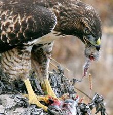

![[2]](http://memory.loc.gov/service/pnp/fsac/1a35000/1a35200/1a35278v.jpg)
![[3]](http://memory.loc.gov/service/pnp/fsac/1a34000/1a34600/1a34676v.jpg)
![[4]](http://memory.loc.gov/service/pnp/fsac/1a35000/1a35400/1a35431v.jpg)
![[5]](http://memory.loc.gov/service/pnp/fsac/1a34000/1a34500/1a34555v.jpg)
![[6]](http://memory.loc.gov/service/pnp/fsac/1a34000/1a34500/1a34564v.jpg)
![[7]](http://memory.loc.gov/service/pnp/fsac/1a34000/1a34700/1a34710v.jpg)
![[8]](http://memory.loc.gov/service/pnp/fsac/1a34000/1a34900/1a34902v.jpg)
![[9]](http://memory.loc.gov/service/pnp/fsac/1a34000/1a34900/1a34972v.jpg)
![[10]](http://memory.loc.gov/service/pnp/fsac/1a35000/1a35000/1a35017v.jpg)
![[11]](http://memory.loc.gov/service/pnp/fsac/1a35000/1a35000/1a35062v.jpg)
![[12]](http://memory.loc.gov/service/pnp/fsac/1a35000/1a35200/1a35210v.jpg)
![[13]](http://memory.loc.gov/service/pnp/fsac/1a35000/1a35200/1a35287v.jpg)
![[14]](http://memory.loc.gov/service/pnp/fsac/1a35000/1a35200/1a35291v.jpg)
![[23]](https://commons.wikimedia.org/wiki/Image_talk:Wankel_Cycle_anim_en.gif)
![[24]](http://www.ags.dk/as/moon00/moon.jpg)
![[25]](http://www.simcoeskies.com/astroimg/moon_mosaic_091705.jpg)
![[26]](http://www.nao.ac.jp/Gallery/SolSys/Moon/m010705l.jpg)
![[27]](http://grin.hq.nasa.gov/IMAGES/LARGE/GPN-2000-000473.jpg)
![[29]](https://en.wikipedia.org/wiki/Image:Giraffewithbaby.jpg)
![[34]](https://commons.wikimedia.org/wiki/Commons:Featured_picture_candidates/Log/August_2005#Image:_Thermal_protection_system_inspections_from_ISS_-_Shuttle_nose.jpg.2C_not_featured)
.jpg&action=edit&redlink=1)
_-_The_Nut_Gatherers_(1882).jpg)
_-_The_Nut_Gatherers_(1882).jpg&action=edit§ion=T-1)
![[39]](https://en.wikipedia.org/wiki/Image:Janke.jpg)


