Comment - The image is extremely noisy at full size. I resampled it and tried to smooth out the noise in the sky as much as possible. I also adjusted the tone of the sky very slightly. I will support either version, however. I think it's just that beautiful.PiccoloNamek 05:57, 21 November 2005 (UTC)[reply]
Comment - I concur. I think the picture is good enough that the noise doesn't really matter. Besides, the photo won't be at full resolution. --vaeiou 22:32, 22 November 2005 (UTC)[reply]
Support the 2nd version. Both are beautiful, but the edit just has a little more sharpness, especially on the wooden pier. Raven4x4x 00:30, 23 November 2005 (UTC)[reply]
Now that the 2nd version has been removed, I will support the original. Raven4x4x 08:21, 25 November 2005 (UTC)[reply]
Support Orignal. Strong Oppose changed version. The updated version is way oversharpened and exibits halos at the size given by the image page. --Gmaxwell 04:43, 23 November 2005 (UTC)[reply]
Comment - He's right, I think I really overdid it there. I'll try to fix that later.PiccoloNamek 05:14, 23 November 2005 (UTC)[reply]
Perhaps I'm revealing my total inexperience and lack of knowledge here, but I am unable to find anything wrong with Piccolo's edit. Not that it really matters, I like both versions a lot, but I'd just like to know what is so wrong with this image that I can't see. Raven4x4x 13:17, 23 November 2005 (UTC)[reply]
In the thumbnails they look pretty much alike, however if you look at the two images at full screen size you'll see some artifacts from image processing. The process of 'shapening' in an image editor does not actually add resolution to an image: what it does is increase accutance. I started to write a lot about accutance because I think you need to understand sharpening to understand the cause of the artifacts... I wrote so much that I turned into a lame (but illustrated) stub articl, so go there. In any case, if you look at the trunk on the left it has light and dark halos (light are usually more annoying), the noise in the sky is greatly increased (look around the darker cloud to the upper left of the shelter), and the water looks outright abrasive rather than smooth (perhaps that one is a matter of taste, but its less accurate!). Again, this is mostly visable on the image at a large size, at thumbnail size there is less of an impact because the downsampling smoothes out the effect of the sharpening. However, there is still some quality reduction in the thumbnails: if you look carefully in the Y of the trunk in PiccoloNamek's image you'll see there is some grittyness there. This is not due to the sharpening directly, but due to the sharpened image being more difficult for jpeg to compress when the thumbnail is created. The positive effects you see from the processing exist because even though the thumbnailing mostly destroys the sharpening, the image was so vastly oversharpened that some remains. I have created an additional feature for mediawiki which allows you to request some post-thumbnailing sharpening as an image tag setting, but we already have problems handling the number of thumbnails created already (we have about 10 copies of every image, sharp settings would probably make that 20) and the process would add an additional performance burden, so I probably won't request this feature become part of the official code any time soon. --Gmaxwell 18:15, 23 November 2005 (UTC)[reply]
Original verion ok. "Improved" version: WTF was this guy thinking? Keep him away from image editors! Kim Bruning 00:50, 24 November 2005 (UTC)[reply]
Kim, take a look through the archives and you'll see dozens of photos that Piccolo has improved wonderfully, and this is certainly the first time I've heard any real complaints about his work. I'll take your word for it that this one isn't that great (thanks for the big explanation Gmaxwell) even though I don't share your dislike for it, and I'll be interested to see if Piccolo can come up with a better version. Raven4x4x 03:56, 24 November 2005 (UTC)[reply]
I actually went through the archives with Gmaxwell, and a third party who shall remain anonymous at this point in time. I do think Piccolo is a great photographer, and let's leave it at that. :-) Kim Bruning 06:54, 24 November 2005 (UTC)[reply]
Ouch, that's like getting complimented but then kicked in the crotch right afterwards. Oh well, I suppose all I can hope to do is to keep improving. I know I'm a lot better now than I was a year ago. Perhaps one year from now I will be what you consider to be acceptable.PiccoloNamek 07:01, 24 November 2005 (UTC)[reply]
( + ) Support By a narrow squeak. Noise ruins it, but it is such a beautiful part of the world and the photo is pretty good, so I think its worthy. --Fir0002 08:12, 27 November 2005 (UTC)[reply]
Version 3, see comment below
Since the original 2nd version has been removed, may I suggest a new 3rd version: I only removed the noise from the most objectionable parts of the sky with some soft masking, but did not use any sharpening at all. Some downsampling (to 1600 px) took care of that. If 1600 px is wide enough, I think my experiment may have impoved the image. BTW, re. acutance, there's a great digiphoto tutorial here, see the "understanding sharpness" chapter. --Janke | Talk 13:19, 28 November 2005 (UTC)[reply]
At my screen resolution I honestly cannot tell the difference between these two images, although I am only at 1024×768 (that's probably why I thought the 2nd version was alright). So I'll be happy with whichever one. Raven4x4x 05:47, 29 November 2005 (UTC)[reply]
Weak support. --Lysy(talk) 19:39, 30 November 2005 (UTC)[reply]
Promoted Image:Fakarava-ponton-rotoava.jpg. All this discussion about image editing and it turns out that everyone was happy with the original... Raven4x4x 05:39, 3 December 2005 (UTC)[reply]
Slight oppose. How many Matejko's featured pictures do we need? He is not Rembrandt, if you know what I mean. Talking about historical genre, I'd better nominate a Rubens or a Reynolds, something less brimming with nationalism and more valuable in the terms of art. --Ghirlandajo 13:06, 20 November 2005 (UTC)[reply]
Piotr, you see anti-Polish conspiracies everywhere. Please grow up. As I said above, we have enough featured pictures by Matejko. He is not Leonardo to have all of his artworks featured, especially when the greatest historical painting ever created - The Surrender of Breda - remains unheeded. --Ghirlandajo 19:07, 20 November 2005 (UTC)[reply]
I don't understand what is your basis for judging we have enough 'Matejko's (btw, could you do me a favour and list how many are FPs?). I could unerstand an objection on the grounds 'it's ugly' or 'it's low technical quality', but I simply cannot follow your present line of thought. If you think we need more Rembrands or whatevers, find good quality versions and/or nominate our current ones. If you think the Breda pic is good - nominate it. I don't have time to do all by myself, you know.--Piotr Konieczny aka Prokonsul PiotrusTalk 02:36, 21 November 2005 (UTC)[reply]
Comment. I don't think that this is a serious objection (I don't see anything anti-Polish in it). Number of featured images by one author should not decide if another image of the same author should be featured (neither positively nor negatively). If you believe that a painting by Rembrandt, Rubens or Reynolds should be featured, do nominate it. Nikola 08:50, 21 November 2005 (UTC)[reply]
Support. The painting, in addition to its artistic merit, illustrates a significant event in European history. Appleseed 02:13, 21 November 2005 (UTC)[reply]
Support — for the painting's historic importance, cultural value and, not least, for its relative unfamiliarity to much of the world. logologist 06:56, 21 November 2005 (UTC)[reply]
Support — as per Logologist, with the accent on cultural value rather than unfamiliarity. Halibutt 09:45, 21 November 2005 (UTC)[reply]
Support as per Logologist. To Halibutt: Free elections in 16th century were not that familiar :-) --Lysy(talk) 16:25, 21 November 2005 (UTC)[reply]
Support per everyone. PS Ghirlandajo, please, let us know when you nominate the Velázquez. I for one will readily support the choice. --SylwiaS 15:34, 22 November 2005 (UTC)[reply]
Oppose. The reproduction doesn't seem to be very good (strange vertical dark streaks in the background left of the tent, a vertical line separating lighter blue from darker blue in the sky top right, the faces of the people in the foreground are just blurry). Unsure whether all these are reproduction artefacts or due to the quality of the original painting, but I suspect the former. Compare with this detail from the lower right corner! BTW, the source of the image ([1], linked at [2]) should be given on the image description page. Lupo 09:28, 25 November 2005 (UTC)[reply]
( − ) Oppose Have to agree with Lupo --Fir0002 08:29, 27 November 2005 (UTC)[reply]
Oppose. Way to compressed, I need higher image quality.--Ewok Slayer 17:50, 27 November 2005 (UTC)[reply]
Oppose, too small, compression artifacts. A better scan/photo would get my support. --Janke | Talk 13:55, 28 November 2005 (UTC)[reply]
Not promoted - real close, 6/4(5)/1 - BrokenS 02:37, 4 December 2005 (UTC)[reply]
The photo shows the awesome power of a 1:8 scale hobby-built locomotive.
(Note: I've adjusted contrast & brightness on a Mac, which has a different gamma from most PC displays. This can be adjusted if necessary. Also, it could be cropped closer for a more dramatic effect. Suggestions, please!)
Nominate and support. - Janke | Talk 11:46, 20 November 2005 (UTC)[reply]
Neutral That's quite nice, but the 'passanger' spoils the picture to me. Not enough to object... but enough not to support.--Piotr Konieczny aka Prokonsul PiotrusTalk 02:04, 23 November 2005 (UTC)[reply]
Comment: Ah, but without the passenger it would be just an ordinary locomotive, right? These miniatures are works of art - I do have a close-up of just the engine, but that's almost indistinguishable from the "real thing", so such a picture wouldn't be "special"... --Janke | Talk 18:11, 23 November 2005 (UTC)[reply]
OK, you'll find it, and quite a few more Live Steam locomotive pictures, on my Live Steam website. The closeup I'm talking about is on this sub-page. It is shot from a little too high position to be entirely realistic, though. For a "slightly retouched" photo, putting a 1:8 scale medel loco into a full-size environment, look at this. - too small for a FPC. I think, even though it was fun making it;-) --Janke | Talk 11:38, 26 November 2005 (UTC)[reply]
Resolution is a bit low, but I'll still support. I think the passanger gives it scale. --Gmaxwell 04:55, 23 November 2005 (UTC)[reply]
Support -- TomStar81 20:12, 23 November 2005 (UTC)[reply]
Neutral. It may be an interesting subject, but the photo itself isn't of a sufficiently high standard. The image lacks clarity, especially in the foliage, and the patch of sky on the top left is horribly over-exposed. Enochlau 06:25, 24 November 2005 (UTC)[reply]
I changed my mind. The quality is actually pretty bad. Oppose. Enochlau 22:56, 24 November 2005 (UTC)[reply]
Oppose. Thumbnail nice, fullsize bad. Qualitywise not FP material. --Dschwen 12:27, 24 November 2005 (UTC)[reply]
Comment: Unfortunately, I had only a 2 megapixel camera at my disposal on the occasion (several years ago) - this explains the low quality. It does look sharper in sizes below 800px or so, but I assume that is too small for a FPC? --Janke | Talk 13:44, 25 November 2005 (UTC)[reply]
Oppose a bit boring and just a snapshot; the valve gear is obscured by smoke, the background is far too green and there's a tree in the way. There are much better pictures, sorry. Might make portal:trains FP though. — Dunc|☺ 14:24, 28 November 2005 (UTC)[reply]
Oppose Boring image. The hobby it illustrates is rather obscure and boring too.-- --(User | Talk | Contribs) 22:38, 2 December 2005 (UTC)[reply]
Not promoted BrokenS 02:33, 4 December 2005 (UTC)[reply]
The beautiful ballerina's skirt of the Heliospheric current sheet, is the largest structure in the Solar System. Not many people know that!
Nominate and support. - Iantresman 20:25, 21 November 2005 (UTC)[reply]
Oppose Way too dark for my liking. Gives the impression of being underexposed though I suppose you can't say that about a computer generated image. Denni☯ 02:42, 24 November 2005 (UTC)[reply]
Oppose. The colours are a bit uninspiring. Enochlau 06:21, 24 November 2005 (UTC)[reply]
Oppose - Is there a reason why it's purple? Interesting subject, but the visualization is a bit lacking. --vaeiou 03:37, 25 November 2005 (UTC)[reply]
Neutral Uploaded an edit, but the image is too low quality - especially since this is computer generated there should be no excuse for the artefacts. --Fir0002 08:11, 27 November 2005 (UTC)[reply]
I like your edit better! --Iantresman 14:02, 27 November 2005 (UTC)[reply]
Not really stunning, (looks like cheap molded plastic... ;-) so I'll oppose. --Janke | Talk 14:23, 28 November 2005 (UTC)[reply]
Oppose. Low quality. --Lysy(talk) 19:37, 30 November 2005 (UTC)[reply]
Not promoted JtkieferT | C | @ ---- 05:00, 5 December 2005 (UTC)[reply]
Not sure if it's good enough for featured article, but I thought i'd give it a shot. I shot it and it is the anchoring point for Peterborough, New Hampshire at the current time. Karmafist 20:47, 21 November 2005 (UTC)[reply]
Nominate and support. - Karmafist 20:47, 21 November 2005 (UTC)[reply]
Comment. Exposure, composition and size are way below standard. The pic does not seem striking at all, nor does it contribute significantly to the article about that town. This is not fixable at all(except for exposure maybe), so I might just as well strongly oppose right now... --Dschwen 08:03, 22 November 2005 (UTC)[reply]
Oppose. see above and below and the picture. --Dschwen 07:55, 24 November 2005 (UTC)[reply]
Oppose. Sorry: whatever it may do for the article in question, as a picture it just isn't interesting. William M. Connolley 16:36, 23 November 2005 (UTC).[reply]
Oppose I can't think of a single feature of this photo that would merit it for Featured Picture status. Denni☯ 02:38, 24 November 2005 (UTC)[reply]
Oppose. I don't think I need to explain myself. Enochlau 06:21, 24 November 2005 (UTC)[reply]
Strong Oppose Same reasons as already given by everyone else. —Vanderdecken∫ξφ 12:56, 24 November 2005 (UTC)[reply]
Strongly Oppose This image is of exceedingly inferior quality and does not add anything significant to Wikipedia. --mdd4696 18:26, 26 November 2005 (UTC)[reply]
( − ) Oppose. Can't see what's exceptional here. --Lysy(talk) 19:35, 30 November 2005 (UTC)[reply]
Not promoted JtkieferT | C | @ ---- 04:55, 5 December 2005 (UTC)[reply]
Charleston Hot peppers in varying stages of maturity.USDA original 300dpi image of above.Edited version
The photo is used in article pepper, and illustrates it excellently. What I personally like about the image are the colors, unusual composition and informativeness.
Photo is taken by Scott Bauer of the US Agricultural Research Service.
Nominate and support. - Nikola 12:25, 22 November 2005 (UTC)[reply]
Great shot! SupportOpposeDenni☯ 02:36, 24 November 2005 (UTC)[reply]
Oppose. Horrible artifacts and image quality. Enochlau 06:20, 24 November 2005 (UTC)[reply]
Oppose check the fullsize image. The thumbnail looks great, but the fullsize version is utter crap. --Dschwen 12:22, 24 November 2005 (UTC)[reply]
I think "utter crap" might be a wee tad too strong. There are some issues with focus in the large version (which are why I'm changing my vote) but if that were fixed, I think this would be a worthy candidate. Denni☯ 21:19, 26 November 2005 (UTC)[reply]
Comment I currently agree with Dschwen. If somebody (possibly me when I have time) could correct the colour and contrast and lower the resolution a bit then it would be fine. It looks like it's been enlarged beyond its original res at the moment. —Vanderdecken∫ξφ 19:04, 24 November 2005 (UTC)[reply]
I guess it's me, but all I can see is the image being slightly fuzzy. Can someone please point out the horrible artefacts mentioned above? - Mgm|(talk) 09:09, 25 November 2005 (UTC)[reply]
Oppose. The original version from the USDA is somewhat, but not much better. I keep getting errors when trying to download the advertised 300dpi variant. Lupo 09:13, 25 November 2005 (UTC)[reply]
Comment I figured out how to do it. Needs a bit of cropping. --vaeiou 15:34, 25 November 2005 (UTC)[reply]
Comment: reluctantly agree that its too fuzzy. Great idea, nice colours, badly focussed. For a professional shot that seems odd. William M. Connolley 14:03, 26 November 2005 (UTC).[reply]
( − ) Oppose I have uploaded an edit with a white background which I think will be an improvement for whatever article the photo is in, but I still don't think its FP worthy. --Fir0002 08:01, 27 November 2005 (UTC)[reply]
Weak oppose - too "artistic" composition to illustrate the subject. --Lysy(talk) 19:32, 30 November 2005 (UTC)[reply]
Comment Too artistic? How else would you illustrate the various stages of maturity in a hot pepper? --mdd4696 02:12, 3 December 2005 (UTC)[reply]
I see that this is not going to be featured, but to answer anyway: if I would illustrate various stages of maturity, I would do it by placing peppers one below or aside the other. Author of the image used the circle, which is way better, and one of the reasons I recommended the image. Nikola 22:43, 3 December 2005 (UTC)[reply]
Support All of these object votes kind of baffle me, but then most of them came before Fir's edit, which to my eyes addresses all the technical problems.—jiy (talk) 07:30, 5 December 2005 (UTC)[reply]
Not promoted BrokenS 02:30, 6 December 2005 (UTC)[reply]
Support it's a great pic and would surely be a great addition to the article on the artist. Halibutt 09:30, 23 November 2005 (UTC)[reply]
Very grainy at full resolution. —Cryptic(talk) 02:50, 24 November 2005 (UTC)[reply]
( + ) SupportOn condition that somebody (possibly me) lowers the res, despeckles, adjusts contrast and tries to make the wires less obtrusive. —Vanderdecken∫ξφ 19:17, 24 November 2005 (UTC)[reply]
That would be great if you could do that. Thank you--SylwiaS 04:53, 27 November 2005 (UTC)[reply]
Oppose Looks good as a thumb but is less impressive when enlarged. As well, the full-scale image is too small by current standards.Denni☯ 21:16, 26 November 2005 (UTC)[reply]
Out of couriosity: the full scale is 1400x2400 (or similar) - are you sure it is 'too small'? What is the accepted size then?--Piotr Konieczny aka Prokonsul PiotrusTalk 00:42, 27 November 2005 (UTC)[reply]
( − ) Oppose too much noise even when resized --Fir0002 08:32, 27 November 2005 (UTC)[reply]
Oppose unless something can be done to grain and white dust specks in the full-size image. Otherwise, nice picture. --Janke | Talk 13:30, 28 November 2005 (UTC)[reply]
I'm sorry, I still haven't got round to fixing that. I'll try as hard as I can to get it done tonight. Homework takes so much time! Also, would anyone grumble if I removed the wires? Expect it under this comment tonight. —Vanderdecken∫ξφ 10:58, 29 November 2005 (UTC)[reply]
There. New version. You may be pleased to know that the new one is ~200k, with the old one at 2.5Mb. If you like it better, vote. If you don't like it, vote. Have fun. —Vanderdecken∫ξφ 19:33, 29 November 2005 (UTC)[reply]
Oh yes, and that changes my vote to a ( + ) Support as well. For the second. —Vanderdecken∫ξφ 19:37, 29 November 2005 (UTC)[reply]
OH NO! After removal of the cables, there are horrible "eraser marks" left in the sky. Still grainy, too, even in the smaller size. Selective de-speckling of the sky (of the original) would be in order. Strong oppose of version 2. --Janke | Talk 09:47, 30 November 2005 (UTC)[reply]
Personally I can't see any eraser marks at full size, but okay. Tell me where they are and I'll try to correct them. And I think a certain graininess adds to it, but when someone tells me how to selectively despeckle the sky in Photoshop CS, I'll do it. —Vanderdecken∫ξφ 10:25, 30 November 2005 (UTC)[reply]
OK, there are two very strong eraser marks just above the trees to the left of the "ladder", looking like (weak) spotlight beams. Then, there are two weaker marks going diagonally over the clouds in the middle of the picture. To "selectively" de-speckle, you need to make a soft-edged selection that contains the area to be worked on, but nothing else. --Janke | Talk 13:57, 30 November 2005 (UTC)[reply]
Right, got you. I'll try to rectify 'em. —Vanderdecken∫ξφ 18:08, 30 November 2005 (UTC)[reply]
Okay, here we go. This time is my last. I like this picture, but this is the last time I clean it up. It's starting to annoy me now. Any more cleaning needed, and someone else will have to do it. —Vanderdecken∫ξφ 19:26, 30 November 2005 (UTC)[reply]
( + ) Support either version but would prefer to have the image on commons. Also, I don't quite get why hi res is bad thing. --Lysy(talk) 19:30, 30 November 2005 (UTC)[reply]
When I look where the wires used to be I can still see erase marks if I try to. Besides which I like the coloring scheme better on the first image.-- --(User | Talk | Contribs) 22:29, 2 December 2005 (UTC)[reply]
Oppose. Quite nice as a thumbnail, but I'm less than impressed with the full sized version. Too grainy. Enochlau 15:34, 4 December 2005 (UTC)[reply]
Oppose. Impressive colours/scene but unimpressive quality photograph unfortunately. Diliff | (Talk)(Contribs) 21:31, 6 December 2005 (UTC)[reply]
Not promoted BrokenS 02:46, 7 December 2005 (UTC)[reply]
I would like to thank you all for your kind comments, both the support and the opposite ones. It was a real pleasure to read them. I must also say that I am particularly touched with Vanderdecken’s efforts to improve the picture. I hope I’ll be able to contribute better images to Wiki in future.--SylwiaS 11:42, 7 December 2005 (UTC)[reply]
Subject similar to the recently narrowly rejected Wikipedia:Featured_picture_candidates/Aral_ship, but without the cited issues (yes this is the last one- I'll quit if you don't like it). This one is in the Desertification and Soil salination articles- shows the amazing amount of salt deposited on the ground. (Looks like snow.) Taken by me.
Nominate and support. - Staecker 13:50, 23 November 2005 (UTC)[reply]
Oppose - If you look at the zoomed in image, the boat is actually very interesting. However it's lost in the rest of the picture. For that reason, I'm opposing it. --vaeiou 21:13, 29 November 2005 (UTC)[reply]
Oppose. The figure in the foreground spoils this as a FP. Denni☯ 21:11, 26 November 2005 (UTC)[reply]
*Oppose. Not enough contrast between ship and ground.--Ewok Slayer 21:23, 26 November 2005 (UTC)[reply] Support - the slayer version. Now I can see the ship.-- --(User | Talk | Contribs) 00:16, 3 December 2005 (UTC)[reply]
( − ) Oppose As above --Fir0002 08:08, 27 November 2005 (UTC)[reply]
Would probably support if the picture is cropped to expose the ship. What is the blue dressed man in the front of the picture for there ? --Lysy(talk) 19:18, 30 November 2005 (UTC)[reply]
Oppose. Why a man in the picture? In particular, why a blue man? Enochlau 15:32, 4 December 2005 (UTC)[reply]
It's stealth advertising for Intel! But really, the photo made me curious enough to read the articles. The man doesn't bother me; I think his impact on the photo is a matter of opinion. I Support either version. ••MDD4696( talk - contribs ) 16:51, 4 December 2005 (UTC)[reply]
Not promoted BrokenS 02:46, 7 December 2005 (UTC)[reply]
I searched for Plasma, and this was at the top of the article. Immediately striking, and well taken. Very slightly unfocused, but if I get the time to do a slightly lower resolution version that could be fixed. The colour is amazing. I already nominated M4 Carbine Casing which was a success, so I thought this might be recognized as well. Let it be known that I did not take or upload this. I am just nominating it because I saw it on the article and thought it was worthy. There are also two other Featured Pictures currently in the article, the Voyager Heliosheath diagram and the Energy Arc.
Support A great image, good background. -Falcorian 04:17, 26 November 2005 (UTC)[reply]
Support -- Sweet shot, amigo. A rare find indeed. TomStar81 09:46, 26 November 2005 (UTC)[reply]
( + ) Support It's not particularly sharp, but I don't think that can be fixed on this photo unless you reshoot. Good background and colors, plus I really like plasma balls. --Fir0002 08:02, 27 November 2005 (UTC)[reply]
( + ) Support - Support for sure. Every bit as good as mine, even better in some ways. A worthy FP.PiccoloNamek 08:32, 27 November 2005 (UTC)[reply]
I think you accidentally removed my vote when you copied my support template for your vote Piccolo. Never mind, fixed now. --Fir0002 10:44, 27 November 2005 (UTC)[reply]
Support, quite spectacular. I'm not sure how sharp this sort of shot can be, but it looks fine to me. Raven4x4x 23:58, 27 November 2005 (UTC)[reply]
Support. Very beautiful image. Carioca 04:10, 28 November 2005 (UTC)[reply]
Really no need for more support, is there? --Janke | Talk 13:49, 28 November 2005 (UTC)[reply]
( + ) Support. --Lysy(talk) 19:20, 30 November 2005 (UTC)[reply]
New version, removed all artefacts in the background (of which there were quite a few) and adjusted colours slightly. The file size is smaller too. —Vanderdecken∫ξφ 20:05, 30 November 2005 (UTC)[reply]
Support either. It's going on my desktop as wallpaper now. Enochlau 15:31, 4 December 2005 (UTC)[reply]
Support and comment. I had been meaning to add this[3]] to wikipedia for quite a while now and this featured picture has reminded me. I definitely agree that this one is a higher quality image, but I like the illustration in my photo of exactly how the plasma is 'attracted' to a conducting object. Diliff 01:02, 6 December 2005 (UTC)[reply]
Promoted Image:Plasma-lamp_2.jpgRaven4x4x 03:22, 8 December 2005 (UTC)[reply]
The icelike crystals of glacial acetic acid were created and photographed by Prof. David Gingrich of the University of Potsdam. The picture was taken purposely to accompany the acetic acid article, illustrating the beauty of an otherwise normal chemical compound. The picture was released into the public domain by the author. Technical picture details are available on image:AceticAcid010.jpg (jpg instead of png). The picture here (png instead of jpg) as candidate for featured picture is a selected detail.
Comment What's so unique about this image? It isn't visually stunning. --vaeiou 05:15, 27 November 2005 (UTC)[reply]
Creating these crystals, which melt at 16 °C, is a skilled activity. Creating a good picture of them is a different skill. So there is achievement in the picture both chemically as well as photographically (I find it stunning). Wim van Dorst 19:55, 27 November 2005 (UTC).[reply]
The difficulty of taking the image is not normally a criteria. Also, the image is quite small. I just don't feel it illustrates the article to the extent that is required for a FP. Raven4x4x 05:40, 28 November 2005 (UTC)[reply]
The more I think about it, the more I don't like it. I oppose. --vaeiou 01:45, 29 November 2005 (UTC)[reply]
Oppose. This picture is not stunning in any way. A bottle of the photographic glacial acetic acid I used years ago once solidified by itself at low temperature, so I don't see why it's an "achievement"... no offense intended, though. --Janke | Talk 13:25, 28 November 2005 (UTC)[reply]
Did you happen to take a stunning picture of it, coincidentally? No offense taken, at least not by me. Wim van Dorst 21:08, 28 November 2005 (UTC).[reply]
No, I didn't even think of it, since it is such a common occurence. --Janke | Talk 22:11, 28 November 2005 (UTC)[reply]
Oppose. Too small and not particularly thrilling. —DO'Neil 07:33, 29 November 2005 (UTC)[reply]
Oppose. I could be pursuaded to support an image of such crystals, but this image is very low-res and the right side appears to be blurry and overlit. - Mgm|(talk) 11:30, 29 November 2005 (UTC)[reply]
Weak oppose. Lo res. --Lysy(talk) 18:55, 30 November 2005 (UTC)[reply]
Oppose Murky pic, subject matter not distinctive, it strictly shouldn't be PNG (unless it's a diagram it's meant to be JPG). I actually think that the full version (Image:AceticAcid010.jpg), which this is an edit of would stand more chance of becoming a featured pic, but still not a lot. It's really not that special. —Vanderdecken∫ξφ 19:31, 30 November 2005 (UTC)[reply]
Oppose. Low res, and you really can't tell what it is. Enochlau 15:28, 4 December 2005 (UTC)[reply]
OpposeAgree with Janke --Fir0002 21:58, 4 December 2005 (UTC)[reply]
Not promoted Raven4x4x 02:21, 10 December 2005 (UTC)[reply]
Comment: the source ([4], linked at [5]) should be given on the image description page. It would be nice if that page also gave more information on the painting itself (72×110cm, oil on canvas, painted when?; in a private collection). Despite the interesting subject (at least, interesting to those who can grasp and appreciate the subtle point of both Ottomans and Polish warriors being shown), I fail to see what makes this image so outstanding that it should be a featured picture. On a side note, Józef Brandt’s Gallery contains several times the Polish text "Olej na płótnie" (oil on canvas). That should be fixed. Furthermore, I wonder whether having such a gallery here on Wikipedia is appropriate at all. Why not just link to this gallery? It's more comprehensive anyway... Lupo 21:33, 27 November 2005 (UTC)[reply]
Oppose, unless something is done about twofour major flaws: The burned-out sky (uneven lighting?), and the very murky colors, the small size, and the compression artifacts. --Janke | Talk 13:45, 28 November 2005 (UTC)[reply]
Oppose. Picture of a picture. Mark1 03:05, 29 November 2005 (UTC)[reply]
Oppose. No composition discernable in the picture. --Ghirlandajo 14:54, 30 November 2005 (UTC)[reply]
Support. An interesting and exotic piece of art.--Molobo 15:03, 30 November 2005 (UTC)[reply]
Weak support but source should be given. --Lysy(talk) 19:04, 30 November 2005 (UTC)[reply]
( + ) Support Either Version. Added a slightly lighter image, but nothing too much could be achieved without burning out the highlights.
Not promoted Raven4x4x 02:21, 10 December 2005 (UTC)[reply]
Wailua Falls, HawaiiVersion 2: Removed some sky flare and darkened right side slightly.
Nominate and support. - Ewok Slayer 03:10, 26 November 2005 (UTC)[reply]
I had to hike down to the bottom of the falls to get this Image. Most are taken up above, from the road. This is from the Wailua Falls article, of course. I took this image in 2005. Feel free to enhance it, but don't overwrite the version I have up right now. 03:10, 26 November 2005 (UTC)
Comment: I feel that there is a bit too much flare from the sky in the upper part of the image. I fixed that, and darkened the right side slighly, see version 2. What do you think? --Janke | Talk 15:23, 26 November 2005 (UTC)[reply]
Support either version, slight preference for my own edit... ;-) --Janke | Talk 13:47, 28 November 2005 (UTC)[reply]
Would support (version 2) if it's used to illustrate an article. --Lysy(talk) 19:14, 30 November 2005 (UTC)[reply]
Support either version. Thryduulf 23:32, 1 December 2005 (UTC)[reply]
Oppose - Blown out sky ruins.--Deglr6328 17:53, 3 December 2005 (UTC)[reply]
Support either version but I personally think the 2nd one is slightly better by a small margin. JtkieferT | C | @ ---- 05:15, 4 December 2005 (UTC)[reply]
Oppose. The sky as mentioned above. Enochlau 15:29, 4 December 2005 (UTC)[reply]
Oppose. Actually if I were to nominate a waterfall photo, I'd nominate mine[6] also on the waterfall article ;). But I haven't. Maybe I will... hmm. Diliff 19:47, 5 December 2005 (UTC)[reply]
Oppose this picture, but Diliff please nominate yours, it is far superior! --Dschwen 23:33, 6 December 2005 (UTC)[reply]
Not promoted Raven4x4x 02:21, 10 December 2005 (UTC)[reply]
Support I think it's a wonderful image; it hardly even looks real! Good resolution, but could someone clean it up some? Remove the hairs and other blemishes, and perhaps adjust the saturation a tad... they're just minor imperfections, but it should be done. --mdd4696 02:55, 28 November 2005 (UTC)[reply]
Changing my vote to support version 4. --mdd4696 01:50, 3 December 2005 (UTC)[reply]
Support. Extreme beauty at its best. -Mysekurity 05:22, 28 November 2005 (UTC)[reply]
User:Vanderdecken/StrongSupport Wow! Amazing. I give this the strongest support I possibly can. It looks like it's CGI from a big Hollywood film! It's amazing! I'll try and clean it up tonight if I can. —Vanderdecken∫ξφ 14:45, 28 November 2005 (UTC)[reply]
There. Try that out. I lowered the brightness by 7 and raised contrast 16, then touched up speckles and artefacts. The resolution is also slightly reduced (to make it smaller, sharper, and because 2048 dpi is a round size). —Vanderdecken∫ξφ 20:22, 28 November 2005 (UTC)[reply]
Support second image, it seems quite a bit clearer than the original. That said they are both spectacular, with more than a little 'alien landscape' feel about them. Raven4x4x 05:40, 29 November 2005 (UTC)[reply]
I'll support the third image as well. I have no problems with either the second or third images. Raven4x4x 11:28, 29 November 2005 (UTC)[reply]
Support the second version. Beautiful. TomStar81 06:13, 29 November 2005 (UTC)[reply]
On closer examination, I’ll Support the fourth as well. TomStar81 05:35, 3 December 2005 (UTC)[reply]
Support - wow!!! (to 2nd image)- Ta bu shi da yu 06:43, 29 November 2005 (UTC)[reply]
Support the second image. What a beautiful waterfall! —DO'Neil 07:30, 29 November 2005 (UTC)[reply]
I would support something inbetween these two versions - the sky got burned out a bit in the adjustment... Well, fixed it myself, version 3. The photo itself is breathtaking! --Janke | Talk 08:16, 29 November 2005 (UTC)[reply]
Support third. - Mgm|(talk) 11:24, 29 November 2005 (UTC)[reply]
Comment I don't know if this is an important point, but I am the photographer, and I remember that the colours of the first picture were the true ones. --Roger McLassus 17:28, 29 November 2005 (UTC)[reply]
Well, there is never a "true" color in any reproduction. There are so many variables between the actual scene and what we see on our monitors; film, developing, scanning, gamma of monitors, etc. So don't feel offended if others try to improve a good image and make it even better... we're only looking for consensus here. (Remember what the upload license states!) Version 4, which Piccolo made to retain the colors of the original, is a sickly blue-green. I believe the Dettifoss carries a lot of silt, so the water indeed is a murky brown? --Janke | Talk 09:37, 30 November 2005 (UTC)[reply]
Comment Janke, things are not as impossible as you make them sound. Yes, getting the exact color of a real scene is impossible with an RGB display, however, the modifications are far greater than the color error we'd expect a human observer to measure between the real scene and a calibrated display. As far as consensus goes, if the photographer had the good judgement to perform 98% of the work in creating a feature worthy image, we should try to default to his judgement unless someone can make a clear objective argument (i.e. not 'I like it better) for the adjusted image. --Gmaxwell 17:02, 8 December 2005 (UTC)[reply]
Comment - Version 4, which Piccolo made to retain the colors of the original, is a sickly blue-green. I agree. I was thinking that to myself the whole time I was working on the photo. But what if it really did look like that? Anyway, I was only trying to be nice. :)PiccoloNamek 14:41, 30 November 2005 (UTC)[reply]
Comment - If that is the case, here is a higher contrast version of the orignal that retains the original color cast.PiccoloNamek 06:36, 30 November 2005 (UTC)[reply]
Support version #4, on the condition that someone edit out the two turquoise blotches: one in the upper left corner in the clouds, and a very prominent one in the bottom middle, in the spray. There are also a few dark speckles: one in the middle top, in the clouds, and some more in the bottom right corner. Also, file size has increased by a factor of three—can that be rectified? 1.5 Mb is a tad large... And in any edits you do, make sure you do indeed preserve the original color cast. Versions 2 and 3 with their strong brown tint are just horrible. Lupo 09:05, 30 November 2005 (UTC)[reply]
Comment - Man, I could have sworn I had gotten all of those. Well, I'll fix it later if nobody else does.PiccoloNamek 09:39, 30 November 2005 (UTC)[reply]
Re the brown cast - see my comments above. --Janke | Talk 09:40, 30 November 2005 (UTC)[reply]
I was not offended. I just wanted to make this statement because I am the only one here who did not only see the pictures but also the real scenery on that day. Number 4 looks great, much better than the original picture - and the colours are still true. Can I change my nomination so that number 4 is the picture in question now? --Roger McLassus 11:14, 30 November 2005 (UTC)[reply]
Support version 4. --Lysy(talk) 18:46, 30 November 2005 (UTC)[reply]
Support version 4 and the original picture. +MATIA☎ 21:37, 30 November 2005 (UTC)[reply]
Support any of the 4 versions that are up here. Raven4x4x 05:19, 1 December 2005 (UTC)[reply]
Support any of the four versions. Thryduulf 17:25, 1 December 2005 (UTC)[reply]
Strong support for original picture and version 4 Kessa Ligerro 10:48, 4 December 2005 (UTC)[reply]
Support any. Enochlau 15:27, 4 December 2005 (UTC)[reply]
Strong support (fourth) Excellent photo! Bmdavlltalk 10:16, 7 December 2005 (UTC)[reply]
Strong support only version 4.Zafiroblue05 19:07, 7 December 2005 (UTC)[reply]
Support 1 and 4. Go with the photographer's judgement. Although I question the accuracy of the inflated local contrast provided in 4, since it seems that it's managing to remove the real haze of the scene and not just loss of contrast from internal reflections in the camera. :) --Gmaxwell 17:02, 8 December 2005 (UTC)[reply]
Support 1 and 4. Color of water better on 1 and 4. All are great, though. P-unit 00:19, 11 December 2005 (UTC)[reply]
Promoted Image:Iceland Dettifoss 1972-4.jpgRaven4x4x 06:34, 11 December 2005 (UTC)[reply]
This scene is just fantastic. Somehow you can't believe that such paradise really exists.
The photo shows a beach on the Saona Island in the Dominican Republic. The waving makes it difficult to take good, synchronized photos but it still looks good.
Taken by Tamas Iklodi
Nominate and supportTamas Iklodi 09:50, 27 November 2005 (UTC)[reply]
The scene is quite remarkable. I do feel that the stitching of the panorama is of some what low quality though. The margins between the component photos are apparent, and easily discernable in the angular arc of the top of the beach. Can it be restitched? Conditional support - Debivort
Comment - When I look at the picture, it appears lopsided. That's my only gripe about an otherwise good picture. --vaeiou 22:20, 28 November 2005 (UTC)[reply]
Weak oppose because of the stitching artifacts - that unnaturally wavy beachline kills it for me. If that can be fixed, I'll strongly support. --Janke | Talk 08:39, 29 November 2005 (UTC)[reply]
Oppose. Great picture, bad stitching. Would support cleaned up version. - Mgm|(talk) 11:26, 29 November 2005 (UTC)[reply]
Weak support. --Lysy(talk) 18:48, 30 November 2005 (UTC)[reply]
Oppose - take image apart, fix barrel distortion, restich then I can support it.--Deglr6328 18:47, 1 December 2005 (UTC)[reply]
Oppose. Agree with previous oppose. It has potential but needs to be revisited and if possible, restitched with better software/attention to detail. Diliff 21:01, 1 December 2005 (UTC)[reply]
Oppose for stitching/distortion issues detailed above. Will support if image is corrected. --mdd4696 02:07, 3 December 2005 (UTC)[reply]
Oppose. Funny looking beach from stitching. Enochlau 15:25, 4 December 2005 (UTC)[reply]
( − ) Oppose It's such a shame though, because other than the stictching, the photo is gorgeous. --Fir0002 21:57, 4 December 2005 (UTC)[reply]
This is one of those historical photos that I absolutly love, the completion of the US Transcontinental Railroad. I uploaded two large, seperate versions of the photo.
Nominate and support. TomStar81 03:04, 27 November 2005 (UTC)[reply]
Comment: This is indeed a classic. The second version is way too dark, though, losing much detail. The first one could be improved somewhat by some gamma adjustment. --Janke | Talk 11:01, 27 November 2005 (UTC)[reply]
I don't know how to gamma adjust a picture, so if some kind soul could do that I would be thrilled. TomStar81 21:14, 27 November 2005 (UTC)[reply]
OK, I did it, see version 3. When the time comes to vote, I'll support even though the quality isn't the best possible, but because of the historical significance of this picture. If someone can find a higher resolution version, that would be great. --Janke | Talk 12:23, 28 November 2005 (UTC)[reply]
As promised, I’m thrilled! Thanks! TomStar81 06:07, 29 November 2005 (UTC)[reply]
Support but information on the author would be nice. --Lysy(talk) 18:52, 30 November 2005 (UTC)[reply]
At you request, I went looking for information on the author. Acoording to this site, the man who snapped this photo was Andrew J. Russell.
( + ) Support Version 3 is quite nice. Very special occaision. --Fir0002 21:56, 4 December 2005 (UTC)[reply]
Support for third version. Would be neutral due to the low quality and resolution of the image but it has important historical significance which elevates my vote to support. Diliff | (Talk)(Contribs) 21:28, 6 December 2005 (UTC)[reply]
As I mention in my comment above, I support. --Janke | Talk 09:33, 10 December 2005 (UTC)[reply]
Promoted Image:GoldenSpikev3.JPGRaven4x4x 06:34, 11 December 2005 (UTC)[reply]
"Spiral Cleft" done with MandelZot and down-sampled with Photoshop"Spiral Cleft" Simpler colors.
Clear and striking Mandelbrot set image.
This appears in Mandelbrot set. It was created by David R. Ingham.
It looks like a science fiction cover because it is purely mathematical in origin and has no direct connection with reality. Fine detail was averaged out by down-sampling.
Support. This is one of the best (and certainly the most colourful) fractal images I've ever seen. Raven4x4x 03:17, 30 November 2005 (UTC)[reply]
Support. --Wojsyl(talk) 18:45, 30 November 2005 (UTC)[reply]
Comment, Image:Mandelpart2.jpg is already featured. Do we need a second featured Mandelbrot? Also, why did you resample it. As pointed out several times, upload highest resolution and let mediawiki resample. --Dschwen 23:46, 30 November 2005 (UTC)[reply]
Yes, but you can't really say that the image:buddhabrot-deep.jpg and this one are similar enough to disqualify this one from being featured. Raven4x4x 09:31, 2 December 2005 (UTC)[reply]
A photo has finite resolution in the first place. With fractals, it seems to me that whether and how to resample fundamentally change the character of the image. I will upload the point by point calculation if requested, but I don't condider it to be the same picture. It has only colors in the color lookup table. If someone with a larger computer wants my colorset and coordinates, they are welcome to re-do it with higher resolution. So I feel that this is the highest resolution version of this particular image.David R. Ingham 03:18, 1 December 2005 (UTC)[reply]
Support - unbelievably beautiful JoJan 16:53, 3 December 2005 (UTC)[reply]
Oppose. Considering the large number of potential candidates, for mathematical creations such as Mandelbrot sets, I think we need to set the bar high. In any case, the currently featured one as linked above is better; for this one, the colours aren't terribly nice. Enochlau 15:23, 4 December 2005 (UTC)[reply]
( − ) Oppose The colors to me are terrible, and as Enochlau says, for something like Madelbrots which can be quite easily created, the bar has to be high --Fir0002 21:38, 4 December 2005 (UTC)[reply]
Oppose. Garish coloring. I like the coordinate choice better than current FP Image:Mandelpart2.jpg's, though. —Cryptic(talk) 11:50, 5 December 2005 (UTC)[reply]
Oppose per above. Colors too bright, and there's an infinite number of fractals that we can nominate; thus, they have to be exceptional. Flcelloguy (A note?) 17:37, 11 December 2005 (UTC)[reply]
Oppose - I've seen much better images of the Mandelbrott Set. - JustinWick 01:08, 12 December 2005 (UTC)[reply]
I noticed that some others are shown in more that one version so I am adding my other version. From a data visualization point of view, this shows less, but some may prefer it artisticly.David R. Ingham 21:47, 6 December 2005 (UTC)[reply]
Not promoted , but it's featured in my book. Although I do see where the opposers are coming from: I put it as my wallpaper and the rest of the family told me to get rid of it. :) Raven4x4x 04:18, 12 December 2005 (UTC)[reply]
I happened across this photo when I hit the "Random Article" button. Its a new and interesting look for a familar landmark.
Nominate and support. TomStar81 06:18, 29 November 2005 (UTC)[reply]
Comment and version 3. Although I think that "The Slayer Version" is a marked improvement on the original, but I don't like that it was reduced in resolution, and I think that the painted sky and over saturated colors make it look fake. Having been to the falls several times in person at night, I prefer a more natural-looking image. So, I've uploaded Image:Niagara_falls_in_dark_3.jpg.
Support version 3 - excellent picture JoJan 16:52, 3 December 2005 (UTC)[reply]
Oppose all three. I don't think its all that striking or interesting compositionally. Diliff 22:54, 3 December 2005 (UTC)[reply]
Oppose. Agree with Diliff. Enochlau 15:22, 4 December 2005 (UTC)[reply]
( − ) Oppose Agree with Diliff --Fir0002 21:37, 4 December 2005 (UTC)[reply]
After a very unsuccessful search for a good (Free) shot of a microprocessor die for the CPU article, I decided to make one myself. After preparing the die, I gave it to a friend who took this photograph. The brightness and contrast are modified slightly for better detail, and I did some touchup in GIMP to remove a few specs of dust that made their way into the picture. I'm very pleased with the outcome and think it fits really nicely into the article where it is used. Thanks to User:Zocky for removing some strands of cotton that appeared around the image border.
Nominate and support (the first version). - uberpenguin 02:05, 30 November 2005 (UTC)[reply]
The silicon die itself is a bit murky, so I selectively gamma-corrected that and sharpened it a little, see version 2. --Janke | Talk 09:57, 30 November 2005 (UTC)[reply]
Well, the colours in the first picture are definitely more correct (the die itself doesn't reflect a whole lot of light), but I'll leave it up to the voters as to which version they like. -- uberpenguin 13:18, 30 November 2005 (UTC)[reply]
Comment I like the first one...the color/contrast has that electronic circuitry feel. I'm not sure if it makes any sense. --vaeiou 21:28, 30 November 2005 (UTC)[reply]
I went ahead and cleaned up the original version a bit more, mostly improving the sharpness and contrast. I think this one looks very good, and the colours are much more real and less washed out looking than on the very high contrast version -- uberpenguin 21:42, 30 November 2005 (UTC)[reply]
I agree. Nice work. --vaeiou 23:49, 30 November 2005 (UTC)[reply]
Support first version. --vaeiou 14:18, 3 December 2005 (UTC)[reply]
Good, now that version 1 is a bit sharpened. I'll support either version. --Janke | Talk 08:12, 1 December 2005 (UTC)[reply]
Comment It would be nice to accompany this image with an annotated version which indicated the various major subunits present on the die. I've seen these for many microprocessors (Byte magazine used to publish them) but can't immediately find one. If someone can find a (non free) version, I can produce a free version based on this image. -- Finlay McWalter | Talk 17:32, 1 December 2005 (UTC)[reply]
I debated over this a bit personally... Similarly to the PDP-8/I image I'm using in the CPU article, you need to view the image at full resolution to actually be able to read any useful annotation. Thumbnails of a high-res annotated images look poor and aren't as visually arresting to the reader, which is why I've opted to keep images in this form for the article. That being said, I'm totally for annotating versions of these images and linking them from the article and the untouched image pages, so people can get more meaning out of the image than simply "oh, that's neat looking." I'll dig around Intel's site a bit tomorrow to see if I can find some die layout diagrams. Unfortunately those aren't typically the sorts of things that Intel likes to release and it can be difficult to accurately guess which portions of the die do what (other than the very obvious things like cache and general area of functional units, control units, data busses, etc)... -- uberpenguin 19:19, 1 December 2005 (UTC)[reply]
Support version 2 (I like the lighter version). Very nice image, not many of these kind of photos on Wikipedia. A valuable addition to the Intel 80486 article. Also, see 80486DX2_arch.png. --mdd4696 02:02, 3 December 2005 (UTC)[reply]
Changing vote to support either version. ~MDD4696(talk • contribs) 00:10, 12 December 2005 (UTC)[reply]
Support Original version. Detailed and sharp enough for me. Agree that annotation could help but I don't think it should be in the picture itself. Diliff 22:50, 3 December 2005 (UTC)[reply]
Support the second. Good work. It's a little easier to see the details in the second, which is lighter. Enochlau 15:21, 4 December 2005 (UTC)[reply]
Support the first as it more accurately depicts the subject matter. Enochlau 01:16, 11 December 2005 (UTC)[reply]
( + ) Support Version 2 - lighter is usually better. --Fir0002 21:37, 4 December 2005 (UTC)[reply]
Comment: Even over colour accuracy? Anyway, if the second version DOES get promoted it should be redone from the lossless source; you can see JPEG recompression artifacts in the area of the cache. -- uberpenguin 22:08, 4 December 2005 (UTC)[reply]
Oh? The first is closer to the correct colour? Enochlau 22:32, 4 December 2005 (UTC)[reply]
Yes; see my comments above. It's not that the second version is bad, but photolithographed dies don't actually reflect a whole lot of light, so the second one looks pretty washed out and grainy compared to what the die actually looks like up close, even under bright lighting. -- uberpenguin 23:28, 4 December 2005 (UTC)[reply]
Support firstOppose second. Accuracy above all other considerations. We are, after all, an encyclopedia. I have an opened up SX25 here and the color in the first is consistant with the appearence here. Plus, the second just looks washed out to me. --Gmaxwell 16:53, 8 December 2005 (UTC)[reply]
Support first. Sharpness is sufficient and color is superior. —Cryptic(talk) 19:56, 9 December 2005 (UTC)[reply]
The picture is a good illustration of the hub of the District Line during an off-peak time, giving an overview of the station - showing the trains, platfoms and architecture of the station.
It is used in the following articles on the English Wikipedia
Self-nominate and support. - Thryduulf 17:12, 1 December 2005 (UTC)[reply]
Oppose Not striking. Glaurung 18:42, 3 December 2005 (UTC)[reply]
From the top of this page: "Featured pictures...add significantly to articles, either by illustrating article content particularly well, or being eye-catching to the point where users will want to read its accompanying article." (emphasis mine). It isn't that striking, but (imho) it does illustrate the content of the articles its on well - particularly Earl's Court tube station and District Line. Thryduulf 01:20, 4 December 2005 (UTC)[reply]
True, but I could take a picture of my office chair (which is absolutely common) and try to get it featured because it is very representative of my own office chair. I'm pushing a bit here, but what I mean is that it just look like a pretty common station. So it may well illustrate Earl's Court tube station, but it is not eye catching and don't deserve IMHO to be featured, hence my vote. Glaurung 07:21, 7 December 2005 (UTC)[reply]
I like it. Support. --SPUI (talk) 02:49, 4 December 2005 (UTC)[reply]
Oppose. Nothing particularly special about this one. Enochlau 15:18, 4 December 2005 (UTC)[reply]
Weak Oppose Unfortunately, I think that if someone completely new to Wikipedia saw this as a Featured Picture, his or her first thought would be "What's so special about that photo?" instead of "Wow, that really gives me a good idea of what Earl's Court station looks like!". I don't think it's striking enough out of context, such that readers would want to take a look at the article. ••MDD4696( talk - contribs ) 16:48, 4 December 2005 (UTC)[reply]
( − ) Oppose Agree with Mdd4696 --Fir0002 21:32, 4 December 2005 (UTC)[reply]
Weak oppose - it's not that stunning, but illustrates the article well. Appears a bit slanted as well, or that may just be an illusion... Flcelloguy (A note?) 17:32, 11 December 2005 (UTC)[reply]
Oppose. While it illustrates the subject well, it isn't visually interesting enough to entice people to read the article. Camerafiend 02:40, 14 December 2005 (UTC)[reply]
Not promoted JtkieferT | C | @ ---- 02:32, 15 December 2005 (UTC)[reply]
I found this on Wikimedia commons, and it is now on the article Joshua tree. I think the contrast between the silhouette of the joshua tree and the spectacular sunset make this a great pic. It says it is public domain.
Nominate and support. - Jon 23:01, 30 November 2005 (UTC)[reply]
Weak Oppose - Very nice pic, but a bit small and there are thousands of jpeg compression artefacts in the sky, especially between the branches. It also looks like it has been enlarged beyond original dpi. Good subject though. If someone could take it again or something very similar it would be good, but that picture as it is isn't good enough. —Vanderdecken∫ξφ 08:56, 1 December 2005 (UTC)[reply]
I see what you mean, about the compression artifacts. Pity, the original contributer has left Wikipedia, or I would see if he has another copy. I really like the subject and composition. Is there any way to clean the current version up? Jon 01:23, 2 December 2005 (UTC)[reply]
Sorry, but with that many, and so obvious, it would be impossible to remove them. To get rid of them all, you'd have to blur the sky, and that would remove all the detail into a smudge. As a thumbnail it looks good, but the full size is too small and irreversibly compressed. Sorry! —Vanderdecken∫ξφ 10:55, 2 December 2005 (UTC)[reply]
Weak support - Nice, but as said above, too many artifacts. The thumbnail was really nice. --Vidarlo 17:06, 1 December 2005 (UTC)[reply]
Oppose. Lovely picture ruined by its small size and insane level of artifacts. I'd happily support a high-res version. —DO'Neil 07:11, 2 December 2005 (UTC)[reply]
Ditto, oppose. --Janke | Talk 09:57, 2 December 2005 (UTC)[reply]
Oppose. Agree with previous - too small, bad jpeg artifacts. Diliff 15:42, 2 December 2005 (UTC)[reply]
Oppose as above. Enochlau 15:18, 4 December 2005 (UTC)[reply]
( − ) Oppose Agree with Vanderdecken. --Fir0002 21:33, 4 December 2005 (UTC)[reply]
Self-nomination. I think this show some of the beauty in the landscape. Vidarlo 21:41, 30 November 2005 (UTC)[reply]
Comment. Tilted horizon, and as many landscape pictures posted before this one is pretty but not really stunning, also it is not very specific and therefore does not add significantly to the Flora article. --Dschwen 23:41, 30 November 2005 (UTC)[reply]
Have you got anything with less clouds? We already have a lot of great sunset photographs, some of which are featured IIRC. - Mgm|(talk) 11:14, 1 December 2005 (UTC)[reply]
No, sadly, I have not got one with less clouds. I also think the clouds add some darkness to the image, which I think fits in nicely. --Vidarlo 16:20, 1 December 2005 (UTC)[reply]
Oppose The image does not relay any specific information about Flora, Norway (it could be Florida, USA for all I know). Nice photograph though. --mdd4696 01:47, 3 December 2005 (UTC)[reply]
Oppose - As Mdd4696, this image isn't visually spectucular or show anything particularly significant (geography/people/landmarks..etc). --vaeiou 06:20, 3 December 2005 (UTC)[reply]
Oppose a nice picture but not stunning and not anything special. JtkieferT | C | @ ---- 05:10, 4 December 2005 (UTC)[reply]
Oppose. Nothing particularly special. Enochlau 15:19, 4 December 2005 (UTC)[reply]
( − ) Oppose Could have been taken anywhere near the sea, so not really illustrative of Norway, and as mentioned above there is already plenty of really nice sunset photos. I think it would be better with some of the clouds cropped out, but still not FP quality IMO --Fir0002 21:35, 4 December 2005 (UTC)[reply]
Support. But we need more images of other things. Wikikiwi 21:20, 8 December 2005 (UTC)[reply]
Oppose per above. Just a note - it can't be Florida, we have a flat landscape! :-) Flcelloguy (A note?) 17:35, 11 December 2005 (UTC)[reply]
Oppose Stunning but uninformative. - JustinWick 01:05, 12 December 2005 (UTC)[reply]
Not promoted JtkieferT | C | @ ---- 02:32, 15 December 2005 (UTC)[reply]
Nominate and Neutral since I am the photographer myself. - Roger McLassus 19:58, 3 December 2005 (UTC)[reply]
SupportComment. Wow. What an amazing photo. It truly conveys the gritty urbanism and I like the people on the right. The only thing that bothers me is the white rope(?) that spans the picture, but I'll support when the two-day commenting period is over. One question though, what were you doing outside a Hashish shop???:/ LordViD 20:33, 3 December 2005 (UTC)[reply]
After more then 32 years I don't remember what the ropes were for - probabely to give additional stability to an adjacent building that was in danger of collapsing. By the way, a few months later hashis became illegal in Nepal, so this photo has some documentary value. I took the picture, because the end of legality was already imminent then. --Roger McLassus 20:51, 3 December 2005 (UTC)[reply]
why does the caption say "(re-inserted for discussion)"? It should have a better caption and it shouldn't refer to FPC. BrokenS 01:06, 4 December 2005 (UTC)[reply]
The picture was there before, but someone took it out. It is not my habit to re-insert pictures or texts deleted, but in this case I made an exception. But you are right, the information should be given in the discussion and not under the picture. I'll change that. --Roger McLassus 09:29, 4 December 2005 (UTC)[reply]
Oppose. Well i oppose because the place is not legal... as he claims.. i live there... so i know.... and yeah... even the building doesnt exist.. HOTEL EDEN is still there... but its just a hotel... so i recommend... u edit..the false informaton. Oh by the way, they are the ropes from the electric pole.... and they help ground the extra electric charges that might occur on the poles....to prevent danger!!! Sakar Bhusal
What a stupid reason to oppose an image. He clearly states that it was taken over 30 years ago before hash was made illegal there, why would the signs and buildings still appear the same today? duh. --Deglr6328 08:04, 4 December 2005 (UTC)[reply]
Indeed, this image doesn't promote hashish use, so the illegal argument can't be used here.
Also opposing on grounds based on the place itself and not on the image by it's merit is not a valid argument to oppose and will most likely be discounted by the closing admin. JtkieferT | C | @ ---- 17:57, 4 December 2005 (UTC)[reply]
Actually, anyone can close a nomination here, you don't have to be an admin. I'm not. Raven4x4x 01:48, 6 December 2005 (UTC)[reply]
The white lines are really bugging me, so while it may need to be documented, I'm afraid I'll oppose once voting on this one is allowed. - Mgm|(talk) 11:10, 4 December 2005 (UTC)[reply]
For an advertising picture intended to attract coustomers I'd have removed the bicyle, the people, and by some editing tricks also the ropes. But my intention was different. The picture should show a real piece of oriental life - and so everything fits in. --Roger McLassus 12:03, 4 December 2005 (UTC)[reply]
Oppose. Focus too soft. —Cryptic(talk) 11:45, 5 December 2005 (UTC)[reply]
Support I like the picture a lot, though I really wish something could be done about the distracting lines... Some clever photoshopping could take care of them, and frankly I think that would make the image much better. -- uberpenguin 17:33, 5 December 2005 (UTC)[reply]
Support, and I don't think that photoshopping something out of the original photo is morally acceptable just to make it more aesthetically pleasing. Colour saturation/balance, sharpness and luminosity are merely subjective aspects of a photo, and I think are therefore fair game, but not physically elements of a photo such as the cable. Diliff 19:34, 5 December 2005 (UTC)[reply]
Well then call me immoral; I think it would be better off with the lines removed. If I'm hopelessly outnumbered in this opinion it obviously won't matter :) -- uberpenguin 21:28, 5 December 2005 (UTC)[reply]
Hehe, well I never said it wouldn't be better off with the lines removed. I just said I didn't think it does justice to documentary photography to remove aesthetically unpleasing elements. :). The scene should remain as it was when the photo was taken - IMHO! Diliff | (Talk)(Contribs) 21:22, 6 December 2005 (UTC)[reply]
Oppose because of the rope/cable/whatever. A featured picture should be free of impediment, and this one is not. I have no qualms about photoshopping a picture, though, so long as the objective is not deceit. I would vote to keep if the rope was gone. Denni☯ 02:15, 6 December 2005 (UTC)[reply]
The rope is not an impediment but a feature. It is part of what the picture is intended to show. --Roger McLassus 09:42, 8 December 2005 (UTC)[reply]
Nonsense. The rope is simply there. It was not purposely placed to enhance the view. Therefore, it can be removed without affecting the view. Denni☯ 22:48, 11 December 2005 (UTC)[reply]
Support This picture is remarkable because of its object, which does not exist any more and probabely will never again exist in the future. All discussions about aesthetical or technical matters here miss the point. Kessa Ligerro 15:07, 9 December 2005 (UTC)[reply]
Support for its content value. I concur with Kessa Ligerro. Enochlau 01:11, 11 December 2005 (UTC)[reply]
Support The image has high historical value, and is on par with other Featured pictures' quality. However, I would appreciate someone who is knowledgeable about Kathmandu to write a paragraph on the history of hashish there, so there is some article relevance. ~MDD4696(talk • contribs) 06:16, 11 December 2005 (UTC)[reply]
Neutral - love the pic, but the ropes distract too much from the overall quality. Flcelloguy (A note?) 17:26, 11 December 2005 (UTC)[reply]
Oppose - Nice subject matter but those darn ropes are just so distracting! - JustinWick 00:57, 12 December 2005 (UTC)[reply]
Support. Great photo. The ropes add to it, leave them in. Hamedog 01:09, 13 December 2005 (UTC)[reply]
Support. This is an excellent photo. It is striking and conveys the information more effectively than words. The ropes are part of the scene and should be left in. Camerafiend 02:36, 14 December 2005 (UTC)[reply]
Support. Keep the ropes! --Hein 11:04, 14 December 2005 (UTC)[reply]
Oppose - Overall quality is just not up to standard for FP.--Deglr6328 05:59, 16 December 2005 (UTC)[reply]
Not promoted This was very close, but I'm afraid I'll have to call it a no consensus. Raven4x4x 03:13, 17 December 2005 (UTC)[reply]
After thinking again about this decision, and especially noticing the contribution history of Sakar Bhusal (3 edits, all related to this vote) I have decided that I should have promoted this. To rectify my mistake:
The original versionDiliff's edit. See comments for details. Hope this satisfies the opposition. :)
I came accross this image on the Tram article and really liked it. The lighting, wood and stillness of it give it a gentle by-gone era feel about it. The young girl in the picture adds life to it, its more than a stale musuem image.
Nominate and support. - Thryduulf 00:35, 3 December 2005 (UTC)[reply]
Umm, looks like a bus to me, what's so special about this?-- --(User | Talk | Contribs) 00:43, 3 December 2005 (UTC)[reply]
It is a really nice image, the composition is nice and I agree about the lighting and wood. However, I think it's cropped too much on the sides and I think it would've been nicer if the photographer tried to center himself in the tram a little more. Also, this image is a really low resolution! On the other hand, it is the only image on the Tram page that shows a tram's interior... --mdd4696 01:36, 3 December 2005 (UTC)[reply]
Comment Hey guys, we're still in the commenting period... no votes yet! ••MDD4696( talk - contribs ) 15:55, 3 December 2005 (UTC)[reply]
Are people not looking at previously featured puctures before they nominate? Really, you should know immediately that something like this has no hope before you even think to put it here if you just look at already featured images for a little guidance. --Deglr6328 17:47, 3 December 2005 (UTC)[reply]
I appreciate Thryduulf's efforts, but as the photographer and uploader of this image I ask you to stop discussing it. When I uploaded it more than three years ago there was no such thing as a "featured picture", and I have never intended this image to be a candidate. Back in 2002, images had to be reduced in size if they were to fit into a Wikipedia article as there was no way to magnify them by clicking on them. I could come up with a high resolution version, but I'm not going to after reading about all its other shortcomings ("cropped too much on the sides", "too bright", etc.). <KF> 15:47, 4 December 2005 (UTC)[reply]
I really like this image - the lighting gives it the feeling of a Norman Rockwell painting. My only issue is that the picture is a bit unbalanced, and it looks like the left side of the picture has been cropped short. Denni☯ 02:18, 6 December 2005 (UTC)[reply]
I just noticed why...the bus has a 1-2 configuration...so that means that the aisle will not be straight down the middle. So, unless the photographer stands in the middle of seats, you aren't going to get a more centered shot. I support the third. --vaeiou 02:46, 7 December 2005 (UTC)[reply]
Neutral until a higher resolution copy is available. I have spoken to KF and they may be able to find a better copy of the original. Diliff | (Talk)(Contribs) 20:34, 6 December 2005 (UTC)[reply]
I have now edited the Tram_interior_original_II.JPG version and uploaded it to wiki. Editing details are as follows for what it is worth: Ran original II image through Neatimage for noise reduction, reduced in size slightly (from 1840px high to 1400px high) as the image retained slight artifacts from the noise. This removed most remaining artifacts. Then adjusted levels to bring the greypoint a little darker and then finally ran shadows/highlights tool to decrease highlight brightness slightly (about 7% from memory) leaving shadows untouched. Photo appears far more saturated than original now, but no saturation adjustment was done. I hope this allows the previous oppose voters to reconsider as I think compositionally the photo is very good, and the only problems with the original FPC were brightness and resolution. Diliff | (Talk)(Contribs) 19:50, 7 December 2005 (UTC)[reply]
Definitely has my support now. Denni☯ 01:43, 8 December 2005 (UTC)[reply]
Oppose all versions. Who's the girl? Do we have her (or her parents') consent to her image being used and re-published? She has personality rights... have her parents agreed to her picture being taken and published on the Internet? See Privacy rights in the U.S. and also de:Recht am eigenen Bild and a commentary on the situation in Austria. Commercial uses of that image would require the written consent of the girl's parents; and I wonder whether its being included at User:Nymph/girls could already be construed to be a violation of her personality rights. If the car was full of people or at least half full (so that one could still see the car's interior itself), I think we'd have less of a problem. (And it would make the image look less artificial.) Lupo 08:54, 8 December 2005 (UTC)[reply]
The image was created and uploaded by KF, who I assume is the parent/guardian of the girl, and thus able to give permission - and, by uploading it to the Internet has given persmission for it to be published on the Internet. Assuming that this is true (I will leave a message on their talk page), then I presume that by licensing the images under the GFDL, permission has been given for the images to be used in ways compatible with the GFDL. The gallery you link to is not in voilation of the GFDL nor any other laws I am aware of (unless you know otherwise).
Regarding your second point, I do not think that this image looks artifical - as I deailed when I nominated it I feel the girl adds to the image. Thryduulf 10:11, 8 December 2005 (UTC)[reply]
Yes, if KF is the parent, he can give that permission and everything is fine, which is precisely why I asked. Second, the gallery itself does not violate any laws (and I didn't claim it did); but I wouldn't be surprised if the girl or her parents had objections to that image being asssociated in any way with the term "nymph"—very close to nymphet (which is derived from nymph). Lupo 11:31, 8 December 2005 (UTC)[reply]
Support (any version, but naturally the larger version is nicer). It nicely illustrates its subject, and is attractive to boot. The little girl really adds to the picture: she gives it context, scale, and character. -- Finlay McWalter | Talk 11:23, 8 December 2005 (UTC)[reply]
Support the original version. The edit seems to me to make it too glossy. I agree with the above that the girl strongly adds to the image's artistic merits. Sarge Baldy 11:25, 8 December 2005 (UTC)[reply]
Don't get me wrong here. I'm not saying I want those pictures deleted. We're living in the 21st century, life has become hazardous and public, people's privacy is being intruded upon all the time. It's awful enough if you type your own name into Google, but what is worse is all those images people add to their personal web sites which show you doing silly things and you don't even know about it.
The photo I uploaded is an image of a car, not of a girl. You will find the same girl at Aspern; again, that's an image of a sculpture, not of a girl. She's there to demonstrate the size of the monument. She liked both images and agreed to have them published, but what if she changes her mind when she gets older?
Some days ago I asked you to stop discussing this image. It was one of the first pictures I uploaded for Wikipedia, adding it to a tram article which at the time had no other images. There were no tags on Wikipedia then. Next thing someone will come along and add Template:Violation of personality rights to it or remove it from the article. I am neither a U.S. nor an Austrian lawyer, and I'm certainly not going to read up on the situation in Austria, which I do not understand. Do as you please, and good luck to you all. <KF> 11:33, 8 December 2005 (UTC)[reply]
PS I agree with Lupo on User:Nymph's collection of girls' images and on the obvious connotations. I don't like it. It's a sad sign of the times that we have come to be very alert to potential dangers such as child abuse, and if I had had more time I would have tried to do something about that user name in connexion with the girls' images. <KF> 11:57, 8 December 2005 (UTC)[reply]
Support, preferably the edited version. Wikikiwi 21:14, 8 December 2005 (UTC)[reply]
Oppose - Nothing special. --Deglr6328 07:04, 9 December 2005 (UTC)[reply]
Support Diliff's edit. I think the girl breathes life into what would otherwise be lifeless. Enochlau 01:13, 11 December 2005 (UTC)[reply]
Support - without going into any of the above arguments, I just find this picture to be excellent. Flcelloguy (A note?) 17:27, 11 December 2005 (UTC)[reply]
Oppose - Subject matter seems boring to me - it's hard to tell what distinguishes this tram interior from interiors of modern busses/trams at this angle. Cute girl though. - JustinWick 00:59, 12 December 2005 (UTC)[reply]
If you look at pictures of modern trams, such as these from Nottingham and Croydon you'll see the difference. Thryduulf 03:00, 12 December 2005 (UTC)[reply]Nottingham tram interiorCroydon tram interior.
Support Diliff's version. --LV(Dark Mark) 22:04, 12 December 2005 (UTC)[reply]
SupportHamedog 01:53, 13 December 2005 (UTC). Diliffs ver.[reply]
Support third version (Diliffs edit). I just now bothered looking at the full res pic. This is actually an awesome photo. Composition, alignment and DOF are great. Also well balanced exposure now. --Dschwen 21:48, 13 December 2005 (UTC)[reply]
Support third version. The technical quality of the image is very good, and the overall effect is charming. -Vontafeijos 02:40, 14 December 2005 (UTC)[reply]
Promoted Image:Tram_interior_edit1.jpg Diliff's version has the most support here. Raven4x4x 03:08, 17 December 2005 (UTC)[reply]
Created by US Geological Service, appears in lava. *grimace* Small, though. 00:34, 3 December 2005 (UTC)
Nominate and support. - Zafiroblue05 00:34, 3 December 2005 (UTC)[reply]
Hrm. There are some more of the lava photos from the USGS website Kilauea Eruption Images There are med/large image sizes (large is 600x800). I'm partial to this one, if the recent lava falls were the subject. It's bigger too. --vaeiou 04:35, 3 December 2005 (UTC)[reply]
I had that one up before, actually, but I think it looks a little strange, like someone drew the lava on with a crayon. What do others think? Zafiroblue05 17:27, 3 December 2005 (UTC)[reply]
Image is 298 px (width) x 425 px (height) JtkieferT | C | @ ---- 05:07, 4 December 2005 (UTC)[reply]
Yes, you've quoted the dimensions correctly. That's probably a tad too small though. Enochlau 15:41, 4 December 2005 (UTC)[reply]
Yeah, the image is quite small especially considering the subject of it, an image of a natural event of something has an even more important reason than most images to be large since it should be able to be big enough to be absolutely stunning, especially FP quality ones. JtkieferT | C | @ ---- 18:01, 4 December 2005 (UTC)[reply]
Oppose. Smaller than the displayed thumbnail. —Cryptic(talk) 11:44, 5 December 2005 (UTC)[reply]
And oppose the second image, too, due to the rock in the lower left. —Cryptic(talk) 06:17, 13 December 2005 (UTC)[reply]
Here is a larger image of the same lava cascade... 600x800, should It's a different picture, closer up, but it's stunning as well. Zafiroblue05 19:03, 7 December 2005 (UTC) (If this belongs in a new featured picture candidacy, please tell me.)[reply]
Wow, if that detail is derived from the original photo then surely a much higher resolution image is available somewhere. I can't support either of them as-is, but I would definitely support a version that that is a similar DPI but of the overall scene. Diliff | (Talk)(Contribs) 19:53, 7 December 2005 (UTC)[reply]
It's a different photo entirely - taken earlier, it appears: note the lack of partially solidified buildup at the bottom of the cascade in the second as opposed to the first. Zafiroblue05 21:39, 10 December 2005 (UTC)[reply]
( − ) Oppose Low res, but otherwise pretty cool. --Fir0002 23:27, 10 December 2005 (UTC)[reply]
Oppose. Low res. Enochlau 01:14, 11 December 2005 (UTC)[reply]
That oppose is for the first one. I will also oppose the second also; although the picture is quite stunning and I'm sure difficult to take, the large out of focus rock is annoying. Enochlau 22:39, 12 December 2005 (UTC)[reply]
Support second version. I think the size/resolution is fine in the second picture; stunning flow of lava. Flcelloguy (A note?) 17:29, 11 December 2005 (UTC)[reply]
Support second version - illustrative and instantly recognizable, great colors. - JustinWick 01:01, 12 December 2005 (UTC)[reply]
Not promoted Raven4x4x 02:59, 17 December 2005 (UTC)[reply]
Created by US Forest Service, appears in fire. 00:11, 3 December 2005 (UTC)
Nominate and support. - Zafiroblue05 00:11, 3 December 2005 (UTC)[reply]
Comment I don't believe this image is particularly striking in any way, other than the obscenely wide angle. This image hardly captures the essence of a forest fire (i.e. how big they can get, how fast they can move, how much destruction they can cause), and it has a number of image quality issues. First off, the image needs to be cropped to remove the black border on the left. Secondly, this image has very low detail; with a subject as (potentially) detailed as this one the compression and low resolution really detract from it. The flames look like an enormous yellow blob, and the trees look "poofy". The angle at which the photographer took the photo is unbalanced, and makes me feel like I'm going to tip over... surely there are better photos of forest fires than this one! --mdd4696 00:49, 3 December 2005 (UTC)[reply]
Oppose. Agree with first comment. Doesn't really show the scale or presence of a fire. Diliff 19:31, 5 December 2005 (UTC)[reply]
Oppose Can't begin to compare to the current FP. Denni☯ 02:21, 6 December 2005 (UTC)[reply]
Oppose, i agree that the previous fire pic is far superior. -Lanoitarus 04:50, 6 December 2005 (UTC)[reply]
( − ) Oppose I also agree that the existing fire photo is much better. --Fir0002 23:28, 10 December 2005 (UTC)[reply]
Oppose. The proposed one is taken at an odd angle. Enochlau 01:15, 11 December 2005 (UTC)[reply]
Oppose - agree with above; the second photo has too much emphasis on the dark foreground. Flcelloguy (A note?) 17:30, 11 December 2005 (UTC)[reply]
The second one is already featured :) Enochlau 00:14, 12 December 2005 (UTC)[reply]
Ah, mea culpa. I guess I would have opposed that one, eh? :-) Flcelloguy (A note?) 01:23, 12 December 2005 (UTC)[reply]
Oppose. I actually like it better in many ways than the other forest fire picutre. However, the image quality is not the best. Black lines, too fuzzy, etc. grenグレン 09:49, 13 December 2005 (UTC)[reply]
Oppose, it appears like it was taken with a fisheye lens, which completely distorts the image. Also, the background fire is just a monotonous glow, no detail can be discerned from it. Titoxd(?!? - did you read this?) 21:10, 15 December 2005 (UTC)[reply]
Not promoted Raven4x4x 02:58, 17 December 2005 (UTC)[reply]
Nominate and neutral. - cele4 19:28, 4 December 2005 (UTC)[reply]
I'm going to move it up to the comment area. --vaeiou 20:34, 4 December 2005 (UTC)[reply]
Created new wiki page, updated links, removed from below. --vaeiou 20:51, 4 December 2005 (UTC)[reply]
Comment Not much to say, it's a great picture! I just added it to the Asian Arowana article. ••MDD4696( talk - contribs ) 21:48, 4 December 2005 (UTC)[reply]
Comment Could someone who speaks German please check the copyright status of this image and the others uploaded by cele4? I'm pretty sure they're fair game, but I would appreciate someone clearing this up for me since I don't understand the source website. I'm confused because on its special photos page it shows a number of images that have been featured on the German wiki, but on other photos it says that they are not to be copied. Help? ~MDD4696(talk • contribs) 23:35, 5 December 2005 (UTC)[reply]
Erm—Cele4 claims to be Marcel Burkhard and claims to have taken the image himself. The external web site you give has an impressum, where Marcel Burkhard is given as the person responsible for that website. That user also has signed up at the German Wikipedia (Benutzer:Cele4). I see no reason to doubt his claims, and certainly he has the right to publish his images elsewhere under whatever license he pleases, including "all rights reserved". It looks like some of the images he uploaded onto Wikipedia became featured pictures over at the German WP, and he mentions that fact on his own web site. There's nothing wrong with that. Note: by uploading something onto Wikipedia, he does not give up copyright! In fact, the copyright remains with him. But if he publishes and licenses an image under a free license on Wikipedia, anybody else can copy it, too, but that doesn't mean that that "anybody" had acquired the copyright. In summary: this looks perfectly fine to me, and User:Cele4 should be thanked for sharing his great images and making them available under a free license. Thank you, Marcel! Lupo 15:59, 6 December 2005 (UTC)[reply]
Oppose, it is a great shot but without the full fish in the image I don't think its quite good enough. -Lanoitarus 04:48, 6 December 2005 (UTC)[reply]
Oppose I really, really, really want to support this image, but I think that having the entire fish in the photograph is critical for the Asian Arowana article. ~MDD4696(talk • contribs) 22:26, 9 December 2005 (UTC)[reply]
Support. Great pic; I don't think it's necessary to have the rest of the fish in order to illustrate the article well. Sure, it would be nice, but this pic does it well. Flcelloguy (A note?) 21:09, 10 December 2005 (UTC)[reply]
Nice photo and adds signifcantly to the article.
NOTE:TURTLES HAVE DIFFERENT FEET TO TORTOISE'S AS THEY HAVE ELEPHANT LIKE FEET SO JUST SO YOU NO TURTLES HAVE LITTLE FEET AND CANT STAY ON LAND FOR LONG AS THEY BECOME DRIED UP AND THEY CANT MOVE ON LAND LIKE A TORTOISE. TORTOISE'S WALK AROUND SLOW BUT THEY ALSO MOVE ALOT FASTER AND CAN LIVE ON LAND WITH NO WATER ONLY FOR DRINKING
Support. Self Nom. --Fir0002 09:21, 4 December 2005 (UTC)[reply]
Comment - Well-exposed, and I love the turtle's face (he's smiling!), but the head-on view and lack of focus make it hard to see anything else, especially his neck! I'll have to think about this.PiccoloNamek 09:54, 4 December 2005 (UTC)[reply]
Comment I love the photo, it is very striking, but the lack of focus makes it kind of un-encyclopaedic. Off the topic, I have taken tonnes of these off the road this year. --liquidGhoul 10:04, 4 December 2005 (UTC)[reply]
Comment I have alternatives], but none as pretty as this one. The tortoise was in a tank (ruled out using a flash), and the lighting was pretty ordinary so a large aperture was needed. I'm glad Piccolo noticed the little smile, as that was one of the reasons I liked this photo. --Fir0002 11:41, 4 December 2005 (UTC)[reply]
Comment. I like the blurry background, especially the big green bit - a space-age tortoise almost! But I don't know how much use the photo is here when the rest of the tortoise apart from the head is out of focus. Enochlau 15:38, 4 December 2005 (UTC)[reply]
Comment As far as illustrating what an Eastern long neck tortoise looks like, I think this photo does a better job. However, in that one, the tortoise's head is slightly out of focus. I don't like this picture so much because you cannot really get an idea of what the tortoise looks like, and because only the tortoise's head is in focus. It is also pretty dark. ••MDD4696( talk - contribs ) 16:21, 4 December 2005 (UTC)[reply]
Neutral. Very nice photo for photography's sake but not really illustrative enough for me as only the face is in focus. Agree with MDD4696 that the other image is better, but I think that none of the photos really stand out on their own as FPC material. Unfortunately I know its difficult when working with dim lighting and small depth of field but what matters is the final product I guess. Diliff | (Talk)(Contribs) 21:19, 6 December 2005 (UTC)[reply]
Neutral - I like the shot (especially the trace of a smile), but it's a bit too blurry. Flcelloguy (A note?) 21:38, 10 December 2005 (UTC)[reply]
Neutral. I like it, but as mentioned above, the subject is not entirely in focus. Enochlau 01:08, 11 December 2005 (UTC)[reply]
Support. Apart from the fact that it's odd for me to support half a fish, yet not support half a tortoise, I had a look at the statement of what a featured picture is again, and I think that it could work well to attract readers to the subject. It is, after all, a very tantalising photo (it's my wallpaper on my work computer!). It contains enough tortoise I think. Enochlau 22:36, 12 December 2005 (UTC)[reply]
Oppose. I like it, but it doesn't illustrate the subject very well. This photo could use an increase in depth of field, but alas, that's not something that can be fixed now. -Vontafeijos 02:25, 14 December 2005 (UTC)[reply]
Not promoted Raven4x4x 04:51, 18 December 2005 (UTC)[reply]
Good representation of Peron's tree frog. This is a very common frog throughout the Australian state of New South Wales. Appears in Peron's tree frog, and was created by liquidGhoul 00:41, 4 December 2005 (UTC).[reply]
Nominate and support. - liquidGhoul 00:41, 4 December 2005 (UTC)[reply]
My only complaint on this image is that the reflections in the water distract from the frog, other than that it's a nice photo. JtkieferT | C | @ ---- 05:05, 4 December 2005 (UTC)[reply]
I think the colors are too bland. - Mgm|(talk) 11:08, 4 December 2005 (UTC)[reply]
The background is really detracting. --vaeiou 02:39, 5 December 2005 (UTC)[reply]
I went out frog watching last night, and came across another of this species. This photo gets rid of most of the problems you all have. I didn't want to place another FPC, so I will just put it here as no one has voted yet. --liquidGhoul 12:46, 6 December 2005 (UTC)[reply]
Comment - I don't really like the new one any better than the older version. --vaeiou 21:11, 6 December 2005 (UTC)[reply]
Neutral. The new one has better colours but flash photography is never that pretty and in the case of the slimy frog, it results in lots of blown out reflections which don't look that great at 100%. Diliff | (Talk)(Contribs) 22:18, 6 December 2005 (UTC)[reply]
( − ) Oppose Agree with Diliff, also the front leg seems in an odd position. --Fir0002 23:26, 10 December 2005 (UTC)[reply]
Oppose as per Diliff. Enochlau 01:09, 11 December 2005 (UTC)[reply]
Oppose - agree with the above; I also don't find it that stunning. Flcelloguy (A note?) 17:21, 11 December 2005 (UTC)[reply]
Oppose - colors ugly, not terribly original angle or composition. - JustinWick 00:54, 12 December 2005 (UTC)[reply]
Not promoted Raven4x4x 04:51, 18 December 2005 (UTC)[reply]
I believe this image is a good representation of Felix the Cat, an internationally known cartoon character whose popularity was eclipsed only by Mickey Mouse. This screen shot from "Oceantics" (1930) demonstrates the character's famous pace. It should be noted that "Oceantics" fell into the public domain in 1955. This image was created by Pietro 22:49, 15 May 2005 (UTC).[reply]
Nominate and support. - Pietro 02:45, 4 December 2005 (UTC)[reply]
There is no source info on the picture. Who scanned/digitized it? Sources like that are needed to prove copyright status (I think). I know it's PD-old but still, this is FPC not usable pictures candidates. BrokenS 03:30, 4 December 2005 (UTC)[reply]
I guess I should have pointed out that it was me who made that screen shot, directly from the cartoon via Roxio DVDMAX Player. I'm new at this, so I apologize. - Pietro 04:34, 4 December 2005 (UTC)[reply]
No problem. By the way, are you sure that this picture has entered the public domain because of its age? It was only copyrighted for 25 years (1930-1955)? BrokenS 04:56, 4 December 2005 (UTC)[reply]
I'm positive of this. None of the Copley Pictures Felix cartoons were ever renewed for copyright. Please don't hesitate to voice your thoughts on this image. - Pietro 05:14, 4 December 2005 (UTC)[reply]
If it was copyrighted from 1930 to 1958, it's only 47 years ago. I thought stuff entered PD 70 years after the dead of the creator if not renewed or at least 50. This is too new to qualify IMO. - Mgm|(talk) 11:06, 4 December 2005 (UTC)[reply]
I probably wasn't being clear, but the image did not enter the public domain because of its age. It fell into the public domain because it was not renewed after its 25-year copyright term. Films and other copyrighted materials in the United States are supposed to be renewed 25 years after their release. I know this because I've researched in Walter E. Hurst's "Film Superlist" - a guide to every single American film copyrighted and renewed. Pretty much all the films released in 1930 that I looked up were renewed in 1955. If a film or material is failed to be renewed, then it falls into the public domain. Such was the case with "Oceantics". Therefore, it qualifies. Please don't hesitate to voice your thoughts on this image. - Pietro 12:25, 4 December 2005 (UTC)[reply]
Please don't remove comments even if they don't apply anymore. The best way to deal with this is to contact the person who made it (in this case me and ask them to strike the comment). - Mgm|(talk) 10:10, 5 December 2005 (UTC)[reply]
Ah, I see, I wasn't sure how to deal with it. Again, I'm new at this, so thanks for guiding me in right path. - Pietro 20:09, 5 December 2005 (UTC)[reply]
Support. The image is both visually striking and indicative of the Felix character in his pace. Jeff schiller 21:19, 4 December 2005 (UTC)[reply]
Support. The picture captures Felix's classic cynicism and loner style, underlined also by the stark and slightly foreboding contrast in the background -- from harsh white to grim, dark shading. Ramapith 09:43, 6 December 2005 (UTC)[reply]
Support, even though the sharpness is not too good in full size. But, since it's a video frame grab, you probably can't get it better. --Janke | Talk 19:33, 8 December 2005 (UTC)[reply]
Oppose - The uploader's efforts are certainly to be commended, but I don't really see this as a particularly spectacular image. --Deglr6328 07:02, 9 December 2005 (UTC)[reply]
Oppose. What Deglr6328 said. —Cryptic(talk) 19:50, 9 December 2005 (UTC)[reply]
Oppose. Agree with Deglr6328. Enochlau 01:10, 11 December 2005 (UTC)[reply]
Oppose - The top is a bit unclear. Flcelloguy (A note?) 17:22, 11 December 2005 (UTC)[reply]
Oppose - Bad composition, black and white, what is that on the top? - JustinWick 00:56, 12 December 2005 (UTC)[reply]
JustinWick, this image is a film capture from a Felix the Cat cartoon, made in the 1920s. None of the episodes from that time period were color. Also, since the image is a screen capture, you can't really control the composition or "that thing at the top." They're part of the scene as the animators drew it. What is being depicted here is Felix's famous pace, which it does quite well. ~MDD4696(talk • contribs) 22:54, 12 December 2005 (UTC)[reply]
Not promoted Raven4x4x 04:51, 18 December 2005 (UTC)[reply]
I know most of the featured pictures are 100000dpi and 100 metres by 100 metres (or so), but I simply believe that the icons are also an integral part of wikipedia - and this one is one of the best I've seen recently. Simple and informative (as an icon should be), it has the power of saying all about the Korean conflict in a matter of milliseconds. Just look at it and... you know everything. A powerful image and Kudos for User:Grutness for making it. Halibutt
Nominate and support. - Halibutt 23:35, 5 December 2005 (UTC)[reply]
I think it's really silly that we have to wait two days to vote, especially when the comment here is probably a good clue as to how we're going to vote anyway, but, ehhh. This is an excellent piece of graphics art, and my hat goes off to Grutness. Denni☯ 02:10, 6 December 2005 (UTC)[reply]
Is it used in any articles (besides stub templates)? BrokenS 02:26, 6 December 2005 (UTC)[reply]
I doubt it is usable in articles (outside of templates, tables and such) as it is... well... an icon. Nothing more, nothing less. I can't really imagine this being a symbol of any political party or a replacement for the map of the peninsula, so I guess it is not used. Although, it could be added to the articles on Icon, symbol or similar. What do you think? Halibutt 02:37, 6 December 2005 (UTC)[reply]
Then I am afraid the picture is ineligible for FP status. Why not try at commons? BrokenS 03:41, 6 December 2005 (UTC)[reply]
Yeh, I think it's pretty much accepted that a prerequisite is that it is included in an article (but not through a template) and that it adds at least a small amount of value to it. Enochlau 07:57, 6 December 2005 (UTC)[reply]
I added it to the article on symbol and I believe it really belongs there. Halibutt 11:55, 6 December 2005 (UTC)[reply]
At symbol, I think it is original research (it isn't a symbol used in the world. Can you find the use of this symbol outside of wikipedia?). It'd be better to use a symbol not created for Wikipedia. BrokenS 20:34, 6 December 2005 (UTC)[reply]
Would be better with a transparent background. —Cryptic(talk) 02:37, 6 December 2005 (UTC)[reply]
Okay, so I've got a vested interest, but I'll add a support (and a thanks for the kind words!). Of all the stub icons I've designed, I'm proudest of this one, because it does show everything you need to know in one image. I wanted to somehow convey a historically united peninsula that was also two countries with opposing ideologies, and it suddenly clicked that the Yin-Yang symbol - itself frequently associated with Korea - in red for the north and blue for the south, deliberately on a white background representing hoped-for peaceful reconciliation throughout Korea, was an obvious way to do it. IMHO, a successful experiment in graphic design. Grutness...wha? 02:40, 6 December 2005 (UTC)[reply]
Support. I don't claim to know the legalities of an icon as featured picture but assuming it is valid, I support it. As always, the best symbols are the simple ones. Diliff | (Talk)(Contribs) 20:04, 7 December 2005 (UTC)[reply]
If the image is eligible, I Oppose because the icon is not vector based (SVG), but should be. ~MDD4696(talk • contribs) 02:33, 9 December 2005 (UTC)[reply]
Oppose. Sorry, but I just don't think this should qualify for a featured pic. It doesn't add significantly to any article, and could qualify as original research at the symbol article because it's not used anywhere else and was designed for Wikipedia. In addition, while the design is good, I don't see how the superimposed yin-yang adds to the image, which illustrates the "locations of Korea" stub. Thanks! Flcelloguy (A note?) 20:13, 10 December 2005 (UTC)[reply]
Not really. It is a symbol commonly used throughout the Korean peninsula to refer to two opposites which form together to make a united whole. For this reason, it seemed a perfect analogy for the politics of the Korean peninsula itself, especially since it is often depicted with red at the top and blue below, colours often used to represent communism and non-communism. Grutness...wha? 23:54, 10 December 2005 (UTC)[reply]
Oppose. I'm not opposed to the idea of having icons as featured pics in general, but in this case, it's too small and we don't have a vector based version, limiting its potential greatly. Enochlau 01:05, 11 December 2005 (UTC)[reply]
Oppose. If this should be featured at all, then on commons please. --Dschwen 16:29, 11 December 2005 (UTC)[reply]
Oppose. Icons are important but this is hardly the best icon. It's cute though. - JustinWick 00:50, 12 December 2005 (UTC)[reply]
Neutral One of the best icons I have ever seen, but I am unsure if this qualifies as a featured picture. -- Chris 73 | Talk 00:47, 13 December 2005 (UTC)[reply]
Not promoted Raven4x4x 04:38, 19 December 2005 (UTC)[reply]
This is a photo I took earlier this year in Cape Otway National Park, Victoria, Australia. I'm nominating it because I think its probably the best photo of a koala on wikipedia and is detailed and composed well enough to give you a very good idea of the anatomy, shape and the way it climbs. I have uploaded a newer (sharpened) version of it as I know you guys are hard on soft images :). See the image on commons for the original if you'd like here[8]. There is a previously featured photo of a koala here[9] but I feel this is a better image to represent a koala as it is a) in its natural habitat, not a zoo and; b) AWAKE! It is actually in the process of climbing from one tree to another which was a great chance to see the koala at eye-level.
Nominate and support. - Diliff 20:34, 5 December 2005 (UTC)[reply]
He (she?) is looking directly into the camera, I love it! Will someone please bold my Support if the image has not been revised by the time it enters voting. -Lanoitarus 04:47, 6 December 2005 (UTC)[reply]
I've bolded it as per your request. I will also support. Very sweet indeed, and it is great to see one that is awake. Raven4x4x 05:36, 7 December 2005 (UTC)[reply]
Support. It adds nicely to our collection of Koala pictures. -- Mgm|(talk) 10:05, 8 December 2005 (UTC)[reply]
View from Mt Ainslie at nightRotated 1.2 degrees clockwise
Quite a nice panorama of a classic view IMO. Not as sharp as I could have liked but it was pretty windy when I took the shots. Alternatives can be found here
Support Self Nom. --Fir0002 04:03, 5 December 2005 (UTC)[reply]
Comment, mabye it's because I'm familiar with the scene, but when using the lake as a the horizon, the image is slanted to the left.--nixie 04:22, 5 December 2005 (UTC)[reply]
Comment It's a good scenic photo, but it seems a tad blurry, and though I'd have completely missed it unless she had mentioned it, nixie is right on the money with the image being slanted. Ambi 06:39, 5 December 2005 (UTC)[reply]
Comment Think I have fixed the slant. And I welcome you to FPC Ambi, your first time here isn't it? --Fir0002 09:32, 5 December 2005 (UTC)[reply]
Haha, ditto Fir0002. Aussie invasion of FPC. Enochlau 05:37, 6 December 2005 (UTC)[reply]
Hehe I had noticed that too. Fully one third of the FPC images seem to be from aussies. Diliff | (Talk)(Contribs) 21:16, 6 December 2005 (UTC)[reply]
Support -- TomStar81 22:49, 6 December 2005 (UTC)[reply]
Oppose. Not bad but just too blurry and dark for the most part - all you can see are (blurry) points of light. Would look much nicer at dusk when there is still a glow in the sky and some light on the ground. I guess you were probably short on time though. Diliff | (Talk)(Contribs) 05:06, 7 December 2005 (UTC)[reply]
Oppose. Was the exposure on this one too long or something, b/c it looks like everywhere there is light is either out of focus or blurry. Cliffhanger407 22:53, 9 December 2005 (UTC)[reply]
Oppose — too blurry, too little light. Flcelloguy (A note?) 21:02, 10 December 2005 (UTC)[reply]
Oppose. As above. Enochlau 01:06, 11 December 2005 (UTC)[reply]
Oppose. Very dark, and I've seen much better panoramas than this. - JustinWick 00:52, 12 December 2005 (UTC)[reply]
Not promoted Raven4x4x 04:38, 19 December 2005 (UTC)[reply]
Support - Wow! I can read it! I'm partially colorblind (daltonism) and I can't remember the last time I could read a map with so many different colors used in the key but I can read yours perfectly because of the hash marks you added to some colors! yay!--Deglr6328 05:51, 7 December 2005 (UTC)[reply]
Great to have you around to comment on issues like this, and great to see a map that finally cuts it. Lots of brownie points on the image for this, of course. — Sverdrup 13:08, 7 December 2005 (UTC)[reply]
that's good. i was worried about this, but i didnt put it through any testing to check for this. perhaps more could be added to the map to control for this. – ishwar(speak) 16:36, 7 December 2005 (UTC)[reply]
There is one thing....If you add checkmarks (# pattern) to Chumashan it will make it much easier to distingush from Chimakuan which while being nearly the same color (to me anyway) has very similar luminance also. This would resolve the only slight difficulty in reading the image as it is now. --Deglr6328 04:05, 8 December 2005 (UTC)[reply]
i added the checkerd grid pattern to Chumash. – ishwar(speak) 21:28, 9 December 2005 (UTC)[reply]
Perfect!--Deglr6328 00:19, 10 December 2005 (UTC)[reply]
Good map and interesting map, although there isn't too much special about it (more than noted above). As a sidenote I think it would add wayy more to the article if it was next to some nice text in the beginning. — Sverdrup 13:08, 7 December 2005 (UTC)[reply]
added content to Indigenous languages of the Americas#Greenland, Canada & USA section. yeah, it is just a map — no more, no less. i thought that it may add significantly to the article, especially since the article was (and mostly is) a list of families. i havent found anything better on the internet (which was why i created it). if it lacks specialness, is there a way to increase specialness? or is the topic itself the problem? thank you for comments. – ishwar(speak) 16:36, 7 December 2005 (UTC)[reply]
Definitely has my support - a fine piece of craftsmanship. Denni☯ 00:40, 9 December 2005 (UTC)[reply]
Clear support. The only improvement I can think of would be an svg version. —Cryptic(talk) 19:46, 9 December 2005 (UTC)[reply]
Support - this is just what featured pictures should be. It's stuff like this that just can't be adequately described in any amount of text. -- Finlay McWalter | Talk 20:11, 9 December 2005 (UTC)[reply]
Support, can we get a map of this quality for Mexico and south too? :) Titoxd(?!? - did you read this?) 21:03, 15 December 2005 (UTC)[reply]
Support, for a lot of work is needed to create an illustration like this, and the result is clear and informative. --Dschwen 17:44, 19 December 2005 (UTC)[reply]
Promoted Image: Langs N.Amer.pngRaven4x4x 06:46, 20 December 2005 (UTC)[reply]
Support. The first time I consider a frog to be cute, but I'm sure some people are going to be bother by the size. Is there a larger version? - Mgm|(talk) 10:03, 8 December 2005 (UTC)[reply]
Unfortunetly, I couldn't find a larger version. I looked first before posting it. If someone wants to contact the original editor who posted the picture, maybe he might have something. --ZeWrestlerTalk 15:16, 8 December 2005 (UTC)[reply]
Neutral: the size detracts from it somewhat, but I don't like the branch sticking in front of the frog. Flcelloguy (A note?) 19:43, 10 December 2005 (UTC)[reply]
( − ) Oppose Too small res --Fir0002 23:24, 10 December 2005 (UTC)[reply]
Oppose. Too small. Enochlau 01:01, 11 December 2005 (UTC)[reply]
Oppose. Too small, little color variation. - JustinWick 00:48, 12 December 2005 (UTC)[reply]
Support Little color variation is desired in this type of photo. Remember, animals often have camouflage techniques suited to their environment -- too often, I feel animal pictures are taken out of context. I'm okay with the size (though a large one *would* be nice). Janet13 04:27, 14 December 2005 (UTC)[reply]
Comment: Perhaps if the background was burned? I think that would increase the color variation and make the frog more obvious. -Vontafeijos 16:18, 14 December 2005 (UTC)[reply]
Oppose too nice an image to only be available in such a low resolution. I'd support a higher resolution version of this image were one available. --Gmaxwell 07:03, 16 December 2005 (UTC)[reply]
Oppose Nice pic but just too small for FP. Leave the colour and background contrast as it is, though. Changing it for aesthetic purposes would severly misrepresent an important point of interest regarding this frog (its natural camoflage). ~ Veledan • Talk 22:29, 17 December 2005 (UTC)[reply]
Not promoted Raven4x4x 06:39, 20 December 2005 (UTC)[reply]
Rainforest walk at the National Botanical Gardens, Canberra
I quite like this panorama, but I've noticed a lot of people feel my photos too saturated. I'd be happy to tone it down if people want.
Support. Self Nom. --Fir0002 06:36, 6 December 2005 (UTC)[reply]
Its not too saturated for my tastes, a good image. Thryduulf 18:56, 6 December 2005 (UTC)[reply]
Support, now I'm allowed to. Thryduulf 10:21, 8 December 2005 (UTC)[reply]
Support. I really like the fact that the path is off-centre, giving you what I assume is around a 120 degree perspective towards the left. Personally I think it would be prettier on an overcast day as sunlight is a killer in rainforest scenes, blowing out just about everything it touches. :) But this one is definitely worthy of FP. Diliff | (Talk)(Contribs) 19:09, 8 December 2005 (UTC)[reply]
Neutral. I still like the panorama for what it is, but despite what gmaxwell says, I think the image does need a little work. While viewing at 100% is unrealistic, I think it shows that some heavy processing has occured and that it could be improved. And not that I'm suggesting Fir002 go back to Canberra (on what I assume was a school trip, as he is not from there) to re-shoot this panorama, but as I said above, it would be better balanced and prettier on an overcast day. There are just as meny negatives as there are positives to this photo IMHO. Diliff | (Talk)(Contribs) 17:09, 17 December 2005 (UTC)[reply]
Support Very nice! --Janke | Talk 19:35, 8 December 2005 (UTC)[reply]
Support -- TomStar81 00:41, 9 December 2005 (UTC)[reply]
Support. Hey, I was at this park a few years ago! This is exactly how I remember it. Raven4x4x 00:43, 9 December 2005 (UTC)[reply]
Support - I DO think it is a bit too saturated but I'll support anyway.--Deglr6328 06:59, 9 December 2005 (UTC)[reply]
Neutral - nice pic, but a bit dark on the left. Flcelloguy (A note?) 19:59, 10 December 2005 (UTC)[reply]
Oppose. I think it is saturated to the point that detail is lost. The parts in the sun are completed washed out. Enochlau 01:03, 11 December 2005 (UTC)[reply]
Support - Stunning! - JustinWick 00:49, 12 December 2005 (UTC)[reply]
Support. How did I know Fir's pic would be featured? Can we just feature any pic this guys brings. Truly great. If you haven't thanked Fir for improving Wikipedia, you should. --LV(Dark Mark) 21:55, 12 December 2005 (UTC)[reply]
After further consideration, oppose. Enochlau is right. It looks awful in high res. I still stand by my statement to go thank Fir for his work. Next time I'll vote correctly the first time. --LV(Dark Mark) 21:58, 12 December 2005 (UTC)[reply]
Oppose It is shockingly poor in high res. Hamedog 02:33, 15 December 2005 (UTC)[reply]
Oppose I was trying to tell if the image looked funny at high res just because of the color of the ferns, or if it was image quality. I decided it was image quality. ~MDD4696(talk • contribs) 03:14, 15 December 2005 (UTC)[reply]
Comment: In certain browsers that re-scale the full-sized image to fit the window, the result is terrible. Look at it in some photo editing software instead. Remember, this image is over 4000 pixels wide! --Janke | Talk 14:15, 15 December 2005 (UTC)[reply]
Support: The image quality of very high resolution images should not be judged looking at the image at 100% because no user of this image would use it at that scale (at the resolution of my screen the image would be over 3ft wide, so what we're saying is that we are opposing a >3ft wide image because a little noise is visable). The noisyness of the shadow areas goes away if the image is viewed at half the resolution.. so what we're saying is that we'd support the image if the uploader had anticipated our foolishness and throw out half the images resolution before uploading it. I'm sorry, but thats broken. --Gmaxwell 07:12, 16 December 2005 (UTC)[reply]
There is more wrong with the image quality than noisy shadow detail though. I admit that I only looked a lot closer to the image once others noticed, but there is very obvious banding in the shadows and what looks like stitch marks in certain areas. Most stitch marks in panoramas are usually blended in better though - these are almost like sharp lines. I agree with you that viewing at 100% isn't realistic, but I still believe its rather poor quality regardless - viewing at 100% with a Canon 20D shouldn't result in detail as poor as this one has. It just appears to be very heavily processed and resampled poorly (presumably with the panorama software, I guess, since photoshop shouldn't butcher an image like that unless it was resampled with something other than bicubic). Diliff | (Talk)(Contribs) 17:09, 17 December 2005 (UTC)[reply]
There is so much support for this picture that it will undoubtedly be featured. However, it might be a good idea to reduce the size to 50% or so, in order to get rid of most of the objections. Would Fir himself care to do it? That would be best... --Janke | Talk 16:47, 19 December 2005 (UTC)[reply]
Promoted Image:Rainforest walk national botanical gardens.jpgRaven4x4x 06:43, 20 December 2005 (UTC)[reply]
Image:Dggst.jpg - I delinked it to make the page work friendly. BrokenS 02:11, 21 December 2005 (UTC)[reply]
I found this image when reading about it on ANI. It was uploaded by User:Paeris and I think it's beautiful. I like the female's light tan over her shoulders, then as we move into the more private areas, she becomes milky white; then we see her fine buttocks that hide the penetration of the penis.
Nominate and support. - Anittas 09:50, 20 December 2005 (UTC)[reply]
Comment unclear licensing, the pic is up for deletion. Also not really stunning, apart from the vast amount of skin visible. --Dschwen 10:06, 20 December 2005 (UTC)[reply]
Comment: Kids, can you say WP:POINT? I knew you could! --Calton | Talk 13:23, 20 December 2005 (UTC)[reply]
Support, er, oppose. Hedley 14:22, 20 December 2005 (UTC)[reply]
Comment. You are kidding me. LOL! __earth 14:57, 20 December 2005 (UTC)[reply]
You are joking, right? Somebody get an admin in here to delete this. Are you seriously suggesting that we say 'Oh yes, here are the finest pictures in an encyclopedia. Oh look - some porn! That got loads of votes!'. Strong Oppose. —Vanderdecken∴∫ξφ 18:42, 20 December 2005 (UTC)[reply]
Here we go again *yawn* ~ Veledan • Talk 22:17, 20 December 2005 (UTC)[reply]
Oppose You can take the following reasons in any order:
The liscense is ineligable at the moment,
The subject matter is controversial,
This is not the Porno Portal, and
I personally find this offensive. TomStar81 00:45, 21 December 2005 (UTC)[reply]
Oppose due to copyright issues. Zach(Sound Off) 00:50, 21 December 2005 (UTC)[reply]
Oppose. Very good promotion but it isn't the style of wikipedia. Chooserr 01:03, 21 December 2005 (UTC)[reply]
Oppose - Not a very good photo stylistically. WP:POINT seems to be the order of the day. FCYTravis 02:19, 21 December 2005 (UTC)[reply]
Oppose - per FCYTravis. It's not hard to find a better illustration of the position; this photo doesn't illustrate much. -GTBacchus(talk) 02:43, 21 December 2005 (UTC)[reply]
Comment: Okay, so far we concluded these two things:
The photo is copyrighted;
We can have a better photo of that position;
So my question is: who will volunteer? --Anittas 02:51, 21 December 2005 (UTC)[reply]
Oppose It's just not a very good picture. ~MDD4696(talk • contribs) 02:56, 21 December 2005 (UTC)[reply]
Speedy Not promoted BrokenS 04:17, 21 December 2005 (UTC)[reply]
Hopetoun Falls, near Otway National Park, Victoria, AustraliaVersion 2Version 3
This is a photo I took which is the lead image in the waterfall article. I have nominated it as suggested by Dschwen in the Wailua Falls nomination. Clearly illustrates a waterfall and is (IMHO) a well composed and pretty temperate rainforest scene in Southern Australia.
Comment - magical picture, I love it. It's a shame that branch sticks out on the left but I assume only one camera position was possible. I'll certainly be supporting it - Adrian Pingstone 17:38, 7 December 2005 (UTC)[reply]
You're certainly right that only one camera position was possible. Moving any further to the left and you cover the waterfall with the foreground branches, any further forward and you lose the foreground completely, which I thought added a lot to the composition and made you feel like you were 'in' the rainforest as opposed to just viewing it. Really, any major change to the position and you lose the intimacy and composition of the photo, so short of fording the creek, climbing the cliff face and hacking down the branch, I had to put up with it. :) Thanks for your comments though. Diliff | (Talk)(Contribs) 18:08, 7 December 2005 (UTC)[reply]
Support - Completely enchanting. I don't think the branch is a problem. It adds to the feel of the whole scene. Which to my imagination looks exactly what I picture a carboniferous[10] forest to look like. --Deglr6328 18:28, 7 December 2005 (UTC)[reply]
Support UNEDITED ONLY.--Deglr6328 06:33, 11 December 2005 (UTC)[reply]
That's a terrific photograph. I'm sure it's even nicer to look at in person. Sarge Baldy 11:14, 8 December 2005 (UTC)[reply]
Support. Sorry if I am too early but I won't be around next week. Wikikiwi 21:21, 8 December 2005 (UTC)[reply]
Support. Quite an awesome picture. The branch is no problem.--Dakotate 03:32, 9 December 2005 (UTC)[reply]
Support The branch is an interesting foreground Glaurung 07:16, 9 December 2005 (UTC)[reply]
Support. I also think the branch is an asset. —Cryptic(talk) 19:38, 9 December 2005 (UTC)[reply]
Support original only. Version 2 is visibly edited, even without the comparing the original, and the leaf doesn't detract enough from the image to justify altering reality. I'd have no objection to the edits for contrast if they were applied to a version with the leaf. —Cryptic(talk) 06:17, 11 December 2005 (UTC)[reply]
Support Very Nice. -- LogicX 01:54, 10 December 2005 (UTC)[reply]
Support Great pic. Lorax 02:51, 10 December 2005 (UTC)[reply]
Support. Good composition, great pic. --Dschwen 15:18, 10 December 2005 (UTC).[reply]
Now that this image manipulation/falsification thing seems to really take off here: Support original, strongly Oppose edits. It is an encyclopedia for crying out loud, we should faeature real pictures if they are pretty, not doctored photoshop orgies. Aditionally the edit leaves a murky washed-out area behind. --Dschwen 15:04, 11 December 2005 (UTC)[reply]
Comment. Thanks for the support there. I have to admit I don't really like the edit - partially because its like the corruption of my child. ;) But I still stand by my comments in other FPCs - gross manipulation and deception based on omission is not OK in my opinion. I do, however, support minor contrust/sharpness/noise/colour adjustments if they don't detract from the original intention of the photo. Besides the actual removal of the branch, I'm not sure if I prefer the contrast adjustment in the case of the third edit, as the original scene was quite misty due to the waterfall. The contrast adjustment, while making the scene 'appear' less foggy, has created deep shadows and removed detail. Diliff | (Talk)(Contribs) 04:57, 12 December 2005 (UTC)[reply]
Well OK, I can certainly see your point. But I look at it this way, like noise or dust spots etc, an unwanted element should be removed. I don't know if you'd agree, but I think that I definetly improved Image:Globe and high court.jpg by the removal of the branch: Image:Globe and high court fix.jpg. I don't want to seem like I don't appreciate the beauty of your photo I do, but leaving something which can so easily be fixed doesn't appeal to me. So I respect your feelings regarding the matter and I hope you'll respect mine. --Fir0002 08:12, 13 December 2005 (UTC)[reply]
I see your point, but noise and dust weren't there in the reality the picture should try to capture (any picture). It is perfectly ok to adjust contrast and color tone as long as the purpose is to reproduce the conditions when the pic was taken, cameras are not perfect and tend to falsify colortemp and contrast. So I'd call that adjusting the representation of reality, which I'm totally ok with. But when you start manipulating the subject of the image itself I have to apply the emergency brake. Such precedents must be avoided. Besides that I actually think the leaf adds a feeling of imersion into the rainforrest to the pic. Sorry if this gets annoying, but I feel pretty strong about this matter. Maybe we should continue the discussion on the Talkpage, since it applies to other nominees as well. --Dschwen 19:31, 13 December 2005 (UTC)[reply]
Agree with your sentiments there Dschwen. It concerns me that Fir0002 feels that so many photos need to be 'fixed'. Aesthetics is a very subjective and personal thing, as can be seen by the varying opinions on whether it looks 'better' with or without the branch, but as I've said previously - this is photography for an encyclopaedia, not a competition. Sure, there is an element of that since we're voting for the purpose of elevating an image above the mediocre, but ultimately, photography is about the right exposure, framing and timing - the elements that are in your control at the moment you press the shutter. I completely agree that colour balance, contrast, noise and sharpening (and when necessary, perhaps cropping and rotating) for the purpose of representing the scene as it appeared should be the extent of the editing performed here. Anything more would be a misrepresentation of reality, as you said. The question remains in my mind - should this be discussed further and perhaps policy further refined, or should it remain at the discretion of individuals on a per-image basis? A similar issue has already been up for discussion on the FPC page, but this issue is a little different - not whether the author should request an image to remain unedited, but whether particular editing should be discouraged or refrained from... Food for thought anyway. Diliff | (Talk)(Contribs) 22:42, 16 December 2005 (UTC)[reply]
( + ) Support Either Version 2 or 3. Great photo, but to me the leaf spoils it, so I have added two edits. Version two is obviously just the leaf removal, second version has additional contrasting. --Fir0002 23:23, 10 December 2005 (UTC)[reply]
Support either 2 or 3. I agree that it's better without the leaf. Enochlau 00:57, 11 December 2005 (UTC)[reply]
Support friggin awesome, all of them. Could you edit the dimensions to make it more wallpaper-friendly? Borisblue 02:32, 11 December 2005 (UTC)[reply]
Support any of the versions. I have no problem with the leaf there, but I have no problem with it being removed either. Raven4x4x 06:23, 11 December 2005 (UTC)[reply]
Support any version. Stunning - JustinWick 00:46, 12 December 2005 (UTC)[reply]
Support original The leaves well out of the way of the main subject of the picture; editing it is unnecessary. -- uberpenguin 22:56, 12 December 2005 (UTC)[reply]
Support Original -- Chris 73 | Talk 00:42, 13 December 2005 (UTC)[reply]
Support original only - we're messing too much with Mother Nature as is... ;-) --Janke | Talk 09:52, 13 December 2005 (UTC)[reply]
Support the original only, I agree with Uberpenguin that the editing is unnecessary and doesn't add anything to the picture. Where the edit improves the image (e.g. tilting) then I have no problem with it, but things should only be removed when there is a need to have them removed. Thryduulf 16:28, 13 December 2005 (UTC)[reply]
Support first version only. The branch wasn't obtrusive enough to merit taking out. Titoxd(?!? - did you read this?) 21:02, 15 December 2005 (UTC)[reply]
Support orignal. Nice image. Oppose later versions. Removal of branch removes the "closed in" and otherwise makes the corner look unbalanced with the rest of the image, but more importantly the photographer doesn't really like the change. As for the third, I'm as much of a sucker for a contrasty image as anyone else, but it's a misty scene.. it's not supposted to pop. --Gmaxwell 06:59, 16 December 2005 (UTC)[reply]
Support original only. A beautiful scene, and I don't see the point of trying to make it more so by taking parts out. Anyway, I feel that branch added to the image. Sarge Baldy 18:57, 16 December 2005 (UTC)[reply]
Support original only. Oppose later versions. --Canthusus 09:49, 17 December 2005 (UTC)[reply]
Promoted Image:Image:Hopetoun_falls.jpg - The original is definately the one with consensus. Raven4x4x 05:42, 21 December 2005 (UTC)[reply]
Comment. The image has a lot of artifacts. I've spent some time editing it and smoothed out some of its wrinkles. The only thing I'm not entirely happy about is the posterization in the sky. This is not due to my editing per-se but rather the JPEG compression in photoshop - the posterization does not occur in the image I've been working on until the time of saving to JPEG format. I've saved the file as a PNG file (lossless) here [11] so you can see how it is SUPPOSED to look but obviously it is larger than it needs to be as a PNG and not the ideal format for a photo. If anyone else can take that copy and save it as a JPEG without posterization in the sky, that would be appreciated, but I think my copy is otherwise a marked improvement over the original. Diliff | (Talk)(Contribs) 18:12, 8 December 2005 (UTC)[reply]
Comment I get the impression the rocket is leaning to the right - Adrian Pingstone 18:17, 9 December 2005 (UTC)[reply]
Why don't you measure it then? :) Its hard to be sure since the sides slope towards the point, but if it is, it couldn't be more of a shift than 1-2 pixels from top to bottom. Often a perceived lean is an optical illusion. The only way to be sure is to be objective and measure it. I just did that and couldn't find any substantial lean. Diliff | (Talk)(Contribs) 19:55, 9 December 2005 (UTC)[reply]
I'm afraid I can't pick any difference between your jpeg and PNG Diliff. This is about the third or fourth time people have made changes that I just cannot see at all. And I mean not at all. Why is it that other people can and I can't? Whatever the reason, I do think it's an improvement over the original, and I will support Diliff's version. Raven4x4x 05:06, 10 December 2005 (UTC)[reply]
Raven, my guess re the reason you can't see the difference is that your monitor isn't calibrated particularly well. Try this calibration [12]. Ideally, you should be able to differentiate all the graduations from A to Z, but most typical monitors can't at either extreme, particularly in the shadows. Or there is this page too[13]. Diliff | (Talk)(Contribs) 02:08, 11 December 2005 (UTC)[reply]
Neutral — it's a great picture, but I'm afraid that the spotlights on the left distract too much. Also, it may just be a figment of my imagination, but I also get the feeling that the rocket is leaning right... Flcelloguy (A note?) 19:05, 10 December 2005 (UTC)[reply]
( + ) Support Original Version. It doesn't seem to suffer much from artifacts to me, and Diliff's version seems to loose a lot of detail. For instance the tip of the shuttle seems fade out. --Fir0002 23:09, 10 December 2005 (UTC)[reply]
Look at the sky in the original version, and the detail around the rocket. There are plenty of artifacts. I agree that the tip is faded and that must be due to me accidently running over it when I was touching it up, but aside from that, where else does it look like detail is missing? I don't think there is anything much else visible. Diliff | (Talk)(Contribs) 02:37, 11 December 2005 (UTC)[reply]
Sorry but I can't see any artefacts worth worrying over. Comparing the two side by side the fringes of the original look sharp and consequently less smooth, but that's about it. Your edit seems to have mad the spotlights in the bottom LH corner become more faded as well. --Fir0002 04:04, 12 December 2005 (UTC)[reply]
Well, I can't speak for everyone but I do certainly see them and I suspect others do too. The sky is not at all smooth - it has horizontal and vertical lines running through it, which I have for the most part removed. If you really don't see them, then try having a look at the levels in photoshop and move the white point (the far right slider) towards the left and you'll enhance the shadow detail (brighten it) and the artifacts will pop out at you. Heres one I prepared earlier ;)[14]. Diliff | (Talk)(Contribs) 05:11, 12 December 2005 (UTC)[reply]
Yeah OK, but the thing is, as I can't see the artefacts without using severe level adjustment I can't see how a reomved version is better. And as mentioned above it has less detail. --Fir0002 06:53, 13 December 2005 (UTC)[reply]
If you can't see it, then perhaps you should calibrate your monitor, as per my comments with Raven above. They are very obvious to me without any levels adjustments at all, and obvious to others too, it seems, since they are favouring my edit. Also, I don't think I have removed any detail. Can you give me an example? If anything, my version appears slightly sharper to me. Diliff | (Talk)(Contribs) 18:37, 13 December 2005 (UTC)[reply]
Horizontal lines.. um you mean the wires which you blured into oblivion all but one? .. Odd that we not require being factually inaccurate to feature a picture on wikipedia. --Gmaxwell 06:53, 16 December 2005 (UTC)[reply]
Actually I was referring to artifacts presumably introduced by digitising the original photo. Can you not see them either? I agree that there is a slight loss of clarity in /part/ of the wires attached to it, but I didn't delibrately blur it - that was an unfortunate byproduct of the noise removal algorithm that I ran the image through, but it isn't as though you cannot see the wires at all, and it isn't as though the edit makes the image factually inaccurate any more than extreme artifacts in the original. I wasn't trying to say my edit was perfect, - far from it - but it certainly makes it more viewable and doesn't detract significantly in my opinion. If you disagree, thats fine, but less snide comments would be appreciated if you're not going to vote. ;) Diliff | (Talk)(Contribs) 17:12, 16 December 2005 (UTC)[reply]
Read Diliff's words above. I also can't find any lean when I try to measure it. Raven4x4x 23:45, 10 December 2005 (UTC)[reply]
Support Diliff's edit, although it would be good if someone can put it back into JPEG as mentioned. Enochlau 00:53, 11 December 2005 (UTC)[reply]
Support Diliff's version. Glaurung 08:32, 11 December 2005 (UTC)[reply]
Neutral Nice but spotlights and over-saturation of the rocket detract from it. - JustinWick 01:02, 12 December 2005 (UTC)[reply]
Support Very striking --rogerd 04:45, 12 December 2005 (UTC)[reply]
Support Diliff's edit. Very illustrative and eye-catching. -- Marcika 03:01, 13 December 2005 (UTC)[reply]
Support Image 2. The lighting is absolutely breathtaking in this image. One of the best Apollo shots I've seen. Denni☯ 02:52, 14 December 2005 (UTC)[reply]
Adds significantly to the articles and I like how it came out.
Support Self Nom. --Fir0002 08:01, 8 December 2005 (UTC)[reply]
Comment Photo is nice, but as I understand it a Gamelan is a group of players. This image is of a single player, and it does not show his instrument well at all. I feel this image is rather lacking subject-wise. ~MDD4696(talk • contribs) 01:29, 9 December 2005 (UTC)[reply]
Support, though the mallet is a bit blurry. However, overall, a magnificent picture! Flcelloguy (A note?) 19:21, 10 December 2005 (UTC)[reply]
Support-Great colors and clarity. P-unit 00:23, 11 December 2005 (UTC)[reply]
Support. Although it may be lacking a little in subject matter, the setting in which it is taken and its clarity more than make up for it. Enochlau 00:55, 11 December 2005 (UTC)[reply]
support nice Borisblue 02:34, 11 December 2005 (UTC)[reply]
Support - This is quite nice.--Deglr6328 06:39, 11 December 2005 (UTC)[reply]
Support Good composition, color, subject matter. Clear action. - JustinWick 00:45, 12 December 2005 (UTC)[reply]
Support. Got anything like it for wayang? -- Jmabel | Talk 09:24, 21 December 2005 (UTC)[reply]
Promoted Image:Traditional indonesian instrument being played at the indonesian embassy.jpgJtkieferT | C | @ ---- 22:33, 22 December 2005 (UTC)[reply]
Comment — The bright clouds in the left hand corner distracts from the photo. By the way, in the future, would you mind replacing the "Add your reasons for nominating it here; say what article it appears in, and who created the image." with a nomination statement? Thanks a lot! Flcelloguy (A note?) 19:09, 10 December 2005 (UTC)[reply]
Oppose I'm not particularly fond of this photo. There really isn't anything spectacular. --vaeiou 03:55, 11 December 2005 (UTC)[reply]
Support I know the building. It is amazing what this picture could make out of it. - Kessa Ligerro 13:48, 11 December 2005 (UTC)[reply]
That sounds more like a reason to Oppose it. This is still an encyclopedia. Apart from that I do not think it is particularly stunning. --Dschwen 14:55, 11 December 2005 (UTC)[reply]
For those of us who don't know the building, the picture seems quite boring. How is it amazing that this is what the picture could make of it? --vaeiou 16:47, 11 December 2005 (UTC)[reply]
My statement pointed to the fact that it is very difficult to make a good photo of the modern front of the library, because there is only a dark and narrow gap between it and another quite high building. But in spite of this obstacle the picture looks pretty good. --Kessa Ligerro 20:33, 11 December 2005 (UTC)[reply]
Oppose - Though it is a picture of the building, I don't think that it contributes significantly to its article. If you argued it does significantly add to the article, then we might as well include all half-decent pictures of famous buildings, which we don't want to do. I do think it is a cool angle for the photo, but this photo really isn't what feature photos are supposed to be. P-unit 18:11, 11 December 2005 (UTC)[reply]
Oppose. Agree with above, although I would also have opposed for the washed out clouds. Enochlau 22:28, 12 December 2005 (UTC)[reply]
This is a pretty dramatic photo to me, and I will openly admit that it is a composite. I can understand if people have a problem with this and certainly as a general rule I prefer images as unedited as possible, but I think it was a pretty good transformation of a very dull photo. Anyway I have an alternative if you don't like so moody a pic.
Support. Self Nom. --Fir0002 05:51, 9 December 2005 (UTC)[reply]
Comment - Now this I like. The lighting is perfect and very moody. I'd be happy to support it.PiccoloNamek 07:14, 9 December 2005 (UTC)[reply]
Yep, nice one. Please let me know when it's up for the vote. - Mgm|(talk) 09:10, 9 December 2005 (UTC)[reply]
Comment. Not sure what to think about this one. On the one hand, the image is excellent and if you hadn't pointed out that it was a composite, I probably would not have considered it, although looking now, the highlights on the right side of the dome suggest a source of sunlight, as opposed to diffused dark clouds.. :) Anyway, on the other hand, I just don't see an encyclopaedia being the place for composite photos like that. I know that really it doesn't in any way falsify the war memorial itself, though, so I'll probably support it. For the record, the alternative doesn't look as natural to me. Diliff | (Talk)(Contribs) 15:50, 9 December 2005 (UTC)[reply]
Comment: It's a good photo, but I'm not sure about the major editing of the photo. Where was the picture of the sky taken? Thanks! Flcelloguy (A note?) 19:15, 10 December 2005 (UTC)[reply]
Oppose - agree with below that this sets a dangerous precedent; we shouldn't just articificially improve pictures by changing the background. Flcelloguy (A note?) 01:20, 12 December 2005 (UTC)[reply]
support the sky does it for me. Borisblue 02:35, 11 December 2005 (UTC)[reply]
Oppose. I've had a think about it and while I said above that I don't think it falsifies the subject of the photo itself, I do think it sets a dangerous precedent. I don't think that altering the subject matter in a photo is right for an encyclopaedia article. Such things should be reserved for art. Diliff | (Talk)(Contribs) 03:12, 11 December 2005 (UTC)[reply]
Oppose. Completely agree with Diliff. --Dschwen 14:58, 11 December 2005 (UTC)[reply]
Oppose. Agree with Diliff. On its own merits, however, I note that the lighting that we can see on the building is improbable if there are storm clouds. Enochlau 22:30, 12 December 2005 (UTC)[reply]
Oppose. Agree with Diliff, altering the content of photos is inappropriate in an encyclopedia. Camerafiend 02:30, 14 December 2005 (UTC)[reply]
Oppose - altered photos should not be here. P-unit 02:41, 18 December 2005 (UTC)[reply]
Not promoted Raven4x4x 03:17, 23 December 2005 (UTC)[reply]
Photo of a foggy day in Albuquerque, New MexicoStraightened version. (AAfog3b.jpg)
This image is unlike many other fog photos. It has a definite artistic touch and it makes good use of shadows, light, the fog, the white grass, and the trees. Additionally, it clearly shows what fog is and what it does visually.
This photo appears in Fog. It was taken by Vontafeijos, Tate Strickland.
Nominate and support. - P-unit 23:39, 10 December 2005 (UTC)[reply]
Comment: Is it just me, or does the land appear to be uneven? Flcelloguy (A note?) 17:14, 11 December 2005 (UTC)[reply]
That depends on what you mean by uneven! - Adrian Pingstone 08:59, 12 December 2005 (UTC)[reply]
The road and the grass line appear to rise from left to right - would it be possible to tilt it a bit or measure it to find out if I'm just imagining things? :-) Thanks! Flcelloguy (A note?) 23:16, 12 December 2005 (UTC)[reply]
It is indeed rising from left to right. Might just be because the land is rising, but it's probably the photo being taken at a small angle. Enochlau 23:48, 12 December 2005 (UTC)[reply]
Perhaps it needs some tilting, but it looks loads better than a lot of common fog photos I've seen so far. Support. - Mgm|(talk) 09:20, 12 December 2005 (UTC)[reply]
Support. As above. Enochlau 22:18, 12 December 2005 (UTC)[reply]
Oppose - I don't like the composition with the house in the back. Also, I am not sure if this is fog, mist, or overexposure. The river in the right is clearly visible in the distance -- Chris 73 | Talk 00:35, 13 December 2005 (UTC)[reply]
Comment: There's no river anywhere within a five mile radius of where this picture was taken... also, I've fixed the slight tilting. By the way, it's definitely fog... light fog, but fog nonetheless. -Vontafeijos 02:10, 13 December 2005 (UTC)[reply]
( − ) Oppose Not very much visible fog. I think there would be better ones out there. --Fir0002 08:26, 13 December 2005 (UTC)[reply]
Oppose This is not fog, this is a light mist! Glaurung 19:16, 13 December 2005 (UTC)[reply]
Support. I definitely like the light and the contrast in the photo, and nice job fixing the slant. Although I agree it is more of a light mist and as such would be better suited for a different article, it is, nontheless, still a good picture. Wubblu 22:20, 13 December 2005 (UTC)[reply]
Comment: On further consideration, you're probably right... it's a bit more like mist than fog. It's now in that article. Thanks! -Vontafeijos 22:22, 13 December 2005 (UTC)[reply]
Support. The photo clearly illustrates the concept of mist in a way that is striking and appealing. Camerafiend 01:47, 14 December 2005 (UTC)[reply]
Comment: In response to Chris 73's comments: I think the background actually helps show how the fog/mist changes visibility, and helps the composition. Additionally, the think that you call the river in the background does not hurt the picture in any way and does not distract the reader from the mist/fog, but instead adds depth and makes the photo more interesting. -P-unit 04:38, 14 December 2005 (UTC)[reply]
Support. This is a superb example of modern photographic skill. InkPunk 19:45, 14 December 2005 (UTC)[reply]
Oppose - sorry, but I just don't like this photo too much, and I'm not exactly sure why. It's not that striking - perhaps it's the house that's bothering me. Flcelloguy (A note?) 16:41, 16 December 2005 (UTC)[reply]
Another comment: For the record, that's a library in the background, not a house. -Vontafeijos 23:39, 16 December 2005 (UTC)[reply]
Oppose, would be more siuted for Mist, but there are better pics already. --Dschwen 13:02, 19 December 2005 (UTC)[reply]
Support, It's like a party in my eye and only attractive people are invited. Dyntyne 15:13, 19 December 2005 (UTC)[reply]
Not promoted Raven4x4x 04:14, 24 December 2005 (UTC)[reply]
Comment: This is a shot a flamethrower in action, for those of you who can't see details in the thumbnail. TomStar81 06:29, 12 December 2005 (UTC)[reply]
Support -- Oops, I meant to do that when I commented and I forgot ;) TomStar81 06:34, 12 December 2005 (UTC)[reply]
Oppose. Doesn't really work for me. I would've thought the intensity of the flames would be better expressed in colour. Enochlau 22:20, 12 December 2005 (UTC)[reply]
Weak oppose. A little too blurry. Ouuplas 23:28, 12 December 2005 (UTC)[reply]
Oppose, a color pic would be more impressive, also I'd like to see the full range the flames are extending. --Dschwen 07:54, 13 December 2005 (UTC)[reply]
( − ) Oppose Have to agree with Dschwen --Fir0002 08:27, 13 December 2005 (UTC)[reply]
Oppose Not the clearest illustration of a flamethrower in action. This image does not show the stream of fire that a flamethrower emits. Denni☯ 02:34, 14 December 2005 (UTC)[reply]
Oppose Not the best photograph of a flamethrower I've seen. Would be much better in color with full range shown. Oberiko 04:16, 15 December 2005 (UTC)[reply]
Not promoted Raven4x4x 04:14, 24 December 2005 (UTC)[reply]
California Poppy version 1California Poppy version 2
Self-nomination; GFDL and CC-by-sa. Version 1 is used in the California Poppy article here and on fr:Pavot de Californie. (There are a couple of other versions at commons:Eschscholzia_californica if those are preferable.) It's hard to be objective and I'm not an expert photographer, but to me they look clear and nicely composed, with good contrast and focus on the flower, showing the different structures of petals and stamens, and the delicacy of the petals and the coloration. The unopened bud in the background, although unfocused, shows a little more about the plant as well.
Nominate and neutral (self-nom). - — Catherine\talk 20:47, 10 December 2005 (UTC)[reply]
Comment: Is there any way you could upload a larger and higher resolution image? Thanks! Flcelloguy (A note?) 17:16, 11 December 2005 (UTC)[reply]
I'm afraid not; I wasn't thinking of Wikipedia when I took these, so the camera wasn't set at higher resolution. Next spring, perhaps.... :) — Catherine\talk 19:20, 11 December 2005 (UTC)[reply]
Neutral - I like the pic, but it's a tad too small. Flcelloguy (A note?) 16:43, 16 December 2005 (UTC)[reply]
Oppose. A touch on the small side sorry. Enochlau 22:20, 12 December 2005 (UTC)[reply]
Support first version, size is OK -- Chris 73 | Talk 00:36, 13 December 2005 (UTC)[reply]
Oppose Version 1 is a lovely pic with gorgeous colours and very nicely composed, so I'm reluctant to let it go but I'd prefer to hold out for the higher resolution one I hope you'll take next spring! ~ Veledan • Talk 22:04, 17 December 2005 (UTC)[reply]
Not promoted Raven4x4x 04:14, 24 December 2005 (UTC)[reply]
This is a stunning image I came across while reading star. It's used in quite a few articles, and is also used as the image in the star-stub template. First uploaded by Worldtraveller, the photo is from NASA.
Support. Captures the essence of space well. Enochlau 22:21, 12 December 2005 (UTC)[reply]
Support. One of my favourite space pictures. Raven4x4x 00:00, 13 December 2005 (UTC)[reply]
Support for what is surely the largest list of articles linked to a file I have seen in a long time -- Chris 73 | Talk
Its on all those articles because its used as the astronomy stub icon. --Deglr6328 02:04, 13 December 2005 (UTC)[reply]
Support - original version was too small. uploaded larger version. --Deglr6328 02:04, 13 December 2005 (UTC)[reply]
Support Almost looks computer generated. Fantastic, although it is noisy at full res. --Fir0002 07:46, 13 December 2005 (UTC)[reply]
Support although it's annoying that it's used as an icon for a stub category--I can't tell what articles it's on for the image itself! ~MDD4696(talk • contribs) 03:01, 15 December 2005 (UTC)[reply]
Support, although I would prefer to have a picture resized 50% to get rid of the noise. Titoxd(?!? - did you read this?) 20:56, 15 December 2005 (UTC)[reply]
Done. I also removed a couple of dust specks around the star Merope, these specks were obviously on the photographic film when it was scanned. I'll leave it to somebody else to minimize file size, I uploaded at max jpg quality. This is a stunning image, will support any version. --Janke | Talk 07:30, 17 December 2005 (UTC)[reply]
Support either version. This is a truly arresting photo. Too bad so many of the featured pictures are taken by NASA, though... oh well. -Vontafeijos 16:58, 23 December 2005 (UTC)[reply]
Promoted Image: Pleiades_half.jpgRaven4x4x 04:23, 24 December 2005 (UTC)[reply]
Support. Stunning indeed. - Mgm|(talk) 09:22, 12 December 2005 (UTC)[reply]
Oppose. Like for Mandelbrot sets, I think for space photos we need to set a high bar due to the large number of potential candidates. This one isn't quite geometrically pleasing, and I'm not too excited about the colours towards the middle of the image (a bit washed out?). Enochlau 22:23, 12 December 2005 (UTC)[reply]
( + ) Support I really like space photos like this. --Fir0002 07:47, 13 December 2005 (UTC)[reply]
Oppose - Per Enochlau, so many great space photos. This one gets owned by the Horsehead Nebula in my opinion. - Hahnchen 01:25, 14 December 2005 (UTC)[reply]
Oppose There are so many more more visually pleasing nebula images than this. Denni☯ 02:47, 14 December 2005 (UTC)[reply]
Question Are images of nebula colorized (they must be, right?). Do the colors correspond to anything in particular? ~MDD4696(talk • contribs) 03:04, 15 December 2005 (UTC)[reply]
Answer: Not necessarily "colorized". but they are not always in "natural" colors, either. Such images are taken, through a telescope, with three successive exposures, and each exposure is through a different colored filter. The exposures can be in visible light, but also ultraviolet and infrared. When these exposures are added together for the final picture, each one is given one of the primary colors, thus creating a full-color image. If the shots were not through visible light filters, the final colors are not "natural". Nowadays, this all is often done with CCD chips and computers. Also note that you cannot see much color if you look through a telescope, since the human eye is almost color-blind in very low light. --Janke | Talk 06:58, 16 December 2005 (UTC)[reply]
Oppose, agree with Enochlau on setting the bar higher for space pics. --Dschwen 10:47, 20 December 2005 (UTC)[reply]
Not promoted Raven4x4x 04:14, 24 December 2005 (UTC)[reply]
Midway Airport is an impressive sight from the air - an airport on a square mile in an urban area. This is a good photo of it. I thought it was worth a nomination. The photo appears in the Chicago Midway International Airport article and was created by User:Sgiard.
Nominate. - Adz 13:32, 10 December 2005 (UTC)[reply]
CommentOppose. This photo is way too small to be a featured picture. Perhaps you could contact the user who uploaded this and ask for a larger photo. That aside, I don't think it illustrates what its supposed to illustrate. From what I see, the structure resembles a football field (albeit a rather distorted one), and the image fails to clearly show that this is actually an airport. There aren't even any airplanes. LordViD 15:44, 10 December 2005 (UTC)[reply]
Of course there are planes. There are always at Midway, it's a busy little square mile. Oppose, of course, due to the small resolution. Phoenix2 04:16, 19 December 2005 (UTC)[reply]
Oppose. While I could be pursuaded to see this as an airport, the image has a low resolution and misses a clear description on the image description page. - Mgm|(talk) 09:24, 12 December 2005 (UTC)[reply]
Oppose. Definitely too small. Enochlau 22:23, 12 December 2005 (UTC)[reply]
Oppose this version. I would considder supporting a larger version with a good comment on the image description page. Thryduulf 23:08, 12 December 2005 (UTC)[reply]
Oppose. Too small and rather unremarkable. Alr 02:54, 13 December 2005 (UTC)[reply]
You find a square airport in the middle of an urban area unremarkable? - Mgm|(talk) 09:41, 13 December 2005 (UTC)[reply]
How many major airports do you know of that are one mile squared and completely surrounded by urbania? Midway is a relic of the propeller age when aircraft required shorter runways and people weren't concerned about aircraft noise or accidents. Aviation enthusiasts consider it fairly special, if not remarkable - partly because nobody would dream of building an airport like it these days. There are very few airport of its type left. ... I'm obviously just a weird propeller head. Thanks for your comments. Sorry for wasting your time. -- Adz 10:12, 13 December 2005 (UTC)[reply]
Comment I'd say the subject of the picture is indeed pretty remarkable, unfortunately the pic is far too small to be featured. It has been said over and over on this page (which the casual reader might not know), a featured pic should be fit for printing and fullscreen display. --Dschwen 13:47, 13 December 2005 (UTC)[reply]
Thanks. I'll know next time. -- Adz 20:59, 13 December 2005 (UTC)[reply]
( − ) Oppose Agree with Alr --Fir0002 07:48, 13 December 2005 (UTC)[reply]
Oppose. Too small, regardless of whether or not it's remarkable. Camerafiend 02:08, 14 December 2005 (UTC)[reply]
Nominate and neutral, since I am the photographer cele4 07:22, 10 December 2005
Comment - This is very confusing. What is the difference between this image and this? Was it uploaded by you also? Also, the picture isn't likely to be supported unless it is used in an article, which it isn't. I'd add it to the Plumed Basilisk article, but this image is there instead. LordViD 07:52, 10 December 2005 (UTC)[reply]
Support Edited Version. Great photo. Have uploaded a slightly sharper more contrasty version. --Fir0002 08:00, 13 December 2005 (UTC)[reply]
Support either. As Enochlau said, it's funny how lizards do sometimes look unreal when you see them, especially when they lie so still, and the photo captures that well. This is a wonderful photo. Raven4x4x 00:19, 14 December 2005 (UTC)[reply]
Comment- is not plastic, is a real picture cele4 09:04, 14 December 2005 (UTC)[reply]
Don't worry, I don't think any of us really think it's plastic. We just said it looks like plastic :) Enochlau 14:17, 14 December 2005 (UTC)[reply]
Support second version. Both are great but second is slightly more constrasty. Diliff | (Talk)(Contribs) 16:35, 16 December 2005 (UTC)[reply]
Cropped and increased saturation.Another version, cropped.
Women posing as geisha are a common sight, but depictions of authentic geisha are increasingly rare. Can you tell the difference? The current Wikipedia article on Geisha features a snapshot of two young girls in costume who are not geisha. In this candid photograph, a real geisha is shown in her natural work environment entertaining a businessman at a private gathering in Gion. Those who are familiar with this art form will recognize that her kimono, makeup, facial expression, and subtle body language are true to classic form and reflect an elegant style years in the making. Beyond the manufactured imagery of Hollywood, this is a rare glimpse of what a real geisha looks like when she is working in the evening -- when the simple act of lighting a cigar becomes art. For the sake of authenticity and out of respect for the original tradition, I nominate this photograph of a lovely geisha -- a true geisha -- at work in Kyoto, Japan.
This photograph appears near the bottom of the Wikipedia article entitled Geisha.
Photograph by Todd Laracuenta, taken with geisha's permission, 7 February 2003, Kyoto Gion, Japan.
Nominate and support, because I think this is a striking picture, and we need to feature the real thing in our articles. - ToddLara 00:34, 10 December 2005 (UTC)[reply]
Please look at previously featured pictures. This image is far too small to ever have a chance at becoming featured in its current satate.--Deglr6328 03:43, 10 December 2005 (UTC)[reply]
Larger version resubmitted that is larger than the currently featured picture in the Geisha article, so I hope this size will suffice. Please, give it another look. Thanks for the help. ToddLara 06:34, 11 December 2005 (UTC)[reply]
Yes, this new size is more than sufficient, for my purposes anyway. Raven4x4x 10:37, 11 December 2005 (UTC)[reply]
Great. I appreciate the guidance. ToddLara 01:46, 12 December 2005 (UTC)[reply]
Oppose. Who's the dude? It would be better with just the geisha. I understand wanting to show her in a natural act, but he takes away from the art of the act itself. Sorry. --LV(Dark Mark) 21:50, 12 December 2005 (UTC)[reply]
While I appreciate the rarity of this picture (a geisha entertaining a male client), the picture still lacks clarity and sharpness. It is an interesting picture, don't get me wrong, but the quality of the picture is lacking. There are many quality things to be photographed, but they must be photographed with quality to make the cut. While the subject is of astounding quality, this photo is not, in my opinion. I am sorry. I still oppose. --LV(Dark Mark) 15:26, 17 December 2005 (UTC)[reply]
Oppose. I agree with User:Lord Voldemort about the man in the photo. Also the photo itself isn't all that spectacular. Enochlau 22:27, 12 December 2005 (UTC)[reply]
Thanks for the comments. "Who's the dude?" As the caption indicates, he's a geisha client. Very relevant. You might be surprised to know that geisha don't earn their living posing for tourists or holding umbrellas. They go out in the evening and entertain men at exclusive gatherings just like this photo shows. How do you propose telling the story of these banquets without showing a man in the photo? If you are insisting on a quaint, stereotypical picture postcard of a couple of airbrushed "geisha-girls" regardless of whether it tells the real story, that is an inappropriate measuring stick for an encyclopedia photo. Anyway, I respect your thoughts, and thanks very much for listening to mine. ToddLara 22:58, 12 December 2005 (UTC)[reply]
I understand "who the dude is". I just think perhaps a shot of just her and the lighting of the cigar would be better. The shot would have been good if it was closer and some random guy wasn't just hunched over in the pic. I don't want a postcard shot like the main pic on the article, but would like a shot of just her and her task, not some dude. Thanks for your quick response. --LV(Dark Mark) 15:59, 13 December 2005 (UTC)[reply]
Weak Oppose -- I agree with User:Lord Voldemort about the dude in the picture; were it not for him, I would likely support. TomStar81 02:37, 13 December 2005 (UTC)[reply]
Full Support for the third image. In my opinion, its the best shot. (Special thanks to User:Mdd4696 for bringing the cropped images to my attention). TomStar81 03:22, 15 December 2005 (UTC)[reply]
Have looked at both of the pictures for a longer period I think that they both look good, so I will Support Version 2 and 3. TomStar81 06:00, 17 December 2005 (UTC)[reply]
Comment: the man is the entire point of the picture: to show geisha in their work. Without the man there the picture would be meaningless, or certainly less illustrative. Raven4x4x 02:46, 13 December 2005 (UTC)[reply]
( − ) Oppose Washed out, not particularly sharp and slightly noisy. --Fir0002 08:01, 13 December 2005 (UTC)[reply]
Ok, considering how rare it is change to ( + ) Supportthird version --Fir0002 01:32, 18 December 2005 (UTC)[reply]
I think you need a better reason than that to oppose this picture. The technical quality is not the greatest (though it's still pretty good), but the fact that the photo is relatively rare trumps that. As previously stated, both subjects gave their permission, which is exceptionally difficult to obtain. The event depicted is an extremely valuable depiction of the article's subject material that goes beyond the physical appearance of a Geisha to her actual duties on the job. I urge you to rethink your vote. -Vontafeijos 01:56, 15 December 2005 (UTC)[reply]
Question: You say the geisha has given permission to be photographed, but how about the "dude" - is he happy to have his image featured on the web in this context? --Janke | Talk 09:47, 13 December 2005 (UTC)[reply]
Support. I like the contrast between the geisha and the man. --Bernard Helmstetter 16:10, 13 December 2005 (UTC)[reply]
I have a clear preference for the original version. --Bernard Helmstetter 20:31, 18 December 2005 (UTC)[reply]
Oppose The focus of the image should be the Geisha. I think the client's prescence is valuable in the picture, but his is overly prominent. ~MDD4696(talk • contribs) 00:53, 14 December 2005 (UTC)[reply]
Changing vote to Support the second version of the image (slightly cropped). ~MDD4696(talk • contribs) 02:31, 15 December 2005 (UTC)[reply]
Support. I think the focus of the image is the Geisha despite the presence of the man. I would even argue that the man enhances the quality of the image, contrasting the Geisha so she stands out even more. And as ToddLara said, it shows the Geisha "in action," so to speak. -Vontafeijos 02:19, 14 December 2005 (UTC)[reply]
Updating my support to include the first and second ones only. -Vontafeijos 15:23, 16 December 2005 (UTC)[reply]
Comment: The geisha and the gentleman pictured above have consented -- which is pretty rare, considering this was a private engagement (rarely photographed). The geisha in this picture was featured in an American television documentary on A&E and the BBC. This is one of the very few (possibly only two) American men who have been accepted within the geisha district of Gion, which is very much closed to the outside world. I want to thank those of you, on both sides, who have taken the time to analyze this picture frankly while respecting the two subjects. As it happens, one of the top geisha experts in the U.S. requested permission to use this very picture in a nationwide exhibit because it was thought to aptly illustrate "ozashiki" (geisha banquets in which men are attended by geisha). Since the other two pictures in the Geisha article in Wikipedia are (1) a lovely picture of two non-geisha posing in costume and (2) a distorted screen shot of a possible real geisha on the street while on her way to work, I figured this picture would add significantly to the article. I look forward to more thoughtful comments -- support or oppose. If I get any more shots of geisha by themselves posing for tourist cameras, I will certainly post them as well. But, frankly, a geisha with a man is like a matador with a bull -- the bull doesn't have to be pretty and the bull doesn't have to be somebody. ToddLara 04:09, 14 December 2005 (UTC)[reply]
Support. From reading the article, it seems that being a geisha is certainly about the interaction between the woman and (a) client(s). I would worry more about whether there is permission from the client? Janet13 04:21, 14 December 2005 (UTC)[reply]
I will support 1 or 2 (with slight preference for 1, I like the framing) but not 3, which I feel de-emphasizes the client-geisha relationship too much. Janet13 08:06, 16 December 2005 (UTC)[reply]
Comment: That is an extremely valid point about obtaining permission from the client. Generally, it is the client that opposes public disclosure. Geisha (and those who imitate them) are the most photographed women in Japan, but they are rarely ever pictured with a client for that reason. There is a code of silence, and the client's privacy is vigorously protected. In this case, permission was granted. It is a rare picture. Alternate versions uploaded for those who wanted more geisha and less client. If I eliminate the client altogether, the picture will make no sense.ToddLara 04:31, 14 December 2005 (UTC)[reply]
Support first, oppose rest. Hamedog 01:28, 16 December 2005 (UTC) 01:07, 16 December 2005 (UTC)[reply]
OpposeNeutral - the shadows behind the geisha and the client bother me and distract from the photo. Flcelloguy (A note?) 16:49, 16 December 2005 (UTC)[reply]
Support v1 or 2 because rare, striking, & a significant contribution to the encyclopedia. I prefer the composition of the original. ~ Veledan • Talk 22:35, 17 December 2005 (UTC)[reply]
Support 3rd version 3rd version fixes issues that I'd have with the man being the entire scope of the photo. JtkieferT | C | @ ---- 05:25, 18 December 2005 (UTC)[reply]
Comment: The third version is awkward. Almost all of the man is cropped out except for his face and his hand. If we're going to have him in at all, he shouldn't be shoved into the far right side of the frame. As I said before, the Geisha is already much more prominent than the man in the photo (as she should be), so there is no reason to resort to such severe cropping. The second version should be sufficient for those who believe that the first shows too much of the man. -Vontafeijos 00:57, 19 December 2005 (UTC)[reply]
I would second that and also note the third detracts by hiding the relationship and distance between the Geisha's position and the client's. He could be leaning over much further in the 3rd version. ~ Veledan • Talk 17:52, 19 December 2005 (UTC)[reply]
Support second. I agree that the first version is too much of the man, but the third version looks rather ridiculously cropped. Plus, I see no real problem having the man in the photo. - Cuivienen 01:27, 19 December 2005 (UTC)[reply]
Support first or second. The third one is poorly cropped, but the other two are well-composed and informative. Camerafiend 19:40, 19 December 2005 (UTC)[reply]
Support first or second only. I think the photo itself is rather average, but the significance of what is captured is what compels me to support it. Diliff | (Talk)(Contribs) 19:53, 19 December 2005 (UTC)[reply]
Support first or second, significant contribution indeed. --Dschwen 10:52, 20 December 2005 (UTC)[reply]
Oppose - Overall image quality is lacking. What can I say, I'm just not wowed.--Deglr6328 07:29, 22 December 2005 (UTC)[reply]
I visited the Isle of Capri a year ago and it is one of the most beautiful places I've ever seen.
Nominate and support. - Grant-o 18:03, 11 December 2005 (UTC)[reply]
Comment - It looks kind of dull, and red too, so I uploaded this edit. The JPEG artifacting is kind of heavy, too.PiccoloNamek 20:42, 11 December 2005 (UTC)[reply]
The second is a bit too contrasty. --vaeiou 22:50, 11 December 2005 (UTC)[reply]
Very cool image - good luck! - JustinWick 00:42, 12 December 2005 (UTC)[reply]
I don't often see artefacts, but here the sky has a lot of them. Can someone fix it? - Mgm|(talk) 09:16, 12 December 2005 (UTC)[reply]
Comment - Gotta agree that the artifacts are highly visible and obvious all over this one. You really can't remove them; you'd need to have a non-recompressed source image. I'll oppose the image if a better quality version isn't uploaded. -- uberpenguin 23:01, 12 December 2005 (UTC)[reply]
Support. Amazing photo. Artifact just enhances it. — Preceding unsigned comment added by Hamedog (talk • contribs) .
Oppose Original and first edit: Way too much compression artifacts and I don't see how artifacts can enhance a picture! Neutral about second edit. Glaurung 07:35, 21 December 2005 (UTC)[reply]
Oppose A huge conflict (for me anyway) between the foreground column and the background mountains and town. It seems the image is trying to rip itself in half. Denni☯ 02:32, 14 December 2005 (UTC)[reply]
Oppose. The colours look rather off. Enochlau 00:01, 15 December 2005 (UTC)[reply]
Oppose. Resolution far too low, jpeg artifacts.. the edited version makes the artifacts much worse. --Gmaxwell 06:46, 16 December 2005 (UTC)[reply]
Comment. Edited it to remove artefacts, as much as possible without losing too much detail. I've also adjusted the contrast and got rid of the red colour cast. What do you folks think? --SunTzu2 03:05, 21 December 2005 (UTC)[reply]
Not promoted Raven4x4x 03:23, 25 December 2005 (UTC)[reply]
Not yet used by any article (a suitable one is yet to be found).
Nominate and neutral, since I am the photographer (and owner) myself - Roger McLassus 14:37, 11 December 2005 (UTC)[reply]
Comment: I moved this to a subpage, as it was placed directly on WP:FPC at first. Also, FPs must be used (and add significantly) to an article, so it's unlikely that this will pass without being used. Perhaps it could be inserted in microscope? Thanks! Flcelloguy (A note?) 17:12, 11 December 2005 (UTC)[reply]
Good idea. I have put it there replacing just some empty space. --Roger McLassus 18:12, 11 December 2005 (UTC)[reply]
Certainly adds to article now it's there. Can you add model, type and brand info on this microscope to the commons description page? - Mgm|(talk) 09:18, 12 December 2005 (UTC)[reply]
Unfortunately all this information is unknown to me. There is nothing written on this microscope, and my grandfather, who once bouht it, is dead. --Roger McLassus 19:17, 12 December 2005 (UTC)[reply]
( − ) Oppose Not very sharp and sorry, but I find it a pretty dull subject. --Fir0002 08:26, 13 December 2005 (UTC)[reply]
Oppose. Some people might find it interesting, but it's not terribly striking; I doubt many people would want to read the article on the basis of this photo. Camerafiend 02:15, 14 December 2005 (UTC)[reply]
Oppose as above. Enochlau 00:01, 15 December 2005 (UTC)[reply]
Oppose - While the picture illustrates the topic well, it's not that striking. Flcelloguy (A note?) 16:39, 16 December 2005 (UTC)[reply]
Oppose The case is the same colour as the table. Cafe Nervosa | talk 20:11, 16 December 2005 (UTC)[reply]
Support A beautiful picture. Not "in your face" striking, but that's not the point, is it? I particularly like the way the colours of the case and wooden table complement and tone with each other. --Canthusus 11:51, 17 December 2005 (UTC)[reply]
Comment try laying a cloth over the table in a solid contrasting color. Durova 19:37, 17 December 2005 (UTC)[reply]
Not promoted Raven4x4x 03:23, 25 December 2005 (UTC)[reply]
In this satellite photo the pollution from the explosions, appearing black, is spreading in two main streams from the explosion site at the apex of the inverted 'v'.
One that made me say "wow". From the American National Oceanic and Atmospheric Administration, although I haven't found this picture on their website; the ones on [15] are rather less impressive.
Nominate and support. - Mark1 14:36, 13 December 2005 (UTC)[reply]
It's a little bit small and grainy; would you be able to upload a larger one? Thanks! Flcelloguy (A note?) 22:48, 13 December 2005 (UTC)[reply]
It is on the small side, yes; I've looked for a higher-res version, but no luck so far. Mark1 10:15, 14 December 2005 (UTC)[reply]
Oppose per my comments above and comments below. Flcelloguy (A note?) 16:32, 16 December 2005 (UTC)[reply]
Oppose - To me this picture is the most boring example of the smoke plume available. There are so many spectacular shots taken of the smoke plume, some which look ominous and unnatural, this one evokes zero emotion. - Hahnchen 01:30, 14 December 2005 (UTC)[reply]
Oppose A good picture should never need explaining. Without the "London" tag and a little commentary, this image would make no sense. Denni☯ 02:22, 14 December 2005 (UTC)[reply]
Oppose. An image from ground level is in my view much more likely to evoke emotion in a reader. This does show the extend of the plume, and is no doubt informative, but the image simply isn't stunning enough. - Mgm|(talk) 14:09, 14 December 2005 (UTC)[reply]
Oppose Too small. What am I supposed to be looking at? The black blob...? ~MDD4696(talk • contribs) 02:25, 15 December 2005 (UTC)[reply]
Oppose. As above. Enochlau 02:51, 15 December 2005 (UTC)[reply]
Looking out towards the Monashee mountains at the top of the Powder Chair, Big White Ski Resort.
Good light and back drop of stunning mountains. Displays people using the mountain aswell. Appears in Big White Ski Resort article
I am the uploader so I nominate and I support. BTW a family member snapped this. Hamedog 01:37, 13 December 2005 (UTC)[reply]
Comment. Tilted horizon, cut off people, spots in the sky, and a confusing yellow thing in the bottom left corner. --Dschwen 07:50, 13 December 2005 (UTC)[reply]
I can barely see what the people are doing, and their feet are cut off. Horizon isn't straight either. - Mgm|(talk) 09:38, 13 December 2005 (UTC)[reply]
Oppose So many things wrong it's hard to focus on what's right. Denni☯ 02:24, 14 December 2005 (UTC)[reply]
If I was to take a similar photo with a straight horizon and people not cut out, would people support it? When I get 2 more comments I will delete this photo if that is not against policy of any sort. Hamedog 02:50, 14 December 2005 (UTC)[reply]
Well, it depends on how it looks at the time, but you'll have a bigger chance at support, because so far, those are the only reasons opposed on. BTW, only admins can delete a photo, so make sure you put a {{db}} tag on it. - Mgm|(talk) 05:49, 14 December 2005 (UTC)[reply]
I mean delete it from this canadits page because the photo is used in an article.
Don't worry about that. As soon as an admin maintaining this page comes along they'll remove it for you. - Mgm|(talk) 14:10, 14 December 2005 (UTC)[reply]
You don't need to be an admin on FPC: anyone can remove pages. If you really want this nomination to be removed, simply remove it from this page and add it to the archive. Raven4x4x 05:08, 15 December 2005 (UTC)[reply]
Oppose - It doesn't have a license, and it looks poorly done. Alr 01:13, 16 December 2005 (UTC)[reply]
Oppose. Depending on how your next shot turns out, I would consider supporting it. Flcelloguy (A note?) 16:34, 16 December 2005 (UTC)[reply]
Comment: I have rotated this image to make the horizon level. -- The Anome 16:57, 16 December 2005 (UTC)[reply]
Not promoted JtkieferT | C | @ ---- 07:25, 28 December 2005 (UTC)[reply]
Not quite as moody as my other photo, but this time a genuine shot.
Support Self Nom. --Fir0002 04:00, 12 December 2005 (UTC)[reply]
Too bad the other nomination is getting so many opposition. I think this one is rather dark. Do you also have a picture of the memorial by day? - Mgm|(talk) 09:14, 12 December 2005 (UTC)[reply]
Support. It looks great at night with the lightsHamedog 01:42, 13 December 2005 (UTC)[reply]
Oppose Again, what separates this shot from a thousand other war memorials? Denni☯ 02:28, 14 December 2005 (UTC)[reply]
Oppose. Plain. Also, it looks really unbalanced geometrically. Enochlau 23:59, 14 December 2005 (UTC)[reply]
Oppose -- too dark. - Longhair 00:54, 15 December 2005 (UTC)[reply]
A picture of a microwaved maxwell DVD-R that looks pretty awesome. There are no artifacts, the size is large and the focus is good. It also makes an interesting subject. User:PiccoloNamek took the photo, not myself.
Nominate and support. - Wackymacs 21:07, 13 December 2005 (UTC)[reply]
Comment: Cool, but... what article does it illustrate? -Vontafeijos 00:55, 14 December 2005 (UTC)[reply]
It is part of the Microwave oven article about the hazards of microwave ovens. JtkieferT | C | @ ---- 01:08, 14 December 2005 (UTC)[reply]
Comment (after an edit conflict)Support Should be renamed when bad things happen to good DVD-R's, it's a good photo that also works well in the article on microwave ovens which is one of the key criteria to whether a picture is good or not, I'll definitely change to support when the time passes.JtkieferT | C | @ ---- 01:08, 14 December 2005 (UTC)[reply]
Oppose - I just don't really get it, surely every microwaved CD and DVD will cause this kind of effect, it's not really some fleeting miraculous point caught on camera. - Hahnchen 01:19, 14 December 2005 (UTC)[reply]
No-one said anything about it being 'miraculous'. It's just an extremely well taken photo to illustrate the effect. The criteria don't say anything about how rare the effect is or how hard it is to take the photo. Raven4x4x 01:48, 14 December 2005 (UTC)[reply]
Dogs aren't rare, but a good picture of a dog can still be featured. Wasn't this nominated before? - Mgm|(talk) 14:07, 14 December 2005 (UTC)[reply]
Agreed, there are thousands of snowflakes around me every day, but a great picture of one is still a great picture. -Lanoitarus(talk).:. 19:07, 14 December 2005 (UTC)[reply]
Support Neat image illustrating what happens when certain objects are put into the microwave. ~MDD4696(talk • contribs) 02:23, 15 December 2005 (UTC)[reply]
Support. A stunning illustration. Enochlau 02:50, 15 December 2005 (UTC)[reply]
Support indeed, I'd never have thought a picture of a CD could be so spectacular. Raven4x4x 10:55, 15 December 2005 (UTC)[reply]
oppose- not informative enough. We have had a microwaved CD like this before and it failed (but looked nice). BrokenS 02:30, 16 December 2005 (UTC)[reply]
How more informative does it need to be? I've never seen a better image to illustrate this effect. The previous nomination you are referring to is this one. It's a different photo, so that decision isn't really relevent here. And this is a vastly superior picture in my opinion. Raven4x4x 07:27, 16 December 2005 (UTC)[reply]
The picute may be more visualy pleaing but it is just as (or less informative). The article isn't about the effect and the article doesn't even mention the effect of microwaves on CDs or DVDs. The caption is not een a sentence and doesn't explain why the cracks formed. BrokenS 20:34, 16 December 2005 (UTC)[reply]
Support, scores better than the previous nominated microwaved CD image. - Mgm|(talk) 10:33, 16 December 2005 (UTC)[reply]
Oppose - Good pic, but doesn't contribute signficantly to an article, in my opinion. The only article it is in is Microwave oven, and nowhere in the article does it mention anything about heating DVDs or CDs. In either case, placing a picture of something heated in a microwave doesn't contribute to the article that much. Sorry. Flcelloguy (A note?) 16:31, 16 December 2005 (UTC)[reply]
Oppose Nice picture, but not spectacular, and has no real function in the article it's in. Zafiroblue05 07:33, 17 December 2005 (UTC)[reply]
Support I've moved the pic slightly and amended its caption to make its contribution to the surrounding article clearer in Microwave oven#Acute dangers. I've also added it to article Joule heating where its contribution may not be as significant, but it is relevant. ~ Veledan • Talk 21:47, 17 December 2005 (UTC)[reply]
Oppose, you should mention it is already removed from Joule heating. And it does not significantly add to the microwave article. Putting CDs into a microwave is a very specific danger and lacks general relevance. This article would benefit much more from a pic of the guts of a microwave oven. --Dschwen 15:36, 18 December 2005 (UTC)[reply]
Reply yep, I've struck it out now. I didn't manage it earlier because I'm at work and I just scraped enough time to correct my insertion to the article as 1st priority. I have also struck out my support vote. Now I've done a bit more research, I still think the pic is of FP quality but as yet the article for it hasn't been written and may not be for some time. I can envisage an interesting article on the effects of electromagnetic radiation on solid objects and this pic would be a great addition, but until then I'm not sure I can support it either. ~ Veledan 15:55, 18 December 2005 (UTC)
Comment, I might add that this pic is still very beautifully done, so I'd suggest nominating it on commons instead. --Dschwen 15:38, 18 December 2005 (UTC)[reply]
Not promoted Close though. BrokenS 14:15, 28 December 2005 (UTC)[reply]
Various large Japanese utensils, including a long flexible Oroshi hocho ( おろし包丁) (middle) and a hancho hocho (半丁包丁) (closest to camera). The utensils are used to fillet large tuna.
This image shows some of the Various large Japanese utensils, including a long flexible Oroshi hocho ( おろし包丁) (middle) and a hancho hocho (半丁包丁) (closest to camera). The utensils are used to fillet larger tunas. I am the photographer and took the shot during a visit to the Tsukiji fish market in Tokyo. In the background is a large piece of tuna and two workers to the side.
The image appears in Oroshi hocho.
I intend to upload a higher resolution copy. Cafe Nervosa | talk
Comment. I don't like the cropped people on the side of the image. - Mgm|(talk) 11:14, 17 December 2005 (UTC)[reply]
Comment It's nice to see the knives in an "actual use" setting, but I don't think the composition features the knives well enough. It looks a bit too "spontaneous" for a photo illustrating knives. ~MDD4696(talk • contribs) 18:36, 17 December 2005 (UTC)[reply]
Comment: at its current state, the picture is probably too small to pass a FPC. Could you upload a bigger/higher resolution picture? Thanks! Flcelloguy (A note?) 18:51, 17 December 2005 (UTC)[reply]
Oppose, size, composition. --Dschwen 16:03, 18 December 2005 (UTC)[reply]
Oppose Too small, not very striking. Glaurung 19:28, 18 December 2005 (UTC)[reply]
Oppose. I don't like the composition and like MDD, I'd prefer to see them in use. - Mgm|(talk) 22:27, 18 December 2005 (UTC)[reply]
Higher quality image loaded. 1600 x 1200 Pixels (1.92 MPixels). I appreciate the imput. For the knives in action, checkout Image:Oroshi hocho Tuna Knife.JPG, however, there is a bloody rag laying accross one of the blades. We didn't want to disturb these men during their work. The position of the knives was as the worker placed them in the course of his work. Cafe Nervosa | talk 00:04, 19 December 2005 (UTC)[reply]
Oppose Can't tell whether the picture is about the people, the fish, or the knives. No focus. Denni☯ 02:29, 19 December 2005 (UTC)[reply]
( − ) Oppose Agree with the above comments. --Fir0002 08:20, 19 December 2005 (UTC)[reply]
Oppose. The composition is not very good. Camerafiend 19:24, 19 December 2005 (UTC)[reply]
Oppose. Agree with comments about composition. enochlau (talk) 15:10, 22 December 2005 (UTC)[reply]
Oppose Grainy, not very interesting.. Maybe if they were in the process of using the knives... drumguy8800 - speak? 07:42, 23 December 2005 (UTC)[reply]
Not promoted Raven4x4x 00:57, 31 December 2005 (UTC)[reply]
Iraqis show off stained fingers in the January elections
I stumbled upon this image when reading about the recent Iraqi elections and the January elections. The picture captures the emotions well, and the contrast between some of the people add to effect. True, it's not absolutely stunning as some of our other featured pics, but I believe that it is a great picture that illustrates Iraqi legislative election, January 2005, Purple Revolution, and 2005 well. The picture was uploaded by Mindsweeper onto Commons.
Support. Sharp clear image, very appropriate to the articles it links to.--Dakotate 04:40, 17 December 2005 (UTC) Realized I voted too early. Will support when this image is open for voting.--Dakotate 04:49, 17 December 2005 (UTC)[reply]
Support Great photo for the relevant articles. ~MDD4696(talk • contribs) 22:53, 18 December 2005 (UTC)[reply]
Support. It is a good sharp image as I stated before, very appropriate to it's linking articles.--Dakota?e 05:14, 19 December 2005 (UTC)[reply]
( + ) Support I like this photo --Fir0002 08:21, 19 December 2005 (UTC)[reply]
Support. Great photo. Camerafiend 19:26, 19 December 2005 (UTC)[reply]
Neutral. I don't know what to make of it. The pic has several flaws, like the blown out sky. Then it does not speak for itself. It's a couple of foreign looking guys with dirty fingers. The caption needed to understand it is the original US army press office text. Its single-sided view, and mission completed praise at the end makes me a bit sceptical. --Dschwen 17:36, 20 December 2005 (UTC)[reply]
If you want me to rewrite the caption so that it's not copied from the original press office text, I'd be more than happy to. Thanks! Flcelloguy (A note?) 19:42, 20 December 2005 (UTC)[reply]
I've added a brief alternate caption to the photo. Flcelloguy (A note?) 21:14, 21 December 2005 (UTC)[reply]
Oppose This just feels like a photo on CNN or BBC... What really makes a photo a FP? Nothing of that here... --Janke | Talk 07:58, 21 December 2005 (UTC)[reply]
I hope you don't mind if I answer your question here. :-) I believe that the photo captures the emotions of the day well, and the contrast between the voters add the quality of the photo. True, it's not as stunning as some of our other FPs, but it illustrates the topics very well and is a great photo. Of course, I respect your vote and opinion. Thanks! Flcelloguy (A note?) 21:20, 21 December 2005 (UTC)[reply]
Oppose - I've seen a lot better picture of the elections in the press. - Hahnchen 03:04, 22 December 2005 (UTC)[reply]
Oppose - There are several featureworthy images [16] of this particular event. This is not one of them though.--Deglr6328 07:25, 22 December 2005 (UTC)[reply]
Weak oppose. It's that kind of shot that captures the moment, as noted above. However, I note that the blown out sky and the blurred hand at the front detract from the image. enochlau (talk) 15:09, 22 December 2005 (UTC)[reply]
Support - Does it not say at the top of the nomination page that as far as technical quality goes, exceptions can be made under extenuating circumstances? This photo was taken in Iraq on the day of watershed elections that will only happen with such significance once. This is a great photo of Iraqi elections that doesn't have to "speak for itself" as Dschwen says; it's supposed to accompany and support the content within the article. Let's step away from the current obsession with technical quality and look at the merits of the event itself. -Vontafeijos 16:44, 23 December 2005 (UTC)[reply]
Comment, the statue is a bit blurry and I can't see much detail in it. Do you have an image which shows the statue clearly? Also the water fountains make the image look off-center, the fountains are symmetrical, but the statue isn't in the center of it. - Mgm|(talk) 10:40, 16 December 2005 (UTC)[reply]
No, I don't have another picture. =( __earth 10:51, 16 December 2005 (UTC)[reply]
Comment It looks more like a backlighting problem. The figure at extreme left is sidelit and shows up better. It's a fine composition. Try a different time of day? Durova 19:21, 17 December 2005 (UTC)[reply]
( − ) Oppose Burnt out highlights in sprinklers. --Fir0002 08:22, 19 December 2005 (UTC)[reply]
Oppose. Visually interesting, but I'm not happy with the exposure. Camerafiend 19:28, 19 December 2005 (UTC)[reply]
Oppose. Same as both opposition above. Try shooting it from a higher angle too. --SunTzu2 12:41, 20 December 2005 (UTC)[reply]
October 2004, Paul M. Girouard. I woke up real early one morning, and snapped this picture of my hometown as the sun rose. View from the east bank of the Mississippi River, looking towards downtown Saint Louis, Missouri.
Nominate and support. - Queenmuffin 02:41, 16 December 2005 (UTC)[reply]
Comment: I lived in St. Louis for a few years, and one could get better pictures of the St. Louis skyline. Maybe try getting the Arch at the left of the frame, and fitting in more of the Laclede's Landing/Eads bridge side of the Arch, it's more interesting than the blue sky... Zafiroblue05 07:30, 17 December 2005 (UTC)[reply]
Oppose. Not as interesting as it could be. Camerafiend 19:30, 19 December 2005 (UTC)[reply]
Reluctant Oppose: I lived in St. Loius for a few years, and have been through St. Louis before on my trips back east. In my opinion, this picture doesn't do St. Lou's skyline justice. TomStar81 00:51, 21 December 2005 (UTC)[reply]
Oppose per above. In addition, I feel that the arch in the center is distracting. Flcelloguy (A note?) 21:48, 21 December 2005 (UTC)[reply]
Ummm... Hello? The arch is the defining aspect of the St. Louis skyline. - Cuivienen 04:08, 22 December 2005 (UTC)[reply]
Oppose. There's that horrible gleaming building. Although the arch may be the defining aspect of the area, the overall effect a little dull. enochlau (talk) 15:06, 22 December 2005 (UTC)[reply]
Not promoted Raven4x4x 00:57, 31 December 2005 (UTC)[reply]


 Neutral That's quite nice, but the 'passanger' spoils the picture to me. Not enough to object... but enough not to support.--Piotr Konieczny aka Prokonsul Piotrus Talk 02:04, 23 November 2005 (UTC)
 Support I like this visualization.--Piotr Konieczny aka Prokonsul Piotrus Talk 06:08, 26 November 2005 (UTC)


 Oppose Murky pic, subject matter not distinctive, it strictly shouldn't be PNG (unless it's a diagram it's meant to be JPG). I actually think that the full version (Image:AceticAcid010.jpg), which this is an edit of would stand more chance of becoming a featured pic, but still not a lot. It's really not that special. —Vanderdecken∫ξφ 19:31, 30 November 2005 (UTC)


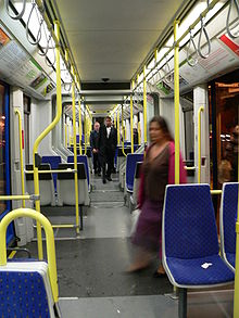


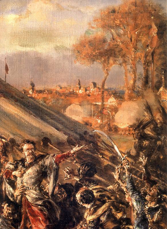
![[1]](http://www.pinakoteka.zascianek.pl/Matejko/Images/Dzieje_cyw_11.jpg)
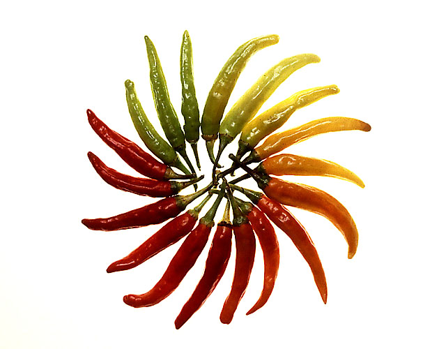
![[3]](https://commons.wikimedia.org/wiki/Image:Plasma_lamp_touching.jpg)
![[4]](http://www.pinakoteka.zascianek.pl/Brandt/Images/Powrot_z_Wiednia.jpg)
![[6]](https://en.wikipedia.org/wiki/Image:Hopetoun_falls.jpg)


![[8]](https://upload.wikimedia.org/wikipedia/commons/archive/4/49/20051205202827%21Koala_climbing_tree.jpg)


.jpg)


![[10]](http://www.fieldmuseum.org/research_collections/ecp/ecp_sites/NPI_web/models_images/geo75400.JPG)


![[11]](http://members.iinet.net.au/~julianiliff/pics/wiki/Apollo_17_The_Last_Moon_Shot_Edit1.png)
![[12]](http://members.iinet.net.au/~julianiliff/pics/wiki/luminosity%20calibration%20chart.png%7Cchart)
![[14]](http://members.iinet.net.au/~julianiliff/pics/wiki/enhance.jpg)


.jpg)
.jpg)


.jpg)


![[16]](http://us.news2.yimg.com/us.yimg.com/p/afp/20050128/capt.sge.fri76.280105155903.photo00.photo.default-384x270.jpg)

 Oppose Agree with the above. This photo would look more interesting at night] --Fir0002 08:26, 19 December 2005 (UTC)