Wikipedia:Featured picture candidates/February-2011
| Featured picture tools |
|---|
Please cut and paste new entries to the bottom of this page, creating a new monthly archive (by closing date) when necessary.
Canadian Museum of Civilisation, Gatineau edit
Voting period is over. Please don't add any new votes. Voting period ends on 1 Feb 2011 at 14:35:04 (UTC)

- Reason
- Good detail of an interesting building designed by Douglas Cardinal, attractive lighting, and hundreds of visitors not in the way. Quality is pretty good and resolution is, too. Featured on de.wiki and Commons.
- Articles in which this image appears
- Canadian Museum of Civilization, Douglas Cardinal
- FP category for this image
- Places
- Creator
- Wladyslaw
- Support as nominator --Maedin\talk 14:35, 23 January 2011 (UTC)
- Weak Oppose It's good, but I kinda wanna see the whole building... I don't like that it's cut off... And the glare on the lights on the RHS is a pet peev of mine in night shots... gazhiley.co.uk 15:22, 23 January 2011 (UTC)
- The building is huge and there are many good sides, and other interesting buildings in the museum complex. There is certainly scope for whole building FPs and detail FPs; having the one doesn't preclude the other. I like that this focuses on one main feature and captures some atmosphere. Maedin\talk 15:50, 23 January 2011 (UTC)
- Support I find this to be an outstanding example of architectural photography. It is very eye-catching. Greg L (talk) 20:04, 23 January 2011 (UTC)
- Support As above. Cowtowner (talk) 21:35, 23 January 2011 (UTC)
- Oppose Ignoring "cut off" arguments it still doesn't give a good feel for the architectural feature that it is illustrating (front on). Nice as architectural photography, not so good as far as EV is concerned. JJ Harrison (talk) 01:16, 24 January 2011 (UTC)
- Weak oppose per JJ. Decent quality, but after seeing the other angle, you really lose a good view of the entire building. SpencerT♦C 01:47, 24 January 2011 (UTC)
- Weak oppose Not convinced of the framing, and while night images tend to look good, they have less detail. Weak EV per JJ. --Elekhh (talk) 05:36, 24 January 2011 (UTC)
- Support. I like the angle and I think it does give a good sense of the building. Perhaps not a good sense of the size and overall structure, but that's not always possible. Ðiliff «» (Talk) 13:36, 24 January 2011 (UTC)
- Support - it may not give the best sense of the building, but it gives a good sense of the architect. I'm not that familiar with Cardinal's work, but the moment I saw the photograph I guessed who designed the building without reading the caption. That's a mark of good architectural photography to me, and that's why I support it for FP. --Ser Amantio di NicolaoChe dicono a Signa?Lo dicono a Signa. 16:13, 24 January 2011 (UTC)
- Support I think the night view doesn't detract that much from the educational value, and I don't mind that it's cut off—focuses on the very distinctive entrance. /ƒETCHCOMMS/ 22:47, 24 January 2011 (UTC)
- Support As per Nicolao. SMasters (talk) 03:34, 26 January 2011 (UTC)
- Support excellent. -- Felix König ✉ 19:07, 29 January 2011 (UTC)
Promoted File:Gatineau - QC - Museum of Civilisation3.jpg --Makeemlighter (talk) 15:07, 1 February 2011 (UTC)
Town hall Lauffen edit
Voting period is over. Please don't add any new votes. Voting period ends on 1 Feb 2011 at 16:22:27 (UTC)

- Reason
- why you think it meets the FPC criteria and should be featured (check criteria first)
- Articles in which this image appears
- Lauffen am Neckar
- FP category for this image
- link to category from WP:FP that best describes the image (check categories first)
- Creator
- User:Felix König
- Support as nominator ---- Felix König ✉ 16:22, 23 January 2011 (UTC)
- Oppose This image looks like it was processed with a boat-load of HDR. I don’t know why, but it is flat, dull, and lacks dynamic range. Greg L (talk) 20:01, 23 January 2011 (UTC)
- Oppose It does look flat, dull, and lacking dynamic range, but I'm completely certain that it was not processed with HDR at all. The angle does not really show the building well and the nominator did not produce a reason for nomination. Purpy Pupple (talk) 22:17, 23 January 2011 (UTC)
- Oppose. Sorry, I have to agree that the angle is not ideal here. J Milburn (talk) 23:38, 23 January 2011 (UTC)
Not Promoted --Jujutacular talk 17:33, 1 February 2011 (UTC)
Roy Halladay edit
Voting period is over. Please don't add any new votes. Voting period ends on 1 Feb 2011 at 23:16:36 (UTC)

- Reason
- A well used image of a notable subject of high quality. On par with our other baseball FPs.
- Articles in which this image appears
- Roy Halladay, Roy Halladay's perfect game Philadelphia Phillies all-time roster (H)
- FP category for this image
- Wikipedia:Featured_pictures/People/Entertainment
- Creator
- Keith Allison
- Support as nominator --Cowtowner (talk) 23:16, 23 January 2011 (UTC)
- Oppose Today seems to be a day for nominations that look drab and lacking in dynamic range. Take a look at this one’s histogram; it beats me why someone would upload a picture so poorly processed. Moreover, images of a baseball pitcher in this pose are ubiquitous (Google montage—note the Little League kid in nearly the exact pose) nearly to the point of being a cliché—like those brooding black & white pictures of an old barn, or the telephoto shot of forlorn railroad tracks disappearing into an uncertain horizon. At least, if one were to have the ol’ “here’s a fastball for ya” picture, I would certainly expect to see one with exemplary lighting… not so-so lighting. Greg L (talk) 02:35, 24 January 2011 (UTC)
- Oppose mundane photo of VP quality. Nergaal (talk) 05:19, 24 January 2011 (UTC)
- Oppose per Nergaal gazhiley.co.uk 12:54, 27 January 2011 (UTC)
Not Promoted --Makeemlighter (talk) 23:37, 1 February 2011 (UTC)
1933 Double Eagle Coin edit


- Reason
- The 1933 Double Eagle coin is a gold coin used in the United States until executive order 6102 stopped it from being legal tender. It is a very high quality public domain photo of a rare coin, whose historic value reminds us of Roosevelt's reaction the 1930's bank crisis.
- Articles this image appears in
- 1933 Double Eagle, Saint-Gaudens double eagle, Louis E. Eliasberg
- Support as nominator -- Michael miceli (talk) 17:30, 23 January 2011 (UTC)
- Oppose Sorry, many photographs can “illustrate the subject really well.” But coins are a really hard subject if one wants an attractive, eye-catching image. Even this image of a hologram Canadian Maple Leaf gold coin is so-so, even though the actual coin in real life is stunning. This picture of some Krugerrands gets close to capturing the beauty of gold coins. Greg L (talk) 20:18, 23 January 2011 (UTC)
- A photograph like that has almost no EV though. This has maximum EV and this is how you illustrate a coin for people interested in coins. All coins illustrated in coin books are illustrated like this. And I personally think this series of coins is one of the most beautiful US coins. — raekyt 12:03, 27 January 2011 (UTC)
- Support I think this is very much comparable to our current Fields Medal FP [1] [2]. Both are exceedingly rare items which are well documented. Cowtowner (talk) 21:31, 23 January 2011 (UTC)
Opposetechnically good, but the specimens are too deteriorated. Even though they might be rare, better specimens like File:1933 double eagle.JPG seem to be available. Nergaal (talk) 05:21, 24 January 2011 (UTC)- Can you clarify what you mean by deteriorated? As far as I can tell there are only minor scratches and some tarnish. I think that's to be expected of a coin of 77 years and not significant enough to detract from it's portrayal here. Cowtowner (talk) 01:28, 25 January 2011 (UTC)
- I don't think the scratches are that minor on the female: the nose, the fingers, knee. Nergaal (talk) 05:47, 25 January 2011 (UTC)
- For a 7.5 million dollar coin, I kinda doubt better photographs could be obtained. Just to few exist, and the ones that do exist are in museums and private collections, and getting the best possible specimen available for high quality photos and for those photos to be freely available for our use is a near impossibility. To make the claim that we could obtain another picture of this quality is a bit absurd, imho. — raekyt 16:19, 25 January 2011 (UTC)
- Is this THE 7.5 million coin? Or just another one of the dozens remaining? Nergaal (talk) 23:59, 25 January 2011 (UTC)
- Have you read the article? It's not legal US tender, the secret service confiscates any that are found in the wild. The odds there being (a) "Dozens" in the wild, and (b) one of these people to photograph and release a picture of there illegal coin as a freely licensed image we could use, is astronomically slim. — raekyt 05:31, 26 January 2011 (UTC)
- Support Nergaal (talk) 08:02, 26 January 2011 (UTC)
- I just saw one on the show Pawn Kings which leads me to believe that there are quite a few out there. The original was sold for 7mil because it was thought to be the only one. Nergaal (talk) 18:01, 31 January 2011 (UTC)
- You sure it was a 1933? Theres lots of the earlier years, those are legal to own, but 1933 was never released thus not official legal tender, if one did show up on that show, and I find it hard to believe an owner of one is dumb enough not to know what it is and pawn it, then you can be assured the secret service will quickly confiscate it. The 7 million dollar one was one of the legal copies given out, two coins was given out I think according to the article, those two are legal, any others are not. Then we can always fall back on the odds of someone who has one of these illegally being willing to take high quality pictures of it and posting them to be freely available for us, which is almost zero odds. — raekyt 21:36, 31 January 2011 (UTC)
- I just saw one on the show Pawn Kings which leads me to believe that there are quite a few out there. The original was sold for 7mil because it was thought to be the only one. Nergaal (talk) 18:01, 31 January 2011 (UTC)
- Support Nergaal (talk) 08:02, 26 January 2011 (UTC)
- Have you read the article? It's not legal US tender, the secret service confiscates any that are found in the wild. The odds there being (a) "Dozens" in the wild, and (b) one of these people to photograph and release a picture of there illegal coin as a freely licensed image we could use, is astronomically slim. — raekyt 05:31, 26 January 2011 (UTC)
- Is this THE 7.5 million coin? Or just another one of the dozens remaining? Nergaal (talk) 23:59, 25 January 2011 (UTC)
- For a 7.5 million dollar coin, I kinda doubt better photographs could be obtained. Just to few exist, and the ones that do exist are in museums and private collections, and getting the best possible specimen available for high quality photos and for those photos to be freely available for our use is a near impossibility. To make the claim that we could obtain another picture of this quality is a bit absurd, imho. — raekyt 16:19, 25 January 2011 (UTC)
- I don't think the scratches are that minor on the female: the nose, the fingers, knee. Nergaal (talk) 05:47, 25 January 2011 (UTC)
- Can you clarify what you mean by deteriorated? As far as I can tell there are only minor scratches and some tarnish. I think that's to be expected of a coin of 77 years and not significant enough to detract from it's portrayal here. Cowtowner (talk) 01:28, 25 January 2011 (UTC)
- Support for reasons above. — raekyt 16:20, 25 January 2011 (UTC)
- Support For its EV. SMasters (talk) 03:38, 26 January 2011 (UTC)
- Support per Raeky ie reasons above gazhiley.co.uk 13:00, 27 January 2011 (UTC)
- Support High EV and the picture quality is high and as interesting as it can be without compromising the EV. Cat-five - talk 02:55, 30 January 2011 (UTC)
Promoted File:Specimen1Obv.jpg --Makeemlighter (talk) 23:45, 1 February 2011 (UTC) Promoted File:Specimen1Rev.jpg --Makeemlighter (talk) 23:45, 1 February 2011 (UTC)
- As a set. Makeemlighter (talk) 23:45, 1 February 2011 (UTC)
Mexican west coast rattlesnake edit
Voting period is over. Please don't add any new votes. Voting period ends on 9 Feb 2011 at 18:40:40 (UTC)

- Reason
- Good composition and EV
- Articles in which this image appears
- Crotalus basiliscus, Viperidae
- FP category for this image
- Wikipedia:Featured pictures/Animals/Reptiles
- Creator
- Holleday
- Support as nominator --Citron (talk) 18:40, 31 January 2011 (UTC)
- Comment If this coiling is a common way this snake can be found, then I am inclined to support. If this is an uncommon "pose", then whereas this image is artistic, it would have insufficient EV (thought it is very eye-catching). Can this be clarified? Is this representative of a particular half-way common state of the snake? Greg L (talk) 19:57, 31 January 2011 (UTC)
- Euh... this is a strange question. See here File:Basilisken-Klapperschlange (Crotalus basiliscus).JPG--Citron (talk) 21:02, 31 January 2011 (UTC)
- Oppose Rattlesnakes coil up, so that's fine, but I have an issue with the coloration of the specimen, according to the description of the species this specimen does not illustrate the typical diamond banding, and appears to be abnormally colored, also this is only a closeup of the specimen, not the entire animal, so it's EV for illustrating the species is near nil, and it probably shouldn't also be the infobox image for the article either for these reasons. — raekyt 23:58, 31 January 2011 (UTC)
- Comment: Raeky, see this Google-Image search on “Crotalus basiliscus”. It seems this isn’t a rare coloration. One might even say it is a rather pedestrian coloration. But I do agree with you about the extreme closeup; I find that it lends to eye-catching but it detracts from EV; a double-edged sword, if you will. Greg L (talk) 00:37, 1 February 2011 (UTC)
- It doesn't readily show the patterning of the scales which is a key characteristic for identifying the species in the field, and since it was placed in the infobox I feel it's just to fault it on it's ability to to identify the species, both on coloration and on showing the full specimen. Theres no reason an artistic closeup of the species couldn't be a FP, but i wouldn't want it to be the infobox image and it would need to relate somehow into the article, like maybe closeup features of a pit viper's head, like the eyes and the pits, all perfectly good reason for an extreme closeup of the head... But this picture was placed in the article replacing another infobox image which does show characteristic coloration. — raekyt 06:39, 1 February 2011 (UTC)
 I withdraw my nomination You are right. It's a bad picture, extreme closeup and uncommon "pose"! I understand why, on Commons, this picture didn't the unanimity. --Citron (talk) 17:21, 1 February 2011 (UTC)
Not Promoted --Makeemlighter (talk) 00:01, 2 February 2011 (UTC)
- Withdrawn by nominator. Makeemlighter (talk) 00:01, 2 February 2011 (UTC)
Svetlana Kuznetsova at the 2009 US Open edit
Voting period is over. Please don't add any new votes. Voting period ends on 2 Feb 2011 at 13:37:22 (UTC)


- Reason
- It was shot during a play (!), but looks like she posed for a photo. High EV, good quality, eye-catching; want to prepare the article into FA status, so it would be great if this were featured. (cropped version of File:US Open 2009 4th round 005.jpg)
- Articles in which this image appears
- Svetlana Kuznetsova
- FP category for this image
- Wikipedia:Featured pictures/People/Entertainment
- Creator
- Edwin Martinez
- Support as nominator -- ♫Greatorangepumpkin♫ T 13:37, 24 January 2011 (UTC)
- Comment: The crop is far, far too tight- it really needs head room. The composition of the original is actually rather interesting- reminds me of this FP. J Milburn (talk) 19:07, 24 January 2011 (UTC)
- I will add another version tomorrow.-- ♫Greatorangepumpkin♫ T 19:54, 24 January 2011 (UTC)
- Something's gone wrong with the second crop, and the licensing needs sorting. J Milburn (talk) 10:54, 25 January 2011 (UTC)
- Well I don't know then.
Where can I suggest a cropping here in wikipedia?-- ♫Greatorangepumpkin♫ T 13:11, 25 January 2011 (UTC)I found it-- ♫Greatorangepumpkin♫ T 17:44, 25 January 2011 (UTC) - I replaced the cropped image.-- ♫Greatorangepumpkin♫ T 12:23, 26 January 2011 (UTC)
- Well I don't know then.
- Something's gone wrong with the second crop, and the licensing needs sorting. J Milburn (talk) 10:54, 25 January 2011 (UTC)
- I will add another version tomorrow.-- ♫Greatorangepumpkin♫ T 19:54, 24 January 2011 (UTC)
- I am afraid I am going to have to weakly oppose both. The lighting just doesn't seem to be up to scratch, and the background is a little distracting. J Milburn (talk) 00:29, 27 January 2011 (UTC)
- The light is from the headlights; the game took place in the night but I will look at this and the background (even if I don't see why the crowd should be sharpen).-- ♫Greatorangepumpkin♫ T 09:38, 27 January 2011 (UTC)
- I would be surprised if Mr Milburn's objections was due to them being blurred - portrait shots normally only get through this process if the background is plain and not distracting - sharpening the crowd would make them more of a distraction if anything... gazhiley.co.uk 12:54, 27 January 2011 (UTC)
- I don't understand what should be done to make the crowd not distracting. I also think the background is excellent; it features Kuzy more to the foreground and the blurring effect is nothing but great, for me anyway.-- ♫Greatorangepumpkin♫ T 13:06, 27 January 2011 (UTC)
- That's kinda the point - there isn't a lot that can be done about the background, which is why the large majority of profile pictures that pass here are more posed or at least have some action taking place that is useful for another article... A picture of a person appearing to be standing not doing a lot with a background this busy just isn't going to be accepted by a lot of editors... gazhiley.co.uk 15:28, 27 January 2011 (UTC)
- I don't understand what should be done to make the crowd not distracting. I also think the background is excellent; it features Kuzy more to the foreground and the blurring effect is nothing but great, for me anyway.-- ♫Greatorangepumpkin♫ T 13:06, 27 January 2011 (UTC)
- I would be surprised if Mr Milburn's objections was due to them being blurred - portrait shots normally only get through this process if the background is plain and not distracting - sharpening the crowd would make them more of a distraction if anything... gazhiley.co.uk 12:54, 27 January 2011 (UTC)
- The light is from the headlights; the game took place in the night but I will look at this and the background (even if I don't see why the crowd should be sharpen).-- ♫Greatorangepumpkin♫ T 09:38, 27 January 2011 (UTC)
Not Promoted --Makeemlighter (talk) 16:39, 2 February 2011 (UTC)
Cairo Nile River edit
Voting period is over. Please don't add any new votes. Voting period ends on 2 Feb 2011 at 21:12:02 (UTC)

- Reason
- Very nice composition, strikingly illustrates contrast between old (sailing boats) and new (skyscrapers) in Cairo.
- Articles in which this image appears
- Cairo
- FP category for this image
- link to category from WP:FP that best describes the image (check categories first)
- Creator
- User:Jawed
- Support as nominator --JustinWuzhang (talk) 21:12, 24 January 2011 (UTC)
- Oppose (on steroids) This isn’t even close to FP-quality. Overcast day and haze is far from the crystal clear imagery that is typically associated with outstanding landscapes. The crop is far too lose, and the scene is overall quite underwhelming. I’m sorry, but this looks like the sort of on-the-fly shot that would be taken on a tour bus while it’s still moving: “And to your left, you can see Cairo with its modern steel-framed buildings and modern smog.” (*snap*) Greg L (talk) 22:22, 24 January 2011 (UTC)
- Hey Justin- it's nice to see some new faces at FPC. However, I have to agree with Greg, this picture just isn't really up to standards. The overcast sky and haze, as well as the somewhat uninspiring composition, do not lend themselves well to featured picture status. This picture will probably fail, but I hope you don't feel discouraged. Perhaps stick around FPC for a little while to get a stronger idea of the kind of things which do and don't pass, and the kinds of criticisms people make? J Milburn (talk) 23:40, 24 January 2011 (UTC)
- Hmmm… This appears to be the good cop / bad cop thing going on here. J Milburn and made the effort to be encouraging but realistic. Very good. I failed to recognize that Justin is a new contributor and thus, I earned the dubious distinction of serving in the role of bad cop. Indeed, Justin, try again when you have a picture in your hands you think is especially gorgeous. Featured Picture Candidates is frequented by… uhmm… those that frequent this place and thusly tends to get the same ol’ types of pictures nominated. We need a more eclectic collection of nominations; it’s unfortunate the weather wasn’t cooperating when User:Jawed was in Cairo. Greg L (talk) 23:52, 24 January 2011 (UTC)
- Comment This photo isn't actually that hazy compared to a normal day in Cairo. It's going to be very difficult, if not impossible, to get a clearer shot of Cairo. See Cairo#Pollution. Mahahahaneapneap (talk) 02:03, 27 January 2011 (UTC)
- Yes, if you've been to Cairo, you'll see that this is a fairly clear day in Cairo. 76.102.150.64 (talk) —Preceding undated comment added 08:29, 29 January 2011 (UTC).
- I can partly agree with Mahahahaneapneap where he writes that it is “very difficult” to catch Cairo on a clear day. But I can’t agree with the “if not impossible” part. A simple Google Image search shows ample examples of what would reasonably called a “clear day in Cairo” (chock one up to the power of that ‘InterWeb thing’). The city gets 2.5 centimeters (1 inch) of rain a year; most of it is Dec.–March. So I’m sure there are many a crisp winter morning after a rainfall and a bit of a breeze, where lots of photographers wake up and rush out to take pictures of a beautiful Cairo illuminated by a golden sun.
Clearly, all of this are just academic musings about the theoretical possibility of finding a clear day in downtown Cairo; it’s more-than reasonable for FP criteria (ultimately founded upon common human experiences) to have the expectation that a landscape picture of the Cairo be shot on a day with clear blue sky above so the river water looks attractive, like this one.
We just need more contributors from this part of the world; FP-quality pictures of Cairo do exist. Greg L (talk) 19:03, 29 January 2011 (UTC)
- I can partly agree with Mahahahaneapneap where he writes that it is “very difficult” to catch Cairo on a clear day. But I can’t agree with the “if not impossible” part. A simple Google Image search shows ample examples of what would reasonably called a “clear day in Cairo” (chock one up to the power of that ‘InterWeb thing’). The city gets 2.5 centimeters (1 inch) of rain a year; most of it is Dec.–March. So I’m sure there are many a crisp winter morning after a rainfall and a bit of a breeze, where lots of photographers wake up and rush out to take pictures of a beautiful Cairo illuminated by a golden sun.
- Yes, if you've been to Cairo, you'll see that this is a fairly clear day in Cairo. 76.102.150.64 (talk) —Preceding undated comment added 08:29, 29 January 2011 (UTC).
Not Promoted --Makeemlighter (talk) 21:52, 2 February 2011 (UTC)
Juan Carlos I of Spain edit
Voting period is over. Please don't add any new votes. Voting period ends on 3 Feb 2011 at 04:20:57 (UTC)


- Reason
- Very good image and high ev as lead image. Quality image and valued on commons also it is featured on German and Turkish wikis
- Articles in which this image appears
- Juan Carlos I of Spain, Sailing at the 1972 Summer Olympics
- FP category for this image
- Wikipedia:Featured pictures/People/Royalty
- Creator
- א
- Support as nominator --Spongie555 (talk) 04:20, 25 January 2011 (UTC)
- Comment he looks bored. Nergaal (talk) 04:52, 25 January 2011 (UTC)
- I would say he look more serious as he is attending the Charlemagne Prize ceramony for 2007, hence the yellow ribbon around his neck(even though he won it in 1982). Spongie555 (talk) 05:04, 25 January 2011 (UTC)
Conditional strong support Having taken pictures of U.S. presidents before, I can attest first-hand that getting close enough to get a clear, well lit shot like this is not easy. This is pretty good and looks like an AP picture. I really like the red highlights off the back of his shoulders; that is something one doesn’t see every day. But I definitely think this could be much improved with a better cropped version; I see no point to all that stuff to the left of him. Greg L (talk) 05:10, 25 January 2011 (UTC)
- There is a crop version here, File:Juan Carlos I of Spain 2007-2.jpg. I just thought this one had some shoulder room. Spongie555 (talk) 05:22, 25 January 2011 (UTC)
- That’s (almost) exactly what I was hoping for. It is ideal horizontally. But it has way too much above his head. Why not a third one? One that is cropped horizontally like File:Juan Carlos I of Spain 2007-2.jpg and is cropped vertically like this one? Greg L (talk) 05:32, 25 January 2011 (UTC)
- I put it there as an alt incase anyone perfers the original. Spongie555 (talk) 05:33, 25 January 2011 (UTC)
- That’s (almost) exactly what I was hoping for. It is ideal horizontally. But it has way too much above his head. Why not a third one? One that is cropped horizontally like File:Juan Carlos I of Spain 2007-2.jpg and is cropped vertically like this one? Greg L (talk) 05:32, 25 January 2011 (UTC)
- Support Original Having taken pictures of U.S. presidents before, I can attest first-hand that getting close enough to get a clear, well lit shot like this is not easy. This is pretty good and looks like an AP picture. I really like the red highlights off the back of his shoulders; that is something one doesn’t see every day. I’m not sure it needs so much of that cloth business off to the left of him, but it seems, somehow, better than the square Alt (which has way too much black above his head for low-flying birds). Greg L (talk) 05:37, 25 January 2011 (UTC)
- Support original. This is a good picture; the lighting and focus are great, and the composition manages to be useful yet interesting- this is no passport photo. The alt very much is a passport photo, which is not ideal for FPC. J Milburn (talk) 10:50, 25 January 2011 (UTC)
- Weak oppose. The lighting looks really weird to me (was he under colored stage lighting?) Also, the fact that we see a ribbon from which the awarded medal was suspended, but not the medal itself, looks odd. I'm aware that HM, and not the medal, is the subject of the portrait, but it just seems weird and distracting to see that colored ribbon out of context. Spikebrennan (talk) 22:33, 25 January 2011 (UTC)
- Support Original The alt looks terrible! Almost like a cheap, passport shot. I like the original much better for its EV, and difficult to shoot (as in availability) royal. SMasters (talk) 03:46, 26 January 2011 (UTC)
- To see that a wikipedian took a photo of His Majesty up close and with great detail is very impressive. Spongie555 (talk) 05:24, 26 January 2011 (UTC)
- Weak oppose both as per Spikebrennan. The lighting looks very unbalanced. The red light at this shoulders is just...distracting.Razum2010 (talk) 04:26, 26 January 2011 (UTC)
- The Red light looks like it outlines his shoulders so that his suit doesnt blend into the black background. Spongie555 (talk) 05:24, 26 January 2011 (UTC)
- Oppose based on lighting. The combination of red light on the shoulders and the white light from the camera flash looks unnatural to me. Purpy Pupple (talk) 05:15, 26 January 2011 (UTC)
- This was most likly a staged shot but I could be wrong. Spongie555 (talk) 05:24, 26 January 2011 (UTC)
Not Promoted --Makeemlighter (talk) 04:41, 3 February 2011 (UTC)
- Support < 5 Makeemlighter (talk) 04:41, 3 February 2011 (UTC)
Manmohan Singh edit
Voting period is over. Please don't add any new votes. Voting period ends on 3 Feb 2011 at 08:52:20 (UTC)

- Reason
- Technically good, sufficient resolution, picture of prime minister of India. Adds lot of value to the article.
- Articles in which this image appears
- Manmohan Singh, Union Council of Ministers of India
- FP category for this image
- Wikipedia:Featured_pictures/People/Political
- Creator
- Ricardo Stuckert/PR
- Support as nominator --Ahirwav (talk) 08:52, 25 January 2011 (UTC)
- Weak Oppose. It certainly adds value to a lot of articles (to widely varying degrees), but I don't think it's a great portrait. The skin tone seems a bit flat and the composition is opportunistic rather than well framed. Just not quite up to scratch for our FP portraits IMO. Ðiliff «» (Talk) 09:25, 25 January 2011 (UTC)
- Oppose. Sorry, I have to agree with Diliff. The poor background is a bit of a deal-breaker for me. J Milburn (talk) 10:46, 25 January 2011 (UTC)
- Oppose The background makes this look like high-resolution surveillance video rather than showcase photography. Greg L (talk) 12:53, 25 January 2011 (UTC)
- Oppose Sorry, I think the angle of his face is not ideal for an FP. SMasters (talk) 03:48, 26 January 2011 (UTC)
- Oppose I agree that the background is bad. Purpy Pupple (talk) 05:14, 26 January 2011 (UTC)
Not Promoted --Jujutacular talk 10:03, 3 February 2011 (UTC)
Saint Usuge Spaniel edit
Voting period is over. Please don't add any new votes. Voting period ends on 3 Feb 2011 at 12:30:15 (UTC)

- Reason
- I believe that the image may meet all requirements of being a FP. I've placed it at peer review, where it hasn't received any comments (negative or otherwise) which I'm taking as a good thing. I've touched up and balanced the image in Photoshop and removed a copyright tag that the creator on commons placed there (original file is saved in the image history). This is my FP nomination, so I'm happy to be corrected if this is not up to scratch. For a little context - a Saint Usuge Spaniel is a rare breed working French spaniel which I didn't even know of until I found this image in the unidentified dogs category on Wikimedia Commons. I haven't described the color of the coat in the caption as this is the only color/pattern that appears in the breed.
- Articles in which this image appears
- Saint Usuge Spaniel
- FP category for this image
- Wikipedia:Featured pictures/Animals/Mammals
- Creator
- DanielV27 (On Commons, Miyagawa is nominator on WP)
- Support as nominator -- Miyagawa talk 12:30, 25 January 2011 (UTC)
- Oppose I’m sorry; I just don’t know how to deliver this honest opinion and soften the points any further. In my opinion, pretty much any half-way closeup photograph of a Saint Usuge Spaniel would illustrate the subject matter (the breed) just fine. What is sorely missing here is an important element of the image being especially eye-catching. The Photoshopping here has left the image, IMHO, with overly saturated colors and the color cast is off. The heavily overcast day probably led to a very muted, dull look to the image. Whereas overcast no-doubt softened the shadows, the image editing to counteract the flatness and to punch up the image left it with an artificial, overly processed contrast. And then there’s the lawn. It is what is is: one owned by a dog owner—and that of an active breed so it is sparse and worn. The totality makes this image look like one of millions of dog pictures, where the picture is Wife-Approved©™® for putting on Facebook because it is free of any visible dog droppings. Whereas this image is fine, it is far from exemplary, fine photography insofar as lighting, post-processing, and the background goes. Greg L (talk) 20:00, 25 January 2011 (UTC)
- Miyagawa, I'm sorry to say that there really isn't anywhere near enough participation at PR, which I think is a real shame. It was weeks before I got any comments on my picture when I posted it there some months ago, and when I did, there was not any consensus if it would pass. I took a gamble and tried for an FP anyway, and luckily it was promoted. I think that people expect criticism at PR, and it's not as bad to take as when a picture gets shot down here, especially if you are the photographer. Anyway, this pic for me is not quite up to FP standards due to reasons mentioned by Greg, but please do keep trying and don't give up! SMasters (talk) 04:03, 26 January 2011 (UTC)
- Oppose it is indeed regrettable that activity on Picture Peer Review is far less. The technical execution of the image is, as Greg L mentioned, not up to par with most of the Featured Pictures however - for instance, the background is mediocre and distracting (especially the top edge). The colours of the image seem to be slightly unnatural (too cyan, or something). Maybe your computer monitor needs calibration. Purpy Pupple (talk) 05:10, 26 January 2011 (UTC)
Not Promoted --Makeemlighter (talk) 16:08, 3 February 2011 (UTC)
Althea Gibson’s Wimbledon Trophy 1956 edit
Voting period is over. Please don't add any new votes. Voting period ends on 4 Feb 2011 at 23:18:54 (UTC)

- Reason
- It is of historical importance, being the Grand Slam trophy won by Althea Gibson, a first for any female African American, at Wimbledon.
- Articles in which this image appears
NoneAlthea Gibson- FP category for this image
- Wikipedia:Featured pictures/Other
- Creator
- Cliff from Arlington, Virginia, USA (Flickr username). Uploaded onto Commons by Sp33dyphil.
- Support as nominator --Sp33dyphil (Talk) (Contributions)(I love Wikipedia!) 23:18, 26 January 2011 (UTC)
- Note: This doesn't seem to be used in any articles. Isn't that one of the requirements?--RDBury (talk) 23:54, 26 January 2011 (UTC)
- Oppose. Hey Phil- it's great to have some new contributors here, but sadly, this image really isn't up to scratch for a number of reasons. Most importantly, it is not used in any articles. The most important element of featured pictures is that they add to the article(s) in which they are used. Secondly, the composition is rather uninteresting- it has a tight crop, and a distracting background. Thirdly, the technical quality of the image is lacking somewhat. I strongly doubt that this image will pass, but I hope you are not discouraged from contributing here. J Milburn (talk) 00:27, 27 January 2011 (UTC)
- Oppose It illustrates “Athea Gibson’s trophy” just great. But it is not good lighting and shooting through the glass introduced the reflection of the photographer’s arm and camera. Exemplary, eye-catching imagery would likely require privileged access and better lighting. Greg L (talk) 03:39, 27 January 2011 (UTC)
- Oppose per Greg L gazhiley.co.uk 11:23, 27 January 2011 (UTC)
- Oppose Sorry, the reflection of the glass rules it out for me. – SMasters (talk) 09:15, 28 January 2011 (UTC)
- Oppose although the subject is historically significant, the technical aspects of this photo fail in that it is blurry, suffers from reflections on the glass, has a distracting and irrelevant background. But, as J Milburn mentioned, please continue to contribute in the future! Purpy Pupple (talk) 00:11, 30 January 2011 (UTC)
Not Promoted --Makeemlighter (talk) 20:51, 4 February 2011 (UTC)
Boeing 777 edit
Voting period is over. Please don't add any new votes. Voting period ends on 5 Feb 2011 at 04:49:59 (UTC)


- Reason
- It is off aviation historical significance, with high resolution, no image noise, and is not too cropped.
- Articles in which this image appears
- Boeing 777
- FP category for this image
- Wikipedia:Featured pictures/Vehicles/Air
- Creator
- Boeing Dreamscape (Flickr username) Uploaded onto Commons by Sp33dyphil.
- Support as nominator --Sp33dyphil (Talk) (Contributions)(I love Wikipedia!) 04:49, 27 January 2011 (UTC)
- Comment I'm not ready to vote on this yet but just wondering is it my monitor or is this picture a bit dark? for above cloud level I would have expected a little more brightness... Also really don't like the "(probably)" bit in the description... Should really be a fact or not included I would have thought... gazhiley.co.uk 11:21, 27 January 2011 (UTC)
- I'm 99% sure it's involved in flight testing. Sp33dyphil (Talk) (Contributions)(I love Wikipedia!) 21:04, 27 January 2011 (UTC)
- I'm still not keen on the "probably" bit being there... Anyone else have any thoughts on whether that should be removed? gazhiley.co.uk 11:22, 28 January 2011 (UTC)
- Comment I could see myself supporting this, but as gazhiley noted, it ought to be brighter. I also don’t see the point of so much cloud below the plane (and to a lesser extent, above the plane); more zoom could do this picture proud. I note that the vast majority of public-domain pictures are ground-based ones. Due to FAA rules regarding separation, air-to-air shots like this are typically owned by airlines and manufacturers of the planes. This is a rare catch. With some tweaks, I think it could be a fine FP. Greg L (talk) 23:18, 27 January 2011 (UTC)
- Support Alt I made the Alt shown here. I cropped it, shoved around the brightness & contrast to extend the histogram, moved the midpoint of the histogram to brighten the ground, took a touch off the saturation, and smoothed out the ground and clouds, which had a lot of JPEG artifacts. As I noted above, the vast majority of public-domain pictures are ground-based ones. Due to FAA rules regarding separation, air-to-air shots like this are typically owned by airlines and manufacturers of the planes. An air-to-air like this is a rare catch. Greg L (talk) 23:40, 27 January 2011 (UTC)
- Thanks for the improvement. I'm not a really good expert at photography, but I see that the picture (original and alt) have really important aviation significance, so I though, with some retouching, it should be FP. Sp33dyphil (Talk) (Contributions)(I love Wikipedia!) 01:02, 28 January 2011 (UTC)
- You are most welcome. Look at the original’s clouds in full zoom and then look at the clouds in the Alt. I didn’t even touch the JPEG artifacts on the plane itself. Yet, that simple little trick of addressing it in the clouds and the purple valley above and behind the plane really improved the image. Greg L (talk) 02:04, 28 January 2011 (UTC)
- Weak Support Alt this is indeed a rare catch, especially since the aircraft is in the original Boeing livery. However, the image quality is quite mediocre with JPEG artifacts, image noise (contrary to the nominator's claim, I see quite some image noise) and lack of sharpness arising from the JPEG artifacts. Purpy Pupple (talk) 00:10, 28 January 2011 (UTC)
- oppose both The clouds are in general nice, but white coluds on the white airplane doesn't work. Also small and for that too much quality issues, see Purpy Pupple. --kaʁstn 17:21, 3 February 2011 (UTC)
Not Promoted --Makeemlighter (talk) 22:10, 5 February 2011 (UTC)
Juvenile Brown Booby edit
Voting period is over. Please don't add any new votes. Voting period ends on 6 Feb 2011 at 08:46:54 (UTC)

- Articles in which this image appears
- Brown Booby
- Creator
- Benjamint 08:46, 28 January 2011 (UTC)
- Support as nominator --Benjamint 08:46, 28 January 2011 (UTC)
- Support A nice high-quality image that captures the bird. Exposed correctly. Colors look a little saturated, but still okay. --Garrett247 (talk) 06:58, 31 January 2011 (UTC)
- Support. Good composition. Twilightchill t 01:21, 1 February 2011 (UTC)
- Support the image is technically fine although the colours do seem quite strongly saturated. Purpy Pupple (talk) 06:13, 3 February 2011 (UTC)
- oppose sharpening halo, very small, overexposed hide --kaʁstn 17:17, 3 February 2011 (UTC)
Not Promoted --Makeemlighter (talk) 17:26, 6 February 2011 (UTC)
- Support < 5 Makeemlighter (talk) 17:26, 6 February 2011 (UTC)
Warsaw Ghetto Uprising edit
Voting period is over. Please don't add any new votes. Voting period ends on 16 Feb 2011 at 00:45:33 (UTC)

- Reason
- an obvious featured picture, if only for its historic merit
- Articles in which this image appears
- Jewish civilians captured during the Warsaw Ghetto Uprising
- FP category for this image
- link to category from WP:FP that best describes the image (check categories first)
- Creator
- Unidentified ss soldier, uploaded by Jarekt
- Support as nominator --Thanks, Hadseys 00:45, 7 February 2011 (UTC)
- Comment. There is actually already a slightly cleaned-up FP of this image. The FP should really the be the one used in articles. NauticaShades 01:49, 7 February 2011 (UTC)
- It mostly is, but the unrestored version was in a template; I just replaced it. Suggest speedy close of this nomination as moot. Chick Bowen 02:48, 7 February 2011 (UTC)
- Speedy close as per Chick Bowen. Purpy Pupple (talk) 09:58, 7 February 2011 (UTC)
- Speedy close per above-- ♫Greatorangepumpkin♫ T 10:20, 7 February 2011 (UTC)
- Nomination withdrawn - my bad sorry --Thanks, Hadseys 12:15, 7 February 2011 (UTC)
Not Promoted --Makeemlighter (talk) 17:31, 7 February 2011 (UTC)
- Withdrawn by nominator. Makeemlighter (talk) 17:31, 7 February 2011 (UTC)
Ford Mustang grille edit
Voting period is over. Please don't add any new votes. Voting period ends on 7 Feb 2011 at 14:42:22 (UTC)

- Reason
- It's eye caching, there's good composition it looks like that Mustang actually runs towards viewer.
- Articles in which this image appears
- Ford Mustang (first generation)
- FP category for this image
- Ford Mustang I
- Creator
- es:Usuario:Barahonasoria
- Support as nominator --SHAMAN 14:42, 29 January 2011 (UTC)
- Oppose and suggest Speedy close. This is not close to the kind of quality required for a featured picture. The resolution is too low, there is a lot of noise, the highlights are completely blown, there is significant chromatic aberration (purple fringing) around the image edges and, arguably, the depth of field is too small. The subject is common so this picture would be easy to recreate but with the improved quality from a better camera. Zephyris Talk 17:48, 29 January 2011 (UTC)
- Oppose The post-processing, in order to reduce the resolution all the way to the bare-bones minimum of 1024 pixels wide seemed to have been been for the purpose of (trying to) obscure the lack of depth of field. Well, having the far side of the grill be outside of the DOF is one thing; having the tail-end of the emblem outside of the DOF is a flaw. Also, I see the camera was an Olympus from the C‑310 family. Yet, there is excessive lens flair between the mustang’s head and the top of the emblem (due to a bright-sky reflection off the top of the emblem) that appears to be the simple product of a dirty lens; it’s more of the sort of thing I would expect to see from an iPhone that’s been carried in a pocket for a week without cleaning. This subject matter would require the full attention of a talented photographer to make this an eye-catching image. It appears to have been shot in a garage with the car facing out into the driveway. This would have looked much better had it been shot under a tree at a park on a sunny day; then the 3‑D relief of mustang would have modeled the environment reflections of blue sky (off top-pointing surfaces), green fields (forward-facing geometry), and gray ground on lower-pointing surfaces. A proper surround is crucial for getting truly eye-catching results with mirror-like surfaces—something Alchemist has long mastered as evidenced by his noms of his reflective examples from the periodic table. This photo comes up far short on pretty much every critical element necessary for consideration as an FP. Greg L (talk) 18:34, 29 January 2011 (UTC)
- Comment I think that it was cropped to focus on the subject. Depth of field - it's autofocus here. Anyway I believe that composition is good and picture does its job ("being eye-catching to the point where users will want to read its accompanying article.") as in an infobox at Mustang page one's unable to see all the nuances.SHAMAN 20:05, 29 January 2011 (UTC)
- Oppose and support Speedy close. The resolution is insufficient, the image suffers from lens flare, the depth of field is insufficient (autofocus is not an acceptable reason since it is the f-number that controls depth of field), there is very noticeable chromatic aberration. The oblique angle delivers questionable encyclopedic value. The image is also not that eye catching. Given that the Ford Mustang is common and first-generation Mustangs can be seen frequently, surely a superior image may be taken. Also, the nominator has failed to provide a featured picture category. Purpy Pupple (talk) 00:07, 30 January 2011 (UTC)
- Comment I know what the depth of field is and I believe that I could take good picture of it with my manual SLR camera only if the subject would be equally common where I live. Eye-cathiness is a discussable term.
Not Promoted --Makeemlighter (talk) 17:32, 7 February 2011 (UTC)
Masked Tree Frog edit
Voting period is over. Please don't add any new votes. Voting period ends on 7 Feb 2011 at 02:49:30 (UTC)

- Articles in which this image appears
- Smilisca phaeota, Mexican Treefrogs
- Creator
- Benjamint 02:49, 29 January 2011 (UTC)
- Support as nominator --Benjamint 02:49, 29 January 2011 (UTC)
- Support. High quality, high EV. NauticaShades 14:04, 29 January 2011 (UTC)
- Comment All I have is an intuition-based (exceedingly non-Vulcan) sense that the “vivid” setting on the camera was enabled or someone punched up the saturation in post-processing. I’ve seen ample leaves, including leaves like these in Hawaii, and the colors here *look* unnaturally saturated. Greg L (talk) 21:11, 29 January 2011 (UTC)
- Comment The lighting seems rather harsh, no? Was it really dark there or something? Purpy Pupple (talk) 06:10, 3 February 2011 (UTC)
- It was night time so yeah, it is a nocturnal frog afterall. A better flash set-up would be nice but a little expensive too. Benjamint 04:01, 4 February 2011 (UTC)
- That's a good reason. Purpy Pupple (talk) 02:30, 6 February 2011 (UTC)
- It was night time so yeah, it is a nocturnal frog afterall. A better flash set-up would be nice but a little expensive too. Benjamint 04:01, 4 February 2011 (UTC)
- Support since it is technically quite good apart from the harsh lighting and I'm sure that high quality free images of this nocturnal frog are hard to come by. Purpy Pupple (talk) 02:30, 6 February 2011 (UTC)
- Support The colours don't look unusual to me. I like the focus on the frog's face. Aaadddaaammm (talk) 12:45, 5 February 2011 (UTC)
Not Promoted --Makeemlighter (talk) 17:32, 7 February 2011 (UTC)
- Support < 5, probably worth re-nominating in the future. Makeemlighter (talk) 17:32, 7 February 2011 (UTC)
Making of a Death Mask 2 edit
Voting period is over. Please don't add any new votes.

- Reason
- the original image was nominated back in August, but by the time an adequate restoration was made, the voting time had lapsed with consensus for promotion but no clear consensus on which version to promote. This is a nomination for the last restoration of the image. The original reason from the August nomination stated: great historic image from 1908 showing how death masks are made. It has great EV. I, for one, did not know how they are made. How is the dead body handled? Do they apply plaster on the body as it's lying down? etc. The high res of this image, the historical significance, and the fact that it's the only image in the article showing how death masks are made are the top reasons why this should be a featured pic
- Articles in which this image appears
- Death mask
- FP category for this image
- Culture, entertainment and lifestyle
- Creator
- Bain News Service, originally uploaded by Howcheng, restoration by AutoGyro
- Support as nominator --AutoGyro (talk) 22:09, 28 January 2011 (UTC)
- Support The quality is about as good as it goes for the era. This image is clearly eye-catching. I like the sepia tone, which helps to convey the age. Greg L (talk) 22:50, 28 January 2011 (UTC)
- Support. Captivating, informative. NauticaShades 14:00, 29 January 2011 (UTC)
- Support - though I do find it rather creepy. --Ser Amantio di NicolaoChe dicono a Signa?Lo dicono a Signa. 21:21, 31 January 2011 (UTC)
- Oppose - Althuogh this is a good image if you look closely at it there are some defects. Also based on comments I have seen in the past the image is displayed in a prominant way on the article as a Featured image should be. --Kumioko (talk) 15:19, 1 February 2011 (UTC)
- Weak oppose. I am not convinced that this is the strongest illustration of the procedure. Yes, it is useful, but I do not feel it is featured quality. J Milburn (talk) 23:45, 2 February 2011 (UTC)
- Support per above-- ♫Greatorangepumpkin♫ T 10:22, 7 February 2011 (UTC)
Promoted File:Making_Death_Mask_Edit_4.jpg --Makeemlighter (talk) 17:40, 7 February 2011 (UTC)
Walheim power plant edit
Voting period is over. Please don't add any new votes. Voting period ends on 7 Feb 2011 at 19:06:29 (UTC)

- Reason
- best image of this place; QI and VI on Commons
- Articles in which this image appears
- Walheim
- FP category for this image
- link to category from WP:FP that best describes the image (check categories first)
- Creator
- User:Felix König
- Support as nominator ---- Felix König ✉ 19:06, 29 January 2011 (UTC)
- Oppose This has technical shortcomings. It needs to be brighter, the midpoint of the histogram moved to preferentially lighten the darks, and a touch more contrast after all that has been done. Just as notably, the color needs to be de-saturated as this seems to be the product of a camera that has the “vivid” setting turned on, or someone post-processed for that effect. Since the subject is the power plant, it needs also to be zoomed as tight as possible. When all that is done, (which I tried), I ended up with a sterile-looking building and the overall effect still wasn’t eye-catchig—not for me, anyway. Greg L (talk) 21:00, 29 January 2011 (UTC)
- Oppose per Greg... Plus I'm sure there must be a better closer angle as this is so far away that it isn't massively crisp... gazhiley.co.uk 12:17, 2 February 2011 (UTC)
- Sorry, another oppose from me. Composition isn't doing it for me. Aaadddaaammm (talk) 12:44, 5 February 2011 (UTC)
- Oppose As per Greg. SMasters (talk) 12:51, 7 February 2011 (UTC)
Not Promoted --Jujutacular talk 21:28, 7 February 2011 (UTC)
Écorché by Honoré Fragonard edit
Voting period is over. Please don't add any new votes. Voting period ends on 1 Feb 2011 at 16:10:11 (UTC)


- Reason
- Because it's creepy and different, :) Will soon be featured on Commons: nom.
- Articles in which this image appears
- Honoré Fragonard, Musée Fragonard d'Alfort
- FP category for this image
- Sciences
- Creator
- Jebulon
- Support as nominator --Maedin\talk 16:10, 23 January 2011 (UTC)
- Support I find this to be eye-catching and unusual (for FPC). However, I can’t see any use for all that surrounding black; it could be cropped tighter. Notwithstanding that quibble, support based on the subject matter and the lighting and overall quality. Greg L (talk) 20:03, 23 January 2011 (UTC)
OpposeAs far as I can tell, the rest of the horse has been preserved too. I think the whole horse should be there for this to be of FP quality. Cowtowner (talk) 21:34, 23 January 2011 (UTC)- Getting the whole of the horse would have prevented this from being FP quality. As a museum piece behind glass photographed hand-held, fitting a horse in frame (think of the size) would have been almost impossible to do well and without introducing distracting elements (glass corners, reflections, museum plaques, bases, supports, etc) or quality issues (blur and noise, namely). Considering the circumstances, it has to be this way, as the creator stated: "This picture is indeed a 'detail'. It is a museum picture, and it is impossible to take a good enough one of the whole composition, because of the lack of distance, the glass reflections, or the back light, or the contre-jour... It was for me the only way to show this 'cavalier', sorry." [3] Maedin\talk 22:52, 23 January 2011 (UTC)
- Support. Good EV and quality, unusual subject. --Avenue (talk) 14:05, 24 January 2011 (UTC)
- Support - I suspect it's as good as we'll get for the subject, and the subject is eye-catching enough to stop a fellow in his tracks. --Ser Amantio di NicolaoChe dicono a Signa?Lo dicono a Signa. 16:05, 24 January 2011 (UTC)
- Oppose. Terrible composition. Way too much headroom and totally random aspect ratio. I know aesthetics aren't that important here, but for a modern reproducible photo it should at least utilize some basic concepts of good photographic composition. Kaldari (talk) 22:22, 24 January 2011 (UTC)
- Oppose per Kaldari and: I think the background don't fit to the picture; it is way too unrealistic. I would have desired another background, like in a museum or "repairshop" or mortuary.-- ♫Greatorangepumpkin♫ T 19:11, 25 January 2011 (UTC)
- Weak support; I like it, and I think the EV is solid, and I think it's eyecatching. The technical quality is just a tad lacking for me. J Milburn (talk) 00:31, 27 January 2011 (UTC)
- Support -- George Chernilevsky talk 11:51, 27 January 2011 (UTC)
- Added crop. Maedin\talk 18:43, 29 January 2011 (UTC)
- Support cropped --7040US (talk) 17:32, 31 January 2011 (UTC)
More comments on the crop needed, please. Jujutacular talk 17:31, 1 February 2011 (UTC)
- Support both, prefer crop. --Avenue (talk) 03:19, 2 February 2011 (UTC)
- Support crop, but what are the chances to crop out the two white bars? (the one in the back should be easy). Nergaal (talk) 19:19, 7 February 2011 (UTC)
Promoted File:Écorché cavalier Fragonard Alfort 1 edit1.jpg --Jujutacular talk 09:44, 8 February 2011 (UTC)
Jammed and Free-Flowing Phases of the Biham-Middleton-Levine Traffic Model edit
Voting period is over. Please don't add any new votes. Voting period ends on 9 Feb 2011 at 00:59:53 (UTC)
- Reason
- Earlier, the intermediate phases were promoted to Featured Picture status. Since the non-intermediate phases tend to dominate more, especially at extreme traffic concentrations; and were discovered earlier (in fact the original paper by Biham, Middleton, and Levine only talks about the jammed and free flowing phases and not the intermediate ones), the EV with these videos are arguably even stronger and certainly deserve their own FP status. The video quality is as high as I could get it to be with the Ogg Theora codec (which is the only one that Wikipedia supports) whilst maintaining a reasonable filesize. Unfortunately, due to the limitations of Theora, there are some minor artifacts; nevertheless, these do not detract significantly from the quality. These videos ought to be added to the BML Traffic Model featured picture set.
- Articles in which this image appears
- Biham-Middleton-Levine traffic model
- FP category for this image
- BML Traffic Model (featured picture set);
- Creator
- Purpy Pupple
- Support as nominator --Purpy Pupple (talk) 00:59, 31 January 2011 (UTC)
- Support As an editor who has made a number of animations myself for donating to Wikipedia, I know first hand just how much time and effort this sort of thing requires. No single fixed image could demonstrate the concept of “traffic increasingly jamming up” than an animation such as this. Having an animation as the Featured Picture for one day on the Main Page will illustrate not only traffic patterns, it will illustrate the virtue of an electronic encyclopedia over a print edition. Greg L (talk) 02:34, 31 January 2011 (UTC)
- support What Greg said. More than "a pretty animation", this is a technically sound, factually correct piece -- which makes it doubly valuable. Jon C (talk) 04:26, 1 February 2011 (UTC)
- These are very nice animations. I noticed that in File:BML N=200 P=36.png, the red cars move up and the blue cars move right. In these, the red cars move right and the blue ones move down. Mathematically these are equivalent, but visually the appearance is not the same. In particular, File:BML N=200 P=36.png does not appear to be jammed if the colors are interpreted as in these images, and vice versa. I'm not sure whether this is relevant to the FP nomination, but if the goal is perfection, all the images in the article should use the same convention. — Carl (CBM · talk) 16:20, 1 February 2011 (UTC)
- Acknowledged. My bad... I will fix those other pictures later today or so. They only need to be rotated 90 degrees clockwise. Or maybe I will make completely new pictures! I'm also irked by how in File:BML N=200 P=36.png et al the "cars" are circular and take up more space than they should. Purpy Pupple (talk) 17:54, 1 February 2011 (UTC)
- FIXED now all the images in the article are consistent. Purpy Pupple (talk) 06:41, 2 February 2011 (UTC)
- Support: I'd like to see these put together with the other two BML FP's to make a set of four. It's the transition from free flowing to completely jammed as a function of density, with the transitional states in between, that give the sequence it's EV, the individual animations aren't that informative.--RDBury (talk) 21:16, 3 February 2011 (UTC)
- Support As per nom. Nicely done. SMasters (talk) 12:53, 7 February 2011 (UTC)
Promoted File:Biham-Middleton-Levine traffic model self-organized to a globally jammed phase.ogv --Makeemlighter (talk) 05:02, 9 February 2011 (UTC)
Promoted File:Biham-Middleton-Levine traffic model self-organized to a free flowing phase.ogv --Makeemlighter (talk) 05:02, 9 February 2011 (UTC)
- Added to set. Makeemlighter (talk) 05:02, 9 February 2011 (UTC)
Pedro II of Brazil edit
Voting period is over. Please don't add any new votes. Voting period ends on 9 Feb 2011 at 03:16:46 (UTC)

- Reason
- Very good image of him. Also very rare image by Mathew Brady since he normally takes pictures of American politicans and people but never world leaders.
- Articles in which this image appears
- List of the last monarchs in the Americas, Apogee of Pedro II of Brazil
- FP category for this image
- Wikipedia:Featured pictures/People/Royalty
- Creator
- Mathew Brady and Levin Corbin Handy
- Support as nominator --Spongie555 (talk) 03:16, 31 January 2011 (UTC)
- Comment: Appears only in the list article; I am not wild about the EV here. J Milburn (talk) 09:00, 31 January 2011 (UTC)
- I'd argue that this picture, whether FP-worthy or not, is superior to the infobox image in Pedro II of Brazil. NauticaShades 11:35, 31 January 2011 (UTC)
- It's a featured article- I recommend raising it on the talk page. I'm going to oppose based on its current usage- I'd be willing to reconsider if it was placed in the infobox in the main article. J Milburn (talk) 18:51, 31 January 2011 (UTC)
- I have raised the issue on the main articles talk page and contacted the user who is the main editor of the empire of Brazil and Pedro II of brazil articles. Spongie555 (talk) 19:19, 31 January 2011 (UTC)
- It's a featured article- I recommend raising it on the talk page. I'm going to oppose based on its current usage- I'd be willing to reconsider if it was placed in the infobox in the main article. J Milburn (talk) 18:51, 31 January 2011 (UTC)
- I'd argue that this picture, whether FP-worthy or not, is superior to the infobox image in Pedro II of Brazil. NauticaShades 11:35, 31 January 2011 (UTC)
- Support A fine picture, indeed. J Milburn, this photograph is presently the main picture in Apogee of Pedro II of Brazil which will deal with the Emperor's trip to the United States (where the photo was taken). Right now I'm finishing Princess Maria Amélia of Brazil (Pedro II's younger sister). Once I'm done with it, I'll improve the article about Pedro II's apogee as emperor. Thus, the photo has a place that of prominence. I believe you should support it. Kind regards, --Lecen (talk) 19:36, 31 January 2011 (UTC)
- Support. Good quality and restoration, and the EV works with the Apogee of Pedro II of Brazil article. NauticaShades 11:35, 4 February 2011 (UTC)
- Support A very good photograph with much EV, eye-catchiness and good quality for that time.-- ♫Greatorangepumpkin♫ T 10:25, 7 February 2011 (UTC)
- Support quality is quite good. It really ought to be placed prominently in Pedro II's article though. Maybe the image could also benefit from a slight brightening? Purpy Pupple (talk) 10:40, 7 February 2011 (UTC)
- Support High EV and nice restoration, but as everyone has been saying, do try to give this more prominence in terms of where it appears. SMasters (talk) 12:56, 7 February 2011 (UTC)
Promoted File:Pedro II of Brazil - Brady-Handy.jpg --Makeemlighter (talk) 05:21, 9 February 2011 (UTC)
Hagia Sophia Church, Sofia (interior) edit
Voting period is over. Please don't add any new votes. Voting period ends on 5 Feb 2011 at 14:42:10 (UTC)

- Reason
- A rare quality photo of the interior of the old basilica which gave its name to the capital of Bulgaria. The church is one of the most valuable pieces of Early Christian architecture in Europe.
- Articles in which this image appears
- Hagia Sophia Church (Sofia)
- FP category for this image
- Wikipedia:Featured pictures/Places/Interiors
- Creator
- MrPanyGoff
- Support as nominator --MrPanyGoff (talk) 14:42, 27 January 2011 (UTC)
- Support personally can't see any reason to not support... Looks technically fine to me and the darkness of the shot reflects the solomn(?) nature of the setting... gazhiley.co.uk 15:25, 27 January 2011 (UTC)
- I dunno, I would have preferred more lighting in the foreground. That big piece of furniture is just black on the side facing us. Picture seems very red as well, but that could just be how it is there. Matthewedwards : Chat 04:10, 28 January 2011 (UTC)
- Oppose:The picture does appear pretty murky at first glance, but perhaps that's the best you can do without setting up special lights. What I'm really not getting is the EV here, it's basically a hallway with arches so not really something to inspire interest in the subject. The other picture in the article is better, imo.--RDBury (talk) 15:00, 28 January 2011 (UTC)
- comment: It is not "a hallway". It is the nave. Rmhermen (talk) 17:35, 28 January 2011 (UTC)
- I think EV would be higher if the article were a bit more informative. It would be nice to know more about the architectural techniques that we're seeing here, including how much of this is original and how much reconstructed. For example, the brickwork looks significantly different to me than the early churches I've seen in Italy, but I don't know enough about it to know whether those differences are significant. Chick Bowen 01:26, 29 January 2011 (UTC)
- Comment: The image is not so dark when you open it from the thumbnail. This is one of the most beautifully and informatively reconstructed temples of this kind which you can see at all. Furthermore, it is almost imposible anyone to obtain photo of the interior with such a quality without explicit permission from the diocese and this makes the image itself extremely valuable. Since you mention some other picture in the article I would say that, in general, the exterior photos are something different and cannot be compared with the interior ones. If the arches are not so impressive to you RDBury this not define the evaluation of the image. For instance, a standart fragment from the elevation of the Empire State Building is not impresive at all but doesn't an image of the building deserve FP status... The brickwork in Italian churches is supposedly in Roman style while this is the Byzantine one.--MrPanyGoff (talk) 20:24, 29 January 2011 (UTC)
- Support I think the EV is quite good. The picture is sharp and looks quite good at full size. I would have liked more dynamic range, but given the difficulty of obtaining such a photo, it's fine. Notice that they have some speakers and fluorescent light bulbs on the walls. I wonder why those lights weren't turned on? The only technical deficiency in the image is the purple lens flares arranged in an ellipse around the altar. I spent some time staring at those until I realized they were lens flares. I'd really like someone to remove these lens flares. Purpy Pupple (talk) 00:20, 30 January 2011 (UTC)
- Conditional support, so long as the purple lens flares are fixed. I think the photo does well to capture the interior of the church. The detail is remarkable for such a low-light situation. While it's admittedly not exactly striking, it's a solid, encyclopedic image of great illustrative quality. The article does need an expansion, and I might just go about doing this as soon as I have enough free time. — Toдor Boжinov — 20:00, 31 January 2011 (UTC)
- The purple lens flares are fixed but I don't know how to proceed with the retouched version. Since this photo obtained QI and VI status then obviously, I cannot upload the retouched one over this image. After all, is this correction so necessary? I believe it won't affect the A3 format print so much. --MrPanyGoff (talk) 09:57, 3 February 2011 (UTC)
- Support The picture seems to be very clear, and visually useful. I can zoom in on it and see lots of detail. The lighting is slightly dark, although I don't know if you can expect much from the location. You can see in the picture that there is insufficient lighting, so I think that the darkness isn't that derogatory. Like someone said, when you see the thumbnail it doesn't look so dark. It would be nice if you could brighten it somehow. You might want to show it in a bigger format on the page to help with the lighting. Overall, I think it's a good image that is Featured Picture class. ------Nanoman657 12:00 AM (UTC), Jan 31
- Support - Looks worthy too me. --Kumioko (talk) 15:22, 1 February 2011 (UTC)
- Oppose I have to go against the mob here, but although the exposure and stuff is pretty damn good for such difficult conditions, I find the composition awful. To me, it looks like it's tilted to the left, the chandeliers aren't centred, and the foreground is boring to the point of distracting. Aaadddaaammm (talk) 12:48, 5 February 2011 (UTC)
- Compare to Wikipedia:Featured picture candidates/delist/Old saint pauls 2.jpg, nominated for delist, because of compostion (plus other stuff), when its comp is much nicer than this one's. Aaadddaaammm (talk) 12:52, 5 February 2011 (UTC)
- Compare to Wikipedia:Featured picture candidates/delist/Old saint pauls 2.jpg, nominated for delist, because of compostion (plus other stuff), when its comp is much nicer than this one's. Aaadddaaammm (talk) 12:52, 5 February 2011 (UTC)
- Comment Personally, I think the picture is better than Old Saint Paul's. The sharpness is better than the St. Paul's, which reveals a lot more detail. St. Paul's picture is also pretty small, whereas most of the featured pictures I've seen are usually pretty big, around the size of this one. I still think it's a pretty good candidate for featured class.-----Nanoman657 14:54, 5 February 2011 (UTC)
Promoted File:StSophiaChurch-Sofia-10.jpg --Makeemlighter (talk) 05:24, 9 February 2011 (UTC)
The Ugly Duchess edit
Voting period is over. Please don't add any new votes. Voting period ends on 11 Feb 2011 at 16:23:36 (UTC)

- Reason
- Certainly eyecatching. Obvious EV in all four usages, but as a noted and influential artwork, rather than as a portrait. The quality of the reproduction is high, and it comes from a reliable source.
- Articles in which this image appears
- The Ugly Duchess, Quentin Matsys, Duchess (Alice's Adventures in Wonderland), Margaret, Countess of Tyrol
- FP category for this image
- Wikipedia:Featured pictures/Artwork/Paintings
- Creator
- Quentin Matsys
- Support as nominator --J Milburn (talk) 16:23, 2 February 2011 (UTC)
- Comment I think the caption should emphasize that it's not an actual portrait, but rather a satirized depiction. Twilightchill t 20:10, 2 February 2011 (UTC)
- Indeed—I changed the caption to remove the word "likeness," which was inaccurate: a likeness by definition is an accurate portrait. Chick Bowen 23:09, 2 February 2011 (UTC)
- Support my goodness, that is quite ugly indeed! Certainly eyecatching. Scan quality is great, too. Although, it does seem slightly dark... Purpy Pupple (talk) 00:28, 4 February 2011 (UTC)
- Support Brilliant. May be a decent choice for April Fools'. Jujutacular talk 01:37, 4 February 2011 (UTC)
- Support - as per Jujutacular. --Ser Amantio di NicolaoChe dicono a Signa?Lo dicono a Signa. 15:50, 4 February 2011 (UTC)
- Support Great quality scan. Aaadddaaammm (talk) 12:43, 5 February 2011 (UTC)
- Support This picture made me laugh. Nice EV and great scan. SMasters (talk) 12:57, 7 February 2011 (UTC)
- Support -- ♫Greatorangepumpkin♫ T 11:51, 11 February 2011 (UTC)
Promoted File:Quentin Massys 008.jpg --Makeemlighter (talk) 19:27, 11 February 2011 (UTC)
- Comment I'm sure I remember waking up with her...and she certainly didn't look like that the night before in the bar after several dozen pints... Lemon martini (talk)
Three Little Pigs illustration edit
Voting period is over. Please don't add any new votes. Voting period ends on 13 Feb 2011 at 01:24:57 (UTC)

- Reason
- High quality scan. Restored version of File:Three little pigs 1904 straw house - original.jpg.
- Articles in which this image appears
- Three Little Pigs
- FP category for this image
- Wikipedia:Featured pictures/Artwork/Literary illustrations
- Creator
- Leonard Leslie Brooke, restored by Jujutacular
- Support as nominator --Jujutacular talk 01:24, 4 February 2011 (UTC)
- Comment. The colors in this restored version seem to be a little washed out when compared to the original. NauticaShades 11:40, 4 February 2011 (UTC)
- I felt the original was a little warm, but I may be able to punch up the restoration slightly. Jujutacular talk 16:46, 4 February 2011 (UTC)
- Punched up the colors a bit - you may need to clear your page cache to see the change. Jujutacular talk 03:55, 5 February 2011 (UTC)
- It doesn't look like a house to me... Aaadddaaammm (talk) 12:42, 5 February 2011 (UTC)
- That's because it is in the process of being blown down. I would say take it up with the illustrator, but we missed our chance 70 years ago ;-) Jujutacular talk 23:50, 5 February 2011 (UTC)
- OK Support Aaadddaaammm (talk) 15:38, 7 February 2011 (UTC)
- That's because it is in the process of being blown down. I would say take it up with the illustrator, but we missed our chance 70 years ago ;-) Jujutacular talk 23:50, 5 February 2011 (UTC)
- Support. Nice! --KFP (contact | edits) 17:11, 6 February 2011 (UTC)
- Support. Looks good now. NauticaShades 01:45, 7 February 2011 (UTC)
- Support Nice work. SMasters (talk) 13:03, 7 February 2011 (UTC)
- And I'll huff, and I'll puff, and I'll support per the nom! Spikebrennan (talk) 19:05, 9 February 2011 (UTC)
Promoted File:Three little pigs 1904 straw house.jpg --Makeemlighter (talk) 07:25, 13 February 2011 (UTC)
F-15C Eagle edit
Voting period is over. Please don't add any new votes. Voting period ends on 14 Feb 2011 at 03:24:05 (UTC)

- Reason
- I think the image can try its luck: unlike many others, it features the beginning (most likely) of the decoy flare release. Probably because the photo was taken during a total solar eclipse, the aircraft has eye-catching colors.
- Articles in which this image appears
- Flare (countermeasure)
- FP category for this image
- Vehicles/Air
- Creator
- Chad Warren
- Support as nominator --Twilightchill t 03:24, 5 February 2011 (UTC)
- Support The image isn't amazing quality, but it doesn't get much cooler than a fighter jet firing a rocket during an eclipse! Aaadddaaammm (talk) 12:40, 5 February 2011 (UTC)
- just a tiny point hence tiny writing - it's a flare he's firing not a rocket... just fyi... gazhiley.co.uk 01:50, 6 February 2011 (UTC)
- Oppose The flare looks like a light being shone on the belly of the F-15, so this photo has very limited EV. Nick-D (talk) 09:17, 6 February 2011 (UTC)
- Oppose per Nick-D. It's a good picture, but I think a photo showing the flare clearly separated from the plane would have higher EV. --KFP (contact | edits) 17:05, 6 February 2011 (UTC)
Not Promoted --Makeemlighter (talk) 05:06, 14 February 2011 (UTC)
Winter storm 2011 Chicago Before and After edit
Voting period is over. Please don't add any new votes. Voting period ends on 13 Feb 2011 at 15:39:04 (UTC)


- Reason
- These two comparative pictures are a great documentation of the effects of the Jan. 31st-Feb.2, 2011 Winter storm in Chicago. They are high resolution perfectly framed shots that help anyone see the impact of this storm.
- Articles in which this image appears
- http://en.wikipedia.org/wiki/January_31%E2%80%93February_2,_2011_North_American_winter_storm
- FP category for this image
- Nature
- Creator
- VictorGrigas
- Support as nominator --Ashstar01 (talk) 15:39, 4 February 2011 (UTC)
- Oppose. This looks like it was taken from inside a car. Although I suppose there are few people willing to risk their equipment/health for a picture, you've got that black area (the side paneling?) in the top left corner and snow on the car window. howcheng {chat} 18:16, 4 February 2011 (UTC)
- Oppose The photos unfortunately just aren't technically FP quality. Aaadddaaammm (talk) 12:41, 5 February 2011 (UTC)
- Support Maybe these photo aren't of the best quality (really, I have no knowledge about the technical side of photos/cameras, so I shan't say anything that even comes close to all of that), but in my humble opinion these photos do perfectly what they are supposed to do: show the difference of landscape that the 2011 North-American winter storm created. The difference between them two photos are enormous, yet anyone can easily recognise the fact that these two photos were shot from almost exactly the same point, simply by looking at the trees. Also a big pro for me: many photos include only a car stuck in the snow or something like that. These photos really show the effects: water was frozen, lots of snow has fallen, rubbish visibility. Anyhow, to conclude: I support this nomination. :) Robster1983 (talk) 16:11, 5 February 2011 (UTC)
- Oppose. Sorry, as above, the quality just really isn't there. J Milburn (talk) 11:17, 6 February 2011 (UTC)
- Oppose The educational/illustrative value is only one criterion. The photo also needs to come up to the mark in terms of quality (Wikipedia's best work?), and it's not such a unique shot that quality can be ignored. I came to this page wondering about how pictures get to be POTD, simply because I'm so impressed by the consistently high quality of those photos (or in some cases by their uniqueness). If this was POTD I'd be very confused. Tt 225 (talk) 20:19, 6 February 2011 (UTC)
- Oppose, poor quality. --Avenue (talk) 03:52, 7 February 2011 (UTC)
- Oppose, as previously stated, poor picture quality. The featured photo should not only possess illustrative value but should also possess high quality to help portray its illustrative purposes. sogospelman (talk) 12:03, 8 February 2011 (UTC)
- Comment This picture would have my support as a FP candidate and I feel is far superior technically and better demonstrates the subject:

Razum2010 (talk) 00:57, 10 February 2011 (UTC)
Not Promoted --Makeemlighter (talk) 05:06, 14 February 2011 (UTC)
Tyndall effect at CN Tower edit
Voting period is over. Please don't add any new votes. Voting period ends on 14 Feb 2011 at 15:56:08 (UTC)

- Reason
- educational image, nice view as well
- Articles in which this image appears
- Tyndall effect
- FP category for this image
- Creator
- Wladyslaw
- Support as nominator --– Wladyslaw (talk) 15:56, 5 February 2011 (UTC)
- Question I don't get it... would any picture of the sky do? Aaadddaaammm (talk) 16:29, 5 February 2011 (UTC)
- the Tyndall effect is not in every picture of the sky visible. --93.194.112.24 (talk) 10:12, 6 February 2011 (UTC)
- I read that already, and I read it again, and I still don't get it. What are we looking at in this photo? Aaadddaaammm (talk) 10:22, 6 February 2011 (UTC)
- Oppose. I don't think the sky looks that nice near the sun (concentric bands visible). Also, as I said at its Commons FPC, I don't believe that what we're seeing here is a good example of the Tyndall effect. I don't see any difference in colour, just brightness; like a fog shadow without the fog. --Avenue (talk) 03:46, 7 February 2011 (UTC)
- I'm with you. I think this is the shadow of the building in the car-exhaust haze. Chick Bowen 15:20, 8 February 2011 (UTC)
- And that is exactly what the Tyndall effect (or rather the absence thereof in the shadow) is. --Dschwen 20:19, 10 February 2011 (UTC)
- No - see my response to your post below. --Avenue (talk) 05:17, 11 February 2011 (UTC)
- Actually Yes, car-exhaust is given as an example in the article. You make a different argument, namely that it is not small particulate exhaust, but larger particulates that scatter. --Dschwen 19:03, 11 February 2011 (UTC)
- No - see my response to your post below. --Avenue (talk) 05:17, 11 February 2011 (UTC)
- And that is exactly what the Tyndall effect (or rather the absence thereof in the shadow) is. --Dschwen 20:19, 10 February 2011 (UTC)
- I'm with you. I think this is the shadow of the building in the car-exhaust haze. Chick Bowen 15:20, 8 February 2011 (UTC)
- Oppose: I read the article, looked at the picture, read the article again and looked at the picture again, but I still couldn't see any evidence that of the effect. The sky is normally blue due to Rayleigh scattering, a different phenomenon, and it seems a bit unlikely to see more blue on top of something that is already blue. The glass of blue flour is a much better example. Interesting picture but I don't see the EV for the article it's in.--RDBury (talk) 17:55, 9 February 2011 (UTC)
- Tyndall effect is based on Mie scattering. Rayleigh scattering is a different beast and is not of relevance here (other than causing the backdrop for the effect to be blue). --Dschwen 20:21, 10 February 2011 (UTC)
- Oppose. Seems like OR to assert that this is an example of the Tyndall effect... furthermore, this image should perhaps even be removed from that article. --Dante Alighieri | Talk 22:51, 9 February 2011 (UTC)
- Two years ago I asked german physicans at de.wikipedia ([4]) about this picture. They told me and constituted that this effect on the picture is the tyndall effect. But maybe be physics in USA/GB is different to this in germany ;-) --– Wladyslaw (talk) 13:10, 10 February 2011 (UTC)
- Sorry but I see no answer that this is the tyndall effect. Like "Das: Tyndall-Effekt müsste es doch sein. Es ist einfach der Dunst + Staub in der Atmosphäre.", written by Alchemist-hp, translated: "This: It must be the Tyndall-effect. It's just dust and mist in the atmosphere."-- ♫Greatorangepumpkin♫ T 16:01, 10 February 2011 (UTC)
- Comment. I'm pretty certain that the reason for the light/shadow phenomenon in the picture is Mie scattering on dust/smog particles in the Toronto air (the article itself mentions blue motorcycle exhaust). However the image has a slight shortcoming, namely it does give no hint of the frequency dependence of this scattering process, which might be the main source for the confusion in this nomination. --Dschwen 20:26, 10 February 2011 (UTC)
- Mie scattering I could believe. According to our Mie theory article, Mie scattering is
not frequency dependentroughly independent of wavelength, which would agree with what we see in this image. It is also caused by a much wider range of particle sizes than would produce the Tyndall effect (according to our Tyndall effect article, which says that effect occurs with suspended particles of between roughly 40 and 900 nanometers). Particulate pollution in Toronto seems to be dominated by much larger particles, i.e. between 2500 and 10000 nanometers. (See Table I in M.E. Campbell, Q. Li, S.E. Gingrich, R.G. Macfarlane, and S. Cheng (2005). Should people be physically active outdoors on smog alert days?, Canadian Journal of Public Health, 96(1), 24-28.) Perhaps this image should be put in the Mie theory article instead, in the section on applications in atmospheric science where it talks about how Mie scattering causes haze and occurs mostly in the lower portions of the atmosphere where larger particles are more abundant. --Avenue (talk) 05:17, 11 February 2011 (UTC)- Uhm, in the range of particles sizes around and below the wavelength of the scattered light Mie theory predicts a fourth power dependence of intensity on wavelength. That is the opposite of "roughly independent". For much larger particles you do not need Mie theory, that is just scattering by reflection. --Dschwen 18:56, 11 February 2011 (UTC)
- Just to clarify: Tyndall effect occurs in a subrange of particles sizes whose scattering is described by Mie theory. So, I have to agree, that the picture shows scattering (which can be described by Mie theory), but it does not show an obvious frequency dependence. Ultimately that makes it a weak illustration for the Tyndall effect. ---Dschwen 19:01, 11 February 2011 (UTC)
- Uhm, in the range of particles sizes around and below the wavelength of the scattered light Mie theory predicts a fourth power dependence of intensity on wavelength. That is the opposite of "roughly independent". For much larger particles you do not need Mie theory, that is just scattering by reflection. --Dschwen 18:56, 11 February 2011 (UTC)
- Mie scattering I could believe. According to our Mie theory article, Mie scattering is
Not Promoted --Makeemlighter (talk) 19:03, 14 February 2011 (UTC)
Animations of maze generation. edit
Voting period is over. Please don't add any new votes. Voting period ends on 15 Feb 2011 at 02:07:16 (UTC)
- Reason
- Extremely strong encyclopedic value in clearly illustrating maze generation with two very different algorithms. Adds significantly to the maze generation article.
- Articles in which this image appears
- Maze generation algorithm, Prim's algorithm, Depth-first search.
- FP category for this image
- Wikipedia:Featured pictures/Sciences/Mathematics
- Creator
- Purpy Pupple
- Support set as nominator --Purpy Pupple (talk) 02:07, 6 February 2011 (UTC)
- Comment source code available. Purpy Pupple (talk) 02:15, 6 February 2011 (UTC)
- Support Extremely interesting, especially when displayed together. Adds significantly value to the articles. Jujutacular talk 03:39, 7 February 2011 (UTC)
- Support-- ♫Greatorangepumpkin♫ T 10:21, 7 February 2011 (UTC)
- Oppose. These have many of the same problems as your previous submission, Wikipedia:Featured_picture_candidates/Maze_Generation.
- Still too big. Remember, there are people out there with poor eyesight and low resolution monitors. The cells of the maze should be larger and the maze should be smaller. I suggested 4×4 before, and I still think that's a good idea. (Remember, the animation is supposed to be instructive, not generate a good maze.)
- Still too fast. Someone who doesn't know what's already happening will have trouble keeping up with the algorithm's progress. The animation should go slowly enough that each step of the algorithm is visible. Each algorithm performs several actions to add one cell to the maze: They have a list of possible starting points, they pick one, and then they add it. These steps should be clear to the viewer. (I see that your code doesn't currently make this easy, but I think this is very important.)
- Both algorithms are graph algorithms, but neither of the animations makes this clear. The animation should display the underlying graph somehow. I still think that the scheme I proposed at your previous FP nomination is a good idea: Show all graph vertices in dark red; highlight the ones that can be added at the current step; add a special highlight to the one that will be added; then add it to the maze; and repeat. Since the depth-first search algorithm maintains a stack of all visited vertices it should include a special color for vertices currently on the stack but not currently reachable. (Again, I realize that your implementation doesn't do this, but you are trying to make an instructive animation here.)
- I realize that I'm asking you to make pretty big changes to your code and that it would be somewhat painful to do in C. You might have an easier time in C++ (where you could use STL containers) or in a higher-level language (like Matlab or Python). Ozob (talk) 12:00, 7 February 2011 (UTC)
- Thank you for your suggestions. However, an extremely small maze like a 4x4 one may not convey the macroscopic properties of the two algorithms as well. For instance, in the present videos, it is clear that the maze generated using the Prim's algorithm variant has a far larger branching factor compared with the DFS one; whereas the DFS one is characterized with long corridors and low branching factor. Also, I do not consider it necessary to show the graph of the maze separately. The maze itself is the graph and looking at the maze suffices to observe the graph. In the DFS algorithm, the viewer should clearly notice the similarity to a two-dimensional random walk. Maybe the animations can be improved by actually showing the red cursor "backtracking" for the DFS animation, and maybe the "frontier" cells in the Prim animation should be highlighted. Purpy Pupple (talk) 12:36, 7 February 2011 (UTC)
- Besides, regarding the argument about people with poor eyesight and low-resolution screens, it would seem to me that in the present placement in the articles, each maze cell is the same size as a character in the surrounding text. If one cannot clearly see the maze, then surely he cannot read the text either, in which case he should not be reading Wikipedia. Purpy Pupple (talk) 12:40, 7 February 2011 (UTC)
- I mostly still disagree:
- The difference between the mazes generated by the two algorithms is visible even at smaller maze sizes. Maybe 4×4 is too small to make the difference clear, but 8×8 isn't. (Plus, making the animation shorter makes the file smaller. It's an acceptable size already, but making it smaller would be a nice bonus.)
- I still think that showing the graph is vital. The algorithms are just as applicable to graphs which aren't lattices; you can use them to build a hexagonal maze or a three dimensional maze or a maze inside a complete bipartite graph or anything you like without changing the algorithm at all. If you code it right you won't even have to change your code, just the input you give it. In fact, any algorithm that generates spanning trees will generate mazes; the difference you noted above about the shape of the resulting mazes reflects the fact that they do not give the same probability distribution on the space of spanning trees (and in particular they do not generate uniform spanning trees).
- Regarding size, I know several people with poor eyesight. It's easy to get a browser to display text in a bigger font—I do this myself on Wikipedia even though my eyes are fine because I think Wikipedia's default font is too small. It's harder to increase the size of a picture because that can't be controlled using CSS. The pictures would be more accessible if the cells were larger.
- I agree on the backtracking and frontier ideas.
- Ozob (talk) 02:56, 8 February 2011 (UTC)
- Support, especially the first one. Nergaal (talk) 19:17, 7 February 2011 (UTC)
- Support One of the most educational videos I've seen in a while, and gives an excellent idea of the differences in the macrostructure of mazes generated in these ways. Adam Cuerden (talk) 14:22, 11 February 2011 (UTC)
Promoted File:MAZE 30x20 DFS.ogv --Makeemlighter (talk) 03:02, 15 February 2011 (UTC) Promoted File:MAZE 30x20 Prim.ogv --Makeemlighter (talk) 03:02, 15 February 2011 (UTC)
- As a set. Makeemlighter (talk) 03:02, 15 February 2011 (UTC)
Lewis and Clark Bridge panorama edit
Voting period is over. Please don't add any new votes. Voting period ends on 15 Feb 2011 at 23:47:51 (UTC)

- Reason
- This image has already passed Commons QI, VP and just recently FPC, and I feel that the image meets all of the enWP FPC criteria as well.
- Articles in which this image appears
- Lewis and Clark Bridge (Columbia River), Washington State Route 433, List of crossings of the Columbia River, List of longest cantilever bridges, National Register of Historic Places listings in Columbia County, Oregon
- FP category for this image
- Wikipedia:Featured pictures/Places/Panorama
- Creator
- Cacophony
- Support as nominator --AdmrBoltz 23:47, 6 February 2011 (UTC)
- Weak oppose Image quality is definitely very high. The only drawback for me is that the vapor clouds seem to command too much attention, and the lighting could be better (overcast sky). Jujutacular talk 03:12, 7 February 2011 (UTC)
- Support - Image quality is crisp for the conditions given. Dough4872 03:15, 7 February 2011 (UTC)
- Weak support The subject is well centered. The sharpness is ok. Maybe there are many eye-catchers, and the color balance is a bit too cold for my taste, but I agree for the industrial example. Telemaque_MySon talk 14:15, 8 February 2011 (UTC)
- Weak oppose High quality image, but not eye catching enought to stimulate my interest. Aaadddaaammm (talk) 17:43, 9 February 2011 (UTC)
- Weak oppose The color saturation is too weak. I also feel that the 'vapor clouds' are quite distracting from the overall landscape. Razum2010 (talk) 00:50, 10 February 2011 (UTC)
Not Promoted --Makeemlighter (talk) 01:14, 16 February 2011 (UTC)
Andromeda Galaxy (with h-alpha) edit
Voting period is over. Please don't add any new votes. Voting period ends on 16 Feb 2011 at 21:47:41 (UTC)
.jpg)
- Reason
- Stunning picture, high resolution, good EV
- Articles in which this image appears
- Andromeda Galaxy
- FP category for this image
- Wikipedia:Featured pictures/Space/Looking out
- Creator
- Adam Evans on Flickr
- Support as nominator --NotFromUtrecht (talk) 21:47, 7 February 2011 (UTC)
- Hell yea! And propose a speedy close :P Aaadddaaammm (talk) 17:43, 9 February 2011 (UTC)
- Conditional support. Some note should be made that the image has been "enhanced" with an h-alpha filtered exposure. --Dante Alighieri | Talk 22:47, 9 February 2011 (UTC)
- I have updated the image page and mentioned the use of an h-alpha filter. NotFromUtrecht (talk) 09:09, 14 February 2011 (UTC)
- Support Nothing to add to that's already been said. Full support! — Preceding unsigned comment added by Robster1983 (talk • contribs) 01:22, 10 February 2011 (UTC)
- Support - Per nominator. --George2001hi 18:56, 12 February 2011 (UTC)
- Support This is beeeeyoutiful. Greg L (talk) 23:46, 12 February 2011 (UTC)
- Support fo' Sure! This looks wonderful and will significantly add to any article it is featured in. That Ole' Cheesy Dude (Talk to the hand!) 04:52, 14 February 2011 (UTC)
- Information: This is now being discussed as a Featured Picture Candidate on Wikimedia Commons. NotFromUtrecht (talk) 11:47, 15 February 2011 (UTC)
- Support even though it's going to get promoted for sure. Purpy Pupple (talk) 00:53, 16 February 2011 (UTC)
- Support --Avenue (talk) 03:01, 16 February 2011 (UTC)
- Support Nice find! – SMasters (talk) 06:04, 16 February 2011 (UTC)
Promoted File:Andromeda Galaxy (with h-alpha).jpg --Makeemlighter (talk) 20:41, 16 February 2011 (UTC)
Dhow edit
Voting period is over. Please don't add any new votes. Voting period ends on 17 Feb 2011 at 09:32:30 (UTC)


- Reason
- Good quality and EV. The original shows the steering activity as well.
- Articles in which this image appears
- Dhow
- FP category for this image
- Creator
- Muhammad Mahdi Karim
- Support as nominator --Muhammad(talk) 09:32, 8 February 2011 (UTC)
- Support-- I support 'A Dhow in the Indian Ocean' because the subject is well centered,focused and the photography technique clearly enligths a traditional fact not featured until now. (Telemaque_Myson) 14:00, 8 February 2011 (UTC)
- Support original. Aaadddaaammm (talk) 17:44, 9 February 2011 (UTC)
- Support alt1 per nom. Alt1 nicely illustrates the distinctive form of the sail, whereas the sail in the original looks (superficially) like other sailing vessels. Also, the shoreline in the original passes almost right through the boat, which I find kind of distracting, but alt1 does not have this issue. Spikebrennan (talk) 18:59, 9 February 2011 (UTC)
- Neutral. Although I appreciate the EV of the 1st alt from the standpoint of the sail, I find the image too dark and the crew isn't as featured as the original... which, as pointed out above, masks the distinctiveness of the sail. --Dante Alighieri | Talk 22:40, 9 February 2011 (UTC)
- Question Since both these images appear in the article and both have EV of different issues can we have them as a set nomination instead? --Muhammad(talk) 08:53, 10 February 2011 (UTC)
- Support Original JJ Harrison (talk) 02:36, 11 February 2011 (UTC)
- Support Original the second has a bad perspective and the canvas their is unrealistically bias.-- ♫Greatorangepumpkin♫ T 10:40, 11 February 2011 (UTC)
- Weak Oppose. Lighting and composition are somewhat blah. The sky especially seems uncooperative and cantankerous. Good EV though! Kaldari (talk) 21:50, 16 February 2011 (UTC)
- Comment. Why these images rather than File:Inhambane-dhow.JPG? File:Inhambane-dhow.JPG seems like a much more aesthetic photo and is also good quality. Kaldari (talk) 21:53, 16 February 2011 (UTC)
- That is cut off at the top edge of the image. Purpy Pupple (talk) 02:16, 17 February 2011 (UTC)
Promoted File:Dhow znz.jpg --Makeemlighter (talk) 09:10, 17 February 2011 (UTC)
Emperor Pedro II of Brazil at age 20, 1846 edit
Voting period is over. Please don't add any new votes. Voting period ends on 17 Feb 2011 at 22:55:47 (UTC)

- Reason
- A beautiful painting of the young emperor amidst Brazilian flora
- Articles in which this image appears
- Pedro II of Brazil (a Featured article)
- FP category for this image
- Wikipedia:Featured pictures/People/Royalty
- Creator
- Johann Moritz Rugendas
- Support as nominator --Lecen (talk) 22:55, 8 February 2011 (UTC)
- Oppose. I don't see how this image is of exceptional EV compared to the numerous other images of Pedro II in the article. --Dante Alighieri | Talk 22:42, 9 February 2011 (UTC)
- Oppose I disagree with Dante insofar as there's no other painting of him between 12 and 25, and he grew a beard by the age 25 illustration. However, this isn't the painting, this is a reproduction with obvious halftoning. The painting would be featureable, but this just isn't, I'm afraid. Adam Cuerden (talk) 01:46, 14 February 2011 (UTC)
Not Promoted --Makeemlighter (talk) 20:34, 18 February 2011 (UTC)
Muottas Muragl Winter edit
Voting period is over. Please don't add any new votes. Voting period ends on 17 Feb 2011 at 17:14:52 (UTC)


- Reason
- This image offers a great description of how this location looks like during winter.
- Articles in which this image appears
- Engadin, on the "Upper Engadin" section.
- FP category for this image
- Wikipedia:Featured pictures/Places/Landscapes
- Creator
- User:Murdockcrc
- Support as nominator --Murdockcrc 17:14, 8 February 2011 (UTC)
- Oppose Sorry, but compared to your other photos on commons, this isn't up to par. IMVHO, there's too much sky and it's not sharp enough where it matters (village, ski fields, trees). Aaadddaaammm (talk) 17:47, 9 February 2011 (UTC)
- Comment the reason why it looks soft at full resolution is because he didn't downsize this from its original whopping 21 megapixels, unlike, say, this. Purpy Pupple (talk) 02:13, 17 February 2011 (UTC)
- Neutral. Excess sky can be cropped, and I don't know that the sharpness is a fatal flaw... perhaps throw up an edited version? --Dante Alighieri | Talk 22:43, 9 February 2011 (UTC)
- Support edit the composition is nice and the image is impeccably sharp up to (and maybe beyond) WQXGA - more than good enough for FP. Purpy Pupple (talk) 02:13, 17 February 2011 (UTC)
- Support edit - may be worth a renomination since the edit was added so late in the game. Jujutacular talk 02:35, 17 February 2011 (UTC)
- Support edit Much better. – SMasters (talk) 06:47, 17 February 2011 (UTC)
- Support edit Nergaal (talk) 16:29, 17 February 2011 (UTC)
Promoted File:Muragl LCD-edit.jpg --Makeemlighter (talk) 01:34, 19 February 2011 (UTC)
Old meets new in Boston, Massachusetts edit
Voting period is over. Please don't add any new votes. Voting period ends on 18 Feb 2011 at 22:28:39 (UTC)

- Reason
- I just took this photo because I thought it was fun, but looking at it closer, I reckoned it to be a building in another building; the entrance of Hancock Place is in eactly the same spot as the entrance of the church is, altough in reflection. I really felt it was like old meets new (or vice versa) in Boston, or better yet; they blend in perfectly.
- Articles in which this image appears
- Trinity Church (Boston)
- FP category for this image
- Wikipedia:FP#Places
- Creator
- User:Robster1983
- Support as nominator --Robster1983 (talk) 22:28, 9 February 2011 (UTC)
- Oppose. It's a lovely image, to be sure, but I'm not sure how it adds to the 'pedia (other than aesthetically). --Dante Alighieri | Talk 22:38, 9 February 2011 (UTC)
- Oppose The encyclopedic value is weak as Dante Alighieri mentioned. Also, the technical aspects of this picture are not that great since there is a significant amount of oversharpening causing halos, and the dynamic range is lacking causing the sky to be blown out. Purpy Pupple (talk) 04:43, 10 February 2011 (UTC)
- Oppose. Poor encyclopedic value. Spikebrennan (talk) 19:52, 10 February 2011 (UTC)
- I'd suggest trying this again in the afternoon. This is obviously morning, with the sun coming toward the camera along St. James, blowing out the sky and leaving Trinity Church in shadow. Later in the day the church will be lit and the sky looking in this direction—southeast—won't be so bright. I do think there's potential EV for this, since Pei's intention was to avoid disrupting the feel of Copley Square by having the older buildings reflected in the tower. Chick Bowen 01:00, 12 February 2011 (UTC)
Not Promoted --Makeemlighter (talk) 01:37, 19 February 2011 (UTC)
Zebra and Wildebeests edit
Voting period is over. Please don't add any new votes. Voting period ends on 20 Feb 2011 at 12:03:45 (UTC)

- Reason
- We already have a FP of a zebra but I feel this image also adds EV to the article since it shows zebras grazing in the company of grazing wildebeests. The image appears in the section describing zebras' interaction with other grazers. The image ahs been stable in the article for over 4 months now
- Articles in which this image appears
- Plains Zebra
- FP category for this image
- Creator
- Muhammad Mahdi Karim
- Support as nominator --Muhammad(talk) 12:03, 11 February 2011 (UTC)
- Comment I like your original zebra FP (File:Plains Zebra Equus quagga.jpg). My problem with this is that there is not a clear shot of the wildebeests, so I can't quite decide. – SMasters (talk) 06:22, 16 February 2011 (UTC)
- Support interesting to see zebras in such close proximity with other grazers. Image quality is quite good too, I think. Purpy Pupple (talk) 01:53, 17 February 2011 (UTC)
- Support decent EV. Nergaal (talk) 16:31, 17 February 2011 (UTC)
Not Promoted --Jujutacular talk 23:50, 20 February 2011 (UTC)
- <5 supports. Jujutacular talk 23:50, 20 February 2011 (UTC)
Old fort and Stone Town edit
Voting period is over. Please don't add any new votes. Voting period ends on 20 Feb 2011 at 11:46:09 (UTC)

- Reason
- Good quality, aesthetics and EV. This is the entire view of the Old fort as can be seen from the House of Wonders (the tallest building in the area).
- Articles in which this image appears
- Old Fort of Zanzibar, Stone Town, Zanzibar, Zanzibar City
- Creator
- Muhammad Mahdi Karim
- Support as nominator --Muhammad(talk) 11:46, 11 February 2011 (UTC)
- Support per nom. JJ Harrison (talk) 10:01, 13 February 2011 (UTC)
- Support - a very fine illustration. --Ser Amantio di NicolaoChe dicono a Signa?Lo dicono a Signa. 15:09, 14 February 2011 (UTC)
- Comment Very interesting picture. It's a shame there's all that rubbish on the bottom left hand corner. I'll reserve my judgment for the moment. – SMasters (talk) 06:13, 16 February 2011 (UTC)
- Oh sorry, I thought they were rubbish! I'm happy to support this then. – SMasters (talk) 06:44, 17 February 2011 (UTC)
- Really? All tipped on their sides, and a variety of old tables and rough looking wooden benches... That's a cafe forecourt?!! gazhiley.co.uk 12:34, 18 February 2011 (UTC)
- Oh sorry, I thought they were rubbish! I'm happy to support this then. – SMasters (talk) 06:44, 17 February 2011 (UTC)
- Support Jujutacular talk 13:56, 16 February 2011 (UTC)
- Support. Interesting view! The colorful shop is a nice detail, for example. --KFP (contact | edits) 19:55, 16 February 2011 (UTC)
- Support Very interesting and encyclopedic indeed! As a minor side note, maybe the description should mention that the fort is actually somewhat rectangular although the cylindrical projection of the panorama has significantly curved the wall that's nearest to the camera. Purpy Pupple (talk) 06:12, 17 February 2011 (UTC)
Promoted File:Old Fort of Zanzibar.jpg --Maedin\talk 00:34, 21 February 2011 (UTC)
Frogmouth - Cryptic Pose edit
Voting period is over. Please don't add any new votes. Voting period ends on 21 Feb 2011 at 09:16:34 (UTC)

- Reason
- This species has two existing FPs, but with the addition of this image to the article we finally have a nice illustration of the camouflage behavior
- Articles in which this image appears
- Tawny Frogmouth
- FP category for this image
- animals
- Creator
- Benjamint 09:16, 12 February 2011 (UTC)
- Support as nominator --Benjamint 09:16, 12 February 2011 (UTC)
- Support very cool. It looks like a piece of tree bark in this position! It reminds me of transformer owl. Purpy Pupple (talk) 03:17, 13 February 2011 (UTC)
- Support. But I actually think there are other images in the article that show the camoflage of the bird against the tree better than this one. Perhaps not the behaviour as well though. Ðiliff «» (Talk) 20:21, 13 February 2011 (UTC)
- Support--Citron (talk) 21:59, 13 February 2011 (UTC)
- Support, though agree with Diliff. --Avenue (talk) 21:49, 15 February 2011 (UTC)
- You're right, I worded that pretty poorly. Are you still planning a trip to Nepal for this year Diliff? Guess it won't be for another 10 months or so but I'm looking forward to seeing some shots Benjamint 22:42, 15 February 2011 (UTC)
- Yeah, I am, at this stage I think it will be early October so about 8 months away. Still haven't confirmed but might also be cycling through Southern France (Pyrenees, Côte d'Azur, foothills of the French Alps) then Italy (Tuscany, Dolomites) and into Slovenia between June and September, so there may be a bit of a flurry of photography later in the year. :-) I've been holding out for the 5D MkIII for ages but it looks like it will be announced toward the end this year (if it was going to be announced, it would have already been by now, based on Canon's usual release dates). Too late for the trip, so I'm probably going to buy a second hand 5D MkII soon and sell it when the MkIII comes out. Ðiliff «» (Talk) 17:41, 16 February 2011 (UTC)
Promoted File:Tawny-frogmouth.jpg --Makeemlighter (talk) 20:33, 21 February 2011 (UTC)
McKinley "Prosperity" campaign poster edit
Voting period is over. Please don't add any new votes. Voting period ends on 21 Feb 2011 at 17:03:57 (UTC)

- Reason
- Highly educational, of good quality.
- Articles in which this image appears
- William McKinley, United States presidential election, 1900, Gold standard
- FP category for this image
- Wikipedia:Featured_pictures/History/USA_History
- Creator
- Unknown, restored by User:NativeForeigner
- Support as nominator --NativeForeigner Talk/Contribs 17:03, 12 February 2011 (UTC)
- Support. Great quality scan, plenty of EV. NauticaShades 00:43, 13 February 2011 (UTC)
- Support like Tabor supported Bryan. (What? You knew I was a nerd...) --Ser Amantio di NicolaoChe dicono a Signa?Lo dicono a Signa. 15:08, 14 February 2011 (UTC)
- Support. Awesome poster. Neutralitytalk 20:21, 15 February 2011 (UTC)
- Support Per above. P. S. Burton (talk) 22:43, 15 February 2011 (UTC)
- Support As per nom. Nice restoration work. – SMasters (talk) 06:15, 16 February 2011 (UTC)
- Support good EV. Nergaal (talk) 16:28, 17 February 2011 (UTC)
Promoted File:McKinley Prosperity.jpg --Makeemlighter (talk) 20:35, 21 February 2011 (UTC)
CG image of espresso tamper edit
Voting period is over. Please don't add any new votes. Voting period ends on 21 Feb 2011 at 23:30:46 (UTC)

- Reason
- Relatively few CG illustrations based on solid models make it to FPC. It amply illustrates the capabilities of the CAD program used to make it and is eye-catching. It is an interesting way to engage readers so they might further explore 3D computer graphics.
- Articles in which this image appears
- Cobalt (CAD program), Portal:Computer graphics/Selected picture
- FP category for this image
- 3D computer graphics
- Creator
- User:Greg L
- Support as nominator --Greg L (talk) 23:30, 12 February 2011 (UTC)
- Support. Nice example of rendering different textures. GFHandel. 23:57, 12 February 2011 (UTC)
- Question What does this do that other "demonstration of computer graphics" or "demonstration of ray-tracing" featured pictures don't? JJ Harrison (talk) 02:14, 13 February 2011 (UTC)
- Questions The sandstone table looks very weird - the reflections and lighting in the foreground suggest it is smooth whereas the shadows in the background have very jagged edges implying that it is highly rough. Moreover, since many people might not be familiar with high-end coffeemaking equipment, don't you think it would be better to render something more common? I couldn't tell that the air bubble was an air bubble without reading the caption. I'd strongly suggest setting up a well-lit scene with a variety of objects like this. Purpy Pupple (talk) 03:12, 13 February 2011 (UTC)

Oppose. (Unless I am completely missing the point) I don't see the value of this image; it is a very mediocre 3D render. I am certain that higher quality examples of renderings from CAD software are not just possible but are also common and widely available... See on the left for an example of the quality that should be expected for FP rendered images. - Zephyris Talk 16:14, 14 February 2011 (UTC)- Yes, you are completely missing the point and are comparing apples and oranges. That is partly my fault, I suppose, for not anticipating this obvious source of confusion. But then, that is the whole purpose of *discussion*.
The wine-glass image you added here (which I discovered years ago on Wikipedia and shared with many friends because it is so outstanding) was created with POV-Ray, which is a high-end dedicated ray-tracing application that imports solid models from any variety of programs, including CAD programs. POV-Ray has an incredible number of ray-tracing tools, including atmospheric haze.
Most high-end CAD programs don’t do ray-tracing worth a darn like this tamper without either adding an aftermarket add-in package or by exporting to something like POV-Ray. For a true CAD program, where the geometry is created in double-precision with true solid models and which provides all the bells & whistles one would expect of a toolset in a CAD program, and where the image was processed entirely within the CAD program, this is quite good. And I am familiar with AutoCAD, Pro/E, and Solidworks. That’s why this image illustrates the subject matter of the article: Cobalt (CAD program). The CAD program can even generate sunlight angles that are true for a given day of the year and time of day for accurate shadows. These are simply entirely different tools for a way-different set of purposes.
The subject is CAD, not Ray-tracing (although the caption mentions that as a feature within the CAD program) and I (very) briefly tried to make that distinction in my “Reason”, where I wrote It amply illustrates the capabilities of the CAD program used to make it and is eye-catching. I could revise the caption to make this point clearer for the purposes of vetting the nomination here, but I wrote the caption as I would propose it for a general-interest readership to make it interesting with a variety of links for readers to followup on. Greg L (talk) 01:44, 15 February 2011 (UTC)
- Fair enough, and good argument! Given this evidence I withdraw my oppose vote. - Zephyris Talk 09:07, 15 February 2011 (UTC)
- It is not that amazing that a CAD program has rendering abilities built-in. Demonstrating that a CAD program has a built-in renderer isn't that impressive when better results can be achieved by exporting the CAD model to a dedicated renderer or using a rendering plugin such as VRay. It seems to me that the only encyclopedic value for this image is to illustrate one feature of one program, which doesn't appear all that significant. Purpy Pupple (talk) 20:39, 15 February 2011 (UTC)
- Well, I agree; it’s not “that amazing.” But then, CAD-related articles can easily make for awfully boring screen shots (“Here is the icon for the chamfer tool with X/Y intercept lengths option” or “On the screen of this CAD program is a whole skyscraper!” ). Hardly eye-catching material. For this program, one could use this animation showing the parametric features of the Drafting Assistant, which illustrates the CAD program’s ease-of-use. I made that animation and am proud of the behind-the-scenes tricks I used to squeeze it into 350 KB. But for an FP candidate: (*zzzzzz*). Does anyone care to guess what kind of camera is reflecting off the spheres here in this picture? Greg L (talk) 22:41, 15 February 2011 (UTC)
- Maybe this is a sign that we don't need any more FPs of Cobalt! Purpy Pupple (talk) 19:44, 17 February 2011 (UTC)
- Well, I agree; it’s not “that amazing.” But then, CAD-related articles can easily make for awfully boring screen shots (“Here is the icon for the chamfer tool with X/Y intercept lengths option” or “On the screen of this CAD program is a whole skyscraper!” ). Hardly eye-catching material. For this program, one could use this animation showing the parametric features of the Drafting Assistant, which illustrates the CAD program’s ease-of-use. I made that animation and am proud of the behind-the-scenes tricks I used to squeeze it into 350 KB. But for an FP candidate: (*zzzzzz*). Does anyone care to guess what kind of camera is reflecting off the spheres here in this picture? Greg L (talk) 22:41, 15 February 2011 (UTC)
- Yes, you are completely missing the point and are comparing apples and oranges. That is partly my fault, I suppose, for not anticipating this obvious source of confusion. But then, that is the whole purpose of *discussion*.
- Support. As a proficient user of a variety of CAD/CAM packages, I am quite impressed with Greg L's picture. This is quite an astonishing model and ray trace, and to learn that it came from one software package is impressive. This is a high quality picture, and certainly worthy of Featured Picture.SteveB67 (talk) 02:04, 15 February 2011 (UTC)
- Support per Greg's follow up argument --Muhammad(talk) 02:33, 15 February 2011 (UTC)
- Question: Is it possible to edit the image so that the top of the espresso tamper is more distinguishable from the background? SpencerT♦C 01:50, 16 February 2011 (UTC)
- Sure; no problem. I’ll just move the midpoint of the I/O curve (non-linearize it) and/or move the bottom end rather than re-render the whole thing. I keep forgetting that Mac gamma and PC gamma are different (I’m on a Mac). There’s no excuse for this oversight either since I have a utility that sets my iMac’s 27‑inch screen to PC gamma. So all I have to do is remember to double check my black levels for images like this. First, Spencer, be sure that your monitor can discern at least the three dark grays on the black background at the top of the screen and also examine the tamper’s image full-size (so the thumbnail isn’t lost in a sea of pure white). If you report back that the handle is still lost, I’d be more than happy to go tweak the thing. There’s no need for two versions; I’ll just upgrade the original. Do you like it, otherwise?? Greg L (talk) 02:55, 16 February 2011 (UTC)
P.S. Done. I went back to a gigantic, 6000-pixel original, adjusted the gamma there for PCs, reduced it all down and replaced the original on Commons. I still have the original to restore the old one with if needed but I think this is a clear improvement for most people. It probably doesn’t look like a dramatic change, but when you compare them side by side, the change was significant. Greg L (talk) 05:18, 16 February 2011 (UTC)
- Sure; no problem. I’ll just move the midpoint of the I/O curve (non-linearize it) and/or move the bottom end rather than re-render the whole thing. I keep forgetting that Mac gamma and PC gamma are different (I’m on a Mac). There’s no excuse for this oversight either since I have a utility that sets my iMac’s 27‑inch screen to PC gamma. So all I have to do is remember to double check my black levels for images like this. First, Spencer, be sure that your monitor can discern at least the three dark grays on the black background at the top of the screen and also examine the tamper’s image full-size (so the thumbnail isn’t lost in a sea of pure white). If you report back that the handle is still lost, I’d be more than happy to go tweak the thing. There’s no need for two versions; I’ll just upgrade the original. Do you like it, otherwise?? Greg L (talk) 02:55, 16 February 2011 (UTC)
- Support Nergaal (talk) 16:27, 17 February 2011 (UTC)
- Oppose: As per Purpy Pupple, for lack of EV. One rather average capability of one CAD program which is not even standard or typical of CAD does not make for an educational or informative illustration. Maedin\talk 17:39, 17 February 2011 (UTC)
- So… Cobalt’s integral ray-tracing capabilities is a strike *against* it, based partly on the observation that it is not even standard or typical of CAD. (Sweeeeet.) Perhaps I should have shown the “line” tool; it’s quite standard and typical of other CAD programs. Greg L (talk) 18:12, 17 February 2011 (UTC)
- The reason why ray-tracing isn't standard or typical of CAD is because it is usually extraneous to the core purpose of CAD -- which is to create precise engineering drawings. There is not so much EV in a built-in renderer because far better results can be attained with more standard solutions such as a standalone renderer or a separate rendering plugin. And anyway we already have two FP's made with Cobalt, of which the latter is ray-traced. Purpy Pupple (talk) 19:44, 17 February 2011 (UTC)
- (*sigh*) Well, everyone is entitled to an opinion, I suppose. As if “facts” matter, the trend for CAD since day-1 has been for increasing realism in their shading and rendering capabilities. That should surprise no one. Realistic rendering allows engineers to design products and show clients what something will look like, like this wrist watch and this measuring cup (both of which were real products for real clients by real designers and engineers). Rendering is an important, central feature for many CAD users to communicate with clients or bosses.
In the CAD stone-ages, all mere mortals could afford was CAD programs that gave them wireframe. Do you think progress stopped there? Then out came flat shading, and Gouraud and Phong shading. Then the various levels of ray-tracing. And this technology is forever becoming more accessible—price-wise and in ease-of-use.
No engineer wants to buy even more software (like thousands of dollars grows on trees) to show a client what their product looks like if the can get impressive results with the CAD program and the solid model that’s already sitting there staring them in the face. Engineers will always desire realistic renderings and will want access to that realism made as easy and fast as possible. It’s called “progress”; rendering is an important feature of CAD and progress will continue on that front—even though you don’t think it is important.
I don’t want any of the above to come across as being hostile to you. I just think it is exceedingly unfortunate that Wikipedia makes it so easy for people with no clearly no expertise whatsoever in a particular technical matter to opine on issues they don’t really understand. If you had stopped at “it isn’t all that impressive,” that would have been fine. But flat stating that rendering realism is “extraneous to the core purpose of CAD” betrays galactic-grade cluelessness of the actual facts. I looked at your user page. I prefer to think that your work towards your degree in engineering physics and your work on other fine, ray-traced graphics like these glass balls on sticks has compromised your objectivity. That’s an impressive rendering you made, by the way. Maybe it is a “resentment” thing (you’re not impressed). Either that, or you really don’t understand CAD. Greg L (talk) 21:41, 17 February 2011 (UTC)
- I'll just let my large team of fellow civil engineers and CAD technicians know that when we create those huge plots in AutoCAD from which we actually build multi-span bridges, we're doing it wrong, according to Greg, and we're not really engineers, on account of, you know, the construction aspect, and that we really don't know how to do computer-aided draughting at all, because we're not ray-tracing and playing with light, but specifying steel and levels and very precise and to-scale measurements. It's fine, I'm sure they'll take it well, just like I have. Maedin\talk 22:32, 17 February 2011 (UTC)
- Then you know full well that bridges and wristwatches are two different things. Phong shading would be fine to illustrate a bridge to a client. Greg L (talk) 23:10, 17 February 2011 (UTC)
- Perhaps it would be more accurate to call designing wristwatches CAID instead of CAD. In engineering CAD, rendering photorealistic images is indeed extraneous to the core purpose. I made the glass balls on sticks just for artistic purposes and they are certainly not suitable for manufacturing; nor are they to scale. Purpy Pupple (talk) 02:22, 18 February 2011 (UTC)
- Then you know full well that bridges and wristwatches are two different things. Phong shading would be fine to illustrate a bridge to a client. Greg L (talk) 23:10, 17 February 2011 (UTC)
- I'll just let my large team of fellow civil engineers and CAD technicians know that when we create those huge plots in AutoCAD from which we actually build multi-span bridges, we're doing it wrong, according to Greg, and we're not really engineers, on account of, you know, the construction aspect, and that we really don't know how to do computer-aided draughting at all, because we're not ray-tracing and playing with light, but specifying steel and levels and very precise and to-scale measurements. It's fine, I'm sure they'll take it well, just like I have. Maedin\talk 22:32, 17 February 2011 (UTC)
- (*sigh*) Well, everyone is entitled to an opinion, I suppose. As if “facts” matter, the trend for CAD since day-1 has been for increasing realism in their shading and rendering capabilities. That should surprise no one. Realistic rendering allows engineers to design products and show clients what something will look like, like this wrist watch and this measuring cup (both of which were real products for real clients by real designers and engineers). Rendering is an important, central feature for many CAD users to communicate with clients or bosses.
- The reason why ray-tracing isn't standard or typical of CAD is because it is usually extraneous to the core purpose of CAD -- which is to create precise engineering drawings. There is not so much EV in a built-in renderer because far better results can be attained with more standard solutions such as a standalone renderer or a separate rendering plugin. And anyway we already have two FP's made with Cobalt, of which the latter is ray-traced. Purpy Pupple (talk) 19:44, 17 February 2011 (UTC)
- So… Cobalt’s integral ray-tracing capabilities is a strike *against* it, based partly on the observation that it is not even standard or typical of CAD. (Sweeeeet.) Perhaps I should have shown the “line” tool; it’s quite standard and typical of other CAD programs. Greg L (talk) 18:12, 17 February 2011 (UTC)
- Oppose since I forgot to mention that earlier when I said "it's not that impressive...". Purpy Pupple (talk) 19:44, 17 February 2011 (UTC)
- Oppose This really doesn't demonstrate what CAD is about. I studied engineering for a few years, so have some clue. JJ Harrison (talk) 22:44, 17 February 2011 (UTC)
- Support Eye-catching. Draws reader (certainly, my) interest to the associated article. High quality. Attractive. Well-done.--Epeefleche (talk) 04:59, 21 February 2011 (UTC)
- Support A good example of what Cobalt can do, evidently, and thus highly encyclopedic. Adam Cuerden (talk) 09:41, 22 February 2011 (UTC)
Promoted File:Cobalt ray-tracing, high-end coffee tamper.jpg --Makeemlighter (talk) 23:22, 22 February 2011 (UTC)
Bag of Metura Elongatus edit
Voting period is over. Please don't add any new votes. Voting period ends on 24 Feb 2011 at 12:54:41 (UTC)

- Articles in which this image appears
- metura, bagworm
- Creator
- Benjamint 12:54, 15 February 2011 (UTC)
- Support as nominator --Benjamint 12:54, 15 February 2011 (UTC)
- Oppose Just looks odd... The stark white background looks un-natural, and there is no way of knowing what is wood, what is the bag etc... It all looks the same (which may be the idea but it doesn't make for a very clear picture)... My main issue is the crop though - I'd rather see this with a natural background to enhance it's EV... gazhiley.co.uk 11:03, 17 February 2011 (UTC)
- I think this pic would be better with the original background (or a better cut of the background). Nergaal (talk) 16:33, 17 February 2011 (UTC)
- This is the original, it was taken in studio. I'll See what I can do about an outside shot, I'd prefer to find one that is crawling as well. Benjamint 21:07, 17 February 2011 (UTC)
- Fair enough, thought it was a pretty tidy crop! gazhiley.co.uk 12:06, 18 February 2011 (UTC)
- Something funky going on at the edges, glare/overexposure/something??? but what the hell, it's a cool insect. Support! Aaadddaaammm (talk) 21:32, 22 February 2011 (UTC)
Not Promoted --Makeemlighter (talk) 22:02, 24 February 2011 (UTC)
1999 Oklahoma tornado damage edit
Voting period is over. Please don't add any new votes. Voting period ends on 24 Feb 2011 at 05:34:51 (UTC)

- Reason
- Though the image lacks the sharpness of more recent pictures, it is easily one of those "eye-catching" pictures that would make someone read an article. The combination of an American Flag blowing in the wind in front of a devastated neighborhood brings up some raw emotions. Personally, I find it to be the most standout image of the available ones for this specific tornado, which is also the costliest to ever hit the United States.
- Articles in which this image appears
- 1999 Bridge Creek–Moore tornado, Patriotism
- FP category for this image
- Wikipedia:Featured pictures/Natural phenomena/Weather
- Creator
- Andrea Booher (Federal Emergency Management Agency)
- Support as nominator --Cyclonebiskit (talk) 05:34, 15 February 2011 (UTC)
- Oppose. Poor EV for 1999 Bridge Creek–Moore tornado. Spikebrennan (talk) 14:25, 15 February 2011 (UTC)
- Oppose' - Doesn't really show anything except that some Americans are patriotic. Mahahahaneapneap (talk) 17:07, 15 February 2011 (UTC)
- Just as a side note, I had a few other images which I thought of nominating, though I only was planning on nominating one. If one of these meets the critera better than the current one, I'll add it as an alternate (Thought it best to just link them rather than show all three as alternates). FWIW, they are: [5], [6], [7] Cyclonebiskit (talk) 17:20, 15 February 2011 (UTC)
- I quite like #1, even if it is noisy and a touch too tight at the sides (and currently unused). The other two aren't nearly as good IMO (suffering from random composition and poor quality respectively). BTW, I was surprised to see that our patriotism article is completely unillustrated. --Avenue (talk) 21:46, 15 February 2011 (UTC)
- Oppose including #1. Nergaal (talk) 16:31, 17 February 2011 (UTC)
- Just out of curiosity, any reason for your oppose? Even if it's per someone above... gazhiley.co.uk 12:10, 18 February 2011 (UTC)
- The original has essentially zero EV. Just because Americans like to call themselves patriotic when the really mean nationalistic, doesn't mean that we should feature a picture that further adds to their own confusion. #1 is just a mess, while the original is just a mess with a flag to cover half of the mess. Nergaal (talk) 16:18, 18 February 2011 (UTC)
- The "mess" is part of the image. It's a portion of the destruction wrought by the tornado which destroyed thousands of homes. Cyclonebiskit (talk) 16:21, 18 February 2011 (UTC)
- The original has essentially zero EV. Just because Americans like to call themselves patriotic when the really mean nationalistic, doesn't mean that we should feature a picture that further adds to their own confusion. #1 is just a mess, while the original is just a mess with a flag to cover half of the mess. Nergaal (talk) 16:18, 18 February 2011 (UTC)
- Just out of curiosity, any reason for your oppose? Even if it's per someone above... gazhiley.co.uk 12:10, 18 February 2011 (UTC)
- Oppose - Not being an American or even a 'flag person', any impact of this image is lost on me. And aside from that subjective reason, I don't see how this image is of high EV. Anoldtreeok (talk) 04:27, 19 February 2011 (UTC)
- Support I didn't know that Americans went around and randomly planted flags after disasters "as a patriotic symbol of hope". Purpy Pupple (talk) 05:33, 19 February 2011 (UTC)
- One person stuck up a flag- you assume it is "a patriotic symbol of hope" and you think that, therefore, the image has EV? Right. J Milburn (talk) 13:53, 19 February 2011 (UTC)
- Right. I drew my assumption from the caption in patriotism. Anyway, I find it pretty amusing that people would go around sticking up flags instead of saving people, rebuilding, or salvaging things. Purpy Pupple (talk) 21:25, 19 February 2011 (UTC)
- One person stuck up a flag- you assume it is "a patriotic symbol of hope" and you think that, therefore, the image has EV? Right. J Milburn (talk) 13:53, 19 February 2011 (UTC)
- Oppose symbolism is in the eye of the beholder here, and EV in the tornado article is very small. This is a patriotic American saying this, too, btw. Dropping a flag on the Pentagon after a plane flies through it, that's symbolically patriotic. A flag waiving after one tornado really isn't. upstateNYer 20:45, 20 February 2011 (UTC)
- Oppose very little EV, and who cares about the patriotism here? (as UpstateNYer has pointed out) —innotata 20:15, 22 February 2011 (UTC)
- Support IFF you can persuade me it's an iconic image from this tornado. Aaadddaaammm (talk) 21:35, 22 February 2011 (UTC)
- Sorry to be pedantic, but can we not use iff in situations where it doesn't make any sense? JJ Harrison (talk) 08:18, 23 February 2011 (UTC)
- My bad, I only ever thought it meant "if and only if", had no idea its meaning goes deeper. Aaadddaaammm (talk) 09:18, 23 February 2011 (UTC)
- Sorry to be pedantic, but can we not use iff in situations where it doesn't make any sense? JJ Harrison (talk) 08:18, 23 February 2011 (UTC)
Not Promoted --Makeemlighter (talk) 22:03, 24 February 2011 (UTC)
Elephant edit

- Status
- Nomination suspended
- Reason
- Good EV, high quality
- Articles in which this image appears
African elephantCurrently noneAfrican Bush Elephant- FP category for this image
- Wikipedia:Featured pictures/Animals/Mammals
- Creator
- Ikiwaner
- Support as nominator --Nergaal (talk) 05:28, 26 October 2010 (UTC)
- Support. I actually liked this a lot better when I clicked it. Nice colours and composition, very sharp. J Milburn (talk) 11:38, 27 October 2010 (UTC)
- Question I think something should be said about the semi-erection - normally the penis is somewhat retracted compared to this. This individual may be aroused, may have recently mated, or possibly this could be related to musth - it was taken at about the right time of year for this. Whatever the case, it needs to be commented on in captions because this is not what a male African elephant normally looks like. Papa Lima Whiskey (talk) 18:46, 27 October 2010 (UTC)
- You mean ask the person who submitted the cause of the erection? Nergaal (talk) 00:25, 28 October 2010 (UTC)
- Notified. Papa Lima Whiskey (talk) 06:46, 28 October 2010 (UTC)
- You mean ask the person who submitted the cause of the erection? Nergaal (talk) 00:25, 28 October 2010 (UTC)
- The only additional information I can give as the photographer is that I have not seen this elephant mating nor have there been females in the immediate surrounding. I don't know whether this is an erection. Elephants are huge animals and thus have large penisses. This elephant's penis was only slightly smaller. --Ikiwaner (talk) 20:56, 19 November 2010 (UTC)
- This image of a group of females and youngsters was taken less than two minutes later. Did you travel a large distance between taking the two shots? Papa Lima Whiskey (talk) 11:29, 26 December 2010 (UTC)
- Support Wow about PLW's comment, but still doesn't take away from EV - may even add to it. Aaadddaaammm (talk) 19:40, 27 October 2010 (UTC)
- It adds nothing if there's no reference to it in the text, and at best will confuse readers. Papa Lima Whiskey (talk) 20:32, 27 October 2010 (UTC)
- Support nice --Extra 999 (Contact me + contribs) 13:41, 30 October 2010 (UTC)
- Oppose until a better caption can be given (see above for details). Papa Lima Whiskey (talk) 15:03, 30 October 2010 (UTC)
- Hmm, it's currently being used as a taxobox image. On the basis that over 80% of African elephants are female [8] and males at most times do not have an erection, I removed the image as a poor representation of African elephants generally. The article does not have a gallery, so I didn't create one, otherwise it could have gone there while a better solution is found for this. To re-iterate my point: there's nothing fundamentally wrong with the image, but it needs to be properly labelled and also imo kept out of the taxobox. Papa Lima Whiskey (talk) 16:31, 30 October 2010 (UTC)
- I think it is a really bad practice of removing images from articles when they have been nominated for FPC and the nomination is still open. --Muhammad(talk) 18:02, 30 October 2010 (UTC)
- There is a strong argument for using an image of a male and an image of a female in the taxobox- this is generally how it is done (if possible) in higher quality articles. Is the image currently used in the taxobox of a female? If so, perhaps this one could be added as a second image? J Milburn (talk) 18:42, 30 October 2010 (UTC)
- I am really confused about the unilateral decision. How is the current image any better? Females travel almost always in packs and there is no indication of that in the current image. There are other images on commons that are taken in sets showing both lone animals and in pack, an one of the former would be actually an improvement over an ambiguous image. Anyways, I've added the image to the specific species article (African Bush Elephant) because it has high EV there that other pictures don't. Nergaal (talk) 00:39, 31 October 2010 (UTC)
- I think it is a really bad practice of removing images from articles when they have been nominated for FPC and the nomination is still open. --Muhammad(talk) 18:02, 30 October 2010 (UTC)
- Support --Muhammad(talk) 15:08, 31 October 2010 (UTC)
- Support --George Chernilevsky talk 12:44, 1 November 2010 (UTC)
- I do think it would be fair to suspend this until Ikiwaner's had a chance to comment (he hasn't edited in a month). Papa Lima Whiskey (talk) 10:03, 3 November 2010 (UTC)
- Suspended per absence of objection. Papa Lima Whiskey (talk) 22:58, 3 November 2010 (UTC)
- 12h for objections; how long for the creator to respond? Nergaal (talk) 05:30, 4 November 2010 (UTC)
- He's away, but I don't think he's dead yet. Papa Lima Whiskey (talk) 09:00, 4 November 2010 (UTC)
- I think this has enough votes for a promote. After all, a suspend also requires consensus :-) --Muhammad(talk) 12:18, 8 November 2010 (UTC)
- The suspension hasn't been opposed. I don't think being pushy about this when the image is placed in a self-contradicting section that's marked as lacking any references, with a caption that has no apparent basis in reliable sources, is really a good idea. All of this will hopefully be resolved when Ikiwaner returns to give some more context on the image. Currently treating this as WP:NORUSH. Papa Lima Whiskey (talk) 12:34, 9 November 2010 (UTC)
- I think this has enough votes for a promote. After all, a suspend also requires consensus :-) --Muhammad(talk) 12:18, 8 November 2010 (UTC)
- He's away, but I don't think he's dead yet. Papa Lima Whiskey (talk) 09:00, 4 November 2010 (UTC)
- 12h for objections; how long for the creator to respond? Nergaal (talk) 05:30, 4 November 2010 (UTC)
- Suspended per absence of objection. Papa Lima Whiskey (talk) 22:58, 3 November 2010 (UTC)
- My internet access is sometimes interrupted due to my work in very remote areas so it may take a little longer to answer as many of you are used in the north. --Ikiwaner (talk) 20:56, 19 November 2010 (UTC)
- Understood. There's one more question up there for you, when you have the time. Papa Lima Whiskey (talk) 11:29, 26 December 2010 (UTC)
Promoted File:Serengeti Elefantenbulle.jpg --Jujutacular talk 23:51, 24 February 2011 (UTC)
- See WT:FPC concerning the decision to close this. Jujutacular talk 23:56, 24 February 2011 (UTC)
Batak edit
Voting period is over. Please don't add any new votes. Voting period ends on 25 Feb 2011 at 01:14:55 (UTC)

- Reason
- Good resolution and quality for the time period, restored well, irreplaceable given age.
- Articles in which this image appears
- Batak (Indonesia), Kristen Feilberg
- FP category for this image
- Wikipedia:Featured pictures/People/Traditional
- Creator
- Kristen Feilberg, edited by Peter Weis
- Support as nominator --Jujutacular talk 01:14, 16 February 2011 (UTC)
- Support, though do you think it's maybe a little light? Adam Cuerden (talk) 05:19, 16 February 2011 (UTC)
- Looks just right to me, but feel free to throw up an edit if you feel strongly. Jujutacular talk 15:35, 17 February 2011 (UTC)
- lightness was adjusted via histogram to 8 | 1,00 | 195 which increases contrast and brightness. the white skirt got a seperate adjustment to minimize hotspots. i've tried several settings in the first place and working with the left and right border of the histogram gave the best results. nonetheless the impression of an image always depends on the calibration of the display and the working environment, so there are too much unknown variables to consider. regards, Peter Weis (talk) 17:18, 18 February 2011 (UTC)
- Support per nom. Spikebrennan (talk) 19:45, 16 February 2011 (UTC)
- Support quite unusual. Nergaal (talk) 16:27, 17 February 2011 (UTC)
- Support good quality, encyclopedic and irreplaceable. Purpy Pupple (talk) 02:51, 19 February 2011 (UTC)
- Support. Well done, good quality.--Epeefleche (talk) 04:19, 22 February 2011 (UTC)
- S. Aaadddaaammm (talk) 21:31, 22 February 2011 (UTC)
Promoted File:Batak Warriors 60011135 edit.jpg --Makeemlighter (talk) 03:37, 25 February 2011 (UTC)
Nazca Booby edit
Voting period is over. Please don't add any new votes. Voting period ends on 26 Feb 2011 at 21:13:52 (UTC)

- Articles in which this image appears
- Nazca Booby
- Creator
- Benjamint 21:13, 17 February 2011 (UTC)
- Support as nominator --Benjamint 21:13, 17 February 2011 (UTC)
- Support Is it spray behind? JJ Harrison (talk) 04:09, 19 February 2011 (UTC)
- It's waves crashing against the rocks, yeah Benjamint 08:31, 19 February 2011 (UTC)
- Support The background adds some nice flare. upstateNYer 20:51, 20 February 2011 (UTC)
- Support I just wish I could zoom in further for more details --Muhammad(talk) 00:23, 22 February 2011 (UTC)
- Support, despite it being JAFBP, I love the background. Like seriously love it. Maybe too much than is healthy. Aaadddaaammm (talk) 21:30, 22 February 2011 (UTC)
- I fixed the caption: you had "it's." Chick Bowen 00:08, 23 February 2011 (UTC)
- thanks --Benjamint 00:30, 23 February 2011 (UTC)
- Support, although agree with Muhammad. Brandmeister t 10:34, 24 February 2011 (UTC)
- Support Very nice and good EV. SMasters (talk) 09:08, 25 February 2011 (UTC)
- Support lovely. Nergaal (talk) 20:08, 25 February 2011 (UTC)
Promoted File:Nazca-Booby.jpg --Jujutacular talk 23:15, 26 February 2011 (UTC)
Mumbai University Rajabhai Tower edit
Voting period is over. Please don't add any new votes. Voting period ends on 27 Feb 2011 at 19:14:57 (UTC)

- Reason
- In the Public Domain;
- Rajabhai Tower is an Iconic Symbol of Mumbai, and also of Mumbai University
- Articles in which this image appears
- University of Mumbai
- FP category for this image
- Wikipedia:Featured pictures/Places/Architecture
- Creator
- Author Unknown
- Support as nominator --Pratik.mallya (talk) 19:14, 18 February 2011 (UTC)
- Oppose the tower has not been completed yet in this photo. Moreover, the size is rather small. Purpy Pupple (talk) 02:49, 19 February 2011 (UTC)
- Comment Does not meet the requirement of >1000 pixels in height or width. Makeemlighter (talk) 05:56, 19 February 2011 (UTC)
- Oppose. Low resolution, unclear licensing. J Milburn (talk) 16:27, 20 February 2011 (UTC)
Not Promoted --Maedin\talk 22:57, 27 February 2011 (UTC)
Boeing 777-200LR edit
Voting period is over. Please don't add any new votes. Voting period ends on 28 Feb 2011 at 05:04:41 (UTC)

- Reason
- This is a test flight of the Boeing 777-200LR, the longest-ranged commercial aircraft capable of flying more than halfway around the world. It would start commercial service on February 2, 2006, according to [9]. From a technical point of view, I think the photo is of high contrast and resolution, adds value to an article and is released under a free license.
- Articles in which this image appears
- Aircraft
- FP category for this image
- Wikipedia:Featured pictures/Vehicles/Air
- Creator
- Boeing Dreamscape
- Support as nominator --Sp33dyphil (T • C • I love Wikipedia!) 05:04, 19 February 2011 (UTC)
- Support only if licensing issues are resolved. Purpy Pupple (talk) 05:29, 19 February 2011 (UTC)
- Oppose. The colour is off. Looks like it's had some heavy editing.. The clouds look very unrealistic. Ðiliff «» (Talk) 12:52, 20 February 2011 (UTC)
- Oppose - Colours oversaturated, the original image looks significantly better than more recent uploads. But even in the original image, the background proves a distraction. - hahnchen 16:16, 20 February 2011 (UTC)
- Oppose - Object "sticks" to the background.--ΠΣΟ˚ (talk) 01:10, 21 February 2011 (UTC)
- Oppose per neo, actually. Aaadddaaammm (talk) 21:29, 22 February 2011 (UTC)
Not Promoted --Makeemlighter (talk) 06:27, 28 February 2011 (UTC)
Donald Pleasence edit
Voting period is over. Please don't add any new votes. Voting period ends on 28 Feb 2011 at 13:48:57 (UTC)

- Reason
- A very nice portrait from the early seventies- very much irreplaceable, as the subject died in '95. Massive resolution and a well-documented free license.
- Articles in which this image appears
- Donald Pleasence
- FP category for this image
- Wikipedia:Featured pictures/People/Entertainment
- Creator
- Allan warren
- Support as nominator --J Milburn (talk) 13:48, 19 February 2011 (UTC)
- Oppose for now I had been eying this photo myself, but I don't think it's ready for primetime yet--lots of dust and scratches. I had been meaning to restore it myself, but GIMP crashed on me after a good deal of work and I got discouraged... maybe someone else can take this on? Calliopejen1 (talk) 22:51, 19 February 2011 (UTC)
- Support I am allowed to vote for myself right?♦ Dr. Blofeld 12:22, 20 February 2011 (UTC)
- Support: Pleasence was one of the most prolific character actors from the 60's until his death in the 90's. His characters were often highly intelligent and I think the pensive expression in this portrait demonstrates this very well. I agree partially with Calliopejen1 in the current resolution exposes the defects in the original film, perhaps a smaller version would be better since we don't need to see every pore.--RDBury (talk) 17:46, 22 February 2011 (UTC)
- Support love the low DOF. Aaadddaaammm (talk) 21:25, 22 February 2011 (UTC)
- Support As per nom. SMasters (talk) 06:20, 24 February 2011 (UTC)
- Oppose Wonderful portrait, but I regretfully agree with Calliopejen1. I would probably support a smaller version, if no one has time for a thorough restoration. --Avenue (talk) 22:29, 27 February 2011 (UTC)
- Oppose: Needs clean-up work and some headroom. Otherwise very nice. Maedin\talk 23:06, 27 February 2011 (UTC)
Not Promoted --Makeemlighter (talk) 22:51, 28 February 2011 (UTC)
Changuu Island Panorama edit
Voting period is over. Please don't add any new votes. Voting period ends on 28 Feb 2011 at 10:38:36 (UTC)

![[1]](https://en.wikipedia.org/wiki/File:FieldsMedalFront.jpg)
![[2]](https://en.wikipedia.org/wiki/File:FieldsMedalBack.jpg)
.JPG)
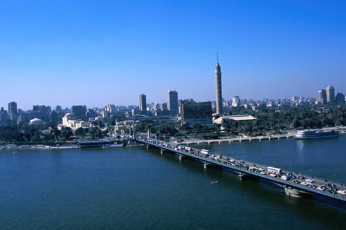
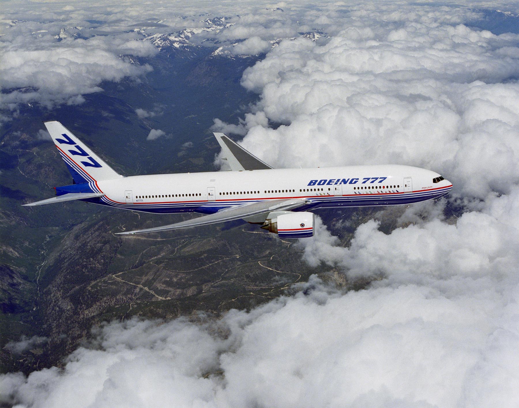
![[3]](https://commons.wikimedia.org/w/index.php?title=Commons:Featured_picture_candidates/_File:%C3%89corch%C3%A9_cavalier_Fragonard_Alfort_1.jpg&diff=next&oldid=48450641)
.jpg)
![[5]](https://en.wikipedia.org/wiki/File:FEMA_-_3744_-_Photograph_by_Andrea_Booher_taken_on_05-04-1999_in_Oklahoma.jpg)
![[6]](https://en.wikipedia.org/wiki/File:FEMA_-_3757_-_Photograph_by_Andrea_Booher_taken_on_05-04-1999_in_Oklahoma.jpg)
![[7]](https://en.wikipedia.org/wiki/File:FEMA_-_3819_-_Photograph_by_Andrea_Booher_taken_on_05-01-1999_in_Oklahoma.jpg)
- Reason
- The only image of the Island. It was quite difficult to shoot this from a small boat but I think it has turned out quite good. The person adds scale.
- Articles in which this image appears
- Changuu
- Creator
- Muhammad Mahdi Karim
- Support as nominator --Muhammad(talk) 10:38, 19 February 2011 (UTC)
- Comment The horizon is pretty tilted on the right hand side. You could just use the shear tool or something to fix it though I think (given that it is just beach). JJ Harrison (talk) 11:58, 19 February 2011 (UTC)
- I have uploaded an edited version over the current one. Ok? --Muhammad(talk) 13:11, 19 February 2011 (UTC)
- A bit, but the horizon is two different angles at each end. I think that this should pass in one form or another but the current version isn't quite right yet. JJ Harrison (talk) 09:02, 20 February 2011 (UTC)
- Made a couple of adjustments, fixed the sand and another stitching scar in the center of the sky. Followed your lead and uploaded over the original, feel free to revert Benjamint 11:17, 20 February 2011 (UTC)
- A bit, but the horizon is two different angles at each end. I think that this should pass in one form or another but the current version isn't quite right yet. JJ Harrison (talk) 09:02, 20 February 2011 (UTC)
- I have uploaded an edited version over the current one. Ok? --Muhammad(talk) 13:11, 19 February 2011 (UTC)
- Support Its good on the right, could do with perhaps a similar but smaller change on the left. Overall pretty good though, and the water shot gives a fresh perspective. JJ Harrison (talk) 20:59, 21 February 2011 (UTC)
- Support per nom. Spikebrennan (talk) 14:44, 22 February 2011 (UTC)
- Weak oppose. Every high resolution panorama doesn't need to pass! I find this photo uninspiring - no attempt to take a "good" photo, just trying to document this island. FPs have to be eye catching too. Aaadddaaammm (talk) 21:28, 22 February 2011 (UTC)
- If you don't mind me asking, how would you have made this more inspiring and good? --Muhammad(talk) 10:18, 23 February 2011 (UTC)
- Of course you can ask! How would I have made it better? I wouldn't have - I'm sure you're a much better photographer than me. How could you have made it better? I'm not sure, I think my main gripe is that you didn't try to interpret the island at all, just to take a high resolution photo of it. I feel it lacks soul. But I have no idea how to add soul to a photo. The one practical thing I can say is that maybe a higher angle would capture the island better (I know, not easy to erect a ladder on a boat). Sorry for this really shirty answer, I hope you can understand where I'm coming from. Aaadddaaammm (talk) 20:32, 24 February 2011 (UTC)
- It is difficult to sit and take pictures from a boat like this. Imagine what would have happened had I tried standing from a ladder ;-) --Muhammad(talk) 13:17, 25 February 2011 (UTC)
- Of course you can ask! How would I have made it better? I wouldn't have - I'm sure you're a much better photographer than me. How could you have made it better? I'm not sure, I think my main gripe is that you didn't try to interpret the island at all, just to take a high resolution photo of it. I feel it lacks soul. But I have no idea how to add soul to a photo. The one practical thing I can say is that maybe a higher angle would capture the island better (I know, not easy to erect a ladder on a boat). Sorry for this really shirty answer, I hope you can understand where I'm coming from. Aaadddaaammm (talk) 20:32, 24 February 2011 (UTC)
- If you don't mind me asking, how would you have made this more inspiring and good? --Muhammad(talk) 10:18, 23 February 2011 (UTC)
- Support I'm perplexed as to how you don't find this eye-catching, Adam. Personally, I'm packing my bags, based on this pic ;) Jujutacular talk 12:56, 23 February 2011 (UTC)
- Comment I've just noticed that there are banding problems in the sky... JJ Harrison (talk) 11:51, 24 February 2011 (UTC)
- Oppose. Not eye catching, per Aaadddaaammm, harshly lit, and cut off at the left. Lots of detail though. --Avenue (talk) 22:22, 27 February 2011 (UTC)
Not Promoted --Makeemlighter (talk) 22:52, 28 February 2011 (UTC)
edit
Voting period is over. Please don't add any new votes. Voting period ends on 28 Feb 2011 at 09:02:16 (UTC)

- Articles in which this image appears
- Jalmenus evagoras
- Creator
- Benjamint 09:02, 19 February 2011 (UTC)
- Support as nominator --Benjamint 09:02, 19 February 2011 (UTC)
- Support per nom :P. JJ Harrison (talk) 09:04, 20 February 2011 (UTC)

- Support Nice job. upstateNYer 20:47, 20 February 2011 (UTC)
- Support: nice. (But the small article was left over-illustrated by nominator (which I've now fixed).) Maedin\talk 01:12, 21 February 2011 (UTC)
Oppose It's out of focus! Or are my eyes playing tricks on me?Aaadddaaammm (talk) 21:29, 22 February 2011 (UTC)
- looks sharp to me, I definitely wouldn't use the term oof Benjamint 00:27, 23 February 2011 (UTC)
- OK, yea today it doesn't look too bad. Aaadddaaammm (talk) 20:26, 24 February 2011 (UTC)
- Weak oppose. Butterfly very nice, but the background seems a bit too cluttered for an FP. --Avenue (talk) 21:50, 27 February 2011 (UTC)
- Support It works for me. Jujutacular talk 07:13, 28 February 2011 (UTC)
- Support --Muhammad(talk) 13:55, 28 February 2011 (UTC)
Promoted File:Jalmenus-evagoras-ventral.jpg --Makeemlighter (talk) 22:54, 28 February 2011 (UTC)