Photo taken by me on December 30 in my hometown Český Těšín during the worst snowstorm in years (see). I don't think it's a great photo, but it is at least nice, so I've tried to nominate it. Note: At the time of taking this photo, it was still snow falling and I was frozen to bone and covered with solid amount of snow.
Nominate and support. - Darwinek 23:39, 18 January 2006 (UTC)[reply]
Oppose. Low quality at full size. Alr 00:15, 19 January 2006 (UTC)[reply]
Oppose. Nice, but not striking. Which article does it belong to? Zarniwoot 03:07, 19 January 2006 (UTC)[reply]
Oppose I feel bad opposing... but its just too low quality. This is a great vantage point and it should serve as an excellent oppurtunity for you.. next time it snows, take a tripod out there and try and get a really crisp picture. Maybe a higher resolution / higher megapixel effective camera would help as well. Low ISO, too.. given that's a possibility. drumguy8800 - speak? 06:46, 19 January 2006 (UTC)[reply]
Comment: I suggest reducing the size of the image. — 0918BRIAN • 2006-01-19 17:25
Oppose - low quality as above users. --Thorpe | talk 19:19, 20 January 2006 (UTC)[reply]
Support.It is in an article Český Těšín and represents the worst winter storm in 2 decades. I also suggest reduction in image size.--Dakota~ε 21:56, 20 January 2006 (UTC)[reply]
Oppose composition. The camera should aim a little higher and the fence thing on the right spoils it for me.--Dschwen 23:54, 20 January 2006 (UTC)[reply]
Neutral - I've uploaded a version edited to improve mentioned aesthetical problems. I don't think it is that useful for encyclopedia, but maybe you'll find it simply nice (as I do :-) Winter in the GIMP --Wikimol 11:32, 21 January 2006 (UTC)[reply]
Support the original. The second is nice too, though I object to the removing of the fence.--Lewk_of_Serthic 02:52, 26 January 2006 (UTC)[reply]
Oppose both. Just a snow scene... Also, removing the fence is taking too much liberty - that's not "technical" retouching anymore. --Janke | Talk 08:47, 26 January 2006 (UTC)[reply]
Oppose both. I think the two people in it spoil it. enochlau (talk) 09:05, 26 January 2006 (UTC)[reply]
Nominate and support. One of the best illustrations to an article I've seen - Gobeirne 18:35, 18 January 2006 (UTC)[reply]
Support. Just a few days ago I was just wondering how the filmtransport works. Thanks! :-) And a great illustration too. Sources available? --Dschwen 19:28, 18 January 2006 (UTC)[reply]
I obviously support the new version, just chuck the old one, who would want to keep it? --Dschwen 17:37, 30 January 2006 (UTC)[reply]
Support (the new version). Woderfully illustrative. I can overlook the small rendering flaws... I also added it to Intermittent movement, an article I've worked on. --Janke | Talk 21:18, 18 January 2006 (UTC)[reply]
Support That fuzz at the bottom of the green disk bothers me, but I think this image is quite informative and nicely done. ~MDD4696 22:22, 18 January 2006 (UTC)[reply]
Support. Very understandable. enochlau (talk) 23:21, 18 January 2006 (UTC)[reply]
Support. Clear illustration of mechanism, and fun to watch. BillC 00:06, 19 January 2006 (UTC)[reply]
Support. Crisp, clear, and just plain interesting. Alr 00:14, 19 January 2006 (UTC)[reply]
Thanks for the nomination, and the kind words of support. This was done in 3D Studio Max, and I still have all the files kicking around, I think; anyone wanting to play with them can drop me a PM. I'll also try to clear up the rendering errors if I get a chance. Thanks again! Mike1024 (t/c) 00:27, 19 January 2006 (UTC)[reply]
Mike1024.. added a wikilink to 3D Studio Max to your comment.. I'm assuming you contributed heavily to the creation of the page? It's well done. drumguy8800 - speak? 03:03, 19 January 2006 (UTC)[reply]
Support That's very clear.. I'm not sure but if there's an option to use anisotropic filtering on the 3D Studio Max program, maybe using that would clear up whatever people have a problem with..? I personally think it looks perfect the way it is. It's saved off as a gif and it's as clear as a Flash animation.. complaining is just being way too nitpicky. drumguy8800 - speak? 03:00, 19 January 2006 (UTC)[reply]
Support. My only objection to this picture is that part of the green dial (the part that grabs the red one) disappears for part of the rotation. -JPM 03:29, 19 January 2006 (UTC)[reply]
( + ) Support Mesmerizing --Fir0002 05:06, 19 January 2006 (UTC)[reply]
Support -- TomStar81 05:33, 19 January 2006 (UTC)[reply]
Support. I really like the addition of animation to wikipedia articles. It doesn't have to be particularly pretty to be functional. Would prefer rendering errors to be fixed but would definitely support it as-is too. Diliff | (Talk)(Contribs) 05:38, 19 January 2006 (UTC)[reply]
He he. Support. Very illustrative and strangely amusing as well (or is it just me?). Raven4x4x 06:04, 19 January 2006 (UTC)[reply]
I support the second version more. It fixes those little problems. Raven4x4x 07:26, 23 January 2006 (UTC)[reply]
Support- Makes me happy just watching.--Urthogie 10:28, 19 January 2006 (UTC)[reply]
Support but could it be just a little faster? Renata 13:52, 19 January 2006 (UTC)[reply]
Support Fun to watch. Please don't make it any faster - Adrian Pingstone 16:50, 19 January 2006 (UTC)[reply]
I agree, keep at this speed.--Urthogie 17:00, 19 January 2006 (UTC)[reply]
User:Vanderdecken/Support Mesmerising, very clear. Probably sound a little stupid of me, but I'd always wondered how they did that. Well now I know. Well done. —Vanderdecken∴∫ξφ 18:40, 19 January 2006 (UTC)[reply]
Comment Doesn't sound stupid at all. I always just assumed that the movement was continuous. ~MDD4696 02:41, 21 January 2006 (UTC)[reply]
Support Very clear and well illustrated.--Ali K 09:37, 20 January 2006 (UTC)[reply]
Support - no frame problems and a good illustration. --Thorpe | talk 19:20, 20 January 2006 (UTC)[reply]
Support Good illustration of the Geneva mechanism. deeptrivia (talk) 07:06, 21 January 2006 (UTC)[reply]
Support Wow, this is really a cool picture!! Nice 3D Animated Artwork indeed! --Davpronk 12:12, 21 January 2006 (UTC)[reply]
Support very good idea and nice performance Eteru 15:09, 21 January 2006 (UTC)[reply]
Comment I've just applied some of the changes suggested here and fixed the faults that were annoying me in the past... the new version is the lower of the two shown. Mike1024 (t/c) 17:29, 21 January 2006 (UTC)[reply]
Support --Briseis 19:42, 21 January 2006 (UTC)[reply]
support the new oneBrokenS 23:14, 23 January 2006 (UTC)[reply]
(+)SupportHalibutt 01:45, 26 January 2006 (UTC)[reply]
Support either one. Awesome! -- Chris 73 | Talk 15:27, 29 January 2006 (UTC)[reply]
Support very good explanation of the mechanism - can replace a lot of words --Mikeo 23:08, 29 January 2006 (UTC)[reply]
Support I know the support above is overwhelming, but I simply just had to log in just to add my support. Very, very nice! And Wikipedia needs more animations! I love them! I love, love, love them! --Dna-Dennistalk - contribs 16:06, 31 January 2006 (UTC)[reply]
Support second. Very interesting. Camerafiend 19:21, 31 January 2006 (UTC)[reply]
Support very nice made me read up on it immediatly Wolfmankurd 23:08, 27 May 2006 (UTC)[reply]
Promoted Image:Geneva mechanism 6spoke animation.gifRaven4x4x 05:41, 1 February 2006 (UTC)[reply]
Neutral - The tail is cut, plus three dead pixels in the upper part of the pic. — Pixel8 06:13, 18 January 2006 (UTC)[reply]
Three "dead pixels" removed. Unfortunately if I had included the tail, it would've been a giant blur. The quality of the actual lizard is high because I'm using a high F-Stop.. making the depth-of-field large enough to focus on a curving tail & the lizard would've resulted in an image of much lower quality. drumguy8800 - speak? 13:30, 18 January 2006 (UTC)[reply]
I'd consider supporting a version with the tail included, even if it is out of focus due to shallow DOF. Not the current version with the tail chopped off though. 84.9.223.82
Neutral very nearly FPC quality, but the upper back is blurred -- looks like he moved during the exposure. chowells 14:48, 18 January 2006 (UTC)[reply]
Close, but no cigar... (that actually means oppose ;-) I miss some tail, too. --Janke | Talk 21:30, 18 January 2006 (UTC)[reply]
Support Good sharpness. Very clear picture. Andrew18@ 23:20, 18 January 2006 (UTC)[reply]
Neutral. I want more tail too. enochlau (talk) 23:20, 18 January 2006 (UTC)[reply]
( + ) Support But I'd like one with the tail --Fir0002 05:07, 19 January 2006 (UTC)[reply]
Oppose - Appears to be a Green (Carolina) Anole, in a different family, not a Gecko at all. It is a nice picture, but falls short of exceptional in several aspects: lacking depth of field (too much of subject is unfocused), composition (the missing tail unbalances the shot), and the green spots on the white chin are a bit washed out. I judge the photo currently illustrating the Carolina Anole article to be a better FPC, as it is exceptional in high-res. BCool 04:50, 20 January 2006 (UTC)[reply]
Strongly Oppose. You are right, I removed this pic in the gecko article, where it was just recently inserted by the photographer, and put back the old (real) gecko image. As of now the nominated pic is not used in any article. I did not add it to the Carolina Anole article since it already resembles a gallery. Hence oppose.--Dschwen 09:23, 20 January 2006 (UTC)[reply]
Thanks for the correction, but I really don't see reasoning *not* to put it in the Carolina Anole article. It's still large and illustrative, and even if there are minor flaws to get all pissy about in an FPC debate, it's still a nice image. Putting it in the gallery. drumguy8800 - speak? 14:16, 20 January 2006 (UTC)[reply]
All pissy? Anyway, at least it's in the correct article now. But this somehow shows a bigger problem with FPC. I've just seen it too often recently that people upload a new picture, slam it into whatever article it might fit, and nomitate it for FPC. The quality of nominations would benefit if those pictures would spend a little time in the articles and get a chance to be peer reviewed by article contributors. Whats the big deal about Featured Picture status anyway that some people want to bag FPs by the dozen? The focus should lie on illustrating the articles with the best pictures possible. --Dschwen 16:10, 20 January 2006 (UTC)[reply]
I absolutely agree with Dschwen above. FPC is not a photo competition. --Janke | Talk 07:46, 24 January 2006 (UTC)[reply]
Oppose. The in-focus leaves in the foreground on the right are distracting. deeptrivia (talk) 15:19, 21 January 2006 (UTC)[reply]
Support Great image! Lejean2000 10:31, 28 January 2006 (UTC)[reply]
Ineligible for FP status as others have mentioned (it is not in an article). Try submitting it to commons. BrokenSegue 00:05, 31 January 2006 (UTC)[reply]
Support if it's in an article, also the the forground leaves should be bluredWolfmankurd 23:06, 27 May 2006 (UTC)[reply]
Not promoted Raven4x4x 05:38, 1 February 2006 (UTC)[reply]
From commons and used in Charlotte Corday and Jean-Paul Marat, this painting by Paul Jacques Aimé Baudry depicts wonderfully the event of Marat's death. The story is intriguing and the painting is beautiful. Wikipedia is lucky to have such a piece of art.
Nominate and support. - LV(Dark Mark) 19:29, 19 January 2006 (UTC)[reply]
We should as well upload (it might be already done) and nominate "Marat Assassiné" by David. Ericd 02:40, 21 January 2006 (UTC)[reply]
Support Love the pic and I agree it's a happy thing we have it. But do we know whether the artist knew what they looked like in real life (i.e. worked from a contemporary picture or description), or made an effort to get the details of the room right, etc? To be an encyclopaedic contribution to Charlotte Corday and Jean-Paul Marat, I think the description should specify the details were right. ~ Veledan • Talk 19:35, 21 January 2006 (UTC)[reply]
Well, I don't know a ton about the painting itself, so I can't be positive. My guess is Marat is probably accurate (judging by the other paintings of him... close enough to be correct), but don't really know about Corday herself, or the details of the room. I would say "poetic license" may have taken, but like I said before, am unsure. I think the story depicted is more important than getting every detail absolutely correct. If there were on article based solely on the Death of Jean-Paul Marat, this would illustrate it perfectly, and since that is all Corday is really notable for, this painting depicts her wonderfully (IMO). --LV(Dark Mark) 23:28, 21 January 2006 (UTC)[reply]
I read the article you linked and it implies that amongst all the paintings of this scene, this one is the odd one out in being sympathetic to Corday! Even so, I suppose it's every bit as encyclopaedic as an artist's impression of space or a deep sea scene and I don't think I'd hesitate to support one of them that repaid inspection like this painting. ~ Veledan • Talk 23:54, 25 January 2006 (UTC)[reply]
Neutral Well its a good scan or something, but wouldn't this really be more of a comment on the actual artwork..? The only thing positive I can say about the scan is that its clear and fairly high-res. I do have a major problem with the fact that it might be violating copyright laws to exist here in such high-res form. Nevermind that, I see from the page that the death of the artist has placed it in the public domain. I'm so used to commenting on a picture for its merits as a work of art that its difficult for me to support an image that *wasnt* created by a user and whose only purpose is to convey *another piece of art*. Thus, I cannot support, but remain neutral... drumguy8800 - speak? 04:09, 22 January 2006 (UTC)[reply]
Support sorry, I now see that it is portraying an actual event and its purpose is not only to show a piece of art. I support, then. drumguy8800 - speak? 04:13, 22 January 2006 (UTC)[reply]
Argh!!! Sorry about that. I had tried to type in and tell you that it was Public Domain, but got an edit conflict. Then I had tried to type in to tell you it was portraying the murder of Marat, and IIRC, murder is not generally considered an artform, but got an edit conflict. Hopefully this goes through. I'm a slow typist, I guess. --LV(Dark Mark) 04:15, 22 January 2006 (UTC)[reply]
Addendum... you may also want to read this website (or perhaps just starting with the paragrapgh that reads, "While Antoinette’s iconography during the Revolution..."). It gives a little more depth to the story of Corday and her portrayal in paintings. Happy reading. --LV(Dark Mark) 04:30, 22 January 2006 (UTC)[reply]
Support - Bit on the small side, though. KILO-LIMA 21:02, 23 January 2006 (UTC)[reply]
Oppose - It's just a painting, albeit a nice one. We might as well start nominating all the great pictures by the great masters, beginning with the Mona Lisa, if this gets to be FP. --Surgeonsmate 05:17, 24 January 2006 (UTC)[reply]
There is a difference. This painting represents an actual, important and notable event, and that in this instance a painting is the best representation there can be. ~ Veledan • Talk 08:56, 24 January 2006 (UTC)[reply]
Oppose. Picture of a picture. I'm not convinced this picture adds much to the subject, since it's the second picture of the same scene in the Marat article. Mark1 11:00, 25 January 2006 (UTC)[reply]
Despite its artistic merits, the David painting has less encyclopedic value, lacking Corday and the 18th-C map of France that gives the nominated picture its historical context. You're not suggesting that the existence of an inferior picture is a reason to oppose? ~ Veledan • Talk 15:35, 29 January 2006 (UTC)[reply]
Cumulus clouds panorama. Taken in Swifts Creek, Victoria
Lovely countryside, nice panorama and great cumulus clouds.
Support Self Nom. --Fir0002 05:00, 19 January 2006 (UTC)[reply]
Support You live in a very lovely area. On the picture page though, you're apparently using the Featured Picture Template, not the Featured Picture candidate one ({{FPC}}). drumguy8800 - speak? 06:38, 19 January 2006 (UTC)[reply]
This is because the image is not on Wikipedia, but on Wikimedia Commons, and it is already a featured picture there. Glaurung 07:13, 19 January 2006 (UTC)[reply]
Support. - Mgm|(talk) 09:22, 19 January 2006 (UTC)[reply]
Support cus its prettyful.--Urthogie 10:30, 19 January 2006 (UTC)[reply]
Support beautiful and illustrating. Caption in the article might need an overhaul. Are all clouds in the pic cumulus? --Dschwen 13:49, 19 January 2006 (UTC)[reply]
To me it seems so, cumuli from humilis to congestus. Which do you suspect is not cumulus? --Wikimol 12:27, 20 January 2006 (UTC)[reply]
Oppose boring, too little landscape. chowells 15:26, 19 January 2006 (UTC)[reply]
The photo is illustrating the clouds, not the landscape. Raven4x4x 23:42, 19 January 2006 (UTC)[reply]
I know. chowells 19:15, 21 January 2006 (UTC)[reply]
Then I have difficulty seeing how your objection can be considered serious. -
I find the photo boring and not particularly striking. That is my objection, as stated in the first comment. chowells 22:21, 26 January 2006 (UTC)[reply]
But the landscape it does show is quite beautiful--Lewk_of_Serthic 02:49, 26 January 2006 (UTC)[reply]
New version of the first chapter of Genesis, or B'reshit, written on an egg, in the Jerusalem museum.Cropped to just show subject
Self-nom; I took the picture last summer in Jerusalem. It's used in the Genesis and B'reishit articles; this is the cropped version; there's also a larger one.
Nominate and support. - СПУТНИКСССР 02:36, 19 January 2006 (UTC)[reply]
So special is what we're calling weird now? ;-) Sadly the picture is a little on the small side (especially the subject in the center). Can you comment on the colors? Bad whitebalance or was it really orange-yellow?--Dschwen 07:52, 19 January 2006 (UTC)[reply]
What's the encyclopedic value of this image, apart from looking pretty? enochlau (talk) 03:40, 19 January 2006 (UTC)[reply]
Oppose. I don't agree with the yellow. enochlau (talk) 09:07, 26 January 2006 (UTC)[reply]
( + ) Support Nice --Fir0002 05:06, 19 January 2006 (UTC)[reply]
Oppose That isn't clear, at all, and the background is grainy. The background could be completely blurred using Photoshop and it wouldn't diminish the quality of the egg... drumguy8800 - speak? 06:39, 19 January 2006 (UTC)[reply]
Oppose (both) Not stunning or captivating, and doesn't do much for the article, either. If it was a electron microscope shot of Gen:1 engraved on a pinhead, well, maybe then... ;-) --Janke | Talk 08:30, 19 January 2006 (UTC)[reply]
Oppose, artefacts in background in both thumbnail and hi-res version. - Mgm|(talk) 09:26, 19 January 2006 (UTC)[reply]
Oppose Egg is much too small in its frame, odd colours - Adrian Pingstone 14:59, 19 January 2006 (UTC)'[reply]
Support. Striking enough to get people to read an article. — 0918BRIAN • 2006-01-19 17:23
Oppose The egg looks as if it is tilted to one side. --Ali K 11:04, 20 January 2006 (UTC)[reply]
I laid a grid over it and it doesn't appear to be tilted. Maybe an optical illusion? — 0918BRIAN • 2006-01-20 19:35
Oppose - nothing too special to show and what a horrible backdrop. --Thorpe | talk 19:18, 20 January 2006 (UTC)[reply]
Comment: I've uploaded a new version that I think addresses some of the concerns here (background problems, graininess, coloring/contrast changes as well). Compare old and new (make sure to CTRL+F5 on the new version to refresh). — 0918BRIAN • 2006-01-20 19:35
New version still does not address the question of color temperature. And the egg still has a low pixel count.--Dschwen 23:52, 20 January 2006 (UTC)[reply]
Support Maybe I just played too much with ray tacers, but I like it, including the colors. I don't know much about the subject, but I guess the composition with the small egg somehow supports it. Zarniwoot 02:19, 22 January 2006 (UTC)[reply]
Support. Great picture, I guess a little lacking on the encylcopedic value, though. Dylan 04:58, 22 January 2006 (UTC)[reply]
Oppose - I'm just not wowed.--Deglr6328 10:28, 22 January 2006 (UTC)[reply]
Strongly Oppose The entire picture is basically the background. I uploaded a cropped version to illustrate my point here. If it is cropped to just show the subject, then it is too small for FP. Also, the text looks grainy, and it blends in with the background. --liquidGhoul 13:01, 23 January 2006 (UTC)[reply]
Last time I checked, we had some featured pictures this size, and smaller. — 0918BRIAN • 2006-01-23 22:46
They were generally when the standards were lower, or you had to restrict image size because of server limitations. I have not seen one this size get through since I have been here. --liquidGhoul 03:36, 24 January 2006 (UTC)[reply]
Please keep the background. Otherwise it's just a boring egg. Zarniwoot 06:25, 24 January 2006 (UTC)[reply]
Exactly, why are you supporting a background? --liquidGhoul 07:03, 24 January 2006 (UTC)[reply]
What do you have against backgrounds? :-) I think it add some kind of peace to the picture. The motive looks isolated and small, which I think is the point, but also somehow more important. If the picture was in the Writing very small letters on eggs article, i would prefer your edit. Zarniwoot 12:12, 24 January 2006 (UTC)[reply]
So all we have to do to a small picture, is to add an overly large background, and it will get featured? --liquidGhoul 12:39, 24 January 2006 (UTC)[reply]
That was not what I said. I usually prefer when all unnecessary objects are croppet out, but every picture should be considered individually. Maybe we can just agree that we disagree on this one? Zarniwoot 15:05, 24 January 2006 (UTC)[reply]
Oppose. Agree with liquidGhoul. --Dschwen 13:10, 23 January 2006 (UTC)[reply]
Support. Looks nice. Palm_Dogg 07:45, 24 January 2006 (UTC)[reply]
Oppose. Not such a great image. Also, at least as importannt, it does not add significantly to the article. Junes 13:19, 31 January 2006 (UTC)[reply]
Neutral I like the picture, but I'm not sure it adds to much to the Genesis article. Perhaps if it were under some form of art, it would be stronger.
Slab of turquoise in matrix showing a large variety of different colouration
Self-nomination: I think that having a picture of a single piece of turquoise that shows such a great variation in color is valuable to the turquoise article. This shows every color that turquoise can be, all in one specimen.
OpposeNot very striking. It is also a bit small according to current FP standards. Very good for the article, though. --Janke | Talk 10:17, 28 January 2006 (UTC)[reply]
Neutral, for large version. --Janke | Talk 16:32, 31 January 2006 (UTC)[reply]
Question. Would having it bigger be better? I artifically lowered the rez and made it smaller. I could upload a larger version. --Dante Alighieri | Talk 17:49, 28 January 2006 (UTC)[reply]
People like to be able to blow it up real big and look at the small details. Please do upload the larger version on top of this one, we have lots of hard diskspace for good pictures. I can't really tell if I like the picture or not. Making it bigger could sway my vote. BrokenS 18:47, 28 January 2006 (UTC)[reply]
I have the full-rez one on my other computer. I'll upload it on Monday morning (California time). --Dante Alighieri | Talk 09:32, 29 January 2006 (UTC)[reply]
Oppose. Even with a higher res photo, I'm not convinced it has a wow factor. enochlau (talk) 14:18, 29 January 2006 (UTC)[reply]
Oppose An OK pic but not interesting or striking enough for Featured - Adrian Pingstone 22:04, 29 January 2006 (UTC)[reply]
Comment. OK, the new image is up. 1144x2076 instead of 565x1024... that's over FOUR TIMES as big. :) As for the naysayers who say that it's not interesting enough or doesn't have the "wow" factor... I humbly submit that Featured Pictures are also those which illustrate the subject well, and need not necessarily be "wow" inducing. Personally, I think all those colors of turquoise in one slab IS wow-inducing, but I'm a rock and gem nut. ;) --Dante Alighieri | Talk 18:34, 30 January 2006 (UTC)[reply]
Weak support I like it. BrokenSegue 00:00, 31 January 2006 (UTC)[reply]
Oppose boring. and I LIKE rocks. Pschemp | Talk 07:10, 2 February 2006 (UTC)[reply]
I think this is a very mouthwatering picture, and is an excellent photograph of a pancake.
It is in the Pancake article, and it was created by Joshua.
Nominate and support. - YB 20:01, 20 January 2006 (UTC)[reply]
Oppose the focus is too much on the strawberry. The Pancace is cut and degraded to a background. Also the top rim of the frame is a bit distracting. Apart from that, I love pancace. Maybe add a strip of bacon... --Dschwen 20:25, 20 January 2006 (UTC)[reply]
Oppose Not an interesting picture, I can't see much of the pancake, and out of focus - Adrian Pingstone 22:24, 20 January 2006 (UTC)[reply]
Oppose. Lighting on the strawberry not good enough for fp. But I do want pancake now! Zarniwoot 23:47, 20 January 2006 (UTC)[reply]
What's wrong with it? Are you sure your screen his the proper contrast? - Mgm|(talk) 10:37, 23 January 2006 (UTC)[reply]
Yes, its fine. There is a strong blue color in the reflections. I guess the lighting is a mixture of outdoor and indoor light. This photo could properly be better made in a tabletop macro studio where lighting can be controlled. Zarniwoot 13:21, 24 January 2006 (UTC)[reply]
Oppose - lighting (blue reflections all around), colours, distracting objects along the top, the subject is the strawbery not the pancake. --84.242.95.3 00:34, 21 January 2006 (UTC)[reply]
Oppose The cream blends in with the plate, it is mouthwatering though!--Ali K 04:24, 21 January 2006 (UTC)[reply]
Oppose. Agree with above. Alr 02:31, 22 January 2006 (UTC)[reply]
Support. Photographer to photographer, this picture is very hard to do as getting that close up & still being able to retain definition is quite difficult. I see nothing wrong with the picture except that the plate in the background looks out of sorts & that the blue reflections are detremental. Spawn Man 03:05, 22 January 2006 (UTC)[reply]
If you have a super-macro lens, you can get this close and retain real defintion example. drumguy8800 - speak? 04:04, 22 January 2006 (UTC)[reply]
Oppose Not really out of focus, but the ISO appears to have been far too high and the detail level is far too low. beyond that, it has a poor composition, and the reflections on the strawberry are annoying. drumguy8800 - speak? 04:04, 22 January 2006 (UTC)[reply]
Oppose. Looked okay as a thumbnail, but really pretty unattractive up close. Dylan 04:55, 22 January 2006 (UTC)[reply]
Support, interesting composition and I see nothing wrong with the hi-res version. - Mgm|(talk) 10:37, 23 January 2006 (UTC)[reply]
User:Vanderdecken/Oppose Not very appealing at all, I'm afraid. Doesn't look appetising, and what does it illustrate? Half a strawberry looking sorry for itself? —Vanderdecken∴∫ξφ 10:47, 23 January 2006 (UTC)[reply]
Oppose Although I love pancakes and it is a nice picture, the butter and plate blend into each other too much--Lewk_of_Serthic 02:46, 26 January 2006 (UTC)[reply]
Oppose. I think having the entire plate in the picture would have looked better. enochlau (talk) 09:13, 26 January 2006 (UTC)[reply]
Oppose strawberry is too dominant for a picture to explain a pancake - as it is cut in half, it wouldn't serve the strawberry article very well either --84.134.6.58 23:02, 29 January 2006 (UTC)[reply]
Oppose Agree with Vanderdecken Eyesclosed 17:29, 31 January 2006 (UTC)[reply]
Oppose I agree with Vanderdecken that "the strawberry is too dominant". The caption would be more accurate if it said "Strawberries on pancakes," but even then I'm distracted by the odd tinge of the strawberry's color.--Jonthecheet 01:59, 2 February 2006 (UTC)[reply]
Not promoted Raven4x4x 07:19, 3 February 2006 (UTC)[reply]
Beautiful image taken which shows landmarks and roads of Moscow. It was created by Wikimedia Commons user, Azov.
Nominate and support. - Thorpe | talk 19:07, 20 January 2006 (UTC)[reply]
Support. I agree. Zarniwoot 23:38, 20 January 2006 (UTC)[reply]
Support but please clarify the pictures description. What are the church bridge and highrise in the skyline? Would make it much more informative! --Dschwen 23:49, 20 January 2006 (UTC)[reply]
Support Like this one better than the previous "Kremlin sky"... --Janke | Talk 08:45, 21 January 2006 (UTC)[reply]
Oppose. Interesting, but too dark for my liking.... Spawn Man 03:08, 22 January 2006 (UTC)[reply]
Support. The darkness adds an important mood to it. Dylan 04:56, 22 January 2006 (UTC)[reply]
Oppose - Main subject underexposed and upper right sky utterly blown.--Deglr6328 10:26, 22 January 2006 (UTC)[reply]
Support - very grand and encompasing. Almost makes me fell like I'm their. JQF 20:40, 24 January 2006 (UTC)[reply]
(+)SupportHalibutt 01:45, 26 January 2006 (UTC)[reply]
Oppose. As noted above, the sky on the upper-right is washed out. enochlau (talk) 09:12, 26 January 2006 (UTC)[reply]
( − ) Oppose Much prefer the previous kremlin photo --Fir0002 22:00, 26 January 2006 (UTC)[reply]
Oppose under exposed. chowells 22:22, 26 January 2006 (UTC)[reply]
Support Great picture with lots of content. I love the mix in skyline with the great sky behind it. --Lewk_of_Serthic 03:35, 29 January 2006 (UTC)[reply]
Oppose - too dark -.- Chris 73 | Talk 15:25, 29 January 2006 (UTC)[reply]
Oppose - agree with Chris 73 - it's too dark, the late/early daytime did not really help this time --Mikeo 20:03, 29 January 2006 (UTC)[reply]
Support - A nice addition to the article, shows the landmarks in reltion to each other. Eyesclosed 17:31, 31 January 2006 (UTC)[reply]
Oppose. I'm not convinced that this is the best representation of the Moscow skyline. --Dante Alighieri | Talk 18:24, 2 February 2006 (UTC)[reply]
Not promoted Raven4x4x 07:19, 3 February 2006 (UTC)[reply]
If you were born before 1982, this image needs no explanation. It is a high-quality (albeit a bit dark and a little fuzzy) picture taken shortly after the Space Shuttle Challenger disintegrated during lift-off. I couldn't believe this image wasn't listed at Category:Memorable photographs, or anywhere on Wikipedia or Commons, so I uploaded it from the ironically-named Great Images in NASA page.
Nominate and support. - Palm_Dogg 08:52, 20 January 2006 (UTC)[reply]
Support. Very memorable and shocking. Perfect to illustrate the articles on the shuttle. - Mgm|(talk) 11:42, 20 January 2006 (UTC)[reply]
SupportWikimol 12:45, 20 January 2006 (UTC)[reply]
Support. Definately memorable. Alr 16:24, 20 January 2006 (UTC)[reply]
Support Very important - cohesion★talk 09:17, 23 January 2006 (UTC)[reply]
Oppose - I know this image is important and was widely published. I can't support it even so. We are looking at people dying in this image. No matter how widely seen, it remains too private a moment for me too look at without feeling as if I am intruding in an umcomfortably lurid manner. --Deglr6328 17:55, 24 January 2006 (UTC)[reply]
Ask yourself, "Is that a valid reason to oppose an FPC?" "Comfort factor" is not a concern. —Cuiviénen(Cuivië) 22:48, 31 January 2006 (UTC)[reply]
I'm not sure what you want me to do. Could you perhaps phrase your request in a more condescending and excessively simplistic manner? thanks.--Deglr6328 09:16, 1 February 2006 (UTC)[reply]
Support - "Lest we forget" is the apropriate quote here, is it not? JQF 20:42, 24 January 2006 (UTC)[reply]
Support. It does capture the event very well, despite the grim circumstances. enochlau (talk) 09:11, 26 January 2006 (UTC)[reply]
( + ) Support Amazing that this photo was taken --Fir0002 22:00, 26 January 2006 (UTC)[reply]
Say again? NASA photograph everything, for documentation and technical research. --Janke | Talk 08:01, 27 January 2006 (UTC)[reply]
My original photo was going to be Neil Armstrong's stool before he landed on the Moon. :) Palm_Dogg 15:27, 27 January 2006 (UTC)[reply]
It was taken with a motion picture camera. NASA used several motion picture cameras to image launches. The Public Affairs Officers then go in an grab the *best* frames. That other famous image of Challenger's launch with the birds in the foreground was taken the same way. 216.134.171.20 06:13, 29 January 2006 (UTC)[reply]
Support It would fit nicely considering the anniversary is coming up --ThrashedParanoid 03:40, 28 January 2006 (UTC)[reply]
Support -- significant, memorable picture, adds substantially to the article -- Gurch 15:42, 28 January 2006 (UTC)[reply]
Support -- Very historically significant. Vernon 01:11, 29 January 2006 (UTC)[reply]
Opposte -- If we didn't know what was happening then the image wouldn't mean very much... This is probably true with some of the featured portraits but I don't think this image is very good... despite the importance of the event. grenグレン? 08:15, 29 January 2006 (UTC)[reply]
Support A great picture, shows what Wikipedia is capable of. Anchorage 12:04, 29 January 2006 (UTC)[reply]
Support. Very significant. Staxringold 13:54, 30 January 2006 (UTC)[reply]
Support. Agree with everybody on that :) Eyesclosed 17:32, 31 January 2006 (UTC)[reply]
Strongly Support Grenavitar has a point about how by itself (no caption), the picture would not mean as much. Still I believe that the placement of the picture (next to the "No explosion" section of the article)improved the article significantly. It gave a visual to the explaination of the incident instead of leaving it up to the imagination.--Jonthecheet 02:23, 2 February 2006 (UTC)[reply]
Comment. I saw this happen live... on TV, sure... but NO caption is necessary. For the rest of my life I'll instantly know what that image is without being told. --Dante Alighieri | Talk 18:21, 2 February 2006 (UTC)[reply]
I was born a bit less than a decade after the incident and initially thought it was some picture about fire or smoke. The caption, to me, brought more significance to the picture. I think it would be analogous to a caption for the image of Saddam Hussein's statue being pulled down in Baghdad; future generations will not understand why the statue is taken down, but the caption could understand why the statue is being taken down. I think that is the purpose of captions.--Jonthecheet 04:33, 3 February 2006 (UTC)[reply]
Promoted Image:Challenger explosion.jpgRaven4x4x 07:22, 3 February 2006 (UTC)[reply]
A panorama photo of the castle Blankenhain and its pond (near Crimmitschau, Germany). It has been stiched together using two single images.
Sheer beauty, great resolution and sharpness. Appears in the Crimmitschau article and is featured on the Wikimedia Commons. License is Creative Commons Attribution ShareAlike 2.5.
Support, but what's up with all the castle pics? -JPM 22:25, 21 January 2006 (UTC)[reply]
Comment beautiful picture of a not to thrilling subject. Would have preferred the viewpoint to be set a little to the left to avoid the rubble on the right. --Dschwen 22:31, 21 January 2006 (UTC)[reply]
Support. I like it. Alr 02:30, 22 January 2006 (UTC)[reply]
Support, even though we're having a flood of panoramas and castles righrt now... --Janke | Talk 08:32, 22 January 2006 (UTC)[reply]
Support It may be yet another castle but i like this one.--Ali K 07:48, 23 January 2006 (UTC)[reply]
Support - very crisp, clear and bright. JQF 20:37, 24 January 2006 (UTC)[reply]
Strong oppose. Another bland and boring photo. Some square buildings, some flat water, some faded trees, and a muted sky. Yes, it's clear and crisp and bright and technically perfect. But a featured picture should be stunning, and the only thing stunning about this image is its mediocrity. Zafiroblue05 07:05, 25 January 2006 (UTC)[reply]
Comment: "Some square buildings, some flat water, some faded trees, and a muted sky". That's exotic for me! deeptrivia (talk) 01:28, 30 January 2006 (UTC)[reply]
Exactly! There's no need for a featured picture to be exotic - that is, by the very nature of the word, inconsistent. What's exotic to some people is trivial to others, and vice versa. A FP shouldn't necessarily be exotic, but it should necessarily be striking. And this picture is anything but, particularly in relation to the general norm of nominated pictures. Zafiroblue05 23:38, 1 February 2006 (UTC)[reply]
(+)Support - we're not voting for "interesting" pics here. What we need are "informative" pics, and this one tells pretty everything about the castle. Halibutt 01:42, 26 January 2006 (UTC)[reply]
Thurston Lava Tube, Hawai'i Volcanoes National Park, Island of Hawai'i, USA
Interesting colors and textures, excellent depth, and shows dripstone well on lower right wall. It has good resolution considering that it is illuminated only by the lights installed in the tube. This lighting contributes to the quality of the image, in my view. It appears in the article Lava tube. Michael Oswald created the image. License is Commons PD-self.
Can you get a higher res version? This one is too small to have a chance of being an FP. Also, I appreciate that lighting may have been a challenge but I have to say I don't think there's much to distinguish this visually from any old cave pic, and I've seen far more beautiful cave pics. Is there no perspective a lava tube coud be photographed from that would bring its more singular qualities to the fore? I think the close-up you uploaded tells me more about lava tubes but that isn't FP quality either ~ Veledan • Talk 20:26, 22 January 2006 (UTC)[reply]
now, Hi-Res (2272x1704) version is available, I think the perspective is OK, as it is also showing that lava has once been flowing in that tube. I had to use ISO 400, so a slight noise can be seen. --Mikeo 20:33, 29 January 2006 (UTC)[reply]
Support Thanks, the higher res version addresses both my concerns. ~ Veledan • Talk 17:49, 30 January 2006 (UTC)[reply]
Oppose for now. 568x426 is not FP-ready. Interesting subject though. --Dschwen 21:00, 22 January 2006 (UTC)[reply]
New version hardly shows any additional detail. I fail to see what sets this tube apart from any other ordinary tunnel/cave. --Dschwen 21:30, 29 January 2006 (UTC)[reply]
Oppose- If there was a higher resolution then i would change my vote. --ZeWrestlerTalk 21:04, 22 January 2006 (UTC)[reply]
Support I see no rules that say there's any particular size requirements. The image is informative, interesting and probably hard to get (you know, lava and all that). - Mgm|(talk) 10:39, 23 January 2006 (UTC)[reply]
Please check Wikipedia:What_is_a_featured_picture point 5. Sadly the wording leaves room for interpretation, but if you look at previous nominations you'll find a good consensus that anything <800px will be kicked out.--Dschwen 10:49, 23 January 2006 (UTC)[reply]
Thanks for tracking down that link for me. Still think you're being too strict, though. BTW, did I miss that link, or isn't it in the lead of FPC anymore? - Mgm|(talk) 10:04, 24 January 2006 (UTC)[reply]
Support - I like it, even although I am still going to support, I feel it's on the small size. KILO-LIMA 21:00, 23 January 2006 (UTC)[reply]
Oppose Will support larger version if available. ~MDD4696 23:29, 23 January 2006 (UTC)[reply]
Support ~MDD4696 05:51, 4 February 2006 (UTC)[reply]
Oppose. Would reconsider if resolution is boosted. --Neutralitytalk 03:11, 24 January 2006 (UTC)[reply]
Oppose Too small, and needs a person to give scale - Adrian Pingstone 16:00, 24 January 2006 (UTC)[reply]
Oppose - Postage stamp.--Deglr6328 17:39, 24 January 2006 (UTC)[reply]
SupportSmall but very nice. --Lewk_of_Serthic 02:42, 26 January 2006 (UTC)[reply]
Oppose. Too small to see details. enochlau (talk) 09:17, 26 January 2006 (UTC)[reply]
Neutral now that there is a higher res version. I understand that it must have been hard to take, but unfortunately hard-to-takeness is not a criterion for FP. It's still somewhat unclear to see details, which are important in encyclopedia images, but it's better than what was there before. enochlau (talk) 23:35, 29 January 2006 (UTC)[reply]
Oppose. Too small... I'd give this one an unconditional support though, if a higher res image showed up. --Dante Alighieri | Talk 09:27, 28 January 2006 (UTC)[reply]
Support. I'm not thrilled about the noise at this rez, but the larger image is still nice. Probably darn near impossible to do better under the conditions. --Dante Alighieri | Talk 07:35, 30 January 2006 (UTC)[reply]
You should be able to get a sharp picture with a tripod and manual focus, noise could be reduced as well with a longer exposure time. A G3 can do better. --Dschwen 10:32, 30 January 2006 (UTC)[reply]
Support just uploaded 2272x1704 version, I also like it, photographing conditions were quite hard --Mikeo 10:27, 29 January 2006 (UTC)[reply]
One reason that I nominated this image is that it is very much superior to my attempts to photograph this and similar subjects. I would like to see my fellow editors take into account the limitations imposed by the subject, e.g., low light level, a very dark, low-contrast subject with restricted viewpoints in this case. Even so, I would not have nominated it if I did not think it was a striking and informative image on its own merits. For example, the step mark on the right wall indicates the depth at which the lava flowed for a period of time. Regarding scale (brought up by another editor), the light diffusers on the left wall provide a good indication. Walter Siegmund(talk) 22:43, 29 January 2006 (UTC)[reply]
Support - I like it -- Chris 73 | Talk 15:23, 29 January 2006 (UTC)[reply]
Support I can only imagine the difficulty raised in the photographic attempts within cave like environments...every image I ever took appeared to be simply black holes, so this one is absolutely excellent in comparison--MONGO 17:32, 30 January 2006 (UTC)[reply]
Support Very informative AND nice looking Eyesclosed 17:27, 31 January 2006 (UTC)[reply]
Support per Chris 73 and MONGO--Jonthecheet 02:15, 2 February 2006 (UTC)[reply]
Support I like it. Its cool in a hot lava tube way. Pschemp | Talk 07:16, 2 February 2006 (UTC)[reply]
Support Resolution problem fixed. I approve. --ZeWrestlerTalk 17:14, 4 February 2006 (UTC)[reply]
Promoted Image:Thurston Lava Tube.jpgRaven4x4x 05:33, 5 February 2006 (UTC)[reply]
An adult queen conch shell; a gift to me several years ago.
Self nom. - BRIAN0918 20:40, 23 January 2006 (UTC)[reply]
Support - I like it, I also have one of these in my bathroom if anyone is interested(!) KILO-LIMA 20:57, 23 January 2006 (UTC)[reply]
Oppose.Weak oppose. Not striking. Alr 21:13, 23 January 2006 (UTC)[reply]
I've attempted a newer version. Compare: old and new. — 0918BRIAN • 2006-01-23 22:06
The second version is definately better than the first, but it just doesn't catch my eye. Alr 23:50, 23 January 2006 (UTC)[reply]
Fair enough. Thanks for motivating me to work on it though :) — 0918BRIAN • 2006-01-23 23:58
Oppose I don't like the texture in the backgrund. It is a cool shell. Zarniwoot 12:55, 24 January 2006 (UTC)[reply]
Oppose Mediocre focus, no way of gauging its size, not interesting. Sorry! - Adrian Pingstone 15:56, 24 January 2006 (UTC)[reply]
Oppose, agree with Adrian, DOF is a bit low, and the shell lacks context.--Dschwen 23:19, 24 January 2006 (UTC)[reply]
Oppose. The background doesn't complement or give context to the subject of the photo. enochlau (talk) 09:31, 26 January 2006 (UTC)[reply]
Oppose Nice shell, but I think it should be in its natural habitat, as many animal featured pictures are. Anchorage 12:15, 29 January 2006 (UTC)[reply]
Probably won't be used in articles about the animal? Samsaracontribtalk 23:13, 5 February 2006 (UTC)[reply]
Comment: It's a very interesting item, central to many traditional and modern tropical island and beach cultures and economies. Also a status symbol in historic (e.g. Victorian) and contemporary Western cultures. Maybe put one on top of some bathroom item, e.g. sink/toilet if a photogenic one is at hand. I suppose that would be its "natural habitat" and resolve the size concerns. - Samsaracontribtalk 23:13, 5 February 2006 (UTC)[reply]
Not promoted Raven4x4x 03:19, 6 February 2006 (UTC)[reply]
This is just the kind of picture I was looking for--thanks! —Preceding unsigned comment added by Rhymetime (talk • contribs) 13:31, 19 October 2007 (UTC)[reply]
Very Nice collage, useful in article Perfume. Visually pleasing;
Created by User:Palladian
Nominate and support. - cohesion★talk 09:08, 23 January 2006 (UTC)[reply]
Comment. Nice collection, but each individual bottle is rather small. Is the CC license appropriate? With all the protected designs, trademarks and logos, shouldn't the pic be fair use? — Preceding unsigned comment added by Dschwen (talk • contribs)
Hmm, I don't know how that would work, I believe the individual images were taken by the uploader, so is that still fair use, or can they license their own work? - cohesion★talk 09:27, 23 January 2006 (UTC)[reply]
Oppose, remove nomination. License surely is not free. The Bottles and trademarks are the main focus of this picture. To be even eligible for FP status this pic must be licensed freely, meaning allowing derivative work and commercial use. I'm fairly sure the perfume maker will strongly oppose to this. Thus the pic is a legal liability. --Dschwen 17:51, 31 January 2006 (UTC)[reply]
Support - Nice collection. Excellent work. KILO-LIMA 20:57, 23 January 2006 (UTC)[reply]
Comment - [Follow up] From personal experience, I am aware that the perfume bottle that looks like a star and is light blue in colour, is Thierry Mugler. However, someone viewing the image would not be able to know this. KILO-LIMA 16:59, 24 January 2006 (UTC)[reply]
Oppose. Several bottle out-of-focus kills it for me. Unless those labels are printed blurry on purpose, than I retract this. --LV(Dark Mark) 21:07, 23 January 2006 (UTC)[reply]
Oppose. The bottle in the lower left corner is way too fuzzy for a FP. Nice in the article, though. --Janke | Talk 07:40, 24 January 2006 (UTC)[reply]
Oppose. I agree with the above about the out of focus labels. enochlau (talk) 09:18, 26 January 2006 (UTC)[reply]
Support. The individually fuzzy label in the lower left doesn't take away from the composition as a whole. --Dante Alighieri | Talk 09:29, 28 January 2006 (UTC)[reply]
Comment - can this be CC? I would have guessed it was fair use like this. Did the user talk all of the pictures and collage them? grenグレン
Weak support - I like it, but share the same concerns as Grenavitar. Eyesclosed 17:16, 31 January 2006 (UTC)[reply]
The phenomenon known as Earthshine or reflected Earthlight visible on the Moon's night side;
Created by Nasa in the article Earthshine.
Nominate and support. - Dbalderzak 22:36, 24 January 2006 (UTC)[reply]
Oppose it's just an overexposed pic of the moon, and grainy too. Yeah, I get it, you can see the part not lit by the sun, but I'm just not stunned. This is visible with the naked eye on a clear night.--Dschwen 23:15, 24 January 2006 (UTC)[reply]
And if I looked outside on the right day, I would see these, and if I went to the right part of Texas, this, or to the store three blocks away, this, or into my basement, these. These things are visibile to the naked eye as well (and I've never seen Earthshine, because there's too much light pollution where I am). The guidelines say that a FPC should "add significantly to articles, either by illustrating article content particularly well, or being eye-catching to the point where users will want to read its accompanying article." If this image doesn't illustrate the article content well, then I don't know what else can. I oppose this picture as well, because I don't think the article to which it links is that good, but I think you were too brash. - JPM | 23:47, 24 January 2006 (UTC)[reply]
:-) Point taken. Let's just leave it with I'm not stunned. And part of my brashness results from having to remove this very picture from WP:FP where an anonymous editor put it up woithout going through this voting process.--Dschwen 07:34, 25 January 2006 (UTC)[reply]
Good thing they couldn't put it on the mainpage also! - JPM | 17:53, 25 January 2006 (UTC)[reply]
Oppose. Doesn't wow me either. enochlau (talk) 10:09, 26 January 2006 (UTC)[reply]
Oppose informative, but visually - nothing particularry appealing. Eyesclosed 08:29, 27 January 2006 (UTC)[reply]
Oppose. I don't mind this picture, but it doesn't illustrate what Earthshine looks like to the naked eye. I would rather see a less overexposed picture that shows the lit crescent with just a faint hint of Earthshine, as we see from Earth. The Singing Badger 16:18, 5 February 2006 (UTC)[reply]
Oppose for all the reasons already given Calderwood 16:27, 6 February 2006 (UTC)[reply]
Not promoted Alr 02:20, 7 February 2006 (UTC)[reply]
A picture of the Feral Rock Dove, also known as feral pigeon.A cropped version.DOF Edit.
Photo taken by Andrew Dunn, or Solipsist, showing pigeons of various plumages fluffing their feathers in the winter to stay warm. Uploaded a cropped version as well. Appears in a few articles, namely the Rock Dove one.
Nominate and support. - JPM | 18:35, 25 January 2006 (UTC)[reply]
Oppose. Does not catch my eye. Alr 21:50, 25 January 2006 (UTC)[reply]
Support. Accurate and intriguing. Tevi 22:51, 25 January 2006 (UTC)[reply]
Support They're so fat! I've never seen them before, but I think I have a good idea of what they look like now. ~MDD4696 05:01, 26 January 2006 (UTC)[reply]
I suspect they're not actually that fat, they've just ruffled their feathers up to aid in heat retention. Diliff | (Talk)(Contribs) 15:04, 26 January 2006 (UTC)[reply]
Oops, I've seen them before. They just looked really different in this picture. ~MDD4696 21:54, 27 January 2006 (UTC)[reply]
Oppose. Messy background, a bit small according to present FP standards. --Janke | Talk 08:43, 26 January 2006 (UTC)[reply]
Oppose yeah, the background should be blurred by reducing DOF. As for the cropping, the uncropped version is ok, makes it look like there are many more than just three pigeons.--Dschwen 11:33, 26 January 2006 (UTC)[reply]
Uploaded a DOF edited version. - JPM | 00:06, 27 January 2006 (UTC)[reply]
Just wondering, how did you edit the DOF? I thought it was something you couldn't change once the photo has been taken? Or was the edit just a blurring of the background? enochlau (talk) 12:51, 28 January 2006 (UTC)[reply]
I called it "editing the DOF," but I just blurred the background to fake the DOF. - JPM | 22:45, 28 January 2006 (UTC)[reply]
Weak support. Well executed photo but I think the subject matter is a little bland. Then again, we can't all shoot cuttlefish. ;) Kidding. Diliff | (Talk)(Contribs) 15:04, 26 January 2006 (UTC)[reply]
Oppose the picture is hardly of much interest for anybody who knows what a pigeon looks like Eyesclosed 08:23, 27 January 2006 (UTC)[reply]
Oppose. Thanks for the vote of confidence. I quite like this picture for its 'coldness', but I don't think it has FP quality. -- Solipsist 20:49, 27 January 2006 (UTC)[reply]
Oppose I don't like the backlighting --- makes it too hard to see the detail of the birds. SteveHopson 01:07, 28 January 2006 (UTC)[reply]
Oppose. SteveHopson makes a good point. The subject matter is a little bland as well. enochlau (talk) 12:50, 28 January 2006 (UTC)[reply]
Oppose. Not impressive, too dark. -- Chris 73 | Talk 15:19, 29 January 2006 (UTC)[reply]
Support. I think the pigeons are funny. Pschemp | Talk 07:14, 2 February 2006 (UTC)[reply]
Support DOF edit. - Pureblade | Θ 17:58, 7 February 2006 (UTC)[reply]
Not promoted ~ Veledan • Talk 21:18, 8 February 2006 (UTC)[reply]
This is a photo I took recently at the Georgia Aquarium. I'm expecting a tougher crowd on this one as it is a subject that is difficult to capture. Overall, I'm pretty happy with it though, as it shows two cuttlefish with very different 'personalities' - one has its tentacles drawn in and is swimming along, while the other is playing the role of (friendly? mating? I'm not sure!) aggressor and is visibly using its agile tentacles to hold the other. Considering this was shot through glass, I was happy with the lack of optical dispersion and it doesn't appear to have lost much sharpness. I think that although the environment could be a bit prettier, it is a good example of cuttlefish in action. Compare to the previous image for the cuttlefish article here[1]. Your thoughts?
Strong Support. I like this one a lot. - JPM | 05:55, 25 January 2006 (UTC)[reply]
That one in the back is really a shame, nearly ruins the image. Nevertheless, the position, interaction, and expressions on the two in the foreground are stunning. Weak support current version, would Strong support if someone could adequately remove the background fish. Zafiroblue05 06:59, 25 January 2006 (UTC)[reply]
SupportI removed the one in back and it set them off even better. My program isn't that great, some one with a better program could do it perfectly. It's an amazing image nonetheless.--Dakota~ε 10:54, 25 January 2006 (UTC)[reply]
Comment - Could we possibly see your edit of the one in the background gone?
Yes, I will upload later today, but as said my program is not the greatest.--Dakota~
What license would be used for an edited version of this?--Dakota~ε 16:29, 26 January 2006 (UTC)[reply]
Strong support. Interesting and very well-captured. - Mgm|(talk) 09:33, 26 January 2006 (UTC)[reply]
Weak support. Interesting, but the one at the back seems to have an unsightly glow to it. However, I wouldn't advocate removing the one at the back, because that would possibly mean its shadow on the right hand side would look out of place. enochlau (talk) 10:13, 26 January 2006 (UTC)[reply]
Does the back cuttlefish have a shadow at the back? I'm not seeing it... Zafiroblue05 20:55, 26 January 2006 (UTC)[reply]
That dark stripe on the right - that isn't the shadow of the back cuttlefish? enochlau (talk) 23:00, 26 January 2006 (UTC)[reply]
I figured that was a "ledge" of some sort on the tank's floor. But now that I think about it, I think you may be right... Zafiroblue05 01:20, 27 January 2006 (UTC)[reply]
Support It looks alot better than the previous image.--Ali K 15:06, 26 January 2006 (UTC)[reply]
( − ) Oppose Poor composition. Unbelievable quality for ISO 1600, but the cuttlefish is cut off. Would support a similar photo with the full cuttlefish.
In case you are wondering, I supported Wikipedia:Featured picture candidates/Gecko Revision even though the tail was cut because I feel the tail of a lizard is pretty uninteresting and when included can make the lizard's head/body too small. Obviously tail would have been preferable, but I think it didn't detract as much in the instance. The cuttlefish however isn't long like a lizard and therefore the addition of it's rear end would make the photo much better IMO --Fir0002 22:15, 26 January 2006 (UTC)[reply]
Well there really isn't anything of significance to the cuttlefish tail. And you can see the tail on the lower cuttlefish. Fair enough though. Diliff | (Talk)(Contribs) 19:59, 28 January 2006 (UTC)[reply]
Commnet - well, strictly speaking it's irrelevant how hard or easy this was to capture, it's the end result that matters. I like the sharpness, but the colors are a bit pale IMHO. Maybe it's worth trying to bump up the saturation?.. Eyesclosed 08:27, 27 January 2006 (UTC)[reply]
I think people are less lenient to photos that had shortcomings that could have easily been avoided. Or that could be fixed by reshooting. This isn't one of those photos. That said though, I was expecting a tougher crowd BECAUSE it has flaws. It does crop the rear of one of the cuttlefish and there are blown highlights on the rear cuttlefish. I can accept that, but whether the technical imperfections are more important than the fact that its an interesting and detailed photo is something that I put out there for you guys to decide. Diliff | (Talk)(Contribs) 19:59, 28 January 2006 (UTC)[reply]
Oppose, sorry. I know it was a difficult shot, but the composition is not to my liking, one half cuttlefish in the background, and one of the front ones is cut off... Maybe a longer stakeout next time, to get an even better shot? Oh, yes, this is miles better than the old image you mention, but still - we seem to collectively have set very high standards for FPs at the moment. --Janke | Talk 21:28, 29 January 2006 (UTC)[reply]
Nominate and Support. - TomStar81 05:37, 26 January 2006 (UTC)[reply]
Oppose. Not striking, and I don't see how it adds to the article any more than any other photo of a cruiser. Question -- why isn't it used on its own article (USS Lake Champlain)? Dylan 03:38, 27 January 2006 (UTC)[reply]
The computer lab was full, and a young lady needed to write a report, so I surrendered the machine I was using. I guess I forgot to add this picture to Lake Champlain’s article when I got home. TomStar81 04:16, 27 January 2006 (UTC)[reply]
Oppose Nothing wrong with this pic, it's just not striking enough for Featured - Adrian Pingstone 07:34, 27 January 2006 (UTC)[reply]
Oppose Agree with Adrian. Eyesclosed 08:20, 27 January 2006 (UTC)[reply]
Oppose per Adrian. enochlau (talk) 12:52, 28 January 2006 (UTC)[reply]
Nominate and support. - Raul654 21:22, 27 January 2006 (UTC)[reply]
I must oppose. The picture doesn't have a caption and isn't adding much to the article (it's tacked onto the end). See WP:WIAFP (number 4). BrokenS 21:47, 27 January 2006 (UTC)[reply]
Oppose Too much missing (like both rear legs) - Adrian Pingstone 21:48, 27 January 2006 (UTC)[reply]
Oppose not striking PPGMD 21:49, 27 January 2006 (UTC)[reply]
Oppose. The background is a bit too choppy, lighting is poor on parts of the Komodo, and the rock's hiding too much of it. - JPM | 21:56, 27 January 2006 (UTC)[reply]
Oppose. Agree with above. Alr 01:25, 28 January 2006 (UTC)[reply]
Oppose I also agree with comments above.--Ali K 05:05, 28 January 2006 (UTC)[reply]
Oppose. I would've preferred to see the bits of the dragon hidden by the rock. enochlau (talk) 14:13, 29 January 2006 (UTC)[reply]
Oppose per enochlau and Adrian Pingstone. Dylan 13:02, 30 January 2006 (UTC)[reply]
Nominate and support. - Raul654 21:23, 27 January 2006 (UTC)[reply]
Oppose. Background is too messy and distracting for me. Played around with the DOF a bit but still didn't look good. - JPM | 21:45, 27 January 2006 (UTC)[reply]
Oppose Agree with JPM, the background is too chaotic - Adrian Pingstone 21:50, 27 January 2006 (UTC)d[reply]
Oppose not striking, I also agree about the DOF, should have used a smaller aperture to isolate the subject. PPGMD 21:51, 27 January 2006 (UTC)[reply]
Oppose. Agree with above. Alr 00:13, 28 January 2006 (UTC)[reply]
Oppose Just not striking.--Ali K 05:06, 28 January 2006 (UTC)[reply]
Oppose. Background is distracting... can some blurring be done to "fix" this? --Dante Alighieri | Talk 09:33, 28 January 2006 (UTC)[reply]
Oppose. Good, but nothing to push it beyond good to special. enochlau (talk) 14:13, 29 January 2006 (UTC)[reply]
Oppose, nothing wrong with trees in the background, or with the subject, but even at high-resolution the image is too blurry. = Mgm|(talk) 10:24, 30 January 2006 (UTC)[reply]
A picture is worth a thousand words and this one has always been a powerful one. It was taken onboard a sinking Japanese carrier in 1944. I have always been impressed with the poise and order seen in the picture. Even though the ship is obviously foundering (and would sink fourteen minutes later), the crew are not panicking or scrambling about, but have found a moment of quiet tranquility as they salute the lowering of their flag. If you examine the page for the photo, you'll also notice that out of all the photographs on the Battle of Leyte Gulf, this one was chosen to be displayed on the Main Page.
Nominate and support. - Palm_Dogg 17:56, 27 January 2006 (UTC)[reply]
Support. - JPM | 18:46, 27 January 2006 (UTC)[reply]
Comment I know it's an old photo, but is there a higher quality scan anywhere? It's rather tiny on a 1920x1200 screen... chowells 21:11, 27 January 2006 (UTC)[reply]
Support. Dylan 02:07, 29 January 2006 (UTC)[reply]
Support This really makes you think about those people. --Mikeo 10:47, 29 January 2006 (UTC)[reply]
Support Really made me think about what is going on on the boat. Anchorage 12:12, 29 January 2006 (UTC)[reply]
Support. Amazing. enochlau (talk) 14:11, 29 January 2006 (UTC)[reply]
Support. Cudos to the Photographer and the men -- Chris 73 | Talk 15:16, 29 January 2006 (UTC)[reply]
Support Interesting and well captured.--Ali K 05:17, 30 January 2006 (UTC)[reply]
Support Looks great. Staxringold 13:53, 30 January 2006 (UTC)[reply]
Oppose, low quality. BrokenSegue 00:03, 31 January 2006 (UTC)[reply]
Support. I've removed some dust and other noise from the photo, but it probably use some more work. — 0918BRIAN • 2006-02-1 06:00
Support Very poignant and interesting picture considering age and the circumstances. Also informative as it shows an calm mentality that resembles that of kamakaze pilots (e.g. saluting). Brilliant.--Jonthecheet 06:58, 1 February 2006 (UTC)[reply]
Support I agree with BrokenSegue that the quality is low, but that's not the point. An amazing picture.
Support Awesome picture. TomStar81 05:34, 2 February 2006 (UTC)[reply]
Support. Low quality, but LITERALLY impossible to do better. We shouldn't "rules-lawyer" away such a great image. --Dante Alighieri | Talk 18:25, 2 February 2006 (UTC)[reply]
Support For historical photos like this one technical quality is a matter of minor importance Calderwood 16:35, 6 February 2006 (UTC)[reply]
Support. It all about dignity and honour even if the quality is not top notch.--Shella° 22:54, 6 February 2006 (UTC)[reply]
Promoted Image:Lowering the flag on Zuikaku.jpgRaven4x4x 04:54, 10 February 2006 (UTC)[reply]
Weak support -- breathtaking photo, although it isn't very important to illustrating article. Dylan 03:41, 27 January 2006 (UTC)[reply]
Oppose Strange colours (perhaps it's sunset but I still dislike the colours), blown out sky (but the focus of this pic is amazing) - Adrian Pingstone 07:32, 27 January 2006 (UTC)[reply]
Whats with the movie look? You've got strange colors down in Swifts Creek. --Dschwen 07:55, 27 January 2006 (UTC)[reply]
I really can't see what you mean by "movie look"? As to strange colors, you can hardly make a generalization like that - it was just very unusual lighting. Pretty interesting comment though when compared to yours on the commons --Fir0002 05:22, 1 February 2006 (UTC)[reply]
Not at all. It is a stunning picture, and as such I respect it when voting on commons. But en:FPC is not commons:FPC, it has different standards. So it should be no surprise to you when I question the factual accuracy of the picture on this page. Or when I highly doubt its encyclopedic value for that matter... --Dschwen 20:05, 5 February 2006 (UTC)[reply]
Oppose Sharpness and resolution is great, color is "interesting", but the totally blown-out sky doesn't get my vote, thus oppose. --Janke | Talk 07:59, 27 January 2006 (UTC)[reply]
Support. I think the colors are this picture's strong point. - JPM | 08:01, 27 January 2006 (UTC)[reply]
Support - I think some people take the rule about pictures not having any pure white on them too literally. It's not set in stone, and there are legitimate cases when it's perfectly natural to have parts of the sky blown-out. Counter-lighted picture like this is a good example. What's important is the overall impression that the photo leaves, not what that "Learn Digital Photography" book says about what all landscapes should look like :-) Eyesclosed 08:19, 27 January 2006 (UTC)[reply]
We are talking here about Featured Pic not Any Pic so blown out sky does matter (to me). How can it be a first class pic with areas of the sky glaring white? - Adrian Pingstone 08:41, 27 January 2006 (UTC)[reply]
What exactly is wrong with glaring white, who said a first-class pic can't have any? I have certainly seen the clouds bright enough so that I'm not able to see any details on them in nature, and darn, it was beautiful! Eyesclosed 08:48, 27 January 2006 (UTC)[reply]
I guess we disagree because we have different standards of "perfection" that we're looking for in a Featured Pic. So let's just agree to disagree! - Adrian Pingstone 16:59, 27 January 2006 (UTC)[reply]
Oppose. White skies may be beautiful sometimes, but in this case it highlights the image artefacts in the sky. - Mgm|(talk) 09:40, 27 January 2006 (UTC)[reply]
Support. - Good stuff. Alr 15:32, 27 January 2006 (UTC)[reply]
Oppose. the blown sky matters to me too. Sometimes it blends in well and isn't noticable, but it really doesn't in this case. Otherwise its a pretty but unmemorable scene to me. Diliff | (Talk)(Contribs) 18:40, 27 January 2006 (UTC)[reply]
OpposeNeutral I love the picture and I'm truly impressed by the focus and the stitching but I don't think the encyclopaedic contribution amounts to much. I've looked at the three articles you added it to, and I'm not even convinced that it's a desirable addition to any of them let alone an outstanding one. ~ Veledan • Talk 20:10, 27 January 2006 (UTC)[reply]
At the very least, I think it fits fine on hill. As a side note, the fact that we have nothing more on hill is a bit of shame. (Not as bad as the fact that Moral responsibility didn't exist until the Siegenthaler controversy, but still.) And it does appear to be bushland, doesn't it? Zafiroblue05 20:56, 27 January 2006 (UTC)[reply]
I've changed my vote to neutral and I apologise for being a bit harsh. This would be a decent addition to Hill if it were a real article but it's not even a stub. ~ Veledan • Talk 17:32, 28 January 2006 (UTC)[reply]
Support I like it. chowells 21:13, 27 January 2006 (UTC)[reply]
Support Very dramatic with a cinema-like quality. SteveHopson 01:09, 28 January 2006 (UTC)[reply]
Support I think it captures the mood perfectly, which is hard to do with this type of picture.--Ali K 04:44, 28 January 2006 (UTC)[reply]
Weak support Very interesting colors (almost movie-like), and overall very dramatic which adds some mood to the photo. There are some artifacts in the white sky but they can be edited out digitally. However, the encyclopedic value is not much. --Every1blowz 08:18, 28 January 2006 (UTC)[reply]
Support. Artistically it's lovely and I think there's tremendous encyclopedic value in seeing what a place that I'll likely never visit looks like. --Dante Alighieri | Talk 09:32, 28 January 2006 (UTC)[reply]
Weak support I like it very much but the colours are somehow odd Eteru 09:44, 28 January 2006 (UTC)[reply]
Support. Beautiful. Mike1024 (t/c) 10:18, 28 January 2006 (UTC)[reply]
Weak support. It's quite nice, and I get a real feel for the place, but I'm not entirely confident about its encyclopedic value; I would usually oppose due to the blown out sky, but the rest of it is quite pretty. enochlau (talk) 14:09, 29 January 2006 (UTC)[reply]
Support. Beautiful. - Darwinek 22:27, 31 January 2006 (UTC)[reply]
Support and put on the Main Page - Oh my greek gods that is eye catching.--God of War 04:56, 2 February 2006 (UTC)[reply]
Support. Love it - its worth making an article just for this beauty.Pschemp | Talk 07:13, 2 February 2006 (UTC)[reply]
Comment. I already voted support above. I just wondered if anyone else thought that this looked almost like a shot of the Okavango Delta region of the Kalahari desert or the Serengeti or something? --Dante Alighieri | Talk 18:16, 2 February 2006 (UTC)[reply]
Support The contrast between the light of some of the clouds and the darkness on some of the mountains is astounding. Tokugawapants 00:33, 4 February 2006 (UTC)[reply]
The Dragon Khanroller coaster in Port Aventura, Spain can be seen clearly in any part of the park. It is one of the park's most intense roller coasters. This image shows some of the roller coaster and reminds us of the intensity and happiness of it.
Nominate and support. - Thorpe | talk 18:41, 28 January 2006 (UTC)[reply]
Oppose. Not striking. Alr 23:25, 28 January 2006 (UTC)[reply]
Oppose Too much of that street in the foreground, if roller coaster was a close up, I would support. Anchorage 12:07, 29 January 2006 (UTC)[reply]
Oppose annoying foreground, part of the 'coaster is chopped off and the image needs rotating a bit so the vertical things are actually vertical. chowells 14:22, 29 January 2006 (UTC)[reply]
Oppose. The photo's subject isn't sufficiently high res to see its details. Also, the trees on the left obscure too much of the rollercoaster. enochlau (talk) 14:24, 29 January 2006 (UTC)[reply]
Oppose - Foreground it too busy. KILO-LIMA 21:15, 29 January 2006 (UTC)[reply]
oppose It is too far away and provides too many distractions.--Ali K 05:10, 30 January 2006 (UTC)[reply]
Oppose, I could forgive having stuff in the foreground, but this image doesn't even show the whole coaster. It's cut off on the left. - Mgm|(talk) 10:35, 30 January 2006 (UTC)[reply]
Oppose. Unexceptional. Camerafiend 19:07, 31 January 2006 (UTC)[reply]
Oppose. good example of result not using the 2/3 rule.Pschemp | Talk 07:10, 2 February 2006 (UTC)[reply]
Support - I rode that rollercoaster. I waited so I could get in the front car but then the plastic thing that keeps you from falling out wouldn't go down so the guy had to slam a few times to make it click. That was all that was holding me in from instant death so I was kind of scared. I was holding onto the plastic restraint thing for the entire ride because I was so scared it was going to come off. I'm usually not afraid of roller-coaster but man I was worried on that one. Plus it being a foreign country, I didn't know if they had the same saftey standards (if any) as america. Great ride though. 8 loops in unbelievable.--God of War 05:56, 2 February 2006 (UTC)[reply]
Watch it - some people could take that safety standards comment as racist. —Vanderdecken∴∫ξφ 15:23, 4 February 2006 (UTC)[reply]
That's a bit harsh. Paternalistic maybe, but not racist. --Dante Alighieri | Talk 19:05, 4 February 2006 (UTC)[reply]
I want to hear you talk that PC nonsense when you're strapped into this 80 mile an hour death machine. All of a sudden all that stuff doesn't matter.--God of War 21:46, 4 February 2006 (UTC)[reply]
I love roller coasters though! --Thorpe | talk 16:36, 7 February 2006 (UTC)[reply]
How is not knowing local legislation, racist? Some people can take just about anything as racist, but that doesn't mean it is.--Lewk_of_Serthic 00:25, 5 February 2006 (UTC)[reply]
Oppose not FPC quality, looks very soft and blurry at 100% zoom. Additionally not particularly striking. chowells 17:06, 28 January 2006 (UTC)[reply]
Oppose. Blurriness bothers me, but that's all. --Dante Alighieri | Talk 17:51, 28 January 2006 (UTC)[reply]
Oppose. Blurriness, and I think it's tilted. - JPM | 18:26, 28 January 2006 (UTC)[reply]
Oppose Yet another tilted pic - Adrian Pingstone 18:54, 28 January 2006 (UTC)[reply]
Oppose. Agree with above. Alr 23:24, 28 January 2006 (UTC)[reply]
Oppose. As above, blurry. I also don't like the heavy foreground. Dylan 02:07, 29 January 2006 (UTC)[reply]
Oppose Pixel resolution is way above optical resolution --Mikeo 10:42, 29 January 2006 (UTC).[reply]
Oppose. Agree with above. enochlau (talk) 14:21, 29 January 2006 (UTC)[reply]
Oppose Being tilted and blurry is reason enough.--Ali K 05:08, 30 January 2006 (UTC)[reply]
Oppose, overlit, and people in lower right corner. - Mgm|(talk) 10:34, 30 January 2006 (UTC)[reply]
Neutral. Correct the tilt as far as possible (building may not be quite straight, plus perspective leads to tilt against image edge) and crop out bottom 20%, and it will be a nicer picture. - Samsaracontribtalk 13:13, 31 January 2006 (UTC)[reply]
Oppose. Not sharp, distracting foreground elements. Camerafiend 19:10, 31 January 2006 (UTC)[reply]
( − ) Oppose Good composition, but poor image quality --Fir0002 07:41, 2 February 2006 (UTC)[reply]
Created by Fir0002; showing a pair of two lemons. I think it shows great detail toward the lemon because its very close up.
Nominate and support. - KILO-LIMA 14:42, 28 January 2006 (UTC)[reply]
They look sappy. But i am not sure if I support. So Neutral.
Support. Good detail. Alr 15:59, 28 January 2006 (UTC)[reply]
Support. However, does anyone agree that it might be best to crop out the leftmost lemon (partially visible) which is in focus? --Dante Alighieri | Talk 17:52, 28 January 2006 (UTC)[reply]
Either way would probably look great; it doesn't bother me right now, and cropping the side would require cropping the other side to keep the image centered on the two lemons. Support —Cuiviénen(Cuivië) 20:52, 28 January 2006 (UTC)[reply]
Support - nice. --Thorpe | talk 18:44, 28 January 2006 (UTC)[reply]
Oppose annoying composition, the fact that the lemon on the upper left side is in focus bothers me and distracts from the lemons in the centre. chowells 14:16, 29 January 2006 (UTC)[reply]
Oppose. I like the lemons, but I hate the background. Too busy - and are those weeds on the bottom left? enochlau (talk) 14:20, 29 January 2006 (UTC)[reply]
Oppose ditto enochlau. A good pic for the encyclopedia, but not for FP. And we already have a lemon . ~ Veledan • Talk 15:07, 29 January 2006 (UTC)[reply]
Technically, that's a lime. KILO-LIMA 21:14, 29 January 2006 (UTC)[reply]
No, it is a lemon, only unripe. Try reading the word-thingies near and heading the image. ~ Veledan • Talk 21:23, 29 January 2006 (UTC)[reply]
Oppose, seems to be in the shadow, good but not great colors -- Chris 73 | Talk 15:14, 29 January 2006 (UTC)[reply]
Oppose. Fir has uploaded some great pictures - those I will support, but this is not one of them - not stunning in any way. --Janke | Talk 21:21, 29 January 2006 (UTC)[reply]
Oppose An OK pic but not Featured material - Adrian Pingstone 22:02, 29 January 2006 (UTC)[reply]
Support, IIRC we've got a similar image of peaches featured. And stunning isn't the only thing an FPC can be judged on. I've seen several unremarkable pics make featured status simply for being a good pic of a common subject. I find the background a good thing. We can't have them hanging of a branch with no background at all. - Mgm|(talk) 10:31, 30 January 2006 (UTC)[reply]
Oppose unbalanced composition, bucket in the background. --Dschwen 17:32, 30 January 2006 (UTC)[reply]
Oppose. Nice but not exceptional. Camerafiend 19:11, 31 January 2006 (UTC)[reply]
Oppose I feel this image just does not have what other FPs do. I do like the green background though.--Ali K 13:13, 1 February 2006 (UTC)[reply]
Comment. I've decided to "Be Bold" and crop out the left side... what do people think now? (P.S. That's not a "bucket" on the right side, it's a plant growing in a container) --Dante Alighieri | Talk 18:34, 2 February 2006 (UTC)[reply]
I do prefer the composition of your crop and it's a very good illustration of lemons but I still wouldn't support for FP. ~ Veledan • Talk 17:39, 3 February 2006 (UTC)[reply]
I still find it somewhat distracting unfortunately. chowells 22:52, 3 February 2006 (UTC)[reply]
Not promoted Raven4x4x 08:16, 11 February 2006 (UTC)[reply]
Nominate and support. - ragesoss 02:43, 28 January 2006 (UTC)[reply]
Support. It's a masterpiece of period illustration. (It's also in the Ernst Haeckel article) --Dante Alighieri | Talk 09:34, 28 January 2006 (UTC)[reply]
Support, agree with Dante. However, it is unnecessarily large, it could be re-sampled a little smaller, to increase the sharpness. --Janke | Talk 10:19, 28 January 2006 (UTC)[reply]
Support Absolutely Positively BEAUTIFUL! Illustrates its page perfectly, definitley featured picture material. Anchorage 12:04, 28 January 2006 (UTC)[reply]
Support Not entirely sure why, but I really like this picture -- Gurch 15:35, 28 January 2006 (UTC)[reply]
Support. This is something different for sure. enochlau (talk) 14:15, 29 January 2006 (UTC)[reply]
*Oppose for the moment -- the image looks like it could do with some help from a descreen filter. chowells 14:20, 29 January 2006 (UTC)
[reply]
Is there a way to do that from Photoshop? enochlau (talk) 14:26, 29 January 2006 (UTC)[reply]
I guess so, typically there is a "descreen" option in the scanner software though. chowells 14:36, 29 January 2006 (UTC)[reply]
My scanner does not have a descreen option. However, the diagonal groove pattern throughout the image is not a scanner artifact; it's actually there in the original. The other Haeckel images have different details that seem like possible artifacts, but were processed in the same way (cropped and rotated in GIMP, then I Feel Luckied in Picasa and exported as JPG), and seem (to me at least) to also reproduce original details. If anyone would like the original bitmap to do a more sophisticated processing job, I can provide it.--ragesoss 16:16, 29 January 2006 (UTC)[reply]
Upload the original to either WP or Commons, drop me a line on my talk page, and I'll see what I can do... --Janke | Talk 21:30, 29 January 2006 (UTC)[reply]
Support I'll support now, thanks. chowells 23:10, 4 February 2006 (UTC)[reply]
Support nice picture. --a.n.o.n.y.mt 15:16, 29 January 2006 (UTC)[reply]
Comment: I spent a while on the original scan provided by Ragesoss, descreened it and adjusted the contrast / brightness slightly - there are some almost blown-out highligts in the first edit. Also, since the image is not intrinsically very sharp (due to registration problems in the lithographic process), I reduced the resolution from 2276 to 1600 px. --Janke | Talk 08:13, 30 January 2006 (UTC)[reply]
It looks great. I would have rather had it without the descreening (which masks the lithographic character of it), but the contrast and brightness adjustments are a definite improvement. Thanks!--ragesoss 17:40, 30 January 2006 (UTC)[reply]
I agree with Ragesoss, the descreening isn't an improvement. Also, I'd leave the resolution high... we can see the detail in the paper at that level, and understand that the limitations in sharpness are inherent in the original. Good contrast and brightness changes though. --Dante Alighieri | Talk 19:51, 30 January 2006 (UTC)[reply]
I agree as well. Descreening is not an improvement; always use highest possible resolution. Otherwise a definitive support. Mstroeck 02:10, 2 February 2006 (UTC)[reply]
Now I've replaced the originally proposed file with one that is closer to Janke's edit, but without the descreening and size reduction; the palette is a little cooler, and the shadows are stronger.--ragesoss 02:39, 4 February 2006 (UTC)[reply]
Support. Early example of animal illustration in colour. Historically significant in many ways. - Samsaracontribtalk 00:30, 31 January 2006 (UTC)[reply]
LoveitSupport. Just great. Pschemp | Talk 07:11, 2 February 2006 (UTC)[reply]
Support. This is somehow just terribly fun. — Laura Scudder☎ 03:28, 3 February 2006 (UTC)[reply]
Support Great image. –Joke 03:44, 8 February 2006 (UTC)[reply]
Promoted Image:Haeckel Actiniae.jpg No-one seems to have commented on the non-descreened edit, so I'll promote the original. Raven4x4x 08:22, 11 February 2006 (UTC)[reply]
Created by Abubakr.h. A stunning view of Loch Lomond which is regarded by many as the most beautiful lake in the world. Appears in the article Loch Lomond.
Nominate and support. - Abubakr.h 16:00, 29 January 2006 (UTC)[reply]
support. It is a beautiful picture and deserving of being a featured article. Sotakeit 18:40, 29 January 2006 (UTC)[reply]
Oppose. A bit blurry, the lighting isn't that good, and the branches in the foreground are too distracting. - JPM | 18:46, 29 January 2006 (UTC)[reply]
Support. I completely disagree with JPM about the branches, imho they add to the image. Thryduulf 19:16, 29 January 2006 (UTC)[reply]
Oppose Agree with JPM - a lower viewpoint could have helped making the branches less dominant. --Mikeo 19:52, 29 January 2006 (UTC)[reply]
Oppose. "...regarded by many as the most beautiful lake in the world." A pity this photo doesn't convey that feeling - with its murky colors and bare, ugly twigs - sorry, doesn't work for me. --Janke | Talk 20:50, 29 January 2006 (UTC)[reply]
Comment - You only seem to dislike the image caption. KILO-LIMA 13:19, 7 February 2006 (UTC)[reply]
Support - I like it. KILO-LIMA 21:14, 29 January 2006 (UTC)[reply]
Oppose the lighting on the tree in the right foreground spoils it for me.--Dschwen 21:27, 29 January 2006 (UTC)[reply]
Oppose per Dschwen. Pity, because it's such a nice photo apart from this. deeptrivia (talk) 01:06, 30 January 2006 (UTC)[reply]
Oppose. Nice picture, but the lighting does spoil it.--Ali K 05:13, 30 January 2006 (UTC)[reply]
Opppose. Too much distracting foreground. Dylan 13:00, 30 January 2006 (UTC)[reply]
Oppose. I actually LIKE the photo, but I feel that it doesn't do a good job of depicting the subject. Here's a case where it's simply too "artsy". --Dante Alighieri | Talk 19:47, 30 January 2006 (UTC)[reply]
Changing vote to Support. Every time I see it, I like it better, and the others make excellent points. --Dante Alighieri | Talk 01:46, 4 February 2006 (UTC)[reply]
Support I think it captures the mood nicely. chowells 01:19, 31 January 2006 (UTC)[reply]
Support. A rare moment well captured. - Samsaracontribtalk 11:53, 31 January 2006 (UTC)[reply]
Support I too, like the mood.--Lewk_of_Serthic 02:05, 2 February 2006 (UTC)[reply]
Support I like it.Pschemp | Talk 07:08, 2 February 2006 (UTC)[reply]
( + ) Support Beautiful shot --Fir0002 07:40, 2 February 2006 (UTC)[reply]
Support I think it's just beautiful СПУТНИКСССР 22:20, 2 February 2006 (UTC)[reply]
Support Great atmosphere. — Pixel8 23:08, 2 February 2006 (UTC)[reply]
Oppose I find the branches at the top ruinously distracting: they really steal the focus. And the light on the trunk lets it down too. Good enough for the encyclopedia but not good enough for FP. ~ Veledan • Talk 17:56, 3 February 2006 (UTC)[reply]
Support. Captures the mood well. The lighting is actual quite beautiful I think. enochlau (talk) 00:28, 4 February 2006 (UTC)[reply]
Oppose, the branches draw too much attention away from the bonnie bonnie banks of the lake itself. Andrew Levine 02:42, 4 February 2006 (UTC)[reply]
Support. Very emotional picture, excellent camera work, and a tribute to the Scottish portal and image collection. --PistolPower 18:38, 5 February 2006 (UTC)[reply]
Striking, most of all in scale. Appears in Rainbow.
Nominate and support. - Zafiroblue05 22:51, 29 January 2006 (UTC)[reply]
Support, really nice photo. -b 23:56, 29 January 2006 (UTC)[reply]
Support One of the best on the article. Clear and not thin and hard to see. Well done, but where is the pot of gold? ;) --Ali K 05:12, 30 January 2006 (UTC)[reply]
Weak support pretty picture but I wish you could have somehow captured the entire rainbow. --Every1blowz 06:17, 30 January 2006 (UTC)[reply]
Well, it wasn't me that took it. :) That being said, trying to get whole rainbow can be impressive (, but it often looks, per Ali K, very thin and hard to see. Zafiroblue05 06:32, 30 January 2006 (UTC)[reply]
Its not trivial to photograph a whole rainbow. You typically need a fisheye lens, or a composite panorarma as explained in the article. --
You need a strong wide-angle lens.It can be a fisheye, but since the needed angle of 84° is far from 180°, it doesn't have to. --Ikar.us 06:32, 23 February 2006 (UTC)[reply]
Support. You seldom see the spectrum colors this clearly in a photo. I assume it's unretouched... --Janke | Talk 07:32, 30 January 2006 (UTC)[reply]
Support.It sorta looks too good to be true.--ragesoss 20:36, 30 January 2006 (UTC)[reply]
Support rainbows are hard to photograph, and photographing the entire rainbow is nigh on impossible in my experience! Nice vivid colours. chowells 01:20, 31 January 2006 (UTC)[reply]
Supportfor above reasonPschemp | Talk 07:08, 2 February 2006 (UTC)[reply]
Support. Even though it doesn't show the pot of gold. --Dante Alighieri | Talk 01:33, 3 February 2006 (UTC)[reply]
Support Either version. Great photo! Uploaded a slightly sharper version --Fir0002 10:14, 4 February 2006 (UTC)[reply]
SupportJtkieferT | C | @ ---- 08:49, 5 February 2006 (UTC)[reply]
Strong support - I saw it in the article and though it should be nominated. I was surprised that it acctually is. So I came here to vote. Renata 02:02, 6 February 2006 (UTC)[reply]
Nominate and support. - Kirkfx 13:59, 30 January 2006 (UTC)[reply]
Comment: Why is there a black line running across the top of the image? Alr 15:44, 30 January 2006 (UTC)[reply]
Oppose. Weird colors, too much blown-out sky, a person showing his butt (not bare, but butt anyway), small size. --Janke | Talk 18:23, 30 January 2006 (UTC)[reply]
Oppose. Fully agree with Janke, plus the sun is in a place where you'd expect the main subject to be at--Mikeo 19:01, 30 January 2006 (UTC)[reply]
Oppose the extremely bright centre of the photo is very distracting. chowells 01:21, 31 January 2006 (UTC)[reply]
( − ) Oppose Low res, not very clear subject --Fir0002 07:40, 2 February 2006 (UTC)[reply]
Oppose. False color scheme (is this intentional?) doesn't work for me. --Dante Alighieri | Talk 18:10, 2 February 2006 (UTC)[reply]
Comment. Can not see anything but the image place holder, image is not displayed.--Dakota~ε 06:58, 3 February 2006 (UTC)[reply]
Worked for me just then. enochlau (talk) 00:47, 4 February 2006 (UTC)[reply]
Err, when I said "doesn't work for me", I meant that in the sense of "I don't like it". --Dante Alighieri | Talk 19:01, 4 February 2006 (UTC)[reply]
I was responding to Dakota's comment. enochlau (talk) 04:12, 8 February 2006 (UTC)[reply]
Oppose. My eyes! The sky's burning them! enochlau (talk) 00:47, 4 February 2006 (UTC)[reply]
A view of Mission San Juan Capistrano in April, 2005. At left is the façade of the first adobe church with its added espadaña. Behind the campanario, or "bell wall" is the Mission's "Sacred Garden." The Mission has earned a reputation as the "Loveliest of the Franciscan Ruins."
Self-nom. An interesting combination of textures and colors, and an archaeologically-important site.--Lordkinbote 07:39, 13 February 2006 (UTC)[reply]
Regretful Oppose Good pic but we've set the technical standard very high for pictures that don't represent a one-off photo opportunity and I don't think this one quite makes it. It's unsharp all over and a bit overexposed, and there is noise in the sky even at half resolution. The noise and sharpness could probably be improved (a bit) but I think there is very likely detail permanently lost to the overexposure :-( It's a beautiful place though!!! ~ Veledan • Talk 17:26, 13 February 2006 (UTC)[reply]
Oppose. Bushes and sky take up 70% of the picture. I'm not too regretful that we set the standards this high, as long as people understand that an image contribution does not have to be FP to be useful and appreciated. --Dschwen 17:49, 13 February 2006 (UTC)[reply]
Oppose. Half the building is completely overexposed and highlights are blown. I'm not that impressed with the composition either.. Diliff | (Talk)(Contribs) 23:07, 13 February 2006 (UTC)[reply]
Oppose. Agreed. Alr 23:53, 13 February 2006 (UTC)[reply]
Heliotaurus ruficollis (Coleoptera, Alleculidae). Barrio de Peñagrande, Madrid.
Beetles, although making up 80% of all animal species, are much underfeatured on wikipedia. This is a deft shot of a beetle feeding on and pollinating a flower - very child friendly and educational: many species other than bees pollinate plants! The flower featured is a compound flower (inflorescence); specifically, the inflorescence is a capitulum, and the plant a member of the Asteraceae (old name Compositae) - I'm sure someone here can identify the species, too! So lots of interesting things can be said about the picture.
Oppose. The beatle itself is too small in the picture, and somewhat blurry. - JPM | 00:57, 31 January 2006 (UTC)[reply]
Opppose noisy and weird artifacs. The edges of the petals look completely out of focus. chowells 01:23, 31 January 2006 (UTC)[reply]
Oppose The picture is supposed to focus on the beetle and flower, but when looking at it, one gets distracted.--Ali K 13:08, 1 February 2006 (UTC)[reply]
Weakly oppose The picture isn't bad, but its easy to think that the picture is about the flower and a pollinator. I would feel better if the picture could be cropped to focus on the beetle more.--Jonthecheet 02:05, 2 February 2006 (UTC)[reply]
Neutral edges of petals are funky but insect is goodPschemp | Talk 07:07, 2 February 2006 (UTC)[reply]
( − ) Oppose A basically good photo, but not that spectacular --Fir0002 07:39, 2 February 2006 (UTC)[reply]
Oppose. Quality of the photo isn't up to par (noise/artifacts), but the beetle looks good. --Dante Alighieri | Talk 18:09, 2 February 2006 (UTC)[reply]
Oppose. That's one very grainy photo. enochlau (talk) 00:48, 4 February 2006 (UTC)[reply]
Oppose. It's the only photo at the Darkling beetle article, but there's too much flower, not enough beetle, also not of "sufficiently high resolution to allow quality reproductions" [2]Zaui 16:32, 7 February 2006 (UTC)[reply]
Types of carbon nanotubes. Vote on this one, please.Chart on Carbon Nanotube Naming Scheme.3D model of the view inside a carbon nanotube
A model I created for the carbon nanotube article. I think it illustrates the structure of nanotubes quite well. Update: I made another image according to Dschwen's comments, please vote on the newer one.
Support and self-nominate. Mstroeck 16:51, 1 February 2006 (UTC)[reply]
I'm not too thrilled. Whats the encyclopedic value? What do the colors mean? Are atomic radii physically motivated? The interesting thing about carbon nanotubes is the roll-up vector and how it influences the properties. It is missing in the image caption. What type of NT are we looking at? --Dschwen 17:07, 1 February 2006 (UTC)[reply]
You are right, I was a bit quick in nominating this... A created a new picture that probably has more encyclpedic value. As an alternative to the new one, one could also crop it to just the two tubes. What do you think? Regarding coloring and atom size: Physical accuracy sometimes has to take the back seat. If you make nanotubes in one color and with bigger atoms, you can't see the structure at all. "Rainbow" like coloring is more or less the only way to really make the structure easy to understand, IMO. Mstroeck 18:26, 1 February 2006 (UTC)[reply]
New picture is nice, the only problem I have now is the text. It is not readable in thumbnail size, and not language neutral. Is there any way you can relayout the pic, keeping all three illustrations but moving the text to the caption? --Dschwen 18:35, 1 February 2006 (UTC)[reply]
strike the language comment, I was on commons with my mind :-) --Dschwen 18:42, 1 February 2006 (UTC)[reply]
I like the new one, but could you add it to the article and you might want to get rid of the text (replace it with a zig-zag one?) and put the text in the article caption and on the Image page. Did that make any sense? BrokenSegue 20:42, 1 February 2006 (UTC)[reply]
I'd like to have a zig-zag one too, but unfortunately I have been unable to find the data (in any format, pdbh ,ib, xyz, whatever) of a zig-zag one and frankly don't have the energy and knowledge to build one from the ground up myself. I'll keep searching...
Nevermind, I just found the data I needed. I also added small line-drawing schematics to make the structure more obvious. I also added it to the article. Mstroeck 22:54, 1 February 2006 (UTC)[reply]
Support the new edit. One little tweak would make it even better: The legend under zig-zag is almost touching the armchair version. A little more space, if you please... (Also, isn't it common practise to have the nearer parts red, the parts further away blue, to give a more intuitive feeling of depth? Just curious...) --Janke | Talk 23:16, 1 February 2006 (UTC)[reply]
OK, I shuffled things around a bit, everything is more evenly spaced now. About the coloring: To be honest, I really don't know what's customary, I have close to no experience with modeling molecules... I cannot really remember why I put the blue end first :-) Mstroeck 23:33, 1 February 2006 (UTC)[reply]
Support because I think it illustrates the topic well and has pretty colours :-) Wikizwerg 00:06, 2 February 2006 (UTC)[reply]
Support. Impressive looking, informative, clear. Layout could be played around with more, but as long as it's of comparable quality, I'll support it.--ragesoss 01:31, 2 February 2006 (UTC)[reply]
Support does an excelent job at showing what a carbon nanotube looks like, and it looks nice.--Lewk_of_Serthic 02:03, 2 February 2006 (UTC)[reply]
Support... but reluctantly. I wish this could show, or at least have a caption about how they all have to be benzene and sp2 hybridized. Right now it just seems to be a lot of cyclohexanes, which would be impossible because of the curvature. - JPM | 03:34, 2 February 2006 (UTC)[reply]
Any ideas on how I might work that in? I don't want to obscure the very basic information what nanotubes are all about by adding stuff that 98% of readers won't even attempt to understand. An unobstrusive, clear way would be nice, though. Mstroeck 01:59, 4 February 2006 (UTC)[reply]
I don't think there's a way to show it graphically without ruining the picture, and explaining it thoroughly would be a bad idea as you said, but it might be important to note somewhere (it can be a very small note) that they are actually benzene and not cyclohexane, for encyclopedic value. - JPM | 06:35, 4 February 2006 (UTC)[reply]
Support.Looks nicePschemp | Talk 07:05, 2 February 2006 (UTC)[reply]
Support - Yes yes yes!--Deglr6328 07:10, 2 February 2006 (UTC)[reply]
Support. This has become an excellent illustration now. --Dschwen 07:13, 2 February 2006 (UTC)[reply]
( + ) Support --Fir0002 07:38, 2 February 2006 (UTC)[reply]
Support It illustrates the article well.--Ali K 11:46, 2 February 2006 (UTC)[reply]
Can you provide a reference for the image? That'd be great. Support even if you don't. BrokenSegue 01:15, 3 February 2006 (UTC)[reply]
OK, I'll add some references. All the information is in the article and referenced there, though. Mstroeck 01:59, 4 February 2006 (UTC)[reply]
Support. Definitely. enochlau (talk) 00:49, 4 February 2006 (UTC)[reply]
Support although I think, white background would be more elegant Eteru 10:27, 5 February 2006 (UTC)[reply]
Comments.
While most of the text labels are nicely antialiased, those in the diagram in the top left look strange when viewed full-size. It looks either like an artifact of interpolated scaling or the application of a filter (perhaps a blur) post text rendering. It would be nice if this could be fixed.
Unfortunately, I don't have the time to fix this right now. I just took a picture from the article, inverted it, scaled it up and put it in there. I'd have to redo that part of the drawing... Please feel free to go ahead and do it yourself, though, if you can. I'd really appreciate it. At least, it's only apparent if you look at it at full resolution, which is way beyond what fits on 99% of screens out there.
The spelling of "zigzag" isn't consistent - in the topright diagram it's spelled "zig-zag" with a hyphen, in the top left without one.
Damn, I was hoping I could still slip that change in without anybody noticing :-) I have the original of the picture on a different PC, but will correct that before voting ends.
The use of text labels in a diagram such as this is unavoidable, but that still leaves problems changing it for use in other languages. I'm assuming uploading a source document (like an SVG) isn't possible? I'll support if you upload an alternate version to commons (linked from the image page of the current image) with all the text labels (including the math labels in the top left diagram) removed, to allow easier translation. -- Finlay McWalter | Talk 00:19, 7 February 2006 (UTC)[reply]
Yes, that's true. I will upload an uncaptioned version to Commons. Unfortunately, the original is a rather sloppy Photoshop composition, not an SVG, so I can't upload it. However, I specifically didn't use any fancy backgrounds or gradients because you can just take the eraser or a black pen-tool and get rid of the captions in less than a minute. Not ideal, but since we can't upload .PSDs... Mstroeck 01:52, 7 February 2006 (UTC)[reply]
Support --Wikimol 09:11, 8 February 2006 (UTC)[reply]
Oppose. I don't like the black background; it should be white instead. And even if you like the black, why is there a transparent bar on the left side? Finally, the image is not at the Commons, so it is less useful to other Wikimedia projects. dbenbenn | talk 08:35, 10 February 2006 (UTC)[reply]
Being in commons is _not_ a requirement for FPC. chowells 15:09, 10 February 2006 (UTC)[reply]
Animation of an accelerating particle travelling along its worldline. The dots on the line are spaced at regular proper time intervals. The diagonal lines show the particle's light cone at that time. The other dots are random events.
This animation by User:Cyp is just an amazing addition to special relativity, where it has a much more complete caption. It illustrates very well how the proper time of an accelerating observer changes with velocity. Several people have praised this image on Talk:Special relativity so I definitely feel it fits the useful to the article criterion.
Nominate and support. - — Laura Scudder☎ 18:52, 2 February 2006 (UTC)[reply]
Support. Very cool. Hurray for science.--ragesoss 02:03, 3 February 2006 (UTC)[reply]
Support. Very, very awesome. This is all you need for a basic non-mathematical course in Special Relativity :) — 0918BRIAN • 2006-02-3 05:32
I'll support it, but I won't try to understand it. - JPM | 06:40, 3 February 2006 (UTC)[reply]
Was going to oppose because it was unexplained, but it's explained in depth on the special relativity page. (Not that I now understand what's going on, but still. :P) Support.Zafiroblue05 22:37, 3 February 2006 (UTC)[reply]
Support. As above. enochlau (talk) 00:54, 4 February 2006 (UTC)[reply]
Support Good one! Including the source-code is a nice touch. You could copy some explanatory text over to the image page from the article, so people who get there via some other means (like FP visible, or something) won't feel quite as lost. Mstroeck 01:52, 4 February 2006 (UTC)[reply]
Comment I love how the source code was included, and only uses standard libraries. I would be interested in knowing what was used to convert the pgm files into the gif file though.--Lewk_of_Serthic 03:10, 4 February 2006 (UTC)[reply]
convert lor*.pgm lor.gif (convert is part of ImageMagick.) Κσυπ Cyp 13:35, 4 February 2006 (UTC)[reply]
SupportSnargle 06:14, 7 February 2006 (UTC)[reply]
Support, excellent way to illustrate a complicated subject, which is something all FP should do. Titoxd(?!? - help us) 23:47, 7 February 2006 (UTC)[reply]
Support Marvelous. –Joke 04:01, 8 February 2006 (UTC)[reply]
Weak Oppose the picture illustrates too many things at once to my taste. (the movement of the observer, the change in view of spacetime, observers trajectory) In my opinion it is easier to understand the transforms than to understand this picture. Use of the image in Special relativity page obscures the thing. Nice work with computing and animation, though. --Wikimol 08:56, 8 February 2006 (UTC) (Contarary to above stated comments about complicated subject, the relativist boost transform is easy and intuitive.)[reply]
The boosts themselves are easy to understand, but, having taught the subject, I can say the counter-intuitive consequences are not at all so easy for students. What I love about this one is really how much there is in one diagram. — Laura Scudder☎ 15:36, 8 February 2006 (UTC)[reply]
Support - A great illustration of a scientific principle. Lejean2000 07:43, 11 February 2006 (UTC)[reply]
Weak support. This representation is very cool. I think it would be less confusing if there were longer straight-line stretches. --Doradus 14:20, 14 February 2006 (UTC)[reply]
Promoted Image:Lorentz transform of world line.gifRaven4x4x 05:36, 16 February 2006 (UTC)[reply]
Liverpool Metropolitan Cathedral at duskFile:Small-Liverpool Metro rect.jpgRectified perspective - note, this is only a small example - see Janke's comment.Somewhat reduced grain by using Rawshooter rather than Photoshop CS2 to "develop" the RAW files -- see commentThink this is the best version :) Fairly low grain, corrected perspective in PTGui. Please vote on this image.brian0918's attempt to give the image more 'life'
I'm not religious in the slightest, but I think this picture is quite pretty. The architecture is fairly unusual, particularly for a cathedral, and at night the building is well lit-up. It's about five minutes walk from where I live.
Self-nom and support. - chowells 22:03, 3 February 2006 (UTC)[reply]
Support, I really like this picture and think the lighting is great. Sotakeit 22:06, 3 February 2006 (UTC)[reply]
Oppose. It's way too grainy. - JPM | 22:56, 3 February 2006 (UTC)[reply]
Support. Didn't think anyone would want to edit it down in size; bigger is better seems to be a crux around here. I support an edited version that makes it less grainy. - JPM | 08:37, 4 February 2006 (UTC)[reply]
Fair comment, it is a bit grainy. Thankfully the grain seems to be caused solely by Photoshop CS2 -- its RAW converter does not seem to have done a very good job of "developing" the RAW .cr2 files into TIFFs. I tried using RawShooter Premium instead and the grain appears to be MUCH reduced/not present. I will upload the reduced grain version in a moment. chowells 13:13, 4 February 2006 (UTC)[reply]
Support Like Sotakeit, I really like the lighting, my only problem with it, is the building in the background is tilted. It is not very prominent though. --Lewk_of_Serthic 00:06, 4 February 2006 (UTC)[reply]
Fixed in the fourth image. Thanks. chowells 21:16, 4 February 2006 (UTC)[reply]
Support. Interesting. Alr 00:32, 4 February 2006 (UTC)[reply]
Support. Good illustration of the building. The sky helped as well. enochlau (talk) 01:01, 4 February 2006 (UTC)[reply]
Support. Great composition. Be fair, sure it's grainy... at 5666x3096 pixels... if its really a problem, reduce it by HALF and it's STILL big. --Dante Alighieri | Talk 01:43, 4 February 2006 (UTC)[reply]
Support. Fantastic. Dylan 05:07, 4 February 2006 (UTC)[reply]
Support (4th version). Nice exposure. So what, if it's grainy at 17 megapixels? Also, it's entirely possible to rectify the slanted perspective (and the foreshortening of the tower caused by tilting the camera using a wide-angle lens), see the example. Note: The example is only 800 px wide. If consensus favors rectifying, I volunteer to do it on the large image, too. --Janke | Talk 07:39, 4 February 2006 (UTC)[reply]
Thanks. Hopefully the grain issues are resolved with the new version I have just added. As for perspective correction, good point. I have tried doing this by specifying vertical lines in PTGui when stitching the image together but I seem not to be very successful. For creating the image I went RAW->uncompressed TIFF, so ideally the perspective correction should be done on this TIFF rather than the JPEG. chowells 14:00, 4 February 2006 (UTC)[reply]
Actually you probably shouldn't do any perspective control on the TIFFs as it will need to be done perfectly or you will have alignment issues when you try to stitch it ;) Better to let PTGui do it. When aligning it as the final step before rendering, you can use the 'set center point' option (on the bottom of the panorama editor window, near the left corner). You can do basic perspective control with that. I recommend you set the center point somewhat near the bottom, this should give you a more natural looking image. You may find that that results in it being slightly warped at the top but that is unfortunately what happens with perspective controls. ;) See an example here[3] (this is the exterior of the Notre Dame basilica in Montreal, the one I created the mosaic of the interior of). This pic is a pretty good example of how not to make a panorama :). It was just too wide an angle to try to stich and attempt to keep linear, but there was no other way to do it unfortunately, as there are too many things in the way if you attempt to photograph it from further back. Diliff | (Talk)(Contribs) 17:42, 4 February 2006 (UTC)[reply]
Yeah sorry, I was referring to doing the perspective correction on my final master TIFF, rather than the 1st JPEG, which was created from the TIFF. I actually love that photo of Note Dame outside, lovely colours. Setting the centre point near the bottom seemed to be essential, since PTGui otherwise ignored my vertical control lines, not quite sure why. Taking this photo took many attempts -- I originally tried using my 50mm f/1.8 but that was way too narrow and taking enough photos to include the sky was impossible :) I was slightly worried about barrel distortion at the short end of the 17-85 so I zoomed it in slightly, so I think that finally got it ok. chowells 15:30, 5 February 2006 (UTC)[reply]
You're right to worry about zooming in too far. Up to a point, the more detail, the better, but when you're making a panorama with a lot of sky in it, if you don't include a substantial amount of foreground information, its impossible to accurately stitch the sky with the sky, since the only visible things are clouds that move between shots. ;) Diliff | (Talk)(Contribs) 17:14, 7 February 2006 (UTC)[reply]
Ok, good. In fact, you can easily do the perspective correction yourself, since you have Photoshop. Do a "select all", choose the "distort" command, and pull the top corner handles horizontally outward. This is better than the "perspective" command, which tends to distort the height/width ratio. When you're satisfied, you can delete all the other examples and leave just your edit... --Janke | Talk 16:45, 4 February 2006 (UTC)[reply]
Oppose - Huge images don't get an automatic pass. This one is insufficiently remarkable otherwise to support.--Deglr6328 10:02, 5 February 2006 (UTC)[reply]
Support Fourth version. Finally you got it all right. I was really interested to see that Rawshooter resulted in a better quality image. I've always used PS CS2 but I'll have to check it out. Perhaps you weren't using the ideal settings in CS2, as it is somewhat a black art to master raw post production. Diliff | (Talk)(Contribs) 11:53, 5 February 2006 (UTC)[reply]
Thanks. It's quite possibly my incompetence at handling RAW, I've only started recently. Basically I loaded the images in Photoshop CS2 and chose the default options. Did the same with Rawshooter. The results from Rawshooter definitely look better to me, so who knows what was going on. I also like the design of the program. Just need to consider whether to go for the free RSE or pay for RSP. chowells 15:32, 5 February 2006 (UTC)[reply]
Support whichever version wins. TomStar81 21:40, 5 February 2006 (UTC)[reply]
Support any version. — 0918BRIAN • 2006-02-6 04:04
Comment: I've uploaded yet another version in which I attempted to give the image some more 'life'. See "brian0918's attempt". Compare the coloring of the sky as well as that of the building and the stained glass. — 0918BRIAN • 2006-02-6 04:04
Comment: No, it looks artificial, too saturated. My above vote of support is for Chowells last edit. --Janke | Talk 07:11, 6 February 2006 (UTC)[reply]
Support any version. Interesting subject. Nice photograph. Adds to article about subject and articles on whatever architecture styles were used. - Mgm|(talk) 09:10, 6 February 2006 (UTC)[reply]
Support - Any of the large version images, apart from Brian0918's version, which looks too saturated and unnatural. - Hahnchen 07:25, 7 February 2006 (UTC)[reply]
Comment A daytime shot would probably not be as interesting. The artful lighting of architecture often brings out features not seen in daylight. --Janke | Talk 09:29, 9 February 2006 (UTC)[reply]
Huh what? What about it being at dusk makes it unencyclopaedic? The building doesn't just disappear at night time y'know. I see no reason why how it looks at night should not be documented, in fact, in my opinion the building looks it best at night whilst illuminated. It is afterall the only time to enjoy the stained glass window at its best due to the fact that it's illuminiated from inside, and as you can see from the other photos on Liverpool Metropolitan Cathedral during the day it looks fairly dull, grey and un-colourful. I'd be greatful if you could explain your "unencylopaedic" reasoning. chowells 10:32, 9 February 2006 (UTC)[reply]
If the point of the photo is to illustrate the stained glass, do so from the inside. We can barely see any of the stained glass here. (Which, of course, you have already done, though people are opposing it.) If the point of the photo is to illustrate the building, however, do so during the day. Sure, we could document what it looks like at night, but we could also document what it looks like at 7:30 am on the winter solstice as opposed to 7:31 am on the day after the winter solstice. In short, what's the point? There are already more than enough images on the page. Basically, it seems to me you just wanted to take a picture of some pretty blue clouds. Fair enough. But as a sunset picture, this one is distinctly uninteresting. Other remarks - it's not sharp, it's fairly grainy, and it has artifacts. Zafiroblue05 08:02, 10 February 2006 (UTC)[reply]
The point of the picture is to illustrate what the cathedral looks like at night. The logic in the rest of your argument makes no sense whatsoever. chowells 10:07, 10 February 2006 (UTC)[reply]
Last time I checked, the best way to answer an argument is not by calling it stupid. Whenever I do that, at least, it just makes me look the same. And I don't know why I'm feeding you, but my point is that there's no reason to illustrate what the cathedral looks like at night - we already see what it looks like during the day. Should we set up a 24 hour live webcam on the cathedral - hell, on every location mentioned on Wikipedia - so we can see what it looks at all times? That's the logical extension of showing this picture. Wikipedia is notan indiscriminate collection of images. Finally, I don't understand why you need to attack a two-bit critiquer like myself. Your photo is passing through FPC with flying colors, and nothing I say will change that. I would just like to speak my mind: I don't think it's a particularly striking, interesting, or even technically accomplished photo. That, of course, is not a personal judgement, and shouldn't be taken as one. Why are you attacking me? Zafiroblue05 17:41, 10 February 2006 (UTC)[reply]
I did not use the word stupid or any of its various synonyms so I do not understand how you read that meaning. I'm sorry that you consider me finding your argument to be illogical a personal attack, but there is not a great deal I can do about that. I, and seemingly quite a few people (considering there are books on the subject [4]) find the art of night and low light photography to be fascinating and extremely interesting and as I think I have already said, I think the cathedral looks significantly nicer at night time than during day. I note that you didn't oppose User:Diliff's photo of Tower Bridge on the grounds that it should not be FPC because it was taken at night. Is there something, that I am missing, which makes makes your argument of "If the point of the photo is to illustrate the building, however, do so during the day" apply just to this image, but not Diliff's? chowells 18:02, 10 February 2006 (UTC)[reply]
If "your argument makes no sense whatsoever" without explaining why doesn't mean "your argument is stupid," then I apologize. It seemed pretty harsh to me. As to Diliff's Tower Bridge photo, I didn't support it, either; it has other problems. Similarly, your photo has other problems: grain and artifacts, to name two. If one problem is enough to make me oppose it, I don't bother listing all the faults I find in it. As a side note, there are pictures that can be better at night - see Image:Sydney Harbour Bridge night.jpg, also by Diliff. I wasn't present when originally it was listed here (and you were, I note), but I would unequivocably support it - it is jaw-dropping. It has a natural grandeur to it - it is a work of art. Not to compare your photo to such high company, but, well, it doesn't compare. The dusk setting for the cathedral adds very little to it. The architecture is interesting, but in this photo - where is the grandeur? Where is the art? I don't see it. Again, of course, it doesn't matter - only one other person agrees with me. The strong consensus favors your photo - congratulations. :) Zafiroblue05 00:11, 11 February 2006 (UTC)[reply]
Yes, calling your argument stupid was never my intention in the slightest. If someone doesn't like the image that's fine by me since we are all different, but I couldn't get my head around your argument at all. Thanks for the explanation, I understand your position better now. Yes, I could have explained why I thought your argument made no sense, though you also didn't explain why you felt it was unencyclopaedic in the first place ;) cheers. 84.9.223.82 01:38, 14 February 2006 (UTC)[reply]
Support (though I'd really prefer to look at a picture of Liverpool Anglican cathedral than Frederick Gibberd's wigwam). David | Talk 10:38, 9 February 2006 (UTC)[reply]
A night time photo of the anglican cathedral is on my todo list (along with night time photos of the Three Graces and St. George's Hall). chowells 10:41, 9 February 2006 (UTC)[reply]
Promoted Image:Liverpool Metropolitan Cathedral at dusk (reduced grain), corrected perspective.jpg. The fourth version seems the most popular. Raven4x4x 06:50, 17 February 2006 (UTC)[reply]
Shows dawn quite well - the sun inching it's way up, a bit of morning mist not yet burnt off, all in the beautiful setting of rural Australia.
Support Self Nom. --Fir0002 06:23, 3 February 2006 (UTC)[reply]
Oppose. I like the image, but it clearly has artefacts in the sky. Blocky transitions when there's a change in color. - Mgm|(talk) 08:46, 3 February 2006 (UTC)[reply]
Oppose it's an OK photo, but this is meant to be an encyclopaedia, not a photography competition. I really can't see how this adds to the article in the slightest (in fact, IMO, it looks slightly odd sitting there at the end), nor can I really see how it would fit into another article. chowells 15:12, 3 February 2006 (UTC)[reply]
Oppose Another nice panorama Fir but not your best and I have to say I feel this is another with very little encyclopedic value. ~ Veledan • Talk 17:48, 3 February 2006 (UTC)[reply]
Weak oppose. Nice image, but a little lacking in encyclopedic value. I can't see any artifacts in the sky though... enochlau (talk) 00:59, 4 February 2006 (UTC)[reply]
Oppose. Nice enough image, but it's wrong for the sunrise page, IMO. --Dante Alighieri | Talk 01:44, 4 February 2006 (UTC)[reply]
Oppose Doesn't look good- I'm not a photographer tho Borisblue 01:48, 4 February 2006 (UTC)[reply]
Oppose. As said: FPC is not a photo competition. Just because an image is nice or technically brilliant doesn't qualify it for FP. --Janke | Talk 07:10, 4 February 2006 (UTC)[reply]
Oppose full ack. --Dschwen 20:01, 5 February 2006 (UTC)[reply]
I happened to be re-reading the article I wrote ages ago about the Kreutz Sungrazers, some of the most spectacular comets in history, and I was struck by how nice I thought my family tree diagram looked and how clearly it shows how many of the brightest comets of the last two centuries came to exist. So, I thought I'd nominate the diagram here and see if others agree.
Comment I would consider supporting a high resolution PNG version of even better SVG, but I'm afraid a small GIF with aliased lines doesn't appeal. It's also not very obvious what it means. chowells 15:21, 5 February 2006 (UTC)[reply]
Oppose unless the graphic presentation is substantially improved. --Janke | Talk 15:35, 5 February 2006 (UTC)[reply]
Oppose Should contain more information. Also, the layout leaves a lot to be desired. ~MDD4696 17:42, 5 February 2006 (UTC)[reply]
What further information should it contain? And how could the layout be improved? Worldtraveller 18:42, 5 February 2006 (UTC)[reply]
Well, there's a lot of possibilities, but if I were to do it I would start by putting time on the X axis, changing the background to be light and the foreground/text to be dark, increasing the size of the image, and improving the antialiasing. It could be styled as a comet/spaced themed timeline somehow, but that might end up being too "cutesy". As far as information, adding relevant images would be neat, and adding notable events from around the same time would give more of an idea of time frame. I'm not really familiar with the subject matter, but I'm sure there is a fair amount of information that could be incorporated. ~MDD4696 04:50, 9 February 2006 (UTC)[reply]
Oppose. It's a useful image, but nowhere near feature quality.--ragesoss 18:32, 5 February 2006 (UTC)[reply]
Oppose because of quality and layout. In a picture that consists practically only of lines, you might at least use anti-aliased ones, line up their starting and ending points, etc... Useful, but shouldn't be an FP. I don't want to sound harsh, but what made you think this might be a featured picture? Are we missing something? (honest question) Mstroeck 19:24, 5 February 2006 (UTC)[reply]
Maybe you are! It illustrates something which would be almost impossible to describe in words, 'in such a way as to add significantly to that article' in my opinion. Its value to the article it illustrates is substantial, and it's unique to Wikipedia. It shows you when the comets arrived, which ones split up to give birth to which others, how the Kreutz families and sub-families arose, etc - packed with info really.Worldtraveller 21:41, 5 February 2006 (UTC)[reply]
Well, I agree it's useful. But please take a look at Wikipedia:Featured_pictures_visible (especially the "Drawings and diagrams"-section) or your own two featured pictures. The quality is not comparable at all. Mstroeck 22:52, 5 February 2006 (UTC)[reply]
Oppose. Agree with above. Alr 20:07, 5 February 2006 (UTC)[reply]
Oppose. Agree with above. Mikeo 21:25, 5 February 2006 (UTC)[reply]
Oppose, for image quality. | Spaully 00:00, 6 February 2006 (UTC)[reply]
Oppose ACK Mstroeck Calderwood 10:12, 7 February 2006 (UTC)[reply]
Oppose Illustrates the family tree just fine, but not special enough for FP - Adrian Pingstone 20:19, 7 February 2006 (UTC)[reply]
OpposeSupport Sloping horizon corrected - Adrian Pingstone 08:50, 9 February 2006 (UTC)[reply]
NOTE: The sloping horizon, or appearance of a sloping horizon, is due to the fact that the largest of the Elizabeth Islands (Cuttyhunk) is visible just on the horizon. If you look closely, you will be able to see the island.
Actually I just measured, and it is actually sloping around 1.5 degrees clockwise. It has nothing to do with the islands. Diliff | (Talk)(Contribs) 02:54, 8 February 2006 (UTC)[reply]
I can see the island but that's not what we're talking about Look at the sea horizon on the far left of the pic. Featured pics should not slope! - Adrian Pingstone 17:21, 8 February 2006 (UTC)[reply]
Comment I've corrected the slope, please revise your votes. ~MDD4696 05:05, 9 February 2006 (UTC)[reply]
Still Support (vote revised as per above). Sahasrahla 07:26, 9 February 2006 (UTC)[reply]
Oppose, the image isn't at the Commons. (Please strike this vote if / when the picture gets uploaded in the right place.) dbenbenn | talk 08:28, 10 February 2006 (UTC)[reply]
Oppose per Janke. enochlau (talk) 15:06, 11 February 2006 (UTC)[reply]
Oppose per above; also, current version not used in article. Flcelloguy (A note?) 16:07, 12 February 2006 (UTC)[reply]
Neutral. If you have a chance, go and take a panoramic shot. I feel like some of the surf/coast is "missing" on the left side. --Dante Alighieri | Talk 00:08, 15 February 2006 (UTC)[reply]
Not promoted JtkieferT | C | @ ---- 04:35, 19 February 2006 (UTC)[reply]
Field of Hay bales. "Curves" in field made by baler
My last photos of hay failed in its nomination, perhaps this one is better.
Support Self Nom --Fir0002 04:51, 5 February 2006 (UTC)[reply]
Comment Why does the sky colour change in the middle of the photo? --liquidGhoul 05:57, 5 February 2006 (UTC)[reply]
Because I was using a circular polariser and when I moved the camera panning, the polarizing effect of the sky was diminished --Fir0002 07:55, 5 February 2006 (UTC)[reply]
Thats usually a no-no with wide angle lenses or panoramas. Probably shouldn't have been used in this case. It doesn't look good and takes away somewhat from the realism of the scene. A polariser CAN help to make a scene more balanced (to avoid a washed out sky) but only when it is even across the scene. Just my two cents. Diliff | (Talk)(Contribs) 12:02, 5 February 2006 (UTC)[reply]
Oppose. Tecnically well stitched, great resolution, but - hey, it doesn't show the hay too well. Furthermore, I suspect the "curves" are more than somewhat exaggerated by the panoramic technique... My favorite pic on the hay page is the first: Bales_of_hay.jpg. If that one was of better quality, I might support a nomination of it. --Janke | Talk 08:29, 5 February 2006 (UTC)[reply]
Neutral. Cute, but I'm not entirely sure that it is the best picture to illustrate hay. enochlau (talk) 09:06, 5 February 2006 (UTC)[reply]
Well I think it does, because it shows the bales, but more importantly it shows the recently mowed field and the edge of the field without mowing (thus showing what hay looks prior to being rolled into the bale) --Fir0002 04:54, 6 February 2006 (UTC)[reply]
Support I don't believe that this picture is best for illustrating "hay", per se, but I do think that it is a wonderful panorama and it deserves to be acknowledged, maybe just not as the icon for hay.—Jared 13:46, 5 February 2006 (UTC)[reply]
No, it doesn't 'deserve to be acknowledged'. According to the FP-Criteria, a featured picture must be 'Useful: Adds value to an article and helps complete readers' understanding of an article in ways other pictures in the article do not.' I don't see how this picture illustrates hay so particularly well. I agree it's a very nice photograph, but other criteria than technical quality and motive have to be considered when making something a featured picture. Mstroeck 14:21, 5 February 2006 (UTC)[reply]
Neutral. I guess that's true. I didn't realize that at the time. It is still a nice picture, though—even though it isn't the best—so I hereby change my vote. —Jared 14:38, 5 February 2006 (UTC)[reply]
See my comment above --Fir0002 04:54, 6 February 2006 (UTC)[reply]
Oppose because I'm not convinced it represents "hay" very well and because of the uneven sky and the strange tilt in the horizon. Mstroeck 14:21, 5 February 2006 (UTC)[reply]
I'm not sure how those factors would affect the representation of "hay". They seem pretty much irrelevant to that. The strange "tilt" in the horizon is what's known as hills. --Fir0002 04:54, 6 February 2006 (UTC)[reply]
They don't even have to affect the representation of hay at all. Featured pictures should be 'pleasing to the eye' and to me the entire picture is a turn-off. I'll change my vote to neutral if you at least fix the sky, but as it stands it's just a long way from your other pictures and most other FPs. BTW, I realize that it's a hill, but it still doesn't look good at all. It looks like lens distortion, especially in combination with the sky. Mstroeck 18:01, 6 February 2006 (UTC)[reply]
Oppose, pretty but no encyclopedic value. --Dschwen 17:23, 5 February 2006 (UTC)[reply]
Oppose as above. ~MDD4696 17:44, 5 February 2006 (UTC)[reply]
Neutral. The splotchy sky isn't a problem; it can be fixed in Photoshop. I like the feeling this image gives you of actually being in a hay field, but that's broken by the grass border at the bottom. I was also expecting to see more bales of hay in the field, but I haven't been in that many hay fields :) — 0918BRIAN • 2006-02-6 03:50
Oppose. Very nice picture (and all your recent panoramas are charming by the way), but unfortunately with little encyclopedic value. Glaurung 07:15, 6 February 2006 (UTC)[reply]
Support. Enough encyclopedic value. It can illustrate hay and baler and the potential articles hay bale and hay field. The fact a lot of people know what it looks like, doesn't change that. - Mgm|(talk) 09:07, 6 February 2006 (UTC)[reply]
If we ever have four distinct articles on those topics, I hope somebody will be bold enough to merge them ;-) It's a nice picture technically, but the GIF-animation on baler for example is way more relevant than this.Mstroeck 18:01, 6 February 2006 (UTC)[reply]
Question for Fir, re. the caption of this photo: "Curves" in field made by baler - is that really so? To me, they look just like the curves you get with panoramic techniques (both rotary lens cameras, as well as stitching) - see this image. The horizon also bends typically. Is this hayfield on a hill? Please clarify if the field was actually as curved as seen in your panorama, or if the stitching has exaggerated the curving & hill. This is an encyclopedia, we should be very precise... --Janke | Talk 08:20, 7 February 2006 (UTC)[reply]
The curves were originally there due to the fact that it is a hill, and thus the contours cause the cutting to be down in a curved fashion, this probably was enhanced by the stitching, but it is not unrealistic. --Fir0002 08:11, 12 February 2006 (UTC)[reply]
It's acomposite picture thus give some technical details. Ericd 19:31, 8 February 2006 (UTC)[reply]
Rödberget fort, seen from the north. The moat and the armored turrets are clearly visible, as well as the magnificent view one has from the fort.File:Rodberget38edit.jpgReduced size edit (1524 px), sharper, less grain.
A beautiful picture on how a modern (20th century) fort may look, in this case Rödberget Fort, part of Boden Fortress, which is the article it appears in. The scenery around the fort itself adds to the image in a great way.
Nominate and support. - -- Elisson•Talk 18:17, 6 February 2006 (UTC)[reply]
Oppose. Grainy, the landscape is pretty but is big and distracts from the subject. And the photo doesn't help me understand the article any better. Dylan 18:32, 6 February 2006 (UTC)[reply]
Comment. The graininess is only seen at maximum zoom, so how about sizing down the image? Is that a way to go? The current article is being completely rewritten and expanded here, while not nearly complete, it might give you a hint at what the photo is supposed to show, that is, not only how the forts look, but also how they were placed in the terrain, with a great line of sight. And that leads to why the landscape is still there. -- Elisson•Talk 19:02, 6 February 2006 (UTC)[reply]
Hmmm... It looks terrible at full size, looks bad at thumbnail and the size it is in the article. But go here, and all of a sudden one makes out the trees radiating outwards, and the fort acquires a sort of grandeur, like it stands up on its bluff and looks down imperiously on its kingdom. Where is this picture taken from? I assume it's from a hill or mountain, but it looks like it's from a helicopter or something. I'm going to weak oppose, however. The telephone wires at the bottom are annoying me the more and more I look at it. Zafiroblue05 23:57, 6 February 2006 (UTC)[reply]
I've been at the location (did my military service in Boden, spending a lot of time on the firing range on the far left ;) ), so I know how the terrain looks, and the fort is at the absolute peak of the mountain, so the picture must have been taken from a helicopter (or plane, but I doubt that). -- Elisson•Talk 13:09, 7 February 2006 (UTC)[reply]
Support the reduced-size image I just uploaded. The sharpness is vastly improved, and the graininess is substantially reduced in the edit. An intriguing shape for a fort! And those telephone lines do belong there (G.I. phone home ;-)... --Janke | Talk 09:35, 7 February 2006 (UTC)[reply]
As you may have noticed, this specific image cannot be found at Rodbergsfortet.com (Fästningsguiden). I emailed them to see if they had a larger version of a picture they showed on the site, and I asked if I could use it under a free license, they answered by sending me this wonderful picture and the only demand for me to use it freely was that the source of the picture was stated. Their email in Swedish for those who understand it:
Hej Bifogar en bild som du kan använda under en förutsättning samt ett önskemål. 1. Ange att bilden har Fotograf/källa: Fästningsguiden Boden 2. Vore kul att se vad du skriver när bilden används meila detta till: xxx@xxx.xxx
Rough translation: Hi, attaching a picture you can use under one condition and one wish: 1. mention that the picture has photographer/source: Fästningsguiden Boden, 2. would be fun to see what you write when the picture is used, mail it to: xxx@xxx.xxx Hope this clears a few things up. -- Elisson•Talk 13:09, 7 February 2006 (UTC)[reply]
Thank you, that clarifies it. I'd suggest you upload this to Commons instead, and use the CC-BY-SA license. You can add a line with the source there, that has to be included wherever the image is used. I'm not quite sure GDFL can specify that - if someone else can clarify that, please? If the pic is left in the Wikipedia space, please copy that permission, and the translation to the image page. BTW: I added this picture to the fortification article, too!--Janke | Talk 14:28, 7 February 2006 (UTC)[reply]
Will do that. Should I upload the full-size image or the reduced one? While the full size is a bit grainy, isn't it better to have it available instead of a smaller modified version? Thanks for the advice (and the support vote!). -- Elisson•Talk 17:10, 7 February 2006 (UTC)[reply]
Oppose. This is good enough to be used for the article, but there is too much landscape and graininess to be a featured picture. - Pureblade | Θ 17:47, 7 February 2006 (UTC)[reply]
Oppose Great pic for the article/encylopedia and full kudos to you for asking and obtaining permission like that, but I find the composition a bit unexciting for FP. And it doesn't illustrate the fact that the fortress is made up of several of these, not one. ~ Veledan • Talk 22:44, 7 February 2006 (UTC)[reply]
Well it is a bit hard to get all five forts to fit in one picture. ;) -- Elisson•Talk 22:52, 7 February 2006 (UTC)[reply]
Oppose. The copyright is somewhat iffy. The email exchange quoted above doesn't say anything about the GFDL, or about commercial reuse and modification. The email reply only says that we can use the picture, as long as we credit them. That sounds a lot like {{permission}}, which would make it a CSD. dbenbenn | talk 08:19, 10 February 2006 (UTC)[reply]
Well, I asked for a free license picture and they sent me this one, under the condition that the source be mentioned. I take that as the picture not being a "copyright with permission" picture. Most people don't know about "licenses" more than copyrighted and not copyrighted, and they probably belong to that group, so I myself added a license (GFDL) that I knew about. CC-BY-SA might be better though, as Janke mentioned further up. -- Elisson•Talk 19:43, 10 February 2006 (UTC)[reply]
Weak oppose. It's interesting, but it's somewhat too blurry for my liking. enochlau (talk) 15:23, 11 February 2006 (UTC)[reply]
With some of the data I gathered when I made the carbon nanotube image I nominated below, I created an overview of the variety of molecular structures that can be built out of carbon. It's currently used in the carbon and Allotropes of carbon articles and is quite useful there. UPDATE: I created a new image according to suggestions.
Self-nominate and support. - Mstroeck 17:31, 6 February 2006 (UTC)[reply]
Support although I would appreciate captions below each allotrope in the image. - Mgm|(talk) 19:52, 6 February 2006 (UTC)[reply]
Thank you for the feedback! I wanted to upload this to Commons, so I left out English language captions for now... What do other people think? Mstroeck 23:06, 6 February 2006 (UTC)[reply]
I wouldn't put text in the image, makes it harder to reuse in other wikipedias. But you might label with numbers which you can refer to in the caption. --Dschwen 23:13, 6 February 2006 (UTC)[reply]
I added labels and a more detailed caption. Mstroeck 01:17, 7 February 2006 (UTC)[reply]
Comment. I think the diamond phase would profit from a reduction of atom count, magnification and a slight change of angle. Also you have three fullerenes in the picture which I think overrepresents them. Have you thought about Lonsdaleite and amorphous carbon? --Dschwen 23:16, 6 February 2006 (UTC)[reply]
OK, I added them. I kept the fullerenes though, I really like them :-) Mstroeck 01:17, 7 February 2006 (UTC)[reply]
Comment: It's getting better! Keep working on it, and I'll support! (I'd like to see diamond and Lonsdaleite improved - they're a bit unclear now.) --Janke | Talk 09:24, 7 February 2006 (UTC)[reply]
Working on it, Janke. I'll upload in a day or two. Mstroeck 00:34, 8 February 2006 (UTC)[reply]
Weak support - I really like the image, and it supports the articles well. I'd go to strong support if diamond was clearer, but I'd still support it as it stands. Nice work | Spaully 21:25, 7 February 2006 (UTC)[reply]
How about some colors? Renata 23:23, 7 February 2006 (UTC)[reply]
Hmm, I'd rather not use colors just for the sake of being colorful. If you have any ideas how we could make good use of colors, tell me. I think of this as a collaborative process ;-) Mstroeck 00:41, 8 February 2006 (UTC)[reply]
I don't know, but the pic now is way too grey for me. And colors could do two things (1) make it more colorful so I can say it is pretty and (2) make the structure more clear. Now g for example is a complete mess - a hairy grey spot without form (I understand it might be the whole purpose). Also it takes some time to figure out a. Renata 03:19, 8 February 2006 (UTC)[reply]
Yes, a) is messy, I'm working on that. g) is indeed meant to be 'without a clearly defined shape or form', which is after all the dictionary definition of 'amorphous'. I'll try to upload a picture with some color, just for comparison. Mstroeck 03:39, 8 February 2006 (UTC)[reply]
Support nice illustration chowells 18:32, 8 February 2006 (UTC)[reply]
Comment -- Very nice work, this is a great subject. I think the diamond representation in what is being called the "old version" is superior to the one in the new. I am not sure if it the more clear perspective or if it simply more carbons, but the repeating pattern appears more clearly in the old version. Just my $0.02.
Support - good.--Deglr6328 06:34, 10 February 2006 (UTC)[reply]
Oppose, the image isn't at the Commons. (Please strike this vote if / when the picture gets uploaded in the right place.) dbenbenn | talk 08:20, 10 February 2006 (UTC)[reply] Vote was removed because image has been uploaded to Commons. Mstroeck 13:41, 18 February 2006 (UTC)[reply]
Would you show us where having uploaded the picture to commons is mentioned as a voting criteria for en:WP:FPC ? --Dschwen 11:33, 10 February 2006 (UTC)[reply]
Wikipedia:What is a featured picture lists a few general criteria, among them that an image should be useful. Images uploaded here can only be used here; images at the Commons are more useful in that they can be used by any Wikimedia project. dbenbenn | talk 16:41, 10 February 2006 (UTC)[reply]
Wow, that's quite a stretch! After all this is en.wp and the image is useful here. And besides it is not property of the image itself, if you want to use it on any other wikipedia you are free to upload it to commons yourself. Who stops you? It's a wiki after all ;-) --Dschwen 16:54, 10 February 2006 (UTC)[reply]
Please read the criteria for FPs before voting. I have no problem with opposing votes on grounds of picture quality, but this is just weird. Your vote is invalid anyway, but rest assured that I will upload it to Commons after I've made the changes that other users have suggested. Mstroeck 12:21, 10 February 2006 (UTC)[reply]
Comment. I dunno, would it be too much to ask for some colour to be put on it? enochlau (talk) 15:18, 11 February 2006 (UTC)[reply]
Oppose - quite frankly, I don't find it striking, given its black and white state and dullness. Illustrates article well, but not spectacular. Thanks! Flcelloguy (A note?) 16:00, 12 February 2006 (UTC)[reply]
Neutral. I almost like it... but there's still something missing. I don't know what it is yet. Maybe it's that the letters are two small (for the caption identification) or that it's in b&w? --Dante Alighieri | Talk 00:19, 15 February 2006 (UTC)[reply]
Promoted Image:Eight_Allotropes_of_Carbon.pngRaven4x4x 03:37, 20 February 2006 (UTC)[reply]
Nominate (self nom) and support - Roger McLassus 16:01, 6 February 2006 (UTC)[reply]
Support. Dirt can be so beautiful! Calderwood 16:44, 6 February 2006 (UTC)[reply]
Support - Nice picture. Especially since it's dirt. Nice dirt :) Sotakeit 21:54, 6 February 2006 (UTC)[reply]
Support - Briseis 22:06, 6 February 2006 (UTC)[reply]
Support - Wow! Is that dirt, though? It looks like rust. Zafiroblue05 23:51, 6 February 2006 (UTC)[reply]
Comment - My immediate reaction, independent of the comment above, was — it's not dirt at all, it's rust. Kinda misleading. Would support the same image under "rust" or "corrosion". deeptrivia (talk) 23:55, 6 February 2006 (UTC)[reply]
Comment - I agree with the previous comment. Isn't rust the more obvious feature on this picture? Call it rust, put it on oxidation and I'll support. Mstroeck 01:21, 7 February 2006 (UTC)[reply]
oppose it's not really dirt and it's not that illustrative. BrokenSegue 02:46, 7 February 2006 (UTC)[reply]
Comment The picture has "rust and dirt" in its filename, and the plate is in fact a bit rusty. But most of what looks like rust because of its colour is in fact dirt, as a closer inspection after the uploading revealed. Roger McLassus 07:20, 7 February 2006 (UTC)[reply]
Oppose. Iron oxide, burnt-in grease, a few dirt particles. Not stunning. --Janke | Talk 09:17, 7 February 2006 (UTC)[reply]
Burnt-in grease is dirt since it is a pollutant from outside the object. Roger McLassus 09:59, 7 February 2006 (UTC)[reply]
Support I would not call such a plate anything but dirty - and the picture is great! Kessa Ligerro 10:34, 7 February 2006 (UTC)[reply]
Oppose looks nice, but I don't think that it illustrates the concept of dirt very good. I'd like to have a comparison with a pristine clean surface. The discussion shows that it is not immediately clear from the image what the effects of the dirt are. --Dschwen 16:21, 7 February 2006 (UTC)[reply]
Oppose. Image has too little visual context, and isn't exceptionally striking, though it is nice.--130.132.146.165 18:06, 7 February 2006 (UTC)[reply]
Strong Oppose. Not a good representation of dirt. The photo is also not remarkable in any way.Meniscus 19:41, 7 February 2006 (UTC)[reply]
Oppose Unremarkable, and mostly rust not dirt - Adrian Pingstone 20:12, 7 February 2006 (UTC)[reply]
Oppose Inappropriate for dirt because it looks like rust and so is misleading. Inappropriate for rust or iron because it's dirt. Iron already has a similarly coloured/themed FP , not that that point is especially relevant ~ Veledan • Talk 21:10, 7 February 2006 (UTC)[reply]
Oppose Per Veledan, looks like rust to me. –Joke 03:54, 8 February 2006 (UTC)[reply]
Oppose This is nothing special, and it is also not a suitable picture for dirt. Mikeo 22:25, 8 February 2006 (UTC)[reply]
Oppose not a good illustration of dirt Glaurung 07:37, 9 February 2006 (UTC)[reply]
Comment. Wikipedia doesn't have an aritcle called Dirt. We have a disambiguation page (Dirt), but since disambiguation pages exist to direct readers to their desired article, images only distract (this image has thus been removed from Dirt). So this image isn't actually in use anywhere at the moment.--Commander Keane 09:48, 11 February 2006 (UTC)[reply]
Oppose as above. enochlau (talk) 15:17, 11 February 2006 (UTC)[reply]
A busy Hong Kong StreetFile:BUSY.JPGThe 2nd uploaded imageOverhead shot
Shows how dense a steet can be with many people and adverts.
Apears in the Crowd article.
Nominate and support1,2 and 3. - --HamedogTalk|@ 13:03, 6 February 2006 (UTC)[reply]
Oppose. Unsharp, blurry foreground people are distracting. --Janke | Talk 14:19, 6 February 2006 (UTC)[reply]
Comment: I thought that the purpose of the picture was to show how crowded a street in Hong Kong would be. However I agree with Samsara that a higher viewpoint would be much better.--Jonthecheet 00:18, 7 February 2006 (UTC)[reply]
Comment: would prefer a picture taken from a higher position, e.g. raising the camera above your head as you are standing in the crowd. - Samsaracontribtalk 15:09, 6 February 2006 (UTC)[reply]
Comment after two people have suggested that the people close make the photo blury, I have uploaded a photo facing the otherway on the street using a smaller camera.
Out of the three options, I prefer the first, because it has the densest crowd. Also love the Chinese banners - something different! - Samsaracontribtalk 18:13, 10 February 2006 (UTC)[reply]
Would anyone support this image and/or think I should replace the first image on the crowd page? --HamedogTalk|@ 10:42, 7 February 2006 (UTC)[reply]
Oppose ACK Janke Calderwood 10:09, 7 February 2006 (UTC)[reply]
Comment; The new pic doesn't look really crowded - too much foreground space. Agree with Samsards' comment above, a higher angle, and lots of people would make a better crowd shot. But the first picture is good for the crowd article, I just don't feel it is of FP quality. --Janke | Talk 14:35, 7 February 2006 (UTC)[reply]
Comment I have uploaded a photo on the same street taken over head. Again there are people in the foreground, but this can be edited out if need be.--HamedogTalk|@ 12:00, 8 February 2006 (UTC)[reply]
Unfortunately the people in the foreground are still out of focus. A smaller aperture (larger f number) would be preferable if you can still keep the shutter speeds up to an acceptable level. chowells 19:11, 8 February 2006 (UTC)[reply]
Oppose Don't like any of these pictures Hein 22:24, 10 February 2006 (UTC)[reply]
Oppose 1 & 3, Support 2. All of these are great pics that illustrate one of the things that I liked about HK - its busyness, and the fact that you've got people and signs and all kinds of stuff just everywhere. However, 1 & 3 have blurry heads which are unacceptable. Is this in Mong Kok? You really should write a more descriptive summary on the description page. And try not to name your file BUSY.JPG. enochlau (talk) 15:14, 11 February 2006 (UTC)[reply]
Comment. Updating the descriptive summary now--HamedogTalk|@ 08:14, 12 February 2006 (UTC)[reply]
Support 1 and 2. You should probably update the summary in all three pictures. I've just done it for you, assuming all three are in the same street. Please revert if incorrect. - Samsaracontribtalk 13:45, 12 February 2006 (UTC)[reply]
Oppose - sorry, don't find them striking. Thanks! Flcelloguy (A note?) 16:02, 12 February 2006 (UTC)[reply]
Comment Out of the 3, 1 has the best group and the banners really add to the feeling of crowdedness. The other two just don't do the same for me. I would strongly support if you could retake something like 1 and get the focus up to par.--Jonthecheet 06:02, 13 February 2006 (UTC)[reply]
I wish I could, but I was on holiday there --HamedogTalk|@ 09:10, 13 February 2006 (UTC)[reply]
Thats a shame. It really is a great picture though (1) so I Support--Jonthecheet 17:31, 13 February 2006 (UTC)[reply]
Oppose, neither pic blows me away. --Dschwen 17:40, 13 February 2006 (UTC)[reply]
Support. I like either pic 1 or 3. I can't really explain it, but I really like those two shots. Definitely not 2 though. --Dante Alighieri | Talk 00:16, 15 February 2006 (UTC)[reply]
Not promoted Raven4x4x 03:34, 20 February 2006 (UTC)[reply]
"Petty apartheid": sign on Durban beach in English, Afrikaans and Zulu
This picture is very clear and speaks by itself. The composition is great. This image was taken in 1989 and donated by [|John Mullen]. It appears in the article "History of South Africa in the apartheid era" and shows one of the worst atrocities the human being can ever do... (and not many years ago!)
"Petty apartheid was the general term for the more apparently trivial aspects of apartheid. It was usually held to mean those measures short of directly affecting employment, residence or voting rights" (Definition taken from the Petty apartheid article).
Nominate and support. - darkinquirer 07:23, 6 February 2006 (UTC)[reply]
Oppose on grounds of technical quality only: tilted horizon and way too small for a FP. It is a very, very important image in the article, though. --Janke | Talk 08:00, 6 February 2006 (UTC)[reply]
Support The more I think of this, the technical limitations seem less ans less important. My first vote was explained above, but I do have the right to change it... so, support, on grounds of historical significance. --Janke | Talk 09:45, 8 February 2006 (UTC)[reply]
Oppose although it is an extremely important picture and I'm very glad we have it. Quality isn't up to FP standard, unfortunately... Mstroeck 17:44, 6 February 2006 (UTC)[reply]
Forget it, I'll support anyway.Mstroeck 17:46, 6 February 2006 (UTC)[reply]
Comment: We need a mechanism for singling out (on the front page or wherever) historically relevant but low quality pictures like this one -- without making them run the gauntlet here. The pictures that now typically hit the front page are pretty, but let's face it: Everybody already knows what a sunset or some critter looks like...Mstroeck 17:44, 6 February 2006 (UTC)[reply]
Well, that's what featured articles are for. I'd like to see this on the front page, too, but as the lead picture to the article. On its own, especially as a thumbnail, it's just a sign in a small image with a tilted horizon. --Janke | Talk 20:27, 6 February 2006 (UTC)[reply]
Strong support. Important to have. Thankfully, not the most artsy of photos, which is its strong point. It's not huge, but it's plenty big enough. Zafiroblue05 23:48, 6 February 2006 (UTC)[reply]
Strong support - Agree with Zafiroblue05; perhaps put it in White supremacy as there are no images on this article? KILO-LIMA 13:12, 7 February 2006 (UTC)[reply]
Support - Featured article or no, this image is so chock full of significance that it ought to be a FP. The kid in the background is the kicker.--ragesoss 18:16, 7 February 2006 (UTC)[reply]
Strong Support, powerful image, which more than overcomes technical limitations. Put it on the Main Page soon. Titoxd(?!? - help us) 23:41, 7 February 2006 (UTC)[reply]
Strong Oppose, Faked IMO, or at least heavely enhanced. Ericd 19:14, 8 February 2006 (UTC)[reply]
What makes you think that? chowells 19:42, 8 February 2006 (UTC)[reply]
I see no indication of manipulation. What I see are compression artifacts, and the same pincushion distortion in the sign edges as in the horizon (I suspect this was shot with a cheap tele-zoom lens, which often has this type of distortion). The distortion in both background and sign is a clear indication to me that the image is not faked. --Janke | Talk 20:20, 8 February 2006 (UTC)[reply]
Speaking of which, perhaps we should try to get rid of the distortion? Mstroeck 21:53, 8 February 2006 (UTC)[reply]
Not unless we can get a hi-res version. Modifying this will worsen the artifacts. --Janke | Talk 06:25, 9 February 2006 (UTC)[reply]
There's something wrong in the deep of field. The panel is sharp while everything else is out of focus. Ericd 10:42, 9 February 2006 (UTC)[reply]
Err, that's a photographic technique called bokeh which is caused by a large aperture and shallow depth of field. I really can't see how you could contrive that it has been manipulated. chowells 12:35, 9 February 2006 (UTC)[reply]
Thanks I know it FYI I started the article Bokeh. What is wrong is that the panel is sharp while the piece of wood that hold the panel is unsharp. One inch doesnt create such a difference in sharpness. I took some time to understand what kind of manipulation can lead to such a result. Let's be clear that I don't think yet the photo was faked. However, I am somewhat sensitive to some effects that don't look as the normal result of a "straight" photographic process. Here is probably how this pic was done. This was shot at a focal length around 300mm for a 135 camera. The lens was not of the best one, maybe cheap zoom or a 135mm with a 2x teleconverter. The film used was probably not very fast (100 ISO or less). As a result of the poor performance of the optics and maybe a bit of motion blur the next was not that sharp thus it was sharpnened in Photoshop or PSP or any other software, added to heavy jpeg compression that create a lot of artefacts this doesn't look natural to me. To sum up the photo looks "wrong" to me but is not faked IMO. Certainly not of FP quality in this version. Ericd 20:56, 9 February 2006 (UTC)[reply]
Thanks for the explanation. You did specifically use the word "faked" in your initial oppose however which to me suggests you think some malicious trickery is going on. I can understand your technical critiscism of the image, it isn't the greatest, but I don't believe the FPC criteria state that an image must be 100% technically perfect. I can understand your opposition though. I believe the historical significance far outweigh the technical problems. chowells
Oppose, the image isn't at the Commons. (Please strike this vote if / when the picture gets uploaded in the right place.) dbenbenn | talk 08:24, 10 February 2006 (UTC)[reply]
Please stop doing this. Read the criteria for Wikipedia FPs before you vote. If you think that pictures should be uploaded to Commons before we can feature them, propose it on some talk page, but not here. Mstroeck 12:47, 10 February 2006 (UTC)[reply]
Vote struck out, see below. Raven4x4x 03:58, 20 February 2006 (UTC)[reply]
Support. Just like the Japanese ship we had recently, this image conveys quite a bit of history, and it's good enough to read the text. enochlau (talk) 15:09, 11 February 2006 (UTC)[reply]
Support this pic and fight racism! - Darwinek 23:44, 11 February 2006 (UTC)[reply]
Oppose - too small and a bit blurry. Flcelloguy (A note?) 16:03, 12 February 2006 (UTC)[reply]
Support for historical value. We've accepted far lower quality images in the past because of their significance. Diliff | (Talk)(Contribs) 03:40, 13 February 2006 (UTC)[reply]
Oppose. This is an unremarkable photo. It's nice that it conveys history and all that, but that's not enough: it's not exemplary of the best images on Wikipedia. If it gets nominated for Wikipedia:Historical picture candidates then I'll support it there. --Doradus 14:06, 14 February 2006 (UTC)[reply]
Oppose An important historical topic, but a poor picture. This doesn't convey much of anything: you could simply quote the words from the sign to much the same effect. Apartheid wasn't that long ago, and was intensely covered by the media — surely there must be more interesting pictures? A FP should speak a thousand words; this speaks 28 ~ Veledan • Talk 21:15, 14 February 2006 (UTC)[reply]
Oppose. Veledan makes excellent points. This just doesn't represent the topic very well. The picture doesn't give you anything that the words themselves don't. --Dante Alighieri | Talk 00:13, 15 February 2006 (UTC)[reply]
Support The photo quality is irrelevant. As to the comment above, quoting the sign would not show the beach, or the white kids, or the way the sign looks just like any other non-remarkable beach sign.--Colle||Talk-- 04:33, 18 February 2006 (UTC)[reply]
Oppose per Veledan WP 09:27, 18 February 2006 (UTC)
Promoted Image:DurbanSign1989.jpg. I have uploaded the image to Commons here and so have struck out dbenbenn's vote per his request. Raven4x4x 03:58, 20 February 2006 (UTC)[reply]
This picture does illustrate the elments of the Italianate style of architecture clearly. As per the article: Key visual components of this style include: low-pitched or flat roof; large eave brackets under the roof; dramatic cornice structures; windows with one or two panes and heavy surrounds; tall, arched windows with hoods or "eyebrows"; paired windows, arched and curved windows; tall first floor windows; square or rectangular towers; cast-iron railings and facades; two or three stories (rarely one story) ...
It was really when reviewing the Australian architectural styles page, it struck me how clear it was amongst a sea of gallery pictures. I thought it would be informative for me to get some comments about it from others - in part to help me to learn how to take better pictures. This is my first nomination for Featured picture.--A Y Arktos 00:03, 6 February 2006 (UTC)[reply]
Nominate (self-nomination) and support. - A Y Arktos 00:03, 6 February 2006 (UTC)[reply]
Support I don't see any distractions, and it fits architecural styles⇒SWATJesterReadyAimFire! 02:43, 8 February 2006 (UTC)[reply]
Oppose. Not striking, the clouds behind the tower distract, and artefacts (halos) around details. --Janke | Talk 08:24, 6 February 2006 (UTC)[reply]
Support it could be sharper, but I support it anyway. Disagree that the clouds distract.. just natural. drumguy8800 - speak? 21:41, 6 February 2006 (UTC)[reply]
Oppose. Agree with Janke. Alr 23:34, 6 February 2006 (UTC)[reply]
Support Excellent pic, nicely illustrating the article - Adrian Pingstone 20:16, 7 February 2006 (UTC)[reply]
Neutral. Nice picture, but not as sharp as it should be for FP status Hein 22:22, 10 February 2006 (UTC)[reply]
Oppose. I find the cropping uncomfortable. enochlau (talk) 15:08, 11 February 2006 (UTC)[reply]
Oppose. Feels "crowded", but the bigger "problem" is the sharpness. --Dante Alighieri | Talk 00:10, 15 February 2006 (UTC)[reply]
Comment: given this is the first time I have sought feedback in this way, could people please clarify what they mean by "artefacts (halos)" and "crowded"? I am not sure how you would illustrate Italianate architecture other than with a "crowded" image. Thank you --A Y Arktos 00:38, 15 February 2006 (UTC)[reply]
Perhaps crowded is not the proper word. I think something about the angle is making me feel as if I'm "too close" to the building. Now, obviously, you're going to want to get close-ups to show the architecture. However, I think that if you were across the street (or at some other location) then you could still have zoomed in to get the details of the architecture without it feeling "cramped". At least, I *think* that's what bothers me about it. :) --Dante Alighieri | Talk 00:36, 16 February 2006 (UTC)[reply]
The artefacts (halos) I mentioned are seen as a bright border around edges, very visible around the lamp, for instance. This is due to excessive sharpening (usually in the camera's own software), and gets even worse with jpg compression. --Janke | Talk 07:10, 16 February 2006 (UTC)[reply]
Not promoted Raven4x4x 03:35, 20 February 2006 (UTC)[reply]
Nominate (self nom) and support - Roger McLassus 15:55, 7 February 2006 (UTC)[reply]
Oppose, basic and background is boring. --Thorpe | talk 16:37, 7 February 2006 (UTC)[reply]
OpposeI'm not convinced this illustrates a spiral. The definition in the article is "turns around some central point or axis, getting progressively closer to or farther from it, depending on which way one follows the curve." None of the pictures in that article illustrate something that meets this definition - only the drawing does.Zaui 17:10, 7 February 2006 (UTC)[reply]
Judging it as a Slinky, my vote still stands, on the grounds that it doesn't 'best illustrate' the subject. I agree with Veledan below - capture it in motion. Zaui 21:19, 7 February 2006 (UTC)[reply]
Oppose. Agree with above. Alr 17:46, 7 February 2006 (UTC)[reply]
Oppose This would be much better on Slinky than on spiral so I've added it to that page. I still wouldn't support it for FP though - it's a bit monochrome and static. Photograph one in motion walking down the stairs with a fast shutter speed and I'll support it :-) ~ Veledan • Talk 20:08, 7 February 2006 (UTC)[reply]
Support nice clear low noise photo. I'd like it even more if the shadow wasn't cut off. I echo the concerns of other people that it's not a spiral and shouldn't be in that article -- slinky would be better. chowells 20:15, 7 February 2006 (UTC)[reply]
Comment This is not a spiral at all, it is a helix: and so are those other three photographs on the spiral page so I have removed the lot. I don't think the short Helix article needs any more images so I haven't added any of them to it though I did add this pic to Slinky ~ Veledan • Talk 20:26, 7 February 2006 (UTC)[reply]
The article slinky contains the sentence "The shape is a simple spiral". Is this true or not? If not, it should be corrected. Roger McLassus 22:02, 7 February 2006 (UTC)[reply]
Well spotted, I'll correct it. These shapes are often referred to as spirals in colloquial English of course, but I agree an encyclopedia should use precise terminology. ~ Veledan • Talk 22:19, 7 February 2006 (UTC)[reply]
Oppose - As mentioned above it is not a spiral, but I don't think I would support it from slinky either - not interesting enough, although not a particularly easy object to photograph. I'm with Veledan | Spaully 21:21, 7 February 2006 (UTC)[reply]
Oppose, as it isn't a very interesting angle for a photograph of a slinky. I would prefer something similar to a slinky in motion, but that's probably just me. Titoxd(?!? - help us) 23:32, 7 February 2006 (UTC)[reply]
Support I love how you can see diferent colors reflecting off of it.--Lewk_of_Serthic 00:08, 9 February 2006 (UTC)[reply]
Support I agree. The colours where you would not expect them are part of the picture's charm. Calderwood 08:44, 9 February 2006 (UTC)[reply]
Support now that it is in slinky. Encyclopedic enough to be FP. Have you looked at what it replaced? --Janke | Talk 09:25, 9 February 2006 (UTC)[reply]
Comment: there's a dead pixel at 720x590 ~ Veledan • Talk 18:11, 9 February 2006 (UTC)[reply]
Who killed it??? My, you are scrutinizing! ;-) --Janke | Talk 14:18, 10 February 2006 (UTC)[reply]
Support I had a slinky once; unfourtunatly I loved it to death. This is a very nice picture. TomStar81
Oppose. It's a nice, clear image, but unfortunately, there's nothing special about it. enochlau (talk) 15:29, 11 February 2006 (UTC)[reply]
Oppose. The picture only shows a piece of metal. There is nothing that makes it worthy to become a featured picture. - Alanmak 22:14, 11 February 2006 (UTC)[reply]
Oppose - good pic, but not spectacular. Flcelloguy (A note?) 15:57, 12 February 2006 (UTC)[reply]
SupportBriseis 13:48, 14 February 2006 (UTC)[reply]
Picture taken at sunrise from the Laban Rata hostel at 3272m on Mt. Kinabalu, the highest mountain
in South East Asia.
Nominate and support. - Jaronb 07:50, 7 February 2006 (UTC)[reply]
Oppose: Distracting Underexposed foreground prevents it from become a striking photo. Perhaps with a graduated ND filter, a more even exposed picute would have been more striking. PPGMD 15:21, 7 February 2006 (UTC)[reply]
Oppose. Agree with PPGMD. Alr 15:37, 7 February 2006 (UTC)[reply]
Oppose. Does not illustrate an article. Zaui 17:01, 7 February 2006 (UTC)[reply]
Weak Oppose. The dark foreground ruins it. Titoxd(?!? - help us) 23:33, 7 February 2006 (UTC)[reply]
Oppose Concur. –Joke 03:56, 8 February 2006 (UTC)[reply]
Neutral the dark foreground counterweights the beautiful clouds Calderwood 08:47, 9 February 2006 (UTC)[reply]
Oppose. Does not illustrate an article. enochlau (talk) 15:28, 11 February 2006 (UTC)[reply]
A magnificent snow scene deep in the mountains of Bulgaria. Photo is by Psy guy and was taken this winter during his trip to the Balkans. Used in the Shipka Pass article, but might deserve a place in the Winter article as well, since it presents the season the clearest way possible. It's even better than the featured picture we have of winter in my opinion. Take a look at the full image, as the thumbnail seems to hide some of its beauty.
Support. Meets all criteria, only I suggest the time of year the picture was taken be added to the caption. Zaui 17:16, 7 February 2006 (UTC)[reply]
Support; an excellent capture of the way snow makes things seem completely ethereal and peaceful. - Pureblade | Θ 17:43, 7 February 2006 (UTC)[reply]
Oppose. It appears to be blurry in high res. Is it just me? It's good, but not sharp. --LV(Dark Mark) 18:21, 7 February 2006 (UTC)[reply]
Strong support. I like it enough to have it on my userpage on all projects, as well as using it for the desktop on my computer. It doesn't seem blurry to me at all (either onsite or the copy on my hard drive). I think it is an amazing depiction of winter beauty, and even more impressive that Psy guy is an amateur photographer, and doesn't use professional equiptment. (A very nice digital camera, yes, but not professional.) It's exactly what featured pictures should be: Breathtaking photos by ordinary Wikipedians. EssjayTalk • Contact 18:40, 7 February 2006 (UTC)[reply]
Support Really nice photo, definitely deserves to be featured | Spaully 20:56, 7 February 2006 (UTC)[reply]
I do detect a bit of blurriness at 100% zoom, but that can be resolved by reducing the resolution just a tad. It is not noticeable at fit-to-fullscreen magnification, therefore, Support. Titoxd(?!? - help us) 23:36, 7 February 2006 (UTC)[reply]
Oppose - I'm obviously a minority, but I don't think this is better than the current featured picture at all. The framing/composition is very bland and I don't find this picture striking enough to be featured. Nice scenery, yes. Extraordinary photography: no. Mstroeck 01:04, 8 February 2006 (UTC)[reply]
Oppose - Agree with Mstroeck, further I think there could be a little more contrast. I checked in photoshop and the highlights aren't (badly) clipped, but it still seems to lack any tone in the white areas.–Joke 03:53, 8 February 2006 (UTC)[reply]
Oppose Agree with Mstroek & Joke - too high-key, blown-out highlights. Sure, this is a nice, "artsy" picture, but is it encyclopedic? These trees could be anywhere, not only in Shipka Pass... --Janke | Talk 09:30, 8 February 2006 (UTC)[reply]
Just a comment: I've never really understood the "it could be anywhere" criticism that is fairly common on FPC pictures. Lots of landscapes, buildings, plants, animals, etc. could be anywhere or any (or, really, many) type of plant/animal, and so on - but the point is that the picture illustrates that particular region or species in question. Not to be argumentative, but could you (or anyone) explain what is wrong with the fact that these trees could be any trees, in the Shipka Pass or not? Are we doubting the photographer's truthfulness? Zafiroblue05 06:40, 9 February 2006 (UTC)[reply]
I've supported this one on Commons - there is a difference! Here on WP we need images that illustrate articles, and have encyclopedic value. "Pretty" isn't enough. I'd like to see some of the Shipka Pass in a FP from that location. On Commons, a pretty, but unencyclopedic picture is quite OK. As I've said before, WP FPC is not a photo contest - but, you could consider Commons FPC as one... --Janke | Talk 09:03, 9 February 2006 (UTC)[reply]
Oppose agree with above comments. Very pretty but somewhat arbitrary. --Dschwen 21:58, 8 February 2006 (UTC)[reply]
Support Nice photo! Lejean2000 07:37, 11 February 2006 (UTC)[reply]
Weak support. It's a nice photo, and as mentioned, by an ordinary Wikipedian. Just slight quibbles about it being just a tad over exposed; also, it doesn't have the nice shadows of the current FP but that's ok. enochlau (talk) 15:27, 11 February 2006 (UTC)[reply]
Support with no hesitation. - Darwinek 23:41, 11 February 2006 (UTC)[reply]
I'll admit I've got a soft spot for the Monument valley article, being one of the first articles I wrote in order to provide a home for Image:MonumentValley 640px.jpg from PDphoto. More recently, we got this image from German user Huebi, which is simply excellent. I'd have been happier if it had captured both butes, but then the composition may not have worked.
Nominate and support. - Solipsist 21:37, 8 February 2006 (UTC)[reply]
Comment -- what are those black spots in the sky? Don't think it's my monitor being dirty since I can't see them on this white edit box ;) chowells 22:52, 8 February 2006 (UTC)[reply]
Support -- Very nice photo. If you are asking about the black sports in the upper right, they are very likely birds. Meniscus 01:49, 9 February 2006 (UTC)[reply]
Support. Love the colors.--ragesoss 05:27, 9 February 2006 (UTC)[reply]
Support - Glaurung 07:42, 9 February 2006 (UTC)[reply]
Support, but I'd get rid of the birds, personally. --Dante Alighieri | Talk 08:45, 9 February 2006 (UTC)[reply]
Support, great composition, catches atmosphere brilliantly. - Mgm|(talk) 10:03, 9 February 2006 (UTC)[reply]
Support The contrasting colours are a definite eye-catcher. My only criticism is that the land is on a slant.--Ali K 10:08, 9 February 2006 (UTC)[reply]
Support Great colors. Really does a good job of illustrating the area.--Lewk_of_Serthic 05:06, 10 February 2006 (UTC)[reply]
Support - good but BEGGING for an unsharp mask on the land part only.--Deglr6328 06:32, 10 February 2006 (UTC)[reply]
Oppose. Nice colors, but the framing of the picture isn't great - it'd be a much superior photo if the thumb-thing-I-know-from-Oregon-trail was framed right in the center of the two branches of the tree. It also seems a little slanted. Zafiroblue05 07:51, 10 February 2006 (UTC)[reply]
Support nice image. chowells 15:04, 10 February 2006 (UTC)[reply]
Support Very nice photo and eyecatching. JtkieferT | C | @ ---- 05:17, 11 February 2006 (UTC)[reply]
Support Nice. Next time, I will have to bring my sunglasses so I can stare at the scene longer. TomStar81 06:01, 11 February 2006 (UTC)[reply]
Weak support. Nice, but somewhat blurry. enochlau (talk) 15:34, 11 February 2006 (UTC)[reply]
Support this kitsch. - Darwinek 23:47, 11 February 2006 (UTC)[reply]
Oppose. Agree with Zafiroblue05. Plus: there are better illustrations of Monument Valley. The limits of the optical resolution become evident, even at this size. Colors are nice, though. Mikeo 14:44, 12 February 2006 (UTC)[reply]
Liverpool Anglican Cathedral's west window. The uppermost window is the Bedicite window.Perspective corrected and cropped.
One of the stained glass windows in Liverpool Cathedral. It's an extremely colourful window and I hope my photo has done justice to it. I especially like the coloured light on the left hand wall.
Self nom and support. - chowells 19:01, 8 February 2006 (UTC)[reply]
Oppose A good photo of a beautiful subject. Could use some work in photoshop to
reduce noise in the dark regions (i.e. the chroma noise in the stonework)
correct perspective so that the windows are square and vertical
possibly adjust levels and crop?
If this were done, I would consider supporting. Also, does it need to be 10mb? Is it really ISO 200? –Joke 19:20, 8 February 2006 (UTC)[reply]
I'm not sure exactly how to reduce the noise. It's already had quite a lot of perspective correction done, though I like the way it is now -- I get the feeling I'm standing at the bottom of a massive window. If the consensus is that more perspective correction should be done that is possible. It's already been cropped, though I didn't crop it more tightly due to wanting to include the coloured light on the walls on the left. Cropping more tightly is of course possible. Adjusting levels needs more research since I don't know how to do that :) I tried smaller versions in photoshop but I felt that the extra quality was worth it. Also I don't really see what not -- Mediawiki handles smaller versions automatically and those that want the highest quality possible can have it. It was ISO 200. What makes you doubt that? chowells
Please see #2. chowells 20:39, 8 February 2006 (UTC)[reply]
Support I like the PC'ed/cropped #2 better, but I suppose it is a matter of opinion. I am surprised it is ISO 200, because the colors in the stonework are so blotchy in the upper right hand corner, but I guess it is quite dark in that region. Maybe it is something that came out in levels. Is there some way to reduce the chrominance noise there? I'm not really familiar with noise reduction tools. –Joke 20:47, 8 February 2006 (UTC)[reply]
Comment Very nice pic. But not currently illusrating any article. ~ Veledan • Talk 19:27, 8 February 2006 (UTC)[reply]
Ergh thanks, I thought I'd pressed save, but obviously not. Fixed. chowells 19:37, 8 February 2006 (UTC)[reply]
Support original although I'd be happier seeing it making a more convincing contribution in another article. It's a pity Stained glass is such a gallery already. Super pic though. I disagree with Joke137. Given the resolution I find the small amount of noise perfectly acceptable. Don't play with the levels unless you think the pic truly misrepresents the scene. I'm guessing the stonework ought to be as dark as it looks and anyway the shadow detail looks just fine on my (calibrated) monitor. Using levels to lift the shadow falsely will not make the image look better ~ Veledan • Talk 20:51, 8 February 2006 (UTC)[reply]
You misunderstood me. I was implying that the stonework may have been darker in the photo as it came out of the camera, and has been lightened so that it is possible to make out some detail. I agree that it is fine as it is, though. –Joke 21:01, 8 February 2006 (UTC)[reply]
The camera was outputting RAW so it's exactly as the CCD (or is it a CMOS sensor?) saw it -- Rawshooter premium was then used to convert to 16 bit TIFFs (I understand RAW is 12bit so converting to 8bit tiff at that stage would lose some info I think...) with white balance temperature of 6100K and tint -10. The tiffs were then stitched together in PTGui. No other processing apart from converting the resulting 16bit tiff to 8bit in Photoshop CS2 and then saving as a JPEG. Cheers. chowells 21:40, 8 February 2006 (UTC)[reply]
I think the second version would look better in an article. You need to see this image at something close to full resolution to really appreciate it, but as it is the first version looks poor as a thumbnail because a lot of the image is completely dead space, where it is impossible to make out detail or texture in the stonework. I don't know if this is something to take into consideration for featured pictures. Moreover, I think this image is better than any image currently in the stained glass article, and is as good an example as I've ever seen, so probably it ought to replace one of the more mundane images in the "gallery." –Joke 21:08, 8 February 2006 (UTC)[reply]
Weak support. Nice, although the Liverpool Cathedral article is already very nicely illustrated ;-) Stained glass can be tricky to get the exposure right and this does a good job when examined in full detail. But the overall composition is a little weak, largely because the stained glass itself is less than stellar, compared to say a Chagall[5], a Tiffany[6] or even a William Morris and Co.. Also we should really have a better image description, saying at least which window this is (it looks like the West window) and ideally identifying the subject and the artist. Oh and yes, Liverpool Cathedral is generally very dark and heavy. -- Solipsist 22:27, 8 February 2006 (UTC)[reply]
Lol, indeed it is nicely illustrated. I think you're right, it is at the west end -- I've updated the caption here. It's exactly the opposite the high altar, . chowells 11:16, 9 February 2006 (UTC)[reply]
Support preferably original; it looks worse when it's small, but it's better in the close-up. It's not quite fair to compare it to Tiffany, etc.; it's a different style.--ragesoss 05:23, 9 February 2006 (UTC)[reply]
Neutral; upon returning to this image after looking at some other FP's, it's underwhelming.--ragesoss 05:54, 10 February 2006 (UTC)[reply]
Oppose. I just don't find the subject that interesting or beautiful. There are better stained glass out there. :) Diliff | (Talk)(Contribs) 13:10, 9 February 2006 (UTC)[reply]
Oppose - very detailed, but not stunnig and too dark for me. It looks horrible a thumb. I wish you better luck next time. Renata 23:44, 10 February 2006 (UTC)[reply]
Oppose per Diliff. enochlau (talk) 15:33, 11 February 2006 (UTC)[reply]
Used in the article Drop (liquid). The picture demonstrates the details of a drop's detachment.
Nominate (self-nomination) and supportRoger McLassus 08:26, 8 February 2006 (UTC)[reply]
Oppose I don't like the stark shadows nor the mottled background. If you can make a better one, with a plain background (lit with a separate flash and/or reflector, to get rid of the shadows), I'll support that. Even better would be to have a series of three or four pictures - hey, why don't you make a GIF animation with, say 8 to 10 frames? I'm sure such an image would be almost unanimously supported... --Janke | Talk 09:22, 8 February 2006 (UTC)[reply]
Oppose. I like mine better :-) , just shot half an hour ago. --Dschwen 14:16, 8 February 2006 (UTC)[reply]
Well, Your background is better, but Roger's pics don't have ugly soap and lime stains on the faucet... ;-) Seriously, would either of you care to make a series of shots into an animated gif? (Not an .ogg, I don't think those will show in-line with the article text, and some people don't even have the right plug-ins...) You'd have to shoot quite a few pics to get a coherent, well spaced, series. That would be interesting, and an excellent addition to Wikipedia. --Janke | Talk 14:36, 8 February 2006 (UTC)[reply]
That is easier said than done. Both pictures (I believe) show not the images of the same drop detaching, but entirely different drops (correct me if I'm wrong Roger). To shoot an animation you'd need a camera with a framerate upwards of 100fps. I can ask at our non-linear dynamics lab... --Dschwen 14:44, 8 February 2006 (UTC)[reply]
No, actually, you don't have to have a special camera! A repetitive phenomenon like this can be recorded "in motion" with a still camera! It's a bit tricky to get the exact timing for the different frames (yes, different drops, but they all look the same), but it is entirely possible - especially if you shoot a lot of them. I just thought I'd present you with the challenge ;-) --Janke | Talk 20:01, 8 February 2006 (UTC)[reply]
Good idea, that's also how they capture 4d CTs of human hearts, but my faucet was dripping not too uniformly. I was thinking of getting a strobe light and pan the camera with the shutter open. Next week earliest. --Dschwen 21:04, 8 February 2006 (UTC)[reply]
Comment as to the adding significantly to the article, has anyone looked at the Drop (liquid) page? It is a stub, heavily overloaded with pics, with the nominee taking up 50% screen real estate as a 500px monster (inserted into the article this morning to qualify for nomination). In that way, yes, it is contributing significantly. --Dschwen 14:58, 8 February 2006 (UTC)[reply]
Support I'd prefer another background, but the drops themselves are great. Hein 22:32, 10 February 2006 (UTC)[reply]
Neutral. Interesting, and shows features of water well, but I don't like the background. enochlau (talk) 15:32, 11 February 2006 (UTC)[reply]
Water drop animationNot a vote but since there was a demand for a water drop animation, AND i got a new camera recently, i took about 300 pics of my sink. Here is the result. Looks pretty good. Small improvements would be the gif color error on the right between the tiles, and maybe show the first image a little bit longer than the others. The full scale 1944 x 2592 image was 50 MB, so I scaled it down to 400x640. Best regards -- Chris 73 | Talk 21:24, 11 February 2006 (UTC)[reply]
Wow, do you want to nominate that for FPC? If so, you might want to put it in a separate section so it gets the proper scrutiny. enochlau (talk) 00:27, 12 February 2006 (UTC)[reply]
Great! Throwing out the challenge worked! ;-) Will Roger or Dschwen make an attempt, too? Please do nominate yours separately, Chris! One thing you could do: remove a frame or two, now the drop seems to slow down just as it has detached... --Janke | Talk 08:35, 12 February 2006 (UTC)[reply]
Ok, I made an attempt too (2.5 sec avi), but my faucet has an erratic drop pattern and the cycles do not match very well. Watch the video to see what I mean. I'll try another faucet tomorrow. --Dschwen 22:34, 13 February 2006 (UTC)[reply]
Great work! I'd certainly support it if it was nominated! --Dschwen 11:22, 12 February 2006 (UTC)[reply]
Support It took me a while to reflect. But in spite of the dark shadows I now decided to support the picture because of the brilliant drops. Calderwood 07:55, 16 February 2006 (UTC)[reply]
A photo taken by Jaron B. of Singapore's beautiful Marina Bay at night. This photo captures the elegant and relaxed atmosphere of the Marina Bay during the evening. The sleek metallic railing of the pedestrian bridge in the foreground is representative of Singapore's modernity and cleanliness. The couple walking along the bridge are far enough to not be a dominant aspect of the picture, however their leisurely pace of walking properly conveys the serene and romantic feel of the area. The raindrops on the railing add to the romantic and elegant atmosphere of the area.
The current article on Marina Bay does not contain an image of the area at night, when it is it's most brilliant.
Nominate and support. - Jaronb 05:21, 8 February 2006 (UTC)[reply]
Oppose - Too much noise Glaurung 07:04, 8 February 2006 (UTC)[reply]
Oppose I have been to Marina Bay, and must say that it is stunning at night. This picture just doesn't convey that though.--Ali K 09:11, 8 February 2006 (UTC)[reply]
Oppose. Not stunning. --Janke | Talk 09:16, 8 February 2006 (UTC)[reply]
Oppose, I've seen far better night shots on this page. Here at first glance you only see handrails. --Dschwen 13:19, 8 February 2006 (UTC)[reply]
Oppose. Agree with above. Alr 16:58, 8 February 2006 (UTC)[reply]
Exif suggests you took the photo was at f/2.8. You have no hope in hell of ensuring that everything is going to be in focus at such a narrow DOF (right from the front railings to the buildings in background). I'd get a tripod, stick the camera into aperture priority mode at about f/13 or f/16 or so, look what the camera's metering system suggests is necesscary to properly expose the image, then stick it into manual mode at at that aperture and the suggested shutter speed, and take a few images either side of that shutter speed to ensure that at least one is properly exposed. The image you uploaded looks somewhat under exposed and is very out of focus. There's also a dead pixel right in the middle. Additionally half of the image is obscured by the railing. Possibly taking another photo slightly to the right and stiching together with some panorama software would have solved the last problem. Gotta Opppose, sorry. chowells 18:40, 8 February 2006 (UTC)[reply]
I've just looked at my old Canon Powershot A40 and it has a manual mode, but no aperture priority mode. If your camera is the same I'd suggest you set the aperture to around f/13 or so and try an exposure of 10 or 15 seconds at ISO 100 or 200. You most definitely need a tripod. chowells 18:43, 8 February 2006 (UTC)[reply]
Oppose No licence; noisy; and not a match for our existing similarly-themed FPs. Diliff has spoilt us I'm afraid :-) Have you seen the competition? ~ Veledan • Talk 19:16, 8 February 2006 (UTC)[reply]
The first Montreal one doesn't seem to have a file history displayed- is that a bug? - 86.138.87.64 21:40, 9 February 2006 (UTC)[reply]
The Montreal one is from commons. If you click the link to visit the commons version, you will see the file history. The one of the Sydney Harbour Bridge was uploaded to en.wiki directly. I only upload to commons these days. It just makes more sense. Diliff | (Talk)(Contribs) 22:03, 9 February 2006 (UTC)[reply]
Oppose: Agree with the above Mikeo 22:20, 8 February 2006 (UTC)[reply]
Oppose. The street lamps and the railings make the image look rather messy. enochlau (talk) 15:30, 11 February 2006 (UTC)[reply]
I'm having trouble adding the {{FPC}} since this is a Commons image. Help? --Dante Alighieri | Talk 08:42, 9 February 2006 (UTC)[reply]
I did it for you Calderwood 16:20, 9 February 2006 (UTC)[reply]
Oppose - Just doesn't do anything for me, just not intresting and not striking. PPGMD 16:18, 9 February 2006 (UTC)[reply]
Oppose ACK PPGMD Calderwood 16:21, 9 February 2006 (UTC)[reply]
Oppose. Agree with above. Alr 16:31, 9 February 2006 (UTC)[reply]
Oppose. These people look like they're out for a walk in the park. No shouting? No rage? Just pretty posters and designer clothing? A FP on such a topic would probably need to be a historically significant image. — 0918BRIAN • 2006-02-9 21:01
I don't think a poster with 'IMPERIAL MOTHER FUCKER' on it counts as 'no rage'. And I don't particularly like the language or the content, so Oppose. —Vanderdecken∴∫ξφ 19:00, 10 February 2006 (UTC)[reply]
Oppose - What a bunch of pathetic poseurs. I doubt THEY even know what they're protesting. --Deglr6328 06:29, 10 February 2006 (UTC)[reply]
Comment - Sounds deadly! Especially with that man in black in the foreground with a poster saying "Mother Fucker". KILO-LIMA 17:05, 10 February 2006 (UTC)[reply]
Oppose - Per PPGMD Glaurung 07:19, 10 February 2006 (UTC)[reply]
Oppose - Just doesn't fit. KILO-LIMA 17:05, 10 February 2006 (UTC)[reply]
Oppose. Part of that placard is cut off. What kind of motherfuckers is he protesting? Imp motherfuckers? —DO'Neil 21:12, 10 February 2006 (UTC)[reply]
I'm guessing "imperialist", it has that certain combination of moronic vacuousness and verisimilitude that anti-capitalist/anti-globalization protesters seem to go in for.--Deglr6328 04:48, 11 February 2006 (UTC)[reply]
Oppose for all of the reasons stated above and those likely to follow. TomStar81 05:59, 11 February 2006 (UTC)[reply]
Support. What else could you want from a protest picture? enochlau (talk) 15:37, 11 February 2006 (UTC)[reply]
Very strongly oppose!. The "mother f**ker" slogan gives readers the message that protests are all vulgar actions with uncivilized words in the slogans. -Alanmak 22:12, 11 February 2006 (UTC)[reply]
It is just an example of a protest, not the definition of one. I don't think you should oppose an image just because it isn't absolutely definitive for the article. It sounds like you have an agenda. Diliff | (Talk)(Contribs) 22:21, 11 February 2006 (UTC)[reply]
Yeah, so we should all follow government like a servile dogs? And btw protest is a sign of democratic society. - Darwinek 23:39, 11 February 2006 (UTC)[reply]
I did not say that we should always follow what the government says. Don't put words in my mouth. Protest is a sign of democratic society, and is supposed to be a sign of a civilized society. A protest should aim at expressing the will of the people in a peaceful, rational manner. A picture that simply emphasizes the cursewords on a banner does not demonstrate this important purpose behind a protest. - Alanmak 07:31, 14 February 2006 (UTC)[reply]
Support. Fresh atmosphere and good composition. - Darwinek 23:39, 11 February 2006 (UTC)[reply]
Oppose Pretty poor --Fir0002 00:44, 13 February 2006 (UTC)[reply]
Support Simply because I think others are opposing it based on their ideology.--Colle||Talk-- 04:29, 18 February 2006 (UTC)[reply]
Oppose - I have no problems with the protest or the people participating but I feel that these pictures should be clean so that everyone can view them. Ebill
Oppose Simply because I think others are supporting it based on their ideology. ;-) No seriously, blown out highlights, uninspired composition. Just not FP material. --Dschwen 12:10, 19 February 2006 (UTC)[reply]
Oppose. Primary textual element is cropped, only a few posters are fully seen. If you want to photograph a protest, choose a perspective that gives an idea of the size of the crowd (like this) or portray individual protesters carefully. This very close frontal perspective doesn't work well for crowds (except maybe in orderly protests like this one). As for the "motherfucker" text, it's perfectly fine to show something like this, but we need to be clear what we represent. In the general article protest, we need photos that show the broad range of messages that can be found, and the kind of protest shown here is only one example. In any case, since protests (and photographs thereof - try Indymedia) are so common, a general protest photo will have to be truly exceptional to gain featured status. This means that it should include some very interesting visual elements like costumes, masks, waving flags, effigies, die-ins, etc. -- or, alternatively, powerful consistent symbolism as in Image:Collectivization-get-rid-of-kulak.jpg. --Eloquence* 12:57, 19 February 2006 (UTC)[reply]
I would lean towards a more historically significant image when considering a FP. Maybe this photo would be more appropriate for an article on teen rebellion. — 0918BRIAN • 2006-02-22 02:55
oppose I dont mind the swearing on it but the image doesnt hit me with anything other than the fact it says 'mother fucker' Wolfmankurd 23:10, 27 May 2006 (UTC)[reply]
Not promoted Raven4x4x 07:55, 23 February 2006 (UTC)[reply]
Stoney Creek Frog, in breeding male colourationAlternative
I know many people here do not like flash photography, and usually for good reason. The reasons usually being: glare and colour accuracy. This photo, however has very little glare, and the colour is accurate. This is a very beautiful frog, and although common, is rarely seen or heard by most people, as they have no vocal sac, and are nocturnal. ;
Appears in Stoney Creek Frog. --liquidGhoul 03:42, 9 February 2006 (UTC)[reply]
Nominate and support. - liquidGhoul 03:42, 9 February 2006 (UTC)[reply]
Neutral. Not bad, but I'm not "wowed"... --Dante Alighieri | Talk 08:45, 9 February 2006 (UTC)[reply]
Support. Hey liquidGhoul, I actually thought the same as you when I first saw this one. Awe-inspiringly beautiful. - Samsaracontribtalk 11:16, 9 February 2006 (UTC)[reply]
Weak Support not bad, but a bit on the small side. chowells 11:19, 9 February 2006 (UTC)[reply]
I have just uploaded another. It is larger, and has a less distracting background. :) --liquidGhoul 12:24, 9 February 2006 (UTC)[reply]
Oppose Not bad but insufficient for FP status Calderwood 16:16, 9 February 2006 (UTC)[reply]
Support I like it, but then again, I'm a sucker for frogs. Good composition and I have no problem with the size. I like the original picture better than the alternative, by the way. Swilk 04:52, 11 February 2006 (UTC)[reply]
As do I, I love the toes on the first one. --liquidGhoul 10:38, 11 February 2006 (UTC)[reply]
Oppose. I've never been a fan of artificial lighting. enochlau (talk) 15:35, 11 February 2006 (UTC)[reply]
Can you tell me why? How does it detract from this image? --liquidGhoul 23:26, 11 February 2006 (UTC)[reply]
I just don't feel that harsh unnatural lighting goes well with pictures of natural things, like frogs. enochlau (talk) 00:25, 12 February 2006 (UTC)[reply]
"harsh" suggests that the photo is overexposed and "unnatural" suggests that the colour accuracy is wrong, both of which are not true. So I just don't understand what you mean. --liquidGhoul 00:59, 12 February 2006 (UTC)[reply]
Oppose, agree with Calderwood. Flcelloguy (A note?) 15:52, 12 February 2006 (UTC)[reply]
The Giant Tree Frog (also known as the White-lipped tree frog)
Nominate. It's a photograph of great colour and character, but you may think it's too small...? - Samsaracontribtalk 13:45, 10 February 2006 (UTC)[reply]
Oppose. Yes, small, and we have had a bit too many frogs lately. But nice blasé expression! --Janke | Talk 14:20, 10 February 2006 (UTC)[reply]
The reason for that is that a lot of work is going into frog at the moment (AID candidate for several weeks, now the top ranking candidate; "good article" as of last night; probably and hopefully FA before too long). - Samsaracontribtalk 16:27, 10 February 2006 (UTC)[reply]
Oppose. Yeah, it looks slightly motion blurred and noisy in addition. I like the composition though. Cute. Diliff | (Talk)(Contribs) 15:37, 10 February 2006 (UTC)[reply]
Strong support - I like the angle. KILO-LIMA 17:08, 10 February 2006 (UTC)[reply]
Support. I just love the quirkiness. - Samsaracontribtalk 17:53, 10 February 2006 (UTC)[reply]
Support. I just like it. That little blur does not really bother me. Mikeo 19:11, 10 February 2006 (UTC)[reply]
Weak oppose. Cute frog, but not quite FP quality; noise and size, mainly.--ragesoss 23:52, 10 February 2006 (UTC)[reply]
Weak oppose. Too bad its kinda small....I just want to name him Kermit and take him home. pschemp | talk 08:40, 11 February 2006 (UTC)[reply]
Oppose Agree with Diliff Calderwood 09:01, 11 February 2006 (UTC)[reply]
Comment I have contacted bignoter (creator of the image) to ask if he has a larger image. Personally, I love this photo, but I will reserve my vote until he/she replies. --liquidGhoul 10:47, 11 February 2006 (UTC)[reply]
Comment Bignoter said that he has a much larger photo, but cannot upload it until 25th of February. I think this candidature will go through before then. If I think it is good enough (I am a little worried about the fuzzy nose), then I will nominate it again. --liquidGhoul 11:59, 18 February 2006 (UTC)[reply]
Oppose per Diliff. enochlau (talk) 15:50, 11 February 2006 (UTC)[reply]
Weak oppose, great composition, but too blurry in places. - Mgm|(talk) 13:14, 12 February 2006 (UTC)[reply]
A plate illustrating the Spumellaria subclass of Radiolarians, from Ernst Haeckel's 1899 Kunstformen der Natur.
Although lacking the color of the Sea Anemone lithograph, I find this similarly captivating. It's currently in Polycystine, and I'm going to work on scanning all the plates of radiolarians from Kunstformen der Natur to create a gallery in Radiolarian as well, so it will be there too. As that article puts it, "German biologist Ernst Haeckel produced exquisite (and perhaps somewhat exaggerated) drawings of radiolaria, helping to popularize these protists among Victorian parlor microscopists", and this is one of the best.
Note: said gallery in radiolarian is now installed.--ragesoss 18:25, 11 February 2006 (UTC)[reply]
Nominate and support. - ragesoss 03:32, 10 February 2006 (UTC)[reply]
Support I don't really have a comment, other than that I'm a sucker for these images and the quality of the scan is good. –Joke 03:38, 10 February 2006 (UTC)[reply]
Support. The drawings Haeckel produced are amazing. - Samsaracontribtalk 04:09, 10 February 2006 (UTC)[reply]
Comment There's a lot of dust... anybody want to clean it up? ~MDD4696 04:44, 10 February 2006 (UTC)[reply]
It's not actually dust, it's abrasions to page. But, yes, some better cleanup would be nice.--ragesoss 04:59, 10 February 2006 (UTC)[reply]
Support - Mgm|(talk) 09:00, 10 February 2006 (UTC)[reply]
Oppose this one. I like microphotographs better - and as many of the 19th century lithographs, this is, as you say, exaggerated. (I have a whole 20-or-so volume set of the German "Brockhausen" encyclopedia from the late 1890s, and the lithos in it are a pleasure for the eye, but alas, not as "truthful" as today's standard require...) --Janke | Talk 14:25, 10 February 2006 (UTC)[reply]
Support - looks like x-mas tree decorations :) I don't think truthfullness is the criteria here. It's more eye pleasure and histrical value. Renata 23:34, 10 February 2006 (UTC)[reply]
Support - History and sheer beauty of Nature make this picture a great candidate Swilk 04:48, 11 February 2006 (UTC)[reply]
Support per Swilk. enochlau (talk) 15:38, 11 February 2006 (UTC)[reply]
Tower Bridge at duskTower Bridge at dusk (earlier)
I created this image of Tower Bridge tonight. I think this may set another personal record for high res panoramas. This image was created from around fifty separate 12.8 megapixel images and stiched together with PTGui. I downsampled it substantially as I'm not sure it needs to be any bigger than it currently is (9462x4734)! Shows the Thames at a very low level due (apparently) to low rainfall this winter. It was unfortunate to have the barge in the shot but they are all over the river at the moment and it is basically impossible to avoid. You need to view at 100% to appreciate the level of detail in this image. Diliff | (Talk)(Contribs) 04:00, 10 February 2006 (UTC)[reply]
Support - Panoramas normally make me feel jaded. Not this one. –Joke 04:19, 10 February 2006 (UTC)[reply]
Oppose - I don't like the car blur. At full resolution it's very impressive, but the overall composition of it when viewed at a normal size just isn't that striking.--ragesoss 05:59, 10 February 2006 (UTC)[reply]
Support - It is unfortunate that the right bit is chopped off but the rest is so perfect...--Deglr6328 06:26, 10 February 2006 (UTC)[reply]
SupportGlaurung 07:16, 10 February 2006 (UTC)[reply]
Oppose The sharpness at high resolution is magnificent, but apart from this the picture is not outstanding and would hardly get FP status. I think we should stop featuring expensive cameras and software instead of photographic skill and aestetic qualities. Calderwood 07:41, 10 February 2006 (UTC)[reply]
IMO you're not quite right. After browsing through what imagery is avaliable on the topic on flickr, shutterstock and getty I think Diliff's photo is aestheticaly very good, when beeing 100% illustrative. From the "competition" it seems you can get more impressive "artsy" photo, but in most at the cost of illustrativeness.
IMO it's more about invested time and effort than about software. (Though 12.8 megapixel camera and fast computer helps - I envy :-) --Wikimol 00:30, 11 February 2006 (UTC)[reply]
Agreed with Calderwood's comment, but the real problem with this particular image is, as mentioned above, that the right portion is cut off. Oppose. Zafiroblue05 07:47, 10 February 2006 (UTC)[reply]
Support. Looking at all the pics at Tower Bridge, including the huge gallery, this is visually and technically the best. (PS: Always include an article wikilink in the description. I added one.) --Janke | Talk 08:20, 10 February 2006 (UTC)[reply]
Thanks Janke - just forgot to link it. :) It is virtually impossible to include the entire bridge and still keep the composition pleasing and balanced. I understand people's desire for it to not crop out part of the bridge but it looks rather the same at both ends. :) Diliff | (Talk)(Contribs) 13:14, 10 February 2006 (UTC)[reply]
Do you have a version which isn't cropped at the right end? If so can you upload it to compare -- I think I'd prefer that one. chowells 14:50, 10 February 2006 (UTC)[reply]
Unfortunately not, I didn't even bother to go that far to the right as it just didn't work compositionally. Diliff | (Talk)(Contribs) 15:17, 10 February 2006 (UTC)[reply]
Oppose, blocky artefacts in sky and right part of bridge cut off. - Mgm|(talk) 08:58, 10 February 2006 (UTC)[reply]
Nice. Though the left tower thingy isn't upright, it's tilted slightly clockwise. IMO it could do with some perspective correction by applying some vertical guides to the towers and other vertical bits in PTGui. chowells 14:48, 10 February 2006 (UTC)[reply]
You're right. I think it is a perspective problem. I may go back some time and try again with a different angle with some of the feedback from here. I'm still not sure I could easily show both sides of the bridge though. Diliff | (Talk)(Contribs) 15:17, 10 February 2006 (UTC)[reply]
Never mind. Interested in how you took the photos -- was the camera in portrait format and you just shot moving the tripod horizontally? (if you see what I mean) chowells 16:43, 10 February 2006 (UTC)[reply]
I took them in landscape format. I believe it was around 8 rows wide by 6 columns high, with a few extra segments here and there where necessary to make sure the whole scene was well covered. Its difficult to estimate exactly how many frames will be required as you are guestimating the amount of overlap required, plus there is the added complication of having large amounts of sky which made composing and stitching difficult. I had to make sure there were at least corners of the brige in every shot so that they could all be stitched. So I had to move the camera on the tripod across each row horizontally then move it up horizontally about 50-70% of the height of the row and photograph the next row. To give you an idea of the coverage of each frame in the image, see here[7]. This is a reduced-resolution image (halved in size from 13 megapixel) but contains the full frame of view. Diliff | (Talk)
Thanks for the excellent explanation. It must have taken you a long time! Very impressed with your technique, particularly that somehow you managed to get the sky matching up.chowells 13:32, 11 February 2006 (UTC)[reply]
Support, I like the composition. But, dude, are you touring the world just to shoot pics for wikipedia?! Last month it was canada, before australia, now england. --Dschwen 15:06, 10 February 2006 (UTC)[reply]
Haha, didn't they tell you? I'm Wikipedia's official photographer! ;) Actually I'm Australian but I just spent the last 2 and a half months in the US/Canada, and now I'm living in London for the next 18 months. Unless I dig something up out of the archives, they'll be UK-related for the near future. Diliff | (Talk)(Contribs) 15:17, 10 February 2006 (UTC)[reply]
Looking forward to it. Just keep away from Liverpoool, that's mine :) — Preceding unsigned comment added by Chowells (talk • contribs) 16:43, 10 February 2006
Oppose - Agree with Calderwood. KILO-LIMA 17:07, 10 February 2006 (UTC)[reply]
Slight support. I am not bothered by the cut. The only flaw I see is the blurry car and the ugly white line through it. Could it be edited away? --Bernard Helmstetter 02:02, 11 February 2006 (UTC)[reply]
PTGui can output a layered photoshop file and there's a tutorial on the PTGui site here [8] which might be able to get rid of it. I personally don't mind the car though. chowells 13:32, 11 February 2006 (UTC)[reply]
I don't think it's the same kind of problem here. The car is blurry because of the long exposure time, not because it lies between two images. --Bernard Helmstetter 22:27, 11 February 2006 (UTC)[reply]
Yes. I don't see what that stops it being got rid of in a similar way, assuming the next photo doesn't include the car, which is very likely. chowells 03:17, 12 February 2006 (UTC)[reply]
Oppose. In this case, I prefer an image under daylight conditions, because the object is simply not illuminated enough to be visually appealing at dusk. However, regarding the comment about expensive cameras: Diliff's work is exceptional not simply because he uses expensive equipment, but because he's an expert at stitching panoramas, because he is very thoughtful about the composition of his photos, and because he understands both his camera and the image editing software he uses very well. We should not feature photos because they were taken with expensive cameras, true, but we should not not feature them for that reason either. This is an excellent panorama, though we already have many photos of the Bridge, and I don't see a compelling enough reason to feature this one.--Eloquence* 05:30, 11 February 2006 (UTC)[reply]
Amen regarding equipment. Expensive equipment does not make you a better photographer, certainly not. But a dSLR gives you a lot of nice advantages such as the ability to change lenses to something more suitable, much lower sensor noise which is invaluable on long exposures, aperture priority mode which is IMO essential for getting an idea how long an exposure needs to be (unless if you have a handheld meter), generally higher megapixel counts as well as lots of other things. We could have a "FPC for Masochists who use cheap cameras and 5 quid tripods" but I think I'd rather stick here. chowells 13:32, 11 February 2006 (UTC)[reply]
Weak support. A very detailed and spectacular image. The only Minor Quibbles that I have are about the right hand side being chopped off, and that I don't like the barge in the foreground, but they're minor issues. enochlau (talk) 15:49, 11 February 2006 (UTC)[reply]
Support. You can even recognize couples on the bridge, and people working in their offices in the back. -- Chris 73 | Talk 17:27, 11 February 2006 (UTC)[reply]
Comment: There may be a limit to how much this is a good thing - see Wikipedia:Featured picture candidates/Geisha (in that case both people pictured apparently consented to having the picture taken). Another interesting and relevant example is mentioned here. Clearly, this Tower Bridge photo is not the same thing, but if, for example, either person in the geisha photo had not consented to the photo being taken, it probably should not have been featured. Similarly, if a photo with a resolution as high as this one happened to reveal an embarrassing personal detail, it might be a good idea not to feature it a) because the personal detail distracts from the rest of the photo or b) as a matter of simple courtesy and respect for other people's privacy. Basically, I find it a little unnerving that we can see into people's offices (even though the fact that the huge windows are left open and the light is left on means that the office holder is not against us being able to see in). zafiroblue05 | Talk 03:31, 12 February 2006 (UTC)[reply]
Weak ( − ) Oppose Great resolution etc, but as mentioned the side of the bridge is cut and the barge is a distraction. I don't know how to say this without offending, but I can't see how you can take 53 images (and presumably at least 8 on the bottom row) and have the barge only in one part of the image. I mean at 3.2 seconds of exposure, the barge traveling at a reasonable speed the barge should really be in most of the lower part of the image. And if the barge is moving slow, then that will allow you to have enough time to walk to a point where it isn't in the frame. Just a thought --Fir0002 00:48, 13 February 2006 (UTC)[reply]
The barge in the foreground wasn't moving anywhere. :) It was completely stationary (apart from slight drifting due to the currents - It was anchored down semi-permanently). There really was no other angle that I could see that could avoid it. It seems like the majority of opposers are doing so mainly for compositional reasons but I have a slightly lower resolution (still rather high by any standard) version that I took with fewer segments about 10-15 minutes earlier. I wasn't sure which of the two I prefered to submit, but I guess I'll throw it onto the table for anyone who is interested[9]. The lighting is somewhat different as the sky was brighter and SEEMINGLY the incandescent lights were giving off a cooler spectrum of light (more yellow - perhaps they were still warming up) although this could be a white balance issue instead. I post-processed the two separately. For the record, when you are working with such a big panorama, you don't have a lot of time to wait for boats to pass by necessarily. If you wait, particularly around sunset/dusk, you run the risk of there being a big difference between frames (ie the sky gets darker). Same thing during the day with clouds as I'm sure you've had to grapple with at times. If not the clouds themselves, then the shadow they can cast on the landscape which can mess up the transition between segments. Diliff | (Talk)(Contribs) 04:03, 13 February 2006 (UTC)[reply]
I like that you got all of the bridge in, but you originally submitted the clearly superior photo. This earlier-in-the-night photo loses the enchantment of the first submission. I know it's a lot to ask, but if you could get the lighting of the original submission and the composition of [10], I think it'd be brilliant... zafiroblue05 | Talk 10:24, 14 February 2006 (UTC)[reply]
Support Very nice pic and a great achievement. I don't think the cut is compositionally important and anyway getting both ends of the bridge in would mean taking it more side-on and that would be less interesting ~ Veledan • Talk 18:03, 13 February 2006 (UTC)[reply]
Support'. The first one. ed g2s • talk 17:10, 15 February 2006 (UTC)[reply]
Support. Great looking Photo. 66.57.87.50 04:55, 16 February 2006 (UTC)[reply]
If you want to vote please register first --Fir0002www 21:19, 22 February 2006 (UTC)[reply]
Support. This vote is almost as exciting as the Olympic Bid selection! Hmmm... 86.135.200.146 01:35, 19 February 2006 (UTC)[reply]
If you want to vote please register first --Fir0002www 21:19, 22 February 2006 (UTC)[reply]
Support Very well done. Photos like this can put pros out of business. Agateller 13:09, 20 February 2006 (UTC)[reply]
Support the second version. I would prefer to support the first, but the entirety of the bridge is not in focus. TomStar81 23:49, 22 February 2006 (UTC)[reply]
Promoted Image:Tower Bridge London Feb 2006.jpg, although it was a close thing... Raven4x4x 10:06, 24 February 2006 (UTC)[reply]
Support That ball of burning gas and debris escaping - great! - Samsaracontribtalk 13:56, 10 February 2006 (UTC)[reply]
Support even if it is on the small side. Nice pyrotechnics! --Janke | Talk 14:19, 10 February 2006 (UTC)[reply]
This is one of my photos. I can provide a much higher res version, but we're in the middle of moving right now. It will take me a few days to get the computers set back up and find this in the archive. Two questions - 1) What is considered reasonably good for image size? 2) I'm new around here, even if my photos aren't, so where would I upload this? Anyone have a URL explaining that? --y6y6y6 16:05, 10 February 2006 (UTC)[reply]
Answered on your talk page. Have fun! Mstroeck 17:24, 10 February 2006 (UTC)[reply]
Oppose - I don't like it. Not stunning enough. Renata 23:35, 10 February 2006 (UTC)[reply]
Oppose - Agree with above. Good picture but just not striking. Sotakeit 13:12, 11 February 2006 (UTC)[reply]
Oppose. Sort of grimy-looking. Not that war should be glamorized, but one could get a better image of explosions. zafiroblue05 | Talk 23:55, 11 February 2006 (UTC)[reply]
Comment It seems to be firebombs rather than what one usually calls explosions. There were images like that in WW II movies, but I think they were napalm.
Oppose, agree with above; dark background. Thanks! Flcelloguy (A note?) 15:48, 12 February 2006 (UTC)[reply]
Oppose. agree with above, I could imagine better illustrations for explosions. This one rather looks like a napalm strike. Mikeo 19:03, 12 February 2006 (UTC)[reply]
Oppose. Not bad, but not special. enochlau (talk) 14:20, 23 February 2006 (UTC)[reply]
Not promoted . This is in fact ready to archive; it isn't in the right section because the bot kept getting confused for some reason. Raven4x4x 10:09, 24 February 2006 (UTC)[reply]
This is a photo of Taos Pueblo, right outside Taos, New Mexico. I was surprised that the photos of Taos Pueblo were drawings from many years ago and a close up. None really seemed to reflect the current majesty of the place in its surroundings (and why so many New Agers fell in love with the place). I took this photo on a trip last May, the photo was originally taken in a 3:2 ratio on my beat up Sony Cybershot.
(I apologize for the non-descriptive file name, this was one of the first photos I uploaded and someone kindly told me about giving my files descriptive names a little later)
Nominate and support. - Bobak 21:45, 11 February 2006 (UTC)[reply]
Oppose. The woman standing there distracts. zafiroblue05 | Talk 03:05, 12 February 2006 (UTC)[reply]
Oh, wow. Neutral. Now how about the people in the center? zafiroblue05 | Talk 04:14, 12 February 2006 (UTC)[reply]
support. that place is almost always packed with people, so its impressive how few you have. pschemp | talk 08:10, 12 February 2006 (UTC)[reply]
Agreed. I've been there 3 times and it's always overflowing with tourists. — 0918BRIAN • 2006-02-12 09:20
Neutral - I like it, but I don't find it as visually stunning as what a FP should be. (Maybe the dull colors are what's bothering me?) Thanks! Flcelloguy (A note?) 15:39, 12 February 2006 (UTC)[reply]
Ha ha ha... yeah, those damn Indians and their dull colors... why didn't they think ahead and consider WP:FP standards before they built their houses out of mud? That comment cracked me up, man; if I didn't think you were serious, I'd give you a humor barnstar. :P Kafziel 17:27, 23 February 2006 (UTC)[reply]
Oppose. So this place is always overflowing with tourists? The picture does not reflect that. This is not only another photoshopped picture, this time the manipulation isn't even mentioned in the edit history. Disturbing. And apart from that it doesn't strike me as stunning either. --Dschwen 17:14, 12 February 2006 (UTC)[reply]
If the picture was filled with tourists, everyone would oppose on those grounds; that's why this picture is better than most. I've added a comment to the edit history summarizing the change. I've retouched so many photos, including dozens of featured pictures, that I don't understand the complaint about using Photoshop to fix problems with an image. — 0918BRIAN • 2006-02-12 17:28
Obviously you don't know about this discussion. I really don't want to repeat this all over again, but presenting digitally altered pictures with elements photoshopped out is not good encyclopedic style IMHO. At major newspapers journalists get fired for that stuff. --Dschwen 17:44, 12 February 2006 (UTC)[reply]
And IMHO, removal of unimportant content in order to improve the appearance of an image is perfectly fine. We are not a newspaper. If you don't like the retouch, then vote based on the original image. I've read through your discussion, and don't believe you've presented much of a case. You confirm repeatedly your position, but do not really try to get others to consider it. — 0918BRIAN • 2006-02-12 17:49
Labeling it my discussion doesn't really do it justice... --Dschwen 18:00, 12 February 2006 (UTC)[reply]
So are you opposing both the original version and the modified version, or just the modified version? — 0918BRIAN • 2006-02-12 18:02
Apart from the manipulation I have other objections. It is a bit on the small side, the clutter in the foreground (hard to tell what it is from the angle) obstructs some buildings and I don't like the perspective. It is hard to make out the 3d structure of the pueblos. So I'll go with oppose all.--Dschwen 18:14, 12 February 2006 (UTC)[reply]
I think the stuff in the foreground are carports. — 0918BRIAN • 2006-02-12 18:42
LOL :-) I wonder were all the El Caminos are..--Dschwen 19:58, 12 February 2006 (UTC)[reply]
They are not carports. they were "original" (for what, I've forgotten --it was 9 months ago). The building doesn't have any electricity or water, but it does have residents (based on volunteers from the Taos Pueblo Native Americans). The mountains in the background are the Sangre de Christos. If I'd known that having a person in less than 1% of the photo would've become an issue, I would've yelled at her to move ;-) ...and I kept telling the sky to be bluer but it didn't want to agree with me, don't even get me started about the earth/adobe. I mean, all they wanted to be was brown :-p Heh, sorry, couldn't help myself there. :-) Bobak 20:47, 12 February 2006 (UTC)[reply]
I know they originally served some other purpose, but I seem to recall them being used for carports. At least, I remember a car being parked under one of them. — 0918BRIAN • 2006-02-12 20:51
They are drying racks. pschemp | talk 21:08, 12 February 2006 (UTC)[reply]
Oppose. Image appears out of focus and pixelated. — 0918BRIAN • 2006-02-12 18:40
Wait... are you the same person as the above comments? Or did you change your mind after digitally altering the photo? Bobak 20:40, 12 February 2006 (UTC)[reply]
I was fine with fixing up the photo, but I didn't think it was featured quality. — 0918BRIAN • 2006-02-12 20:51
Well, I can't help the pixelated part of it (I'm not a pro and I don't use film), but I did add an alternative photo above from the same article that shows the important creek in front and does not show anyone (naturally, uneditted). It was uploaded at the same time as the other photo. Bobak 22:48, 12 February 2006 (UTC)[reply]
Know what? Until I noticed this comment,I though that was an altered pictured to make a point, because of the debate at the talk page over removing content from pictures. *headdesk* Circeus 19:42, 16 February 2006 (UTC)[reply]
Not promoted Raven4x4x 07:46, 25 February 2006 (UTC)[reply]
I noticed that Focus (optics) did not have an image to show imagery without focus so I uploaded this photo which I think does a good job of adding to the article.
Nominate and support. - JtkieferT | C | @ ---- 17:05, 11 February 2006 (UTC)[reply]
Opppose yes it's useful for the article, but I don't think this could be described to "exemplifies Wikipedia's very best work" by any stretch of the imagination -- anybody can take a blurry image ;). A blurry image is in addition by it's nature not particulary "pleasing to the eye". chowells 17:37, 11 February 2006 (UTC)[reply]
Oppose Agree with above Calderwood 17:59, 11 February 2006 (UTC)[reply]
Oppose A joke entry, I assume? - Adrian Pingstone 19:29, 11 February 2006 (UTC)[reply]
Oppose. Its mainly motion blur too, not out of focus, so has nothing to do with optical focus and doesn't even illustrate the article it is in. You can tell because the whiskers seem to relatively in focus but 'stuttery' and segmented and my guess is that it is due to the lighting (possibly the TV?) flickering at 50-60hz. Diliff | (Talk)(Contribs) 22:39, 11 February 2006 (UTC)[reply]
Oppose. Funny, I was just wondering the other day if pictures which show errors in photography would get support. Looks like no. - JPM | 00:37, 12 February 2006 (UTC)[reply]
Oppose. Agree with above Mikeo 00:50, 12 February 2006 (UTC)[reply]
Oppose. A good image for this article might have the foreground out of focus but the background clearly in focus. Or perhaps vice versa. Something to illustrate the idea better. zafiroblue05 | Talk 02:50, 12 February 2006 (UTC)[reply]
Oppose. I suppose this picture adds to the article, but a better example would've been this picture and a properly focused picture side-by-side, for comparison. Definitely not FP worthy though.--Jonthecheet 06:03, 12 February 2006 (UTC)[reply]
Didn't see any Mushroom picts, so I am submitting this one. I think it is reasonably clear, and illustrates the lamellae pretty well. This is my first upload to wikipedia, please tell me how it should be improved! This picture does not appear in any article yet (is this a requirement?).
Nominate and support. - Eraticus 10:50, 11 February 2006 (UTC)[reply]
Support. Although fungi are notoriously difficult to photograph, I do agree we should at least have a few fruiting bodies featured. This shot appeals because of the unusual use of sunlight to show the lamellae. - Samsaracontribtalk 12:41, 11 February 2006 (UTC)[reply]
Support. Interesting use of backlighting to show structures in the mushroom. enochlau (talk) 15:53, 11 February 2006 (UTC)[reply]
Support Striking and illustrative. Circeus 18:58, 11 February 2006 (UTC)[reply]
Comment Image currently does not illustrate any article. Circeus 18:59, 11 February 2006 (UTC)[reply]
I'm sure a suitable article can be found. I know nothing about mushrooms, so I'll leave it to someone who knows what type of mushroom this is and who can write an informative caption. Raven4x4x 01:12, 12 February 2006 (UTC)[reply]
Support. Image now on Gill (mushroom), which is not much of an article.
support. - fascinating. why is it translucent though? I'd love to see it from the top.--Deglr6328 04:30, 12 February 2006 (UTC)[reply]
The mushroom was actually quite small--less than 2 inches high, and was translucent to the Sun, but only from below. From above it appeared as a "normal" white mushroom. --72.234.136.133 09:19, 12 February 2006 (UTC)[reply]
support. wow. its great and I like it and I even have a fungi phobia. pschemp | talk 08:11, 12 February 2006 (UTC)[reply]
Support, even though depth of focus could be slightly better... --Janke | Talk 08:40, 12 February 2006 (UTC)[reply]
Support, Great use of back lighting, is informative and simply stunning. - Mgm|(talk) 13:13, 12 February 2006 (UTC)[reply]
Oppose - it's a good pic, but I think that the dullness of the background and the darkness of the pic overall distracts too much. Thanks! Flcelloguy (A note?) 15:43, 12 February 2006 (UTC)[reply]
Points taken. What sort of background would improve the image?--Eraticus 09:13, 13 February 2006 (UTC)[reply]
Oppose ACK Flcelloguy. Also I don't like the composition. Could use some cropping. --Dschwen 17:19, 12 February 2006 (UTC)[reply]
( − ) Oppose I don't find it very interesting --Fir0002 00:40, 13 February 2006 (UTC)[reply]
Support - Sometimes there isn't enough background and sometimes too much. Doesn't that seem a bit... too subjective? —Cuiviénen(Cuivië) 02:44, 15 February 2006 (UTC)[reply]
Support amazing. I never thought a shroom could look so beautiful. ¡Dustimagic!(T/C) 19:23, 16 February 2006 (UTC)[reply]
Support this is a nice picture! --Wingchi 17:45, 17 February 2006 (UTC)[reply]
Oppose nice picture artisticly, but what is it meant to illustrate? Mushroom Gills better illustrated by other photo. Species is unknown. —Pengo 23:23, 18 February 2006 (UTC)[reply]
I agree with you. The other photo at Gill does a better job in illustrating the Mushroom morphology. My photo is less 'encyclopedic'. --Eraticus 19:56, 19 February 2006 (UTC)[reply]
Promoted Image:Backlit mushroom.jpgRaven4x4x 08:09, 25 February 2006 (UTC)[reply]
An excelent animation of an internal combustion engine, which I discovered accidentally while working on improving a different page. I think this is simply awesome. This originated on the commons.
Nominate and support - TomStar81 03:09, 11 February 2006 (UTC)[reply]
Support wholeheartedly. Very good animation. Would be better if it was flash-based but still worthy. Diliff | (Talk)(Contribs) 04:35, 11 February 2006 (UTC)[reply]
Comment: An explanation of what's going on, and what the colors are, would be helpful. - JPM | 05:37, 11 February 2006 (UTC)[reply]
Sure thing. 1) Gasoline enters the cylinder through the valve on the right. This valve is then closed. 2) The gas is compressed until it combusts. 3) The explosion from the gas pushes the cylinder down. 4) The left valve opens, allowing the exhaust gases to escape. This valve closes, and the cycle repeats. TomStar81 05:51, 11 February 2006 (UTC)[reply]
As this is a petrol engine, the description should be: 2) The gas is compressed until the spark plug causes it to combust. Or words to that effect. | Spaully
The entire process illistrated here is explained in words in the article Four-stroke cycle. This should make the desccription of the animation easier. TomStar81 19:53, 11 February 2006 (UTC)[reply]
Support -- This is a superb animation, as good as any on wikipedia in my opinion. As mentioned by JPM it needs a thorough explanation though. In addition to the information put forth by TomStar81 something needs to be said about how the valves are actuated by the cams. The explanation would be excessive for what could fit into the caption and a section of the article needs to be created to explain this animation. Meniscus 06:57, 11 February 2006 (UTC)[reply]
Support. This is exceptional. Mstroeck 09:22, 11 February 2006 (UTC)[reply]
Support. Very good image, but should be inserted in articles with an explanation, similar to Toms. | Spaully
Support. Very good animation. It would be nice, if it ran a little slower. That would make it easier to grasp what is happening in which cycle. As well as a better visualization of the flow direction of the gas. If a vector-based model existed, an animation using SVG might be created from it (just an idea). Mikeo 12:24, 11 February 2006 (UTC)[reply]
Oppose - I would much prefer it if the petrol flow went from left to right. And I've seen better animations of the same process elsewhere. The image aliasing as mentioned below is also pretty poor. - Hahnchen 15:32, 11 February 2006 (UTC)[reply]
Oppose. It's not bad, and illustrations like these do improve understanding. However, I find the lack of arrows indicating flow direction troublesome, as with the speed. enochlau (talk) 15:52, 11 February 2006 (UTC)[reply]
Support. Outstanding animation -- Chris 73 | Talk 17:19, 11 February 2006 (UTC)[reply]
Support. First, it looks cool. Second, it clearly illustrates what is going on in a combustion engine. Featured picture? Why not? - Alanmak 22:17, 11 February 2006 (UTC)[reply]
Remark: Similar image (on the same page) is already featured. zafiroblue05 | Talk 04:18, 12 February 2006 (UTC)[reply]
Support. The animation really makes it clear. I like the classic Miller DOHC configuration and finned sump. It can represent either a four valve or a two valve. Color shows pressure as well as temperature. The counterweight's function is made obvious. On the other hand, the compression ratio appears unreasonably high. David R. Ingham 07:15, 12 February 2006 (UTC)[reply]
Oppose. As David pointed out there should always be a little space left above the piston, also the existing FP is part of a series which shows the process less cluttered and with clearer illustrations. --Dschwen 17:23, 12 February 2006 (UTC)[reply]
( + ) Support --Fir0002 00:41, 13 February 2006 (UTC)[reply]
Comment. Aren't pistons usually flat on top? --Aqua 16:23, 14 February 2006 (UTC)[reply]
Oppose - Animation is good but image aliasing is horrendous.--Deglr6328 05:35, 15 February 2006 (UTC)[reply]
Changing vote to oppose because as Janke notes, the piston does seem to show an unbelieveably high ratio of compression and that is scientifically inaccurate and misleading.--Deglr6328 21:24, 18 February 2006 (UTC)[reply]
Oppose. Good animation. But: needs anti-aliasing, color bands inside the cylinder are distracting and for some reason the piston flashes in stroke 2 and 4. WP 09:17, 18 February 2006 (UTC)
Oppose - I never thought I might oppose an animation this good (I can live with the aliasing), but the technical inaccuracy (infinite compression!!!) compels me to. --Janke | Talk 09:28, 18 February 2006 (UTC)[reply]
Oppose, not entirely accurate and we already have an FP for this. BrokenSegue 14:10, 18 February 2006 (UTC)[reply]
Comment - Is spark from the spark plug blue? What's the temperature like?
Oppose, I believe I've seen a better version of something like this. grenグレン 07:48, 19 February 2006 (UTC)[reply]
Support Beautifully executed. I do not think that SVG or Flash would be better. SVG isn't widely supported enough, and Flash is a potential vector for viruses (which means that people using secure systems often have Flash disabled or not even installed). Agateller 13:04, 20 February 2006 (UTC)[reply]
Support Excellent image and would be good with explanation about the 4 steps. sikander 01:35, 25 February 2006 (UTC)[reply]
Promoted Image:4-Stroke-Engine.gif: there are exactly twice as many supporters as opposers, which is what I tend to use as my guideline. This was a very close result. Raven4x4x 07:53, 25 February 2006 (UTC)[reply]
Comment: Hi - I am UtzOnBike, the creator of this animation. Thanks to all supporters. But here some explanations: 1. This animation was done for the german wikipedia, where it is part of an explanation in text. 2. Of course, some arrows would help - but I do not like arrows in my animations. 3. This animation was done with Autodesk Inventor, a CAD programm. So it is all 3D, but the graphic is not optimized for animations (-> alising). 3. The compression is definitely not infinite! But in pixels, it looks like. 4. The spark itselfes is blue - but looks different (a thin line). 5. There are pistons in a lot of shapes. Some are flat on top, some are roof-shaped (as shown here), some have other shapes. It depends on valve angle, compression, position of spark plug, ... Thanks to all! UtzOnBike (--85.183.209.19 20:34, 11 October 2006 (UTC))[reply]
Support my new background :) --Lewk_of_Serthic 00:43, 14 February 2006 (UTC)[reply]
Oppose License on the source page says SELLING AND REDISTRIBUTION OF THE IMAGE (INDIVIDUALLY OR ALONG WITH OTHER IMAGES) IS STRICTLY FORBIDDEN! DO NOT SHARE THE IMAGE WITH OTHERS! as well as a number of other unacceptable terms. --Gmaxwell 03:26, 14 February 2006 (UTC)[reply]
This is a gray area as noted here. I've had the same concern before. I believe that in most cases, if the photographer is contacted directly, they are happy to grant permission. Maybe that should be done in this case? --MattWright (talk) 04:36, 14 February 2006 (UTC)[reply]
What? I see "Restrictions: There are no usage restrictions for this photo" and "Usage: Royalty free, no restrictions." - JPM | 04:40, 14 February 2006 (UTC)[reply]
That is why it is a gray area. What you saw is what the photographer put as the restrictions when the file was uploaded (I believe). However, the site itself has a license which you can see by clicking the View License Agreement link that is directly under the picture itself. --MattWright (talk) 04:46, 14 February 2006 (UTC)[reply]
I don't get you. The image is on commons, so it should be automatically available for use a featured picture as far as copyright is concerned. I also donotsee that sentencen either at the commons page({{CopyrightedFreeUse}}) not at the original page (On the contrary, I read "Royalty free, no restrictions" and "There are no usage restrictions for this photo.") Circeus 11:46, 14 February 2006 (UTC)[reply]
Click on "View image license" just underneath the image on the source page and you will see that. Possibly the image shouldn't be on commons. 84.9.223.82 15:20, 14 February 2006 (UTC)[reply]
The bit in capitals that says NO SELLING is the overall license for the website where people can upload and display their photos. The bit that says 'Free usage, no restrictions' is the photographer's own comment he placed when uploading it. This makes the license a bit ambiguous even though it's pretty sure the photographer's intention was to release it free. I've done a bit of digging and the same chap has published excellent photos on about 30 websites, some of which have completely free licences, so if no one has done it in the meantime, I'll mail him when I get home this evening and verify (1) we can have the photo and (2) which license he'd prefer ~ Veledan • Talk 15:32, 14 February 2006 (UTC)[reply]
I'm pretty sure the license on the image page supercedes the other one in this matter. - JPM | 21:21, 14 February 2006 (UTC)[reply]
*Support. You may ignore license problems discussed above. The stock.xchng debate has been had a dealt with (see here). The user explicitly states the image is restriction and royalty free. GMaxwell: you may want to withdraw or change your vote as a result. ed g2s • talk 01:52, 15 February 2006 (UTC)[reply]
Licence In case anyone has any remaining doubts, the photographer has replied to my email and confirmed we can use the image without any restrictions whatsoever ~ Veledan • Talk 20:59, 15 February 2006 (UTC)[reply]
Use? But what about unlimited redistribution, derivative works, etc? We don't allow mere 'with permission' on Wikipedia outside of fair use. The word 'use' is often used by people who mean you can display this on your website. Did you send him one of our boilerplate permissions emails? --Gmaxwell 02:58, 16 February 2006 (UTC)[reply]
No I didn't; I wasn't aware of them. Sorry for the ambiguity in my summation - the photographer confirmed that the picture is free of restrictions as opposed to just giving us permission. Anyway, see the link provided by ed g2s - it turns out my email asking for confirmation of the {{CopyrightedFreeUse}} was unnecessary in any case ~ Veledan • Talk 15:26, 17 February 2006 (UTC)[reply]
Support great! Calderwood 07:47, 16 February 2006 (UTC)[reply]
Support Impressive--Looper5920 12:18, 16 February 2006 (UTC)[reply]
Support Beautiful and stunning. ¡Dustimagic!(T/C) 19:19, 16 February 2006 (UTC)[reply]
Support. I would feel somewhat neutral towards this if it wasn't for the sense of scale offered by the mountaineers hiking it. Great image. Diliff | (Talk)(Contribs) 21:24, 17 February 2006 (UTC)[reply]
Support. Great picture--Colle||Talk-- 04:23, 18 February 2006 (UTC)[reply]
Oppose. I find this boring. Have seen many just like it. - Samsaracontribtalk 15:22, 18 February 2006 (UTC)[reply]
Support Splendid image. Illustrates mountain, climbing, glacier, avalanche, etc. Walter Siegmund(talk) 04:16, 19 February 2006 (UTC)[reply]
Support, crisp, good contrast, and a powerful sense of scale. Titoxd(?!? - help us) 06:39, 21 February 2006 (UTC)[reply]
Support. Very good for FP standards; now what would suit my fantasies is — more individuals, but not too much, and a closer resolution of the individuals, but this is enough is great. It is all about the scale. Anyone play America's Army's map Mountain Pass? It's the same feeling and more. It's almost like what you would see on one of those self-esteem posters, with a big caption like "ACHIEVE" or "RISK", etc. Elle vécut heureuseà jamais (Be eudaimonic!) 22:32, 21 February 2006 (UTC)[reply]
Support, great photo. --Terence Ong 13:05, 22 February 2006 (UTC)[reply]
Support - Amazing picture. The presence of the humans actually enhances the picture because it helps to give a sense of scale; without them, I might think this thing was smaller than it really is. Ohh, the inadequacies of the human mind to comprehend something so alien to it. I do think there is a little bit of color washout or white glow around the edges of the snowy peak, but not enough to drop me down to Neutral, and anyway, it's very hard to get a good picture of a white reflective surface like that. --Cyde Weys 18:32, 22 February 2006 (UTC)[reply]
Support. Good image, sharp at (2272x1704, 1466 KB) resolution and the people give it more interest and proper scale. It would a fine featured picture.--Dakota~° 16:19, 23 February 2006 (UTC)[reply]
Support, striking image. I can imagine it being displayed on a number of other articles as well. --BillC 17:32, 25 February 2006 (UTC)[reply]
A full moon and 25 second exposure allowed sufficient light into this photo taken at Amundsen-Scott South Pole Station during the long Antarcticnight. The new station can be seen at far left, power plant in the center and the old mechanic's garage in the lower right.An edit with noise reduction and hot pixel removal.
A stunning image of the Amundsen-Scott South Pole Station, this photograph was taken using a 25 second exposure in order to gain enough light to take the picture. The red light is from the base, while the dazzling green is an aurora. The image illustrates both the articles Amundsen-Scott South Pole Station and Antarctica and was uploaded to Commons by Jsymmetry.
Support (Diliff's edit) wonderful ~ Veledan • Talk 22:43, 12 February 2006 (UTC)[reply]
( + ) Support Unreal --Fir0002 00:40, 13 February 2006 (UTC)[reply]
Support. Wild!--Lordkinbote 07:47, 13 February 2006 (UTC)[reply]
Neutral. Now I don't dare to oppose, but the cropping is a little tight for my taste, especially at the bottom. Poor framing? --Dschwen 17:56, 13 February 2006 (UTC)[reply]
Oppose. I'll buck the trend even further and say that I don't really like the composition much at all. It DOES seem to be an interesting scene but I don't think the position is ideal. It just seems messy and unfocused to me. The image itself could also do with a subtle clean up.. There are a lot of hot pixels and noise that could easily be removed and I don't believe that it is overstepping the bounds regarding editing, as they are the by-product of digital imaging and not in front of the lens at all. I'm not sure I'd support it regardless of how it was cleaned up but I might have a go at it anyway. Diliff | (Talk)(Contribs) 23:16, 13 February 2006 (UTC)[reply]
Strong oppose the first image, support dillif's edit, a massive improvement IMO. chowells 01:41, 14 February 2006 (UTC)[reply]
Strong Support A breathtaking picture. Siva1979Talk to me 14:08, 15 February 2006 (UTC)[reply]
Support as it is awesome. ¡Dustimagic!(T/C) 19:20, 16 February 2006 (UTC)[reply]
Support. Absolument oui! 22:49, 21 February 2006 (UTC)
Strong support - I couldn't even believe it was real until I opened up the full resolution version. This looks like something straight out of Doom III (you know, the research station on Mars). --Cyde Weys 18:29, 22 February 2006 (UTC)[reply]
Support. A fantastic image, with an almost unearthly feel. --Fipe 10:18, 25 February 2006 (UTC)[reply]
Support. Looks not of this planet. Awesome.--Dakota~° 10:30, 25 February 2006 (UTC)[reply]
Promoted Image:Amundsen-Scott marsstation ray h edit.jpgRaven4x4x 06:30, 26 February 2006 (UTC)[reply]
Strong support One of the best pictures I've ever seen, and I'm a photographer. Bluefusion13 04:35, 20 June 2007 (UTC)[reply]
Nominate and support. - PopUpPirate 01:17, 13 February 2006 (UTC)[reply]
Support. Most illustrative. Raven4x4x 09:09, 13 February 2006 (UTC)[reply]
Oppose. I'd prefer to see a series going from extreme under- to extreme over-exposure. And the subject should have a high range of brightnesses revealing different details with every exposure level. --Dschwen 17:54, 13 February 2006 (UTC)[reply]
Oppose. Agree with above. Mikeo 21:55, 13 February 2006 (UTC)[reply]
Oppose in agreement with Dschwen. I may take that challenge at some point if a scene inspires me. Diliff | (Talk)(Contribs) 23:56, 13 February 2006 (UTC)[reply]
Oppose - while it's informative, I don't find it stunning. Thanks! Flcelloguy (A note?) 00:18, 14 February 2006 (UTC)[reply]
Oppose Agree with Fcelloguy Calderwood 13:31, 14 February 2006 (UTC)[reply]
Oppose - Sorry, I don't find it really all that great. KILO-LIMA 13:58, 14 February 2006 (UTC)[reply]
Oppose. Agree with above. Alr 22:41, 14 February 2006 (UTC)[reply]
Support Illustrates its point well, and I think it's kinda cool.--Lewk_of_Serthic 02:42, 15 February 2006 (UTC)[reply]
Oppose - I'm actually the person who took the pictures, and even I don't think it's "stunning" enough to be a FP (though I do think it illustrates the point very well). If I did, I would have nominated it myself :) --Aramգուտանգ 03:30, 15 February 2006 (UTC)[reply]
Oppose per photographer. Informative, but not sufficiently stunning. - Mgm|(talk) 09:57, 15 February 2006 (UTC)[reply]
Oppose. If the photographer doesn't think it is good... well, what to say. Titoxd(?!? - help us) 06:37, 21 February 2006 (UTC)[reply]
Oppose I cannot find any positiv on it. Andrew18@ 09:31, 26 February 2006 (UTC)[reply]

 Oppose I feel bad opposing... but its just too low quality. This is a great vantage point and it should serve as an excellent oppurtunity for you.. next time it snows, take a tripod out there and try and get a really crisp picture. Maybe a higher resolution / higher megapixel effective camera would help as well. Low ISO, too.. given that's a possibility. drumguy8800 - speak? 06:46, 19 January 2006 (UTC)
 Neutral - I've uploaded a version edited to improve mentioned aesthetical problems. I don't think it is that useful for encyclopedia, but maybe you'll find it simply nice (as I do :-)


 Support That's very clear.. I'm not sure but if there's an option to use anisotropic filtering on the 3D Studio Max program, maybe using that would clear up whatever people have a problem with..? I personally think it looks perfect the way it is. It's saved off as a gif and it's as clear as a Flash animation.. complaining is just being way too nitpicky. drumguy8800 - speak? 03:00, 19 January 2006 (UTC)

 has less encyclopedic value, lacking Corday and the 18th-C map of France that gives the nominated picture its historical context. You're not suggesting that the existence of an inferior picture is a reason to oppose? ~ Veledan • Talk 15:35, 29 January 2006 (UTC)


 → Тодор Божинов / Todor Bozhinov → Talk 19:36, 21 January 2006 (UTC)
 you uploaded tells me more about lava tubes but that isn't FP quality either


_steams_in_the_Southern_California_operating_area.jpg)


 • | Đܧ§§Ť | • T | C 12:28, 7 February 2006 (UTC)


 . ~ Veledan • Talk 15:07, 29 January 2006 (UTC)


 , but it often looks, per Ali K, very thin and hard to see. Zafiroblue05 06:32, 30 January 2006 (UTC)


 Ready Aim Fire! 02:44, 8 February 2006 (UTC)
.jpg)
,_corrected_perspective.jpg)


 , not that that point is especially relevant ~ Veledan • Talk 21:10, 7 February 2006 (UTC)


 |Talk-- 04:33, 18 February 2006 (UTC)


 . chowells 11:16, 9 February 2006 (UTC)


 , just shot half an hour ago. --Dschwen 14:16, 8 February 2006 (UTC)

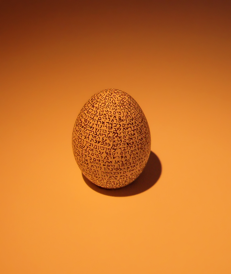
.jpg&action=edit§ion=T-1)
![[1]](https://en.wikipedia.org/wiki/Image:Cuttlefish.jpg)
![[3]](http://members.iinet.net.au/~julianiliff/notre%20dame%20outside.jpg)

 ~ Veledan • Talk 19:16, 8 February 2006 (UTC)
 Oppose. —Vanderdecken∴∫ξφ 19:00, 10 February 2006 (UTC)


 Support per above, nice. JtkieferT | C | @ ---- 09:20, 19 February 2006 (UTC)

![[7]](http://members.iinet.net.au/~julianiliff/pics/IMG_8295.jpg)
![[9]](https://commons.wikimedia.org/wiki/Image:Tower_Bridge_London_Dusk_Feb_2006.jpg)


 zafiroblue05 | Talk 04:18, 12 February 2006 (UTC)

 Elle vécut heureuse à jamais (Be eudaimonic!) 22:32, 21 February 2006 (UTC)


