Wikipedia:Graphics Lab/Illustration workshop/Archive/Mar 2017
 | This page, part of the Graphics Lab Wikiproject, is an archive of requests for 2017. Please do not edit the contents of this page. You can submit new requests here. |

Give Way sign

- Article(s)
- Request
- My original file is based on visual observation, but I have since found actual measurements from SADC. However the math is confusing me, I can make the outer white section with corners in the proper radius, but I can't figure out the reduction in radius for the corners of the red section. I am hoping someone much better at the math and triangle graphics can fix this for me. Please use the measurements where the value of H is 900. Fry1989 eh? 21:20, 23 February 2017 (UTC)
- Graphist opinion(s)
I'll take a look --AntiCompositeNumber (Leave a message) 22:53, 25 March 2017 (UTC)
 Not done Sorry, I don't have time to work on this at the moment. --AntiCompositeNumber (Leave a message) 13:29, 15 April 2017 (UTC)
Signature of Artur da Costa e Silva
_Cart%C3%A3o_de_aut%C3%B3grafo.jpg)

- Article(s)
- Artur da Costa e Silva
- Request
- Please vectorize the signature -- Vinícius O. (talk) 06:43, 30 March 2017 (UTC)
- Graphist opinion(s)
![]() Done Please @Vinícius94: review this and tell me if it is okay. Thank you. --Lommes (talk) 15:22, 12 April 2017 (UTC)
Done Please @Vinícius94: review this and tell me if it is okay. Thank you. --Lommes (talk) 15:22, 12 April 2017 (UTC)
- @Lommes: Thank you. It looks great. Vinícius O. (talk)
Roundel of Venezuela
-
 SVG
SVG -
 PNG
PNG


- Article(s)
- Various
- Request
Can someone please re-arrange the arch of 8 stars on my SVG roundel to be like that on the PNG, with all the stars pointing directly upward. Fry1989 eh? 19:17, 31 March 2017 (UTC)
- Graphist opinion(s)
Standardize Sudoku Images
.png)


(for reference only)


- Article(s)
- Sudoku, Mathematics of Sudoku, and Sudoku solving algorithms
- Request
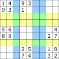
- I would like to improve and standardize all the Sudoku images at the three Wikipedia articles. A summary:
- Lead Article: Current images are OK, but can the 2 lead images (S2, S3) be aesthetically improved? (I think the image will appear better if the subordinate lines are thinner, with outline and lines delineating boxes slightly more prominent, as in S1).
- Mathematics: Includes 11 Images (The 4 to be improved are shown above)
- Algorithms: "S8" (shown above) to be improved.
- Particulars: Please standardize frame size, aspect ratio, thickness of lines, etc. (Match S1, but make in svg file format).
- S1: (Suggested standard). Maybe just make as svg.
- S2 and S3: Make new images if there is a way to aesthetically improve them. (Note: S3 is compared with A in the Algorithm article, but no need to change A.)
- S4: Please standardize and keep the blue hi-lite. see note (1).
- S5: Please standardize and keep the blue hi-lite. see note (1).
- S6: Please standardize. Please continue to use color hi-lites to emphasize the 3 empty rows (yellow) and 3 empty columns (blue). The intersection areas are green (yellow and blue blended). If there is a way to hi-lite the three empty boxes (3x3 areas) that would be great, but only if the overall image remains simple and easy to understand. see note (1).
- S7: Please standardize.
- S8: Please standardize.
note(1): color hi-liting in unsolved cells should be "faint" or rather transparent because they are "unsolved", intending to be "filled in" with an answer (by the reader). Intensity of blue as in S5 looks fine.
Thanks to any graphists able to help.-- LithiumFlash (talk) 13:31, 1 April 2017 (UTC)
- Graphist opinion(s)
Have you considered replacing the images with Template:Sudoku_9x9_grid? Auguel (talk) 21:38, 6 April 2017 (UTC)
- Yes, that template is already used in some math sections, and I plan to leave those in place. But it doesn't look very good (especially in the Main article, where people expect "magazine" quality images). The template will also not work where I need to hi-lite certain rows or columns with a transparent color. Many Sudokus have interesting mathematical properties, which is conveyed by their appearance. For an example, Fractals can be conveyed with ASCII characters or graphics. The editors for Fractals chose to use graphical images, which makes it a good-looking article (this is an extreme example, because Sudokus aren't as complex). But in the same way, I hope to improve the Sudoku article with better images. After these seven, I believe the task is done (I hope future contributors will just make new equivalent images when necessary). Thanks,—LithiumFlash (talk) 00:38, 7 April 2017 (UTC)
![]() Request taken by Auguel (talk) 02:48, 7 April 2017 (UTC).
Request taken by Auguel (talk) 02:48, 7 April 2017 (UTC).
-
 S1 (added to article)
 -
 S2 (added to article)
 -
 S3 (added to article)
 -
 S4 (added to article)
 -
 S5 (added to article)
 -
 S6 (added to article)
 -
 S7 (added to article)
 -
 S8 (added to article)
.svg)


.svg)

Ok so here S1 converted to svg, this will be the standard I use for all the puzzles. Please have a look, and make any comments now before I do the other ones. Be as specific as you want. Auguel (talk) 03:09, 7 April 2017 (UTC)
- It looks perfect. Please keep using that as the standard. I'm even checking the clue numbers. I already updated the article with this Sudoko and it looks great (this one is used in all 3 articles). Thanks!—LithiumFlash (talk) 04:06, 7 April 2017 (UTC)
I'll do the last two tomorrow. Auguel (talk) 05:42, 7 April 2017 (UTC)
- Actually I'm not sure I should do S2 and S3. Do you think the format used here is an improvement on the current one? Auguel (talk) 05:48, 7 April 2017 (UTC)
- For S6, will you be able to make the yellow and green a little darker (especially the yellow)? I do think S2 and S3 will look better with the new style (also it keeps them consistent with others). I hope you can complete those too. The others look great! Thanks for your help. I added the finished ones to the article.—LithiumFlash (talk) 11:32, 7 April 2017 (UTC)
![]() Done Auguel (talk) 23:20, 8 April 2017 (UTC)
Done Auguel (talk) 23:20, 8 April 2017 (UTC)
- Thanks Auguel. I loaded the images to the three articles and they look great! It's the best appearance I've seen in those articles since I started working on them. I appreciate your help.—LithiumFlash (talk) 15:36, 9 April 2017 (UTC)
File:Klimadiagramm-deutsch-Bissau-Guinea-Bissau.png
-
 Climate diagram of Guinea-Bissau in German
 -


- Article(s)
- Geography of Guinea-Bissau and Guinea-Bissau as well as various other Wikipedias.
- Request
- Please create either an English version, or if feasible, a language-neutral version of the graphic. -- Roger (Dodger67) (talk) 15:45, 14 March 2017 (UTC)
- Graphist opinion(s)
![]() Done @Dodger67: Let me know what you think. Auguel (talk) 04:51, 13 April 2017 (UTC)
Done @Dodger67: Let me know what you think. Auguel (talk) 04:51, 13 April 2017 (UTC)
- Thanks Auguel, perfect!
- – Roger (Dodger67) (talk) 11:26, 13 April 2017 (UTC)
 Resolved
- Dear @Dodger67:, @Auguel:, the diagram is of the Walter/Lieth (see http://www.zoolex.org/walter.html or German Wikipedia: https://de.wikipedia.org/wiki/Klimadiagramm#Walter.2FLieth-Klimadiagramm_.28hygrothermisch.29 ), and the axis need to be in 2:1 ratio; the main systematic assumption of Walter and Lieth being that evaporation and temperature are related and thus for a certain temperature (and thus evaporation) a certain amount of precipitation is needed. Everything above this 2:1 ratio introduces humidity, everything below removes it. Quote: "When the precipitation curve undercuts the temperature curve, the area in between them is dotted indicating dry season. When the precipitation curve supercedes the temperature curve, vertical lines are plotted for each month indicating moist season." This only works if the 2:1 ratio is kept.--Lommes (talk) 12:26, 13 April 2017 (UTC)
- One more thing: Your format is, of course, valid (just not the Walter/Lieth format as the original), but then I'd advise you to change the precipitation curve to bar diagrams, as shown in Climograph. --Lommes (talk) 12:30, 13 April 2017 (UTC)
- @Lommes: interesting, I did not know about those diagrams. Are they only a German thing? Either way I changed the precipitation curve to be a bar diagram as you suggested. Auguel (talk) 18:19, 13 April 2017 (UTC)
- @Auguel: I am no ecologist, but afaik they are very common in Germany and internationally, and among the most-used formats. A quick image search for "climate diagram" showed me 1/3 of diagrams conforming to W+L. After all, they have this neat wet season / dry season feature, that other diagrams don't. More information with the same data is nice to have. Cheers.--Lommes (talk) 19:22, 13 April 2017 (UTC)
- @Lommes: interesting, I did not know about those diagrams. Are they only a German thing? Either way I changed the precipitation curve to be a bar diagram as you suggested. Auguel (talk) 18:19, 13 April 2017 (UTC)
- One more thing: Your format is, of course, valid (just not the Walter/Lieth format as the original), but then I'd advise you to change the precipitation curve to bar diagrams, as shown in Climograph. --Lommes (talk) 12:30, 13 April 2017 (UTC)
- Dear @Dodger67:, @Auguel:, the diagram is of the Walter/Lieth (see http://www.zoolex.org/walter.html or German Wikipedia: https://de.wikipedia.org/wiki/Klimadiagramm#Walter.2FLieth-Klimadiagramm_.28hygrothermisch.29 ), and the axis need to be in 2:1 ratio; the main systematic assumption of Walter and Lieth being that evaporation and temperature are related and thus for a certain temperature (and thus evaporation) a certain amount of precipitation is needed. Everything above this 2:1 ratio introduces humidity, everything below removes it. Quote: "When the precipitation curve undercuts the temperature curve, the area in between them is dotted indicating dry season. When the precipitation curve supercedes the temperature curve, vertical lines are plotted for each month indicating moist season." This only works if the 2:1 ratio is kept.--Lommes (talk) 12:26, 13 April 2017 (UTC)
Eyes on the Prize


- Article(s)
- Eyes on the Prize
- Request
- Create a black background with words "Eyes on the Prize" and "America's Civil Rights Movement" retained as in image with identical color, size, font, and arrangement. Mitchumch (talk) 01:15, 17 March 2017 (UTC)
- Graphist opinion(s)
![]() Done, though this is traced. If someone had access to the Font "ITC Century" one could make a much higher quality version. @Mitchumch:, please tell me if this is good enough for your usage scenario.--Lommes (talk) 15:12, 12 April 2017 (UTC)
Done, though this is traced. If someone had access to the Font "ITC Century" one could make a much higher quality version. @Mitchumch:, please tell me if this is good enough for your usage scenario.--Lommes (talk) 15:12, 12 April 2017 (UTC)
a small correction is needed ...
-
 image at top right corner ..

- Article(s)
- Powerful number
- Request
- In the middle of three rows it is written "9 = (1^2) x (3^3)" instead of "9 = (1^3) x (3^2)" or, I think even better, "9 = (3^2) x (1^3)"; I tried to change it, using "Microsoft Paint", but the image was over 30 kilobytes long, so I guess that you may do it much better, i.e. make smaller image ... -- THT1616 (talk) 00:31, 18 March 2017 (UTC)
- Graphist opinion(s)
- It looks like the original uploader is still active, so it's worth a shot... @Hyacinth: If you have this image saved in an easily-editable format, could you change this as requested? If not, don't worry about it, I can take care of it. Thanks. --AntiCompositeNumber (Leave a message) 02:20, 18 March 2017 (UTC)
Methodist Family Tree Diagram
-
 Diagram

- Article(s)
- Methodist Church of Great Britain
- Request
- Please remove the background behind the diagram, so that it is white or transparent. Thanks in advance.-- Hazhk (talk) 22:33, 9 March 2017 (UTC)
- Graphist opinion(s)
-
 SVG version

Former flags of the Australian Governor-General
- Article(s)
- Flag of the Governor General of Australia, List of Australian flags
- Request
- Alright, could someone please create SVG images of the following flags:
1) The flag used by the Australian Governor-General from 1902-1909, viewable here: https://flagspot.net/images/a/au~gg02.gif (and a close up of the badge:https://flagspot.net/images/a/au)gg02.gif)
2) The Governor-General's flag from 1909-1936: https://flagspot.net/images/a/au~gg08.gif (and the badge: https://flagspot.net/images/a/au)gg08.gif)
3) The GG's flag used from 1936-1953: https://flagspot.net/images/a/au_gg1936.gif (similar to the current one, except it uses the Tudor Crown instead of St. Edward's Crown, both on and below the lion)
Again, much appreciated. User:Snow Lion Fenian
- Graphist opinion(s)
-
 Flag of the Governor General 1902-1909
 -
 Flag of the Governor General 1909-1936
 -
 Flag of the Governor General 1936-1953
 -
 Flag of the Governor General 1953-present
.svg)
.svg)
.svg)

![]() Done --Sodacan (talk) 15:35, 9 April 2017 (UTC)
Done --Sodacan (talk) 15:35, 9 April 2017 (UTC)
Belgrano


- Article(s)
- Belgrano
- Request
- svg or png version of signature, please… -- Kintetsubuffalo (talk) 05:32, 27 February 2017 (UTC)
- Graphist opinion(s)
![]() Done @Kintetsubuffalo: I wasn't sure as to the status of the squiggle in the lower right, so i made two versions. Feel free to delete the uneeded one.--Lommes (talk) 01:24, 4 March 2017 (UTC)
Done @Kintetsubuffalo: I wasn't sure as to the status of the squiggle in the lower right, so i made two versions. Feel free to delete the uneeded one.--Lommes (talk) 01:24, 4 March 2017 (UTC)
- @Kintetsubuffalo: Hello? Any reaction? Good, bad? Something else? --Lommes (talk) 14:41, 12 April 2017 (UTC)
- Thank you @Lommes: for pinging me! I started a new job and missed this one!--Kintetsubuffalo (talk) 14:44, 12 April 2017 (UTC)
Africa flag euler diagram
-
Diagram that needs fixing
-
 Original

- Article(s)
- African Union
- Request
- I've been trying to update our African Bodies euler diagram, and the new file works except that when shown in a thumbnail the 3-D effect layer of the Gambia flag turns black. Can't figure out how to fix this. Edited using inkscape. CMD (talk) 02:47, 12 February 2017 (UTC)
- Graphist opinion(s)
![]() Done Auguel (talk) 19:23, 8 March 2017 (UTC) There was some sort of invisible layer behind the flag that wasn't rendering properly.
@Chipmunkdavis:
Done Auguel (talk) 19:23, 8 March 2017 (UTC) There was some sort of invisible layer behind the flag that wasn't rendering properly.
@Chipmunkdavis:
Icons for "Vital" articles
-
 Current "vital" icon

See also Template:Icon#Icon codes for existing icons.
- Article(s)
- Potentially all WP:VITAL and their talk pages
- Request
- I was making a mockup for a revised metabanner (see User:Headbomb/Sandbox/Banner), and I just realized that we don't have icons to indicate the "Vitality" level of articles. So I figure I'd ask her for some mockups and design ideas. I used File:Círculos_Concéntricos.svg for my mockup, but it's not really suitable for an actual implementation.
A possible idea
- Take File:Círculos_Concéntricos.svg, add a fourth blue ring. You might have to reduce the size of the inner ring so it still looks nice at 16px, e.g.
 .
.
- Level 1 = Colour inner ring red (or some other colour)
- Level 2/3/4 = Other rings coloured instead.
- Take File:Círculos_Concéntricos.svg, add a fourth blue ring. You might have to reduce the size of the inner ring so it still looks nice at 16px, e.g.
-- Headbomb {talk / contribs / physics / books} 14:47, 13 February 2017 (UTC)
- Graphist opinion(s)
This is a very interesting idea. One thing I'm not keen on is using only colours to differentiate the icons. If at all possible it should be easy to differentiate the icons without colour (I usually try to draw diagrams so that they are still clear in grayscale). The rating icons do this by using letters (though that also isn't ideal per se, since it's not intercultural, but there isn't space for much else). Maybe the number or size of the circles could change?
I'm not sure about adding another ring to the File:Círculos_Concéntricos.svg, since there is already quite a bit of visual noise. Like I said though, very interesting. I shall have to ponder this further. —♫CheChe♫ talk 18:22, 13 February 2017 (UTC)
- I could also be a target circle with "1/2/3/4" in it. Or just a circle with "1/2/3/4" in it. Headbomb {talk / contribs / physics / books} 18:46, 13 February 2017 (UTC)
- I'd be curious to see if fitting a 1/2/3/4 on the bulls eye would be readable, but I suspect not. So that probably means taking out the bull's eye, and putting a 1/2/3/4 that fits inside the inner ring instead. Or maybe taking out the inner ring entirely? Headbomb {talk / contribs / physics / books} 19:49, 13 February 2017 (UTC)


- Let's put those at the size they'll be used:
 ,
,  ,
,  ,
,  ,
,  ,
,  . The first three seem like a no go to me (details are too small). The last three have the best potential. Since they'll like be used over a background, the empty rings should be white rather than transparent. As far as icons go, the last one is angled like the others, so that's likely the starting point. Headbomb {talk / contribs / physics / books} 19:50, 13 February 2017 (UTC)
- Let's put those at the size they'll be used:
- I've just had an idea, what about a lightbulb icon?
 I know it's not easily generalisable to the other levels, and the one I just made needs some work to be pleasing to the eye at this scale, but I kind of like it. Lightbulbs symbolise an important idea, right? —♫CheChe♫ talk 20:22, 13 February 2017 (UTC)
- I've just had an idea, what about a lightbulb icon?
- I had considered the lightbulb actually, but you can't really indicate 1/2/3/4 with that. Maybe changing the glow from one color to the other, but eeehh... And going from Sun/Floodlight/Flashligh/Candle isn't going to fly either :p Headbomb {talk / contribs / physics / books} 20:25, 13 February 2017 (UTC)
- Going by User:Headbomb/Sandbox/Banner#Mockup, I'd argue that if you want to use color, the progression Red/Green/Yellow/Blue/also doesn't really seem to make sense to me. Gold/Silver/Bronze/Copper might. And the inner ring looks like unneeded distraction more than be 'target-like', so might as well leave it out entirely. Headbomb {talk / contribs / physics / books} 12:33, 14 February 2017 (UTC)
- That makes sense. How about those (above)? I'm not sure what colour to make the last one, since 'copper' isn't sufficiently different from bronze. I've tried making it white, but that hasn't gone very well. Would blue (or something) be ok, do you think? —♫CheChe♫ talk 14:03, 14 February 2017 (UTC)
- Old Gold/Grey/Bronze/Copper look different enough to me, but for a greater contrast, we could have Old Gold/Grey/Bronze/Cool Copper. Failing that, black would probably be better than blue or white for the 4th level. Also,I think you've nailed the general design of it, but a sans-serif font would probably be more readable. Headbomb {talk / contribs / physics / books} 14:42, 14 February 2017 (UTC)
- That makes sense. How about those (above)? I'm not sure what colour to make the last one, since 'copper' isn't sufficiently different from bronze. I've tried making it white, but that hasn't gone very well. Would blue (or something) be ok, do you think? —♫CheChe♫ talk 14:03, 14 February 2017 (UTC)
Tesla Motors
-
 Tesla logo
 -


- Article(s)
- Tesla Motors article set
- Request
- Please extract the dagger-T at the top (above the "TESLA") for use separately. This file exists on Commons, so I believe that the extracted image should still be PD-textlogo as it is a US company logo consisting of a stylized capital-"T" -- 65.94.168.229 (talk) 04:58, 14 February 2017 (UTC)
- Is that really a 'simply geometic shape' though? I'm really not sure this is correctly tagged / actually in the public domain. Headbomb {talk / contribs / physics / books} 14:53, 14 February 2017 (UTC)
- I am assuming it is, since it is sitting on Commons, and has for a few months now. If it isn't, then that file needs to be transferred onto en.wiki with an NFUR for our Tesla Motors article to use. -- 65.94.168.229 (talk) 23:08, 14 February 2017 (UTC)
- Is that really a 'simply geometic shape' though? I'm really not sure this is correctly tagged / actually in the public domain. Headbomb {talk / contribs / physics / books} 14:53, 14 February 2017 (UTC)
- Graphist opinion(s)
![]() Request taken by Fry1989 eh? 22:22, 27 March 2017 (UTC).
Request taken by Fry1989 eh? 22:22, 27 March 2017 (UTC).
![]() Done
Done
- Comments
So does that mean that no graphist is going to take this up? The image is still on commons, and has not been tagged there, so would seem to imply the licensing is valid. -- 70.51.200.162 (talk) 18:10, 27 March 2017 (UTC)
German version
-
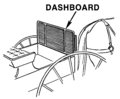 Image of a dashboard on a horse-drawn vehicle
 -
 New version
.png)
.png)
- Article(s)
- de:Armaturenbrett
- Request
- Please replace the word "Dashboard" with the word "Armaturenbrett" and upload it at a new title. This is for use in the German Wikipedia article, since "Dashboard" is just an English word and "Armaturenbrett" is the German translation. -- 208.95.51.115 (talk) 14:17, 17 February 2017 (UTC)
- Graphist opinion(s)
![]() Done --AntiCompositeNumber (Leave a message) 22:49, 25 March 2017 (UTC)
Done --AntiCompositeNumber (Leave a message) 22:49, 25 March 2017 (UTC)
Missing Australian road signs (Part 2)
-

-

-
 Not mine but seems it already exists.
 -

-


.svg)


- Missing Australian road signs
- Request
- Would somebody good with geometry/math/text be willing to recreate the sign seen in this source and that source and that source (remove the yellow thing) and that source and that source -- 66.189.110.148 (talk) 18:42, 17 February 2017 (UTC)
- Graphist opinion(s)
I need it
Colonial flags of Antigua and Barbuda
-
 ensigns of Antigua and Barbuda (1956-1962)
 -
 ensigns of Antigua and Barbuda (1962-1967)
.svg)
.svg)
- Article(s)
- Flag of Antigua and Barbuda, Flags of the British Empire
- Request
- Would someone please try and create SVG files of the two former colonial ensigns of Antigua and Barbuda, including the one used from 1956-1962 (https://flagspot.net/images/a/ag_col1.gif) and the version without the white disc used from 1962-1967 (https://flagspot.net/images/a/ag_col2.gif). And here's a close up of the badge for guidance: https://flagspot.net/images/a/ag)col1.gif. Thanks. User:Snow Lion Fenian
- Graphist opinion(s)
![]() Request taken by FOX 52 (talk) 07:17, 23 March 2017 (UTC).
Request taken by FOX 52 (talk) 07:17, 23 March 2017 (UTC).
- @Snow Lion Fenian: is this how you wanted it? - FOX 52 (talk) 00:30, 24 March 2017 (UTC)
- @FOX 52: Thanks, very good work. Though what about the 1962-1967 version?
- @Snow Lion Fenian: OK second is now done - FOX 52 (talk) 17:01, 25
- @FOX 52: Thanks, very good work. Though what about the 1962-1967 version?
March 2017 (UTC)
- @FOX 52: Thanks, great work again, I appreciate it. User:Snow Lion Fenian
Ishtar
-
 Ishtar symbol

- Article(s)
- Ishtar, Morning Star, Evening Star, Eosphorus, Hesphorus, Venus article sets
- Request
- Please make the background transparent. Currently, the transparency is partial, so not correct. The outer circle inscribes a white background area, while, the entire background should be transparent, such as found in other astrological symbols that enclose spaces. -- 70.51.200.162 (talk) 04:26, 21 March 2017 (UTC)
- Graphist opinion(s)
Thanks to whoever did this, since no graphist has lodged a comment, but it was done. -- 70.51.200.162 (talk) 05:42, 24 March 2017 (UTC)
Need help to convert two small chess piece icons into svg files
Colonial flags of British Honduras
-

-

-

-
 Coat of arms
.svg)
.svg)
.svg)
.svg)
- Article(s)
- British Honduras, Flag of Belize, Flags of the British Empire
- Request
- Could please change the shape of the arms on the above flag, to make it look more like the actual flag British Honduras, in use from 1919-1981 (which can be seen here: https://flagspot.net/flags/bz-bhond.html, and a close up of the badge at: https://flagspot.net/images/b/bz)bh870.gif). And, while we're here, perhaps someone could also make an SVG image of the flag of BH from 1870-1919, which is virtually the same as its successor, except the badge is surrounded by a white disc (https://flagspot.net/images/b/bz_bh870.gif). Thanks User:Snow Lion Fenian
- Graphist opinion(s)
done and done. ![]() Done Auguel (talk) 09:24, 8 March 2017 (UTC)
Done Auguel (talk) 09:24, 8 March 2017 (UTC)
I'm also wondering if we should update File:Emblem of British Honduras (1919-1981).svg?
@Auguel: Yes, that would be a good idea, it would be great if you could do that too. (The actual coat of arms of BH can be seen here:http://www.ambergristoday.com/sites/default/files/archived_images/editorial_blog/2012/09/17/belize_belice_british_honduras_flag_01_jpg_21298.jpg).
-
 chess piece for Mann (black piece with transparent background)
 -
 chess piece for Mann (white piece with transparent background)


| a | b | c | d | e | f | g | h | ||
| 8 |  | 8 | |||||||
| 7 | 7 | ||||||||
| 6 | 6 | ||||||||
| 5 | 5 | ||||||||
| 4 | 4 | ||||||||
| 3 | 3 | ||||||||
| 2 | 2 | ||||||||
| 1 | 1 | ||||||||
| a | b | c | d | e | f | g | h | ||
- Article(s)
- These icons will be used in chess diagrams such as at right and in articles such as Capablanca chess
- Request
- I only need these images to be converted to .svg files, to work in the chess diagram module. For reference larger versions are here:

 (These are already in the article Fairy chess piece)
- For the svg files to be used by the chess diagram module they must remain 45x45 pixels, and the filenames should stay the same (changing only the extension).
- Also for reference (if needed) other icons in the chess diagram collection are here: c:Template:SVG_chess_pieces
- Thanks for your help.LithiumFlash (talk) 20:26, 15 March 2017 (UTC)
- Graphist opinion(s)


How are these? –♫CheChe♫ talk 16:03, 16 March 2017 (UTC)
- I believe they're perfect! I put them at the talk page for chess diagrams [[1]] and I believe another editor will be able to add them to the chess diagram module. Once I know they work for sure I'll leave a note here again. Thank you.LithiumFlash (talk) 19:15, 16 March 2017 (UTC)
- Thanks ♫CheChe♫. These icons have been added to the module for making chess diagrams, and I believe everything is in good order (and added as an example in the diagram above). Looks great! Thank you. LithiumFlash (talk) 22:44, 16 March 2017 (UTC)
- @LithiumFlash: My pleasure. –♫CheChe♫ talk 00:06, 17 March 2017 (UTC)
- Thanks ♫CheChe♫. These icons have been added to the module for making chess diagrams, and I believe everything is in good order (and added as an example in the diagram above). Looks great! Thank you. LithiumFlash (talk) 22:44, 16 March 2017 (UTC)
- I believe they're perfect! I put them at the talk page for chess diagrams [[1]] and I believe another editor will be able to add them to the chess diagram module. Once I know they work for sure I'll leave a note here again. Thank you.LithiumFlash (talk) 19:15, 16 March 2017 (UTC)
A logo for meta:Environmental impact
-
 idea A
 -
 idea B
 -
idea C
- Article(s)
- meta:Environmental impact
- Request
- Dear graphists, please allow me to post a request that is not related to a Wikipedia article. As you may know, I started a project aiming to reduce the environmental impact of the Wikimedia movement, for example by having the Wikipedia servers run on renewable energy (if you would like to support this idea, please add your name here). Recently, the WMF board picked up the idea, so my project is gaining some traction. In order to keep it that way, having a logo is probably a good idea, and I have started making a few first sketches. What do you think? I would love to create some (environmentally friendly) stickers to hand out at the Wikimedia Conference at the end of March that people can put on their laptop covers, so I would love to hear your thoughts! Thank you, -- Gnom (talk) 22:36, 28 February 2017 (UTC)
- Graphist opinion(s)
@Gnom:::Personally I like the look of idea C as the message is clear and the use of a green leaf helps connect it to the environment. The logo is also self contained within the leaf so if it was sticker it wouldn't need to have white space around the edges. Tsange ☯ Talk 16:58, 6 March 2017 (UTC)
- Thanks, Tsange! --Gnom (talk) 23:09, 9 March 2017 (UTC)
- So someone took idea C and improved on it. --Gnom (talk) 11:24, 11 March 2017 (UTC)
![]() Done
Done
Jean Sylvain Bailly
-
 Signature of Jean Sylvain Bailly.
 -
 SVG signature of Jean Sylvain Bailly.


- Article(s)
- Jean Sylvain Bailly
- Request
- Dear users of en.wiki, I'm Distico, an Italian user. I hope not to disturb here but I really need a help for this image. I've put my request also in Commons, because I think that the more people read it the more the probability to find someone raises. This is a signature of French astronomer Jean Sylvain Bailly. I would like you could change this signature by turning it into a .svg version aesthetically more beautiful. I give you an example of what I mean: this is a very nice Lafayette's signature taken from that image. What I mean is exactly the same. Can you do something to improve the signature of Bailly in this way? I thank you for your availability. -- Distico (talk) 21:38, 3 February 2017 (UTC)
- Graphist opinion(s)
- It looks like User:Auguel has
 Completed this request. --AntiCompositeNumber (Leave a message) 02:01, 18 February 2017 (UTC)
Emblem of the OSS
- Article(s)
- Office of Strategic Services
- Request
- The emblem of the Office of Strategic Services [2][3]is still lacking here. Could someone vectorize it?-- Antemister (talk) 13:26, 5 February 2017 (UTC)
- Graphist opinion(s)
PNG renderer problems? or PDF -> SVG conversion issues?
-
 original PDF
 -
 converted SVG


- Article(s)
- United States Department of State, etc.: there are multiple pages across multiple languages
- Request
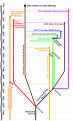
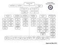
- I've tried to convert Department of State organizational chart (May 2012).pdf this PDF into SVG using two different tools: first, the CloudConvert, and then Inkscape. In both cases, although the resulting SVGs render without any issues in both Inkscape and Firefox, the results of PNG rendering on Wiki are incorrect: you can see the results here. Is the PNG renderer broken, or have I done something incorrectly? cherkash (talk) 07:01, 3 February 2017 (UTC)
- Graphist opinion(s)
- I've had a look and the text is really messed up in this SVG. Retyping it by hand seems to have fixed it (I've done that for the top-left two boxes and for the Secretary of State). I'll do the rest (including that spelling correction) and upload soon. --♫CheChe♫ talk 11:02, 3 February 2017 (UTC)
- @Cherkash: Ok, it took some doing but I think I've fixed the SVG now (as well as correcting the alignments/angles of the lines in the diagram). I think the problem came from the SVG conversion algorithm. With so much text that was roughly aligned, the algorithm found it difficult to know where to put text boxes. This compounded with the fact that it was hard to tell if the text was left-aligned or centre-aligned. The resulting SVG had text boxes all-over the place, with loads of spaces and bizarre text-flows. Anyway, I fixed it by just typing out new text-boxes by hand, so let me know if I made any spelling errors! --♫CheChe♫ talk 12:33, 3 February 2017 (UTC)
- First of all, thank you @CheCheDaWaff: for a nice manual work you've done on cleaning this image up. There were a few minor spelling issues left, but I've fixed what I found, so no need for you to do anything else.
- Now, moving away from immediate issues and their fixes: fundamentally, I don't think we've got to the bottom of the original issues I've observed:
- 1) The discrepancies between how the SVG was rendered by the browsers (correctly) and how SVG->PNG was doing the conversion (incorrectly), is something of a deeper technical concern.
- 2) Also, separately, even on the file you've fixed, if you look at e.g. 1,280 × 942 pixels PNG render, you can see how the kerning is completely screwed up all over (e.g. look at "Pacific Affairs" in the third box on the left). Text also gets out of boxes in a few places, which doesn't happen with the original resolution PNG render. So again, probably a technical issue with fonts scalability (just a wild guess), but something that should probably be looked at by technical folks who maintain the PNG render.
- 3) Finally, since this file gets updated regularly by the Dept of State, and in order to avoid a lot of manual work in the future on this and other similar files (when PDF->SVG and SVG->PNG conversions are used), how do we address all the underlying technical issues here? Feel free to redirect this to anyone who can help further.
- cherkash (talk) 03:51, 7 February 2017 (UTC)
Proposed flag of Moldova, 2017

.svg)
- Article(s)
- Flag of Moldova, List of flags of Moldova
- Request
- Alright, could someone please create an SVG file of President Igor Dodon's proposed flag for Moldova, found at the bottom of the article here: http://www.rferl.org/a/moldova-president-dodon-proposed-flag-romanian-symbols/28277972.html (which is similar to the one above, except the star has eight points instead of five, and it appears to have a thin gold border on all sides). Thanks. User:Snow Lion Fenian —Preceding undated comment added 15:27, 4 February 2017
- Graphist opinion(s)
![]() Request taken by Fry1989 eh? 18:01, 24 February 2017 (UTC).
Request taken by Fry1989 eh? 18:01, 24 February 2017 (UTC).
![]() Done: How's this? :) Fry1989 eh? 18:43, 24 February 2017 (UTC)
Done: How's this? :) Fry1989 eh? 18:43, 24 February 2017 (UTC)
@Fry1989: Very nice work, thanks! User:Snow Lion Fenian
genericized WikiProject Scouting emblems
-

-

-

-

-
 replace "Pramuka" box with elongate Indonesian flag (please overwrite this version)
 -

-

-

-


Article(s): WikiProject Scouting
- Request
- please create free-use [[WikiProject Scouting (name of country).svg]] using the genericized emblems, and upload at Commons, thanks. None of these match existing emblems, but they will be clearly recognizable as to meaning. Creativity is welcome, I just laid out the basic outline.
- "Wouldn't the flags be enough?" Good question-here's why: Wikipedia:WikiProject_Scouting/Userboxes -we've been seeing several users make their own userboxes for their own country's Scouting, which is great except they've been using their country's copyrighted logos. ☹ This covers every country we have members in. I would think flags are okay, but they are using distinct emblems, and the set of existing emblems are very distinct from each other, just as in IRL.
- There are Scouting WikiProjects in several languages, so these could be used by multiple Scouting WikiProjects, hence the request to upload at Commons
- The colors for Germany are not Austria, they are based on the original German Scouting Deutscher Pfadfinderbund
- Disclosure-this was at Commons since October, there is not as much activity there and it went stale--Kintetsubuffalo (talk) 16
- 39, 26 January 2017 (UTC)
- I have created crude mockups so graphists can understand what I seek. Mine are bad, please help.--Kintetsubuffalo (talk) 11:25, 29 January 2017 (UTC)
- Graphist opinion(s)
-
Description of first image
-
Description of second image (if needed)
-
Description of third image (if needed; don't request too many at once, though)
- Article(s)
- United States Navy officer rank insignia, United States Coast Guard officer rank insignia, United States Marine Corps rank insignia, United States Navy, United States Coast Guard, United States Marine Corps, United States Public Health Service Commissioned Corps, NOAA Commissioned Officer Corps, United States Maritime Service (currently, pin-on insignia are not depicted; however, if added they would also be in the naval style, as well), Ensign (rank), Lieutenant (junior grade), Lieutenant (navy), Second lieutenant, First lieutenant
- Request
- In all of the above pages there are errors in the depictions of the grade insignia for O-1 through O-3, except for USMC O-3 on Captain (United States O-3), United States Marine Corps rank insignia, and United States Marine Corps, where the captain (O-3) insignia are correct. Naval insignia (including USN, USMC and USCG, as well as the USPHS, NOAA, and USMS) for these three grades use different style bars than do the military (i.e., Army and USAF) style displayed. Specifically, naval bars do not have beveled edges and the two silver bars of an O-3 have the connecting links almost at the ends of the bars, rather than inboard towards the center as on Army and Air Force insignia. A correct depiction of both types of bars, and the differences in placement of the connecting links is shown at Captain (United States O-3)#Gallery. While the differences between naval and military bars for O-1 and O-2 bars are admittedly slight (only the beveled edges) there is a visibly quite distinct difference in appearance between the naval and military styles of O-3 insignia. Please correct/create and place new graphics to reflect these differences.-- CobraDragoon (talk) 18:20, 21 January 2017 (UTC)
- Graphist opinion(s)
Take off crowns


- Article(s)
- Liliuokalani
- Request
- Please take off the crowns in these monograms. -- The Emperor's New Spy (talk) 00:35, 23 January 2017 (UTC)
- Graphist opinion(s)
![]() Done:
Done:


Jacobite Standard - 1715
-

-
 My best attempt. Not sure about the dimensions or the exact shadings.


- Article(s)
- Jacobitism, Jacobite rising of 1715, List of Scottish flags
- Request
- Would someone please create an SVG file of the Jacobite standard flown in 1715, found at (http://www.maggiecraig.co.uk/blog/wp-content/uploads/2015/09/1715standardculloden2015.jpg), effectively the above arms (with the words NEMO ME IMPUNE LACESSIT below them) on a dark blue field. Thanks. User:Snow Lion Fenian —Preceding undated comment added 00:03, 14 January 2017
- Graphist opinion(s)
![]() Done — Preceding unsigned comment added by Auguel (talk • contribs) 02:41, 15 February 2017 (UTC)
Done — Preceding unsigned comment added by Auguel (talk • contribs) 02:41, 15 February 2017 (UTC)
Custom Vega graph to be turned into a template
- Article(s)
- Various
- Request
- Hello! I've been trying to create a custom line graph with Extension:Graph to no avail. I've been practicing here. My end goal is to make a graph for a specified purpose that's created into a template that can be used on multiple articles. The graph needs to have "x" values that can change with each article the graph is implemented on with "y" values that can range from 1 (no zero) to 100 MAX (hopefully how many can be defined as well) but 1 is the PEAK of the "y" values and 100 being the lowest. If possible, could it accomodate multiple lines as well? If I'm not being explicit enough, let me know! If you can, use my sandbox page as yours to do this, then we can move it to the main template namespace when it's finished. Thank you in advance! I helpdןǝɥ I 05:36, 29 January 2017 (UTC)
- Graphist opinion(s)
Governor's flags of Australian colonies
.svg)
.svg)
.svg)
.svg)
.svg)
.svg)
.svg)
- Article(s)
- Flags of the Governors of the Australian states, Flag of New South Wales, Flag of Queensland, Flag of South Australia
- Request
- Alright, could someone please try and create SVG images of the following flags, using the blank governor's flag above and the badges from the other flags:
1) The flag of the Governor of New South Wales from 1870-1876 (https://flagspot.net/images/a/au-nsw1870gov.gif).
2) The flag of the Governor of Queensland from 1870-1876 (https://flagspot.net/images/a/au-ql_g1.gif).
3) The flag of the Governor of South Australia from 1876-1904 (https://flagspot.net/images/a/au-sa_g2.gif).
Thanks. User:Snow Lion Fenian
- Graphist opinion(s)
![]() Done Auguel (talk) 19:01, 11 March 2017 (UTC)
Done Auguel (talk) 19:01, 11 March 2017 (UTC)
@Auguel: Terrific work, thanks again! User:Snow Lion Fenian
1936-1953 Governor General's flag (Australia)
.svg)
gg02.gif)
gg08.gif)
col1.gif)
bh870.gif)
.svg&action=edit&redlink=1)
- Article(s)
- Flag of the Governor General of Australia, List of Australian flags
- Request
- Okay, could someone please create an SVG file of the flag used by the Governor General of Australia from 1936-1953, found here: http://www.crwflags.com/fotw/images/a/au_gg1936.gif (similar to the current flag, except it uses the Tudor Crown instead of St. Edward's Crown, both on and below the lion). Thanks again. User:Snow Lion Fenian
- Graphist opinion(s)
![]() Done Auguel (talk) 20:01, 12 March 2017 (UTC)
Done Auguel (talk) 20:01, 12 March 2017 (UTC)
@Auguel: Thanks, much appreciated. User:Snow Lion Fenian