Wikipedia:Graphics Lab/Illustration workshop/Archive/Apr 2017
 | This page, part of the Graphics Lab Wikiproject, is an archive of requests for 2017. Please do not edit the contents of this page. You can submit new requests here. |

Insect wing image with flowed text artifact
-
 Insect wing

- Article(s)
- Insect wing and Insect morphology
- Request
- As noted in SVG rendering problem, the image renders improperly because of a Flowed Text problem. Can someone clean this up? -- S Philbrick(Talk) 11:56, 28 April 2017 (UTC)
- Graphist opinion(s)
- Someone else did this already. I'll mark as resolved. Lommes (talk) 16:49, 28 April 2017 (UTC)

New BRFA icons
- Current Icons


- Article(s)
- WP:BRFAs
- Request
- We currently have a series of icons to indicate the status/progress of WP:BRFAs, but they are hack-ish and not perfectly suited to the task.
- Could we get
 remade in blue, with the top + being a checkmark, and the bottom + remaining a +?
 - Could we get
 remade with a green icon, like
  is?
is? - Could we get
 remade with eyelashes (in the same shades of blue as the other icons), to make it clearer this is an eye, and not a planet/star, moon/planet?
Thanks. Headbomb {talk / contribs / physics / books} 15:57, 25 February 2017 (UTC)
- Graphist opinion(s)
![]() Request taken by ♫CheChe♫ talk 18:51, 26 February 2017 (UTC).: Coming right up!
Request taken by ♫CheChe♫ talk 18:51, 26 February 2017 (UTC).: Coming right up!
Ok that's a quick first pass. Do you think the eye should be moved down now that it has the lashes (to put it in the centre)? I'm hesitant because as it is the eye is in the same place as in the other variants. —♫CheChe♫ talk 19:27, 26 February 2017 (UTC)
- Looks wonderful to me. I'll try and see what the new eye looks like when in real-use size and I'll get back to you on that. Headbomb {talk / contribs / physics / books} 22:54, 26 February 2017 (UTC)
- Maybe it'd look better a bit lowered, but as far as I'm concerned, it looks good enough that I wouldn't have complained about the current look if you hadn't mentioned that it might look better slightly lowered. So if you want to lower it a bit, go right ahead. And if you don't, that's perfectly fine too. Headbomb {talk / contribs / physics / books} 23:01, 26 February 2017 (UTC)
- @CheChe: could you remake File:Symbol_abstain_vote.svg in the same shade of grey as File:Symbol_neutral_vote.svg, and balance the grey in File:Image-Symbol_wait_old.svg? Headbomb {talk / contribs / physics / books} 23:41, 26 February 2017 (UTC)
- @Headbomb: Done and done. I updated the clock one, and the 'abstain' variant can be found here: File:Symbol abstain vote grey.svg.
Apollo logo - automatic replacement in articles?
-
 This was the original PNG
 -
This is my SVG replacement

- Article(s)
- NASA, and over 1000 other articles in several dozen different wikipedias
- Request
- I looked through Commons:Top 200 logo images that should use vector graphics and the first one was the Apollo logo. So I recreated it in SVG. I tagged the PNG accordingly, but now someone has to replace the PNG with the new SVG in over 1000 articles spread over dozens of wikipedias. Is there any way to automate this? I am really really relly unmotivated to do this by hand. Thank you. -- Lommes (talk) 22:37, 5 March 2017 (UTC)
- Same for File:FLOSS logo.png > File:FLOSS logo.svg, used in 543 different articles — Preceding unsigned comment added by Lommes (talk • contribs) 22:45, 5 March 2017 (UTC)
- Graphist opinion(s)
@Lommes: I think you can request the task to be done at Wikipedia:AutoWikiBrowser/Tasks Tsange ☯ Talk 16:29, 6 March 2017 (UTC)
- Thank you very much, I asked the question over there. Hope they can help... --Lommes (talk) 19:27, 6 March 2017 (UTC)
- Woow !! Awesome svg work. :D --Yug (talk) 15:21, 7 March 2017 (UTC)
- Thank you very much, I asked the question over there. Hope they can help... --Lommes (talk) 19:27, 6 March 2017 (UTC)
Cutch-flat
-
 flag of Cutch/Kutch
 -
 the SVG version, as requested
 -
Description of second image (if needed)
-
Description of third image (if needed; don't request too many at once, though)


- Article(s)
- Cutch State
- Request
- Could you please vectorize this flag for me - I request a svg because they have 2000px in Wikipedia and I need that size. I requested earlier (2015) and I hope I may request again. Thank you and regards -- JanJC (talk) 14:08, 14 March 2017 (UTC)
- Graphist opinion(s)
 DoneDear @JanJC:, please check if the flag is as you expected. If you could tell me what the elephant is actually carrying on its back, I can improve this. Not knowing anything, i just retraced the geometric forms. Not happy with that. Thank you. --Lommes (talk) 16:08, 12 April 2017 (UTC)
Great - this looks fine for me and is a correct rendering of the original. On top of the elephant is the mahout (the driver) on the head and a palanquin (a tent) on the back for the passenger - usually a distinguished person who should be protected from the sun. Thank you so much and best regards JanJC (talk) 10:37, 26 April 2017 (UTC)
Hue circle
-
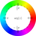 Hue in 360 degrees

- Article(s)
- (talkpage, to support choosing legend colors. A bit like in here).
- Request
- To explain picking a color set by picking hues, I'd like to use this hue-circle, modified. Please:
- Keep the color circle, remove all π numbering (all black). Turn full red (0°) in top (12 o'clock). Add degree markers (clockface like) and numbers, e.g. for 0-90-180-270-360° or 0-40-80-120-...-360° (steps 40° preferred). Numbers not too small (no need to click larger to read numbers; for example the current π symbols are a bit too small. Put them on the outside?). Not sure: some wheels have 0° at 3 o'clock, as this one has. And working counterclockwise (upgoing degrees). Is that standard in color design? If so, then should we keep it?
To consider:
- Do not overwrite (because of current use), but create new file.
- For me svg vectorising is not needed, but you can do as you like or need.
- S and V to be constant, further not relevant (as long as the hue colors are bright).
- DePiep (talk) 21:08, 20 March 2017 (UTC)
- I withdraw this request. No issue. Maybe back some other time. -DePiep (talk) 20:43, 17 April 2017 (UTC)
- Graphist opinion(s)
Please change the French text to English


- Article(s)
- Demographics of South Africa
- Request
- Please change all the French text to English -- Roger (Dodger67) (talk) 08:56, 15 April 2017 (UTC)
- Graphist opinion(s)
![]() Done I hope it was not presumptious to recreate it with the 2011 data. @Dodger67: please tell me if this is okay, or you wish further modifications. Thank you. --Lommes (talk) 19:59, 20 April 2017 (UTC)
Done I hope it was not presumptious to recreate it with the 2011 data. @Dodger67: please tell me if this is okay, or you wish further modifications. Thank you. --Lommes (talk) 19:59, 20 April 2017 (UTC)
- Lommes, thanks, and also for the updated data. – Roger (Dodger67) (talk) 20:07, 20 April 2017 (UTC)
 Resolved
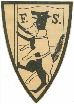
fabian society
-
This is the image as it is, low quality
-


- Article(s)
- Fabian Society
- Request
- Some of the people here are really masters at coat of arms. I would love to see an SVG version of the coat of arms of the Fabian Society, a wolf in sheeps clothing. The design is in the Public Domain, so you can be as close to the original as you want to. There are some other images on the internet, which perhaps might be of help:
- https://2012patriot.files.wordpress.com/2011/05/fabian-socialist-wolf-in-sheep-clothing.jpg
- https://cigpapers.files.wordpress.com/2013/08/kgrhqmokkee1vjfwjibncsuoh1d_128.jpg
- https://theweathereye.files.wordpress.com/2010/06/cs_may05b.jpg <- probably the clearest
Thank you very much in advance. -- Lommes (talk) 22:42, 20 April 2017 (UTC)
- Graphist opinion(s)
![]() Done Let me know what you think. Also if you have a better source for the colors I can update them to match. Auguel (talk) 06:12, 21 April 2017 (UTC)
Done Let me know what you think. Also if you have a better source for the colors I can update them to match. Auguel (talk) 06:12, 21 April 2017 (UTC)
- @Auguel:That is really good, thank you. I'd love to see a more golden yellow (perhaps in the region of #ffee55) and a more vivid red (perhaps around #aa0000), but please use your own good judgement. And if I want to be really nitpicky, I have three more requests.
- The wolf outline looks a bit scrawny in places. While at the tail it looks really really great (yay!), in the second and third legs (counting from top) it looks a bit strange. If you could make the lines somewhat smoother, that'd be just super.
- The flagpole has a different stroke than the sheep and the flag. I think a thicker stroke for both would be best, but consistency is most important.
- And, while I can't put my finger on it, the proportion of the shield seems different. In the original, the shield seems wider than in your recreation. Please do not change the proportion of the animals, but perhaps having a bit more space between tail and shield border would not be bad. However, I am really unsure, so do what you think respects the original best.
- Having said that, I am very happy with the SVG as it is, and if you don't want to change it, that is okay as well. Thank you again for your good work.Lommes (talk) 10:29, 23 April 2017 (UTC)
![]() Done @Lommes: I tried to incorporate all your suggestions. Let me know if you have anymore, or if I could still improve on the ones you already mentioned. I really prefer when the people that make requests can give suggestions on improvement, since I am a bit of a perfectionist. Auguel (talk) 06:12, 24 April 2017 (UTC)
Done @Lommes: I tried to incorporate all your suggestions. Let me know if you have anymore, or if I could still improve on the ones you already mentioned. I really prefer when the people that make requests can give suggestions on improvement, since I am a bit of a perfectionist. Auguel (talk) 06:12, 24 April 2017 (UTC)
- @Auguel: Thank you very much. I only have a tiny thing left, which I see only now: The wolf's eye should be white. Besides that, it is really very good. Thanks again!Lommes (talk) 09:57, 24 April 2017 (UTC)
![]() Done Auguel (talk) 18:35, 24 April 2017 (UTC)
Done Auguel (talk) 18:35, 24 April 2017 (UTC)
- Thanks a lot. All the best. Lommes (talk) 13:57, 26 April 2017 (UTC)
Logo of WIN/GIA
- Article(s)
- WIN/GIA
- Request
- [1] contains the Logo of that organization, but not in color. Could a graphist upload this logo in correct colors like form [2]? -- Antemister (talk) 12:23, 23 April 2017 (UTC)
- Graphist opinion(s)
@Antemister:![]() Done
Done
Thanks!--Antemister (talk) 19:41, 25 April 2017 (UTC)