Wikipedia:Graphics Lab/Illustration workshop/Archive/Jun 2017
 | This page, part of the Graphics Lab Wikiproject, is an archive of requests for 2017. Please do not edit the contents of this page. You can submit new requests here. |

Resolved
Bronze Wolf Award

- Article(s)
- Bronze Wolf Award
- Request
- please combine first two images in the position and proportion of the examples… -- Kintetsubuffalo (talk) 10:11, 26 June 2017 (UTC)
- Graphist opinion(s)
![]() Request taken by FOX 52 (talk) 22:09, 5 July 2017 (UTC).
Request taken by FOX 52 (talk) 22:09, 5 July 2017 (UTC).
 Done - FOX 52 (talk) 22:24, 5 July 2017 (UTC)
- Fantastic, thank you!--Kintetsubuffalo (talk) 13:37, 6 July 2017 (UTC)
This is completed at the other location. --Goran tek-en (talk) 18:29, 21 June 2017 (UTC)
-
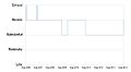 History of the UK Terror Threat levels up to August 2014 (so far)

- Article(s)
- UK Threat Levels
- Request
- Could someone update this image so that it shows the recent change from "severe" to "critical". Thanks. -- Seagull123 Φ 22:55, 23 May 2017 (UTC)
- Graphist opinion(s)
@Seagull123: This is the same request as this one which I will adress when I get a replay and more info from you, thanks. --Goran tek-en (talk) 13:03, 6 June 2017 (UTC)
![]() Done
Done
Evadale High School coat of arms
- Article(s)
- Evadale High School
- Request
- Could someone create a SVG/vectorised version of the Evadale High School coat of arms please? There is no copyright issue as the arms are of unknown authorship from 1955 so ineligible for copyright The C of E God Save the Queen! (talk) 15:24, 12 May 2017 (UTC)
- Can anyone help? The C of E God Save the Queen! (talk) 18:22, 31 May 2017 (UTC)
- Graphist opinion(s)
 Request taken by Goran tek-en (talk) 18:35, 21 June 2017 (UTC).
@The C of E: You will have to help me with feedback on my drafts. --Goran tek-en (talk) 18:35, 21 June 2017 (UTC)
- @The C of E: I just saw that you have a duplicate of this request at commons and that it was completed there. For this reason I close this. --Goran tek-en (talk) 21:07, 21 June 2017 (UTC)
Church-sect continuum.svg
-
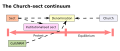 A diagram of the church-sect typology continuum. Include church, denomination, sect, cult, new religious movement, and institutionalized sect.

- Article(s)
- Cult
- Request
- Would it be possible to align the head of the arrow leading from "cult" to "denomination" correctly?-- Hubon (talk) 21:02, 7 May 2017 (UTC)
- Graphist opinion(s)
-
- @Hubon: This is actually a bug in the mediawiki PNG renderer. The SVG was right all along. Altered the SVG by adding a bezier handle to the arrowhead, now it seems to work. Done
- @Hubon: This is actually a bug in the mediawiki PNG renderer. The SVG was right all along. Altered the SVG by adding a bezier handle to the arrowhead, now it seems to work.
Chart for thorium
-
 Graph
Graph

- Article(s)
- Thorium
- Request
- The graph could really use a couple of additions: first, please add a few intermediate values along the y-axis (perhaps 10, 20, ..., 110 could be a good choice) and add semi-transparent lines along them in the graph itself. Also, please elongate the graph along the vertical axis a couple of times or maybe even more (a tall image is desired). Perhaps it is best to have two versions: one with the Total graph (already in the base picture) and one without.-- R8R (talk) 07:45, 8 June 2017 (UTC)
- Graphist opinion(s)
![]() Request taken by Goran tek-en (talk) 17:23, 11 June 2017 (UTC).
Request taken by Goran tek-en (talk) 17:23, 11 June 2017 (UTC).
@R8R Gtrs: Now there is a draft for you to look at and give me feedback on it, anything goes. This has another color scheme and the colors are picked to work for people with color issues. I didn't really understand what you meant by the "semi-transparent lines". But as I wrote before, just give me feedback, thanks. Also please ping me when you replay. --Goran tek-en (talk) 19:12, 11 June 2017 (UTC)
- @Goran tek-en: First and foremost, thank you for taking this one on.
- Forget the "semitransparent" issue. I shouldn't have even attempted to go for it; you've done better, thank you.
- Re colors: I see what you want to go for, but as of now, the impact on the color scheme has been negative on those with no color problems. If you want to pick a new set of colors, may I suggest this tool to help you out? I'd love to have four different colors still (e.g. blue, green, red, violet; or the like). I (quite simply) view the suggested colors as "blue, blue, green, and green."
- The new height/width ratio is an improvement. When you make the version without the "Total" line, please stretch the picture further.--R8R (talk) 17:53, 12 June 2017 (UTC)
- @R8R Gtrs: Now there are two new drafts, you should check everything and specially so that the curves are correct.
- With total.
- No total. Give me feedback, thanks. --Goran tek-en (talk) 17:52, 14 June 2017 (UTC)
- @R8R Gtrs: Now there are two new drafts, you should check everything and specially so that the curves are correct.
- @Goran tek-en: Looks good, thank you! A couple of minor points:
- Lines labeled "30" and "40" would be useful to more clearly see the starting values. In both graphs, really, but in the latter especially.
- To be perfectly correct, "4.5 Ga" should be "4.5 Ga ago." This is not your mistake since the inaccuracy was in the original image, but this should be fixed anyway.
- There should be no space between a mass number and its symbol. (For example, "40K," not "40 K.")
- (no action required) The lines look good and correct. The red line looked "broken" to me, but I checked it and it seems it's correct.
- With these little fixes, I believe we should be good to go.--R8R (talk) 18:26, 14 June 2017 (UTC)
- @Goran tek-en: Looks good, thank you! A couple of minor points:
@R8R Gtrs: Now you can find them here;
No total.
With total. --Goran tek-en (talk) 18:54, 16 June 2017 (UTC)
![]() Done
Done
Confederate States of America

- Article(s)
- Confederate States of America
- Request
- please change grey to black to match others in set… -- Kintetsubuffalo (talk) 01:33, 11 June 2017 (UTC)
- Graphist opinion(s)
![]() Done - FOX 52 (talk) 05:41, 11 June 2017 (UTC)
Done - FOX 52 (talk) 05:41, 11 June 2017 (UTC)
- Thank you as always!--Kintetsubuffalo (talk) 14:02, 12 June 2017 (UTC)
SVG map on blasphemy laws

- Article(s)
- Blasphemy law, Islam and blasphemy, Blasphemy
- Request
- Needs to updated by decoloring Denmark since the law has been abolished. Fixmaster (talk) 15:15, 9 June 2017 (UTC)
- Graphist opinion(s)
- — Preceding unsigned comment added by Fixmaster (talk • contribs) 15:16, 9 June 2017 (UTC)
Logo of the Argentine Congress
-

-

-
 Senate of Argentina (vector)
 -
 House of Deputies of Argentina (vector)


.svg)

State Seal of Japan
-

-
 vectored


- Article(s)
- State Seal of Japan
- Request
- transparent svg version, please… -- Kintetsubuffalo (talk) 03:44, 15 May 2017 (UTC)
- Graphist opinion(s)
![]() Done this ? FOX 52 (talk) 03:59, 5 June 2017 (UTC)
Done this ? FOX 52 (talk) 03:59, 5 June 2017 (UTC)
- Perfect, thank you so much!--Kintetsubuffalo (talk) 03:26, 6 June 2017 (UTC)
Full Arms of British Honduras
-

-
 Full Arms
.svg)
.svg)
- Article(s)
- British Honduras, Coat of arms of Belize
- Request
- Could someone please create the full coat of arms of BH used from 1907-1981, found at http://www.ambergristoday.com/sites/default/files/archived_images/editorial_blog/2012/09/17/belize_belice_british_honduras_flag_01_jpg_21298.jpg, using the shield above. Thanks. User:Snow Lion Fenian
- Graphist opinion(s)
Hollow Moon (or Spaceship Moon)
- Article(s)
- Hollow Moon
- Request
- I have a weird one for you. There's a request template on the talk page asking for a diagram/illustration of what the Hollow Moon might look like, with a suggestion that you might be able to help. Commonly, when it comes up in the modern press, it's in the context of a Spaceship Moon (the moon is an artificial satellite placed in orbit by galactic federation, lizard overlords, etc.). This is a Good Article and would benefit from such an illustration, but unfortunately there are no free ones out there. This is the image most frequently used, from what I can see (the Death Star is another popular one, but that's (a) not cutaway and (b) too obviously the Death Star). Would it be possible to get something similar done here, or is that just too cheeky? Cheers, -- Bromley86 (talk) 01:08, 24 May 2017 (UTC)
- Graphist opinion(s)
![]() Request taken by Goran tek-en (talk) 11:42, 26 May 2017 (UTC). @Bromley86 and Bromley86: I guess it's quite open to what it could look like but if there is something special you think about let me know. If/when you replay please ping me, always, thanks. --Goran tek-en (talk) 11:42, 26 May 2017 (UTC)
Request taken by Goran tek-en (talk) 11:42, 26 May 2017 (UTC). @Bromley86 and Bromley86: I guess it's quite open to what it could look like but if there is something special you think about let me know. If/when you replay please ping me, always, thanks. --Goran tek-en (talk) 11:42, 26 May 2017 (UTC)
- @Goran tek-en:. Wow, thanks! Yep, it's entirely open as to what it might look like; that image supplied seems to be the one the both the media (okay, tabloids) and the conspiracy press use to depict it, when they use a cut-away image. Anything that gets across the idea that it's a metal-shelled (with a layer of rock on top of that, so it looks like a normal moon from the outside) sphere with a void/artificial structure in the middle would be perfect. Bromley86 (talk) 12:27, 26 May 2017 (UTC)
- @Bromley86: Now there is a draft for you to look at. This is a png version of the svg file I'm working in. Give me feedback, thanks. --Goran tek-en (talk) 17:56, 1 June 2017 (UTC)
- Thanks Goran tek-en! Looks great to me. I love the hexing on the inside, as that gets across its constructed nature immediately, as do the two internal planes. And we have the two layers to the shell. Central power/light sources feature heavily in hollow planet stories, so that's perfect too.
- It did take we a while to figure out what you'd done to expose the hollow centre; clearly, jigsaws are not my forte. I wonder if it would be possible to make it look like a geometric segment has been cut away to reveal the hollow, as in that commonly used image? Alternatively, would it be possible to remove the two "waste" pieces from the image, so the outer surface of the moon is exposed, and the outline of the moon is spherical? Either of those changes would make the image immediately understandable, IMO. Bromley86 (talk) 21:18, 1 June 2017 (UTC)
- @Bromley86: Well my idea is that the cut out pieces is not a jigsaw pattern. If you look at this moon image and look at the darker areas there. It's roughly those areas that is open and slided away over the moon surface. To me this is the way that who ever has constructed this hollow moon will go about to open it up when they need. They lift up and slide those areas to the side to get full access for the openings.
- I can fully understand that not every one ever will understand it and for most it will take a while. But I do think that an illustration like this, of an probably not existing thing/object, doesn't have to be correct or totally understandable, it's a part of the subject. Also I wanted to move away from how it's often depicted, this is how I think and work.
- Maybe we can put some information/text in the description so it's more understandable.
- I will need the following;
- * Name of the file
- * Description
- * Category/ies at commons
- to be able to upload it at commons. --Goran tek-en (talk) 15:55, 2 June 2017 (UTC)
- Goran tek-en. My fault for not inserting a smilie there: my point was that it took me a while to realise that you'd lifted those sections out of the moon and slid them off to the side. Actually, my spacial awareness scores (at school, a while back) were usually pretty good, so I was kidding there.
- I think the key thing is when you say: "not every one ever will understand it and for most it will take a while." That's not what I'd like to see in the article, nor do I think it's what the person who added the tag was looking for. I ran it past my wife, who is at the opposite end of the Myers-Briggs spectrum to me, and she had to have what you'd done explained to her. Admittedly, that's a small sample, but it tends to confirm what you said.
- Consequently, I suspect the best thing to do is to leave the article without an image of the hollow moon. I'm really sorry to have wasted your time.— Preceding unsigned comment added by Bromley86 (talk • contribs) 13:36, 4 June 2017 (UTC)
- @Bromley86: I guess it was you who wrote the last but you forgot to sign so I didn't get a notification. No we will not stop here, I will think about this and what I can do is to make two versions and upload them both. So just wait for a new draft, thanks. --Goran tek-en (talk) 15:25, 4 June 2017 (UTC)
- @Bromley86: Is this draft OK for you? --Goran tek-en (talk) 17:22, 4 June 2017 (UTC)
- Hi Goran tek-en. That looks great to me - thanks for persevering!
- Name: Whatever works. Perhaps "Hollow Moon illustration"?
- Desc: Good god, who knows? :) "Illustration of an artificial hollow Moon"?
- Cats: Category:Moon, Category:Aliens, Category:Pseudoscience, Category:Conspiracy_theories
- It's the Moon; if it's a hollow spaceship, it's alien related; there's reference to scientific stuff that doesn't survive scrutiny; and RS call it a conspiracy theory (in the article we make the distinction that it's more accurately a fringe theory than a conspiracy theory). Bromley86 (talk) 10:12, 5 June 2017 (UTC)
- @Bromley86: Is this draft OK for you? --Goran tek-en (talk) 17:22, 4 June 2017 (UTC)
- @Bromley86: I guess it was you who wrote the last but you forgot to sign so I didn't get a notification. No we will not stop here, I will think about this and what I can do is to make two versions and upload them both. So just wait for a new draft, thanks. --Goran tek-en (talk) 15:25, 4 June 2017 (UTC)
- @Bromley86: Well my idea is that the cut out pieces is not a jigsaw pattern. If you look at this moon image and look at the darker areas there. It's roughly those areas that is open and slided away over the moon surface. To me this is the way that who ever has constructed this hollow moon will go about to open it up when they need. They lift up and slide those areas to the side to get full access for the openings.
- @Bromley86: Now there is a draft for you to look at. This is a png version of the svg file I'm working in. Give me feedback, thanks. --Goran tek-en (talk) 17:56, 1 June 2017 (UTC)
@Bromley86: Now you can find them here;
Illustration of an artificial hollow Moon. Segment out.
Illustration of an artificial hollow Moon. Sliding out. --Goran tek-en (talk) 17:19, 5 June 2017 (UTC)
![]() Done
Done
Flag and coat of arms of Fátima, Portugal
-
 Flag
Flag -
 Coat of arms
 -
 vectored
 -
 vectored
.png)


- Article(s)
- Fátima, Portugal, List of cities in Portugal and other pages
- Request
- Can someone please vectorise the flag and coat of arms of Fátima, Portugal? Thanks in advance. — Preceding unsigned comment added by 109.78.94.79 (talk) 21:02, 9 May 2017 (UTC)
- Graphist opinion(s)
Stale
Not a request, more of a bug report
-
 Arms of Marquess of Lansdowne

- Article(s)
- Marquess of Lansdowne
- Request
- In the gallery above, the coat of arms is shown correctly (AFAIK, though the different field for the two red saltires is suspicious). But in the article Marquess of Lansdowne, where it appears in the infobox, the ermine leaks out of the shield and fills the bottom righthand corner of the enclosing rectangle. Also at ja:侯爵#侯爵家, where it appears in a table. I see this with both Chrome and Safari. I've no idea how I might go about fixing it, so I'm hoping that someone here knows. Maproom (talk) 08:51, 5 April 2017 (UTC)
- Graphist opinion(s)
![]() Done I'm certain that the issue has to do with the masks that were being used in the image. I'm don't what causes it, but the imaeg was not rendering correctly with any other svg displayer apart from inkscape. Regardless, I recreated a version that doesn't use any masks, and is more true to File:Petty-Fitzmaurice-crest.jpg. Let me know what you think. Auguel (talk) 05:17, 9 April 2017 (UTC)
Done I'm certain that the issue has to do with the masks that were being used in the image. I'm don't what causes it, but the imaeg was not rendering correctly with any other svg displayer apart from inkscape. Regardless, I recreated a version that doesn't use any masks, and is more true to File:Petty-Fitzmaurice-crest.jpg. Let me know what you think. Auguel (talk) 05:17, 9 April 2017 (UTC)
- Auguel: in my opinion, it's a great improvement. The ermine no longer leaks out, the bends are aligned, both saltires have fields argent, and the thin black lines make it clear that there are distinct but adjacent ermine components. I wonder about the central crescent: you have made it smaller, but should it be there at all? It's not mentioned in the blazon at Marquess of Lansdowne. Traditionally a crescent is a mark of difference indicating a second son. My guess is that the crescent is not present in the arms of the Marquess, and the poorly-done version you have replaced was copied from the arms of a second son of a Marquess of Lansdowne. Maproom (talk) 08:19, 10 April 2017 (UTC)
- Like I said before I was basing myself on File:Petty-Fitzmaurice-crest.jpg rather than the original svg. Note that in the jpg there is a smaller but still present crescent in the center. I really don't have enough knowledge to judge whether it should be there, but if you still think it should be removed, I'm more than happy to remove it. Auguel (talk) 16:09, 10 April 2017 (UTC)
- These omit the crescent:
- http://www.europeanheraldry.org/united-kingdom/families/families-m-r/house-petty-fitzmaurice/
- http://www.alamy.com/stock-photo-heraldry-coat-of-arms-great-britain-coat-of-arms-of-the-marquess-of-60261697.html
- https://books.google.co.uk/books?id=ZfdRAAAAcAAJ&pg=PA588&lpg=PA588&dq=Petty-Fitzmaurice+heraldry&source=bl&ots=ArSHSdJ2yj&sig=9NOzZigklHXp4JQ9ewhB4mXQKtE&hl=en&sa=X&ved=0ahUKEwjC_Lqv8prTAhWFCMAKHcCkDU4Q6AEIYTAQ#v=onepage&q=Petty-Fitzmaurice%20heraldry&f=false
- The only sources I have found which include the crescent are Wikipedia and pages clearly derived from it. Please remove it (and blame me if anyone objects). Maproom (talk) 22:15, 10 April 2017 (UTC)
- These omit the crescent:
- Like I said before I was basing myself on File:Petty-Fitzmaurice-crest.jpg rather than the original svg. Note that in the jpg there is a smaller but still present crescent in the center. I really don't have enough knowledge to judge whether it should be there, but if you still think it should be removed, I'm more than happy to remove it. Auguel (talk) 16:09, 10 April 2017 (UTC)
Stale
bug in the PNG renderer of mediawiki? or is my SVG invalid?
-
 Apollo program insignia

- Article(s)
- Apollo program, and literally a 1000 others
- Request
- Hey, it is me again. I am still improving on the SVG and wanted to start with the moon. If you go to the "File history", you'll see that e.g. https://upload.wikimedia.org/wikipedia/commons/archive/0/00/20170308141914%21Apollo_program.svg has a much more detailed moon surface. However, when I uploaded this, the PNG preview automatically rendered by the wikimedia software showed one of the craters very much different from the others. I tried to find the problem, but, as far as I can see, the SVG is valid. Can someone who knows a lot about SVG and the PNG preview renderer take a look and help me with this? Thank you all. -- Lommes (talk) 14:28, 8 March 2017 (UTC)
- Graphist opinion(s)
- @Lommes:Hi I think the problem is that the moon craters in your SVG have a blur effect on their paths which don't appear until you zoom closer. For example if you zoom-in on your SVG version the blur effect on the craters render. If you remove the blur effect in your SVG then the PNG should render the detail correctly. Tsange ☯ Talk 15:23, 8 March 2017 (UTC)
- @Tsange:Thank you very much for your answer. However, when I open the linked SVG ( https://upload.wikimedia.org/wikipedia/commons/archive/0/00/20170308141914%21Apollo_program.svg ) in either Firefox or Chromium, the blur effect is displayed perfectly. Only the Wikipedia PNG renderer has difficulty displaying this, and only on one specific crater. I believe the blur effect helps showing the moon surface in a way that is closer to the Apollo patch graphic. --Lommes (talk) 14:46, 9 March 2017 (UTC)
- I see a land mass in the North between Canada and Russia. Which continent is this? SharkD Talk 19:50, 12 May 2017 (UTC)
Rothe-Erde

- Article(s)
- Rothe Erde
- Request
- png of arms only, please… -- Kintetsubuffalo (talk) 03:50, 15 May 2017 (UTC)
- Graphist opinion(s)
Coat of Arms


- Article(s)
- Rana dynasty
- Shah dynasty
- Request
- Please improve the above coat of arms to make it better and clear as possible.
Queen's Venturer Award

.png)
- Article(s)
- Queen's Venturer Award
- Request
- replace washed, shrunken patch with graphic please… -- Kintetsubuffalo (talk) 02:31, 19 May 2017 (UTC)
- Graphist opinion(s)
Oblique projection
-
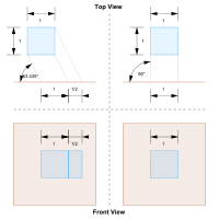 Comparison of an oblique (at left) and orthographic (at right) projection of a cube (colored blue). The projection plane is colored orange. The angle 63.43° is equal to , and the amount of foreshortening in this example is the inverse of , or . Thus, the amount of foreshortening in an oblique projection is inversely proportional to the tangent of the angle between the projection plane and the projection lines.
 -
 Oblique projection of a cube with foreshortening by half, seen from the side


- Article(s)
- Oblique projection
- Request
- I am requesting a critique. To me the image is maybe too abstract. It's meant to depict a 3D scene from two different angles, but the image does not really "feel" 3D. Is there a better way to depict this scene? SharkD Talk 19:53, 12 May 2017 (UTC)
- Graphist opinion(s)
- I already understand what the image is intended to convey, and after some effort, I was able to understand the image. But I still don't understand the caption, which implies that the amount of foreshortening in an orthogonal projection is 0.3171. Maproom (talk) 22:20, 12 May 2017 (UTC)
- The amount of foreshortening in an orthogonal projection is zero (or 100% depending on how you look at it). I don't understand where you got the number 0.3171. SharkD Talk 00:51, 13 May 2017 (UTC)
- Sorry, yes, I made an arithmetic error, that should be 0.352. The caption tells us that "the amount of foreshortening in an oblique projection is inversely proportional to the angle". In the oblique example, the amount of foreshortening is 1/2 and the angle is 63.43°. In an orthographic projection the angle is 90°. I therefore calculated 1/2 × 63.43/90, which is 0.352.
- I think there are (at least) two problems with the caption. One is that "amount of foreshortening" is undefined. Another is that the maths is wrong, there's some trig function missing from the "proportional to" sentence. Maproom (talk) 07:43, 13 May 2017 (UTC)
- Maproom Does this table make more sense? Foreshortenings greater than 1 aren't very useful of course. Foreshortening is defined here. I can't think of a better definition. SharkD Talk 08:15, 13 May 2017 (UTC)
- Foreshortening is also described here. If you can help summarizing this and creating a better definition, it would be great. SharkD Talk 08:17, 13 May 2017 (UTC)
- The amount of foreshortening in an orthogonal projection is zero (or 100% depending on how you look at it). I don't understand where you got the number 0.3171. SharkD Talk 00:51, 13 May 2017 (UTC)
| Angle | Foreshortening |
|---|---|
| atan ∞ = 90.00° | 0 |
| atan 8/1 = 82.87° | 1/8 |
| atan 4/1 = 75.96° | 1/4 |
| atan 2/1 = 63.43° | 1/2 |
| atan 1/1 = 45.00° | 1/1 |
| atan 1/2 = 26.57° | 2/1 |
| atan 1/4 = 14.04° | 4/1 |
| atan 1/8 = 7.13° | 8/1 |
| atan 0 = 0.00° | ∞ |
- Now that that is settled, does anyone have any tips on the image itself? SharkD Talk 08:46, 16 May 2017 (UTC)
- @SharkD: I'll give my two cents. Firstly, I'm not sure the chosen colours work the best. There isn't a lot of contrast, especially due to the transparencies. Why isn't everything opaque? On the accessibility side of things, there is almost zero contrast in grayscale (not ideal at all). I also think the line indicating the plane in the top view should be much thicker (to make the colour more obvious). I would also add more labels to the diagram (like 'cube', 'projection plane', etc.). Lastly, I think it should be clearer which diagrams are showing the same thing (but from a different angle). E.g. It isn't immediately obvious that the two right-hand-side diagrams are of the same thing. I would mitigate this by rotating the whole diagram 90°, and putting a horizontal line through the middle (this is not to mention the fact that the 'front view' label is currently floating in the middle of everything: it's very unclear what it's pointing to). Anyway, given that it's an SVG I'd be happy to work on it myself if that would help. —♫CheChe♫ talk 10:34, 18 May 2017 (UTC)