Wikipedia:Picture peer review/Archives/Jan-Jun 2007
|
Please cut and paste nominations to be archived from the Picture peer review mainpage to the top of the appropriate archive page, creating a new archive (by nomination date) when necessary.
|


A good image, gives the viewer the sense of the speed even though that the category is entry level in open wheel racing; the article appears in Jeremy Metcalfe and possibly Formula Renault when that article is cleaned up; the original image was created by christianb_7 from Flickr.
- Nominate and support Edit 1. - Phill talk Edits 10:24, 25 May 2007 (UTC)
Comments:
- While the edit does offer some improvements, the crop is way too close to the front of the car, and the colours seem rather cool. --Pharaoh Hound (talk) (The Game) 11:45, 25 May 2007 (UTC)
Seconder:
I believe this image meets the criteria. It's a large size and resolution. It shows a unique property. It's used in Quartz and Transparency (optics). Created by commons:User:Zimbres, it has a creative commons license.
- Nominate and support. - Joe I 19:30, 21 May 2007 (UTC)
Comments:
- For something so reproducable, a little more quality could be expected; text does't look very smooth, heavy vignetting (probably from weak, hard, direct lighting). J Are you green? 01:08, 22 May 2007 (UTC)
Seconder:

A truly beautiful ghostly composite image taken by the Hubble Space Telescope, when seen in hi-res you can see dozens of galaxies including some spiral galaxies much like our own. would make a nice featured picture; This image appears in the article about Dark matter ,created by NASA, ESA, M. J. Jee & H. Ford et al. (Johns Hopkins U.)
- Nominate and support. - ▪◦▪≡ЅiREX≡Talk 20:17, 18 May 2007 (UTC)
Comments:
- This image is tiny compared to some of our recent NASA FPs. I'll try to upload the high-resolution version, but right now it seems like my computer is going to crash just opening it... I won't judge the actual picture until I can see how the high-resolution version looks, though. J Are you green? 23:17, 18 May 2007 (UTC)
- Okay, here it is. Just a warning - the file is 14.14 MB (and that's after I compressed it!) so it could crash a computer (as the 44 MB original did to mine). J Are you green? 23:32, 18 May 2007 (UTC)
- I had no problem with the Full resolution 3921 × 3921 pixel image that you uploaded. nicely done btw, people will be able to easily make out many of the galaxies at that resolution, the lower thumbnail resolution of the image speaks to the gravitational lensing of dark matter. Sort of a two for one deal, Galaxies and Dark matter :) ▪◦▪≡ЅiREX≡Talk 06:52, 19 May 2007 (UTC)
- If you want to nominate it, go ahead. I honestly cannot yet voice an opinion, especially given my low knowlege in astronomy, until I see some other comments. J Are you green? 01:50, 21 May 2007 (UTC)
Seconder:

I think this pic should meet the criteria. It's of a size and resolution. It illustrates iridescence subtly but beautifully. It is used in Jewellery, Pearl, Necklace and Alpha Kappa Alpha. It is a pic from Flickr.com user "tanakawho".
- Nominate and support. - Joe I 05:40, 18 May 2007 (UTC)
Comments:
- It might pass, but there are a few things that work against it. For one, pearl necklaces aren't extremely difficult to find and therefore a similar photo of higher resolution could be easily taken (the res does meet the criteria, but it's still rather small compared to some of the newer FPs). Also, it's a bit grainy, some of the necklace is cut off, and I find the coarse fabric background distracting. --Pharaoh Hound (talk) (The Game) 12:40, 18 May 2007 (UTC)
Seconder:

Photographed by Doug Dolde at dawn on Halloween, 2001 above Malibu, California. I found this image on the Malibu, California article.
- Nominate and support. - Spikebrennan 18:31, 16 May 2007 (UTC)
Comments:
- It's looks nice, but it is really tiny. Also, the flare around the sun is a detractor. Sorry, but I do not think that this has much of a chance. J Are you green? 20:44, 16 May 2007 (UTC)
Seconder:


I love this picture (ok, as the photographer and a keen square-rig sailor I'm doubly biased!) but I suspect others may not share my enthusiasm. I'm sure the photo-geeks will be able to pick many technical holes in it; in its defence is the fact that it's an action photo taken at sea rather than posed in a studio. It may be that the composition would be improved by cropping, but I rather like the way in which Colin is isolated in a big blue space in the original.
The caption explains the setting. The picture illustrates the fact that square-rigged sailing ships still exist and that the everyday work on them is the same as it ever was - 100 feet above the sea. It's also useful in a practical, encyclopaedic sense, clearly showing what a footrope and a flemish horse are and how they are used.
What do you think?
- Nominate and support. - PeteVerdon 23:58, 13 May 2007 (UTC)
Comments:
- I like it. However, I'd crop out the object at the very bottom. I think that would focus the photo onto the man instead of the ship, which is what I think your goal is here. Rwhealey 21:35, 22 May 2007 (UTC)
- I also think the image would improve if the bottom was cropped so there was only sky. I think this would show the isolation of Colin much better. I like the image, but don't feel qualified to support or object the nomination as I'm still trying to figure out the criteria. Mehmet Karatay 12:16, 25 May 2007 (UTC)
- Thanks, both of you. I agree that slicing off the bottom of the picture to lose the upper-topsail yardarm would be an improvement - thankyou for pointing it out. Where I mentioned cropping above I had in mind reducing the shot right down to just the man and the gear immediately around him, which I think we agree would not be a good thing. PeteVerdon 12:39, 26 May 2007 (UTC)
- Glad to be of help. One thing which may (or may not) improve the composition of the photo is to crop it to be square. Start at the top right and make the square as big as you can without including the upper-topsail yardarm at the bottom. See what you think. It might make the image more compositionally balanced while still keeping the sense of openness. Have a play. If that doesn't work simply remove the yardarm from the bottom as suggested earlier. Just a thought, and I unfortunately I know you can't really do anything about this, but I wonder if the featured picture review panel would complain about the face being in shadow? I hope not. Mehmet Karatay 14:18, 26 May 2007 (UTC)
- I tried cropping it in a few ways - just plain slicing off the bottom, slicing off the left-hand side, and doing something a little bit like what you describe above, taking a bit off both. I also experiemented with removing the bits of ratline that intrude into the right-hand edge of the picture. I'm not really that keen on any of them; they all have the effect of zooming in on the sailor and reducing the void around him. Or maybe it's just that I'm too used to the full image, having had it sat on my desktop for weeks till I got round to uploading it.
- Do you think it might be feasible to "airbrush" the topsail yardarm away? I don't know what the Featured Pictures orthodoxy has to say about such things, but if anyone more familiar with Photoshop / the Gimp fancies trying it I'd be interested to see the result. PeteVerdon 08:01, 31 May 2007 (UTC)

- I have a feeling that they wouldn't mind as long as it was a perfect job, but if it was at all obvious it would fail. Getting it perfect is well beyond my skill level I'm afraid. Mehmet Karatay 09:41, 31 May 2007 (UTC)
- I tried a few crops for you and feel the best one I got was without the bottom yard-arm and ratline. I find those two items really distract from the image, as my eye explores their detail. This doesn't add to the feeling of openness or what is actually going on at all. I tried to make the image as large as possible, as I felt the square I suggested earlier didn't really work for this image. With this crop I like the pattern formed by the lines on the top right. I find this visually pleasing without being distracting. I also lightened the area of the face, leaving the rich saturated colours you have elsewhere.

- The other thing I feel worked was cropping the sky to the left out from my edited version. The feeling of openness you are after goes completely then I'm afraid but I think it does work compositionally. The main subject (the person) is shown clearly and the mind wonders what he is trying to achieve, how easy he is finding staying there etc.
- My opinion is that the image definitely won't get featured with the bottom yard-arm and possibly the ratline. If you don't like the image without them, then maybe the image isn't of feature quality? Just a thought. Mehmet Karatay 09:41, 31 May 2007 (UTC)
- I like both of those. Perverse, I know, since they're almost identical to ones I made myself, but since when was creativity strictly rational :-) . Presumably an FP candidate has to be a single photo? I can't decide which I prefer. PeteVerdon 18:30, 31 May 2007 (UTC)
- You can nomiate all of them as "alternatives." Just a word of warning, I don't think that you'll encounter too much enthusiasm over that picture - it's not amazingly exiting or informative. There's nothing wrong with it; it serves its purpose well, but I really just don't see the extra in it that makes it featured. By way, my personal preference is for the second crop. I added an edit because you colours are quite dull, and it's hard to discern detail in the shadow. P.S. if you're going to make an element of the picture vanish, please add a retouched photo tag. J Are you green? 02:41, 1 June 2007 (UTC)
- And, just out of curiousity, who is "they," who you seem so inclined to impress? J Are you green? 02:52, 1 June 2007 (UTC)
- I suspect you're right about the picture not really being Feature quality - I guess that's why I listed it here to gauge the enthusiasm of people other than me. Not quite sure what you're getting at with the "they" point - I've never used the term. PeteVerdon 01:18, 9 June 2007 (UTC)
- "I have a feeling that they wouldn't mind as long as it was a perfect job..." That's Mehmet Karatay. I think I see, though. The voters, perhaps? J Are you green? 21:44, 2 July 2007 (UTC)
- Here, I took the liberty of editing it. J Are you green? 00:55, 30 May 2007 (UTC)
- Just to touch on the question about photoshopping stuff out of pictures - the impression I've gotten on that page is that photoshopping to remove defects (correcting colour cast, removing dust specks, etc) is generally okay, but actually altering the portrayed object is not. See here or here for examples. Personally I would almost automatically object to any pic that had the offending bits wiped as being unencyclopedic. Crop, don't erase, IMO. Matt Deres 16:45, 12 July 2007 (UTC)
Seconder:
A Commons picture I came across in Castle, put there by an anon, but originally taken by Dario sanz.
It depicts the imposing Castillo de la Mota in Medina del Campo, and its name refers to the motte or artificial mound common in a castle's early stages. This would be replaced by Late Medieval fortification, and this picture illustrates the major features of a castle superbly - turrets, gatehouse, moat, heavy curtain walls, machicolation and crenellation, etc. - thus making it a good picture for a core topic. Cesare Borgia was imprisoned there, and it was the first monumental building in Medina designated as a Heritage Site (Bien de interés cultural). It is especially appropriate for representing the castle article as an FP because it is in what was once the Kingdom of Castile (whose very name means "castle").
As a photograph, I was impressed by the striking image of snow on a Spanish castle - evocative of both Spanish castle architecture and the Meseta Central.
- Nominate and support. - Grimhelm 19:09, 12 May 2007 (UTC)
Comments:
- It wouldn't pass probably. Mainly because of composition, sharpness and tilt. Nice otherwise. Try getting more of the building next time. -Fcb981 01:04, 13 May 2007 (UTC)
- That's a lot of tilt. Was he trying keep his balance on the slope he standing on or something? vlad§inger tlk 19:46, 22 June 2007 (UTC)
Seconder:

Excellent Image, great quality. It's very colourful and pleasing to the eye. It appears in the article "Soap bubble", and it was created by brokenchopstick from Flickr.
- Nominate and support. - Minibabu7 00:54, 11 May 2007 (UTC)
Comments:
- yeah, go ahead and nominate it, it might not pass but it could and it is an interesting shot. hand held and non-studio from the reflection. -Fcb981 14:25, 11 May 2007 (UTC)
- This pic has already been nominated before. Wikipedia:Featured picture candidates/Bubble brokenchopstick In my opinion, there are other more stunning pics on the soap bubble page. Jumping cheese 21:11, 22 June 2007 (UTC)
- Oops...it was you that nominated it back in May 13. Jumping cheese 21:13, 22 June 2007 (UTC)
Seconder:
- Support I'll second that. I'm not a pro by any means. But that picture makes me want to dig into the article it appears on. --BlindEagletalk~contribs 18:02, 22 June 2007 (UTC)
- Support I like this shot. There may (probably will) be some complaints about the objects reflected in the bubble (the car and so on). vlad§inger tlk 19:49, 22 June 2007 (UTC)

Slight WP:COI here since I took the photo, so I want to see what others think of it rather than jumping in and self-nominating. This image currently appears in the article Hampstead Heath, although at some point I intend to create a separate Vale of Health article. I feel this image serves its intended purpose well, in illustrating the way in which this small village, despite being entirely surrounded by (relatively) central London is completely cut off from the remainder of the city by parkland and steep hills. The high vantage point illustrates London's unusual geography, with the twin central business districts of London Docklands and the City of London both visible, and the steep hills of the North Downs at the southern edge of the city clearly visible in the background. BTW the sky's not overexposed - that is what the London sky looks like in spring.
- Nominate and support. - — iridescenti (talk to me!) 12:51, 10 May 2007 (UTC)
Comments:
- It's certainly a nice shot, but I don't think it's an FP candidate for two reasons. 1) Composition. The foreground is messy and distracting. The tree on the left, the stump with it's wood chips in the middle, are particular problems. Is the hill you were standing on taller? If so, you should be able to get higher up on it, putting more of the green in the middle ground, getting rid of the foreground, and seeing the city more completely above the trees. 2) Image quality. It isn't strikingly clear. I don't know what's going on with the leaves and the sky, but those transitions are distracting in the full version. In fact, the entire image isn't clear enough in the full version. The washed out background would probably be forgiven for being reality, but the middle-ground buildings are far, far too grainy. It's possible that you just need a down-sample, but I think the problems are more serious than that. The camera people might be able to give you advice on resolution, generally, but I can't. This particular image won't make it, but it's quite possible that you can get one from near that spot that will. Enuja 17:12, 10 May 2007 (UTC)
- Just a note: I have edited the image. J Are you green? 16:07, 12 May 2007 (UTC)
Seconder:

No reasons given
- Nominate and support. - Dingemansm 20:58, 8 May 2007
Comments:
- Nice, but it:
- Needs to be in an article and
- Needs to be at least 1000 pixels in one dimension
- Because of these two problems, it fails the Criteria. However, even if they were met, I suspect it would have trouble due to a very shallow DOF and a cut off subject. J Are you green? 20:28, 9 May 2007 (UTC)
Seconder:

It appears in honeybee article [[1]]. I got 2 beestings while taking this picture. But it shows very well how the bees carry the nectar.
- Nominate and support. - Kadripuna 21:29, 7 May 2007 (UTC)
Comments:
- I doubt it would generate much support from FP editors. It's really not that striking an image, effective though it is at communicating the relevant information; it's rather small and the background is blurry and distracting. Daniel Case 13:21, 21 May 2007 (UTC)
Seconder:

I think this picture would be great because you don't often see a picture of a squirrel doing this. I took this picture May 6th, 2007 and it really started to grew on me. I haven't edited this image at all.
- Nominate and support. - MaxFrear 18:56, 7 May 2007 (UTC)
Comments:
- Sorry, but this really doesn't have much of a chance. I like to judge detail by seeing how far an image can be downsampled until it begins to loose detail to see the actual resolution - how much information there actually is as opposed to a pixel count. Unfortunately, I took it down to ~.7 megapixels without any real loss - that means that, by my observation, there really is only 1 pixel for every 9 pixels actually present in the photograph. It isn't your fault, but featured pictures really do make every pixel count. This seems to be the result of excessive in-camera noise reduction; if there is an option to turn it off, I would definitely consider doing so. It would get complaints about blown headlights and purple fringing. I love the picture, but I really don't think it will fare well at FPC. J Are you green? 20:42, 7 May 2007 (UTC)
Seconder:

The Frost Bank Tower of Austin, Texas as seen from Congress Avenue.
I took this photo myself. The tower is one of only two towers in the world that uses the silvery blue glass facade. I felt that the Congress Ave. sign improved on the picture for two reasons; firstly because it identifies the tower in the picture, and secondly because Congress Avenue is in itself notable.
It is however a rather unusual view of the tower, as it looks much different from other angles. (See [2] and [3])
- Nominate and support. - CMBJ 05:41, 7 May 2007 (UTC)
Comments:
- I don't agree that Congress Ave. sign is a useful thing to have in the picture. I'm honestly not sure if any picture, from the ground, looking up at a modern glass-covered sky-scraper, would be a featured picture. Also, from the other pictures, this is a distinctive looking building. Any view that makes it look like a completely conventional skyscraper is unlikely to be featured. Look at the current featured pictures for architecture for an idea of what people expect. Other than the composition, some general tips follow. There is a lot of grain and noise in this picture, especially on the left face of the building. All vertical lines need to be vertical, not tilted (horizontal lines, like the horizon, should be horizontal). If the building on the left isn't a part of Frostbank tower, then it's also a distracting foreground item that might kill a featured picture candidate. Good luck on future pictures! Enuja 01:47, 9 May 2007 (UTC)
- The reason that I felt that the Congress Ave sign was a positive thing is because it is a fairly significant street in Austin (as you can infer from the fact it even has a preexisting article) similar to that of Sunset Boulevard, Park Avenue, or 6th Street. I did consider the fact that this view did portray a slightly more conventional aspect to it, however as mentioned it is one of only two existing buildings with its unique type of glass. The building seen to the left side is indeed part of the same building. I do however entirely understand and appreciate your views on the picture, hence why I posted it here in the first place. I would like to hear further comments from others as well. --CMBJ 07:04, 9 May 2007 (UTC)
Seconder:

Appears on Sooty_Albatross. Fantastic detail and excellent profile. Taken by Vincent Legendre.
- Nominate and support. - Zungaphile 02:08, 5 May 2007 (UTC)
Comments:
- It would be torn to shreds for the subject being cut off and graininess. Noclip 17:11, 5 May 2007 (UTC)
- Actually, it looks pretty nice; it is large enough for the close-up detail to matter less. Nice DOF and sharpness. Being cut-off shouldn't matter much for this shot. Althepal 06:41, 14 June 2007 (UTC)
Seconder:

Used in Cheeseburger, Culture of the United States, Cuisine of the United States, and Five paragraph essay.
- Nominate and support. - ShadowHalo 05:30, 2 May 2007 (UTC)
Comments:
- I am really curious to know where the metadata (0 second exposure at f/0 with a focal length of 0?!) came from. As for the photo itself, but this current nom is getting a relatively hard time with a much better done photograph. J Are you green? 21:05, 2 May 2007 (UTC)
Seconder:

I took this picture the other day. I would like to get some feedback from others on the picture. It appears in a gallery on the article on Laholm
- Nominate and support. - Entheta 23:13, 1 May 2007 (UTC)
Comments:
- Comment - That's a nice image - you've found a pretty subject and the composition is pretty aesthetic. I might have been inclined to move slightly further to the left, to get a slightly more oblique angle on the bridge, but otherwise it's good. One thing that would hamper its chances at FPC is the overexposed sky and chromatic aberration around the treetops. Since you have an SLR camera, you can avoid this either by stopping down the exposure slightly (although that might introduce noise in the subject itself) or by using a circular polariser or a graduated neutral-density filter to reduce the brightness of the sky and increase its colouration. If you don't already have one of those, you should be able to pick them both up for not much cash from a photographic dealer. Alternatively, you could reshoot either early in the morning or later in the afternoon, when the sun is lower and the contrast between shadow and light isn't so strong. Those times of day also produce some attractive lighting, provided the surroundings don't make everything fall too deeply into shadow. --YFB ¿ 23:35, 1 May 2007 (UTC)
Seconder:


Idea leuconoe Paper kite or Rice paper butterfly
I took this pic of a butterfly. I am pretty proud of it and I hope others like it too. I uploaded a cropped version aswell. (PS: this is the first time I do this with any pic so I hope I am doing this the right way.)
[:)]-|--<
- Nominate and support. - PER9000 15:51, 21 April 2007 (UTC)
Comments:
- Beautiful, but DOF is just too shallow. Quite a nice shot, though. J Are you green? 21:33, 30 April 2007 (UTC)
Seconder:

This a picture of a large single standing stone I recently added to the Menhir article. Its a crop of a larger image. I have been taking a number of pictures of megaliths, and more than anything I would appreciate some advice. Thanks.
- Nominate and support. - Ceoil 17:05, 28 April 2007 (UTC)
Comments:
- The image is pretty muddy from High ISO grain. This is pretty difficult to avoid in those lighting conditions without a tripod. Your camera used a fairly quick 1/1000 shutter speed so that there is no motions blur but at the expense of making the sensor very, well, sensitive, If you were to go back I would try taking it during the day or taking a tripod and manualy adjusting the ISO to 200 or 400. Its a good shot but not really up to FP quality. -Fcb981 03:58, 29 April 2007 (UTC)
- Thanks, it was taken during the late afternoon of a good day in a rubbish summer. I'll go back, and incorporate thoes suggestions. Ceoil 04:18, 29 April 2007 (UTC)
Seconder:

This is a fairly high-quality image of the YOO Towers in Tel Aviv, Israel, and appears in the linked article. It was created by me in December 2006 (the towers are not yet completed so it doesn't require an update).
Any comments are appreciated and I will try to fix any flaws found asap.
- Nominate and support. - Ynhockey (Talk) 16:56, 27 April 2007 (UTC)
Comments:
- It does meet size requirements and granted it is of good quality, howerver, it fails to inspire me with wow factor. A good shot and I would guess 15% chance of passing. -Fcb981 06:33, 28 April 2007 (UTC)
Seconder:

This was my old digital snapshot camera's finest hour, and I thought it would be instructive to see how it would do in a review. I've used it to illustrate the article on Hawk Mountain.
- Self-nomination. I'm guessing the main objection would be excessive sharpening (done within the camera) - should that be addressed by further software processing? - Mike Serfas 20:10, 26 April 2007 (UTC)
Comments:
- I doubt it would pass, Bautiful place but the picture is tilted to the right and isn't composed really ENCly. The image quality its self is also so, so. -Fcb981 14:29, 27 April 2007 (UTC)
- The sky is overexposed. I don't think this picture has much chance of passing. --Digon3 14:10, 28 April 2007 (UTC)
- Also, the purported subject of the image, the River of Rocks, is barely visible as two light-colored areas in the background. This might be nice on a hiking guidebook cover but it's not an FP. Daniel Case 13:25, 21 May 2007 (UTC)
Seconder:

I saw this picture and it was interesting enough to make me read the article it came from; Namtso, Peter Vigier.
- Nominate and support. - Schrandit 18:52, 25 April 2007 (UTC)
Comments:
- The main subject (holy rock) is barely in the picture. It is also too compressed for a file of its size. I don't think this has much chance. --Digon3 13:24, 26 April 2007 (UTC)
Seconder:

The image stands out among automotive images, and is of exceptional quality. Image was created by User:DavidChief and appears in the Ford Mondeo article
- Nominate and support. - Karrmann 00:10, 26 April 2007 (UTC)
Comments:
- not bad, location is pretty good for a car shot. angle is good. Big problem is the blown sky and similar highlights on the roof of the car. That is the main problem. I would estimate it has a 5% or so chance of passing and only because of that. -Fcb981 02:00, 26 April 2007 (UTC)
Seconder:

Stumbled across this on Flickr while looking for something else, created by user AMagill there while he was cleaning his computer case. Apart from the encyclopedic value of demonstrating how difluoroethane works to clean things up, I was just struck by so many things aesthetically: the contrasts between the splash of red and the gray/silver background, the soft gradient of the background, the sharp contrast lines of the more circular fluid drops and its general abstract beauty.
I checked the relevant articles (difluoroethane and Dust-Off) and knew they needed this. So I downloaded the largest version, cropped out some of the less successful elements, heightened the contrast and red color a bit. I figured it ought to have a chance at FP status. The original is here, with notes from the photographer, if anyone wants to see if they can do better with it.
- Nominate and support. - Daniel Case 18:28, 24 April 2007 (UTC)
Comments:
- A few things: copyright status, it says some rights reserved on the origenal page, what are those exactly. Also, The crop is nice but it hurts the overall composition. It is hard for me to get context and understanding from the picture. At the full size, artifacts are also pretty bad and the second largest version didn't have them. And, correct me if i'm wrong, the picture is reproduceable and so maybe a better shot could be taken. personaly I doubt it would pass. -Fcb981 23:04, 24 April 2007 (UTC)
- It's CC-BY-2.0 ... in other words, a free image that we're allowed and encouraged to use (I don't troll any other Flickr photostreams besides that and CC-BY-SA-2.0 ... you can put that up here right away). Replaceability is not the issue here.
I took the largest version, artifacts and all, because I knew I was going to have to crop it and only the cropped version would be more than 1000px wide. (Besides, aren't we supposed to work with the biggest versions possible?). Regardless of size, the droplets at the outer edge of the picture are out of focus and blurred (and since they're smaller, it's a distracting mess as well). I couldn't keep them and have a picture worth nominating. Daniel Case 02:20, 25 April 2007 (UTC)
Seconder:

I think it is a good picture of the Bryce Canyon Amphitheater in Utah, USA. A version of this appears in Utah, Bryce Canyon National Park Amphitheatre, and Hoodoo (geology). I dropped the contrast and used a curves ajustment to pull out specific detail in this version.
- Nominate and support. --Digon3 16:21, 12 April 2007 (UTC)
Comments:
- The edit looks better, good work with that. I would wait for a nom until your other hoodoo pic is finished. If that one passes you could give this a try but I personaly think the other one was better. -Fcb981 23:26, 13 April 2007 (UTC)
- I still think it's a nice picture (I saw it on commons) but scaling down hasn't helped getting rid of OOF problem which was my only reason to oppose. Otherwise than that, I don't see why people would oppose. Blieusong 11:01, 14 April 2007 (UTC)
- Actually, this version has not been downsampled yet. I'll do that soon. --Digon3 13:51, 14 April 2007 (UTC)
- Done, second picture is the downsampled version. --Digon3 00:59, 17 April 2007 (UTC)
- I like this shot, but I don't think it'd have much hope as an FP candidate. Despite the downsampling it's still very, very soft; since it's not a subject that's going anywhere in a hurry, people will want a better-quality image than this. If you compare to some of our other landscape FPs, you'll notice that they tend to have much higher detail at pixel level than is available in this photo. Can you go back and re-shoot, by any chance? It looks like your focus was off across the entire panorama. --YFB ¿ 00:50, 18 April 2007 (UTC)
- I probably won't be going back there for a couple of years, but if I do I will definitly re-shoot--Digon3 00:55, 18 April 2007 (UTC)
- D'oh! Well, it's still a lovely photo and would look great on a wall, so don't be too put off. Thanks for contributing it anyway! --YFB ¿ 01:12, 18 April 2007 (UTC)
- I probably won't be going back there for a couple of years, but if I do I will definitly re-shoot--Digon3 00:55, 18 April 2007 (UTC)
- I like this shot, but I don't think it'd have much hope as an FP candidate. Despite the downsampling it's still very, very soft; since it's not a subject that's going anywhere in a hurry, people will want a better-quality image than this. If you compare to some of our other landscape FPs, you'll notice that they tend to have much higher detail at pixel level than is available in this photo. Can you go back and re-shoot, by any chance? It looks like your focus was off across the entire panorama. --YFB ¿ 00:50, 18 April 2007 (UTC)
- It's certainly better than your current hoodoo candidate, but I think you might have trouble so soon after that one, even if you wait until the one is over. None of the current hoodoo pictures are featured, are they? Honestly, I'd wait about a month, and I think the downsampled version might make it. I love impressive views of nature, though, and am much less picky on really sharp, really high resolution nature views than many of the regular posters on featured picture candidates. Enuja 00:38, 20 April 2007 (UTC) You know what, on second thought, the foreground (hoodoo?) on the left will probably kill it. It's such a shame, as this is a fantastic shot. If you put it up, I'll vote for it, but I'm not confident it will pass. Enuja 00:45, 20 April 2007 (UTC)
- I agree, the rock on the left was unneccessary. It has now been cropped. --Digon3 17:56, 20 April 2007 (UTC)
Seconder:

Good encyclopedic value, and beautiful picture--love that her red lipstick matches her red tool. Also love the contrast between her blouse and the armband/leather gloves. A nice complement to the Rosie the Riveter poster at FPC now. Background/hair might be considered too dark, but I like it because it highlights her paleness and delicate features.
In United States home front during World War II, uploaded by me, photo by FSA photographer David Bransby
- Nominate and support. - Calliopejen1 05:18, 17 April 2007 (UTC)
Comments:
- What's the blue spot above her head? It's a bit odd and distracting in the full version. I do think you're going to have trouble with the mostly-black composition at featured picture candidates, but I agree with you, it's really striking. Enuja 00:35, 20 April 2007 (UTC)
Seconder:
- Support same as above. -Fcb981 13:59, 17 April 2007 (UTC)

- Support either - I added a version without the blue spot. --TotoBaggins 18:24, 21 June 2007 (UTC)
- Support second image: in the first image, the first thing that my eyes go to is the dot above her head, which distracts from the main subject, but that is remedied in the alternative image, so I support that one. It's a great photograph about women workers of WWII. --AutoGyro 04:30, 9 July 2007 (UTC)

An image of a sweet violet that addresses the issues brought up with a previous sweet violet image (DOF and chromatic abberation). I'd love some detailed commentary before all the sweet violets are beginning to die off; a web search finds that they usually only last to the end of April, and it is beginning to become quite hard to find a decent example.
- Nominate and support. - Thegreenj 22:16, 16 April 2007 (UTC)
Comments:
- I'll just leave them on Thegreenj's user page. -Fcb981 00:02, 17 April 2007 (UTC)
- Take pictures on an overcast day; in the image page version, the purple looks too pale, and the center of the flower is in shadow. Is there still some fringing on the upper left petal? It's much better than the previous one, and beautiful, but not necessarily quite good enough. I'm not a photographer, so I'm totally making this one up, but I have a strange suggestion; could you shoot under a newspaper or something? If you aren't getting overcast days, maybe you could make one. Enuja 00:52, 20 April 2007 (UTC)
- On overcast days you tend to get much flater and toneless light. To my eye the lighting here is fine if not very good. -Fcb981 05:36, 20 April 2007 (UTC)
Seconder:

I stumbled upon this video, and found it to be incredibly useful in explaining this riding term. I don't know if it's quite exciting enough or big enough to be a featured picture, so I figured I'd post it here to see what others thought.
It appears in Spanish walk and Jerez de la Frontera; it was created by User:Waugsberg.
- Nominate and support. - Calliopejen1 00:05, 14 April 2007 (UTC)
Comments:
- While usefull it is neither large enough or of high enough quality to become a FP. Interesting clip though. -Fcb981 04:47, 14 April 2007 (UTC)
- the "break" on the brackground at the end of the loop is pretty much annoying to me. Blieusong 11:04, 14 April 2007 (UTC)
- Its not long enough; it reverts back to the beginning too quickly and obviously. Nmadh 00:03, 3 May 2007 (UTC)
- FPC states: "Animated images are generally much smaller", so I don't think the size is the issue. I like it but I'd probaby only give it a weak support due to the cut at the end. I haven't seen very many animations, so I'd say give it a shot! Cacophony 06:32, 15 June 2007 (UTC)
Seconder:

Very high quality close up of Yoshino Sakura (Cherry) Blossoms. I am a little worried about possible blown highligts, and/or the flowers being too dark;
Appears in Sakura. I created the image, and it is licensed under the GDFL.
- Nominate and support. - Uberlemur 23:26, 13 April 2007 (UTC)
Comments:
- It'll have a tough time passing with the messy background, distracting sky, and lack of contrast on the flowers themselves. Good shot, not quite FP quality. -Fcb981 06:08, 14 April 2007 (UTC)
Seconder:
- I'm not sure how these would go on FPC since the body is cut off, the left-most one is currently on Com:qic and Com:fpc and seems to be going OK, But I would particularly like opinions on wether they're too dark or use of flash too obvious etc. and, of course, the merits of each one.--Benjamint444 04:30, 11 April 2007 (UTC)
- com:fpc nomination [[4]]
-
 Nomination
 -
 alternative 2
 -
 alternative 3
 -
 alternative 4


- Nominate and support. - Benjamint444 04:07, 11 April 2007 (UTC)
Comments:
- The images are not to dark, the flash took care of that; and, while obvious the use of flash is not very distracting. The composition is of main concern and I would say could do with improvement. 3 looked best in that respect to me but tastes do very. Just the composition would make for a rough time in FPC. -Fcb981 23:24, 13 April 2007 (UTC)
Seconder:
Woodlouse
edit
- Nominate and support. - --Benjamint444 03:40, 13 April 2007 (UTC)
Comments:
- It might pass, it does have artifacts all over the background and 'wow factor' is pretty, meh, but otherwise a good shot. My best guess is a 15% chance of passing. -Fcb981 23:14, 13 April 2007 (UTC)
Seconder:

Own photo made on 2005-03-25. It appears on FN P90, Fabrique Nationale de Herstal, Personal defense weapon and many similar articles in other language wikis
- Nominate and support. - eLNuko 14:24, 3 April 2007 (UTC)
Comments:
- Nice quality picture but the since the man's arm is blocking most of the gun it doesn't depict the subject as well as needed for FP. -Fcb981 03:25, 4 April 2007 (UTC)
Seconder:
Trango Towers
edit
I'm a newb here but this seems like a really cool picture. I checked out all the requirements and it seems to fit all of them. Unfortunatly I am too inexperienced to directly submit this for FP. Can anyone comment on this picture or help me do the proper submission?
- Nominate and support. - MrBeck 04:06, 2 February 2007 (UTC)
Comments:
- This picture is way over sharpened, you can see halos almost everywhere, and also I can tell that originally the picture is not very sharp as it doesn't have much information in the picture. --antilivedT | C | G 07:13, 24 March 2007 (UTC)
- It is already a Featured picture. --Digon3 15:31, 24 March 2007 (UTC)
- Only on commons is it featured. Not on en.wiki -Fcb981 16:37, 24 March 2007 (UTC)
Seconder:

Illustrates the act of Maori wood carving quite well, used in Maori culture
- Self Nominate and support. - antilivedT | C | G 08:37, 23 March 2007 (UTC)
Comments:
Seconder:
- Why not, Low DOF in this case seems pretty effective and asthetic. The ENC composition will very with taste but i think the composition is good and everything else is fine. -Fcb981 05:56, 24 March 2007 (UTC)
- This has already failed an FPcandidacy quite recently. Wikipedia:Featured picture candidates/Maori Student Carving. Witty Lama 04:37, 29 April 2007 (UTC)

Both created by Asiir. #1 is used as the main picture in the Prairie Dog article, replacing a low quality, small size government photo. There are currently no other pictures of this quality on the prairie dog page. I think this shows a prairie dog in a very familiar pose and is very illustrative of prairie dogs in general. My one concern is that the face is not quite in sharp focus.
2 is more in focus. Any comments on either? --Asiir 12:30, 16 March 2007 (UTC)
- Nominate and support. - Asiir 12:30, 16 March 2007 (UTC)
Comments:
- The 1st is better than the second but neither show the animal completely. Part of it is slightly hidden. LostCity42 17:31, 18 March 2007 (UTC)
Seconder:
- Support 1 the first will probably pass as a FP, nominate it. The second has a bad angle and unnatural background. -Fcb981 00:47, 18 March 2007 (UTC)

I think it is a good picture of the Bryce Canyon Amphitheater in Utah, USA. It appears in Utah, Bryce Canyon National Park Amphitheatre, and Hoodoo (geology)
- Nominate and support. - Digon3 21:55, 12 March 2007 (UTC)
Comments:
- The Contrast could be improved. Nelro 20:31, 13 March 2007 (UTC)
- Should it be decreased or increased? --Digon3 13:41, 14 March 2007 (UTC)
- I need to know in order to improve it... --Digon3 00:03, 4 April 2007 (UTC)
- Idk how much gain can be made but I think droping the contrast and then using a curves ajustment to pull out specific detail is your best bet. -Fcb981 17:07, 7 April 2007 (UTC)
- I need to know in order to improve it... --Digon3 00:03, 4 April 2007 (UTC)
Seconder:

It seems very well done, pleasing, and gives an example of the swamp of Houston, Texas. George Bush Park, by JuWiki
- Nominate and support. - JuWiki 14:46, 10 March 2007 (UTC)
Comments:
- Rather ordinary view - not much eye appeal. I highly doubt it would succeed. Royalbroil T : C 04:42, 11 March 2007 (UTC)
- This would never become a FP. its too mundane. Nelro 20:32, 13 March 2007 (UTC)
- How can it be "pleasing" when the trees are bare. Consider reshooting it in summertime when you can guarantee a cobalt blue sky behind it. Daniel Case 18:04, 24 April 2007 (UTC)
Seconder:

I think this picture is pretty good. I used (a trial version of) Panorama maker 4 to stitch 11 images together. The result is a complete view of the mountains. The picture itself was taken from Canada Place in downtown Vancouver.
- Nominate and support. - — Selmo (talk) 06:08, 5 March 2007 (UTC)
Comments:
- Unfortunately this is not really FPC material. there is some stiched tilt mainly on the left side. The picture is very noisy and has substantial blur in verious segmants. Keep trying. -Fcb981 00:01, 8 March 2007 (UTC)
- I agree with Fcb981 Nelro 20:33, 13 March 2007 (UTC)
Seconder:


This is a photograph of the Saw Banksia, Banksia serrata in flower. It shows both the characteristic inflorescences of the Banksia genus, and the toothed leaves from which it gets its common name. It is one of the more common (and showy) Banksias of the east coast of Australia. Photo taken in Broadwater National Park by myself.
- Nominate and support. - Peter1968 08:17, 27 February 2007 (UTC)
Comments:
- The focus and angle are great on the plant as are the lighing and and exposure. what I have trouble with is the other plant in the top left and the messy background both may have been impossible to avoid but they are pretty distracting. This is a close one, keep it up. -Fcb981 16:27, 3 March 2007 (UTC)
- The sky in the upper left is somewhat distracting, but I think it is close enough to give it a try. Royalbroil T : C 04:48, 11 March 2007 (UTC)
- I've cropped the image to focus on the Inflorescence and maintain leaf character within the image Gnangarra 07:23, 1 April 2007 (UTC)
Seconder:

This is an image of American cricketer John Barton King. He is arguably the best cricketer in this country's history and his article is nearing the point of Featured Status (finishing up last Peer Review before FAC). The image is high resultion, but the photograph was a little on the old side. It is a unique picture of fairly good quality. With a couple edits for minor things, I think it could be a Featured Picture of a man that has been dead for more than 40 years (so there is no chance of getting any more pics out of him. This was taken during his prime in the early 1900s. Thanks so much.
- Nominate and support. - Eva bd 05:03, 21 April 2007 (UTC)
Comments:
- Historical pictures are make very good FP's. if this is one of the only pictures of the man, I see no reason to not nominate it. -Fcb981 05:43, 21 April 2007 (UTC)
- Thanks for the comment. I'm fairly uninvolved in FPCs, so I'm not too sure about the requirements and things. This image can be found in various other places at low resolution, but The folks at the CC Morris Cricket Library just found the original in a book and get a high resolution image for me. I think this is as good as it's ever going to get and it's almost one hundred years old now. It's in pretty good shape with just a few dust spots and stuff.--Eva bd 15:13, 21 April 2007 (UTC)
- Sounds good to me. make sure you include that information in your nom if you put it up for FP (which you should do). good luck -Fcb981 15:41, 21 April 2007 (UTC)
- You haven't put this version in the article, yet. That's an important first step before nominating the picture. Also, I think the different tones in the picture will kill it, as while this is a historic picture, it isn't a historic moment (it's the person, not this particular swing, that the picture is communicating). The damage on the other, lower quality scans looks to be different, as well, making me wonder if the different tones are not damage to the actual photograph, and if a better high resolution version could be found. Enuja 02:42, 22 April 2007 (UTC)
- This has now been put up for consideration at FPC. You can find the subpage here. Thanks!--Eva bd 12:50, 23 April 2007 (UTC)
Seconder:

Just what a carpenter should look like, great shot. So detailed you can actually see beads of sweat dripping down his face if you zoom in.
In Carpenter, Brace (tool), Drill, Construction worker, Overall, Hard hat. Uploaded by me, photo by FSA photographer Alfred Palmer.
- Nominate and support. - Calliopejen1 07:36, 17 April 2007 (UTC)
Comments:
- I just put myself on an enforced wikibreak so i can't create any new pages (which I need to nominate these). Can someone put these two images on the FPC page for me? 140.247.250.128 15:39, 17 April 2007 (UTC) (This is Calliopejen1.)
- In it's current state, this won't pass featured picture candidacy. There is too much dust and such, and it's far to fuzzy. I can't do it, and people at FPR might be willing to, but it needs some serious dust removal. It's also huuuuge, so have you tried to downsample it? If you keep both dimensions above 1000 - 1500 px, I don't think anyone will complain about it being too small, but as is, I'm certain people will complain about it being too fuzzy. You can see the sweat, but it's not crisp sweat. Enuja 00:27, 20 April 2007 (UTC)
- It could use a 1/2 downsample and some dust removal but more than that and you wont get any particular gains. On this one a curves and levels adjustment will help tons and I almost did it myself however more things may be brought up on the FPC. Given the historical nature of the shot It shouldn't have a problem passing. In this case let the editing occur at the FPC. -Fcb981 05:31, 20 April 2007 (UTC)
Seconder:
- Support Great, historical, huge and in color. Nominate it. -Fcb981 13:58, 17 April 2007 (UTC)

This picture is the lead image in Larrys Creek, a Featured Article, and is also used in Cogan House Township, Pennsylvania and History of Lycoming County, Pennsylvania. It seems to meet the requirements for WP:FPC and this potential nomination was suggested to me by Dincher. I took the picture myself in March, 2006.
- Nominate and support. - Ruhrfisch 01:26, 5 April 2007 (UTC)
Comments:
- support As the person who suggested that it be nominated in the first place I feel like I should give my reasons for believing that it is a potential nominee. I really like the simplicity of it. The photo shows the structure of the bridge. I shows how the bridge works from an exterior view. Most covered bridges look quaint and rustic, but the photos don't show the arch that is the key to holding the bridge. This photo does. As an added bonus the photo also shows the affects that a creek has on the creek bank. Note that Larrys Creek is in it's normal stream bed in this photo, but that the affects of the recent winter melt can be seen in the grasses that have been flattened on the creek bank. Now, I know very little about photography so I can't comment on the qualities of the photo, but the subject is, to me, very interesting. Looking at the picture tells me a story. Dincher 05:43, 5 April 2007 (UTC)
- Unfortunately the citeria require a minimum of 1000 px, which this doesn't have. -Fcb981 02:47, 6 April 2007 (UTC)
- Sorry - I uploaded it so long ago I was still compressing the files then. I uploaded the original which is large enough for FPC criteria. Ruhrfisch 03:40, 6 April 2007 (UTC)
- - Fcb981 seems to have seconded it, or at least said to nominate it here: User_talk:Ruhrfisch#Pictures_2, so I will nominate it at WP:FPC later today. Thanks, Ruhrfisch 13:57, 6 April 2007 (UTC)
- Now it is nominated for featured picture here: Wikipedia:Featured picture candidates/Larrys Creek Covered Bridge. Ruhrfisch 14:13, 7 April 2007 (UTC)
Seconder:

This is an excellent image; it has a spectacular subject, and is pleasing to the eye. It contributes to the article it's in, and helps illustrates the bird very well. I also believe the image meets all of the technical requirements of a FP. This image appears in the Great Horned Owl article, and was created by Peter Manidis (Falxuis).
If the image meets with success here, I'd like to nominate it for Featured Picture status, but I'm afraid I'm still quite new to Wikipedia, and I have found the process quite complicated. So if someone would like to nominate the image there (if it is granted an acceptable status here), I'd greatly appreciate it.
- Nominate and support. - Emery 17:07, 24 March 2007 (UTC)
Comments:
Seconder:
- It's good enough, I think. It may have problems with the subject being cut-off and it could use an edit to take out the hot pixel and smudges (lens artifacts?) on the background but i'd say 60% chance of an edit passing. -Fcb981 04:24, 25 March 2007 (UTC)

An electron shell is a group of atomic orbitals with the same value of the principal quantum number n. Electron shells are made up of one or more electron subshells, or sublevels, which have two or more orbitals with the same angular momentum quantum number l. Electron shells make up the electron configuration of an atom. It can be shown that the number of electrons that can reside in a shell is equal to .

.jpg)
![[2]](https://en.wikipedia.org/wiki/Image:Frostbanktower_5th-guadalupe.jpg)
![[3]](https://en.wikipedia.org/wiki/Image:Frost_Bank_Tower.JPG)
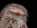
![[4]](https://commons.wikimedia.org/wiki/Commons:Featured_picture_candidates/Tawny_Frogmouth_1.jpg#:Image:Tawny_Frogmouth_1.jpg%7Ccom:fpc)
This peer review is for a set of images, the entirety of which can be found here. While any one alone is obviously unworthy of featured status, together, the clarity that they demonstrate the concept of the electron shell (stemming from simplicity) may be worth "featured set" status. The set is comprehensive and uniform; they are all SVGs; the author for all of them is Pumbaa (original work by Greg Robson); they are all under the same acceptable license. Most do not appear in any article, but the sodium image appears in electron shell and neon appears in noble gas. I put up Uranium because it's a fairly well known element that has a high number of electrons; hydrogen makes a more natural "lead" image. There's not really much that can be done to improve these images, especially on the scale of over 100 images, without losing the simplicity. Such, I only want to gauge the community's reaction.--HereToHelp 13:21, 16 March 2007 (UTC)
- Nominate and support. - HereToHelp 13:21, 16 March 2007 (UTC)
Comments:
- Wow, I'm really impressed with this set -- good find. I especially like the periodic table form of the set. That said, I think some of the scientist types might complain that this way of displaying them distorts the true size of the electron shell and the nucleus, relative to one another (as is already pointed out in the caption, I believe). I don't know how that would affect nomination, since there is no realistic way to fit them all if they were to scale. Still, I think with that caveat made clear, it might have a shot at FP. Any other physics people have suggestions? --Asiir 02:59, 17 March 2007 (UTC)
- I like the periodic table version too, but it's not an SVG. But it is 7022 × 4967, which is big enough to make a poster out of. So close enough. Also, it shows the nucleus as a circle, rather than a clump of neutrons and protons. But the nucleus isn't what's being focused on, so it's passable.--HereToHelp 17:02, 17 March 2007 (UTC)
Seconder:
- Support Ok to me. LostCity42 17:30, 18 March 2007 (UTC)
- Thank you!--HereToHelp 17:38, 18 March 2007 (UTC)

I thought this was a good panorama picture especially after I got help fixing it up, and I wanted to know what others thought. The picture appears in Nā Pali Coast article and the Kauai article. I created the picture but User:MattWright fixed it up a lot. Remember 19:25, 30 January 2007 (UTC)
- Nominate and support. - Remember 19:19, 30 January 2007 (UTC)
Comments:
- My first impression is of a colourful photo, maybe should be extending a little bit more on the right. This being a stitched image, was the photographer stationary on firm ground or on a boat? How much did the boat move? I am sorry to say that I see stitching bugs, one is the discontinuous coast one third to the right, from the irregular blue in the sky it appears to me that photos of different exposure have been used uncorrected, I also suspect that lens vignetting has contributed to the unevenness. At least I do not spot a visible seam in the wave pattern.--Klaus with K 15:24, 31 January 2007 (UTC)
Seconder:
- Hecka pretty. --Indolences 05:37, 31 January 2007 (UTC)
- Nelro 22:20, 13 March 2007 (UTC)
- Nice. Doppelganger 00:17, 14 April 2007 (UTC)
Comment
- Could someone please remove this picture from the peer review process. Remember 17:28, 15 April 2007 (UTC)
.jpg)
Nomination I found this picture and it is amazing!! The two guinea pigs are so cute!! Is there anything that the picture needs to make it better? Here is the picture:
Daniel10 15:45, 27 December 2006 (UTC)
- Comment. I doubt it will pass FPC. The red-eye in the left guinea pig would have to be corrected, and the white balance is off (the picture is too red). The image has noticeable jpg compression, ans thus is not particularly sharp. There is also some colour noise on the background. Unfortunately, "cuteness" is not part of the FP criteria, and isn't valued in FP (though if a picture is good quality and cute, that's quite all right). It's a nice photo, but it's not high enough quality for FPC, sorry. --Pharaoh Hound (talk) 13:47, 28 December 2006 (UTC)
- Comment The left guinea pig is an albino, they naturally have very red eyes. -- anonymous 14:51, 24th of January 2007
- Strong Support. I think that this picture has a very good quality. I think it can make Featured Picture. Sigeway 14:50, 28 December 2006 (UTC)
- Oppose Sorry, no chance at all, the left hand animal is too blurred - Adrian Pingstone 16:22, 28 December 2006 (UTC)
- Support I don't think that the left had guine pig is blurred. Its a very good quality picture. KodiakB3 11:08, 29 December 2006 (UTC)
- Support This is a very good quality picture. TriceraGuy 11:09, 29 December 2006 (UTC)
- Strong Support A very good quality picture such as this deserves to be featured. Since lots of people have supported it, I'll change it to featured picture.
- Oppose per Adrian P. and Pharoah H. —sd31415 (sign here) 12:26, 29 December 2006 (UTC)
- Oppose even though it's been inexplicably nominated on the main nom page. This is such a joke. --frothT C 07:22, 2 January 2007 (UTC)
- Strong Oppose It doesn't matter whether the guinea pigs are cute but whether or not it is an excellent picture that shows Wikipedia's best quality in pictures. There's white splotches on the picture and I cannot even seen the whole entire body of both of the guinea pigs.--¿Why1991 ESP. | Sign Here 20:59, 3 January 2007 (UTC)
- Strong Oppose This, as others have said this is not a quality photo. It is blurred guinea pigs in a box .. one with red eye. Nomadtales 10:32, 4 January 2007 (UTC)
- Strong Support. you guinea-pig haters are cruel. --Ghetteaux 10:36, 4 January 2007 (UTC
 Strong Oppose a blatant user of sockpuppets who nominated this before and failed it. Not a very good picture anyway. Wikipedia:Featured picture candidates/Ajaxf. Daniel, That is enough trolling!Reywas92TalkSigs 23:19, 15 January 2007 (UTC)
- Severe Oppose Not only is it a bad picture but Daniel10 and all of his sockpuppets should be banned. -Fcb981 00:28, 26 January 2007 (UTC)

I found this image a while back and loved it. It seems so fitting a Hospital ship sitting under the rainbow, it makes it seem so peaceful. I belive this picture meets the Featured picture criteria.
This image is listed on the articles United States Navy, USNS Mercy (T-AH-19) and Portal:United States Navy. The image was taken by Chief Photographer's Mate Edward G. Martens, USN
- Nominate and support. - Wilsbadkarma 00:04, 25 December 2006 (UTC)
Comments:
- This is a high quality picture and definitely featured picture material. If that boat wasn't there or if it could be edited out it would be the best picture ON EARTH. I've never seen a full rainbow in my life!--¿Why1991 ESP. | Sign Here 21:06, 3 January 2007 (UTC)
- I disagree, the ship gives it context. Dfrg.msc 1 . 2 . Editor Review 05:38, 16 January 2007 (UTC)
Seconder:
- Strong Support. I think that this picture is very good . Preetikapoor0 21:38, 4 January 2007 (UTC)
- SupportGreat image, should be featured. Dfrg.msc 1 . 2 . Editor Review 05:38, 16 January 2007 (UTC)

I stumbled upon this image a few days ago. It was originally too small to be considered for FP, but the photographer recently uploaded a higher-res version.
I understand that in an ideal world, there are a few things that could be fixed in this photo, but for the most part these are known limitations that are particular to concert photography. These issues include:
- Lighting does not highlight the face well enough (Maybe this can be fixed with some photoshop?)
- Because of this, thumbnail image does not show subject well if it's not big enough.
- It is a little out-of-focus around the hands, or possibly blurry due to the motion of playing the banjo
- It is also somewhat grainy, due to the [necessarily] high ISO setting (800)
That said, I still think that [with a little touch-up], this could be FP because:
- The composition is fantastic - the colors incredible, the placement is artistic, the focus is great
- The subject is very well depicted. I've never really listened to Sufjan Stevens before, so I listened to a few tracks on iTunes. His music is very solemn, quiet, and thoughtful. The look on his face is very illustrative of this type of music.
This image is listed on the article for Sufjan Stevens, and was taken by User:Jlencion.
- Nominate and support. - tiZom(2¢) 06:48, 19 December 2006 (UTC)
Comments:
Seconder:
- Second and support - have I got the format right? I don't know anything about the picture peer review process, but was struck by the beauty of this photograph and wanted to compliment its creator. Dybryd 04:47, 22 December 2006 (UTC)
- Support - yes, very nice; might benefit from a bit of a gamma adjustment to make the fact brighter. Picture Peer Review seems pretty much dead, so I'd recommend nominating it over at WP:FPC to get proper feedback on it. TSP 17:49, 22 December 2006 (UTC)

I think this stands up to Featured criteria. It has a decent resolution and beautiful lighting refractions. It's used in Zirconium, Cubic zirconia, Zirconium dioxide, and Diamond simulant. It was originally uploaded in 2004 by User:Hadal.
- Nominate and support. - Joe I 05:33, 15 May 2007 (UTC)
Comments:
- Unfortunately, it is far too small to be an FP (FPs need to be at least 1000px on one side. This one is 298px on its largest side). The sharpness isn't great, either. --Pharaoh Hound (talk) (The Game) 13:34, 15 May 2007 (UTC)
- Yeah, I actually just saw the 1000px thing, that'll be the same answer for the other I put up, below. Thanks. Joe I 16:59, 15 May 2007 (UTC)
Seconder:

I believe this lives up to all the criteria. It is definitely of a high resolution and quality. The differing angles give good perspective. It is the lead pic on an FA, Diamond, as well as on Jewellery, Brilliant (diamond cut), and quite a few others. It was photographed by Mario Sarto, and seems to have been uploaded by commons:User:HenryLi.
- Nominate and support. - Joe I 03:38, 13 May 2007 (UTC)
Comments:
- Withdrawn - less than 1000px. Joe I 17:01, 15 May 2007 (UTC)
Seconder:

A photo of a beautiful Eastern Orthodox church in a southern Bulgarian city. It is a great example of 19th-century ecclesiastical architecture in the Bulgarian lands. Available under a free Creative Commons license, the author is Nenko Lazarov. High-resolution. Currently only used in the Asenovgrad article, but may fit well in church, Orthodox church (building), Bulgarian National Revival, Plovdiv Province, etc.
- Nominate and support. Todor→Bozhinov 20:20, 25 February 2007 (UTC)
Comments:
- it wont pass because the subject is cut off. It's a nice shot though.-Fcb981 16:22, 3 March 2007 (UTC)
- No, because it is cut off, and it needs to be rotated. Royalbroil T : C 04:50, 11 March 2007 (UTC)
- you need to get the entire church in the picture Nelro 20:35, 13 March 2007 (UTC)
Seconder:

Add your reasons for nominating it here; say what article it appears in, and who created the image.
- Nominate and support. - BillDeanCarter 05:31, 23 February 2007 (UTC)
Comments:
- It appears in the Aaron Sorkin article and was created by a Flickr user. It seems quite good. What do y'all think?-BillDeanCarter 05:31, 23 February 2007 (UTC)
- Oppose Won't do well at FP due to blown highlights and motion blur. ShadowHalo 06:45, 25 February 2007 (UTC)
Seconder:

Self-nomination. I'm not quite sure this picture meets the criteria, so I would like to hear some feedback. As I'm not very technical, the criteria themselves are difficult for me to understand. This picture appears on Kem (town) and Karelia.
- Nominate. - Errabee 11:22, 16 February 2007 (UTC)
Comments:
- The picture is a little small in size and overexposed. I don't think it is FP material technically. You should try increasing contrast a bit. --Digon3 14:42, 16 February 2007 (UTC)
Seconder:

Self-nomination. I'm not quite sure this picture meets the criteria, so I would like to hear some feedback. As I'm not very technical, the criteria themselves are difficult for me to understand. This picture appears on Chariot racing, Quadriga, Republic of Venice, Horses of Saint Mark and History of the Republic of Venice.
- Nominate. - Errabee 11:15, 16 February 2007 (UTC)
Comments:
- As artistic as this is i doubt it will pass fpc for a few reasons. the subjects (the horses) are cut off which people will harp on you for. If you look at the hoves and noses of the horses you will see that the harsh lighting has turned them white. this is refered to as 'blown highlight' where all detail is lost in a bright reigon. there is grainieness in the sky and elsewhere. there is lens flare on the right side of the picture. the composition is not great because of verious unrelated objects on the right of the picture. The angle I do like somewhat though. -Fcb981 23:21, 19 February 2007 (UTC)
Seconder:

Appears in Hoodoo (geology) and Bryce Canyon National Park. I think it is a good close-up picture of hoodoos. Created by Digon3.
- Nominate and support. - Digon3 23:24, 12 February 2007 (UTC)
Comments:
- Its a nice picture, what I like most is the composition and lighting the focus however is a bet soft. -Fcb981 01:05, 18 February 2007 (UTC)
Seconder:

Bandstand Promenade is a kilometer long walkway along the sea on the west side of Bandra, a suburb of Mumbai, India. Less than a decade old, it is simultaneously a popular hang out spot, a jogging track and a park.
This picture was self shot with Nikon Coolpix S10. It appears in an article with same name.
- Nominate and support. - spacejuncky 12:12, 12 February 2007 (UTC)
Comments:
Seconder:

Image of Historic building of Brihan Mumbai Municipal office. Architecture depicts Anglo-British style. Shot taken by myself from CST. Camera- Coolpix S10
- Nominate and support. - spacejuncky 08:59, 12 February 2007 (UTC)
Comments:
- Nice, but its down part is cut off. ≈Tulkolahten≈≈talk≈ 11:13, 12 February 2007 (UTC)
- I know it is because the camera is pointing upwards, but vertical features of the building deviate quite significantly from being vertical in the photo. I would, however, not go as far as doing a full perspective correction.--Klaus with K 11:02, 18 February 2007 (UTC)
Seconder:
[[Image:===Cathedral Rocks===

A very nice picture of Yosemite Valley. This picture shows the sheerness of the granite cliffs; Appears in Yosemite Valley page, created by myself.
- Nominate and support. - Hoffmne 20:11, 9 February 2007 (UTC)
Comments:
- wow, what a beautiful sceen + composition. It is just too blury however. like the camera wasn't still when it was taken or the focus is off. -Fcb981 00:25, 20 February 2007 (UTC)
- I downsampled it in photoshop 50% and it looks stunning and is over the size requirements. If I were you I's upload a about 40% reduction (60% of the origenal size) and nominate it for fpc. It would have a chance.-Fcb981 07:04, 21 February 2007 (UTC)
Seconder:

It looks like a gate to the Bohemian Switzerland a Czech scenic reserve, picture shows a gate in the middle of the forrest near the holy place with cross. It appears in Bohemian Switzerland article and I am the author of that picture.
- Nominate and support. - ≈Tulkolahten≈≈talk≈ 20:32, 8 February 2007 (UTC)
Comments:
- Looks more like the Czech Mirkwood ... the contrast needs to be fixed, to the point of taking the picture over again. The forest behind it is so dark it looks disturbing. Daniel Case 18:09, 24 April 2007 (UTC)
Seconder:

This is a photograph of St Mary's Church on Brownsea Island in Poole, Dorset. The photo depicts the south west side and south side of the church. It is in the Brownsea Island Article.
- Nominate and support. - LordHarris 19:17, 7 February 2007 (UTC)
Comments:
- Give this one a try in the FPC. there are some blown highlights on the right roof and the foreground tree is distracting but you should put this up for voting. -Fcb981 00:27, 20 February 2007 (UTC)
- This would make a good FP Nelro 20:39, 13 March 2007 (UTC)
Seconder:

Striking image that caught my eye as I was reading USS Enterprise (CVN-65), but I was unsure on its possibility of becoming an FP; Appears in USS Enterprise (CVN-65), and was made by Petty Officer 1st Class Todd Cichonowicz.
- Nominate and support. - Havocrazy 06:09, 5 February 2007 (UTC)
Comments:
- there are just too many artifacts all over it. -Fcb981 00:29, 20 February 2007 (UTC)
Seconder:

A high res, sharp image of an endangered species. Used in falconry. Uploaded from Flickr, see the image page for source info.
- Nominate and support. - Pharaoh Hound (talk) 22:13, 4 February 2007 (UTC)
Comments:
Seconder:

If I took the time to fix the stitching issues and re-rendered this 30000x10000px original beast out, would it stand a chance?
- Neutral See above Noclip 01:46, 1 February 2007 (UTC)
Comments:
- If you could make a version without the blown highlights on Lincoln, you'd have a good chance, IMHO. —Dgiest c 08:35, 4 February 2007 (UTC)
- Might need some noise reduction too. —Dgiest c 08:37, 4 February 2007 (UTC)
- i really like the blown highlighting on this -- Cannibalicious!
Seconder:


I submit this image for peer review because it's an image that even I was taken back by when looking through my take of photos from a trip to Charlottesville. I think it potentially says "featured image" on it, but I'm wondering what others think about the subject. It is presently the lead image in fire hydrant.
- Nominate and support. - SchuminWeb (Talk) 05:04, 31 January 2007 (UTC)
Comments:
- Focus is a bit soft and I think I see fringing. Would also prefer daytime lighting and a dry hydrant. —Dgiest c 08:39, 4 February 2007 (UTC)
- I like it. I love the water on the hydrant, it adds a realism to the whole thing. My only negative comment would be about the light reflected in the window in the background. I think you could crop that out, but it might destroy the rest of the picture. Rwhealey 22:46, 26 March 2007 (UTC)
- I believe someone talented with photoshop could fix that reflection with little problem. SchuminWeb (Talk) 02:12, 27 March 2007 (UTC)
- I took a stab at it. I think the file size is now pretty huge. sigh. It's a nice photo. Hmm, it's looks darker too, and not as good as the original, except that weird light in window. What was that about? Was it to add lighting to the hydrant? lol - Jeeny (talk) 22:44, 3 December 2007 (UTC)
- That weird light in the window is one of the hazards of nighttime photography, I'm afraid - it was a reflection of the light from a nearby lamppost. SchuminWeb (Talk) 00:06, 4 December 2007 (UTC)
- It looked like it was sticking out from behind the blinds, because the blinds where bent. At least that's what it looked like to me. But, I've been up all night... so I could be seeing strangs things, ya know? :) - Jeeny (talk) 00:58, 4 December 2007 (UTC)
- That weird light in the window is one of the hazards of nighttime photography, I'm afraid - it was a reflection of the light from a nearby lamppost. SchuminWeb (Talk) 00:06, 4 December 2007 (UTC)
- I took a stab at it. I think the file size is now pretty huge. sigh. It's a nice photo. Hmm, it's looks darker too, and not as good as the original, except that weird light in window. What was that about? Was it to add lighting to the hydrant? lol - Jeeny (talk) 22:44, 3 December 2007 (UTC)
- I believe someone talented with photoshop could fix that reflection with little problem. SchuminWeb (Talk) 02:12, 27 March 2007 (UTC)
Seconder:

This is the Antwerpen Stadhuis. As the photographer I like the sunlight illuminating the building on a mostly cloudy day with a rather short time window to take the two photos for this stitched image.
- Nominate and support. - Klaus with K 18:42, 30 January 2007 (UTC)
Comments:
Seconder:

I took this picture and I liked the outcome. I would say it's my best one.
- Nominate and support. - -- Selmo (talk) 03:02, 29 January 2007 (UTC)
Comments:
- Copy-edit the caption: only two es in "Entrance". Other than than that, great picture! --Fsotrain09 17:02, 5 February 2007 (UTC)
Seconder:

Appears in Tenorio Volcano National Park. Good illustration of the claim: The park is known for the light blue hued Rio Celeste, the colouration being caused by sulphur and calcium carbonates. Taken and uploaded by User:Asequeir
- Nominate and support. - -- Norvy (talk) 08:20, 27 January 2007 (UTC)
Comments:
- Little bit dark, but that's common for the forest which I like. If you nominate it for featured picture let me know I will support it definitely. ≈Tulkolahten≈≈talk≈ 11:15, 12 February 2007 (UTC)
Seconder:

I like the amount of detail; found in: Domesticated duck and Duck, and Created by yours truely, Photonikonman 13:57, 22 January 2007 (UTC).
- Nominate and support. - Photonikonman 13:57, 22 January 2007 (UTC)
Comments:
- Unfortunately, I am very confident that it wouldn't pass FPC. The image has been severely oversharpened, it doesn't show all of any of the ducks (lower encyclopedic value), and the white duck is quite distracting. --Pharaoh Hound (talk) 12:58, 26 January 2007 (UTC)
- Is there a way to get rid of this fast? It has no chance, I see your point PhotoNikonMan 19:52, 30 January 2007 (UTC)
Seconder:

Picture has fine detail and beauty, a good close up, and with the blurred background, the focus of the picture is directed completly at the glass. Appears in Absinthe artile, author is Eric Litton
- Nominate and support. - ≈ The Haunted Angel (The Forest Whispers My Name) 14:44, 21 January 2007 (UTC)
Comments:
- Unfortunately it is far too small. FPs need to be at least 1000 pixels on the smallest side, this image is 600 pixels on the largest side (height). --Pharaoh Hound (talk) 13:00, 26 January 2007 (UTC)
- Size is definitely a factor here. Also, the spoon goes all the way to the bottom...to the point where it looks like it's being cut off. A minute detail, but I'm sure it will get brought up in FPC. Otherwise, this is a fantastic shot, I love it! tiZom(2¢) 01:44, 10 February 2007 (UTC)
Seconder:

Attractive, large image showing to scale the distances between objects in our solar system. However, needs conversion to SVG before nomination. Compare with this image ![]() of the extent of the Oort cloud. Makes you feel small...
of the extent of the Oort cloud. Makes you feel small...
Appears in: Oort cloud / Solar System / 90377 Sedna / Outer Solar System
- Nominate and support. - - Jack (talk) 07:12, 19 January 2007 (UTC)
Comments: This image used to be an animation. Any idea where the animation got to? Oh wait; found it. Serendipodous 15:21, 30 May 2007 (UTC)
Seconder:


This isn't a nomination- just a request for comments before I guess this gets taken to the delist noms. This picture was extremely grainy so I ran a despeckle and reduce noise. The contrails look much better now but the plane has lost its sharpness. What should I do with this? Run the filters on everything but the plane? Also, in the future should something like this go to peer review or direct to delist? --frothT 10:43, 14 January 2007 (UTC)
I guess I'm trying to find consensus on whether the change should be adopted --frothT 22:17, 14 January 2007 (UTC)
Comments:
- Try Neat Image and see if that helps. It's one of my favorite programs. —Disavian (talk/contribs) 18:39, 14 January 2007 (UTC)
- I am actually conservative when it comes to delist candidates, This is actually a fine image. I think you could edit it to make it better though. Arjun 21:03, 14 January 2007 (UTC)
- Well I already did edit it, the edit is on the right. I'll put both the original and edited thumbs up. --frothT 22:16, 14 January 2007 (UTC)
- I would think that an edit could certainly supercede the original, but personally I'd go with my edit ;-) --Fir0002 01:18, 15 January 2007 (UTC)

I'm very proud of this picture. I have taken quite a few pictures for Wikipedia (you can see some of them here) and I think this picture is one of my very best. It was taken from on Yabbarra Beach in the Australian south coast town of Dalmeny, New South Wales. It was taken at about 7.30am, and because it is an east facing beach, the sun is just rising. The sky is clear and waves are rolling up the beach. The water is a very nice blue. The picture was taken with this camera.
It features in the Dalmeny article, and when I update My Pictures page it will be there too. I created this image. For more details, visit the of this picture.
I hope you like the picture, and look forward to reading your comments.
- Nominate and support. - Whats new? 06:33, 11 January 2007 (UTC)
Comments:
- Unfortunately, the image quality is not great. It shows noticeable compression at full resolution, and is somewhat blurry. Seashores are one of the difficult subjects to get through FPC as it is generally easy to shoot a similar image with a better camera, therefore seashore images normally have to be truly exceptional in rarity or quality. This image is quite nice, but I don't feel that it is FP quality. --Pharaoh Hound (talk) 13:07, 26 January 2007 (UTC)
Seconder:

Taken by me, appears in The Crystal Method. I've always considered it one of the best pictures I've ever taken, but is it good enough for WP? I'm a Featured Picture noob, so I'm asking here before I post it as a canidate.
- Nominate and support. —Disavian (talk/contribs) 06:29, 11 January 2007 (UTC)
Comments:
- Sorry, but this picture isn't very good. The room is dark and the reddish colors don't look nice. The man on the right's face is hidden and it doesn't truly illustrate the topic enough to be encyclopedic. Don't waste your time nominating it for FPC and Try to take another picture. I'm sure you have great potential. Sorry, Reywas92TalkSigs 23:11, 15 January 2007 (UTC)
Seconder:

I am nominating this panoramic photograph beacuase of its dramatic view, panoramic aspect, vibrant colors and sharp image quality. A set of pictures that I took and then stitched them together using Autostitch [5].
- Nominate and support. - Merzperson 07:03, 10 January 2007 (UTC)
Comments: It would be more "dramatic" if the top of the tree was not cut off. PhotoNikonMan 12:57, 31 January 2007 (UTC)
Seconder:

I found this image on today's featured article, Invasion. It is also used in the articles Megastructure, Great Wall of China, and New Seven Wonders of the World. It was uploaded to Commons by one Andreas Tille, the photographer. I personally find it very striking. I like how the wall curves over the hills. He must have been quite far away to get so much of it in the picture, yet it looks like you could reach out and touch it. The color has good contrast, with the patches of snow clearly distinguishable from the grass and bare rock and dirt. It gives a good impression of the sheer size of the thing. I don't notice any compression artifiacts or blown highlights. The high-res version is 2048x1299, so it should be big enough. I think it's among the best work on Wikipedia, otherwise I wouldn't be interested in nominating it. It's licensed under the GFDL. It adds value to all of the articles it's used in. It's accurate. I wouldn't be nominating it if I didn't find it pleasing to the eye. The one problem is the caption. Most places where it's used the caption is just something like, "The Great Wall near Bejing in winter" but that's easy enough to fix if other people think the picture itself is FP worthy. Lots can be written about the Great Wall if it is to appear on the Main Page. Lastly, it doesn't seem to be promoting any particular POV.
I'm sending it to peer review to see if others think that it's FP worthy because last time I found an image and nominated it for FP I got a little burned (I didn't know how to find out the size of the image. It looked big so I thought it was big.). If it's not up to the standards let me know, but be nice about it.
- Nominate and support. - ~ ONUnicorn(Talk|Contribs)problem solving 20:02, 9 January 2007 (UTC)
Comments:
- Could be better resoulution and the wall blends in a little with the land, but I'd support it in FPC. Reywas92TalkSigs 23:13, 15 January 2007 (UTC)
- Oppose Sorry, this pic won't succeed as an FP. The largest version of the pic has very poor resolution (unless your computer resizes it to your screen size, in which case it looks OK). Have a look! - Adrian Pingstone 15:48, 16 January 2007 (UTC)
Seconder:

I like the framing and the structure of the castle itself. I haven't modified the picture at all from the camera, let me know how it should be modified. Appears in Bran Castle, and was taken by me, User:KyleT.
- Nominate and support. - KyleT 05:10, 8 January 2007 (UTC)
Comments:
- Oppose Sorry, this is mostly a pic of an arch with far too little of the castle seen. I don't think it has a chance of FP status - Adrian Pingstone 15:52, 16 January 2007 (UTC)
Seconder:

I took this picture, of what appears to be a poodle made by clouds in July and I found it funny, since people always argue about what the clouds "look like"; Please, help me specify what type of cloud this is.
- Nominate and support. - Lambdalix 01:26, 5 January 2007 (UTC)
Comments:
- It's two weak Towering Cumulus clouds with some mackerel sky on the right. -- Bidgee 02:19, 14 January 2007 (UTC)
Seconder:

Here is a pic I took early last year whilst trekking on the Kepler Track in New Zealand. I really like the way the clouds are building up on one side of the ridgeline and the almost silhouetted figure of my mate. Unfortunately I cannot upload a larger size .. it was taken on my little happy snap Canon that I was carrying along the track.
- Nominate and support. - Nomadtales 10:26, 4 January 2007 (UTC)
Comments:
- I'm not sure if it would make it on FPC, there's some pixelation on the mountains. You may want to try it on Quality images candidates on the commons (shortcut COM:QIC). It's an impressive and beautiful picture, but recently standards on FPC are almost insanely high. However, that being said, if possible rejection doesn't phase you, it may be worth trying on FPC. --Pharaoh Hound (talk) 12:57, 11 January 2007 (UTC)
Seconder:

Very high quality picture that I took when a grasshopper landed perfectly on a beer bottle. I shows a crisp look and detail of the grasshopper on the bottle.
- Nominate and support. - William Pembroke(talk) 06:12, 2 January 2007 (UTC)
Comments:
- Uhhh how is a grasshopper on a beer bottle better than a grasshopper in its natural habitat? The beer bottle vastly reduces the enc. of the picture and may also infringe copyright since the packaging is copyrighted. Otherwise a reasonably good picture, try zooming or going a bit closer to the grassshopper to capture more detail. --antilived T | C | G 09:40, 4 January 2007 (UTC)
- 'I agree with the above. The image is okay technically but the fact that the grasshopper is out of its natural habitat...and on a beer bottle, this image would probably never survive a FPC. — Arjun 14:56, 5 January 2007 (UTC)
Seconder:

I uploaded this image, and it's used on Union army. I think it is a very expressive photo, and very representative of the American Civil War. I think the one problem with this might be the "217" in the bottom left corner, but this can be edited out. This image is from another website, but due to its age (144 years) it is public domain. Please view full size for all the details.
- Nominate and support. - GhostPirate 17:14, 1 January 2007 (UTC)
- Oppose: Sorry, but it doesn't meet the 1000px resolution required. --William Pembroke(talk) 06:21, 2 January 2007 (UTC)
Comments:
- Comment This is a historical photo, so if it had something unique about it, say Lincoln smiling, it would pass. However, since it's just a picture of unremarkable people doing unremarkable things, I don't think it's really feature worthy at any resolution. There are more than enough civil war photos with more interest.--Niro5 16:55, 2 January 2007 (UTC)
Seconder:

I took this photograph through a slit-lamp during applanation tonometry. I have not found any similar photographs anywhere and I think it will be useful to students of Ophthalmology to know what the end point should be in Applanation tonometry. Any feedback on whether it deserves to be in the FPC list? This picture comes in the article Tonometry
- Nominate and support. - Manimury 15:26, 5 January 2007 (UTC) Manimury
Comments:
Seconder:
King of the Sky
edit
Tried a shot of the sun, now in spring when it's not so powerfull. Really liked it and i wanted to share the view that all to see that sun is the same here in Romania :).
- Nominate and support. - Luhter 00:03, 18 February 2007 (UTC)
Comments:
Seconder:
Saturn and Earth
edit
This is not only a breathtaking picture but it is informative. It shows the relative sizes of Earth and Saturn. It is high resolution and of good quality. I would appreciate feedback as well as help posting it on the featured picture candidates page.
- Nominate and support. - Lollipop09 18:46, 9 January 2007 (UTC)
Comments:
Seconder:
I don't know how to submit this picture, but it's pretty awesome. See water droplet below the picture of Saturn.