Wikipedia:Graphics Lab/Illustration workshop/Archive/Jul 2012
 | This page, part of the Graphics Lab Wikiproject, is an archive of requests for July 2012. Please do not edit the contents of this page. You can submit new requests here. |
Stale
Coat of arms of the Kingdom of Iraq
-
 Coat of arms of the Kingdom of Iraq
.png)
Article(s): Kingdom of Iraq, Coat of arms of Iraq
Request: Could someone possibly redraw this coat of arms in SVG please, many thanks. TRAJAN 117 (talk) 22:41, 27 May 2012 (UTC)
Graphist opinion(s): Do you know of a higher-res version? It's necessary to see the details. - SSJ t 14:59, 10 June 2012 (UTC)
Mao banner
-
 Flag containing an effigy of Mao

Article(s): Template:Maoism sidebar
Request: Please can you vectorise this image, without a background, in a similar style to File:КПСС.png. -- Peter Talk page 19:25, 28 May 2012 (UTC)
Graphist opinion(s): Will have a go. Roshan220195 (talk) 11:55, 9 June 2012 (UTC)
SVGrize these logos
- File:AFP 3D.png
- File:Rparmy.gif
- File:PN Seal.png
- File:Pmcseal.gif
- File:PAF Seal.png
- File:Saf Patch.jpg
- File:PNPSeal.png
- File:NBISeal.png
- File:DOJ Seal.png
- File:Unibersidad ng Pilipinas.png
- File:DepEd.png
- File:DOJ Seal.png
- File:Defense department philippines seal.jpg
- File:MTRCB Logo.jpg
- File:Democratic Party of Mongolia logo.jpg
Article(s): Armed Forces of the Philippines, Philippine Army, Philippine Air Force, Philippine Navy, Philippine Marine Corps, Special Action Force, Philippine National Police, National Bureau of Investigation (Philippines), Department of Justice (Philippines), Department of National Defense (Philippines), Department of Health (Philippines), Department of Education (Philippines), University of the Philippines, Movie and Television Review and Classification Board, Democratic Party (Mongolia)
Request: Please recreate as vector version. 112.210.11.149 (talk) 04:43, 8 June 2012 (UTC)
Graphist opinion(s): So what? I'll request them to Reckless182. The request will be taken at anytime. --112.210.99.98 (talk) 01:43, 10 June 2012 (UTC)
- More logos waiting to vectorize. --112.210.99.98 (talk) 01:52, 10 June 2012 (UTC)
 DONOT remove the GLNF template. Non free images are not allowed to be displayed here.
Please understand that non free images cannot be 'recreated'. That would be in violation of copyright. We graphists can only extract a logo that is already in vector form(say PDF). I would be happy to do it if you can find a vector version. Roshan220195 (talk) 18:34, 10 June 2012 (UTC)
- That's not true, there are several graphists here who recreate SVGs of copyrighted logos. As long as they're attributed and have a non-free use rationale on them, it's perfectly fine. Fry1989 eh? 19:35, 10 June 2012 (UTC)
- Bot, DONOT mark this section stale. The request will take more days to reply. --112.210.115.58 (talk) 12:49, 12 June 2012 (UTC)
- Other logos are certainly non-vectorizable (conversion to SVG impossible without professional assistance) - their elements are photographic. --112.210.80.208 (talk) 06:14, 13 June 2012 (UTC)
- Bot, DONOT mark this section stale. The request will take more days to reply. --112.210.115.58 (talk) 12:49, 12 June 2012 (UTC)
Chiba-Ken Logo
Article(s): ??
Request: Can you make me a JPEG-file and GIF-File or SVG-File of this Logo please (The red letters in the background too please)... Goroth (talk) 16:41, 12 June 2012 (UTC)
Graphist opinion(s): Hi Goroth, (1) This is already a JPG file (via Save Image As from browser) (2) Why do you need JPG and GIF? (3a) What article is this for? (3b) Do we have proper permission for this to be used on Wikipedia? (4) This is certainly non-vectorizable (conversion to SVG impossible) - the elements are photographic. Given (1) and (4), I don't know if you need graphists to help with the task. In any case, clarification is welcomed. Jon C (talk) 02:59, 13 June 2012 (UTC)
- Yes, but I want a JPEG without the bloody hand in the background. I need this for the Spirit of Metal webzine. I would do it on my own but I can´t handle with such programs. The SVG file I want use in a article at de:WP in the article on Save Our Souls. When a SVG is impossible would creating a GIF-file work? --91.22.39.187 (talk) 09:21, 13 June 2012 (UTC)
- Technical notes: (1) the lettering is partially overlapped by the hand, so just extracting the text (into a raster format like GIF/JPG) would still require painting in the missing parts. Folks over at the photography workshop might be better for that. (They may balk at the idea of a request that has nothing to do with WP at all.) (2) The lettering themselves are highly stylized, and likely modified from original fonts. To prepare a SVG, one would need to trace the individual letters and match the gradient (that is, a time-consuming process). Have you tried contacting the original author for the source files? Jon C (talk) 13:18, 13 June 2012 (UTC)
Sure I asked them. I´m “working” together with band. I asked them if they have a JPEG-file of this logo. Is this picture better? --Goroth (talk) 13:07, 14 June 2012 (UTC)
- For what you need (just the red text), it'd be useful to ask for the source PSD (photoshop) file. The red text likely was assembled on a separate layer, and it would be easy to move it into its own JPG - and it may also be possible to move into Illustrator and made into a vector file. The newly attached JPG is no better in terms of extraction - the desired piece is partially transparent on a busy background. Jon C (talk) 13:16, 14 June 2012 (UTC)
Logos of companies


Article(s): Philippine Army, Philippine Marine Corps, Special Action Force, Democratic Party (Mongolia), Movie and Television Review and Classification Board, Department of National Defense (Philippines)
Request: Bad crop-even out edging all the way around. Remove white background. PNG would be nice if you can... 112.210.116.248 (talk) 23:50, 22 June 2012 (UTC)
Graphist opinion(s):
Dynasties of Hawaj

Article(s): cs:Seznam havajských králů
Request: Please correct dates of reign for Liliuokalani and Kalakaua and remove Kapulehu and replace it with white space; the tree should start with Keawe. KAVEBEAR (talk) 09:26, 23 June 2012 (UTC)
Graphist opinion(s): Prosím, type the dates you would like and the source for them. Dĕkuji. The Haz talk 12:20, 25 June 2012 (UTC)
Also, please provide a source for starting with Keawe. Roshan220195 (talk) —Preceding undated comment added 13:39, 25 June 2012 (UTC)
Dinosaur in today's society

Article(s): Atmospheric chemistry
Request: Please remove the dinosaur. If possible reduce the file size, too. BTW: Does this problem still exist? I cannot see what any display problems. Leyo 07:10, 16 June 2012 (UTC)
Graphist opinion(s):
![]() Request taken by Wylve.
Request taken by Wylve.
 Done. The dinosaur is removed and the file size is reduced. Other users are welcome to further reduce the size. --Wylve (talk) 11:11, 16 June 2012 (UTC)
- Thanks a lot. It seems that the text was converted into paths, which makes translation more difficult. --Leyo 20:47, 16 June 2012 (UTC)
- I am in the process of making the paths in to text. --Wylve (talk) 05:50, 17 June 2012 (UTC)
- I've converted the text from paths to real text, however the subscript text appears to be rendering incorrectly. --Wylve (talk) 11:18, 17 June 2012 (UTC)
- Thank you. Yeah, that's indeed a problem. Do you think it would make a difference if a font from meta:SVG fonts such as Nimbus Sans L is used? --Leyo 12:04, 17 June 2012 (UTC)
- I've converted the text from paths to real text, however the subscript text appears to be rendering incorrectly. --Wylve (talk) 11:18, 17 June 2012 (UTC)
- I am in the process of making the paths in to text. --Wylve (talk) 05:50, 17 June 2012 (UTC)
- The PNG rendering is using Bitstream Vera Sans, an SVG font listed on meta. It is probably a bug of librsvg. --Wylve (talk) 16:20, 21 June 2012 (UTC)
- What do you mean exactly with "It is probably a bug of..."? -- Perhelion (talk) 18:02, 23 June 2012 (UTC)
- If you have a solution, you are most welcome to help. --Leyo 07:24, 27 June 2012 (UTC)
- What do you mean exactly with "It is probably a bug of..."? -- Perhelion (talk) 18:02, 23 June 2012 (UTC)
- Thanks a lot. It seems that the text was converted into paths, which makes translation more difficult. --Leyo 20:47, 16 June 2012 (UTC)
ARF logo
Article(s): Armenian Revolutionary Federation
Request: Please vetorize this image. Yerevanci (talk) 13:11, 29 June 2012 (UTC)
Graphist opinion(s):
Flap of Bermuda - update
-
 Flag of Bermuda; a red British civil ensign defaced with the Coat of arms of Bermuda

Article(s): Bermuda, Flag of Bermuda
Request: Please can you update the flag (long overdue). The current flag uses an older version of File:Coat of arms of Bermuda.svg which is less detailed/adequately vectorised. Please replace the shield on the current version of the flag with the updated coat of arms. The motto should not be included. -- Peter Talk page 00:53, 7 July 2012 (UTC)
Graphist opinion(s): ![]() Done Jon C (talk) 04:46, 7 July 2012 (UTC)
Done Jon C (talk) 04:46, 7 July 2012 (UTC)
Albanian dialects
-
Map of Albanian dialects
Article(s): Albanian dialects
Request: Please vectorize the image and make the borders a little thinner and the text a little larger. Yerevanci (talk) 23:11, 7 July 2012 (UTC)
Graphist opinion(s):
United States-Canada merger
.svg)
Article(s): Annexation movements of Canada
Request: Create a new flag by adding more stars so that there are 63, to represent the 50 American States and Canada's 10 provinces and 3 territories, creating a flag that could be flown for a union of Canada and the USA.
Graphist opinion(s):
Heathrow Express logo
Article(s): Heathrow Express
Request: Please could somebody either make the image transparent but ensure that the white reflections are not lost, or convert it to a vector graphic? Thanks. Cloudbound (talk) 20:23, 17 July 2012 (UTC)
Graphist opinion(s):
Resolved
Periodic table structure
-
 Periodic table structure
 -
 New file


Article(s): Electron configuration, Periodic table
Request: Please update the table by adding 7p. 7p should be just below 6p and have the same style as 6p (but, of course, having "6p" changed to "7p"). In addition, change the group numbers with IUPAC-style group numbers (numbered straight from 1 on the left to 18 on the right, like in Template:Periodic table). Double sharp (talk) 12:07, 27 June 2012 (UTC)
Graphist opinion(s): ![]() Request taken by Roshan220195.
Request taken by Roshan220195.
![]() Done Roshan220195 (talk) 07:58, 29 June 2012 (UTC)
Done Roshan220195 (talk) 07:58, 29 June 2012 (UTC)
 Thank you Double sharp (talk) 09:45, 29 June 2012 (UTC)
- Ma pleasure
 Roshan220195 (talk) 16:12, 29 June 2012 (UTC)
- Ma pleasure
Polonium electron shells
-
 Polonium electron shells

Article(s): Polonium
Request: Please change the colour of the big circle in the middle (the one containing "Po") to #cccccc. Polonium has been changed from metalloid to post-transition metal status in WP. Double sharp (talk) 06:46, 3 July 2012 (UTC)
Graphist opinion(s):
![]() Done - Fallschirmjäger ✉ 10:32, 3 July 2012 (UTC)
Done - Fallschirmjäger ✉ 10:32, 3 July 2012 (UTC)
- Thank you Double sharp (talk) 11:11, 3 July 2012 (UTC)
Abbey logo svg
Article(s): Abbey National
Request: Could you please change the style of the file to an Abbey variant of File:Banco Santander.svg as this was the style most used by the bank? Thanks. I would ask the creator of the current Abbey svg but they have retired. Cloudbound (talk) 15:45, 2 July 2012 (UTC)
Graphist opinion(s): ![]() Done Jon C (talk) 13:47, 6 July 2012 (UTC)
Done Jon C (talk) 13:47, 6 July 2012 (UTC)
- Great, thanks. Cloudbound (talk) 23:40, 6 July 2012 (UTC)
Friedman signature
-
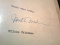
-
 SVG
SVG

Article(s): Milton Friedman
Request: Make a vector signature out of the image. ◅PRODUCER (TALK) 23:16, 4 July 2012 (UTC)
Graphist opinion(s): I can do this. Jon C (talk) 13:54, 6 July 2012 (UTC)
I've corrected the perspective, tilt, and skewing, and prepared a 2-color SVG based on the corrected image. I made no attempts to match the line weight or color intensity - other graphist who wish to take a stab at that can find the corrected raster signature embedded in the SVG. To original poster: please mark as resolved if this is acceptable to you. Jon C (talk) 14:06, 6 July 2012 (UTC)
- Looks great, thanks. -- ◅PRODUCER (TALK) 14:30, 6 July 2012 (UTC)
Decay chain of ununoctium-294
-
 Decay chain of ununoctium-294

Article(s): Ununoctium
Request: Change "290116" to "290Lv", "286114" to "286Fl", and "282112" to "282Cn" (but keep the alignment the same as the original). This updates the element names, as elements 112, 114, and 116, which had not yet been named when this image was named, are now named. Please overwrite the original file with these changes. Double sharp (talk) 07:05, 7 July 2012 (UTC)
Graphist opinion(s):
![]() Done -DePiep (talk) 14:59, 7 July 2012 (UTC)
Done -DePiep (talk) 14:59, 7 July 2012 (UTC)
- Thank you Double sharp (talk) 07:00, 8 July 2012 (UTC)
Logo of the 100th Anniversary of the Independence of Albania
Article(s): 100th Anniversary of the Independence of Albania
Request: There is a logo of the 100th Anniversary of the Independence of Albania which is work of the artist from Kosovo, Zeni Ballazhi (link1 link2, link 3...). It would be very usefull to have such logo drawn and uploaded to wikipedia. Anybody willing to help? Antidiskriminator (talk) 13:58, 7 July 2012 (UTC)
Graphist opinion(s): ![]() Done Jon C (talk) 04:24, 8 July 2012 (UTC)
Done Jon C (talk) 04:24, 8 July 2012 (UTC)
Crystal structure: png into svg
-
 Hexagonal close packed crystal structure
 -
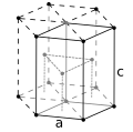


Article(s): Atomic packing factor
Request: Please set into svg. -DePiep (talk) 15:14, 30 June 2012 (UTC)
Graphist opinion(s): Is this superceded by this SVG? Or does the dash lines mean something? Jon C (talk) 08:17, 1 July 2012 (UTC)
- 1. The file has a strange name
120px-Hexagonal_lattice.svg.png, and is not clear (black & greys only for me). 2. As far as I could see, and the name suggests too, it shows file:Hexagonal lattice.svg. That is a different structure. The png file I mentioned has extra dots within the structure, which is a different way of stacking balls. -DePiep (talk) 13:33, 7 July 2012 (UTC)
- 1. The file has a strange name
![]() Request taken by DePiep. - might as well try myself. -DePiep (talk) 10:05, 8 July 2012 (UTC)
Request taken by DePiep. - might as well try myself. -DePiep (talk) 10:05, 8 July 2012 (UTC)
![]() Done. Thank you myself. -DePiep (talk) 13:33, 8 July 2012 (UTC)
Done. Thank you myself. -DePiep (talk) 13:33, 8 July 2012 (UTC)
- Bravo! Jon C (talk) 13:37, 8 July 2012 (UTC)
Two tweaks for "Fluorine"
.svg)

Article(s): Fluorine
Request:
1. For cryolite, please
A. Move the caption slightly to the left. Right now, as displayed, the "d" of dissolved is falling on the pipe at the right (keep it in the blue). And don't make the font smaller.
B. Make the "A" and the "L" lower case please.
2. For the phase diagram, please make the font for "liquid" and "solid" larger (same size as the H2O label font). You will need to slide the solid/liquid caption down a bit so the words don't break over the phase boundary. TCO (talk) 00:27, 8 July 2012 (UTC)
P.s. Thanks in advance, you all rule.
Graphist opinion(s): ![]() Done I've made the requested changes. Except that in the cryolite diagram, the overlapping is due to a bug in the SVG-renderer, where it renders fonts differently in some thumbnails than in full version. Jon C (talk) 05:28, 8 July 2012 (UTC)
Done I've made the requested changes. Except that in the cryolite diagram, the overlapping is due to a bug in the SVG-renderer, where it renders fonts differently in some thumbnails than in full version. Jon C (talk) 05:28, 8 July 2012 (UTC)
I noticed that too. Could we cut the word "dissolved"?
- Could we use the IUPAC spelling "aluminium" on a science article, as per WP:ALUM? --John (talk) 10:46, 8 July 2012 (UTC)
- Cryolite: Dissolved is removed, and spelling of Al is adjusted. Jon C (talk) 13:59, 8 July 2012 (UTC)
- great! TCO (talk) 14:34, 8 July 2012 (UTC)
- Thank you! --John (talk) 21:13, 9 July 2012 (UTC)
Archbishop and chancellor
-
 White archbishop on white square
 -

-
 White archbishop on black square
 -

-
 Black archbishop on white square
 -

-
 Black archbishop on black square
 -

-
 White chancellor on white square
 -
 White chancellor on black square
 -
 Black chancellor on white square
 -
 Black chancellor on black square
 -

-

-

-


Article(s): Fairy chess piece, Archbishop (chess), Chancellor (chess)
Request: Vectorise all, with new svg images under the same file names as the old png images but with 44 replaced with 45. (This is so that Template:Chess diagram will recognise the images.) See File:Chess rll44.png and File:Chess rll45.svg for an example. Double sharp (talk) 07:28, 10 July 2012 (UTC)
Graphist opinion(s): I thought that the vector version of that template used transparent vectors, which already exist for these. If you do want these, though, it would be easier to add backgrounds to these rather than remake them. NikNaks talk - gallery 11:54, 10 July 2012 (UTC)
Did some anyway. Atleast they will find use in the articles. Will finish the rest soon. And btw, they could use some improvements especially the base and the eye. Will take a look at that too. Roshan (talk) 13:53, 10 July 2012 (UTC)
- Well, I would prefer that the white archbishop on white square svg actually does look like the others... Double sharp (talk) 13:54, 10 July 2012 (UTC)
- Others meaning?? Roshan (talk) 14:08, 10 July 2012 (UTC)
- The other archbishop svgs. The horse-head shape for the knight at the top looks different. (Also note File:Chess nll45.svg and the other three knight svgs.) Double sharp (talk) 14:10, 10 July 2012 (UTC)
- BTW, I find that the white archbishop on white square svgs (without base and eye improvements) looks a lot nicer at small size, which is how it will be used anyway. With base and eye improvements and without. Double sharp (talk) 14:11, 10 July 2012 (UTC)
- By other svg's, if you mean the ones which i have put up here, they have the same knight. Do you want the knight to be similar to File:Chess nll45.svg?? Roshan (talk) 14:21, 10 July 2012 (UTC)
- Indeed yes, I meant the nll45 knight. That's because the archbishop and chancellor have a very visible knight's head in their diagram here, so it wouldn't look good if they didn't look the same as the usual knight. (Somehow my browser cache is not responding.) Double sharp (talk) 14:23, 10 July 2012 (UTC)
- OK, I actually tried to match the png files. Will make the changes tonight. Roshan (talk) 14:35, 10 July 2012 (UTC)
- Indeed yes, I meant the nll45 knight. That's because the archbishop and chancellor have a very visible knight's head in their diagram here, so it wouldn't look good if they didn't look the same as the usual knight. (Somehow my browser cache is not responding.) Double sharp (talk) 14:23, 10 July 2012 (UTC)
- By other svg's, if you mean the ones which i have put up here, they have the same knight. Do you want the knight to be similar to File:Chess nll45.svg?? Roshan (talk) 14:21, 10 July 2012 (UTC)
- BTW, I find that the white archbishop on white square svgs (without base and eye improvements) looks a lot nicer at small size, which is how it will be used anyway. With base and eye improvements and without. Double sharp (talk) 14:11, 10 July 2012 (UTC)
- The other archbishop svgs. The horse-head shape for the knight at the top looks different. (Also note File:Chess nll45.svg and the other three knight svgs.) Double sharp (talk) 14:10, 10 July 2012 (UTC)
- Others meaning?? Roshan (talk) 14:08, 10 July 2012 (UTC)
![]() Request taken by Roshan220195.
Request taken by Roshan220195.
![]() Done Roshan (talk) 21:06, 10 July 2012 (UTC)
Done Roshan (talk) 21:06, 10 July 2012 (UTC)


- Thank you Thanks so much! Double sharp (talk) 04:57, 11 July 2012 (UTC)
Berkelium

Article(s): Berkelium
Request: Fix the electrons. Squee3 (talk) 15:32, 9 July 2012 (UTC)
- Which are broken? -DePiep (talk) 22:54, 9 July 2012 (UTC)
- Looks like requester already fixed it. -DePiep (talk) 22:59, 9 July 2012 (UTC)
- Which are broken? -DePiep (talk) 22:54, 9 July 2012 (UTC)
Graphist opinion(s):
![]() Done. Electron shells changed from 2, 8, 18, 32, 26, 9, 2 into 2, 8, 18, 32, 27, 8, 2 by requestor. -DePiep (talk) 11:49, 15 July 2012 (UTC)
Done. Electron shells changed from 2, 8, 18, 32, 26, 9, 2 into 2, 8, 18, 32, 27, 8, 2 by requestor. -DePiep (talk) 11:49, 15 July 2012 (UTC)
Osage script
-
 "Osage language" in Osage script
 -

Article(s): Osage alphabet, Osage language
Request: Can you restore the transparent background? If you like, I can upload the original image (or just go to the source listed in the file info), but it would need to be made B&W. — kwami (talk) 22:28, 14 July 2012 (UTC)
Graphist opinion(s):
![]() Done I also uploaded a vector version: File:Wazhazhe ie.svg. ―― Phoenix7777 (talk) 08:07, 15 July 2012 (UTC)
Done I also uploaded a vector version: File:Wazhazhe ie.svg. ―― Phoenix7777 (talk) 08:07, 15 July 2012 (UTC)
- Thanks! — kwami (talk) 08:36, 15 July 2012 (UTC)
Please make background transparent
Article(s): PhillyCarShare
Request: Please make background transparent. --evrik (talk) 19:25, 16 July 2012 (UTC)
Graphist opinion(s):
- What is wrong with this archived version? --Leyo 22:30, 16 July 2012 (UTC)
- Someone tagged it as being "too big." --evrik (talk) 14:22, 17 July 2012 (UTC)
The "Buff" color of U.S. State Flags
Please see this: Buff_(colour)#U.S._State_Flags.
U.S. State Flags
Officially, the flags of Delaware and New Jersey, and former flags of New York and Maine, include "buff".
-
 The Flag of the State of Delaware includes "a background of colonial blue surrounding a diamond of buff".
 -
 The Flag of the State of New Jersey has "the State seal ... in Jersey blue on a buff background"
 -
 Former flag of the State of New York (until 1901)
 -
 Former flag of the State of Maine (until 1901)


.svg)
.png)
"
By law, all these flags are to include the color "Buff".
This is the color "Buff": Buff (color). The buff portions of these four flag illustrations should be this color, in this infobox:
(Infobox removed after the fact because it was breaking formatting. Pi.1415926535 (talk))
I request that the "Buff" portions of these four US state flags conform to the official paramaters of the color "Buff".
Thank you for your kind attention to this matter.
![]() Request taken by Pi.1415926535.
Request taken by Pi.1415926535.
- Done All buff in those flags set to (240,220,130). Pi.1415926535 (talk) 16:21, 21 July 2012 (UTC)
- Thanks! Chrisrus (talk) 16:50, 21 July 2012 (UTC)
Topfreedom logo
-
 Topfreedom logo

.svg)
Article(s): Topfreedom
Request: Please reduce the excessive margin around the logo (but leave a little bit). Kaldari (talk) 05:16, 18 July 2012 (UTC)
Graphist opinion(s):
![]() Done That's with 50-pixel margins; let me know if you want them changed. Pi.1415926535 (talk) 18:05, 22 July 2012 (UTC)
Done That's with 50-pixel margins; let me know if you want them changed. Pi.1415926535 (talk) 18:05, 22 July 2012 (UTC)
structure of MnF4
Article(s): Fluorine, Manganese(IV) fluoride
Request: Create an illustration for the MnF4 structure. See para in "Fluorine" for context. I would like it for two reasons: (1) the discussion is complex and a graphic will help people (especially non-technical ones) feel more comfortable and (2) it is sort of different than the chains and lattices shown.
In terms of the appearance, I would like something showing "octahedra" (since they are referred to in the text) and showing a ring of 4 of them. Perhaps use a dashed "circle" to emphasize the ring-ness. I am really more concerned with something a little cartoonish that illustrates the text than making sure we have a complete unit cell or the like.
Here is only non-free illo I could find [1]. It's OK, I guess...just would want the dashed circle added for the reader to see ring-ness emphasized.
![[1]](http://www.webelements.com/_media/compounds/Mn/F4Mn1-15195581.jpg)
I don't have crystal structure date, but perhaps you can research it (I am really not a purist on that sort of thing, but feel free if you are). Here is a reference: [2].
TCO (talk) 18:06, 15 July 2012 (UTC)
P.s. I prefer aspect ratio that is "wide and short" if it does not otherwise hurt the image (fits better in text wrap).
Graphist opinion(s):
![]() Done
Done