Wikipedia:Graphics Lab/Photography workshop/Archive/Jul 2013
Stale
edit-
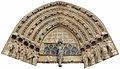
Cropped and reconstructed. -

Example. -

Alternate version, ready for cutting. -
 tight-n-dark


.jpg)
-tight-n-dark.jpg)
Article(s): Catedral de San Antolín de Palencia
Request:
editRequest:
|
|---|
|
I'm posting this here on behalf of Rowanwindwhistler (talk):
Note:
|
Graphist opinion(s):
editGraphist opinion(s):
|
|---|
|
I've removed the "resolved" template. As the OP, User:Kevjonesin, hadn't been offered the opportunity to weigh in yet as is customary. Well, that's the de jure version anyhow. As to the de facto version, please examine Rowanwindwhistler's comment above, taking the time to parse and consider it in full. Specifically: "Unless the community prefers to do the trimming and reconstruction in the alternate composite image". Might it perhaps be appropriate to allow said community a chance to respond? It seems to me the active sub-thread below might warrant some consideration. And while the current version is quite good, I think that there may still some room for improvement. At the very least, I'd prefer to hear some more feedback on the latest suggestions added to "Requests:" above before marking this thread as resolved. --Kevjonesin (talk) 18:12, 11 June 2013 (UTC)
Part of being considerate, it seems to me, is being clear to start with when posting a request "on behalf" of another what one's connection is with it when doing so if it is something other than "copy and paste", and also (as has been pointed out to me before) signing your posts. I have explained why I believed that this posting was a copy of a request by Rowanwindwhistler and thus that this contributor, as the creator and uploader of the image, was the actual OP. I'm not a mind reader when it comes to this, and no I'm not autistic either. Centpacrr (talk) 01:34, 12 June 2013 (UTC)
|
Another example
editAnother example
|
|---|
|
I worked out some of my technical issues (mostly using erase tool instead of paths and masks, back to basics) and proceeded to tighten up the cropping on one of Centpacrr's versions to better align with my discussions —preceding my coming here to invite other editors to help— with Rowan. To more closely resemble the illustrated examples provided above in the "requests section". I then implemented the suggestion to add a dark background (gray, composed of 88% black over white). Discussions below with Nagual also inspired me to adjust hue and saturation a bit. Unfortunately, I'm having difficulty uploading, some sort of file error has been introduced. Even with row-by-row 'JPEG restart markers'. No preview pic or thumbnails display on the file page but if one clicks on the blank space an image will load. Not functional for article use, but I thought I'd share as an example for now. I'll likely try to trouble shoot the upload process again at some point. --Kevjonesin (talk) 12:43, 16 June 2013 (UTC)
|
New composite
editNew composite
|
|---|
|
Can I come out yet? ...Kev, I saw the previous discussion on the Commons and decided to see how my laptop and Photoshop handled the photomerge, using the original files. With a bit of tweeking I managed to remove a lot of distortion (though I've possibly introduced some somewhere, if you look closely!) and I've been trying to upload it but I'm having problems. DerivativeFX drops out before uploading and the normal method just hangs. It's a 103Mb png. I don't suppose anyone would mind if I converted it to a jpg and tried uploading it as a new version of this file? *holds breath* nagualdesign (talk) 00:23, 11 June 2013 (UTC)
|
Allegory of the Spanish Republic
edit
-
 Allegory of the Spanish Republic

Article(s): First Spanish Republic
Request:
- Could someone possibly improve the quality of this picture please, many thanks. TRAJAN 117 (talk) 19:32, 17 June 2013 (UTC)
Graphist opinion(s):
Darkened it a little. – JBarta (talk) 20:01, 17 June 2013 (UTC)
Resolved
edit
.svg)
Article(s): List of states with limited recognition Somaliland
Request:
- First image and Second image: The leaders of Awdalland declared autonomy in 2010, and they do not recognize the secessionist Somaliland government's claim to sovereignty or to its territory. In this case, should the maps still include Awdalland territories? (I have also added this entry on File_talk:Limited_recognition.png)
Second Image: Parts of Sool, Ayn, Somalia, Khatumo State and Maakhir is controlled by Puntland, an autonomous state in Somalia.

Can you fix the second image? Maybe there could be light red for claimed territories and dark red for controlled territories. -- Reepy1 (talk) 17:02, 28 June 2013 (UTC)
Graphist opinion(s):
Question is probably best posed at Talk:List_of_states_with_limited_recognition. – JBarta (talk) 17:11, 28 June 2013 (UTC)
- Oh... I've accidentally put it here instead of the Wikipedia:Graphics Lab/Map workshop. Sorry :P Reepy1 (talk) 09:00, 29 June 2013 (UTC)
Brad Carvey
edit

Article(s): Brad Carvey
Request:
- non-notable buddy shot, please trim down to the encyclopedically interesting shorter fellow... -- Kintetsubuffalo (talk) 23:47, 28 June 2013 (UTC)
Graphist opinion(s):
![]() Done - The next question is can the hand that's growing out of his neck be removed? Yes it can, but not by me. At least not by me now. If someone else wants to do it... go for it. If it's still here later, maybe I'll do it. – JBarta (talk) 00:00, 29 June 2013 (UTC)
Done - The next question is can the hand that's growing out of his neck be removed? Yes it can, but not by me. At least not by me now. If someone else wants to do it... go for it. If it's still here later, maybe I'll do it. – JBarta (talk) 00:00, 29 June 2013 (UTC)
- I'll give it a whirl...
 Request taken by nagualdesign (talk) 00:05, 29 June 2013 (UTC).
  Done nagualdesign (talk) 00:48, 29 June 2013 (UTC)
- Wow guys, that's fantastic, thank you so much!--Kintetsubuffalo (talk) 02:35, 29 June 2013 (UTC)
Apollo 13 Mailbox
edit-
 Engineers work on the Apollo 13 Mailbox

Article(s): Aerospace engineering, Apollo 13, Christopher C. Kraft Jr. Mission Control Center.
Request:
- Crop whitespace on right and top. Any and all possible restoration work, as I'd like to nominate this image to become a featured picture. -- WingtipvorteX PTT ∅ 20:06, 27 June 2013 (UTC)
Graphist opinion(s):
![]() Done - First upload is simply cropping the white border. Second upload is adjusting the contrast a little and cleaning up a few spots. It's not the greatest image in the world to start with, (a lot of area is pure white) but it looks presentable to me. Of course, if other editors want to give it a whirl... go to it. – JBarta (talk) 20:54, 27 June 2013 (UTC)
Done - First upload is simply cropping the white border. Second upload is adjusting the contrast a little and cleaning up a few spots. It's not the greatest image in the world to start with, (a lot of area is pure white) but it looks presentable to me. Of course, if other editors want to give it a whirl... go to it. – JBarta (talk) 20:54, 27 June 2013 (UTC)
- Looks good. There are other versions of the image, such as JSC at 40 MCC Gallery that have better exposure. --Mark viking (talk) 21:27, 27 June 2013 (UTC)
- That one does look like it has a lot more detail left on it. --WingtipvorteX PTT ∅ 21:40, 27 June 2013 (UTC)
- It has better shading, but being a much lower resolution, has much less detail. The full size image we're hosting here is a somewhat badly altered version of the original, but unless we can get that original at a resolution near the one we have, we're SOL and the better option remains the one we have. – JBarta (talk) 23:25, 27 June 2013 (UTC)
- Yikes! I had meant to say more highlight detail. I am not sure if there is a way to ask NASA for the full res scan. Any experience with that?--WingtipvorteX PTT ∅ 02:36, 28 June 2013 (UTC)
- Sweet Georgia Brown... I found a copy of the original here. I tweaked the color & shading and uploaded it. The only drawback is that it's a little grainy and it was saved as a rather highly compressed JPG. It's now loaded with JPG artifacts. There's no reversing that in this copy of the image. The only hope for an even better image is that scan before someone saved it as a highly compressed JPG. (I should mention that JPG is great image format... just be aware of what compression level your image is being saved at. Low compression = good, high compression = bad.) – JBarta (talk) 02:58, 28 June 2013 (UTC)
- Haha, I found that 2 mins ago, and was comparing it to the one here when I noticed they looked almost the same! Thanks for all the help here, my friend. Cheers!--WingtipvorteX PTT ∅ 03:08, 28 June 2013 (UTC)
- Sweet Georgia Brown... I found a copy of the original here. I tweaked the color & shading and uploaded it. The only drawback is that it's a little grainy and it was saved as a rather highly compressed JPG. It's now loaded with JPG artifacts. There's no reversing that in this copy of the image. The only hope for an even better image is that scan before someone saved it as a highly compressed JPG. (I should mention that JPG is great image format... just be aware of what compression level your image is being saved at. Low compression = good, high compression = bad.) – JBarta (talk) 02:58, 28 June 2013 (UTC)
- Yikes! I had meant to say more highlight detail. I am not sure if there is a way to ask NASA for the full res scan. Any experience with that?--WingtipvorteX PTT ∅ 02:36, 28 June 2013 (UTC)
- It has better shading, but being a much lower resolution, has much less detail. The full size image we're hosting here is a somewhat badly altered version of the original, but unless we can get that original at a resolution near the one we have, we're SOL and the better option remains the one we have. – JBarta (talk) 23:25, 27 June 2013 (UTC)
- That one does look like it has a lot more detail left on it. --WingtipvorteX PTT ∅ 21:40, 27 June 2013 (UTC)
- That is much better, thanks Jbarta! --WingtipvorteX PTT ∅ 21:40, 27 June 2013 (UTC)
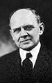
John Baker White (Virginia)
edit-
 Portrait of John Baker White

Article(s): John Baker White
Request:
- This image was taken from a scanned copy of History of Hampshire County, West Virginia: From Its Earliest Settlement to the Present in Google Books and the overall quality is quite poor. Any sharpening, leveling, trimming around the edges, and general overall fixes would be greatly appreciated. This is the only known image of Mr. White hence my usage of it for his forthcoming article on Wikipedia. A link to the original source can be found here:
Maxwell, Hu (1897). History of Hampshire County, West Virginia: From Its Earliest Settlement to the Present. Morgantown, West Virginia: A. Brown Boughner. Retrieved June 30, 2013. {{cite book}}: Invalid |ref=harv (help); Unknown parameter |coauthors= ignored (|author= suggested) (help)
-- Caponer (talk) 17:16, 30 June 2013 (UTC)
Graphist opinion(s):![]() Request taken by Centpacrr (talk) 17:41, 30 June 2013 (UTC).
Caponer, is this what you were looking for? Centpacrr (talk) 18:40, 30 June 2013 (UTC)
Request taken by Centpacrr (talk) 17:41, 30 June 2013 (UTC).
Caponer, is this what you were looking for? Centpacrr (talk) 18:40, 30 June 2013 (UTC) ![]() Done Centpacrr (talk) 20:43, 30 June 2013 (UTC)
Done Centpacrr (talk) 20:43, 30 June 2013 (UTC)
- Centpacrr, thank you so incredibly much for your tremendous work in rehabilitating this old scanned photograph. This more than satisfies the request and I greatly appreciate your assistance! Thanks again for all you do! -- Caponer (talk) 20:31, 30 June 2013 (UTC)
- You're welcome. Centpacrr (talk) 16:26, 1 July 2013 (UTC)
- Additional note to Caponer: Besides the downloadable Google Books version of the book from which you have been finding images of persons about which you have been using images therefrom, additional versions in a variety of other formats of it can be downloaded at http://archive.org/details/historyofhampshi00maxw which may better suit your purposes. Centpacrr (talk) 14:04, 2 July 2013 (UTC)
- You're welcome. Centpacrr (talk) 16:26, 1 July 2013 (UTC)
-
 Memorial at Płaszów
.JPG)
Article(s): Kraków-Płaszów concentration camp
Request:
- If you could remove the date stamp from this image that would be awesome. Thanks, -- Diannaa (talk) 21:44, 30 June 2013 (UTC)
Graphist opinion(s):![]() Done Centpacrr (talk) 23:17, 30 June 2013 (UTC)
Done Centpacrr (talk) 23:17, 30 June 2013 (UTC)
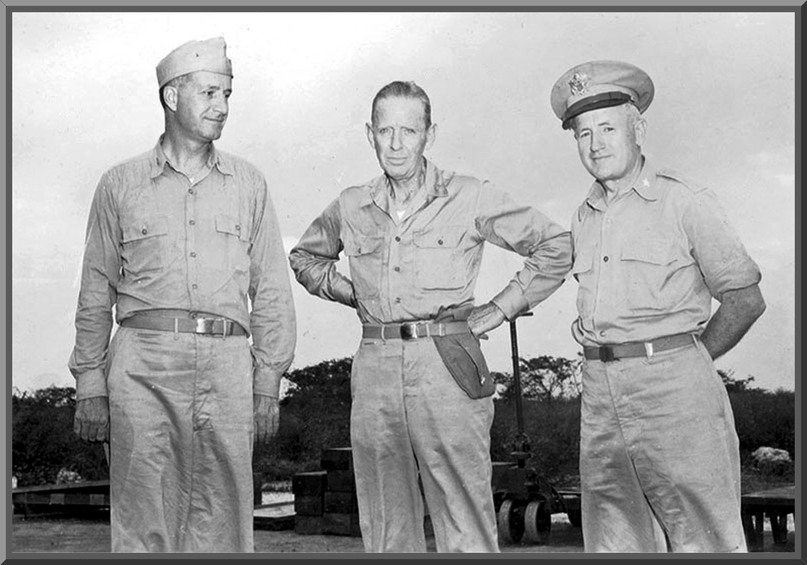
Tinian Joint Chiefs
edit-
 Tinian Joint Chiefs
 -
 Purnell


Article(s): William R. Purnell
Request:
- Hi! I think the contrast and brightness on the first image could use some work. If you would rather work from the source version, it's here.
The second image, whatever you can do to brighten, clean, etc. Thanks so much. --Diannaa (talk) 17:29, 1 July 2013 (UTC)
Graphist opinion(s):![]() Request taken by Centpacrr (talk) 18:27, 1 July 2013 (UTC). I am not really clear as to what you wanted done to these two images Diannaa, but I have tweaked and cleaned them up and bit. If this is not what you were looking for then you (Diannaa) should feel free to revert them or provide more specific instructions as to what you would want me to do further. Centpacrr (talk) 19:46, 1 July 2013 (UTC)
Request taken by Centpacrr (talk) 18:27, 1 July 2013 (UTC). I am not really clear as to what you wanted done to these two images Diannaa, but I have tweaked and cleaned them up and bit. If this is not what you were looking for then you (Diannaa) should feel free to revert them or provide more specific instructions as to what you would want me to do further. Centpacrr (talk) 19:46, 1 July 2013 (UTC) ![]() Done Centpacrr (talk) 23:43, 1 July 2013 (UTC)
Done Centpacrr (talk) 23:43, 1 July 2013 (UTC)
- Thanks Centpacrr. I didn't want to get too specific as I am not sure what's possible and don't know the specialised lingo. Both images look much better, especially the portrait. Thank you! -- Diannaa (talk) 21:06, 1 July 2013 (UTC)
- You're welcome. The first one didn't really look that bad to me so I just spiffed it up a bit and tweaked the contrast so it didn't look quite so "flat" or gray. The portrait took a bit more work to deal with the Moiré pattern but I think for an info box image it now works well. Centpacrr (talk) 21:16, 1 July 2013 (UTC)
- Yes, the portrait took you a lot more effort, I can see that, but it's a very nice result. Thanks again. -- Diannaa (talk) 21:34, 1 July 2013 (UTC)
- I just read the article on RADM Purnell ... a very interesting career for him indeed. I hope you didn't get too badly hurt by the floods up there. I have lots of friends in Calgary and elsewhere in the Province and it looks as if it is going to take years to fully recover from the damage downtown, the Stampede Grounds, and elsewhere. Centpacrr (talk) 21:43, 1 July 2013 (UTC)
- Hawkeye is working on the article right now, for a GA nomination. We are fine, I live up near Edmonton. I have a lot of friends in the Bow Valley (Canmore, Banff) but as far as I know everyone is okay. Calgary, what a mess. :/ -- Diannaa (talk) 21:57, 1 July 2013 (UTC)
- I've worked in pro hockey for over 40 years so have many friends from around Edmonton, Calgary, and elsewhere in Alberta including Flames' GM Jay Feaster and coach Bob Hartley who are both long time buddies. I don't see how the Saddledome can possibly be put back in shape in time for the season having been flooded up to the tenth row. A mess indeed. Centpacrr (talk) 23:19, 1 July 2013 (UTC) PS: I am also ironically also currently reading the book "In Harm's Way" about the sinking of the cruiser USS Indianapolis just a few days after that ship had delivered the Hiroshima bomb to Tinian Island. Centpacrr (talk) 00:15, 2 July 2013 (UTC)
- Hawkeye is working on the article right now, for a GA nomination. We are fine, I live up near Edmonton. I have a lot of friends in the Bow Valley (Canmore, Banff) but as far as I know everyone is okay. Calgary, what a mess. :/ -- Diannaa (talk) 21:57, 1 July 2013 (UTC)
- I just read the article on RADM Purnell ... a very interesting career for him indeed. I hope you didn't get too badly hurt by the floods up there. I have lots of friends in Calgary and elsewhere in the Province and it looks as if it is going to take years to fully recover from the damage downtown, the Stampede Grounds, and elsewhere. Centpacrr (talk) 21:43, 1 July 2013 (UTC)
- Yes, the portrait took you a lot more effort, I can see that, but it's a very nice result. Thanks again. -- Diannaa (talk) 21:34, 1 July 2013 (UTC)
- You're welcome. The first one didn't really look that bad to me so I just spiffed it up a bit and tweaked the contrast so it didn't look quite so "flat" or gray. The portrait took a bit more work to deal with the Moiré pattern but I think for an info box image it now works well. Centpacrr (talk) 21:16, 1 July 2013 (UTC)
Joshua Soule Zimmerman
edit
-
 Portrait of Joshua Soule Zimmerman

Article(s): Joshua Soule Zimmerman
Request:
- To the brilliant graphists of Wikipedia, I've located a second image of Joshua Soule Zimmerman from a scanned copy of the 1922 West Virginia Blue Book which is linked below. Is there any way to lighten, sharpen, or otherwise make more clear this scanned black and white image? Thanks again for all your phenomenal efforts! -- Caponer (talk) 20:20, 6 July 2013 (UTC)
- Harris, John T. (Clerk of the West Virginia State Senate) (1922). West Virginia Legislative Hand Book and Manual and Official Register, 1922. Charleston, West Virginia: Tribune Printing Company. Retrieved July 6, 2013.
{{cite book}}: Cite has empty unknown parameter:|coauthors=(help)
Graphist opinion(s):I have cropped and tweaked this image a bit to make it more suitable for use in an infobox which I gather this is where you plan to use it. I'm not sure if this is what you wanted, Caponer, but If not as the OP you should feel free to revert it. Centpacrr (talk) 22:12, 6 July 2013 (UTC)
Battle of Caseros
edit

Article(s): Platine War
Request:
- Hi, I'd like to see the "Illustrated London News" mark removed from the bottom (to the left) as well as the vertical line crossing the fortress in the background (to the right). -- Lecen (talk) 12:43, 7 July 2013 (UTC)
Graphist opinion(s):![]() Done Centpacrr (talk) 13:40, 7 July 2013 (UTC)
Done Centpacrr (talk) 13:40, 7 July 2013 (UTC)
Culverwell Mesolithic site
edit
Article(s): Culverwell Mesolithic Site
Request:
- A rather poor picture and taken on a day when there was very heavy overcast, but the image is so very dark that it is hard to see anything except the road. It can presumably be lightened somewhat without it looking artificial? Also perhaps some of the road in the foreground should be cropped off (?) as the site is apparently on the right of the road? Thanks, Invertzoo (talk) 21:34, 13 July 2013 (UTC)
Graphist opinion(s):![]() Request taken by Centpacrr (talk) 22:50, 13 July 2013 (UTC). I have cropped and adjusted the gamma of this image are requested. If this is not what you wanted, as the OP requester you should feel free to revert to the original version and/or let me know how else you would like it adjusted. If it is a satisfactory resolution to your request, however, you are free to mark it "resolved" at your discretion. Centpacrr (talk) 23:04, 13 July 2013 (UTC)
Request taken by Centpacrr (talk) 22:50, 13 July 2013 (UTC). I have cropped and adjusted the gamma of this image are requested. If this is not what you wanted, as the OP requester you should feel free to revert to the original version and/or let me know how else you would like it adjusted. If it is a satisfactory resolution to your request, however, you are free to mark it "resolved" at your discretion. Centpacrr (talk) 23:04, 13 July 2013 (UTC)
- Seems good to me! Much better than it was. Thanks so much, Invertzoo (talk) 02:01, 14 July 2013 (UTC)
Kumamon
editArticle(s): Kumamon
Request:
- This is a terrible pic to illustrate that article-please trim down to the black bear character in the center, and fix the perspective. It's okay to make a separate image. Thank you. -- Kintetsubuffalo (talk) 09:17, 14 July 2013 (UTC)
Graphist opinion(s):Is this what you are looking for? If not, as the OP requester feel free to revert. Centpacrr (talk) 13:41, 14 July 2013 (UTC)
- Wow, you did a great job with very poor source material, thank you! However, I just read the tag on the image "Derivatives of this file which focus more on the non-free element(s) may not qualify as de minimis and may be copyright violations. As a direct consequence it might be needed to review the copyright status if you crop the picture." So, hate to go back to the drawing board, can you try one more perspective? With the same landscape rectangle proportions, scale down to include the panel and both the open doors. I think that should satisfy the tag. Thanks again!--Kintetsubuffalo (talk) 14:01, 14 July 2013 (UTC)
- Yeah, that'll work great, thank you!--Kintetsubuffalo (talk) 14:55, 14 July 2013 (UTC)
![]() Done Centpacrr (talk) 15:49, 14 July 2013 (UTC)
Done Centpacrr (talk) 15:49, 14 July 2013 (UTC)
Schindler's factory
edit
-
 Entrance to DEF

Article(s): Oskar Schindler
Request:
- The camera must have been tilted when the pic was taken. If the pole on the right could be made parallel with the edge of the photo that would help make it look better, IMO. What do you think? -- Diannaa (talk) 18:43, 14 July 2013 (UTC)
Graphist opinion(s):
Juan Manuel de Rosas
edit

Article(s): Juan Manuel de Rosas
Request:
- Would it be possible to make his blue eyes less bright? His hair looks too dark, it's actually more blond. See this link to understand, please. -- Lecen (talk) 03:01, 9 July 2013 (UTC)
Graphist opinion(s):Desaturated eyes; lightened hair. Centpacrr (talk) 03:42, 9 July 2013 (UTC)
Such a change to a painting is highly unencyclopedic. At the very least, please upload as separate file and use Template:Retouched picture documenting the change. – JBarta (talk) 03:50, 9 July 2013 (UTC)
I agree, it's pretty unencyclopedic, especially if we use it without being clear it's a retouch, and I'm not sure why we would want to show a retouch... But, just for fun, because I wanted to see how Photoshop's "Match Colour" would do with just the hair from your Amazon photo, here's File:Juan Manuel de Rosas by Descalzi oval retouch(B).png. (I desaturated the blue in the eyes too). Begoon talk 04:06, 9 July 2013 (UTC)
Margaret Mead
edit_(2).jpg)
Article(s): Margaret Mead
Request:
Graphist opinion(s):![]() Done Centpacrr (talk) 22:08, 14 July 2013 (UTC)
Done Centpacrr (talk) 22:08, 14 July 2013 (UTC)
I did a little more cleanup on the file and for some reason there is a problem after I uploaded it. I didn't make any brightness or contrast changes to the file, but when viewed in Firefox after uploaded to WP, my upload looks darker than Centpacrr's last upload. In this instance it's not deliberate. When I view the two files locally, they appear the same. The only difference I can see is that Centpacrr's upload is a progressive JPG and mine is a regular JPG. Any insight here would be welcome. – JBarta (talk) 03:03, 15 July 2013 (UTC)
- Brightness/contrast of [1] and [2] look the same to me in Chrome (29.0.1547.15 dev-m), and IE9.
- This is interesting, though very old - don't know if it still applies:mozillazine discussion... [*]
- And sure enough, I just installed latest Firefox for XP (22.0), and they are different when compared in that, yours is quite noticeably darker there, as you describe. They mention colour profiles in the link, perhaps that's relevant? Begoon talk 03:56, 15 July 2013 (UTC)
- [*] - ah - in Bugzilla, still open: [3] To do with ICC2 ICC4 profiles... I can't actually make head nor tail of that and all the linked bugs, and whether or not it applies here, except it seems to confirm that there are or have been problems with FF showing Jpegs "darker" "sometimes" which may or may not have been fixed... Begoon talk 04:03, 15 July 2013 (UTC)
- I checked using Chrome and Maxthon (IE based) and all the brightness is the same. Even comparing the two files locally (with Irfanview and GIMP), the image brightness is the same. The only thing that's lighter is Centpacrr's upload and only when viewed in Firefox. I've noticed this situation once or twice before with black and white images and I think that was over a Centpacrr upload as well (I'm not however suggesting he did anything wrong here). In the past he has uploaded color images with embedded color profiles which are problematic and I brought it to his attention. Hopefully that's not an issue any more. It doesn't seem to be the culprit here though. – JBarta (talk) 05:02, 15 July 2013 (UTC)
- This is interesting... in Centpacrr's upload, viewing the EXIF data using PhotoME there is this entry: "Profile Description: Dot Gain 20%". Wikipedia has an article on Dot gain and suggests that Dot gain can cause the image to appear lighter. If this is so, maybe Firefox is the only browser that picks up on that instruction and renders that image lighter? – JBarta (talk) 06:06, 15 July 2013 (UTC)
- Don't know - but coincidentally I used to be in printing, which is where the term comes from - and I remember that dot gain is undesirable because it darkens a printed image (by making the black/cyan/magenta/yellow printed dots bigger/spread - more black/colour on the white paper), as part of the mechanical process slapping ink on paper, so to compensate for dot gain you'd make the monitor image lighter than the intended eventual printed image, based on the predicted dot gain. I think... (Funnily enough, when I edited my earlier comment to say that your image appeared quite noticeably darker in FF, I was going to type 15-20% but settled for vagueness because it was my subjective visual judgement (true story)
 ).
). - Printing (CMYK) is a subtractive colour mixing process and monitors use RGB (additive). Photoshop does some dot gain compensation when you convert between RGB/CMYK - see Dot gain in Photoshop. One can also tweak this, in colour profiles - which may be where the 20% comes from, not sure.
- Generally, as far as I remember, and because every printing press would need a potentially different setting here, it would be the lithographic printer who worried about optimising this setting rather than anyone else, at the time he converted to CMYK to output colour separated films for the print job - although some customers/designers supplied separated film, in which case I guess they would need to have done it based on their chosen print house's known requirement.
- Couple that with what we saw above that Firefox can deal differently with colour profiles, and it's looking a good favourite here.
- tldr; Sounds like you found the cause, I'd guess. Begoon talk 07:01, 15 July 2013 (UTC)
- Yes, I suspect "dot gain" is the the problem. From my reading, Photoshop (the editor Centpacrr used) can be configured to effectively lighten an image for printing due to dot gain as printed images (especially black & white images) often print darker than would show up on a computer monitor. This is all fine and dandy, except for two problems... first, different print media will experience different dot gain so this adjustment should be done by the printer... not us. And second, as it seems at least one browser has seen fit to pick up on this (Firefox) the image can look different to different people depending on the browser that's used. This is not good. I might also mention it causes collaborative editing problems as we see here. In this instance, the original uploaded image contained basically no EXIF data and Centpacrr's edit added EXIF data as well as the dot gain adjustment. What of this he's aware of I can't be sure, but to Centpacrr I would advise that while adding some metadata to a file can be useful, the dot gain parameter is problematic and should be eliminated in all uploads to Wikipedia. (And that should go for color profiles in general.) In the event Centpacrr did this deliberately, I would argue that such an adjustment is better left to the printer as he knows what he'll be printing on. Our responsibility is to simply provide an easily digestible file that looks the same to everyone (as far as that's possible). – JBarta (talk) 01:42, 16 July 2013 (UTC)
- That's a good summary of the issue, I think. 2 things worth stressing are:
- The "dot gain" adjustment should only be made by a printer or print agent with a view to improving colour matching of a printed image, and
- I believe Firefox is wrong to take account of this setting for web display and this is a 'bug'. 'Dot gain' settings should only be applied when the image is printed (usually via output to film or plates).
- I agree that for a general purpose Wikipedia/Commons upload, any additional 'profile' settings that may be variably interpreted by software in this way, correctly or due to 'bugs', should always be omitted, and a basic image file produced. That way this type of confusion is avoided.
- If an end user wants to use the image for other purposes such as lithographic printing, screen printing etc..., then they would be the ones to add whatever technical parameters their chosen additional process requires. We could not know what those parameters might be - only the end user could. Begoon talk 02:56, 16 July 2013 (UTC)
- I did not manually add or edit any metadata information on this file. Changes made, if any, were done so automatically and in the background by PhotoshopCS5 (Mac), the application I use to edit files, as part of the way its process works. As far as I know those only consisted of adding the name of the application (PhotoshopCS5) and the date and time the file was last saved (14:35, 15 July 2013). All specific identification data came from the original file from which I started. The only time I ever manually edit metadata information is on files I upload to WP are on my own uploads (never to edits of those of others), and what I add to my uploads is exclusively identifying information such as copyright, source, file title and description, etc. I never add or alter any technical data. Any editing I do in here is strictly for webviewing on WP and nothing else. It is not designed for printing. Centpacrr (talk) 03:22, 16 July 2013 (UTC)
- On your Firefox issue, I have just looked at both the Mead image and about a dozen other images (both monochrome and color) that I have uploaded to WP side by side on Firefox 22.0 (Mac) and the same image file on PhotoshopCS5 (Mac) on a MacBook Pro (2012) with LED illuminated 1280x800 screen running OSX 10.6.8 and can see no difference whatsoever on how the two applications display the images as far as brightness, gamma, tone or anything else. To me they look absolutely identical. Perhaps then the problem you are having is exclusive to your make and/of model computer, the version of Firefox you are using, the operating system, or something else. Centpacrr (talk) 03:51, 16 July 2013 (UTC) (See here) Centpacrr (talk) 04:07, 16 July 2013 (UTC)
- I just noticed this: When you open Photoshop CS5, with no image loaded, select Edit-Colour Settings. Then More Options... Towards the end is an option: Desaturate Monitor Colours By: - which in my default installation is unchecked (but with a default value of 20%). Probably not the issue, but do you have that set to "on" (checked)? (those are PC version settings - I guess Mac may differ in how you get to the dialog) Begoon talk
- Then you might wish to investigate what your Photoshop is adding to the file... because adding it is...
- I did not manually add or edit any metadata information on this file. Changes made, if any, were done so automatically and in the background by PhotoshopCS5 (Mac), the application I use to edit files, as part of the way its process works. As far as I know those only consisted of adding the name of the application (PhotoshopCS5) and the date and time the file was last saved (14:35, 15 July 2013). All specific identification data came from the original file from which I started. The only time I ever manually edit metadata information is on files I upload to WP are on my own uploads (never to edits of those of others), and what I add to my uploads is exclusively identifying information such as copyright, source, file title and description, etc. I never add or alter any technical data. Any editing I do in here is strictly for webviewing on WP and nothing else. It is not designed for printing. Centpacrr (talk) 03:22, 16 July 2013 (UTC)
- That's a good summary of the issue, I think. 2 things worth stressing are:
- Yes, I suspect "dot gain" is the the problem. From my reading, Photoshop (the editor Centpacrr used) can be configured to effectively lighten an image for printing due to dot gain as printed images (especially black & white images) often print darker than would show up on a computer monitor. This is all fine and dandy, except for two problems... first, different print media will experience different dot gain so this adjustment should be done by the printer... not us. And second, as it seems at least one browser has seen fit to pick up on this (Firefox) the image can look different to different people depending on the browser that's used. This is not good. I might also mention it causes collaborative editing problems as we see here. In this instance, the original uploaded image contained basically no EXIF data and Centpacrr's edit added EXIF data as well as the dot gain adjustment. What of this he's aware of I can't be sure, but to Centpacrr I would advise that while adding some metadata to a file can be useful, the dot gain parameter is problematic and should be eliminated in all uploads to Wikipedia. (And that should go for color profiles in general.) In the event Centpacrr did this deliberately, I would argue that such an adjustment is better left to the printer as he knows what he'll be printing on. Our responsibility is to simply provide an easily digestible file that looks the same to everyone (as far as that's possible). – JBarta (talk) 01:42, 16 July 2013 (UTC)
- Don't know - but coincidentally I used to be in printing, which is where the term comes from - and I remember that dot gain is undesirable because it darkens a printed image (by making the black/cyan/magenta/yellow printed dots bigger/spread - more black/colour on the white paper), as part of the mechanical process slapping ink on paper, so to compensate for dot gain you'd make the monitor image lighter than the intended eventual printed image, based on the predicted dot gain. I think... (Funnily enough, when I edited my earlier comment to say that your image appeared quite noticeably darker in FF, I was going to type 15-20% but settled for vagueness because it was my subjective visual judgement (true story)
- This is interesting... in Centpacrr's upload, viewing the EXIF data using PhotoME there is this entry: "Profile Description: Dot Gain 20%". Wikipedia has an article on Dot gain and suggests that Dot gain can cause the image to appear lighter. If this is so, maybe Firefox is the only browser that picks up on that instruction and renders that image lighter? – JBarta (talk) 06:06, 15 July 2013 (UTC)
- I checked using Chrome and Maxthon (IE based) and all the brightness is the same. Even comparing the two files locally (with Irfanview and GIMP), the image brightness is the same. The only thing that's lighter is Centpacrr's upload and only when viewed in Firefox. I've noticed this situation once or twice before with black and white images and I think that was over a Centpacrr upload as well (I'm not however suggesting he did anything wrong here). In the past he has uploaded color images with embedded color profiles which are problematic and I brought it to his attention. Hopefully that's not an issue any more. It doesn't seem to be the culprit here though. – JBarta (talk) 05:02, 15 July 2013 (UTC)
EXIF data
|
|---|
[PhotoME]
PhotoME version: 0.79R17 (Build 856)

[Overview]
File name: 20130714220542!Margaret_Mead_(1901-1978)_(2).jpg
File type: JPEG
File size: 732.8 KB
Creation date: 7/15/2013 23:51
Last modification: 7/15/2013 23:51
Dimension: 2000 x 1575 px (3.2 MP, 4:3)
Comment: Acc 90-105, Box 14, Folder "Biog. Mead, Margaret";
[PhotoME] PhotoME version: 0.79R17 (Build 856) [Overview] File name: 20130715025000!Margaret_Mead_(1901-1978)_(2).jpg File type: JPEG File size: 1,309 KB Creation date: 7/14/2013 18:04 Last modification: 7/15/2013 23:53 Software: Adobe Photoshop CS5 Macintosh Dimension: 2000 x 1575 px (3.2 MP, 4:3) [IPTC-NAA data (IIM)] Coded Character Set: UTF-8 Application Record Version: Version 0 Caption/Description: Acc 90-105, Box 14, Folder "Biog. Mead, Margaret"; Headline: Dr. Margaret Mead at NYAS Creator: Stephen Siegel Source: Smithsonian Institution Archives Title: SIA2008-5980 Date Created: 2009-09-16 Time Created: 14:35:53 UTC -05:00 Copyright Notice: This image was obtained from the Smithsonian Institution. The image or its contents may be protected by international copyright [Image] Image width: 2000 px Image height: 1575 px Number of bits per component: 8, 8, 8 Pixel scheme: RGB Image title: Acc 90-105, Box 14, Folder "Biog. Mead, Margaret"; Orientation of image: 0° (top/left) Number of components: 3 Image resolution in width direction: 600 dpi Image resolution in height direction: 600 dpi Unit of X and Y resolution: inch Software: Adobe Photoshop CS5 Macintosh File change date and time: 2013-07-14 18:04:51 Person who created the image: Stephen Siegel Copyright holder: This image was obtained from the Smithsonian Institution. The image or its contents may be protected by international copyright laws. Exif IFD Pointer: 0x000001D4 [Thumbnail Info] Compression scheme: JPEG (old-style) Image resolution in width direction: 72 dpi Image resolution in height direction: 72 dpi Unit of X and Y resolution: inch Offset to JPEG SOI: 0x0000026A Bytes of JPEG data: 8459 bytes [Camera] Exif version: Version 2.21 Color space: Uncalibrated Image width: 2000 px Image height: 1575 px [ICC Profile] Profile CMM Type: Adobe CMM Profile Version: 2.1.0 Profile Class: Output Device Profile Data Color Space: Gray Profile Connection Space: XYZ Profile Date Time: 1999-06-03 00:00:00 Profile File Signature: "acsp" Primary Platform: Apple Computer Inc. CMM Flags: Not Embedded, Independent Device Manufacturer: none Device Model: Not set Media Attributes: Reflective, Glossy, Positive Polarity, Color Device Attributes: Not set Rendering Intent: Relative Colorimetric Connection Space Illuminant: [0.96420, 1.00000, 0.82491] Profile Creator: Adobe Systems Incorporated Profile ID: Not set Profile Copyright: Copyright 1999 Adobe Systems Incorporated Profile Description: Dot Gain 20% Media White Point: [0.96420, 1.00000, 0.82491] Media Black Point: [0.00000, 0.00000, 0.00000] |
- I'm not chastising you. I understand this parameter may be a default setting and being added without your being aware. But now that you are aware, it would be helpful to dig into your Photoshop settings and set it to zero (or whatever adjustment is necessary to eliminate the issue). – JBarta (talk) 04:09, 16 July 2013 (UTC)
- Or maybe not. While PhotoME shows a big difference in the quantity of metadata, it seems some of this metadata was actually in the original upload... but PhotoME didn't recognize it. That same metadata was recognized in Centpacrr's upload. Somehow when the image went through Centpacrr's Photoshop, the data became recognizable to PhotoME as EXIF data. Looking at the files in a hex editor I see in the original image the text "Photoshop 3.0". That's a version of Photoshop from the mid 1990's. That might explain why PhotoME didn't recognize the metadata and a modern Photoshop did. So your Photoshop didn't exactly add as much metadata as I originally thought. But still, the dot gain item seems to be the most likely cause of the brightness issue. – JBarta (talk) 04:43, 16 July 2013 (UTC)
- Heh - I noticed that PhotoMe must be missing some data - it told me there was no EXIF data in the original - then after I edited it stuff like source and author appeared... nevertheless, I think Centpacrr's Mac Photoshop seems to be adding the [ICC Profile] section, and that's the key. Begoon talk 04:47, 16 July 2013 (UTC)
- Possibly back then Photoshop was saving metadata in a different way or a non-standard way. A modern Photoshop picked up its own old data while a modern generic EXIF viewer did not. – JBarta (talk) 04:53, 16 July 2013 (UTC)
- Opening the original image in a hex editor I stripped out the following XMP metadata... the non-EXIF data that PhotoME couldn't read...
- Possibly back then Photoshop was saving metadata in a different way or a non-standard way. A modern Photoshop picked up its own old data while a modern generic EXIF viewer did not. – JBarta (talk) 04:53, 16 July 2013 (UTC)
- Or maybe not. While PhotoME shows a big difference in the quantity of metadata, it seems some of this metadata was actually in the original upload... but PhotoME didn't recognize it. That same metadata was recognized in Centpacrr's upload. Somehow when the image went through Centpacrr's Photoshop, the data became recognizable to PhotoME as EXIF data. Looking at the files in a hex editor I see in the original image the text "Photoshop 3.0". That's a version of Photoshop from the mid 1990's. That might explain why PhotoME didn't recognize the metadata and a modern Photoshop did. So your Photoshop didn't exactly add as much metadata as I originally thought. But still, the dot gain item seems to be the most likely cause of the brightness issue. – JBarta (talk) 04:43, 16 July 2013 (UTC)
- I'm not chastising you. I understand this parameter may be a default setting and being added without your being aware. But now that you are aware, it would be helpful to dig into your Photoshop settings and set it to zero (or whatever adjustment is necessary to eliminate the issue). – JBarta (talk) 04:09, 16 July 2013 (UTC)
XMP data from original upload
|
|---|
<?xpacket begin="<bh:ef><bh:bb><bh:bf>" id="W5M0MpCehiHzreSzNTczkc9d"?>
 <x:xmpmeta xmlns:x="adobe:ns:meta/" x:xmptk="Adobe XMP Core 4.2-c020 1.124078, Tue Sep 11 2007 23:21:40        ">
  <rdf:RDF xmlns:rdf="http://www.w3.org/1999/02/22-rdf-syntax-ns#">
   <rdf:Description rdf:about=""
    xmlns:tiff="http://ns.adobe.com/tiff/1.0/">
    <tiff:Orientation>1\</tiff:Orientation>
    <tiff:ImageWidth>7545\</tiff:ImageWidth>
    <tiff:ImageLength>5941\</tiff:ImageLength>
    <tiff:PhotometricInterpretation>2\</tiff:PhotometricInterpretation>
    <tiff:SamplesPerPixel>3\</tiff:SamplesPerPixel>
    <tiff:XResolution>600/1\</tiff:XResolution>
    <tiff:YResolution>600/1\</tiff:YResolution>
    <tiff:ResolutionUnit>2\</tiff:ResolutionUnit>
    <tiff:BitsPerSample>
     <rdf:Seq>
      <rdf:li>8\</rdf:li>
      <rdf:li>8\</rdf:li>
      <rdf:li>8\</rdf:li>
     </rdf:Seq>
    </tiff:BitsPerSample>
   </rdf:Description>
   <rdf:Description rdf:about=""
    xmlns:xap="http://ns.adobe.com/xap/1.0/">
    <xap:CreateDate>2009-09-16T14:34:43-04:00\</xap:CreateDate>
    <xap:ModifyDate>2009-09-16T14:35:53-04:00\</xap:ModifyDate>
    <xap:MetadataDate>2012-01-06T13:43:53-05:00\</xap:MetadataDate>
    <xap:CreatorTool>Adobe Photoshop CS3 Windows\</xap:CreatorTool>
    <xap:Rating>0\</xap:Rating>
   </rdf:Description>
   <rdf:Description rdf:about=""
    xmlns:dc="http://purl.org/dc/elements/1.1/">
    <dc:format>image/tiff\</dc:format>
    <dc:creator>
     <rdf:Seq>
      <rdf:li>Stephen Siegel\</rdf:li>
     </rdf:Seq>
    </dc:creator>
    <dc:title>
     <rdf:Alt>
      <rdf:li xml:lang="x-default">SIA2008-5980\</rdf:li>
     </rdf:Alt>
    </dc:title>
    <dc:rights>
     <rdf:Alt>
      <rdf:li xml:lang="x-default">This image was obtained from the Smithsonian Institution.
        The image or its contents may be protected by international copyright laws.\</rdf:li>
     </rdf:Alt>
    </dc:rights>
    <dc:description>
     <rdf:Alt>
      <rdf:li xml:lang="x-default">Acc 90-105, Box 14, Folder "Biog. Mead, Margaret";\</rdf:li>
     </rdf:Alt>
    </dc:description>
   </rdf:Description>
   <rdf:Description rdf:about=""
    xmlns:photoshop="http://ns.adobe.com/photoshop/1.0/">
    <photoshop:History/>
    <photoshop:Source>Smithsonian Institution Archives\</photoshop:Source>
    <photoshop:Headline>Dr. Margaret Mead at NYAS\</photoshop:Headline>
    <photoshop:DateCreated>2009-09-16T14:35:53-05:00\</photoshop:DateCreated>
    <photoshop:LegacyIPTCDigest>BB65D26588B497A8810F233E93A2E2D5\</photoshop:LegacyIPTCDigest>
    <photoshop:ColorMode>3\</photoshop:ColorMode>
    <photoshop:ICCProfile/>
   </rdf:Description>
   <rdf:Description rdf:about=""
    xmlns:xapMM="http://ns.adobe.com/xap/1.0/mm/">
    <xapMM:InstanceID>uuid:113A94FAEEA2DE119F90AB33E1D8D1F9\</xapMM:InstanceID>
    <xapMM:DocumentID>uuid:0D3A94FAEEA2DE119F90AB33E1D8D1F9\</xapMM:DocumentID>
    <xapMM:DerivedFrom rdf:parseType="Resource"/>
   </rdf:Description>
   <rdf:Description rdf:about=""
    xmlns:exif="http://ns.adobe.com/exif/1.0/">
    <exif:PixelXDimension>7545\</exif:PixelXDimension>
    <exif:PixelYDimension>5941\</exif:PixelYDimension>
    <exif:ColorSpace>65535\</exif:ColorSpace>
    <exif:ExifVersion>0221\</exif:ExifVersion>
   </rdf:Description>
   <rdf:Description rdf:about=""
    xmlns:photomechanic="http://ns.camerabits.com/photomechanic/1.0/">
    <photomechanic:Prefs>0:0:0:-00001\</photomechanic:Prefs>
   </rdf:Description>
   <rdf:Description rdf:about=""
    xmlns:crs="http://ns.adobe.com/camera-raw-settings/1.0/">
    <crs:AlreadyApplied>True\</crs:AlreadyApplied>
   </rdf:Description>
   <rdf:Description rdf:about=""
    xmlns:Iptc4xmpCore="http://iptc.org/std/Iptc4xmpCore/1.0/xmlns/">
    <Iptc4xmpCore:CreatorContactInfo rdf:parseType="Resource">
     <Iptc4xmpCore:CiAdrCity>Washington\</Iptc4xmpCore:CiAdrCity>
     <Iptc4xmpCore:CiAdrRegion>D.C.\</Iptc4xmpCore:CiAdrRegion>
     <Iptc4xmpCore:CiAdrCtry>USA\</Iptc4xmpCore:CiAdrCtry>
     <Iptc4xmpCore:CiEmailWork>osiaref@si.edu\</Iptc4xmpCore:CiEmailWork>
     <Iptc4xmpCore:CiUrlWork>http://siarchives.si.edu\</Iptc4xmpCore:CiUrlWork>
    </Iptc4xmpCore:CreatorContactInfo>
   </rdf:Description>
  </rdf:RDF>
 </x:xmpmeta>
<?xpacket end="w"?>
|
- – JBarta (talk) 08:20, 16 July 2013 (UTC)
- Yeah - I did that earlier, too, that's why I changed my mind here - it's just as easy to do in a decent text editor, like Notepad++ (not basic Notepad) - the xml data shows up as text after the binary image stuff.
- <exif:ColorSpace>65535\</exif:ColorSpace> means uncalibrated, I think, see this link and search Colorspace on the page.
- <photoshop:ICCProfile/> is there as an empty, self closed tag - implying no data, unless I'm misreading it.
- <photoshop:ColorMode>3\</photoshop:ColorMode> is just RGB - [4] Begoon talk 08:45, 16 July 2013 (UTC)
- – JBarta (talk) 08:20, 16 July 2013 (UTC)
When I open the original, make a small edit, and save with File-Save As, I get this EXIF data added by CS5 Windows XP - Note there is no [ICC Profile] section - I think we need to establish why C's version is adding that section...
My EXIF
|
|---|
[PhotoME] PhotoME version: 0.79R17 (Build 856) [Overview] File name: C:\...\desktop\201307edited-14220542!Margaret_Mead_(1901-1978)_(2).jpg File type: JPEG File size: 1,072 KB Creation date: 16/07/2013 14:25 Last modification: 16/07/2013 14:25 Software: Adobe Photoshop CS5 Windows Dimension: 2000 x 1575 px (3.2 MP, 4:3) [IPTC-NAA data (IIM)] Coded Character Set: UTF-8 Application Record Version: Version 0 Caption/Description: Acc 90-105, Box 14, Folder "Biog. Mead, Margaret"; Headline: Dr. Margaret Mead at NYAS Creator: Stephen Siegel Source: Smithsonian Institution Archives Title: SIA2008-5980 Date Created: 2009-09-16 Time Created: 14:35:53 UTC -05:00 Copyright Notice: This image was obtained from the Smithsonian Institution. The image or its contents may be protected by international copyright [Image] Image width: 2000 px Image height: 1575 px Number of bits per component: 8, 8, 8 Pixel scheme: RGB Image title: Acc 90-105, Box 14, Folder "Biog. Mead, Margaret"; Orientation of image: 0° (top/left) Number of components: 3 Image resolution in width direction: 600 dpi Image resolution in height direction: 600 dpi Unit of X and Y resolution: inch Software: Adobe Photoshop CS5 Windows File change date and time: 2013-07-16 14:25:56 Person who created the image: Stephen Siegel Copyright holder: This image was obtained from the Smithsonian Institution. The image or its contents may be protected by international copyright laws. Exif IFD Pointer: 0x000001D0 [Thumbnail Info] Compression scheme: JPEG (old-style) Image resolution in width direction: 72 dpi Image resolution in height direction: 72 dpi Unit of X and Y resolution: inch Offset to JPEG SOI: 0x00000266 Bytes of JPEG data: 6803 bytes [Camera] Exif version: Version 2.21 Color space: Uncalibrated Image width: 2000 px Image height: 1575 px |
Begoon talk 04:37, 16 July 2013 (UTC)
- I am uneasy about changing the wide variety of default settings on Photoshop to something else that might very well introduce some completely different and unanticipated new issues -- especially when I suspect that virtually everybody (or certainly most) Photoshop users will continue to run on the default setting called "North America General Purpose 2". Unless and until the community agrees on some "standard" for use on WP it seems a pointless and counterproductive exercise for me and everyone else to start experimenting with the dozens of adjustments possible on Photoshop (and doubtless on other digital editing applications such as GIMP, etc) without having any idea what the results of this will be. As I pointed out above, I have compared how the Mead image and a dozen or so such files (both monochrome and color) that I have created and/or edited and uploaded to WP side by side in Firefox 22.0 and PhotoshopCS5 on my MacBook Pro and find no discernible difference in how any of them display.
- There are millions of users around the world who view images on WP every day and there is no possible way to optimize every image for every display used by every viewer. This would simply be a fool's errand to even contemplate. That being the case, I think it is unwise to start experimenting and straying away from the default settings on Photoshop or any other digital editing application without knowing exactly what I am doing ... and probably not even then. As you are apparently only having issues with whatever OS version Firefox you are using and no other browsers I really don't know how you can resolve those. But for me and others to start fiddling with the well established default setting of our various digital image editing programs does not seem to me to be the answer. Centpacrr (talk) 04:55, 16 July 2013 (UTC)
- Well, we're not talking about brain surgery here... just a Photoshop setting. I think investigating it further on your end won't cause the world to end. It might even give you a better understanding of how your software works... not to mention sparing a few other editors needless confusion. – JBarta (talk) 05:05, 16 July 2013 (UTC)
- I might also mention that while you don't see a difference, the two other editors who have looked at it do. Something is happening. This whole discussion is an effort to figure out what that something is. From what we can tell there is a brightness difference in the two files mentioned (1,2) that show up in Firefox only for both myself and Begoon. At this point the most likely culprit is a "dot gain" parameter in your upload. Possibly the fact we're on Windows and you use a Mac plays a role... I don't know. And I don't use Photoshop so my investigative usefulness here is limited. Any help you can offer would be useful. – JBarta (talk) 05:20, 16 July 2013 (UTC)
- Here's a related discussion which contains this phrase:
| “ | The solution to this mess is not to embed any profile at all. In that case a default profile will be assumed... | ” |
- • For me, on Windows, "File-Save As" has a checkbox, under Color, marked ICC Profile: and this is always unchecked, so I don't save a profile.
• If I use "Save for Web and Devices" - convert to sRGB is checked, Optimised is checked and Embed Color Profile is unchecked. I never need to change any of these.
• This is Photoshop CS5 - Windows, and I rather feel these options when saving may be very relevant... - I honestly think it might be helpful to check if these are the same for you when you save files, since this doesn't affect anything except whether you embed a profile or not, when saving - no messing with any internal settings, just how the file is saved - and it's the opposite of what you say above:
(trying to) optimize every image for every display used by every viewer
- the idea here is not to do that by trying not to embed colour profile information from Photoshop that may override user or software settings, and just save a standard Jpeg. Begoon talk 05:36, 16 July 2013 (UTC)- I tried uploading a version of the Mead file saved without the 20% dot gain profile and alas it was rendered too dark on FF compared to PS and not the other way around so I reverted it the previous version with the profile that displays identically for me on both FF and PS when viewed side by side. So perhaps the reason a version you had uploaded appeared too dark when rendered on FF is because you saved it without a profile and not the other way around. Centpacrr (talk) 11:22, 16 July 2013 (UTC)
- Ok - well I hadn't even noticed you'd uploaded a new series of files... I officially give up, because everything from "redone from scratch" onwards is now darker in IE and Opera, but not in Firefox, and I do see the difference going the other way as you describe in Firefox, where your "no profile" file is darker. Your "no profile" file (1,209,891 bytes) is also bigger than your latest "with profile" file (1,207,768) as far as I can see, and that seems a bit odd too - but maybe it's not odd. I'm lost.
- At this point I feel like I'm comparing apples with bananas and space aliens, and there are too many variables for me to understand anything about the differences in the new files - so I'll just say I don't know - too many possibilities with too many files. What is obvious is that Firefox is behaving differently to all the other browsers, and dot gain in a profile does make a difference in Firefox - but I don't know what else has changed from "redone from scratch". Sorry, that's it for me... I'll just have to hope someone else knows more than I do - which seems likely - I'm too confused :-( Begoon talk 13:27, 16 July 2013 (UTC)
- Exactly my point Begoon. With so many hundreds of millions of different viewers and the wide variety of displays, computers, operating systems, configurations, CPUs, web connections, browsers, etc they use to view images on WP, and the tens of thousands of different users contributing using an equally wide variety of graphics applications, displays, and operating systems (and how they are configured) the combinations of which are also virtually unlimited, there is no possible way to optimize every image for every user.
- No two browsers (or even different versions of the same browsers) and their various plug-ins handle webpages, the many types and formats of image, video and audio files, and everything else that comes down the internet the same way and never will. Also as far as I know the community has never even attempted to establish any particular target standards for any of this either other than very broad and open ended ones if that, so I am just going to continue to create, edit, save and contribute digital images to WP the same way I always have and leave it at that as while any changes I might make could work better form some viewers they will doubtless work less well (or not at all) for others. Others are welcome to continue to discuss this further if they care to but I am going to now head off later this week to Maine for vacation. For me for this issue is therefore "over and out". ;) Centpacrr (talk) 14:12, 16 July 2013 (UTC)
- I found this document linked in my notes from when I set up Photoshop ages ago [5], and it made me dig deeper and see how I'm actually set up. I may have misled you slightly, I think - what I'm set up to do is preserve profiles rather than never saving them...
- That's why I said I never need to alter the save dialog by checking/unchecking ICC profile - I don't - Photoshop does it for me.
- So in Edit-Colour Settings I have, under Color Management Policies, all 3 dropdowns (RGB, CMYK, Gray) set to "Preserve Embedded Profiles" and all the 3 "Ask" options unchecked so it happens automatically and I don't get nagged all the time.
- As I understand it, that means I'll always save an image with the same profile settings it had when I opened it (if any). Maybe that helps.
- In general, I hate the inconsistencies in this area, and I'm never surprised when they cause issues - but adding or forcing my own profile seems like a no-no to me, because that would just add another variable into what's already a messy equation. The document I linked is a very good one on the subject, really worth reading and I hope it helps. Cheers, and have a good trip. Begoon talk 16:13, 16 July 2013 (UTC)
- Actually, this is making perfect sense. It IS the "dot gain" setting in Centpacrr's Photoshop and it IS showing up for him as well. Consider his two recent uploads... 1,2. The first with dot gain and the second without. In my Firefox, #1 is lighter than #2. In other browsers they appear the same (both darker). In other words the dot gain setting in #1 is showing up in Firefox as we've observed all along. It's also showing up for Centpacrr because he then reverted #2 back to #1 saying it was too dark. Centpacrr, the dot gain setting in your Photoshop is artificially lightening the image in some circumstances and you are noticing it too... and you have demonstrated that you know how to turn it off. – JBarta (talk) 17:17, 16 July 2013 (UTC)
- I looked at several of Centpacrr's recent B&W uploads to Commons looking for evidence that his Photoshop adds the dot gain parameter to images. I found nothing consistent or convincing. That leads me to suspect that while dot gain is still the culprit, Centpacrr may not actually be adding it. Possibly in this particular instance there was something in the old XMP data that his Photoshop interpreted and converted into a dot gain instruction that Firefox subsequently picked up on. – JBarta (talk) 18:21, 16 July 2013 (UTC)
- Yes, at one point I was absolutely convinced that was the case, but then when I couldn't find an obvious culprit in the old XML I was a bit disappointed. The important thing to remember, I guess, is that it was an old format EXIF rdf, so Photoshop may indeed have misinterpreted it when it "converted". It certainly wouldn't be the first time I've seen Photoshop be too "clever" for its own good. If it hadn't been for the Firefox "bug" (which is well documented if you google it), nobody would ever have seen the anomaly, since other browsers were not wrongly applying "dot gain" to a web-displayed image. It's the best explanation we have, I think. Begoon talk 04:02, 17 July 2013 (UTC)
If anyone else wants to offer input, look at these two files (1,2) in separate Firefox tabs. Tab between the two. Do you see a brightness difference? Try a different browser. Any differences? You are welcome to note your observations. And it might be useful to mention your operating system. – JBarta (talk) 05:38, 16 July 2013 (UTC)
Schindler
edit
Non-free file: File:Schindler, Oskar.jpg
Article(s): Oskar Schindler
Request:
- Hi again. Mr Schindler is covered with white dots. The source pic at the Yad Vashem is no better. Is there anything that can be done? Thanks so much. :) -- Diannaa (talk) 22:43, 14 July 2013 (UTC)
Graphist opinion(s):![]() Request taken by Centpacrr (talk) 23:21, 14 July 2013 (UTC).
Request taken by Centpacrr (talk) 23:21, 14 July 2013 (UTC). ![]() Done Centpacrr (talk) 23:47, 14 July 2013 (UTC)
Done Centpacrr (talk) 23:47, 14 July 2013 (UTC)
Crop
edit
Article(s): Alfred Richard Gurrey, Sr.
Request:
Graphist opinion(s):
Red strawberry tongue
edit-
 Red strawberry tongue

Article(s): Glossitis#Strawberry tongue
Request:
- There are supposed to be bumps on this tongue, but they can hardly be seen. The tongue is supposed to be bright red in this condition, but could the color or contrast be tweaked or something so that the bumps are more visible, without changing the color too much? Thank you -- Lesion (talk) 23:32, 22 July 2013 (UTC)
Graphist opinion(s):
- I toned down the whacked out colors a bit. I suppose that makes the bumps a little more visible. The tongue is not really "bright red" anymore... though probably redder than normal. – JBarta (talk) 23:50, 22 July 2013 (UTC)
- I just noticed that you said "without changing the color too much". That image, as it what, was WAY over saturated. To make it any semblence of normal and encyclopedic, the colors are going to have to change. – JBarta (talk) 23:56, 22 July 2013 (UTC)
- Agree, I think looking at the skin tone, the color is now more realistic. Could anything else be done to make the bumps more visible, like contrast to make shadows, or something? It's supposed to look like a strawberry with bumps ... No worries if no, the color is better now anyway. Lesion (talk) 23:58, 22 July 2013 (UTC)
- Increasing the contrast a little doesn't make the bumps stick out much more. Increasing the contrast more makes the bumps more noticable, but makes the whole image look awful. Trying to manipulate just the tongue area starts to border on unencyclopedic photo retouching. To me, this is about as good as it's going to get. If someone else wants to have a whack at it, they are welcome to. – JBarta (talk) 00:04, 23 July 2013 (UTC)
- Agree, I think looking at the skin tone, the color is now more realistic. Could anything else be done to make the bumps more visible, like contrast to make shadows, or something? It's supposed to look like a strawberry with bumps ... No worries if no, the color is better now anyway. Lesion (talk) 23:58, 22 July 2013 (UTC)
![]() Done
Done
Crop and Microphone removal
edit


Article(s): Democratic Party presidential candidates, 2012
Request:
- In both images, please crop around face and jacket like this image and remove the microphone. I want to use these images here rather than the ones currently there. William S. Saturn (talk) 05:25, 23 July 2013 (UTC)
Graphist opinion(s):
![]() Done
Done
Did the first one as well as I could - quite a lot of the face behind microphone in original.. There's a version in the history with no background "lettering" you can revert to if you like it. I wasn't sure if I liked it or not. Begoon talk 12:28, 23 July 2013 (UTC)
And I did Mr Terry too - he was a bit easier, but paradoxically not quite as good quality...
(Also, I desaturated the colour of both a bit, but the prior versions are again in the history of the "crop" files if you didn't want that.) Begoon talk 13:01, 23 July 2013 (UTC)
- Thank you. I appreciate it.--William S. Saturn (talk) 14:43, 23 July 2013 (UTC)
White background
edit


Article(s): Isabel, Princess Imperial of Brazil
Request:
- Hi, would it be possible to make an white background to all pictures (two of them are actually light blue, and the other has marks)? -- Lecen (talk) 13:27, 23 July 2013 (UTC)
Graphist opinion(s):
Argentine television
edit-
 Blank television set
 -
 Flag of Argentina
 -


Article(s): Template:Argentina-tv-stub
Request:
- I need a small svg of a TV with the Argentine flag inside. Similar to
 , which is about British television -- Cambalachero (talk) 23:39, 24 July 2013 (UTC)
Graphist opinion(s):
- Because this involves vector graphics
you need to make a request at the illustration workshop. Regards, nagualdesign (talk) 23:52, 24 July 2013 (UTC) - I posted a request for you. Hope that's okay. nagualdesign (talk) 00:00, 25 July 2013 (UTC)
- Done as File:Argentina flag tv.svg - Begoon talk 04:13, 25 July 2013 (UTC)
Lindy Boggs
edit
.JPG)
.png)
.png)
![[1]](https://upload.wikimedia.org/wikipedia/commons/archive/d/db/20130715025000%21Margaret_Mead_%281901-1978%29_%282%29.jpg)
![[2]](https://upload.wikimedia.org/wikipedia/commons/d/db/Margaret_Mead_%281901-1978%29_%282%29.jpg)
Article(s): Lindy Boggs
Request:
- Lighten background or cut it away entirely so subject stands out... -- Kintetsubuffalo (talk) 16:26, 28 July 2013 (UTC)
Graphist opinion(s):![]() Request taken by Centpacrr (talk) 17:49, 28 July 2013 (UTC).
Request taken by Centpacrr (talk) 17:49, 28 July 2013 (UTC). ![]() Done Centpacrr (talk) 18:04, 28 July 2013 (UTC) (Above thumbnail may not be updated but the full size image displays correctly on its host page.)
Done Centpacrr (talk) 18:04, 28 July 2013 (UTC) (Above thumbnail may not be updated but the full size image displays correctly on its host page.)
- Beautiful job, thank you!--Kintetsubuffalo (talk) 22:09, 28 July 2013 (UTC)