Wikipedia:Graphics Lab/Illustration workshop/Archive/Mar 2010
 | This page, part of the Graphics Lab Wikiproject, is an archive of requests for March 2010. Please do not edit the contents of this page. You can submit new requests here. |
Stale
Carteret Islands

Article(s): Carteret Islands
Request: Rotate the image about 70 degrees clockwise so north is at the top... Chris (クリス • フィッチュ) (talk) 10:32, 8 February 2010 (UTC)
Graphist opinion(s): Not a simple and straight-forward job. The rotation is, but an awful lot of sea and clouds would need to be cloned in order to fill out the gaps once the rotation is completed. --Fred the Oyster (talk) 13:41, 8 February 2010 (UTC)
- Or just leave it as blank space for now, we'll see what it looks like at that point. Cheers. --Chris (クリス • フィッチュ) (talk) 13:40, 9 February 2010 (UTC)
Coat of Arms of Yugoslav Kingdom
-
 Coat of Arms of the K. of Yugoslavia

Article(s): Kingdom of Yugoslavia
Request: Hi to all. Actually, wiki has the image above as CoA of the K. of Yugoslavia. However, how it can be seen [1], [2], [3], [4], the real CoA was more simple, and the crown was a bit different. Can anybody solve the problem? Thanks. 95.237.154.119 (talk) 17:35, 10 February 2010 (UTC)
Graphist opinion(s):
Guyana coat of arms
-
Guyana Coat of Arms
Article(s): Guyana (and many many many other language versions)
Request: I need an SVG version of this! I tried to make one, but I couldn't get it right. Mine looked too blurry and distorted. Someone help out? Cheers, Nesnad (talk) 13:04, 18 February 2010 (UTC)
Graphist opinion(s):
- You can buy a professional version here. --Shandristhe azylean 14:23, 18 February 2010 (UTC)
- The user needs one for here at Wikipedia, not personal use. --Chris (クリス • フィッチュ) (talk) 03:10, 20 February 2010 (UTC)
Coat of arms of Grand Ducal Police
Article(s): Grand Ducal Police
Request: Create the coat of arms of Grand Ducal Police (Police Grand-Ducale) from CoA of Luxembourg, [5], [6], [7], [8]. Thanks. GJo (talk) 11:56, 21 February 2010 (UTC)
Graphist opinion(s):
Voyager Golden Record: vectorization of cover explanation
-
 Original JPEG
(former version) -
 My SVG attempt
(currently in the article) -
 The Pioneer plaque


.svg)
Article(s): Voyager Golden Record
Request: Last month, I made (by hand, using Inkscape) an SVG version of the record cover explanation given by NASA. However, it is more than double the file size of the original JPEG. Its details also are somewhat inconsistent and inaccurate to the original (for example, the dashes in the binary codes are inconsistent). I would like assistance with improving this vectorization. Is it worth it or should I just convert the JPEG into 1-bit PNG and nominate the SVG for deletion? Note that many of the symbols on the record cover originally were on the earlier Pioneer plaque. Linked from that image's description page are SVG files that have some, but not all, of the individual symbols. There should also be a photo of the actual record cover in the article linked to above. PleaseStand (talk) 21:49, 22 February 2010 (UTC)
Graphist opinion(s):
Youth Olympic Games logos
Article(s): 2010 Summer Youth Olympics ; 2012 Winter Youth Olympics
Request: To create .SVG of these logos... Hektor (talk) 07:32, 24 February 2010 (UTC)
Graphist opinion:
- It is impossible to make exact SVG conversions of these. The best would be hand-drawn knock offs. IMO, as it's a pet peeve of mine, it is superior to use official logos from official sources, than to try to re-create and re-draw these logos. Furthermore, more often than not, vector logos can often be obtained from official sources. -Andrew c [talk] 17:03, 25 February 2010 (UTC)
- Why is it impossible to make an "exact" conversion? They look quite simple to do. --Fred the Oyster (talk) 17:07, 25 February 2010 (UTC)
- First, I want to point out that a vector version of the logo can be had [9]. We just need to extract it from the PDF. I'd gladly do that if no one else takes it up. What do you mean they look quite simple to do? What is your understanding of the process? Please see my post here where I point out three conversions that have inaccuracies. And I'd be glad to discuss the issues with the process further. -Andrew c [talk] 17:14, 25 February 2010 (UTC)
- Just because you may not find it simple does not mean that I don't. And what those images you "discuss" have to do with anything is irrelevant, other than to display your penchant for critiques. Additionally if you wish to denigrate this whole Illustration project then may I suggest that you choose a different venue in which to do it? --Fred the Oyster (talk) 17:40, 25 February 2010 (UTC)
- Hey, I think there has been a slight misunderstanding here. -Andrew c [talk] 19:17, 25 February 2010 (UTC)
- I think the point Andrew c is making is that these should not be redrawn. Redrawing images can lead to inaccuracies. Part of the reason for having copyright protection on images is to protect artistic integrity, and inaccuracies can damage this integrity. However there is no reason these images cannot be SVG, as long as it comes from an official vector source such as the PDF he shared. If you have an opinion about this I strongly recommend joining the converstation at Wikipedia talk:Non-free content#SVG conversions and non-free content.2C again. --Svgalbertian (talk) 02:22, 26 February 2010 (UTC)
- Hey, I think there has been a slight misunderstanding here. -Andrew c [talk] 19:17, 25 February 2010 (UTC)
Various Paralympic Winter Games logos
Article(s): 1992 Winter Paralympics ; 1994 Winter Paralympics ; 1998 Winter Paralympics
Request: To create .SVG of these logos... I have posted three, there are a few others, but that would be a good start. Hektor (talk) 11:16, 21 February 2010 (UTC)
Graphist opinion: ![]() Request taken by Parutakupiu.
Request taken by Parutakupiu.
- Could someone clarify if it is an official wikipedia policy ? Thanks a lot. Hektor (talk) 12:29, 1 March 2010 (UTC)
- There is nothing wrong with SVG logos, as long as the SVG is an exact representation. Redrawing images leads to small imperfections, particularly with the fonts chosen. I encourage you to join the discussion at Wikipedia talk:Non-free content#SVG conversions and non-free content.2C again. Personally I think non-free images should not be listed in the Illustration workshop, as it encourages people to redraw. --Svgalbertian (talk) 18:19, 1 March 2010 (UTC)
- The shade of blue for the Nagano logo is different. Is there an "official Paralympic blue" clearly defined somewhere? Hektor (talk) 09:39, 24 February 2010 (UTC)
- Could we use this as reference?


--Shandristhe azylean 10:06, 24 February 2010 (UTC)
- All three of the colours are different to the colours shown on the main page here. As soon as we come to an agreement I'll change the Nagano logo. The best way is to settle on an image that contains the right colours, sample each colour and find out its specific value. At least that way we can standardise. My guess is that the original Nagano png above is lacking in contrast for some reason as it seems somewhat pale for a logo and compared to its Paralympic brethren. --Fred the Oyster (talk) 11:34, 24 February 2010 (UTC)
The main image as mentioned in the above links to the official page contains the 3 primary colours, here are their values (in the RGB colour space):
| Red | Green | Blue | |
|---|---|---|---|
| Hex | #be0a2f | #008448 | #005aa2 |
| RGB | 190,10,47 | 0,132,72 | 0,90,162 |
| HSB | 348,95,75 | 153,100,52 | 207,100,64 |
| Lab | 48,73,45 | 46,-71,23 | 35,-7,-51 |
| CMYK | 13,97,80,3 | 100,19,92,9 | 100,62,13,2 |
Once we're agreed on whether or not those are the colours we go for then I'll implement the changes, at least to the image I've done anyway. --Fred the Oyster (talk) 14:09, 24 February 2010 (UTC)
- As creator of the initial request I agree with the above values. Hektor (talk) 14:21, 24 February 2010 (UTC)
- I've amended the Nagano logo (and tidied up the 'ears') with the new colours and the new version (with an sRGB colour space profile) has been uploaded. I won't do either of the other two for the present as User:Parutakupiu has indicated that he is doing them. --Fred the Oyster (talk) 14:54, 24 February 2010 (UTC)
- As creator of the initial request I agree with the above values. Hektor (talk) 14:21, 24 February 2010 (UTC)
Skin Diagram
-
 Raster diagram of skin
 -
 Semi-complete version


Article(s): Skin, Epidermis (skin) and many more (both raster and vector)
Request: If someone could just improve upon my existing work, adding more detail, it would be much appreciated. I've been unable to make it look good. NikNaks93 (talk) 20:04, 2 March 2010 (UTC)
Graphist opinion:
2010 Central American and Caribbean Games logo
Article(s): 2010 Central American and Caribbean Games
Request: Improve this image and convert it to PNG or SVG; remove the white background. Arteyu ? Blame it on me ! 20:30, 2 March 2010 (UTC)
Graphist opinion(s): I'm not sure about the fair use of this, but I've made an SVG up anyway NikNaks93 (talk) 21:25, 2 March 2010 (UTC)
![]() Request taken by NikNaks93.
Request taken by NikNaks93.![]() Done
Done
- I do think the image is copyrighted based on the original upload but we can still make a SVG out of it. You can refer to this image for example. But I don't think copyrighted image can be uploaded on commons. Thank you very much for the SVG, but there seems to be a slight mistake on the font. And based from this [10] logo, it should have some black lining. Arteyu ? Blame it on me ! 21:47, 2 March 2010 (UTC)
- I don't think we can use the SVG, because it was traced/recreated and therefore introduced inaccuracies that the paid designers of those logos never intended. The typeface is different (look at the "M" and the "1" for starters), and the graphic elements are a bit off (point on the flame, bottom of wave, etc) . You may want to read the discussions generated from the past 2 discussions concerning official logos, a few requests up. I'm currently searching the official website and PDFs to see if I can't locate an official vector version of the logo. Hang tight. -Andrew c [talk] 01:02, 3 March 2010 (UTC)
- I have been unable to locate anything acceptable. I found an unofficial source for this, but it appears the U is messed up. When I am on another computer with different software, I'll do some A/B comparisons to see how accurate/inaccurate it is. -Andrew c [talk] 01:34, 3 March 2010 (UTC)
- Okay, I'll be waiting for your update Arteyu ? Blame it on me ! 03:34, 3 March 2010 (UTC)
- The typeface looks like something simple, something that should be installed on default on your computer. Arial/Calibri/Verdana/Tahoma come to mind, but this is just a guess. Connormah (talk | contribs) 04:43, 3 March 2010 (UTC)
Wikipe-tan
-
 Wikipe-tan jumping.
 -
 Wikipe-tan got a birthday present.


Article(s): Misc.
Request: Improve the first image and third image, remove the white backgrounds and the Japanese wordings. If possible, convert them to PNG. Just improve the second Wikipe-tan image, it doesn't look like her at all. Thanks. Arteyu ? Blame it on me ! 21:16, 2 March 2010 (UTC)
- Can the transparent wikipe-tan in swimwear be further improved? Arteyu ? Blame it on me ! 11:02, 3 March 2010 (UTC)
Graphist opinion(s):
-
 First image Done by Fred the Oyster
 -

-


- Either by the original artist uploading a higher resolution image or by re-drawing as an SVG file. Obviously I can't do the former and unfortunately I don't have the time at the moment to do the full redraw necessary. --Fred the Oyster (talk) 11:07, 3 March 2010 (UTC)
Population Pyramids
Article(s): Demographic Transition and many others
Request:Not sure if this would be useful, but it would make sense to have a standard for the various population pyramids that are on Wikipedia, and SVGs are easiest to modify for new statistics. I've made my own variation on the design, which is currently blocky and blurry, but I'm looking for opinions or some help, or both. --NikNaks93 (talk) 18:57, 6 March 2010 (UTC)
-
 Original file
 -
 My SVG
 -
 Alternative PNG
 -
 Existing SVG


Graphist opinion:
- I'm not a graphist, but I use Excel to create demographic files (i.e. the chart function) and export them in PNG. An example of the result can be found here: Commons:File:Population Pyramid of Estonia (2009).png. For me, Excel is the best way to go from data to graphs. Cheers, Van der Hoorn (talk • contribs) 19:02, 19 August 2010 (UTC)
Improve and remove white background, and convert to PNG
Article(s): Badminton World Federation
Request: Improve and remove white background, and convert to PNG. If possible, please find and upload a better version of it (I don't think you guys can find a vector version of the logos but you could try to find it if you want to). Thank you. Arteyu ? Blame it on me ! 07:46, 7 March 2010 (UTC)
Graphist opinion(s): ![]() Done, found a vector version File:BWF logo.svg --Svgalbertian (talk) 05:08, 8 March 2010 (UTC)
Done, found a vector version File:BWF logo.svg --Svgalbertian (talk) 05:08, 8 March 2010 (UTC)
- Nice one! But how about File:IBF logo.jpg? Can you remove the white background and improve it a bit? that should be easy imho. Arteyu ? Blame it on me ! 09:42, 8 March 2010 (UTC)
- yes removing the white is easier, the problem is that there are so few pixels to work with as it is such a low resolution image. Also there is artifacting and anti-aliasing so the contrast between the red and the white isn't as close as one would think. So removing the white will either deteriorate the text and some of the shuttlecock or if you reduce the tolerance the edges become ragged. IMHO it's not worth the trouble. The only way to do the job properly is to either convert to vector or get a higher resolution image to work with. --Fred the Oyster (talk) 14:50, 8 March 2010 (UTC)
- Sorry, i should have known earlier, and should have posted a higher resolution image over here for you guys to work with. Arteyu ? Blame it on me ! 19:50, 8 March 2010 (UTC)
- yes removing the white is easier, the problem is that there are so few pixels to work with as it is such a low resolution image. Also there is artifacting and anti-aliasing so the contrast between the red and the white isn't as close as one would think. So removing the white will either deteriorate the text and some of the shuttlecock or if you reduce the tolerance the edges become ragged. IMHO it's not worth the trouble. The only way to do the job properly is to either convert to vector or get a higher resolution image to work with. --Fred the Oyster (talk) 14:50, 8 March 2010 (UTC)
- Nice one! But how about File:IBF logo.jpg? Can you remove the white background and improve it a bit? that should be easy imho. Arteyu ? Blame it on me ! 09:42, 8 March 2010 (UTC)
Coat of Arms of Niels Bohr
-
 Coat of Arms of Niels Bohr

Article(s): Niels Bohr
Request: Please add the azure textile under the collar of the Order of the Elephant and the ribbon with the motto: CONTRARIA SUNT COMPLEMENTA. See: [11], [12], [13].GJo (talk) 09:42, 8 March 2010 (UTC)
Graphist opinion(s):
redlining

Article(s):
Request: please redo image 1 with image 2, leave out red text at bottom... Chris (クリス • フィッチュ) (talk) 03:01, 9 March 2010 (UTC)
Graphist opinion(s):
Resolved
Scrabble

Done: Cropped, removed background. File:Scrabble United States.png

Done: Opaque background removed
Article(s): Scrabble
Request: Cleanup... Chris (クリス • フィッチュ) (talk) 02:16, 25 February 2010 (UTC)
Graphist opinion(s):
![]() Request taken by Fred the Oyster.
Request taken by Fred the Oyster.
![]() Done
Done
- Thanks, Fred! --Chris (クリス • フィッチュ) (talk) 01:33, 28 February 2010 (UTC)
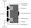
Diagrams for MOSFET
-
 Done
Done -
 Vectorised
 -
 Done
Done -
 Vectorised
 -
 Done
Done -
 Vectorised
 -
 Done
Done -
 Vectorised


Article(s): MOSFET
Request: Vectorize JovianEye (talk) 05:06, 27 February 2010 (UTC)
Graphist opinion(s):
![]() Request taken by Fred the Oyster.
Request taken by Fred the Oyster.
![]() Done
Done
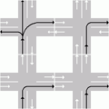
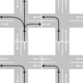
Left & Right hand traffic
-
 Done
Done -
 Vectorized
 -
 Done
Done -
 Vectorized


Article(s): Right- and left-hand traffic
Request: Vectorize JovianEye (talk) 06:31, 1 March 2010 (UTC)
Graphist opinion(s):
![]() Request taken by Parutakupiu.
Request taken by Parutakupiu.![]() Done — Parutakupiu (talk) 00:28, 2 March 2010 (UTC)
Done — Parutakupiu (talk) 00:28, 2 March 2010 (UTC)
NORAD tracks Santa
-
 Before
 -
 After
After


Article(s): NORAD tracks Santa
Request: Trim away beige background and shading... Chris (クリス • フィッチュ) (talk) 09:09, 1 March 2010 (UTC)
Graphist opinion(s):
![]() Request taken by Fred the Oyster.
Request taken by Fred the Oyster.
![]() Done
Done
- Perfect, thank you! --Chris (クリス • フィッチュ) (talk) 04:50, 4 March 2010 (UTC)
Flag of the Prime Minister of Cuba
-
 Original
 -
 Vector version


Article(s): none
Request: Vectorize. Should be easy. Thanks. Connormah (talk | contribs) 04:41, 3 March 2010 (UTC)
Graphist opinion(s):![]() Done --JovianEye (talk) 06:52, 3 March 2010 (UTC)
Fred the Oyster (talk) 00:35, 4 March 2010 (UTC)--
Done --JovianEye (talk) 06:52, 3 March 2010 (UTC)
Fred the Oyster (talk) 00:35, 4 March 2010 (UTC)--
-
 raster Under Secretary of the Navy flag
 -
 Done
Done -
 raster Assistant Secretary of the Navy flag
 -
 Done
Done -
 raster United States Assistant Secretary of War flag
 -
 Done
Done -
 vector example of United States Secretary of the Navy flag
 -
 vector example of United States Secretary of the Army flag


Article(s): Under Secretary of the Navy, Assistant Secretary of the Navy, transcluded via {{USSecNavy}} onto ~200+ pages; United States Under Secretary of the Army, United States Assistant Secretary of War, and transcluded via {{USSecArm}} onto ~100+ pages
Request: Vectorize the three raster flag images. Hopefully, you can just take the current vectors and change the colors as needed, they are otherwise (supposed to be) identical. bahamut0013wordsdeeds 14:09, 4 March 2010 (UTC)
- All done, but I haven't updated any of the templates they're transcluded in, or even tagged the other images as having a vector version available. Too busy. --Fred the Oyster (talk) 15:16, 4 March 2010 (UTC)
- Great, thanks! bahamut0013wordsdeeds 00:03, 5 March 2010 (UTC)
Graphist opinion(s):
![]() Request taken by Fred the Oyster.
Request taken by Fred the Oyster.![]() Done--Fred the Oyster (talk) 15:16, 4 March 2010 (UTC)
Done--Fred the Oyster (talk) 15:16, 4 March 2010 (UTC)
Medal of Honor
-
 Medal of Honor, Navy version used 1913 to 1942
.png)
Article(s): Medal of Honor, and all pages currently using File:NavyMOH 1913-1942.jpg
Request: Please make background transparent. I was meddling with it in Adobe Photoshop, but when I flattened the image, the transparency disappeared? Anyway, I'm starting to replace all uses of File:NavyMOH 1913-1942.jpg with this image, so renaming it would not be useful; please override the current one at Commons. bahamut0013wordsdeeds 00:45, 5 March 2010 (UTC)
- In Photoshop, instead of flattening layers, use merge visible layers instead. Flattening throws away the transparency. Or alternatively if saving as a PNG, keep the layers the way they are and choose "save for web/devices", then when you choose PNG you have the option of maintaining the transparency. --Fred the Oyster (talk) 01:07, 5 March 2010 (UTC)
- To be 100% honest, I didn't do a very good job of it anyway. I feel better that a competent graphist took this task on. I do appreciate the advice, however. bahamut0013wordsdeeds 01:14, 5 March 2010 (UTC)
Graphist opinion(s):
![]() Request taken by Fred the Oyster.
Request taken by Fred the Oyster.
![]() Done
Done
Qantas
{{resolved}}
-

-
 Vectorised
 -
 Vectorised
Article(s): Qantas
Request: SVG, in red instead of black, remove dates at bottom... Chris (クリス • フィッチュ) (talk) 11:01, 21 February 2010 (UTC)
Graphist opinion(s): I've done the second one, using the existing SVG. Still need the other doing. NikNaks93 (talk) 20:20, 3 March 2010 (UTC)
Scratch that. Done the other as well. NikNaks93 (talk) 19:50, 4 March 2010 (UTC)
![]() Request taken by NikNaks93.
{{Done}}
Request taken by NikNaks93.
{{Done}}
- Thank you, they look great! The font on the first one is a little different, I will see if I can find a better match. It's a common style for that period, but not so much in use now. --Chris (クリス • フィッチュ) (talk) 13:13, 5 March 2010
Austrian Airlines Logo
Article(s): Austrian Airlines
Request: This SVG file was taken from an official PDF source here. The file is displaying perfectly in Inkscape but is not being displayed properly by the Wikimedia server. What can be done to fix this? JovianEye (talk) 20:24, 5 March 2010 (UTC)
Graphist opinion(s):
Cracked it after three attempts. I re-extracted it from the PDF in Adobe Illustrator and expanded the paths/group that made up the curve and the gradient. I scaled it up a bit and et voila it displays properly now, or at least it does in Firefox anyway.
![]() Request taken by Fred the Oyster.
Request taken by Fred the Oyster.
![]() Done
Done
- I think the problem originated from the gradient that was embedded as a bitmap image. Fred's version was still using it, so I uploaded a new version with a real gradient. —Quibik (talk) 21:13, 5 March 2010 (UTC)
1st Medical Battalion
-
 Original JPEG
 -
 EGA to use on left
 -
 Navy seal to use on right
 -
 good caduceus to use
 -
 Done
Done


.svg)
Article(s): 1st Medical Battalion, various lists of units
Request: The original author merely ocnverted a very low-resolution version of the logo, and as a result, distorted many details. The Eagle, Globe, and Anchor on the left looks more like a smear, and the Navy seal on the right isn't much better. The caduceus is horrid: it looks like a strand of DNA growing bat wings and a cotton swab in the center. The lettering ins't so hot, either. I'm hoping a graphist can correct the poor converstion with the good examples I'be provided. bahamut0013wordsdeeds 23:14, 5 March 2010 (UTC)
- You are pretty darn awesome, Fred. Thanks! bahamut0013wordsdeeds 02:52, 6 March 2010 (UTC)
Graphist opinion(s):
![]() Request taken by Fred the Oyster.
Request taken by Fred the Oyster.![]() Done
Done
Hanshin Tigers
-
 Original
 -
 Vector


Article(s): Hanshin Tigers
Request: Smooth out graininess... Chris (クリス • フィッチュ) (talk) 00:27, 6 March 2010 (UTC)
Graphist opinion(s): It's an easy one and I had 5 minutes spare :) --Fred the Oyster (talk) 01:27, 6 March 2010 (UTC)
![]() Request taken by Fred the Oyster.
Request taken by Fred the Oyster.
![]() Done
Done
- Great! I boosted it back up to the yellower one. --Chris (クリス • フィッチュ) (talk) 11:29, 6 March 2010 (UTC)
IIM Lucknow Logo
Article(s): Indian Institute of Management Lucknow
Request: The SVG logo for this institution can be obtained from this official PDF here. The logo on the last page is the best version. The logo is being displayed properly in Inkscape but not by the Wikimedia server. Please help me fix this! (The motto of the institution is in raster form, dont trouble yourself vectorizing it!) JovianEye (talk) 20:26, 6 March 2010 (UTC)
- Thanks a lot for fixing it! Given the amount of discussion regarding non-free logos on this page itself, I would suggest to leave the motto in raster form. Any effort to vectorize it would be a waste! We could upload a better version of the logo when IIM Lucknow publishes a PDF where the entire logo is in vector form.
Graphist opinion(s): ![]() Done I traced the logo text for now. If you can write it out in Sanskrit I might be able to place it on a path in Inkscape which will look better. -- RA (talk) 11:10, 7 March 2010 (UTC)
Done I traced the logo text for now. If you can write it out in Sanskrit I might be able to place it on a path in Inkscape which will look better. -- RA (talk) 11:10, 7 March 2010 (UTC)
Tawny Owl

Article(s): Tawny Owl
Request: Trim away extra blank space... Chris (クリス • フィッチュ) (talk) 08:27, 7 March 2010 (UTC)
Graphist opinion(s): ![]() Request taken by Rannpháirtí anaithnid.
Request taken by Rannpháirtí anaithnid. ![]() Done I also increased the size of the text so it would be readable at standard thumbnail size. -- RA (talk) 10:35, 7 March 2010 (UTC)
Done I also increased the size of the text so it would be readable at standard thumbnail size. -- RA (talk) 10:35, 7 March 2010 (UTC)
- Great, thank you! --Chris (クリス • フィッチュ) (talk) 12:17, 7 March 2010 (UTC)
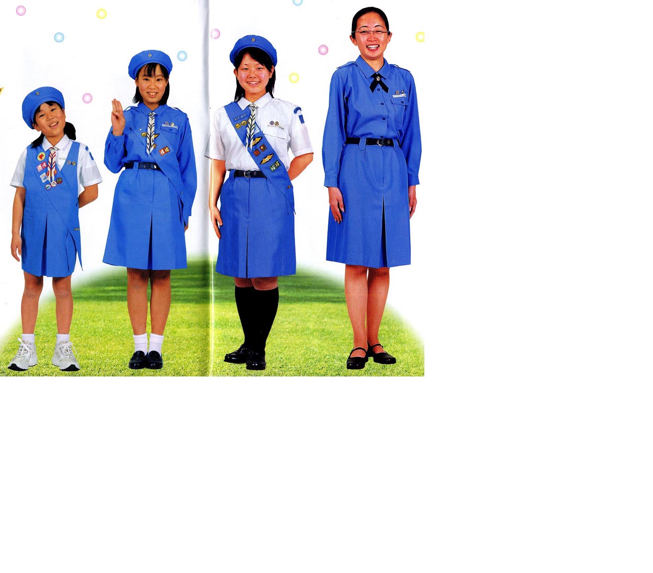
Wikipedia:Wikipe-tan
-
 Also added, just for laughs, my version of the 3-fingered salute.
 -
 Additional version incorporating Kasuga's Wikipe-tan design.


Article(s): Wikipedia:Wikipe-tan
Request: create a Wikipe-tan Girl Scouts of Japan Girl Scout in a round hat like the first little girl in the corner of http://www.girlscout.or.jp/ for the all Girl Scout/Guide theme for the March 2010 WikiProject Scouting portal, and later to enhance Wikipedia:WikiProject Scouting/Girl Guiding and Girl Scouting task force? (using the three finger sign as in File:Plast - Scout Salute.jpg) Thank you ahead of time! Chris (クリス • フィッチュ) (talk) 08:04, 1 March 2010 (UTC)
Graphist opinion(s):
![]() Request taken by Fred the Oyster.
Request taken by Fred the Oyster.
- The first attempt isn't a free image for 2 reasons. 1) the Wikipedia globe is copyrighted, and cannot be used in such instances 2) the smiling girl is clearly a derivative work of this, and would also still be copyrighted by girlscout.or.jp. I needs to be deleted from the Commons (and because of it's non-free nature, isn't appropriate for a WikiProject, due to the limitation of non-free content outside of the article namespace WP:NFCC #9). But with modification, I'm sure something along these lines would be acceptable for sure. Good start! -Andrew c [talk] 22:44, 1 March 2010 (UTC)
- I'll give you the Wikipedia logo, which I have to say is hypocritical of the foundation, given that the image was on Commons and isn't free. I will argue that the face isn't a derivative per se. The image is change substantially from the image in the link you gave. It didn't contain the 90, the pattern on the neckerchief is different, as are the colours. Not to mention that it's now part of a totally different design. Think of it as akin to being a music sample. Similar enough to be recognised, different enough to be considered a new design. Anyway, just to be sure I've changed the face quite dramatically now whilst trying to maintain the recognisable image. I do find it amusing though that you come up with all the above yet totally missed the typo! --Fred the Oyster (talk) 01:02, 2 March 2010 (UTC)
- Fred, that is so cool! When I made the request, I wasn't thinking about a badge, I was thinking about a full-standing Wikipe-tan, but your idea is great! Now comes (I know, I know...) the changes. This is not for the Girl Scouts of Japan article, I want her to be Japanese because Wikipe-tan is Japanese. So the text should really be Girl Guiding and Girl Scouting, you can put some above and some below. I like the map of Japan, I have several badges that have that, you really do have an eye for this sort of thing. However, because it's not just Japan, maybe could you change the background to the logo of the Scouting WikiProject? It is free use as we made it ourselves, the colors and shape don't match any national emblem, we created it for any generic use. And I love her neckerchief, you really have great attention to detail! Thank you for your hard work! --Chris (クリス • フィッチュ) (talk) 04:46, 4 March 2010 (UTC)
- Wow you rock! Can you make her hand match her flesh tones? Can you put the blue beret back on her? If you want, use the kanji (祖, so) from her hairtie-puzzle piece as the badge for her hat, and take off Wikipe-tan from the text, she doesn't need to be named and that will let you stretch out the rest of the text. --Chris (クリス • フィッチュ) (talk) 11:46, 4 March 2010 (UTC)
- I'm not sure if the hat works, I've been looking at it too long and stretching and deforming it to sort of look right. I filed the gap at the bottom with the kanji characters after having first tried another smaller version of the fleur-de-lys. But for some reason it kept breaking in svg form and the right-hand 'branch kept on disappearing to various places on the image. The gap does need filling though, but I wasn't sure quite what to fill it with! --Fred the Oyster (talk) 16:26, 4 March 2010 (UTC)
- Since this is the Guiding 2010 Centenary, how about replacing the kanji at the bottom with 2010 or 100? Also, I'm eyeballing it here, so it is completely OR, but the hat and the uniform are closer to 6495ED Cornflower blue or File:Union of Burma Girl Guides Association 1950.svg, somewhere in between. And if you can, slightly thinner lines around her hand, so it matches her face. --Chris (クリス • フィッチュ) (talk) 13:24, 5 March 2010 (UTC)
- The blue on the necktie is #0052D6 (0,82,214) as discussed in a previous thread on Scouting colours, the orange/gold is #FE8F03 (254,143,3). The hat starts off as #0052D6 but is a radial gradient to black. As for the gap, I can fill it with whatever you like, as I said on you talk page, I have no knowledge whatsoever on the scouting movement so I'll leave it to your superior knowledge. --Fred the Oyster (talk) 13:45, 5 March 2010 (UTC)
- Neckerchiefs come in all sorts of colors-the color/pattern you chose is great! Each country has their own color uniforms, some are nice, some are weird. Just the hat needs a lighter shade of blue (maybe radial gradient between the two shades I found?), and I think 100 is maybe the best bottom text. --Chris (クリス • フィッチュ) (talk) 23:52, 5 March 2010 (UTC)
- Which two shades of blue? The existing one obviously, but which other shade and how light is light? Please remember that the gradient is there to show some curve and shadowing, so if the two shades are too close together that effect will be lost. --Fred the Oyster (talk) 13:24, 6 March 2010 (UTC)
- Can you match the blue from File:Union of Burma Girl Guides Association 1950.svg, and gradient away from there, but to darker blue, not to black? --Chris (クリス • フィッチュ) (talk) 08:30, 7 March 2010 (UTC)
- I've now changed the hat (and a few other little gradient tweaks) gradient to a gradient mesh. I've used three shades of blue; the existing blue, the Burma blue and a navy blue (right on the very edges). I'm not sure though if I should tone down the brighter blue and do a better blend. What do you think? --Fred the Oyster (talk) 14:46, 7 March 2010 (UTC)
- Okay, I've been thinking, this is so close...
- Please remove or make the hat brim smaller, it's a beret, now looks kind of ball-cappish
- I found some decent (not great, a little dark and small) pics- http://www.yokoi.com/girlscout/uniform1.jpg
- The orange border is ok, but against the light blue it is distracting, can you change the orange hat badge disk to
 , and make her neckerchief slide match?

--Chris (クリス • フィッチュ) (talk) 05:48, 8 March 2010 (UTC)
- ps-also you can use the same font for 100 as you did the other lettering. --Chris (クリス • フィッチュ) (talk) 15:08, 8 March 2010 (UTC)
- How's this version? I didn't have time to vectorise the orchid so had to embed it. It's only small so didn't increase the file size too much. Close to final version yet? --Fred the Oyster (talk) 15:56, 8 March 2010 (UTC)
- ps-also you can use the same font for 100 as you did the other lettering. --Chris (クリス • フィッチュ) (talk) 15:08, 8 March 2010 (UTC)
- She's perfect, Fred, ready to go! --Chris (クリス • フィッチュ) (talk) 02:27, 9 March 2010 (UTC)
A picture is worth a thousand words
-
 comic strip

Article(s): A picture is worth a thousand words
Request: Vectorize. Cybercobra (talk) 09:54, 5 March 2010 (UTC)
Graphist opinion(s):
- Just curious why you want this vectorized? We will never be able to re-create the line quality of the inking used (notice the wavy lines on the shirt, the quality of the lines that make up the box, and how the line on the head gets thin then thick then thin again, etc) . I could understand this request more if I knew what specific application you thought SVG would be superior, but if we are trying to represent the artist's work, no SVG conversion would do that justice. -Andrew c [talk] 14:38, 5 March 2010 (UTC)
- I had a quick try at a combination of a Live Trace and manual tracing in Illustrator and I couldn't come close to re-creating the line work. Which after all is the crux of a cartoonist's work. I'd suggest not bothering. --Fred the Oyster (talk) 20:58, 5 March 2010 (UTC)
- I agree completely (and I fired up illustrator to check out the autotrace as well). That said (ha) this is a freely licensed file, and the author did agree to future modifications and re-use, so I wouldn't oppose a separate SVG, if there was a purpose. I just can't think of an encyclopedic purpose on WIkipedia (unless we are trying to demonstrate an auto-trace feature, and have a side by side comparison or something like that). I would oppose the SVG trying to represent the artist's work, but wanted to see the requestor's intention. -Andrew c [talk] 22:21, 5 March 2010 (UTC)
- On the article in question, the rescaling causes quite visible and unsightly artifacts; most significantly, the text is quite hard to read. --Cybercobra (talk) 22:58, 5 March 2010 (UTC)
- I agree completely (and I fired up illustrator to check out the autotrace as well). That said (ha) this is a freely licensed file, and the author did agree to future modifications and re-use, so I wouldn't oppose a separate SVG, if there was a purpose. I just can't think of an encyclopedic purpose on WIkipedia (unless we are trying to demonstrate an auto-trace feature, and have a side by side comparison or something like that). I would oppose the SVG trying to represent the artist's work, but wanted to see the requestor's intention. -Andrew c [talk] 22:21, 5 March 2010 (UTC)
- I had a quick try at a combination of a Live Trace and manual tracing in Illustrator and I couldn't come close to re-creating the line work. Which after all is the crux of a cartoonist's work. I'd suggest not bothering. --Fred the Oyster (talk) 20:58, 5 March 2010 (UTC)
Someone resized the image, and that seems to have sufficiently mitigated the problem. --Cybercobra (talk) 16:36, 8 March 2010 (UTC)
Wezombeli
Article(s): Wezombeli
Request: Sharpen... Chris (クリス • フィッチュ) (talk) 12:28, 8 March 2010 (UTC)
Graphist opinion(s): I've sharpened it, but as there aren't many pixels to work with there's a limit as to what could be done with this image. Would it not be worthwhile contacting the relevant association and asking if it would be possible to appropriate the original artwork, or at least a higher resolution one. After all it is in their interests. --Fred the Oyster (talk) 14:45, 8 March 2010 (UTC)
![]() Request taken by Fred the Oyster.
Request taken by Fred the Oyster.
![]() Done
Done
- It would, but most African countries orgs are too small/poor... to have the resources to even respond. Hence all the Girl Scout stuff. --Chris (クリス • フィッチュ) (talk) 02:21, 9 March 2010 (UTC)
Rub el Hizb
-
 ROUB EL HIZB 06DE.svg
Done -
 U+06DE.svg
Done


Article(s): Rub el Hizb
Request: Trim away blank space... Chris (クリス • フィッチュ) (talk) 12:32, 8 March 2010 (UTC)
Graphist opinion(s):
Also did File:U+06DE.svg for good measure. --Fred the Oyster (talk) 13:26, 8 March 2010 (UTC)
![]() Request taken by Fred the Oyster.
Request taken by Fred the Oyster.
![]() Done
Done
- Thank you! I have no idea why the second one was made, which brought my attention in the first place. --Chris (クリス • フィッチュ) (talk) 14:39, 8 March 2010 (UTC)
Tonga branch of The Scout Association
Article(s): Tonga branch of The Scout Association
Request: Center crown just slightly... Chris (クリス • フィッチュ) (talk) 16:02, 8 March 2010 (UTC)
Graphist opinion(s): As it happened most of the mitre was off-centre, nothing was aligned and even the horizontal paths overshot the edges. --Fred the Oyster (talk) 17:23, 8 March 2010 (UTC)
![]() Request taken by Fred the Oyster.
Request taken by Fred the Oyster.
![]() Done:
Done:
- Better, thank you! --Chris (クリス • フィッチュ) (talk) 02:19, 9 March 2010 (UTC)
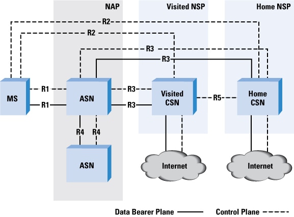
WiMAX Architecture
-
 PNG Version
 -
 Done
Done


Article(s): WiMAX
Request: Vectorize. --JovianEye (talk) 00:11, 9 March 2010 (UTC)
- The dotted lines between CSN and ASP Network are missing! Please add them. --JovianEye (talk) 14:48, 9 March 2010 (UTC)
- I have removed R8 from the figure! It is a factual error in the original file. The original file has several factual errors! User this figure as a reference. I think it would be better to include the legend as shown in the Cisco diagram. --JovianEye (talk) 15:09, 9 March 2010 (UTC)
- All done with the corrections, I used the colouring from the Cisco diagram. --Fred the Oyster (talk) 16:27, 9 March 2010 (UTC)
Graphist opinion(s):
![]() Request taken by Fred the Oyster.
Request taken by Fred the Oyster.
![]() Done:
Done:
Emblem of India

Article(s): Plenty
Request: Given the importance of this emblem, I am requesting a little more perfection. First, the bull on the lower right has an eye missing which the parent File:Supreme Court of India.svg does have. Second, between the main emblem and the text there is rectangular portion which was present in 25 Novemeber 2006 version of the file. For an official reference use page 28 of this PDF source. JovianEye (talk) 05:46, 10 March 2010 (UTC)
Graphist opinion(s):
I'll get that sorted later on today. --Fred the Oyster (talk) 10:12, 10 March 2010 (UTC)
![]() Request taken by Fred the Oyster.
Request taken by Fred the Oyster.
![]() Done
Done
coat of arms of Venezuela
.svg)
Article(s): coat of arms of Venezuela
Request: The old coat of arms of Venezuela did not contain "Bolivarian" until Chavez, so most coats of arms in the category on Commons are incorrect, this one has the text right but the drawing is weak... better SVG duplicated, and the word "Bolivariana" removed from it, to match this one Chris (クリス • フィッチュ) (talk) 12:48, 10 March 2010 (UTC)
Graphist opinion(s): I'm not entirely sure what you're after. Do you want the better SVG duplicated, and the word "Bolivariana" removed from it, to match this one? If not, could you be a little more specific? --NikNaks93 (talk) 19:49, 10 March 2010 (UTC)
![]() Request taken by Fred the Oyster.
Request taken by Fred the Oyster.
{{Done}}
- The horse direction and head were changed in 2006, this version now has the new one. Brilliant rest of it, though! --Chris (クリス • フィッチュ) (talk) 11:07, 11 March 2010 (UTC)
- Horse all sorted. --Fred the Oyster (talk) 14:54, 11 March 2010 (UTC)
- The horse direction and head were changed in 2006, this version now has the new one. Brilliant rest of it, though! --Chris (クリス • フィッチュ) (talk) 11:07, 11 March 2010 (UTC)
- Of horse, of horse! Thanks Mr. Fred! --Chris (クリス • フィッチュ) (talk) 17:04, 11 March 2010 (UTC)
Mon
-

-
 SVG
SVG


Article(s): Mon (crest)
Request: Clear background... Chris (クリス • フィッチュ) (talk) 11:05, 11 March 2010 (UTC)
Graphist opinion(s): Done Sodacan (talk) 15:28, 11 March 2010 (UTC)
- Cool, thank you! --Chris (クリス • フィッチュ) (talk) 17:05, 11 March 2010 (UTC)
Ashoka Chakra

Article(s): Several
Request: The white portion in the file should be converted into alpha background. JovianEye (talk) 00:02, 13 March 2010 (UTC)
Graphist opinion(s):
![]() Request taken by Fred the Oyster.
Request taken by Fred the Oyster.![]() Done
Done
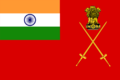
Flag of Indian Army
-
 PNG Version
 -

-
Done


Article(s): Several
Request: The original vector version of this file has been deleted from Commons for some reason. A vector version currently exists but is of poor quality (File:Flag of the Indian Army.svg). Please recreate the vector version from the PNG version. You can use File:Emblem of India.svg and File:Flag of India.svg to assist in the recreation. Thanks. JovianEye (talk) 19:28, 12 March 2010 (UTC)
There is already an SVG available, I have added it here so you may see Fry1989 (talk) 21:20, 12 March 2010 (UTC)
- Thanks a lot Fred! --JovianEye (talk) 22:50, 12 March 2010 (UTC)
- Whoops, just noticed, the swords are crossed opposite to the png, which is the correct version... I best double check before I alter it?
- I too, cant really say which is right! The issue is there is no clear reference image on the Army Website. This website is quite authoritative but here also it isnt really clear. The rank flag on the website shows the left sword over the right. So I guess this version should be correct! --JovianEye (talk) 00:14, 13 March 2010 (UTC)
- One of these days I'm going to learn not to duplicate the images on Wikipedia, the swords on the flags on that website look nothing like the ones on the above PNG, which of course I replicated (but had to build from scratch). --Fred the Oyster (talk) 00:20, 13 March 2010 (UTC)
- The flag on that website does not even maintain 3:2 aspect ratio! So, I guess your version cannot be criticized. --JovianEye (talk) 21:23, 13 March 2010 (UTC)
- Also should the chakra thingummy-bob on the flag have a central circle like the chakra below? There isn't one in the above version. --Fred the Oyster (talk) 21:33, 13 March 2010 (UTC)
- The central circle should be present. See File:Flag of India.svg. --JovianEye (talk) 21:46, 13 March 2010 (UTC)
- I would have used File:Flag of India.svg in the first place, but there seems to be an error in the SVG code and it just made Illustrator barf. Anyway, I've corrected the chakra using the below illustration. --Fred the Oyster (talk) 21:56, 13 March 2010 (UTC)
Graphist opinion(s):
![]() Request taken by Fred the Oyster.
Request taken by Fred the Oyster.
![]() Done
Done
File:No Smoking.svg

Article(s):
Request: Trim away blank space... Chris (クリス • フィッチュ) (talk) 04:22, 14 March 2010 (UTC)
Graphist opinion(s):
![]() Request taken by Jovianeye.
Request taken by Jovianeye.
![]() Done
Done
- Thank you! --Chris (クリス • フィッチュ) (talk) 05:54, 14 March 2010 (UTC)
Supreme Court of India
-
 it's like this, elements rearranged
This one sorted too!
Article(s): Supreme Court of India
Request: Vectorize... Chris (クリス • フィッチュ) (talk) 03:04, 9 March 2010 (UTC)
Graphist opinion(s):
I think this will need someone with better eyesight than me. I can hardly see what is meant to be vectorised. The 'dial' at the back yeah, but I can't make out the details of the rest of it. --Fred the Oyster (talk) 03:25, 9 March 2010 (UTC)
- Comment - The Lion emblem can be obtained here and the dial can be obtained here. I went through the website of the Supreme Court but I could not find the motto. --JovianEye (talk) 03:55, 9 March 2010 (UTC)
- I'll have a stab at it then, if only the basics until we can find what the script looks like. I take it the blue background isn't necessary and a black and white image is all that's required.?--Fred the Oyster (talk) 04:11, 9 March 2010 (UTC)
- I started my own version then had an epiphany. Courts usually generate a rather lot of documentation. So I had a nosey. And found one wih a vector version of the logo. I can even use it to generate a new version of File:Emblem of India.svg, which I'll do later. --Fred the Oyster (talk) 04:21, 9 March 2010 (UTC)
- I'll have a stab at it then, if only the basics until we can find what the script looks like. I take it the blue background isn't necessary and a black and white image is all that's required.?--Fred the Oyster (talk) 04:11, 9 March 2010 (UTC)
![]() Request taken by Fred the Oyster.
Request taken by Fred the Oyster.
![]() Done
Done
- Could have sworn I already thanked you both for that. Great job! --Chris (クリス • フィッチュ) (talk) 12:53, 14 March 2010 (UTC)
- Actually, JovianEye did the final job. Extracting the vector version from the same PDF I used, but a different graphic. I altered the Supreme Court version and missed the default version. JovianEye sorted it properly. --Fred the Oyster (talk) 13:12, 14 March 2010 (UTC)
- Though I did the final extraction, I thank Fred for discovering the PDF file. Not even in my dreams I had expected the Supreme Court to publish PDF with vector graphics. --JovianEye (talk) 15:52, 14 March 2010 (UTC)
Lotus Racing

Done
File:Lotus f1 racing.svg
Article(s): Lotus Racing
Request: Remove white background. Replace with SVG version if possible. Thanks. Arteyu ? Blame it on me ! 17:17, 13 March 2010 (UTC)
Graphist opinion(s):
![]() Request taken by Fred the Oyster.
Request taken by Fred the Oyster.![]() Done
Done
- Thank you very much Fred! Arteyu ? Blame it on me ! 10:45, 14 March 2010 (UTC)
Flag of Bequia

Article(s): Flag of Bequia
Request: vectorize... Chris (クリス • フィッチュ) (talk) 06:54, 14 March 2010 (UTC)
Graphist opinion(s):
![]() Request taken by Fred the Oyster.
Request taken by Fred the Oyster.
![]() Done
Done
- splendid, thank you! --Chris (クリス • フィッチュ) (talk) 11:25, 14 March 2010 (UTC)
Graphist opinion(s):
![]() Request taken by Fred the Oyster.
Request taken by Fred the Oyster.
![]() Done
Done
Sword Cross Sections
-
 Sword blade cross sections
 -
 Done
Done


Article(s): Longsword
Request: Please redraw as SVG and remove the obvious note in the botton-left corner. Thanks. Fallschirmjäger 01:17, 18 March 2010 (UTC)
Graphist opinion(s):
![]() Request taken by Fred the Oyster.
Request taken by Fred the Oyster.
![]() Done
Done
- Thank you so much, that is perfect! Fallschirmjäger 09:48, 18 March 2010 (UTC)
US Squash & US Open (tennis)
Article(s): US Squash and US Open (tennis)
Request: Improve and remove the white background for both. If possible, please find and upload better logo for the US Open tennis preferably in PNG or SVG. And please remove the ® symbol on the first image. Thank you. Arteyu ? Blame it on me ! 12:46, 6 March 2010 (UTC)
Graphist opinion(s): You can get the second from de:File:US Open.svg. It is however not well made. --Leyo 12:58, 6 March 2010 (UTC)
- That's because the editor who created it couldn't replicate the flaming ball and simply embedded the low resolution raster image in the svg. --Fred the Oyster (talk) 13:06, 6 March 2010 (UTC)
- I've finished it off with a vectorised ball + flame. Can't work out how to upload to the german wiki, though, so feel free to move it across if necessary. The flame is inconsistent between the JPG and the embedded graphic, though, so I'm not sure which is more accurate. --NikNaks93 (talk) 15:44, 6 March 2010 (UTC)
![]() Done
Done
- First of all, I don't think it's appropriate to remove the (R) symbol. Maybe if it was a PD-text image, but this is not the case. Seems like we would do well to not bother removing stuff like that on non-free images (but maybe I'm wrong about that). Next, I found a PDF on the 2009.usopen.org webpage that had a vector version of the logo. I've uploaded that version (slightly modified for color). NikNaks93's version was a little off (the serifs and bowl of the P in the type was off, and the shape of the flames a bit wonky). -Andrew c [talk] 20:49, 6 March 2010 (UTC)
- This image looks awesome! Thanks a lot for the images guys. Thank you NikNaks, thank you Fred and thanks a lot Andrew. Arteyu ? Blame it on me ! 01:59, 7 March 2010 (UTC)
Logo for IISER Thiruvananthapuram
Article(s): IISER Thiruvananthapuram
Request: This logo is being displayed perfectly in Inkscape. But the Wikimedia server is displaying the text "Thiruvananthapuram" left aligned. See here for what the logo is suppose to look like. You can download a PDF source here. Please help me fix this. Thanks. JovianEye (talk) 14:03, 22 March 2010 (UTC)
- All done. --Fred the Oyster (talk) 15:03, 22 March 2010 (UTC)
- Thanks Fred! --JovianEye (talk) 01:10, 23 March 2010 (UTC)
Graphist opinion(s):
![]() Request taken by Fred the Oyster.
Request taken by Fred the Oyster.![]() Done
Done
watermarking

Article(s): Scientific racism
Request: remove watermarking up the side, that is not original... Chris (クリス • フィッチュ) (talk) 01:37, 23 March 2010 (UTC)
Graphist opinion(s):
![]() Request taken by Jovianeye.
Request taken by Jovianeye. ![]() Done
Done
- Thank you! --Chris (クリス • フィッチュ) (talk) 03:46, 23 March 2010 (UTC)
Soldier icon
-
A small soldier's silhouette
-


Article(s): Template:Mil-unit-stub – transcluded in many articles
Request: Re-draw as a vector image. (I don't feel confident enough with my artistic skills to handle this one). Thanks, Quibik (talk) 15:50, 20 March 2010 (UTC)
Graphist opinion(s):
![]() Request taken by Ruminaglass.: Never tried one this complex before. I can see a lot of jagged edges & curves, but I thought it's worth a shot. ~Ruminaglass
Request taken by Ruminaglass.: Never tried one this complex before. I can see a lot of jagged edges & curves, but I thought it's worth a shot. ~Ruminaglass
Layout of Mughal Gardens at Taj Mahal
-
 Total layout of the site
 -
 First draft
 -
 Done
Done


.svg)
Article(s): Taj Mahal
Request: Please vectorize if possible. JovianEye (talk) 17:00, 22 February 2010 (UTC)
- Are there any takers for this? It has been quite a while. --JovianEye (talk) 15:49, 17 March 2010 (UTC)
- If Shandris isn't going to complete it I'll have a go. It can't be straight away though as I'm in the process of reinstalling my system after upgrading to Windows 7. Hopefully I should be sorted either by late tonight or tomorrow. --Fred the Oyster (talk) 16:46, 17 March 2010 (UTC)
- Please continue on my draft, guys! Have been extremely busy as of lately and can't guarantee to finish it. Please, go ahead. ;)
- 75% done now, soon be ready :) --Fred the Oyster (talk) 00:25, 19 March 2010 (UTC)
- Please continue on my draft, guys! Have been extremely busy as of lately and can't guarantee to finish it. Please, go ahead. ;)
- If Shandris isn't going to complete it I'll have a go. It can't be straight away though as I'm in the process of reinstalling my system after upgrading to Windows 7. Hopefully I should be sorted either by late tonight or tomorrow. --Fred the Oyster (talk) 16:46, 17 March 2010 (UTC)
--Shandristhe azylean 17:26, 18 March 2010 (UTC) Graphist opinion(s):
![]() Request taken by Fred the Oyster.
Request taken by Fred the Oyster.
![]() Done
Done
- It's really good. Thanks a tonne! --JovianEye (talk) 12:22, 19 March 2010 (UTC)
- How are you making them so fast? Are you using Illustrator like me? You're a pro with too much time on your hands xD --Shandristhe azylean 22:13, 19 March 2010 (UTC)
- Heheheh, yes I'm using Illustrator, and Ctrl-D a lot ;) --Fred the Oyster (talk) 22:22, 19 March 2010 (UTC)
- Ctr+D? --Shandristhe azylean 18:33, 20 March 2010 (UTC)
- Illustrator's standard shortcut key for "transform again". --Fred the Oyster (talk) 00:16, 21 March 2010 (UTC)
- Ctr+D? --Shandristhe azylean 18:33, 20 March 2010 (UTC)
- Heheheh, yes I'm using Illustrator, and Ctrl-D a lot ;) --Fred the Oyster (talk) 22:22, 19 March 2010 (UTC)
- How are you making them so fast? Are you using Illustrator like me? You're a pro with too much time on your hands xD --Shandristhe azylean 22:13, 19 March 2010 (UTC)
- Any transformation you make, e.g rotating a shape round a central axis, such as the arms of a cross. Simply rotate one arm 90 degrees from a central axis so you have two arms. Then hit Ctrl-D twice and Illustrator will complete the next two movements giving you 4 arms in total. It's a great way for repeating movements. I do wish it had the InDesign function of "step and repeat" though, that's really handy for repeating elements. --Fred the Oyster (talk) 02:38, 26 March 2010 (UTC)
Fresno County


Article(s): Fresno County, California
Request: Vectorize; design seems very amenable to recreation as SVG. Cybercobra (talk) 10:47, 5 March 2010 (UTC)
Graphist opinion(s): I'll check for some PDFs that may contain this. Connormah (talk | contribs) 22:09, 6 March 2010 (UTC)
- Sorry I didn't mention anything earlier, but I did extensive searching and it appears all the PDFs on the website are raster. There was a website selling a vector version, but of course, paying for it and uploading it here would violate WP:NFCC #2... -Andrew c [talk] 22:59, 6 March 2010 (UTC)
![]() Request taken by Rannpháirtí anaithnid. I'll do it by hand. --RA (talk) 11:33, 14 March 2010 (UTC)
Request taken by Rannpháirtí anaithnid. I'll do it by hand. --RA (talk) 11:33, 14 March 2010 (UTC)
![]() Done If happy delete the PNG per an orphaned non-fair use image. --RA (talk) 19:35, 16 March 2010 (UTC)
Done If happy delete the PNG per an orphaned non-fair use image. --RA (talk) 19:35, 16 March 2010 (UTC)
- Quite excellent work! Thanks a bunch. Will be sure to delete and replace the raster soon. --Cybercobra (talk) 22:27, 16 March 2010 (UTC)
Aryabhata's sine table
-
 Arc and chord of a circle
 -
 Done
Done -
 Arc and jya (half-chord)
 -
 Done
Done


Article(s): Aryabhata's sine table
Request: Convert them to SVG. Arteyu ? Blame it on me ! 13:26, 15 March 2010 (UTC)
Graphist opinion(s):
![]() Request taken by Fred the Oyster.
Request taken by Fred the Oyster.![]() Done
Done
- Wow, that's fast! Thank you very much! Arteyu ? Blame it on me ! 15:12, 15 March 2010 (UTC)
Crop image
-
 George Barbier, Nijinsky as the faun, 1913
,_Vaslav_Nijinsky_(1890-1950),_1913_3.jpg)
Article(s): Afternoon of a Faun (Nijinsky)
Request: Please crop image (and straighten it if possible). Squandermania (talk) 18:20, 17 March 2010 (UTC)
- Please note in future that raster graphics such as this one should be taken to the Photography Workshop for attention. Thanks. --Fred the Oyster (talk) 00:00, 18 March 2010 (UTC)
Graphist opinion(s): ![]() Request taken by Rannpháirtí anaithnid.
Request taken by Rannpháirtí anaithnid.
 Done: If the crop is too tight, let me know and I'll put some air back in at the sides. --RA (talk) 20:01, 17 March 2010 (UTC)
Heidelberg CoA
-

-
Done

Article(s): BHeidelberg
Request: Convert to SVG. Connormah (talk | contribs) 04:09, 18 March 2010 (UTC)
- Note that there is one cleaner verison and one vectorised version already available in Commons:Category:Coats of arms from Heidelber. /94.193.242.248 (talk) 13:59, 18 March 2010 (UTC)
Graphist opinion(s):
![]() Request taken by Fred the Oyster.
Request taken by Fred the Oyster.
![]() Done
Done
Rainwater harvesting images
-
 Image 1
 -
 Done
Done -
 Image 2
 -
 Done
Done -
 Image 3
 -
 Done
Done


Article(s): Rainwater harvesting
Request: Articles need to be SVG'ed KVDP (talk) 08:17, 22 March 2010 (UTC)
Graphist opinion(s):
![]() Request taken by Fred the Oyster.
Request taken by Fred the Oyster.![]() Done
Done
Foster City logo


Article(s): Foster City, California
Request: Vectorization (seems extremely feasible). PDF with higher res but black-and-white raster.Cybercobra (talk) 02:44, 23 March 2010 (UTC)
- Nice! Thanks. --Cybercobra (talk) 16:39, 23 March 2010 (UTC)
Graphist opinion(s):
![]() Request taken by Fred the Oyster.
Request taken by Fred the Oyster.
![]() Done
Done
Minoxidil Structure for its page
Image is here: http://i43.tinypic.com/epqg4z.png (Couldn't figure out how to embed, apologies)
Article(s): Minoxidil
Request: Make an image of drug structure from this file. Can you also place it on the page as I don't know anything about editing. Source of this drug structure is the British Pharmacopoeia (the absolute reference source for structures) FruitywS (talk) 23:06, 24 March 2010 (UTC)
Graphist opinion(s):
I'll do it in the morning (UK time). --Fred the Oyster (talk) 02:44, 25 March 2010 (UTC)
![]() Request taken by Fred the Oyster.
Request taken by Fred the Oyster.
- Comment:The article already has a chemical structure in a different orientation. --JovianEye (talk) 03:15, 25 March 2010 (UTC)
- Actually, after doing the conversion I discovered that the above linked image is subtly different to the below diagram. --Fred the Oyster (talk) 11:48, 25 March 2010 (UTC)
-
 PNG version
 -
 New SVG version
 -
 Requested image in SVG form


![]() Done
Done
"Graduation hat"
150.250.177.147 (talk) 21:35, 26 March 2010 (UTC)

![[1]](http://aes.iupui.edu/rwise/banknotes/yugoslavia/YugoslaviaP24-1000Dinara-1920-donatedsb_f.jpg)
![[2]](http://aes.iupui.edu/rwise/banknotes/yugoslavia/YugoslaviaP25-10Dinara-1926-donatedms_b.jpg)
![[3]](http://aes.iupui.edu/rwise/banknotes/yugoslavia/YugoslaviaP33-1000Dinara-1935-donatedis_f.jpg)
![[4]](http://www.babamim.com/yahoo_site_admin/assets/images/50_dinars.164130300_std.JPG)
![[6]](http://www.police.public.lu/pictures/fr/top_nav/logo_pgd.gif)
![[7]](http://www.police.public.lu/pictures/fr/left_nav/logo_menu.gif)
![[8]](http://www.police.public.lu/actualites/a_connaitre/administration/2004/04/Nouvelle_Numerotation/Numerotation_01.jpg)
![[10]](http://s261.photobucket.com/albums/ii74/villaorleanspr/?action=view¤t=may2010logo.png&newest=1)
.png)
![[11]](http://4.bp.blogspot.com/_-xyKcpbV58A/SZvSo10PzzI/AAAAAAAAAZ8/Vvepem3DjlY/s1600-h/bohr_crest.png)
![[12]](http://curvebank.calstatela.edu/birthdayindex/oct/oct7bohr/Bohr1.jpg)
![[13]](http://www.mach5.org/travel/dk/pics/frederiksborg_castle/5.jpg)
Articles: Tons of templates
Request: Clean up the vector. Since it's only used in small scale, the lines do not have to be as detailed as they are, they can be straightened, and the tassel simplified. 150.250.102.72 (talk) 01:03, 24 March 2010 (UTC)
Graphist opinion(s):
Redrawn from scratch --Fred the Oyster (talk) 02:52, 24 March 2010 (UTC)
![]() Request taken by Fred the Oyster.
Request taken by Fred the Oyster.![]() Done
Done
Logo for India Government Mint

Article(s): India Government Mint
Request: Use the raster version from this PDF source to create a vector version of the logo. JovianEye (talk) 21:18, 25 March 2010 (UTC)
- I feel that the white cross running through the 4 black quadrants and the white circle around them should be made into alpha background. What do u think? Also, please reduce the nominal size of the logo to somewhere about 300px, otherwise later it will be tagged saying "Non-free Reduce"! --JovianEye (talk) 00:17, 27 March 2010 (UTC)
- I can certainly make the cross transparent, but as for the nominal size, I can't see it being tagged as it's a vector it makes no difference what size it is. All the nominal size is is the screen size it's viewed at first. If you do feel strongly about it I certainly can do so, as I recall it's only about 500px across. I don't think I've ever seen an svg file tagged with non-free reduce before. --Fred the Oyster (talk) 02:11, 27 March 2010 (UTC)
- Ooh, I just found out something I didn't know. I reduced the size to 300px high, subtracted the white, uploaded it only to find that the nominal size was still 512px x 520px. Strange thing this wiki rendering thingy :) --Fred the Oyster (talk) 02:30, 27 March 2010 (UTC)
- The logo is now perfect! I am not really sure about the dimensions for Non-free images but I have noticed that generally anything larger than 500px gets tagged. With regards the vector logos, you are completely right that they can be scaled to any size. But for non-free vector logos the nominal dimensions are taken into consideration. When I initially started uploading vector logos, I used to upload big like 1000px X 500px. All of them got tagged and I had re-upload each one with a smaller nominal size! --JovianEye (talk) 13:09, 27 March 2010 (UTC)
- Ooh, I just found out something I didn't know. I reduced the size to 300px high, subtracted the white, uploaded it only to find that the nominal size was still 512px x 520px. Strange thing this wiki rendering thingy :) --Fred the Oyster (talk) 02:30, 27 March 2010 (UTC)
- I can certainly make the cross transparent, but as for the nominal size, I can't see it being tagged as it's a vector it makes no difference what size it is. All the nominal size is is the screen size it's viewed at first. If you do feel strongly about it I certainly can do so, as I recall it's only about 500px across. I don't think I've ever seen an svg file tagged with non-free reduce before. --Fred the Oyster (talk) 02:11, 27 March 2010 (UTC)
Graphist opinion(s):
![]() Request taken by Fred the Oyster.
Request taken by Fred the Oyster.![]() Done
Done