Wikipedia:Graphics Lab/Illustration workshop/Archive/Aug 2010
 | This page, part of the Graphics Lab Wikiproject, is an archive of requests for August 2010. Please do not edit the contents of this page. You can submit new requests here. |
Stale
College athletics logos
Article(s): too many to list, but see here
Request: Currently, a whole lot of non-free images of college athletics logos are being used in too many articles, when we have possible free equivalents. Fancy graphical logos can be replaced with text-only logos in many cases. Your task is to look at the list here to find current articles that need such image replacements, then search for official sources of text only logos, and upload them to the Commons. Having the logos in SVG format is strongly recommended. More often than not, there is either a Collegiate Licensing Company sheet, or a branding/manual of style PDF for the university, where such text-only logos can be extracted and saved as SVG (keep in mind, official sources is important, as many of the "free vector logo" websites have either unofficial logos, or redrawn logo knock-offs). Look at the crossed out items on the list, and my upload history at the Commons for examples of what I'm looking for (and for example sources where I extracted the files). I'd be glad to make the replacements myself with AWB, I just need help tracking down and uploading the text-only logos.Andrew c [talk] 17:27, 9 July 2010 (UTC)
- BTW, a few can be found User:BQZip01/FBS Trademarked logos, but many of those are either not in SVG format, are not athletics logos, and/or are not official logos, so this is why I'm asking the new logos be located and uploaded.-Andrew c [talk] 17:29, 9 July 2010 (UTC)
Here is a list of logos that need non-free PD-text replacements from official sources:
- File:University of Nebraska Logo 1967-1981.PNG
- File:UAB Blazers Logo.gif
- File:Cincinnati Bearcats.svg
- File:University-of-Colorado-Boulder-sports-logo.png
- File:SavannahStateTigers.png
- File:BallStateCardinals.png
- File:University of Nebraska Logo 1982-1991.PNG
- File:BennyBeaver.jpg
- File:Super 14 logo.png
- File:GuerradeTitanes.jpg
Graphist opinion(s):
Yekaterinburg coat of arms (1973)
-
 Coat of Arms of Yekaterinburg, 1973
 -

_(1973).png)
_(1973).svg)
Article(s): Yekaterinburg
Request: Redraw as SVG 217.114.226.71 (talk) 14:56, 15 July 2010 (UTC)
Graphist opinion(s):
KIIT University
Article(s): KIIT University
Request: Kindly vectorise the image and also make a transparent background. Amartyabag TALK2ME 16:35, 15 July 2010 (UTC)
Graphist opinion(s):
University of Lucknow Logo
Earlier version of logo. It may help to redraw the logo. I dont know exactly it will help ot not.
Article(s): University of Lucknow
Request: Need SVG... Alokprasad84 (talk) 17:17, 15 July 2010 (UTC)
Graphist opinion(s):
- That is a pretty complex logo. I doubt that we'll be able to locate a vector version from an official source, and there isn't enough detail to redraw it by hand (and such redrawing will introduce errors into the logo). -Andrew c [talk] 01:00, 16 July 2010 (UTC)
- Earlier version of logo. May both of logo have enough detail to redraw it. Please try.Alokprasad84 (talk) 08:35, 16 July 2010 (UTC)
- For official logos and such, we often cannot simply redraw them because we'd be creating cheap knock offs that wouldn't represent the university accurately. Universities and companies often pay thousands and thousands of dollars on marketing and branding, and we need to respect their vision. There is no way anyone could accurately redraw that image in SVG format, and still do the university brand justice. Our only other option is to search through official publications and see if we can't find an already exiting copy of the logo in vector format. But additionally, non-free content is supposed to be at a reduced size and resolution, and a too detailed SVG could break that policy. Why do you want this image in SVG format? Why should we spend our time and resources working on non-free content that can only be used in one or two webpages in a small resolution? -Andrew c [talk] 13:19, 16 July 2010 (UTC)
- Actually I just wanted that this logo should be in svg as other universitie's logos.Alokprasad84 (talk) 13:46, 16 July 2010 (UTC)
- Just for the record, the reason why a lot of universities logos are in SVG is because they were made available on those universities websites, not because users here redrew the logos (a practice I discourage greatly). That said, it appears there are at least 3 or 4 different version of this "logo" on the university's website, and it is more of a seal than a logo created by a branding/design/marketing firm. Such instances (seals, coat of arms and such), I feel it is less important to source the content from only official sources, and I probably wouldn't outright oppose a hand redrawing of this seal (still, this doesn't change my position than it is better to spend time and energy on creating free content, then working on limited non-free content ;) I've also searched the web for a vector version of the seal already available, which I came up empty (but did see the 3-4 different versions).-Andrew c [talk] 21:09, 16 July 2010 (UTC)
- Actually I just wanted that this logo should be in svg as other universitie's logos.Alokprasad84 (talk) 13:46, 16 July 2010 (UTC)
- For official logos and such, we often cannot simply redraw them because we'd be creating cheap knock offs that wouldn't represent the university accurately. Universities and companies often pay thousands and thousands of dollars on marketing and branding, and we need to respect their vision. There is no way anyone could accurately redraw that image in SVG format, and still do the university brand justice. Our only other option is to search through official publications and see if we can't find an already exiting copy of the logo in vector format. But additionally, non-free content is supposed to be at a reduced size and resolution, and a too detailed SVG could break that policy. Why do you want this image in SVG format? Why should we spend our time and resources working on non-free content that can only be used in one or two webpages in a small resolution? -Andrew c [talk] 13:19, 16 July 2010 (UTC)
- Earlier version of logo. May both of logo have enough detail to redraw it. Please try.Alokprasad84 (talk) 08:35, 16 July 2010 (UTC)
Why did you tag this image as PD-self? If you created it yourself, you should have access to the original vector drawing, no? I think you have mistagged this image, and I believe strongly is non-free and should be retagged as such (or you need to send in OTRS permission verification that it is your own content). -Andrew c [talk] 13:22, 16 July 2010 (UTC)
- Hello Andrew, Yeah you are correct I didnt tagged image as PD-self, only just uploaded other version. But now I have changed the licensing issue and make compatible as other university logo eg New York University.Alokprasad84 (talk) 13:41, 16 July 2010 (UTC)
Central Organization For Railway Electrification

Article(s): Central Organization For Railway Electrification
Request: Please make it SVG version... Alokprasad84 (talk) 08:56, 16 July 2010 (UTC)
Graphist opinion(s):
Seal of Uttar Pradesh Government
-
 Seal of Uttar Pradesh Government

Article(s): Uttar Pradesh, Full list of Articles
Request: Need SVG... Alokprasad84 (talk) 09:07, 16 July 2010 (UTC)
Graphist opinion(s):
Scouting uniforms for Scouting infobox

Article(s): Wikipedia:WikiProject Scouting/Article incubator/Template:Infobox WorldScouting uniform
Request: We don't need all the badges and numbers, just the shirt/pants/hat and a female version.... Chris (クリス • フィッチ) (talk) 17:49, 20 July 2010 (UTC) We need:
- long and short sleeve variants
- shorts and pants variants
- male and female variants
Please leave the uniform parts a neutral white so we can color them as the need calls
Graphist opinion(s):
Flag of Nyasaland
|
|
 |
.svg)
Article(s): Flag of Nyasaland
Request: someone that is good with animals, please help. The cheetah needs redrawn for shape and lifelike features. I found http://www.crwflags.com/fotw/flags/mw_his.html, which is not much better, but has the colors closer, and I suggest the silhouette at File:Scout Association of Nyasaland.svg as a good period match. Chris (クリス • フィッチ) (talk) 04:54, 5 August 2010 (UTC)
Graphist opinion(s):
It's not only the cheetah, the whole coat of arms is inaccurate and needs to be redrawn. The one at Flags Of The World at the above link is much better, but there might be other inaccuracies, especially when you compare it to the one at this link. As you could imagine, there's a lack of related resources on the web, so I resorted to old postage stamps of Nyasaland, although they can help with the shape only, not the colors. While the same shape you found at File:Scout Association of Nyasaland.svg features nicely on some of them, the coat of arms itself has a cheetah similar to those on the above links, so we can't use the silhouette. Now all I have to do is find someone who owns said stamps and ask them for a good scan, which is doable, but might take a while.
So, this file is now on my to do list. However, if anybody can find better sources and/or want to do it themselves, please feel free to jump in! Regards, -- Orionist ★ talk 21:26, 19 August 2010 (UTC)
Resolved
Swabi District

Article(s): Swabi District
Request: Unstretch text. —mono 00:58, 27 July 2010 (UTC)
Graphist opinion(s):
![]() Request taken by Finemann.Finemann (talk) 16:49, 30 July 2010 (UTC)
Request taken by Finemann.Finemann (talk) 16:49, 30 July 2010 (UTC)![]() Done
Done
South African Special Forces Brigade
-
Original.
-
 Vectorized as per request.

Article(s): South African Special Forces Brigade
Request: vectorize-simple geometrics... Chris (クリス • フィッチ) (talk) 04:04, 28 July 2010 (UTC)
Graphist opinion(s):
![]() Done. Wasn't easy the whole star was very irregularly made but didn't want to redo it so manually traced it. 3 hours later finished. --Shandristhe azylean 15:27, 28 July 2010 (UTC)
Done. Wasn't easy the whole star was very irregularly made but didn't want to redo it so manually traced it. 3 hours later finished. --Shandristhe azylean 15:27, 28 July 2010 (UTC)
- Thank you for your hard work! お疲れさまです! Sorry for thinking it was simple.--Chris (クリス • フィッチ) (talk) 04:04, 29 July 2010 (UTC)
Lithuania

Article(s): Lithuania
Request: lighten red base, it doesn't really get darker like that, vectorize... Chris (クリス • フィッチ) (talk) 14:11, 11 July 2010 (UTC)
Graphist opinion(s):
![]() Request taken by mono.
Request taken by mono.
![]() Done - I did this as it was marked stale (didn't notice it was marked "taken") - I have informed mono Begoontalk 15:04, 31 July 2010 (UTC)
Done - I did this as it was marked stale (didn't notice it was marked "taken") - I have informed mono Begoontalk 15:04, 31 July 2010 (UTC)
- Much better, thank you!--Chris (クリス • フィッチ) (talk) 21:57, 31 July 2010 (UTC)
JAXA

Article(s): JAXA
Request: trim away excess blank space... Chris (クリス • フィッチ) (talk) 13:10, 2 August 2010 (UTC)
Graphist opinion(s):
Indian Railways

Article(s): Indian Railways
Request: Need SVG... Alokprasad84 (talk) 08:58, 16 July 2010 (UTC)
Graphist opinion(s): I have located the vector version (AI file) for this logo here. I opened the file with Inkscape and the Hindi fonts in the logo got jumbled up. Anyone with Adobe Illustrator please convert this to SVG and upload it. --JovianEye (talk) 23:04, 3 August 2010 (UTC)
 Done. I had to install 2 obscure fonts for it to work: Antique Olive and KrutiDev011 (Hindi font, found it on an unknown web page after 2 hours Googling). --Shandristhe azylean 00:36, 4 August 2010 (UTC)
Oligodendrocyte image needed
-

-
another draft

Article(s): Brain
Request: We need an illustration of an oligodendrocyte forming the myelin sheath around a central nervous system axon, for the article, Brain. There are no free images that I can find. I list here several links to non-free illustrations. Would anybody on this project be able to knock up an illustration for us. If not, I'll give it a shot with pencil and paper.
Cheers. Anthony (talk) 08:06, 8 July 2010 (UTC)
Graphist opinion(s):
![]() Request taken by Andrew c.: I gave this a shot. Used an existing neuron diagram, and just added the oligodendrocyte. Check out File:Neuron with oligodendrocyte and myelin sheath.svg. Tell me what you think. Maybe it could be cropped even closer, and the zoomed in detail box remove. -Andrew c [talk] 00:25, 13 July 2010 (UTC)
Request taken by Andrew c.: I gave this a shot. Used an existing neuron diagram, and just added the oligodendrocyte. Check out File:Neuron with oligodendrocyte and myelin sheath.svg. Tell me what you think. Maybe it could be cropped even closer, and the zoomed in detail box remove. -Andrew c [talk] 00:25, 13 July 2010 (UTC)
- Wow! I'm glad you beat me to this request because you've done a very good job! I'd only suggest - apart from a closer crop - that the action of wrapping be demonstrated more clearly, something like [8], and for the detail box something like [9]. Maybe you can do that by making the sheaths opaque and adding some shadow? I don't know. I hope you don't find my suggestions annoying. Regards, -- Orionist ★ talk 17:32, 13 July 2010 (UTC)
- That is SO impressive. Thank you. I have left a note at Talk:Brain inviting comments. I'll post a summary here in a few days. Beautiful! Anthony (talk) 18:14, 13 July 2010 (UTC)
- Coming here from Talk:Brain, I also want to congratulate and thank you on excellent work! A few personal opinions: I agree that a little more cropping would be good, but I definitely would keep the zoomed detail box. Please label the nucleus of the Oligodendrocyte as the "Nucleus", and delete the nucleus (including its yellow area) from the inset and from each of the myelin sheaths. Please delete both instances of "(Schwann cell)". (Thus, these labels would simply be, respectively, "Myelin Sheath" and no label at all, with the nucleus removed from the inset. The idea of wanting this image is that we wanted one that does not refer to Schwann cells specifically.) Also, please make the Oligodendrocyte (now magenta) the same blue color as the Myelin Sheaths. (The idea is that they are parts of the same cell.) Perhaps my fellow editors from Brain will have other ideas. Thanks again! --Tryptofish (talk) 18:33, 13 July 2010 (UTC)
- I want to first reiterate that all I did was add the oligodendrocyte to an already exiting, very superb diagram of a neuron. The vast majority of the work should be credited to LadyofHats. Next, I really appreciate the comments. They are quite helpful, and I'll get to work on them ASAP. The reason why I had the oligodendrocytes a different color from the sheath was I was taking cues from this and this. But I can easily change the color, and transparency, and try to make the wrapping more apparent, and fix the labels, and zoom in a bit and... yeah, just work on it some more. Will probably post another draft in a couple hours (rather upload over the original). Thanks again for the feedback, it is really helpful (and I wish I had it when I was doing my D&C diagram last month).-Andrew c [talk] 18:47, 13 July 2010 (UTC)
- Maybe we should wait a little in case any other Brain editors would like to offer suggestions. Anthony (talk) 19:02, 13 July 2010 (UTC)
- Yes, that's true. I was only speaking for myself. --Tryptofish (talk) 19:08, 13 July 2010 (UTC)
- Can I suggest we take the discussion to Talk:Brain and present Andrew with an agreed set of requested changes in a few days? Anthony (talk) 19:18, 13 July 2010 (UTC)
- Ah, see also herding cats! Fine with me. --Tryptofish (talk) 19:26, 13 July 2010 (UTC)
- Thank you so much for your efforts, Andrew c and Narayanese. Discussion has now settled at Talk:Brain. Andrew c's last version is nearly there, but would it be possible to remove the red strands at the bottom left, and the little yellow ovals visible in the sheaths (as in Narayanese' version [10])? Anthony (talk) 20:33, 17 July 2010 (UTC)
- Ah, see also herding cats! Fine with me. --Tryptofish (talk) 19:26, 13 July 2010 (UTC)
- Can I suggest we take the discussion to Talk:Brain and present Andrew with an agreed set of requested changes in a few days? Anthony (talk) 19:18, 13 July 2010 (UTC)
- Yes, that's true. I was only speaking for myself. --Tryptofish (talk) 19:08, 13 July 2010 (UTC)
- Maybe we should wait a little in case any other Brain editors would like to offer suggestions. Anthony (talk) 19:02, 13 July 2010 (UTC)
- I want to first reiterate that all I did was add the oligodendrocyte to an already exiting, very superb diagram of a neuron. The vast majority of the work should be credited to LadyofHats. Next, I really appreciate the comments. They are quite helpful, and I'll get to work on them ASAP. The reason why I had the oligodendrocytes a different color from the sheath was I was taking cues from this and this. But I can easily change the color, and transparency, and try to make the wrapping more apparent, and fix the labels, and zoom in a bit and... yeah, just work on it some more. Will probably post another draft in a couple hours (rather upload over the original). Thanks again for the feedback, it is really helpful (and I wish I had it when I was doing my D&C diagram last month).-Andrew c [talk] 18:47, 13 July 2010 (UTC)
- Coming here from Talk:Brain, I also want to congratulate and thank you on excellent work! A few personal opinions: I agree that a little more cropping would be good, but I definitely would keep the zoomed detail box. Please label the nucleus of the Oligodendrocyte as the "Nucleus", and delete the nucleus (including its yellow area) from the inset and from each of the myelin sheaths. Please delete both instances of "(Schwann cell)". (Thus, these labels would simply be, respectively, "Myelin Sheath" and no label at all, with the nucleus removed from the inset. The idea of wanting this image is that we wanted one that does not refer to Schwann cells specifically.) Also, please make the Oligodendrocyte (now magenta) the same blue color as the Myelin Sheaths. (The idea is that they are parts of the same cell.) Perhaps my fellow editors from Brain will have other ideas. Thanks again! --Tryptofish (talk) 18:33, 13 July 2010 (UTC)
- That is SO impressive. Thank you. I have left a note at Talk:Brain inviting comments. I'll post a summary here in a few days. Beautiful! Anthony (talk) 18:14, 13 July 2010 (UTC)
- OK, uploaded a version with those changes over the #3 draft. -Andrew c [talk] 03:57, 22 July 2010 (UTC)
- Brilliant. Thank you so much. Whatever name you think is appropriate would be fine, Andrew. Can you let us know at Talk:Brain? Anthony (talk) 17:10, 22 July 2010 (UTC)
Ossification
-
 Image of bone broken and rebuilt.
 -
 SVGized.
 -
 SVGized and translated into Spanish.


Article(s): Ossification
Request: This image was upload in WP in english. I need it in Commons in order to use it in WP in spanish. If someone can do it, excellent. This is the linkThanks. Andreateletrabajo (talk) 17:18, 29 July 2010 (UTC)
- PS: The author says is Copywrite free.--Andreateletrabajo (talk) 17:20, 29 July 2010 (UTC)
Graphist opinion(s):
Questions
- Does any of the text in the image need to be translated to Spanish? (If so, what is the translation)
- I'm assuming you would also prefer a vector image at Commons, since that would be appropriate for the content?
- Begoontalk 14:42, 3 August 2010 (UTC)
- Done. I made the Spanish translation by Googling ;) --Shandristhe azylean 21:23, 3 August 2010 (UTC)
- Cool - great job - I probably should have thought of that. I'm always a bit wary of online translators, and I know no Spanish at all, but I don't suppose much could be wrong in that. I'm glad you did it, because I was struggling to pick out the red/purple difference a bit. I wonder if they should be made a little more different in colour than you already have done, just to be easier to distinguish. That is, unless of course those colours are particularly standard or significant. Are you going to upload it to Commons so it can be used on es? Begoontalk 01:39, 4 August 2010 (UTC)
- Thank you so much, both of you. I use to work in sp WP, so I just see your message. Everything is great. Don´t worry about the colours, I can change it myself (I´m talking about the dark red and the violet because they´re too similar). --Andreateletrabajo (talk) 06:54, 4 August 2010 (UTC)
- I'm glad you liked my diagram, Alejandro. I didnt's use Google Translate I Googled for their respective Wikipedia articles: TGF (Factor de crecimiento transformante beta) and IGF (Factor de crecimiento insulínico tipo 1) --Shandristhe azylean 13:21, 4 August 2010 (UTC)
Flag request
- Copying across request from Wikipedia:SVG Help User A1 (talk) 20:09, 28 July 2010 (UTC)
There are many flags whose borders should be edited out.
- File:Lesser_Poland_flag.svg Done
- File:Slaskie_flag.svg Done
- File:Opole_flaga.svg Done
- File:POL Chełm flag.svg Unable to do! file is garbled when opened in Illustrator. Maybe someone has to do it in Inkscape. - Done in Inkscape
- File:POL Gdynia flag.svg Done
- File:Pila flag.svg Done
- File:Rudaslaska flag.svg Done
- File:POL Tychy flag.svg Done
- File:Zach-pomorskie flag.svg Done
- File:Eindhoven flag outline.svg (despite the name) Done
- File:Lodz_Flaga.PNG Done
- File:Chin_National_Army_Flag.svg Done
- File:Flag of the Federation of Bosnia and Herzegovina.svg Done
72.85.220.152 (talk) 18:06, 28 July 2010 (UTC)
Graphist opinion(s): Fixed Rudaslaska. --Shandristhe azylean 12:34, 29 July 2010 (UTC)
 Request taken by Orionist. I'll continue working on these. -- Orionist ★ talk 08:58, 6 August 2010 (UTC)
- Done all but one! Unfortunately I was unable to do File:POL Chełm flag.svg. hope someone else can do it in Inkscape. Regards, -- Orionist ★ talk 11:10, 6 August 2010 (UTC)
Currents

Article(s): Currents
Request: remove excess blank space... Chris (クリス • フィッチ) (talk) 08:59, 6 August 2010 (UTC)
Graphist opinion(s):
![]() Done. Piece a cake. --Shandristhe azylean 14:30, 6 August 2010 (UTC)
Done. Piece a cake. --Shandristhe azylean 14:30, 6 August 2010 (UTC)
- Thank you, I appreciate it!--Chris (クリス • フィッチ) (talk) 18:30, 6 August 2010 (UTC)
Argentina
Article(s): Argentina
Request: remove stray edging... Chris (クリス • フィッチ) (talk) 06:25, 8 August 2010 (UTC)
Graphist opinion(s):
![]() Done: 100px|none --MDragunov (talk) 07:34, 8 August 2010 (UTC)
Done: 100px|none --MDragunov (talk) 07:34, 8 August 2010 (UTC)
- Fantastic, better than I had hoped, thank you!--Chris (クリス • フィッチ) (talk) 09:14, 8 August 2010 (UTC)
Party Down logo
 |
 |
Article(s): Party Down
Request: Vectorize/make into SVG. Drovethrughosts (talk) 20:03, 8 August 2010 (UTC)
Graphist opinion:
- Thanks! Drovethrughosts (talk) 23:45, 8 August 2010 (UTC)
Tulsa Seal SVG cleanup

Article(s): Tulsa
Request: Redraw the gold field to be one object, not a million slices as it is now. Connormahtalk 21:39, 6 August 2010 (UTC)
Graphist opinion(s):
![]() Done: --MDragunov (talk) 04:05, 7 August 2010 (UTC)
Done: --MDragunov (talk) 04:05, 7 August 2010 (UTC)
Convert to swf to fla
Image is located here (can't upload swf files).[11]
Article(s): Highway 401
Request: My original copy has become corrupt (I'd rather it at least to attempt to load a garbled image then just saying "nope"), and so I'm looking for someone with Premier or similar software to convert the swf back into an fla file so I can complete the image. The svg copy is also located here if that is easier to work with. ʄɭoʏɗiaɲ τ ¢ 19:44, 10 August 2010 (UTC)
Graphist opinion(s):
![]() Done: http://rghost.net/2315801 --MDragunov (talk) 03:18, 11 August 2010 (UTC)
Done: http://rghost.net/2315801 --MDragunov (talk) 03:18, 11 August 2010 (UTC)
Icon
File being used in template, so assuming resolved...


Article(s):
Request: Vectorize. Connormahtalk 01:26, 2 August 2010 (UTC)
Graphist opinion(s): This is redrawn, so slightly different (I used a slightly different shape jigsaw piece as a "starter") - may be ok at icon size as used?
- note - there's an earlier version without the fisheye perspective on the flag if you look in the file history - you may prefer that. Begoontalk 06:20, 2 August 2010 (UTC)
Saarc Logo
 |
Article(s): SAARC
Request: Please Vectorize to make it in SVG format.--Kkm010 | Talk with me 09:05, 9 August 2010 (UTC)
Graphist opinion(s):
I got the PDF source for the SAARC logo. Extracted it using Inkscape (it looked fine)....now after uploading the letters SAARC below the logo are missing. I need somebody with better ability or software (AI perhaps) to work on this! --JovianEye (talk) 23:30, 12 August 2010 (UTC)
- Firefox renders the text under the logomark, when I open the SVG directly, which leads me to believe this is an issue with the SVG conflicting with Wikimedia's png renderer. Is it an embedded font? Just checked the source file, and confirmed it. You need to convert the text to paths (but only do it if you have Calisto MT installed on your system. I do not, so I cannot do that). This is something you can do with inkscape. -Andrew c [talk] 23:56, 12 August 2010 (UTC)
Apec Logo
 |
Article(s): APEC
Request: Please Vectorize to make it in SVG format.--Kkm010 | Talk with me 09:05, 9 August 2010 (UTC)
Graphist opinion(s):
Thanks for the help on SAARC. :-) Now I need help on APEC's Logo! --JovianEye (talk) 01:57, 13 August 2010 (UTC)
- I put the text to paths as Arial, tidied up some weird kerning as best I could, and increased the thickness of the "grid" lines on the globe because they seemed thinner than in the pdf. They are 0.25 point now, but you can adjust them if you think that's wrong. Begoontalk 08:30, 13 August 2010 (UTC)
WP:APPLE logo


Article(s): Logo for WP:APPLE, used a lot of places
Request: Vectorize... —mono 02:18, 25 July 2010 (UTC)
- Comment I think the prior version without the red looks a heck of a lot better. --Cybercobra (talk) 22:18, 3 August 2010 (UTC)
Graphist opinion(s):
- I've redrawn the "Mac with the W" as an svg. I stopped there, because I wasn't sure what the strange translucent curved thing covering the top part of the monitor was supposed to be, or if it was even supposed to be there. (I'm sure I'll feel dumb when you tell me.) I didn't add the red gradient or chop the left bit of the Mac off, because I kind of agree with the comment above, so wanted to see your thoughts before doing that. All those things can easily enough be done. Begoontalk 08:53, 4 August 2010 (UTC)
- I had a little time free, so: 2 more above - red gradient background, and cropped... Begoontalk 00:56, 5 August 2010 (UTC)
- Looks great! Thanks. ℳono 06:02, 9 August 2010 (UTC)
Logo of Alliance Of Democrats
Article(s): Alliance of Democrats
Request: Please Vectorize to make it in SVG format.--Kkm010 | Talk with me 09:05, 9 August 2010 (UTC)
Please transform this logo to svg it has been almost 3-5 days that this logo was posted.--Kkm010 | Talk with me 08:57, 15 August 2010 (UTC)
- I understand, from my limited research, that if the editors donating their free time to do this don't perform your request as quickly as you would like, or to your preferred quality, you can get a full refund of all fees. :-) Begoontalk 17:45, 15 August 2010 (UTC)
Thanks a lot.--Kkm010 | Talk with me 18:50, 15 August 2010 (UTC)
- You are welcome :-) And remember, 20% of the refund cheque is mine as "finder's fee" (lol) Begoontalk 19:19, 15 August 2010 (UTC)
Graphist opinion(s):![]() Done - see File:Alliance of Democrats Logo.svg, extracted from an official PDF. Connormah 17:30, 15 August 2010 (UTC)
Done - see File:Alliance of Democrats Logo.svg, extracted from an official PDF. Connormah 17:30, 15 August 2010 (UTC)
General Union
Article(s): General Union
Request: vectorize... Chris (クリス • フィッチ) (talk) 13:44, 13 August 2010 (UTC)
Graphist opinion(s): Not perfect - if you can find a better source, less fuzzy, can be improved (I looked quickly, couldn't find one) Begoontalk 11:15, 15 August 2010 (UTC)
- Posted the same moment, it's perfect, thank you brother!--Chris (クリス • フィッチ) (talk) 11:17, 15 August 2010 (UTC)
Dermatomes
-
 Human dermatomes.
 -
 Done by Mono

.svg)
Article(s): Various language versions of Dermatome and related articles.
Request: Just a quick one here folks; could someone please change 'Lumbal' and 'Thoracal' to read 'Lumbar' and 'Thoracic'? Many thanks, Colds7ream (talk) 13:40, 14 August 2010 (UTC)
Graphist opinion(s):
- Request taken by Mono. ℳono 22:57, 14 August 2010 (UTC)
- Done by Mono at File:Dermatoms (re-labeled).svg ℳono 23:09, 14 August 2010 (UTC)
- Thanks! :-) Colds7ream (talk) 12:39, 15 August 2010 (UTC)
Yale 'Y'

Request: Vectorize. Thanks, Connormah 03:10, 15 August 2010 (UTC)
Graphist opinion(s):
![]() Done - File:Yale Logo.svg (the Harvard logo at Harvard–Yale football rivalry doesn't have the surrounding space, so I removed it, to match) Begoontalk 09:29, 15 August 2010 (UTC)
Done - File:Yale Logo.svg (the Harvard logo at Harvard–Yale football rivalry doesn't have the surrounding space, so I removed it, to match) Begoontalk 09:29, 15 August 2010 (UTC)
Ulster Defence Association
 |
.svg)
Article(s): Ulster Defence Association
Request: create graphic coat of arms from left side of flag... Chris (クリス • フィッチ) (talk) 13:41, 13 August 2010 (UTC)
Graphist opinion(s):
- Er, just in case you didn't realise, that's a photo of a flag flapping in the wind, hardly an illustration. It contains distortions and extra information (e.g. pole, cloud, shadow) that make generating a reasonable representation difficult (how do we know what angle to make the yellow bit above the centre of the shield?). Your chance of a successful conversion would be increased if you could find a better image, or crop and remove these distortions first (maybe ask Here), then try again. gringer (talk) 23:42, 15 August 2010 (UTC)
- Wait, you mean it's not a chocolate cake? Imagine my surprise! Thanks for being so helpful, not!--Chris (クリス • フィッチ) (talk) 02:36, 16 August 2010 (UTC)
I redrew from this image as it seemed more likely to be faithful than the flag - also was in proper perspective. File is here: File:Emblem of the Ulster Defence Association.svg Begoontalk 06:18, 16 August 2010 (UTC)
- Thank you so much, and thank you also for the legwork!--Chris (クリス • フィッチ) (talk) 07:15, 16 August 2010 (UTC)
Kirchardt CoA


Article(s): Kirchardt
Request: Create an SVG version - thanks. Connormah 20:05, 13 August 2010 (UTC)
Graphist opinion(s): I'm not sure if the shield border is black or green... In the png it's pixellated with bits of green, and I can't find a better guide. It doesn't look right in the light green, but I'm not 100% sure. Maybe it's a darker green? If anyone knows better, please change it, or let us know. Begoontalk 13:39, 16 August 2010 (UTC)
Actually when I looked again, I'm almost certain it's a black bar at the top - green remainder of border. The green from http://www.kirchardt.de/ seems to work. If I'm wrong there are versions with all black and all green borders in the history you can revert to - use the latest 3 versions if you need to revert - I fixed a slight gap in a path. Begoontalk 15:12, 16 August 2010 (UTC)
Coat of arms of Saint Kitts and Nevis
Article(s): Coat of arms of Saint Kitts and Nevis
Request: trim away extra blank space as it makes the image display smaller... Chris (クリス • フィッチ) (talk) 11:18, 16 August 2010 (UTC)
Graphist opinion(s):
![]() Done - cropped - Begoontalk 11:36, 16 August 2010 (UTC)
Done - cropped - Begoontalk 11:36, 16 August 2010 (UTC)
- Wow, that was fast, thank you!--Chris (クリス • フィッチ) (talk) 11:38, 16 August 2010 (UTC)
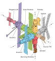
ISS Diagram
-
 ISS configuration image.

Article(s): International Space Station, Assembly of the International Space Station
Request: Just a small one, folks - the W3C validator won't pass the diagram as a valid SVG as its flagging up two errors in the source code - if someone could fix those I'd be grateful. Many thanks in advance, Colds7ream (talk) 12:13, 17 August 2010 (UTC)
Graphist opinion(s):
- I only get 4 not really significant warnings from the validator and no errors. So I don't see anything to fix here. —Quibik (talk) 14:07, 17 August 2010 (UTC)
- Weird - must have been reading the old version of the file - many thanks anyway! :-) Colds7ream (talk) 15:21, 17 August 2010 (UTC)
Capitol Loop
-
 start of SVG version

Article(s): Capitol Loop
Request: I started converting the PNG into an SVG. I've cleaned up the marker graphic by removing the improper blue background and evenly spacing the stripes. The rounded corners match the FHWA specs for highway signs, and the unique font has been cloned as best as possible. (In Adobe Illustrator, I'm getting little pieces missing in a few of the corners though.) The problem is recreating the Capital Dome, as that's above my current abilities. Imzadi 1979 → 23:30, 10 August 2010 (UTC)
Graphist opinion:
- I only did this quickly - the dome is a trace which is roughly masked and retouched, so the file is really too big - but it might help if you want to tidy it up a bit... Sorry it'll be a bit hard to edit, because I used an autotrace, and so there are lots of odd paths in there - if someone wants to redraw it that would be much better, but it would be a fairly big job which i can't fit in right now. Hope this is some help - the letterring is closer, if nothing else. Begoontalk 05:34, 12 August 2010 (UTC)
- I'm appreciating the help. The traces I attempted in Illustrator didn't come out well. I'm still new at more complex vector art, so the settings I was trying just didn't work very well. Fortunately, most highway markers are much simpler shapes, or the official PDFs have vector art in them for the extraction, not so here. Any further assistance from the graphics gurus here is appreciated. Imzadi 1979 → 10:48, 12 August 2010 (UTC)
- I had a stab at this and redrew the whole dome from scratch. I used the official PDFs and photos of the dome as a reference. It might need some small tweaks here and there. Please feel free to modify or even revert if you don't like the result. regards, -- Orionist ★ talk 22:02, 18 August 2010 (UTC)
Sakura


Article(s): Sakura
Request: vectorize... Chris (クリス • フィッチ) (talk) 17:20, 11 August 2010 (UTC)
Graphist opinion(s):
![]() Done - BarnSakura.svg Begoontalk 01:11, 19 August 2010 (UTC)
Done - BarnSakura.svg Begoontalk 01:11, 19 August 2010 (UTC)
- Great, thank you!--Chris (クリス • フィッチ) (talk) 01:44, 19 August 2010 (UTC)
WikiProject Hawaii

Article(s): WikiProject Hawaiʻi
Request: remove "Pacific Ocean" as unnecessary... Chris (クリス • フィッチ) (talk) 12:42, 16 August 2010 (UTC)
Graphist opinion(s): Can't process that svg - but I've chopped it out of the png. Begoontalk 14:28, 16 August 2010 (UTC)
- Done removed from the SVG. —Quibik (talk) 22:00, 16 August 2010 (UTC)
- Thank you! What is causing the weird coding on the svg?--Chris (クリス • フィッチ) (talk) 03:43, 17 August 2010 (UTC)
- I just didn't have that flavour of Helvetica std LT where I was. I guess I could have removed it anyway, but I like to see any changes I make visually. It uses that font and Bitstream Vera Sans, plus there are effects applied to the text which Illustrator was complaining about. It may work in Inkscape with the right fonts installed - but the type would need converting to paths for the SVG to render at Wikipedia - which is kind of a catch-22, because you then need someone with the fonts (and preferably a "master" file with type not as paths...) to edit it in future if any of the type changes. Begoontalk 07:27, 17 August 2010 (UTC)
- Thank you! What is causing the weird coding on the svg?--Chris (クリス • フィッチ) (talk) 03:43, 17 August 2010 (UTC)
- You guys rock, thank you!--Chris (クリス • フィッチ) (talk) 11:06, 17 August 2010 (UTC)
- Snazzy!--Chris (クリス • フィッチ) (talk) 13:58, 17 August 2010 (UTC)
Micronesia

Article(s): Micronesia
Request: spell correctly Federated States of Micronesia (or just Micronesia), Northern Mariana Islands (or just Northern Marianas), New Caledonia... Chris (クリス • フィッチ) (talk) 17:19, 17 August 2010 (UTC)
Graphist opinion(s): ![]() Request taken by Fallschirmjäger. 15:15, 18 August 2010 (UTC)
Request taken by Fallschirmjäger. 15:15, 18 August 2010 (UTC)
- Done - All the labels should be correct now according to their official full length names. Fallschirmjäger ✉ 16:57, 18 August 2010 (UTC)
- Great, thank you!--Chris (クリス • フィッチ) (talk) 00:47, 19 August 2010 (UTC)
Raven Banner
Article(s): Raven Banner
Request: remove excess blank space... Chris (クリス • フィッチ) (talk) 00:45, 19 August 2010 (UTC)
Graphist opinion(s):
![]() Done - scaled/cropped - Begoontalk 07:12, 19 August 2010 (UTC)
Done - scaled/cropped - Begoontalk 07:12, 19 August 2010 (UTC)
- Great, thank you!--Chris (クリス • フィッチ) (talk) 08:20, 19 August 2010 (UTC)
Calling Codes

Article(s): Calling Codes
Request: extra blank space makes the image display smaller... Chris (クリス • フィッチ) (talk) 06:19, 19 August 2010 (UTC)
Graphist opinion(s):
![]() Done - scaled/cropped - Begoontalk 07:12, 19 August 2010 (UTC)
Done - scaled/cropped - Begoontalk 07:12, 19 August 2010 (UTC)
- Thank you again!--Chris (クリス • フィッチ) (talk) 08:20, 19 August 2010 (UTC)
Election symbol of political parties
 |
 |
 |
 |
Article(s): Indian National Congress and Bharatiya Janata Party
Request: Vectorize.--Kkm010 | Talk with me 08:53, 15 August 2010 (UTC)
Please take a look and accept my request.--Kkm010 | Talk with me 14:42, 16 August 2010 (UTC)
Graphist opinion(s): I dont have Adobe Illustrator so I need help here from other graphists. I have found the vector sources for both (EPS format). I believe both these sources should be acceptable. The logo for the Congress party can be found here. Extract only the hand symbol and discard the background flag. The logo for the BJP party can be found here. --JovianEye (talk) 04:36, 18 August 2010 (UTC)
- FYI, Inkscape is free, open source software, and it is able to read EPS files as well. gringer (talk) 11:19, 20 August 2010 (UTC)
![]() Request taken by Imzadi1979.,
Request taken by Imzadi1979., ![]() Done Let me know if you want me to restore the color in the BJP logo, or leave it in black and white. Imzadi 1979 → 06:34, 18 August 2010 (UTC)
Done Let me know if you want me to restore the color in the BJP logo, or leave it in black and white. Imzadi 1979 → 06:34, 18 August 2010 (UTC)
- May I suggest matching the nominal sizes of the files, at 250 or 300 px wide? Not that it's something important, but I feel since the files are related, it's better if they preview at the same nominal size. -- Orionist ★ talk 06:54, 18 August 2010 (UTC)
- Please bring down the nominal size of INC SVG. Its too large, and may violate fair use rationale which does not permit large nominal sizes. Additionally, please change the current white portions of the BJP symbol to transparency. Thanks! JovianEye (talk) 12:18, 18 August 2010 (UTC)
- Not that I see how it makes much difference, but I reduced the scale. SVGs by their very nature are display-size independent. That is they can be scaled to any size without any loss of resolution. The fair-use guideline about not displaying them any larger than necessary just means that the graphic's size needs to be specified in the article. The fact remains, if I specify the size to be 1000px, I will get a crystal clear image, even if the nominal size is 115px. As for the BJP symbol, I figured out how to make those areas transparent. Imzadi 1979 → 15:45, 18 August 2010 (UTC)
- It's strange that it does seem to make a difference to the wikipedia editors, but it does seem that nominal size matters for SVG files (perhaps because that's what people see when they click through to the image). Nominal sizes should be small for logos, otherwise the image will get a 'please reduce the size of this' tag added to it. gringer (talk) 11:24, 20 August 2010 (UTC)
- The template {{Non-free reduce|type=svg}} may explain that a bit better gringer (talk) 11:42, 20 August 2010 (UTC):
- Not that I see how it makes much difference, but I reduced the scale. SVGs by their very nature are display-size independent. That is they can be scaled to any size without any loss of resolution. The fair-use guideline about not displaying them any larger than necessary just means that the graphic's size needs to be specified in the article. The fact remains, if I specify the size to be 1000px, I will get a crystal clear image, even if the nominal size is 115px. As for the BJP symbol, I figured out how to make those areas transparent. Imzadi 1979 → 15:45, 18 August 2010 (UTC)
| This non-free media file should be replaced with a smaller version to comply with Wikipedia's non-free content policy and United States copyright law. According to Wikipedia's policy for non-free content, the amount of copyrighted work used under fair use should be as little as possible. In particular, non-free media on Wikipedia should not be usable as substitutes for the original work. A vector image displayed at excessive nominal size is questionable fair use and may be deleted per Wikipedia's copyright policy.
The SVG can be configured a smaller size by changing the nominal size data using an appropriate vector image editor such as Inkscape. |
Logo of Indian company
 |
Article(s): Bharat Petroleum, HDFC Bank and Reliance Communications
Request: Vectorize.--Kkm010 | Talk with me 18:17, 18 August 2010 (UTC)
Graphist opinion(s): Again, please use {{GLNF|image.ext}} when posting non-free images... again, I'll look, but no promises.. Connormah 18:29, 18 August 2010 (UTC)
I found the HDFC vector logo. Please click on JPG file for link to vector version. --JovianEye (talk) 02:13, 19 August 2010 (UTC)
I've located some PDFs for Bharat, but my computer doesn't want to be cooperative, and won't open them: here's some links: [12] [13]. Anyone who can get these open, and extract a logo (if there is one), it'd be greatly appreciated. Edit: Just checked the PDFs on a mobile device, and it looks like the do contain vectors. Anyone who can extract them - it'd be greatly appreciated. Connormah 04:08, 21 August 2010 (UTC- I've got it open - hold on a sec.. Connormah 04:44, 21 August 2010 (UTC)
- Bharat done. Connormah 04:49, 21 August 2010 (UTC)
- Marking as Done - all 3 logos have been located. Connormah 05:07, 21 August 2010 (UTC)
Logo of university
Article(s): Kuvempu University
Request: Please Vectorize this logo.--Kkm010 | Talk with me 04:08, 15 August 2010 (UTC)
Graphist opinion(s): Sorry, I can't find an official vector source. Retraced vectors are never a good idea as most of the time they are not accurate to it's original. It'd be best to contact the University for such a thing, but please don't re-trace it - we need to depict this logo as it is, not an approximation. Lastly, please use {{GLNF|image.jpg}} when posting requests for non free images here. Thanks. Connormah 07:19, 15 August 2010 (UTC)
Thanks for giving me this vital information. If this logo can't be formed as SVG then there is nothing much that you or i can do about it. Thanks--Kkm010 | Talk with me 08:47, 15 August 2010 (UTC)
- Again, I could try and contact the university, but I can't really think of a justifiable reason to want a vector - the PNG is fine. Connormah 17:07, 15 August 2010 (UTC)
Its OK, its better we keep it in PNG format. If possible in future please change it in SVG format for a moment leave it. But please don't refuse my other requests and make sure at least they are done.--Kkm010 | Talk with me 17:28, 15 August 2010 (UTC)
- Please see the reply to your other request, and the linked talk page discussion for further clarification. Thanks. Begoontalk 18:29, 15 August 2010 (UTC)
Looks resolved? Marking as such. §hepTalk 23:50, 21 August 2010 (UTC)
Songs Day
Article(s): Songs Day
Request: vectorize, should be white hiragana characters うたの日 on black background, the hiragana is the important stuff, below text optional, you can cut out the English and the skyline below... Chris (クリス • フィッチ) (talk) 12:59, 21 August 2010 (UTC)
Graphist opinion(s): The characters you gave render as above - that's MS Gothic. Not the same as pic? Begoontalk 15:41, 21 August 2010 (UTC)
- Thank you for your hard work! The characters are the same, the color scheme is right, but the た and the の are stacked vertically to create the silhouette of a sanshin, and the other characters are slightly skewed and stylized.--Chris (クリス • フィッチ) (talk) 02:50, 22 August 2010 (UTC)
It's probably very wrong, because I can't even see what the "stylising" is in most places, so this is an attempt to visually look like the picture. Of course, the quality of the original picture is worse than my non existent knowledge of hiragana - so it could be anything... Begoontalk 07:49, 22 August 2010 (UTC)
- Very close! I will try to find you a better copy!--Chris (クリス • フィッチ) (talk) 08:17, 22 August 2010 (UTC)
- If I had only thought to Google it in Japanese... here are some actual pics, maybe the last is a sharper image for you.
- --Chris (クリス • フィッチ) (talk) 08:23, 22 August 2010 (UTC)
- Yeah, that is a problem... ;) I can't get it to render, have refreshed my browser, does it show for you in the article?
- No - I just uploaded a new version and it won't render - nothing wrong with the file - I even recreated it, validates perfectly at W3C - displays in Illustrator CS3, 4, 5 - Inkscape. I'm blaming Wikipedia caching/rendering at the moment. Funnily, the previous version didn't render for a while, then did for no apparent reason, with no changes - strange goings on indeed... Begoontalk 12:29, 22 August 2010 (UTC)
- Pretty sure it's a server problem - look here and on the Photo Lab page - lots of gaps for recently uploaded images - also, just for giggles, have a look at this link to see 250 most recent images... Begoontalk 12:38, 22 August 2010 (UTC) [and now it seems to be working again - new version shows here for me...]
![]() Done - uploaded best version I can make from those sources. Begoontalk 15:55, 22 August 2010 (UTC)
Done - uploaded best version I can make from those sources. Begoontalk 15:55, 22 August 2010 (UTC)
- Perfect, thank you!--Chris (クリス • フィッチ) (talk) 03:16, 23 August 2010 (UTC)
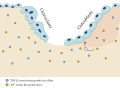
Cousin tree (with genetic kinship)
-
 Vectorize
 -
 SVG version
 -
 Orginal artwork
.png)


Article(s): Family tree
Request: Make a vector version of File:Cousin tree (with genetic kinship).png using File:CousinTree.svg for artwork. Svgalbertian (talk) 20:46, 8 August 2010 (UTC)
Graphist opinion:
- I'll have a go at this, it fits well with my thesis. gringer (talk) 06:04, 9 August 2010 (UTC)
Logo of Wipro
Article(s): Wipro
Request: Vectorize.--Kkm010 | Talk with me 18:37, 13 August 2010 (UTC)
Graphist opinion(s):
- Cannot vectorize. In the future, please make sure your request can actually be vectorized. ℳono 19:05, 13 August 2010 (UTC)
![]() Request taken by Jovianeye.
Request taken by Jovianeye. ![]() Done --JovianEye (talk) 00:02, 14 August 2010 (UTC)
Done --JovianEye (talk) 00:02, 14 August 2010 (UTC)
- That is a ridiculously large file. ℳono 00:41, 14 August 2010 (UTC)
- The file is indeed quite large! I guess that is mainly because of the Rainbow sunflower with its gradients. The logo for Lamborghini is still a raster and not vector. We did try the vector here at the lab but that was a massive 5MB. So the vector was abandoned... --JovianEye (talk) 01:13, 14 August 2010 (UTC)
- That's what you get for having a photo as your logo! This Wipro logo epitomizes everything you should not do when designing a logo! On a serious note, I don't think we should encourage this kind of requests. First of all this is a photo and vectorizing it would be pointless. You did the right thing by acquiring the logo from the company's website, and that what we should advise requesters to do, if they can't find it there, they can try e-mailing the company or extracting it from published documents (PDFs etc.) to get an exact copy. Another issue is that the copyright status of commercial logos is always dodgy, and they see very limited use. So I think we should have some pre-written advice that we can post here whenever we have a similar request. What do yo think? -- Orionist ★ talk 04:19, 14 August 2010 (UTC)
- The file is indeed quite large! I guess that is mainly because of the Rainbow sunflower with its gradients. The logo for Lamborghini is still a raster and not vector. We did try the vector here at the lab but that was a massive 5MB. So the vector was abandoned... --JovianEye (talk) 01:13, 14 August 2010 (UTC)
Yangon Division flag
-
 Best copy there is
 -


Article(s): Yangon Division
Request: Navy blue background, two olive laurels surrounding a red star and the words ရန်ကုန်တိုင်း on the banner. Hintha (talk) 09:27, 16 August 2010 (UTC)
Graphist opinion:
Ok - I've had a go at this. There are 2 things to note, and check.
- Firstly, it's a bit "rough" due to the low quality original - I had to approximate in places.
- Secondly, and more importantly - the wording: I can't correct this, because I don't know the language - what I did was copy and paste the characters you used above, then used a font called Zawgyi-One. There are some differences in some of the characters - but I don't know how to fix them. Notably the 'c' shaped portions above some characters are missing, and there is a 'J' shaped portion not present in the original on some characters. Quite probably I just need a different font - but I have no idea which one. (the text is converted to paths in the version I uploaded) Begoontalk 01:43, 20 August 2010 (UTC)
- Since you're using Zawgyi-One, try replacing that with this text in the parentheses: ( ရန္ကုန္တိုင္း ). Zawgyi-One uses glyphs that don't appear in Unicode, so that's why there's that mumbo jumbo. Hope that helps.--Hintha (talk) 02:23, 20 August 2010 (UTC)
Law Enforcement WikiProject
-

-
Vectorized

Article(s): Wikipedia:WikiProject Law Enforcement
Request: vectorize... Chris (クリス • フィッチ) (talk) 09:11, 8 August 2010 (UTC)
Graphist opinion(s):
- Done, roughly. Not really vector material. ℳono 19:28, 13 August 2010 (UTC)
- Thank you for your hard work! I guess it's not, and I am sorry.--Chris (クリス • フィッチ) (talk) 10:51, 14 August 2010 (UTC)
- Sorry, but I find autotracing raster images (as is in the case of this vector image) to be a really bad idea. It only deteriorates the image's quality, imho. Please don't automatically convert images to SVG just for the sake of them being SVG. —Quibik (talk) 17:07, 16 August 2010 (UTC)
- Actually, it's mandated, per http://commons.wikimedia.org/wiki/Commons:Transition_to_SVG --Chris (クリス • フィッチ) (talk) 03:22, 17 August 2010 (UTC)
![]() Done Completely redrawn. Once I found a vector version of the crown the rest of the logo posed no problem. There are a few differences from the original design, but nothing substantial. Regards, -- Orionist ★ talk 18:28, 20 August 2010 (UTC)
Done Completely redrawn. Once I found a vector version of the crown the rest of the logo posed no problem. There are a few differences from the original design, but nothing substantial. Regards, -- Orionist ★ talk 18:28, 20 August 2010 (UTC)
Mir diagram
-
 A diagram of the space station Mir.
 -
 Done, no-shuttle version


Article(s): Mir
Request: Hi folks! If someone could please SVG-ify this diagram, and upload it with a better name, such as File:Mir diagram (en).svg, I'd be very grateful. This would a) serve to make the image clearer in infoboxes, and b) make it easier for the 30 other wikis that use it to translate the thing. Many thanks, Colds7ream (talk) 13:40, 9 August 2010 (UTC)
Graphist opinion(s): ![]() Request taken by Orionist.
Request taken by Orionist.
- I uploaded the no-shuttle version as promised. It needed more work than I expected, that's the reason of the slight delay. The shuttle version will hopefully be done in a couple of days. Regards, -- Orionist ★ talk 17:12, 18 August 2010 (UTC)
- Wow, that's absolutely brilliant! Many thanks indeed! :-) Colds7ream (talk) 11:00, 19 August 2010 (UTC)
- I made a few minor changes to the labelling, but otherwise that image is absolutely beautiful; don't worry about the version with the shuttle on it, it's great as it is. Alas, when I relabelled it, I managed to invalidate the source code, so if you could just fix that that'd be fantastic. Cheers, Colds7ream (talk) 15:26, 20 August 2010 (UTC)
- I applied the new labels but for some reason the Italics are not showing as such. I hope this will suffice at the moment until I find out why. I'm halfway through the shuttle and will upload it soon (in a separate file). I'm glad you liked the result, and many, many thanks for the barnstar (my first)! Regards, -- Orionist ★ talk 18:19, 20 August 2010 (UTC)
- Thanks very much - it's all appreciated (and you're welcome!). Incidentally, I think I've managed to swap the old file out with the new one on most of the articles that used it, with the exception of the article on the Malayan Wikipedia, as it doesn't seem to allow me to edit it, and a couple of instances on the German Wikipedia which could do with the version with Shuttle. Can't wait to see the final final versions! :-D Colds7ream (talk) 18:26, 20 August 2010 (UTC)
- I applied the new labels but for some reason the Italics are not showing as such. I hope this will suffice at the moment until I find out why. I'm halfway through the shuttle and will upload it soon (in a separate file). I'm glad you liked the result, and many, many thanks for the barnstar (my first)! Regards, -- Orionist ★ talk 18:19, 20 August 2010 (UTC)
War icon

Article(s): Too many to name.
Request: Vectorize. (File:Waricon.svg may be helpful) ℳono 03:45, 11 August 2010 (UTC)
Graphist opinion(s):
![]() Done:
Done:

--MDragunov (talk) 05:34, 11 August 2010 (UTC)
3rd World Scout Jamboree


Article(s): 3rd World Scout Jamboree
Request: vectorize with no brown background... Chris (クリス • フィッチ) (talk) 11:32, 8 August 2010 (UTC)
Graphist opinion(s):
![]() Request taken by Orionist.
Request taken by Orionist.
- Is this logo in the Public Domain? It is categorized as such. I need to know if I should upload the SVG to Wikipedia or Commons. -- Orionist ★ talk 05:01, 21 August 2010 (UTC)
- It is, but we are trying to figure out whether that category should be moved to Commons quite yet.--Chris (クリス • フィッチ) (talk) 07:07, 21 August 2010 (UTC)
- Almost Done. Sorry for the delay. It's done and all but we still need a better font that's more similar to the original. My Hard Drive that contained my fonts had moved to a better place (R.I.P. D:\ !) and I was left with a choice of Arial or Times New Roman (just like an economy class airline meal). Now you just need a little bit of help from my fellow graphists here. Regards! -- Orionist ★ talk 01:30, 24 August 2010 (UTC)
- Almost
- It is, but we are trying to figure out whether that category should be moved to Commons quite yet.--Chris (クリス • フィッチ) (talk) 07:07, 21 August 2010 (UTC)
- Hello! I've just got a message that the File:3rd_World_Scout_Jamboree.svg file I uploaded for your request on the Illustration Workshop has been nominated for speedy deletion. So you might want to use it in an article so that it can be valid as Fair Use, or maybe use a {{hangon}} template and provide a reason. Regards, -- Orionist ★ talk 05:49, 25 August 2010 (UTC)
- Thank you, I totally didn't see that this was done, I am sorry for the delay. It's great, thank you!--Chris (クリス • フィッチ) (talk) 11:19, 25 August 2010 (UTC)
Dutch East Indies
-

-
-
 thank you anonymous masked man!


Article(s): Dutch East Indies
Request: remove heavy brown shadowing, vectorize if you can... Chris (クリス • フィッチ) (talk) 04:41, 13 August 2010 (UTC)
Graphist opinion(s):
- I don't exactly think this is a candidate for vectorizing. It's too complex, and tedious; the file gets to be large and very imperfect. Vector is for simple shapes, to be honest. ℳono 04:50, 13 August 2010 (UTC)
- Hint: It's just the center of this! 76.117.247.55 (talk) 09:46, 15 August 2010 (UTC)
![]() Done: Removed curtain, changed black to actual path, clipped out extra bits. We should make a "produced / modified by the Graphic lab" template gringer (talk) 15:30, 19 August 2010 (UTC)
Done: Removed curtain, changed black to actual path, clipped out extra bits. We should make a "produced / modified by the Graphic lab" template gringer (talk) 15:30, 19 August 2010 (UTC)
So, can this be marked as resolved? §hepTalk 04:05, 27 August 2010 (UTC)
- Totally missed this, yes please, that's great!--Chris (クリス • フィッチ) (talk) 06:04, 27 August 2010 (UTC)
Map of SAARC
-
 SAARC SVG

Article(s): South Asian Association for Regional Cooperation
Request: Redraw as SVG. And don't make it perfect rectangle both sides should be round. Eg:here.--Kkm010 | Talk with me 14:46, 24 August 2010 (UTC)
- I've removed the GLNF template, since this is a free image so you don't need to use the GLNF when requesting. Have a look at the license, it usually contains a red © symbol for non-free images, in which case you have to use a GLNF. Otherwise you can post a request in the normal way. I know this whole copyright issue might seem baffling at first (it was for me!), but it's quite easy and very useful when working with images in Wikipedia. Regards! -- Orionist ★ talk 17:09, 24 August 2010 (UTC)
Graphist opinion(s):
![]() Request taken by Stepshep. Should be pretty easy. §hepTalk 19:11, 26 August 2010 (UTC)
Request taken by Stepshep. Should be pretty easy. §hepTalk 19:11, 26 August 2010 (UTC)
![]() Done I'm not sure why Suriname was colored in the PNG, so I left it uncolored and added countries that have joined since the original was created. That look okay/accurate? §hepTalk 20:03, 26 August 2010 (UTC)
Done I'm not sure why Suriname was colored in the PNG, so I left it uncolored and added countries that have joined since the original was created. That look okay/accurate? §hepTalk 20:03, 26 August 2010 (UTC)
- Thanks its GOOD.--Kkm010 | Talk with me 03:59, 27 August 2010 (UTC)
Mount Kenya

Article(s): Mount Kenya
Request: remove border per WPMOS... Chris (クリス • フィッチ) (talk) 12:01, 25 August 2010 (UTC)
Graphist opinion(s):
![]() Done Begoontalk 11:25, 26 August 2010 (UTC)
Done Begoontalk 11:25, 26 August 2010 (UTC)
- Thank you sir!--Chris (クリス • フィッチ) (talk) 12:06, 26 August 2010 (UTC)
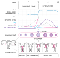
Menstrual cycle
-
 Menstrual cycle

![[4]](http://homepage.psy.utexas.edu/homepage/class/Psy332/Salinas/Cells/oligo.gif)
![[6]](http://www.leukonet.de/index.php?eID=tx_cms_showpic&file=uploads%2Fpics%2FOLIGO_E_01.JPG&width=800m&height=600m&bodyTag=%3Cbody%20bgcolor%3D%22black%22%3E&wrap=%3Ca%20href%3D%22javascript%3Aclose()%3B%22%3E%20%7C%20%3C%2Fa%3E&md5=fa0f2a9a314f8a5a7be3e640b55741d1)
![[10]](https://en.wikipedia.org/wiki/File:Neuron_with_oligodendrocyte_and_myelin_sheath-2.svg)
.svg&action=edit&redlink=1)
Article(s): Menstrual cycle
Request: Can someone edit this diagram to make the dip in basal body temperature less extreme. The dip seen around day 13 (right before the big increase) should be slight, not dramatic. The editors at Menstrual cycle won't use this diagram on the article until this gets fixed :( Kaldari (talk) 02:34, 23 August 2010 (UTC)
Graphist opinion(s): I've moved the low point around day 13 up by just less than half a division. If that's too much or too little just say so - it's easy to alter now because I've converted the graph line from a complex filled shape to be a single line in its own layer. Begoontalk 05:41, 23 August 2010 (UTC)