Wikipedia:Graphics Lab/Photography workshop/Archive/Aug 2013
Stale edit
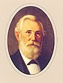
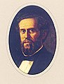
Oval crop: List of Governors of Texas edit
-

-

-

-

-

-

-

-

-

-

-

-

-

-

-

-

-
-
-

-

-
-

-
-
 Transparent background


Article(s): List of Governors of Texas and etc, Request:
- Oval crop all these images, removing the background. -- KAVEBEAR (talk) 02:37, 5 July 2013 (UTC)
- Reminder to graphists: Best practice at Commons is to upload the resulting images as new .png files with transparent backgrounds. The DerivativeFX tool may help the uploading. --Kevjonesin (talk) 20:03, 11 July 2013 (UTC)
Graphist opinion(s):
Resolved edit
Kurt Meyer edit
-
 Panzer Leader Kurt Meyer Bundesarchiv image

Article(s): Kurt Meyer
Request:
- Hello fellow Wikipedians. If we could get the black stuff removed along the left and repair the white marks, especially on the face. The contrast and brightness could be tinkered with as well I think. Please do not trim off the Bundesarchiv information from the right hand side; it's better to leave it. Thanks, -- Diannaa (talk) 19:47, 30 July 2013 (UTC)
Graphist opinion(s):
 Done - Though I did crop off the text on the right as is usually done with those images. If you really feel it's important to retain in this instance, you can add {{Metadata from image}} and transcribe the data to the image description page. – JBarta (talk) 20:23, 30 July 2013 (UTC)
- It's still available on the original download so people can refer to that copy if need be. Thank you very much; it's a nice result :) -- Diannaa (talk) 20:40, 30 July 2013 (UTC)
- I've cleaned up a few additional white splotches on the lower half of the image which appear to be on the print (and possibly the negative) and not on the uniform. (The dark mark on the subject's left sleeve seems to be on the uniform so I did not remove that.) I also tweaked the contrast as the original image appears a bit flat and washed out. If you prefer the earlier version however, Diannaa, feel free to revert it. Centpacrr (talk) 22:41, 30 July 2013 (UTC)
- It's still available on the original download so people can refer to that copy if need be. Thank you very much; it's a nice result :) -- Diannaa (talk) 20:40, 30 July 2013 (UTC)
Silver spoon by George Unite edit
-
 Silver spoon by George Unite
 -
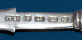 Maker's marks only
 -
 Alternate edit
(JBarta) -
 Alternate edit
(JBarta)
.jpg)
.jpg)
Article(s): George Unite
Request:
- Please crop, remove the reflection, and lighten the tip of the bowl of the spoon. Other improvements at your discretion. Also, please upload a separate crop, showing just the hallmarks, made as readable as possible. Andy Mabbett (Pigsonthewing); Talk to Andy; Andy's edits 20:55, 31 July 2013 (UTC)
Graphist opinion(s):![]() Request taken by Centpacrr (talk) 23:06, 31 July 2013 (UTC).
Request taken by Centpacrr (talk) 23:06, 31 July 2013 (UTC).
- Took a stab at this myself. – JBarta (talk) 18:17, 1 August 2013 (UTC)
- The alternate files are completely missing all metadata information as to their origin, applications applied to them, how they were created or any other details to identify them, and how they may be technically different and/or distinguishable from the other edits. Was this unintentional or is there some specific reason for this useful information having been deleted and withheld? Centpacrr (talk) 19:02, 1 August 2013 (UTC)
- The graphics app I usually use saves as plain vanilla jpgs and doesn't save EXIF data (though I sometimes wish it did). I suppose I could use another app to re-add the metadata, but quite honestly, I don't think it's worth the trouble... especially not for a derivative file. Beyond that and as far as some of the various informational items you specifically mention, I'd say you're veering into the nonsensical. – JBarta (talk) 19:57, 1 August 2013 (UTC)
- My point is that by deleting the metadata when you edit another contributor's image all of the information contained in the original file such as camera type, exposure, f/stop, ISO data, lens type used, focal length, resolution in dpi, original date of creation, Exif version, when and with what application the file was last modified, descriptive and copyright information that may have been added by the file's copyright owner or others, and many other technical parameters that are useful in the editing and evaluation processes is lost and no longer available to assist others in working with the image. As I recall you personally made considerable use of the metadata information in both the original and subsequent edits of the Margaret Mead image file during the extensive discussion a few weeks ago about it when you were trying to determine why it displayed differently for you on Firefox than it did with other browsers. Without the file's metadata you would have been left completely in the dark on this matter.
- In the case of any contributor's own original and completely self created image file perhaps the metadata would not be so important if the creator/contributor does no chose to include it, but it seems to me that as a matter of policy any editor who either contributes and/or edits an image file created originally by another that already contains metadata it would be incumbent upon every editor who alters the file in any way to ensure that all the metadata information is retained for others (editors and viewers alike) to be able to use to evaluate the image as a viewer and/or potential editor of it. Centpacrr (talk) 20:56, 1 August 2013 (UTC)
- First, the metadata is not lost. Any metadata included in an upload is still present in the original upload. Second, have you actually looked at the metadata changes you uploaded with your edit? Hardly valuable stuff. And third, in your edit the changes were significant enough to make the old metadata practically irrelevant. You're making a silly mountain out of a molehill. I'd strongly suggest you spend more time editing the image rather than making silly arguments with me... then maybe your edit would have been a little better and I wouldn't have felt the need to upload another edit and we wouldn't even be having this discussion. Interestingly, I figured I'd upload as a separate edit rather than upload over yours because I didn't want to deal with your nonsense. So much for that idea... – JBarta (talk) 21:19, 1 August 2013 (UTC)
- Once again I am truly puzzled as to why you have chosen to completely ignore my main points above which relate to the information contained in the original file which is lost (i.e. no longer displayed in the file's host page) as well as any new information from an edit (such as when it was done and what application was used) as this is not retrievable unless somebody goes back to the original version, downloads it, and then opens in in Photoshop, Graphics Converter, or some other application. And also did you not find the metadata useful to you in the evaluation of the Mead image? As I recall you made a huge point of what it contained to the exclusion of almost everything else.
- As for my edit, you will notice that while I had marked it as "Taken" I had not yet marked this as "Done" but instead asked the OP if this is what he had in mind and was awaiting his answer which you did not allow him time to do (and as of now it still has not been posted). Instead you again appear to have decided on your own that my current version is "wanting" (but have not said how so I assume it is probably NIH factor) and posted new versions which for the life of me I can hardly see are any different than mine in any significant way. Your drop shadow appears a little softer, the gamma is slightly different as is the cropping, and there appears to be (but I am not sure) some very slight difference in the borders of the bowl of the spoon against the background, but all of these differences are really de minimus at best. Why not be patient and allow the OP to at least comment instead of just jumping in again with unexplained changes that also delete all the original metadata so there is no way to tell what you did? Again there are always going to be more than one acceptable way to edit images and I don't see on what basis (nor have you explained) you have unilaterally decided that mine is apparently unacceptable to you.
- If the OP is unsatisfied and I can't resolve that for him then you are perfectly free to offer an alternative, but right now you appear to have posted two new images that are basically the same as mine in all but the smallest detail to everyone except yourself. If you have something new to say to me in response that takes into account what I have said here then please do so, but if you are again going to completely ignore what I say then and go off on another tangent about my supposed shortcomings I am afraid this discussion is going to be another fruitless exercise. (To be truthful your response again truly reminds me of the Monty Python "Do you want a five minute argument or the full half hour" sketch.) And now I am off to a lecture on the RMS Titanic at the Penobscot Marine Museum so won't be on here for a few hours during which time I hope the OP has a chance to answer my question to him. Centpacrr (talk) 22:05, 1 August 2013 (UTC)
- First, the metadata is not lost. Any metadata included in an upload is still present in the original upload. Second, have you actually looked at the metadata changes you uploaded with your edit? Hardly valuable stuff. And third, in your edit the changes were significant enough to make the old metadata practically irrelevant. You're making a silly mountain out of a molehill. I'd strongly suggest you spend more time editing the image rather than making silly arguments with me... then maybe your edit would have been a little better and I wouldn't have felt the need to upload another edit and we wouldn't even be having this discussion. Interestingly, I figured I'd upload as a separate edit rather than upload over yours because I didn't want to deal with your nonsense. So much for that idea... – JBarta (talk) 21:19, 1 August 2013 (UTC)
- The graphics app I usually use saves as plain vanilla jpgs and doesn't save EXIF data (though I sometimes wish it did). I suppose I could use another app to re-add the metadata, but quite honestly, I don't think it's worth the trouble... especially not for a derivative file. Beyond that and as far as some of the various informational items you specifically mention, I'd say you're veering into the nonsensical. – JBarta (talk) 19:57, 1 August 2013 (UTC)
- The alternate files are completely missing all metadata information as to their origin, applications applied to them, how they were created or any other details to identify them, and how they may be technically different and/or distinguishable from the other edits. Was this unintentional or is there some specific reason for this useful information having been deleted and withheld? Centpacrr (talk) 19:02, 1 August 2013 (UTC)
- Took a stab at this myself. – JBarta (talk) 18:17, 1 August 2013 (UTC)
Thank you, both. I'll go with the JBarta edits. Andy Mabbett (Pigsonthewing); Talk to Andy; Andy's edits 20:14, 4 August 2013 (UTC)
Wilcox fair use photos edit


Article(s): Virginia Kaihikapumahana Wilcox and Robert Kalanikupuapaikalaninui Wilcox
Request:
- Anyway to oval crop the photographs of the children as a non-free fair use image base in the rationale (#10. "Pictures of deceased persons, in articles about that person, provided that ever obtaining a free close substitute is not reasonably likely"). Naturally they would be out of copyright but since it is a photograph taken by somehow else it is still copyrighted.-- KAVEBEAR (talk) 22:48, 31 July 2013 (UTC)
Graphist opinion(s):
- Done - Both images are old enough to arguably be in the public domain. I suppose there may be technicalites with Hawaii not being part of the US when the photos were taken, but I'll leave that to you to decipher. You might also wish to check the birth year of the princess. The grave marker says 1899, but the article says 1895. When you sort that out, check the dates on the image description page for correctness, and also the dates in the categories of the article and the image description page. – JBarta (talk) 15:24, 1 August 2013 (UTC)
Basic photo cleanup edit
Article(s): National Register of Historic Places listings in Elkhart County, Indiana
Request:
- Simple rotation is needed, and please lighten the image somewhat if you don't mind. I can't do it because I have nothing more advanced than Windows Paint on my computer. Nyttend (talk) 22:28, 27 July 2013 (UTC)
Graphist opinion(s):![]() Done Centpacrr (talk) 23:07, 27 July 2013 (UTC)
Done Centpacrr (talk) 23:07, 27 July 2013 (UTC)
-
 Freely licensed photo of the Dresden Triptych uploaded from flckr

Article(s): Dresden Triptych
Request:
- Can the image above be sharpened, slightly de-yellowed, the light shadow (if that's the correct term) be removed from the upper right above the woman reading, and cropped down to show only the frame and the painting without the background? Thanks. -- Victoria (talk) 13:15, 28 July 2013 (UTC)
Graphist opinion(s):![]() Request taken by Centpacrr (talk) 13:35, 28 July 2013 (UTC).
Request taken by Centpacrr (talk) 13:35, 28 July 2013 (UTC). ![]() Done Centpacrr (talk) 14:05, 28 July 2013 (UTC)
Done Centpacrr (talk) 14:05, 28 July 2013 (UTC)
Remove caption: File:Cross-linking procedure, UV light source.jpg edit

Article(s): Corneal collagen cross-linking, Keratoconus
Request:
Graphist opinion(s):
South African Class 35-400 edit
-
 Watermarked picture
 -
 Watermarked picture
 -
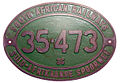 Locomotive number plate
 -
 Locomotive number plate - transp png


Article(s): South African Class 35-400
Request:
- On the first two pictures, please remove the watermarks. On the third, if possible, please blank out the background so that only the oval plate remains. (The plate was no longer mounted on a locomotive, but displayed in a glass case in a museum.) André Kritzinger (talk) 20:17, 11 August 2013 (UTC)
- I have removed the watermarks from the two images (as well as the shadow of the photographer in the foreground of #408) and given the locomotive builder's plate a neutral cream colored background. (If you would rather have a white background for that image let me know and I will change it.) Centpacrr (talk) 22:36, 11 August 2013 (UTC)
- Great work, especially on the shadow! For the number plate, I think white will be better - cream doesn't look very railwayish...
- I assumed you were a train nut as well, given your monicker! Thanks, will look tomorrow - it's 03:00 over here. André Kritzinger (talk) 01:00, 12 August 2013 (UTC)
- I added a PNG version of the number plate with no (transparent) background in case that's any use. Problem is it seems to lose detail in the render wikimedia gives for pngs - disappointing. I tried (imperfectly) to knock back a bit of the "glare" at the same time, but I'm not totally happy with how that came out, and the original, before I played with that, is in the file history to revert to, if desired. Probably none of it is an improvement because of the rendering, but there it is anyway. If nothing else, it could be a nice example of why converting to png isn't a good idea with a high quality image... ! Begoon talk 06:36, 14 August 2013 (UTC)
- Thanks, Begoon, that's actually what I wanted in the first place, but I agree, the result is a little less sharp than the original. Even in thumbline format. In any event, all of these are streets ahead of the original (not uploaded) one. (Perhaps I should upload that one and you can start from scratch?) André Kritzinger (talk) 13:11, 14 August 2013 (UTC)
- Done. It looks rather bleak since it was in a glass box and I had to use a flash. André Kritzinger (talk) 15:38, 14 August 2013 (UTC)
- Looks just about perfect to me! Even the green colour is spot-on. Thanks, Begoon. (I just wish the SATS museum would buff the letters now and then, but since this is an aluminium plate, not brass, it's perhaps just as well...) André Kritzinger (talk) 12:40, 15 August 2013 (UTC)
- I assumed the green was supposed to be close to the green in Flag of South Africa and worked toward that, so I was 'lucky' if that's right... I did try to enhance the lettering a bit, but I didn't want to do too much to it and make it not authentic. Glad you're happy. Begoon talk 13:07, 15 August 2013 (UTC)
Graphist opinion(s):![]() Request taken by Centpacrr (talk) 22:06, 11 August 2013 (UTC).
Request taken by Centpacrr (talk) 22:06, 11 August 2013 (UTC). ![]() Done Centpacrr (talk) 23:46, 11 August 2013 (UTC)
Done Centpacrr (talk) 23:46, 11 August 2013 (UTC)
Remove watermarks edit
-

Watermarkedpicture -
Watermarkedpicture -

Watermarkedpicture -

Watermarkedpicture -

.jpg)


_crop.jpg)
Article(s): The Mrs. Carter Show World Tour
Request:
- Can somebody please remove the watermarks from these pictures? -- My love is love (talk) 11:41, 15 August 2013 (UTC)
Graphist opinion(s):
![]() Done Someone might be able to improve on the fourth one - the elbow was a bit tricky and I did my best... Begoon talk 14:07, 15 August 2013 (UTC)
Done Someone might be able to improve on the fourth one - the elbow was a bit tricky and I did my best... Begoon talk 14:07, 15 August 2013 (UTC)
The first was such a nice shot I made a crop of it. – JBarta (talk) 15:08, 15 August 2013 (UTC)
File:Golden Girls title card.jpg edit

Article(s): The Golden Girls
Request:
- Can you create the free derivative by consisting of only text logo? In other words, no Miami background. -- George Ho (talk) 18:34, 15 August 2013 (UTC)
Graphist opinion(s):
- If anyone want's to do this, a better version of the title is here. And while it's not an exact match, the font appears to be Monotype Corsiva. – JBarta (talk) 19:31, 15 August 2013 (UTC)

![]() Done -- Well, there it is. I don't know why I did it... but I did it. It's an SVG with white lettering and a transparent background. I don't know what you plan to do with it... but it's all yours. – JBarta (talk) 04:55, 16 August 2013 (UTC)
Done -- Well, there it is. I don't know why I did it... but I did it. It's an SVG with white lettering and a transparent background. I don't know what you plan to do with it... but it's all yours. – JBarta (talk) 04:55, 16 August 2013 (UTC)
- If I may say so, JBarta that is splendid work from such a poor original, especially considering that the Monotype Corsiva font is only "close". Begoon talk 06:40, 16 August 2013 (UTC)
- Actually, I didn't use the font. That was 100% extracted and derived from the larger screen grab I pointed to above. Quality-wise, for what it is and where it came from it's sufficient. I wouldn't go much further than that though... but thank-you just the same ;-) – JBarta (talk) 07:49, 16 August 2013 (UTC)
- I was unsure of replacing non-free image with free logo. Nevertheless, I added the logo in non-English versions. --George Ho (talk) 19:29, 16 August 2013 (UTC)
- Wow! Brilliant job, JB! And I'm sure you'll agree it was worth the effort if you look at its global usage already.
 As someone with almost zero experience of creating/editing SVG files I'm fascinated to know how you did it. May I ask what software you used? And (if you'd like to share) could you briefly explain the process? Kind regards, nagualdesign (talk) 10:59, 18 August 2013 (UTC)
- Well, in a nutshell, I approached it this way... I doubled the size of the logo, grayscaled it, then isolated and cleaned up just the white part of the logo. That was the important part. From that, and using layers, I was able to create an outline and the drop shadow. (Though actually the drop shadow wasn't really a drop shadow... it was more of an extrusion.) I ran the end result through Potrace to make an SVG and finished in Inkscape. – JBarta (talk) 17:19, 18 August 2013 (UTC)
- Wow! Brilliant job, JB! And I'm sure you'll agree it was worth the effort if you look at its global usage already.
- I was unsure of replacing non-free image with free logo. Nevertheless, I added the logo in non-English versions. --George Ho (talk) 19:29, 16 August 2013 (UTC)
- Actually, I didn't use the font. That was 100% extracted and derived from the larger screen grab I pointed to above. Quality-wise, for what it is and where it came from it's sufficient. I wouldn't go much further than that though... but thank-you just the same ;-) – JBarta (talk) 07:49, 16 August 2013 (UTC)
John C. Breckinridge edit

Article(s): John C. Breckinridge
Request:
Graphist opinion(s):
Locomotive no. 39-251 edit
-
 Ex loco number 39-251

Article(s): South African Class 39-000
Request:
- Please lighten up the image. It's a late afternoon Blackberry shot and somewhat on the dark side. André Kritzinger (talk) 17:49, 16 August 2013 (UTC)
Graphist opinion(s):
- I brightened the midtones, and took a little bit of saturation out. If that's not how you wanted it, please say... Begoon talk 18:53, 16 August 2013 (UTC)
- Looks great, thank you! André Kritzinger (talk) 19:03, 16 August 2013 (UTC)
SAR Class 91-000 edit
-
 Class 91-000 no. 91-004
 -
 Class 91-000 no. 91-007


Articles: Avontuur Railway and South African Class 91-000
Request:
- 91-004: Please rotate anticlockwise to get the train to appear upright instead of leaning over, and remove watermark
91-007: Please lighten up some - early morning shot and it's somewhat on the dark side
André Kritzinger (talk) 23:50, 16 August 2013 (UTC)
Graphist opinion(s):![]() Request taken by Centpacrr (talk) 02:38, 17 August 2013 (UTC).
Request taken by Centpacrr (talk) 02:38, 17 August 2013 (UTC).
- Adjusted as requested. (AK, you may also find of interest some examples of my own original railroad photography of various roads primarily in Maine, Pennsylvania, and California available here.) Centpacrr (talk) 03:08, 17 August 2013 (UTC)
- Thank you! (Will take a look.) André Kritzinger (talk) 13:52, 17 August 2013 (UTC)
Alexander Adams (Hawaii) edit
.jpg)

Article(s): Alexander Adams (Hawaii), John Young (Hawaii)
Request:
- Please clean up and restore and make it black and white? -- KAVEBEAR (talk) 04:09, 18 August 2013 (UTC)
Graphist opinion(s):
- Done - Tried not to get carried away and do too much on the first. Not a whole to to do on the second, but there you go. – JBarta (talk) 18:01, 18 August 2013 (UTC)
- All I wanted. I just dislike the brown paper color.
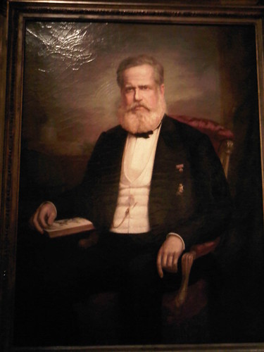
Crop borders edit
-

-
 color adjusted

.jpg)
Article(s): Pedro II of Brazil
Request:
- This is an actual photo of frameless painting. Is it possible to fix the borders? I don't know if simply cropping away will be a good idea, because I want to aboid taking away any part of the actual painting. -- Lecen (talk) 14:08, 13 August 2013 (UTC)
- Holy s%#@. It looks amazing. Jbarta, you made an outstanding job. Wow. --Lecen (talk) 15:39, 13 August 2013 (UTC)
- Indeed. It's always hard to know what to do if you can't see the original painting and the image just looks wrong, but I've got a shiny silver dollar that says this is what it should look like. Begoon talk 17:31, 13 August 2013 (UTC)
- While the "edit" version of this image looks "nice", it also seems to materially alter the intention of the artist as indicated by the other versions of this painting available on the internet (see here, here and here (the original scan)) which have the green background and tint. Curiously this type of "edit" that alters the entire tone of a work of art is something that Jbarta has frequently railed against in here as being "unencyclopedic" and thus not an acceptable on WP so one has to wonder why he/she finds this painting should be an exception to that rule. Perhaps he/she would be willing to explain this inconsistency. Centpacrr (talk) 14:56, 14 August 2013 (UTC)
- Glad to see you're paying attention to the topic of unencyclopedic edits. And you have a valid question. I suppose the real question is this... did the artist likely and deliberately paint the portrait with a green hue? I'd say probably not. If the green isn't added by the camera, possibly it's added by lighting conditions in the room. I don't know for sure. I made an assumption... arguably a reasonable one. – JBarta (talk) 15:26, 14 August 2013 (UTC)
- Jbarta you have consistently insisted in here that assumption/speculation does not equal encyclopedic but that only seems to apply when other contributors' "reasonable assumptions" do not suit your view of things but as here take the exact opposite position for your own assumptions. You need to be consistent in your approach. There is not one rule for you and another for everybody else. That just leads to chaos. If you want to advance a standard of "arguably reasonable assumption" as valid for yourself you can't summarily reject it for everybody else. Such a blatantly self determined subjective "standard" is no standard at all. Centpacrr (talk) 15:47, 14 August 2013 (UTC)
- Glad to see you're paying attention to the topic of unencyclopedic edits. And you have a valid question. I suppose the real question is this... did the artist likely and deliberately paint the portrait with a green hue? I'd say probably not. If the green isn't added by the camera, possibly it's added by lighting conditions in the room. I don't know for sure. I made an assumption... arguably a reasonable one. – JBarta (talk) 15:26, 14 August 2013 (UTC)
- While the "edit" version of this image looks "nice", it also seems to materially alter the intention of the artist as indicated by the other versions of this painting available on the internet (see here, here and here (the original scan)) which have the green background and tint. Curiously this type of "edit" that alters the entire tone of a work of art is something that Jbarta has frequently railed against in here as being "unencyclopedic" and thus not an acceptable on WP so one has to wonder why he/she finds this painting should be an exception to that rule. Perhaps he/she would be willing to explain this inconsistency. Centpacrr (talk) 14:56, 14 August 2013 (UTC)
- Indeed. It's always hard to know what to do if you can't see the original painting and the image just looks wrong, but I've got a shiny silver dollar that says this is what it should look like. Begoon talk 17:31, 13 August 2013 (UTC)
- Holy s%#@. It looks amazing. Jbarta, you made an outstanding job. Wow. --Lecen (talk) 15:39, 13 August 2013 (UTC)
- It's a little more subtle than that Centpacrr. To me, unencyclopedic would be changing the hair color of the subject, completely changing the background of a photo (remember the 50 star flag you placed behind the pre-1959 general?), swapping in another (and wrong) face of a clock and adding/removing/editing the lights on the front of a train (which you got wrong... again). These were all edits you made that I called unencyclopedic and which I called you on. (And that's just this year! I didn't go back any further than that.) The point is, materially altering a photo/painting can be unencyclopedic. It's all a matter of degree. Removing an unintended hue from a painting is a subtle and reasonable effort and is, in my opinion, perfectly encyclopedic and is done all the time around here. Of course, none of this is written in stone and other editors are welcome to raise their concerns. If you really feel the painting was painted with a green hue, then make your argument and throw it into the mix. – JBarta (talk) 16:25, 14 August 2013 (UTC)
- All I am saying is to pick one standard and stick to it for yourself if you want others to do the same. Personally I think the edited version looks better but I have no basis to "assume" that is what the artist intended. I am making the point that if you want to apply a strict standard of editing to me and everybody else then you need to be willing to meet it yourself or at least explain on a case by case basis why any material alteration is appropriate. As for assumptions in general, however, remember for instance that you recently publicly accused me in here that many if not all of the images I have contributed to WP over the years that I had photographed and/or digitized from items my personal collections that I have been building for more than half a century had just been "pilfered from around the internet" by me, and when I challenged you to back up that reckless claim you finally admitted that you had absolutely no evidence whatsoever to support this charge but that it was instead just unsupported personal speculation or assumption. So if you are going to make "assumptions" then support them if you want the rest of us to do that as well. Centpacrr (talk) 16:40, 14 August 2013 (UTC)
- The "argument" for the green background is that this is how it appears in the three different images of this painting that I have found on the internet and thus the available "evidence" mitigates that in the absence of anything else this supports that the artist intended it to be green. The "edit" with the green background altered is fine if all it is just meant to be used for is to illustrate he subject of the painting (Pedro II) but not the painting as a work of art "itself" as there there appears to be nothing available that supports a "reasonable assumption" that it is other than green other than personal speculation. In the absence of such evidence, under Jbarta's "standard" it should be left as a green background. Centpacrr (talk) 17:57, 14 August 2013 (UTC)
Here's another painting of the same guy by the same artist showing a reddish hue, yet another actual photo of the painting shows it in more realistic colors. And another painting by that artist that while a poor copy, does show that he painted it in normal tones. Not really "proof" one way or another, but something to consider. And as an interesting aside, check out the variation in colors in the most famous painting in the world. Interestingly, the version that's considered to be the most authentic has a bit of a greenish hue. Possibly colors in paintings change with age? I don't know. Here are two links that suggest they do. [2][3]. So if we assume that it wasn't painted with a greenish color (a solid assumption IMO), it could be argued that the green was added either by the camera/scanner, the printer (if it was scanned from a book), lighting/surroundings or even simple age. So where does that leave us? I would also add that (color-wise) we both changed the image in the same direction. I just did so to a greater degree. So if I'm guilty of an offense, you're guilty of the same offense... only half as much ;-) – JBarta (talk) 18:11, 14 August 2013 (UTC)
- That really seems to me to be a pretty thin "apples and oranges" argument about these two completely different works. While both were painted in 1875, the larger portrait hanging at the Museu Histórico Do Brasil is of Pedro II depicted in formal civilian dinner dress sitting in a red chair with a book on his knee and what appears to be a painting of a landscape in the background. The considerably smaller, more formally posed standing portrait with Pedro II garbed in heavily gold braided military dress belonging to the Acervo Artístico do Ministério das Relações Exteriores and hanging at the Palácio Itamaraty has a completely "neutral" background which in all images available online is a light apple green. Claiming that the larger, more informal 1875 portrait as well as the much earlier da Câmara rendering of Pedro II as a young man were painted in "normal tones" implies that the other 1875 portrait is in abnormal tones for which I see no evidence at all that supports that claim. Centpacrr (talk) 18:53, 14 August 2013 (UTC)
- Centpacrr, you're looking for conclusive evidence... and there is none (so far). The three online copies you point to (of which two appear to be from the same source and all are oval cropped) don't prove anything conclusive other than they all sport the same greenish hue... not why there is a greenish hue or if any are a true representation of the painting. In the absence of conclusive proof we must exercise judgement. And to suggest that in this one instance the painter decided to give his subject a greenish hue is, in my opinion, poor judgement. Better judgement would suggest that the artist painted the portrait in fairly normal tones and the green was added by some other process. Given that, we make adjustments if we wish. I made an adjustment and you made an adjustment. It would appear you think my adjustment went too far. I think yours probably didn't go far enough. I might even go so far as to "speculate" that if you had been able to get the coloring as natural as mine you would have uploaded it and we wouldn't even be having this conversation. I think you're just a little frosty that someone favored my version and you felt like picking a fight. Pure speculation of course... – JBarta (talk) 19:20, 14 August 2013 (UTC)
- Yet another thing to consider... the website Lecen's upload of this painting was taken from is here. Seems to be the site of a painting restoration specialist and she displays photos of her finished work. If you look at the photos of her work from 2010 on, you'll notice most of the photos/scans have a greenish tint while none before 2010 have it. That strongly points to her photography/scanning equipment imparting the green to the painting. Of course, we could argue over how much green was added and how much was there to begin with, but again I'd argue that at least when it was painted, it probably had pretty natural coloring. – JBarta (talk) 20:14, 14 August 2013 (UTC)
- You know, just for shits and giggles I figured I'd see what a combination of yours and mine would look like and I discovered that you had enlarged yours by a few pixels. What's that about?? Another accidental resizing? That computer really gets away from you sometimes. You'd better be careful or one day you'll put your eye out with that thing... – JBarta (talk) 21:59, 14 August 2013 (UTC)
- An interesting point about the Weber images but how then do you account for the similar greenish coloration in this image identified as having been "Scanned from Itamaraty Safra catalogue (1993)" published some 19 years before the Restauro Weber image was made? You're right about on thing, however, as what you said about my "motives" here was again pure speculation -- and also again completely misses the point (i.e. again ignores) I am trying to make which is your penchant for having what seems to me to be a different application of rules for yourself than you do for everybody else when it comes to interpretation and judgement in working with images.
- As for this particular image all I did was remove the unwanted material on the edges because that's all that the OP asked for. (As for the supposed "issue" of "size" that is a complete red herring.) What I pointed out after you posted a materially altered version, however, was that this was far beyond what was requested and rendered it an unencyclopedic representation of the painting based on your own previous standard as advanced in many previous comments you have made about the work of myself and others (see, for example, your comment on my "interpretation and judgement" on the "Rosas" painting immediately below) by deciding on your own that you didn't approve of the artist's choice of colors which you "assumed" to be "unnatural" while giving no objective basis on which you came to such a personal, subjective conclusion. Instead you just claimed that your "assumption" was "reasonable".
- As I said before, I think your altered version is a perfectly acceptable illustration of Pedro II if that is all it is being used for, but whether or not it is also meant to be accepted as an accurate representation of the painting and the artist's intentions, judgement, and use of color in creating his work of art is not something that you, I, or anyone else has any way of knowing without viewing the actual painting in person as opposed to various online pictures of it. There is no conclusive evidence available (nor do I expect to find any) that the background color is green and thus the rest of the coloration is also as the artist intended, but the three different images found online are certainly the best evidence that there most likely is. There is no evidence at all, however, that the artist intended its coloration to be something other than that which makes this unsupported speculation.
- My point again, therefore, is if you are going to constantly insist that no alterations however slight be made by others to the coloration, gamma, contrast, highlighting, shading, etc in any images by myself and others then you ought to be willing to apply the same standard to yourself. If instead you want a standard of wide personal interpretation and judgement based on "reasonable assumptions", then don't attempt to stifle such interpretation and judgement in the work of others as well. That is the point I am making here and have only used this particular image merely as a vehicle to illustrate it, and not as an end in itself. Centpacrr (talk) 22:33, 14 August 2013 (UTC)
- You make an interesting point... why would the restorer's photo and the scan from a book both show it as having a greenish tint? We're left with basically two choices... the artist deliberately painted the guy with a greenish (or greenish-yellow) pall... or, the green was added by some other process. I think the latter is the more likely. Maybe even a combination of the two... that is, maybe the guy was painted normal and the background was indeed greenish, and the scanners/cameras simply got the rest of the colors wrong with so much green in the field. I don't know.
- It's sort of like this... you go outside and the ground is all wet. You make a natural assumption that it had been raining. Another guy comes along and says that since you did not actually see rain fall from the sky, the water could have just as easily seeped out of the ground. You use a little judgement based on a little experience and say... no, it probably rained. Then the other guy goes running off shouting some nonsense about double standards and editor-in-chief etc etc.... – JBarta (talk) 15:35, 15 August 2013 (UTC)
- No, the two photographs of the painting taken by art professionals almost two decades apart -- one for a museum catalogue and the other by the painting's restorer -- that show the same "greenish" coloration constitute the best (and for that matter the only) available evidence of what the painting actually looks like. While it may have looked different in 1875, you have been unable to provided any evidence whatsoever that supports that personal "assumption" on your part beyond your own speculation and claimed use of a "little judgement based on a little experience". Exactly what "little experience" do you have with this particular work of art that you are basing your judgement on? The fact that you admit above that "I don't know" indicates that you don't have any that relates to this question, and I don't see how your faux straw man argument about "did it rain" holds any water either (pardon the pun) to support that argument either. With respect this offered metaphor is just nonsensical in this case.
- Museum catalogue publishers and art restorers are expected above all others to take great care in producing accurate reproductions of art works, and the fact that these two independently created images of the painting they produced in 1993 and 2010 match so closely provide a strong corroboration for each other that the coloration they both depict is correct. That being the cast they therefore should be accepted by WP as encyclopedicly accurate over anyone's personal "assumption" or "speculation" of what this work of art he or she has never seen in person may have looked like 138 years ago. Centpacrr (talk) 16:37, 15 August 2013 (UTC)
Graphist opinion(s):
- I uploaded a cropped and color adjusted version. The original was just too green. Compared to the original, it almost looks like mine is too red. By itself it looks ok. Comments welcome. – JBarta (talk) 15:19, 13 August 2013 (UTC)
Latrine at Auschwitz II edit
-
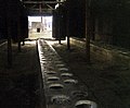 Latrine at Auschwitz II

Article(s): Auschwitz-Birkenau; Auschwitz concentration camp
Request:
- Hello! could you please tilt the image so the walls of the structure are parallel to the edges of the photo? Thank you. -- Diannaa (talk) 15:30, 18 August 2013 (UTC)
Graphist opinion(s):Rotate 1º and compensated for distortion; adjusted gamma inside and out, cropped. ![]() Done Centpacrr (talk) 17:09, 18 August 2013 (UTC)
Done Centpacrr (talk) 17:09, 18 August 2013 (UTC)
- Nice job with that Centpacrr. Brightness in and out is perfect. – JBarta (talk) 17:39, 18 August 2013 (UTC)
- Actually I prefer the darker version by User:Hohum, here. The brighter one looks grainy and weird on my display. I think the darker one suits the subject matter better too. I think we should revert to that version. Comments? -- Diannaa (talk) 17:56, 18 August 2013 (UTC)
- I have made the inside darker again but have retained the outside adjustment so that it is not washed out and you can see the other structures. The "graininess" is caused because that part of the image was underexposed as a result of there being a bright central portion for which the camera was trying to compensate. No matter how the image is adjusted it will be a compromise because of the stark contrast between the dark inside of the building and the outside that is in sunlight. I think this is a fair compromise although when viewed by the naked eye "in real life" it probably looks more like the previous lighter version as the human eye and brain's visual cortex are capable of compensating for a much wider gamma than is a camera.Centpacrr (talk) 18:13, 18 August 2013 (UTC)
- Actually I prefer the darker version by User:Hohum, here. The brighter one looks grainy and weird on my display. I think the darker one suits the subject matter better too. I think we should revert to that version. Comments? -- Diannaa (talk) 17:56, 18 August 2013 (UTC)
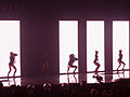
The Mrs. Carter Show World Tour edit
-

Watermarkedpicture -

Watermarkedpicture -
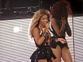
Watermarkedpicture -
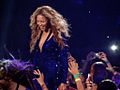
Watermarkedpicture -
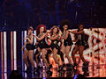
Watermarkedpicture
.jpg)


Article(s): The Mrs. Carter Show World Tour
Request:
- Can someone please remove the watermarks from this pictures? -- My love is love (talk) 01:24, 16 August 2013 (UTC)
Graphist opinion(s):
 |

|

|
Article(s): I Love Lucy
Request:
- Must the free SVG or PNG version of the logo be possible? I have two good sizable alternatives: [4][5]. -- George Ho (talk) 05:06, 19 August 2013 (UTC)
Graphist opinion(s):
- Done I've done this, George, I'll upload it in a short while. Begoon talk 08:57, 19 August 2013 (UTC)
- I had done and uploaded one, then came back here and saw your post Begoon. I guess now we'll have two ;-) Anyhow, while I wanted to give the heart a very faint and subtle gradient background, I'm not quite skilled enough to make the gradients shaped as you see in the originals... which follow the contours of the heart (more or less). If anyone can work a little magic and improve on the heart background, feel free. Then again, maybe getting too particular and copying the subtleties of the original too much will move the SVG from PD-text to a copyvio? I suppose that could be argued either way. – JBarta (talk) 09:09, 19 August 2013 (UTC)
- I played around with your gradient, but honestly, without using a lot of Illustrator special effects which embed bitmaps and bloat the file I can't make it look much better. What you've done is subtle enough that it works - maybe could be a little lighter just inside the heart border, but meh - it didn't make enough difference for me to want to upload anything. The bold heart border sort of suggests the gradient shape to the eye anyway, and makes it happen a bit when you look at it, and it looks fine to me. Begoon talk 10:23, 19 August 2013 (UTC)
- Just for fun I played with some concentric coloured hearts and a "blend" in Illustrator. The examples (far too strong) are in the history of JB's file (I should have put solid white behind the gradient, but you can see the shape of it) - BUT it pushes the file up to a whopping 270 kb for hardly any visual gain, so I reverted it as not worth it. Begoon talk 14:20, 19 August 2013 (UTC)
- Well, I managed the background... and learned a little in the process... and only 20KB. – JBarta (talk) 21:39, 21 August 2013 (UTC)
- Yeah, that's very nice - clipped to shapes, but the effect and the shape has to be right or it looks silly - there's art in that, even though it might not seem as tricky as it is to someone who hasn't done it. You should click the other tab(s) at the top of this page more often JB. Vectors can be fun... . Begoon talk 22:39, 21 August 2013 (UTC)
- Yeah, that's very nice - clipped to shapes, but the effect and the shape has to be right or it looks silly - there's art in that, even though it might not seem as tricky as it is to someone who hasn't done it. You should click the other tab(s) at the top of this page more often JB. Vectors can be fun...
- Well, I managed the background... and learned a little in the process... and only 20KB. – JBarta (talk) 21:39, 21 August 2013 (UTC)
I replaced the non-free title card with two logos in the article. Care to see the diff? --George Ho (talk) 07:10, 20 August 2013 (UTC)
- I changed it back (sorry). The earlier title card is far superior than the SVG of the lettering... and I would say that for most of these title images. Further, other wikis are more than welcome to upload a non-free title image of their own. The only reason one of these SVG's should be used in an infobox like that is 1) It is superior to a screenshot, or 2) A particular wiki does not allow a non-free image upload and the free SVG is better than nothing. – JBarta (talk) 15:41, 20 August 2013 (UTC)
Article(s): Quantum Leap
Request:
- Now with I Love Lucy and The Golden Girls done, maybe we must do something about this logo. -- George Ho (talk) 15:57, 19 August 2013 (UTC)
Graphist opinion(s):
- Changed the license for Quantum Leap (TV series) titlecard.jpg to {{PD-text}}. (IMO it doesn't meet the threshold of originality) It can be uploaded to Commons and anyone can use it. – JBarta (talk) 19:04, 20 August 2013 (UTC)
 |
.svg)
|
Article(s): M*A*S*H (TV series)
Request:
- A little help here? I found another alternative if the screen is too small: [6]
-- George Ho (talk) 16:03, 19 August 2013 (UTC)
Graphist opinion(s):
- Try MASH.svg on German wikipedia (link) Begoon talk 16:14, 19 August 2013 (UTC)
British "Harry Potter" logo edit
.svg)
Article(s): Harry Potter
Request:
- I found the British logo of "Harry Potter", but it is simple font, different from the American logo, used for films. Here are the hi-res version and the lo-res one. -- George Ho (talk) 16:42, 20 August 2013 (UTC)
Graphist opinion(s):
Dutch "Backertje" tram edit
-
 DSM tram loco (derivative)
 -
 (Bestand:Repro van DSM-station Coevorden 1906.jpg) Fullsize picture


Article(s): NZASM 10 Tonner 0-4-0T
Request:
- The detail tram locomotive picture was derived from the larger. Is it possible to improve the quality of the derivative? -- André Kritzinger (talk) 12:52, 22 August 2013 (UTC)
Graphist opinion(s):
- I enlarged it a bit and added some contrast. Whether it's an improvement is debatable. – JBarta (talk) 13:06, 22 August 2013 (UTC)
- I didn't expect too much - not much there to work with! Thank you. André Kritzinger (talk) 15:34, 22 August 2013 (UTC)
Straighten picture edit

Article(s): Pedro II of Brazil
Request:
- I know it's not a great picture but it's better than nothing. Could it be straightened? -- Lecen (talk) 19:23, 20 August 2013 (UTC)
Graphist opinion(s):
Exif fixing edit
Per this OTRS request, would someone be able to edit this and this file so that the name can be removed from the image data? Thanks! Kevin Rutherford (talk) 04:21, 21 August 2013 (UTC)
- Done -- I could not get to the OTRS ticket, but I assume you mean the name "Benedict" recorded as artist in the metadata. I removed all metadata from both files. (the small amount of metadata that remained was unimportant... so I just got rid of it) – JBarta (talk) 05:39, 21 August 2013 (UTC)
Orontes edit
Article(s): Orontes I
Request:
Graphist opinion(s):![]() Done Centpacrr (talk) 02:20, 24 August 2013 (UTC)
Done Centpacrr (talk) 02:20, 24 August 2013 (UTC)
File:Lichen planus lip.jpg brighter/crop please edit
-
 Lichen planus of lower labial mucosa.

Article(s): Lichen planus
Request:
- Too dark, can't see lesion on lower lip... please make brighter if possible. Might be difficult as I note that the camera glare has caught the lip, so increase in brightness might burn out the lip and destroy area of interest. Lesion is supposed to look like lacey white lines on red background. Please see if any improvement is possible,
- Also worth cropping out the text on the bottom of the image? And why not crop left margin to center area of interest too? Thank you. -- Lesion (talk) 20:36, 5 August 2013 (UTC)
Graphist opinion(s):
- Adjusted the colors and cropped. A bit of an improvement I suppose. If anyone can improve on it or get the colors to look more natural... go for it. – JBarta (talk) 21:00, 5 August 2013 (UTC)
Rosas 2.jpg edit


Article(s): Juan Manuel de Rosas
Request:
- Jbarta, could you something similar to this picture? --Lecen (talk) 17:52, 13 August 2013 (UTC)
Graphist opinion(s):
- I gave it a look, but couldn't get it to look much better than what's there already. – JBarta (talk) 18:37, 13 August 2013 (UTC)
- Yeah, I played with that one too, after you asked, and everyone has their own ideas of "what colour should look like" but I don't see it as obviously wrong, and couldn't improve on it enough to want to upload anything. Begoon talk 18:53, 13 August 2013 (UTC)
- Took a shot at it as well Lecen. If this is not what you are looking for feel free to revert. Centpacrr (talk) 19:08, 13 August 2013 (UTC)
- That's actually probably a bit of an improvement. The original was arguably a bit oversaturated. Quite subjective on these, but I like your version, Centpacrr. Begoon talk 19:26, 13 August 2013 (UTC)
- I disagree. While there is certainly room for improvement, I think Centpacrr's edit made it worse. The face especially is awful. Doing something with an eye for improvement is a wonderful thing... doing something just to say we did it is not. – JBarta (talk) 21:30, 13 August 2013 (UTC)
- Yes of course you think it's "worse", Jbarta, as you can never seem to be able to comment on the contributions of others in here without being condescending and/or dismissive. (NIH factor again, or perhaps you just need to finally calibrate your monitor.) Oh well I guess we'll all have to just live with that particular penchant of yours. I posted this as a suggestion and told Lecen if it was not what he wanted to revert it, so why not let the him as the OP requester decide. In the meantime if you don't think you can add anything constructive why not just say nothing at all, or at least showing that you are able to assume good faith on the part of WP's other contributors. Centpacrr (talk) 22:41, 13 August 2013 (UTC)
- I agree with everybody - and I think we're all probably wrong, too... Does that help?
- Joking apart - I added the version I played with earlier, for us all to love or hate... As I said earlier, it probably doesn't improve. Begoon talk 05:54, 14 August 2013 (UTC)
- Your version looks equally valid to me, Begoon, and gives the OP another completely acceptable option to choose from. Don't allow yourself to be put off by Jbarta's comments, however. This is just his/her general style of dealing with other contributors and their efforts in this project which if they are not exactly the way that he/she likes (and they virtually never are), they are by his/her definition always "worse", "awful", "disruptive", probably "pilfered", and/or have been posted in bad faith ("Doing something with an eye for improvement is a wonderful thing... doing something just to say we did it is not."), and generally expresses that by way of mean spirited, condescending, and/or dismissive comments about the efforts of his/her fellow volunteer WP contributors. (Jbarta will, of course, deny all this and feign innocence from behind his/her veil of anonymity, but the discussion sections in this project's archives are replete with similar examples for anyone to review for themselves. He/she also doesn't like other editors to defend and/or explain their work which Jbarta dismisses as "endless argument" not worth even being read or responded to.)
- I agree with everybody - and I think we're all probably wrong, too... Does that help?
- Yes of course you think it's "worse", Jbarta, as you can never seem to be able to comment on the contributions of others in here without being condescending and/or dismissive. (NIH factor again, or perhaps you just need to finally calibrate your monitor.) Oh well I guess we'll all have to just live with that particular penchant of yours. I posted this as a suggestion and told Lecen if it was not what he wanted to revert it, so why not let the him as the OP requester decide. In the meantime if you don't think you can add anything constructive why not just say nothing at all, or at least showing that you are able to assume good faith on the part of WP's other contributors. Centpacrr (talk) 22:41, 13 August 2013 (UTC)
- I disagree. While there is certainly room for improvement, I think Centpacrr's edit made it worse. The face especially is awful. Doing something with an eye for improvement is a wonderful thing... doing something just to say we did it is not. – JBarta (talk) 21:30, 13 August 2013 (UTC)
- That's actually probably a bit of an improvement. The original was arguably a bit oversaturated. Quite subjective on these, but I like your version, Centpacrr. Begoon talk 19:26, 13 August 2013 (UTC)
- Took a shot at it as well Lecen. If this is not what you are looking for feel free to revert. Centpacrr (talk) 19:08, 13 August 2013 (UTC)
- Yeah, I played with that one too, after you asked, and everyone has their own ideas of "what colour should look like" but I don't see it as obviously wrong, and couldn't improve on it enough to want to upload anything. Begoon talk 18:53, 13 August 2013 (UTC)
- I gave it a look, but couldn't get it to look much better than what's there already. – JBarta (talk) 18:37, 13 August 2013 (UTC)
- He/she still does not accept that there are always more than one valid way to edit image files and therefore always takes the position that he/she should be the final arbiter (sort of "Editor in Chief") if there is any disagreement with his/her approach by unilaterally reverting those efforts of others. I have no problem with differing views and constructive criticism as that helps make for the best possible results for everybody concerned, but disagreement always expressed disagreeably, dismissively, and with unsupported speculation about the motives (or even mental health) of the other WP contributors is counterproductive and disruptive, and tends to result in just the opposite. Centpacrr (talk) 14:01, 14 August 2013 (UTC)
- Actually, I will add something. You made an effort to improve the image, and yes I was a little harsh. While I'm entitled to offer an opinion on the quality of the edit, I was out of line in suggesting that you did it just to do it. It occurs to me I sometimes do the same thing and sometimes the effort doesn't come off so well. So I'll apologize for that half of the comment and say folks should always upload whatever effort they wish... be it good, bad or ugly. – JBarta (talk) 15:52, 14 August 2013 (UTC)
Paul Ignatius edit

_titlecard.jpg)
_(2).jpg)
![[5]](http://clynnlars.files.wordpress.com/2012/05/i-love-lucy-title-screen-cbs-via-wikipedia.jpg)
_titlecard.jpg)
![[6]](http://4.bp.blogspot.com/-c6Fcm93FMSA/T3UyApQaeVI/AAAAAAAAIV8/ien9ydSZdaM/s1600/titlecard.jpg)
Article(s): Paul Robert Ignatius
Request:
- Please brighten this image and improve as much as possible. -- Երևանցի talk 23:41, 21 August 2013 (UTC)
Graphist opinion(s):
Bultaco edit
Article(s): Bultaco
Request:
- Distracting and weird to have two of the same logo, one overlapping the other. crop out best one. transparent png, please. -- Kintetsubuffalo (talk) 00:09, 25 August 2013 (UTC)
Graphist opinion(s):
- Done I did use another image from elsewhere to visually help me clean up and pick out details, but to all intents and purposes it's cropped from that, for licensing, your honour. Begoon talk 05:08, 25 August 2013 (UTC)
- Thank you sir! Nice to see the smile!--Kintetsubuffalo (talk) 07:27, 25 August 2013 (UTC)