Wikipedia:Graphics Lab/Photography workshop/Archive/Apr 2013
Stale edit
Resolved edit
Many watermarks edit
This is a general request for a large number of pictures, namely all the contributions of this user: [1]. All of these have a watermark near the bottom that is a link to a company's website.
Request: Is it doable in some way to make these contributions suitable for use in wikipedia without this watermark? What are the options? --VanBurenen (talk) 14:12, 8 March 2013 (UTC)
Graphist opinion(s):
The option at this point is to leave them. Unfortunately, one of the problems Commons suffers from is lack of a good and strong watermark policy. Guidelines are written in such a way as to give uploaders the impression that watermarks might be ok. I went and tagged them {{watermark}} which will add them to the huge mountain of other watermarked images. As far as removing the watermarks, there are two options... some sort of mass crop (don't even know if that's possible) which will remove the bottoms of the images (not an appealing idea), or whittle away at the watermarks one at a time as the images are used. For now, they will simply sit on Commons unused. Used even less because of the watermarks actually. In an amateurish effort to bring attention to his web site, the uploader has ensured that even fewer of his images will ever see the light of day. – JBarta (talk) 15:39, 8 March 2013 (UTC)
- Someone has nominated one of his watermarked images for deletion and cited the reason as "advertising". May make for interesting discussion... or not. – JBarta (talk) 16:11, 15 March 2013 (UTC)
- I pointed all deletion discussions regarding this uploader's files to one common request. – JBarta (talk) 23:30, 15 March 2013 (UTC)
- If somebody is able to automaticly crop off the bottoms of these images than that would be a perfect solution in my opinion. Indeed a small part of the image is lost. But if somebody wants to do a better crop on a later moment this is always possible based on the current version. Basvb (talk) 15:05, 17 March 2013 (UTC)
- I pointed all deletion discussions regarding this uploader's files to one common request. – JBarta (talk) 23:30, 15 March 2013 (UTC)
Jon Hinson edit

Article(s): Jon Hinson
Request: If possible, please remove the green line in the middle of the image. Thanks. Delaywaves • talk 01:43, 28 March 2013 (UTC)
Graphist opinion(s):
![]() Done – JBarta (talk) 02:32, 28 March 2013 (UTC)
Done – JBarta (talk) 02:32, 28 March 2013 (UTC)
Pouvanaa a Oopa edit
-

-
 cropped
.JPG)
_(cropped).JPG)
Article(s): Tahitians
Request: Crop a smaller profile image, so it can fit in the table for the Tahitian article... KAVEBEAR (talk) 18:59, 30 March 2013 (UTC)
Graphist opinion(s):
![]() Done – JBarta (talk) 02:07, 31 March 2013 (UTC)
Done – JBarta (talk) 02:07, 31 March 2013 (UTC)
Churchill and Abdullah edit
-

-
 (Centpacrr's) Derivative
Moved to Commons (under a different name)

.jpg)
Article(s): Abdullah I of Jordan, History of Palestine
Request: A really nice old photo that could stand a bit of a crop and some light cleanup. I would suggest that the starting point be the high-res TIFF from the LOC as the current JPG has been moderately compressed. Also, maybe rotate to the left a little and/or slight perspective correct? – JBarta (talk) 02:02, 1 April 2013 (UTC)
Graphist opinion(s):
Very nice job Centpacrr. I touched up a few more spots and darkened one of the guy's shoes... minor stuff. I'll put your derivative in the articles. ...though I really wish you would upload to Commons like everyone else. – JBarta (talk) 11:03, 3 April 2013 (UTC)
John X of Antioch edit
-
 Original image
 -
 Original image cropped (currently used in article)
 -
 Centpacrr's edit
 -
 JBarta's edit
 -
 nagualdesign's edit


Article(s): John X of Antioch
Request: Can anything be done about the reflection in his glasses? January (talk) 17:39, 25 March 2013 (UTC)
Graphist opinion(s):Done (NOTE: Despite the requester's marking the original fix that I did to this image "Resolved", another editor keeps altering it so that the image subject's vestments are stygian black and thus no longer distinguishable (apparently being unfamiliar with the concept that even dark cloth reflects light) and engaging in other "second guessing", a practice in which this particular user engages in both this and the Commons Graphics Lab project on almost every image that has earlier been worked on by any editor other than him/herself. This is unhelpful to the project, when engaged in to this extent (virtually every request) constitutes disruptive behavior, and constantly reverting other editors' contributions multiple times insisting that his/her version is the only acceptable one is also "edit warring" and thus a violation WP:3RR. Centpacrr (talk) 00:16, 26 March 2013 (UTC))
- I'll respond to your point about dark cloth reflecting light which is a good point, and one I checked before reverting the excessive and uneven gamma correction of your edit. First, the Commons image above was taken in lower light indoors and the image you link to was taken outdoors. BIG difference. Also, if you look at images in general of this person, you'll see the robe is generally black. Ideally I think it doesn't need to be lightened any more. That said, if it's really that important to you, I would tolerate the robe being *a little* lighter, but not as light as you originally made it, and as long as it's done evenly. If you can't see the uneveness, look closely at his chest in between the chains on your edit and see the shading difference. Also, please lighten from my edit as I fixed the eye you slightly mangled and cleaned up more reflections on the glasses which really don't need to be there. – JBarta (talk) 03:05, 26 March 2013 (UTC)
- As for the image, the room may have been dark, but the picture appears to me to have most likely been taken with a flash which would have been reflected by the cloth thus showing detail of the garment. In addition the very structure of the vestments is also potentially of interest to readers of the article and as the digital information that show this is in the picture then it deserves to be made visible. The way you have adjusted the image is to instead make it just a pit of stygian darkness showing nothing whatever of his vestments is not only unnecessary but hides valuable and relevant infomation.
- Removing the highlights from the glasses, while a "small" thing, is also totally unnecessary nit picking and it also changes the "reality" (which ironically you always seem to think is so important to never alter) of the rounded shape of the frames. The request made by the editor who posted the image in here was to remove the flash reflection from the lens of the glasses which is what I did. Your view that his eye was "mangled" is just that -- your view. I disagree but as it is covered in the original image by the glare on the glasses your contention that it is mangled is also once again just your personal speculation. I used the inner portion of his right eye to reconstruct the missing portion of the left eye, and did so in a way that did not make the image "unacceptable" as a representation of his eye. You may disagree but that does not make you "right" and me "wrong".
- That being said let me now address the real point I am making in here which is not the details of this particular image but instead is your overall attitude displayed in here that you must always not only have the final say on every request made in this project, but also that you will not continence any different view of anybody else. Quite frankly I find your behavior in here is more akin to that of a bully than that of a collaborative editor. I suggest that you take a look at the final long comment that I posted a few days ago about this very issue here which you have ignored up to now. I have continually tried to give you the benefit of the doubt and assume good faith on your part for more than a year now only to be slapped down again and again by your frequently condescending and/or dismissive remarks and you editing without consideration or the views of anyone other than yourself. This is to say that I am really not going to put up with that any more.
- There ia always more than one way to do things, and neither you nor anyone else gets to be the "final arbiter" on everything in here is done. There are lots of things you have done to images in here that I haven't agreed with and find to be "inferior" but I have not changed them because they were also not out of what seemed to me to be generally acceptable. This project is not about who can "pick the most nits" or who is the most determined wikilawyer. It is instead a collaborative effort in which each editor does things his or her own way, and just because that is not the way another editor may have done so as long as it is accomplished within the policies, guidelines, and general community accepted standards of WP it does not give you or anyone else a carte blanche "right" to trump what other editors do that doesn't exactly fit your personal taste or approach.
- Mutual respect for the work of others will make things in here much easier on everybody. WP doesn't really need any Mitch McConnells or Ted Cruzs in here to determine and enforce their personal culture of "not invented hereism" on everybody else. This is the kind of behavior that eventually drives many worthwhile contributors away from WP, but I am not going to allow you or anybody else do that to me. Now I expect I am a good bit older than you are although I have no way of telling as you have declined to disclose anything at all useful about yourself (not even your gender) which is, of course, your "right" in WP. (The only thing you ever did say about yourself was to claim that you were a former organized crime assassin who lives in New Jersey under the Federal Witness Protection Program which is apparently untrue.) I, on the other hand, believe that such disclosure by editors about themselves is not only a simple matter of common courtesy, but an essential element of showing "good faith" to the community. You are, of course, free to disagree but you should understand that this is where I am coming from and how I contribute in WP is based on that premise. After all, no published encyclopedia or credible reference work published in the world other than Wikipedia keeps who its writers and contributors are a secret. It is the very disclosure of who they are that gives the reference work credibility.
- So please keep this in mind in all future interactions with me on WP. If you behave inappropriately toward me I will call you on it, and if you continue to behave anti-collaboratively in here and try to impose you will on me and others for your own reasons then I will call you on that too. I would much rather that we work together in here for the benefit of all, but if you are not able to "play nice" then you can expect no further quarter or assumption of good faith from me. Centpacrr (talk) 05:06, 26 March 2013 (UTC) (NOTE: I reserve the option in advance to make modifications to this comment if I feel it would be useful for clarity whether or not it has been "responded to" in the interim.)
- You are neither required to read this nor to respond to it, but I will tell you that it explains exactly how I plan to deal with you in here in the future and why. If you are not interested in knowing then that is up to you, but this will not change anything on my part so don't tell me in the future that you are either surprised or don't understand. I will tell you here, however, that the dismissiveness in your decision to ignore this only reinforces my views on the matter. The ball is in your court. Centpacrr (talk) 05:59, 26 March 2013 (UTC)
- As someone else pointed out, if you put as much effort into editing images as you do arguing and prattling on and fine-tuning your comments, you wouldn't have half the problems here that you do. And just to be clear, there is no such thing as "collaboration" with you. You go on and on and on with ceaseless argument, half-truths, claims of persecution and nonsensical tirades with no end or resolution in sight. I'm not sure why I'm telling you this because it surely won't have any effect... I guess because despite all the BS, you do sometimes do fine work and you do sometimes show glimmers of being able to get along with others. Plus I have no doubt that you are a decent person. If you keep on doing what you're doing you'll keep on getting what you got. – JBarta (talk) 17:08, 26 March 2013 (UTC)
- I am disappointed (but not surprised) that you have yet again so completely missed the point and have chosen instead to once again not respond to the actual points that I have raised but instead only with more condescension and invective. You are, of course, entitled to you own views as I am to mine which I have stated in detail above and elsewhere. Unless and until you are actually willing to address the substance of the issues, however, as opposed to just complaining about how they are raised I guess we are at an impasse to resolving anything. I stand by what I have said above and will proceed accordingly. Centpacrr (talk) 17:33, 26 March 2013 (UTC)
- As someone else pointed out, if you put as much effort into editing images as you do arguing and prattling on and fine-tuning your comments, you wouldn't have half the problems here that you do. And just to be clear, there is no such thing as "collaboration" with you. You go on and on and on with ceaseless argument, half-truths, claims of persecution and nonsensical tirades with no end or resolution in sight. I'm not sure why I'm telling you this because it surely won't have any effect... I guess because despite all the BS, you do sometimes do fine work and you do sometimes show glimmers of being able to get along with others. Plus I have no doubt that you are a decent person. If you keep on doing what you're doing you'll keep on getting what you got. – JBarta (talk) 17:08, 26 March 2013 (UTC)
- You are neither required to read this nor to respond to it, but I will tell you that it explains exactly how I plan to deal with you in here in the future and why. If you are not interested in knowing then that is up to you, but this will not change anything on my part so don't tell me in the future that you are either surprised or don't understand. I will tell you here, however, that the dismissiveness in your decision to ignore this only reinforces my views on the matter. The ball is in your court. Centpacrr (talk) 05:59, 26 March 2013 (UTC)
It seems Fastily has waded into the pool by reverting the original image back to its original state and uploading both my edit and Centpacrr's edit as derivative files. I'm not sure how helpful that is... now all the articles across several wikis must be changed to use one or the other derivatives. And if push comes to shove, the argument is now moved to the articles. I quit here. I'm done with this image. The requester, maintainer's of the articles, Centpacrr or even Fastily can do as they wish with them with no further argument from me. – JBarta (talk) 03:40, 27 March 2013 (UTC)
- FWIW I did not contact any admin(s) with regard to this image, nor did I request that any changes be made or derivative files of it be created. I made my case above and had left it at that. Centpacrr (talk) 04:06, 27 March 2013 (UTC)
- You mentioned it to Penyulap after Penyulap gave you a spiffy award and then Penyulap asked Fastily to "split the history" and Fastily did so... calling it the "lamest edit war ever". I'm still wondering which of us is the lamest ;-) – JBarta (talk) 04:20, 27 March 2013 (UTC)
- I mentioned a public discussion to Penyulap for him to read and that's all I expected him to do. I neither asked nor anticipated that he (or anyone else) would do anything at all beyond that. I also had no idea that he had (or would) subsequently ask an admin to take any action, nor was I aware of any of this (including that he had posted response) until I saw your comment above (03:40, 27 March 2013) when I go home from working on a network telecast of an NHL hockey game in Philadelphia tonight. I don't see how splitting and posting these derivatives is useful either, nor had I ever heard of the process ("splitting the history") carried out to do so. So I'm afraid in this case your paranoia runneth over. I am not and never have been responsible for the editing actions of anyone other than my own, nor have I ever asked another editor to take any such actions on my behalf. Centpacrr (talk) 06:44, 27 March 2013 (UTC)
- To be clear, there's no "paranoia" here. Just stating the events that ended in "the split". I don't hold you accountable for Fastily's actions, I hold Fastily accountable. I don't hold you accountable for Penyulap's actions. Actually I don't really hold Penyulap accountable even for himself... he's quite a character and he might be controlled by forces beyond our mortal understanding. I only hold you accountable for you Centpacrr... only you. – JBarta (talk) 07:01, 27 March 2013 (UTC)
- I have absolutely no problem at all being held accountable for my actions, and that is also why whenever they may be questioned by anyone I will explain exactly the "what and why" for them in detail. Reciprocally I always hope that others will be equally forthcoming and willing to be held accountable for their actions as well, and when similarly questioned to directly address the issues raised as opposed to ignoring them and instead simply inveighing against those who have raised the issues as, for instance, in the discussion immediately above as well as here, and here and here, a practice which is unfortunately far too often the case on WP. Centpacrr (talk) 07:36, 27 March 2013 (UTC)
- To be clear, there's no "paranoia" here. Just stating the events that ended in "the split". I don't hold you accountable for Fastily's actions, I hold Fastily accountable. I don't hold you accountable for Penyulap's actions. Actually I don't really hold Penyulap accountable even for himself... he's quite a character and he might be controlled by forces beyond our mortal understanding. I only hold you accountable for you Centpacrr... only you. – JBarta (talk) 07:01, 27 March 2013 (UTC)
- I mentioned a public discussion to Penyulap for him to read and that's all I expected him to do. I neither asked nor anticipated that he (or anyone else) would do anything at all beyond that. I also had no idea that he had (or would) subsequently ask an admin to take any action, nor was I aware of any of this (including that he had posted response) until I saw your comment above (03:40, 27 March 2013) when I go home from working on a network telecast of an NHL hockey game in Philadelphia tonight. I don't see how splitting and posting these derivatives is useful either, nor had I ever heard of the process ("splitting the history") carried out to do so. So I'm afraid in this case your paranoia runneth over. I am not and never have been responsible for the editing actions of anyone other than my own, nor have I ever asked another editor to take any such actions on my behalf. Centpacrr (talk) 06:44, 27 March 2013 (UTC)
- You mentioned it to Penyulap after Penyulap gave you a spiffy award and then Penyulap asked Fastily to "split the history" and Fastily did so... calling it the "lamest edit war ever". I'm still wondering which of us is the lamest ;-) – JBarta (talk) 04:20, 27 March 2013 (UTC)
I know I said I was through with this image, but I'd like to add one more comment. Centpacrr, I see you went and edited the original image and modestly lightened the robe. Personally I find that lightening perfectly satisfactory. If you were to crop that and upload it over your earlier edit I think it would be a great choice for use in the article. The eye and glasses are minor issues and I won't quibble over that. – JBarta (talk) 20:37, 27 March 2013 (UTC)
I have to agree that the lightening of the robes is entirely unnecessary, and I thought I might demonstrate another methodology. It's just a suggestion. Please compare the 3 successive edits I uploaded of a derivative file. What I'm trying to demonstrate is not only my personal taste of what particular adjustments to make, but also an example of good practice (IMO) in collaboration. First, when in doubt, upload a derivative. That way no-one gets pissy about having their work 'overwritten'. Then enable others to work on your edits by uploading incremental changes. Upload a cropped/cleaned copy first without any contrast/gamma/colour adjustments. That way if other editors are unhappy with one change they can keep the others, or recombine the uploads and make further adjustments for consideration. I mean, you could upload in one fell swoop if you're confident in your edit, but if you're going to try some (possibly OTT) slider adjustment after spending a long time flyspecking your single contribution might be rendered useless. Finally, be willing to discuss any edits just as with editing articles, and tend toward the majority view (consensus) when finalizing an edit. Oh, and invite comment from those not already involved in a discussion by not letting a dialectic turn into a diatribe. Other editors whose opinion might settle any arguments (by voting logic) are no doubt put off voicing their opinion if we appear to be scent marking our contributions or defending our own efforts overzealously. ..My only comment about my own final upload is that it could stand more cropping. I just wanted to work with the maximum amount of material before making any kind of destructive edit. Another example of good practice (IMO). Regards, nagualdesign (talk) 04:41, 31 March 2013 (UTC)
- By the way, I don't like what either of you have done to his right eye. It's altered the character of his facial expression and there was no need to touch it anyway. The only image with his eye still intact, apart from my upload, is the cropped version currently used in articles. But that one still has the large reflection in his glasses. nagualdesign (talk) 05:00, 31 March 2013 (UTC)
- Well, at the risk of diving back into this again and stirring up another mess, I've decided that it's a shame to let the article just sit with the old bad picture in it. So... I've redone my edit from scratch, making the robe about as light as Centpacrr's edit of the original. Also carefully editing the eye that I hope nagualdesign will find satisfactory. I'll change the en:WP article to use my edit and change the other wikis later if there is no objection. Hopefully everyone is happy with this compromise and the article will finally get a decent image and we can put this one behind us. – JBarta (talk) 22:40, 1 April 2013 (UTC)
- Actually, it was his right eye that I didn't like. There's no specular reflection in his right eye on the original image because that eye opens slightly less than his left eye. This adds a subtle but very distinct character to his expression (some might call it a 'lazy eye'), which is lost when the highlight is added back in artificially. Also, I'd done some noise reduction and separately white balanced the background and foreground. Perhaps you'd like to take my edit, fiddle with gamma/curves adjustments (to appease Centpacrr), crop it slightly and see how it looks? At the very least it will be less noisy. Regards, nagualdesign (talk) 12:57, 2 April 2013 (UTC)
- ...I just tried a slight curves adjustment to my own upload but I couldn't bring myself to upload it. Frankly, the guy is dressed in black. Not grey, black. It's plain to see that his cane and his sleeve are a much darker black, and I can easily distinguish the folds and contours of his robes without any adjustments. If his robes are 'stygian' then what is his cane?! Are we not simply pandering to Centpacrr here because he kicked up a stink, running to other editors to have a moan? Well I don't care much for it. If we had a picture of a black cat in a coal mine would we have to make the whole picture dark grey just because one editor can't seem to adjust his monitor profile correctly?! I'd much rather invite other editors to say what they think is right, one way or the other. nagualdesign (talk) 13:13, 2 April 2013 (UTC)
- On the issue of the eye, I didn't realize the original image had no reflection in his right eye. I thought I had accidentally edited it out. I reverted my edit back to the original. As far as the robe color, in my edit, do you think it's too light? Or can you live with it the way it is? – JBarta (talk) 14:56, 2 April 2013 (UTC)
- Sure, I could live with it. Although it's boosted the noise level. As far as it (the original) being "a pit of stygian darkness showing nothing whatever of his vestments", that's just bunkum. I can see every detail. I think the 'problem' here is that the background on the right side is also quite dark, so the shoulder gets a little lost. Perhaps some editing to the background would remedy this? And perhaps I should also point out that having the sleeve of the other guy in the cropped image is a bit of a no-no. Let me give my edit another tweek and see what you think... nagualdesign (talk) 16:55, 2 April 2013 (UTC)
- The other guy's sleeve can be edited out easily if necessary. – JBarta (talk) 17:15, 2 April 2013 (UTC)
- Yep. ..So I did a couple of edits. Let me know what you think. Having had a play with the blacks I'd say that raising the gamma doesn't even address the (non)issue of not showing the detail in his vestments. In order to increase contrast in the blacks it's better to apply an S-curve to that portion of the histogram. (ie, make the highlights lighter and the blacks darker.) nagualdesign (talk) 17:25, 2 April 2013 (UTC)
- Personally I think yours is too dark. I had no problem making the robes lighter and a little easier to see... just not as light as Centpacrr's edit. At this point honestly, I'm losing interest other than a desire to have in the article an image that has the reflection on the glasses fixed and a robe that is basically black. – JBarta (talk) 17:56, 2 April 2013 (UTC)
- Fair enough. Contributing to WP is supposed to be an enjoyable experience. If you want to put your latest edit into the article(s) and be done with it you'll get no complaints from me. For the record I don't think this was the 'lamest edit war ever', I think the points you raised were entirely appropriate. It's a shame that an admin (Fastily) saw fit to wade in with a transparently one-sided and useless 'resolution' rather than simply trying to mediate. nagualdesign (talk) 18:43, 2 April 2013 (UTC)
- Well, in defense of Fastily, I disagree it was "one sided". His effort was neutral and he felt he was solving a problem. Whether or not it really solved a problem or that it was a helpful effort is debatable IMO. But I don't believe he was choosing sides. As far as his quip "lamest edit war ever", we'll just do ourselves a favor and forget about that bit. – JBarta (talk) 20:09, 2 April 2013 (UTC)
- Fair enough. Contributing to WP is supposed to be an enjoyable experience. If you want to put your latest edit into the article(s) and be done with it you'll get no complaints from me. For the record I don't think this was the 'lamest edit war ever', I think the points you raised were entirely appropriate. It's a shame that an admin (Fastily) saw fit to wade in with a transparently one-sided and useless 'resolution' rather than simply trying to mediate. nagualdesign (talk) 18:43, 2 April 2013 (UTC)
- Personally I think yours is too dark. I had no problem making the robes lighter and a little easier to see... just not as light as Centpacrr's edit. At this point honestly, I'm losing interest other than a desire to have in the article an image that has the reflection on the glasses fixed and a robe that is basically black. – JBarta (talk) 17:56, 2 April 2013 (UTC)
- Yep. ..So I did a couple of edits. Let me know what you think. Having had a play with the blacks I'd say that raising the gamma doesn't even address the (non)issue of not showing the detail in his vestments. In order to increase contrast in the blacks it's better to apply an S-curve to that portion of the histogram. (ie, make the highlights lighter and the blacks darker.) nagualdesign (talk) 17:25, 2 April 2013 (UTC)
- The other guy's sleeve can be edited out easily if necessary. – JBarta (talk) 17:15, 2 April 2013 (UTC)
- Sure, I could live with it. Although it's boosted the noise level. As far as it (the original) being "a pit of stygian darkness showing nothing whatever of his vestments", that's just bunkum. I can see every detail. I think the 'problem' here is that the background on the right side is also quite dark, so the shoulder gets a little lost. Perhaps some editing to the background would remedy this? And perhaps I should also point out that having the sleeve of the other guy in the cropped image is a bit of a no-no. Let me give my edit another tweek and see what you think... nagualdesign (talk) 16:55, 2 April 2013 (UTC)
- On the issue of the eye, I didn't realize the original image had no reflection in his right eye. I thought I had accidentally edited it out. I reverted my edit back to the original. As far as the robe color, in my edit, do you think it's too light? Or can you live with it the way it is? – JBarta (talk) 14:56, 2 April 2013 (UTC)
- Well, at the risk of diving back into this again and stirring up another mess, I've decided that it's a shame to let the article just sit with the old bad picture in it. So... I've redone my edit from scratch, making the robe about as light as Centpacrr's edit of the original. Also carefully editing the eye that I hope nagualdesign will find satisfactory. I'll change the en:WP article to use my edit and change the other wikis later if there is no objection. Hopefully everyone is happy with this compromise and the article will finally get a decent image and we can put this one behind us. – JBarta (talk) 22:40, 1 April 2013 (UTC)
- As I have not done anything to this image for more than a week nor have I touched at all either of the versions the two of you are currently fiddling with, I am unclear as to why you find it necessary to continue to make dismissive references in your various comments since then to views I expressed long ago on a completely different version of the image that is not being used anywhere. I also never requested nor expected that the "splitting the history" procedure would be done, nor, for that matter, had I ever even heard of this process. Therefore if you still want to keep bringing me up in this discussion, then the most appropriate and helpful way to do so would be to address the real underlying issues I that I actually raised at considerable length both above (at 05:06 on March 26) as well as on March 19 in the discussion of the Farrell image which both of you have chosen to completely ignore. If not then please leave me out of further discussions of this image as I am no longer involved with it and have not been so for more than a week. Centpacrr (talk) 18:35, 2 April 2013 (UTC)
- I mentioned the issue you raised about the robes being 'stygian black', which I disagree with. I couldn't care less about the other issues you raised. I only wanted to discuss the image, not the editors. If you have anything to say about that then say it, if not let's just leave it there. nagualdesign (talk) 18:43, 2 April 2013 (UTC)
- I have no problem with disagreement among editors and encourage it as long as it is not done disagreeably. However you seem to me to view many such "disagreements" with a zero-sum mentality while I don't as I believe that in any subjective endeavor such as digital image editing that there are many valid final results. It appears to me, for instance, that you like to demphasize gamma in images whereas I prefer to make details they can reveal visible in many circumstances. Both approaches are valid. The same can be said as to color saturation, sharpness, texture, cropping, tone, and many other factors. As my views on this relating to this image are no longer a relevant issue as I withdrew from working on it more than a week ago, however, I'm puzzled why you keep bringing it up. As for the other issues I raised which are mostly (although not exclusively) addressed to the other editor, If you don't want to comment on these then that's up to you. Centpacrr (talk) 19:33, 2 April 2013 (UTC)
- I mentioned the issue you raised about the robes being 'stygian black', which I disagree with. I couldn't care less about the other issues you raised. I only wanted to discuss the image, not the editors. If you have anything to say about that then say it, if not let's just leave it there. nagualdesign (talk) 18:43, 2 April 2013 (UTC)
Updated the rest of the wikis with File:Patriarch John X of Antioch 2.jpg and marked this section {{resolved}}. – JBarta (talk) 22:59, 5 April 2013 (UTC)
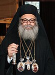
Alois Weber edit
.jpg)
Article(s): Alois Weber (general)
Request: Anyone want to try and remove the watermark? Start from the source image if you wish. Just remember to resize it back down to 0.1 megapixels as it's a non-free image. – JBarta (talk) 05:45, 4 April 2013 (UTC)
Graphist opinion(s):wmr (see here until servers update] — Preceding unsigned comment added by Centpacrr (talk • contribs)
Well done Centpacrr. You did a great job on the texture of his jacket. A nice touch. – JBarta (talk) 17:53, 4 April 2013 (UTC)
-
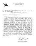 Navy commendation
 -
 Converted to .jpg

_Navy_Unit_Commendation_Citation_2004-2005_Iraq.jpg)
Article(s): Not presently in use
Request: The image looks squished when viewing as a thumbnail, but is fine when viewed full-size. If it could be extracted from the PDF format and made more presentable it might be a useful item to retain. Thanks. Dianna (talk) 14:18, 6 April 2013 (UTC)
Graphist opinion(s):![]() Done — Preceding unsigned comment added by Centpacrr (talk • contribs)
Done — Preceding unsigned comment added by Centpacrr (talk • contribs)
Palatal cysts of the newborn edit

Article(s): Palatal cysts of the newborn
Request: Please crop image to area of interest (i.e. the mouth). Thank you. Lesion (talk) 16:41, 6 April 2013 (UTC)
Graphist opinion(s):Cropped as requested (display of new version delayed owing to server update lag) — Preceding unsigned comment added by Centpacrr (talk • contribs)
Adm. Worth Bagley edit
-

-
 Restored image

.jpg)
Article(s): Worth H. Bagley
Request: So I had been looking for ages for a photo of Admiral Worth Bagley until I came across this today. Is there any chance someone could have a go at removing the watermark, cropping it and fixing the tint in the top right corner? Thanks so much! – Connormah (talk) 23:40, 10 April 2013 (UTC)
Graphist opinion(s):Monochrome restoration posted — Preceding unsigned comment added by Centpacrr (talk • contribs)
New image is now at Commons where it should have been uploaded as a derivative image in the first place. – JBarta (talk) 02:21, 11 April 2013 (UTC)
HP Envy x2 edit
-
 HP Envy x2 convertible
 -
 edit
edit

.jpg)
Article(s): HP Envy
Request: Remove background and MacBook Pro from image. RaviC (talk) 12:51, 31 March 2013 (UTC)
Graphist opinion(s): Surely you could find a better image of this laptop than one taken with an iPhone that clips the corners of the laptop? Perhaps one of the HP Envy not sitting on top of another laptop. nagualdesign (talk) 23:21, 31 March 2013 (UTC) ...This one, for example. nagualdesign (talk) 23:25, 31 March 2013 (UTC)
- Cannot use that particular image from Flickr. It allows no derivative images. Within the Flickr images that are allowed on Commons, the pickins are slim. – JBarta (talk) 00:03, 1 April 2013 (UTC)
- Why make a derivative at all? The image looks useable as is, no? nagualdesign (talk) 00:25, 1 April 2013 (UTC)
- No, you misunderstand. In order for an image to be uploaded to Commons, one of the requirements is that there are no restrictions on anyone now or in the future to make a derivative of it. That particular image on Flickr has a license that prohibits derivative versions... so we can't use it. Even if we plan to use it with no alterations, the permission must be there to alter it if we wish. I think it's lame for the Flickr uploader (Intel?) to put such restrictions on it. If they didn't, that fine image would now be gracing the HP Envy article on Wikipedia, one of the most heavily trafficked web sites in the world. Instead, the nice image sits in obscurity on Flickr and what everyone sees in the article is a crappy snapshot. In an effort to "protect" themselves they shoot themselves in the foot. Good going. – JBarta (talk) 00:59, 1 April 2013 (UTC)
- I see. Thanks for explaining. nagualdesign (talk) 01:22, 1 April 2013 (UTC)
- No, you misunderstand. In order for an image to be uploaded to Commons, one of the requirements is that there are no restrictions on anyone now or in the future to make a derivative of it. That particular image on Flickr has a license that prohibits derivative versions... so we can't use it. Even if we plan to use it with no alterations, the permission must be there to alter it if we wish. I think it's lame for the Flickr uploader (Intel?) to put such restrictions on it. If they didn't, that fine image would now be gracing the HP Envy article on Wikipedia, one of the most heavily trafficked web sites in the world. Instead, the nice image sits in obscurity on Flickr and what everyone sees in the article is a crappy snapshot. In an effort to "protect" themselves they shoot themselves in the foot. Good going. – JBarta (talk) 00:59, 1 April 2013 (UTC)
- Why make a derivative at all? The image looks useable as is, no? nagualdesign (talk) 00:25, 1 April 2013 (UTC)
I isolated the laptop, but didn't edit any further than that. There seem to be some spots, and the color seems off, but I'm a little unsure what of that should be edited. I figured I'd throw it up and see if anyone else wants to take it from there. Actually, I suppose an enterprising editor might also fill in those chopped off corners. – JBarta (talk) 12:25, 1 April 2013 (UTC)
- How's that? nagualdesign (talk) 15:46, 12 April 2013 (UTC)
- Very nice. It's not a crappy snapshot any more ;-) – JBarta (talk) 18:38, 12 April 2013 (UTC)
- Now that it's a nice image the eye starts looking for perfection.... I notice the screen suffers from a bit of reflection. It gets lighter towards the upper right. I wonder if it would be wise to try and reduce that? Also, the true color of the notebook appears to be silver with blackish keys, where this photo has a bit of a bronzy color (probably from the lighting). Here's another photo that, while not quite silver, is less bronze. And the screen border (and screen?) might also be a little more black and less bluish. I wonder if you'd like to take a stab at that as well? – JBarta (talk) 18:56, 12 April 2013 (UTC)
 Done Another well polished turd, if I do say so myself. Well.. I couldn't do anything about the noise but I don't suppose a grainy turd is any worse. I think this may as well be copied over the original (end the edit deleted) since it's better quality, and the original appears rotated 90 degrees when I try to view it full screen, making the image next to useless. I'll let you handle the paperwork.
  nagualdesign (talk) 00:25, 13 April 2013 (UTC)
- I was just wondering, can two image files be merged? It would be handy to have all the versions of both images together, in chronological order. Can that be done automatically? nagualdesign (talk) 00:54, 13 April 2013 (UTC)
- Damn that looks good. You took that from a crappy snapshot to quite respectable image. Very impressive. As far as merging the files, I don't think any of that is necessary. I think we can just leave it as an original and a derivative and be done with it. I'll also mark this request resolved. – JBarta (talk) 07:27, 13 April 2013 (UTC)
Removal of Icons edit


Article(s): Basilica Cycle (under construction)
Request: Hello, I have got 6 jpegs of about 4 MB each which I'd like to upload to Commons. They are pictures of the six paintings of the basilica cycle from the Saint Catherine's Monastery at Augsburg at the moment only described on German Wikipedia. However, the pictures come from a CD-ROM attached to the most important publication about the cycle and contain icons of the paintings on an empty background. I am afraid, the icons are copyrighted. The paintings' frames are also photographed, but I think that won't cause copyright problems since they are almost not 3D and very simple. Due to the icons I can't upload the images. Is there anybody to whom I could send the images and who could remove the icons so that I can upload the images? It suppose that the removal will be rather easy. Thanks in advance, --Marsupium (talk) 01:40, 11 April 2013 (UTC)
Graphist opinion(s):
If you feel the images can be made acceptable with a minor alteration, then just upload them and we'll take it from there. If not, or there are other problems preventing their acceptability, they can always be deleted. – JBarta (talk) 02:08, 11 April 2013 (UTC)
- Thank you for your advice. Now the pictures are here. The small icons in the upper right corners should be removed for they are superfluous and perhaps copyrighted. So one may upload new versions and delete the current versions later? I hope the paintings' frames won't cause any problems. Thanks in advance, --Marsupium (talk) 01:03, 12 April 2013 (UTC)
Capo edit
-
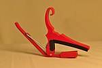 Original
 -
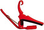 JBarta's edit
 -
 Fallschirmjäger's edit
 -
 JBarta's edit(2)

.jpg)

.jpg)
Article(s): Capo
Request: If possible, could the background's levels be adjusted to make it more white, while retaining the red color of the subject (possibly for a FP nom)? If the prospective edit could be uploaded under a separate file that'd be great as well! – Connormah (talk) 03:49, 14 April 2013 (UTC)
Graphist opinion(s):
Gave it a white background (rather than making it "more white") but not entirely liking the result. I'm kind of liking the original better. Plus one of the problems is all the yellow cast on the part from the yellow surroundings. I tried to reduce it... but it's still not so great. All in all I can't see my edit having a prayer as a FP (on en:WP at least... Commons has lower standards. If all else fails you can get a Commons "Valued Image" tag... any image plus 50 cents will get you one ;-) Of course if anyone else wants to have a whack at it... go to it. – JBarta (talk) 11:46, 14 April 2013 (UTC)
- I had a crack at it as well. It's not perfectly white as that looked a little strange, seemed better to have a little colour in the background. Fallschirmjäger ✉ 12:24, 14 April 2013 (UTC)
- I did a few tweeks to your edit, Fallschirmjäger, as I thought yours was the best starting point and didn't want to upload another file. Hope you don't mind. Regards, nagualdesign (talk) 15:08, 14 April 2013 (UTC)
- I fiddled with it a bit myself... reduced the yellow cast in the background and cleaned up a few spots. – JBarta (talk) 16:02, 14 April 2013 (UTC)
- All the edits have been re-done how they were intended. Unless anyone has any suggestions I think that's a wrap. nagualdesign (talk) 01:13, 20 April 2013 (UTC)
- I fiddled with it a bit myself... reduced the yellow cast in the background and cleaned up a few spots. – JBarta (talk) 16:02, 14 April 2013 (UTC)
- I did a few tweeks to your edit, Fallschirmjäger, as I thought yours was the best starting point and didn't want to upload another file. Hope you don't mind. Regards, nagualdesign (talk) 15:08, 14 April 2013 (UTC)
Also, I would suggest that if the original is retained for the article, that it would benefit from a slight crop. – JBarta (talk) 13:18, 14 April 2013 (UTC)
Following Fallschirmjäger's example, I gave it another shot just toying with colors and a slight crop. Still could use a little fine cleanup, but is ok for comparison purposes. – JBarta (talk) 13:55, 14 April 2013 (UTC)
2 more admiral photos edit
-

-
 Done
Done -
 Done
Done -
Derivative

.jpg)

Article(s): Bernard Clarey, David H. Bagley
Request:
- Remove watermarks/crop, fix colors if possible (in the Clarey one). Thanks so much in advance! – Connormah (talk) 04:05, 12 April 2013 (UTC)
- *NOTE to Connormah: As there is a disagreement (please see discussion below) as to which version (the "original" or "derivative") of the Adm. Bagley image to use in the article, as the original requester and individual who will decide when your request has been "Resolved", please select which of the two images that you feel is the most representative for the infobox of a flag officer and put it in the article. Despite what anyone else says, as the requester this is really your call. Centpacrr (talk) 23:03, 13 April 2013 (UTC)
Graphist opinion(s):Derivative created of Bagley portrait; cleaned up Clarey (edit) background and color issues. 11:34, 13 April 2013 (UTC) — Preceding unsigned comment added by Centpacrr (talk • contribs)
- If you felt the need to use a fake background you should have put him on a nice, tropical beach. He'd have liked that. Joking aside, I thought that was a bad edit (or rather, bad practice) so I cleaned the original and put it into the article. nagualdesign (talk) 16:18, 13 April 2013 (UTC)
- Sorry, but the version with the plain dark background makes the figure look completely lost in the infobox thumbnail and frankly looks like an ordinary passport photo as opposed to a proper Admiral's official portrait.. Also as the picture was taken in 1957 he was clearly still a junior or field grade officer (probably no higher than a Commander) while "flag officer" photographic portraits on WP virtually always contain "flags". (This may not be the case in the Royal Navy but it certainly is in the US Navy and other service branches.) Replacing a plain background with American and Navy flags is in no way misleading nor do they alter the understanding of the image.
- I do not in any way agree that this is a "bad practice" in this case, and the image is also marked as a "derivative" with a link to the original so there is no attempt to deceive anybody, just to make a better looking infobox image. Irrespective of whether or not you feel this is bad practice, I do not see that the "flagged" version of the portrait in any way violates any WP policy. Again this is also another example of there being more than one valid way to adjust any image for use on WP, a topic which I have raised with you and another editor several times before in here but which you have specifically refused to address because you "couldn't care less" about it. Centpacrr (talk) 17:05, 13 April 2013 (UTC)
- While I understand your argument for the alteration, I don't agree and the original photo should remain in the article. That was a bit of creative editing that went a little past encyclopedic IMO. For better or worse, that was the portrait that was taken and that is the portrait we should display (and it's a perfectly fine image by the way). If there is another photo actually taken of him that contains a background you feel is more suitable, by all means upload it and it can be considered as with any other photo. On the general topic of "composite images" that you have an affinity for, I personally think in many cases it's unnecessary. As an encylopedia, I think we should be presenting images in the most unaltered way possible (save for cleanup) without adding or inserting elements as our creative juices dictate. Readers should have a reasonable expectation that what they're looking at is exactly what they think they're looking at. – JBarta (talk) 19:34, 13 April 2013 (UTC)
- For the reasons I stated above (and as I have explained elsewhere in great detail) I completely disagree. The original image with the plain curtain background looks no better than a crappy coin operated automatic airport photo booth strip or passport picture as opposed to a formal portrait of a Naval flag officer which is far more appropriate for the infobox of this one paragraph stub article. (I have since adjusted my image to make it show his shoulders in full.) The image of a Naval flag officer with American and US Navy flags in the background is in no way "unencyclopedic" (but in fact standard and expected), does not "mislead" anyone who views it, is identified in the file's title as a derivative, contains a link to the original image for anyone who wants to see what it was derived from looks like can do so, and is aesthetically far superior and more representative of the individual as a infobox thumb as being a US Naval flag officer then the perfectly dreadful original.
- I know that you (and Nagualdesign) seem to believe that you are always the final authorities on what is and isn't acceptable for images on WP, but the fact is that is just not the way the project works and the constant deletions and/or altering of whatever anybody else does in here that doesn't meet your taste is both unhelpful and disruptive. As I have stated many times before in detail, there are always other acceptable and appropriate ways to adjust an image than just whatever single particular way appeals to you personally. What I did to improve this image as an encyclopedic illustration in no way violates any WP policies or guidelines, but only (as you admit above) is not acceptable in your "opinion"".
- That is not sufficient justification under WP policy and guidelines to constantly unilaterally and arbitrarily undo the legitimate contributions of others.
- There are lots of alterations the you and others have made to images on WP that I would have done differently as well, but if those other editors have done them appropriately and within the guidelines of the project I don't redo them just because I would have if I had done so differently if I had worked on them first. Such after the fact "second guessing" of everything anyone else does is just not a collegial or cooperative approach, but is instead classic "NIH" behavior.
- I have therefore restored the flag derivative version of the portrait that I contributed which you and your colleague removed and will leave it instead to the exclusive judgement of the requester (Connormah) to either accept that version or change it to the "passport photo" version. As the editor who actually uploaded the watermarked photo and requested that the image be made usable on WP, it is that editor who should decide which one to use and nobody else. I will gladly accept whatever he decides is best -- and so should you and Nagualdesign respect that as well. Therefore to avoid further controversy please do not change this again and leave it instead to requester to make the call on which version he prefers. Centpacrr (talk) 21:59, 13 April 2013 (UTC)
- I'll respond to this bit about the requester being the final authority on which image is used in an article. Your view is ownership by transference. He doesn't own the image or the article just as no one else does. Every editor has a say in which image is best for the article. – JBarta (talk) 22:22, 13 April 2013 (UTC)
- Jbarta really the only one here who is asserting absolute ownership to everything in here is YOU as to "what is best for the article". Since there is a disagreement here I proposed a reasonable neutral involved party, the editor who made the request in the first place who is also the individual who would decide when his request is resolved, to make the call and your response it to again claim ownership and insist on your opinion as always being the "right" and final one. It is this kind of "holier than tho" attitude that eventually drives people away from this project. I regret to say that it looks as if Penyulap has you pegged correctly. Centpacrr (talk) 23:03, 13 April 2013 (UTC)
- Penyulap? You mean the same Penyulap that has been indefinitely blocked from en Wikipedia? I'm not sure what he has me pegged as, but I might just take it as a compliment ;-) – JBarta (talk) 23:12, 13 April 2013 (UTC)
- And as far as "driving people away", the only editor I repeatedly clash with is you.... and you're still here. – JBarta (talk) 23:28, 13 April 2013 (UTC)
- Jbarta really the only one here who is asserting absolute ownership to everything in here is YOU as to "what is best for the article". Since there is a disagreement here I proposed a reasonable neutral involved party, the editor who made the request in the first place who is also the individual who would decide when his request is resolved, to make the call and your response it to again claim ownership and insist on your opinion as always being the "right" and final one. It is this kind of "holier than tho" attitude that eventually drives people away from this project. I regret to say that it looks as if Penyulap has you pegged correctly. Centpacrr (talk) 23:03, 13 April 2013 (UTC)
Centpacrr, your latest edit is a joke. If you can't see what's wrong with it I'm not going to tell you as you probably won't listen anyway. Whilst I totally disagree with your take on who gets the 'final say' I'm happy to let Connormah (or anyone with eyes and a brain) decide. nagualdesign (talk) 22:36, 13 April 2013 (UTC)
- Maybe instead Connormah (and/or anyone else) can offer their thoughts and maybe something resembling a consensus can be formed. – JBarta (talk) 22:51, 13 April 2013 (UTC)
- That's certainly how WP usually operates, and a 2/3rds majority is generally considered consensus. However, since Centpacrr uses such terms as describing you and I as 'colleagues' and intimating that there's some kind of 'turf war' mentality in which you and I guard the same turf I didn't wish to further upset him by pointing out that it's already 2 votes to 1. That said, it's 2 votes to 1. What really amazes me is that Centpacrr says he can't discern the curtains from the jacket on the original image, so makes an edit with a multitude of mistakes that leap out at you: blown out highlights, spots all over his jacket, fake shoulder outline, glaring additions to the now wider image. God knows what he was trying to do with the shoulders. And to state that a flag officer should be photographed in front of flags (even though he wasn't) and then crop through the officer's medals/decorations.. Well, words fail me. nagualdesign (talk) 23:22, 13 April 2013 (UTC)
- Just saw this now...I'll try and wrap my head around this tonight. Many thanks to those who have worked on the images as always. – Connormah (talk) 23:10, 13 April 2013 (UTC)
- The wrong derivative file had been uploaded inadvertently; correct one there now. Centpacrr (talk) 14:30, 14 April 2013 (UTC)
- Dontcha just hate it when you upload the wrong file accidentally? I mean the right one is just sitting there... all fixed up and ready to go... and wouldn't you know it... you upload the wrong one. Then you gotta upload the right one later. I hate when that happens. – JBarta (talk) 14:47, 14 April 2013 (UTC)
- The wrong derivative file had been uploaded inadvertently; correct one there now. Centpacrr (talk) 14:30, 14 April 2013 (UTC)
- Just saw this now...I'll try and wrap my head around this tonight. Many thanks to those who have worked on the images as always. – Connormah (talk) 23:10, 13 April 2013 (UTC)
- That's certainly how WP usually operates, and a 2/3rds majority is generally considered consensus. However, since Centpacrr uses such terms as describing you and I as 'colleagues' and intimating that there's some kind of 'turf war' mentality in which you and I guard the same turf I didn't wish to further upset him by pointing out that it's already 2 votes to 1. That said, it's 2 votes to 1. What really amazes me is that Centpacrr says he can't discern the curtains from the jacket on the original image, so makes an edit with a multitude of mistakes that leap out at you: blown out highlights, spots all over his jacket, fake shoulder outline, glaring additions to the now wider image. God knows what he was trying to do with the shoulders. And to state that a flag officer should be photographed in front of flags (even though he wasn't) and then crop through the officer's medals/decorations.. Well, words fail me. nagualdesign (talk) 23:22, 13 April 2013 (UTC)
- Vinces venio. Centpacrr (talk) 16:17, 14 April 2013 (UTC)
As mentioned above, is the flag in Centpacrr's edit a 50 star flag? Didn't the US flag have 48 stars in 1957? – JBarta (talk) 01:57, 16 April 2013 (UTC)
- Hold on... I just removed 2 stars. Now it's a 48 star flag. Problem solved. – JBarta (talk) 02:06, 16 April 2013 (UTC)
I've listed Centpacrr's edit for deletion. – JBarta (talk) 02:55, 17 April 2013 (UTC)
- While I completely disagree with his/her interpretation of WP guidelines in this matter, in order to protect the community from being misled and avoid any further waste of storage space on WP's servers for the file and further discussion of it I have had it "speedy" deleted at my own request as its original uploader and will leave the passport type image he/she likes on the stub entry for this flag officer. Centpacrr (talk) 10:52, 17 April 2013 (UTC)
- You can't fire me! I quit! At any rate, I was hoping you'd respond to the flag-star problem... but you didn't... you ignored it. So that's why I listed it for deletion. Had you stepped up and done something about it on your own, I might have been a little more compromising. – JBarta (talk) 15:44, 17 April 2013 (UTC)
- No, sir or madam, that is not the case at all. I had instead determined that attempting to deal with you any further with regard to this derivative image had reached a point of diminishing returns as it was obvious to me that you would have found fault no matter what I would attempt to do it and thereby carry on an unending circular process in which you would also continue to demonstrate an unwillingness to ever assume any good faith on my part as your comment immediately above makes clear to me. As you have also made it clear that you would also always revert any attempt to ever use the derivative anywhere on WP, I just didn't see there was any chance my doing anything further would be productive and therefore decided to just let you have your way and avoid an unnecessary couple of week deletion nomination and comment process by instead simply requesting that the image be deleted immediately. If you can't understand or accept that as the reason I requested its speedy deletion unfortunately there is really nothing I can do about that. Centpacrr (talk) 16:27, 17 April 2013 (UTC)
- You can't fire me! I quit! At any rate, I was hoping you'd respond to the flag-star problem... but you didn't... you ignored it. So that's why I listed it for deletion. Had you stepped up and done something about it on your own, I might have been a little more compromising. – JBarta (talk) 15:44, 17 April 2013 (UTC)
Sialolith edit

Article(s): sialolithiasis
Request:
- Please make the inside of the mouth lighter if possible, thank you. Lesion (talk) 13:32, 19 April 2013 (UTC)
Graphist opinion(s):Lightened interior of mouth (sublingual); cropped.
- No wait, this is not a second lesion, this is an artefact created by the lightening within the mouth. If you look on the original, no second lesion is seen [2], but one appears on the reworked img [3]. This second lower, dark red area (just behind lower front teeth) on the reworked image I think needs to be reworked because it was not in the original image. Thank you and sorry to be fussy. Lesion (talk) 23:34, 19 April 2013 (UTC)
- Yes of course you did. *sigh* Centpacrr (talk) 00:44, 20 April 2013 (UTC)
- You're welcome to do the same... as you do from time to time. The goal is to get the best image possible... regardless who gets the credit. – JBarta (talk) 00:47, 20 April 2013 (UTC)
- Yes I suppose that I could "do the same" but then you would just replace or revert it as you virtually always do because your idea of "the best image possible" is whatever suits your personal taste (or "opinion") irrespective of whatever I or anyone else (including the requester whose opinion you always say is irrelevant because of your theory of "transference") does or finds appropriate. If I were "seeking credit" then I would smear my name all over in here instead of just doing the request and leaving it at that. All I am seeking is not keep wasting my time when everything I do is always being immediately second guessed and undone, so please spare me the hypocrisy of "you're welcome to do the same". Centpacrr (talk) 01:07, 20 April 2013 (UTC)
- Are you suggesting my edit wasn't an improvement? Are you simply reducing all differences to a matter of taste? – JBarta (talk) 01:22, 20 April 2013 (UTC)
- I do not see your edit as "an improvement", only as being different. How do you know, for instance, what the natural color of the sublingual mucosa is of this particular patient under the lighting condition under which the image was taken, the effects of the disease process (and treatment) he or she had, or that my edit (or for that matter the original image) is a "little off". You don't, so what you produced only reflects your "opinion" or "taste" as to what you like or think it should be. (I did not change the color temperature at all, by the way, only lightened and cropped the image as requested.) Your edit also seems too dark to me and thus hides some detail, but I suspect the reason for that is because your display is probably adjusted to something less than a gamma correction of 2.2 which is the standard for digital images to compensate for the non-linearity of digital (electronic) photography and thus images appear artificially light to you.
- As I have explained many times before, there can never be one "best possible image" because there are no one absolute or objective criteria for that for web viewed images transmitted and reconstructed digitally over the internet to be viewed on wide variety of many types of displays (CRT, projection, LCD (fluorescent), LCD (LED), "Retina", plasma, etc) in use as well as their resolutions, calibrations, and other factors such as ambient lighting, display surface reflectivity/texture, each viewer's visual acuity and color perception, etc, all of which affect how each image appears to each viewer each time. That being the case the "standards" of what is appropriate for use on WP are necessarily broad and subjective (i.e. there are multiple acceptable versions), and not narrow and purely "objective" (i.e. one and only one "best possible image").
- If WP is to be a collaborative project then it is incumbent for every editor -- including yourself -- to respect the previous edits of other editors as long as the version of the image they have produced meets the broad subjective standards envisioned by the project. When an edit is within the broad subjective bounds to those criteria (and especially when the requester him or herself has already judged the result to be "perfect"), then such "a little off" second guessing is just that -- "second guessing" -- and not an "improvement". I truly hope that this is the last time I am going to have to explain this so if this issue arises again (which I expect it probably will) I will in future simply incorporate by reference this recitation of the difference between "an improvement" and just "different". Centpacrr (talk) 02:23, 20 April 2013 (UTC)
- Are you suggesting my edit wasn't an improvement? Are you simply reducing all differences to a matter of taste? – JBarta (talk) 01:22, 20 April 2013 (UTC)
- Yes I suppose that I could "do the same" but then you would just replace or revert it as you virtually always do because your idea of "the best image possible" is whatever suits your personal taste (or "opinion") irrespective of whatever I or anyone else (including the requester whose opinion you always say is irrelevant because of your theory of "transference") does or finds appropriate. If I were "seeking credit" then I would smear my name all over in here instead of just doing the request and leaving it at that. All I am seeking is not keep wasting my time when everything I do is always being immediately second guessed and undone, so please spare me the hypocrisy of "you're welcome to do the same". Centpacrr (talk) 01:07, 20 April 2013 (UTC)
- You're welcome to do the same... as you do from time to time. The goal is to get the best image possible... regardless who gets the credit. – JBarta (talk) 00:47, 20 April 2013 (UTC)
- Yes of course you did. *sigh* Centpacrr (talk) 00:44, 20 April 2013 (UTC)
- I gather from the dismissive tone of your comment immediately above that you either didn't bother to even read the answers I provided to your questions you asked, or didn't understand them. I do not agree that your version is "an improvement", only that it is "different" which is not at all the same thing, and that the reason you gave for making the change (the color being "a little off") is unsupported by anything other than your personal taste. (For instance you have provided no evidence whatsoever that you somehow know that the actual natural color of the sublingual mucosa is of this particular patient is materially different than the previous version, that the way it would appear under the lighting conditions under which the image was taken was in any way "off" in the existing version that the requester had already judged to be "perfect" in his view, or that you had some grounds based on the verifiably known effects of the disease process and/or treatment the depicted patient had that would justify whatever subtle change you made to the image's coloration. Therefore your changes must instead be based purely on your own personal speculation -- i.e. "taste" -- as to what you would like them to be.)
- So again I repeat to please spare me the hypocrisy of "you're welcome to do the same" when no matter what I or others do will virtually always end up being a waste of our time owing to your instance on being the self appointed doyen of the Graphics Lab with the "right" of being the sole and final arbiter of what is "the best possible image" in every request irrespective of the views of anybody else including the requester him or herself. That's really just not the way that Wikipedia is designed to work, and a simple acknowledgement on your part of that WP guideline would be helpful but alas is not expected.
Rotate slightly to level horizon edit
-
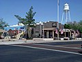 American Legion Post 39, located in Gilbert, Arizona, was built in 1934.

.jpg)
.jpg)
.jpg)
![[2]](https://upload.wikimedia.org/wikipedia/commons/archive/7/7a/20130419143829%21Salivary_gland_stone_removed.jpeg)
![[3]](https://upload.wikimedia.org/wikipedia/commons/7/7a/Salivary_gland_stone_removed.jpeg)
Article(s): Gilbert, Arizona
Request:
- The picture is very slightly off-true and the flag pole therefore looks like its leaning; a User has asked that it be rotated slightly - but I don't know how to do this Brookie :) { - he's in the building somewhere!} (Whisper...) 12:21, 23 April 2013 (UTC)
Graphist opinion(s):Rotated 2.6º CCW & crp — Preceding unsigned comment added by Centpacrr (talk • contribs)