Wikipedia:Graphics Lab/Photography workshop/Archive/Feb 2012
Stale edit
Hadji Ali again edit
-
 Hadji Ali regurgitating

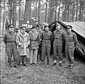
Article(s): Hadji Ali, Professional regurgitator
Request: Please give this a good restoration. I'd give it a go myself, but I lost Photoshop when my harddisk drive died and the disk is scratched. Crisco 1492 (talk) 00:04, 15 February 2012 (UTC)
Graphist opinion(s):
Crisco, this was already "restored" once before. And it's really not that bad. Sure, it can always be improved upon. But why? So you can nominate it as a featured picture? Even if every single spot and scratch were repaired, it's still not featured picture material. I notice you keep finding images, often trying to get them tweaked and then stuff them into a featured picture nomination and a good number of them never make it. Seriously, don't you think that starts to become a bit of wasted effort all the way around and a classic case of make work? And by the way, one phrase I absolutely despise is "I'd do it myself, but...."<end of rant> – JBarta (talk) 00:28, 15 February 2012 (UTC)
- Well, if that's how you feel then I will find a web cafe and time to do it myself. Several commenters suggested that it could be FP material if cleaned up a bit better (no offence to Centpacr). As for the sentence you hate, I expected your reaction (specifically) and tried to say why I was requesting it instead of doing it myself, which I normally would do if my software was working and I felt the touch up was something I could handle. Crisco 1492 (talk) 00:42, 15 February 2012 (UTC)
Complicated Watermark Removal edit
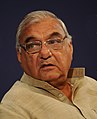
Article(s): Howell M. Estes II
Request: Remove watermark and upload. Thanks. – Connormah (talk) 02:58, 11 February 2012 (UTC)
Graphist opinion(s):
We already have a fine image of this General. Why would we want to bother with with this heavily watermarked ebay image? (Maybe I should add, I'm not trying to be rude(on purpose), I'm just curious.) – JBarta (talk) 19:01, 12 February 2012 (UTC)
- Maybe you should add that little caveat to your signature, permanently! ..Or wear it on a t-shirt when you go out. ;-) nagualdesign (talk) 04:26, 13 February 2012 (UTC)
- I really don't mean to be harsh... it just sort of works out that way. Actually, I think Stalin said that too ;-) – JBarta (talk) 05:10, 13 February 2012 (UTC)
- This is one of him in his 4-star uniform. The other is in a Lt. General's uniform - I'm trying to get another one, but this one is the best I could find. – Connormah (talk) 04:39, 14 February 2012 (UTC)
- Fair enough. Though to me it's too much work just for *another* picture of him. You could always email the ebay seller and ask if you can have a high quality scan for Wikipedia. Never hurts to ask. Tell him you'll give him a plug on the description page ("image courtesy of..."). The worst he can do is tell you to go pluck yourself. In the meantime, it's very possible that another editor may take the challenge and work a little magic on this image. Good luck. – JBarta (talk) 07:09, 14 February 2012 (UTC)
- This is one of him in his 4-star uniform. The other is in a Lt. General's uniform - I'm trying to get another one, but this one is the best I could find. – Connormah (talk) 04:39, 14 February 2012 (UTC)
- I really don't mean to be harsh... it just sort of works out that way. Actually, I think Stalin said that too ;-) – JBarta (talk) 05:10, 13 February 2012 (UTC)
Connormah... again, you should get this image uploaded, put a {{watermark}} tag on it and maybe someone at some time will get it fixed up. – JBarta (talk) 02:16, 22 February 2012 (UTC)
Resolved edit
Oval crop edit


Article(s): James Campbell (industrialist), Numangatini Ariki
Request: Oval crop... KAVEBEAR (talk) 00:42, 30 January 2012 (UTC)
Graphist opinion(s): ![]() Request taken by PawełMM.
Request taken by PawełMM.
![]() Done: Done as requested. PawełMM (talk) 10:30, 30 January 2012 (UTC)
Done: Done as requested. PawełMM (talk) 10:30, 30 January 2012 (UTC)
Meryl Fernandes edit
-
 Meryl Fernandes at the NTA's

Article(s): Meryl Fernandes
Request: Please can this be cropped to the subject and maybe something be done with the lighting or colour to make it look a little better. Only if you think it will look better mind.Rain the 1 09:50, 30 January 2012 (UTC)
Graphist opinion(s):![]() Done Centpacrr (talk) 10:26, 30 January 2012 (UTC)
Done Centpacrr (talk) 10:26, 30 January 2012 (UTC)
Herengracht Panorama, removal of random patch of blue edit
-
The Herengracht canal
Article(s): Canals of Amsterdam
Request: On the right-hand side there is a bridge. Above this bridge there is a large patch of light-blue colouring which (I assume) was introduced by Hugin on stitch. I've had no luck removing it, however... Nikthestoned 11:12, 31 January 2012 (UTC)
Graphist opinion(s): ![]() Request taken by nagualdesign.: Assuming that you want the sky all white/one colour...
Request taken by nagualdesign.: Assuming that you want the sky all white/one colour...
By "light blue coloring", you're referring to the sky? The sky on the right side of the photo is slightly blue and you don't want that?
- Nope... I'm talking about the area above the bridge, below the trees that's sort of a solid teal-colour... Nikthestoned 11:45, 31 January 2012 (UTC)
I'm no fan of many of these panoramas by the way. Too many take in too much arc (like this one), and are of things that are not naturally "panoramic" (like this one) and most seem rather pointless to me. Reminds me of a dog licking his balls. Why does a dog lick his balls you ask? Because he can... – JBarta (talk) 11:37, 31 January 2012 (UTC)
- I love panoramas - I'm not sure why. Either way, I feel it's a better illustration of this canal than the previous image... Nikthestoned 11:47, 31 January 2012 (UTC)
- I feel I disagree it's a better image. (then again, there's no accounting for taste... yours or mine). From my perspective, the key is in how it's done and what it's done of. I've seen quite a few panoramas on commons that are wonderful in my opinion. I think they're way overused however. In this case where you're attempting to take in nearly 180 degrees, what's wrong with a simple series of images? Maybe one pointing left and the other pointing right? And by the way, in your pano (at the left edge), there appears to be a rather large tree growing out of the middle of the canal. (A result of trying to ram a boomerang through a garden hose.) Also, what are all those white dots under and on the bridge at right? – JBarta (talk) 12:07, 31 January 2012 (UTC)
- I'm sorry you don't like panoramas but, for me, this illustrates so much more than an image, or a series of images. The single image (above) could have been taken on any of Amsterdam's canals - it doesn't show anything specific re: this canal whatsoever. RE: a series, yes you could do that but this gives you the whole length of the street (at least in the area I was sitting) as opposed to some particular snapshots - I don't know of a better (non-video) way of showing what something like a street truly looks like. The tree is indeed a stitching error, thanks for that. The "white dots" are blossoms falling from the pictured blossom tree. Nikthestoned 12:43, 31 January 2012 (UTC)
- A well made panorama in a square-ish window with a (side to side) scrollbar at the bottom might work. That way you only see a 'normal' FOV at any one time. A bit like one of those 'virtual tours', without the cylinder projection. Just a thought. nagualdesign (talk) 12:52, 31 January 2012 (UTC)
- I'm sorry you don't like panoramas but, for me, this illustrates so much more than an image, or a series of images. The single image (above) could have been taken on any of Amsterdam's canals - it doesn't show anything specific re: this canal whatsoever. RE: a series, yes you could do that but this gives you the whole length of the street (at least in the area I was sitting) as opposed to some particular snapshots - I don't know of a better (non-video) way of showing what something like a street truly looks like. The tree is indeed a stitching error, thanks for that. The "white dots" are blossoms falling from the pictured blossom tree. Nikthestoned 12:43, 31 January 2012 (UTC)
- I feel I disagree it's a better image. (then again, there's no accounting for taste... yours or mine). From my perspective, the key is in how it's done and what it's done of. I've seen quite a few panoramas on commons that are wonderful in my opinion. I think they're way overused however. In this case where you're attempting to take in nearly 180 degrees, what's wrong with a simple series of images? Maybe one pointing left and the other pointing right? And by the way, in your pano (at the left edge), there appears to be a rather large tree growing out of the middle of the canal. (A result of trying to ram a boomerang through a garden hose.) Also, what are all those white dots under and on the bridge at right? – JBarta (talk) 12:07, 31 January 2012 (UTC)
Sorry about the belated reply, I've been scratching my head wondering how this image can be 'improved'. ..Well I soon realized that the blue patch you mentioned was probably the discolouration against the buildings, which wasn't too difficult to fix, however I'd already spent some time poncing around with the sky and gawping at other glaring errors (the broken bridge being the most obvious so far). Whilst I have finished playing around with it I was in two minds whether to upload it, so I came back here first. Frankly I'm not sure that I appreciate the association! I too love panoramas but, as JB has politely pointed out, this one's just not that good. Sorry. nagualdesign (talk) 12:47, 31 January 2012 (UTC)
- OK OK guys, I get you. To be fair, I'd not noticed either the tree-on-the-left OR the broken bridge (!), else I wouldn't have uploaded... I've reverted it's addition on the mentioned page and will nom for deletion in a sec. Thanks for taking a look though. Nikthestoned 12:58, 31 January 2012 (UTC)
- Thanks for taking it on the chin. :-) I had conceded and was in the process of uploading (the tab's still whirring away now...) but I'm glad that you've taken the advice. Maybe we can help out next time. Regards, nagualdesign (talk) 13:06, 31 January 2012 (UTC)
James Atherton and Craig Vye edit
-
 James Atherton and Craig Vye with fans

Article(s): James Atherton, Craig Vye
Request: James Atherton and Craig Vye are the two males in the left hand corner. Please can this image be cropped down to them. Can the watermark be removed. Is it possible to adjust the lighting etc - to make the actors look better. If you know any tricks to salvage this, please do.Rain the 1 21:47, 31 January 2012 (UTC)
Graphist opinion(s):
![]() Done: – JBarta (talk) 22:00, 31 January 2012 (UTC)
Done: – JBarta (talk) 22:00, 31 January 2012 (UTC)
- Thankyou for doing this guys - but I think the colour change to the hat makes the image look strange.Rain the 1 02:54, 1 February 2012 (UTC)
- The hat color is based on this image taken at the same event but feel free to change it back if you care to. Centpacrr (talk) 03:05, 1 February 2012 (UTC)
News from the vandal-fighting front edit
Enjoy. Materialscientist (talk) 10:29, 26 January 2012 (UTC)
- Hah! I never realised that people vandalised images on Wikipedia! I suppose I shouldn't laugh but that's quite funny. nagualdesign (talk) 11:04, 26 January 2012 (UTC)
Fredenborg Palace edit
-
 Image of Fredensborg Palace (or Castle)

Article(s): Fredensborg Palace
Request: Please can you reduce the brightness of the image and sharpen the detail of the building. Peter (Talk page) 00:48, 30 January 2012 (UTC)
Graphist opinion(s):![]() Done Centpacrr (talk) 01:30, 30 January 2012 (UTC)
Done Centpacrr (talk) 01:30, 30 January 2012 (UTC)
Abel-Nicolas Bergasse Dupetit Thouars edit
-
 Reconsrtuct oval
 Done
Done -
 Denoise Done
 -
 Make transparent version
 -
 Transparent version (new file) Done
 -
 Make transparent version
 -
 Transparent version (new file) Done
 -
 Make transparent version
 -
 Transparent version (new file) Done


.jpg)

Article(s): Abel-Nicolas Bergasse Dupetit Thouars, Fanny Kekelaokalani, Thomas Charles Byde Rooke, Pōmare I
Request: Can someone clean this two images up and create a transparent version for the third and fourth and fifth?--KAVEBEAR (talk) 10:52, 1 February 2012 (UTC)
Graphist opinion(s): *![]() Done: #1 & #2 done. PawełMM (talk) 23:16, 1 February 2012 (UTC) *
Done: #1 & #2 done. PawełMM (talk) 23:16, 1 February 2012 (UTC) * ![]() Done: #3 #4 & #5 done. Terminator (talk) 04:59, 2 February 2012 (UTC)
Done: #3 #4 & #5 done. Terminator (talk) 04:59, 2 February 2012 (UTC)
Daniel Spry edit
-
 Original image
 -
 Cropped image (New file)


Article(s): Daniel Spry
Request: Trim out Daniel Spry, 2nd from right, and name the new file, appropriately, File:Daniel Spry.jpg or .png... Kintetsubuffalo (talk) 13:00, 1 February 2012 (UTC)
Graphist opinion(s): ![]() Done Centpacrr (talk) 02:11, 2 February 2012 (UTC)
Done Centpacrr (talk) 02:11, 2 February 2012 (UTC)
- That's great, thank you!--Kintetsubuffalo (talk) 03:32, 3 February 2012 (UTC)
Andrew Kehoe edit

Article(s): Andrew Kehoe
Request: fix washboarding... Kintetsubuffalo (talk) 13:32, 1 February 2012 (UTC)
Graphist opinion(s):
![]() Done: Done as requested. PawełMM (talk) 19:28, 1 February 2012 (UTC)
Done: Done as requested. PawełMM (talk) 19:28, 1 February 2012 (UTC)
- Much better, thank you!--Kintetsubuffalo (talk) 03:38, 3 February 2012 (UTC)
Tupou IV edit
-

-
 cropped file


Article(s): Tāufaʻāhau Tupou IV
Request: Clean original and crop a version of Crown Prince Taufa’ahau, preferably not full body... KAVEBEAR (talk) 02:03, 2 February 2012 (UTC)
Graphist opinion(s): ![]() Request taken by nagualdesign.
Request taken by nagualdesign.
![]() Done Partially restored original. Could do with further cleaning (and making cropped version). I'll continue tomorrow unless somebody else wishes to take a crack at it... nagualdesign (talk) 04:05, 2 February 2012 (UTC)
Done Partially restored original. Could do with further cleaning (and making cropped version). I'll continue tomorrow unless somebody else wishes to take a crack at it... nagualdesign (talk) 04:05, 2 February 2012 (UTC)
- Done cropped file. PawełMM (talk) 09:30, 2 February 2012 (UTC)
- Hi KAVEBEAR, how would you like the team photo finishing? Would you like it cropped to the photo or should I clean the mount/edges up? nagualdesign (talk) 16:08, 2 February 2012 (UTC)
Michael Piccirilli edit
-
 Michael Piccirilli

Article(s): Michael Piccirilli
Request: Is there anyone who can crop this to Michael and make it look like the reporter lady was never there?Rain the 1 03:48, 2 February 2012 (UTC)
Graphist opinion(s):![]() Done Centpacrr (talk) 04:24, 2 February 2012 (UTC)
Done Centpacrr (talk) 04:24, 2 February 2012 (UTC)
Danny O'Donoghue edit
-
 Danny O'Donoghue and Eric West.
 -


Article(s): Danny O'Donoghue.
Request: Can you crop out the man on the left? Also it made need adjustment of lighting. MayhemMario 19:35, 2 February 2012 (UTC)
Graphist opinion(s): ![]() Request taken by PawełMM.
Request taken by PawełMM.
![]() Done: Done as requested. PawełMM (talk) 22:22, 2 February 2012 (UTC)
Done: Done as requested. PawełMM (talk) 22:22, 2 February 2012 (UTC)
Afar edit
-
 Done
Done

Article(s): Afar people
Request: Crop away the line on the left and clean up... KAVEBEAR (talk) 03:24, 4 February 2012 (UTC)
Graphist opinion(s): ![]() Done Terminator (talk) 07:25, 4 February 2012 (UTC)
Done Terminator (talk) 07:25, 4 February 2012 (UTC)
Emily Dickinson edit
-
 Original
 -
 Restored
.jpg)

Article(s): Emily Dickinson
Request: Remove the marks left by the frame. It seems to be photograph that was originally in a frame that has been taken out of it, but the markings are still around it. Leave original, upload a derivative work. KAVEBEAR (talk) 04:17, 5 February 2012 (UTC)
Graphist opinion(s):![]() Done Centpacrr (talk) 06:52, 5 February 2012 (UTC)
Done Centpacrr (talk) 06:52, 5 February 2012 (UTC)
Suresh Raina edit

Article(s): Suresh Raina
Request: Can you crop the trees above? Extra999 (talk) 12:28, 7 February 2012 (UTC)
Graphist opinion(s):
![]() Done – JBarta (talk) 13:43, 7 February 2012 (UTC)
Done – JBarta (talk) 13:43, 7 February 2012 (UTC)
Reggie Yates and Holly Willoughby edit
-
 Reggie Yates Done
 -

-
 Holly Willoughby Done
 -

-
How far is too far?
(nagualdesign)


Article(s): Reggie Yates and Holly Willoughby
Request: Could the image of Reggie Yates be cropped to the man in the image and the image of Holly Willoughby to the blonde woman in the picture. Thanks D4nnyw14 (talk) 14:28, 5 February 2012 (UTC)
![]() Request taken by PawełMM.
Request taken by PawełMM.
![]() Done: Done as requested. PawełMM (talk) 17:46, 5 February 2012 (UTC)
Done: Done as requested. PawełMM (talk) 17:46, 5 February 2012 (UTC)
- Wow that's great, i didn't even know it was possible to completely remove someone standing so close to someone else. Thanks D4nnyw14 (talk) 16:04, 6 February 2012 (UTC)
- I hate to rain on the parade here, but a thought comes to mind and I figured I'd throw it out there... The effort to remove the fan in these images (and a few others) sometimes leaves us with the subject striking an odd pose in a visibly doctored image. Is that result really better than simply leaving the fan in some images? Do we really need to remove the fan in every single image? Just a thought. Weigh in if you have an opinion on the matter. – JBarta (talk) 20:12, 6 February 2012 (UTC)
- Well, I wasn't going to say anything but it did occur to me that these particular photographs make the subjects look like they're getting slightly amorous with inanimate objects, and that they might look 'even better' if they were hugging trees! That's right, we could turn WP and the Graphic Lab into a running joke. (..I jest! These cut-outs are pretty far out IMO, too.) nagualdesign (talk) 12:11, 7 February 2012 (UTC)
- Why bother. Please recommend all of the above images for speedy deletion. In future perhaps you could keep looking for a better image for a while before requesting alterations. Or in the case of images of this type (oddly posed/difficult to separate the subjects realistically) just don't bother uploading. There must be 100's of free images of Holly Willoughbooby available. Without wishing to sound crude you can't even tell that she has (famously) rather large knockers in this image! nagualdesign (talk) 17:17, 8 February 2012 (UTC)
- People try WAY too hard to be unecessarily nice to each other. In this instance it led to a convoluted result. Personally I think the direct and honest approach wins hands-down every time. If someone gets upset about it, I consider it their problem, not mine. In this instance you could have said "Thank-you very much for the effort, but that's not quite what I was looking for." Any reasonable and mature person would be fine with that and either question you further or leave it at that. – JBarta (talk) 19:57, 8 February 2012 (UTC)
- There's no reason to keep them either. They fall way below any reasonable quality threshold. If they were to be used anywhere in the future it would be a disservice to Wikipedia. (Unless the fans wanted to use them on their userpages, unadulterated?) If they're worth keeping we really need to up the bar! nagualdesign (talk) 17:51, 8 February 2012 (UTC)
John Papa Īī edit
-
 Done
Done -
 Transparent version with some cleanup


Article(s): John Papa Īī
Request: Make version with transparent background... KAVEBEAR (talk) 23:34, 6 February 2012 (UTC)
Graphist opinion(s): ![]() Done Jenith (talk) 04:13, 7 February 2012 (UTC)
Done Jenith (talk) 04:13, 7 February 2012 (UTC)
Freya Stafford edit
-
 Freya Stafford at the 2011 Logie Awards
 -
 Done
Done

.jpg)
Article(s): Freya Stafford
Request: Could a separate crop be made, which is a little more zoomed in on her face (for use in an infobox)? JuneGloom Talk 15:24, 8 February 2012 (UTC)
Graphist opinion(s):
Widemann edit


Article(s): Hermann A. Widemann, Miscegenation
Request: Clean the scratches, dust and holes like this picture. Don't change the color or tone or anything drastic. KAVEBEAR (talk) 04:07, 5 February 2012 (UTC)
Graphist opinion(s): ![]() partially done. Prominent dots are removed. Given to experts to tweak more on that. Terminator (talk) 08:31, 5 February 2012 (UTC)
partially done. Prominent dots are removed. Given to experts to tweak more on that. Terminator (talk) 08:31, 5 February 2012 (UTC)
- Done Dust and scratch reduction. I did alter the colour, but only to remove the blobs of blue discolouration and I tried to match the original's warm tint. Nothing drastic. nagualdesign (talk) 12:31, 5 February 2012 (UTC)
- Can someone help me adjust the dual images above? And possibily clean up the photograph of the house by cropping and cleaning it up.--KAVEBEAR (talk) 03:53, 7 February 2012 (UTC)
- Can you be more specific about what adjustment(s) you want? nagualdesign (talk) 12:00, 7 February 2012 (UTC)
- Clean up the image on the residence and anyway to make them proportional. Also please update the image because it keep showing the version it was before cropping.--KAVEBEAR (talk) 04:14, 8 February 2012 (UTC)
- If refreshing the (article) page doesn't update the image, or the image updates but the aspect ratio doesn't, I click Edit then Save page (without making any changes). It isn't even logged on the History page but the software does seem to re-cache the images on the page. L'il workaround for you there. ;-) I'll see about cleaning and cropping those images or whatever.. nagualdesign (talk) 05:34, 8 February 2012 (UTC)
- Clean up the image on the residence and anyway to make them proportional. Also please update the image because it keep showing the version it was before cropping.--KAVEBEAR (talk) 04:14, 8 February 2012 (UTC)
- Can you be more specific about what adjustment(s) you want? nagualdesign (talk) 12:00, 7 February 2012 (UTC)
- Done Altered aspect ratios of both images. Is that acceptable? Seems a shame to loose the top off the family portrait when the photographer saw fit to reveal his conceit - that this picture was not taken outdoors. The photo of the house still needs cleaning. And FFT filtering... nagualdesign (talk) 06:19, 8 February 2012 (UTC)
- Can someone help me adjust the dual images above? And possibily clean up the photograph of the house by cropping and cleaning it up.--KAVEBEAR (talk) 03:53, 7 February 2012 (UTC)


- FYI, it's not necessary to alter the image dimensions or aspect ratio to get them to look decent side by side. As in the example at right, you could have just as easily adjusted the display widths so both images end up the same height. Two images side by side at the same height are quite presentable even if they are slightly different aspect ratios. – JBarta (talk) 06:39, 8 February 2012 (UTC)
- Point taken. :-) Reverted family portrait to previous uncropped version. Altered the house image thumbnail size above (
150px> 162px) to match heights as recommended. Also corrected left/right in the caption, though they are unnecessary IMO, hence nobody spotted the obvious error. nagualdesign (talk) 17:04, 8 February 2012 (UTC)
- Point taken. :-) Reverted family portrait to previous uncropped version. Altered the house image thumbnail size above (
- Well... if I wanted to argue... I might suggest that if nobody spotted it, then it wasn't an obvious error. If it were an obvious error, then obviously someone would have spotted it (sooner). So, it's obvious to me that it was nothing more than a garden variety regular error. – JBarta (talk) 21:29, 8 February 2012 (UTC)
- By Jove, I think you're right! This is more of a stealth slipup, hiding in plain sight. nagualdesign (talk) 01:00, 9 February 2012 (UTC)
Image modification edit
-
 1 Done
 -
 2 Done
 -
 3 Done


Article(s): Kapil Sibal, Sachin Pilot and Bhupinder Singh Hooda
Request: All 3 images: Remove excess materials and ensure that the face appears bigger in their biography.--Kkm010* ۩ ۞ 04:47, 9 February 2012 (UTC)
Graphist opinion(s): ![]() Done: The last done. PawełMM (talk) 17:20, 9 February 2012 (UTC)
Done: The last done. PawełMM (talk) 17:20, 9 February 2012 (UTC)
Henry Nicholas Greenwell edit
-
 jpg
jpg -
 png
png


Article(s): Henry Nicholas Greenwell
Request: Please oval crop and make a transparent png version as well. Thanks. KAVEBEAR (talk) 10:10, 10 February 2012 (UTC)
Graphist opinion(s): ![]() Request taken by PawełMM.
Request taken by PawełMM.
![]() Done: Done as requested. PawełMM (talk) 11:39, 10 February 2012 (UTC)
Done: Done as requested. PawełMM (talk) 11:39, 10 February 2012 (UTC)
Nick Cohen edit
-
 The Launch of the Euston Manifesto

Article(s): Nick Cohen
Request: Please remove the reflection in the eyes of the man in the centre. January (talk) 19:59, 10 February 2012 (UTC)
Graphist opinion(s):
![]() Done: Done as requested. PawełMM (talk) 21:43, 10 February 2012 (UTC)
Done: Done as requested. PawełMM (talk) 21:43, 10 February 2012 (UTC)
Remove Signature edit
-

-
 HSV comparison.
(See below)

.jpg)
Article(s): Buster Glosson
Request: Can anyone remove the autograph and play around with the levels/brightness and contrast? Thanks – Connormah (talk) 02:57, 10 February 2012 (UTC)
Graphist opinion(s):![]() Done Centpacrr (talk) 04:28, 10 February 2012 (UTC)
Done Centpacrr (talk) 04:28, 10 February 2012 (UTC)
"Play around with the levels/brightness and contrast" ... Centpacrr, I'll bet that sent shivers up and down your spine ;-) It's nice work, but there are now a few spots on his jacket you'd probably like to touch up. – JBarta (talk) 04:32, 10 February 2012 (UTC)
Okay, I realise that some people might get annoyed at this but there's been quite a few versions of this image uploaded today so I'm going to say it anyway. And please don't think that I'm annoyed at having my version reverted either - it was a rather large leap in terms of contrast from the original (which is subjectively right or wrong) and it only took me a few minutes in Photoshop. Colour, however, is not so subjective. Whilst our perception of colour is relative, and tabbing between 2 images we see only the difference between the 2, tools like Photoshop give us a method of measuring absolutes. (Yes, I know that real light consists of discrete wavelengths and that RBG values only stimulate the cone cells to produce the tristimulus values that approximate real world colours, blah blah blah.. The point is that these values are absolutes.) So here's a quick lesson in colour correction. Hey, I'm not saying I'm the leading expert on colour grading but these methods are pretty standard and they seem to have bypassed some of you.
First thing to note on this image is that the blacks are far from black. This would normally necessitate a Levels correction (bringing the black point in a bit) but the histogram shows a 'tail' leading almost to pure black, so a 'hockey stick' Curves adjustment is in order (blackening the blacks but keeping the black point, midtones and highlights intact). That provides an optimal tonal range for assessing colour (but can be pared back later if desired - something I neglected to do having gotten used to the contrast). Colour, as I have said, is highly subjective, so we use the Eyedropper/Sample tool. First of all we check that the whites are white (low saturation, high value), then we compare the deepest shadows to the lighter areas. A blue jacket under dark conditions should be dark blue. In almost all versions of this image the shadows are orange! Yes, it's hard to believe when you see it with your own oh-so-fallible eyes, but check for yourself. Here's a HSV comparison of the current image compared to my own version. (Again, my version's a bit too contrasty, admittedly, but the colour is correct.)
A little bit of sampling here and there reveals that the problem with the colour lies in the shadows, much less so in the midtones and the highlights are fine. To correct for this we use the Color Balance tool. Focussing purely on the shadows (and preserving luminosity) we carefully reduce the redness. Again the change is easier to percieve than the result, so we again use the Eyedropper to probe the image and affect more changes incrementally until we get the result we were aiming for. We don't then flip-flop between the new and old image to admire our adjustments, because our eyes will lie to us about how great a change we have made - we do it by the numbers! The final image must stand up on it's own, not as a comparison to the original.
I'm sorry to anyone that already knows this stuff and perhaps thinks that I'm being patronising. Obviously this isn't meant for you. ;-) To anyone that might have learned something from this, try using the Eyedropper tool to analyse your own upload(s) and see if you agree. Well that's quite enough from me. Sorry to go on about it! Kind regards, nagualdesign (talk) 05:47, 11 February 2012 (UTC)
- Let me ask you a simple question... of the two images in your HSV comparison above, which do you think *looks* better? – JBarta (talk) 08:32, 11 February 2012 (UTC)
- Without wishing to sound egotistical, I prefer mine. The contrast could be reduced, which looks a bit harsh compared to the original. There was no reason to brighten the whites, which I seem to have done, but where his left shoulder blends into the background, that is due to clipping so should almost certainly have been barely black at some point. I'd guess that the red fog comes from scanning a photograph (or print) which is high gloss, or uses black where 'bronzing' becomes a problem (modern printers have 2 different black inks for this reason). If you try to alter the overall whitebalance (using Camera Raw) it doesn't work because the whites are okay. I'd also introduced a little bit of green too, looking at it, but if the saturation was reduced slightly very dark cyan is more or less very dark blue. ..Which is a verbose way of saying that yours had a red fogginess (or foggy redness) to it. nagualdesign (talk) 08:57, 11 February 2012 (UTC)
- ..To my eyes (which might be particularly sensitive to red) the orangeness of the shadows in his jacket somehow makes them look lighter than the blue, not darker! nagualdesign (talk) 09:03, 11 February 2012 (UTC)
- Nothing egotistical at all. Personally I like mine better. However, even you have criticisms of your version. By all means, upload another version that looks good to your eye, keeping in mind what you mention above and what I mention in my revert of you. We already have like 20 versions... one more certainly isn't going to hurt anything. At the very least we'll consider it a critical fine tuning of our skills and maybe a lesson that few of us are as skilled as we like to think we are ;-) – JBarta (talk) 09:23, 11 February 2012 (UTC)
- I applied the luminosity of your image over mine. It was a bit much (still hazy) so I pulled it back and back until I was happy that the corner of his shoulder was barely black. You can actually make out a dot of red on the flag by his shoulder now, so it was a little dark when I did it before. The 'noise' seems more apparent up close on his jacket now, but as you look at the whole image it looks like a nice rich blue fabric texture, like it ought to be. I always have criticisms of my images. Whenever I stop working on a photo I can see all the bits I've missed - no matter how long I spend on it! Not because I lack the skills to rectify things but because I'm good at spotting niggles. nagualdesign (talk) 09:49, 11 February 2012 (UTC)
- Not bad at all. Making it a little lighter really helped. The face seems a little "off", but I suppose there's only so much that can be done, and maybe it's just my imagination. I can easily live with this version though. Nice work. And you make an excellent point about not comparing the difference between old and new versions but look at an image on its own. I will keep that in mind in the future, thanks. – JBarta (talk) 10:26, 11 February 2012 (UTC)
- I'm reminded of this illusion. Or the scientist (was it Newton?) who looked through cardboard tubes at coloured spots projected on his wall, only to discover that there's no such thing as colour at all - it's all in the mind. Sure the same red will always look the same to each person, and several people might agree on what shade of red we call that, but each person has his own internal comprehension of that and even different tristimulus responses, so one man's metamers are separate colours to another man. It's fortunate that we only have to deal with the RGBs or else we'd never come to an agreement! I constantly flick back and forth to see what I've done in Photoshop, or to see where I'm heading, but when it comes to subtle colour corrections I sometimes make a brew before gawping at the finished image, just to reset my eyes. Seriously. Ever look at something the following morning and realise it looks really obviously wrong? nagualdesign (talk) 10:52, 11 February 2012 (UTC)
- I've seen the gray version of such an illusion, but never the colored. Pretty amazing. Again, you've offered an important and valuable point to keep in mind. – JBarta (talk) 11:18, 11 February 2012 (UTC)
- I'm reminded of this illusion. Or the scientist (was it Newton?) who looked through cardboard tubes at coloured spots projected on his wall, only to discover that there's no such thing as colour at all - it's all in the mind. Sure the same red will always look the same to each person, and several people might agree on what shade of red we call that, but each person has his own internal comprehension of that and even different tristimulus responses, so one man's metamers are separate colours to another man. It's fortunate that we only have to deal with the RGBs or else we'd never come to an agreement! I constantly flick back and forth to see what I've done in Photoshop, or to see where I'm heading, but when it comes to subtle colour corrections I sometimes make a brew before gawping at the finished image, just to reset my eyes. Seriously. Ever look at something the following morning and realise it looks really obviously wrong? nagualdesign (talk) 10:52, 11 February 2012 (UTC)
- Not bad at all. Making it a little lighter really helped. The face seems a little "off", but I suppose there's only so much that can be done, and maybe it's just my imagination. I can easily live with this version though. Nice work. And you make an excellent point about not comparing the difference between old and new versions but look at an image on its own. I will keep that in mind in the future, thanks. – JBarta (talk) 10:26, 11 February 2012 (UTC)
- I applied the luminosity of your image over mine. It was a bit much (still hazy) so I pulled it back and back until I was happy that the corner of his shoulder was barely black. You can actually make out a dot of red on the flag by his shoulder now, so it was a little dark when I did it before. The 'noise' seems more apparent up close on his jacket now, but as you look at the whole image it looks like a nice rich blue fabric texture, like it ought to be. I always have criticisms of my images. Whenever I stop working on a photo I can see all the bits I've missed - no matter how long I spend on it! Not because I lack the skills to rectify things but because I'm good at spotting niggles. nagualdesign (talk) 09:49, 11 February 2012 (UTC)
- Nothing egotistical at all. Personally I like mine better. However, even you have criticisms of your version. By all means, upload another version that looks good to your eye, keeping in mind what you mention above and what I mention in my revert of you. We already have like 20 versions... one more certainly isn't going to hurt anything. At the very least we'll consider it a critical fine tuning of our skills and maybe a lesson that few of us are as skilled as we like to think we are ;-) – JBarta (talk) 09:23, 11 February 2012 (UTC)
Raja Ravi Varma sign edit
-
 Cropped Raja Ravi Varma sign from his painting
 -
 Done
Done
Article(s): Raja Ravi Varma
Request: Remove background. Redtigerxyz Talk 06:05, 11 February 2012 (UTC)
Graphist opinion(s): ![]() Done. I made a transparent background version as I think that that's the done thing with signatures. You may wish to try the Illustration Workshop where they do a lot of signatures. I think they may make svg versions. nagualdesign (talk) 06:49, 11 February 2012 (UTC)
Done. I made a transparent background version as I think that that's the done thing with signatures. You may wish to try the Illustration Workshop where they do a lot of signatures. I think they may make svg versions. nagualdesign (talk) 06:49, 11 February 2012 (UTC)
- Thanks. --Redtigerxyz Talk 06:59, 11 February 2012 (UTC)
- Wow - the thumbnail version of the jpg looks horribly compressed/lossy. I'd definitely recommend using the png. nagualdesign (talk) 08:08, 11 February 2012 (UTC)
- Thanks. --Redtigerxyz Talk 06:59, 11 February 2012 (UTC)
John Adams (mutineer) edit
-
 Done
Done
.jpg)
Article(s): John Adams (mutineer)
Request: Please make black and white... KAVEBEAR (talk) 01:28, 12 February 2012 (UTC)
Graphist opinion(s): ![]() Done: Jenith (talk) 02:34, 12 February 2012 (UTC)
Done: Jenith (talk) 02:34, 12 February 2012 (UTC)
Kuakini edit
-
 Done
Done -
 New transparent png version for the infobox
 -
 Done
Done


Article(s): Kuakini
Request: Clean up first image with minimal cropping. Thanks. KAVEBEAR (talk) 21:38, 26 November 2011 (UTC)
- Can anybody clean up this link and remove the pixelation and upload to second image?--KAVEBEAR (talk) 05:52, 27 November 2011 (UTC)
Graphist opinion(s): ![]() Done First: Jenith (talk) 03:12, 12 February 2012 (UTC)
Done First: Jenith (talk) 03:12, 12 February 2012 (UTC) ![]() Done: The second. PawełMM (talk) 08:45, 12 February 2012 (UTC)
Done: The second. PawełMM (talk) 08:45, 12 February 2012 (UTC)
- Number two won't do. Could someone please tweak either the 4 December 2011 or the 19 March 2011 version so that it matches up perfectly with the first image with him dressed in western clothing.
- Done both again. (And accidentally wrote the wrong edit summary for the 2nd image. Oops!) Jenith, please note the grid of small dots in the background of this version. (Try tilting your monitor backwards if you can't see them.) This is a compression artifact - although at 109kB it isn't overly compressed by any means. Please check your save settings (dither, etc.) Which program do you use? Regards, nagualdesign (talk) 19:24, 12 February 2012 (UTC)
- ..I've also now made a transparent background png for the infobox. Kept the white 'background' within the figure itself, feathered towards the bottom. Any good, or am I just dicking about now? nagualdesign (talk) 19:45, 12 February 2012 (UTC)
- Ok. The perfectionist in me ask can you shave a little off the top of the first image and add a teenzy bit more of shoulder room for the second image, so they are the exact same height and the second image has a little more width since his shoulders are less broad in the second image.--KAVEBEAR (talk) 02:57, 13 February 2012 (UTC)
- That's actually closer to obsessive compulsive than perfectionist! ;-) Though I must admit that the OC in me tried to contrive the same aspect ratio on both, I decided that it was pointless in the end - one is used in the infobox, the other a thumbnail at the other side of the article. Or did you have some specific (side by side) use in mind? And how do you like the new infobox? nagualdesign (talk) 03:50, 13 February 2012 (UTC)
- Hi Nagualdesign, I use GIMP. I could not see the grid of dots, though I tilted the screen, if you point the exact location, will be more helpful. Thanks --Jenith (talk) 03:11, 13 February 2012 (UTC)
- Sorry Jenith, it seems I was talking rubbish about the dots. What I was seeing (when I tilted my monitor back) was the dotty appearance of
#FEFEFE. It's difficult to see because it's so light and when you tilt the screen to see it it looks dotty, oh well. This isn't likely to be a compression problem, judging by the pattern. More likely just a simple error on your part (you probably thought you were working in#FFFFFF). Never mind. nagualdesign (talk) 03:50, 13 February 2012 (UTC)
- Sorry Jenith, it seems I was talking rubbish about the dots. What I was seeing (when I tilted my monitor back) was the dotty appearance of
- OK. No problem. -- Jenith (talk) 04:53, 13 February 2012 (UTC)
- Ok. The perfectionist in me ask can you shave a little off the top of the first image and add a teenzy bit more of shoulder room for the second image, so they are the exact same height and the second image has a little more width since his shoulders are less broad in the second image.--KAVEBEAR (talk) 02:57, 13 February 2012 (UTC)
- Number two won't do. Could someone please tweak either the 4 December 2011 or the 19 March 2011 version so that it matches up perfectly with the first image with him dressed in western clothing.
-
 jpg
jpg -
 png Done
.jpg)
.png)
Article(s): John Pollard (Royal Navy officer)
Request: Oval crop... KAVEBEAR (talk) 03:00, 13 February 2012 (UTC)
Graphist opinion(s): ![]() Done: Jenith (talk) 03:41, 13 February 2012 (UTC)
Done: Jenith (talk) 03:41, 13 February 2012 (UTC)
Widemann's Residence edit
Article(s): Hermann A. Widemann, Miscegenation
Request: FFT filter to remove haftone pattern. nagualdesign (talk) 17:58, 8 February 2012 (UTC)
Graphist opinion(s): ![]() Done: Done as requested. PawełMM (talk) 09:01, 13 February 2012 (UTC)
Done: Done as requested. PawełMM (talk) 09:01, 13 February 2012 (UTC)
Indonesian director edit
Article(s): Sjumandjaja
Request: Remove watermark, downsample to 300px wide. Overwrite. Crisco 1492 (talk) 14:40, 11 February 2012 (UTC)
Graphist opinion(s):
Rather than just saying there is no reason to downsample, I'll ask first... why do you wish it downsampled? – JBarta (talk) 02:28, 12 February 2012 (UTC)
Watermark removed. – JBarta (talk) 02:44, 12 February 2012 (UTC)
- Non-free image, must be low resolution. The original, higher resolution was to make watermark removal easier. Crisco 1492 (talk) 03:45, 12 February 2012 (UTC)
- Fair enough. Done. – JBarta (talk) 03:57, 12 February 2012 (UTC)
- Thanks. Crisco 1492 (talk) 04:04, 12 February 2012 (UTC)
Keir Hardie photograph edit
-
 Photograph of Keir Hardie from 1909

Article(s): Keir Hardie
Request: Please can you remove all of the writing and white marks from the photograph; or just the writing over his jacket will do if the top writing is too much. Peter (Talk page) 12:31, 13 February 2012 (UTC)
Graphist opinion(s):![]() Done Centpacrr (talk) 14:07, 13 February 2012 (UTC)
Done Centpacrr (talk) 14:07, 13 February 2012 (UTC)
Snake Handling edit
-
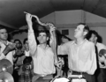 Snake handling in Kentucky, c. 1946

Article(s): Snake handling, George Went Hensley.
Request: I was wondering if someone could improve this image at all? It's a great picture but it's pretty old and I think you might be able to improve it a bit with some image editing software? (I apologize for my cluelessness here, feel free to ignore this/mock me.) Mark Arsten (talk) 01:47, 14 February 2012 (UTC)
Graphist opinion(s):
![]() Request taken by Jbarta. -- Sure it can be cleaned up a little. But can we mock you anyway? – JBarta (talk) 02:08, 14 February 2012 (UTC)
Request taken by Jbarta. -- Sure it can be cleaned up a little. But can we mock you anyway? – JBarta (talk) 02:08, 14 February 2012 (UTC)
- Yeah, might as well! Mark Arsten (talk) 02:18, 14 February 2012 (UTC)
![]() Done -- Cleaned up the most obvious spots, etc. There were some wierd woodgrain type swirls that I left because trying to remove them looked worse than leaving them in. Also, I'm not real happy with the contrast, but trying to reduce it also made the image look worse to me. So, what you see is the end of my effort. If anyone else feels they can improve upon it, be my guest. – JBarta (talk) 03:40, 14 February 2012 (UTC)
Done -- Cleaned up the most obvious spots, etc. There were some wierd woodgrain type swirls that I left because trying to remove them looked worse than leaving them in. Also, I'm not real happy with the contrast, but trying to reduce it also made the image look worse to me. So, what you see is the end of my effort. If anyone else feels they can improve upon it, be my guest. – JBarta (talk) 03:40, 14 February 2012 (UTC)
- Hey, that does look good, thanks a lot! Mark Arsten (talk) 03:57, 14 February 2012 (UTC)
Fanny Stevenson edit

Article(s): Fanny Van de Grift
Request: Could someone clean this up? Thanks. KAVEBEAR (talk) 17:29, 12 February 2012 (UTC)
Graphist opinion(s):(I guess I just wasted my time again. Centpacrr (talk) 02:23, 13 February 2012 (UTC))
- Who said?
- Well you certainly didn't spend it well on this occasion. 3 words my friend: up your game! If it was any more than 5 minutes that you spent titivating that image I'm a monkey's uncle. Either take the time to do something to the fullest of your abilities or don't bother. If you'd put a lot of effort in I'd empathise, but don't spit the dummy just because you got reverted! nagualdesign (talk) 04:19, 13 February 2012 (UTC)
- Why then did you ignore the foxing damage in the image? Just wondering. Centpacrr (talk) 04:39, 13 February 2012 (UTC)
- I took out a few spots which I thought were definitely not supposed to be there. The texture of the wall could have always been like that, and smoothing it all away wouldn't add anything to the image, so I left it. Sometimes less is more. (I once 'removed' a client's facial mole absentmindedly. She let me know about it!) And I don't like what you've now done to the right hand edge either. There may be data to be had there, but it's supposed to be low contrast - the woman is the subject, not the cloth. Now my eyes are drawn to the crumpled lossy-looking texture. nagualdesign (talk) 05:28, 13 February 2012 (UTC)
- In defense of Centpacrr, I too would have removed the spots ("foxing" as you gents call it). I think it's a real stretch to suggest they were supposed to be there. That said Centpacrr, this is yet another occassion where your brightness/contrast adjusting has made things worse. In my opinion of course, and I don't mean to be rude, blah blah blah... – JBarta (talk) 05:52, 13 February 2012 (UTC)
- I took out a few spots which I thought were definitely not supposed to be there. The texture of the wall could have always been like that, and smoothing it all away wouldn't add anything to the image, so I left it. Sometimes less is more. (I once 'removed' a client's facial mole absentmindedly. She let me know about it!) And I don't like what you've now done to the right hand edge either. There may be data to be had there, but it's supposed to be low contrast - the woman is the subject, not the cloth. Now my eyes are drawn to the crumpled lossy-looking texture. nagualdesign (talk) 05:28, 13 February 2012 (UTC)
- Why then did you ignore the foxing damage in the image? Just wondering. Centpacrr (talk) 04:39, 13 February 2012 (UTC)
- Well you certainly didn't spend it well on this occasion. 3 words my friend: up your game! If it was any more than 5 minutes that you spent titivating that image I'm a monkey's uncle. Either take the time to do something to the fullest of your abilities or don't bother. If you'd put a lot of effort in I'd empathise, but don't spit the dummy just because you got reverted! nagualdesign (talk) 04:19, 13 February 2012 (UTC)
- Who said?
- To each his own I suppose, however the artifacts in the background are clearly foxing that were not a part of the original image and when left in constitute visual noise that distract from Mrs. Stevenson, the subject of the image. The settings to the right in my version are much closer to the original gamma of the image as it appears here than your severely darkened treatment which to me makes the image appear unnatural. I prefer images that appear as closely as possible to the way the human eye would see them in "real life" which the much narrower dynamic range of photographic media is unable to accommodate without compromise. You are, of course, free to have your own opinion as to which is closer to the what the photographer who created the original image might have intended as I am to my views on the same. That, however, does not make either of our views (or anybody else's for that matter) "right" and the others "wrong". They are just different. Centpacrr (talk) 06:03, 13 February 2012 (UTC)
- Yes, much of this is subjective. Other things aren't though. Like the soldier's shoulder on another recent photo blending into the background, the items to the right of this image are crushed (I know you like those technical terms, right), which means that they were pure black on original print. Many years on and working from a scan you just can't put that much contrast back in. It would be over egging it. But it should fade to fairly dark, and without having extra-dark flecks dotted about. You've also introduced specular highlights to here dress (at gusset height). Again there should be no extreme tones on a photo this old. On the original her whole dress would have been a beautiful clean white, but you can't 'clean' things back to square one. It's like sandblasting an ancient building. nagualdesign (talk) 06:18, 13 February 2012 (UTC)
- ..Another clue lies in the vase. Smooth, curved surfaces give us a range of tones which should also be smooth. Any excessive curves adjustment (and by extension brightness/contrast, dodging/burning, etc.) leaves telltale 'flat' spots in the surface, affecting its 3 dimensional appearance. Conversely we can use such techniques to assess the gamma of the original image. You can be objective about a lot of asthetic issues. nagualdesign (talk) 06:33, 13 February 2012 (UTC)
I dare say that a large part of the problem here is that the starting point for this "project" is a relatively low resolution compressed jpeg of unknown origin into which many artifacts have doubtless already been introduced. That being said, however, even if the image were "perfect", there are still no "absolutes" in photography or any of the many other visual media. Each image is perceived and interpreted differently (i.e. subjectively) by each individual beholder as this discussion clearly demonstrates. That being the case, there can be no "absolutes", "rights", or "wrongs" -- just differences -- in perception and interpretation of images. Some differences may be great and others very small, but "none" are the same. Centpacrr (talk) 06:49, 13 February 2012 (UTC)
- Having already addressed the second part of your comment earlier, I'll say this about the first part... the image that we(you) have to work with here is not all that unusually bad and is not a large part of the problem ("problem" being differences of opinion). As with your "subjective" argument, I think that's just another copout. – JBarta (talk) 07:01, 13 February 2012 (UTC)
- I think you have missed my point, Centpacrr. Here's a simple example which is far from subjective. I'm not going to hammer my point any harder than that. nagualdesign (talk) 07:06, 13 February 2012 (UTC)
- If there were no subjectivity in perception and interpretation then everybody would agree on everything. That, however, has clearly never been the case in human experience. Calling that a "cop out" seems to me to be the ultimate cop out. So I will just agree that we disagree on this and leave it at that. You are, of course, free to maintain whatever absolutist views on these matters that you may have if you care to, and I will continue to believe that in the visual arts there are multiple legitimate ways to do things. Now I am off to other things. Centpacrr (talk) 07:30, 13 February 2012 (UTC)
- From Exposure (photography) (emphasis added): "A photograph may be described as underexposed when it has a loss of shadow detail, that is, when important dark areas are "muddy" or indistinguishable from black, known as "blocked up shadows" (or sometimes "crushed shadows," "crushed blacks," or "clipped blacks," especially in video). As the image to the right shows, these terms are technical ones rather than artistic judgments; an overexposed or underexposed image may be "correct", in that it provides the effect that the photographer intended;" However, as you seem determined to bury your head I don't expect that you'll concede. I guess you can't teach an old dog new tricks. Or even standard techniques! (I jest) nagualdesign (talk) 19:01, 13 February 2012 (UTC)
- Please then tell me exactly how do you "know" precisely "what the photographer intended" in this case? He/she is listed as "unknown", presumably has not left any notes that you referred to as a guide to those intentions, you have not indicated that you are in possession of an original copy of this image produced by the photographer's own hand, and he/she has probably been dead for more than a century so it no longer available for consultation on the matter. That being the case, your version is a subjective interpretation of his/her intentions based solely on a low res digital image file of unknown origin that was posted on the internet.
- From Exposure (photography) (emphasis added): "A photograph may be described as underexposed when it has a loss of shadow detail, that is, when important dark areas are "muddy" or indistinguishable from black, known as "blocked up shadows" (or sometimes "crushed shadows," "crushed blacks," or "clipped blacks," especially in video). As the image to the right shows, these terms are technical ones rather than artistic judgments; an overexposed or underexposed image may be "correct", in that it provides the effect that the photographer intended;" However, as you seem determined to bury your head I don't expect that you'll concede. I guess you can't teach an old dog new tricks. Or even standard techniques! (I jest) nagualdesign (talk) 19:01, 13 February 2012 (UTC)
- If there were no subjectivity in perception and interpretation then everybody would agree on everything. That, however, has clearly never been the case in human experience. Calling that a "cop out" seems to me to be the ultimate cop out. So I will just agree that we disagree on this and leave it at that. You are, of course, free to maintain whatever absolutist views on these matters that you may have if you care to, and I will continue to believe that in the visual arts there are multiple legitimate ways to do things. Now I am off to other things. Centpacrr (talk) 07:30, 13 February 2012 (UTC)
- The citation you provide above says that "an overexposed or underexposed image may be correct" (which is "subjective"), not that it is correct (which would be an unsupported "absolute"), so right there it counters your claim of absolute correctness, not supports it. The very process of editing and adjusting images presupposes that there are multiple legitimate ways to do it (i.e. "interpretation"). You don't know "what the photographer intended" with this image any more than I or anybody else does. Your version is your "subjective interpretation" of what you think he/she may have wanted (or just the way you personally like it), and so is mine. Neither one is either "correct" or "incorrect", both are just legitimate interpretations. If digital image restoration/alteration were an "absolute" science (as opposed to an "art") then there would be no need for people in the process at all. Now as you say I expect that you are "determined to bury your head" and that I shouldn't "expect that you'll concede" that "subjectivity" and "interpretation" are necessary and extricable parts of any artistic process but they just are -- and always have been. Centpacrr (talk) 19:43, 13 February 2012 (UTC)
- I might add this on the subject of subjectivity. We might also take into consideration the users' eyesight and computer monitor. Senses can deteriorate with age and can vary between individuals, and monitors can vary. A good starting point might be some sort of calibration check. Both of these issues can affect perception and have little to do with artistic subjectivity. Actually, while we're at it, we might also throw cognitive bias into the pot. Probably has as much to do with differing opinions as just about anything else. – JBarta (talk) 22:06, 13 February 2012 (UTC)
- Centpacrr, you really are incorrigible, and you have misrepresented most of what I have said. The photographer very definitely underexposed the items to the left (most likely because he/she was exposing for the white dress). Like the Exposure article says, although over/underexposure is normally considered an error it can also be intentional (either for effect or as a compromise). Whatever the case crushed=underexposed, which isn't open to interpretation. The gradient of a curved surface, and how the angles of incidence affect the amount of reflected light, isn't open to interpretation. Yes of course this is an art, but it is also a science (hence digital techniques being so successful). nagualdesign (talk) 23:57, 13 February 2012 (UTC)
- I am perfectly aware that dynamic range of photographic media of all types is narrower than that of the human eye and thus exposure is a compromise, a point that I have made several times here and in other discussions. That does not mean, however, that it is not completely legitimate (if not desirable) to make adjustments later to compensate for those inherent limitations by such techniques as by dodging in photographic printing or by digital means for images that were created as or converted to digital files. 'That is not in dispute. My point is that how that is done is open to the artistic judgement and interpretation of each "artist" who does it in the same way that musicians "interpret" a printed musical score differently each time they perform the composition. It seems to me that you believe that for every image there is only one possible "legitimate" interpretation and all others are "incorrect". My view is that there are many many different ways to interpret and adjust any image each of which is as "legitimate" and "correct" as the others. Centpacrr (talk) 07:03, 14 February 2012 (UTC)
- How many times are you kids going to beat each other over the head with the exact same points over and over? It's getting boring... really. Somewhere along the line I learned here to make a point once... maybe twice if if the other guy is a little thick-headed. If it still doesn't stick I give up and let it go... at least until the next time ;-) – JBarta (talk) 07:19, 14 February 2012 (UTC)
- I tried to end this without success six posts ago ("Now I am off to other things."). That being said, now I am off to other things. Centpacrr (talk) 07:30, 14 February 2012 (UTC)
- Until next time then. :-) nagualdesign (talk) 07:32, 14 February 2012 (UTC)
- I tried to end this without success six posts ago ("Now I am off to other things."). That being said, now I am off to other things. Centpacrr (talk) 07:30, 14 February 2012 (UTC)
- How many times are you kids going to beat each other over the head with the exact same points over and over? It's getting boring... really. Somewhere along the line I learned here to make a point once... maybe twice if if the other guy is a little thick-headed. If it still doesn't stick I give up and let it go... at least until the next time ;-) – JBarta (talk) 07:19, 14 February 2012 (UTC)
- I am perfectly aware that dynamic range of photographic media of all types is narrower than that of the human eye and thus exposure is a compromise, a point that I have made several times here and in other discussions. That does not mean, however, that it is not completely legitimate (if not desirable) to make adjustments later to compensate for those inherent limitations by such techniques as by dodging in photographic printing or by digital means for images that were created as or converted to digital files. 'That is not in dispute. My point is that how that is done is open to the artistic judgement and interpretation of each "artist" who does it in the same way that musicians "interpret" a printed musical score differently each time they perform the composition. It seems to me that you believe that for every image there is only one possible "legitimate" interpretation and all others are "incorrect". My view is that there are many many different ways to interpret and adjust any image each of which is as "legitimate" and "correct" as the others. Centpacrr (talk) 07:03, 14 February 2012 (UTC)
- Centpacrr, you really are incorrigible, and you have misrepresented most of what I have said. The photographer very definitely underexposed the items to the left (most likely because he/she was exposing for the white dress). Like the Exposure article says, although over/underexposure is normally considered an error it can also be intentional (either for effect or as a compromise). Whatever the case crushed=underexposed, which isn't open to interpretation. The gradient of a curved surface, and how the angles of incidence affect the amount of reflected light, isn't open to interpretation. Yes of course this is an art, but it is also a science (hence digital techniques being so successful). nagualdesign (talk) 23:57, 13 February 2012 (UTC)
- I might add this on the subject of subjectivity. We might also take into consideration the users' eyesight and computer monitor. Senses can deteriorate with age and can vary between individuals, and monitors can vary. A good starting point might be some sort of calibration check. Both of these issues can affect perception and have little to do with artistic subjectivity. Actually, while we're at it, we might also throw cognitive bias into the pot. Probably has as much to do with differing opinions as just about anything else. – JBarta (talk) 22:06, 13 February 2012 (UTC)
- The citation you provide above says that "an overexposed or underexposed image may be correct" (which is "subjective"), not that it is correct (which would be an unsupported "absolute"), so right there it counters your claim of absolute correctness, not supports it. The very process of editing and adjusting images presupposes that there are multiple legitimate ways to do it (i.e. "interpretation"). You don't know "what the photographer intended" with this image any more than I or anybody else does. Your version is your "subjective interpretation" of what you think he/she may have wanted (or just the way you personally like it), and so is mine. Neither one is either "correct" or "incorrect", both are just legitimate interpretations. If digital image restoration/alteration were an "absolute" science (as opposed to an "art") then there would be no need for people in the process at all. Now as you say I expect that you are "determined to bury your head" and that I shouldn't "expect that you'll concede" that "subjectivity" and "interpretation" are necessary and extricable parts of any artistic process but they just are -- and always have been. Centpacrr (talk) 19:43, 13 February 2012 (UTC)
Another Signature Removal edit


Article(s): Donn A. Starry
Request: Remove signature, crop, play with levels/brightness and contrast. Thanks. – Connormah (talk) 04:40, 14 February 2012 (UTC)
Graphist opinion(s):
Did #1. Limited myself to just cleaning & cropping. I suspect the color might be off, but I'm not sure what the correct color of his jacket should be. Probably brown? Brown as it is now? Maybe even green? Don't know. Also, while I was careful around the medals(correct terminology?), the writing was all over them. Hopefully I didn't mess them up too much. – JBarta (talk) 06:47, 14 February 2012 (UTC)
![]() Done #2 The colour of the jacket looks okay to me, JB. Though I'm no military expert I have seen uniforms that colour (with lighter khaki pants?) There's one small change you could make: See where his tie dips into deep shadow, and also under his right shoulder epilette, it looks a bit reddish to my eye (possibly magenta/not green enough). You could try a subtle Color Balance adjustment affecting just the shadows (preserving luminosity). nagualdesign (talk) 07:16, 14 February 2012 (UTC)
Done #2 The colour of the jacket looks okay to me, JB. Though I'm no military expert I have seen uniforms that colour (with lighter khaki pants?) There's one small change you could make: See where his tie dips into deep shadow, and also under his right shoulder epilette, it looks a bit reddish to my eye (possibly magenta/not green enough). You could try a subtle Color Balance adjustment affecting just the shadows (preserving luminosity). nagualdesign (talk) 07:16, 14 February 2012 (UTC)
- The whole thing looks reddish to me. I'm going to refrain from twiddling with it though. First I'd like to see a few perfectly colored images with people wearing similar uniforms. Then we'd have something solid to go by. Until then I, and apparently you too, are just guessing. – JBarta (talk) 07:32, 14 February 2012 (UTC)
- I gotta tell you, I'm really not liking your take on this military image either(#2). I really think your colors and contrasting are all wrong. The uniform is too dark, the face is practically glowing and you've lost some detail. I uploaded a whirl of my own. See if you like it. If not, just revert it back to yours. – JBarta (talk) 07:43, 14 February 2012 (UTC)
- That's definitely improved his face, which is the most important thing. nagualdesign (talk) 07:48, 14 February 2012 (UTC)
- Awesome guys, thanks! – Connormah (talk) 14:30, 14 February 2012 (UTC)
- Lightened to more closely match Blue Shade 1549 for the uniform which was the only shade acceptable between 1975 and Gen Chamberlain's retirement in 1994. (See here)) Centpacrr (talk) 15:28, 14 February 2012 (UTC)
- (I hope I don't sound like I have some kind of vendetta, but here I am again..) Good work finding the right colour match, Centpacrr, but could you not alter the colour without blocking up all of the shadows? His face is now much worse than when JBarta made his alteration and the uniform colour is basically just a tad less green, right? So just altering the Color Balance of the midtones and shadows (without affecting luminosity) would have had the desired effect. I didn't revert because I really don't want to get into an argument (we have to learn to work together), so how about you trying that again? Regards, nagualdesign (talk) 19:15, 14 February 2012 (UTC)
- ..Also, did you alter the rank of Buster Glosson? He now has 3 stars on his epilette(s), where previously he had either 1 or 2. Hope you did your homework first! nagualdesign (talk) 19:23, 14 February 2012 (UTC)
- General Glosson was a LT GEN (three stars) when this photograph was taken and you can also see that there are three stars on his other shoulder (which I did not touch). Stars are also always centered so if he were a BGen (one star) at the time the star would be in the center of his shoulder, not at the end. I have fixed the face on the Chamberlain portrait by replacing it with the face from previous darker (Jbarta) version. Centpacrr (talk) 21:34, 14 February 2012 (UTC)
- The stars were visible in the original, but two of them were only visible as a few bumps and specks. I'm afraid that in my zeal to clean up the writing that appeared over those stars I also removed those specks. Centpacrr simply added two stars. I'm not a huge fan of doing something like that (because it's way too easy to get it wrong), but here I think it's accurate enough and the result doesn't look too bad. – JBarta (talk) 23:59, 14 February 2012 (UTC)
- General Glosson was a LT GEN (three stars) when this photograph was taken and you can also see that there are three stars on his other shoulder (which I did not touch). Stars are also always centered so if he were a BGen (one star) at the time the star would be in the center of his shoulder, not at the end. I have fixed the face on the Chamberlain portrait by replacing it with the face from previous darker (Jbarta) version. Centpacrr (talk) 21:34, 14 February 2012 (UTC)
- Lightened to more closely match Blue Shade 1549 for the uniform which was the only shade acceptable between 1975 and Gen Chamberlain's retirement in 1994. (See here)) Centpacrr (talk) 15:28, 14 February 2012 (UTC)
- Awesome guys, thanks! – Connormah (talk) 14:30, 14 February 2012 (UTC)
- That's definitely improved his face, which is the most important thing. nagualdesign (talk) 07:48, 14 February 2012 (UTC)
George Washington Carver edit
-
 Uploaded hi res version

Article(s): George Washington Carver
Request: Download the original tif file from here and upload it to commons over the compressed version. Crop the edges, straighten, and if necessary clean-up. Upload either over File:George Washington Carver by Frances Benjamin Johnston.jpg or separately . Crisco 1492 (talk) 07:09, 14 February 2012 (UTC)
Graphist opinion(s):![]() Done Centpacrr (talk) 13:46, 14 February 2012 (UTC)
Done Centpacrr (talk) 13:46, 14 February 2012 (UTC)
What's going on with this image? edit


Article(s): Paul F. Gorman
Request: Any clue what is up with the rendering of this image? – Connormah (talk) 00:13, 15 February 2012 (UTC)
- Appears that all the images I'm about to upload this'll happen to. Can anyone tell me what to do to make sure it renders properly so I can upload them all correctly (I have Photoshop CS3 Extended)? – Connormah (talk) 00:23, 15 February 2012 (UTC)
Graphist opinion(s):
I don't use Photoshop, but I use Irfanview as an image viewer. When I open it in Irfanview (and it opens fine by the way) and check image information, it notes compression as "JPEG, CMYK". Other jpgs I have laying around just note "JPEG". Maybe that has something to do with it. I'm afraid I can't be of any further help than that. – JBarta (talk) 00:43, 15 February 2012 (UTC)
- Converting to RGB seemed to do the trick. Thanks. – Connormah (talk) 01:05, 15 February 2012 (UTC)
- I vaguely recall this being briefly discussed at Commons Graphics Lab, a few months ago, as a bug related to CMYK/RGB rendering, i.e. conversion to RGB is a solution. Materialscientist (talk) 01:07, 15 February 2012 (UTC)
I started to reduce the overexposed face in #3 when I noticed his hair is green. And there is a lot of green throughout. I can't help but wonder if that jacket is supposed to be blue. I don't understand... the U.S. Army can hit can hit a gnat in the ass from 1000 miles away, yet can't seem to take a decent picture. Go figure. – JBarta (talk) 05:18, 15 February 2012 (UTC)
- I requested to be sent the full photo - I received it in a .PSD file which looked to be for a web graphic. I'll upload it over if I get them - don't waste your time on this one if I can get a full version ;). The colors are even worse in #2 and I tried to do something about it but couldn't come up with anything decent. But it is a better photo than whaqt we had before. – Connormah (talk) 05:35, 15 February 2012 (UTC)
John Macadam edit
.jpg)
.png)
Article(s): John Macadam
Request: Leave original just make transparent png oval cropped version. Thanks. KAVEBEAR (talk) 00:45, 15 February 2012 (UTC)
Graphist opinion(s): ![]() Done: Jenith (talk) 01:34, 15 February 2012 (UTC)
Done: Jenith (talk) 01:34, 15 February 2012 (UTC)
Gen. Jacob E. Smart edit

Article(s): Jacob E. Smart
Request: Remove watermark/signature. (for those wondering, this is a portrait of Smart as a 4 star general, the current one in his article is a 3 star portrait) Thanks. – Connormah (talk) 04:03, 16 February 2012 (UTC)
Graphist opinion(s):
Just a little micro-quibble here... is there any reason why you wouldn't upload the image and take care of that part yourself? (And yes, I'm just not happy unless I'm complaining about something. ;-) – JBarta (talk) 04:36, 16 February 2012 (UTC)
- My Photoshop skills are extremely limited (I usually do more damage than good when I try this type of thing), but I can upload it later. – Connormah (talk) 05:04, 16 February 2012 (UTC)
- You don't need Photoshop. Just drag the image onto your desktop and upload it from there. (Or right click and save picture as...) Simple. If you're not sure what you're doing, don't worry about it... messing things up is a great way to learn ;-) Besides, before fiddling with an image I sometimes check the source anyway just to compare the two. Another thing to consider is that once you upload the image, it's in the system even if no one cleans it up right now. Like with your heavily watermarked four-star general a few posts up... get it uploaded to commons and in the system, categorize it and slap a {{watermark}} tag on it. Eventually someone may get around to cleaning it up and using it. But if you never get it uploaded.... – JBarta (talk) 05:31, 16 February 2012 (UTC)
NR Tickets edit
-
 National Rail Tickets

Article(s): National Rail
Request: Remove background colour 92.14.187.60 (talk) 14:56, 16 February 2012 (UTC)
Graphist opinion(s):![]() Done Centpacrr (talk) 15:23, 16 February 2012 (UTC)
Done Centpacrr (talk) 15:23, 16 February 2012 (UTC)
Francis Asbury portrait edit
THIS WAS TRANSFERRED FROM ILLUSTRATION WORKSHOP --Gauravjuvekar (talk) 15:08, 16 February 2012 (UTC)
-
Portrait of Francis Asbury Done
Article(s): Methodism, Francis Asbury
Request: Please can you brighten and sharpen the image and remove the text and crest from background (or just the text). --Peter (Talk page) 13:19, 15 February 2012 (UTC)
Graphist opinion(s): ![]() Done: Jenith (talk) 16:48, 16 February 2012 (UTC)
Done: Jenith (talk) 16:48, 16 February 2012 (UTC)
- Hmmm.. You've lost quite a bit of forehead detail there, Jenith. Might I suggest (and this applies to all the users that help out here, including myself) that you/we upload altered images in stages: First remove watermarks, spots, dust and scratches, etc. and upload the cleaned version. Then make global changes to colour and/or contrast, etc. and upload the newer version, uploading as many 'layers' as required. This non-destructive method of working creates a workflow in which other editors can collaborate/compare, and if an editor spends a long time cleaning an image then makes a small error at the final furlong his/her work need not be entirely undone. Hopefully you have kept the cleaned, unadjusted file and can upload another version, otherwise you (or someone else) will have to start from scratch. Regards, nagualdesign (talk) 17:00, 16 February 2012 (UTC)
Hi Nagualdesign, sure. It's a good idea. Thanks. --Jenith (talk) 02:07, 17 February 2012 (UTC)
- Okay, I've tried the old 'head transplant' techique. It doesn't look too bad (I've had some practice on recombined group photos) but it isn't in the spirit of restoration. Spot removal aside, global changes are usually preferable to retouches. If anyone wishes to start again from scratch I commend you. nagualdesign (talk) 18:14, 16 February 2012 (UTC)
- I don't know why you want to remove the text and seal as they are clearly not watermarks but integral parts of the original painting which were put there on purpose by the artist. I have cleaned up the original file but also kept the text and seal. Centpacrr (talk) 18:45, 16 February 2012 (UTC)
- Can always create a derivative file with the text and crest removed. The text and crest may have been part of the original painting, they may have been added at some point later (likely) and they certainly may be removed for our purposes here. – JBarta (talk) 19:09, 16 February 2012 (UTC)
- I think the crest should stay (it seems to be too large to remove easily anyway) but the text appears to have been added on later and, even if it was an international part, that doesn't mean it shouldn't/can't be removed if the effect is that the image looks better. I think the text should be removed again.
Oh - I started writing this before JBarta's comment - and I agree with his suggestion. Two files could be created, with the description on the derivation saying that the image has been largely modified. -- Peter (Talk page) 19:13, 16 February 2012 (UTC)- If there's a way of removing the crest without leaving such a large brown mark (a way of blurring it more) then that would be preferable. I think the brightening of the image at the moment looks good. -- Peter (Talk page) 19:18, 16 February 2012 (UTC)
- If you want a version without the text and/or seal that should be a separate upload as a derivative work. There is also no way of knowing just by looking at the image whether or not the texat and/or seal were an original part of the painting are were added later. It seems to me that claiming they are not original is thus pure speculation without some form of evidence one way or the other. Centpacrr (talk) 19:28, 16 February 2012 (UTC)
- If there's a way of removing the crest without leaving such a large brown mark (a way of blurring it more) then that would be preferable. I think the brightening of the image at the moment looks good. -- Peter (Talk page) 19:18, 16 February 2012 (UTC)
- I think the crest should stay (it seems to be too large to remove easily anyway) but the text appears to have been added on later and, even if it was an international part, that doesn't mean it shouldn't/can't be removed if the effect is that the image looks better. I think the text should be removed again.
- Can always create a derivative file with the text and crest removed. The text and crest may have been part of the original painting, they may have been added at some point later (likely) and they certainly may be removed for our purposes here. – JBarta (talk) 19:09, 16 February 2012 (UTC)
- I don't know why you want to remove the text and seal as they are clearly not watermarks but integral parts of the original painting which were put there on purpose by the artist. I have cleaned up the original file but also kept the text and seal. Centpacrr (talk) 18:45, 16 February 2012 (UTC)
- Okay, I've tried the old 'head transplant' techique. It doesn't look too bad (I've had some practice on recombined group photos) but it isn't in the spirit of restoration. Spot removal aside, global changes are usually preferable to retouches. If anyone wishes to start again from scratch I commend you. nagualdesign (talk) 18:14, 16 February 2012 (UTC)
Kealakekua Bay heiau illustration edit
-
 Done
Done

Article(s): Third voyage of James Cook, Kealakekua Bay, Heiau
Request: Please "crop the white space" from the image, "don't crop the borders" with the title and description, you can make out the distinction between the white space and the bordering. KAVEBEAR (talk) 05:36, 17 February 2012 (UTC)
Graphist opinion(s): ![]() Done: Jenith (talk) 10:50, 17 February 2012 (UTC)
Done: Jenith (talk) 10:50, 17 February 2012 (UTC)
- redone. Sorry Jenith but the margin looked a bit messy. nagualdesign (talk) 04:54, 19 February 2012 (UTC)
No problem Nagualdesign. Good now. Jenith (talk) 02:05, 20 February 2012 (UTC)
House of Kamehameha edit
-
 (original)
 -
PawełMM's edit
-
 JBarta's edit

.jpg)
Article(s): House of Kamehameha
Request: Create a new version by cleaning up and harmonizing the background, remove some of the traces of the frame but try to restore the blurriness on the bottom part. Thanks in advance. KAVEBEAR (talk) 05:43, 17 February 2012 (UTC)
Graphist opinion(s): ![]() Request taken by PawełMM.
Request taken by PawełMM.
![]() Done: I tried do that. PawełMM (talk) 08:24, 17 February 2012 (UTC)
Done: I tried do that. PawełMM (talk) 08:24, 17 February 2012 (UTC)
- It looks unnatural. You can't just crop the figures out and replace the background...--KAVEBEAR (talk) 05:52, 18 February 2012 (UTC)
- Pawel, your new background isn't pure gray, like the rest of the photo, it's a bit red. nagualdesign (talk) 23:49, 17 February 2012 (UTC)
- Redone: Pattern and color of tha background changed. PawełMM (talk) 08:55, 18 February 2012 (UTC)
- It still looks unnatural like you cut the images out and glue them on to a gray color construction paper.--KAVEBEAR (talk) 18:29, 18 February 2012 (UTC)
- Threw another edit into the pile. – JBarta (talk) 18:39, 18 February 2012 (UTC)
- Redone. Me too, only I uploaded mine over the original. Sorry. nagualdesign (talk) 19:12, 18 February 2012 (UTC)
- ..I see that you reverted to the cleaned, uncropped version. (Did I cut too much off?) Bear in mind that the edge of the photo that I made is a bit BS in places. It's just my way of cleaning right to the edge - by overshooting and cropping afterwards. As you can see the original photograph is smaller than the image frame so I'll trim it back a wee bit. Let us know what you think... nagualdesign (talk) 20:49, 18 February 2012 (UTC)
- It was too much for me because I like the entire picture to be shown. Your later version was okay just not what I wanted, sorry. Could you crop the tiny frame edge on the top and redo the darken shadows you did before?--KAVEBEAR (talk) 21:01, 18 February 2012 (UTC)
- Just uploaded a trimmed version. I'll redo the curves adjustment now... nagualdesign (talk) 21:16, 18 February 2012 (UTC)
- .. Done. Good call, Kavebear. The new version has a lot of headroom, I thought, but compared to the 19:10, 18 February 2012 version it looks much better. The slight vignette effect looks quite good, if I do say so myself. ;-) ..Yes, I like it a lot. The 'man of the house' is squarely in the centre with the others radiating out from him, their faces lying on lines that intersect the corners forming a sort of envelope M-shape. Just goes to show that it's often better not to second guess the intent of the photographer, especially not one employed by royalty! nagualdesign (talk) 21:32, 18 February 2012 (UTC)
- It was too much for me because I like the entire picture to be shown. Your later version was okay just not what I wanted, sorry. Could you crop the tiny frame edge on the top and redo the darken shadows you did before?--KAVEBEAR (talk) 21:01, 18 February 2012 (UTC)
- Threw another edit into the pile. – JBarta (talk) 18:39, 18 February 2012 (UTC)
- It still looks unnatural like you cut the images out and glue them on to a gray color construction paper.--KAVEBEAR (talk) 18:29, 18 February 2012 (UTC)
Rachael Beck edit
-
 Rachael Beck and her child Done
 -
 Cropped version


Article(s): Rachael Beck Request: Can you make a crop of Rachael, the adult, suitable for an infobox. I only really want a upperhalf of her body bordering on a headshot - for what I need it for.Rain the 1 00:56, 18 February 2012 (UTC)
Graphist opinion(s): ![]() Done: Jenith (talk) 02:06, 18 February 2012 (UTC)
Done: Jenith (talk) 02:06, 18 February 2012 (UTC)
Reinhard Heydrich edit
-
 Reinhard Heydrich as a cadet (1922) Done
 -
Heydrich and his sisters (1915) Done
.jpg)
Article(s): Reinhard Heydrich
Request: If the black lines across the bottom could be removed, that would be great. Thanks Dianna (talk) 03:32, 18 February 2012 (UTC)
Graphist opinion(s): ![]() Done: Jenith (talk) 03:46, 18 February 2012 (UTC)
Done: Jenith (talk) 03:46, 18 February 2012 (UTC)
Chairman Mao voting edit
-
 Chairman Mao voting

Article(s): Quotations from Chairman Mao
Request: Please can you reduce the blur on the image and clean it up. Thanks! -- Peter (Talk page) 03:54, 18 February 2012 (UTC)
Graphist opinion(s):
![]() Done: Done as requested. PawełMM (talk) 09:11, 18 February 2012 (UTC)
Done: Done as requested. PawełMM (talk) 09:11, 18 February 2012 (UTC)
Grace Young edit

Article(s): Grace Kamaikui
Request: Remove the minor line that I noted on her dress. Do not do anything else to image beyond that! Thanks KAVEBEAR (talk) 01:04, 19 February 2012 (UTC)
Graphist opinion(s):
Are you serious?? That doesn't even rise to the remotest realm of picky. It's just plain ridiculous. (I'm reminded again why I (almost) never edit images for you.) – JBarta (talk) 01:15, 19 February 2012 (UTC)
What line? nagualdesign (talk) 03:29, 19 February 2012 (UTC)
- Might be the vertical one, running down her left shoulder (the horizontal one at the lungs level is part of her dress). Anyway, I would leave them be. Materialscientist (talk) 03:40, 19 February 2012 (UTC)
Modifications edit
-
 Done by JBarta
 -
 Done
Done -
 (cropped)


.jpg)
Article(s): Rakesh Jhunjhunwala, Azim Premji
Request: Remove excess materials and ensure that the face appears bigger in their biography.--Kkm010* ۩ ۞ 04:54, 19 February 2012 (UTC)
Graphist opinion(s): ..20% enough? ;-) nagualdesign (talk) 05:17, 19 February 2012 (UTC)
- Of all people to give a bigger head... that dude needs it the least. I didn't crop closer to his head because one, the image is a little blurry, and two, his face (at least in this picture) is a bit on the freakishly large size and a close crop might be downright scary. – JBarta (talk) 08:52, 19 February 2012 (UTC)
- I agree. And your version is slightly better than mine. :-) If you read his page, though, you may loose all sympathy. Rakesh Jhunjhunwala is not part of 'the solution', if you know what I mean. He's what I'd call a 'planet f#@ker'. nagualdesign (talk) 16:17, 19 February 2012 (UTC)
- Of all people to give a bigger head... that dude needs it the least. I didn't crop closer to his head because one, the image is a little blurry, and two, his face (at least in this picture) is a bit on the freakishly large size and a close crop might be downright scary. – JBarta (talk) 08:52, 19 February 2012 (UTC)
I didn't remove the white writing on the wall behind #2 for two reasons, 1) general laziness and 2) when I started getting into it I wasn't liking the result. All in all I think it looks just fine as it is. – JBarta (talk) 00:41, 20 February 2012 (UTC)
- Thanks!--Kkm010* ۩ ۞ 04:33, 20 February 2012 (UTC)
- FYI, someone uploaded the second crop as a separate file (which is fine) so in whichever articles you wish to use the cropped version, you'll have to manually change the image filename. – JBarta (talk) 11:15, 20 February 2012 (UTC)
- Thanks! I would rather use the separate cropped version which look far better.--Kkm010* ۩ ۞ 11:46, 20 February 2012 (UTC)
- Thanks!--Kkm010* ۩ ۞ 04:33, 20 February 2012 (UTC)
Radama II with crown edit

Article(s): Radama II
Request: Tidy up background... KAVEBEAR (talk) 19:11, 19 February 2012 (UTC)
Graphist opinion(s): ![]() Done: Howzat? I know that you only asked for the background to be tidied but I couldn't help myself. His jacket's a lot lighter than his trousers in La Trobe Picture Collection, so I 'fixed' it. nagualdesign (talk) 20:54, 19 February 2012 (UTC)
Done: Howzat? I know that you only asked for the background to be tidied but I couldn't help myself. His jacket's a lot lighter than his trousers in La Trobe Picture Collection, so I 'fixed' it. nagualdesign (talk) 20:54, 19 February 2012 (UTC)
- Note: There's a noticeable blob on his chin which none of the previous versions, or the current one, have tackled. It's quite distracting. Who thinks that it should be removed (and his face slightly reworked), and who thinks it should be there? nagualdesign (talk) 17:50, 20 February 2012 (UTC)
- Good catch. Another one of those obvious errors, eh? My opinion is that it's an error in the photograph. The error may have been in the original photo or may have happened later (likely). Either way, that sort of error can and should be repaired. The purpose of the image is to offer a quality photo of the man, not offer a perfect replica of the photo as we found it. If it were a famous photo with a well-known error that is part of of the photo's "charm", then that would be a different story. In the end this sort of thing is a judgement call. Actually, as I think of it, there have been a few times with a modern photo where I'll be nice and remove a pimple or two, or edit out a wild wisp of hair. Again, it boils down to judgement. – JBarta (talk) 19:26, 20 February 2012 (UTC)
- Much better now, eh? nagualdesign (talk) 04:17, 21 February 2012 (UTC)
- Good catch. Another one of those obvious errors, eh? My opinion is that it's an error in the photograph. The error may have been in the original photo or may have happened later (likely). Either way, that sort of error can and should be repaired. The purpose of the image is to offer a quality photo of the man, not offer a perfect replica of the photo as we found it. If it were a famous photo with a well-known error that is part of of the photo's "charm", then that would be a different story. In the end this sort of thing is a judgement call. Actually, as I think of it, there have been a few times with a modern photo where I'll be nice and remove a pimple or two, or edit out a wild wisp of hair. Again, it boils down to judgement. – JBarta (talk) 19:26, 20 February 2012 (UTC)
- Note: There's a noticeable blob on his chin which none of the previous versions, or the current one, have tackled. It's quite distracting. Who thinks that it should be removed (and his face slightly reworked), and who thinks it should be there? nagualdesign (talk) 17:50, 20 February 2012 (UTC)
File:SRDas.jpg edit

Article(s): Satish Ranjan Das and possibly The Doon School
Request: Can someone remove the white border around the image? This should be a super easy crop job (and yes, I could probably do it myself except that I have no idea how to upload a new version of the image and what the protocol for that is - anyone feel like explaining?). Nolelover Talk·Contribs 23:17, 19 February 2012 (UTC)
Graphist opinion: Go to the image page. If the image resided at the Commons (this one doesn't) there would be a small Commons logo near the top right of the page, which you could click to go to the image page there. Scroll down the page. Below the thumbnails showing previous versions there should be a link which says 'Upload a new version of this file'. If there isn't a link you may need to sign in - go back to the page top. The rest should be pretty straightforward. nagualdesign (talk) 00:08, 20 February 2012 (UTC)
- Ahh, okay....great! *five minutes later* Ok...I've uploaded, but (a) it still shows the old file (b) should I have copied and pasted all the licensing and FUR info in the comments section, which I left blank? Nolelover Talk·Contribs 00:17, 20 February 2012 (UTC)
- Hit refresh to clear the cache and the new image should show. Because you uploaded a new version of an image the licensing info should already be there. Only when you upload a brand new image do you have to fill out all of the bumf. nagualdesign (talk) 00:22, 20 February 2012 (UTC)
- In that case, is the "File changes:" box in the upload page an edit summary of sorts? Nolelover Talk·Contribs 01:56, 20 February 2012 (UTC)
- Yes. You should really have filled that in when you uploaded (eg, 'Cropped border.') but it doesn't matter. Also, when you saved your cropped version you applied some pretty drastic compression, taking the image from 20kb to 3kb. The outline of his lips became noticably blurred and his neck looked a bit noisy. With an image this small it's hardly worth compressing at all. Don't worry, I took the original and redid it, so it now uses 18kb. Unfortunately the previous versions have been removed so you can't compare the different versions, but at least we are left with (arguably!) the highest quality possible. nagualdesign (talk) 17:21, 20 February 2012 (UTC)
- I did? Oooh, sorry about that. This sounds bad but...do you have any idea how I did that? Nolelover Talk·Contribs 17:27, 20 February 2012 (UTC)
- During the save process on your computer: Most image editors will pop up a dialogue box when you click Save.. (or Save As..) in which you can check/uncheck an Optimize option and choose the percentage. If in doubt stick to 80% or greater (though anything over 60% is usually okay). I like to try and stick close to the filesize of the original image on Wikipedia, unless I deem the original to be overly compressed. (Drastically increasing the filesize of a previously compressed jpg doesn't improve image quality either, but let's not get too technical, eh?) Regards, nagualdesign (talk) 17:42, 20 February 2012 (UTC)
- I did? Oooh, sorry about that. This sounds bad but...do you have any idea how I did that? Nolelover Talk·Contribs 17:27, 20 February 2012 (UTC)
- Yes. You should really have filled that in when you uploaded (eg, 'Cropped border.') but it doesn't matter. Also, when you saved your cropped version you applied some pretty drastic compression, taking the image from 20kb to 3kb. The outline of his lips became noticably blurred and his neck looked a bit noisy. With an image this small it's hardly worth compressing at all. Don't worry, I took the original and redid it, so it now uses 18kb. Unfortunately the previous versions have been removed so you can't compare the different versions, but at least we are left with (arguably!) the highest quality possible. nagualdesign (talk) 17:21, 20 February 2012 (UTC)
- In that case, is the "File changes:" box in the upload page an edit summary of sorts? Nolelover Talk·Contribs 01:56, 20 February 2012 (UTC)
- Hit refresh to clear the cache and the new image should show. Because you uploaded a new version of an image the licensing info should already be there. Only when you upload a brand new image do you have to fill out all of the bumf. nagualdesign (talk) 00:22, 20 February 2012 (UTC)
Jungle Tales of Tarzan edit

Article(s): Jungle Tales of Tarzan
Request: Found this book cover. Thought someone might like to clean this up. And as the requester, my only request is to resist the mighty temptation to mess with colors, contrast, gamma, etc, etc and just focus on a quality and thorough job of cleaning up the age-related wear marks and other minor imperfections. – JBarta (talk) 11:07, 20 February 2012 (UTC)
Graphist opinion(s): ![]() Request taken by PawełMM.
Request taken by PawełMM.
![]() Done: Done as requested. PawełMM (talk) 18:00, 20 February 2012 (UTC)
Done: Done as requested. PawełMM (talk) 18:00, 20 February 2012 (UTC)
Marianne Cope edit
-
 Check page 3 of this link and this version
 -


Article(s): Marianne Cope
Request: Clean up these images. Thanks. KAVEBEAR (talk) 03:52, 21 February 2012 (UTC)
Graphist opinion(s): (With the second image) Why not simply use the other version? If it's due to the distortion, colour and framing of the original I've provided an alternative. If not just revert. Yes, the 'dirty' image has more detail, but it's not as hi-res as it looks and it's unuseably dirty. If anybody can clean that up I'll be impressed (nay, astounded). I'd say the request is pretty pointless. Sorry. nagualdesign (talk) 06:01, 21 February 2012 (UTC)
![]() Done: Done #1. PawełMM (talk) 09:47, 21 February 2012 (UTC)
Done: Done #1. PawełMM (talk) 09:47, 21 February 2012 (UTC)
Watermark edit


.jpg)
Article(s): Lunalilo, Ranavalona III
Request: Remove watermark at the top right... KAVEBEAR (talk) 04:13, 21 February 2012 (UTC)
Graphist opinion(s): ![]() Done all 3. nagualdesign (talk) 04:57, 21 February 2012 (UTC)
Done all 3. nagualdesign (talk) 04:57, 21 February 2012 (UTC)
- {{watermark removed}} tags updated. Thanks again, JB. Regards, nagualdesign (talk) 17:51, 21 February 2012 (UTC)
Bryce Poe II edit

Article(s): Bryce Poe II
Request: Cleanup. Thanks. – Connormah (talk) 06:01, 21 February 2012 (UTC)
Graphist opinion(s):![]() Done Centpacrr (talk) 06:39, 21 February 2012 (UTC)
Done Centpacrr (talk) 06:39, 21 February 2012 (UTC)
- Looks great, Centpacrr, but your final adjustment has left a noticeable circle on his forehead. A stray click perhaps. nagualdesign (talk) 23:54, 21 February 2012 (UTC)
- Damn you got good eyes. I wouldn't call it very noticeable for us mere mortals however. Almost looks like he dabbed the forehead on purpose to reduce its brightness. If anyone else is having trouble finding it, the center of the circle is at about 896,283 and it takes up most of the right side of his forehead (his right, our left). Nagualdesign, was it noticeable to you simply by looking at the photo, or did you find it by tabbing back and forth between edits? – JBarta (talk) 00:18, 22 February 2012 (UTC)
- It's there as an Easter Egg. Centpacrr (talk) 00:27, 22 February 2012 (UTC)
- Hah! :-) The specular highlight looked a little bit gray (when it should be pure white) which drew my attention. The fact that it's a hard edged circle makes it a little easier to spot, but even a soft dot would be noticeable considering the highlight thing. My eyes aren't very good, actually, but you've got to be good looking ('cause they're so hard to see!) nagualdesign (talk) 00:32, 22 February 2012 (UTC)
- The "Easter Egg" has now been found and fetched away by the Easter bunny. ;=) (It was actually part of a multiple step tweak that I then rejected and reversed but I did not go back far enough by one frame in the process.) Centpacrr (talk) 00:48, 22 February 2012 (UTC)
- Yes, much better. Or if you're a mere mortal, meh. ;-) nagualdesign (talk) 00:59, 22 February 2012 (UTC)
- The "Easter Egg" has now been found and fetched away by the Easter bunny. ;=) (It was actually part of a multiple step tweak that I then rejected and reversed but I did not go back far enough by one frame in the process.) Centpacrr (talk) 00:48, 22 February 2012 (UTC)
- Hah! :-) The specular highlight looked a little bit gray (when it should be pure white) which drew my attention. The fact that it's a hard edged circle makes it a little easier to spot, but even a soft dot would be noticeable considering the highlight thing. My eyes aren't very good, actually, but you've got to be good looking ('cause they're so hard to see!) nagualdesign (talk) 00:32, 22 February 2012 (UTC)
- It's there as an Easter Egg. Centpacrr (talk) 00:27, 22 February 2012 (UTC)
- Damn you got good eyes. I wouldn't call it very noticeable for us mere mortals however. Almost looks like he dabbed the forehead on purpose to reduce its brightness. If anyone else is having trouble finding it, the center of the circle is at about 896,283 and it takes up most of the right side of his forehead (his right, our left). Nagualdesign, was it noticeable to you simply by looking at the photo, or did you find it by tabbing back and forth between edits? – JBarta (talk) 00:18, 22 February 2012 (UTC)
- Looks great, Centpacrr, but your final adjustment has left a noticeable circle on his forehead. A stray click perhaps. nagualdesign (talk) 23:54, 21 February 2012 (UTC)
-
 Crop Done
 -
 Crop Done
 -
 Remove bubble-like watermark on bottom right corner Done
 -
 Crop Done by Jenith
 -
 Clean up hole in sky Done
 -
 Clean up patchiness in painting Done
 -
 Remove unnecesary letters and numbers Done
 -
 Clean up Done


Article(s): Ranavalona I and others
Request: Request above. Thanks. KAVEBEAR (talk) 09:40, 21 February 2012 (UTC)
Graphist opinion(s):
![]() Done: #4 by Jenith and all others by PawełMM (talk) 14:15, 21 February 2012 (UTC)
Done: #4 by Jenith and all others by PawełMM (talk) 14:15, 21 February 2012 (UTC)
- Actually there is still a hole in the sky on the fifth image, the patchiness is still there on the sixth image, and third image still has the holes in right corner. Fix if you can, if not I will be okay with it.--KAVEBEAR (talk) 03:18, 22 February 2012 (UTC)
- I can't see any 'holes' in the 3rd. Redid the 4th. Removed a few more spots on 5th image and evened out the colour. Reduced yellowing (patchiness?) on the 6th. You really ought to try being more specific/descriptive with your requests - you wouldn't want to sound ungrateful, eh? ;-) Regards, nagualdesign (talk) 04:50, 22 February 2012 (UTC)
- 3rd image, bottom right corner. Tab between the edits and you'll see the "holes". And "patchiness" probably means jpg artifacts. – JBarta (talk) 05:11, 22 February 2012 (UTC)
- The thing on the third image is very minor. Is the black hole in the sky on the fifth image natural? It is a little left from the center.--KAVEBEAR (talk) 05:21, 22 February 2012 (UTC)
- The 'black hole' was dealt with 2 edits ago! Try hitting Refresh from time to time. nagualdesign (talk) 05:27, 22 February 2012 (UTC)
- The thing on the third image is very minor. Is the black hole in the sky on the fifth image natural? It is a little left from the center.--KAVEBEAR (talk) 05:21, 22 February 2012 (UTC)
- 3rd image, bottom right corner. Tab between the edits and you'll see the "holes". And "patchiness" probably means jpg artifacts. – JBarta (talk) 05:11, 22 February 2012 (UTC)
- I can't see any 'holes' in the 3rd. Redid the 4th. Removed a few more spots on 5th image and evened out the colour. Reduced yellowing (patchiness?) on the 6th. You really ought to try being more specific/descriptive with your requests - you wouldn't want to sound ungrateful, eh? ;-) Regards, nagualdesign (talk) 04:50, 22 February 2012 (UTC)
- Actually there is still a hole in the sky on the fifth image, the patchiness is still there on the sixth image, and third image still has the holes in right corner. Fix if you can, if not I will be okay with it.--KAVEBEAR (talk) 03:18, 22 February 2012 (UTC)
Abby Sunderland edit

Article(s): Abby Sunderland
Request: Do something with them... 68.120.69.32 (talk) 06:52, 26 February 2012 (UTC)
This image has already been through here. What specifically did you have in mind? – JBarta (talk) 08:10, 26 February 2012 (UTC)
- Replace. --68.120.69.32 (talk) 08:46, 26 February 2012 (UTC)
- You don't need us for that. Go find or shoot a better free image, upload it and use it. Actually, there are already bunch on commons available for use. Use one of those if you wish. Just be forewarned you might have to battle (amusingly known around here as "reaching consensus") other editors over which image is best. – JBarta (talk) 09:43, 26 February 2012 (UTC)
Graphist opinion(s):
FFT filter edit
Request: FFT filter to remove halftone pattern. Please do not gaussian blur as too much detail is lost. Also, if you could share your technique with us that would be great. ;-) nagualdesign (talk) 05:17, 22 February 2012 (UTC)
Graphist opinion(s): Has anybody here used any of these techniques for Cleaning up interference with Fourier analysis, and if so what did you think? nagualdesign (talk) 05:35, 22 February 2012 (UTC)
- Done. I've done quick filtering. I feel a bit uneasy teaching the technique because I've learned it from user:Quibik, using this version of hist talk (search for FFT). Anyway, I will explain all details, just ask more specific questions. To start with, you need GIMP and the FFT and wavelets plugins (backup links are at the bottom of my Commons page, but better use links by Quibik on his talk) - the principles will surely work with any other software. Materialscientist (talk) 05:39, 22 February 2012 (UTC)
- Not too shabby. All of the little leaves at the hem of her skirt have stayed intact. Thanks for the pointers, too, though I'm going to try and do it in Photoshop. Regards, nagualdesign (talk) 05:50, 22 February 2012 (UTC)
- Clean denoising of this image requires a bit more time because FFT breaks at all sharp intensity gradients (simply put, borders between black and white). Thus I skipped the leaves this time :-). As Quibik explained, selective masking before FFT solves this problem, but for fine details like these it is faster to just selectively filter those areas with standard tools (NL filter or Despeckle in GIMP). Materialscientist (talk) 06:22, 22 February 2012 (UTC)
- Personally, I think a blur + sharpen does at least as well (if not better) on halftone dots than FFT. Either way, the result is dependent on the coarseness of the dots and either way the result is always a little disappointing. (Actually, these aren't true halftone dots... I think this image has been through the grinder somewhere between when it was on paper and you got it.) – JBarta (talk) 06:27, 22 February 2012 (UTC)
- The advantage of FFT is its sharp selectivity to the regular noise of specific spatial frequencies (manually masked in the Fourier space). It is unambiguous in this matter while our eyes are subjective. FFT filtering is rarely prefect and I often run standard blur + sharpen tools after FFT (never before). However, if there is some regular pattern, FFT + standard denoising always works significantly better than just standard denoising. (And off course not all regular pattern is noise :-) Materialscientist (talk) 06:35, 22 February 2012 (UTC)
- As with many image adjustments I find computation preferable over doing things purely by eye. Of course using these tools also requires one to have 'a good eye' but it's the efficacy of such tools that elevates digital photo manipulation far above traditional darkroom methods (such as blur and sharpen.) ..And understanding the underlying theories of these tools is half the fun (yes, I'm a bit of a nerd!) I'm a little dissappionted that you simply masked out those leaves as I'd hoped that a good FFT filter would leave (tee-hee) them intact anyway. At least if I can get Alex V. Chirokov's PS plug-in working I'll have something to compare to... nagualdesign (talk) 19:03, 22 February 2012 (UTC)
- JBarta, compare this (blurred) to this (FFT filtered). Perhaps the blurring could have been done more carefully but the result would be much the same. nagualdesign (talk) 19:09, 22 February 2012 (UTC)
- Yes, your blurred example is not the greatest. I uploaded an example over yours (feel free to revert). In mine, while the details are a little "blurry", they are smoother and better looking (IMO). Up close, your FFT version is a little choppy. Granted, with this particular image, we're debating who can make better mud soup. – JBarta (talk) 21:11, 22 February 2012 (UTC)
- Nevermind. Looking at the images back and forth at full size, yours is better. The crispness outweighs any choppiness at zoom. I reverted my edit. I'll consider myself smartly swatted down. – JBarta (talk) 21:21, 22 February 2012 (UTC)
- Note that this image is rather bad example of FFT application - FFT simply fails on those numerous black/white borders (like eyes, leaves, etc), and I actually often prefer the blurred versions - they are less sharp but more homogeneous. That said, the combination of FFT and blurring would always work better than blurring. With a bit of practice, it takes less than a minute to apply FFT reasonably well to any image (including masking if needed). Materialscientist (talk) 23:33, 22 February 2012 (UTC)
- I've used FFT on numerous occasions. I've had good results and I've had disappointing results. (Granted, I'm no expert in the finer points of its use.) – JBarta (talk) 23:40, 22 February 2012 (UTC)
- Don't give up - I had very same feeling before and just pushed an inch farther, i.e., only by practice and by asking Quibik I've learned how to apply it better and what are its limitations in a given image. Using wavelets and masking with FFT is often crucial, as well as getting used to the application routine (fast clicking of the right buttons :-). BTW, recalling one past image (many months ago) which you found hard to sharpen, wavelets help with that too. Materialscientist (talk) 23:52, 22 February 2012 (UTC)
- I've used FFT on numerous occasions. I've had good results and I've had disappointing results. (Granted, I'm no expert in the finer points of its use.) – JBarta (talk) 23:40, 22 February 2012 (UTC)
- Note that this image is rather bad example of FFT application - FFT simply fails on those numerous black/white borders (like eyes, leaves, etc), and I actually often prefer the blurred versions - they are less sharp but more homogeneous. That said, the combination of FFT and blurring would always work better than blurring. With a bit of practice, it takes less than a minute to apply FFT reasonably well to any image (including masking if needed). Materialscientist (talk) 23:33, 22 February 2012 (UTC)
- Nevermind. Looking at the images back and forth at full size, yours is better. The crispness outweighs any choppiness at zoom. I reverted my edit. I'll consider myself smartly swatted down. – JBarta (talk) 21:21, 22 February 2012 (UTC)
- Yes, your blurred example is not the greatest. I uploaded an example over yours (feel free to revert). In mine, while the details are a little "blurry", they are smoother and better looking (IMO). Up close, your FFT version is a little choppy. Granted, with this particular image, we're debating who can make better mud soup. – JBarta (talk) 21:11, 22 February 2012 (UTC)
- JBarta, compare this (blurred) to this (FFT filtered). Perhaps the blurring could have been done more carefully but the result would be much the same. nagualdesign (talk) 19:09, 22 February 2012 (UTC)
- As with many image adjustments I find computation preferable over doing things purely by eye. Of course using these tools also requires one to have 'a good eye' but it's the efficacy of such tools that elevates digital photo manipulation far above traditional darkroom methods (such as blur and sharpen.) ..And understanding the underlying theories of these tools is half the fun (yes, I'm a bit of a nerd!) I'm a little dissappionted that you simply masked out those leaves as I'd hoped that a good FFT filter would leave (tee-hee) them intact anyway. At least if I can get Alex V. Chirokov's PS plug-in working I'll have something to compare to... nagualdesign (talk) 19:03, 22 February 2012 (UTC)
- The advantage of FFT is its sharp selectivity to the regular noise of specific spatial frequencies (manually masked in the Fourier space). It is unambiguous in this matter while our eyes are subjective. FFT filtering is rarely prefect and I often run standard blur + sharpen tools after FFT (never before). However, if there is some regular pattern, FFT + standard denoising always works significantly better than just standard denoising. (And off course not all regular pattern is noise :-) Materialscientist (talk) 06:35, 22 February 2012 (UTC)
- Personally, I think a blur + sharpen does at least as well (if not better) on halftone dots than FFT. Either way, the result is dependent on the coarseness of the dots and either way the result is always a little disappointing. (Actually, these aren't true halftone dots... I think this image has been through the grinder somewhere between when it was on paper and you got it.) – JBarta (talk) 06:27, 22 February 2012 (UTC)
- Clean denoising of this image requires a bit more time because FFT breaks at all sharp intensity gradients (simply put, borders between black and white). Thus I skipped the leaves this time :-). As Quibik explained, selective masking before FFT solves this problem, but for fine details like these it is faster to just selectively filter those areas with standard tools (NL filter or Despeckle in GIMP). Materialscientist (talk) 06:22, 22 February 2012 (UTC)
- Not too shabby. All of the little leaves at the hem of her skirt have stayed intact. Thanks for the pointers, too, though I'm going to try and do it in Photoshop. Regards, nagualdesign (talk) 05:50, 22 February 2012 (UTC)
Kamakau and Kalanimoku edit


Article(s): Samuel Kamakau, Kalanimoku
Request: Make transparent png version, remove thin line on Kamakau's image... KAVEBEAR (talk) 05:43, 22 February 2012 (UTC)
Graphist opinion(s): ![]() Request taken by PawełMM.
Request taken by PawełMM.
![]() Done: Done as requested. PawełMM (talk) 08:15, 22 February 2012 (UTC)
Done: Done as requested. PawełMM (talk) 08:15, 22 February 2012 (UTC)
Kitty Gordon edit
-

-
 restored


Article(s): Kitty Gordon
Request: A nice old image if anyone would like to give it a nice restoration and a bit of a crop. – JBarta (talk) 09:58, 22 February 2012 (UTC)
Graphist opinion(s): ![]() Request taken by PawełMM.
Request taken by PawełMM.
![]() Done: Done as requested. PawełMM (talk) 23:07, 22 February 2012 (UTC)
Done: Done as requested. PawełMM (talk) 23:07, 22 February 2012 (UTC)
- Beautiful, though if I were to find flaw, I would suggest there are spots near her neck, on her right side, behind her waist & rear, and in the shadow underneath. Also, it seems that the right half of the subject is lighter than the left half. – JBarta (talk) 23:21, 22 February 2012 (UTC)
- Redone: Contrast or brightness haven't been changed. PawełMM (talk) 08:17, 23 February 2012 (UTC)
- Call me blind, but I don't see any difference between your last two edits. What did you do? – JBarta (talk) 08:43, 23 February 2012 (UTC)
- The first edit: corrections of right up dress corner, the second - the front leg and shadow of the back leg of sofa. PawełMM (talk) 10:21, 23 February 2012 (UTC)
- Ah, found them. That front leg edit is a hard one to spot... even when you know where to look. Question... are you planning on addressing the the things I mentioned above? – JBarta (talk) 10:53, 23 February 2012 (UTC)
- Reredone: IMO it is all what was to do. PawełMM (talk) 09:42, 24 February 2012 (UTC)
- Very good then, excellent work. Thank-you. – JBarta (talk) 11:54, 24 February 2012 (UTC)
- Looks good but may I ask; why upload it separately? Why not simply upload over the original? (I'm not saying that you shouldn't, I'm just curious.) nagualdesign (talk) 05:06, 25 February 2012 (UTC)
- IMO restored files should be loaded as separated files. Original file doesen't be the same as restored, details can be different. The old file may be interesting and therefore I don't want to reload and change it. PawełMM (talk) 09:29, 25 February 2012 (UTC)
- It can go either way. Personally, I prefer to upload simple improvements (such as this) over the original file where possible. It keeps things simpler and tidier and the original is still available in the history if someone wants it. – JBarta (talk) 10:49, 25 February 2012 (UTC)
- I'd agree with JBarta and have been doing such but sometimes the previous versions of an image get spirited away, so if you wish to preserve the original, as Pawel suggests, you have to upload it separately, right? (Though with this image I don't think that the original is worth keeping.) I think it'd be much simpler to stop previous versions from being deleted. Is that possible? nagualdesign (talk) 21:17, 25 February 2012 (UTC)
- Previous versions only get spirited away if it's a non-free image. Let's say a non-free high-res CD cover is uploaded to en:WP. To be compliant the image is reduced in size to about 300px. The previous high-res version should then be deleted. In commons, all images are (supposed to be) free, they don't suffer these restrictions and older edits are not generally tossed. – JBarta (talk) 01:13, 26 February 2012 (UTC)
- Ahh.. Okay. nagualdesign (talk) 01:25, 26 February 2012 (UTC)
- Previous versions only get spirited away if it's a non-free image. Let's say a non-free high-res CD cover is uploaded to en:WP. To be compliant the image is reduced in size to about 300px. The previous high-res version should then be deleted. In commons, all images are (supposed to be) free, they don't suffer these restrictions and older edits are not generally tossed. – JBarta (talk) 01:13, 26 February 2012 (UTC)
- I'd agree with JBarta and have been doing such but sometimes the previous versions of an image get spirited away, so if you wish to preserve the original, as Pawel suggests, you have to upload it separately, right? (Though with this image I don't think that the original is worth keeping.) I think it'd be much simpler to stop previous versions from being deleted. Is that possible? nagualdesign (talk) 21:17, 25 February 2012 (UTC)
- It can go either way. Personally, I prefer to upload simple improvements (such as this) over the original file where possible. It keeps things simpler and tidier and the original is still available in the history if someone wants it. – JBarta (talk) 10:49, 25 February 2012 (UTC)
- IMO restored files should be loaded as separated files. Original file doesen't be the same as restored, details can be different. The old file may be interesting and therefore I don't want to reload and change it. PawełMM (talk) 09:29, 25 February 2012 (UTC)
- Looks good but may I ask; why upload it separately? Why not simply upload over the original? (I'm not saying that you shouldn't, I'm just curious.) nagualdesign (talk) 05:06, 25 February 2012 (UTC)
- Very good then, excellent work. Thank-you. – JBarta (talk) 11:54, 24 February 2012 (UTC)
- Ah, found them. That front leg edit is a hard one to spot... even when you know where to look. Question... are you planning on addressing the the things I mentioned above? – JBarta (talk) 10:53, 23 February 2012 (UTC)
- The first edit: corrections of right up dress corner, the second - the front leg and shadow of the back leg of sofa. PawełMM (talk) 10:21, 23 February 2012 (UTC)
- Call me blind, but I don't see any difference between your last two edits. What did you do? – JBarta (talk) 08:43, 23 February 2012 (UTC)
- Beautiful, though if I were to find flaw, I would suggest there are spots near her neck, on her right side, behind her waist & rear, and in the shadow underneath. Also, it seems that the right half of the subject is lighter than the left half. – JBarta (talk) 23:21, 22 February 2012 (UTC)
Queen Caroline Mathilde portait edit
-
 Queen Caroline of Denmark
 -
 alternate version


Article(s): Letters Written in Sweden, Norway, and Denmark
Request: Please can you remove what appears to be light shining on the right of the portrait; the white mark. Thanks Peter (Talk page) 23:34, 22 February 2012 (UTC)
Graphist opinion(s):
Comment... Tabbing between the version directly after the reflection removal and the latest version (21:09, 23 February 2012 by Centpacrr), I notice a rather substantial difference in shading, brightness, etc. Is anyone else bothered by that? – JBarta (talk) 01:58, 26 February 2012 (UTC)
There is also a significant difference in shading, brightness, etc between my first version and the Jbarta's version (23:31, February 22, 2012) immediately before the current version as well. My earlier versions were just too dark, a factor doubtless caused by the underexposure of the left two thirds of the painting because of the effects of the bright flash reflection on the right third when the original digital image was taken. The aging of the varnish and other intrinsic surface components of 18th century and earlier paintings also tends to darken and mask their original colors over time as does the exposure to atmospheric contaminants (candle smoke, etc) to which they may have been subjected while hanging on display during their history. Centpacrr (talk) 02:22, 26 February 2012 (UTC)- Yes, I made my edit without doing any comparisons to the original... I just went off yours (my bad). And your last edit makes even more severe brightness changes. I understand what you're saying, but I'm not convinced that the brightness changes between the two versions I mention above merely makes up for underexposure in the original. To me it looks way too much. – JBarta (talk) 02:32, 26 February 2012 (UTC)
<Aside>Centpacrr, you have this peculiar habit of adding to your comments after they have been replied to. I understand the problem with edit conflicts, but when you make a point, then someone responds to it, then you go back and change or add to your points... well, it's just not very good form. Just sayin... – JBarta (talk) 02:40, 26 February 2012 (UTC)
- Can also look at this painter's other works for a general comparison. – JBarta (talk) 02:48, 26 February 2012 (UTC)
Yes, the current version is way too saturated, to the piont that colour noise is in places more pronounced than genuine colour-contrasts (under the rim of her hat, for example). The pinks are far beyond what any artist would use on somebody's lips, never mind the underside of their nose. And it also looks like a good portion of her dress (or whatever you call that thing draped over her shoulders) has been completely removed. They say you can't polish a turd, but there's no need to make such a mockery of an already ugly woman! Seriously though, have you calibrated your monitor recently, Centpacrr? nagualdesign (talk) 02:50, 26 February 2012 (UTC)
- It's all yours. Centpacrr (talk) 03:03, 26 February 2012 (UTC)
- Was it something I said? :-P nagualdesign (talk) 03:38, 26 February 2012 (UTC)
- I reverted back to after the point where most of the reflection was removed, but before all the brightening occurred. (Centpacrr did do a fine job with the reflection removal) I think it can be improved from there. – JBarta (talk) 08:18, 26 February 2012 (UTC)
- Aww.. C'mon Centpacrr, don't be silly. Let's be objective here. It was pretty obvious (to me at least) that the 'problem' occurred during the edit which you uploaded with the summary, "Softened facial features a bit and other minor tweaks". Perhaps you were concentrating on her face and let the saturation run away, or maybe you prefer it more colourful (colour noise notwithstanding). I'm not trying to criticize you here, it's a critique of your work is all. It's for your own good, as my mother used to say. nagualdesign (talk) 08:35, 26 February 2012 (UTC)
- I reverted back to after the point where most of the reflection was removed, but before all the brightening occurred. (Centpacrr did do a fine job with the reflection removal) I think it can be improved from there. – JBarta (talk) 08:18, 26 February 2012 (UTC)
- Was it something I said? :-P nagualdesign (talk) 03:38, 26 February 2012 (UTC)
Uploaded an alternate version I found. There's quite a bit more to that furry thing she's wearing. Actually, they might be two versions of the same painting. The necklaces are different. Odd. – JBarta (talk) 13:18, 26 February 2012 (UTC)
- Looks like a more risque version of the other (tits pushed up, more cleavage)! The shape of her head is more naturalistic, too. I'm guessing it was painted much later, when artistic fashions changed. I was right about the
dead animalthing draped over her shoulders. nagualdesign (talk) 19:40, 26 February 2012 (UTC)- They are two different paintings. They reside in two different galleries. Not sure where to go from here. I'd attempt to "fix" the painting, but I'm not so sure that's a good idea and I'm not so sure I'd do a very good job. I did leave a note on the description page explaining the issue. Hopefully that's enough for now.... at least until a better photo becomes available. As far as when it was painted, the gallery dates the "alternate version" at 1769. Our version (if the file description is to be believed) is dated 1770s. So maybe you got it exactly backwards... the risque version is the original and the painter wholesomed it up later. – JBarta (talk) 00:22, 27 February 2012 (UTC)
- One to hang in the withdrawing room, the other to hang in the boudoir (for when the lady's abroad). ;-) nagualdesign (talk) 03:03, 27 February 2012 (UTC)
- They are two different paintings. They reside in two different galleries. Not sure where to go from here. I'd attempt to "fix" the painting, but I'm not so sure that's a good idea and I'm not so sure I'd do a very good job. I did leave a note on the description page explaining the issue. Hopefully that's enough for now.... at least until a better photo becomes available. As far as when it was painted, the gallery dates the "alternate version" at 1769. Our version (if the file description is to be believed) is dated 1770s. So maybe you got it exactly backwards... the risque version is the original and the painter wholesomed it up later. – JBarta (talk) 00:22, 27 February 2012 (UTC)
One more minor item of interest... Nagualdesign, in reference to our dear Caroline you mentioned the word "ugly" and something about polishing "a turd". Well, seems her legacy is quite the opposite. – JBarta (talk) 03:41, 27 February 2012 (UTC)
And yet another interesting little tidbit... seems some doofus is selling prints of this exact image (with the flash glare) on ebay for $63 (no takers yet, sorry). Even more amusing is that he lists it as a "Handcraft Repro Oil Painting" and watermarks across the image "Please do not copy my work". The only thing worse than being so shameless is being so shameless and funny at the same time. I truly hope he sells a few... he needs all the help he can get. – JBarta (talk) 04:05, 27 February 2012 (UTC)
- That's a very flattering portrayal. Then again it would be difficult to find an actress as ugly as the real Caroline Mathilde (if indeed the real Caroline Mathilde looked like her portrait). The eBay seller is a curious one. He claims to be selling genuine reproduction oil paintings, not prints. I know a guy who does reproduction oil paintings and they're only done to order, so perhaps the eBay artist is just saying 'this is what I'll paint for you'. (..And then you get some hideous creation delivered a few weeks later!) Either way he should put his own work on display. Shameless indeed. nagualdesign (talk) 05:19, 27 February 2012 (UTC)
Keith K. Compton edit

Article(s): Keith K. Compton
Request: Remove noise/scanning artifacts. Thanks. – Connormah (talk) 02:32, 23 February 2012 (UTC)
Graphist opinion(s):
Speaking of FFT... at first glance this noise seemed regular enough that FFT would clean it up effortlessly. My results were quite less than stellar. I tried a few different ways at it and got nothing satisfactory. Actually, the only thing that did seem to smooth it acceptably was to blur + sharpen + downsample. At this point in time, I can see no other way other than a combination of the above and some TLC with a cloning brush. Just thinking out loud... – JBarta (talk) 04:39, 23 February 2012 (UTC)
- I guess it's not too horrible - I hope to get a new scan of the original, but that may take a couple years until I get the chance :) – Connormah (talk) 05:10, 23 February 2012 (UTC)
- I just had a quick try. I applied an inverted high-pass filter with the bits of face, medal and stars cut out. It looked okay but my cutting was way too sloppy. I'll have another go again tomorrow unless someone else does it better first. nagualdesign (talk) 06:04, 23 February 2012 (UTC)
- Done Removed the wave pattern. To anyone else who tried to clean it with FFT but was unhappy with the results: do not feel bad, this is somewhere among the top of the most difficult images I have cleaned up in this manner. The reason for this is simple; the wavelength of the noise pattern is about the same size as most of the details in this image, so FFT can't discern signal from noise very well. And Nagualdesign, in case you were not aware of this: subtracting high frequencies from an image is exactly the same as blending it with a blurred version. The method you used is not wrong, the latter way just seems a bit more straightforward to me. —Quibik (talk) 13:22, 23 February 2012 (UTC)
- Fantastic job as usual, Quibik. The difference between working with an inverted HP filtered image and a blurred image is that the HP image, with it's centre-weighted histogram, can itself be manipulated before being 'creatively applied'. It ain't got nothin' of FFT filtering though, admittedly. Regards, nagualdesign (talk) 18:49, 23 February 2012 (UTC)
- I just had a quick try. I applied an inverted high-pass filter with the bits of face, medal and stars cut out. It looked okay but my cutting was way too sloppy. I'll have another go again tomorrow unless someone else does it better first. nagualdesign (talk) 06:04, 23 February 2012 (UTC)
Ted Williams edit

Article(s): Ted Williams
Request: remove tape stain... Kintetsubuffalo (talk) 12:32, 24 February 2012 (UTC)
Graphist opinion(s):![]() Done Centpacrr 09:04, February 24, 2012 (UTC)
Done Centpacrr 09:04, February 24, 2012 (UTC)
- Wow, fantastic, thank you! --Kintetsubuffalo (talk) 02:54, 25 February 2012 (UTC)
Debbie Rush edit
-
 Debbie Rush

Article(s): Debbie Rush
Request: Please can this be cropped to Debbie.Rain the 1 18:50, 24 February 2012 (UTC)
Graphist opinion(s):![]() Done
Done
Fix colors edit
-
 Done
Done -

_cropped.jpg)

Article(s): Richard H. Ellis, Robert E. Huyser
Request: Fix colors/contrast (I can't seem to get anything going). Thanks – Connormah (talk) 00:56, 25 February 2012 (UTC)
Graphist opinion(s):GEN Ellis adjusted.
Took a shot at number 1. I'm not entirely happy with it, but trying to bring out the colors any more was just resulting in splotchy wierdness. If someone else can do a better job, go to it. – JBarta (talk) 02:41, 25 February 2012 (UTC)
- I played around with the levels - looks slightly better, but still has an orangy-yellow tint. – Connormah (talk) 03:30, 25 February 2012 (UTC)
- I've had a go at it, too, but it's left him a little green around the edges. I'll persevere for a while.. (Feel free to revert/overwrite.) BTW Connormah, did you mean to crop the image? nagualdesign (talk) 03:39, 25 February 2012 (UTC)
- Sorry, was working from the original - anyways, yours looks way better. – Connormah (talk) 03:50, 25 February 2012 (UTC)
- @Centpacrr - your correction seems to have made his expression look a bit stranger and flat - the tone is right but the shadows/highlights seem to be nonexistent. – Connormah (talk) 03:52, 25 February 2012 (UTC)
- Further tweaks have removed the green fringing. The yellow blobs and other bits will have to be retouched separately, I just wanted to do a decent global colour correction first. Centpacrr, I don't think painting flat colour in is appropriate here (or anywhere, unless you're Andy Worhol!) Saying that, mine will probably look crappy in the morning. nagualdesign (talk) 04:00, 25 February 2012 (UTC)
- ..Sorry to upload over your efforts, Centpacrr, I think we were uploading at the same time. I'm not really liking where you're going with this image though. Looks a bit posterized and his complexion reminds me of mortuary make-up. It's surprizing how little information you can pack into such a large filesize, eh! ;-) I'm not going to finish the retouching until tomorrow (if at all) because it'll only get overwritten, probably. Someone else take a crack at it by all means. nagualdesign (talk) 05:15, 25 February 2012 (UTC)
- Done. Removed yellow blobs and wotnot. That's about my limit. Others are welcome to improve upon it if they wish. ;-) nagualdesign (talk) 22:39, 25 February 2012 (UTC)
- Made yet another tweak. His coloring was a bit off IMO. (And I notice the thumbnails are sticking in the cache today, so to compare, look at the full sized images.) – JBarta (talk) 02:19, 26 February 2012 (UTC)
- Yes, I think we both tackled the same thing at the same time. There was a greenish wierdness to it, but I tracked it to his skintone. When I'd 'borrowed' the colour of one of Centpacrr's previous uploads I accidentally lost the specular reflections on his face. Because these reflections are white they have zero saturation, which is why the hue became ambiguous. I may be wrong. Try tabbing between my 2 previos uploads, see what you think. nagualdesign (talk) 02:25, 26 February 2012 (UTC)
- ..The interesting thing is that I didn't alter the colour at all, I simply altered the luminosity (which also affects saturation). The greenishness was in part optical illusion! nagualdesign (talk) 02:32, 26 February 2012 (UTC)
- Those damn optical illusions! Either way, optical illusion or not, what an image *looks like* has weight. If someone's face looks green due to an optical illusion, his face still looks green, right? – JBarta (talk) 02:52, 26 February 2012 (UTC)
- Of course. I suppose my question really is, do you think that the edit I made (to his face) solved the greenness issue, or do you think that the global adjustment that you made was really necessary? nagualdesign (talk) 02:59, 26 February 2012 (UTC)
- I think my edit (02:17, 26 February 2012) is preferrable to your last edit because it reduces the greenish-yellow cast on his face and improves the blue of his jacket. It also has the side effect of eliminating the white highlights on his forehead, which I think is a bit of an improvement. Regarding the "global" effect of my adjustment, I don't think the colors of the rest of the image are anywhere near as important as 1) his face and 2) his jacket. If you like yours better, we'll call it draw, go ahead and revert it back and it's all good. – JBarta (talk) 08:09, 26 February 2012 (UTC)
- There's very little in it really, though yours looks slightly magenta to my eyes (I haven't sampled it). One thing I will say though is that whites should be white, and specular highlights should be white. The colour of the lightsource is reflected off the surface of oils on top of the skin, so it doesn't pick up the colour of the skin at all. Specular highlights are necessary to provide the 'illusion' of 3D in computer modelling/rendering (and a lot of work goes into recreating them realistically) because we are so used to seeing them in reality that we expect them. Things look wierd if they aren't there, and our predators eyes instictively look for them for depth cues. Maybe his collar is a little green in my version, but the white stripes of the flag and the stars look white in mine. Sample them and see. nagualdesign (talk) 08:56, 26 February 2012 (UTC)
- I sampled them in Photoshop and it turns out (on this occasion!) that my whites were off a tad. I did one last white balance correction to my previous upload and would you believe it turned out almost identical in colour to your upload. I tip my hat. The specular reflection is back though. I hope you approve (even if I have to force you to!) ;-) nagualdesign (talk) 09:38, 26 February 2012 (UTC)
- There's very little in it really, though yours looks slightly magenta to my eyes (I haven't sampled it). One thing I will say though is that whites should be white, and specular highlights should be white. The colour of the lightsource is reflected off the surface of oils on top of the skin, so it doesn't pick up the colour of the skin at all. Specular highlights are necessary to provide the 'illusion' of 3D in computer modelling/rendering (and a lot of work goes into recreating them realistically) because we are so used to seeing them in reality that we expect them. Things look wierd if they aren't there, and our predators eyes instictively look for them for depth cues. Maybe his collar is a little green in my version, but the white stripes of the flag and the stars look white in mine. Sample them and see. nagualdesign (talk) 08:56, 26 February 2012 (UTC)
- I think my edit (02:17, 26 February 2012) is preferrable to your last edit because it reduces the greenish-yellow cast on his face and improves the blue of his jacket. It also has the side effect of eliminating the white highlights on his forehead, which I think is a bit of an improvement. Regarding the "global" effect of my adjustment, I don't think the colors of the rest of the image are anywhere near as important as 1) his face and 2) his jacket. If you like yours better, we'll call it draw, go ahead and revert it back and it's all good. – JBarta (talk) 08:09, 26 February 2012 (UTC)
- Of course. I suppose my question really is, do you think that the edit I made (to his face) solved the greenness issue, or do you think that the global adjustment that you made was really necessary? nagualdesign (talk) 02:59, 26 February 2012 (UTC)
- Those damn optical illusions! Either way, optical illusion or not, what an image *looks like* has weight. If someone's face looks green due to an optical illusion, his face still looks green, right? – JBarta (talk) 02:52, 26 February 2012 (UTC)
- Made yet another tweak. His coloring was a bit off IMO. (And I notice the thumbnails are sticking in the cache today, so to compare, look at the full sized images.) – JBarta (talk) 02:19, 26 February 2012 (UTC)
- @Centpacrr - your correction seems to have made his expression look a bit stranger and flat - the tone is right but the shadows/highlights seem to be nonexistent. – Connormah (talk) 03:52, 25 February 2012 (UTC)
- Sorry, was working from the original - anyways, yours looks way better. – Connormah (talk) 03:50, 25 February 2012 (UTC)
- I've had a go at it, too, but it's left him a little green around the edges. I'll persevere for a while.. (Feel free to revert/overwrite.) BTW Connormah, did you mean to crop the image? nagualdesign (talk) 03:39, 25 February 2012 (UTC)
Tehaapapa edit
-
 Also clean up this image too... redone
 -
 redone
 -
 redone


Article(s): Tehaapapa III, Tehaapapa II
Request: Can someone help me do a better job of cropping these two out of the first image for use on the infoboxes on their article pages? And is there any possibility of isolating just the person without any of the arms of the people around them without cropping away the torso like this image and this image? Please don't cut it out and make the background transparent, though. KAVEBEAR (talk) 07:36, 25 February 2012 (UTC)
Graphist opinion(s): ![]() Request taken by PawełMM.
Request taken by PawełMM.
![]() Done: Done as requested. PawełMM (talk) 12:20, 25 February 2012 (UTC)
Done: Done as requested. PawełMM (talk) 12:20, 25 February 2012 (UTC)
- PawełMM, I specifically wrote that last sentence toward you. Could you please delete the png versions. --KAVEBEAR (talk) 19:56, 25 February 2012 (UTC)
![]() redone. Howzat? nagualdesign (talk) 01:10, 26 February 2012 (UTC)
redone. Howzat? nagualdesign (talk) 01:10, 26 February 2012 (UTC)
A Modern Funeral edit
-

-
 Leave this alone, though
 -


Article(s): Victoria Kamāmalu
Request: Crop the top image just like the second image but change it to black and white and clean it up a bit. KAVEBEAR (talk) 02:44, 26 February 2012 (UTC)
Graphist opinion(s): ![]() Done B&W and cropped. The contrast could be improved but I didn't want to make it different from the smaller version. nagualdesign (talk) 03:11, 26 February 2012 (UTC)
Done B&W and cropped. The contrast could be improved but I didn't want to make it different from the smaller version. nagualdesign (talk) 03:11, 26 February 2012 (UTC)
- Why not improve it if it can be? I just listed smaller version because it already existed before I upload my larger version and I didn't want to replace it since it was part of a group of images from that book. --KAVEBEAR (talk) 03:39, 26 February 2012 (UTC)
- How does it look now (black on white)? nagualdesign (talk) 04:02, 26 February 2012 (UTC)
- Wait one more thing...Could you do the same for the third image? It would look better on Victoria Kamāmalu's page for both of the image to be there? Make sure their proportions are the same and leave some borders like the second image rather than follow the Page 497 version in the gallery. Thanks.--KAVEBEAR (talk) 04:08, 26 February 2012 (UTC)
- Done by nagualdesign (talk) 04:35, 26 February 2012 (UTC)
- Wait one more thing...Could you do the same for the third image? It would look better on Victoria Kamāmalu's page for both of the image to be there? Make sure their proportions are the same and leave some borders like the second image rather than follow the Page 497 version in the gallery. Thanks.--KAVEBEAR (talk) 04:08, 26 February 2012 (UTC)
- How does it look now (black on white)? nagualdesign (talk) 04:02, 26 February 2012 (UTC)
Caroline Mathilde von England edit
-

-
 from the Royal Collection


.jpg)
.jpg)
.jpg)
Article(s): Caroline Matilda of Great Britain
Request: Found this. Seems too yellow and too washed out. I haven't found another version for reference though. I played around a little with it, but figured I'd post it here if anyone else wants to give it a look. – JBarta (talk) 14:59, 28 February 2012 (UTC)
Graphist opinion(s):Three color studies made. (obs) Centpacrr (talk) 19:09, 28 February 2012 (UTC)
- Like the colour of your first upload (though it's a bit bright and the blacks are choppy), and I like JBarta's upload (though it's a bit dark). (In the absence of a reference peice) somewhere between the two perhaps? nagualdesign (talk) 20:20, 28 February 2012 (UTC)
- I knew mine was dark (relatively speaking). Maybe even too dark. Keeping it light just wasn't working, plus I think our original yellow version is much too bright. Like many paintings of the time, I envision the subject as rather light surrounded by darker background. Anyhow, I lightened it a bit and uploaded again. – JBarta (talk) 20:36, 28 February 2012 (UTC)
- I was just admiring it. Yes, they didn't tend to use 'fill light' in those days, prefering their subjects to look kind of luminous against a darker, often more earthy-coloured backdrops. CP's version draws your eye to the details in their skirts, but unfortunately there's little detail to be had (or the detail is there, but should remain darker, so as not to break it up). Just my opinion of course - don't have a cow, Centpacrr! nagualdesign (talk) 20:46, 28 February 2012 (UTC)
- I'm not so sure how much can be squeezed out of this particular image. I have a feeling a quality shot of this painting would be a very pleasing sight and the faces would look like faces instead of lemons. Centpacrr's "Color study 2" is somewhat nicely done in that it hits the fleshtones of the face pretty well. Could be darker though because the brightness has left some areas quite splotchy. – JBarta (talk) 21:43, 28 February 2012 (UTC)
- I see what you mean about the fleshtones. The colour of the shadows looks better too, whereas in the first study there's a slight magenta overtone. But it's the colours of the dresses that I like in Centpacrr's first study. The 'roses' look rosy and the silk looks a nice creamy off-white, whereas in studies 2 and 3 the roses look a bit orangy and the silk a bit too yellow (in yours too). Remember too that rosy cheeks on ivory skin was once preferable over 'fleshy' skintones. nagualdesign (talk) 23:53, 28 February 2012 (UTC)
- The colour of your latest version looks very nice, Centpacrr (save perhaps the seated woman's head and neck). However, I'm not keen on the methodology. Cutting the women's dresses out of one version and laying them over the other version guarantees that the colour will not match the original. The effects of aging affect the whole painting, so they can only be 'corrected' for using global adjustments. That's not to say you can't tackle the shadows separately from the highlights, or that you can't affect a single faded pigment/colour whilst leaving the rest untouched, provided that the effect is applied to the whole image. The colour of certain parts of the image (eg, the 'roses' and the background) can suggest what is to be done, but we should apply our adjustments globally and try to find a balance between the two, without having to do any cutting out. But hey, that's just me. Sometimes the ends can justify the means and I certainly wouldn't expect you to take my advice (it's hard enough just getting you to listen!) It's looking good so far, if still a little too light in the shadows. I'm sure you'll manage it. ;-) nagualdesign (talk) 03:25, 29 February 2012 (UTC)
- I took Centpacrr's latest, combined it with my latest, then darkened it a bit. Doesn't look half bad I think. I know, a bit of a Frankenpainting... but for our purposes, it works. – JBarta (talk) 03:29, 29 February 2012 (UTC)
- Okay, I didn't want to start uploading my own (I really don't want to step on Centpacrr's toes) but I wanted to extol the benefits of global colour correction. As you can see, my upload is very similar to JBarta's latest (which was nice, by the way) but doesn't chop all of the background up. (There are some jaggies in the background, but they are jpg artifacts.) nagualdesign (talk) 04:33, 29 February 2012 (UTC)
- ..In case you're interested here is how I did it. The complex looking RGB curves layer was applied using colour, the layer above was applied using luminosity and the hue/sat layer softened it. nagualdesign (talk) 04:50, 29 February 2012 (UTC)
- I took Centpacrr's latest, combined it with my latest, then darkened it a bit. Doesn't look half bad I think. I know, a bit of a Frankenpainting... but for our purposes, it works. – JBarta (talk) 03:29, 29 February 2012 (UTC)
- The colour of your latest version looks very nice, Centpacrr (save perhaps the seated woman's head and neck). However, I'm not keen on the methodology. Cutting the women's dresses out of one version and laying them over the other version guarantees that the colour will not match the original. The effects of aging affect the whole painting, so they can only be 'corrected' for using global adjustments. That's not to say you can't tackle the shadows separately from the highlights, or that you can't affect a single faded pigment/colour whilst leaving the rest untouched, provided that the effect is applied to the whole image. The colour of certain parts of the image (eg, the 'roses' and the background) can suggest what is to be done, but we should apply our adjustments globally and try to find a balance between the two, without having to do any cutting out. But hey, that's just me. Sometimes the ends can justify the means and I certainly wouldn't expect you to take my advice (it's hard enough just getting you to listen!) It's looking good so far, if still a little too light in the shadows. I'm sure you'll manage it. ;-) nagualdesign (talk) 03:25, 29 February 2012 (UTC)
- I see what you mean about the fleshtones. The colour of the shadows looks better too, whereas in the first study there's a slight magenta overtone. But it's the colours of the dresses that I like in Centpacrr's first study. The 'roses' look rosy and the silk looks a nice creamy off-white, whereas in studies 2 and 3 the roses look a bit orangy and the silk a bit too yellow (in yours too). Remember too that rosy cheeks on ivory skin was once preferable over 'fleshy' skintones. nagualdesign (talk) 23:53, 28 February 2012 (UTC)
- I'm not so sure how much can be squeezed out of this particular image. I have a feeling a quality shot of this painting would be a very pleasing sight and the faces would look like faces instead of lemons. Centpacrr's "Color study 2" is somewhat nicely done in that it hits the fleshtones of the face pretty well. Could be darker though because the brightness has left some areas quite splotchy. – JBarta (talk) 21:43, 28 February 2012 (UTC)
- I was just admiring it. Yes, they didn't tend to use 'fill light' in those days, prefering their subjects to look kind of luminous against a darker, often more earthy-coloured backdrops. CP's version draws your eye to the details in their skirts, but unfortunately there's little detail to be had (or the detail is there, but should remain darker, so as not to break it up). Just my opinion of course - don't have a cow, Centpacrr! nagualdesign (talk) 20:46, 28 February 2012 (UTC)
- I knew mine was dark (relatively speaking). Maybe even too dark. Keeping it light just wasn't working, plus I think our original yellow version is much too bright. Like many paintings of the time, I envision the subject as rather light surrounded by darker background. Anyhow, I lightened it a bit and uploaded again. – JBarta (talk) 20:36, 28 February 2012 (UTC)
- Like the colour of your first upload (though it's a bit bright and the blacks are choppy), and I like JBarta's upload (though it's a bit dark). (In the absence of a reference peice) somewhere between the two perhaps? nagualdesign (talk) 20:20, 28 February 2012 (UTC)
Well boys and girls, after quite a bit of digging, I found the painter was Francis Cotes and I found a couple high quality versions. We can now stop polishing a turd (as Nagualdesign might say). Have a look at this and this. Interestingly, a couple of us were dead wrong about the dark background. Since it's such a nice painting, I think both these versions should be uploaded to commons. I'll get to it sometime soon unless someone else jumps on it first. – JBarta (talk) 04:59, 29 February 2012 (UTC)
- Ahh.. Well done. I'm surprised at how light the background is. Much lighter than I'd imagined (or than the version here would allow). Looks like the 'roses', the off-white silk and the rosy cheeks on ivory skin were correct though. nagualdesign (talk) 05:38, 29 February 2012 (UTC)
- ..I can understand that our version is still too yellowed and that the background is dark, but I can't for the life of me understand how the seat cover, which should be more or less the same colour as the 'roses', can have become such a different colour. If this is a reproduction it's a very good one. The details are identical. nagualdesign (talk) 05:53, 29 February 2012 (UTC)
- Uploaded the Royal Collection version. I reduced the green slightly, but I think it's still a little too green. – JBarta (talk) 06:31, 29 February 2012 (UTC)
- I agree. I've transplanted the colour from the low-res to the hi-res. That okay? ..Check out the bottom of the column. nagualdesign (talk) 06:58, 29 February 2012 (UTC)
- I'm not sure I like the idea of simply transplanting colors from one to the other. That assumes the colors in the first are the correct ones. (however one defines "correct") The version from the Royal Collection is from the actual owner of the painting. That said, we agree that it is likely that, for whatever reason, it just seems too green. I think it's a better idea to gently adjust the colors slightly to reduce the green than to simply swap colors from another version. There's no rule that says the two images have to be identical. – JBarta (talk) 07:39, 29 February 2012 (UTC)
- Fair point. I was just being lazy. The difference may simply be due to the whitebalance used for each shot. If that's the case you could try starting with the original and adjusting the tint (that is, the green/magenta portion of the whitebalance. The temperature looks okay to me.) nagualdesign (talk) 08:11, 29 February 2012 (UTC)
- Took another whack at it. Personally, I'm fairly pleased. Also fixed the base of the column. (good catch) The original image on the web site was corrupted in that bottom corner and my repair had an error. – JBarta (talk) 08:23, 29 February 2012 (UTC)
- Ahh.. now I get it. I'd done a whitebalance correction myself (-5 temp, +35 tint in ACR units) and noticed something was amiss in the bottom left. I thought it was a stain or something.
Your latest version looks pretty much identical to the one I'd done.Actually, yours looks much better. nagualdesign (talk) 08:30, 29 February 2012 (UTC)- The end results *are* quite similar. – JBarta (talk) 08:38, 29 February 2012 (UTC)
- Sorry, I was actually comparing your latest to the one I whitebalanced but didn't upload. But yes, it is similar to the 'transplanted' one also. ...And looking at the bottom of the transplanted one at 100% I think I prefer it to the current version. The 'stain' is a bit of an issue (albeit a tiny one). nagualdesign (talk) 08:58, 29 February 2012 (UTC)
- The end results *are* quite similar. – JBarta (talk) 08:38, 29 February 2012 (UTC)
- Ahh.. now I get it. I'd done a whitebalance correction myself (-5 temp, +35 tint in ACR units) and noticed something was amiss in the bottom left. I thought it was a stain or something.
- Took another whack at it. Personally, I'm fairly pleased. Also fixed the base of the column. (good catch) The original image on the web site was corrupted in that bottom corner and my repair had an error. – JBarta (talk) 08:23, 29 February 2012 (UTC)
- Fair point. I was just being lazy. The difference may simply be due to the whitebalance used for each shot. If that's the case you could try starting with the original and adjusting the tint (that is, the green/magenta portion of the whitebalance. The temperature looks okay to me.) nagualdesign (talk) 08:11, 29 February 2012 (UTC)
- I'm not sure I like the idea of simply transplanting colors from one to the other. That assumes the colors in the first are the correct ones. (however one defines "correct") The version from the Royal Collection is from the actual owner of the painting. That said, we agree that it is likely that, for whatever reason, it just seems too green. I think it's a better idea to gently adjust the colors slightly to reduce the green than to simply swap colors from another version. There's no rule that says the two images have to be identical. – JBarta (talk) 07:39, 29 February 2012 (UTC)
- I agree. I've transplanted the colour from the low-res to the hi-res. That okay? ..Check out the bottom of the column. nagualdesign (talk) 06:58, 29 February 2012 (UTC)
- Uploaded the Royal Collection version. I reduced the green slightly, but I think it's still a little too green. – JBarta (talk) 06:31, 29 February 2012 (UTC)