Wikipedia:Graphics Lab/Photography workshop/Archive/Dec 2013
Stale edit
File:Route 66 intro title card pilot episode.jpg edit
 |
Article(s): Route 66 (TV series)
Request:
Graphist opinion(s):
- Work with SVG files—such as you've requested—is done at the Illustration workshop. I suggest you repost your request there. Hopefully it will receive useful attention. --Kevjonesin (talk) 21:35, 30 November 2013 (UTC)
Emperor Pedro I edit
-
 Similar portrait

Article(s): Pedro I of Brazil
Request:
- Hi, the portrait to the left is very dark (so dark his face looks yellowish). I wonder if it could be turned to something similar to the portrait to the right? -- Lecen (talk) 15:18, 10 November 2013 (UTC)
Graphist opinion(s):
![]() Done Esteban (talk) 23:08, 28 November 2013 (UTC)
Done Esteban (talk) 23:08, 28 November 2013 (UTC)
Deportation of Armenian notables on 24 April 1915 edit


Article(s): Deportation of Armenian notables on 24 April 1915
Request:
- Okay, this may be a longer task than usual. I hope editors here are up for a bit of a challenge. First off, remove the Armenian captions beneath the photographs. Now...as you can see by the caption of the photograph here, the people in the collage must remain. But their photographs should be replaced by the ones on this website. Also, please add their names as captions beneath each photograph of the intellectuals (remember the names are found here). There's two missing spots, so please add Kegham Parseghian and Jak Sayabalyan from above or the website itself, it doesn't matter since they're the same picture. Please remove the last two people, Tlgadintsi and Yerukhan and replace it with Khachatur Malumian and Levon Larents. Also, while you're at it, please improve the quality of the photographs as well. NOTE: All the photographs in the website are in PD since they are original photographs of a 1919 publication (link to publication). I also added Jak Sayabalyan's and Kegham Parseghian's photographs above if that will be of any additional help. I will greatly appreciate it if someone took up this task since the article is being nominated for FL. Please feel free to ask any questions. -- Proudbolsahye (talk) 06:49, 14 November 2013 (UTC)
- Okay, it looks like user Yerevanci took charge of this. However, is there any way we can add the names of the intellectuals as captions beneath each photo? Proudbolsahye (talk) 08:00, 15 November 2013 (UTC)
Okay just withdraw this nomination please. Proudbolsahye (talk) 21:13, 17 November 2013 (UTC) Graphist opinion(s):
Badishahs of India edit
-
 Rafi ud-Darajat
 -
 Shah Jahan II


Article(s): Mughal emperors
Request:
- Could possibly improve the quality of these portraits (and perhaps increase the ratio as well) please, many thanks. TRAJAN 117 (talk) 03:02, 17 November 2013 (UTC)
Graphist opinion(s):![]() Request taken by Centpacrr (talk) 03:27, 17 November 2013 (UTC). Adjusted gamma, color, & size. Centpacrr (talk) 03:27, 17 November 2013 (UTC)
Request taken by Centpacrr (talk) 03:27, 17 November 2013 (UTC). Adjusted gamma, color, & size. Centpacrr (talk) 03:27, 17 November 2013 (UTC)
- Many thanks. But I don't suppose you could increase the ratio without distorting the pixels, could you? TRAJAN 117 (talk) 02:15, 19 November 2013 (UTC)
- The images were increased in size to 200% using Photoshop CS5 (Mac) running PhotoZoom Pro 5. As the original image files are quite small and low resolution there is not much to work with and so this is about the best that can be done with them if you want them enlarged like this. Centpacrr (talk) 02:49, 19 November 2013 (UTC)
- Perhaps it would better if you just adjusted the gamma, colour etc. But left ratio as it is. TRAJAN 117 (talk) 16:20, 19 November 2013 (UTC)
- The images were increased in size to 200% using Photoshop CS5 (Mac) running PhotoZoom Pro 5. As the original image files are quite small and low resolution there is not much to work with and so this is about the best that can be done with them if you want them enlarged like this. Centpacrr (talk) 02:49, 19 November 2013 (UTC)
Resolved edit
Agenor Gołuchowski (senior) edit
.jpg)
Article(s): Sejm of the Estates
Request:
- Please remove spots and impurities especially around his head. -- Gryffindor (talk) 22:23, 7 November 2013 (UTC)
Graphist opinion(s):
 Request taken by --Victor•talk 07:40, 8 November 2013 (UTC).
- Keep text at the bottom or not? --Victor•talk 07:40, 8 November 2013 (UTC).
- I think you can cut the part where the photo itself ends, it looks like it was glued to some paper. Gryffindor (talk) 13:12, 8 November 2013 (UTC)
- Cleaned up and cropped. Centpacrr (talk) 14:20, 12 November 2013 (UTC)
- Thank you. Gryffindor (talk) 21:06, 18 November 2013 (UTC)
- Cleaned up and cropped. Centpacrr (talk) 14:20, 12 November 2013 (UTC)
- I think you can cut the part where the photo itself ends, it looks like it was glued to some paper. Gryffindor (talk) 13:12, 8 November 2013 (UTC)
- Keep text at the bottom or not? --Victor•talk 07:40, 8 November 2013 (UTC).
Rilindja Demokratike edit
-
 The first number of RD (5 January 1991) in Tirana.

Article(s): Rilindja Demokratike
Request:
- Please, can someone improve this foto. It is of great importance due the fact that it is the first free newspaper published that day in 46 years. Maybe the places where the picture is damaged can be fixed and some color added will be also great! Thanks in advance. -- Albanian222 (talk) 12:52, 9 November 2013 (UTC)
Graphist opinion(s):![]() Request taken by Centpacrr (talk) 15:48, 9 November 2013 (UTC).
Request taken by Centpacrr (talk) 15:48, 9 November 2013 (UTC). ![]() Done Centpacrr (talk) 16:07, 9 November 2013 (UTC)
Done Centpacrr (talk) 16:07, 9 November 2013 (UTC)
- Can someone add some color to this?
- I'm unclear by what you mean by "adding" color to this image or why you are requesting this. I suppose I could add some level of sepia toning to this what appears to be a noncommercial contemporary "snapshot" monochrome (B&W) image but I do not see the point to that or how it would improve it. If you are asking to have it fully "colorized" I do not see the point in that either as it would not in any way contribute to (and it fact could even be considered to diminish) the historical impact of the image, and any such colorization would also be speculative (and thus unencylopedic) as there is no way to know what the "true" colors were of the scene. There is nothing at all wrong with B&W images to illustrate events such as this, and in my view any "colorization" of this image (either by "sepia" toning or converting it to "full color") would add nothing to its impact or value as a vehicle to illustrate this event and could even detract therefrom by making it appear artificial. Centpacrr (talk) 19:50, 16 November 2013 (UTC)
From Illustration Workshop: Please remove annoying line in center of Herschel Grynszpan image edit

Article(s): Herschel Grynszpan
Request:
- The line over his coat is clearly a defect of the photo. Removing it would improve the historical quality of the image. Mikael Häggström (talk) 10:52, 9 November 2013 (UTC)
Graphist opinion(s):![]() Request taken by Centpacrr (talk) 22:00, 9 November 2013 (UTC).
Request taken by Centpacrr (talk) 22:00, 9 November 2013 (UTC). ![]() Done Centpacrr (talk) 22:00, 9 November 2013 (UTC)
Done Centpacrr (talk) 22:00, 9 November 2013 (UTC)
Feudal notes of Japan Edo period edit

Article(s): Scrip of Edo period Japan
Request:
- harmonize, neutralize or remove background, which seems to blend with some of the notes... -- Kintetsubuffalo (talk) 01:39, 30 November 2013 (UTC)
Graphist opinion(s):![]() Request taken by Centpacrr (talk) 00:02, 1 December 2013 (UTC).
Request taken by Centpacrr (talk) 00:02, 1 December 2013 (UTC). ![]() Done Centpacrr (talk) 00:47, 1 December 2013 (UTC)
Done Centpacrr (talk) 00:47, 1 December 2013 (UTC)
- Fantastic, thank you!--Kintetsubuffalo (talk) 14:43, 1 December 2013 (UTC)
Khilla Ramalayam Temple in Nizāmābād edit
-
 Khilla Ramalayam Temple

Article(s): Nizamabad, Andhra Pradesh
Request:
- Hi, I wonder if you could remove the watermark? Thanks, -- Diannaa (talk) 16:10, 30 November 2013 (UTC)
Graphist opinion(s):
 Done - Removed the watermark & tweaked the colours a tad. Kind regards, Fallschirmjäger ✉ 22:58, 30 November 2013 (UTC)
90 Church Street edit

Article(s): 90 Church Street
Request:
- The stitch is not very clean, any takers? -- Gryffindor (talk) 22:46, 24 November 2013 (UTC)
Graphist opinion(s):Tweaked perspective in various parts to correct for stitching error. Centpacrr (talk) 23:48, 24 November 2013 (UTC)
- Re-did photomerge from scratch using source files. nagualdesign (talk) 22:38, 28 November 2013 (UTC)
- Thank you. Gryffindor (talk) 09:18, 29 November 2013 (UTC)
Bibi ka Maqbara interior edit


.JPG)


Article(s): Bibi Ka Maqbara, Safdarjung's Tomb, Rukn-e-Alam
Request:
- Please remove the date in the corners. -- Gryffindor (talk) 21:43, 1 December 2013 (UTC)
Graphist opinion(s):![]() Done Centpacrr (talk) 00:51, 2 December 2013 (UTC)
Done Centpacrr (talk) 00:51, 2 December 2013 (UTC)
- Sorry, one more. Gryffindor (talk) 01:01, 2 December 2013 (UTC)
- Done Centpacrr (talk) 01:42, 2 December 2013 (UTC)
- Great, thank you. Gryffindor (talk) 08:30, 2 December 2013 (UTC)
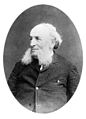
President Benjamin Harrison c1850 edit

Article(s): Benjamin Harrison
Request:
Graphist opinion(s):Removed watermark (cleanly), restored, and oval cropped. Centpacrr (talk) 01:23, 1 December 2013 (UTC)
So?  Esteban (talk) 22:55, 28 November 2013 (UTC)
Incorrect picture showing C7 electrical plug polarization edit
-
 Image depicting polarity of a polarized C7 plug

Article(s):
Request:
- Please correct, or replace, this image to show the correct polarization of a polarized C7 plug. Authoritative examples showing disagreement with this image can be seen here [[1]] and here [[2]] listed under "NEMA 1-15 Angled to IEC320 C7 - 10 Amp Cords" and "NEMA 1-15 to IEC320 C7 - 10 Amp Cords".
(Note: The Image description for this image may be correct; it states: "English: Picture showing the Live/Neutral polarity of a moulded C7 Polarised Connector which was supplied with a UK version of an "Ultrafire WF-137 Lithium Battery Charger for 18650/17670 Cells (100V~240V)"". if it is correct, then it seems the Ultrafire WF-137 Lithium Battery Charger came with a non-standard power cord.) -- -- thismatalk 11:08, 5 December 2013 (UTC)
Graphist opinion(s):
- The image was pretty poor anyway, so I've overwritten it with a derivative of File:IEC60320 Polarised C7.JPG. Probably not the done thing, but hey-ho. That do ya? nagualdesign (talk) 04:13, 7 December 2013 (UTC)
JedOiKnight opinion: I suggest someone gets themselves tested for Dyslexia. Take another look at the second link (since the first link is inconclusive and useless) which supposedly indicates that my polarity labelling was incorrect and you will see that the SQUARE side of the plug has the "L" next to it on ALL of the illustrations of such polarised connectors on that page. Should have gone to SpecSavers !!! — Preceding unsigned comment added by JedOiKnight (talk • contribs) 10:02, 7 March 2014 (UTC)
Maria Theresa signature edit
Article(s): Maria Theresa
Request:
Graphist opinion(s):![]() Done Centpacrr (talk) 15:11, 10 December 2013 (UTC)
Done Centpacrr (talk) 15:11, 10 December 2013 (UTC)
- Moved this request to the Illustration Workshop, as signatures are normally vectorized. nagualdesign (talk) 03:58, 9 December 2013 (UTC)
- Oh dear. Centpacrr, the background should be either white or transparent, the signature should be black/untextured, the edges should be smooth and flowing, and the blob near the top right should have been removed (it is not part of the signature). And even then it would be wrong, because it's supposed to be an svg (vector) file. *facepalm* nagualdesign (talk) 00:33, 10 December 2013 (UTC)
- There is no reason that the signature should be black and untextured, and that is not what was requested. You are suggesting that it should be made to look like a rubber stamp. However if that's what you want, Nagualdesign, then you should feel free to do it yourself and upload that file on a new host page. Centpacrr (talk) 06:14, 10 December 2013 (UTC)
- You're very kind, Centpacrr. Unfortunately I don't do vector graphics either, but the feeling of freedom to do so is very liberating. And thank you for your time and effort. Your upload will be useful somewhere, I'm sure. nagualdesign (talk) 03:43, 11 December 2013 (UTC)
- There is no reason that the signature should be black and untextured, and that is not what was requested. You are suggesting that it should be made to look like a rubber stamp. However if that's what you want, Nagualdesign, then you should feel free to do it yourself and upload that file on a new host page. Centpacrr (talk) 06:14, 10 December 2013 (UTC)
- Oh dear. Centpacrr, the background should be either white or transparent, the signature should be black/untextured, the edges should be smooth and flowing, and the blob near the top right should have been removed (it is not part of the signature). And even then it would be wrong, because it's supposed to be an svg (vector) file. *facepalm* nagualdesign (talk) 00:33, 10 December 2013 (UTC)
![]() Done SVG created and uploaded courtesy of Niamh (talk) at the Illustration workshop. nagualdesign (talk) 03:43, 11 December 2013 (UTC)
Done SVG created and uploaded courtesy of Niamh (talk) at the Illustration workshop. nagualdesign (talk) 03:43, 11 December 2013 (UTC)
Class 7E4 E7272 edit
-
 Class 7E4 no. E7272

Article(s): South African Class 7E4
Request:
- Taken on a heavily overcast day. Please lighten up as much as possible -- André Kritzinger (talk) 15:07, 16 December 2013 (UTC)
Graphist opinion(s):Lightened as requested. Let me know if this is what you were looking for. Centpacrr (talk) 15:49, 16 December 2013 (UTC)
-
- Perfect, thank you! -- André Kritzinger (talk) 15:53, 16 December 2013 (UTC)
- Apparently the image's original uploader didn't want the image altered and reverted it. I will therefore leave it up to you to negotiate with him/her which version to use. Centpacrr (talk) 20:36, 16 December 2013 (UTC)
- I saw. He was unhappy with the result. I'll just leave it be. André Kritzinger (talk) 20:53, 16 December 2013 (UTC)
- The original image was perfectly exposed and did not need lightening. It slightly lacked contrast because of the overcast conditions. I've done my own edit, which will hopefully satisfy all parties. nagualdesign (talk) 05:02, 18 December 2013 (UTC)
- I saw. He was unhappy with the result. I'll just leave it be. André Kritzinger (talk) 20:53, 16 December 2013 (UTC)
- Apparently the image's original uploader didn't want the image altered and reverted it. I will therefore leave it up to you to negotiate with him/her which version to use. Centpacrr (talk) 20:36, 16 December 2013 (UTC)
Zeus at Olympia edit
-
 Statue of Zeus at Olympia

Article(s): Seven Wonders of the Ancient World, User:MarshalN20/Sandbox3
Request:
- Hello, could someone please remove the border of the image? Maybe improve its coloring as well? I'm always impressed by the work done by the graphists here. Thanks and happy holidays!-- MarshalN20 | Talk 05:30, 18 December 2013 (UTC)
Graphist opinion(s):
- Done. Cropped, but left the colour intact, which doesn't need improving IMO. Flattery will get you nowhere.
 nagualdesign (talk) 05:53, 18 December 2013 (UTC)
- Flattery got me this awesome improvement. Thanks Nagualdesign! [:D] --MarshalN20 | Talk 06:21, 18 December 2013 (UTC)
- Happy holidays, Marshal. nagualdesign (talk) 06:41, 18 December 2013 (UTC)
- Flattery got me this awesome improvement. Thanks Nagualdesign! [:D] --MarshalN20 | Talk 06:21, 18 December 2013 (UTC)
Amy Hanaiali'i edit
-

-
 Cropped


Article(s): Amy Hanaiali'i
Request:
- new version crop to subject herself... -- Kintetsubuffalo (talk) 22:14, 16 December 2013 (UTC)
Graphist opinion(s):
- Done. I uploaded a derivative using DerivativeFX as File:Amy Hanaiali'i.jpg. It seemed to work but then I can't find the new file!
Give it a while and hopefully it'll turn up.nagualdesign (talk) 05:23, 18 December 2013 (UTC)- ..Bollocks to that! Re-uploaded as File:Amy Hanaialii Gilliom.jpg instead. DerivativeFX is an absolute crock. nagualdesign (talk) 05:36, 18 December 2013 (UTC)
Thank you! --Kintetsubuffalo (talk) 15:35, 19 December 2013 (UTC)
Change Needed for logo on Advanced Micro Devices Page edit
Article(s): Advanced Micro Devices
Request:
- This is my first request to please help make a change to the AMD corporate logo that is shown on their Wikipedia page. The company went through a re-branding period, and no longer uses the logo that is currently displayed. You will see their corporate website uses a black only logo (no green arrow). Please let me know how I can help to make the Advanced Micro Devices page an accurate reflection of the new brand. Thank you. Seegee222 (talk) 22:51, 18 December 2013 (UTC)
Graphist opinion(s):
- I'm going to move this request over to the Illustration workshop, where they deal with Scalable Vector Graphics (SVG) files. nagualdesign (talk) 23:18, 18 December 2013 (UTC)
- Done Niamh (talk) 01:11, 19 December 2013 (UTC)
- Thanks, Niamh. nagualdesign (talk) 01:45, 19 December 2013 (UTC)
Aivazovsky edit
-
 1
1 -
 2
2 -
 3
3


Article(s): Ivan Aivazovsky (my draft of the article)
Request:
- 1) Please remove the greyish background (esp. lower right corner) 2) improve as much as possible 3) crop out the monument -- Երևանցի talk 07:59, 18 December 2013 (UTC)
Graphist opinion(s):![]() Request taken by Centpacrr (talk) 11:47, 18 December 2013 (UTC).
Request taken by Centpacrr (talk) 11:47, 18 December 2013 (UTC). ![]() Done Centpacrr (talk) 12:16, 18 December 2013 (UTC)
Done Centpacrr (talk) 12:16, 18 December 2013 (UTC)
- Thank you very much Centpacrr. And can you please turn the second image black and white? I think it might be better. --Երևանցի talk 17:56, 18 December 2013 (UTC)
Paul Frees edit
Article(s): Paul Frees
Request:
- remove frame... -- Kintetsubuffalo (talk) 06:32, 21 December 2013 (UTC)
Graphist opinion(s):
- Done. There's maybe something along the bottom edge, too, but I left it. nagualdesign (talk) 07:00, 21 December 2013 (UTC)
- Great, thank you!--Kintetsubuffalo (talk) 07:11, 21 December 2013 (UTC)
Jules Verne edit

Article(s): Jules Verne
Request:
- It's probably not the best time to ask for this, but if anyone has some spare time and wants to help please do a detailed cleanup of this image. If successfully done, I'll probably nominate it for featured picture. -- Երևանցի talk 07:40, 20 December 2013 (UTC)
Graphist opinion(s):
- Request taken by — Jdcollins13 (talk) 16:52, 20 December 2013 (UTC). I took a crack at it.
- Thank you. I think it's good enough. --Երևանցի talk 02:21, 21 December 2013 (UTC)
- Yes I agree, if by 'good enough' you mean 'nearly perfect'. Before this gets marked as resolved though, can anybody here perform an FFT filter to get rid of the halftone pattern on his forehead (and maybe the background)? If you don't know how to do an FFT filter please do not bother using blurring or other techniques. It is not the same thing. nagualdesign (talk) 03:14, 21 December 2013 (UTC)
- Thank you. I think it's good enough. --Երևանցի talk 02:21, 21 December 2013 (UTC)
Dionysius I of Syracuse edit

Article(s): Dionysius I of Syracuse
Request:
- Desaturate... -- Kintetsubuffalo (talk) 11:59, 22 December 2013 (UTC)
Graphist opinion(s):![]() Done Centpacrr (talk) 16:10, 22 December 2013 (UTC)
Done Centpacrr (talk) 16:10, 22 December 2013 (UTC)
- Done Desaturated. See previous section. nagualdesign (talk) 23:56, 22 December 2013 (UTC)
- Thanks! This one is perfect. Can you fix the one above, which still has big chunks of yellow?--Kintetsubuffalo (talk) 00:08, 23 December 2013 (UTC)
- I made and uploaded a proper version of the one above with the same background as this one which was inexplicably then replaced by another editor by the faulty version with blobs of yellow. I have reverted that to my original corrected version which is identical in character to the Dionysius one. Centpacrr (talk) 00:17, 23 December 2013 (UTC)
- With this image, I took your cleaned version and desaturated it, as Kintetsubuffalo requested. Normally you treat the requestor as the ultimate arbiter. Shame you couldn't do the same this time. nagualdesign (talk) 00:24, 23 December 2013 (UTC)
- The request to "desaturate" to me does not mean NO color to me, but that the color should be less intense and even to match the apparent original medium from which it was derived. The OP was not the original uploaded of this image so I wanted to leave the color as close as possible to the original for authenticity. Your version of the Irish seal left large yellow blotches whereas mine gave it a even colored background which better reflect the original. Centpacrr (talk) 00:34, 23 December 2013 (UTC)
- Neither of these images began life with a beige (or pink) background. And it doesn't matter what you think the word desaturate means, in the world of graphic design it means only one thing: zero the saturation. Even if you were asked to slightly desaturate the image, there's no reason to introduce colour that wasn't there! Get a grip Centpacrr, you're not fooling anyone with your silly excuses for having done a half-arsed job. As for the Irish seal above; ditto. nagualdesign (talk) 00:45, 23 December 2013 (UTC)
- I have converted both files to ACTUAL grayscale images and uploaded them. I also cleaned my cache and then redownloaded your version of the Irish crest and it is still filled with yellow blotches. The color I had "introduced" was to as closely as I could match the base backgound color of the original files. Centpacrr (talk) 01:07, 23 December 2013 (UTC)
- So basically, with this image, you've now done exactly the same as what I did in the first place, which you seemingly took great offense to? What a waste of hot air. Merry Christmas, buddy! nagualdesign (talk) 01:18, 23 December 2013 (UTC)
- So basically, with this image, you've now done exactly the same as what I did in the first place, which you seemingly took great offense to? What a waste of hot air. Merry Christmas, buddy!
- I have converted both files to ACTUAL grayscale images and uploaded them. I also cleaned my cache and then redownloaded your version of the Irish crest and it is still filled with yellow blotches. The color I had "introduced" was to as closely as I could match the base backgound color of the original files. Centpacrr (talk) 01:07, 23 December 2013 (UTC)
- Neither of these images began life with a beige (or pink) background. And it doesn't matter what you think the word desaturate means, in the world of graphic design it means only one thing: zero the saturation. Even if you were asked to slightly desaturate the image, there's no reason to introduce colour that wasn't there! Get a grip Centpacrr, you're not fooling anyone with your silly excuses for having done a half-arsed job. As for the Irish seal above; ditto. nagualdesign (talk) 00:45, 23 December 2013 (UTC)
- The request to "desaturate" to me does not mean NO color to me, but that the color should be less intense and even to match the apparent original medium from which it was derived. The OP was not the original uploaded of this image so I wanted to leave the color as close as possible to the original for authenticity. Your version of the Irish seal left large yellow blotches whereas mine gave it a even colored background which better reflect the original. Centpacrr (talk) 00:34, 23 December 2013 (UTC)
- With this image, I took your cleaned version and desaturated it, as Kintetsubuffalo requested. Normally you treat the requestor as the ultimate arbiter. Shame you couldn't do the same this time. nagualdesign (talk) 00:24, 23 December 2013 (UTC)
- I made and uploaded a proper version of the one above with the same background as this one which was inexplicably then replaced by another editor by the faulty version with blobs of yellow. I have reverted that to my original corrected version which is identical in character to the Dionysius one. Centpacrr (talk) 00:17, 23 December 2013 (UTC)
- Thanks! This one is perfect. Can you fix the one above, which still has big chunks of yellow?--Kintetsubuffalo (talk) 00:08, 23 December 2013 (UTC)
- No I converted both files to actual grayscale files (yours are both RGB files) and uploaded them as I did not feel like carrying on this circular duscussion any further. The Irish file that you had uploaded still has yellow blotches in it which both the OP and I saw, and which also appear in it when opened in both Photoshop and Graphic Converter as well. It also does not match the original file or any other file that might have been in my cache, and still appears after purging my cache. So perhaps it is your monitor that needs to be adjusted. Centpacrr (talk) 01:34, 23 December 2013 (UTC)
- Oh, boo-hoo! Go to bed. nagualdesign (talk) 01:41, 23 December 2013 (UTC)
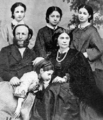
Ruth A. Parmelee edit
-
 Ruth A. Parmelee with children

Article(s): Future article: Ruth A. Parmelee. It's in the works here: User:Proudbolsahye/Ruth_A._Parmlee
Request:
- This is about the best quality photograph I can find of her. Please let me know if you can find something better. Anyways, if you can't find anything, I would really like those pattern dots or whatever they are to disappear as much as possible. A general touchup is needed as well. You guys know best... Once again, I will greatly appreciate it. Note: Photo is retrieved from here. Proudbolsahye (talk) 19:03, 25 December 2013 (UTC)
Graphist opinion(s):![]() Done Cleaned up halftone artifact as requested. Centpacrr (talk) 22:16, 25 December 2013 (UTC)
Done Cleaned up halftone artifact as requested. Centpacrr (talk) 22:16, 25 December 2013 (UTC)
- There is one here [3] but it has this license [4] and I think it's not possible to use the image here as it is not for commercial purpose, but I'm not sure. Maybe someone who knows more about that can tell you if you can use it. --Goran tek-en (talk) 20:41, 25 December 2013 (UTC)
- @Goran tek-en: That's a completely different picture though. Proudbolsahye (talk) 21:02, 25 December 2013 (UTC)
- @Proudbolsahye: It is but I didn't think you needed exactly that image, I thought you just wanted the content. --Goran tek-en (talk) 12:53, 26 December 2013 (UTC)
- @Goran tek-en: That's a completely different picture though. Proudbolsahye (talk) 21:02, 25 December 2013 (UTC)
It might be wise to use an FFT filter on the image to remove the halftone/moiré pattern. You could try asking Quibik (talk), who's highly adept at that sort of thing. Regards, nagualdesign (talk) 22:56, 25 December 2013 (UTC)
File:Matlock cast season 2 1987.jpg edit

Article(s): Matlock (TV series)
Request:
Graphist opinion(s):
- Done. Sorry George, I should have said I was working on this one. Anyway, I've uploaded a cleaned image (watermarks removed). If you prefer the colour image then just revert my upload. Regards, nagualdesign (talk) 23:12, 27 December 2013 (UTC)
Sichuan Rupee edit


Article(s): Historical money of Tibet
Request:
- remove irregular excess background... -- Kintetsubuffalo (talk) 02:08, 28 December 2013 (UTC)
Graphist opinion(s):![]() Done nagualdesign (talk) 02:48, 28 December 2013 (UTC)
Done nagualdesign (talk) 02:48, 28 December 2013 (UTC)
- Removed spurious drop shadows from both images; Rotated Sichuan.Rupee.rev.jpg image 12º CW so that coin is now plumb. Centpacrr (talk) 04:03, 28 December 2013 (UTC)
- Yes, I'm not normally a fan of drop shadows either but in the past, with images of (silver) coins, it seemed to work. You might want to resize one of the images so they're both the same though. Regards, nagualdesign (talk) 04:12, 28 December 2013 (UTC)
- Much nicer, thanks guys! Don't fight-Merry Christmas! ;) (that's what I tell my kindergarteners)--Kintetsubuffalo (talk) 04:26, 28 December 2013 (UTC)
- Yes, I'm not normally a fan of drop shadows either but in the past, with images of (silver) coins, it seemed to work. You might want to resize one of the images so they're both the same though. Regards, nagualdesign (talk) 04:12, 28 December 2013 (UTC)
Irish Confederation edit

Article(s): Irish Confederation
Request:
- neutralize background... -- Kintetsubuffalo (talk) 06:47, 22 December 2013 (UTC)
Graphist opinion(s):![]() Done (Vectorization quite unnecessary) Centpacrr (talk) 20:08, 22 December 2013 (UTC)
Done (Vectorization quite unnecessary) Centpacrr (talk) 20:08, 22 December 2013 (UTC)
- I just think it would be better if this was just vectorised instead. --109.78.207.144 (talk) 17:58, 22 December 2013 (UTC)
- Centpacrr, this isn't the first time that you've left a background with a slightly pinkish hue. Either get your monitor properly calibrated, as has been suggested to you on several occasions, get a new monitor, or get your eyes tested! nagualdesign (talk) 23:48, 22 December 2013 (UTC)
- This is intended to have an even beige background closely matching the paper it was derived from. Your version id filled with yellow blotches. Centpacrr (talk) 00:23, 23 December 2013 (UTC)
- Perhaps you should clean out your cache? My version was not 'filled with yellow blotches', it was greyscale! The reason I re-did the job from scratch was to preserve the details that had been lost in your edit. nagualdesign (talk) 00:30, 23 December 2013 (UTC)
- It's not my cache. Look at the comment of the OP below which says "Can you fix the one above, which still has big chunks of yellow?" That's exactly what I saw too. When opened in Photoshop the mode of your version is NOT a "greyscale" file, it is an "RGB, 24 Bit, 8 Bit Padding, 16.7 million colors" file. Centpacrr (talk) 00:37, 23 December 2013 (UTC)
- Kintetsubuffalo needs to clean out his/her cache too. Look at my edit. The evidence is there. And I'm fully aware of what filetypes are being used here, thanks. An RGB file can be desaturated (converted to greyscale) without converting the filetype. Again with the silly excuses. nagualdesign (talk) 00:51, 23 December 2013 (UTC)
- It's not my cache. Look at the comment of the OP below which says "Can you fix the one above, which still has big chunks of yellow?" That's exactly what I saw too. When opened in Photoshop the mode of your version is NOT a "greyscale" file, it is an "RGB, 24 Bit, 8 Bit Padding, 16.7 million colors" file. Centpacrr (talk) 00:37, 23 December 2013 (UTC)
- Perhaps you should clean out your cache? My version was not 'filled with yellow blotches', it was greyscale! The reason I re-did the job from scratch was to preserve the details that had been lost in your edit. nagualdesign (talk) 00:30, 23 December 2013 (UTC)
- This is intended to have an even beige background closely matching the paper it was derived from. Your version id filled with yellow blotches. Centpacrr (talk) 00:23, 23 December 2013 (UTC)
- Centpacrr, this isn't the first time that you've left a background with a slightly pinkish hue. Either get your monitor properly calibrated, as has been suggested to you on several occasions, get a new monitor, or get your eyes tested! nagualdesign (talk) 23:48, 22 December 2013 (UTC)
- There it is, got it, thx.--Kintetsubuffalo (talk) 00:55, 23 December 2013 (UTC)
- No worries. For future reference, to compare different versions of an image it's best to open each version in a different tab using the thumbs in the File history section, then refresh the tab that should be showing the latest version. You can then flip between tabs for a proper pixel peeping session. Regards, nagualdesign (talk) 01:03, 23 December 2013 (UTC)
- Kintetubuffalo, I have converted both files to ACTUAL grayscale images and uploaded them. I also cleaned my cache and then redownloaded Nagualdesign's version of the crest and it is still filled with yellow blotches as you saw as well that were different from the original file. The color I had "introduced" was to as closely as I could match the base backgound color of the original files. Centpacrr (talk) 01:11, 23 December 2013 (UTC)
- Perhaps it's time you went to bed, Centpacrr. Maybe tomorrow, when your local Wiki server is re-cached (an issue which you're well aware of), you might be able to see my edit. Then I'd invite you to compare it to your latest version and see if you notice the loss of detail. (Hint: look at the cross hatching.) I don't expect that you'll concede though, and revert your own edit. Ownership appears to be your modus operandi around here. Night night. nagualdesign (talk) 01:38, 23 December 2013 (UTC)
- I'm sorry, Nagualdesign, but your edit still displays with multiple yellow blotches, but I'm not going to argue with you over this anymore. As you suggested I have done a Photoshop eyedropper test on exactly how it appears on its host page and color checked the blotches in Photoshop. It shows the yellow blotches on your edit with the following color values: H: 63º, S: 7%, B: 99%, R: 252, G: 252, B: 235, L: 99, a: -3, b: 9, C: 1%, M: 0%, Y: 8%, K: 0%, Color code #fcfdeb. (If it were pure white as you claim the values would be H: 0º, S: 0%, B: 100%, R: 255, G: 255, B: 255, L: 100, a: 0, b: 0, C: 0%, M: 0%, Y: 0%, K: 0%, Color code #ffffff.) I have uploaded a screen capture of the test here so that you can see for yourself. If the OP is satisfied with the image with the yellow blotches then so be it. If he isn't, however, you can either redo it as a grayscale file for him or he can revert to my existing grayscale edit. It is up to him as I do not intend to make any further edits of this image. Centpacrr (talk) 16:20, 23 December 2013 (UTC)
- I think you're pulling the wool over your own eyes here, Scoop. I promise you, hand on heart, that it's a cache issue. I've triple checked it, and it's fine. Just as advertised. If you're receiving the wrong image then obviously it will be wrong however you look at it. All you've confirmed, by opening it up in Photoshop, is that the image you do have has yellow blotches on it, n'est pas? If I'd messed up I'd hold my hand up. Perhaps Kintetsubuffalo will be kind enough to confirm the upload for you? There's nothing more I can do. nagualdesign (talk) 02:06, 24 December 2013 (UTC)
- Well I didn't create the image under discussion, and it is not the original image. As you are the only other individual to have uploaded a version of this image that leaves only you. The file history also says it is yours, and the OP is the one who originally pointed it out the yellow blotches, not me. I tested it using the Photoshop method you requested me to use, have visited the page on this machine (a 2011 Apple MacBook Pro) using three additional browsers besides Firefox (Safari, Chrome and Opera), and then visited the page on another computer (a 2009 Apple MacBook) which had never visited it before using the same four different browsers and got exactly the same result in all eight visits: an image with yellow blotches.
- I think you're pulling the wool over your own eyes here, Scoop. I promise you, hand on heart, that it's a cache issue. I've triple checked it, and it's fine. Just as advertised. If you're receiving the wrong image then obviously it will be wrong however you look at it. All you've confirmed, by opening it up in Photoshop, is that the image you do have has yellow blotches on it, n'est pas? If I'd messed up I'd hold my hand up. Perhaps Kintetsubuffalo will be kind enough to confirm the upload for you? There's nothing more I can do. nagualdesign (talk) 02:06, 24 December 2013 (UTC)
- I'm sorry, Nagualdesign, but your edit still displays with multiple yellow blotches, but I'm not going to argue with you over this anymore. As you suggested I have done a Photoshop eyedropper test on exactly how it appears on its host page and color checked the blotches in Photoshop. It shows the yellow blotches on your edit with the following color values: H: 63º, S: 7%, B: 99%, R: 252, G: 252, B: 235, L: 99, a: -3, b: 9, C: 1%, M: 0%, Y: 8%, K: 0%, Color code #fcfdeb. (If it were pure white as you claim the values would be H: 0º, S: 0%, B: 100%, R: 255, G: 255, B: 255, L: 100, a: 0, b: 0, C: 0%, M: 0%, Y: 0%, K: 0%, Color code #ffffff.) I have uploaded a screen capture of the test here so that you can see for yourself. If the OP is satisfied with the image with the yellow blotches then so be it. If he isn't, however, you can either redo it as a grayscale file for him or he can revert to my existing grayscale edit. It is up to him as I do not intend to make any further edits of this image. Centpacrr (talk) 16:20, 23 December 2013 (UTC)
- Perhaps it's time you went to bed, Centpacrr. Maybe tomorrow, when your local Wiki server is re-cached (an issue which you're well aware of), you might be able to see my edit. Then I'd invite you to compare it to your latest version and see if you notice the loss of detail. (Hint: look at the cross hatching.) I don't expect that you'll concede though, and revert your own edit. Ownership appears to be your modus operandi around here. Night night. nagualdesign (talk) 01:38, 23 December 2013 (UTC)
- Kintetubuffalo, I have converted both files to ACTUAL grayscale images and uploaded them. I also cleaned my cache and then redownloaded Nagualdesign's version of the crest and it is still filled with yellow blotches as you saw as well that were different from the original file. The color I had "introduced" was to as closely as I could match the base backgound color of the original files. Centpacrr (talk) 01:11, 23 December 2013 (UTC)
- No worries. For future reference, to compare different versions of an image it's best to open each version in a different tab using the thumbs in the File history section, then refresh the tab that should be showing the latest version. You can then flip between tabs for a proper pixel peeping session. Regards, nagualdesign (talk) 01:03, 23 December 2013 (UTC)
- There it is, got it, thx.--Kintetsubuffalo (talk) 00:55, 23 December 2013 (UTC)
- Perhaps you are not seeing the blotches because whatever type of monitor you are using is not responsive enough or is set too high. The blotches are also much more pronounced when viewed at an oblique angle (at least on an LCD type display) so try looking at the image that way. However when they appear to the naked eye on four different browsers on two different, unrelated machines, and the blotches are also objectively demonstrable using the Photoshop eyedropper test you suggested, I am left with absolutely no other possible conclusion that the blotches in fact exist in the image file you created and uploaded, and are not a "cache" issue because they do not appear in this form in any other version of this image. This is not a case my "pulling the wool over my eyes" but of subjecting the image file to every objective test I can come up with in order to eliminate every other possible explanation. They all point, however, to just one thing: the image file you uploaded in fact has the yellow blotches and that it is not a cache issue either in my two different machines or in Wikipedia's servers. The ball is thus in your court to prove otherwise. (Also "Scoop" is not a name I ever use in here or anyplace else other than in the world of professional ice hockey in which I have worked for 43 years.) Centpacrr (talk) 05:20, 24 December 2013 (UTC)
- It's okay Scoop, I'm just winding you up. There was some horrible jpg compression on my upload, and I've been having a good ol' giggle at your expense. It's because I find you so belligerent at times (pretty much whenever anyone tries to discuss anything with you) that when you gave me all the usual bullshit excuses for leaving your edit with a pink background I thought I'd treat you in kind for a while, and see how tightly I could get your panties bunched up. My latest upload was converted to Greyscale mode and saved at 100%, although as a jpeg it'll still open as an RGB of course. Well it was fun having the shoe on my foot for a while. I can see why you might like being so contrary all of the time. Merry Chrismas, Mister Cooper. nagualdesign (talk) 05:38, 24 December 2013 (UTC)
- Perhaps you are not seeing the blotches because whatever type of monitor you are using is not responsive enough or is set too high. The blotches are also much more pronounced when viewed at an oblique angle (at least on an LCD type display) so try looking at the image that way. However when they appear to the naked eye on four different browsers on two different, unrelated machines, and the blotches are also objectively demonstrable using the Photoshop eyedropper test you suggested, I am left with absolutely no other possible conclusion that the blotches in fact exist in the image file you created and uploaded, and are not a "cache" issue because they do not appear in this form in any other version of this image. This is not a case my "pulling the wool over my eyes" but of subjecting the image file to every objective test I can come up with in order to eliminate every other possible explanation. They all point, however, to just one thing: the image file you uploaded in fact has the yellow blotches and that it is not a cache issue either in my two different machines or in Wikipedia's servers. The ball is thus in your court to prove otherwise. (Also "Scoop" is not a name I ever use in here or anyplace else other than in the world of professional ice hockey in which I have worked for 43 years.) Centpacrr (talk) 05:20, 24 December 2013 (UTC)
- Well I am pleased to see that you now apparently agree that the blotches actually do exist in your previous file as I had proved above and now acknowledge this by having made a new grayscale file (as I had previously suggested) which you uploaded exactly one minute before I posted the above comment. It really would have been helpful, however, if you had just done that in the first place. Centpacrr (talk) 05:27, 24 December 2013 (UTC)
- Yes it would rather. (Hmm.. helpful.. Now there's a thought!) nagualdesign (talk) 05:40, 24 December 2013 (UTC)
- Well I guess I am supposed to be pleased that I supplied you with a way to entertain yourself at both my and the OP's expense. While that is not why I contribute to Wikipedia, I will take that into account and try to avoid that in the future. Centpacrr (talk) 05:50, 24 December 2013 (UTC)
- What I've done here was thoroughly childish. Thankfully I'm aware of that, and it won't continue. I normally try very hard to treat others as I would like to be treated. If I make mistakes and have them pointed out to me I appreciate it, especially if I learn something new in the process, so I often point out other people's mistakes too. I don't have much time for egos, especially my own, (they only get in the way) and that can grate on some people. Thankfully I'm aware of that too, and out of kindness I keep grating. Did we learn anything? I'm f***ed if I know. Peace. nagualdesign (talk) 06:16, 24 December 2013 (UTC)
- Well I guess I am supposed to be pleased that I supplied you with a way to entertain yourself at both my and the OP's expense. While that is not why I contribute to Wikipedia, I will take that into account and try to avoid that in the future. Centpacrr (talk) 05:50, 24 December 2013 (UTC)
- Yes it would rather. (Hmm.. helpful.. Now there's a thought!) nagualdesign (talk) 05:40, 24 December 2013 (UTC)
Hair on the lens edit
-

-
 Cropped version,
for the infobox.

.jpg)
Article(s): Rene Auberjonois
Request: There appears to have been a hair on the camera lens, which is now showing up on the subject's collar. Could this be removed? Thanks! J Milburn (talk) 17:40, 22 December 2013 (UTC)
Graphist opinion(s): ![]() Done Centpacrr (talk) 20:15, 22 December 2013 (UTC)
Done Centpacrr (talk) 20:15, 22 December 2013 (UTC)
- Thanks; I appreciate that a slight lightening may be a good thing, but I think you've gone too far; it now looks incredibly washed-out. J Milburn (talk) 20:23, 22 December 2013 (UTC)
- I've darkened it a bit and increased the saturation. I think making it much darken than this, however, would make it essentially unusable for for an infobox image. Centpacrr (talk) 20:55, 22 December 2013 (UTC)
- *Sigh* Here we go again.. Not content to leave an image alone you (Centpacrr) did your usual agma adjustment, which left it looking worse. You were gently admonished by the uploader for your unnecessary meddling, so you took your crappy edit (instead of starting from scratch) and darkened it. You discovered in the process that lightening the image too much, uploading it, then attempting to darken it again had messed the colour up, so you fiddled with the saturation to try and fix it, because you couldn't be bothered re-doing the hard part again, which was removing the hair. That about right? (You don't have to answer that. I know that in your many years of pissing around with images you've developed 'a number of proprietary techniques' that you don't wish to share.) Well, here's a tip for you, free of charge: Caucasian skin should not look orange with green fringes, and grey hair should not look yellow.
- So anyway, I did the job as you'd requested, J Milburn, and uploaded it. (See the File history.) You may wish to revert to that edit. Then I did a little subtle lightening, being careful to preserve the photograph, and uploaded that. Again, if you like that edit then feel free to revert to that. And don't worry, being the original uploader and requestor should keep Centpacrr from starting a revert battle with you. He listens to requestors most of the time (even the ones that make naïve, flawed requests - which you didn't). He does have a point in that photographic portraits on Wikipedia don't usually have artistic vignetting, but it's still a good quality photograph just as it is. Or should I say was. nagualdesign (talk) 03:56, 23 December 2013 (UTC)
- Nagualdesign I can really do without both the condescension and amateur psychiatry. You've made a version so dark (and the skin tome unnaturally pinkish) as to be virtually useless as an infobox image. Why don't you check the calibration of your monitor? (Mine is set to Apple Color LCD (LED) gamma of 2.2.) I'll leave this up to the OP to decide what he/she likes and leave it at that. No further comments from you directed at me are necessary in this matter. Centpacrr (talk) 04:48, 23 December 2013 (UTC)
- I'm right though, aren't I? Go on, admit it, you big girl's blouse! *tickles Centpacrr into submission* ..Seriously though; I didn't take the photograph. I didn't make it dark, I lightened it. And I didn't do anything to the colour. You're kinda right about the infobox though (see below). The problem is that one cannot undo a vignette. nagualdesign (talk) 05:41, 23 December 2013 (UTC)
- Nagualdesign I can really do without both the condescension and amateur psychiatry. You've made a version so dark (and the skin tome unnaturally pinkish) as to be virtually useless as an infobox image. Why don't you check the calibration of your monitor? (Mine is set to Apple Color LCD (LED) gamma of 2.2.) I'll leave this up to the OP to decide what he/she likes and leave it at that. No further comments from you directed at me are necessary in this matter. Centpacrr (talk) 04:48, 23 December 2013 (UTC)
- I've darkened it a bit and increased the saturation. I think making it much darken than this, however, would make it essentially unusable for for an infobox image. Centpacrr (talk) 20:55, 22 December 2013 (UTC)
Soo.. I had an idea to get around the infobox issue that Centpacrr raised. Although I don't think the exposure is the issue. (I won't bore you with the technical details as to what constitutes good exposure.) The issue, I think, is that the vignette makes the whole image look dark, even though the face is fine. So I took my second edit ("Subtly lightened.") and made a tight crop. Try it in the infobox and see how it looks. Hope that helps. Regards, nagualdesign (talk) 05:41, 23 December 2013 (UTC)
- I have carefully reworked this image from the original. Colour balanced so that hair is grey, pupil of eye is black, shadows aren't bright red, skin tone is natural, details remain in highlights. (Hohum @) 17:05, 4 January 2014 (UTC)
- A bit better, colour-wise, but he looks a little ashen and the hair is still there. nagualdesign (talk) 17:40, 6 January 2014 (UTC)