Wikipedia:Graphics Lab/Illustration workshop/Archive/Aug 2016
Resolved edit
Unblock Ticket Request System Logo edit
-
 Wikimedia Labs logo
 -
 UTRS Barnstar
 -
 Logo with tagline (replacing first draught)
 -
 Second version, icon only

- Article(s)
- Unblock Ticket Request System
- Request
- I'm looking at redesigning the unblock ticket request system interface. Currently, we use the old toolserver logo to represent UTRS. We'd like to move away from that and take on a more WMF Labs appearance. Looking to possibly merge the WMF Labs logo with something that represents "unblocking". Checkout the UTRS Barnstar for one example of an artists interpretation of unblocking. WMF Labs logo and padlock are not requirements, they are just ideas. Original ideas welcome. Logo will be used on Wikipedia & on the UTRS WMF Labs project. Thank you.-- v/r - TP 20:09, 22 May 2016 (UTC)
- Graphist opinion(s)
@TParis: a first effort is shown above; comments & suggestions welcome.—Odysseus1479 21:10, 26 May 2016 (UTC)
- @Odysseus1479: I love it! @DeltaQuad: What do you think?--v/r - TP 03:17, 28 May 2016 (UTC)
- @Odysseus1479: Could you possibly add a off-white dashed inset border to the red ticket to make it stand out more like a ticket, please?--v/r - TP 03:33, 28 May 2016 (UTC)
- @TParis: glad you like the concept. I wasn’t sure what you’re after for the border; please explain further, or find an example, if this isn’t right. It looks OK in largish renderings, but will become faint or inconsistent at small sizes like the thumbnail above.—Odysseus1479 05:06, 28 May 2016 (UTC)
- @Odysseus1479: Could you possibly add a off-white dashed inset border to the red ticket to make it stand out more like a ticket, please?--v/r - TP 03:33, 28 May 2016 (UTC)
- Note regarding fonts: I used Gill Sans Bold, from the same family as the Wikimedia wordmark. Visiting the UTRS pages on ToolServer, however, I notice you’re using Franklin Gothic or something similar in the page headers, which I could match. Or you might like Linux Libertine, alluding to the Wikipedia logo, or a typewriter font to echo the OTRS orange-ticket logo. Anyway, easy to change to whatever you might prefer.—Odysseus1479 18:38, 28 May 2016 (UTC)
- I'll be straight up with you, DeltaQuad (talk · contribs) and I have the artistic skills of a raccoon. If you told us we should use a different font on UTRS, we likely would. On a related subject, we are looking for a UI developer. The logo looks amazing, I'll get DQ over here to comment.--v/r - TP 19:12, 28 May 2016 (UTC)
- Thank you for taking the time to take on this project. I want to say first that this is beyond anything I could ever put out, so thank you. It's a good initial proposal. I have a few things in mind if you wouldn't mind taking them into consideration.
- I would prefer if we could avoid using text to define the logo. It's likely going to be smaller than (easily) readable in most locations it's used and I feel the illustration should be able to define itself like WP's logo does. I have no issue with the actual use of the ticket itself.
- I like the aspect of dividing the circle around in three spots as in the labs logo as it would define the unblock process 1. Blocked 2. Request unblock 3. Decline or unblocked. So maybe we could rotate the colors through there?
- The keyhole, and as I stated above, the ticket, are prefect illustrations for this logo.
- Feel free to throw me back some questions and i'll get back to it faster than I did this. -- Amanda (aka DQ) 23:06, 26 June 2016 (UTC)
- Thanks for the feedback, @Amanda. No rush AFAIC.
- I had already intended to make a separate, simplified version for use in miniature, even as a favicon, if required. How small will you need to go? (A 64-px rendering, for example, is shown at right.) But if you prefer, the ‘full’ version could have the text underneath, like the Labs logo above—in which case, would you rather use the initialism or a spelled-out version? (We can always deal with that after the graphic is settled.) For very small versions, the inner dashed border should probably be eliminated as well, or it’ll just appear as an indistinct, uneven weakening of the ticket colour; I would also increase the size of the circular cutouts relative to the rest of the ticket, lest they disappear, and cut the enclosing arcs back on either side, cleanly, to avoid obfuscating the shape. Other project logos exist in a variety of configurations for different applications, so one size needn’t ‘fit all’.
- I had conceived the ticket itself as standing for the uppermost arc, and I’m kind of attached to the bilateral symmetry. But having said that … maybe make the left-hand arc maroon, and the ticket green to match the keyhole? Having the ticket on top of a third arc could be a problem at small sizes (see above); what about putting the ticket shape in the middle, but behind the keyhole, while making it somewhat larger? That would free up the top for the third arc, and without the type it won‘t suffer from partial obscuration–now I’ve almost talked myself into it; should I give that a try first? Another possibility is to turn the whole thing inside-out by making a big ticket-shape and putting the keyhole, enclosed in three arcs, inside that.
- Prefect illustrations, eh? Like this? ;)—Odysseus1479 01:31, 27 June 2016 (UTC)
- @Odysseus1479: I'm very sorry for the slow and late responses from us. We greatly appreciate your work and it's not being reflected in our promptness. May I offer another idea for #2? What if the arcs were symmetric, all three, but the middle one was red with the dashed outline and the left and right stubs taken out of the middle? I'm not sure if I'm describing it right, but instead of a rectangle ticket that doesn't follow the arc, we'd have an arc that looks like a bended ticket?--v/r - TP 20:23, 22 July 2016 (UTC)
- @TParis and DeltaQuad: above is a second version of the graphic. I made the ‘ticket’ arc thicker than the others because it seemed too skinny to me, preventing the semicircular cutouts from being large enough to look like anything. I’ll make a version with type underneath once you’re happy with the icon itself.—Odysseus1479 01:27, 23 July 2016 (UTC)
- Thanks for the feedback, @Amanda. No rush AFAIC.
- As I was looking over the image I saw some of the same things as you. I think enclosing the keyhole in the arcs is a good idea, maybe even if you want to make it sort of a background that could happen too, though I don't care as much about the background idea for inside the keyhole. I definitely prefer the older version of how the ticket appeared. So how about instead of worrying about three arcs, we conceptualize the idea that we start at some point on the arc, which represents a user being blocked, then move to the ticket portion of the image, indicating the filing of an appeal and an unblocking down on the otherside. Or maybe (and excuse my ideas just spewing) we make it a process diagram where instead of using the keyhole as a background, we use it for the unblock step of the above representation? The only thing i'm key on here is changing the key location somewhere somehow, so please feel free to throw in more artistic ideas or thoughts. -- Amanda (aka DQ) 07:56, 28 July 2016 (UTC)
- @TParis and DeltaQuad: I understand where you’re coming from with the sequence of steps, but it seems to me there’s some tension between the narrative / process-diagram concept and the need for a graphically simple & recognizable icon. And in particular expressing such through a circular WMF-style graphic could have the unfortunate result of implying a recurring cycle like the Wheel of Rebirth. (There may well be some aptness to suggest the system functions as block – appeal – unblock – rinse & repeat, but that’d be rather cynical to convey through the logo.) OTOH having bilateral symmetry militates against the cyclic reading, tending to imply a sequence with a beginning and an end. Anyway, the above shows some attempts at ‘outside the circle’ brainstorming (something I’m not particularly good at), using elements that represent those three steps: is there anything there that appeals to you? My thought was to interpret the three WMF colours as red-stop, blue-reflect, green-go, but there’s not much else there to tie it to the foundation’s graphic identity (although the version with type underneath will also make that allusion).
- If anyone else who’s had the patience to read through this has a suggestion to try, they’d also be most welcome.—Odysseus1479 03:44, 29 July 2016 (UTC)
- Personally, I like version 2 the best and I also like the top-right of the rough ideas. I'm going to get with DeltaQuad and discuss this because we're taking advantage of your volunteering now and I don't want to push it any longer. We'll make a selection out of the great ideas you've provided.--v/r - TP 08:10, 29 July 2016 (UTC)
- Well, you may notice I haven‘t officially “taken“ this request, so I can drop it the moment I feel imposed upon. ;)
- Let me know if you want to see some combination or variation of any of the above for ‘short-listing’, and I can probably put it together pretty quickly. But fresh ideas could indeed be slower coming.—Odysseus1479 09:10, 29 July 2016 (UTC)
- @TParis and DeltaQuad: have you had a chance to confer on this matter? Or has either of you any further concepts to try out?—Odysseus1479 01:41, 1 September 2016 (UTC)
- I'm embarrassed. I had completely forgotten. DeltaQuad - can we please make a decision about this? I really like File:UTRS_icon.svg and that's what I'm going with if you don't tell me otherwise--v/r - TP 02:08, 1 September 2016 (UTC)
- Personally, I like version 2 the best and I also like the top-right of the rough ideas. I'm going to get with DeltaQuad and discuss this because we're taking advantage of your volunteering now and I don't want to push it any longer. We'll make a selection out of the great ideas you've provided.--v/r - TP 08:10, 29 July 2016 (UTC)
- @FOX 52, Odysseus1479, and DeltaQuad: Folks, I'm going to call it. I love the second version with the red rounded ticket and I'm making the command decision - that's what we're going with. Thank you for your time and patience. I'll let you know when the new version of UTRS goes online, Odysseus, so that you can use it to showcase that you've had work appear on a production system.--v/r - TP 01:33, 9 September 2016 (UTC)
-
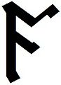
 Example of Additional Angerthas Erebor certh (.png)
 -
 Example of Gondolinic rune (.png)
 -
 Example of rune from The Hobbit (.jpg)


- Article(s)
- Cirth
- Request
- All of the characters I uploaded to the page Cirth are .png (Gondolinic runes and Additional Angerthas Erebor cirth) or worst .jpg (Runes from The Hobbit) format images. This causes size issues when using Mobile view (i.e. some the caracters are displayed too small to be read). I would therefore these images to be fully converted in .svg format. I am looking for someone who would like to do this as I am not able to.
ᚪᛋᚦᚩᚾᛏ (Asþont) | Talk 09:20, 15 August 2016 (UTC)
- Graphist opinion(s)


- I completed four of the requested files. Looks like File:Certh LL.png could be completed by editing the SVG File:Certh 46.svg in Inkscape. Inkscape is free, so if you want to get your feet wet now is the perfect time. Offnfopt(talk) 18:29, 15 August 2016 (UTC)
- A bunch of the PNG files you uploaded already had existing SVG images prior to your uploads. I just spent some time adding the {{vector version available}} template to some of them, but lost interest. Look through C:Category:Single certh in SVG and you'll see what I mean. You should spend some time going through the article and looking through the images and changing out the PNGs/JPEGs with the existing SVGs. After you have done that I would suggest you come back here with a list of images that don't have a SVG version. I just spent too much time looking through PNGs only to find SVGs already exist. A bunch also have SVGs that just need to be flipped vertically/horizontally which could easily be done in Inkscape. Offnfopt(talk) 21:47, 15 August 2016 (UTC)
- @Offnfopt: Ok, thank you very much for the advices. I am going to spend the whole of this morning in substituing old .PNGs with already existing .SVGs. Afterwards I will make a list of images with no .SVG counterpart and post it here. ᚪᛋᚦᚩᚾᛏ (Asþont) | Talk 09:46, 16 August 2016 (UTC)
- I just added the template {{vector version available}} to the already existing cirth in this category (Runes from The Hobbit). The non-existing .SVGs are: File:Tolkien'sFuthorc E.jpg, File:Tolkien'sFuthorc F.jpg, File:Tolkien'sFuthorc K.jpg, File:Tolkien'sFuthorc M.jpg, File:Tolkien'sFuthorc ST.jpg and File:Tolkien'sFuthorc EO.jpg. ᚪᛋᚦᚩᚾᛏ (Asþont) | Talk 11:07, 16 August 2016 (UTC)
- The non-existing .SVGs in this category (Additional Angerthas Erebor cirth) are: File:Certh Article.png, File:Certh EA.png, File:Certh LL.png and File:Certh OA.png. ᚪᛋᚦᚩᚾᛏ (Asþont) | Talk 11:13, 16 August 2016 (UTC)


- @Offnfopt: Thank you so much for the excellent work you've done. What kind of motivation are you speaking about? (I sometimes need time to understand what people are exactly trying to say). ᚪᛋᚦᚩᚾᛏ (Asþont) | Talk 16:17, 16 August 2016 (UTC)
- Oh ok, understood! Again thank you for adding new characters. ᚪᛋᚦᚩᚾᛏ (Asþont) | Talk 18:40, 16 August 2016 (UTC)
- @Asþont:I just uploaded File:Certh LL.svg, unless I'm mistaken I believe all the ones you listed are now complete. Offnfopt(talk) 19:33, 16 August 2016 (UTC)
- @Offnfopt:Yes you vectorised all of the characters I listed this morning (Actually, I feared you needed much more time to find your motivation. I am glad I was wrong!)
- Now there are a bunch of runes in the Gondolinic runes category that need a vector version as well:
- File:Gondolin rune a.png, File:Gondolin rune b.png ✓, File:Gondolin rune b2.png ✓, File:Gondolin rune e-.png ✓, File:Gondolin rune e.png ✓, File:Gondolin rune f.png ✓, File:Gondolin rune lh.png, File:Gondolin rune lh2.png, File:Gondolin rune lh3.png, File:Gondolin rune mh.png, File:Gondolin rune o-2.png ✓, File:Gondolin rune p.png ✓, File:Gondolin rune sh.png, File:Gondolin rune u-.png ✓, File:Gondolin rune u-2.png, File:Gondolin rune u.png ✓, File:Gondolin rune y-.png, File:Gondolin rune y-3.png, File:Gondolin rune y-4.png, File:Gondolin rune a.png, File:Gondolin rune y.png, File:Gondolin rune y3 (consonant).png, File:Gondolin rune z.png, File:Gondolin rune zh.png, File:Gondolin rune y-3.png, File:Gondolin rune æ-.png, File:Gondolin rune æ-2.png, File:Gondolin rune æ.png, File:Gondolin rune æ2.png, File:Gondolin rune ŋh.png, File:Gondolin rune ŋh2.png, File:Gondolin rune œ-.png.
- I am aware they are really a lot to make, thus feel free to take all the time you need to find motivation! ᚪᛋᚦᚩᚾᛏ (Asþont) | Talk 20:31, 16 August 2016 (UTC)
- @Offnfopt:Yes you vectorised all of the characters I listed this morning (Actually, I feared you needed much more time to find your motivation. I am glad I was wrong!)
- newer completed set
-

-

-

-

-

-

-

-


Here are some more completed ones. Offnfopt(talk) 19:16, 17 August 2016 (UTC)
- I've reached my limit on these images, this request is now open for anyone else who would like to complete it. Offnfopt(talk) 20:05, 17 August 2016 (UTC)
- @Offnfopt: Thank you for the uploads. I hope the fact that you reached your limit is not related to me trying to get credits on one image... ᚪᛋᚦᚩᚾᛏ (Asþont) | Talk 21:51, 17 August 2016 (UTC)


.svg)

- I've learned how to use Inkscape and uploaded a .SVG version of File:Gondolin rune b2.png and others. I will make .SVG versions of the remaining runes, but some help from here will be gratefully accepted! ᚪᛋᚦᚩᚾᛏ (Asþont) | Talk 19:05, 22 August 2016 (UTC)


- I have uploaded .SVG versions of all the remaining files. This topic can be marked as closed. ᚪᛋᚦᚩᚾᛏ (Asþont) | Talk 00:09, 23 August 2016 (UTC)
George Rex Flag edit
-
 Taunton Flag
 -
 Blue version
 -
 Reverse
 -
 Red version
 -
 Reverse

.svg)
_reverse.svg)


- Article(s)
- George Rex Flag
- Request
- Could someone create the George Rex Flag based upon the Taunton Red Ensign just like this image in the link please? The C of E God Save the Queen! (talk) 21:00, 3 August 2016 (UTC)
- Graphist opinion(s)
- @The C of E: the description there disagrees with the illustration, reading “George Rex” (without the numeral) and saying there was a different inscription on each side of the flag (rather than having both stacked on the same side). Which is correct?—Odysseus1479 23:31, 6 August 2016 (UTC)
- @Odysseus1479: I believe the illustration is correct with "George Rex and the liberties of America. No Popery" on the front. This link states that the illustration is correct but there is also some additional writing on the back. The C of E God Save the Queen! (talk) 07:40, 7 August 2016 (UTC)
- Thanks; I didn’t read enough of the blurb to get to the description of this version.—Odysseus1479 07:53, 7 August 2016 (UTC)
- I noticed just now that it says the field was blue.—Odysseus1479 08:16, 7 August 2016 (UTC)
 Done. @The C of E: aside from starting with the Taunton artwork, I’ve ignored the images linked above and gone with my own interpretation of the description—but I’m willing to do it differently if you prefer.—Odysseus1479 18:31, 7 August 2016 (UTC)
- @Odysseus1479: Thank you for doing this. If I am honest, I was expecting the red ensign being the one used as it kept cropping up in some of the other sources I have read. But when I do write the article, I would include both the red and blue ensigns as alternatives. The C of E God Save the Queen! (talk) 21:25, 7 August 2016 (UTC)
- @The C of E: how about I do a few versions, then (there could be up to four images, obverse & reverse for each of the two flags described), and you can pick which ones to use in the article. Now that I have a working file, they will only take a few minutes each.—Odysseus1479 21:44, 7 August 2016 (UTC)
- @Odysseus1479: Sounds good to me. I can always have a gallery section in the article to include them all. The C of E God Save the Queen! (talk) 22:07, 7 August 2016 (UTC)
- @The C of E: how about I do a few versions, then (there could be up to four images, obverse & reverse for each of the two flags described), and you can pick which ones to use in the article. Now that I have a working file, they will only take a few minutes each.—Odysseus1479 21:44, 7 August 2016 (UTC)
- @Odysseus1479: Thank you for doing this. If I am honest, I was expecting the red ensign being the one used as it kept cropping up in some of the other sources I have read. But when I do write the article, I would include both the red and blue ensigns as alternatives. The C of E God Save the Queen! (talk) 21:25, 7 August 2016 (UTC)
- @Odysseus1479: I believe the illustration is correct with "George Rex and the liberties of America. No Popery" on the front. This link states that the illustration is correct but there is also some additional writing on the back. The C of E God Save the Queen! (talk) 07:40, 7 August 2016 (UTC)
@The C of E: here is the set. BTW I found an example of the blue one online, in which the text was arranged in a squarish block in the entire fly, rather than in long lines in the bottom half like these: an option to consider. Anyway, let me know if anything needs tweaking.—Odysseus1479 01:13, 8 August 2016 (UTC)
Comic book icon edit
-
 Clapperboard icon
 -
 vectored


- Article(s)
- Many, primarily for use in {{WikiProject Film}} but possibly stub templates as well and maybe others.
- Request
- Could someone please recreate the POW! graphic as an svg? I've had a look but it doesn't seem to exist as a separate file. Ultimately I want to make an svg version of the comic clapperboard icon, but I'm happy to do that part myself. -- PC78 (talk) 16:24, 5 August 2016 (UTC)
- Graphist opinion(s)
Stale edit
Full, human, DNA strand edit
-
 DNA strand sections (wrong colors, no chromosomes

.png)
- Article(s)
- Chromosome, Human genome
- Request
- Please read Talk:Human_genome#An_image_for_multiple_gene-related_pages. Think it might be best to use the DNA strands image above, and use but a small section of the strand, change the colors (to red (A) yellow (T) green (C) blue (G); note that you just need to use a small part of the coiled section, not use the letters section, I just mentioned these for reference purposes). Integrate (dash /)-styled clone arms for the chromosomes (integrate 23 of them), distances between the dashes are mentioned on the talk page (in %). Use brackets to indicate all 23 chromosome lengths. Add in in the image description it's just an indicative image as it will be far too short to be realistic anyway (can't be drawn out full length, see talk page) Should be simple enough, it's basically just one long strand to be drawn with 23 smaller strands on it in a /-style fashion. Perhaps ask other wikipedians whether this is completely correct though (I'm not 100% sure) KVDP (talk) 09:41, 5 July 2016 (UTC)
- Graphist opinion(s)
Logos of TV shows edit
-
 Three's Company
- Article(s)
- Miami Vice
- Blossom (TV series)
- Three's Company
- Grace Under Fire
- Request
- Here are logos of TV shows: Miami Vice, Grace Under Fire, Blossom. Also, Three's Company logo should be SVG. All of them logos must be uploaded to Commons. Just the text and no background. -- George Ho (talk) 20:50, 21 July 2016 (UTC)
- Graphist opinion(s)