Wikipedia:Featured picture candidates/Complete type set of U.S. Fractional currency
Complete type set of U.S. Fractional currency edit
Voting period is over. Please don't add any new votes. Voting period ends on 23 Sep 2013 at 04:57:05 (UTC)
- Reason
- High quality, very high EV (greater EV viewed as a set).
This 24-image set nomination is a complete type set of U.S. Fractional Currency representing each significant design change. The United States issued Fractional currency between 1862 and 1876 in denominations of 3, 5, 10, 15, 25, and 50 cents. Across the five issuing periods paper quality was improved to prevent destruction and designs changed as anti-counterfeiting measures were put in place. Sizes range from roughly 66 x 41 mm to 110 x 54 mm. Captions include: denomination, catalog number, and person or vignette depicted. (I hope this is an acceptable way to present this kind of nomination).
Original – A 24-note complete type set of U.S. Fractional Currency representing each significant design change.
- Articles in which these images appear
- Fractional currency
- FP category for this image
- Wikipedia:Featured pictures/Culture, entertainment, and lifestyle/Culture and lifestyle
- Creator
- The Bureau of Engraving and Printing (and some first issue by American Bank Note Company)
From the National Numismatic Collection, NMAH, Smithsonian Institution.
Images by Godot13.
First Issue (21 August 1862 – 27 May 1863)
-
 $0.05 - Fr.1231
Thomas Jefferson. -
 $0.10 - Fr.1240
George Washington. -
 $0.25 - Fr.1280
Thomas Jefferson. -
 $0.50 - Fr.1312
George Washington.
-%240.05-Fr.1231.jpg)
-%240.10-Fr.1240.jpg)
-%240.25-Fr.1280.jpg)
-%240.50-Fr.1312.jpg)
Second Issue (10 October 1863 – 23 February 1867)
-
 $0.05 - Fr.1232
George Washington. -
 $0.10 - Fr.1246
George Washington. -
 $0.25 - Fr.1284
George Washington. -
 $0.50 - Fr.1322
George Washington.
-%240.05-Fr.1232.jpg)
-%240.10-Fr.1246.jpg)
-%240.25-Fr.1284.jpg)
-%240.50-Fr.1322.jpg)
Third Issue (5 December 1864 – 16 August 1869)
-
 $0.03 - Fr.1226
George Washington. -
 $0.05 - Fr.1238
Spencer Clark. -
 $0.10 - Fr.1254
George Washington. -
 $0.25 - Fr.1294
William Fessenden.
-%240.03-Fr.1226.jpg)
-%240.05-Fr.1238.jpg)
-%240.10-Fr.1254.jpg)
-%240.25-Fr.1294.jpg)
-
 $0.50 - Fr.1328
Francis Spinner. -
 $0.50 - Fr.1339
Francis Spinner. -
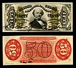
 $0.50 - Fr.1355
Justice holding scales.
-%240.50-Fr.1328.jpg)
-%240.50-Fr.1339.jpg)
-%240.50-Fr.1355.jpg)
Fourth Issue (14 July 1869 – 16 February 1875)
-
 $0.10 - Fr.1259
Bust of Liberty. -
 $0.10 - Fr.1269
Bust of Columbia. -
 $0.25 - Fr.1303
George Washington.
-%240.10-Fr.1259.jpg)
-%240.15-Fr.1269.jpg)
-%240.25-Fr.1303.jpg)
-
 $0.50 - Fr.1374
Abraham Lincoln. -
 $0.50 - Fr.1376
Edwin Stanton. -
 $0.50 - Fr.1379
Samuel Dexter.
-%240.50-Fr.1374.jpg)
-%240.50-Fr.1376.jpg)
-%240.50-Fr.1379.jpg)
Fifth Issue (26 February 1874 – 15 February 1876)
-
 $0.10 - Fr.1265
William Meredith. -
 $0.25 - Fr.1308
Robert Walker. -
 $0.50 - Fr.1381
William Crawford.
-%240.10-Fr.1265.jpg)
-%240.25-Fr.1308.jpg)
-%240.50-Fr.1381.jpg)
- Comment – images have not been in place for 7 days, but were added after nearly 3 weeks of unopposed talk page notice. If this is problematic we can suspend the nomination. Otherwise…
- Single notes added to relevant articles, space permitting (e.g., William H. Crawford, William P. Fessenden, William M. Meredith, Robert J. Walker).-Godot13 (talk) 03:02, 16 September 2013 (UTC)
- Support as nominator --Godot13 (talk) 04:57, 13 September 2013 (UTC)
- Obvious support is obvious - Your work with the Smithsonian is probably the best related to banknotes on Wikipedia. — Crisco 1492 (talk) 06:39, 13 September 2013 (UTC)
- Comment. I mentioned this once before I think, and maybe it's some kind of convention, but I don't like the black. The black borders dominate the impression in an unappealing way, and always remind me of obituary notices. A less severe colour that nevertheless contrasts with the edges of the notes would be better in my opinion. 86.160.84.113 (talk) 17:31, 13 September 2013 (UTC)
- Support. The black backgrounds seem to be pretty standard for currency obverse/reverse images. It helps to clearly define the borders of the banknote. Rreagan007 (talk) 21:41, 14 September 2013 (UTC)
- Support JKadavoor Jee 05:09, 15 September 2013 (UTC)
Not Promoted --Armbrust The Homunculus 05:04, 23 September 2013 (UTC)
- Not enough support for promotion. Armbrust The Homunculus 05:09, 23 September 2013 (UTC)