User talk:Pyrotec/Archive15Q1
| This page is an archive of past discussions. Do not edit the contents of this page. If you wish to start a new discussion or revive an old one, please do so on the current talk page. |
The Bugle: Issue CVI, January 2015
|

The Bugle is published by the Military history WikiProject. To receive it on your talk page, please join the project or sign up here.
If you are a project member who does not want delivery, please remove your name from this page. Your editors, Ian Rose (talk) and Nick-D (talk) 13:28, 23 January 2015 (UTC)
The Bugle: Issue CVII, February 2015
|
The Bugle is published by the Military history WikiProject. To receive it on your talk page, please join the project or sign up here.
If you are a project member who does not want delivery, please remove your name from this page. Your editors, Ian Rose (talk) and Nick-D (talk) 22:50, 20 February 2015 (UTC)
The Bugle: Issue CVIII, March 2015
|
The Bugle is published by the Military history WikiProject. To receive it on your talk page, please join the project or sign up here.
If you are a project member who does not want delivery, please remove your name from this page. Your editors, Ian Rose (talk) and Nick-D (talk) 09:37, 27 March 2015 (UTC)
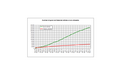
Statistics diagrams
Dear Pyrotec,
I would like to thank you for your high quality articles statistics diagrams
-
 Monthly growth
 -
 Share per million articles
 -
 Total
Total


and offer myself for creating SVG diagrams like these:
-
 Comparison enwp-dewp (GA)
 -
 Comparison enwp-dewp (FA)
 -
 GA / dewp


--Kopiersperre (talk) 11:34, 28 February 2015 (UTC)
- Hello Kopiersperre,
- Thanks for your offer. I currently produce the diagrams off line. The raw data can be found at Wikipedia:Good article statistics, I then manually transcribe it into a Microsoft Excel spreadsheet (I'm currently using version 2003) to produce the set of four graphs. These graphs are then individually copied and pasted into Photoshop Elements and saved off line as PNG files. Finally, they are uploaded to wiki-commons.
- Incidentally, the raw en-wiki data for monthly increases show the same fluctuations as the the de-wiki data, so they are "smoothed" on the diagrams by taking a running 12-point average.
- I'm not very active on wikipedia, hence the delay in reading and responding. If you are able to produce them within wikipedia, it would save me from doing it off line. Pyrotec (talk) 16:03, 2 April 2015 (UTC)
- Unfortunately I also have to create my diagrams offline. But at my diagrams there is the source code for updating, so hopefully someone else will update them. I personally think, that there is no need for smoothing.--Kopiersperre (talk) 19:38, 2 April 2015 (UTC)
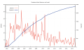
- Hello Kopiersperre, Thanks for your reply; and I'm sorry for the delay in responding. Out of curiosity, I produced an unsmoothed version (without running a 12-point average) of the FA-GA-monthly-growth file (below). Note: I've only used smoothed data for the growth rate graph. As per the De-wiki graph, there is a lot of month-to-month variation, which could be useful if someone, say, is running a back-log drive and wishes to see the direct effect(s). I personally prefer the smoothed version. But, I don't see that as a major "sticking point".
- Unfortunately I also have to create my diagrams offline. But at my diagrams there is the source code for updating, so hopefully someone else will update them. I personally think, that there is no need for smoothing.--Kopiersperre (talk) 19:38, 2 April 2015 (UTC)
- I've now loaded Gnuplot onto my home computer, so I could update any files that are produced at home (well once I've found out how to use it). Looking at your source code, it appears to be just a case of just adding more lines of data, but perhaps I'm mistaken about that. Also, using Gnuplot to directly produce svg graphs, appears to be less troublesome than my two-step process of producing them in a spreadsheet, copying and pasting into a image editor to change the file to png format; and then uploading to wikipedia.
- Note: I should be able to export csv data from my existing spreadsheet in form suitable for direct input into Gnuplot and email it/them to you and/or copy into a wikipeida page if that would save you time and trouble.
-
 Monthly growth (unsmoothed)
_GA-FA_en-wiki.png)