Wikipedia talk:WikiProject Typography/Archive 2
| This is an archive of past discussions. Do not edit the contents of this page. If you wish to start a new discussion or revive an old one, please do so on the current talk page. |
| Archive 1 | Archive 2 |
Samples of script typefaces listed at Requested moves

A requested move discussion has been initiated for Samples of script typefaces to be moved to List of script typefaces. This page is of interest to this WikiProject and interested members may want to participate in the discussion here. —RMCD bot 15:46, 2 April 2017 (UTC)
- To opt out of RM notifications on this page, transclude {{bots|deny=RMCD bot}}, or set up Article alerts for this WikiProject.
Samples of simulation typefaces listed at Requested moves
A requested move discussion has been initiated for Samples of simulation typefaces to be moved to List of simulation typefaces. This page is of interest to this WikiProject and interested members may want to participate in the discussion here. —RMCD bot 15:46, 2 April 2017 (UTC)
- To opt out of RM notifications on this page, transclude {{bots|deny=RMCD bot}}, or set up Article alerts for this WikiProject.
Samples of display typefaces listed at Requested moves
A requested move discussion has been initiated for Samples of display typefaces to be moved to List of display typefaces. This page is of interest to this WikiProject and interested members may want to participate in the discussion here. —RMCD bot 15:46, 2 April 2017 (UTC)
- To opt out of RM notifications on this page, transclude {{bots|deny=RMCD bot}}, or set up Article alerts for this WikiProject.
One of your project's articles has been selected for improvement!
 Hello, |
Does anyone know where this symbol should point to? If not an article about it then a redirect to somewhere appropriate?
It is what is generated when I try to enter a triple dagger symbol extended from the double dagger from page 2 of http://folk.uib.no/hnooh/mufi/proposals/n4704-medieval-punct.pdf
It also displays as ⁄ from page 7 of http://folk.uib.no/hnooh/mufi/pipeline/proposals/MUFIEingabeSSRQ-2011.pdf
Something related to the Medieval Unicode Font Initiative it seems. ScratchMarshall (talk) 20:17, 8 March 2017 (UTC)
- @ScratchMarshall: I just came to check out this WikiProject and it doesn't seem to be so active, so apologies for the very late response. The character you shared has a Unicode codepoint U+2E59. This means it is within the block Supplemental Punctuation. From the code chart, we can see that the 2E5 row is currently not assigned. From the first link you shared, this is meant to be part of an addition of medievalist punctuation to the Unicode standard (Universal Character Set actually, but it's the same for our purposes). So in conclusion, what it is meant to represent is the "triple dagger", but it would not be appropriate to actually create a redirect for it as it is not part of the Unicode standard and was only ever proposed, thus it currently doesn't mean anything to computers other than an arbitrary sequence of bytes. (the appropriate target would have been Dagger (typography)) The reason you see a box or slash is because that's what it was entered as in those PDFs, but your system fonts don't support such a character yet as there isn't anything there in Unicode. Hope that helped. Opencooper (talk) 06:35, 30 July 2017 (UTC)
- maybe we should have an article explaining this rectangle symbol though. Like "this displays when an unrecognized character is used"? There must be a proper name for it. ScratchMarshall (talk) 18:36, 30 July 2017 (UTC)
- It's known as tofu colloquially, and more technically the .notdef glyph (not defined) or a fallback glyph. I'm not sure tofu has been written about sufficiently enough to be notable, though there are the Noto fonts named after it. (the layman wouldn't know what to search for anyway other than "empty boxes" or something) It also wouldn't be feasible to redirect every character outside of the unicode standard as there's ton of empty space. It's just an issue that will have to be solved on the OS side, on Wikipedia with foreign character warning boxes, and through general user education since seeing tofu on its own only tells you that your font can't display the character. (either because fonts usually only cover a common range of characters, because the font is outdated as with emoji, or in our case, a codepoint outside of the unicode standard was entered so it would need a font specifically made for it or it isn't actually used) Opencooper (talk) 00:18, 31 July 2017 (UTC)
- maybe we should have an article explaining this rectangle symbol though. Like "this displays when an unrecognized character is used"? There must be a proper name for it. ScratchMarshall (talk) 18:36, 30 July 2017 (UTC)
WikiProject collaboration notice from the Portals WikiProject
The reason I am contacting you is because there are one or more portals that fall under this subject, and the Portals WikiProject is currently undertaking a major drive to automate portals that may affect them.
Portals are being redesigned.
The new design features are being applied to existing portals.
At present, we are gearing up for a maintenance pass of portals in which the introduction section will be upgraded to no longer need a subpage. In place of static copied and pasted excerpts will be self-updating excerpts displayed through selective transclusion, using the template {{Transclude lead excerpt}}.
The discussion about this can be found here.
Maintainers of specific portals are encouraged to sign up as project members here, noting the portals they maintain, so that those portals are skipped by the maintenance pass. Currently, we are interested in upgrading neglected and abandoned portals. There will be opportunity for maintained portals to opt-in later, or the portal maintainers can handle upgrading (the portals they maintain) personally at any time.
Background
On April 8th, 2018, an RfC ("Request for comment") proposal was made to eliminate all portals and the portal namespace. On April 17th, the Portals WikiProject was rebooted to handle the revitalization of the portal system. On May 12th, the RfC was closed with the result to keep portals, by a margin of about 2 to 1 in favor of keeping portals.
Since the reboot, the Portals WikiProject has been busy building tools and components to upgrade portals.
So far, 84 editors have joined.
If you would like to keep abreast of what is happening with portals, see the newsletter archive.
If you have any questions about what is happening with portals or the Portals WikiProject, please post them on the WikiProject's talk page.
Thank you. — The Transhumanist 07:59, 30 May 2018 (UTC)
One of your project's articles has been selected for improvement!
| Hello, |
A new newsletter directory is out!
A new Newsletter directory has been created to replace the old, out-of-date one. If your WikiProject and its taskforces have newsletters (even inactive ones), or if you know of a missing newsletter (including from sister projects like WikiSpecies), please include it in the directory! The template can be a bit tricky, so if you need help, just post the newsletter on the template's talk page and someone will add it for you.
- – Sent on behalf of Headbomb. 03:11, 11 April 2019 (UTC)
One of your project's articles has been selected for improvement!
| Hello, |
finials
It would be great to have illustrations of the various stroke endings listed. The descriptions would still leave the reader puzzled. 🖖 ChristTrekker 🗣 17:37, 25 June 2019 (UTC)
Bracket is missing another math use?
I seen values written in scientific journals, for example, 43.056(4). I'm guessing the number in the parenthesis is a ±4, ±0.0004, or is it rounding the last significant digit? Can someone verify who is in mathematics? Thanks, Marasama (talk) 04:53, 15 September 2019 (UTC)
- It denotes a measurement with uncertainty. See Uncertainty#Measurements for an explanation. The bracket article already shows its use in Bracket#Usage_in_other_scientific_fields. --
{{u|Mark viking}} {Talk}05:20, 15 September 2019 (UTC)
Request for information on WP1.0 web tool
Hello and greetings from the maintainers of the WP 1.0 Bot! As you may or may not know, we are currently involved in an overhaul of the bot, in order to make it more modern and maintainable. As part of this process, we will be rewriting the web tool that is part of the project. You might have noticed this tool if you click through the links on the project assessment summary tables.
We'd like to collect information on how the current tool is used by....you! How do you yourself and the other maintainers of your project use the web tool? Which of its features do you need? How frequently do you use these features? And what features is the tool missing that would be useful to you? We have collected all of these questions at this Google form where you can leave your response. Walkerma (talk) 04:25, 27 October 2019 (UTC)
Infobox character?
Is there an Infobox typography character? (not movie {{Infobox character}} ;-) ). At the moment there is only {{Infobox punctuation mark}} (ok), abused for other characters like in pound sign. {{Infobox grapheme}}? @Spitzak and John Maynard Friedman:. -DePiep (talk) 19:55, 20 November 2019 (UTC)
- @DePiep:, I haven't come across it if there is. I know I said elsewhere that we might be misdirecting ourselves by the fact that the sidebar (which should become a navbar) is called 'punctuation' and risk losing valuable material by purging it of non-punctuation. But now I suggest that we (meaning you!) should create a new navbar for each category you clear out, mathematical symbols being the obvious one (there is already a currency symbols navbar). --John Maynard Friedman (talk) 20:26, 20 November 2019 (UTC)
- Material purged is landed well elsewhere (see currency signs). Math symbpols being purged shold be covered in math already. I don't think this rule is valid in general. -DePiep (talk) 20:31, 20 November 2019 (UTC)
- Yes, in these two cases, that is true (well, almost, template:infobox currency sign is still under development but yes there is a list of mathematical symbols). I'm sure you intended to ensure that landing zones exist for each element you purge so I hope I'm stating the obvious. --John Maynard Friedman (talk) 23:18, 20 November 2019 (UTC)
- Material purged is landed well elsewhere (see currency signs). Math symbpols being purged shold be covered in math already. I don't think this rule is valid in general. -DePiep (talk) 20:31, 20 November 2019 (UTC)
- For latecomers to this discussion, template:infobox symbol was created as a result of this discussion and is widely used. --John Maynard Friedman (talk) 20:34, 20 May 2020 (UTC)
Typeface specimens
Is there a standard or recommended template for typeface specimen images? I understand many of them are created using the tool at http://shell.aiei.ch/typography/; is there some sort of guidance as to the choice of colours? What about international scripts? --Paul_012 (talk) 17:20, 20 May 2020 (UTC)
- I don't know of any style guide for specimen images. That tool is a reasonable approach. In the absence of a style guide, I look to GA or FA articles as good examples to follow. Garamond is a GA with a specimen that has fairly good contrast, while the colors are still easy on the eyes. --
{{u|Mark viking}} {Talk}20:16, 20 May 2020 (UTC) - Paul 012, that page is very interesting; I hadn't seen it before and have never used it. Many specimen images in the past were done by a user, GearedBull, who last contributed in 2013, before I really started contributing. I don't have their template but I believe from comments that they used QuarkXPress. I create templates in emulation and use either the same colours or ones from various palettes (often those that come with Microsoft Word, to keep things simple). I try to keep the colours not too gaudy, a bit like the colours of an old book. I do spend a lot of time fine-tuning the image to the specific font-often, especially for fonts that feel "small on the body" (a lot of space above and below the x-height zone) you need the linespacing reduced from the default value or the font won't fill up the space properly. You'll see that in their sample image for FF Meta, the bottom row of the alphabet (n-z) is closer to the top row than normal text could be to fill up the space better. If you replaced the 't' with an 'h' in your mind, you'll see that it would collide with the bottom of the 'g'. Same for the numerals. (I didn't do this in the Berthold Block image and you'll see the keyword "Currywurst" seems to be floating in empty space; it needs to be bigger. I may come back and redo it; I otherwise like that sample a lot.) Sometimes for that line to allow tighter spacing you want to make that line all caps, especially if the font has very long descenders, or you want to use a text with no descenders in the sample. You also want to think about what goes on the second row of the six characters: in a font with only one style it'll be more of the same style or maybe some alternative characters; where the font has an italic that's interestingly expressive I use it (as GearedBull's FF Meta image). Where the italic is simply the upright form sloped, as with Helvetica, I follow their lead and show the bold, especially if it's good like Helvetica's is. For Impact, which doesn't have a bold or italic, I showed the brackets which are rather distinctive. For the Stephenson Blake Grotesques I showed the light weight, then the most popular bold "No. 9" weight, to give a feel of escalation. Do you have a font in mind you want to do a sample for? I may be able to suggest (from bitter experience...) what would look good. Blythwood (talk) 03:37, 21 May 2020 (UTC)
- Thanks for the suggestions, Blythwood. I was mostly looking for general ideas. I'm working on an article about Thai typography, and it will need some specimen samples, though I'm thinking horizontal pangram samples like File:Garamond sample.svg might be better suited for this, since the typefaces will only be mentioned in a list. There are articles such as Manoptica, which lacks any kind of specimen, and National fonts needs new images, since the current ones are a Wikipedia self-reference and in jpeg format. So it'd probably be best to build new templates for all of these uses... I'm thinking ahead of myself though. Many of these fonts are non-free, so I'll be limited by what raster samples are already available on the web. May be that's the practical place to start. --Paul_012 (talk) 17:04, 21 May 2020 (UTC)
![]() You are invited to join the discussion at Wikipedia:Templates for discussion/Log/2020 July 6 § Template:Char. Psiĥedelisto (talk • contribs) please always ping! 06:23, 6 July 2020 (UTC)
You are invited to join the discussion at Wikipedia:Templates for discussion/Log/2020 July 6 § Template:Char. Psiĥedelisto (talk • contribs) please always ping! 06:23, 6 July 2020 (UTC)
Typographers vs. Type Designers
There is some unnecessary ambiguity on the Category:American_typographers page as many of the included individuals are known primarily as type designers (someone who creates typefaces), not typographers (someone who uses typefaces in typography or graphic design). These are two separate disciplines and each should have its own category. As an analogy, it would be like combining the makers of bricks, or other building materials, with architects. I see other areas of Wikipedia have already made this distinction — the general List_of_type_designers, for example. (Forgive me if this has been discussed elsewhere, but I am fairly new to Wikipedia editing.) Stewf (talk) 21:30, 19 July 2020 (UTC)
New article
Susan Shaw was a typography enthusiast and she has a new article Victuallers (talk) 17:35, 5 December 2020 (UTC)
Requested move at Talk:Orthographic ligature#Requested move 17 March 2021
There is a requested move discussion at Talk:Orthographic ligature#Requested move 17 March 2021 that may be of interest to members of this WikiProject. ~ Aseleste (t, e | c, l) 05:24, 25 March 2021 (UTC)
Missing articles: stonecut, stone engraving
See Talk:Engraving#stone_engraving_/_stonecut. Can anyone stub and/or redirect those terms as appropriate? --Piotr Konieczny aka Prokonsul Piotrus| reply here 08:58, 13 July 2020 (UTC)
- I will redirect to Letter cutting later. --John Maynard Friedman (talk) 12:54, 1 April 2021 (UTC)
Question about Marigold font
I wanted to read something about Marigold, but apparently there is no Wikipedia article. Does the WikiProject have criteria for font notability? Alas, I lack the knowledge or motivation to create an article -- but if someone like me, not a typography maven, has even heard of this font, that is at least a minimal suggestion of its notability. JamesMLane t c 20:25, 31 March 2021 (UTC)
- JamesMLane, thanks for the suggestion! It's not a font I've heart of-do you know if there's any third-party coverage? Looking online I see at least four different fonts with that name. Blythwood (talk) 20:42, 31 March 2021 (UTC)
- Blythwood: In taking a quick look to see if I could answer your question, I also learned, for the first time, that there are multiple fonts with that name. The one depicted here -- https://fontzone.net/download/marigold -- was included automatically in WordPerfect 6 in the late 1990s, which is how I know about it (my firm used it to do an invitation). To us WordPerfect fans, that makes it notable! As for more general indicia of notability, a Google search for "Marigold font" gets 17.3m hits. Most seem to be ads or sites where you can download a font for free, and some are about the flower. I lack the patience to try to find genuine third-party coverage. JamesMLane t c 00:13, 1 April 2021 (UTC)
- This Marigold font belongs to the italic fonts, It was not possible to find anything about the designer... or other sources for it. It has some simularities with the 16th century italics in France and Italy. It could find a place at the wiki of Italic type, J.T.W.A.Cornelisse (talk) 10:40, 1 April 2021 (UTC)
- Using
"marigold font" WordPerfectas Google search argument cut the return rate dramatically. There was only one non-spammy return, an undergraduate student project at the University of Delaware, here. Sorry, but I think we have to conclude that this font is not WP: notable. --John Maynard Friedman (talk) 12:46, 1 April 2021 (UTC)
- JamesMLane, thanks for the information. I've looked it up now. Marigold was designed by Arthur Baker, a prolific calligrapher and font designer most active in the phototype period; he drew many fonts published by VGC. His article is in need of updating; sadly he passed away in 2016. I think if you look at his other fonts you'll see the same kind of hand-drawn, calligraphic feel as in this font. He designed a huge number of fonts, many of which I imagine haven't been digitised. Stephen Coles of Typographica, who knows more about fonts than basically anybody on the planet, recently shared some stunning images from Carl Crossgrove of designs which put a personal spin on classic fonts, none of which seem ever to been published and commented "Baker’s range just keeps growing. This guy had so much more in his head and hands than I realized." And some really striking abstract work, and more fond comments ("Arthur Baker would phone me sometimes to chat about the type business. They were epic phonecalls, often lasting three hours or more, in which I learned many things.")
As to Marigold specifically, it's a spin on the very first italic type, by Manutius and Griffo. Designed to replicate a specific style of calligraphy, it had long extenders relative to the x-height and very small capitals (upright in the originals, but he clearly decided that wasn't right for modern use). If you like the style I can recommend Jan van Krimpen's design in the same mood, which recently got a very solid open-source digitisation (which its designer felt was only in beta, but it's basically finished). Blythwood (talk) 18:47, 1 April 2021 (UTC)- MyFonts is still selling a number of Arthur Baker (re)designs, including a six-member New Marigold family. I believe Monotype (possibly among others) offers several of the other fonts listed in the above article.—Odysseus1479 21:37, 1 April 2021 (UTC)
Cylinder Press
Currently the topic "cylinder press" redirects to "rotary press". Whilst a rotary press is a cylinder press, a cylinder press need not be a rotary press. There is a whole history of flat bed cylinder presses starting with Koenig's press for the Times that is omitted by this redirect. — Preceding unsigned comment added by Mmckenzie (talk • contribs) 10:58, 3 May 2021 (UTC)
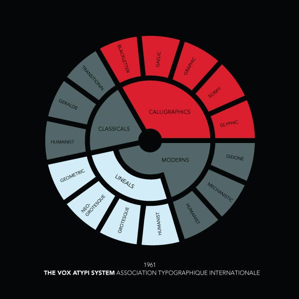
Version of M. Vox's diagram + what is the current VoxAtypl classification?
Hello. I have two questions
1) I have found a reproduction of Vox's diagram of his original 1962 classification, here (from here). The diagram is from the book Dossier Vox, 1975. You can see a clearer, typographical version from the book La Chose imprimée here or here (from here). I found an English version using each font in the diagram here.
Does anyone think that it would be a good idea to ask at c:Commons:Graphic Lab/Illustration workshop to make a version of Vox's original classification? By the way, I think his classification often gets confused with the one wich was later adopted as the Vox-ATypI classification.
2) does anyone have a list of the current font families and fonts of the Vox-ATypI classification? I cannot find it on the official website. Veverve (talk) 12:13, 7 April 2021 (UTC)
Since I have no anwers, I ping @Odysseus1479:, @John Maynard Friedman:, @JamesMLane:, @J.T.W.A.Cornelisse: and @Blythwood: in an attempt to get some. Veverve (talk) 10:46, 10 April 2021 (UTC)
- Since the digital era has started, many new fonts were designed and will be designed... Even before the internet was active, many fonts were made, that might never been listed in this classification by name at all.
- And than... lots of fonts have more than one name. This was in the old type founder age when type founders copied popular faces from competitor type foundries (for instance: Garamond & Garamont).
- How would you imagine to keep track off all this? Any designer of a new font should be able to figure out what kind of fond he has made, and what the purpose of it.
- How can anybody be complete in this ? J.T.W.A.Cornelisse (talk) 08:37, 11 April 2021 (UTC)
- @J.T.W.A.Cornelisse: I understand it is difficult, but it is not the point. I am asking if there is a list of the currect Vox-ATypI classification somewhere. Currently there is e.g. the Classicals family with the Humanist font, the Calligraphics family with the Blackletter font, etc. on the WP article, and I would like to check if the article is up to date.
- Also, what do you think of my first point concerning the diagram? Veverve (talk) 08:56, 11 April 2021 (UTC)
- The Vox diagram is rather schematic, certainly the first diagrams... and that might stay in this way, What is the need to be very precise ? J.T.W.A.Cornelisse (talk) 11:44, 11 April 2021 (UTC)
- @Veverve: if people think it would be useful, I’d be happy to create a version of the diagram. I am somewhat concerned that WP:OR might be required to select representative specimens, as implied by JTWAC above. Of course it could all be done in a generic font, just naming the examples as in the Guide pratique … linked above, but with some loss of illustrative value. At any rate the actual execution would be pretty easy, and I do have a fairly large collection of ‘classic’ fonts from major foundries to draw upon.—Odysseus1479 23:48, 30 April 2021 (UTC)
- @Odysseus1479: It is not OR, because Vox's diagram is official; please note, Vox's diagram is not the Vox-Atypl classification, but Vox's classification. The Vox-Atypl adopted in 1962 contains the Blackletters family, and added the Gaelic family in 2010. I found a fan made diagram of the latest Vox-Atypl classification here. I did ask the question of whether reproducing those two diagrams would infringe copyright on WCommons, and it is likely that it does. Veverve (talk) 07:13, 1 May 2021 (UTC)
- @Odysseus1479: I re-read your message: yes, choosing representatives would be OR, but I do not think it would be a problem. The biggest problem is that reproducing those diagrams would likely infringe copyright. Veverve (talk) 08:07, 1 May 2021 (UTC)
- @Veverve: I disagree that it would necessarily do so. AIUI the classification system itself is an idea or concept, therefore not subject to copyright; as long as the “creative expression” in a representation thereof is not derived from an existing work, it shouldn’t be a problem. I see from the Commons VPC discussion that my take on this may be controversial, but I’d be prepared to defend it in a DR.—Odysseus1479 21:09, 3 May 2021 (UTC)
- @Odysseus1479: From what I understand, the organisation into a circle the way it is done in those two images may be copyrighted, thus the content of those diagrams (in this case, the names of the fonts and font families) is what would be copyrighted. Feel free to have a more thourought discussion on WCommons about this if you want; if I am sure that reproducing those diagrams in SVG by doing either a 1:1 copy or an almost 1:1 copy is not plagiarism or derivative, then I will gladly ask for the making of those SVGs and supervise said making. Veverve (talk) 23:41, 3 May 2021 (UTC)
- @Veverve: I disagree that it would necessarily do so. AIUI the classification system itself is an idea or concept, therefore not subject to copyright; as long as the “creative expression” in a representation thereof is not derived from an existing work, it shouldn’t be a problem. I see from the Commons VPC discussion that my take on this may be controversial, but I’d be prepared to defend it in a DR.—Odysseus1479 21:09, 3 May 2021 (UTC)
Typographical error article
Hi, I recently noticed how the article typographical error may need some improvement, specifically because redirects suggest a wider subject, than what the article is currently about. The misprint and printing error redirects suggest the article should also deal with subjects more relevant to this project (at least the printing part), not sure if in this case it would be better to use a different existing or new article and fix links or to improve this one. Anyway I brought this up in different places (teahouse, typoteam), so eventual comments should probably go to Talk:typographical error to avoid dispersion. Personuser (talk) 21:58, 22 May 2021 (UTC)
Wikipedia:Articles for deletion/Thomas Milo. I should be grateful of any comments. JorgeLaArdilla (talk) 12:36, 25 May 2021 (UTC)
One of your project's articles has been selected for improvement!
| Hello, |