This is an archive of past discussions. Do not edit the contents of this page. If you wish to start a new discussion or revive an old one, please do so on the current talk page.
Latest comment: 14 years ago1 comment1 person in discussion
Could someone update the world map:
North Korea: First case confirmed.
Algeria: First death confirmed.
Estonia: First death confirmed.
Libya: First death confirmed.
Faroe Islands: First case confirmed.
San Marino: First case confirmed.
Indonesia: First confirmed death Done
Zambia: First confirmed case Done
Kazakhstan: First confirmed case Done
Venezuela: First confirmed death Done
Why is China black? AFAIK, nobody died there (and it's not on the main article's table). —Preceding unsigned comment added by 201.82.134.159 (talk) 13:40, 22 July 2009 (UTC)
Antarctica
Latest comment: 14 years ago3 comments3 people in discussion
- Why is Antarctica coloured as an area with confirmed cases? - Alexdeangelis (talk) 18:15, 2 June 2009 (UTC)
Ever seen a penguin with a flu? Ugly business. No, but really, I'd like to know also. Did they ship someone down there who already had it? Does that count? --Kingoomieiii ♣Talk 17:42, 2 June 2009 (UTC)
How about if they got infected while there? That should count. Anyway, here it says: "May 31 [...] Antarctica First two cases confirmed in two American scientists stationed there." There is no source, but if that's true, it should be red. After all, keep in mind this map is not supposed to show which countries citizens have been infected, but rather the geographical spread of the disease, regardless of whether people were just travelling somewhere or lived there permanently; so even if someone was "shipped" there and nobody lives there permanently, it matters that the disease did in fact spread there. --Cessator (talk) 07:41, 3 June 2009 (UTC)
Egypt
Latest comment: 14 years ago1 comment1 person in discussion
First confirmed case announced earlier today [1]. A elalaily (talk) 18:05, 2 June 2009 (UTC)
different color scheme ?
Latest comment: 14 years ago1 comment1 person in discussion
I have changed from orange to red the North American Map and some other maps like the Mexican, Canadian and US map, but i want to make sure before i change the color of this map too, because i dont wanna waste my time if someone reverted it to the original color, so what should i do?? It's just one color, the orange one because it doesnt look very well with the other colors, you can see the difference between the old and new version of the NA Map. --Vrysxy! (talk) 07:06, 5 June 2009 (UTC)
Sorry, i meant the map by confirmed cases not this one. --Vrysxy! (talk) 19:41, 5 June 2009 (UTC)
Hungary has confirmed cases
Latest comment: 14 years ago2 comments2 people in discussion
Hungary has seven cases. no one has corrected the map yet.Wai Hong (talk) 04:17, 22 June 2009 (UTC)
Animated GIF/PNG
Latest comment: 14 years ago1 comment1 person in discussion
Could an animated GIF/PNG be made of all the intermediate verions of this map? This would illustrate the development of the situation over time. 87.212.130.235 (talk) 08:02, 13 June 2009 (UTC)
Downloading Map
Latest comment: 14 years ago4 comments3 people in discussion
This may not seem important, but is there a way to download the map as an svg file? Thanks Mudkip201 (talk) 13:46, 14 June 2009 (UTC)
Go to the "file" page, click on the map, it will load up the SVG version. 70.29.212.226 (talk) 08:57, 19 June 2009 (UTC)
I want to download the SVG file, but I can't find a way to. And that doesn't allow me to download the SVG file. Mudkip201 (talk) 13:34, 19 June 2009 (UTC)
Go to the file page, click on the map image, a new "page" will load, this is the SVG file. Do a save as, and it will save the SVG file.
Go to the file page, right-click on the map, select "save link", this will save the SVG file (DO NOT select "save image" - this is wrong, it will save the cached PNG instead)
Latest comment: 14 years ago2 comments2 people in discussion
See link. I know this isn't the place to suggest corrections, but I've placed it here given the high profile nature of this topic. YeshuaDavid • Talk • 20:06, 14 June 2009 (UTC)
Latest comment: 14 years ago1 comment1 person in discussion
Add this to description:
Ukrainian: Мапа заражених грипом H1N1 країн в 2009 году.
  підтверджені випадки зараження, що привели до смерті
  підтверджені випадки зараження
  непідтверджені випадки зараження
Мапа може змінюватися дуже часто, так як відноситься до поточних подій котрі змінюються кожну годину. —Preceding unsigned comment added by 93.95.184.224 (talk) 21:11, 14 June 2009 (UTC)
Isle of Man
Latest comment: 14 years ago1 comment1 person in discussion
One confirmed case on the Isle of Man, please mark red.--SelfQ (talk) 23:38, 14 June 2009 (UTC)
Out of interest...
Latest comment: 14 years ago2 comments2 people in discussion
does Vatican City have any cases of the Swine Flu? I think we should have a map of the place so people like me can know if they want to. Ross Rhodes (TC)Sign! 15:03, 16 June 2009 (UTC)
The only place where this could be done without compromising any proportionality on the map is the Italy map page. I am not sure if even San Marino shows up as a distict entity on that map, but these places are far too small to spot on a world map, at least one the size we are dealing with.Johnpacklambert (talk) 00:46, 8 July 2009 (UTC)
Puerto Rico
Latest comment: 14 years ago2 comments2 people in discussion
Isn't Puerto Rico part of the United States? It isn't coloured black, it is still coloured red. —Preceding unsigned comment added by Nohomers48 (talk • contribs) 21:18, 16 June 2009 (UTC)
Puerto Rico is a devolved territory and could be cloured serpratly, as could The Isel of Mann and Macau.--86.25.2.113 (talk) 10:59, 30 June 2009 (UTC)
Mistakes in Africa?
Latest comment: 14 years ago1 comment1 person in discussion
Why is Senegal colored yellow? Shouldn't Gambia be colored yellow instead?
And I'm not aware of Eritrea's suspected cases returning negative. Mudkip201 (talk) 18:02, 18 June 2009 (UTC)
A little hint...
Latest comment: 14 years ago1 comment1 person in discussion
I believe Oman has a few confirmed cases... [1]Mudkip201 (talk) 18:07, 18 June 2009 (UTC)
Please, add Papua-New Guinea
Latest comment: 14 years ago1 comment1 person in discussion
Why is there only deaths in the west and south of Australia, in non Inuit/Amerindian parts of Canada, around the River Plate and in the USA except for the Negro dominated states like Georgian and in the remote mountain states like Montanna?!--86.25.4.217 (talk) 09:47, 1 July 2009 (UTC)
Why is only S.E. China is ill in the whole of the mighty nation?!--86.25.4.217 (talk) 09:51, 1 July 2009 (UTC)
Bio-weapons?!--86.25.4.217 (talk) 09:53, 1 July 2009 (UTC)Yep!!!--86.25.5.103 (talk) 10:23, 1 July 2009 (UTC)Bio-weapons, as if! What a load of bull-shit!--86.25.14.224 (talk) 10:06, 2 July 2009 (UTC)
i'm not entering in the discussioon, I just want to talk about the map: I've creadted the map, but I haven't put all the information on it, this fase is just to express the idea that I had. You can see the discussion about the creation of two new maps, more up in this page João P. M. Lima (talk) 10:41, 1 July 2009 (UTC)
The problem with such a world map is that the UK isn't reporting by normal political subdivisions... and Singapore isn't reporting by subdivision at all. 76.66.193.20 (talk) 22:11, 1 July 2009 (UTC)
I can not believe that someone would refer to Afrian-Americans using a term that has been out of date for at least 30 years. However, no US state has an African-American majority. The state that comes closest is Mississippi, with about 36% of the population being Afrian-American, but that is still well under half. The next highest state is Maryland, which has had a death from swine flu. However, with less than 200 deaths in the United States, with less than 2,000 cases in China, and other such numbers this whole disease can easily get over hyped. I like the idea of the world map with some sub-national units delineated, but wish people would not come up with such outlandish ideas about what the disease spread means.Johnpacklambert (talk) 00:55, 8 July 2009 (UTC)
I think this map is a noble effort. I think we need to use some logical restraints though. Singapore is so small that we can barely detect it on the world-map as it is, so it is a country we can logically excuse from sub-national division. We should use the "minimum discernable area rule". If the country already is just an amorphous blob on the world map, don't bother subdividing. In the case of the UK and France, folow the subdivision used for reports, even if treating Scotland as all one unit but sub-dividing England does not really make sense.Johnpacklambert (talk) 00:58, 8 July 2009 (UTC)
New World 2009 Flu Pandemic Map: idea
Latest comment: 14 years ago26 comments11 people in discussion
Hey, I was thinking if it isn't possible to create a map about this subject, which looks like the USA one
. It would be interesting, have the map made in this way João P. M. Lima (talk) 16:10, 29 June 2009 (UTC)
I can't find a map who as the divisions until the counties, but it would be nice, if the map was the one that I've posted before João P. M. Lima (talk) 16:21, 29 June 2009 (UTC)
Makes sense to use provinces, states, regions or counties (or any first-level subdivisions at the national level) in SOME countries, but in most cases you'll end up with tiny pixel-sized dots. Still, this could be interesting for large countries such as Canada, India, Brazil, Russia, etc. 70.83.220.148 (talk) 17:18, 29 June 2009 (UTC)
It would be a good way of showing it's passage around the PRC, Argentina and USA over the passage of time as well as localising cases in the bigger countries like Russia, India, Brazil, etc!--86.25.8.152 (talk) 17:59, 29 June 2009 (UTC)
I would like to see 2 world maps, 1 locating the number of victims per province and 1 locating the 1st case in each country and the provinces of the devistated nations like the USA, Argentina, China, UK and Canada. --86.25.8.152 (talk) 18:05, 29 June 2009 (UTC)
Someone seems to have created such maps for Europe and Asia (date of first case) ... 76.66.193.20 (talk) 06:22, 30 June 2009 (UTC)
But if we use a map with just this
divisions, it would be better. In the actual map (that should continue existing independent of other maps been created), we see countries coloured with just one case, it's "good" to know, what countries has the flu, but is "even better" see, in a world scale, where the cases happened João P. M. Lima (talk) 09:46, -
30 June 2009 (UTC)
The map of the U.S.A looks very informative here. Somebody should do it for the world, and keep updating it (it's a full time job). Julian (talk) 10:25, 30 June 2009 (UTC)
is that that I'm saying. It would be very interesting to have a world map with such information, it would be possible to See the focus in some parts of the world. But I search in commons a map like that, and it doesn't exist, the one more divided that I've found, is the one that I put in this page already (and I think that it isn't complete) João P. M. Lima (talk) 13:53, 30 June 2009 (UTC)
I've made a very quick map, using the one that I posted above, it's not very nice, better is really not nice, but i hope that someone improve it
I think that we should have the map that we already have (only countries), we should have the map above (with the subdivisions), and finally, we should have the world map, like the US has for the divisions of the states João P. M. Lima (talk) 14:33, 30 June 2009 (UTC)
João, your map is excellent, It is just what we need!--86.25.4.217 (talk) 09:26, 1 July 2009 (UTC)
thanks, but it's still missing many parts of the world lol but, I would like to see too, a world map, with the subdivisions of a country (like the USA map) João P. M. Lima (talk) 10:37, 1 July 2009 (UTC)
I think this should not be included on the article (which 86.25.4.217 has done) untill it is up-to-date. At a glance, I can see there are many confirmed cases from the other world map that haven't been included (ie. Africa, Middle East, Southern Asia, Central America). It's a really good idea and gives a far more realistic impression of the geographical spread of H1N1. How easy is it to get current data on all those areas? Hard I'd guess -- m0tive (talk) 11:17, 1 July 2009 (UTC) -
Also it really ought to be a .svg like the rest of the maps. Not only is this ideal for scaling it is almost essential if the map is to be updated easily by other people. The current map is just not good enough quality. |→ Spaullyτ11:25, 1 July 2009 (GMT)
in my computer i can't work with the wikipedia maps (i don't know why -.-'), but the map itself, is not complete, contries in Africa and in Central and South America aren't with their divisions (and the colors - red and yellow - can't be so "live") João P. M. Lima (talk) 14:10, 1 July 2009 (UTC)
i'll try to poste a new version of the map today, but i can't find all the information, to just color the rigth localizations João P. M. Lima (talk) 14:30, 1 July 2009 (UTC)
wiki maps (and alot of the graphics) are SVGs. You need a vector graphics program like Adobe Illustrator or Inkscape (which is free) to create/edit them. You can download Inkscape here. -- m0tive (talk) 14:42, 1 July 2009 (UTC)
ok, thanks i'm installing it, but how can we edit the black map to put the divisions of wich country (exist countries in this map, who have their divisions wrong, and many others neither have divisions) João P. M. Lima (talk) 14:54, 1 July 2009 (UTC)
I can't posto a newer version, and I can't (i don't know) who to full the blank map with the divions of witch country João P. M. Lima (talk) 15:23, 1 July 2009 (UTC)
I had to post a version apart, this is better that the first one, but still needs to be very improved
Sorry to be picky, but that's still not an SVG - It is a lot better though, keep up the good work :) -- m0tive (talk) 17:16, 1 July 2009 (UTC)
I can't color more regions, because there is no information in Wikipedia about it, and the ones that exist (like all the american continent), doesn't have their divisions on the map, that's way I'm asking for help, to complete the map (correcting and ading the regions to all the countries, and after to color it).
By the way, I searched to see the municiples of wich country (like the map of USA), and I think that would be very interesting to have a world map with all that information, it will create a very good visual way to see the parts of the world were the pandemic is seriously João P. M. Lima (talk) 17:55, 1 July 2009 (UTC) -
Here in this web page (PAHO) you can find more information about each state/province, department etc for the Americas [5]), and think there is another version for the other regions --Vrysxy! (talk) 08:50, 3 July 2009 (UTC)
I've found this map:
World administrative divisions
It has all the divisions of all countries in the world, and in most of them, there are the subdivisions too João P. M. Lima (talk) 18:01, 4 July 2009 (UTC)
It's missing Alaska, part of the Pacific, part of Russia, and most of Yukon. Plus it has Antarctica divided, which it should not. It appears to be a second-level national subdivision map? 70.29.208.69 (talk) 21:36, 4 July 2009 (UTC)
You map is truly awesome and authoritative, sir! It has good visualization to--86.25.6.92 (talk) 19:17, 4 July 2009 (UTC)
this map is only a second-level national subdivision map, cause it only appers the areas down of the states (i don't know how to call in english, so i use the US as an example). I found it in the article about the divisions of countries. I know that it misses some parts, but I hope someone create or improve an existing map until this defenition (sub-subdivisions). João P. M. Lima (talk) 22:22, 4 July 2009 (UTC)
1st level only.--86.25.9.212 (talk) 10:50, 10 July 2009 (UTC)
Bosnia, Brazil, and Maps
Latest comment: 14 years ago7 comments4 people in discussion
Somebody caught the bug in Bosnia, allegedly, the first case there, maybe. In Brazil, somebody died, but until it was official, with the appropriate link to the reference the number of dead was 0(1). That's the way to do it. Congrats!
For cases in Bosnia we have 1, even though the reference doesn't seem to be a credible source of information, and it even says that further testing follows. At best, we should have 0(1) for Bosnia, because it's clear that nobody knows for sure, yet.
It Happened with Croatia few weeks ago. Yes, the minister of health stated it, but an hour later, the lab in London, said they made a mistake. Then somebody for no good reason reported cases in Croatia again. All in all, we had misinformation here for about 5 days.
If the Bosnian case proves to be real, we'd have a very wrong map. Croatia marked as having the flu cases, and Bosnia as free of them. However, it wouldn't really matter, because countries with thousands cases are marked the same as countries with one, or none.
I suggest coloring maps differently. There is a difference between 1 and 100, and between 100 and 1,000. Now we have a country with over 10,000. They should definitely be marked differently. There are ways to improve these pages (hope I'm helping).
Still, Wikipedia is the best source for the pig flu information on the Net. My hat down, to all of you. Wonderful work!
Julian (talk) 00:08, 30 June 2009 (UTC) -
Yeah, that's what i was thinking, since im the one updating most maps, i think it's time to change the way of coloring the maps, what if we start using another parameter? Like light pink for 1+ 50, pink for 100+, red for 500+, dark red for 5000+, dark dark red for 30,000+? --Vrysxy! (talk) 03:45, 30 June 2009 (UTC)
How about using different shades of red for the number of cases, and different shades of gray for countries with fatal outcomes (that could make it easier for Vrysxy, too -- maps would stay/seem accurate for a longer time, and easier to read). There is a great map of the U.S.A proposed on this page with a good coloring scheme (it may be just difficult to maintain it). Julian (talk) 09:43, 30 June 2009 (UTC) -
You mean like a hybrid map? Gray for deads? I think it's time to using different shades of red, i saw one example with light pink then pink and even violet then red to dark red in the Australian talk page, but then we will have to change the parameters to the "million" if the flu gets worst. Right now i think is not the best option to have a color for a million cases, because 1 to 5 is to close, and sometimes a country can inform of 10 or more than 100 cases in just one day, so i think the current parameter of 1+ and 5+ should change to another parameter. Any ideas? because then we have to change those colors to all the articles, because i did that change by myself when i changed the color of the US/Mexican/Canadian maps. I think i will need more help --Vrysxy! (talk) 18:52, 30 June 2009 (UTC) -
-
Someone already made a hybrid map... but I don't know what the colors represent, they don't seem to match my conception of what they mean. File:H1N1 map by total cases.svg -
Some good maps around use differently sized circles to indicate the deaths on top of colour for the cases. This seems to work well, though causes problems with very small nations. Having a combined map is appealing if possible, but may be tricky to make legible. -
As for scale, what about 1,100,1000,10000,100000? Or perhaps 50,000 for the top option until 100,000 becomes useful. I'm tempted to try to use powers of ten, good from the logarithmic point of view. In the long run it would be great to get a spectrum of colours used based on the actual figure and some equation to calculate the colour value, though the time involved in that would require a stable situation. |→ Spaullyτ21:57, 30 June 2009 (GMT) -
Yeah that would be better, but who's going to help me with all the updates? I wil need someone to update all the information here on the English Wikipedia, and i will update the numbers in the Spanish Wikipedia, and others Wikipedia can update it late it, they're not up to date anyway like the Spanish and English Wikipedia. --Vrysxy! (talk) 08:56, 3 July 2009 (UTC)
I know that some people get nervous as the numbers get larger; and sometimes the numbers are blown out of proportion; so don't you think it might be a good idea to make a map that has the countries coded by percentage of population infected by swine flu and percentage of population dead from swine flu? Mudkip201 (talk) 02:04, 17 November 2009 (UTC)
Community outbreak maps
Latest comment: 14 years ago6 comments5 people in discussion
Can the various community outbreak maps have their colours harmonized?
How about additing in all countries with confirmed infections, and adding a second color for "isolated infections" ?
76.66.193.20 (talk) 06:06, 1 July 2009 (UTC)
There seems to be a profusion of Switzerland maps being made, instead of having the original being updated... this has already lead to the fragmentation of what map is used in various different Wikipedias...
76.66.193.20 (talk) 06:32, 1 July 2009 (UTC)
File:H1N1 South America Map.svg is closing on being completely black, can someone convert this to first level national subdivisions mapping, like the North America map? 70.29.208.69 (talk) 05:15, 3 July 2009 (UTC)
A year from now, every country in the world will have at least one death from the 2009 flu pandemic virus. This is an encyclopedia, not a newspaper. I can't imagine what people are thinking who are trying to update confirmed deaths and cases every damn day. WAS 4.250 (talk) 05:38, 3 July 2009 (UTC) -
Yeah i agree, with North america is enough, because we have more information about Canada, the USA and Mexico, i know there is information on the PAHO webpage about each death in each country in the Americas, but that would be tough to try to update everyday when someone died, right now i got bored when i update the North America map, then i have to update the Mexican, US and Canadian map, so i dont have time to do another map for South America. --Vrysxy! (talk) 09:01, 3 July 2009 (UTC)
Latest comment: 14 years ago2 comments2 people in discussion
There are just over 2,000 confirmed cases acording to the BBC[6]!!!--86.25.12.86 (talk) 18:07, 6 July 2009 (UTC)
--86.25.12.86 (talk) 18:20, 6 July 2009 (UTC)
Interesting. I can't update the map myself, however, because the software I use does not support .svg. However, I notice some strange things in the image. From the period betweeen July 3 and 6, it appears that ALL confirmed cases and deaths have disappeared from Thailand (!), and while confirmed deaths can indeed become unconfirmed, I don't know about that of already confirmed cases. According to the map, it would appear that deaths have disappeared from the Philippines, Spain, Colombia, and Honduras. Confirmed cases seem to have disappeared from a few others, including Zambia (6 cases?), Monaco, and Myanmar. I recommend re-checking this information in another source before it's added to the article and the map. ~AH1(TCU) 17:45, 7 July 2009 (UTC)
UK help line
Latest comment: 14 years ago1 comment1 person in discussion
Latest comment: 14 years ago2 comments2 people in discussion
Since this image relates to something that is changing over time, it think it should contain a date, so the viewer can quickly see how current the information is. ike9898 (talk) 21:47, 6 July 2009 (UTC)
Latest comment: 14 years ago1 comment1 person in discussion
It appears from data in the chart on swine flu in the main article that Guyana has now confirmed cases of swine flu. It seems the color of that country ought to be changed on the map.Johnpacklambert (talk) 00:40, 8 July 2009 (UTC)
Botswana, Zimbabwe, Tanzania
Latest comment: 14 years ago1 comment1 person in discussion
Botswana, Zimbabwe, Tanzania all have confirmed cases. Someone please change them to red.Wai Hong (talk) 16:42, 10 July 2009 (UTC)
Marcedonia & Belarus
Shouldn't Marcedonia be red if they have 13 cases?
Also, if Belarus has an unconfirmed death, should it not be yellow?
I would change these myself, but I don't know how.... —Preceding unsigned comment added by Special:Contributions 17:32, 18 July 2009 (UTC)
Venezuela
Latest comment: 14 years ago1 comment1 person in discussion
Latest comment: 14 years ago1 comment1 person in discussion
I don't understand why the map has been update with Egypt today, and not with Venezuela 2 days ago ! 81.48.137.225 (talk) 21:02, 20 July 2009 (UTC)
Source please
Latest comment: 14 years ago1 comment1 person in discussion
Every person who make the update map (specially death info), please, put the link as a source with this information... There are 8 countries dont have info about this... Thank you. Lightwarrior2 (talk) 16:33, 21 July 2009 (UTC)
Somalia Cases???
Latest comment: 14 years ago1 comment1 person in discussion
Somalia's been marked twice. I don't see anywhere with swine flu there? Zimbabwe needs to be removed, too.CaninePitDog (talk) 03:01, 22 July 2009 (UTC)
Hungary goes black
Latest comment: 14 years ago1 comment1 person in discussion
Sadly, swine flu arrived to Central Europe, [8]. Please change the color.--Lumidek (talk) 14:30, 22 July 2009 (UTC)
What about Congo?
Latest comment: 14 years ago1 comment1 person in discussion
There are unconfirmed cases in Congo (old Belgian Congo). Please rectify that. --Allarand Arcadia (talk) 21:44, 24 July 2009 (UTC)
Saudi Arabia's first death
Latest comment: 14 years ago1 comment1 person in discussion
Latest comment: 14 years ago3 comments2 people in discussion
PLEASE SOMEONE UPDATE THESE MAPS. THE COUNTRIES WITH CONFIRMED OUTBREAK ARE LISTED IN 2009 flu pandemic by country.
Yes, for now, Zimbabwe and Somalia don't have any confirmed case, so they shouldn't be red. On the other hand, Moldova, Azerbaijan, Gabon, Swaziland, Bhutan and the Falkland Island have confirmed cases and should be red. Belgium should be black, since the first death was confirmed today. —Preceding unsigned comment added by 62.43.70.122 (talk) 19:04, 30 July 2009 (UTC)
Israel should also be black as well, one death confirmed there. —Preceding unsigned comment added by 62.43.70.122 (talk) 19:07, 30 July 2009 (UTC)
France and Taiwan now have confirmed deaths too. —Preceding unsigned comment added by DePalma (talk • contribs) 19:13, 30 July 2009 (UTC)
North Korea, Somalia, Zimbabwe, Falkland Islands, Mainland China
Latest comment: 14 years ago1 comment1 person in discussion
The map has some mistakes, someone please update it:
North Korea No cases
Somalia No cases
Zimbabwe No cases
Falkland Islands First confirmed cases
Mainland China No deaths. I know Hong Kong is part of China, but they are listed separately in the article, like many other dependent territories. In my opinion, it would be a more accurate map.
Latest comment: 14 years ago1 comment1 person in discussion
There is one confirmed death in Vietnam (08/03/2009). Please update the map accordingly.
UnlistedVermin (talk) 04:21, 5 August 2009 (UTC)
The Netherlands
Latest comment: 14 years ago1 comment1 person in discussion
The Netherlands also got 1 death. Please update the map. Zhongwenxuexia (talk) 18:11, 5 August 2009 (UTC)
Somalia and North korea
Latest comment: 14 years ago1 comment1 person in discussion
There are no swine flu cases in Somalia and North Korea. I have looked for sources myself and seen none. They were marked red for a long time and numerous requests were posted to update them. Please respond.
Moreover, there seems to be a grey dot on Monaco, which has already confirmed a swine flu case. Please mark it red.
The map description in Korean should be changed.
It used 'swine' flu rather than 'H1N1' flu. It is replaced.
And last comment for the map updating was completely wrong. It is fixed.
This is new description in Korean.
--
한국어 : 2009년 H1N1 인플루엔자에 의한 국가별 감염 상황
<black> 감염 환자 확인 및 사망자 발생
<red> 감염 환자 확인
<orange> 감염 의심 환자 발생
감염 상황이 지금도 변함에 따라 지도의 정보도 금세 수정되고 있습니다.
Portugal first death
First death in Portugal (Porto city) source (in English) and here (portuguese)
--Light Warrior 00:41, 24 September 2009 (UTC)
Russia colored black
Latest comment: 14 years ago2 comments1 person in discussion
A few days ago it was reported by a Russian virologist that the country had suffered its first swine flu death, which was quickly propagated by the media, but apparently now the health officials are denying it.[9][10] Until there is official confirmation by the authorities, we should probably recolor Russia red.--98.232.98.144 (talk) 04:46, 24 September 2009 (UTC)
I went ahead and removed Russia from the list of countries reporting deaths, as according to WHO information today, the report of a fatality was a mistake.[11]--98.232.98.144 (talk) 17:19, 24 September 2009 (UTC)
First death reported in Iceland
Latest comment: 14 years ago1 comment1 person in discussion
The first death due to H1N1 swine flu has been reported in Iceland. It was announced at a press conference held by the national institute of virology so it's as official as it's going to get.
Please update the map correspondingly. --Ævar Arnfjörð Bjarmason 18:55, 19 October 2009 (UTC)
Czechia goes black
Latest comment: 14 years ago1 comment1 person in discussion
Unfortunately, the first case appeared at 10 am today. A 31-year-old woman in Czech Carlsbad with chronic problems with the heart got also infected with the swine flu which turned out to be fatal. [12] --Lumidek (talk) 14:02, 22 October 2009 (UTC)
First death in Russia
Latest comment: 14 years ago1 comment1 person in discussion
On 27 October 2009, first death in Russia was confirmed. Now is four death already. 95.30.117.223 (talk) 17:38, 27 October 2009 (UTC)
First H1N1 death in Finland
Latest comment: 14 years ago1 comment1 person in discussion
Latest comment: 14 years ago1 comment1 person in discussion
Finland has 1 dead confirmed by swine flu so why map isnt black? —Preceding unsigned comment added by 124.37.253.180 (talk) 10:35, 28 October 2009 (UTC)


 H1N1 map by confirmed community outbreaks.svg -
 H1N1 South America Community Outbreaks.svg -
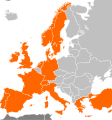 H1N1 Europe Community Outbreaks.svg -
 H1N1 Asia Community Outbreaks.svg -


 H1N1 Switzerland Map.svg
 File:H1N1 South America Map.svg -
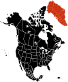 File:H1N1 North America Map.svg -
