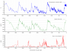
I assume that these Vostok ice cores can be generalized to the global climate. In my opinion, this graph shows that we are on the tip of hot temperature, and that the last tip was more or less 100000, 200000, 300000, and 400000 years ago. It suggests that we are not going to get any hotter climate, for example +2 celsius, but -8 celsius instead. It means an extreme ice age, or the end of a short hot period. The graph suggests a cycle of 100000 years, and that we are entering an ice age worse than that one 11000 years ago. Those widely used other graphs that show warming since the 1820'ties, likely are part of the rising part in this graph or the current fluctuating part. In this graph, we are actually thousands or years past the point, where the Vostok temperature begun to drop during all 4 - 5 previous cycles. Why has it been fluctuating at the more or less maximum long-term temperature 6000 thousand years before the industrial emissions and what does the cycle of 100000 years mean to Al Gore's claim that it is going to ever hotter? Why is there no discussion about this, even by those who doubt global warming? It is not an issue of 190 years or man-made CO2 emssion, but this cycle of 100000 years. I doubt the CO2 emissions will be enough to stop the drop in temperature predicted by this graph, even if the humanity tried to increase the CO2 levels. Wikipedia is not a forum, but this is not Wikipedia, it is a talk page, and that is a forum by definition, contrary to what the rules say above. I prohibit you from deleting this talk.
5. Dec 2010 During all of the cycles, the high level of atmospheric carbon dioxide causes the temperature to drop 4 degrees suddenly. Perhaps this happens due to increasingly severe winters that the summers cannot melt. The summer is said to be the defining factor in the debate of global warming. The CO2 stays up a few thousand years after the temperature has dropped but then drops itself due to cold temperatures. Teemu Ruskeepää (talk) 10:20, 5 December 2010 (UTC)
The horizontal zero points here are misleading. Why is the vertical axis on the uppermost graph shifted slightly to the left? This makes it harder to be able to tell exactly what points correspond to where, as simply moving up vertically directly will cause >1000 years of misadjustment. 69.116.196.223 (talk) 16:33, 18 March 2011 (UTC)
———————————————
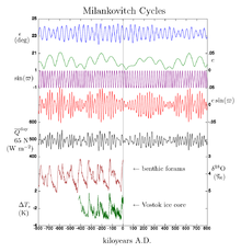
Oh there's much more involved than CO2 alone, which was just varying by a hundred ppm here. It isn't the primary driver of the ice age cycle. This graph is kind of misleading actually if you see it in isolation. Over thousands of years, Earth's orbit, tilt, and precession varies a bit in a pattern that initiates ice ages. I was working on the climate change article recently, so let me lazily copy and paste a relevant bit with talk page link adjustment:
Milankovitch cycles have a large impact on climate and are notable for their correlation to glacial and interglacial periods, their correlation with the advance and retreat of the Sahara, and for their appearance in the stratigraphic record.
The IPCC notes that Milankovitch cycles drove the ice age cycles; CO2 followed temperature change "with a lag of some hundreds of years"; and that as a feedback amplified temperature change. Among other factors, CO2 is more soluble in colder than in warmer waters.
Sokavik (talk) 16:19, 2 June 2011 (UTC)
———————————————
Why is the time axis in the CO2 graph shifted against the temperature graph's time axis? Measure it on the right side, they're not synchronous. I find this confusing. 84.134.78.132 (talk) —Preceding undated comment added 20:11, 13 March 2012 (UTC).

