Latest comment: 15 years ago4 comments3 people in discussion
This wasn't discussed at WT:FCDW, and we're still working out whether there is going to be WP:FCDW/December DYK contest. We can probably run this (if its finished) on December 8 unless the DYK contest materializes. Please coordinate at WT:FCDW so we don't have these last minute surprises: it was listed at the Newsroom even though it's not yet ready. SandyGeorgia (Talk) 07:17, 5 December 2008 (UTC)Reply
I linked in the two earlier Dispatches that discuss free and non-free images, in case any of that information is repeated here and can be deleted. It would be helpful to explain the criteria up front since they are frequently referred to. Also, the image sizes were so large that the prose was lost. I temporarily added section editing. Done for now: I've asked other people to help. SandyGeorgia (Talk) 07:58, 5 December 2008 (UTC)Reply
The featured picture criteria are (implicitly) assumed knowledge and it was the first link in the article anyway. I think it's more convenient to have them in separate tabs rather than scrolling through the whole lot. MER-C 11:19, 5 December 2008 (UTC)Reply
I've started explaining the FP criteria. Since most editors don't participate in the FPC process, you can't assume they know the criteria and most readers are lazy. They won't click through and read the criteria carefully. Awadewit (talk) 17:20, 30 December 2008 (UTC)Reply
Latest comment: 15 years ago2 comments1 person in discussion
This article contains no examples of engravings, lithographs, diagrams, paintings, documents, and all the other types of featured pictures. At a minimum, I'd throw in a Lady of Hats diagram, an engraving, and one of Durova's document restorations - possibly the Islamic calligraphy. Shoemaker's Holiday (talk) 13:30, 9 January 2009 (UTC)Reply
I threw in a few things to try and show the variety of FPs a bit better. IT's now more about images, less about text. It might be a little over-illustrated, actually. Shoemaker's Holiday (talk) 15:20, 9 January 2009 (UTC)Reply
Latest comment: 15 years ago2 comments2 people in discussion
This is far, far too detailed. I'll do a brief summary instead. This should probably form part of a dispatch in its own right. Shoemaker's Holiday (talk) 17:13, 9 January 2009 (UTC)Reply
Yes. The entire thing was too long and overbearing, too heavy on detail. SandyGeorgia (Talk) 18:27, 9 January 2009 (UTC)Reply
Now comes the interesting bit—assessing the technical quality (criteria 1, 3 and 8). Use a raster image editing program such as The Gimp to assess photographs. A vector graphics program may be more appropriate for diagrams. Before you get started, you should calibrate your monitor by following the directions at "Is my monitor calibrated correctly?"
Download the full-resolution image to your hard drive and open it up with your image editor. Now start checking for problems:
Use the eyedropper tool or the histogram to check for clipping, often referred to as blown highlights or blacked-out shadows. An image should show detail in both the highlights and shadows. The eyedropper tool will reveal the loss of detail in flat regions of identically colored pixels. The histogram of a clipped image will count a disproportionately large number of white or black pixels.
Draw horizontal or vertical lines near features that should appear straight, for example the sides of buildings, to check for tilt and distortion.
Is the image underexposed, overexposed, or both? This is related to clipping, and the same tools will help to identify this problem. Overexposed images will appear too bright, and tend to suffer from blown highlights. Underexposed images are, conversely, too dark, and tend to lose detail in the shadows.
Is the subject cut off or partially obscured for no good reason? This both reduces EV and shows poor composition.
Are the corners of the photo darker than the center? This may be caused by vignetting and indicates poor technical quality.
The subject of the image should be in sharp focus, but the background may be blurred by controlling the depth of field. Blurring the background can reduce distracting elements of the scene.
Does it look good? Does it stand out from ordinary photography? This is often referred to as wow factor.
If the image is a JPEG file, as most photographs are, you may see squarish inconsistencies. These are compression artifacts, and none should be visible.
Is there sufficient detail in the picture? (criterion 2) Is the subject in focus?
Check for chromatic aberration. Chromatic aberration generally appears as colorful fringes around bright objects, or as a rainbow effect where the image should show only white.
Is the image aliased? Improper processing of an image can cause odd and distracting patterns to appear.
If the image is a panorama, check for stitching errors. Panoramas are often stitched together from several photographs, called frames. The boundaries of the individual frames should not be visible in the panorama. Objects split between different frames must fit together perfectly, without disjoint lines or blurry "ghosting". The frames should show consistent exposure, lighting, color, and focus.
Check for signs of over-sharpening. Photographs should realistically depict the subject instead of inventing detail. Over-sharpening can also cause halos around bright or dark objects. Do you see any other signs of overenthusiastic post-processing?
Is the image upsampled? Upsampling increases the size of a picture at the expense of quality. This is done automatically in many point-and-shoot cameras when digital zoom is enabled.
Also, check scans for several additional problems. A bad reproduction can scupper an otherwise feature-worthy image.
Check the image for moire patterns or other odd halftoning artifacts. Halftoning was often part of the printing process used for older pictures. These problems can appear when the image is scanned at the wrong resolution.
The scan should be detailed enough to read any text present in the reproduced work. (criterion 2)
For a general idea of what we are looking for, see Commons:Image guidelines. Here are some example reviews.
This one is probably not useful, and criticises an actual nominator.
Here is an exercise nomination as would be presented on Wikipedia:Featured picture candidates. Editors entering a declaration should summarize the critique in a short paragraph, stating exactly what the problems are.
Original - A juvenile Sulawesi Crested Macaque in its habitat at the Buffalo Zoo
Juvenile Sulawesi Crested Macaque at the Buffalo Zoo
Reason
Encyclopedic and beautiful image. (Featured on Commons.)
Support as nominator --Dweeebis (talk) 15:43, 17 November 2008 (UTC)
The answers
Caption (7): OK. I'm slightly concerned that it's a zoo shot, but this is justifiable given the species is critically endangered. However, this makes the image easily replaceable.
Copyright status (4): No concerns.
Accuracy (6): N/A.
Encyclopedic value (5): Lead taxobox image in Celebes Crested Macaque => good enc. It appears in the article for the zoo, but only in a gallery. I have no idea why there is black string in this picture - the composition makes it seem it's part of the animal... right.
Resolution (2): Above the minimum resolution, but there is little detail in the fur. Resolution is insufficient, should expect more.
Technical quality (1): Poor - unsharp, JPEG artifacts aplenty, noisy, clipped shadows, CA on right edge of subject. The subject is underexposed and the background is overexposed, making it highly distracting.
Wikipedia's best work (3): Nope (see 1, 2 above).
Digital manipulation (8): There's a possibility this is upsampled given the atrocious number of artifacts. No other signs of bad post-processing.
Nomination statement is false, this image isn't featured on Commons.
Latest comment: 15 years ago11 comments2 people in discussion
The gallery at the end seems a little gratuitous to me. Do all the images in the gallery have a reason for being there? Will they help readers understand how to review candidates? Wronkiew (talk) 07:44, 10 January 2009 (UTC)Reply
I think it could be cut in half; the Dispatch is still enormously long, and we should remember it's a Signpost Dispatch, not an article. SandyGeorgia (Talk) 15:31, 10 January 2009 (UTC)Reply
I'd also like to cut the image in the lead, as it's fighting with the Signpost banner and giving a cluttered appearance. SandyGeorgia (Talk) 15:32, 10 January 2009 (UTC)Reply
I removed the extra formatting from the lead image, and perhaps it's not so bad now. SandyGeorgia (Talk) 15:40, 10 January 2009 (UTC)Reply
If we need to cut some content to reduce the length, I think these sections add the least value to the article:
What types of images can become featured pictures?
The list of criteria; a link to the criteria might also serve the same purpose
What makes a featured image?
The rest of the sections are essential, though they might be compressed further. Some explanation of the technical aspects of photography is needed, for example, for readers to understand the discussions at FPC. Wronkiew (talk) 00:07, 11 January 2009 (UTC)Reply
I'm happy with the text so far: just think the gallery is large. SandyGeorgia (Talk) 00:58, 11 January 2009 (UTC)Reply
I really think at least the gallery section should be cut. It does show readers what kinds of non-photographic images they might see at FPC, but it does nothing to help them understand how to review them. Wronkiew (talk) 07:10, 11 January 2009 (UTC)Reply
Can someone else do the pruning? As I am not involved with images, I can't decipher which are the most essential. SandyGeorgia (Talk) 17:54, 11 January 2009 (UTC)Reply
I'm not suggesting we prune it. I think we should cut the gallery entirely. It is a neat collection of images, and shows the diversity of FP submissions. However, I don't think it's helpful in this dispatch, which is supposed to be about helping people review FP noms. Maybe we could save it for the hypothetical future dispatch? Wronkiew (talk) 18:13, 11 January 2009 (UTC)Reply
Ah, I see: I wouldn't object to cutting it entirely. SandyGeorgia (Talk) 18:16, 11 January 2009 (UTC)Reply
I removed the following section from the dispatch to reduce the length. Wronkiew (talk) 05:23, 12 January 2009 (UTC)Reply
What types of images can become featured pictures?
Any type! While this Dispatch mainly concentrated on photography, here's a sample of some of the slightly more unusual images that have been promoted to featured picture status.
Latest comment: 15 years ago2 comments2 people in discussion
I have finished proofreading the dispatch, and I think it's ready to go. I'm a little uncomfortable about leaving people hanging at the end. However, from reading the other dispatches it seems they also omit a conclusion.. Wronkiew (talk) 02:19, 21 January 2009 (UTC)Reply
It should run in the next Signpost; thanks for the work !! SandyGeorgia (Talk) 03:19, 21 January 2009 (UTC)Reply
Latest comment: 15 years ago7 comments4 people in discussion
The FP version of Gin Lane is not Hogarth's work from "Davenport's edition", but a later copy engraved by Davenport (probably around 1806-09 for Trusler's Hogarth Moralized). Sorry to jump in at the last minute (assuming it hasn't been used yet), but comparing the two as if they are both Hogarth originals doesn't strike me as a good idea. The first image isn't a good quality scan admittedly but it is from Hogarth's original plates. Yomanganitalk 20:44, 22 January 2009 (UTC)Reply
With so many editors involved, I don't know who added that, or who might correct it. SandyGeorgia (Talk) 00:31, 23 January 2009 (UTC)Reply
The images are illustrative but they could be deleted if necessary. If they are kept, I don't think the captions need to be ultra-precise, because what is being compared is the readability of the text in the scan, not the artistic merit. Wronkiew (talk) 01:26, 23 January 2009 (UTC)Reply
True but having Davenport's copy attributed to Hogarth is one of the reasons I was wary of it being promoted to FP in the first place. I've reworked the captions, what do you think? Yomanganitalk 01:48, 23 January 2009 (UTC)Reply
While it's important to note that it is reworked by Davenport (e.g. Davenport's edition), I don't see how what's agreed to be a pretty exact copy needs much more disambiguation than saying it's Davenport's edition. Shoemaker's Holiday (talk) 01:54, 23 January 2009 (UTC)Reply
However, if it's really an issue, since I rewrote this story, some Gustave Doré works have been promoted which have low-res versions on the commons. The Doré is definitely authentic, so we could use him instead. Shoemaker's Holiday (talk) 10:37, 24 January 2009 (UTC)Reply


.jpg)
 A diagram of the human eye
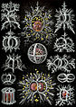 Ernst Haeckel's illustration of radiolarians
 A Japanese ukiyo-e print of Kinhyōshi yōrin, hero of the Suikoden (Water Margin)
 A set of trading cards on the early history of ballooning
 Casting tin soldiers
 Besides looking really cool, this image illustrates stereographic projection.
 A photograph of Limburger cheese
 An 1890s table d'hôte menu
 An 18th-century Ijazah, or diploma in Islamic calligraphy
 An early Coca-Cola advertisement
 An engraving by Currier and Ives
 Illustrated children's sheet music for Au Clair de la Lune
 An overview of adaptations in the beaks of birds
 A scanning electron micrograph of the soybean cyst nematode and its egg
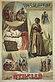 An advertisement for an 1844 production of Otello
 A map of Antelope Island
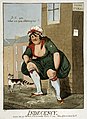 A 1799 cartoon by Isaac Cruikshank showing a woman urinating in the street
 Emile Zola's newspaper article "J'accuse!", an open letter exposing the French government's scandalous mistreatment of Alfred Dreyfus


