Wikipedia:Featured picture candidates/VanGoghsStarryNight
Van Gogh's Starry Night edit


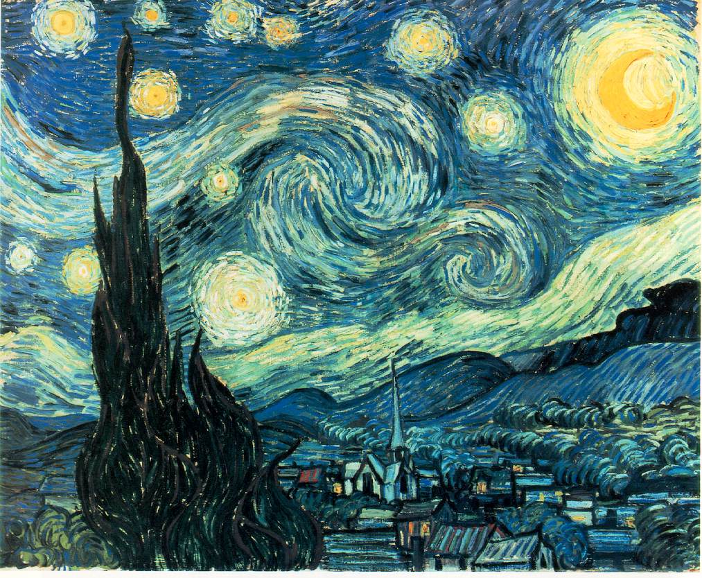
This is the highest resolution of any Van Gogh's photograph-paintings I have ever seen. It beautifully captures the impastos (well, almost)
- Nominate and support original. - Vircabutar 03:29, 13 July 2006 (UTC)
- Support really great resolution, really close shot. --bdude Talk 05:02, 13 July 2006 (UTC)
- Support - Cribananda 06:13, 13 July 2006 (UTC)
- Support Wow! Nnfolz 08:07, 13 July 2006 (UTC)
 Support My edit. This is a good rendition of a painting I'd hang on my wall --Fir0002 09:18, 13 July 2006 (UTC)
- Support Joe I 09:49, 13 July 2006 (UTC)
Support this is the sort of stuff we need on the main page, not crappy clipart pirates :-) Childzy (Talk|Contribs) 10:48, 13 July 2006 (UTC)Support. An excellent representation of a very famous painting. I wish it was bigger (even if it's above the guidelines), but it seems like I say that about almost every nom. --Pharaoh Hound (talk) 14:31, 13 July 2006 (UTC)- Support edit 1. --Pharaoh Hound (talk) 18:37, 16 July 2006 (UTC)
- Support Reasons above. Cab02 14:55, 13 July 2006 (UTC)
- Support Perfect. Pleasing to the eye, encyclopedic, high resolution, high quality, in good standing copyright position... Chancellor Alt 09:28, April 28, 2024 (UTC).
- Oppose. I love the painting but the color balance of this photo appears to be quite a bit off. Somebody with a gray card and the knowledge to use it properly should take a new image if possible. -- moondigger 20:11, 13 July 2006 (UTC)
- Comment There are a wide variety of images of this painting on the internet, but I think this one [1] is closest to reality in terms of color balance. Many images of this painting have the color balance completely wrong, either because they don't know how to manually set white balance or because the images were shot on film in mixed lighting. -- moondigger 20:20, 13 July 2006 (UTC)
![[1]](http://photos.oes.org/albums/userpics/10002/Starry_Night-Vincent_VanGogh%281152x864%29.jpg)
- Oppose, per moondigger. I felt like something was off with the colors before I read his not, and comparing the linked version, it's clear that this version is way too red.--ragesoss 19:38, 14 July 2006 (UTC)
- Support The image that moondiger provided [2] was very blurry and rather un-clear ( i don't understand this "red" thing that you guys were talking about). The nominated image is so much better; it's clearer and it's high in resolution.--Popcorn0189 23:53, 14 July 2006 (UTC)
- User:Popcorn0189 is a new user, has only two edits, both to this page, and no talk or userpages. Editing structure/pattern identical to Thomasgre231 further down the page, in that he voted and forgot to leave his signature, and immediately edited the page again to leave his signature. —Vanderdecken∴ ∫ξφ 16:14, 16 July 2006 (UTC)
- I'm not suggesting that image as a better choice. I'm referencing it to show what the color balance should be. This one is way off, from what I can tell, and I think it would be embarrassing to those of us who vote on FPC and to Wikipedia in general if one of the most famous works of art in the world showed up on the main page or had a "featured" tag looking like that. When Ragesoss says the image is too red, he doesn't mean that the image looks red; he means the color balance has too much red in the mix, making the blues look purple. This is not uncommon when shooting in incandescent light without properly setting white balance. This is not something that can be fixed satisfactorily using regular Photoshop tools, since moving the hue slider causes the moon (and other yellows in the image) to change too much w/r/t the blues. Adjusting it other ways yields other problems. For this image to look right, it should be re-shot by somebody with cross-polarized flashes or in ambient light with properly-set white balance. For the time being, I'd ask that those who supported it reconsider your votes, given the problems with color balance. Obviously it's your choice, but I really think it would reflect badly on us to present such a famous work of art with the color balance so far off. The colors Van Gogh picked were carefully chosen; Wikipedia should present it as accurately as possible. -- moondigger 00:47, 15 July 2006 (UTC)
- Comment I've uploaded an edit which I feel has addressed the color balance issue.--Fir0002 23:29, 15 July 2006 (UTC)
- Oppose as per Moondigger. I like Van Gogh as much as the next guy, and this is one of his best, but personally I don't like this nominating of great artworks as FPs, regardless of how well the pic/scan is captured. --jjron 06:17, 15 July 2006 (UTC)
- Oppose I could have painted that. No, seriously, as per Moondigger. Stevage 09:13, 15 July 2006 (UTC)
- Oppose per Moondigger. Certainly seems to have a red balance issue making it not a good representation of the painting. This is obvious in that all of the greenery is displayed as brownery --Peripitus (Talk) 12:52, 15 July 2006 (UTC)
- support beautiful depiction. image is perfectly fine--Thomasgre231 18:08, 15 July 2006 (UTC)
- User:Thomasgre231 is a new user, has only two edits, both to this Van Gogh FPC page, has no talk or user pages. Editing structure/pattern identical to Popcorn0189 further up the page, in that he voted and forgot to leave his signature, and immediately edited the page again to leave his signature. —Vanderdecken∴ ∫ξφ 16:14, 16 July 2006 (UTC)
 Oppose original nom,
  Support Fir0002's edit. —Vanderdecken∴ ∫ξφ 16:08, 16 July 2006 (UTC)
- Oppose, colors are off. I fear supporting fir's edit. How do we know those colors are right? I've seen good reproductions, though, and fir's is much closer (so weak oppose that one). BrokenSegue 16:49, 16 July 2006 (UTC)
- Comment. The problem with images of paintings is that the paint itself is three-dimensional, especially in the case of Van Gogh's work. Anyone who has seen Mulberry Tree knows what I'm talking about. Furthermore, no reproduction can capture what is essentially the interplay between the pigments and illumination sources. There are ways of getting close, and if we are to accept any paintings as FP, we have to be willing to accept limitations in capturing what are essentially blobs of paint. If you look at this image [3], open it in Photoshop, and correct for the pink-yellow cast, you will find that the result is actually somewhere in between what was originally submitted and the subsequent edit. On the basis of the corrected linked photograph (because it is shot in context), I am more inclined to support the original rather than the edit. --Wickerprints 00:27, 17 July 2006 (UTC)
- I'm not inclined to support either, though Fir's edit looks closer to reality to me. That this painting is usually displayed under artificial light does not sway me; I'd prefer an edit that shows what it would look like by window light or daylight, which is (probably) the kind of light Van Gogh used while painting it. That's why I'm wishing for an image shot with cross-polarized flashes (to simulate daylight) or with white balance set by a gray card. -- moondigger 01:45, 17 July 2006 (UTC)
- This raises some questions you have not addressed. First, have you seen the painting in person? Even if you have, how do you know your color perception is the same as other people's? How could you anticipate what it would look like under natural lighting? How can you assume Van Gogh intended this work to be viewed in window light or daylight? Did you do your own corrections on the snapshot I linked to? Why be so strict about the question of precise color accuracy--to the point of disallowing FP status to a good capture--when there already exist significant deviations in all manner of printed reproductions? Have you Googled for various reproductions online? Personally, from all the images I have been able to find in various art anthologies and online, I must insist that the edit is far too cyan, and that in fact it is the original image that is the closer (but yet not precise) color match to the original. After all, how do you know that the original image was not in fact taken under the conditions you described, and that the other variants are in fact wrong? By no means am I suggesting the image should be given a free pass; indeed, I have not yet come to a decision about it. But I find that the issue of its color accuracy is not being treated objectively. -Wickerprints 03:18, 17 July 2006 (UTC)
- Answers to your questions. No, I haven't seen it in person. But the wide variety of reproductions I have seen in print (in my college art history book, for example) reproduce it with the sky in various blue hues, not purple. Your question about color perception is a philosophical one that has no bearing on this discussion... it's entirely possible that you perceive "blue" differently than I do, and that we both perceive it differently than a third person. That is irrelevant. Color perception is a subjective thing; color balance is not. Colors (paint, crayon, whatever) are defined by the wavelength of light they reflect when displayed in 'white' light. That's why a gray card would be useful here; because it is equal parts RGB, light reflected from it should be equal parts RGB. In white light, that happens. In artificial light, the reflections might be too yellow, red, green, etc. So you use the gray card as a reference for neutrality, eliminating (as much as is possible) an off-color cast. The gray card should appear gray in the image. If it does, then you know the color balance is correct. I assume Van Gogh intended it to be viewed in daylight because he didn't paint it in artificial light. There were no fluorescent or incandescent lights in common use in 1889. Most paintings were painted by windowlight or in daylight in the late 1800s, even night scenes. It is possible that he painted it by oil lamp light or firelight, though I have never seen any reference to such a claim (which would be required to accept anything other than the default). I did do my own corrections on the image you linked to, and depending on what particular tiny area I assume should be neutral, the supposed "neutral" color balance varies widely. Unless you can point me to a gray card hidden in the image somewhere, you can't assume that any particular area is a reliable neutral reference point. We should be strict about color accuracy for paintings because color is such an important aspect of those paintings. Frankly, I don't consider any capture, however good from a resolution and sharpness POV it may be, to be a "good capture" unless it presents accurate color. Your claim that printed reproductions vary widely in color balance is not born out by the printed reproductions I have seen in reference books, though there is indeed a wide variety in online reproductions. This is not surprising, given the widespread misunderstanding and/or misuse of white balance tools by the vast majority of the snapshooting public, and even some professional photographers I have met. Photographers who have the job of photographing works of art for reproductions in reference books must understand lighting, color, and white balance or they don't get the work. To address your last statement - the implication that I'm not treating the question of color balance objectively - all I can do is insist that I am. As I stated previously, I am unlikely to support any particular version of the image unless I have some objective assurance that the color balance is correct. I'm advocating standard methods of accurate color reproduction -- cross-polarized flashes, gray cards, etc. -- moondigger 14:05, 17 July 2006 (UTC)
- Well just tell me what picture you want to reference your color balance from. I based my image off Moondigger's original link--Fir0002 06:31, 17 July 2006 (UTC)
- Just a quick comment, Fir. The sky in your edit looks closer to what I remember, but I have no assurance that it's correct. As I indicated previously, the color balance can't easily be adjusted using normal Photoshop tools. Or rather, it can -- but doing so means picking what areas you want to be accurate and what areas won't be. Notice that in the first version the moon demonstrates good contrast with the moonglow that surrounds it. In Edit 1, the moon contrasts less with the surrounding moonglow. This is because when you adjusted the color balance to make the sky less purple, the relationships of the other colors (yellows, oranges) change w/r/t each other and the blues. See also the relationship of the stars to the surrounding sky; it changes somewhat depending on the color balance. It's these kinds of uncertainties, plus an inability to find an online version of the image with confirmed-correct color balance for comparison, that makes me want to wait until somebody can photograph it with proper lighting and white balance. -- moondigger 19:56, 17 July 2006 (UTC)
- Acutally the moon stars etc contrast are no problem at all. I purposeless reduced the contrast to simulate the version you should me. Just choose a reference photo that you like and I'll edit it to look like that. Photoshop is plenty powerfull enough (if you know how to use it) to handle color balance issues. --Fir0002 22:24, 17 July 2006 (UTC)
- Oh and on another point, moondigger, do you konw how to use a gray card properly? Because what I'm gathering from what you wrote above is that you use the gray card as a reference which you can visualy see if it is "gray" if the wihte balance is correct. That's not how it works at all. Here's how to do it: take a photo of a gray card in the scene you are photographing (make sure you are shooting in RAW). Take the shot of the scene. Load up your RAW image processor - in this example I'm using DPP. Selected your gray card image and the image you want white balanced. Choose the "click white balance tool". Click on the gray card, and this will adjust the white balance on all selected images. --Fir0002 07:49, 18 July 2006 (UTC)
- Yes, I know how to use a gray card. The gray card is a neutral reference point. If it isn't gray (i.e., if it doesn't have equal RGB values in the image) then the white balance is not correct. When you 'click the gray card' using the 'click white balance tool,' you're telling the software that this particular spot in the image should have equal values for Red, Green, and Blue. i.e., you're telling the software that this is a neutral reference point. The software then adjusts the color balance to give that particular spot you clicked equal RGB values, and all the other values in the image are adjusted accordingly to correct the white balance. That same adjustment can then be applied to other images shot in the same lighting without a gray card in the frame. -- moondigger 12:05, 18 July 2006 (UTC)
- Oh and on another point, moondigger, do you konw how to use a gray card properly? Because what I'm gathering from what you wrote above is that you use the gray card as a reference which you can visualy see if it is "gray" if the wihte balance is correct. That's not how it works at all. Here's how to do it: take a photo of a gray card in the scene you are photographing (make sure you are shooting in RAW). Take the shot of the scene. Load up your RAW image processor - in this example I'm using DPP. Selected your gray card image and the image you want white balanced. Choose the "click white balance tool". Click on the gray card, and this will adjust the white balance on all selected images. --Fir0002 07:49, 18 July 2006 (UTC)
- Acutally the moon stars etc contrast are no problem at all. I purposeless reduced the contrast to simulate the version you should me. Just choose a reference photo that you like and I'll edit it to look like that. Photoshop is plenty powerfull enough (if you know how to use it) to handle color balance issues. --Fir0002 22:24, 17 July 2006 (UTC)
- Just a quick comment, Fir. The sky in your edit looks closer to what I remember, but I have no assurance that it's correct. As I indicated previously, the color balance can't easily be adjusted using normal Photoshop tools. Or rather, it can -- but doing so means picking what areas you want to be accurate and what areas won't be. Notice that in the first version the moon demonstrates good contrast with the moonglow that surrounds it. In Edit 1, the moon contrasts less with the surrounding moonglow. This is because when you adjusted the color balance to make the sky less purple, the relationships of the other colors (yellows, oranges) change w/r/t each other and the blues. See also the relationship of the stars to the surrounding sky; it changes somewhat depending on the color balance. It's these kinds of uncertainties, plus an inability to find an online version of the image with confirmed-correct color balance for comparison, that makes me want to wait until somebody can photograph it with proper lighting and white balance. -- moondigger 19:56, 17 July 2006 (UTC)
- Well just tell me what picture you want to reference your color balance from. I based my image off Moondigger's original link--Fir0002 06:31, 17 July 2006 (UTC)
- Answers to your questions. No, I haven't seen it in person. But the wide variety of reproductions I have seen in print (in my college art history book, for example) reproduce it with the sky in various blue hues, not purple. Your question about color perception is a philosophical one that has no bearing on this discussion... it's entirely possible that you perceive "blue" differently than I do, and that we both perceive it differently than a third person. That is irrelevant. Color perception is a subjective thing; color balance is not. Colors (paint, crayon, whatever) are defined by the wavelength of light they reflect when displayed in 'white' light. That's why a gray card would be useful here; because it is equal parts RGB, light reflected from it should be equal parts RGB. In white light, that happens. In artificial light, the reflections might be too yellow, red, green, etc. So you use the gray card as a reference for neutrality, eliminating (as much as is possible) an off-color cast. The gray card should appear gray in the image. If it does, then you know the color balance is correct. I assume Van Gogh intended it to be viewed in daylight because he didn't paint it in artificial light. There were no fluorescent or incandescent lights in common use in 1889. Most paintings were painted by windowlight or in daylight in the late 1800s, even night scenes. It is possible that he painted it by oil lamp light or firelight, though I have never seen any reference to such a claim (which would be required to accept anything other than the default). I did do my own corrections on the image you linked to, and depending on what particular tiny area I assume should be neutral, the supposed "neutral" color balance varies widely. Unless you can point me to a gray card hidden in the image somewhere, you can't assume that any particular area is a reliable neutral reference point. We should be strict about color accuracy for paintings because color is such an important aspect of those paintings. Frankly, I don't consider any capture, however good from a resolution and sharpness POV it may be, to be a "good capture" unless it presents accurate color. Your claim that printed reproductions vary widely in color balance is not born out by the printed reproductions I have seen in reference books, though there is indeed a wide variety in online reproductions. This is not surprising, given the widespread misunderstanding and/or misuse of white balance tools by the vast majority of the snapshooting public, and even some professional photographers I have met. Photographers who have the job of photographing works of art for reproductions in reference books must understand lighting, color, and white balance or they don't get the work. To address your last statement - the implication that I'm not treating the question of color balance objectively - all I can do is insist that I am. As I stated previously, I am unlikely to support any particular version of the image unless I have some objective assurance that the color balance is correct. I'm advocating standard methods of accurate color reproduction -- cross-polarized flashes, gray cards, etc. -- moondigger 14:05, 17 July 2006 (UTC)
- This raises some questions you have not addressed. First, have you seen the painting in person? Even if you have, how do you know your color perception is the same as other people's? How could you anticipate what it would look like under natural lighting? How can you assume Van Gogh intended this work to be viewed in window light or daylight? Did you do your own corrections on the snapshot I linked to? Why be so strict about the question of precise color accuracy--to the point of disallowing FP status to a good capture--when there already exist significant deviations in all manner of printed reproductions? Have you Googled for various reproductions online? Personally, from all the images I have been able to find in various art anthologies and online, I must insist that the edit is far too cyan, and that in fact it is the original image that is the closer (but yet not precise) color match to the original. After all, how do you know that the original image was not in fact taken under the conditions you described, and that the other variants are in fact wrong? By no means am I suggesting the image should be given a free pass; indeed, I have not yet come to a decision about it. But I find that the issue of its color accuracy is not being treated objectively. -Wickerprints 03:18, 17 July 2006 (UTC)
- I'm not inclined to support either, though Fir's edit looks closer to reality to me. That this painting is usually displayed under artificial light does not sway me; I'd prefer an edit that shows what it would look like by window light or daylight, which is (probably) the kind of light Van Gogh used while painting it. That's why I'm wishing for an image shot with cross-polarized flashes (to simulate daylight) or with white balance set by a gray card. -- moondigger 01:45, 17 July 2006 (UTC)
- Support Edit 1. --Abdominator 01:42, 17 July 2006 (UTC)
- Support Edit 1. I assume thats the correct colour Childzy (Talk|Contribs) 19:50, 17 July 2006 (UTC)
- comment Here is the painting's image from the MoMA website(and it seems to me that the original nominated picture is a better representation of the painting).MoMA's Starry Night. Edit one seems very artificial. No other photograph of van gogh's painting, in my oppinion, have captured his impastos as beautifully as this image--Vircabutar 20:42, 17 July 2006 (UTC)
- The MoMA image seems to be between the original and Fir's edit in terms of color balance. No guarantees that it's accurate, but I'd trust it more than most online sources. I wish I lived closer to NYC... I'd check it out for myself. -- moondigger 21:48, 17 July 2006 (UTC)
- I am visiting NYC in mid-August. If I can, I will view the painting in person and take a gray card shot. But even so, this doesn't address the concerns about light source. --Wickerprints 00:16, 18 July 2006 (UTC)
- Do you guys even know how a gray card works? See my comments above. You can take a photo under any light source and get a proper white balance that way. --Fir0002 07:52, 18 July 2006 (UTC)
- Actually this would only be true if the gamut of your camera was unlimited, try whitebalancing candlelight shots and you see what I mean... --Dschwen 20:41, 22 July 2006 (UTC)
- And it only works with lightsources emitting roughly a black-body spectrum. Anyway there probably is a reason why high quality art reproductions cost a fortune... --Dschwen 20:45, 22 July 2006 (UTC)
- Fir, I've been using gray cards for the past 20 years, with film and digital. I know how they work, and never said there would be a problem with light source. -- moondigger 11:10, 18 July 2006 (UTC)
- Actually this would only be true if the gamut of your camera was unlimited, try whitebalancing candlelight shots and you see what I mean... --Dschwen 20:41, 22 July 2006 (UTC)
- Do you guys even know how a gray card works? See my comments above. You can take a photo under any light source and get a proper white balance that way. --Fir0002 07:52, 18 July 2006 (UTC)
- I am visiting NYC in mid-August. If I can, I will view the painting in person and take a gray card shot. But even so, this doesn't address the concerns about light source. --Wickerprints 00:16, 18 July 2006 (UTC)
- I had also seen the MoMA image. One thing that immediately struck me was that the FP submission is noticeably more saturated. But in any case, I still maintain that the edit is too cyan. But the only way I'm ever going to know for sure is if I see the original painting with my own two eyes. --Wickerprints 00:21, 18 July 2006 (UTC)
- I have seen the one at MoMA, but I don't think I can be of much help with my colour-blindness, sorry :-( - Cribananda 05:34, 18 July 2006 (UTC)
- We have a good (poster) reproduction of it in our living room, which looks much more "3D" than either of these images. In any case, the original image looks way too purple, and the edit 1 looks a bit too teal to me. Our poster looks like a neutral blue, much less saturated than Edit 1. --Marumari 19:03, 18 July 2006 (UTC)
- I have seen the one at MoMA, but I don't think I can be of much help with my colour-blindness, sorry :-( - Cribananda 05:34, 18 July 2006 (UTC)
- The MoMA image seems to be between the original and Fir's edit in terms of color balance. No guarantees that it's accurate, but I'd trust it more than most online sources. I wish I lived closer to NYC... I'd check it out for myself. -- moondigger 21:48, 17 July 2006 (UTC)
- Oppose for now, I suppose. I really wouldn't know what is proper not having seen the original in many years. Maybe someone could make gray card if that's warranted or at least explain a little. gren グレン 02:15, 20 July 2006 (UTC)
- Oppose. If we're going to worry about colour, then from this and various reprints I've seen, neither version looks right. At the end of the day, it depends on your monitor, which is likely not calibrated. - Samsara (talk • contribs) 11:24, 20 July 2006 (UTC)
- Comment. Regardless of the color, someone needs to fix the tilt. --Dante Alighieri | Talk 18:51, 20 July 2006 (UTC)
![[3]](http://www.ces.rcs.k12.tn.us/teachers/YarbroughT/starry%20night.jpg)
Not promoted Raven4x4x 11:16, 29 July 2006 (UTC)