| This article must adhere to the biographies of living persons (BLP) policy, even if it is not a biography, because it contains material about living persons. Contentious material about living persons that is unsourced or poorly sourced must be removed immediately from the article and its talk page, especially if potentially libellous. If such material is repeatedly inserted, or if you have other concerns, please report the issue to this noticeboard.If you are a subject of this article, or acting on behalf of one, and you need help, please see this help page. |
| This article is rated Start-class on Wikipedia's content assessment scale. It is of interest to the following WikiProjects: | ||||||||||||||||||||||||
| ||||||||||||||||||||||||


Infobox Photo Discussion edit
The following discussion is closed. Please do not modify it. Subsequent comments should be made on the appropriate discussion page. No further edits should be made to this discussion.
Which photo should used in the Infobox, A, B, or C? Nightscream (talk) 00:53, 10 January 2015 (UTC)
-
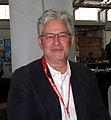 A
A -
 B
B -
 C
C -
 Astrocog's crop of A
 -
 Alternate crop of A (created by Softlavender)
 -
 Crop made by Jason Quinn
 -
 D
D


- Headshots are best for infoboxes, but C is the least attractive shot of the three (looks particularly haggard and scruffy). I think it should be A (or else B), but cropped into a headshot. Softlavender (talk) 01:06, 10 January 2015 (UTC)
I agree, a crop of A would be my first choice.Curly Turkey ¡gobble! 01:34, 10 January 2015 (UTC)- D. Curly Turkey ¡gobble! 20:39, 19 January 2015 (UTC)
Agree - A cropped; the levels need to be tweaked too.--ukexpat (talk) 01:49, 10 January 2015 (UTC)- New addition D is best assuming that the permission can be sorted out. It looks like a pro photo so unlikely to be "own work".--ukexpat (talk) 13:28, 19 January 2015 (UTC)
- Agree with Curly and Ukexpat. Crop of A. — Crisco 1492 (talk) 01:54, 10 January 2015 (UTC)
- Assuming D was actually uploaded by Pots himself (he'll need to send a release to OTRS to confirm that), D. — Crisco 1492 (talk) 12:46, 19 January 2015 (UTC)
Yep. Crop A. Technically better and he looks nicer. 02:00, 10 January 2015 (UTC)
- D. Clear, well-lit, well-composed. Thanks for pointing out the addition of another photo, Nightscream. --Anthonyhcole (talk · contribs · email) 12:56, 19 January 2015 (UTC)
- I was asked, didn't look at the words, decided I preferred extreme closeup which means C, looked at the words, looked closer at the pix, and decided yes, A would win if cropped to something like 1200 x 1500. And I'm glad that among my thousands of Wikipix there are hardly any portraits. Jim.henderson (talk) 02:20, 10 January 2015 (UTC)
- I made a possible cropped version, and put it in the above gallery. What do you think? Cheers, AstroCog (talk) 02:42, 10 January 2015 (UTC)
- Re: Astrocog's crop of A: I realize you have to crop narrow around his face to avoid the window and wall edge, but the image right now is too tall and narrow. Therefore need to crop that one further, under his neck, so the shape of the image is like C. Softlavender (talk) 02:52, 10 January 2015 (UTC)
- Re-crop A, making it a little wider than the current cropped image. That way the head does not look like it is boxed off; editing the already cropped image would just bring the photo too tight and close to the face. Pejorative.majeure (talk) 02:57, 10 January 2015 (UTC)
- Re-cropped according to Jim.henderson's suggestion. Cheers, AstroCog (talk) 03:20, 10 January 2015 (UTC)
- The problem with that is the glare from the window, and the wall edge. It really needs to be narrow around his head, and short under his neck. Heck, I'll do that if no one else will. Softlavender (talk) 03:33, 10 January 2015 (UTC)
- For overall composition I prefer C, but the contrast is hideously glaring. If that can be tidied up I'd support it, but on the balance, right now I support Astrocog's crop. Evan (talk|contribs) 04:20, 10 January 2015 (UTC)
I like Astrocog's crop best.David A (talk) 04:35, 10 January 2015 (UTC)- I now prefer the last addition D instead. David A (talk) 15:45, 19 January 2015 (UTC)
- I'd say that A, or the first crop thereof, is the best. BOZ (talk) 04:37, 10 January 2015 (UTC)
- I also think a crop of A would be best. I have posted the crop I think would work best. It's an 8x10 crop which is a common ratio. And it also catches the "Darkhorse comics" on the necklace, which adds important context to the photo. Jason Quinn (talk) 13:14, 10 January 2015 (UTC)
Go with Astrocog's crop.Doczilla @SUPERHEROLOGIST 15:04, 10 January 2015 (UTC) D looks best. Doczilla @SUPERHEROLOGIST 02:35, 21 January 2015 (UTC)- I vote for Astrocog's crop of A. Fortdj33 (talk) 21:07, 10 January 2015 (UTC)
- I would say Astrocog's crop of A, considering the size of the thumbnail, the resolution is enough to show a flattering and accurate photo of the subject.CaffeinAddict (talk) 05:26, 11 January 2015 (UTC)
I like "Crop made by Jason Quinn" because it shows a bit of his body frame.Anna Frodesiak (talk) 11:32, 11 January 2015 (UTC)
- D It's new and high res. What's not to like? Anna Frodesiak (talk) 14:15, 19 January 2015 (UTC)
My first choice is "Crop made by Jason Quinn", but Astrocog's crop of A is a close second. I agree with Anna’s observation, but I also note that the light in the upper right is distracting, and for whatever reason, it bothers me in the Astrocog crop, but not so much in the Quinn crop.--S Philbrick(Talk) 16:39, 11 January 2015 (UTC)- New addition "D" looks best--S Philbrick(Talk) 12:55, 19 January 2015 (UTC)
- I'd say either "A" or "Crop made by Jason Quinn", both of which seem perfectly acceptable to me. Grandpallama (talk) 15:34, 13 January 2015 (UTC)
- D looks better than the others. Armbrust The Homunculus 23:33, 19 January 2015 (UTC)
The discussion above is closed. Please do not modify it. Subsequent comments should be made on the appropriate discussion page. No further edits should be made to this discussion.