Talk:COVID-19 pandemic in the Republic of Ireland/Archive 1
| This is an archive of past discussions. Do not edit the contents of this page. If you wish to start a new discussion or revive an old one, please do so on the current talk page. |
| Archive 1 | Archive 2 |
Graphs getting too wide
| Graphs are unavailable due to technical issues. There is more info on Phabricator and on MediaWiki.org. |
- I like this version as an alternative to a slider. -- Ânes-pur-sàng(Talk) 11:00 15 June 2020
- Yeah, just a shame we cant show values (numbers) on the graph too. Maybe on the some of the peaks, or every week like date. I'll look into it... 51.171.196.25 (talk) 18:34, 16 June 2020 (UTC)
| Graphs are unavailable due to technical issues. There is more info on Phabricator and on MediaWiki.org. |
| Graphs are unavailable due to technical issues. There is more info on Phabricator and on MediaWiki.org. |
| Graphs are unavailable due to technical issues. There is more info on Phabricator and on MediaWiki.org. |
- I like this version as an alternative to a slider. -- Ânes-pur-sàng(Talk) 11:00 15 June 2020
or stacked together:
| Graphs are unavailable due to technical issues. There is more info on Phabricator and on MediaWiki.org. |
- No, its too hard to see the death figures -- Ânes-pur-sàng(Talk) 11:00 15 June 2020
- Yeah agree deaths doesn't work great here. Just an idea. Would maybe need to be log graph to work but probably doesn't make sense as would over emphasise deaths in relation to cases. 51.171.196.25 (talk) 18:34, 16 June 2020 (UTC)
| Graphs are unavailable due to technical issues. There is more info on Phabricator and on MediaWiki.org. |
- No. -- Ânes-pur-sàng(Talk) 11:00 15 June 2020
| Graphs are unavailable due to technical issues. There is more info on Phabricator and on MediaWiki.org. |
- No, not without a slider. -- Ânes-pur-sàng(Talk) 11:00 15 June 2020
- Must admit i hate the slider (especially on mobile) 51.171.196.25 (talk) 18:34, 16 June 2020 (UTC)
| Graphs are unavailable due to technical issues. There is more info on Phabricator and on MediaWiki.org. |
- No, not without a slider. -- Ânes-pur-sàng(Talk) 11:00 15 June 2020
- or this for older cases
| Graphs are unavailable due to technical issues. There is more info on Phabricator and on MediaWiki.org. |
& bar graph for more recent cases so can see numbers for days
| Graphs are unavailable due to technical issues. There is more info on Phabricator and on MediaWiki.org. |
...preferable on the same line (col=span or whatever) have to figure out: 51.171.196.25 (talk) 19:07, 16 June 2020 (UTC)
What is the argument against having a slider on the graph? It would be much better to have a slider on the graph and know exactly the figures for a given day, rather than having a graph where you'd just have to guess. MrBoopsy (talk) 16:36, 23 June 2020 (UTC)
Total Hospitalised Numbers - Whats going on? Jun 12th
Total hospitalised numbers seem to be going down. Was up around 3315 or something like that then went to 3307 yday and 3275 today? Surely this is a total number hospitalised and therefore should only go up? (with the possible exception of of the odd de-notified case which previous days can be adjusted for). But i dont think it makes sense to take 300ish off this number over last few days? Any ideas/thoughts? I was using the difference in these numbers to calculate daily num admitted to hosp & icu. Today -32 'admittied' (de-admitted?) to hosp but 3 admitted to ICU (412 yday 415 today). Surely number admitted to ICU is a subset of number admitted to hosp? Not sure what we should do about this? Could back date 2975 figure but that will ruin all other numbers for weeks (since number was below 2975). 51.171.196.25 (talk) 18:35, 16 June 2020 (UTC)
- This works for hosp/ICU total (especially on mobile) Since we've gone to weekly dates doesnt need to be so wide:
| Graphs are unavailable due to technical issues. There is more info on Phabricator and on MediaWiki.org. |
Any objections? Could even align it on the right (like testing graph in testing section)? 51.171.196.25 (talk) 18:35, 16 June 2020 (UTC)
- Looks okay to me, go ahead. Edl-irishboy (talk) 14:26, 18 June 2020 (UTC)
- Done.
| Graphs are unavailable due to technical issues. There is more info on Phabricator and on MediaWiki.org. |
What do you think about ideas for daily case & deaths (see discussion above...). 51.171.196.25 (talk) 17:11, 20 June 2020 (UTC)
De-notification of deaths?
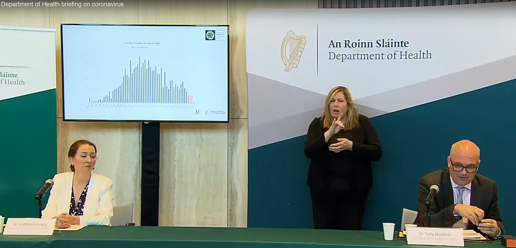
How are we dealing with de-notification of deaths? I notice 13 May logged as 10 deaths in graph but i have seen it given as 9 on other sites (-1 for denotified death). If we dont remove denotified deaths the numbers dont add up. Ie. all the days in our graph doesnt add up to 1497 total. I noticed in the dept of health briefing today on youtube (https://www.youtube.com/watch?v=aql4U4_NX2c) they showed a graph of correct deaths and correct days they were notified to (and were de-notified from). This looks very different to out graph. Without the big spike of 'probable deaths' on 21st 24th 25th 26th Apr as deaths info is updated with correct deaths to each day. I took a screenshot: https://ibin.co/5MPfRKe9h1yo.jpg or on youtube timestamp @23:01 or youtube.com /aql4U4_NX2c?t=1381 (without space) Not sure where this slide is from but i havent seen it in any pdfs. Looks much more realistic than the quite flat graph we have with a big spike. Tony Holohan talks about the higest deaths being 57 or 58 around the 12th or 13th of April. As a possible solution we could take all de-notified deaths off the big 222 death spike on 24 Apr if we cant find source of graph Tony shows at press conference?
- On further investigation i've found that our deaths graph adds up to 1732 total NOT current official 1497 total. A difference of 235! Quite a big difference. I propose taking this off days with excess probable deaths. something like this:
| Graphs are unavailable due to technical issues. There is more info on Phabricator and on MediaWiki.org. |
or this just take if off 2 biggest days:
| Graphs are unavailable due to technical issues. There is more info on Phabricator and on MediaWiki.org. |
- Implemented! — Preceding unsigned comment added by 51.171.197.101 (talk) 15:06, 14 May 2020 (UTC)
- Hi, I don't think this will answer all questions we have but this is at least a WP:Reliable source of mortality figures: COVID-19 Statistics on the government's Open Data PortalAnEddy11 (talk) 22:50, 15 May 2020 (UTC)
- This seems like it might be helpful. I've had a bit of a poke around but couldn't easily find the info. CSV probably easiest format but didn't seem complete. Fairly complicated interface too. Leave it with me i'll try figure it out. Think i remember seeing a large spreadsheet on ECDC website too but not sure if that being updated with latest info as deaths are notified & de-notified to correct days or is just using what we've already got. Still no idea where the chart referred to above in dept of health daily press conference came from. If we could find that (or its source) we'd be all set. — Preceding unsigned comment added by 51.171.196.190 (talk) 07:11, 16 May 2020 (UTC)
- Hi, I don't think this will answer all questions we have but this is at least a WP:Reliable source of mortality figures: COVID-19 Statistics on the government's Open Data PortalAnEddy11 (talk) 22:50, 15 May 2020 (UTC)
Add Remaining/currently in ICU number to daily hosp ICU graph?
| Graphs are unavailable due to technical issues. There is more info on Phabricator and on MediaWiki.org. |
Info from RTE news youtube of daily dept of health briefing: https://www.youtube.com/watch?v=5fEP0pbbggQ etc. I've just filled in a few for now but can add in more and track in future if people think its useful.
- Added ventilated into this graph too as info seems to be getting published regularly.
| Graphs are unavailable due to technical issues. There is more info on Phabricator and on MediaWiki.org. |
80.111.240.86 (talk) 20:46, 9 June 2020 (UTC)Can we get currently in Hospital. Not just ICU. I think they say it in the press conference.
- Lemme have a wee look. Is it around 200ish now? Might make a mess outta the graph. Was already considering switching to semi-log X-axis for this graph as getting a bit squashed down the bottom. Something like this:
| Graphs are unavailable due to technical issues. There is more info on Phabricator and on MediaWiki.org. |
Could not figure out log or semi log scale for X-axis. Might try again tomorrow... 51.171.196.38 (talk) 23:07, 9 June 2020 (UTC)
80.111.240.86 (talk) 12:35, 10 June 2020 (UTC) Yeah looks good. I think its a good stat to have. Judging by the numbers i think the people in hospital have been there a long time. They only seem to be dropping when the deaths drops, which is horrible to see. I know its a bit of work, but maybe we should break daily admissions to ICU and hospital with currently remaining(and have 2 graphs?). At this stage, the numbers are so low, you cant read the values as the larger numbers. That would make the highest value on the graph 140.
- Are these figures being published regularly (& if so where?). I've had a wee look around and cant find... if you can give me a few going back a month or 2 I can fill them in. Just heard number from today & filled in above (with a couple of other i made up just to get a line going)
- OK. Dug up a few figures from daily briefings and added to main page graph. Also removed dots to improve visibility of bottom 2 lines
- Are these figures being published regularly (& if so where?). I've had a wee look around and cant find... if you can give me a few going back a month or 2 I can fill them in. Just heard number from today & filled in above (with a couple of other i made up just to get a line going)
LOG???
| Graphs are unavailable due to technical issues. There is more info on Phabricator and on MediaWiki.org. |
Thanks for adding that. I went looking for daily hospital numbers and found everything else. ~ Bpb101 (talk) 10:18, 14 June 2020 (UTC)
2 May in Testing graph
The chart where time intervals are not the same is not correct it is typical example of graph manipulation, 2nd May should be removed from Testing graph, otherwise the chart is giving incorrect message about the speed of testing. See article https://en.wikipedia.org/wiki/Misleading_graph section Improper intervals or units. dalmdalm talk 5pm 12/5/20
- I disagree. Graph is not misleading. Removing info does not make graph more informative. Quite the opposite in fact. As I've said before this graph X axis is NOT weeks ...(starts off with a few days between figures then mostly goes to 6, 7 or 8 days, but also 4 days, etc). Perhaps we could discuss further on talk page? Only other option i can think of is to add in spaces for everyday and just fill in numbers on days we have (like recoveries on main graph) but it would just leave a lot of gaps. Or to remove may 2 from main body of page but I am STRONGLY AGAINST this... removing info seems the wrong way to go just to satisfy some arbitrary (imagined) graph axis symmetry. The info we are getting is messy and incomplete admittedly, but that does not mean we cant track what we get. 51.171.197.101 (talk) 16:22, 12 May 2020 (UTC)
Cases & Deaths per million in header
I think if we are going to include deaths per million we have to include cases per million for context. Cannot compare deaths per million unless also looks at casese per million. For instance Ireland & Sweden have similar deaths per million (295 v 319) but we have much higher cases per million (4,657 v 2,606). Just looking at the 1st figure makes us look similar but as u can see from cases per million not really the same. Also testing per million is useful but might fit better in "testing" section. — Preceding unsigned comment added by 51.171.197.101 (talk) 17:52, 10 May 2020 (UTC)
Breakdown of cases and deaths to date
table like this (percentages now correct):
| Age | Number of Cases (%) | Deaths (%) | |||||||
|---|---|---|---|---|---|---|---|---|---|
| 0-4 | 120(0.5%)
| ||||||||
| 5-9 | 108(0.4%)
| ||||||||
| 10-14 | 145(0.6%)
| ||||||||
| 15-19 | 357(1.5%) |
0(-)
| |||||||
| 20-24 | 1,226(5.3%) |
0(-)
| |||||||
| 25-29 | 1,719(7.5%) |
0(-)
| |||||||
| 30-34 | 1,970(8.5%) |
0(-)
| |||||||
| 35-39 | 1,944(8.4%) |
6(0.4%)
| |||||||
| 40-44 | 1,981(8.6%) |
0(-)
| |||||||
| 45-49 | 2,171(9.2%) |
9(0.6%)
| |||||||
| 50-54 | 1,949(8.5%) |
13(0.9%)
| |||||||
| 55-59 | 1,707(7.4%) |
30(2%)
| |||||||
| 60-64 | 1,262(5.5%) |
25(1.7%)
| |||||||
| 65-69 | 771(3.3%) |
69(4.8%)
| |||||||
| 70-74 | 910(3.9%) |
128(8.9%)
| |||||||
| 75-79 | 974(4.2%) |
180(12.5%)
| |||||||
| 80-84 | 1,241(5.4%) |
304(21.2%)
| |||||||
| 85+ | 2,239(10.1%) |
652(45.6%)
| |||||||
| Unknown | 31(0.1%) |
0(-)
| |||||||
|
Median age of confirmed cases = 49. Note: For the purpose of patient confidentiality 0 relates to 5 or less cases | |||||||||
info from: https://www.gov.ie/en/press-release/e9339d-statement-from-the-national-public-health-emergency-team-friday-8-ma/ Gonna add this to main page shortly if nobody objects
- Looks like this info isn't going to be issued as often as daily age breakdown. Considering maybe moving this further down in the page (May timeline section perhaps, on right beside 6th May?) or maybe split cases & deaths again. Although a bit reluctant as it took me ages to make this new layout. Feedback welcome... — Preceding unsigned comment added by 51.171.197.101 (talk) 20:20, 11 May 2020 (UTC)
Gonna go to separate graphs for Age profile of case & deaths as deaths seems to be getting updated much less frequently (weekly? vs daily). So lets split it out and can update each as they are updated (like format from dept of health updates on gov.ie like this;
| Age | Number of Cases (%) | ||||||||
|---|---|---|---|---|---|---|---|---|---|
| 0 - 4 | 122(0.5%)
| ||||||||
| 5 - 14 | 263(1.1%)
| ||||||||
| 15 - 24 | 1,631(7%)
| ||||||||
| 25 - 34 | 3,792(16%)
| ||||||||
| 35 - 44 | 4,004(17.3%)
| ||||||||
| 45 - 54 | 4,186(18%)
| ||||||||
| 55 - 64 | 3,014(13%)
| ||||||||
| 65 - 75 | 1,691(7.3%)
| ||||||||
| 75 - 84 | 2,165(9.3%)
| ||||||||
| 85+ | 2,251(9.7%)
| ||||||||
| Unknown | 25(0.1%)
| ||||||||
|
Median age of confirmed cases = 48. | |||||||||
& this for deaths;
| Age | Deaths (%) | ||||||||
|---|---|---|---|---|---|---|---|---|---|
| 0-14 | 0(-)
| ||||||||
| 15-19 | 0(≤5 see note)
| ||||||||
| 20-24 | 0(≤5 see note)
| ||||||||
| 25-29 | 0(≤5 see note)
| ||||||||
| 30-34 | 0(≤5 see note)
| ||||||||
| 35-39 | 6(0.4%)
| ||||||||
| 40-44 | 0(≤5 see note)
| ||||||||
| 45-49 | 9(0.6%)
| ||||||||
| 50-54 | 13(0.9%)
| ||||||||
| 55-59 | 30(2%)
| ||||||||
| 60-64 | 25(1.7%)
| ||||||||
| 65-69 | 69(4.8%)
| ||||||||
| 70-74 | 128(8.9%)
| ||||||||
| 75-79 | 180(12.5%)
| ||||||||
| 80-84 | 304(21.2%)
| ||||||||
| 85+ | 652(45.6%)
| ||||||||
| Unknown | 0(-)
| ||||||||
|
Note: For patient confidentiality 0 relates to 5 or less cases | |||||||||
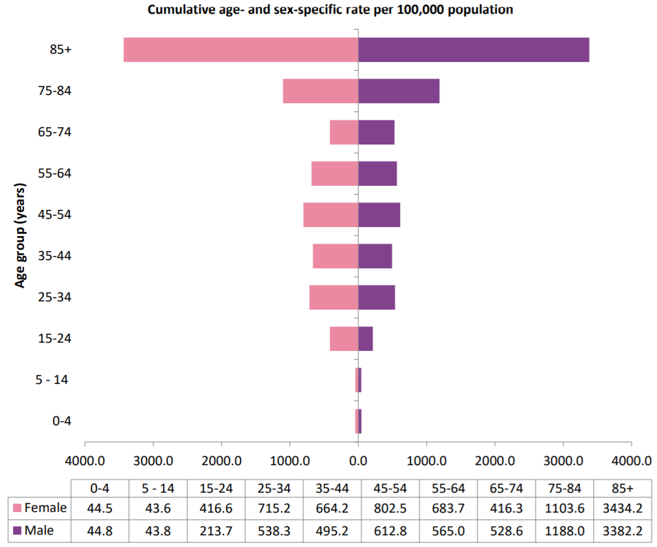
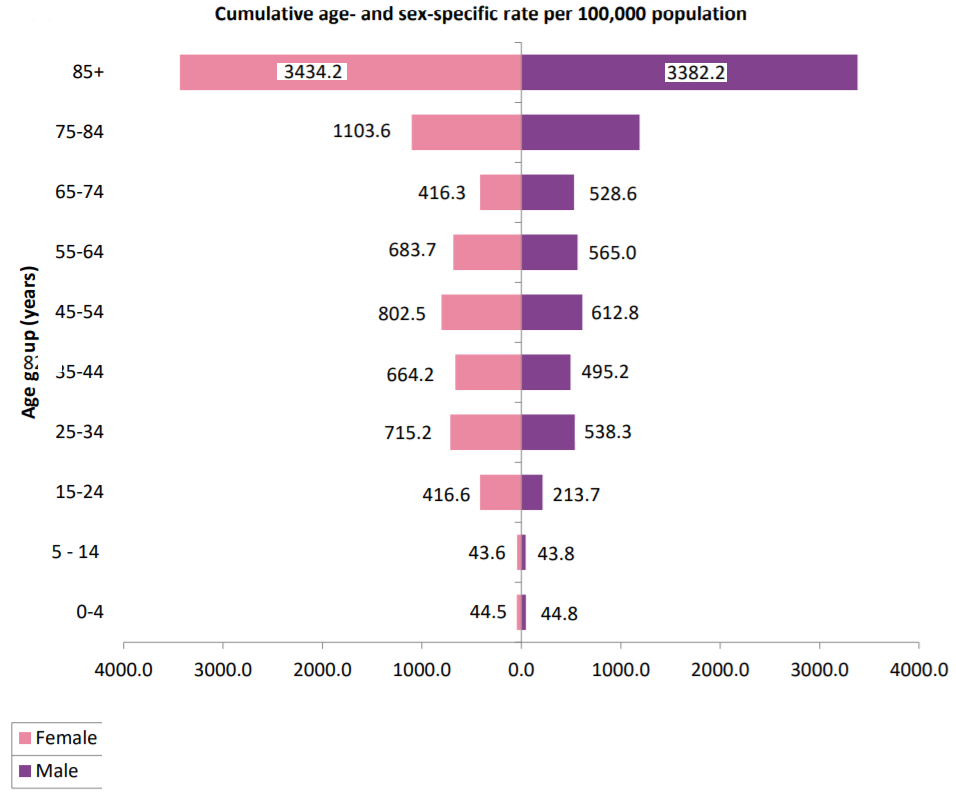
- Can we use age/sex profile of case from https://www.hpsc.ie/a-z/respiratory/coronavirus/novelcoronavirus/casesinireland/epidemiologyofcovid-19inireland/COVID-19%20NPHET_Report_New%2020200527_%20Website_v1.pdf page 4. Would look something like this. Can maybe just use screengrab image like: https://ibin.co/5O69QRJsWaRz.png or https://ibin.co/5O69oTqfnX7P.png with a bit of edit.
Map location of counties
How do we (do we) know which counties the cases occurred in? The Dept of Health only seems to publish the general regions. Rethliopuks (talk) 08:15, 10 March 2020 (UTC)
Local knowledge. I for one live not far from cases #3-#6. Those cases also made it into a local paper. Outback hens (talk) 23:56, 11 March 2020 (UTC)
- They have now been reported as recovered. donal.hunt (talk) 00:03, 16 March 2020 (UTC)
Please update the map to include Kihttps://en.wikipedia.org/w/index.php?title=Talk:2020_coronavirus_pandemic_in_the_Republic_of_Ireland&action=editldare. The first death occurred at Naas General according to the Irish Times on 11th March. Not sure what case number this woman was on the chart but she was reported as being in a critical condition the day she was diagnosed. — Preceding unsigned comment added by 149.157.126.64 (talk) 08:56, 12 March 2020 (UTC)
Could the headings relate to the four provinces? 82.196.126.239 (talk) 22:15, 15 March 2020 (UTC)
- I suspect they are one of the HSE internal region schema. Some cases have been attributed to the northwest. See Hospital Groups map, HSE Areas and Public Health areas donal.hunt (talk) 00:01, 16 March 2020 (UTC)
RTÉ reported the number of cases per county today; https://www.rte.ie/news/coronavirus/2020/0318/1124007-ireland-coronavirus-cases/ I won't change the map in case people want to keep the current style of map. Dextrose12 (talk) 21:31, 18 March 2020 (UTC)
Where did the gifs of counties spread in top right box come from? Can they be updated or maybe removed as the are out of date now? 51.171.197.95 (talk) 16:19, 31 March 2020 (UTC)
- They come from me. I'm trying to update the maps soon after new data are announced every evening. I am aware that the maps may not immediately appear on Wikipedia after new versions are uploaded to Wikimedia (possibly because of browser caching?). Do you think the gifs work or would static maps as on the similar sites work better? Voanhvuxd (talk) 23:45, 31 March 2020 (UTC)
- OK. Thanks for reply. I'm pretty new to wiki so not really sure how things work. Is this the correct place to discuss changes/ideas? Not too sure about the map/gifs. Is it possible to add play/pause controls. It flicks thru the days quite quickly ...(and maybe numbers/labels) so can see what values are for each county? Also maybe could be a bit smaller. Where/how did you make these? I'd kinda like to maybe do one to compare irish rates per 100k to different countries. like this (https://geohive.maps.arcgis.com/apps/opsdashboard/index.html#/a192b58ba6904c1494f651706c223520 - international rates ) but animated over time. 51.171.196.104 (talk) 16:28, 1 April 2020 (UTC)
- Thanks. I've made some changes as per your suggestions. If you or anyone else has new ideas/suggestions, please reply to this thread. I combine data from various official sources (case data from the DoH, population data from the 2016 census, and the base map from the OSi) and process them with some Java code I write myself to produce the maps. The maps are available in both vector and raster formats for everyday from 16/3/2020. I see most similar sites for other countries use static vector maps to show the most recent numbers of cases only. I think the animation is more informative as it shows the spread over time. But it makes the infobox more cumbersome. So, if you have thoughts on this, let me know. I'll try to help as much as I can. — Preceding unsigned comment added by Voanhvuxd (talk • contribs) 18:24, 3 April 2020 (UTC)
- Good job. Looks great. Thanks. As for further suggestions, I was looking at stats on Johns Hopkins dashboard & saw they using a 5day moving average (see here https://coronavirus.jhu.edu/data/new-cases) This is calculated for each day by averaging the values of that day, the two days before, and the two next days. This approach helps prevent major events (such as a change in reporting methods) from skewing the data & and smooths outs the peaks and dips. Might be a bit tricky to implement automatically though (and calculating it each day a bit labour intensive) 51.171.196.233 (talk) 19:24, 3 April 2020 (UTC)
Can we move 'statistics' back up nearer to the top of the page? Above testing seems like a good place. This is the best way to quickly take in info & see trends in numbers at a glance 51.171.196.104 (talk) 18:09, 1 April 2020 (UTC)
- Super. Thanks 51.171.196.104 (talk) 18:46, 1 April 2020 (UTC)
Recoveries
List of recoveries that have been publicised in the media...
11 March 2020 - The Echo (Cork based paper) reported that a patient that had previously been diagnosed with COVID-19 was discharged. [1]
15 March 2020 - Four patients were discharged from University Hospital Limerick.[2] The 4 people dischared from the hospital all tested negative for the virus according to the article mentioned. is it accurate to report these as a recoveries? Username1207 (talk) 13:38, 16 March 2020 (UTC)
- Yes, because they had previously tested positive for the virus, as reported in the source. BastunĖġáḍβáś₮ŭŃ! 16:54, 16 March 2020 (UTC)
Folks at the moment there is a running count of confirmed cases as opposed to active cases. If this way of counting continues that would mean that the main graph would continue to go up, without ever flattening. Can the graph be changed to reflect active cases (confirmed cases - recoveries). In the coming days we should see recoveries increase and thus the graph flatten. I can make the change myself but would like to hear peoples thoughts before I do this. 37.228.245.211 (talk) 01:31, 23 March 2020 (UTC) CplJeebus
Considered removing "recoveries" from statastics graph as the updated numbers do not seem to be being relaesed (at least I cannot find them). 51.171.197.95 (talk) 20:56, 30 March 2020 (UTC)
Also considering a graph for "hospitalised" with "ICU" numbers. Info seems to be getting released so should maybe track it? 51.171.197.95 (talk) 20:56, 30 March 2020 (UTC)
Can we update recoveries: "62 patients admitted to ICU were discharged as of that date.[17]" https://www.rte.ie/news/2020/0410/1129884-covid-19-cases-deaths/ https://en.wikipedia.org/wiki/2020_coronavirus_pandemic_in_the_Republic_of_Ireland#cite_note-10_April-17 51.171.197.213 (talk) 21:52, 10 April 2020 (UTC)
I will make an attempt to add a recoveries scale onto the graph. Only one problem with this, the numbers of recoveries are released periodically. Looking at the graph will make it same as though there are no recoveries for one week then all of a sudden there is a surge of 4 thousand recoveries, and then nothing for a week. But sure why not MrBoopsy (talk) 17:02, 30 April 2020 (UTC)
- Dont think this is all that useful. As you said recoveries not really updated regularly... also if people want to see so called "active" cases they can just look at area between recoveries & total (although as you say its not really that accurate as recovery info not complete). Its in the timeline below anyway if people want it. It would basically be another line exactly the same trajectory but just above recoveries. — Preceding unsigned comment added by 51.171.197.19 (talk) 18:29, 30 April 2020 (UTC)
Ah yeah I get that now. Only dawned on me halfway through making some attempt to log them on the chart. And by trying to get rid of those figures I ended up bottling the whole graph all together. So big props to whoever was able to fix it MrBoopsy (talk) 19:00, 30 April 2020 (UTC)
The number of recoveries has remained at 24,000 since July 30th, it's been several months since then, why is it not updated with a more up to date number of recoveries! — Preceding unsigned comment added by 86.42.250.112 (talk) 19:25, 20 October 2020 (UTC)
References
- ^ "First coronavirus patient discharged from CUH after making full recovery". www.echolive.ie. The Echo. Retrieved 16 March 2020.
- ^ "Coronavirus: Four people being treated for Covid-19 in Limerick released from hospital". www.irishexaminer.com. Irish Examiner. Retrieved 16 March 2020.
WikiProject COVID-19
I've created WikiProject COVID-19 as a temporary or permanent WikiProject and invite editors to use this space for discussing ways to improve coverage of the ongoing 2019–20 coronavirus pandemic. Please bring your ideas to the project/talk page. Stay safe, --Another Believer (Talk) 17:42, 15 March 2020 (UTC)
Epidemiology Report
Report available daily at Cases in Ireland the morning after the press conference
Contains more detailed information.
Specifically a table of cluster locations and type:
Table 6: Number of clusters/outbreaks COVID-19 notified to midnight March 23rd 2020 by location and HSE-area
| Location | E | M | MW | NE | NW | SE | S | W | Total |
|---|---|---|---|---|---|---|---|---|---|
| Travel related | 4 | 4 | 2 | 1 | 2 | 2 | 15 | ||
| Hospital | 3 | 1 | 1 | 2 | 1 | 8 | |||
| Extended family | 2 | 3 | 1 | 6 | |||||
| Private house | 2 | 1 | 2 | 1 | 2 | 2 | 4 | 14 | |
| Community outbreak | 1 | 1 | |||||||
| Community hospital/Long-stay unit | 1 | 1 | |||||||
| Nursing home | 9 | 9 | |||||||
| Residential institution | 1 | 1 | |||||||
| Workplace | 1 | 1 | 2 | ||||||
| Hotel | 1 | 1 | |||||||
| Other | 1 | 1 | 1 | 3 | |||||
| Not Specified | 2 | 2 | |||||||
| Total | 20 | 3 | 5 | 8 | 3 | 7 | 10 | 7 | 63 |
Data source: CIDR as of 25/03/2020 13:05 — Preceding unsigned comment added by 89.101.130.193 (talk) 09:33, 27 March 2020 (UTC)
Statistics section
Hello @F1lover22:, @Darranc: put the statistics section towards the beginning. I had moved it down, but then it made sense what @Darranc: had done. I am planning on moving the section back up. Your edit.
The US page as of 1 April 2020 has the statistics section towards the introduction
Another user also made this suggestion to move the section closer to the intro.
The rational is that this is an ongoing pandemic and readers would probably want the statistics closer to the beginning.
Ear-phone (talk) 23:58, 1 April 2020 (UTC)
- @Ear-phone: As per other European countries (see Spain, Italy, UK, France, Germany, etc.) the statistics section should remain subsequent to the discussion in the article. A personal judgement on what people are looking for in the article is not grounds for justifying a move. If you wish to make such a change it would require consensus between all European articles and prior discussion on the talk page. Please do not change again and begin edit warring F1lover22 talk 14:43, 2 April 2020 (UTC)
- Hello @F1lover22:. This is not about European or non-European. The pandemic is a global problem. It is not about my personal opinion. It is about presenting the information in the most optimal way for the public good, which has been highlighted by other users independently of me. There is wisdom in how one of the most viewed pages on this topic displays the statistics near the beginning. It's not as if you're punishing me with your unilateral decision opposed by several of those who have edited the page. You know better so, I will leave it as is. Ear-phone (talk) 15:38, 2 April 2020 (UTC)
- Yeah, lets not worry about what other pages are doing let just do whats clearest. I agree should be nearer to the top while daily stats still unfolding... (very annoying to have to scroll all the way down UK, Australia, etc pages to get look at which way curves going). 51.171.196.233 (talk) 16:53, 2 April 2020 (UTC)
- Hello @F1lover22:. This is not about European or non-European. The pandemic is a global problem. It is not about my personal opinion. It is about presenting the information in the most optimal way for the public good, which has been highlighted by other users independently of me. There is wisdom in how one of the most viewed pages on this topic displays the statistics near the beginning. It's not as if you're punishing me with your unilateral decision opposed by several of those who have edited the page. You know better so, I will leave it as is. Ear-phone (talk) 15:38, 2 April 2020 (UTC)
- It's not a trivial point @F1lover22:. Key policy makers may be reading Wikipedia and making key decisions. The clearer the info. the better. I cannot move the statistics section back up, otherwise I'll violate the 3 revert rule and I'll be blocked. Paradoxically the burden of proof should have been with you, since you found the page in that state (statistics section near the top). That was the implicit consensus of several editors. @Joseywales1961: @Bygmester: @5 albert square:. Ear-phone (talk) 18:36, 2 April 2020 (UTC)
- I would be inclined to agree with Ear-phone and 51.171.196.233 that it would be better placed near the top Joseywales1961 (talk) 19:05, 2 April 2020 (UTC)
- I also agree that the stats section should take priority. The timeline sections across all Wikipedia articles on the pandemic are a mess. It's a pity there is not a better way to organize the timeline section, some sort of collapsible bullet point table or something. In any event, the stats should come first. AugusteBlanqui (talk) 19:09, 2 April 2020 (UTC)
- I would be inclined to agree with Ear-phone and 51.171.196.233 that it would be better placed near the top Joseywales1961 (talk) 19:05, 2 April 2020 (UTC)
- I agree that organising the timeline section is challenging. It looks like it's now, since 29 March, a more intensive phase beyond the delay phase. Maybe a new section for April too. Anyhow, please may you kindly move the statistics section @Joseywales1961: @51.171.196.233: @AugusteBlanqui: @Darranc: @Bygmester: @5 albert square: @JMS Hunt 2020: @Aku-PDF-Finder:? Ear-phone (talk) 22:28, 2 April 2020 (UTC)
- I went ahead and made the move as per the local consensus on this talk page. If there is a Manual of Style guideline specific to Covid19 articles then obviously we will follow it. AugusteBlanqui (talk) 08:07, 3 April 2020 (UTC)
- I agree that organising the timeline section is challenging. It looks like it's now, since 29 March, a more intensive phase beyond the delay phase. Maybe a new section for April too. Anyhow, please may you kindly move the statistics section @Joseywales1961: @51.171.196.233: @AugusteBlanqui: @Darranc: @Bygmester: @5 albert square: @JMS Hunt 2020: @Aku-PDF-Finder:? Ear-phone (talk) 22:28, 2 April 2020 (UTC)
- It was better near the top for the reasons stated above. Also terribly confusing, from an editing perspective, to find the part where the information goes. I think that would apply to any country. --Bygmester (talk) 05:24, 3 April 2020 (UTC)
Considering adding a testing graph. Something like this maybe;
| Graphs are unavailable due to technical issues. There is more info on Phabricator and on MediaWiki.org. |
Information quite limited now but hopefully will be reported more going forward... or can try to dig up more numbers if people think good idea 51.171.196.233 (talk) 17:10, 3 April 2020 (UTC)
- I've added this to the main page under testing as figures were updated today (although I struggled to find source to cite as heard numbers on RTE radio1 news at 6pm 7/4/20. — Preceding unsigned comment added by 51.171.197.20 (talk) 18:19, 7 April 2020 (UTC)
@Bygmester: - Epidemiology of COVID-19 in Ireland, 5 April 2020 Ear-phone (talk) 14:16, 6 April 2020 (UTC)
- @Bygmester: @Ear-phone:Not sure what this refers to. But if you need to access the past daily reports, they are archived here: Epidemiology of COVID-19 in Ireland - daily reports Voanhvuxd (talk) 21:40, 9 April 2020 (UTC)
Considering tiding up (compressing) deaths graph by removing zero deaths days at the start. Start from 1st death instead of 1st confirmed case to try to stop the graphs getting too wide and busy with compressed info. Something like this:
| Graphs are unavailable due to technical issues. There is more info on Phabricator and on MediaWiki.org. |
What do people think? Another idea would be to try switching the axis X & Y to make graphs vertical instead of horizontal (kind of like the "cases" graph in timeline section). The longer this goes on the wider & consequentially more compressed these graphs are going to become. Could look like this:
| Graphs are unavailable due to technical issues. There is more info on Phabricator and on MediaWiki.org. |
Oh, please no! That's an incredibly non-intuitive graph, and we are not Fox News! I know it's not exactly mixing logarithmic and linear scales, but that latter presentation really just grates! BastunĖġáḍβáś₮ŭŃ! 08:57, 8 April 2020 (UTC)
- Yeah agree it doesnt look great but formatting is new to me. How about something like this:
| Date | New Deaths per day |
|---|---|
| 2 Apr | 13
|
| 3 Apr | 22
|
| 4 Apr | 17
|
| 5 Apr | 21
|
| 6 Apr | 16
|
| 7 Apr | 36
|
...or just the remove dates before 1st death from graph as it is now (see original dark red horizontial above)? If nobody objects i'll implement this 51.171.197.20 (talk) 17:06, 8 April 2020 (UTC)
- Just stick with the first example above? It's clear, and how information like this (result over time) would normally be expressed. That graph is fine, aize-wise, right now, and will allow for expansion. If necessary, in a few weeks, we can change to a weekly scale. BastunĖġáḍβáś₮ŭŃ! 18:17, 8 April 2020 (UTC)
Can we do something about the spike in reported cases on 10th Apr? Ruins the graph. Maybe spread them out over the previous 5 days (due to lag)... or something like 5 day moving average. Feel like in 1 day this graph has gone silly (and not real daily increase). Any thoughts/ideas welcome? — Preceding unsigned comment added by 51.171.197.213 (talk) 18:02, 11 April 2020 (UTC)
- How about this to show German tests (backlog spikes):
| Graphs are unavailable due to technical issues. There is more info on Phabricator and on MediaWiki.org. |
- Thanks 46.7.128.13 for implementing: ″Numbers from April 10 onwards changed to highlight the number of previously backlogged cases processed in Germany.″ into main cases table/graph - This helps. Good job 51.171.197.79 (talk) 03:03, 15 April 2020 (UTC)
Propose tidy up hospitalisation & ICU stats graph like this:
| Graphs are unavailable due to technical issues. There is more info on Phabricator and on MediaWiki.org. |
If nobody objects i'll go ahead and implement.
Deaths like this (starting on date of 1st death) to give us a bit more room as more days added:
| Graphs are unavailable due to technical issues. There is more info on Phabricator and on MediaWiki.org. |
Propose grouping daily new cases after first case to make graph a bit clearer & room for expansion without getting too wide or too compressed:
| Graphs are unavailable due to technical issues. There is more info on Phabricator and on MediaWiki.org. |
What are we going to do about the 185 (probable) deaths on 24th of Apr. If we dont include in graph the numbers dont match. The over 1000 number is now the official figure i've seen everywhere (including sidebar top box, timeline graph & body of article). I know it kinda makes a mess of the graphs but i think we have to include it. Otherwise numbers dont match (...or add up). I saw somebody had included it then it got changed to just 37. Thoughts? — Preceding unsigned comment added by 51.171.197.95 (talk) 18:01, 25 April 2020 (UTC)
| Graphs are unavailable due to technical issues. There is more info on Phabricator and on MediaWiki.org. |
How about something like this?
Also I notice 10 probable deaths are included in 25 Apr so think we need to add other 'probable' deaths for the sake of consistency/completeness. — Preceding unsigned comment added by 51.171.197.19 (talk) 06:27, 26 April 2020 (UTC)
- I'm going to go ahead and implement this if nobody objects. Anyone???
- I think you should add the 'Probable Deaths' chart as the numbers on the current chart doesnt mention anything about the 'backlog of deaths' reported. It only mentions the probable deaths on the timeline section. User_talk:Edl-irishboy 18:29, 26 April 2020 (UTC)
- OK. Done. Cheers for feedback. 51.171.197.19 (talk) 21:29, 26 April 2020 (UTC)
- I think you should add the 'Probable Deaths' chart as the numbers on the current chart doesnt mention anything about the 'backlog of deaths' reported. It only mentions the probable deaths on the timeline section. User_talk:Edl-irishboy 18:29, 26 April 2020 (UTC)
Cases table
Is it time to split the first table displayed under "Cases" into pre- and post-March 18. Numbers are increasing to the extent that we'll never now know any of the details contained in the daily rows of the table - all we'll have will be number of confirmed cases. BastunĖġáḍβáś₮ŭŃ! 11:45, 3 April 2020 (UTC)
- Thanks, but my point was more that we're never going to know, e.g., the origin type or gender breakdown of patients 907-1125, say, and the columns should be removed. Sorry I wasn't clear. BastunĖġáḍβáś₮ŭŃ! 21:51, 3 April 2020 (UTC)
Title
Why is this entitled ".. Republic of .." That's certainly not the norm. See Category:2019–20 coronavirus pandemic by country and territory
--2604:2000:E010:1100:B802:4553:6936:1C2C (talk) 15:16, 3 April 2020 (UTC)
Maynooth Dunnes Store
The photo of the Maynooth Dunnes Stores has a caption that describes it as "An Irish grocery store" - the photo shows clothing on sale, but I'm not sure if there's a groceries section. Is there a WP:RS about what this branch sells? Autarch (talk) 20:27, 4 April 2020 (UTC)
- perhaps "super market" is a better description? It sells clothes, groceries, toys, and liquor. AugusteBlanqui (talk) 19:52, 5 April 2020 (UTC)
Ulster Counties
Do the cases in Monaghan & Cavan count as east of Ireland or West of Ireland in the cases section? (Fran Bosh (talk) 18:20, 6 April 2020 (UTC))
Statistics sources - "Recovered" figure
I have a concern over the figure being used for recoveries. It's sourced to "worldometers.info". Worldometers doesn't list its own sources but there's a link to input figures oneself. This means it can't be classed as a WP:RS. As the likes of Google are using Wikipedia as a source right now for worldwide stats, we need to be even more careful than usual. We should only be using gov.ie, hse.ie, Department of Health and CSO stats. BastunĖġáḍβáś₮ŭŃ! 09:05, 8 April 2020 (UTC)
- Agreed--good catch! AugusteBlanqui (talk) 09:22, 8 April 2020 (UTC)
I challenge the number of recoveries from Worldometers and the dashboard from gov.ie. These are all of the recoveries that I could find that were published online. 33 recovered from ICU according to the first article from Fergal Bowers, 1 recovered on 11 March, 4 on 15 March, a Wicklow solicitor on 21 March, 1 on 3 April (82-year-old man from Roscommon), Michael Carton, Claire Byrne, Ciara Kelly and Ryan Tubridy.[1][2][3][4][5][6][7][8][9] The total of all of these is 44, so that's greater than 25. To be fair, I think it would be very inefficient to use all of these citations to support the number of recoveries in the infobox at the beginning of the article, there could be people that have recovered that haven't been reported by anything online, and it seems to me that the Department of Health does not mention the number of recoveries each day in their updates. I couldn't find any article from the Irish Times, theJournal.ie, RTE or anything else that says that 25 people have recovered. Would anybody care to share their thoughts on what I've said? Thanks. 31.187.4.94 (talk) 12:07, 9 April 2020 (UTC)
- Without going through all of your sources, I think yes, you're right, the "25" figure is under-reporting. I think we update as and when we can, when a reliable Irish source reports a figure. It doesn't need to be daily, after all. I've raised the same concern about this source on the main pandemic talk page. BastunĖġáḍβáś₮ŭŃ! 14:11, 9 April 2020 (UTC)
- This presumes that recoveries will be actively monitored and reported at all. For the period where statistic known not to have been updated, the figure should be excluded altogether -- otherwise it paints an inaccurate picture. If we imagine no recoveries data was available ever, it would clearly be misleading to state "0 recoveries". Where they are not actively being produced, it should be removed from the graphs, or at the very least, marked with a footnote that the number isn't actively updated. - 2A01:4B00:86C4:B800:B915:9336:E4B4:E870 (talk) 09:40, 12 April 2020 (UTC)
Thank you. I know I have an excessive number of citations, but I included all of them so that people wouldn't think that I'm making this up. 31.187.4.94 (talk) 14:15, 9 April 2020 (UTC)
In this evenings press conference the chief medical officer said "in cases where they have not been hospitalised it is a reasonable assumption to assume that case has recovered" and went on further to say hospitalisation occurs in roughly 18% of cases and mentioned following the course of low symptomatic illness. https://m.facebook.com/story.php?story_fbid=244100936644100&id=257558294273180 (34:50 onward)
The advice if you are experiencing mild symptoms is to isolate for 14 days. The total number of cases 14 days ago was 4,059 with 1,903 hospitalisations. It is reasonable to assume there has been in the region of 2,000 recoveries to date. 02:30, 15 April 2020 (UTC)
- Its my understanding it can take up to 14 days for symptoms to occur ...& then some cases can be up to 3 weeks in hospital (with obvious lag in testing/reporting) so very difficult to estimate recoveries based on past confirmed cases. Probably best to just leave it till we get reliable figures from official sources. I know its frustrating, but would just be a guess. 51.171.197.79 (talk) 02:53, 15 April 2020 (UTC)
- This discussion doesn't seem to be actually going anywhere. Inferring the number recovered from projections (Wikipedia's own projections), is out because it is clearly WP:OR. The number is clearly inaccurate, but yet it is dated as 15 April, as though it were accurate on that date.
- As far as I can see no statistic has been published at all on the number of recoveries, and the numbers in the graphs are just sums of the number of individual reported recoveries: i.e. if two news reports today said John Doe and Jane Doe recovered, we (or Global Stats) would +2. This is wrong, because it makes it seem like there has been some kind of systematic measurement today and that number was two, when nothing of the sort occured. Wherever Global Stats are getting their info, we know it clearly suffers from this issue: notwithstanding the WP:OR that projections would violate, they at least are informative enough to say with near certainty that the Global Stats number is incredibly unrepresentative and should not be trusted.
- Since there is no proper source for the information as a statastic which would be comparable to either, the other numbers in the graphs (cases, deaths) or to the "Recovered" statistic in other regions, this information is clearly misleading and unreliable. It should be removed until a proper stat is published (which is unlikley to happen). Not all the other articles even report this stat -- e.g. Sweden does not have a stat for this, nor does the UK, likely for similar reasons. - Estoy Aquí (talk) 13:32, 19 April 2020 (UTC)
Added "Recoveries" to first graph as we now have reliable source on recovered numbers. I'm not sure about 77 number last week. Can maybe remove if looks a bit weird? Tried putting in 5 figure in early weeks but ruined graph so just removed it... as obviously not complete figure (as discussed above). 51.171.197.4 (talk) 19:14, 21 April 2020 (UTC)
- The important thing here is the facts - verifiable numbers attributed to a reliable source - rather than the prettiness of graphs. It looks like we're not going to get reliable daily updates on number of recoveries, but earlier reports were a bit bizarre, to say the least, when I (an average editor who does not move in celebrity circles) was able to say "Hmm, I know about 40% of the people who have recovered, at least to see on TV..." We finally have an attributable stat, so there's no problem including in the graph. Obviously there were daily recoveries all along, but if we have no figures, it's likely we'll see flatlines then sudden jumps in the 'recovered' stat line on the graph. That's fine. Also, thanks to those who've been maintaining these graphs - good job, folks! BastunĖġáḍβáś₮ŭŃ! 22:36, 21 April 2020 (UTC)
References
- ^ Fergal Bowers (7 April 2020). "Beaumont Hospital treating most Covid-19 patients". RTE News.
- ^ Mary Corcoran (11 March 2020). "First coronavirus patient discharged from CUH after making full recovery". The Echo.
- ^ David Raleigh (15 March 2020). "Four people being treated for Covid-19 in Limerick released from hospital". Irish Examiner.
- ^ Ciaran Mullooly (3 April 2020). "Roscommon man, 82, speaks of Covid-19 recovery". RTE News.
- ^ "Mick Carton shares uplifting yet 'scary' Covid-19 story". RTE Sport. 5 April 2020.
- ^ Hannah Hillyer (3 April 2020). "Newstalk presenter Ciara Kelly has recovered from Covid-19 and will be returning to work as a doctor". VIP.
- ^ Claire Concannon (6 April 2020). "Back from the shed! Claire Byrnes returns to RTÉ Studio". evoke.ie.
- ^ Hayley Halpin (7 April 2020). "'I was very, very fortunate': Ryan Tubridy returns to air after recovering from Covid-19". TheJournal.ie.
- ^ Tim O'Brien (21 March 2020). "Wicklow man recovered from coronavirus showed no symptoms after ski trip". The Irish Times.
Map
Come on guys, the map of Ireland without the Six Counties just looks wrong. I know this is an article about the pandemic in the Republic of Ireland, but you could at least have a lap where Northern Ireland is in grey or something. --80.111.180.148 (talk) 18:57, 9 April 2020 (UTC)
- The way the map in 2020 coronavirus pandemic in the United Kingdom has a greyed-out RoI? Sure... :-) BastunĖġáḍβáś₮ŭŃ! 20:54, 9 April 2020 (UTC)
- I can modify the maps if there is a consensus view on this. At the moment, I use the county boundary map from Ordnance Survey Ireland, which does not contain NI. But I understand the point @80.111.180.148: brings up. Voanhvuxd (talk) 21:30, 9 April 2020 (UTC)
comparison to UK
https://www.theguardian.com/commentisfree/2020/apr/14/coronavirus-uk-ireland-delay (14 April 2020)
- "365 people have died in Ireland of Covid-19 and 11,329 have died in the UK. Adjusted for population, there have been 7.4 deaths in Ireland for every 100,000 people. In the UK, there have been 17 deaths per 100,000.
Which is the best place in the article to mention this ? --Neun-x (talk) 16:03, 14 April 2020 (UTC)
Every COVID page that I have seen has year - month - day. Fran Bosh (talk) 21:46, 23 April 2020 (UTC)
Date Format
Could someone please change the date format in the timeline section to day, month, year? (Fran Bosh (talk) 14:16, 19 April 2020 (UTC))
- Comment This article already use Day-month-year format from the beginning of the creation. 114.125.230.86 (talk) 15:38, 19 April 2020 (UTC)
- Yeah he's right. In the "timeline" (vertical) graph date is in the format: year-month-day 2020-04-19 etc
- I agree this is better: day-month-year 19-04-2020 etc
- Probably got something to do with the template & format from rest of covid pages across wikipedia. Does every page have to use same format?
Age & Gender breakdown?
Anyone willing to add a table like Template:2019–20 coronavirus pandemic data/Italy medical cases based on data at https://www.hpsc.ie/a-z/respiratory/coronavirus/novelcoronavirus/casesinireland/epidemiologyofcovid-19inireland Ain92 (talk) 19:52, 27 April 2020 (UTC)
- like this type of thing;
| Graphs are unavailable due to technical issues. There is more info on Phabricator and on MediaWiki.org. |
| Graphs are unavailable due to technical issues. There is more info on Phabricator and on MediaWiki.org. |
These are correct numbers (havent found gender breakdown yet) but can use this as a starting point. Might add it to the page as is & can fill in more info as we find it.
| Graphs are unavailable due to technical issues. There is more info on Phabricator and on MediaWiki.org. |
- Male
- Female
- Just copied Italy graphs format for now - can fill in Irish info if people think its a good idea. 51.171.197.19 (talk) 06:50, 29 April 2020 (UTC)
- I think adding these graphs is a good idea, but should it still be added to the statistics section of the article? Edl-irishboy (talk) 13:11, 29 April 2020 (UTC)
Is there a way to display % on this graph too?
| Graphs are unavailable due to technical issues. There is more info on Phabricator and on MediaWiki.org. |
I tried putting it in brackets but broke the graph! Help. — Preceding unsigned comment added by 51.171.197.20 (talk) 20:17, 2 May 2020 (UTC)
How about this to show gender breakdown
42 / 100
|
| 42% Female 57% Male |
or
Female (pink). Male (blue).
| Gender | Number of Cases (%) |
|---|---|
| Female | 11,979(57.8%)
|
| Male | 8,695(41.9%)
|
| Unknown | 68(0.3%)
|
Actually just noticed this works for age & % too. Leave it with me... 51.171.197.20 (talk) 23:12, 2 May 2020 (UTC)
| Age | Number of Cases (%) |
|---|---|
| 0 - 1 | 38(0.2%)
|
| 1 - 4 | 69(0.3%)
|
| 5 - 14 | 215(1%)
|
| 15 - 24 | 1,417(6.7%)
|
| 25 - 34 | 3,373(16%)
|
| 35 - 44 | 3,588(17%)
|
| 45 - 54 | 3,858(18.3%)
|
| 55 - 64 | 2,772(13.2%)
|
| 65+ | 5,711(27.1%)
|
| Unknown | 23(0.1%)
|
Gonna add DEATHS by gender:
| Gender | Number of Deaths(%) | ||||||||
|---|---|---|---|---|---|---|---|---|---|
| Male | 683(51%)
| ||||||||
| Female | 653(48.8%)
| ||||||||
| Unknown | 3(0.2%)
| ||||||||
|
Median age = 84 (Mean age = 82) | |||||||||
Revise cases graphs to incorporate new information about backlogged cases?
The HSE has now provided a chart that has the backlogged cases assigned to their "correct" dates. I've revised the cases graphs to reflect that new data. Please move the graphs to the main page if you see fit. One caveat is that we don't know how many of the backlogged cases were health care workers. AnEddy11 (talk) 22:48, 27 April 2020 (UTC)
| Graphs are unavailable due to technical issues. There is more info on Phabricator and on MediaWiki.org. |
| Graphs are unavailable due to technical issues. There is more info on Phabricator and on MediaWiki.org. |
- Looks good to me. Lets do it. — Preceding unsigned comment added by 51.171.197.19 (talk) 04:33, 28 April 2020 (UTC)
- Done. I've revised the graphs, the timeline, and cited the source. AnEddy11 (talk) 12:05, 28 April 2020 (UTC)
- I wonder can we find the same info for deaths (i've had a look in the pdfs, but no joy). That 220 on 24th spike is ruining graph. If we cant i think we should at least spread them out over a few days ....as they are a backlog anyway.
- Done. I've revised the graphs, the timeline, and cited the source. AnEddy11 (talk) 12:05, 28 April 2020 (UTC)
- Looks good to me. Lets do it. — Preceding unsigned comment added by 51.171.197.19 (talk) 04:33, 28 April 2020 (UTC)
| Graphs are unavailable due to technical issues. There is more info on Phabricator and on MediaWiki.org. |
Figures given on 28 April
Dr Tony Holohan reported today death toll 1,159 and total cases 19,877 [1] RTE gives figures 19,947 [2] - which total figures should be used? Joseywales1961 (talk) 17:05, 28 April 2020 (UTC)
Masked statue phenomenon
@Laurel Lodged: (regarding the masked Molly Malone upload). Phil Lynott has also been wearing a mask (though he doesn't seem to be here). Thought I saw a photo of Patrick Kavanagh wearing one too. The masked statue phenomenon is occurring during the (nearly) summer of 2020 in Dublin, where, in several different parts of the city, statues of important figures are observed wearing personal protective equipment. Who else is doing it? Grattan? Joyce?
A search of other Dublin statues (and free photo uploads if masked) might be an idea for anyone interested. And (if not in Dublin) someone could check others if they are within 2km.
Suggestions: Oscar and Eduard in Galway. Yeats outside Sligo's Ulster Bank. Mick O'Dwyer in Waterville. Joe Dolan in Mullingar. Big Tom in Castleblayney. Seán Ó Riada in Cúil Aodha. -- Bygmester (talk) 01:53, 30 April 2020 (UTC)
- I snapped that pic before the lockdown . I don't have any of the above within 2km of my home but it's s a good idea. Laurel Lodged (talk) 10:43, 30 April 2020 (UTC)
Statistics: Daily new deaths graph figures move above bars?
Should the figures on the Daily New Deaths graph be the same as the Cases graph as in like the numbers above the bar? Like this? :
| Graphs are unavailable due to technical issues. There is more info on Phabricator and on MediaWiki.org. |
This is the graph without numbers above the bar:
| Graphs are unavailable due to technical issues. There is more info on Phabricator and on MediaWiki.org. |
Edl-irishboy (talk) 15:13, 1 May 2020 (UTC)
- Yeah it might be getting close to that time alright. I did it yesterday for daily cases as it getting very crowded. I must say that 222 (backlog) figure on 24 Apr is still ruining this graph & moving the value offset above is going to make it even worse (more squashed). Maybe we can take any de-notified deaths off this figure (24 Apr) from now on? ...ie probable deaths that turned out not to be. Or I still think we could spread this out over couple of days (25 + 26 Apr). — Preceding unsigned comment added by 51.171.197.20 (talk) 17:32, 1 May 2020 (UTC)
- Thanks for the response. I do know that the 222 probable death cases is ruining the graph and I think you should go ahead by spreading this figure (222 p. deaths) out over days 25 and 26 April. Edl-irishboy (talk) 17:02, 2 May 2020 (UTC)
- We can't alter or interpret the data. If the source says 222 deaths, that's what we use. We're here to produce accurate data per [[WP:RS], regardless of what it does to a graph. BastunĖġáḍβáś₮ŭŃ! 23:39, 13 May 2020 (UTC)
- Thats exactly the point. The graph was wrong due to 'probable' & then 'denotified' deaths. See discussion at top of page... — Preceding unsigned comment added by 51.171.197.101 (talk) 19:26, 14 May 2020 (UTC)
- We can't alter or interpret the data. If the source says 222 deaths, that's what we use. We're here to produce accurate data per [[WP:RS], regardless of what it does to a graph. BastunĖġáḍβáś₮ŭŃ! 23:39, 13 May 2020 (UTC)
Or will we leave it as is? MrBoopsy (talk) 21:20, 14 May 2020 (UTC)
- Then the chart is wrong... & shows 236 more deaths than the official figures (everywhere else on page/online). Ideally we could get a copy of the correct chart (referred to above) in yesterday briefing, with each death correctly attributed to the correct date, & de-notified deaths removed. Until then I think its probably best to remember to remove all future de-notified deaths from previous days going forward. Otherwise we wont be showing official figure. See top of page for more discussion on issue... — Preceding unsigned comment added by 51.171.197.101 (talk) 22:25, 14 May 2020 (UTC)
Timeline: New cases on May 14th 2020
Should we add a color to signify that the 426 new cases today were a cumulative number from one hospital with cases that stem back as far as March? MrBoopsy (talk) 21:18, 14 May 2020 (UTC)
- Good idea. Done. — Preceding unsigned comment added by 51.171.197.101 (talk) 03:48, 15 May 2020 (UTC)
DP?
The description of the spread of the virus in Direct Provision facilities in Cahersiveen does not belong in a "Policing and Prisons" section. Asylum seekers are not criminals — Preceding unsigned comment added by 177.194.178.151 (talk) 04:45, 16 May 2020 (UTC)
active cases
active cases has been calculated by taking the total number of confirmed cases and taking away the total number of recoveries and also taking away total deaths. however the the total reported deaths contains 242 probable deaths which would never have been considered a confirmed case so this part of the deaths should not be taken away from total cases to find active cases — Preceding unsigned comment added by 2001:BB6:1702:BE00:1860:40B2:A351:DC47 (talk) 18:59, 23 May 2020 (UTC)
Recoveries update for May 27th
The Chief Medical Officer stated in today's HSE briefing that 90% of all Covid-19 cases in Ireland have now recovered. [1] That would give a new recovery figure of approximately 22,320. Culloty82 (talk) 19:25, 27 May 2020 (UTC)
Testing Figures from New Dashboard
The Department of Health released a new dashboard with daily testing figures (as of midnight the previous day), and daily testing figures going back to 18 March.[1] Should the data from this be incorporated into the Testing section? It's a lot more comprehensive than the weekly testing figures we've had up to now.Alby benny (talk) 20:58, 18 June 2020 (UTC)
- I'll have a look. Might be an idea. Seems we getting in a bit of trouble in other places on this page for having the 11th longest page on wikipedia so maybe dont wanna be adding too much more info or may get split again. 51.171.196.25 (talk) 18:55, 21 June 2020 (UTC)
- https://covid19ireland-geohive.hub.arcgis.com/ = very good find. Loads of detailed info on that page. Is this new or was it there the whole time? Lots of the info/updates we've been trying to find is here (as opposed to buried in poxy pdfs!). Is there a way to do lookup in a wiki page to automatically pull (embed) latest numbers/info from this page? As for testing probably best to stick to roughly weekly as otherwise just going to end up with another massive graph & huge timeline. Numbers/curve seems to be fairly stable now so once a week is probably sufficient. — Preceding unsigned comment added by 51.171.196.25 (talk) 16:23, 22 June 2020 (UTC)
- Yes the dashboard[2] is new. The Department of Health released it only recently. And yes, we should only add the testing figures weekly because we will have a huge testing section and graph. Edl-irishboy (talk) 15:25, 23 June 2020 (UTC)
- I wonder should we include Testing in top right sidebar (with county maps, current nunbers, etc). "Tests Completed: 404,989" or something like that ...from dashboard linked above? Could update that every day or 2 without making the testing section & graph huge. I'm happy to do this if nobody objects? 51.171.196.25 (talk) 16:53, 23 June 2020 (UTC)
- Which top right sidebar? Do you mean the infobox? Please be more specific. We really need to think of ideas for the testing section now because with testing figures announced every week, the section will become too long and will cause it to split again. Edl-irishboy (talk) 13:56, 24 June 2020 (UTC)
- Yeah Infobox (not up on all terms). Had a bit of fiddle with it yesterday but didnt work. Just looking at https://en.wikipedia.org/wiki/Template:Infobox_outbreak now i know name and dont see 'testing' parameter. There's a few others there we could use that we have numbers for like: |hospitalized_cases= |critical_cases= |ventilator_cases= Altho could be making a rod for our own back as someone will have to keep them updated (you most likely as u seem to be 1st with updates). As for testing section not sure what we can do. All sections just going to keep getting bigger as this goes on. — Preceding unsigned comment added by 51.171.196.78 (talk) 20:28, 24 June 2020 (UTC)
- Yeah you cannot put unknown 'testing' parameter in the infobox following Template:Infobox outbreak. In relation to the testing section, I think we should just leave it as it is, I can't find a solution. For the ventilator cases in the infobox, where do you get the info from? As I can't find the details. Edl-irishboy (talk) 03:15, 25 June 2020 (UTC)
- Source is linked in comment of my edits. Its from the pdfs published daily by HSE on https://www.hse.ie/eng/services/news/newsfeatures/covid19-updates/covid19-updates.html ie. https://www.hse.ie/eng/services/news/newsfeatures/covid19-updates/covid-19-daily-operations-update-2000-24-june-2020.pdf page 11. — Preceding unsigned comment added by 51.171.196.78 (talk) 14:29, 25 June 2020 (UTC)
- Thanks for the sources. I noticed that the article doesn't have a statistic graph for cases by county, which I think would be helpful/useful to add. But we would need to update the figures for all the counties daily as well. Ideas? Edl-irishboy (talk) 15:43, 25 June 2020 (UTC)
- No worries. These pdfs are usually published each day after 8pm (generally around 10pm). So probably best not to update till then. Its measured slightly differently (and at different times) in different places so probably best to keep it the same for consistency sake. I'm happy do it when doing hosp/ICU/vent graph.
- Thanks for the sources. I noticed that the article doesn't have a statistic graph for cases by county, which I think would be helpful/useful to add. But we would need to update the figures for all the counties daily as well. Ideas? Edl-irishboy (talk) 15:43, 25 June 2020 (UTC)
- Source is linked in comment of my edits. Its from the pdfs published daily by HSE on https://www.hse.ie/eng/services/news/newsfeatures/covid19-updates/covid19-updates.html ie. https://www.hse.ie/eng/services/news/newsfeatures/covid19-updates/covid-19-daily-operations-update-2000-24-june-2020.pdf page 11. — Preceding unsigned comment added by 51.171.196.78 (talk) 14:29, 25 June 2020 (UTC)
- Yeah you cannot put unknown 'testing' parameter in the infobox following Template:Infobox outbreak. In relation to the testing section, I think we should just leave it as it is, I can't find a solution. For the ventilator cases in the infobox, where do you get the info from? As I can't find the details. Edl-irishboy (talk) 03:15, 25 June 2020 (UTC)
- Yeah Infobox (not up on all terms). Had a bit of fiddle with it yesterday but didnt work. Just looking at https://en.wikipedia.org/wiki/Template:Infobox_outbreak now i know name and dont see 'testing' parameter. There's a few others there we could use that we have numbers for like: |hospitalized_cases= |critical_cases= |ventilator_cases= Altho could be making a rod for our own back as someone will have to keep them updated (you most likely as u seem to be 1st with updates). As for testing section not sure what we can do. All sections just going to keep getting bigger as this goes on. — Preceding unsigned comment added by 51.171.196.78 (talk) 20:28, 24 June 2020 (UTC)
- Which top right sidebar? Do you mean the infobox? Please be more specific. We really need to think of ideas for the testing section now because with testing figures announced every week, the section will become too long and will cause it to split again. Edl-irishboy (talk) 13:56, 24 June 2020 (UTC)
- I wonder should we include Testing in top right sidebar (with county maps, current nunbers, etc). "Tests Completed: 404,989" or something like that ...from dashboard linked above? Could update that every day or 2 without making the testing section & graph huge. I'm happy to do this if nobody objects? 51.171.196.25 (talk) 16:53, 23 June 2020 (UTC)
- Yes the dashboard[2] is new. The Department of Health released it only recently. And yes, we should only add the testing figures weekly because we will have a huge testing section and graph. Edl-irishboy (talk) 15:25, 23 June 2020 (UTC)
- https://covid19ireland-geohive.hub.arcgis.com/ = very good find. Loads of detailed info on that page. Is this new or was it there the whole time? Lots of the info/updates we've been trying to find is here (as opposed to buried in poxy pdfs!). Is there a way to do lookup in a wiki page to automatically pull (embed) latest numbers/info from this page? As for testing probably best to stick to roughly weekly as otherwise just going to end up with another massive graph & huge timeline. Numbers/curve seems to be fairly stable now so once a week is probably sufficient. — Preceding unsigned comment added by 51.171.196.25 (talk) 16:23, 22 June 2020 (UTC)
On related note is it possible to give infobox its own section so can edit it without having to edit & resubmit whole page (to avoid edit conflicts/large commits?). As for counties, would be a lot of work and wouldn't tell us much as its huge Dublin and tiny everywhere else. This is available other places (gov.ie dashboard & covid19ireland-geohive.hub.arcgis.com) so probably not worth effort of duplicating and keeping updated but if you want to i've no objections. Also can you make a quick comment when doing updates please so everyone can see what you've updated (particularly de-notified cases) so i can see what is done & what still needs to be done without having to look thru each individual edit. Thanks & keep up all your good work ;) 51.171.196.78 (talk) 18:00, 25 June 2020 (UTC)
- Thanks so much for feedback. I don't really know stuff about edit conflicts so I can't give feedback. In relation to counties, I've re-thought and I don't think we need counties graph anymore due to the huge cases in Dublin. And I will make a quick comment for edits on de-notified cases/deaths and statistics in the future. Thanks for the work on making graphs because I'm not really good at adding graphs. If you look at the very last section of this talk page, I've mentioned a query on recovery figures, I would like if you can answer what I should do. Thanks. Edl-irishboy (talk) 20:26, 25 June 2020 (UTC)
Looks like they've changed the format of daily reports released on gov.ie not sure what we should do as not getting same figures in same format as we have been. Age profile, hosp stats, etc. Can get some of these elsewhere but breakdown is different format. Not sure what we should do. I'll have a look around & see what i can find. 86.44.85.90 (talk) 21:35, 28 June 2020 (UTC)
Splitting the article ideas
While this article is really informative and regularly updated, it's become the 11th longest article on Wikipedia. Perhaps, it will be good to create offshoot articles such as Timeline of the COVID-19 pandemic in the Republic of Ireland, which would chronicle the daily cases over the past few months. It will probably grow as more cases are reported, more people recover and others leave this world. I have split the New Zealand and COVID-19 pandemic in Malaysia articles. Before I do it, I just wanted to get feedback from people who edit the Irish article since I'm not from Ireland and this article is outside of my natural territory. Andykatib 08:31, June 21, 2020 (UTC)
- On behalf of Andykatib, I am going to create the Timeline of the COVID-19 pandemic in the Republic of Ireland article, as I agree that this article is too long, especially the Timeline section. Anyone agree?? Edl-irishboy (talk) 17:11, 21 June 2020 (UTC)
- Not sure i understand. So the page will be split in 2 going forward? Does this mean will have to keep 2 pages updated or will one take over updates & other will be all older stuff? Maybe we could do a trim/tidy up (delete/consolidate some info) to avoid a split? Must admit not mad keen on deleting info having worked so hard to gather & update it for last few months. Are there any other options? Didnt know there was a size limit on wiki articles? 51.171.196.25 (talk) 19:03, 21 June 2020 (UTC)
- I'm going to rethink this. There is many timeline articles on Wikipedia, such as Timeline of the COVID-19 pandemic in the United States and Timeline of the COVID-19 pandemic in Malaysia. If we create the Timeline of the COVID-19 pandemic in the Republic of Ireland article, we will copy all the existing info from the main article to the timeline one, which technically doesn't remove all the hard work we've done in the past few months. And we will remove all the info from the main and replace it with this template: – as seen on the Malaysia article. But if this isn't agreed, we can probably just remove unnecessary info and condense the timeline section of the main article. If it is agreed to condense the article, we'll have to shorten it a lot, lot more as this article is longer than the COVID-19 pandemic articles of the US, UK, Italy and the COVID-19 pandemic article itself!!! Any ideas on what we should do??? Edl-irishboy (talk) 00:43, 22 June 2020 (UTC)
- Hi Edl-irishboy and User:51.171.196.25, have to agreed with EDL-irishboy, transferring the timeline content to a separate will save us the problem of having to trim and condense the content, which would cause a good deal of information to be loss. I see it as a win-win situation in that we get to preserve the information while keeping the main Irish COVID-19 article at a manageable size. I know we can't cite Wikipedia for research but the sources that Wikipedia cites in the references will be useful. Will leave it to the community to make a decision. Cheers. Andykatib 02:31, 22 June 2020 (UTC)
- What we could do is we could leave the major announcements from the government of Ireland on the main article, and we could copy all the daily cases and deaths from maybe March to June to the new timeline article, as many COVID-19 articles are doing that also like the timeline section on the UK article. Major daily cases/deaths announcements can remain on the main article, and maybe major announcements from the government can also be copied to the new article. Is this a good idea? Edl-irishboy (talk) 14:33, 22 June 2020 (UTC)
- Yeah i suppose we better split so. Probably better than deleting info. Agree with idea to move old updates to new page and maybe start fresh now (or from 1st July) for new stuff and move Feb-Jun to another page. Must admit i'm kinda impressed we've got the most detailed wiki covid page around! — Preceding unsigned comment added by 51.171.196.25 (talk) 16:41, 22 June 2020 (UTC)
N.B. Daily updates on new cases, deaths, recoveries is now moved to the new Timeline of the COVID-19 pandemic in the Republic of Ireland article. New updates/info on cases, deaths, recoveries and other announcements is to be added to the new article. Edl-irishboy (talk) 21:05, 22 June 2020 (UTC)
Thanks @Edl-irishboy for the move. Good idea to keep the major Government announcements on the main article while moving reports of cases to the timeline. Thanks so much for taking the lead. Also thanks for your support User:51.171.196.25. Cheers. Andykatib (talk) 21:09, 22 June 2020 (UTC)
Another split? Love of Corey? 51.171.197.245 (talk) 23:56, 18 July 2020 (UTC)
Recovery figures (23,349 vs 23,364)
I have just noticed finally that Worldometer updated the recoveries figures on the Ireland section. But, the number they added was 23,364 recovered and the Wikipedia article has 23,349 recovered. I've researched and all COVID-19 update dashboards/websites also says that 23,364 people have recovered in Ireland. Including https://www.trackcorona.live/country/ie/. Should I update the figures to 23,364 recoveries? Edl-irishboy (talk) 18:41, 25 June 2020 (UTC)
- Yeah recoveries is a particularly tricky (poorly reported) figure. I've had a quick look around and & cant really find a good source on worldinfo number (i wonder is it based on the 92% recovered given today) or maybe it was in the briefing (which i did not watch). Anyway its only 15 case diff in 25k so wouldnt worry too much about it. Will get superseded (or clarified) soon enough. — Preceding unsigned comment added by 51.171.196.78 (talk) 23:04, 25 June 2020 (UTC)
- Alright grand.
- Update to 23,364 worldinfo number cause other number hasnt been updated in weeks. 51.171.197.169 (talk) 21:48, 12 July 2020 (UTC)
- Alright grand.
Updated recovered to 23,932. Calculated from 196 active cases announced in 27th Jul dept of health briefing (on RTE tv). Subtract 196 active and 1763 deaths from 25,892 cases = 23,932 recovered. 51.171.196.120 (talk) 20:55, 27 July 2020 (UTC)
7 Day Average New Cases Graph?
Something like this maybe:
| Graphs are unavailable due to technical issues. There is more info on Phabricator and on MediaWiki.org. |
Should we add something like this maybe? Gives a good idea of where we are week by week. From HSE/CSO.ie via David W. Higgins twitter @higginsdavidw - 26th Jul 51.171.196.120 (talk) 16:43, 27 July 2020 (UTC)
Median age new case & hospitalised by week?
This useful? Worth adding?
| Graphs are unavailable due to technical issues. There is more info on Phabricator and on MediaWiki.org. |
51.171.196.120 (talk) 19:45, 28 July 2020 (UTC)
- I appreciate all the work you put in to adding graphs to the article, good on you, but I think the statistics section is a bit too detailed now, because if we keep adding more detailed graphs, the article will eventually be like the Statistics sections in COVID-19 articles such as the United States. Thanks. Edl-irishboy (talk) 22:55, 28 July 2020 (UTC)
- Yeah you may be right. I just figured it was easy to squeeze in on the right of charts we already have. Interesting how the median age seems to be dropping as we reopen and more people (young people?) are out and about. Think as we go on, average/weekly numbers may be useful, as individual days jump all over the place. Anyway just thought as info is there and we have room why not stick it in? 51.171.196.120 (talk) 16:38, 29 July 2020 (UTC)
Test positivity rate in testing graph?
Try to add positivity rate of test into graph (work in progress - needs a secondary axis on the righthand side)
| Graphs are unavailable due to technical issues. There is more info on Phabricator and on MediaWiki.org. |
51.171.196.190 (talk) 22:03, 4 August 2020 (UTC)
- See you've added this. I've just re-jigged it a bit as didn't seem to be showing line shape correctly. Took out the legends too as we dont really need them if only one line. Simplify & clean things up a bit. 51.171.196.165 (talk) 21:52, 14 August 2020 (UTC)
Vandalism of page
Is there a way to block/report/ban IPs for vandalism to the page? I've noticed this has happened a couple of times in last few days — Preceding unsigned comment added by 51.171.196.190 (talk) 22:28, 5 August 2020 (UTC)
- Any user who is an administrator can block/ban IPs for vandalism. Although nor you and me are admins so we can't block this page. Alternatively, you can request for a page to be protected at Wikipedia:Requests for page protection. BUT, I do not think we should block this page because over the past few days, no one have vandalised this article. Edl-irishboy 20:50, 12 August 2020 (UTC)
- Yeah think its ok now. Hasn't happened in a while 51.171.196.165 (talk) 21:49, 14 August 2020 (UTC)
- Just to note, if page protection is requested, IP accounts won't be able to edit it at all. 51.71., would you consider creating an account? You have nothing to lose except revealing your IP address to the world :-) Regards, BastunĖġáḍβáś₮ŭŃ! 08:04, 15 August 2020 (UTC)
- That is certainly correct @Bastun! @51.171.196.165 you should consider creating an account, because if this or any page is protected, IP address users will not be able to edit pages. Edl-irishboy (talk) 16:33, 16 August 2020 (UTC)
- Just to note, if page protection is requested, IP accounts won't be able to edit it at all. 51.71., would you consider creating an account? You have nothing to lose except revealing your IP address to the world :-) Regards, BastunĖġáḍβáś₮ŭŃ! 08:04, 15 August 2020 (UTC)
- Yeah think its ok now. Hasn't happened in a while 51.171.196.165 (talk) 21:49, 14 August 2020 (UTC)
Transmission Breakdown
How about this
| Classification | % |
|---|---|
| Community Transmission | 30.6(%)
|
| Contact Confirmed Case | 66.8(%)
|
| Travel Related | 2.5(%)
|
or with diff colours
| Classification | % |
|---|---|
| Community Transmission | 30.6(%)
|
| Contact Confirmed Case | 66.8(%)
|
| Travel Related | 2.5(%)
|
or maybe pie chart would work best for percentage brerakdown
| Graphs are unavailable due to technical issues. There is more info on Phabricator and on MediaWiki.org. |
51.171.196.165 (talk) 17:58, 15 August 2020 (UTC)
- Playing around with layout colours to try to compres this a bit:
| Graphs are unavailable due to technical issues. There is more info on Phabricator and on MediaWiki.org. |
Also is this graph correct? Should the Xaxis not add up to 100% (ie cumlative/stacked)? Not sure how to do this but i'll look into it. 51.171.196.165 (talk) 21:33, 15 August 2020 (UTC)
- I've changed bits and pieces from the bar chart and graph. I think it looks fine now. I tried it with a pie chart few hours ago and I preferred it but the only thing that let me down was how the number percentage on the orange part was upside down. I dont know how to fix it and that bothers me because if it's upside down, it just looks like it's a different percentage. I think the graphs and charts for transmission is fine now to me. Edl-irishboy (talk) 23:31, 15 August 2020 (UTC)
- Yeah you're probably right. Resized & moved back to bottom now is a bit smaller. Keeps things looking pretty much as they were with the 2 new added at end. Keep up the good work. Lot of effort to put the big graph together! 51.171.196.165 (talk) 22:47, 15 August 2020 (UTC)
- I noticed I've been working hard on graphs lately! From active cases on the first graph to positivity rate of testing graph and now to transmission cases graphs!
- Yeah you're probably right. Resized & moved back to bottom now is a bit smaller. Keeps things looking pretty much as they were with the 2 new added at end. Keep up the good work. Lot of effort to put the big graph together! 51.171.196.165 (talk) 22:47, 15 August 2020 (UTC)
Just so you know: I think the data_max figure has to be at '75' so that the Contact Confirmed Case percentage (66.8) will fit in the bar chart like this:
| Classification | % |
|---|---|
| Community Transmission | 30.6(%)
|
| Contact Confirmed Case | 66.8(%)
|
| Travel Related | 2.5(%)
|
Or else it will look like this:
| Classification | % |
|---|---|
| Community Transmission | 30.6(%)
|
| Contact Confirmed Case | 66.8(%)
|
| Travel Related | 2.5(%)
|
Edl-irishboy (talk) 00:18, 16 August 2020 (UTC)
- I think the 2nd version is better. When the bars fill the box as much as possible. Why do you want the empty space on the right? Especially as it makes community transmission (%) symbol fit on bar ...and smaller scales (ie 2.5 travel related) is more visible. — Preceding unsigned comment added by 51.171.196.165 (talk) 21:39, 18 August 2020 (UTC)
- No, no. I tested on desktop and there was nothing wrong with it. If you switch to mobile and go to the article on Wikipedia you'll see that the bar goes out of the box... And the only way I could fix it was to change the data max to 75 because it bothers me. Edl-irishboy (talk) 01:58, 19 August 2020 (UTC)
Daily New Confirmed Cases and Deaths Graphs
I think the Daily New Confirmed Cases/Deaths graphs should be like this:
| Graphs are unavailable due to technical issues. There is more info on Phabricator and on MediaWiki.org. |
Rather than it covered, because if the type is line, it will show more detail I think. Same goes to the Deaths graph:
| Graphs are unavailable due to technical issues. There is more info on Phabricator and on MediaWiki.org. |
Edl-irishboy (talk) 16:29, 16 August 2020 (UTC)
- OK. No real objections here although i'll admit i kinda liked the fill. Maybe bring back dots (showsymbols=1 or 2) if you want to see more detail:
| Graphs are unavailable due to technical issues. There is more info on Phabricator and on MediaWiki.org. |
| Graphs are unavailable due to technical issues. There is more info on Phabricator and on MediaWiki.org. |
- The dots is a good shout to give more detail. I'll change that on the page. Moving on, how do you get the second decimal place for the testing and positivity rate figures?? Because I've been trying to get it but I can't unfortunately... Edl-irishboy (talk) 00:31, 18 August 2020 (UTC)
- Divide tests that week by positives that week... but i've mostly been getting it from David W. Higgins @higginsdavidw on twitter. He posts some good analysis of the data like: https://twitter.com/higginsdavidw/status/1295416408734564354/photo/1 Should check him out. Plenty of good stuff there 51.171.196.165 (talk) 16:36, 18 August 2020 (UTC)
- Thank you. I checked his Twitter and it has lots of helpful stuff. I should check his twitter more often. Edl-irishboy (talk) 02:02, 19 August 2020 (UTC)
- Divide tests that week by positives that week... but i've mostly been getting it from David W. Higgins @higginsdavidw on twitter. He posts some good analysis of the data like: https://twitter.com/higginsdavidw/status/1295416408734564354/photo/1 Should check him out. Plenty of good stuff there 51.171.196.165 (talk) 16:36, 18 August 2020 (UTC)
- The dots is a good shout to give more detail. I'll change that on the page. Moving on, how do you get the second decimal place for the testing and positivity rate figures?? Because I've been trying to get it but I can't unfortunately... Edl-irishboy (talk) 00:31, 18 August 2020 (UTC)
- Came across this source today - may be useful? BastunĖġáḍβáś₮ŭŃ! 11:33, 19 August 2020 (UTC)
- Yes yes the COVID-19 Dashboard is very useful released by the Department of Health back in June. Edl-irishboy (talk) 01:47, 21 August 2020 (UTC)
- Came across this source today - may be useful? BastunĖġáḍβáś₮ŭŃ! 11:33, 19 August 2020 (UTC)
Weekly deaths?
How about weekly deaths (or 7 day average deaths per day) perhaps? Something like:
| Graphs are unavailable due to technical issues. There is more info on Phabricator and on MediaWiki.org. |
or with median age of deaths each week added in too:
| Graphs are unavailable due to technical issues. There is more info on Phabricator and on MediaWiki.org. |
Considered slapping it into the weekly 7 day average graph we already have but it would be very low (ie 1 or 2 per day a lot of weeks) so would probably have to be weekly TOTAL not 7 day average to be visible on graph. May be a bit confusing thought if one is total and other daily average (over 7 days). But here it is anyway for the craic:
| Graphs are unavailable due to technical issues. There is more info on Phabricator and on MediaWiki.org. |
51.171.197.36 (talk) 19:42, 25 August 2020 (UTC)
De-notified deaths?
How are we dealing with de-notified deaths these days? I notice there was 1 death reported today (2 sep) but also 1 death de-notified (presumably from some time in the past) so total did not increase. Should we still graph this? Means weekly total graph does not necessarily match daily totals. Or remove 1 death from a previous day to keep totals correct? Not sure what is best? What have you been doing recently re denotified deaths (& cases) Edl-irishboy? — Preceding unsigned comment added by 51.171.197.48 (talk) 17:43, 2 September 2020 (UTC)
- I am working on a graph for de-notified cases and de-notified deaths. And for the Daily New Deaths graph, if a death is de-notified, I always remove the number de-notified from previous days. Same goes with cases graph. Edl-irishboy (talk) 17:10, 5 September 2020 (UTC)
- Added this graph on the page. Is this ok?
| Graphs are unavailable due to technical issues. There is more info on Phabricator and on MediaWiki.org. |
- Not sure this is a great solution. A bit confusing ...and I thought we were gonna try to ease up on new graph clutter? Maybe just keep removing from previous days/weeks. Not sure how do deal with weeks. Probably best to leave the deaths when they are reported otherwise weekly graph seems to be out of step with daily (last 9 days). To be honest i'm not really sure what is best here either way. Maybe need to consolidate these graphs a bit for a start. Might try to stick hospitalised bar in with age profile. See new section below... 51.171.197.48 (talk) 19:03, 5 September 2020 (UTC)
Cases per 100k population (weekly)?
New graph:
| Graphs are unavailable due to technical issues. There is more info on Phabricator and on MediaWiki.org. |
51.171.197.48 (talk) 19:37, 3 September 2020 (UTC)
I like it, can we make it live Bpb101 (talk) 23:12, 28 December 2020 (UTC)
Age Profile Hospitalised Cases - Correct Percentages?
Surely this should be percent of each age hospitalised (not percent of total cases). Ie should add up to 100%
| Age | Number of Cases (%) |
|---|---|
| 0–4 | 25(0.08%)
|
| 5–14 | 19(0.06%)
|
| 15–24 | 80(0.2%)
|
| 25–34 | 210(0.7%)
|
| 35–44 | 278(1%)
|
| 45–54 | 458(1.6%)
|
| 55–64 | 503(1.8%)
|
| 65–74 | 598(2.1%)
|
| 75–84 | 759(2.7%)
|
| 85+ | 481(1.7%)
|
| Unknown | 1(0%)
|
Like this (so bars match percentages):
| Age | Number of Cases (%) |
|---|---|
| 0–4 | 25(0.8%)
|
| 5–14 | 19(0.6%)
|
| 15–24 | 80(2.4%)
|
| 25–34 | 210(6%)
|
| 35–44 | 278(8%)
|
| 45–54 | 458(13%)
|
| 55–64 | 503(14%)
|
| 65–74 | 598(17%)
|
| 75–84 | 759(22%)
|
| 85+ | 481(14%)
|
| Unknown | 1(0.03%)
|
51.171.197.48 (talk) 17:01, 4 September 2020 (UTC)
- Done. Edl-irishboy (talk) 17:06, 5 September 2020 (UTC)
Age & Hospitalised together
Some consolidation (as discussed above);
| Age | Number of Cases (%) | Hosptialised (%) | |||||||
|---|---|---|---|---|---|---|---|---|---|
| 0–4 | 315(1%) |
26(0.7%)
| |||||||
| 5–14 | 622(2%) |
20(0.5%)
| |||||||
| 15–24 | 2,713(9.2%) |
81(2.3%)
| |||||||
| 25–34 | 5,127(17.5%) |
209(6.1%)
| |||||||
| 35–44 | 5,115(17.5%) |
278(8.1%)
| |||||||
| 45–54 | 5,101(17.4%) |
458(13.3%)
| |||||||
| 55–64 | 3,554(12.1%) |
504(14.7%)
| |||||||
| 65–74 | 1,947(6.6%) |
598(17.4%)
| |||||||
| 75–84 | 2,374(8.1%) |
760(22.2%)
| |||||||
| 85+ | 2,411(8.2%) |
483(14.1%)
| |||||||
| Unknown | 24(0.07%) |
1(0.02%)
| |||||||
|
Median Age: 46 (Mean Age: 50) Age Range: 0-106 | |||||||||
What do you think? 51.171.197.48 (talk) 20:36, 5 September 2020 (UTC)
- Yes, we should combine these two together in one although I know this looks fine on desktop, but I'm finding it difficult to navigate and see the second part of this chart on mobile, because the second part is chopped off and can't see the entire part at all in fact. And also I'm thinking of removing the de-notified cases/deaths graph because the page might be too overkill on graphs and I completely forgot that I said to stop adding graphs before a few weeks ago haha. Edl-irishboy (talk) 22:03, 5 September 2020 (UTC)
- Yeah it is a bit wide for mobile. I tried making it smaller but that seems to be the minimum width. Maybe just leave the 2 separate (as it is now) and remove new de-notified graph.
- Alright grand.
- Yeah it is a bit wide for mobile. I tried making it smaller but that seems to be the minimum width. Maybe just leave the 2 separate (as it is now) and remove new de-notified graph.
| Graphs are unavailable due to technical issues. There is more info on Phabricator and on MediaWiki.org. |
How about last 14days instead of last 10day for 'in detail' charts?
hey Edl-irishboy, Seems 14 days numbers being reported followed a lot more now. Can just add in extra day each day for next few days to get there? What do you think?
- Alright changed to 14 days.
- Good stuff. I've slightly adjusted to improve display & match width of other charts on the page 51.171.197.231 (talk) 16:27, 28 September 2020 (UTC)
Page name change
Hello @Bygmester:, @Edl-irishboy:, @31.187.4.94:, @AugusteBlanqui:, @Joseywales1961: and @51.171.196.61:. What are your thoughts regarding the recent page name change? Ear-phone (talk) 14:38, 28 October 2020 (UTC)
- Strange. Given the commonplace gaffs we see of various notable individuals who are unaware of the sovereign status of Ireland[1], it seems to me that specificity in the title would be helpful. AugusteBlanqui (talk) 15:34, 28 October 2020 (UTC)
- ^ Lyons, Kate. "'Embarrassing' Trump told Ireland is not part of UK". The Irish Times. Retrieved 2020-10-28.
- What was the change? From "Republic of" to just "Ireland"? Think i prefer Republic as we don't include Northern Ireland ...& it has its own page. An all ireland page would be useful. I tried to do a comparison before of rates (per 100k pop 14 day) a few months ago but had trouble finding info (& people didnt seem that interested here or there so I left it). Also the politics of the whole thing is probably not worth the hassle of getting into. Must admit the maps look weird with blank northern ireland & generally high numbers in all counties up against the border. — Preceding unsigned comment added by 51.171.196.61 (talk) 18:41, 29 October 2020 (UTC)
- It should be moved back to COVID-19 pandemic in the Republic of Ireland, for clarity. Oculi (talk) 18:56, 29 October 2020 (UTC)
- Yeah I agree 51.171.196.61 (talk) 20:10, 29 October 2020 (UTC)
Hi @Deb:. I am seeking your advice. @Gerald Waldo Luis: changed the page's title from COVID-19 pandemic in the Republic of Ireland to COVID-19 pandemic in Ireland. As above: @AugusteBlanqui:, @51.171.196.61: @Oculi: and myself do not support this. What is the way forward? Ear-phone (talk) 21:32, 29 October 2020 (UTC)
I'm surprised it was a WP:BOLD title move. Given the scope of the topic, I thought it was already discussed on the talk page. Love of Corey (talk) 21:47, 29 October 2020 (UTC)
Why was the change made? Is this for the list of countries page/table at https://en.wikipedia.org/wiki/COVID-19_pandemic_in_Europe#Statistics_by_country_and_territory ? Perhaps we could change it to: "Ireland (Republic of)" so it appears in same place on list 51.171.196.61 (talk) 22:08, 29 October 2020 (UTC)
- It's vague to specify it. If we really need to, then we should also make specify in the title that COVID-19 pandemic in Australia is talking about the country and not the continent. Seriously-- everyone knows it's gonna be talking about the country of Ireland. It's a title, and I bet no readers would think we're writing bout the island of Ireland since Ireland is a WP:COMMONNAME for the country. The specific location can be specified instead at the lead: "Coronavirus disease 2019 was confirmed to have reached the Republic of Ireland..." GeraldWL 02:24, 30 October 2020 (UTC)
- @Gerald Waldo Luis:. Ireland is an island containing two countries. We already have COVID-19 pandemic in Northern Ireland, so we need to be clear for the benefit of readers who don't know this. At the very list it should have been discussed first.Deb (talk) 09:04, 30 October 2020 (UTC)
- Deb, I doubt anyone will seriously think this article talks about the island of Ireland. As I said, the lead will give the clarification. Ireland is a WP:COMMONNAME for the Republic of Ireland, so simply mentioning "Ireland" in a title is fine. Someone also suggested that the title be "COVID-19 pandemic in Ireland (Republic of)," which I oppose, since brackets are generally used when a similar term is used on an article title, like Mercury (planet) and Mercury (mythology). We don't have an article on the pandemic in the island of Ireland, so as of now, specifying seems vague. GeraldWL 09:49, 30 October 2020 (UTC)
- If you feel the move is justified, just propose it at Wikipedia:Requested moves and see if others agree. Deb (talk) 09:52, 30 October 2020 (UTC)
- Deb, I doubt anyone will seriously think this article talks about the island of Ireland. As I said, the lead will give the clarification. Ireland is a WP:COMMONNAME for the Republic of Ireland, so simply mentioning "Ireland" in a title is fine. Someone also suggested that the title be "COVID-19 pandemic in Ireland (Republic of)," which I oppose, since brackets are generally used when a similar term is used on an article title, like Mercury (planet) and Mercury (mythology). We don't have an article on the pandemic in the island of Ireland, so as of now, specifying seems vague. GeraldWL 09:49, 30 October 2020 (UTC)
- Point of order: We have a long-standing consensus on article names and page titles involving Ireland - Wikipedia:Manual of Style/Ireland-related_articles#Use of Ireland and Republic of Ireland. Why not adhere to that? BastunĖġáḍβáś₮ŭŃ! 09:55, 30 October 2020 (UTC)
Maps in Infobox?
Maps (gif/video) in infobox seem to not be updated since Aug. Maybe replace with screen shot of map of county incidence over previous 2 weeks on page 5 of https://www.hpsc.ie/a-z/respiratory/coronavirus/novelcoronavirus/surveillance/covid-1914-dayepidemiologyreports/COVID-19%2014%20day%20epidemiology%20report_20201109_website.pdf these seem to be getting published daily. Probably dont have to do it every day but every few days or weekly could be good.
FYI: "Figure 2: Cumulative incidence rates of confirmed COVID-19 cases per 100,000 population by county notified in Ireland between 26/10/2020 and 08/11/2020 Please do not directly compare county shades to previous maps. The categories listed will change as the number of cases change, which may result in changes to the map shading"
I think this could/should also be used on European country summary page here too: https://en.wikipedia.org/wiki/COVID-19_pandemic_in_Europe#Ireland as chart there at the moment is not very clear and different to most of the others on that page.
What do people think?
Also a good county breakdown here: https://www.breakingnews.ie/ireland/covid-19-in-ireland-latest-county-by-county-data-4-1031510.html (made with datawrapper) can we use datawrapper in wiki pages? 51.171.197.90 (talk) 17:42, 10 November 2020 (UTC)
- Great shout! I have always wanted to make COVID-19 maps for the page since months and I never was able to! I only found out about this excellent and outstanding Datawrapper site now! I have removed the ugly, old-looking maps on the page and replaced it with this map I made with Datawrapper:

- I think it looks good. What do you think? Any improvements or ideas?
- I just hope this map doesn't get removed because of "copyright"...
- Edl-irishboy (talk) 19:43, 13 November 2020 (UTC)
- Yeah looks pretty good. And maybe more colour steps (like: https://www.datawrapper.de/_/kmwlc) Also can we get the numbers in each county like https://www.datawrapper.de/_/cAYD5? ...possibly with county name ie "Dublin (161.3)" floating over appropiate county? Like: https://www.datawrapper.de/_/kmwlc or https://www.datawrapper.de/_/6Qo6D/ this one here with local election areas (updated weekly) or both. County every day or 2 and LEA every week maybe as there are 2 maps there in infobox now. Havent played around with this too much as dunno if we can use ...but seems pretty customisable. Also width of 255px seems correct for rest of infobox (the multi pic grid thingy is 255 wide too) 51.171.197.178 (talk) 23:54, 13 November 2020 (UTC)
- I have updated the map data and revamped & tweaked the legend, added a date and a transparent PNG background. I didn't add the county-by-county labels along with their incidence rate because all the other articles don't have any labels on their countries/counties/states/territories. I have tried enlarging the legend because it is a bit hard to see it, and even after tweaking some settings, it still looks tiny. When should I update this map? (I updated it today when revamping the map - from the Daily NPHET Statements) Should I update it weekly (7 days) or every two weeks (14 days)? — I won't be able to update it daily because I simply don't have the time to. Edl-irishboy (talk) 19:26, 14 November 2020 (UTC)
- Yeah every day is probably a bit much. Weekly probably best. If going to do weekly can use local election area (https://www.datawrapper.de/_/6Qo6D/) which is more granular than county info & is released every Thurs. As for labels i see a few countries (poland, moldovia, ukraine etc) on EU summary page have numbers on maps. Think it would be useful ...but may be tricky to implement. — Preceding unsigned comment added by 51.171.197.178 (talk) 22:37, 14 November 2020 (UTC)
- Ok I'll update weekly. I see what you mean by the Local electoral area thing, but I think it's a bit much - I know it's more useful, but adding the labels with it will be cramped and messy. I think I'm going to stick with the counties for the 14 day incidence. I'm also planning to add another map showing the "confirmed cases of COVID-19 by county". This map will be very useful as well and will be placed on top, above the incidence map. Also, for both maps, I'll try to add the labels and see if it looks good or not. Edl-irishboy (talk) 08:15, 15 November 2020 (UTC)
- Did you have a look at map in HSPC daily reports here: https://www.hpsc.ie/a-z/respiratory/coronavirus/novelcoronavirus/surveillance/covid-1914-dayepidemiologyreports/COVID-19_14_day_epidemiology_report_20201114%20-Website.pdf page 5. Would be easy to screen shot every few days. Numbers in counties (14day) already & has a good size legend already there. And TOTAL cases by county can be found here: https://www.hpsc.ie/a-z/respiratory/coronavirus/novelcoronavirus/casesinireland/epidemiologyofcovid-19inireland/COVID-19_Daily_epidemiology_report_(NPHET)_20201113%20-%20website.pdf on page 6. Might be easier than datawrapper.51.171.197.178 (talk) 19:53, 15 November 2020 (UTC)
- I am aware that maps showing 14 day incidence is already published and released by the HPSC, and I could easily just screenshot the maps, but due to Wikipedia's strict photo-use policy, I'm not too sure if I'm allowed to upload the maps to Wikipedia. I already was suspended from uploading images to Wikipedia before so I don't want to risk it and get terminated from uploading. I think I'll have to update Datawrapper maps every week then.... Edl-irishboy (talk) 22:39, 15 November 2020 (UTC)
- Fair enough. Is the 2nd map 14 day per 100k? Doesnt say "14 day" in title/caption. Think this and overall (ie since start pandemic) cases PER POPULATION would be more useful than total case numbers... 1st map currently makes Cork look very similar to Dublin which it isnt really due to population skewing legend and colours ( >25,496 ≥3,928 colour but one is nearly 8x larger). Per population would improve this. Seems to be the standard across EU now
- I am aware that maps showing 14 day incidence is already published and released by the HPSC, and I could easily just screenshot the maps, but due to Wikipedia's strict photo-use policy, I'm not too sure if I'm allowed to upload the maps to Wikipedia. I already was suspended from uploading images to Wikipedia before so I don't want to risk it and get terminated from uploading. I think I'll have to update Datawrapper maps every week then.... Edl-irishboy (talk) 22:39, 15 November 2020 (UTC)
- Did you have a look at map in HSPC daily reports here: https://www.hpsc.ie/a-z/respiratory/coronavirus/novelcoronavirus/surveillance/covid-1914-dayepidemiologyreports/COVID-19_14_day_epidemiology_report_20201114%20-Website.pdf page 5. Would be easy to screen shot every few days. Numbers in counties (14day) already & has a good size legend already there. And TOTAL cases by county can be found here: https://www.hpsc.ie/a-z/respiratory/coronavirus/novelcoronavirus/casesinireland/epidemiologyofcovid-19inireland/COVID-19_Daily_epidemiology_report_(NPHET)_20201113%20-%20website.pdf on page 6. Might be easier than datawrapper.51.171.197.178 (talk) 19:53, 15 November 2020 (UTC)
- Ok I'll update weekly. I see what you mean by the Local electoral area thing, but I think it's a bit much - I know it's more useful, but adding the labels with it will be cramped and messy. I think I'm going to stick with the counties for the 14 day incidence. I'm also planning to add another map showing the "confirmed cases of COVID-19 by county". This map will be very useful as well and will be placed on top, above the incidence map. Also, for both maps, I'll try to add the labels and see if it looks good or not. Edl-irishboy (talk) 08:15, 15 November 2020 (UTC)
- Yeah every day is probably a bit much. Weekly probably best. If going to do weekly can use local election area (https://www.datawrapper.de/_/6Qo6D/) which is more granular than county info & is released every Thurs. As for labels i see a few countries (poland, moldovia, ukraine etc) on EU summary page have numbers on maps. Think it would be useful ...but may be tricky to implement. — Preceding unsigned comment added by 51.171.197.178 (talk) 22:37, 14 November 2020 (UTC)
- I have updated the map data and revamped & tweaked the legend, added a date and a transparent PNG background. I didn't add the county-by-county labels along with their incidence rate because all the other articles don't have any labels on their countries/counties/states/territories. I have tried enlarging the legend because it is a bit hard to see it, and even after tweaking some settings, it still looks tiny. When should I update this map? (I updated it today when revamping the map - from the Daily NPHET Statements) Should I update it weekly (7 days) or every two weeks (14 days)? — I won't be able to update it daily because I simply don't have the time to. Edl-irishboy (talk) 19:26, 14 November 2020 (UTC)
- Yeah looks pretty good. And maybe more colour steps (like: https://www.datawrapper.de/_/kmwlc) Also can we get the numbers in each county like https://www.datawrapper.de/_/cAYD5? ...possibly with county name ie "Dublin (161.3)" floating over appropiate county? Like: https://www.datawrapper.de/_/kmwlc or https://www.datawrapper.de/_/6Qo6D/ this one here with local election areas (updated weekly) or both. County every day or 2 and LEA every week maybe as there are 2 maps there in infobox now. Havent played around with this too much as dunno if we can use ...but seems pretty customisable. Also width of 255px seems correct for rest of infobox (the multi pic grid thingy is 255 wide too) 51.171.197.178 (talk) 23:54, 13 November 2020 (UTC)
- Can we have the North greyed back in like the older map. Looks strange without it Bpb101 (talk) 14:11, 27 November 2020 (UTC)
- Done. I have added the grey fill colour back for Northern Ireland. It can be seen here. Edl-irishboy (talk) 19:50, 28 November 2020 (UTC)
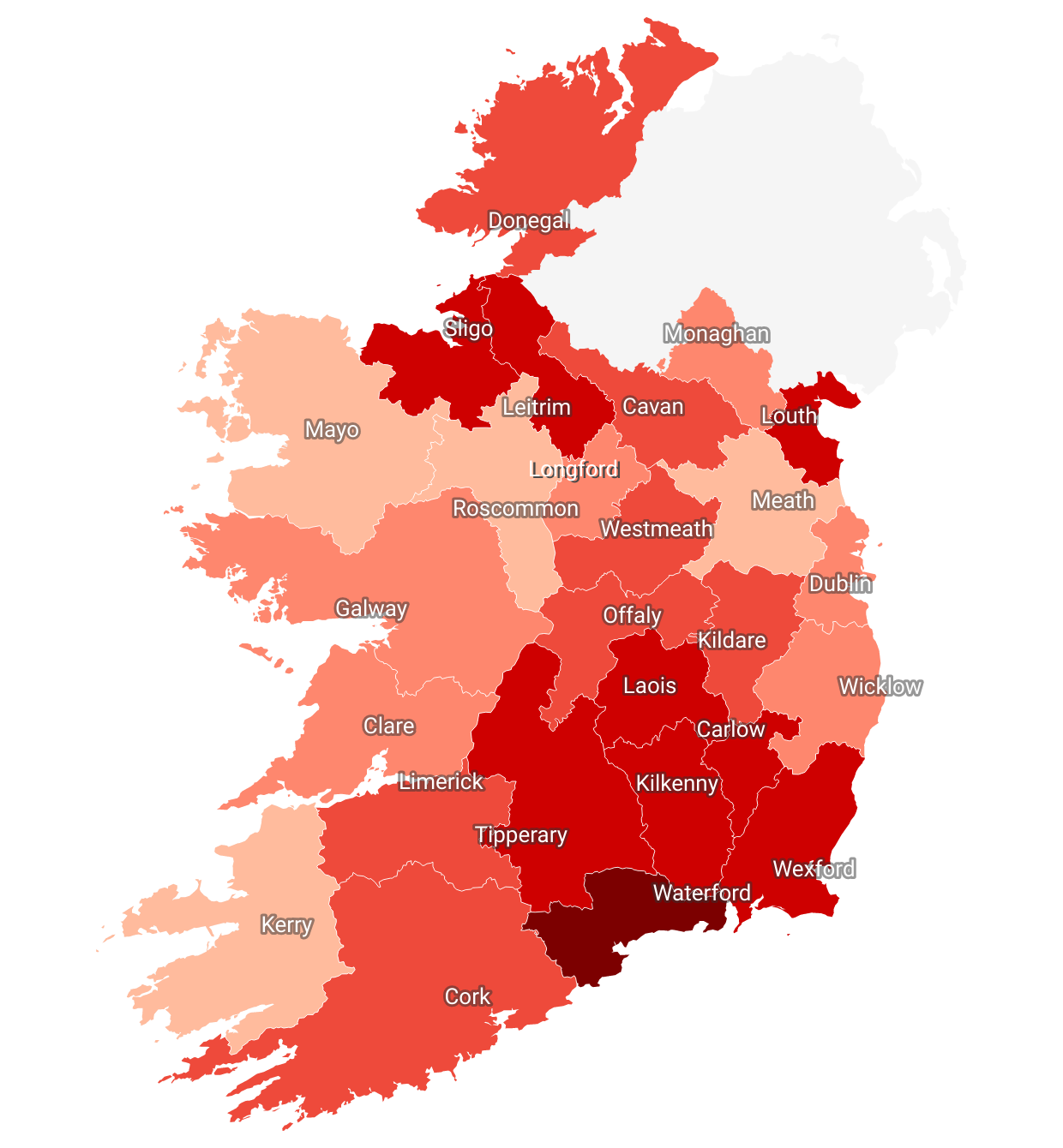
Recoveries update 15/11/20
I have noticed that the recoveries figures have not been changed since 30 July 2020. It has been 4 months.
I went on to the COVID-19 Dashboard released by the Department of Health, and found out that hospital discharges data and info was there.
From the 31 July, 1 person was discharged from hospital, and on 1 August, another person was discharged. From then on, figures released on the dashboard show from 31 July to 15 November, 1,003 people had been discharged from hospital. (all figures from 31/07 to 15/11 added up)
I think we should use hospital discharges as a substitute for recovery figures from now as no Department of Health or HSE or HPSC data shows any recovery figures since the 31 July 2020.
I noticed the Northern Ireland page (https://en.wikipedia.org/wiki/Template:COVID-19_pandemic_data/Northern_Ireland_medical_cases_chart) also uses hospital discharges as a way of recoveries.
I have replaced today's recovery figures to 25,003 because all hospital discharged figures added is totalled to 1,003. Hence, 24,000 recoveries + 1,003 is total to 25,003.
Hospital discharged recoveries will be updated weekly.
I know it's not a bit like recoveries and the figures aren't exact, but it will do for now...
Edl-irishboy (talk) 14:14, 15 November 2020 (UTC)
- Yeah the recovery figures are very old. Been annoying me for some time. I've asked the HSE & dept health several times to update, but nothing. Hospital discharges will have to do i suppose. Better than nothing. I think 80% of people dont need hospital ...& recover or at least aren't actively infectious after 14days. Maybe could look at that too. There is no way we have currently have 40k active cases. Probably more like 4k. Was actually considering removing recovered & active or putting large disclaimer not updated since june as numbers (& lines on graphs) so obviously incomplete. 51.171.197.178 (talk) 19:40, 15 November 2020 (UTC)
The number of recoveries was updated a few days ago, it's now at 25,335, not at the old number of recoveries at 24,000 back in July!
Why was the number of recoveries on the page changed from the proper number of 25,422, with the last update being yesterday back down to 24,000 with the last update being at the end of July? Is that someone's idea of a joke! I'm not laughing.
Remove active cases
Should we remove active cases? I presume this is confirmed cases minus deaths and “recovered” but we haven’t got an recovered update in several months I believe? The question is do we have 48k currently infected people in the country ? If not and don’t know, should we remove this stat?
- I have removed it.
I wonder should we change infobox from
- "Recovered 25,335 (as of 14 December 2020"
to something like
- "Recovered 25,335 (as of 31 Jul 2020)" or
- "Recovered 25,335 (*Not updated since July 2020)" or
- "Recovered 25,335 (*last update July 2020)"
...or whenever the last proper update was. What do people think? Which do you prefer? — Preceding unsigned comment added by 51.171.197.171 (talk) 20:27, 17 December 2020 (UTC)
- The number of active cases needs to be on the page. I need the exact numbers to update a thread on a forum site I go on to keep people updated on how things are going in regards to the pandemic in the Republic of Ireland, plus the number of recoveries was updated just a few days ago, don't go lying claiming the number of recoveries wasn't updated since July 23rd! — Preceding unsigned comment added by 86.42.255.134 (talk) 22:44, 17 December 2020 (UTC)
- OK. Fair enuff. My bad. Not lying. Where/when was it updated? Didnt see that. Citation just points to the dept health dashboard site which doesnt have up to date (or any recovered) figure as far as i can see. My estimate is that his figure should be prob be approx 95% of cases... so real/current number is probably around 70,000+. Think its unlikey more than few % of cases since Jan still active. Can you update the citation with source from a few days ago you mention above. Also main graph line barely moved since late July. Perhaps we should add a *comment that this figure is incomplete (& not fully up to date/complete)? 51.171.197.171 (talk) 23:11, 17 December 2020 (UTC)
- I have added a comment in the discharged hospitalisation source for recoveries as asked for regarding the recovery figure issue. The recoveries figure is discharged from hospitals, so this figure is likely to be larger than it is. Edl-irishboy (talk) 19:08, 18 December 2020 (UTC)
- OK. Fair enuff. My bad. Not lying. Where/when was it updated? Didnt see that. Citation just points to the dept health dashboard site which doesnt have up to date (or any recovered) figure as far as i can see. My estimate is that his figure should be prob be approx 95% of cases... so real/current number is probably around 70,000+. Think its unlikey more than few % of cases since Jan still active. Can you update the citation with source from a few days ago you mention above. Also main graph line barely moved since late July. Perhaps we should add a *comment that this figure is incomplete (& not fully up to date/complete)? 51.171.197.171 (talk) 23:11, 17 December 2020 (UTC)
It was the source that was there before the page got messed up a few days that confirmed the number of recoveries with it being updated, and I want the number of active cases back up. As I said, I need to know, the number of active cases like what was there before the page was messed up. I want the section on the number of active cases restored, if I could do it myself properly I'd do just that right now! The number of active cases including the 582 new cases announced today is at 55,068. I need that on the page for the forum site where I update on how the pandemic is affecting Ireland, otherwise I'd be made out to be a liar! — Preceding unsigned comment added by 86.42.255.134 (talk) 18:34, 18 December 2020 (UTC)
- @86.42.255.134 – As I have said before, there is no point of re-adding the active cases into the infobox. The page was not messed up a few days ago. Only the active cases was removed in the infobox, which is no biggie. I understand that you need this figure for the forum site you update regarding the pandemic in Ireland, but exactly why do you need the forum site? The truth is – even if the active cases is re-added back in the infobox, it will be wrong. No other source on the internet shows the actual, genuine active cases figure for COVID-19 in Ireland. Even Worldometer does not show a genuine active cases figure because it hasn't been really updated since July. Edl-irishboy (talk) 19:08, 18 December 2020 (UTC)
I don't need the forum site. I only update daily as someone has to, so people know how bad the virus is in Ireland and the page was messed up when the active cases section was removed. Restore it! — Preceding unsigned comment added by 86.42.255.134 (talk) 19:25, 18 December 2020 (UTC)
Restore Active cases
The section with the number of active cases should be restored, without it, how are people to know how many active cases of COVID-19 there are in Ireland atm, you don't see that happening on other pages for countries affected by COVID-19, like Australia for example removing it was a terrible decision that needs to be corrected ASAP! — Preceding unsigned comment added by 86.42.255.134 (talk) 18:43, 18 December 2020 (UTC)
- Please read the above section. You keep repeating this... Obviously there are people that want to know how many active cases there are in Ireland. You need to understand that the active cases figure is wrong and have been wrong since July. No other trusted source shows an actual active cases figure for Ireland. And don't mention that there was a figure a few days ago. That was all wrong all together. You don't see this happening in other pages for countries affected by COVID-19 because their active cases figure is actually verified and genuine, but for Ireland, it's not!!Edl-irishboy (talk) 19:13, 18 December 2020 (UTC)
The number of active cases from what we know atm, taking away the number of recoveries and deaths from Covid-19 is at 50,770. Just did the math myself to confirm it, twice. Restore the number of active cases with that as number as the number of active cases as of today, maybe add, subject to change though. Otherwise your making me out to be a lair on the forum site, where daily for months I've updated how people have the virus in Ireland, how many have gotten better, how many are in hospital, etc.
Until we hear different, that is the number of how many active cases there are in the country!
The current number of recoveries at 25,335 updated a few days ago are what I accept as the official number of recoveries from the virus in Ireland, till it's updated again! — Preceding unsigned comment added by 86.42.255.134 (talk) 19:23, 18 December 2020 (UTC)
- Okay, I will restore it. Edl-irishboy (talk) 19:42, 18 December 2020 (UTC)
- Yeah i'm not sure about this. I see other pages are putting n/a (not available) when no up to date (correct) recoveries/active figure is available. Think putting 50k active cases is clearly wrong and if we are going to use it should put a comment or note that figure hasn't been updated since July (apart from a few hosp discharges that Edl-irishboy has cleverly worked out and added on) but is obviously only a fraction of cases recovered as only counts people that go into hospital. Maybe could put a "official figure (july) + recovered after hospitalisation" or something like that. Seems very incomplete though and may only add to confusion. I agree recovered should either be removed or date put as "last update july". I think the current note/date should probably be july with note in citation about few extra hosp discharges since then. I think putting 14 dec creates impression figure is up to that date when it clearly isn't. Maybe mention how incomplete/old this data is in citation/comment. Think date should be july then people know its not current recovered/active. Whole thing is a mess. Dont know why dept of heath dont just update us on proper official figure <shakes head>. 51.171.197.171 (talk) 20:30, 18 December 2020 (UTC)
- I think we should stop the hospitalisation recoveries and replace it with the last proper update from July - 24,000 figure - You have mentioned good ideas but I think it will just add to confusion. I think we should just stick with the 24,000 recoveries and change the comment/citation to "Last update July" or "As of July (dno proper date)". I also see many countries putting N/A as their recovery figure like the UK did that a few months ago but I don't know if they changed it yet. But even if it's changed to 24,000 recoveries, the active cases will still be chaos - it will have over 55k~ cases which is clearly wrong. If I change to 24,000 with a comment "as of July", what should I do to the active cases in infobox or the statistics section? Edl-irishboy (talk) 12:39, 19 December 2020 (UTC)
- Yeah i'm not sure about this. I see other pages are putting n/a (not available) when no up to date (correct) recoveries/active figure is available. Think putting 50k active cases is clearly wrong and if we are going to use it should put a comment or note that figure hasn't been updated since July (apart from a few hosp discharges that Edl-irishboy has cleverly worked out and added on) but is obviously only a fraction of cases recovered as only counts people that go into hospital. Maybe could put a "official figure (july) + recovered after hospitalisation" or something like that. Seems very incomplete though and may only add to confusion. I agree recovered should either be removed or date put as "last update july". I think the current note/date should probably be july with note in citation about few extra hosp discharges since then. I think putting 14 dec creates impression figure is up to that date when it clearly isn't. Maybe mention how incomplete/old this data is in citation/comment. Think date should be july then people know its not current recovered/active. Whole thing is a mess. Dont know why dept of heath dont just update us on proper official figure <shakes head>. 51.171.197.171 (talk) 20:30, 18 December 2020 (UTC)
- Okay, I will restore it. Edl-irishboy (talk) 19:42, 18 December 2020 (UTC)
- Yeah. I agree. This seems reasonable to me. Not much else we can do until get a proper update from dept health. 51.171.196.150 (talk) 20:43, 21 December 2020 (UTC)
- OK i've removed active cases & put recoveries back to last official update (30 Jul). I know its not great but think its all we can do. 51.171.196.150 (talk) 21:50, 21 December 2020 (UTC)
- Thanks for restoring 24,000 figure. What should we do to the active cases line on the first graph on the statistics section? I noticed nothing is happening to it... Edl-irishboy (talk) 18:21, 22 December 2020 (UTC)
- Yeah I was thinking about this too. Not sure. We could maybe remove it... or stop it after July. Something like:
- Thanks for restoring 24,000 figure. What should we do to the active cases line on the first graph on the statistics section? I noticed nothing is happening to it... Edl-irishboy (talk) 18:21, 22 December 2020 (UTC)
- OK i've removed active cases & put recoveries back to last official update (30 Jul). I know its not great but think its all we can do. 51.171.196.150 (talk) 21:50, 21 December 2020 (UTC)
- Yeah. I agree. This seems reasonable to me. Not much else we can do until get a proper update from dept health. 51.171.196.150 (talk) 20:43, 21 December 2020 (UTC)
| Graphs are unavailable due to technical issues. There is more info on Phabricator and on MediaWiki.org. |
- I have revamped the graph in the article and removed the active cases after July. I also noticed that the Median Age (by Week) graph is getting a bit too confusing to understand as it's getting squashed together by previous dates. Overtime, this graph will develop even more and it will be needed to be changed. This situation also happened back in April with the original cases graph. (see first few discussion on talk page) Edl-irishboy (talk) 15:20, 24 December 2020 (UTC)
- Yeah. Could maybe remove it. Think it was kinda useful at start of second wave when growth in cases seemed to be mostly young people but now probably not so useful. Lets look at it again in the new year once things calm down a bit after festive season. — Preceding unsigned comment added by 51.171.197.126 (talk) 23:56, 24 December 2020 (UTC)
- I have revamped the graph in the article and removed the active cases after July. I also noticed that the Median Age (by Week) graph is getting a bit too confusing to understand as it's getting squashed together by previous dates. Overtime, this graph will develop even more and it will be needed to be changed. This situation also happened back in April with the original cases graph. (see first few discussion on talk page) Edl-irishboy (talk) 15:20, 24 December 2020 (UTC)
Because maybe someone at the Dept of health isn't doing their job and needs to be replaced. — Preceding unsigned comment added by 86.42.255.134 (talk) 20:34, 18 December 2020 (UTC)
Active cases section was again removed. Restore it, the number of active cases including today's figures is 53,657! — Preceding unsigned comment added by 86.42.255.134 (talk) 18:38, 22 December 2020 (UTC)
Vaccine rollout
The Hse took its first shipment of the pfizer/biotech vaccine yesterday. Should we add a new section on its rollout across the country. would be nice to have a place to track it, update stats on how many have been vaccinated ect Bpb101 (talk) 15:14, 27 December 2020 (UTC)
- Yeah seems like a good idea to me. Hopefully we will be getting regular daily (or weekly) updates once vaccines start. In the infobox perhaps? I just had a look at infobox template and dowt see anything there for 'vaccinated' or anything like that. I've asked over on the infobox template page too — Preceding unsigned comment added by 51.171.196.173 (talk) 17:41, 27 December 2020 (UTC)
- Yeah a new section on the page is a good idea. I see Northern Ireland has its vaccine section as well. Edl-irishboy (talk) 20:03, 27 December 2020 (UTC)
7-day rolling/moving average of daily cases and deaths
Hey. I see that most COVID-19 articles now have 7-day rolling averages on their graphs, such as the UK, US, India and the Philippines articles. I had to research to see what a "7-day/5-day/14-day rolling average" was, because funny enough - I didn't know! I came across this website that shows a step-by-step guide on how to calculate a 7-day or 14-day rolling average. Its process is actually simple enough! I chose to add a 7 day average because all articles I see is using it. I think we should replace the current graph with this one I revamped:
Daily New Confirmed Cases with 7-Day Moving Average
(Some days include backlog of cases)| Graphs are unavailable due to technical issues. There is more info on Phabricator and on MediaWiki.org. |
Daily New Deaths with 7-Day Moving Average
(Some days include backlog of 'probable' deaths)| Graphs are unavailable due to technical issues. There is more info on Phabricator and on MediaWiki.org. |
We can experiment with colours, but I'm fine with any objections.... I'm now working on the 7-day moving average graph for deaths. Edl-irishboy (talk) 20:13, 27 December 2020 (UTC)
- Good work. Are you calculating it manually or is there a way to automate it (like a simople function maybe)? Do we need 3 decimal places? Is the plan to do weekly (cuz we already have that so dont need to calcualte again)... or u just filling in a weekly of the old ones and will be daily going forward? Anyway looks good. Stick it in 51.171.196.173 (talk) 17:17, 28 December 2020 (UTC)
- Yeah i'm calculating it manually... I don't think there's a way of calculating it automatically sadly... We don't really need 3 decimal places but I just added an extra one for "more detail" I guess, but if it doesn't need to be added, we can remove the extra decimal place. After each day, we add a comma after the latest figure (a bit like the recoveries) - until 7 days (1 week) have passed. That's why it's called a 7-day moving average I'm pretty sure.... But this 7-day moving average graph doesn't need to replace the current Weekly Average Case/Death Graphs.... Edl-irishboy (talk) 18:21, 28 December 2020 (UTC)
- Yeah sure but dont need to only update it once week. Can do a 'rolling 7 day average'. Just use last 7 days and divide by 7 everyday (...or can get from twitter.com/higginsdavidw he posts pretty good dashboard every day). If wanna just do it once a week probably best to do friday & can use figure we already calculate. Save doing basically same thing twice a week in 2 diff places 51.171.196.173 (talk) 19:48, 28 December 2020 (UTC)
- Yeah i tried doing the actual moving average today (use last 7 days and divide by 7 everyday) and it took me the whole day to calculate it. But, however, once I was finished, the graph did not look right. The moving average was wonky, it wasn't on-line and it looked terrible altogether! Literally it wasn't even a 7 day moving average after that. I don't know what I went wrong. Unfortunately, with all this that happened, I just gave up :( Edl-irishboy (talk) 19:24, 29 December 2020 (UTC)
- Actually! I re-tried today and it was successful! I will have it posted by 6pm hopefully. Edl-irishboy (talk) 15:38, 30 December 2020 (UTC)
- OK cool. Actually filled in today myself earlier. Must have been while your work was in progress. Do we need decimal places? — Preceding unsigned comment added by 86.44.85.217 (talk) 19:40, 30 December 2020 (UTC)
- Ah we don't really need decimal places... It already took me hours to do it without the extra decimal places. lol Edl-irishboy (talk) 21:48, 30 December 2020 (UTC)
- OK cool. Actually filled in today myself earlier. Must have been while your work was in progress. Do we need decimal places? — Preceding unsigned comment added by 86.44.85.217 (talk) 19:40, 30 December 2020 (UTC)
- Yeah sure but dont need to only update it once week. Can do a 'rolling 7 day average'. Just use last 7 days and divide by 7 everyday (...or can get from twitter.com/higginsdavidw he posts pretty good dashboard every day). If wanna just do it once a week probably best to do friday & can use figure we already calculate. Save doing basically same thing twice a week in 2 diff places 51.171.196.173 (talk) 19:48, 28 December 2020 (UTC)
- Yeah i'm calculating it manually... I don't think there's a way of calculating it automatically sadly... We don't really need 3 decimal places but I just added an extra one for "more detail" I guess, but if it doesn't need to be added, we can remove the extra decimal place. After each day, we add a comma after the latest figure (a bit like the recoveries) - until 7 days (1 week) have passed. That's why it's called a 7-day moving average I'm pretty sure.... But this 7-day moving average graph doesn't need to replace the current Weekly Average Case/Death Graphs.... Edl-irishboy (talk) 18:21, 28 December 2020 (UTC)
Cases per 100k in infobox ...with increase/decrease coloured arrows (like new deaths, hospitalised, etc) ?
I like the new up/down ![]() red/green
red/green![]() arrows in the infobox. Is it possible to implement these for cases per 100k? Would be quite useful to see at a glance where we are and which way the trend is heading. 51.171.196.173 (talk) 23:50, 25 December 2020 (UTC)
arrows in the infobox. Is it possible to implement these for cases per 100k? Would be quite useful to see at a glance where we are and which way the trend is heading. 51.171.196.173 (talk) 23:50, 25 December 2020 (UTC)
- sounds good to me. should we have a graph to show it up and down over a longer period? Bpb101 (talk) 15:07, 27 December 2020 (UTC)
Added 24hr increase (plus colored up down arrow ![]() red/green
red/green![]() ) to 14day per 100k number in infobox under county map. 51.171.196.173 (talk) 22:15, 28 December 2020 (UTC)
) to 14day per 100k number in infobox under county map. 51.171.196.173 (talk) 22:15, 28 December 2020 (UTC)
I Think we should probably limit the infobox updates to once a day with the new daily increase info:
- hosp =
 409 (+24)
 - ICU = 34 (+4)
If they are updated a few times a day by different people from different sources at different times the +/- figure becomes a bit meaningless and hard to compare. For instance the "hospitalised" figure is updated at least 3 times a day from HSE (8am, 2pm 8pm and possibly other times on datahub/various media reports). From the start the figure we've used are from HSE daily PDF at 8pm (published usually around 10pm). I've been doing this from the start and using the same figure from the same source to ensure consistency. Would probably be best to leave yesterdays figure till todays update so can easily see + or - difference. Today the hosp figure is already (+24) and yday number gone (8pm-8am or 2pm or something else impossible to tell on datahub). So i cant easily work out daily difference when i update it later when pdf published. I also do the hosp/icu/ventilate graph from same source at same time... or whenever pdf is published. Can be a bit late sometimes particularly at weekends or bank holidays. Its me 51.171. BTW but looks like my IP has changed to 86.44.85.217 (talk) 17:28, 29 December 2020 (UTC)
- & Confirmed Cases in ICU: 34 recorded at 11am and 7:30pm on datahub — Preceding unsigned comment added by 86.44.85.217 (talk) 17:47, 29 December 2020 (UTC)
- Well said. Looking through the page history, it seems that we have a new editor on the article @INgIEroC. I've noticed that INgIEroC is mostly online all of the time, updating recent data and stats such as the active hosp/icu figures in the infobox. It seems to me that the "format" for the fatality rate in the infobox is always being removed for no reason. Every time I update cases/deaths released (usually at 6pm), the fatality rate format is removed. The format for fatality rate is Percentage|Total deaths|Total cases|2. For example for this evening's f. rate is Percentage|2237|91779|2, but this is always getting removed. Strange. Edl-irishboy (talk) 20:29, 31 December 2020 (UTC)
- It was me who removed the case fatality rate format during the last few days.
- I was editing the case fatality rate to what it was on a certain day.
- Rather than using the ‘Percentage|Total deaths|Total cases’ as usual, I would type in (e.g) ‘2.44%’
- I thought that it would show up the same way as it would if the other format was used.
- I have been doing that since I found it easier. Until now, I didn’t know how to do it in the format you were describing above since I’m relatively new.
- I apologise if I messed anything up. INgIEroC (talk) 20:56, 31 December 2020 (UTC)
- You're all right. You didn't mess anything up. Thanks for updating the page. You're more online than me ! 🤣 Just put in the total deaths along with total cases for the fatality rate, for e.g. the Percentage|X|X|2 thing is already there. Just replace the first X with total deaths, second X with total cases. On the page it won't have the X's though. It will show the actual total deaths and the actual total cases figures from that date. If you still don't understand, you can leave it to me to update it. Edl-irishboy (talk) 23:23 31 December 2020 (UTC)
- Alright then. INgIEroC (talk) 23:39, 31 December 2020 (UTC)
- It's good that you are keeping up to date with the latest data of hosp/icu in the infobox, but however, you don't really need to update it 3 times a day. Maybe just update it once a day. See above for more. Edl-irishboy (talk) 13:49, 1 January 2021 (UTC)
- Alright then. INgIEroC (talk) 23:39, 31 December 2020 (UTC)
- You're all right. You didn't mess anything up. Thanks for updating the page. You're more online than me ! 🤣 Just put in the total deaths along with total cases for the fatality rate, for e.g. the Percentage|X|X|2 thing is already there. Just replace the first X with total deaths, second X with total cases. On the page it won't have the X's though. It will show the actual total deaths and the actual total cases figures from that date. If you still don't understand, you can leave it to me to update it. Edl-irishboy (talk) 23:23 31 December 2020 (UTC)
- I apologise if I messed anything up. INgIEroC (talk) 20:56, 31 December 2020 (UTC)
Okay then, that’s grand. I have read what was said above, I’ll update the figures once the HSE release their daily operations update presentations at the end of the day. INgIEroC (talk) 20:58, 2 January 2021 (UTC)
Vaccinated?
I see the number vaccinated was published today = 1800. Wonder where we should put it. Maybe in the header paragraph of statistics
By 1 January, the Department of Health had confirmed 93,532 cases and 2,248 deaths;[1] a rate of 18,484 cases per million, 451 deaths per million and 478,268 tests per million population.[48]
Although someone said we should probably use the term "inoculated" instead of "vaccinated" but thats a discussion for another day — Preceding unsigned comment added by 51.171.196.6 (talk) 21:42, 1 January 2021 (UTC)
- I didn't know the number vaccinated was published today. Where did you find that 1800 had been vaccinated? I think we should put the number on the Vaccines section because we have our own section for vaccines now. Edl-irishboy (talk) 22:04, 1 January 2021 (UTC)
- Done (with reference/citation) — Preceding unsigned comment added by 51.171.196.6 (talk) 22:05, 1 January 2021 (UTC)
Clusters (and all other graphs) on page update with new year format now. Should be good to go for updates. Let me know if i missed any? Think i got them all 51.171.196.6 (talk) 22:07, 1 January 2021 (UTC)
- Well done. Edl-irishboy (talk) 22:18, 1 January 2021 (UTC)
From rte today
Mr Donnelly also confirmed that the number of vaccinations being carried out per day in Ireland will be added to the Covid-19 Ireland data hub.
Do yeah. Lets get this added Bpb101 (talk) 16:52, 2 January 2021 (UTC)
Would put it in the info box^ Sorry on phone and its crap for replying on talk Bpb101 (talk) 16:53, 2 January 2021 (UTC)
- OK i've added it into the infobox too. Format needs a bit of work though. Can't get it to display the same as the others as its just text ...is not a proper category (currently). — Preceding unsigned comment added by 51.171.196.6 (talk) 18:39, 3 January 2021 (UTC)
Backlogged cases 04/01/21
As we are aware, the large increase in daily confirmed cases is because of a delay in positive tests (backlogged cases) since Christmas. Do we have figures showing the amount of backlogged cases each day? Like in April 2020, we had backlogged cases as well because of delayed testing from a lab in Germany, that time, we had figures showing the amount of cases that are backlogged. I'm just wondering if we have any figures on that now? I've went through the NPHET's statements from 2 January and I can't find any figures for backlogged cases. Edl-irishboy (talk) 19:30, 4 January 2021 (UTC)
- I've seen a few people estimating these... See "unreported" here (from few dys ago): https://twitter.com/higginsdavidw/status/1345056218411372544 & Looks like they starting to clear backlog now anyway: https://twitter.com/higginsdavidw/status/1346154152032952322 ...but i think we should stick to cases as they reported. Otherwise could end up reporting them twice. Lets stick to the official numbers. Can see "Epidemiological date" v "Notification date" here on page 2: https://www.hpsc.ie/a-z/respiratory/coronavirus/novelcoronavirus/casesinireland/epidemiologyofcovid-19inireland/COVID-19%20Daily%20epidemiology%20report%20(NPHET)_20201230_website.pdf (most recent release 30 dec - which may have something to do with back log) but we should stick with what we have been doing as to do otherwise would mean going back and editing last few weeks each day with no clear numbers & subject to change/revision after the publication IMHO 51.171.196.6 (talk) 20:21, 4 January 2021 (UTC)
- Ok, we'll stick to official numbers. I was just wondering because in April, when we also had backlogged cases, NPHET actually gave us the actual daily backlogged case numbers. Edl-irishboy (talk) 01:50, 5 January 2021 (UTC)
- Oh yeah, the German lab cases. Think its a bit different this time as the back log is in ireland & as far as i understand due to people not seeking tests over xmas & system not being able to handle the numbers when they did. Maybe we can look at it if they issue 'proper' numbers for last few days at some stage — Preceding unsigned comment added by 51.171.196.150 (talk) 16:57, 5 January 2021 (UTC)
- Ok, we'll stick to official numbers. I was just wondering because in April, when we also had backlogged cases, NPHET actually gave us the actual daily backlogged case numbers. Edl-irishboy (talk) 01:50, 5 January 2021 (UTC)
Hospital, ICU and Ventilated Graph scale
OK Removed Median Age (i'll just stick it here for now)
| Graphs are unavailable due to technical issues. There is more info on Phabricator and on MediaWiki.org. |
51.171.196.131 (talk) 17:55, 8 January 2021 (UTC)
This getting hard to see. Gonna try few things. May have to try log scale ..or maybe split.
| Graphs are unavailable due to technical issues. There is more info on Phabricator and on MediaWiki.org. |
| Graphs are unavailable due to technical issues. There is more info on Phabricator and on MediaWiki.org. |
| Graphs are unavailable due to technical issues. There is more info on Phabricator and on MediaWiki.org. |
- Yeah, this graph needs to be changed and split. The "in hospital" graph certainly should go on its own as it's important and high at the moment. Does the "currently ventilated", "daily admitted to hospital" and "daily admitted to ICU" data/graph need to be there as the ventilated figures are in the infobox as well. I don't really know what to do to the daily admitted to hosp & icu's, but the currently in ICU should also probably be on its own, like the current in hospital. We can't split this graph to all different individual parts because it will just look ridiculous and messy in my opinion.
For the daily admitted to hospital and ICU, we can probably put it in the infobox, along with the total & active hosp/icu figures. For example:
Hospitalised cases:
Critical cases:
I know it's not ideal but it will have to do.... Separately, I think we should remove the "Median age (by week)" graph as it's out of date and too hard to understand it. Edl-irishboy (talk) 13:36, 8 January 2021 (UTC)
- Yeah not sure about a split after looking at it... agree splitting into 5 different graphs is not a good solution. As for hosp ICU admission in infobox might be a bit misleading as new dailys is always gonnna increase ie " 1 (daily admitted)" but 4 could be discharged so would give incorrect overview. Think we already got this covered in 1,043 (+89) (active) as this shows 24hr change & can go to green down arrow
 -3 if more are discharged than admitted. Think we still need ICU Hosp graph as cannot see historic trend (previous peaks & lows) in infobox (can only see today & yday)... so people cant see where we are in relation to previous waves/surges if we remove. 51.171.196.131 (talk) 17:55, 8 January 2021 (UTC)
- Ok, what should we do to the graph then? I am also noticing that because of the recent spikes in cases, the first peak in April/May and the second peak in October/November on the daily new confirmed cases graph looks small, but it's still understandable. Same with the 7-day average new cases graph - the peak in today's figure is ruining the older figures. Like we can barely see the June and July figures on the graph now. I have changed the width of the graph to make it longer. Edl-irishboy (talk) 19:27, 8 January 2021 (UTC)
- Dunno. Not really much we can do. Try making graphs a bit taller maybe (like Hosp/icu). Could do log scale but it tends to make the increase look smaller than it actually is & overemphasise early cases. Think we'll just have to live with how it looks (ie bad)...because new peak dwarfs earlier peaks & thats just where we are unfortunately. Just had another look: Maybe remove 7day average (line black) so can see orange line a bit easier. Can see 7day average case in bar chart (with number) anyway so maybe dont need if just covering orange line. Trend pretty clear even without it. 51.171.196.131 (talk) 19:52, 8 January 2021 (UTC)
- Ok, what should we do to the graph then? I am also noticing that because of the recent spikes in cases, the first peak in April/May and the second peak in October/November on the daily new confirmed cases graph looks small, but it's still understandable. Same with the 7-day average new cases graph - the peak in today's figure is ruining the older figures. Like we can barely see the June and July figures on the graph now. I have changed the width of the graph to make it longer. Edl-irishboy (talk) 19:27, 8 January 2021 (UTC)
Daily new confirmed cases with 7-day moving average (Some days include backlog of cases)
| Graphs are unavailable due to technical issues. There is more info on Phabricator and on MediaWiki.org. |
or
Daily new confirmed cases with 7-day moving average (Some days include backlog of cases)
| Graphs are unavailable due to technical issues. There is more info on Phabricator and on MediaWiki.org. |
- I just tweaked it a bit. I dont' want to remove the moving average. It'll do for now I guess.....
The lowest point of coronavirus infections was 2 (28/6/20), but the highest was 6,110 (4/1/21). — Preceding unsigned comment added by 93.95.87.186 (talk) 21:55, 9 January 2021 (UTC)
- What's the point of this? The highest point of infection was actually on 8 January 2021 at 8,248 infections. Edl-irishboy (talk) 16:38, 10 January 2021 (UTC)
Fatality rate
| Graphs are unavailable due to technical issues. There is more info on Phabricator and on MediaWiki.org. |
I'm not good at fatality rates but should the arrow in infobox not be ![]() ? Instead, it's
? Instead, it's ![]() 1.59%. Edl-irishboy (talk) 14:19, 11 January 2021 (UTC)
1.59%. Edl-irishboy (talk) 14:19, 11 January 2021 (UTC)
- Fatality rate falling is good... so i think green is the correct colour 51.171.196.131 (talk) 17:49, 11 January 2021 (UTC)
- I wonder should we track/graph this. i've been having a look at the last few weeks "Epidemiology of COVID-19 in Ireland - 14 day report Report prepared by HPSC on 10/01/2021" from here: https://www.hpsc.ie/a-z/respiratory/coronavirus/novelcoronavirus/surveillance/covid-1914-dayepidemiologyreports/ page 1. Just noticed date is backwards ...but u get the idea 51.171.196.131 (talk) 20:12, 11 January 2021 (UTC)
Yeah, green is the correct colour for the case fatality rate. INgIEroC (talk) 17:25, 12 January 2021 (UTC)
Deaths Detailed Info No Longer Being Published
Deaths detailed info (age profile & gender split) not being published anymore. From HSE: "Note: As of 4th January 2021, the Epidemiology of COVID-19 in Ireland Daily Report is replaced by an infographic" (here: https://www.hpsc.ie/a-z/respiratory/coronavirus/novelcoronavirus/casesinireland/Not really sure what do do about this. I've managed to find the gender breakdown elsewhere but not age. Any ideas? — Preceding unsigned comment added by 51.171.196.131 (talk) 17:54, 11 January 2021 (UTC)
- Don't really know what to do about this unfortunately..... It's strange why the HSE would remove this. Edl-irishboy (talk) 19:22, 11 January 2021 (UTC)
- Yeah seems like a definite backwards step to me. Especially as deaths are rising & are most likely going to continue rising (lagging surge in cases). Anyway I've been having a bit of a look around and think can hack this... I've found the new death detail in the fortnightly reports so when its released tomorrow (2 weeks from last update) i'll add it on manually. 51.171.196.131 (talk) 20:18, 11 January 2021 (UTC)
- OK I found a new source for this deaths data. Published in a different place now (and only weekly) but that will do i suppose. Have updated main page today & will do same next week. From: https://www.hpsc.ie/a-z/respiratory/coronavirus/novelcoronavirus/surveillance/epidemiologyofcovid-19inirelandweeklyreports/ 51.171.197.35 (talk) 17:30, 12 January 2021 (UTC)
- Yeah seems like a definite backwards step to me. Especially as deaths are rising & are most likely going to continue rising (lagging surge in cases). Anyway I've been having a bit of a look around and think can hack this... I've found the new death detail in the fortnightly reports so when its released tomorrow (2 weeks from last update) i'll add it on manually. 51.171.196.131 (talk) 20:18, 11 January 2021 (UTC)