Talk:Sea level rise
| Sea level rise has been listed as one of the Natural sciences good articles under the good article criteria. If you can improve it further, please do so. If it no longer meets these criteria, you can reassess it. Review: February 2, 2019. (Reviewed version). |
| The contents of the Future sea level page were merged into Sea level rise on 15-08-2018. For the contribution history and old versions of the redirected page, please see its history; for the discussion at that location, see its talk page. |
| This It is of interest to the following WikiProjects: | ||||||||||||||||||||||||||||||||||||||||||||||||||||||
| ||||||||||||||||||||||||||||||||||||||||||||||||||||||


|
Daily pageviews of this article
A graph should have been displayed here but graphs are temporarily disabled. Until they are enabled again, visit the interactive graph at pageviews.wmcloud.org |
Index
|
||||||
|
This page has archives. Sections older than 365 days may be automatically archived by Lowercase sigmabot III when more than 6 sections are present. |
Copy editing, trimming & Migration edit
Hello y'all. Thanks to all who have contributed so much interesting info to this article. Im planning to undertake a little copy edit run to see if the unsightly tag can be removed. I'll likely also do a little trimming. Much as I agree with ITK's arguments, the article does seem too long. No worries if anyone reverts these changes if they don't see them as improvements, especially the trimming, its always unpleasant to remove another editors work.
One change that I do think should remain at least in some form is the update concerning migration. Considering there's a strong possibility of climate migrations numbering between 0.5 – 1.5+ billion souls within the lifetimes of some here, the subject is a little under discussed in the sources. But in the specific case of SLR, António Guterres spoke about the risk of SLR alone impacting on almost a billion, causing mass migration on a "biblical scale". The good secretary general's warning was widely reported in the media, so does seem to warrant inclusion. FeydHuxtable (talk) 15:14, 25 February 2023 (UTC)
- Thank Feyd! Would be great to bring out good the best parts of these recent additions by trimming. For anything as sensitive as migration, do use high quality secondary sources. Femke (alt) (talk) 18:57, 25 February 2023 (UTC)
- Where do we stand now regarding article length? It strikes me as still a bit too long (66 kB (10944 words) "readable prose size"); perhaps aim to get it to around 50 kB? Just wondering if there are any obvious sections where trimming could be done. Pinging FeydHuxtable EMsmile (talk) 12:53, 27 June 2023 (UTC)
- I've added the template for section sizes to the top of the talk page and it shows that the sections on causes (particularly the Antarctica section) and on regional impacts stand out as being rather long (but perhaps that cannot be changed, I am not sure). EMsmile (talk) 12:56, 27 June 2023 (UTC)
- Agreed, and especialy that the 'section sizes' template should be useful for future trimming. I'd already trimmned all the content I was confident no one would object to, so for now nothing to add to Femke's advise on possible bits to trim. FeydHuxtable (talk) 19:36, 3 July 2023 (UTC)
- I've added the template for section sizes to the top of the talk page and it shows that the sections on causes (particularly the Antarctica section) and on regional impacts stand out as being rather long (but perhaps that cannot be changed, I am not sure). EMsmile (talk) 12:56, 27 June 2023 (UTC)
- Where do we stand now regarding article length? It strikes me as still a bit too long (66 kB (10944 words) "readable prose size"); perhaps aim to get it to around 50 kB? Just wondering if there are any obvious sections where trimming could be done. Pinging FeydHuxtable EMsmile (talk) 12:53, 27 June 2023 (UTC)
What to remove, and what to add edit
So, at this point, we all seem to agree that the article is too large, right? I went for another attempt at condensing the article, and it did get slightly smaller - now at 10778 words. Still, according to Femke, this article needs to be at most exactly 10k words to qualify for Featured - so, we still essentially need trim a thousand words from somewhere to be in the running.
Looking at the recent revisions, I would say that an easy target is this edit by Datatada. No-one appears to have spotted it, but what those sentences describe are the consequences of climate change in general ("climatic shift") not sea level rise specifically. It's an easy choice to cut it, but shedding those 73 words only brings us ~10% closer to the goal.
Another choice which should be relatively easy is the last paragraph of Small Island States - the whole, "international mining conglomerates will move in once they are flooded" relies on a single Dutch-language from 1989 (that is, a year before the first IPCC report!) and considering the spotlight these nations have fought for in the recent summits, it's safe to assume it doesn't represent reality any longer unless proven otherwise. That sheds another 62 words, unless a more recent, credible source can be found which isn't contradicted by a better source.
Unfortunately, it seems like cutting the last ~600 words would require painful decreases of what seems like universally good and valuable data left. Moreover, it raises another question: with the article already past its suggested limits, what kind of material is valuable enough to include, and which one should be left out?
Some notable research/articles from this year, any and all of which may qualify for inclusion.
- New LiDAR-Based Elevation Model Shows Greatest Increase in Global Coastal Exposure to Flooding to Be Caused by Early-Stage Sea-Level Rise - this (plus its secondary source say that sea level rise will cover far more land over the first two metres in the earlier estimates (with less afterwards). This presumably belongs somewhere in "Impacts"?
- Future socioeconomic development along the West African coast forms a larger hazard than sea level rise - in some ways, it makes the same point the article already does when quoting IPCC report for the African section, but this study is fully BY, and there are some figures which may be really helpful (probably more so than my choice to show several major city coastlines when creating this section last year.)
- Large obliquity-paced Antarctic ice-volume fluctuations suggest melting by atmospheric and ocean warming during late Oligocene - may fit for past sea level rise section, though the decisions of what research to include and what to exclude there will probably always be a little arbitrary.
- High-Tide Flooding Along the China Coastline: Past and Future - could be useful for Aisa section, but it's already quite large. (Moving some of it to regional climate change page might be a good idea eventually, but I'm hesitant to do it now due to often-dubious quality of those, and what appears like their relatively low visibility according to Wikipedia:WikiProject Climate change/Popular articles.)
- Multistability and Transient Response of the Greenland Ice Sheet to Anthropogenic CO2 Emissions - definitely has to be featured in the GIS article (along with any number of secondary sources), but the question is whether we have the space for it here as well.
- Future sea-level projections with a coupled atmosphere-ocean-ice-sheet model - this one is interesting because while its numbers can still give pause, it seems to contradict several earlier papers we have featured extensively and suggests lower Antarctica-driven sea level rise than they do. Including it will likely require relatively long explanation.
- Fearmongering about people fleeing disasters is a dangerous and faulty narrative - what makes this academic commentary very interesting is the pointed criticism it makes of Guterres' remarks FeydHuxtable added earlier this year, as seen on this talk page. Interestingly, my brief search on the subject turned up mostly paywalled research but also two year 2021 papers, whose estimates of displacement are also notable for being much lower than Guterres' claims. I feel like we cannot just leave those in place now without some sort of qualification considering the opposition from these reliable sources - but that will again take us further away from the ideal article length.
- And then there is this paper, which has some interesting numbers, but happens to come from Frontiers.
In all, thoughts? InformationToKnowledge (talk) 17:28, 29 June 2023 (UTC)
- I've mostly stopped editing climate change articles for now, but really excited to see you work towards FA. In terms of word count, the "ideal" is a rough 8k, with some people opposing if it gets over 10,000. So if we can, we may want to condense more. The ideas you have are good, as those old primary sources will defitintely give you trouble at FA level.
- One key place to cut is the lead. It now stands at 755 words, which means that most paragraphs are too long to comfortably read for somebody with slightly below-average reading skills. Aim for around 500 words, and a Flesh reading ease over 45/50 (now 42 according to readable.com). That way, a larger share of people will be able to read the entire introduction. The first paragraph is too number-heavy. I would cut some things myself, but it seems like some of the information is unique to the lead (the lead should only summarize the article, so this is an issue already at GA level).
- I think the difference between accelaration and a normal lagged response is too technical. If we omit this, and just say how much it'll rise, that would make it easier
- The numbers in the second paragraph come from a primary source (tens/hundreds). Is there a secondary source we can use that says it more concisely
- The third paragraph is about regional impacts. Yet, the last sentence of the second paragraph talks about individual cities based on a Guardian article. This can be omitted, as it's a bit repetitive to single out cities ánd countries in the lead.
- local factors like tides, currents, storms, tectonic effects and land subsidence. -> which are the two most important ones?
- The statement about migration in the third paragraph does not seem supported by the cited source. The body of the article quotes a non-scientist on migration, and given the controversy around the topic, I do not believe this to be properly supported. You may want to omit, and cite is more robustly in the body
- Fourth paragraph looks good.
- For the rest of the article, it's often using less information from sourcing that makes it the text more "professional" / suitable to a lay audience. For instance, I get bored before I read the end of the following: "In the near term, some of the largest displacement is projected to occur in the East Africa region, where at least 750,000 people are likely to be displaced from the coasts between 2020 and 2050. It was also estimated that by 2050, 12 major African cities (Abidjan, Alexandria, Algiers, Cape Town, Casablanca, Dakar, Dar es Salaam, Durban, Lagos, Lomé, Luanda and Maputo) would collectively sustain cumulative damages of USD 65billion for the "moderate" climate change scenario RCP4.5 and USD 86.5billion for the high-emission scenario RCP8.5: the version of the high-emission scenario with additional impacts from high ice sheet instability would involve up to 137.5billion USD in damages. Additional accounting for the "low-probability, high-damage events" may increase aggregate risks to USD 187billion for the "moderate" RCP4.5, USD 206billion for RCP8.5 and USD 397billion under the high-end instability scenario". Can you pick out the most relevant numbers? —Femke 🐦 (talk) 18:24, 29 June 2023 (UTC)
Hello ITK, great to see you're possibly interested in elevating this article to FA class. If you’d like to trim the line with António Guterres's "biblical scale" quote from the article, I've no objection.
That said, the above arguments against the good secretary-general are not even wrong. I listened to the whole of his SLR address to the UN, that's why I came to this article in the first place. At no point did Guterres make a quantitative forecast on migration numbers. So there's no possibility of estimates from 2021 papers "being much lower than Guterres' claims". I'd guess the confusion may arise from various disengaged academics misunderstanding Guterres's metaphor when he said SLR might bring a 'torrent of trouble' to almost a billion people. 'Torrent of trouble' essentially meant disruption to their lives, not forced displacement for almost a billion! That would be ludicrous. It's important to understand that folk like Guterres are informed by the best available mainstream science, and are not going to make fringe claims. It may also be helpful to appreciate Guterres's target audience was UN delegates and other players involved in world governance. Those sort of folk are engaged with practical reality and can be relied on to hear his intended meaning. Granted, Guterres did speak of SLR threatening a mass exodus on a "biblical scale". But this is entirely inline with mainstream predictions. In biblical times, the earths' population was far lower than today. The dramatic wording connotes disasters affection entire peoples or nations as happened in various Bible stories - which is exactly the expected plight faced by various low lying island states. Changing track a bit, you might benefit from considering the economy of expression in Guterres's words, and how they compare with the long sentence on displacement Femke mentioned above, where the list of dry facts are boring even to an accomplished data scientist.
I see the 'Conversation' source suggests Guterres dramatic rhetoric might worsen anti-migrant sentiment. To clarify, Guterres is not an imbecile. He knows that. He's also in a position to judge the effect his words will have in inspiring action & weakening opposition across the worlds different political constituencies. Not to mention the effect on the political unconscious, and various non instrumental reasons like giving public recognition to the existential threat facing various marginalised peoples. When you hold an office like UN secretary-general, you can't always express yourself in flat, neutral language. Sometimes you have to take actions that are going to have mixed results. To do otherwise would be an abhorrent dereliction of duty. It's doubtful the mid rank academics who wrote that 'Conversation' piece are even capable of understanding such matters. The Conversation (website) is little more than a WP:RSOPINION expert blog in this context, not the sort of high quality WP:RS we'd want to set against someone like Guterres.
For future reference, if you come across an addition of mine you'd like to remove or change, you're welcome to simply go ahead and make the edit. See WP:Bebold. Unless perhaps it's a very major change, no need to start a talk page section, and definitely no need to ping me. Unless you want to of course. It's just there's a risk of setting me off if I read nonsense like in that source attempting to criticise the good secretary-general. Almost as annoying as seeing an editor trying to diss the Colonel! FeydHuxtable (talk) 19:36, 3 July 2023 (UTC)
A Commons file used on this page or its Wikidata item has been nominated for deletion edit
The following Wikimedia Commons file used on this page or its Wikidata item has been nominated for deletion:
Participate in the deletion discussion at the nomination page. —Community Tech bot (talk) 10:38, 26 February 2023 (UTC)
Article title, short description, and lede edit
The short description This article is about the current and projected rise in the world's average sea level from climate change. For sea level rise in general, see Past sea level.
. The focus of this article is affirmed by the lede which begins Between 1901 and 2018 …
.
Given that, IMO, this article should be named Sea level rise (current and projected) and Past sea level should be named Sea level rise.
I came to this article looking for general information on sea level rise and found the title very misleading in view of the content. I see there has been discussion around related issues in the archives, but the present state is, at minimum, incoherent. Humanengr (talk) 18:00, 11 June 2023 (UTC)
- I have no firm view on this but I think the consensus was that as per WP:Commonname, the term "sea level rise" is mostly used for the currently happening sea level rise, not the one from other geological time scales. So from that perspective, the current naming convention would be fine. EMsmile (talk) 09:00, 16 June 2023 (UTC)
Question about the section on causes edit
The section on causes had the following sub-structure so far:
Ocean heating
Antarctica
Greenland
Glaciers
Land water storage
I have changed that now to this as something like "Greenland" is not an actual cause description (and it also makes it easier to jump directly to the section of interest from the table of content):
Ocean heating
Changes of Antarctica's ice mass balance
Greenland ice sheet melting
Glaciers melting
Sea ice melting
Changes to land water storage
Did I get this right and do people agree with this? I wasn't sure about the Antarctica section as it's complicated. Therefore just "Antarctica melting" wouldn't be correct. Is "Changes of Antarctica's ice mass balance" is OK? Or "Changes to Antarctica's ice mass balance" is better? EMsmile (talk) 12:44, 27 June 2023 (UTC)
Changes to land water storage edit
This content in "Changes to land water storage" is not clear to me, could someone take a look and improve it for more clarity?:
"Humans impact how much water is stored on land. Building dams prevents large masses of water from flowing into the sea and therefore increases the storage of water on land. On the other hand, humans extract water from lakes, wetlands and underground reservoirs for food production leading to rising seas.
"
My questions: the building of dams just temporarily changes how much water flows to the ocean but not once the dam has operated for a while. Or are you referring to evaporation from the dam's surface? Also why does the extraction of water from lakes lead to rising sea levels? For extraction from groundwater I can imagine this but not from lakes? And aren't those amounts rather insignificant compared to the other process, i.e. melting and heating? EMsmile (talk) 12:49, 27 June 2023 (UTC)
- Thanks for those comments, which are an excellent demonstration of the need for clear and accurate language. I have edited this section and I hope the new version is clearer. Ehrenkater (talk) 15:45, 27 June 2023 (UTC)
- Hi Ehrenkater, thanks for trying to help but it's still not clearer for me. The sentences themselves are simple enough but the concepts are not explained properly: Dams hold back water but the system will reach steady state when the dam has been operating for a few years, so it's only during dam construction that less water reaches the sea, right? Or is the issue more about the evaporation from the dams? Secondly why would extraction from lakes lead to rising seas? I think this section is probably trying to summarise some complex interactions but it's been summarised so much that for a lay person the logic has become lost? EMsmile (talk) 08:36, 28 June 2023 (UTC)
- the current wording is now (marginally clearer than before):
Human activity impacts how much water is stored on land. Dams retain large quantities of water, which is stored on land rather than flowing into the sea (even though the total quantity stored will vary somewhat from time to time). On the other hand, humans extract water from lakes, wetlands and underground reservoirs for food production, which may lead to rising seas.
EMsmile (talk) 08:36, 28 June 2023 (UTC)
- the current wording is now (marginally clearer than before):
- Hi Ehrenkater, thanks for trying to help but it's still not clearer for me. The sentences themselves are simple enough but the concepts are not explained properly: Dams hold back water but the system will reach steady state when the dam has been operating for a few years, so it's only during dam construction that less water reaches the sea, right? Or is the issue more about the evaporation from the dams? Secondly why would extraction from lakes lead to rising seas? I think this section is probably trying to summarise some complex interactions but it's been summarised so much that for a lay person the logic has become lost? EMsmile (talk) 08:36, 28 June 2023 (UTC)
Took out stripe chart edit
_Richard_Selwyn_Jones.png)
I've removed the strip chart because: I am not sure about this stripe chart, seems like the image was taken from a tweet - gets flagged up as unreliable. Also I think stripe charts work better with temperatures. But perhaps others love it? EMsmile (talk) 07:20, 10 July 2023 (UTC)
- — This is an example of a Warming stripes diagram, designed to immediately and intuitively communicate quantitative concepts to non-scientists. They don't just "work better with temperatures" even though that was their first application. Warming stripes are in contrast to line graphs, which make many people's eyes glaze over in perplexity. Warming stripes are "new" (2018-) and there is resistance to anything new; accordingly if your requirement is that editors "love it", then it will fail your test.
- — I'm interested: where was it "flagged up" as "unreliable"? Obviously, being in a tweet does not make it inherently "unreliable". Here, tweet author Richard Selwyn Jones (bio) is a reliable source for basic information, especially since the tweet credits an article in Surveys in Geophysics. —RCraig09 (talk) 16:11, 10 July 2023 (UTC)

- It was flagged up by this script as being unreliable: https://en.wikipedia.org/wiki/User:Headbomb/unreliable That's because the tweet is given as the source. If the journal article was given as the source it wouldn't have been flagged, I guess. Overall, I find this chart takes far too long to understand and to convey the same information that is in the "normal" line chart in the lead (see on the right). I guess you are trying to point out that SLR per year is accelerating? It should be possible to do this in a different way, like plotting the slope of the rise over time. (I know you are a big fan of those stripe charts but not everyone shares your enthousiasm about them (see discussion at climate change talk page here)). - Anyhow, what do any of the other page watchers think about this? EMsmile (talk) 16:45, 10 July 2023 (UTC)
References
- ^ Jones, Richard Selwyn (8 July 2019). "One of the most striking trends – over a century of global-average sea level change". Richard Selwyn Jones. Archived from the original on 30 July 2019. Retrieved 10 August 2019. (link to image). For sea level change data, Jones cites Church, J. A.; White, N. J. (September 2011). "Sea-Level Rise from the Late 19th to the Early 21st Century". Surv Geophys. 32 (4–5). Springer Netherlands: 585–602. Bibcode:2011SGeo...32..585C. doi:10.1007/s10712-011-9119-1. S2CID 129765935.
- ^ Change, NASA Global Climate. "Sea Level | NASA Global Climate Change". Climate Change: Vital Signs of the Planet. Retrieved 2023-06-27.
Maximum possible sea level edit
I came to this page with the question: if all of the ice on earth was to melt, how much would sea level change. There is a lot of really great information on this page, but if my question is answered I was unable to find that answer. There is a lot of "if this" and "depending on that" and speculation and guesswork, but it seems like mine is a fairly simple and straightforward question. Hopefully someone knowledgeable can correct this omission or if it is there, make it somehow more obvious. Please don't consider this as a nasty criticism so much as a way to make a good page even better. FatBear1 (talk) 04:04, 26 September 2023 (UTC)
- I came across a sentence in the ice sheet article which said it would be 58 m. See here: https://en.wikipedia.org/wiki/Ice_sheet#Antarctic_ice_sheet If it's not already in the sea level rise article, it could be added, I guess. Would you like to give that a go? - Oh wait, I see we have this sentence already: "The available fossil fuel on Earth is enough to ultimately melt the entire Antarctic ice sheet, causing about 58 m (190 ft) of sea level rise." Should we make it clearer / more prominent, perhaps also mention it in the lead? EMsmile (talk) 07:24, 26 September 2023 (UTC)
- Thank you. I actually did see that 58 meters in this article, but found it ambiguous as it pertains to the question of all ice on earth melting. Should we assume that the last ice on earth will melt off of Antarctica with the final sea level 58 meters above current level? That might be reasonable, but a novice like me doesn't know that. Or does it mean that the melting of Antarctic ice will contribute 58 meters to sea level increase, but that other ice sheets will make their own contribution?
- This is a well researched high quality article and even if I do learn the final answer, I'm not sure I could make the changes in a quality way. I'm not being lazy or a coward. I've written and modified many Wikipedia articles that I did know something about or which needed someone to get them started. If the answer does become clear to me and nobody else will make the change, I will attempt it. But someone here probably already knows the answer and can do a better job of it than I can. FatBear1 (talk) 16:29, 26 September 2023 (UTC)
- I happened to come across some more content about this in the climate apocalypse article. There it was written like this:
As temperatures increase, glaciers and ice sheets melt and the ocean expands which causes a rise in sea levels. Sea levels have risen by about 23 cm since 1880 and are currently rising at around 3.2 mm each year.[1] It is difficult to predict amounts of sea-level rise over the next century, although the ice sheets are melting earlier than predicted which makes a high-end scenario of 2 metres of sea-level rise by 2100 increasingly plausible.[2] If the entire Greenland ice sheet were to melt, the world's oceans could rise by more than 6 metres.[3] In the past, at times when the Earth has been 6°C above the pre-industrial baseline, sea levels were 20 metres higher than today.[4] If all the ice on land and at the poles melted, sea levels would rise by more than 65 metres.[3]
EMsmile (talk) 08:25, 18 October 2023 (UTC)
- I happened to come across some more content about this in the climate apocalypse article. There it was written like this:
References
- ^ "Sea level rise, explained". National Geographic. 2019-02-19. Retrieved 2020-01-02.
- ^ "Sea Level Rise Will Flood Hundreds of Cities in the Near Future". National Geographic News. 2017-07-12. Retrieved 2020-01-02.
- ^ a b "Global Catastrophic Risks 2018" (PDF). Issuu. Retrieved 2019-12-21.
- ^ Climate Change: What Happens If The World Warms Up By 5°C?, retrieved 2019-12-20
Spring back edit
While I was here and reading about the ice sheets it occurred to me: 10,000 feet of ice resting on Greenland is really heavy and is significantly depressing a large piece of the earth's crust. When that ice melts, the crust will spring back upwards. This is a well understood process when glaciers recede, but I think it will be significant in the case of such a large ice sheet as Greenland (or Antarctica). That upward springing land will displace water and will cause additional sea level rise around the world. I'm curious if anyone has figured out how to estimate that and how much they think it will be. FatBear1 (talk) 04:04, 26 September 2023 (UTC)
Ocean Heat Content Rise Graphic edit

Showing a dead link at {79}. There are more up to date graphics out there and the link has migrated to ? How about changing out the graphic and link to a newer version. GeoSample (talk) 16:55, 26 October 2023 (UTC)
Arguments against causes of sea level rise edit
i noticed that arguments against the causes of sea level rise are not provided. For the sake of a balanced article, it would be better to add objections to the listed causes, especially man-made causes 105.113.105.228 (talk) 09:22, 22 November 2023 (UTC)
Readability edits and taking out older content? edit
- I'm going to be working in the coming weeks on the Sea level rise article with a view to making it more readable. (This is part of the research communications project that deals with SDG 13 (action on climate change) administered by Stockholm Environment Institute (SEI) and funded by the Swedish government research council for sustainable development Formas. I've noted the discussion here and in the preceding sections about length. So I'll also try and shorten it, including the lead. I'll do this from a readability rather than substance perspective. So feel free to reverse any deletions that you think remove important material. Comments welcome.Jonathanlynn (talk) 11:02, 10 January 2024 (UTC)
- Further to this I've now edited the Observations and Projections sections. I’ve removed some of the material from the “Projections for the 21st century” subsection concerning the reaction to the previous (2013-14) IPCC report AR5. (These are the 2017 University of Melbourne study and the 2017 fourth US national climate assessment. Also the very number-heavy discussion of studies contrasting with Jim Hansen’s 2016 paper.) This material seems less relevant now that we have the IPCC’s SROCC and AR6 providing an up-to-date assessment of all research. It also struck me as too technical for the article. In the Post 2100 sea level rise subsection I removed the 17-83% range from some of the ranges.
- This does reduce length, but editors who disagree may wish to revert the changes.Jonathanlynn (talk) 13:38, 10 January 2024 (UTC)
- Thanks for the edits. Agree this page should contain the most current and immediately applicable information, but I do feel there is merit to keeping the old information elsewhere, perhaps Climate model#History. I do wonder if there is merit to a standalone article on the history of sea level rise predictions, alone or together with other climate change-related predictions [1][2], but that's a much longer term step. CMD (talk) 02:29, 11 January 2024 (UTC)
- Interesting question. For now, I've put the text blocks of the older predictions back in at the very end of the article - awaiting consensus on talk page whether this should be deleted completely or moved elsewhere for archiving purposes? @Jonathanlynn: where these the only two text blocks that you cut out? EMsmile (talk) 12:10, 12 January 2024 (UTC)
- I don't think that was a good idea. Firstly, my impression was that the main issue happened to be with the size of the entire article, so removing material from one section only to place it in another does not really help. Secondly, those predictions aren't really "old" at all when compared to a typical citation in a climate change paper - let alone to the 2000s (and sometimes older still) research which is still cited on its own across far too many articles here. In fact, implying that extensive analytical work as recent as 2020 is something which already needs to be "archived" is really counterproductive in my view.
- Now that I am more-or-less done with updating the three ice sheet articles, I decided to simplify the section in a different way, by mentioning the AR5 and AR6 predictions next to each other, and simply mentioning fewer details about the other projections beyond how they differ from the IPCC.
- I have also tightened up the parts on both of the Antarctica ice sheets, again based on the work I have been doing. InformationToKnowledge (talk) 20:10, 13 January 2024 (UTC)
- That sounds like a good solution. (I didn't plan for my new "archive section" to stay for long; it was more of a "parking spot" to put those text block back in which User:Jonthanlynn had taken out. If you found a way of condensing this info without losing content then all the better. Thanks!). EMsmile (talk) 21:46, 14 January 2024 (UTC)
- Coming back to the discussions here and elsewhere about length, it seems to me the simplest solution would be to remove the bulk of the very long "Regional impacts" subsection in "Impacts" to a separate article. A much shorter section with a highlight for each region could be retained in this main article to provide readers with immediate regional information and links to where to find more. Jonathanlynn (talk) 15:17, 2 February 2024 (UTC)
- (To be clear I'm not proposing to do that myself and will edit that section for readability as part of my overall work on the whole article.) Jonathanlynn (talk) 15:20, 2 February 2024 (UTC)
- Well, it's a fair suggestion, but the issue is the same as it was before - a sub-article just for the regional projections will likely languish with very low views and few updates and not be very useful. Moving much of the information to the specific regional pages is more reasonable, but the problem is in their poor state.
- Most notably, the largest part of Regional impacts is the Asia section, yet Climate change in Asia does not actually exist - that link redirects you to a fairly poor two-paragraph summary in the actual Asia article, and then it suggests you either go to (yes, a link to a category as a "Further information" link or to other subarticles, most of which also do not exist (Climate change in Southeast Asia and Central Asia links just lead you to single paragraphs in those articles, "Climate change in East Asia" is a disambig for "Climate change in East Asian country" pages and "Climate change in North Asia" is a redirect to Climate change in Russia). It seems like if we want to move content out of here, actually creating Climate change in Asia would be a necessary prerequisite. Africa and Europe sections could also do with moves, and Climate change in Africa/ Climate change in Europe at least exist, though both are fairly bloated messes.
- TLDR; Someone eventually needs to step up on those regional articles in general and the Asia article in particular. InformationToKnowledge (talk) 15:48, 2 February 2024 (UTC)
- Predictably, that "someone" ended up being me. Grumbling aside, we finally do have Climate change in Asia article, so there finally was a space for many of the details in this article!
- While I was at it, I did something similar with the Africa section (it helped that Climate change in Africa got better somewhat, though it is still really not great). Now, this article is finally below 10k words for the first time in forever! Amongst the other things, this also means that a key hurdle to nominating this for FA is gone. InformationToKnowledge (talk) 09:14, 8 May 2024 (UTC)
- Coming back to the discussions here and elsewhere about length, it seems to me the simplest solution would be to remove the bulk of the very long "Regional impacts" subsection in "Impacts" to a separate article. A much shorter section with a highlight for each region could be retained in this main article to provide readers with immediate regional information and links to where to find more. Jonathanlynn (talk) 15:17, 2 February 2024 (UTC)
- That sounds like a good solution. (I didn't plan for my new "archive section" to stay for long; it was more of a "parking spot" to put those text block back in which User:Jonthanlynn had taken out. If you found a way of condensing this info without losing content then all the better. Thanks!). EMsmile (talk) 21:46, 14 January 2024 (UTC)
- Interesting question. For now, I've put the text blocks of the older predictions back in at the very end of the article - awaiting consensus on talk page whether this should be deleted completely or moved elsewhere for archiving purposes? @Jonathanlynn: where these the only two text blocks that you cut out? EMsmile (talk) 12:10, 12 January 2024 (UTC)
- Thanks for the edits. Agree this page should contain the most current and immediately applicable information, but I do feel there is merit to keeping the old information elsewhere, perhaps Climate model#History. I do wonder if there is merit to a standalone article on the history of sea level rise predictions, alone or together with other climate change-related predictions [1][2], but that's a much longer term step. CMD (talk) 02:29, 11 January 2024 (UTC)
Suggestion to cull content on WAIS edit
I've just made a bold edit and suggestion: let's cut this one and move it to West Antarctic Ice Sheet if it's not already there (pinging User:InformationToKnowledge as they have recently worked and updated the West Antarctic Ice Sheet: is it OK to condense the WAIS content here a bit and point people to the other article for more info?. I think this is a bit too detailed here, using only primary sources, for this high level article that is already very long:
++++++++++
Marine ice cliff instability, a related phenomenon observed in geological records but which has not yet been directly observed, occurs when ice cliffs with heights greater than 100 m (330 ft) collapse under their own weight once they are no longer buttressed by ice shelves. This is thought to create a self-sustaining retreat, where, after an ice cliff collapses, further ice behind it is to the same instability, creating rapid loss of ice on a larger scale than has ever been previously observed. However, this theory is controversial, has never been directly observed by humans, and is only supported by geological records.[1] Recent research has highlighted the importance of glacial geometry in preventing or contributing to marine ice cliff instability.[2] EMsmile (talk) 17:39, 28 April 2024 (UTC)
References
- ^ Wise, Matthew G.; Dowdeswell, Julian A.; Jakobsson, Martin; Larter, Robert D. (October 2017). "Evidence of marine ice-cliff instability in Pine Island Bay from iceberg-keel plough marks" (PDF). Nature. 550 (7677): 506–510. doi:10.1038/nature24458. ISSN 0028-0836. Archived from the original (PDF) on 6 May 2020.
- ^ Perkins, Sid (June 17, 2021). "Collapse may not always be inevitable for marine ice cliffs". ScienceNews. Retrieved 9 January 2023.
EMsmile (talk) 17:39, 28 April 2024 (UTC)
- Well, I had a mention of this process before, but it was then expanded to this size by @Curlsstars:, who clearly feels strongly about it. The thing is, it really is potentially hugely important, and is the main reason why some projections are so much higher than the IPCC median. However, it is also really uncertain: Curlsstars' edits seem to assume that the one paleoclimate study from West Antarctica is adequate proof, but not even the two modellers who invented the hypothesis think that way!
- So, I ultimately decided to add a couple of paragraphs to briefly summarize the hypothesis, the reasons it's controversial and the suggested way of resolving the question (outside of seeing it directly, obviously, which would hopefully not happen.) To compensate, enough material was condensed to still keep this within 10k words. After all, now that two new graphics show how much certain projections exceed the IPCC and we explain the reason why, we no longer need to devote as much space to certain primary projections. InformationToKnowledge (talk) 16:59, 1 June 2024 (UTC)
- Seems good! I'm mostly trying to improve references, particularly access to live/archived links, and adhere content to those references cited, and so was applying that approach more than familiarity with knowledge of the science. If it seemed agendized, I apologize, as I'm generally less neutral in my offsite writing than is good practice for Wikipedia. Appreciation for the nuance expressed in these sections, it has greatly improved the article, and would have been beyond me to contribute. Curlsstars (talk) 16:43, 3 June 2024 (UTC)
- @Curlsstars Great, I am glad that we have an agreement and ultimately improved this article a lot!
- One last thing: I should say that we are actually not usually supposed to add URL links to journal citations. See Help:Citation Style 1:
It is not necessary to specify a URL to a link identical to a link also produced by an identifier. The |url= parameter (or |title-link=) can then be used for providing a direct deep link to the corresponding document or a convenience link to a resource that would not otherwise be obviously accessible.
- Essentially, what that means is that we only use |url= when the article is paywalled but there is a pdf of it available elsewhere, such as whiterose or the like. Otherwise, URL does the exact same thing as DOI and is therefore unnecessary. I realized this a while back, after I noticed that the citation bots have actually been removing URLs from the journal references I added earlier (while adding bibcodes, pmcs and the like.) If you ask on the talk page there, I'm sure they'll tell you the same.
- You are not the only one who makes this mistake, to be fair: I noticed @RCraig09 has been doing the same thing (in addition to his non-standard refname style which just tends to take up excessive space for no real gain.) InformationToKnowledge (talk) 06:43, 8 June 2024 (UTC)
- @InformationToKnowledge: Do you think there is a single "standard" for a WP:REFNAME? —RCraig09 (talk) 17:07, 8 June 2024 (UTC)
- There isn't, but there is a consistent academic citation style - "FirstAuthorLastNameYear" - which is immediately recognizable by just about anyone who had ever looked at a paper. It is also a style which other editors tend to use naturally, not just me. (Well, they can go further and add "et al/others" or 2nd author's last name for 2-author papers - all of which is how proper academic citation is meant to function, but generally only eats up space in refnames only us can see.)
- Your style is not something I have seen any other editor use, and it results in large refnames with typically excessive detail (there is almost never a need to specify date down to the day). Your decision to use journal title instead of the author last name is not a good idea, IMO - not only does it create longer and less readable refnames, but when a paper is by a prominent author, or when the same scientist authored multiple papers but in different journals, that fact is more important to highlight in the refname than the specific journal. InformationToKnowledge (talk) 18:08, 8 June 2024 (UTC)
- @InformationToKnowledge: Do you think there is a single "standard" for a WP:REFNAME? —RCraig09 (talk) 17:07, 8 June 2024 (UTC)
- Seems good! I'm mostly trying to improve references, particularly access to live/archived links, and adhere content to those references cited, and so was applying that approach more than familiarity with knowledge of the science. If it seemed agendized, I apologize, as I'm generally less neutral in my offsite writing than is good practice for Wikipedia. Appreciation for the nuance expressed in these sections, it has greatly improved the article, and would have been beyond me to contribute. Curlsstars (talk) 16:43, 3 June 2024 (UTC)
Can we update/replace File:Sea_level_rise_projections_for_the_21st_century.png? edit
 - an editor-created graphic from 2013, whose creator has not been active since 2016.
Needless to say, it is really dated nowadays. It doesn't look very well either, as it is monochrome and very pale, to the point it's blown up to a disproportionate size in the article just to make it readable.
The question is: do we want to have someone like @RCraig09 create something similar but with the modern projections, or just ditch it outright in favour of an existing compatibly licensed graphic from one of those other studies? InformationToKnowledge (talk) 04:30, 26 May 2024 (UTC)
- I remember it was a long time before I encountered a good graphic or data for long-term sea level rise for
 . If someone knows of a good source summarizing other sources' predictions, that is the kind of chart I could generate. Finding a source is the main task. —RCraig09 (talk) 04:40, 26 May 2024 (UTC)
a good source summarizing other sources' predictions
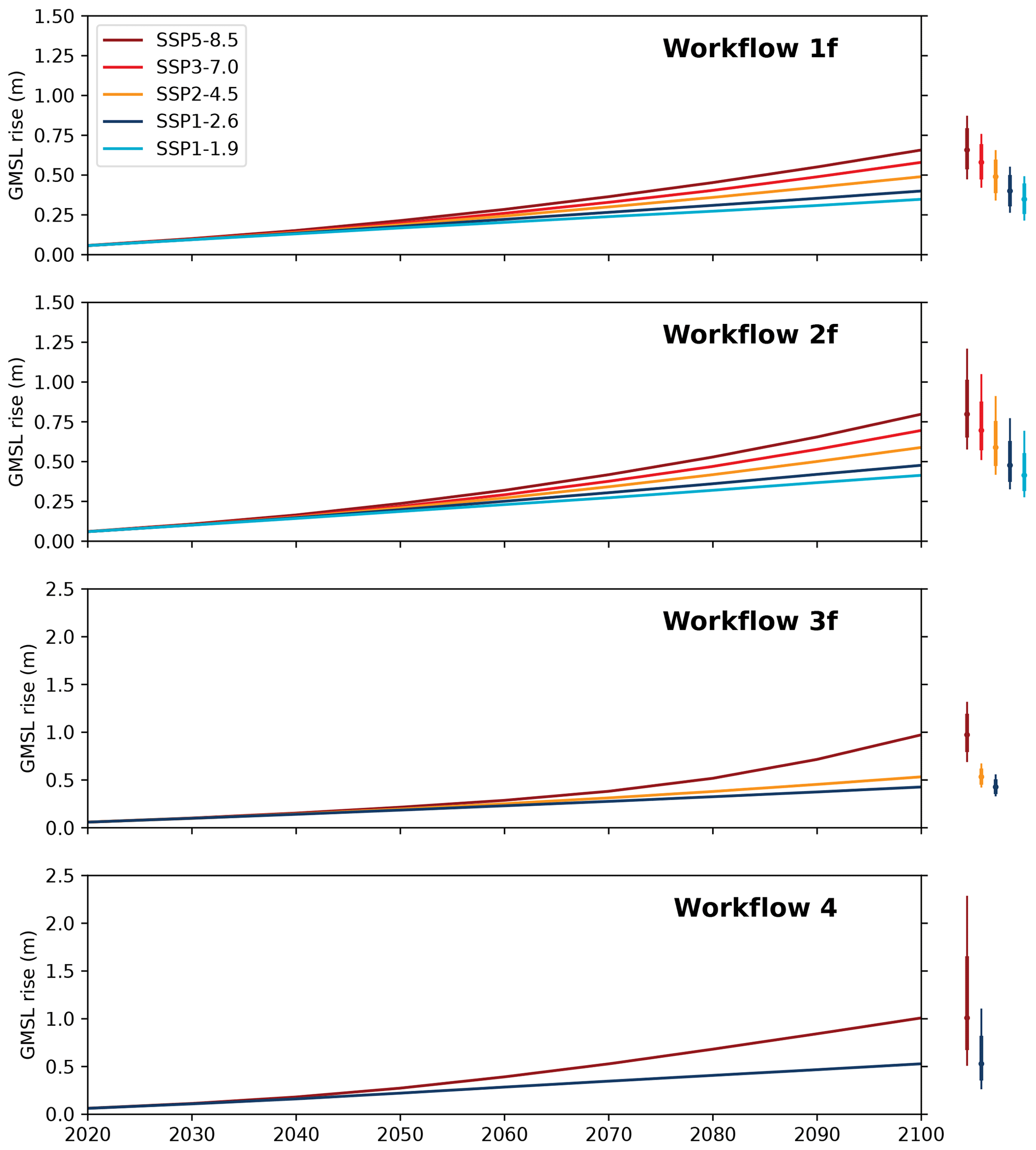
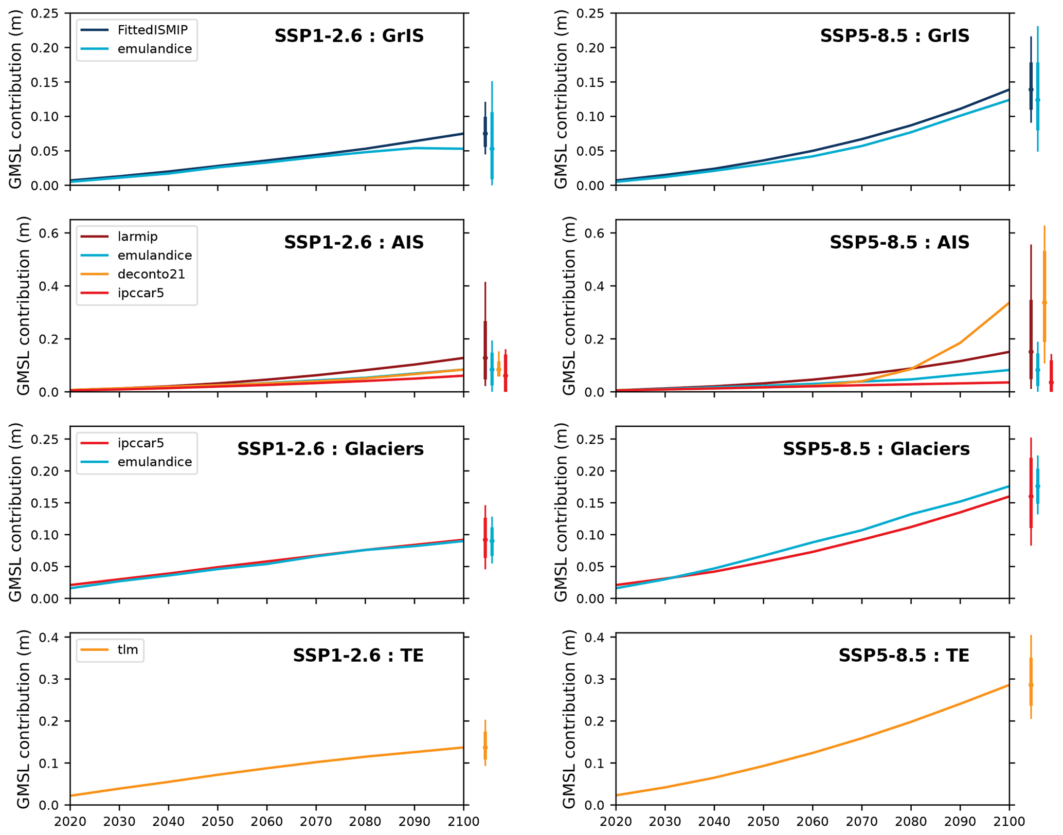
So, the IPCC?I get what you mean, and after thinking I would never find it, I think this here is exactly what you are looking for. Recent (2022), comprehensive (82 projections) and reasonably easy to understand once you get what they mean by "families". (In fact, I'll probably end up rewriting at least one paragraph based on its explanations.)- It is also CC-BY, so in theory, we could just use this figure directly. I know you would say it's "too techy", but consider what is currently in place. To me, the main issue would be explaining all the acronyms (perhaps write our own explanations for the coloured lines in the massive empty space in the lower-right corner of the graphic, and leave the rest in place?) Once we deal with this, it should already be a huge improvement over the current graphic.
- We could also use this graphic and/or this graphic, both of which are very recent and CC-BY. I don't think the first graphic is superior to the 2022 one, but the second one could be really helpful for explaining how sea level rise consists of four main aspects. We could also then move another graphic or two to the lead - if Climate change has multiple images in the lead, why shouldn't this article? InformationToKnowledge (talk) 06:22, 26 May 2024 (UTC)
- Actually, I can't see including any of the three suggested charts in a layman's encyclopedia. "families, based on similarities in methods and data"? "Combining families and thresholds leads to three categories,"? They look like inclusions in a doctoral thesis. A good inclusion criterion on Wikipedia would follow from asking: What clear "takeaway" would a layman discover in looking at a chart? Here, the immediate solution is simply to remove the outdated chart. A related issue is that skeptics would look upon "82 projections" as proof that "scientists don't agree". —RCraig09 (talk) 00:30, 27 May 2024 (UTC)
- As I said, to me the main issue was with the original labels being unclear for non-academics, and luckily the CC-BY license does not prevent us from trying to address that. Further, the original section on "Projections" was already not very approachable with its fairly long-winded (and mostly unreferenced!) explanations of terms like "semi-empirical". That is where the 2022 paper ended up very relevant.
- I decided to be bold this time, as I really think the article is looking so much better with the new images now, and it is better-referenced as well. InformationToKnowledge (talk) 17:52, 28 May 2024 (UTC)
- It seems you've replaced the friendly and understandable with the indecipherably techy
 . Can you imagine such a chart being included in Britannica? Remember our audience includes butchers and bakers and candlestick makers with whom we're trying to communicate, and not doctoral advisors whom we're trying to impress. —RCraig09 (talk) 20:37, 28 May 2024 (UTC)
- But I haven't? That chart of yours is where it always was, over at Sea level rise#Post-2100 sea level rise. The chart I added is several paragraphs beneath it.
- And I don't see how "there are four groups of two lines and they all go up over time - lines on the right always go up by more" is a hard message to grasp for anyone. The original graphic did have the issue of its acronyms being too hard for many readers to guess (not long ago, I would not have known that "TE" is thermal expansion either.) Now that I wrote all of them out in full, that issue is gone. InformationToKnowledge (talk) 13:27, 29 May 2024 (UTC)
- Sorry I missed ; I must have been looking at a completely different article in a different tab.
- Though they may be good for a technical review article, I'm finding
 and definitely too complex for laymen and too needlessly detailed for communicating the concepts described in their captions. The captions help a lot, but most readers will squint at the graphics and scratch their heads and move on—defeating the purpose of having a graphic rather than narrative text alone. And
  is ~somewhat overly complex, and misleading because of different vertical scales in left vs right columns. Generally speaking, rather than starting out by finding an interesting techy graphic and captioning what it teaches scientists, it would be better to start with an encyclopedia-level concept and then finding/creating a graphic that visually communicates that concept; that's what's difficult. —RCraig09 (talk) 17:33, 29 May 2024 (UTC)
- Thanks for reminding me of the vertical scale difference for - I now added that to its caption.
- And I think we can apply the converse of "not every reader has a tertiary degree" - not every reader is a "layman" either. Given how many graphics this article has, it's fine if a couple of them are more complex than the others - particularly if they are present next to paragraphs which already explain the more theoretical content which "butchers, bakers and candlestick makers" would likely skip over either way. (Since presumably, such people don't need the specifics of what melts where to increase abstract-sounding global sea level to the nearest cm - the impacts of what gets flooded where is what would matter to them, and those parts have very approachable illustrations.) InformationToKnowledge (talk) 17:09, 1 June 2024 (UTC)
- P.S. Speaking of graphics - would you consider tweaking your
 ? I have recently promoted Ice to GA, and this graphic is likely to appear on the front page soon as part of a DYK. This forced me to look at it closely and I think some colours are too faint and similar to each other. Most notably, I think you need to make the difference between Arctic melt, Antarctic melt and Ice shelf calving much, much stronger visually - I suspect a lot of the readers would not even spot that faint Antarctic line at the top, and would instead assume that the big faint blue line is the Antarctic and the small faint blue line is the Arctic, rather than Ice Shelf Calving.
 - Grounded ice sections could also do with more distinct colours (shades for the two ice sheets are way too similar), but since they are at least of a similar size recently, this isn't as much a priority as addressing the sea ice colours. InformationToKnowledge (talk) 17:16, 1 June 2024 (UTC)
- Thanks for reminding me of the vertical scale difference for
- Sorry I missed
- It seems you've replaced the friendly and understandable
- Actually, I can't see including any of the three suggested charts in a layman's encyclopedia. "families, based on similarities in methods and data"? "Combining families and thresholds leads to three categories,"? They look like inclusions in a doctoral thesis. A good inclusion criterion on Wikipedia would follow from asking: What clear "takeaway" would a layman discover in looking at a chart? Here, the immediate solution is simply to remove the outdated chart. A related issue is that skeptics would look upon "82 projections" as proof that "scientists don't agree". —RCraig09 (talk) 00:30, 27 May 2024 (UTC)
- Version 3 of is uploaded (1 June 2024). It's clearer, though it won't win graphics awards without starting from scratch.
- Separately, to my knowledge there is no converse to WP:ONEDOWN on Wikipedia. In practice we can test the limits of understandability—if the added complexity adds to informative takeaways of non-pedantic knowledge rather than abstruse or puzzle-worthy data. —RCraig09 (talk) 19:50, 1 June 2024 (UTC)
- Version 3 of
Excessive cites and complexity in the lead edit
Great to see recent improvement to the article reflecting a balance between RCraig09's eye for accessibility & 'typical reader’' friendly approach, against I2K's outstanding scholarship. I thought maybe we could go a little further in simplifying the first para for the benefit of the less educated reader, and edited accordingly. Per not wanting to get in the way of editors who might be putting in the hard work to take this to FA, no objection to my edit being fully reverted without discussion, if it's not seen as an improvement. Except, it would be good not to put back the bit about polar glaciers, as including that sort of nonsense so prominently discredits our credibility and serves pro polluter interests. FeydHuxtable (talk) 22:09, 7 June 2024 (UTC)
- I undid that revision; polar glacier is a term used by Britannica and there is also this Nature headline - and that's just from a cursory search. Think about it; how is it inaccurate to say that Thwaites Glacier is a polar glacier? Greenland's glaciers like Helheim might be a bit further away from the geographic pole, but according to the explicit definition supplied by Britannica, they would count as well. Not commenting on readability/citation count, since other editors are more focused on that anyway. InformationToKnowledge (talk) 06:33, 8 June 2024 (UTC)
- I think the readability was improved, even though the new text was 't quite grammatically correct. For instance, there was a sentence starting with while, which didn't have a subclasses. —Femke 🐦 (talk) 06:48, 8 June 2024 (UTC)
- @ I2K: No issue with the undo of my edit, though would have nice to see a follow up deleting "polar glaciers" or replacing with 'icesheets'. But the polar defence is unexpected. I thought I was quite clear that part of the lede is nonsense?
- To clarify, no one's suggesting "polar glacier" isn't a valid term, or that Greenland's features can't be called polar on latitudinal grounds! The salient point is that polar glaciers suffer very little melting. As per your Britanica link:
A polar glacier is defined as one that is below the freezing temperature throughout its mass for the entire year
How can melt from perma-frozen Glaciers account for 23% of SLR? The nature headline isGeoengineer polar glaciers to slow sea-level rise
. Hopefully you'll later agree it's amusing you picked out two of the best possible sources to prove why the 'polar glaciers' part of the lede is nonsensical.
- To clarify, no one's suggesting "polar glacier" isn't a valid term, or that Greenland's features can't be called polar on latitudinal grounds! The salient point is that polar glaciers suffer very little melting. As per your Britanica link:
- While "polar glaciers" is self evident nonsense in this context, if one checks the source, it's also blatant false WP:OR and misrepresentation. Even in the abstract is says:
Ocean thermal expansion, glaciers, Greenland and Antarctica contribute 42 %, 21 %, 15 % and 8 % to the global mean sea level
This clearly say's glaciers contribution is 21% , not a total of 44% split between temperate & polar types. It's even more obvious if you read the body of the paper that it treats the Greenland icesheet as seperate from glaciers - e.g. "total land ice mass loss (from glaciers, Greenland and Antarctica)" On this note, the word temperate should ideally be removed from the lede too, some of the 21% will be from sub-polar glacier melt not temperate alone. Still, at least the 'temperate' WP:OR isn't obviously false at first glance even without consulting the source.
- While "polar glaciers" is self evident nonsense in this context, if one checks the source, it's also blatant false WP:OR and misrepresentation. Even in the abstract is says:
- I understand you're optimistic on the outlook at a civilisational level, but even the most sanguine analyses accept climate change is already causing hardship in vulnerable parts of the world, and threatens to do so with even more severity in the near future. So it's not really on to respond to another editors' concerns about pro-polluter nonsense by doubling down with a "cursory search". Especially when we're talking about the first para of the lede, the only part of the article many readers will read. If you only have time for a cursory look, then on a topic as important as this, it may be best just not to say anything at all, rather than waste other editors time with half baked argument? Let me try to put this in a more helpful way. Having a fine mind is like possessing a high tier sports car. It's great, but at more risk of crash than a regular car if not driven carefully. I used to see this often with my 180 IQ X . When she got passionate about something, she could articulate half a dozen cogent lines of argument with astonishing speed. But they'd each include a tiny error, like Lord Keynes says "starting with a mistake, a remorseless logician can end up in bedlam.". This kind of thing can be advoided by not rushing to act or argue in the heat of passion, instead taking ones time to sympathetically look at the others point of view. Sometimes the super-genius can learn something from the layman. :-) Anyways, we're well into the discuss part of BRD, so it would be good if you could remove the nonsense WP:OR yourself or approve for others to make the edit? (Unless I've missed something in my analyses of course.) FeydHuxtable (talk) 09:44, 8 June 2024 (UTC)
- Feyd: please focus on content, not on the contributor. We're all trying to improve the article and mistakes happen. You're correct about polar glaciers: the current lead is incorrect. Most of the loss on the poles comes from the ice sheets themselves. —Femke 🐦 (talk) 09:51, 8 June 2024 (UTC)
- The edit in question seems to be this one. I'm not sure about the "Sea level rise is happening around the world" wording, but the general principle of dialing down on the stats/numbers in the opening paragraph seems a good one. CMD (talk) 10:20, 8 June 2024 (UTC)
- Yes, can we please spend less time on drawing inferences from editing patterns and more time on double-checking what we think we know?
- So, first and foremost, I would like to note how we got to that wording in the lead in the first place. I did not have anything to do with it: my edits to the lead on 16 July 2023 had that sentence at
Human-caused climate change is predominantly the cause: between 1993 and 2018, thermal expansion of water contributed 42% to sea level rise (SLR); melting of temperate glaciers contributed 21%; Greenland contributed 15%; and Antarctica contributed 8%.
- Then, though, @Jonathanlynn embarked on several rounds of well-intentioned simplification of this article. So, in August 2023, he changed it to say
Melting temperate glaciers accounted for 21%, with Greenland accounting for 15% and Antarctica 8%
. Then, this February, he changed it again toMelting temperate glaciers accounted for 21%. Within this, Greenland accounted for 15% and Antarctica 8%.
- incorrectly stating that all the glacier loss occurs on the poles and that ice sheets consist of temperate glaciers! Unfortunately, neither me nor anybody else watching the page recognized the issue at the time. Thus, it was actually a significant improvement when an IP editor got us to this "polar glaciers" wording two weeks later, on February 19. - So, if you want to restore the wording which was in my July 2023 edit, or something similar, I would not object. Having said that, I would like to explain why I was not opposed to the previous wording either.
As per your Britanica link: A polar glacier is defined as one that is below the freezing temperature throughout its mass for the entire year How can melt from perma-frozen Glaciers account for 23% of SLR? The nature headline is Geoengineer polar glaciers to slow sea-level rise.
- So...are you suggesting that Thwaites Glacier isn't melting? And yes, the Nature article most definitely refers to Thwaites, Pine Island and Greenland's Jakobshavn - see the version archived before the paywall went up. Possibly the most relevant quote:The Jakobshavn glacier in western Greenland is one of the fastest-moving ice masses on Earth. It contributes more to sea-level rise than any other glacier in the Northern Hemisphere. Ice loss from Jakobshavn explains around 4% of twentieth-century sea-level rise, or about 0.06 millimetres per year. Jakobshavn is retreating at its front. Relatively warm water from the Atlantic is flowing over a shallow sill (300 metres deep) and eating away at the glacier’s base.
- Now...
Most of the loss on the poles comes from the ice sheets themselves.
- What do you mean by "ice sheets themselves?" Because, it's undeniable that literally all the ice loss from Antarctica is from the coastal glaciers.- Here is an article which explains it the best:
- Greenland and Antarctica are gaining ice inland, but still losing it overall
Ice all around the coast of Greenland thinned drastically, due to warmer summer temperatures (SN: 9/18/19). But the most severe thinning happened on Greenland’s outlet glaciers, which are like “a whole bunch of little fingers that spread out into the ocean,” Gardner says. Where the tips of these glacial fingers poke out from between cold fjords and meet warmer ocean water, that water erodes the ice, causing the glaciers to flow out faster and thin inland. Greenland’s southern Kangerdlugssuaq and Jakobshavn glaciers have thinned most rapidly — by 4 to 6 meters of ice thickness per year. In Antarctica, warmer seawater not only melts glaciers, but it also melts the extensions of the ice sheet that float on the ocean, called ice shelves, which surround the continent.
- Even in Greenland, where the ice sheet itself does melt seasonally, the glaciers are still responsible for between half of the losses
The remaining 1,938 ± 541 billion tonnes (49.7 per cent) of ice loss was due to increased glacier dynamical imbalance, which rose from 46 ± 37 billion tonnes per year in the 1990s to 87 ± 25 billion tonnes per year since then.
- Or even two-thirds.
The mass loss is controlled at 66.8% by glacier dynamics (9.1 mm) and 34.8% by SMB (4.6 mm).
- So, all the ice loss from Antarctica and at least half the loss from Greenland is from the coastal glaciers. Considering this, I didn't think Feyd's wording -
Close to half of sea level rise results from thermal expansion of sea water, with melting glaciers and ice sheets the other main cause.
- was good, and I really didn't like the decision to strip references from the first paragraph and only from the first paragraph, so I reverted it. InformationToKnowledge (talk) 11:22, 8 June 2024 (UTC)- Apologies I2K for how I've approached this. In the OP I wrote "no objection to my edit being fully reverted without discussion, if it's not seen as an improvement" exactly because I didn't want to waste your valuble time. I'm in awe of how much quality improvements you make to our articles.
- Feyd: please focus on content, not on the contributor. We're all trying to improve the article and mistakes happen. You're correct about polar glaciers: the current lead is incorrect. Most of the loss on the poles comes from the ice sheets themselves. —Femke 🐦 (talk) 09:51, 8 June 2024 (UTC)
- I understand you're optimistic on the outlook at a civilisational level, but even the most sanguine analyses accept climate change is already causing hardship in vulnerable parts of the world, and threatens to do so with even more severity in the near future. So it's not really on to respond to another editors' concerns about pro-polluter nonsense by doubling down with a "cursory search". Especially when we're talking about the first para of the lede, the only part of the article many readers will read. If you only have time for a cursory look, then on a topic as important as this, it may be best just not to say anything at all, rather than waste other editors time with half baked argument? Let me try to put this in a more helpful way. Having a fine mind is like possessing a high tier sports car. It's great, but at more risk of crash than a regular car if not driven carefully. I used to see this often with my 180 IQ X . When she got passionate about something, she could articulate half a dozen cogent lines of argument with astonishing speed. But they'd each include a tiny error, like Lord Keynes says "starting with a mistake, a remorseless logician can end up in bedlam.". This kind of thing can be advoided by not rushing to act or argue in the heat of passion, instead taking ones time to sympathetically look at the others point of view. Sometimes the super-genius can learn something from the layman. :-) Anyways, we're well into the discuss part of BRD, so it would be good if you could remove the nonsense WP:OR yourself or approve for others to make the edit? (Unless I've missed something in my analyses of course.) FeydHuxtable (talk) 09:44, 8 June 2024 (UTC)
- It was just the polar thing I had a strong view on as that did & still does seem incorrect. The Nature article is about possibly artifically creating polar glaciers as a solution to SLR - which does rather suggest they can't be causing 23% of the problem. While the Nature article does indeed refer to Thwaites Glacier, it does not define Thwaites as a polar glacier. Thwaites is not a polar glacier in the salient sense here, exactly because it is melting like you say. As per our own definition :
The ice of a polar glacier is always below the freezing threshold from the surface to its base, although the surface snowpack may experience seasonal melting.
As I think we all agree, the contribution of said snow melt is trivial - essentially polar glaciers do not melt, so can't contribute significantly to SLR. Indeed, they can even help mitigate it. Again, I'm sorry that some element of my wording here may have made the point harder to grasp than it should be. All your other points make sense I2K, I still prefer less or no cites in the lede, but it's fully valid to think otherwise. FeydHuxtable (talk) 11:59, 8 June 2024 (UTC)- There are multiple definitions of polar glacier it seems. Either it's a glacier at the pole, or a glacier below the freezing threshold. We should just stick to the source, and not talk about polar glaciers.
- Apologies for saying a majority of ice melt comes from the ice sheets without verifying. On a skim, I can't find out if your sources say it's ice loss via glaciers (drainage) or only of the glaciers themselves. —Femke 🐦 (talk) 12:36, 8 June 2024 (UTC)
- Indeed. As John Hicks said about definitions: "bad tools that break in our hands". Though as you'll know better than most, certain conversations cannot be productively had without definitonal clarity. Its the thermal state definition thats more common, at least in relevent literature, as per I2K's Britanica source. The current incorrect lede even sets the reader's expectations along those lines with the wiki link for temperate glacier. I guess part of my error was in assuming normally very sharp editors would not need an explanation of the various senses in which 'polar' is wrong.
- I believe the source is saying the proportions are: Thermal expansion: 42% | Glacier melt: 21% | Ice-sheet melt (Greenland + Antarctica): 23% . With the other 14% coming from the net of snow mass change, variation in atmospheric water vapour, terrestrial water storage flows, permafrost melt, and potentially other unidentified factors. FeydHuxtable (talk) 13:48, 8 June 2024 (UTC)
- After reading the entire source, it's not quite correct to say 23% comes from ice sheet melt. The 15% Greenland + 8% Antarcica figures are mostly from melting ice-sheets, but also to a small extent due to Greenland & Antarcica glaciers. (WCRP didn't want to seperate out the peripheal glacier contribution to Greenland & Antarcica figures, due to measurment limitations.)
- It's probably non optimal to have wording too close to the source(
Ocean thermal expansion, glaciers, Greenland and Antarctica contribute 42 %, 21 %, 15 % and 8 % to the global mean sea level
), as if we don't specificy what we mean by Greenland and Antarctica, the reader could see that as question begging. I guess that's part of why we had the good faith miss-representation from the IP. But defo TMI to fully specify in the first para of lede, and would be slightly false WP:OR to replace "polar glaciers" with "ice-sheets". So I'm just going to sum up 21 + 15 + 8 & present as melt from ice-sheets & glaciers. This also has the virtue of slightly simplifying the lede. FeydHuxtable (talk) 17:45, 9 June 2024 (UTC)
- It was just the polar thing I had a strong view on as that did & still does seem incorrect. The Nature article is about possibly artifically creating polar glaciers as a solution to SLR - which does rather suggest they can't be causing 23% of the problem. While the Nature article does indeed refer to Thwaites Glacier, it does not define Thwaites as a polar glacier. Thwaites is not a polar glacier in the salient sense here, exactly because it is melting like you say. As per our own definition :