User talk:Amandajm/Archives/2014/April
| This page is an archive of past discussions. Do not edit the contents of this page. If you wish to start a new discussion or revive an old one, please do so on the current talk page. |
A barnstar for you!

|
The Writer's Barnstar |
| Thank you for the fabulous article on Myra Juliet Farrell, of whom I had not previously heard. Marvellous! hamiltonstone (talk) 22:30, 27 February 2014 (UTC) |
Wazzup?
Cherie, I'se gettin bored. What yo'll doin these days? In Oz? Msge plze. PiCo (talk) 10:40, 8 March 2014 (UTC)
Advice on images
Amandajm, I'm interested in adding some mini galleries to sections of an article and I've noticed your good use of images in articles such as Romanesque architecture. Do you have any quick advice or best practice suggestions that you've learned so far? I'm interested in just about everything: templates, formatting, sizes, quantity, image choice, placement, etc. AmateurEditor (talk) 03:11, 11 March 2014 (UTC)
Re:Michelangelo
I read your message, since the sources didn't appear to show what was exactly said, I figured in a "general" form would be a better explanation in case if there is a mistake in posting what the sources actually said, but since I didn't find the sources it would be less of a risk of posting a mistake by putting the name of a general region instead of an exact city, I just based my edit in the article as it appeared three years ago which said in "his beloved Tuscany". I'm quite sorry if I made a mistake by doing this. (N0n3up (talk) 03:23, 14 March 2014 (UTC))
Wells
Sounds good. Just, y'know, if it's not used well in something, we'd probably have to delist. Adam Cuerden (talk) 02:42, 17 March 2014 (UTC)
- It happens. It's a great image, but so's the lead image of the article; might suggest the lead image in a week or two. Adam Cuerden (talk) 07:02, 17 March 2014 (UTC)
hey there, do you have a minute to check out an article?
Hi amandajm, thanks for your feedback on my art-related articles, I really appreciate it. I've just moved a new article out of my user space, Cimabue's Celebrated Madonna, and noticed that you list Cimabue as one of your contributions. If you have a moment, I'd appreciate if you could give it a quick review and let me know if you notice anything that isn't clear. Thanks! Cmprince (talk) 03:25, 18 March 2014 (UTC)
- Thanks for the extensive notes on the talk page. I actually caught the dangling modifier this morning when I reread the article—my wife (an editor by profession) would have been very disappointed. I'll look into the other points of content and try to find some sources for them. (I had no idea about Cimabue and Duccio being rivals!) Cmprince (talk) 22:31, 18 March 2014 (UTC)
- Well, the rivalry was more between th cities than the individuals. I don't know how it was that Duccio got the commission for the Ruccellai Madonna. I'll see if I can find out.
- Cmprince, The problem with Vasari was that he didn't know what he was looking at. Apparently he went to Siena looking for Duccio's work, and must have seen the enormous Maesta in the Cathedral but for some reason didn't Identify it as Duccio's renowned masterpiece. Art had changed so much in 250 years that he seems to have discounted anything "old fashioned" as being a great work.
- I have to confess that I stood in front of the same painting and was totally overcome with emotion. Amandajm (talk) 13:14, 19 March 2014 (UTC)
Somerset Churches
Hi again, Thanks for all your fiddling with my pic of Church of St Nicholas and St Mary, Stowey, much better than I could do. Ages ago when still working on Wells Cathedral we discussed having a go at Bath Abbey. I've done some fiddling with the history but haven't touched the architecture. I was thinking of nipping over there sometime with my camera (if I can get the right perspective) but wondered if there were specific bits you thought we needed more photos of?— Rod talk 08:52, 23 March 2014 (UTC)
- Thanks - who says the camera never lies - I think photoshop has a lot to answer for. Just to let you know the new Bishop of Bath and Wells will be enthroned on 7 June so I have suggested Wells for the front page that day - hope that is OK with you?— Rod talk 09:11, 23 March 2014 (UTC)
question
Lambocar (talk) 19:59, 24 March 2014 (UTC) I got a message about one of my correction on the Cologne Cathedral from you.
"
   Explanation: Your change was to a statement that was in quotation marks. You cannot change a referenced quotation so that it says something different. The word used in the quote is "Christian", not "Catholic".
   I don't know whyyou wanted the word "Christian" changed to "Catholic", but it was almost certainly a matter of discrimination. Don't do it. Amandajm (talk) 06:26, 24 March 2014 (UTC) "
The reason that I changes Christian into Catholic in because MOST Christians served GOD in their everyday life. If a person doesn't want to be Christian, no one is forcing him to be one. If someone does what to be Christian, all the better for him. They didn't force people to do things the way THEY wanted things done. Every person has the right to his own opinion. The the other side, Catholics forced people to go into poverty by making them donate a set amount of money to the church, which explains why they have such monstrously huge building, most of which was just empty hallows, like the big pillars on top of the building. If a person couldn't afford to pay that set "fine" as it was called by some, they were to be punished. There is a large difference in Christianity and Catholicism, even though Catholicism is counted as a branch of Christianity.
Fillet-O-Fish
LOL I just got it from [1] near the bottom of the page.
And as a heads up, I actually posted it on my own page.....so don't worry about any SPAM.
Posted by: VladDroid256 (talk) 02:32, 25 March 2014 (UTC)
I Apologize
I'm sorry. Didn't mean to change anything quoted and I was just writing from my personal opinion. Sorry if I hurt anyone's feelings.
Some bubble tea for you!

|
ENJOY!! VladDroid256 (talk) 03:01, 25 March 2014 (UTC) |
We need to have a chat about architectural photography
Hi Amandajm. I've started to notice a pattern emerging. You comment on the perspective corrections applied to an image on Featured Picture Candidates, I reply, explaining in detail why I think you're wrong or misguided as the case may be, and I hope for some dialogue so that this doesn't keep happening on every vertically corrected photo that appears in FPC. However, I find that you usually don't acknowledge or respond to any of the points I've made, and history repeats itself next time an image comes up in FPC. At first I thought maybe you accepted my points and moved on, or that you were busy and didn't have a chance to respond to me, but now I'm starting to think that you're just ignoring me. You're entitled to do so of course, but it's very counter-productive when you're essentially being disruptive by entering a discussion, making your points (which I believe to be wrong, at least in parts), and then disappearing again without any chance to discuss or reason them. I'm prepared to discuss these issues, using science, logic and mathematics if necessary, to explain and argue my points. You don't appear to be willing to do the same. Ðiliff «» (Talk) 10:18, 27 March 2014 (UTC)
- In the hope that you agree that this is an outstanding issue that does need to be debated until conclusion, I'll get the ball rolling. I noticed that you were talking to Rodw on his talk page about his image and about correcting vertical lines. I was going to reply to both of you there, but I thought it would make more sense to respond to you directly as I'm not sure he's really as interested in the technical debate. I hope you do it the honour of reading it carefully and if you disagree with anything, then please elucidate, responding specifically to each point in turn. It's the only way we'll get anywhere, I think. So here's my reply below:
- I'd just like to add that I think it is Amandajm that has the erroneous idea in her comparison of vertical and horizontal perspective. Nobody is saying that horizontal perspective is good and vertical perspective is bad. Ideally for most architectural photography, there would be no perspective distortion at all (in other words, you would take a photo from an infinite distance away with an infinitely powerful telephoto lens, so that no lines would be geometrically distorted at all). But in the real world, this is not possible. We have real world lenses and real world viewing distances, so distortion is always a consideration and horizontal perspective distortion is an issue just as vertical perspective distortion is. However, vertical distortion is fundamentally different to horizontal in the sense that we can always (well almost always) position ourselves and the camera in the centre, horizontally, of a composition. If we want the horizontal line of a building to be horizontal in the photo, we position ourselves perpendicular to the horizontal line. In other words, we look straight at the face of the building. This is often instinctive in photography and we do it without really thinking much about it, as long as geography allows us to stand far enough back to get the entire building in the frame. However, it is not that simple for vertical perspective. The reason is this: Buildings usually begin at ground level and rise above it. Therefore the centre of the verticals is at the midway point between the ground and the top of the building. We are usually unable to position the camera in the centre because unfortunately we can't hover above the ground or climb a big ladder. If we could, we could centre the building in the camera's viewfinder and avoid all vertical leaning. But, since we can't do that, we have two choices: we either make the vertical centre of the viewfinder the horizon (in other words, the camera is pointing at the horizon and not tilting up or down) and accept that there will be a lot of foreground that we probably don't want, or we tilt the camera upwards so that the centre is the middle of the building. We usually do the latter for compositional reasons, but this has the unavoidable consequence of the vertical lines tilting inwards. If we choose the former, as I said, we have a lot of foreground that isn't related to the building itself. We can crop this foreground out, however, and this has the exact same' geometrical consequence as 'correcting the vertical lines' in Photoshop. Exactly the same. The perspective and distortion is identical. So this is why I argue most vehemently that correcting verticals is not 'wrong'. There is nothing unnatural about it. The only argument that I believe could be made is that it is not as 'aesthetic', but this is extremely subjective and not universally agreed upon. As an aside, the other reason why we are often more accepting of horizontal lines leaning is that buildings are usually wider than they are tall, with the obvious exception of skyscrapers and the like. As such, because of width and the fact that other obstructions limit how far back you can get and still have a clear view of the subject, we accept that in order to photograph the building, we need to position ourselves to the side of the building, such as along the street. This introduces leaning horizontals but most of the time, the angle is too extreme to correct it in an aesthetically pleasing manner, not to mention that buildings are usually symmetrical on the vertical axis, so any distortion created by an off-centred shooting location is far more obvious. The same applies to vertical lines of a skyscraper. If we stood at street level looking straight up at a skyscraper, there would be no way of correcting verticals without introducing extreme distortion. So the only question remains is this: at what point is the distortion caused by perspective correction too extreme? Another subjective question with no precise answer. All we can do as architectural photographers is attempt to keep both horizontal and vertical lines straight whenever it is practical to do so. It is not misleading, it is not manipulative. It is simply striving for the best representation of a three dimensional scene on a two dimensional plane. As I've argued elsewhere and am yet to see your response to it, the human eye does not see the leaning verticals the way an uncorrected image would show them. Ðiliff «» (Talk) 11:20, 27 March 2014 (UTC)
- Thanks for the notification about this discussion but I don't feel qualified to contribute - although I am interested in the outcome.— Rod talk 15:46, 27 March 2014 (UTC)
- Off topic but what do you think of File:Stowey church interior showing Strachey picture.jpg (amazing wall painting but dodgy lighting) which I took today to illustrate the interior of the church which may have triggered this debate?— Rod talk 20:39, 27 March 2014 (UTC)
- Hi Rodw. Well, the image isn't bad considering the lighting, but the depth of field is very limited so the ceiling and the pews are quite out of focus. What you would need to do to improve it is to take the photo on a tripod with a much smaller aperture (this would increase the depth of field). The reason you'd need a tripod is that stopping down the aperture would result in a much longer shutter speed (probably a number of seconds). I use even more advanced techniques than that, involving stitching multiple images together with different exposure levels to increase the detail and exposure balance. I don't expect most people to go to that kind of trouble, but good interior photography is usually more difficult than 'point and shoot'. Ðiliff «» (Talk) 21:13, 27 March 2014 (UTC)
- Off topic but what do you think of File:Stowey church interior showing Strachey picture.jpg (amazing wall painting but dodgy lighting) which I took today to illustrate the interior of the church which may have triggered this debate?— Rod talk 20:39, 27 March 2014 (UTC)
- Thanks for the notification about this discussion but I don't feel qualified to contribute - although I am interested in the outcome.— Rod talk 15:46, 27 March 2014 (UTC)
Perspective in photography
I have written what is below over several days, being unable to upload as my internet connection has been repeatedly dropping out.
You are an excellent photographer, but you stand to benefit a great deal from the insight of a person with solid knowledge of architectural style, and an exceptionally good eye. If you can take on some of what I know about the workings of the architectural mind, and the concepts of Classical architecture, you will be a better photographer, because you will apply a greater insight than you are doing now.
With each building that you photograph, you have to ask the question “What was the architect on about?” There is very often some subtle notion that involves contrast, emphasis, movement and space. This is a lot less simple than thinking in terms of walls, columns, openings and roof.
With every architect-designed structure that you look at, you should proceed under the presumption that the architect knew and cared about the effects of perspective both horizontal and vertical. Ask the question “What has the architect done to utilise, emphasise or counter the effects of perspective?”
The following was written a couple of days ago.
- Firstly, let me state that I am not entirely opposed to the digital adjustment of architectural photographs. In many cases it is useful, particularly when the view of a building is restricted, and the perspective is greatly exaggerated as a result.
- Unfortunately there are a many of buildings of great historic and/or architectural significance that are represented on Commons only by very poor images, some of which are almost useless to demonstrate the architectural value of the building, without considerable digital adjustment. In these many instances, digital adjustment is really useful.
- I also appreciate that stitching together an image from several images may have limitations and requirements.
- My objections are not to all perspective adjustment, but to the sort of adjustment that you have referred to here where you say ’’All we can do as architectural photographers is attempt to keep both horizontal and vertical lines straight whenever it is practical to do so.’’
- This statement is, of itself, a denial of the value of perspective as essential in providing a true view of a building.
- It is also a denial of the fact that the architect of the work that you have photographed knew about perspective and made it work in the building’s favour.
- I do understand what you are saying about the "ideal" situation in which a building might be photographed from a central position (both vertically and horizontally) and remote distance that eliminates the effects of perspective. This is indeed the ideal under the following circumstances:
- The building has been designed to be seen remotely
- The architect has not taken close perspective into account and made adjustments to the lines and proportions.
- That the "architectural elevation" view is the ideal view, i.e. that the requirement in taking the photograph is that the real-world effects are minimised in favour of a view that shows the precise location, proportion and style of the architectural elements, rather than the effect of the location, proportion and style of these same elements.
- Answering some of the points you have made:
- ’’We are usually unable to position the camera in the centre because unfortunately we can't hover above the ground or climb a big ladder. If we could, we could centre the building in the camera's viewfinder and avoid all vertical leaning’’
- What you are supposing here is that Vertical perspective (vertical leaning) is a bad thing.
- What you are also supposing is that the ideal view of a building is one that is centred half way up the façade (the hovering view), and that this view is a preferable one to the view from eyelevel. This is fuzzy thinking. Buildings are usually viewed from eyelevel. Adult eyelevel is usually from 5 to 6 feet above the ground.
- A well-designed building is designed to be seen from 5-6 feet above the ground.
- A photograph that is taken with a viewfinder, (or from a tripod set at eye-level) sees the building at the height that the architect had in mind as the eye-level, when he designed it.
So what does the architect do, to utilize or counteract the effects of perspective?
- The architect knows that the centre of the ground level of the façade will appear to be the lowest visual point, as it is below eye level, and the lines of perspective curve upward, below eye level. So the architect who wants the appearance of a straight, flat ground level, curves the ground line slightly upwards in the centre. Conversely, the architect might utilize the downward curve with an imposing central feature such as a portico.
- Your architect knows that the perspective of the building tapers slightly inwards below eye-level, (i.e. towards the grouns) so the architect counters this and gives greater stability to the overall appearance by adding a basement level that comes to about eye-height, or which begins to step inwards, above eye-height.
- When one stands directly in front of a wide façade, the centre of the façade is nearer, and perspective makes the outermost corners curve away. Your knowing architect gives extra weight to the outer corners by making the vertical elements (columns, pilasters or buttresses) a little thicker and/or closer together.
- Columns generally have a base and a capital. Between these stabilizing elements is the shaft of the column. If it has straight parallel sides, then the columns will appear to be concave. So architects who use columns of a classical type counteract this optical effect by tapering the columns from bottom to top, and swelling the columns out below the centre. This is done on “flat” pilasters as well as circular columns. Flat pilasters are rarely flat.
- When one looks at a building (from eyelevel, from a street or a square, rather than from a long vista) the building tapers inward, above eyelevel. Architects in the classical styles were well aware of this. They countered the effect of this apparent tapering in a number of ways. Firstly the proportions of the storeys of the building are graduated in different ways, to utilize or counteract perspective. The attic storey and/or/ cornice and/or balustrade gives weight and emphasis to the top of the building, when seen in perspective. (NOTE: the proportion is designed to work in perspective, not on your idealized adjusted view.
- Many buildings have defined horizontal elements such as projecting courses, sills, balconies etc. which act as visual stops to the vertical recession.
- In the case of buildings designed in the Classical Style (Ancient Roman, Ancient Greek, Renaissance, Baroque, Rococo, and all the Revival styles of the 18th, 19th and 20th centuries) the most significant horizontals are the basement (mentioned previously) and the cornice. The cornice may overhang the walls of the building by more than a metre. Its visual purpose is mainly to counter the effect of perspective. Under normal visual perspective, the sides of the building appear to zoom inwards as they rise, and the wide heavy cornice puts a stop to this, like a capital on a column, and ‘’visually’’ creates a width which balances that of the basement. In fact, the cornice often juts out considerably further than the basement does. This is apparent, when you look at an architectural drawing elevation of the building’s façade. But when you look at the building, the balance seems right. The reason that it seems right is that Wren or Hawksmoor or Jones or Michelozzo or Palladio, knows what they are doing.
What is the effect of digitally adjusting the perspective so that verticals are parallel? (and the horizontals of a centrally-viewed façade are parallel?)
- It counters all the adjustments that an architect will have made (either very consciously, or less consciously by architectural tradition) which take into account the effects of visual perspective.
- It makes the building appear top heavy.
- It can make the building appear as if its outer walls are falling outwards.
- Unless the person making the adjustments is aware of the proportions, the end result is to make the proportions of the building too wide for its height.
- Semi-circular arches are flattened into wide elliptical arches.
- The sense of “presence” is lost, because the viewer loses their eyelevel.
Looking at the exteriors by particular architects we find that Brunelleschi was doing ground-breaking studies in linear perspective and appears to have applied his findings to the interiors of San Lorenzo and Santo Spirito. (There are significant differences between the two that indicate different solutions to particular problems. Everything that he was doing was ground-breaking) Neither of these buildings have facades; they simply weren’t added and the building terminate in rough bricks.
Alberti came along and designed a totally brilliant facade at Mantua, which indicates how he was able to think in three-dimensions. No front-on image of that façade could ever do it justice. A successful image needs to be somewhat oblique to show the depth of the central arch. No even half reasonable image exists on Commons because the building is so hard to photograph.
Michelozzo knew what to do with a square box- he put a basement and a big cornice on it, and there you have an enduring form. Michelangelo…. Getting a good photo of the chancel end of St Peter’s is also extremely difficult. Some vantage point in the Vatican gardens is necessary, and then there are trees in the way.
Palladio was incredible. Palladio designed a box with porticos and a dome. Look at it full-frontal and you only see one portico. Only an oblique view indicates that the little box is the same every way you rotate it.
Palladio played with perspective. He designed the churches of San Giorgio and Il Redentore to be viewed across the Giudecca Canal. He also realised that the main approach was by water, and that the building had to be able to hold its own, as you approached. Once you arrive, the buildings can only be seen from the narrow quayside. Perspective-wise, they had to look satisfying from the distance of a few metres. Palladio employed extraordinary techniques to make sure that this was the case. For this reason, the long view, your “ideal” view, is a starting point for a visual understanding of the building. But the middle view, from the low vantage point of a gondola on the canal is also valid, and the close-up view from the cramped space of the quay has architectural joys that cannot be experienced from that distant and “ideal” view across the water.
Full frontal image: Is this to be preferred?
The comment was made by someone reviewing an image recently that a “façade” picture was a boring view, from the point of view of a featured image. My response was that the façade view is ideal in any situation that discusses the architectural proportion, forms, and details, particularly in circumstances where buildings are being compared. Externally, the façade is the most significant part of an architect-designed building.
This is not the case with every building. Rod and others have taken many fine photos of English parish churches. In these cases, there is very often no façade at all i.e. in many cases no architect or medieval builder has given consideration to one single external face of the particular building. Its west end might have a tower, but no west door. Its main entrance might be through a porch of stone or wood jutting from the side of the building nearest the street. There is nothing that resembles a façade.
An ideal view in this case would be one that showed clearly the various compartments and building stages: Nave, chancel, tower, porch. Any such view is going to be an oblique one, with a considerable amount of recession in the perspective. This oblique “ideal” view carries right through to the enormous cathedrals of England. Many of them are best viewed from a diagonal. This is quite different from the cathedrals and abbeys of northern France where the façade is a major feature.
There are many buildings, such as Palladio’s Basilica di San Giorgio, that are designed to be seen primarily as facades, and other, such as Palladio’s Villa Rotunda, that are much better observed from an oblique angle.
-
 Not "corrected". NOTE: They architect has maximised the effect of perspective by stepping the centre of the building forward in layers. Even though the facade is considered unduly wide for its height, the height of the centre is maximised, to the viewer, by being set forward. Straighten the lines, and this effect is lost. Also, yes, there really is subsidence on the left. They commenced building a tower but had to demolish it.
 -
 "Perspective corrected " photo of otherwise high quality. This shot has had its verticals straightened so that now the attic is much too top heavy, and the outer walls lean outwards.


-
 not "corrected".
 -
 A panorama in which the vertical perspective has been "corrected". All the proportions and the correct shapes of the various architectural components are lost in the process.
.jpg)

-
 This "corrected" image is useless and should be deleted.
 -
 This image, though of dull light and poor resolution, indicates the proportions of the building


-
 This image has been rendered useless by "correcting" the vertical perspective. I could not possibly use this image in any of the relevant articles.
 -
 Here is an uncropped image. NOTE: the archway of the central door is semi-circular.
 -
 This is a useful crop which indicates correctly the height of the building, the proportions of the building and the fact that its openings are semi-circular.


-
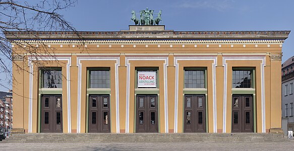
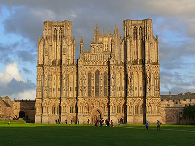 An image of the facade of Wells Cathedral currently in use. Two architects successively have made each stage smaller so that the towers taper. The effect is to 'maximise vertical perspective.
 -
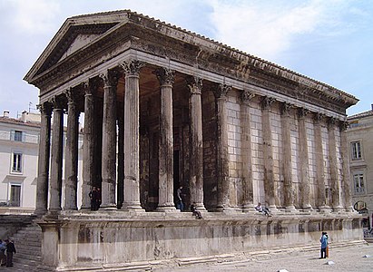 Maisson Carée, Nimes, demonstrates how the overhang of the cornice counteracts the vertical perspective. Once the perspective is removed, the intended effect of the cornice is negated and the building becomes top-heavy.


-
 Here is a photo in which the photographer has battled with all the intentions of the architect, in a futile attempt to make this image comply with some ridiculous Wikipedia convention, rather than the conventions of Classical Architecture that have been quite brilliantly utilized in the design of the building. This, unfortunately, is considered a "Quality image".
 -
 My restoration of the photo, not perfect by any means, but at least displaying the actual forms. Every vertical line of the building tapers towards the top. Every vertical form is slightly convex. Note the tapering shadow of the pilaster. Note the convexity of the columns. Note the marked taper on the columns and the overhanging abacus that gives a clue to all the other Classical forms of the building. The big flat pilasters at the corners of the towers bulge and taper in the same manner. The towers themselves bulge and taper like the columns. Nothing in this building was intended to be straight and parallel.


-
 This image has been assessed as a "Quality image" and is categorised as a "Quality image" by its uploader, a "Quality image of Venice" and a "Quality image of a church". It is not a "quality image"; it is a ghastly travesty. It represents the distortion of one of Venice's greatest works of architecture. No architectural historian could ever consider using this image to represent Palladio's building.
 -
 This image shows the proportions of Palladio's masterpiece.
 -
 This image reveals the degree of "correction" that must have been employed in order to achieve the results in the first of these three images. The white space gives a rough indication of how much the image has been stretched. Yet it was accepted on Wikimedia Commons as a "Quality image" because it complied with some simplistic set of rules. This is farcical.


- This is an interesting essay which is worthy of wider consideration and discussion. I have learnt to look at buildings (or my photos of them) differently - although I doubt I have properly taken it all in. I was particularly struck by the comment "We are usually unable to position the camera in the centre because unfortunately we can't hover above the ground or climb a big ladder." as I'm seriously considering buying one of these to get just that "hover" and ability to do First-person view videos as you fly over buildings (& under bridges) etc. This was triggered by coming a cross this video when working on the Wellington Monument, Somerset, which gives an insight I could never have otherwise. My son also wants to use it for Frisbee competitions as well but that is another story. I hope the ability to see the discussion (and the buildings) from different points of view will help my understanding.— Rod talk 10:11, 30 March 2014 (UTC)
- Rod talk, that would be such tremendous fun!
- In terms of cathedrals and such, you could get such a great sense of the layout which you often can't see from the ground or from a plan. In the case of Wells Cathedral, for example, when you look at a ground plan it is apparent that there is a long central axis which is crossed by three "arms". What the plan doesn't tell you is that the first transverse arm is actually two projecting towers, the second transverse arm is the main transept which is the same height as the nave and has a lower aisle on both sides, and the third transverse arm is a pair of projecting chapels that are only as high as the aisles. On the plan alone (without knowledge of the conventions) it would be very easy to miss the importance of the first arm (towers) and overestimate the size and visual significance of the "eastern transept" (off the presbytery).
- You could also see details of the West Front statuary that are only visible with binoculars. It would be a tremendous asset in checking out the state of the stonework, without a cherry-picker.
- You can also see the relation of the building to its environs... Wow!
- On the other hand, hovering midway up a facade, in order to counteract perspective, is not the way that an architect ever intended a building to be viewed. The ideal height to view a well-designed building is human height. The main exception to this is in the interior of a theatre where the architect has generally designed the best view to be from the more elevated seats: not the stalls, not "the Gods", but the "Dress Circle".
- Thanks for your message, Rod! Amandajm (talk) 04:04, 31 March 2014 (UTC)
- Rod, I've often considered getting a multicopter for aerial photography, although to get the kind of high quality photography that I would want, including the ability to carry a professional DSLR and lens, and then bring it all home safely, the cost is pretty prohibitive: about £5000-10000 and arguably certification from relevant aviation authorities. In any case, I think, especially in light of the debate raging at the moment about architectural accuracy, that Phantom Vision you're looking at would have a major flaw. The camera's lens is fisheye, and would result in very warped looking buildings. It is possible to attach other small cameras that can take decent photos to small multicopters for less than £1000, but I don't think I'd be satisifed with that for long, unfortunately! Ðiliff «» (Talk) 12:17, 31 March 2014 (UTC)
- I nipped over to Wells today with the latest toy. It wasn't sunny and a bit too breezy which causes some turbulence but take a look at: File:Aerial video of Wells Cathedral.webm for a different "perspective".— Rod talk 17:04, 22 April 2014 (UTC)
- Rod, I've often considered getting a multicopter for aerial photography, although to get the kind of high quality photography that I would want, including the ability to carry a professional DSLR and lens, and then bring it all home safely, the cost is pretty prohibitive: about £5000-10000 and arguably certification from relevant aviation authorities. In any case, I think, especially in light of the debate raging at the moment about architectural accuracy, that Phantom Vision you're looking at would have a major flaw. The camera's lens is fisheye, and would result in very warped looking buildings. It is possible to attach other small cameras that can take decent photos to small multicopters for less than £1000, but I don't think I'd be satisifed with that for long, unfortunately! Ðiliff «» (Talk) 12:17, 31 March 2014 (UTC)
- Hi Amanda, thanks for engaging with me. As you've written quite an extensive reply to me, I'm going to have to break it down somewhat if I'm going to be able to reply to any of it with clarity. I'll start with the statements and claims that you've made that warrant further discussion and dedicate one point to each one.
- You say "With every architect-designed structure that you look at, you should proceed under the presumption that the architect knew and cared about the effects of perspective both horizontal and vertical. Ask the question “What has the architect done to utilise, emphasise or counter the effects of perspective?”". I agree that architects did often design structures with perspective in mind. After all, you're right that we don't usually view a building from the 'architectural plan' perspective, so any view will have perspective effects of some kind. However, the extent to which various perspective effects affect the view (that's quite a mouthful of a sentence, sorry) is determined by the precise location of the viewpoint, and most buildings do not have only a single possible viewpoint. So while an architect may have attempted to allow for perspective, I disagree that we should look at the architecture as the architect intended. After all, the building is designed for the benefit of the people, not for the benefit of the architect, and it is the people who decide how they would like to view it. All the architect can do is attempt to satisfy the people, as that, ultimately, is his job. But that notwithstanding, as I said, I agree that buildings are indeed designed with some 'perspective allowances'. I just disagree that we should photograph them with those counteractions in mind. We should photograph them as geometrically accurately as possible, and if indeed there are some 'designed distortions' which attempt to either exaggerate or counter perspective distortions, then ideally, we should be allowed to see them in the photo. If we're purporting to be an ecyclopaedia with an emphasis on factual accuracy, we should wish to see the buildings as they are, not as the architect intended to trick our perception. It's up to the article text to explain the distortions and what purpose they have.
- You say "I also appreciate that stitching together an image from several images may have limitations and requirements." This is only partly true. A stitched image doesn't really have any limitations that a single photo does not have, except of course that any movement that occurs between the component images will affect the ability to stitch properly. However, if the subject is static, as most buildings are, there are no significant limitations. A stitched image will have all of the same qualities as a single image, with the added advantage of additional resolution which allows some perspective distortion adjustments without reducing the effective resolution of the final image as much. (if you try to distort a regular 'single photo' image, you end up with reduced detail in the extremities which often means you must reduce the resolution of the entire image so that the extremities are not so obviously faulty).
- You say "What you are supposing here is that Vertical perspective (vertical leaning) is a bad thing. What you are also supposing is that the ideal view of a building is one that is centred half way up the façade (the hovering view), and that this view is a preferable one to the view from eyelevel. This is fuzzy thinking. Buildings are usually viewed from eyelevel. Adult eyelevel is usually from 5 to 6 feet above the ground. A well-designed building is designed to be seen from 5-6 feet above the ground. A photograph that is taken with a viewfinder, (or from a tripod set at eye-level) sees the building at the height that the architect had in mind as the eye-level, when he designed it.". Yes, I'm not just supposing, but stating that vertical leaning is a bad thing in most cases, because they just aren't what we see when we view a structure with our own eyes. As I've already argued extensively, I disagree that the human eye sees vertical leaning, because vertical leaning only occurs significantly in the periphery of a wide angle photo. Our eyes do not see a complete wide angle view in any meaningful way, however. We may perceive that they do, but they do not take in the entire view without flicking from detail to detail and piecing the details together to form a 'mental picture' of the scene. I just don't believe that we perceive a geometrically accurate picture of the scene, and certainly not a rectilinear projection of the scene. Rectilinear projection is only applicable when you try to apply a 3D scene onto a 2D surface (a photo on paper or a computer screen). Rectilinear projection's main benefit is that it keeps straight lines from being curved by the 'conversion' from 3D to 2D, but at the expense of distortions at the periphery. These distortions include leaning vertical and horizontal lines. So when you consider that leaning vertical lines only occur because of photography's inherent limitations on a 2D surface, and not because of any 'reality' of the building, you should realise that they are not part of the building's design, nor of our perception of it, and should therefore be corrected as long as the correction does not make the distortion significantly worse (a subjective question). But there is a difference between distortion inherent in a particular viewpoint (regular perspective distortion), and distortion introduced by projection onto a flat surface. To assume they are all the same thing is a mistake that I think you may be making.
- You say "When one looks at a building (from eyelevel, from a street or a square, rather than from a long vista) the building tapers inward, above eyelevel. Architects in the classical styles were well aware of this. They countered the effect of this apparent tapering in a number of ways. Firstly the proportions of the storeys of the building are graduated in different ways, to utilize or counteract perspective. The attic storey and/or/ cornice and/or balustrade gives weight and emphasis to the top of the building, when seen in perspective. (NOTE: the proportion is designed to work in perspective, not on your idealized adjusted view.". Tapering is somewhat different to leaning. I agree that tapering, on a somewhat abstract level, occurs, because the bottom of a building is closer to the viewer than the top is, and therefore the perceived width/sie of the building is smaller at the top than it is at the bottom. This is just basic Pythagorean mathematics. Leaning should be an obvious consequence of that tapering, because if the outer edges of the building remain straight, they must lean inwards in order to meet at the top which has a smaller width than the bottom does. But if you are standing in the middle of the building, facing the façade, and then look at the left edge of the building, then scan from the top to the bottom of that edge, you will not see the leaning. Then you look at the right edge of the building, scanning from top to bottom, you will also not see the leaning. This is because when you move your eyes around, you are centring the view on that point, and this nullifies the leaning effect because everything leans relative to that central point, and since your eyes cannot accurately see the geometry of the periphery of your view, you don't see the lean. What you may notice, however, is that recgonisable shapes and objects (columns, statues, engravings etc) decrease in size as you scan from the top to the bottom of the edge of the building. This is the crux of it all, in my opinion. Objects that can fit in your foveal view do indeed get smaller as they appear further up the face of the building. Lean is not a factor because the foveal angle of view is about 5 degrees, and lean is imperceptible at such a small angle. The human eye's total field of view is almost 180 degrees horizontally, but this is not particularly spatially aware, and is more adapted to respond to movements than to perceive geometry (it's also not rectilinear, so even if we could perceive geometry in the periphery, it would be somewhat fish-eyed). So I would argue that there is some truth to what you are saying, that individual objects on a building may indeed be designed to take into account this decreasing size as your view moves up to the top of a building, but I disagree that the effect applies in any meaningful way to the overall shape of a building. So again, it comes down to a compromise. You can leave an image uncorrected, in which case the individual objects and details of a building remain somewhat more accurately proportioned but the overall shape of the building is most definitely not accurate, or you can correct the shape of the building so that the vertical edges are vertical, at the expense of the proportions of the details of the building at the periphery. I don't believe there is always a right or wrong answer to this question. Both scenarios involve compromise. So I will happily concede that there are some situations where correcting verticals would distort an image too much, and perhaps I've even been guilty of that. But in the case where a building is photographed from a sufficient distance where the angle of view is not too extreme, I wholeheartedly believe that correcting vertical lines is the lesser of two evils, because the proportions of the details are imperceptibly altered, far less obvious than the inherent inwards lean is. As I've stated before, I suspect your acceptance of vertical leaning is probably because the vast majority of amateur point-and-click architectural photography (the kind that ends up on Commons), does not correct the vertical lines, and so it has become the 'status quo'. If you see enough of it, you begin to assume it's normal. It may be normal, but it isn't ideal.
- You say "What is the effect of digitally adjusting the perspective so that verticals are parallel? (and the horizontals of a centrally-viewed façade are parallel?)". And you then list a series of complaints. And they are to an extent a valid list of complaints. But let me just clarify something. There are a large number of different digital perspective adjustments. They all bend and distort an image in different ways. Some of them are architecturally appropriate, some of them are (arguably) not. It's problematic to lump them all in together as 'digital adjustments' though. The bare basic rectilinear projection with corrected verticals is, as I've said already many times, exactly the same as simply ensuring that the camera is not tilted upwards when taking the photo. There is no further digital trickery involved. If the camera is not tilted upwards, the verticals remain straight, parallel and vertical. As I said further above, straight vertical lines is just the rectilinear projection doing what it does. The angle of the verticals is determined by the degree to which the camera is tilted away from the the horizon. If you tilt the camera above the horizon, the verticals lean inwards, if you tilt it below the horizon, the verticals lean outwards. So in summary, I object to this being called 'digital adjustment'. Whether the correction occurs on a computer, or the composition was decided by the photographer 'on site', there is no functional difference.
- You say "Full frontal image: Is this to be preferred?". I absolutely agree with you that each subject potentially requires a different approach. Some subjects are absolutely limited by geographical constraints. Sometimes the 'ideal view' is simply not possible. This makes some subjects inherently difficult to photograph to a high technical standard. For example, you took issue with a photo of mine that was taken 'off centre' (to avoid the chandeliers clashing with the stained glass windows) but horizontally perspective corrected so that the pews were not angled, but rather horizontal. This had the effect of distorting the left edge somewhat more than was ideal. I still stand by the angle as the better compromise, but I completely accept criticism if warranted, and maybe because of the inherent constraints, a great photo of the interior is just not possible. However, as per my last point above, this perspective is not unnatural and could have been achieved simply by pointing the camera with a wide angle lens towards the right-hand painting of the clouds, and then cropping the scene beyond the columns on the right. In other words, digital manipulation need not be involved to create this perspective. It is simply the equivalent of a regular rectilinear view with the right hand side cropped, so in effect the central point of the image becomes off-centred due to the crop.
- Let's move onto the examples you provided.
- Firstly, the façade of St Peters. I actually don't see a significant difference in proportions between the corrected and uncorrected view. This is because it was taken from so far away that the vertical leaning effect was minimised, and as such, the correction had very little distortive effect on the building. You may be hypersensitive to perspective distortion. You claim that you have an 'exceptionally good eye', and that may be so for perspective distortion, but that doesn't mean that your criticisms should be applicable to everyone. I don't think the vast majority of people are as sensitive as you are to this. Most people from my experience are far more critical of vertical leans, hence it being an established practice in architectural photography.
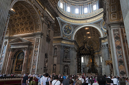
- The interior of St Peters. It's not really a fair comparison, because as I said above, there are many different types of digital adjustments/projections, and this is most definitely not rectilinear. It's likely to be cylindrical or something similar. This is a good explanation about what cylindrical projection is in the context of a panorama.
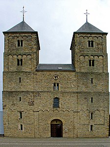
- The Abbey of Saint-Étienne. I don't think this is a fair comparison either because actually, the 'corrected image' is not just vertically corrected but vertically squashed too. I completely agree with you that it's useless in that form. A vertically corrected, rectilinear projection of this building would have the towers even taller and more projected than the uncorrected image, because the effect of the vertical correction is to splay the extremities both outwards and upwards.
- Susteren Abbey. The exact same situation with this. It's been vertically squashed. I think it was stitched with 'equirectangular' projection which is similar to cylindrical but with additional curving of the vertical plane. In other words, projection onto a sphere rather than a cylinder.
- Regarding the Propylaea in Munich, can you confirm to me how you know that the vertical lines taper and are convex towards the top? You've made this claim before without any evidence to prove it's true. I'm not calling you a liar, I just want to see a source that says so, otherwise it just comes across as original research. The Wikipedia articles (both in English and in German) don't mention anything about it, and nor does the one reference in the article. In any case, I do see that there is a slight inwards curve on the edges of even the corrected image, but this could easily be a lens flaw and not an actual curve of the building, because it doesn't appear to have been taken by a high quality camera.
- Church of San Giorgio Maggiore. I disagree with your distortion estimates about what was done to stitch the first of the three images. I agree that the original is not from an ideal angle to photograph the building and the image suffers a little as a result (especially when it seems you can take a better photo from a gondola). But I don't think your third image suggests what corrections must have occurred. Perhaps I've misunderstood, but while you claimed the white line gives an indication of how much the image has been stretched, you didn't explain how the white line gives the estimation. Since all you've done is taken the existing border of the image and pushed it downwards to (partially) correct the horizontal lines, I don't see how it proves anything about the original image. Your image is no closer to accurate than his original, in my opinion. You've corrected the horizontal lines somewhat and you appear to have compressed the horizontal plane (which kind of has the effect of moving the perspective slightly towards the middle of the building), but I don't see how that has corrected anything.
- Well, I hope that's covered at least most of the major points you've made, particularly the ones I found issue with. Ðiliff «» (Talk) 12:17, 31 March 2014 (UTC)
I've skimmed some of the above lengthy text. I'm rather sceptical abut some of the claims wrt perspective made about the architecture of buildings and have to assume this is "original research" unless you can point me at some sources. Particularly the comments about architects curving inwards/outwards as if to correct for a perspective distortion.
The eye sees all solids tapering with distance no matter if that is vertical, horizontal or depth, but depth is the most common one for two reasons. Firstly most buildings are not large vertically so this is an uncommon perspective issue relatively speaking. Secondly, our eyes are limited by what we can see vertically or horizontally without moving them, but not in depth. So one can stand in the middle of a terraced road and when we look down the road, the buildings shrink with distance but their verticals remain true. If we turn and look directly at the terraced house, everything looks true because we can only see a few houses and they aren't particularly tall. If one stands below a skyscraper then there is no possibility to correct the vertical perspective because the angle of view is very much from below rather than perpendicular. But looking out a City office on the 6th floor, I see many other skyscrapers and they are most certainly absolutely true vertically. And the difference is distance and angle-of-view. For me, the top of Tower42 is not that much further away than the middle (it is 183m tall but 430m away from me).
For me, it is the angle-of-view that causes most of the issues with perspective correction. Moving further away reduces the angle-of-view of the top/bottom/left/right compared to the centre. Moving towards the middle also reduces the worst-case angle-of-view. Either change may be sufficient for a rectilinear projection to be achieved while holding the camera level. Increasing the angle of view increases our problems with a rectilinear image. This is true if the image is created by an extreme wide-angle lens or in software. Correcting an image (whether though optics or software) to give a rectilinear view can cause issues because the angle-of-view does not change.
Consider standing near to a tower block with flower boxes in the windows. The lowest story one can see the flowers. The next story up one can only see the side and bottom of the flower boxes, but not the flowers inside. Further up, one can only see the bottom of the flower boxes. There is nothing any lens or software can do to fix that, even if we adjust the image so the boxes are perfectly vertically true. This makes the image look odd. However, if I view that tower block from a nearby hill, with a telephoto lens, all the flower boxes will be viewed side-on and I can see all the flowers and none of the bases. The examples given above of top-heavy building images aren't because the image has the verticals true but because the angle-of-view of the top of the building is wrong for the perspective. One has given the illusion, perspective-wise, of being far away but one hasn't fixed the angle-of-view, because one can't. The bad photos were all clearly taken from a viewpoint not much further away from the building than the building is tall. A photograph taken from a hill further away of the same building (should that be possible) would look absolutely fine -- not top heavy or wrong or weird or "not as the architect intended". It would look fine.
I'm sure some architects do exploit perspective and such to make their buildings look grand close-up but they also looked grand further away. And then someone erects another building close by and suddenly nobody can stand as far away any more. And so on. In London, it is nearly impossible to get further away from many buildings than the building is tall. I agree that "fixing" the perspective by a lot will nearly always produce a wonky result, and I've opposed FPs before where such correction have produced weird results. On the other hand, there can be merit in extreme perspectives. The 180-degree panorama or 360-degree wrap-around can yield an interesting image. Neither St. Peter's Basilica photo above is "correct" or as they eye sees it but both photographs have use provided one is aware of the issues. To give one big example, any projection of the earth onto a flat map is distorted, yet we find such projections useful and have come to accept them. -- Colin°Talk 12:33, 31 March 2014 (UTC)
Response
(adding a sub heading for the convenience of editing)
- I haven't got time to work through all this just yet.
- Colin°Talk, you say "I'm rather sceptical abut some of the claims wrt perspective made about the architecture of buildings and have to assume this is "original research" unless you can point me at some sources. Particularly the comments about architects curving inwards/outwards as if to correct for a perspective distortion."
- Colin, I would like to laugh. Let me assure you that this is not Original Research. What I am saying is very well known. How I would love to be the architectural historian that discovered this!
Cut and paste from Ancient Greek architecture
Proportion and optical illusion
The ideal of proportion that was used by Ancient Greek architects in designing temples was not a simple mathematical progression using a square module. The math involved a more complex geometrical progression, the so-called Golden mean. The ratio is similar to that of the growth patterns of many spiral forms that occur in nature such as rams' horns, nautilus shells, fern fronds, and vine tendrils and which were a source of decorative motifs employed by Ancient Greek architects as particularly in evidence in the volutes of capitals of the Ionic and Corinthian Orders.[1]

The Ancient Greek architects took a philosophic approach to the rules and proportions. The determining factor in the mathematics of any notable work of architecture was its ultimate appearance. The architects calculated for perspective, for the optical illusions that make edges of objects appear concave and for the fact that columns that are viewed against the sky look different to those adjacent that are viewed against a shadowed wall. Because of these factors, the architects adjusted the plans so that the major lines of any significant building are rarely straight.[1] The most obvious adjustment is to the profile of columns, which narrow from base to top. However, the narrowing is not regular, but gently curved so that each columns appears to have a slight swelling, called entasis below the middle. The entasis is never sufficiently pronounced as to make the swelling wider than the base; it is controlled by a slight reduction in the rate of decrease of diameter.[2]


The Parthenon, the Temple to the Goddess Athena on the Acropolis in Athens, is the epitome of what Nikolaus Pevsner called "the most perfect example ever achieved of architecture finding its fulfilment in bodily beauty".[3] Helen Gardner refers to its "unsurpassable excellence", to be surveyed, studied and emulated by architects of later ages. Yet, as Gardner points out, there is hardly a straight line in the building.[4] Banister Fletcher calculated that the stylobate curves upward so that its centres at either end rise about 2.6 inches above the outer corners, and 4.3 inches on the longer sides. A slightly greater adjustment has been made to the entablature. The columns at the ends of the building are not vertical but are inclined towards the centre, with those at the corners being out of plumb by about 2.6 inches.[2] These outer columns are both slightly wider than their neighbours and are slightly closer than any of the others.[5]
The references here are Banister Fletcher, Helen Gardner, Nicholas Pevsner and Moffett, Fazio, Wodehouse.
History
- The understanding of why these adjustments were made was lost with the fall of the Roman Empire, (who had inherited that Classical style from the Greeks) and began to be rediscovered by Italian architects in the 1400s. By the time that Andrea Palladio was building in the late 1500s, he had a very good grasp of how and why the Ancient Roman architects had done what they did.
- The 19th century was a period of excavation and study of Classical remains. Everything was measured and theories were reconstructed. The Classical principles were widely applied, and in the 19th and 20 centuries, a number of buildings were constructed that attempted to archaeologically reproduce Ancient buildings. They include the Thorvaldens Museum in Copenhagen, the Propylaeon in Munich (see above) and the Melbourne War Memorial.
-
 Facade of Thorvaldens Museum. Here we are as usual, with its outer edge of its tapering columns made parallel so that it looks utterly ridiculous!
 -
 This shows the taper.
 -
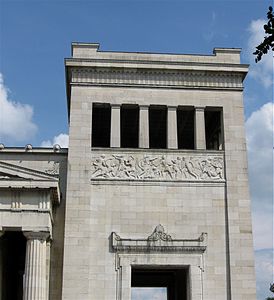 Good pic of the Propylaen to show the taper and the very slight curve on the pilasters. Note the tapering shadow.
 -
 This old pic from a long distance shows precisely the tapering forms.


- Ðiliff, as I have said to you before, I am not entirely opposed to adjustments. I don't want to argue the point with your refutation of the benefits of adjusting every individual image.
- With regards to your refutations over the images that have used as examples, two are particularly dreadful. But the reasons that they are so bad is that ordinary snapshot-takers upload their pics and then follow the simplistic instruction to straighten the verticals. I am perfectly aware that you would produce a much better image. But the fact is that usable images are being ruined all the time, simply by users following a simplistic and inappropriate instruction. It is this that renders the images useless.
- Re the Propylaen. Use your eyes! You are a photographer, for God's sake! You spend your life looking. It is clearly apparent in every single photograph except the ones that have been so stupidly straightened out!
- The reason why this sort of stuff hasn't been included in the articles is simply that it's too sophisticated. You can call stating what my eyes see "Original Research" if you like. However, this is my' Talk Page, not an article.
- Re the Church of San Giorgio. Yes, as I commented, my adjustments were not good, and reduced the width more than necessary. Looking obliquely at a building has the effect of narrowing it. The "original" has been stretched to ridiculous widths, completely ruining its proportion. Can you not see that? If you can't, then enlarge it and you will find that every single individual walking around on the quay is strangely obese.
The main thing that concerns me here is that after all I have written, we still have a statement being made to the effect that the intentions of the architect can be disregarded. If you can seriously read what I have written here and look at the Propylaen, at the Maisson Caree, at Wells Cathedral and San Giorgio"s and believe that you can ignore the way the architect uses perspective, then you are plainly not about to get the message.
What I am encouraging you to do is take a much more sensitive and aware approach than simply saying "The best we can do is make the verticals parallel and the horizontals straight." If you are going to continue to think like that, after all I have written, and the images you have looked at, then you should become a bricklayer and concern yourself purely with plumb-bobs and spirit levels. However, if you are going to involved yourself in recording and interpreting the works of other artists (architects) then you need to consider what they had in mind. I am going to take this one step further and draw a couple of diagrams. I'll put them up tomorrow. Amandajm (talk) 16:23, 31 March 2014 (UTC)
- I don't think either of us are debating whether you're entirely opposed to adjustments, I think we're debating whether specific types of adjustments, primarily the correction of leaning verticals, is appropriate for architectural images. As such, I don't think we're getting off topic. I certainly agree with you that some images are edited poorly, but this debate is not about the poor editing, it's about the adjustments theselves. If you're going to use poor edits as a justification for opposing corrections, it's the equivalent of saying 'some people do bad things in the name of religion, therefore religion is bad'.
- As for the Propylaen, yes I see the tapering now, it is evident in the fact that the pseudo-columns project outwards with respect to the wall between them. However, it is very slight. The true angle of the taper would be perhaps one or two degrees at most. (an estimate: 10cm of widening on a column height of perhaps 25 metres?) The angle that you've applied in your edit is closer to 5 or 10 degrees. So yes, the complete correction of verticals in that image is inappropriate, and I agree with you on that. However, that doesn't mean I don't believe that no correction is required either. I still believe that even High Contrast's image is still closer to the true angle of the out edges of the building than your edit, or any normal uncorrected photo of the building.
- I disagree that we have a statement to the effect that the intentions of the architect can be disregarded. Of course the intentions of the architect should be considered, especially when there are physical properties of the building that can be measured and documented. However, I think it is more the place of the text to explain any visual trickery or compensation for perspective that the architect has designed into the building, because a photo is never a complete and uncompromised attempt to capture a three dimensional structure. A good architectural photo should make clear any design elements though. If there is indeed some tapering of columns, or a reduction in scale of the components of the building in order to accentuate the perspective, or effects of that type, then a good photo would show this. And by show it, I mean make it clear to the viewer that the column is not completely vertical. A vertically corrected image will do that far better than an image that already has a perspective lean because it is orders of magnitude more difficult to determine whether any perceived lean is due to perspective, or due to a tapering column! A vertically corrected image (taking into account any non-vertical edges, of course) will simplify the view so that the viewer knows that any tapering is not due to perspective, but rather the inherent design.
- You say "What I am encouraging you to do is take a much more sensitive and aware approach than simply saying "The best we can do is make the verticals parallel and the horizontals straight." If you are going to continue to think like that, after all I have written, and the images you have looked at, then you should become a bricklayer and concern yourself purely with plumb-bobs and spirit levels.". When I said "The best we can do is make the verticals parallel and the horizontals straight", I was referring to making actual verticals vertical. If there is indeed an actual lean in the building, either designed or due to subsistence, I am not suggesting we correct that. I'm suggesting that any true vertical lines should be made vertical, when it is possible to do so. Ðiliff «» (Talk) 17:09, 1 April 2014 (UTC)
- Re the Prpoylaen, my edit restored not just the actual taper, but the vertical perspective as well, which mad the the towers both taper and lean inwards.
- The poorly editted photos are the direct result of amateur photographers applying a simplistic directive.
- You still seem to be missing the point that architects designing buildings that were going to be viewed from close up, knew that they would appear to taper regardless of how straight the actual lines were, and took this into account in designing the building. Every time you straighten out a building that is usually seen close, and has been photographed close, (for lack of space), then you are denying both the architect's design skills, and the fact that the architect may be using the apparent taper to good effect.
- Straightening the verticals so that there is no rising taper also has the effect of making the walls appear to lean out (in any instance where the camera is relatively near). You may have become immune to this, but believe me, it is not a good look, to have the building splaying out ward, when it should soar.
- Amandajm (talk) 09:10, 2 April 2014 (UTC)
-
 1. A villa of a Classical style designed as a country house. This building has been styled to be seen at a distance. It stands on a broad, high "crepidoma" or basement that elevates it and gives "presence" when seen from a distance. (compare size of figure with pic 2) The balustrade around the roof continues the vertical and horizontal lines of the building. The architect is not required to take into account the vertical perspective, because the building is ideally seen from a distant view, minimising the effects of linear perspective.
 -
 2.A "palazzo" in the Classical style designed as a city building. This drawing shows the building as it would appear in a street. The building is strongly affected by perspective: its verticals taper and its horizontals appear curved. The upper line of the basement is approximately eye-height and therefore appears straight. (note size of figure) It is a little wider than the building and stabilises everything below eye-level. Above eye-level, all the verticals appear to slope inwards. The architect counters this by adding an entablature that juts out much further than the basement. The end result is to counteract the apparent inward lean of the sides, caused by the restricted view.
 -
 3. A "palazzo" in the Classical style designed as a city building, seen obliquely, strongly affected by perspective: its verticals taper and its horizontals appear curved. The architect counters this by adding an entablature that juts out much further than the basement. The end result is to counteract the apparent inward lean of the sides, caused by the restricted view.
 -
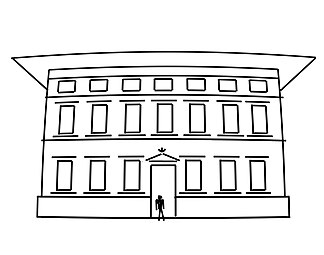
 4. A "palazzo" in the Classical style designed as a city building, when seen without the effect of vertical perspective, and with all its verticals and horizontals straightened as it would appear in a drafted elevation. Without the inward taper caused by perspective, the entablature is too large, and the building looks top-heavy. The whole design appears clumsy. It has not been designed to be seen from this view. It has been designed to be seen as Nos. 2 and 3. Transferred to the countryside and given a long vista, it will not appear as elegant as No 1. even though it is identical, except for the entablature/parapet and basement.


It would have been more useful if you pointed me at "sources" rather than a Wikipedia article you wrote. Is there anything perhaps online I could refer to? You may well be right about certain illusions being corrected for, though many of perspective issues generated by a wide-angle lens or a stitched panorama are not natural and would not have been dreamt of by any architect. I don't think any of us here disagree that correcting an image taken from close-up such that the verticals are straight will usually create a heavily distorted image -- whether or not the building has tapers or is actually true. A problem remains that no eye projects a 3D view of a tapering building (whether by perspective or design or both) onto a 2D flat surface. Our pair of curved retinas create a 3D view for us to explore by moving our eyes around and changing our focus. So all 2D projections of close-up buildings will have significant distortions and it may well be a matter of taste/fashion/context as to what is desirable. It is only when one gets further back that a photograph approaches vision in terms of vertical/horizontal perspective, but then the focal length of the lens may then start to distort depth perspective. One can't win. For any given image, what we really need is a variety of shots taken under controlled conditions (camera dead level, standard lens) in order to gauge whether any leaning or tapering is real. This may not be possible when one is presented with an image for review. -- Colin°Talk 09:11, 4 April 2014 (UTC)
(Update) Some Googling tonight has produced The origins of entasis: illusion, aesthetics or engineering?, similar to a paper linked from Wikipedia's own Entasis article. It rather suggests the "counteracts an optical illusion" is a Just-so story created by Hero of Alexandria. So this is not a "discovery" by a "architectural historian", as you claim above while mocking my ignorance. I may be pretty ignorant about architecture, but I've got an open enquiring mind. Let's agree that some classical buildings taper, curve and lean, but whether that is deliberately to make them look better close-up or to correct for distortions, is something only Dr Who could answer. -- Colin°Talk 21:20, 4 April 2014 (UTC)
- Colin°Talk
- I pointed to Helen Gardner, Banister Fletcher and Nicholas Pevsner, because in each case their works are very well known and highly accessible. The full details of their publications are cited in the references to that article.
- Re "discovery by an architectural historian". You suggested that what I had written was "Original Research". That was my response to your comment. If I was the architectural historian who had discovered that all the lines of the Parthenon are curve etc etc, then it would be my own original research, and I would indeed be proud of it. But no, as you point out, others have had this field well covered before me.
- The best known architectural historian to "discover" entasis (etc) from his own Original Research is Charles Robert Cockerell in the early 1800s. He made measurements of the Parthenon and drew diagrams. However, his work was not original because "entasis" had not only been described in relation to the Greek temple at Paestum by an Italian architect Paolo Paoli, but its usefulness had been disputed. Here is a good source [2] Giovanni Battista Piranesi, famous for his engravings of buildings, had observed such details in the mid 1700s.
- With regards to OR, and the status of the architectural historian: most Ancient texts were not available during the Middle Ages, and became available in the 1400s. Vitruvius' De Architectura wasn't rediscovered until 1414. Nothing had been written on the subject (that is now known) for 1400 years. Alberti, knowing Vitruvius, was then inspired to write his own treatise. Alberti was essentially a dilettante: he designed buildings on paper and left all the practical considerations for the builders to work out. Alberti's contemporary Brunelleschi, was exactly the opposite. In about 1402, before Vitruvius' "Architectura" was yet discovered, Brunelleschi set off, in the company of the 15 year-old Donatello, to "rediscover" Ancient Rome. They were the first people to approach Roman ruins as archaeologists. Brunelleschi literally "rediscovered" the orders that governed ancient Classical architecture. There were rules, at that time forgotten, as to how the various components related to each other. Brunelleschi re-established, (initially for himself) the nature of these rules, and set about building structures that conformed to what he perceived as the "correct" configurations and proportions. The Ospedale degli Innocenti and the two great church interiors that he created, San Lorenzo's and Santo Spirito's, were ground-breaking. Meanwhile, Alberti was busy writing his own highly influential Treatise on architecture, inspired by Vitruvius.
- Original research: I cannot find evidence of entasis in Alberti's buildings, other than the Tempio Malatesta, and the basement of San Sebastiano, (which doesn't count because it wasn't built to plan and any reconstruction is speculation). In Brunelleschi's work, he has used slight entasis at Spirito, but I didn't observe it at Lorenzo's. (earlier design, but maybe I wasn't looking for it). The entasis is all the more remarkable at Spirito given that the building was largely constructed after his death, by builders with no understanding of Classical concepts, and therefore most unlikely to curve the columns out of custom, in the way that a Victorian architect might do.
- Further OR This leads us to the architects of the 1500s. Michelangelo had grasped it as early as 1514. I have found clearly demonstrable evidence of the Mighty Mick's continued use, but I'm not sharing that on this page. Antonio da Sangallo the Younger utilised entasis on his columns in the courtyard of Farnese Palace, about 1530-40.
- Palladio, active from about 1540-80, knew every trick in the book, and out of it as well. I'm sure all his refinements must be discussed somewhere. I cannot direct you to sources because I know what I know from observation. Palladio was so aware of the Classical concepts that he was able to utilise them in a plastic manner. It gets back to the notion of "What is the architect on about?" In many cases the story is as simple as "putting the architectural elements together to make a pretty building" but with Palladio, Michelangelo and Brunelleschi, it goes much further than that. Amandajm (talk) 06:15, 5 April 2014 (UTC)
- Regarding the different ways that: a) the 3D image of the eye, b) the image of the camera lens, and c) the 2D image on paper or screen represent an object, the consideration here is how to reconcile a and c through the processor b.
- The end result in 2D cannot adequately represent the 3D view of the highly-flexible dual vision of a pair of human eyes. No-one is suggesting that. But even with one eye shut, perspective presents itself; more tidily in fact, which is why artists often shut one eye or use a little view-finder to distil the perspective when required. The camera obscura was designed for this purpose.
- The curves that one perceives with the human eye when looking at a building from a fairly close view are not simply the result of a curved eye. They are the result of proximity. Even though the earliest artists to work scientifically with linear perspective (Brunelleschi again), the lines of sight are not straight; they all appear to curve. If this were not so, then the ceiling above us and the ground at our feet would appear to rise and drop to points where the lines met.
- I am going to say again that I am not completely opposed to perspective adjustment.
- I am going to repeat that making all verticals (I mean true verticals; I exclude building like the Parthenon and the Propylaen).... Making the verticals perfectly parallel is in many cases contrary to the way the eye sees, and the way the architect has conceived the building. If the building is viewed close, then it is almost always preferable to maintain a slight taper because it looks more natural.
- The optical effect of straightening a building seen from a low vantage point is to make the top appear to splay outwards. Any diagonals (the line of a pediment or the inner perspective of a tower) will further push the verticals apart.
- My additional suggestion is that when you approach a building in order to photograph it, you really look before you make the presumption that its lines are straight. If you are looking at Greek temple, then they are almost certainly not. If you are looking at Palladio or Michelangelo or Christopher Wren, or Nicholas Hawksmoor's work, then they are almost certainly not. If you are photographing a work that is consciously Neo-Classical and dates from about 1790 through to the Art Deco period, then the building almost certainly tapers as it rises, and may also curve as the Propylaen does.
- Gothic architecture is another story. The architects designed the buildings to soar. If there are two towers on the facade, then there is a good chance that they taper, and step inwards. Making the outer walls of the towers parallel is obviously inappropriate.
- Ground level (and everything below eye level) curves down to the lowest point at your feet. So the rows of seating in a church or theatre curve upwards on the flat 2 dimensional plane on either side. Allowing this to happen to some extent (instead of making your horizontals perfectly horizontal) and likewise allowing some upward curve of the roof achieves three purposes: 1. the viewer is more part of the scene. 2. the interior appears more 3D. 3. The distortion (apparent stretching) that happens to the outer sides of the image when the lines are pulled to parallel is considerable reduced.
What I want to see happen here is the simplistic concept "make verticals parallel" replaced by a much more sensitive and knowledgable approach to each work of architecture.
Amandajm (talk) 06:58, 5 April 2014 (UTC)
- Colin°Talk
- I forgot that I hadn't commented on the article that you found on entasis! Ha!
- If I read it correctly..... they were asking the preferences of the group based on a series of images of columnar shapes that were 1. single columns (not in rows, as they appear on a building) and 2. from 10.5 - 11 centimetres high, 3. viewed on a computer screen!! How could this possibly indicate what is pleasing to the eye when it is thirty feet high and has light and shade on its curved surface? Note that they are from the Department of Psychology, not Architecture. It's hilarious!
- Amandajm (talk) 07:14, 5 April 2014 (UTC)
- I haven't caught up on this part of the thread yet, nor read the article in detail, so I won't comment too much on the article or its conclusions, but what is so hilarious about the department of Psychology doing the study? I'd imagine that researchers specialising in 'spatial vision' would be better suited to studying the visual effects/illusions than architects because they would be better able to consider the neurological aspect of visual perception than architects would. Also, based on a quick skim of the article, I can tell you that they do seem to have studied the effect on a series of parallel columns, not just one in isolation. I quote: "EXPERIMENT 6. Having failed to discover any evidence that entasis counteracts an illusion of parallel columns appearing concave, we carried out a final experiment to determine whether entasis might be an aesthetic preference. For this experiment we generated a schematic temple, mimicking the proportions of the Parthenon". Ðiliff «» (Talk) 07:50, 5 April 2014 (UTC)
- I think we are all furiously agreeing that over-correcting buildings can look odd/weird/wrong. And it is useful information that you supply wrt what kinds of architecture may have features that slope or curve or lean, thus confounding attempts to straighten them up. But architectural historians commenting on optical illusions and making guesses about the intentions of people who never wrote down their intentions... well that's just bad science. Some more humility needed in that profession me thinks. It's like the evolutionary psychology "science" where people make up stories about why women evolved to like the colour pink and other such rubbish. I think to some degree you are simply trying to rationalise your personal tastes wrt viewing buildings.
- All 2D images of our 3D world are distorted. Whether we can figure out the distorted image and make sense of it and apply it to our mind's eye depends on our experiences, culture, taste, and mental/visual abilities. A wire-frame sketch of a building may be hard to fathom to someone unfamiliar. And one can make a technical drawing at an angle that is inferior to another angle. I am reminded of a conversation I had with a Bible-translation missionary years ago. He commented on the stick figures in the "Good News" Bible causing problems in some cultures who aren't used to an arm being cropped-off at the edge of the frame or a person drawn with just one eye, a nose and no mouth. These are artistic effects with are so used to we think nothing of them. BTW, Google turns up this interesting article on the stick figure drawings in the GNB. The artist, Vallotton, in producing the illustrations, had to avoid creating a misleading interpretation of the subject. Something we are all aiming at, but perhaps with different approaches and tolerances. -- Colin°Talk 10:38, 5 April 2014 (UTC)
- Furiously agreeing? I haven't noticed anything resembling condescending agreement, let alone "furious agreement".
- "Hilarious?" it is not hilarious that they are doing such an experiment.It is "hilarious" that they are trying to gauge the psychological effect using something 10.5 centimetres high. Amandajm (talk) 13:15, 5 April 2014 (UTC)
- Understand this: I have been told here "The best we can do is make verticals vertical and horizontals horizontal". Despite what I have written, there has been no acknowledgement that perhaps this is not the "ideal approach".
- Try to put yourself in my position. I have been through this with two people who know cameras, photography, digital imaging etc and have a great deal of expertise. At this point in time, I haven't challenged either of you to back up your claims, give references or prove yourselves correct. What are your sources?.... I don't really need to know. I am prepared to look at images you have taken and read what you have written, to accept that you have expertise.
- On the other hand, my statements about architecture have been seriously challenged. I have been accused of "original research" over matters that are the subject of wide study and writing. (I am quite happy to put OR on my own page or talk pages, but I do prefer to make it clear that my own original research is in fact my own, if it is at all significant. The observations here on Brunelleschi, Michelangelo and Palladio are OR in Wikipedia terms, simply because they are based on observation and are not sourced, but are not necessarily "original" in terms of scholarship.)
- I have written most of the major articles on architecture that are on Wikipedia, including Ancient Greek architecture, three articles on Romanesque architecture (of which two are ground-breaking in their collation of information that has not been drawn together previously), Renaissance architecture, Italian Renaissance painting, monographs on some of the world's most important churches including St Peter's and St Paul's, not to mention Leonardo da Vinci, and the greater part of the article on Michelangelo which probably makes me the most widely read author on art and architecture on the planet. Would you believe that Leonardo da Vinci gets more hits than Leonardo diCaprio?
- So, it's like this:
- When I tell a couple of photographers that the walls of the towers of the Propylaen slope inward, I don't expect to be queried and made to prove the point. My statement is made on the basis of very wide knowledge, which I would have thought was apparent almost from the first paragraph that I wrote on the subject of architectural photography.
- Put yourself in my position: I look up Classical Revival architecture on Commons, specifically to give you a good example. What do I find? I find the Munich Propylaen in such a distorted form that you, Colin and Diliff, both query whether the towers really do slope and whether the sides really are curved.
- To me, finding that building bastardised to that extent, and put it into an encyclopedia is about as horrible an experience as someone dropping your favourite lens in their Bolognaise sauce. You want if fished out and fixed immediately. The misrepresentation of the building is so bad that you, who photograph buildings, want me to prove what I know to be true, because of the date and the style and the very precise language of the architectural form that is being represented in the building.
- If I typeset this sentence "I amgoingto takeaphotoof thepropylean inmunich", you could undoubtedly decipher it, because you know the language, but it would not express the form of the language or the intention of the writer. The photo of the Munich Propylaen, the photo of San Giorgio's in Venice and a great many others that are listed as "Good Images" on Commons are in fact as poor representations of the subjects as my badly typeset sentence is of written English.
- Am I making myself clear?
- IF the photo of the Propylaen was a good photo, then you, or anyone else who looked at it, would KNOW that the sides of the towers slope inwards. You mightn't notice until it was pointed out, but you wouldn't have reason to doubt it, when told. That photo, like so many others that distort the images, is the result of the notion that "The best thing to do is make the verticals parallel and the horizontals parallel".
- As an architectural historian, I don't want the Wikipedia reading public's views of buildings distorted by "corrections" that are the result of the photographer blindly following a directive and failing to actually look at the building.
- I have stated already what I want from this: that two Wikipedia photographers look with their very own eyes, as well as the camera lens, and ask the question "What is the architect on about?" before adjusting the image, so that this Propylaen sort of thing doesn't happen again.
- Further, I would like you to give some serious thought as to how to express methods of image adjustment that encourage a much more sympathetic approach to the subject that simply lining up the verticals. How do you frame instructions that are relatively easy to follow, (for amateurs uploading images) but achieve a good effect overall?
- My feeling is that the first is not a hard ask; it is the second one that is difficult.
- Amandajm (talk) 13:15, 5 April 2014 (UTC)
- I have to say, you're making it very difficult to respond to you, with the odd and inconsistent combinations of indents and numbering.
- As regards to 'furious agreement' vs 'a lack of even condescending agreement', you seem to have missed the part where I repeated more than once that I was not advocating the complete vertical correction of walls, columns etc that are not actually vertical in real life.
- It doesn't necessarily matter how high the subject is. Because of this thing called perspective that we've been debating for the last however many pages, something that is 10 centimetres high can have the same visual appearance as the equivalent shaped object 100 metres high, as long as the angle of view remains the same and the object's height is proportional to its distance from you. As I understand it in the case of the experiment, they were using computer generated images showing what the columns would look like from a given perspective. Just calling something hilarious without demonstrating specifically what is wrong with it isn't that helpful.
- There was some context to the quote of mine that you're using. As I said already, I have happily conceded an exception to this general rule when the lines are not actually vertical. Of course they should not be made vertical. And I have also happily conceded that there are limits to how far you can correct the vertical lines. A photo looking almost straight up at a skyscraper will never be vertically correctable without introducing extreme distortion. In such a case, the lesser of two evils would be the vertical leaning lines. But in most other cases, yes, I still maintain that it is the correct approach. It is not only my opinion, it is the opinion of most architectural photographers.
- I'm not in a position to doubt how much work you've put into the various classical architecture articles, but ultimately, nothing that makes a factual claim should be included in an article if it isn't backed up by a verifiable source. For most of the doubts I've had about your claims, I've asked you to demonstrate that it is true by providing a source for your information. I'm sorry if you aren't used to having your expertise questioned. You may claim to be the most widely read author on art and architecture on the planet (a rather far-fetched claim, I might add, given that there are likely hundreds of researchers dedicating their entire professional life to many of these subjects), but arguments from authority don't carry much weight in my opinion. If you're correct, don't just tell me you're correct, demonstrate you are correct. I don't think it's so much to ask, really. I don't think you should accept my claims without question either. Of course I think I'm right about the claims I've made or I wouldn't have made them, but I am prepared to back them up with logic, reason and independent sources if necessary, and I'm also happy to respond to queries and doubts if you can be specific about what you disagree with. If you prove me to be factually incorrect, I'll happily accept that.
- I have to say, you're making it very difficult to respond to you, with the odd and inconsistent combinations of indents and numbering.
- Response "far fetched claim".... The claim isn't made in arrogance, and it isn't an idle claim either. It was made simply in light of the fact that this is Wikipedia. it is the first port of call for thousands of students. Anyone who wants to know about Ancient Greek architecture online (for example) gets Wikipedia as a first option. As a result of the success of Wikipedia, the major articles for which I am the author (or in a couple of cases author of the architectural content) get a million hits a months. (I haven't counted the minor one.) It is the result of the success of Wikipedia, rather than my personal success, so the comment was made tongue in cheek, but you may not have realised that. Amandajm (talk) 11:39, 7 April 2014 (UTC)
- I see what you mean now. I thought you meant it as in 'well read', which is according to the OED: "Well-informed by reading, learned in (a subject)". In the context you used it in, I therefore thought you were claiming to be the most knowledgeable author on classical architecture on the planet. That's why I found it slightly far-fetched. Anyway, yes, you might well be. But how widely read you are doesn't imply that you are infallible and cannot be questioned. Even external sources can be wrong or contradict each other. That's why questioning is important. Because of how commonly used Wikipedia is, it's important that the information is accurate. As per this amusing cartoon, before long, incorrect articles left unchecked become assumed and widely cited as fact. ;-) Ðiliff «» (Talk) 12:04, 7 April 2014 (UTC)
- Response "far fetched claim".... The claim isn't made in arrogance, and it isn't an idle claim either. It was made simply in light of the fact that this is Wikipedia. it is the first port of call for thousands of students. Anyone who wants to know about Ancient Greek architecture online (for example) gets Wikipedia as a first option. As a result of the success of Wikipedia, the major articles for which I am the author (or in a couple of cases author of the architectural content) get a million hits a months. (I haven't counted the minor one.) It is the result of the success of Wikipedia, rather than my personal success, so the comment was made tongue in cheek, but you may not have realised that. Amandajm (talk) 11:39, 7 April 2014 (UTC)
- Again, going back to the Propylae, I agreed with you at the time that if the columns on the outer wall do taper outwards, then they should not be vertical. But I simply disagree with you that the solution to this problem is to have them lean inwards as you had them do in your correction. How does this make the building look more accurate? As I mentioned already, I estimated that the taper of the columns must be approximately 10cm wider at the base than the top of the roughtly 25 metre high column. As such, that makes it a 0.4 degree taper. This is almost imperceptible. Certainly measurable, but arguably imperceptible at first glance. Why would you replace an image with a vertical correction that is effectively just 0.4 degrees off being vertically correct with an image that is grossly inwardly leaning, and not remotely showing the correct taper angle? I suppose what I'm asking, repeatedly, is for you to not just tell me that a building is misrepresented, but explain rationally why it is so. And I don't necessarily mean aesthetically, or because it is misrepresenting the architect's wishes. Those are separate issues which I think we've already covered, but I'm happy to discuss it again if necessary. But for now, I'd like to know why a corrected image (assuming any taper is allowed for in the correction, so please don't use the 0.4 degree error as the reason) is geometrically misrepresented, and why an uncorrected image is not geometrically misrepresented.
- Response: Just to clarify the Propylaen problem (and the San Giorgio's problem): In both cases that re-adjusted images (to indicate the curved tapering surfaces on one hand, and the degree to which the building was stretched on the other) were both made without knowing exactly what process had been employed in the first place. In the case of the Propylaen, when I adjusted too far, the central portico was pulled out of whack to an unacceptable degree. Amandajm (talk) 02:19, 8 April 2014 (UTC)
- As for your final wish that we can find a method or set of instructions that improve the architectural photography and specifically the way in which corrections take place, I think you're right that it is going to be difficult, because there are so many different tools with which to do the manipulation, and in the end, the extent to which corrections and manipulations are appropriate is entirely subjective. You're clearly more sensitive to the issue than most people, so it's going to be a hard sell to get others to follow your way of thinking. But being sensitive doesn't make you absolutely right. In any case, as Colin mentioned, I think we do already agree that bad corrections are bad for the final image. Some of the bad correction examples you provided were bad because they not only corrected verticals but also included other geometric distortions that were not appropriate to the scene, like compressing the image on the vertical axis so that the spire was out of proportion. But I just don't think we currently agree on whether other specific corrections are bad or not. Although we've digressed about other related issues at times, this whole discussion is primarily about vertical corrections and whether they are appropriate. Apart from the aforementioned exceptions where it creates too much distortion or overcorrects lines that were actually tapering and not vertical, I just haven't seen any persuasive arguments about why it's wrong. And as I've repeated so many times, it's nothing more than the equivalent of keeping the camera pointed horizontally. Ðiliff «» (Talk) 00:18, 6 April 2014 (UTC)
I have read and tried to understand the arguments made by all the knowledgeable contributors to this discussion. Would one way of trying to identify what you all agree on (and the areas where there is still disagreement) be to try to write a draft guideline for non experts (eg me) as a bullet point list? Once you had got as far as you can, including the exceptions, then put it out for wider consultation to architecture & photography type wikiprojects and the people who comment on photos at Featured Picturs etc.— Rod talk 19:27, 6 April 2014 (UTC)
- What is most frustrating about this is that Amanda has misinterpreted the statement "All we can do as architectural photographers is attempt to keep both horizontal and vertical lines straight whenever it is practical to do so." The key parts of this misunderstanding are "vertical lines" and "practical". If Amanada would understand these rather than attacking straw men, we'd get somewhere. Let's be clear: if the lines aren't vertical and straight to begin with then adjusting them so they are vertical straight is probably not a good idea. The whole discussion of whether the architect made the lines tapered, bent or leaning for aesthetic, optical or structural reasons is an irrelevant distraction. And secondly, it is only practical to attempt straight verticals in a photograph if the angle of view is reasonably constrained. There is a reason why rectilinear lenses don't support 180-degree angle of view -- because infinity isn't very practical. There are plenty bad cases of perspective correction on Commons, but far more bad cases of no-correction where someone has merely pointed their camera up in an attempt to get the whole building in. Neither are ideal representations of the subject, though the view-upwards from the base of a tall building can have some artistic merit of its own. The extent of correction that is acceptable may be a matter of taste and depends also on the subject -- some features like round towers and weather vanes tend to look pretty weird when corrected, whereas other flatter subjects may not show up the distortion as badly. Taste may also include whether one is aiming for an architectural style or a dramatic one. -- Colin°Talk 13:41, 7 April 2014 (UTC)
- Thank you Colin°Talk. I agree with almost everything that you have said here, except that "Amanda has misinterpreted the statement "All we can do as architectural photographers is attempt to keep both horizontal and vertical lines straight whenever it is practical to do so."" This is not the case.
- My comments here have arisen from the fact that I consider the photographs of buildings taken by Wikipedia photographers who are as competent as Ðiliff «» (Talk) to be in general over-compensated (in terms of perspective) because there is an over-riding direction to make verticals parallel.
- I have used some exaggeratedly bad examples here in order to make the point clear, but the point remains that the simplistic instruction "Make verticals parallel" is not a good one, even in the hands of a photographer who is as competent in every other way as Diliff is.
- In general, the paralleling of vertical lines, so that the image does not represent natural visual perspective does not work well. Even on the straightest, most box-like, palazzo-style building, (like the diagrams above) the end effect is to make the walls appear to lean outward at the top. This is because 1. the eye expects what is above it to taper inwards, 2. the architectural style (as demonstrated above) takes this apparent taper into account.
- What I am proposing here is that "Make the verticals parallel" is a misguided instruction, even in the hands of the competent photographer, and is a disaster in the hands of whoever photographed the Propylaen and San Giorgio's (two photographs acclaimed as "Good Images" on Commons, both adhering to this rule, and both being very poor representations of their subject.)
- So far, neither of you has presented any convincing evidence as to why making verticals parallel, instead permitting them to taper really is aesthetically better.
- Historically Brunelleschi, (the aforementioned), and Piero della Francesca, in the early 1400s, discovered the geometry of "linear perspective" and their successor Domenico Ghirlandaio flew with it. (NOTE: OR) Ghirlandaio's successor, the Mighty Mick, on evidence of his architecture (because he didn't paint buildings into his images) already knew that the eye didn't see in straight lines. (end OR) His successor the architect Palladio flew with this, brilliantly. I haven't done a detailed study on perspective in Baroque painting, so I will not comment on that except to say that Dutch interiors by Vermeer and others were often created using a camera obscura and accurately recall what the lens saw, rather than being ruled up with geometric precision and dead straight lines. By the 19th century, James McNeil Whistler, Degas and John Singer Sergeant knew perfectly well that the eye didn't see in straight lines. All three of these artists used photography to aid and confirm their vision. (NOTE: these are three "realistic" painters, not Post-Impressionists like Van Gogh).
- In the light of this history the notion that the vertical lines of an image should be parallel is a return to the geometrics of the early 1400s, and ignores all the developments since.
- Here are my main points:
- The eye does not perceive a building (except from a distant viewpoint) as having all its lines parallel. Convergence (in arcs) is what we see. This applies to interiors as well as exteriors.
- No evidence has been presented that making verticals parallel in such an image is the ideal, aesthetically. On the contrary, it generally results in the distortion of the building. The distortion e.g. arches which should look round are flattened into low ellipses, might only be apparent to someone who knows the building (or the style) but constitutes a misrepresentation to someone without this knowledge.
- I am not insisting that adjustment to the perspective of images is essentially bad. It can be very helpful, particularly in the case where the only available image of an important building is one taken from an undesirable angle which does not display the building's character well.
- I am saying that there has been a general and widespread tendency among Wikipedia photographers to follow the simplistic "make verticals parallel" instruction without awareness, and without thought. Straightening all the curved lines of the Parthenon is typical. Straightening the lines of the Propylaen is typical. Removing the inward lean of the walls of the Thorvaldsen Museum is typical. Stretching the facade of San Giorgio's is typical. Some of these photos have gold stars as among the "Best on Wikimedia Commons".
- What I have proposed here is that the photographer think carefully about the architect's intentions and whether the architect has: 1. compensated for the effects of perspective convergence; 2. deliberately utilised the effect of perspective convergence (most typically in church towers). If buildings are the photographer's main subject, then the photographer's competence ought to extend to being aware of the subject. Do the walls slope? Are the columns tapered? Are the columns curved? How has the architect utilised eye-level? Has the architect created horizontal stopping-points for the upward movement? Is there an overhanging cornice, and if so, why? Are the sides of the towers and buttresses parallel, staged, stepped or tapered? Why?
- In general, I believe that a more subtle approach is needed than applying a the most simplistic mathematical solution.
- My proposition is that the simplistic instruction that verticals should be made parallel doesn't work well in practice and that more thought needs to go into devising instructions that result in better effects.
- Amandajm (talk) 01:40, 8 April 2014 (UTC)
- Amanda, some of your main points above have been already been refuted by me, but I don't believe you've ever directly responded to them, so we are still at a point where we simply have conflicting points of view but no real interaction over those points. I've attempted to respond to yours but you seemingly have not attempted to respond to mine. Here they are again:
- In my opinion, the eye does perceive a building as having its vertical lines parallel. It doesn't actually see all lines vertical and relative to each other simultaneously though, it sees details only in a very narrow foveal view and in that constrained view, there simply isn't a wide enough angle for perspective to substantially lean vertical lines inwards. It is estimated the foveal angle of view is around 5 degrees, whereas the eye's total angle of view is close to 180 degrees horizontally, and slightly less vertically. That means that only the centre 3% of our vision is foveal. Now, I don't have any proof that we primarily perceive geometry and spatial relationships in the foveal vision (It's rather an obscure premise, but perhaps some research has been done on this), but I strongly suspect it is, based on my own observations. As I suggested already, try it next time you're in front of a building. Look at the top right corner of the building. You'll see that the vertical edge is vertical. Then look at the top left corner of the building, you'll see that it too is vertical. This is because the act of centring your vision on them ensures that they are vertical, exactly as happens with a camera. But, unlike a camera which sees the entire scene with the same acuity, I strongly suspect that you won't be able to perceive the angle of the opposite corner with any accuracy. This is because of the limitations in our vision, both physically and I suspect mentally, beceause our brains have evolved to process geometric information primarily from the foveal view, and to process mainly movement in our peripheral vision. It's fairly clear why this would be the case from an evolutionary point of view: we can move our eyes and our head to centre our vision on something that we're particularly interested in, but we also need to perceive movements in the periphery in order to be aware of potential dangers. This would also explain why our ability to see colour is much more limited outside of the foveal view, but our ability to see in the dark is actually better.
- It's a loaded statement to say that "No evidence has been presented that making verticals parallel in such an image is the ideal, aesthetically", because there is no single ideal and it will vary from case to case. However, I believe that evidence has been presented to support the claim that it is generally preferable to leaving an image uncorrected. Neither Colin nor I have made the claim that correcting vertical lines magically fixes every geometric distortion inherent in a 2D projection of a 3D scene though. We've always maintained that there will compromises inherent in that conversion regardless of whether the verticals are corrected or not. But distortion of the elements of a building at the extremities is often (arguably) more aesthetic and a less obvious distortion to the viewer than the leaning of vertical lines which gives the building the appearance of leaning backwards or forwards, relative to the viewer. I'm not sure why you think that arches become flattened as a result of vertical correction. In fact, the opposite is true, because without correction, the arches appeal flatter than they actually are. Consider this real world example of mine. I recently visited Westminster Cathedral and took a photo of the view leading to the sanctuary. Towering over the entrance to the santuary is one of the semi-circular arches. In the vertically corrected completed panorama, the arch is preceisely circular, and in the uncorrected image (which is actually one of the component images of the panorama, hence being slightly more zoomed in), the arch is not, and you can see that because the arch has become flattened slightly, it pushes the point at which the arch should stop curving and become vertical below where it actually does become vertical. The red circles used to demonstrate this are precisely circular, so it is not visual trickery. The reason why the arch is circular in the corrected image is because the arch is parallel to the plane of the viewpoint (the verticals become corrected precisely because the plane is adjusted to become parallel with to the vertical lines), whereas the arch is NOT parallel in the uncorrected image. In terms of perspective, it is effectively tilting away from us, and when you consider how something tilting away from us looks, you realise that it also has the effect of being vertically compressed, hence the arch is vertically compressed. Another practical example: hold your hand in front of and parallel with your face with your fingers pointing upwards, and then tilt it away from yourself. Your fingers effectively become shorter relative to the width of your hand, which doesn't change in size. That's vertical compression as a result of perspective tilt. In summary, one major benefit of correcting vertical lines is that it also corrects the geometric relationship between straight lines and provides a more accurate plan of the architecture. To repeat, I'm not saying there is no distortion of any kind. I'm just saying the geometric relationship is better preserved.
- You keep insisting that the photographer should consider the architect's intentions. I'm not saying we should be oblivious to the architect's intentions, but I have always argued that if a building was designed with perspective trickery in order to accentuate a building's proportions or angles, then I don't think the photographer should necessarily go out of his way to make the building look that way. The photographer should aim to portray the image correctly and show the trickery for what it is, because if we're reading an encyclopaedia article about the building, we want to know what it is really like. The article text can wax lyrically about the trickery and how clever it is all it likes, but the building physical proportions that should not be hidden. If there is a particularly notable visual trick employed, then perhaps a architecturally corrected view and the view that the architect intended would be useful to compare and illustrate the illusion. But if we have to have just one image and the visual tricks are not particularly obvious or notable, then I side with accuracy over the architect's intent to deceive or accentuate. Call me an extremist if you like, but geometric accuracy matters to me. Ðiliff «» (Talk) 13:33, 8 April 2014 (UTC)
- Here are my main points:
- Ðiliff «» (Talk), :You use the term "architects intent to deceive". This really isn't a good way of expressing it. What the architect was doing was creating something of balanced proportions. In achieving the balance, a good architect will have taken perspective and the common viewpoint into account.
- "Geometric accuracy" is nonsense. You can put together an image of something that is totally flat, and maintain geometric accuracy, but the moment that a column, pediment or porch juts out of that flat facade, you have lost the accuracy. When you look into a building and your eye and camera register the recession, then you know longer have "geometric accuracy". You are looking at geometry on in the most simplistic way the building has straight lines and corners at 90 degrees so that is the way they should be. This is straight forward enough, but when you look into the building, even if it is only so far as the projecting cornice and the window sills, you have diagonals coming into play, which are not actually present in the building.
- Your "corrected" image of the interior of Westminster Cathedral illustrates one of the points that I have been making very well. You have succeeded in making the verticals all truly vertical, and the horizontal that run across the plane of the image truly horizontal, according to the rules of linear perspective. However, there is nothing to counteract the fact that all the converging horizontals appear as diagonals. This has several effects:
- Everything above eye-height/camera-height appears to lean outwards, even though you know the lines are vertical. The outwards push of all those diagonals has that optical effect.
- If the picture was wider than the example that you have chosen, there would be a distortion to everything right and left of centre, increasing the further that you move from centre.
- The way to counter the apparent outward lean of the verticals is to maintain a slight inward taper. The way to prevent considerable distortion to the outer parts of a wide image is to maintain a slight curve, as the eye sees it.
- An example of over-correction is your image of Holy Trinity, Sloane Square. [3]. You know that the seats are all lined up in straight rows, so because they are parallel to the picture plane, you have made them so in the image, even though neither you nor your camera saw them that way. And you have made all the columns vertical. In doing so, the central part of the image, with the altar and reredos, (rectangular and parallel to the picture plane) have remained in correct perspective. The pulpit, being to the side, and viewed corner-wise, has suffered a considerable degree of distortion to its perspective. The window to the right hand side has suffered still more distortion. Neither of them has "geometrical accuracy". The chairs, as straight lines in your composition, are indeed geometrical straight, but to me, every individual chair, among the nearer ones, is screaming to me that you have pulled its geometry apart in forcing it to conform with the notion that straight-line geometry reflects the object better.
- Let me put it to you that if you want to represent these objects (buildings) with geometrical accuracy, then you should become a model-maker. If you are going to deal in images, then you need to accept what an image is, and what it isn't. The moment that you remove your lens-cap, you are dealing with the element of perspective. Perspective does not function in straight lines. Your great architects knew that. What you are making is photographs, not architectural drawings for a builder to work from. Because you are making photographic images and not elevations, they are effected by perspective, by light, by cast shadows, by atmosphere, by setting, by clouds, and by the presence of people.
- Examples: This picture of Il Redentore [4] tells you a great deal more about the facade of the building than this view, [5]. I can analyse the second image in detail and tell students why it is that the structure works visually, but the first image demonstrates for itself the subtle harmony that Palladio has put in place. It is the sort of image that a student can look at and say "yes, I get it".
- Of your pictures of the facade of St Paul's Cathedral, this one [6] is considerably better than the adjusted one in which you have attempted to make the verticals at the extremities of the tower completely parallel, but the corner pediments of the spires are announcing the viewpoints and contradicting your adjustments so that the walls appear to be splaying out. You cannot remove the diagonals, even though you know that on a drafted architectural elevation, they would be as horizontal as all the other horizontals. To the eye and to the camera, they are diagonal. The only way to achieve a "correct appearance" is to recognise that paralleling the verticals but not making the diagonals horizontal makes your buildings top heavy and splay outwards. Fixing this means sacrificing the notion of "correct geometry" as being a parallel grid. Let's go with "visual geometry". Amandajm (talk) 05:55, 9 April 2014 (UTC)
![[3]](https://commons.wikimedia.org/wiki/File:Holy_Trinity_Sloane_Street_Church_Nave_2_-_Diliff.jpg)
![[4]](https://commons.wikimedia.org/wiki/File:Campo_Del_Santissimo_Redentore_(7257280276).jpg)
![[5]](https://commons.wikimedia.org/wiki/File:Basilica_del_Santissimo_Redentore_Venice_1.jpg)
![[6]](https://commons.wikimedia.org/wiki/File:St_Pauls_Cathedral_from_West_-_Feb_2007.jpg)
Amanda, you really aren't saying anything new, just using lots of words. Essentially your tolerance for the distortions of a rectilinear projection at wide angle-of-view is low compared to David. You can rationalise this all you like, but ultimately it is a matter of taste and what one is hoping to get from the image. A camera held level on the ground near (or inside) a tall building needs very wide angle-of-view to capture the subject because much of the angle is subterranean and wasted. Capturing the building by pointing the camera upward results in a much smaller angle-of-view (fully utilised by the subject, perhaps) but introduces huge distortion to the vertical perspective. Both photographs have the same depth-perspective (which is affected by the focal-length of the lens and the distance from the subject). You simply prefer more trade-off of one distortion compared to another.
You dislike very wide-angle rectilinear interior shots. Fine, that's your taste. Out of interest, one can compare my fish-eye interior shots: File:Scottish Parliament Debating Chamber 1.jpg, File:Scottish Parliament Debating Chamber 2.jpg and File:Scottish Parliament Debating Chamber 3.jpg. These have different distortions to a rectilinear projection. There's much less stretching (size-distortion) but more curving, particularly at the top and bottom and less in the middle. All of these perspectives fail compared to the interactive view my eye gets. While the middle debating chamber image looks quite natural in the middle, if you look at the step near the bottom, it is curved. Whereas in real life, looking at the step near the bottom would show a completely straight step. The same thing happens with David's rectilinear church -- in reality the eye doesn't see stretched shapes when one turns and looks a the sides of the room. Yet when my eye scans round the 2D image on my monitor, it stubbornly refuses to fix itself! It is simply impossible to eliminate all these distortions and they get worse with increasing angle-of-view. One day, we will surf Wikipedia with 3D interactive glasses, and this debate will be irrelevant. But in the mean time, please don't try to impose your taste and tolerances onto others as though they are the only Truth. You are free to oppose an image if someone has "corrected" verticals that aren't actually vertical and straight. And free to oppose an image that has distortions you dislike. But let's not pretend there is only one true way of representing reality on a 2D plane, because the multitude of projections and lenses and art styles show there is not. -- Colin°Talk 12:09, 9 April 2014 (UTC)
- Colin°Talk, I have at no point stated an objection to "very wide-angle rectilinear interior shots". Please don't treat me as if I am taking a very narrow point of view. And please do not imply that it is my opinion "that there is only one true way of representing reality on a 2D plane".
- You have missed something here: Ðiliff's statement "But if we have to have just one image and the visual tricks [employed by the the architect] are not particularly obvious or notable, then I side with accuracy over the architect's intent to deceive or accentuate. Call me an extremist if you like, but geometric accuracy matters to me." Diliff is referring to adjusting verticals to the vertical and parallel and horizontals to the truly horizontal.
- You also seem to be missing the major point, while looking around for some all-encompassing criticism of Diliff's photography on my part.
- The first point that I am making is: that following a simplistic Wikipedia guideline of making verticals parallel frequently leads to problems of a variety of kinds.
- The second point is: that accepting that making all the verticals parallel makes for more correct perspective is erroneous thinking in terms of visual perspective.
- What I am encouraging here is a broader view of photographic perspective, rather than the narrow view that is currently applied (and often enforced for "Featured Images") on Wikipedia (and related).
- Amandajm (talk) 06:22, 10 April 2014 (UTC)
- Leaving images without any corrections also leads to problems of a variety of kinds though. This vast discussion is the result of your insistence on Featured Pictures Candidates that seemingly all wide angle images with straightened verticals are 'overcorrected', and give the appearance of leaning outwards. In most cases, I don't think that's the case at all. If you see it that way, fine, but I don't think everyone else does. Could it be that you're in the minority? You've also claimed that vertical correction flattens arches, and yet I gave showed you why the opposite is in fact true. It seems like many of your arguments are either so subjective that one can't really prove or disprove them (unless we commission a study into how prevalent your view of various distortions is within in the general population), or they are actually factually wrong. I note again that every time I provide hard evidence that you are wrong, you don't respond to it or even acknowledge the point I've made, and instead give yet more examples of what you think is good and bad photography. Most of the time, I have no idea why you think one photo is good and another is bad, but it's not for want of trying. You use phrases like "the structure works visually" and "the subtle harmony that Palladio has put in place" but what does that really mean? They're just so subjective and flowery that I find it difficult to see what you see. To use another religious analogy: People often claim that they just know God is real, or is listening to them, or some other personal spiritual experience. You ask how they know, and they say "you wouldn't understand, you just have to experience it for yourself". Well that's how I feel about your beliefs about the geometry and aesthetics of architecture. You seemingly 'feel' and 'intuit' the aesthetics, and you have strong opinions about what is right and wrong or good and bad, but you have difficulty communicating why they are in ways that we can understand. That doesn't mean you're right and I'm wrong, or vice versa, it just means they're fundamentally subjective. Ðiliff «» (Talk) 16:17, 10 April 2014 (UTC)
- It appears you've either been busy or you've decided to end this discussion. I won't prolong it unless you're still interested in discussing it, except to mention this image that I came across today. I found it interesting because it's an 'architecturally inspired' painting (with straight verticals) of a church interior by Dutch classical painter Pieter Jansz. Saenredam dating from the 17th century. On reading his Wikipedia article, I was fascinated by this in particular:
- Alternatively, the paintings of church interiors by Saenredam and other 17th century Dutch painters have been interpreted as having less to do with religion and more with the new-found interest in perspective and with the Dutch interpretation (known as Dutch Classicism) of Palladio’s theories of proportion, balance and symmetry. In any case, Saenredam wanted to record this time of change by documenting the country’s buildings. Many artists before him had specialized in imaginary and fanciful architecture, but Saenredam was one of the first to focus on existing buildings. According to the J. Paul Getty Trust “Saenredam’s church paintings…owe their poetry to his remarkable blend of fact and fiction. He began by making site drawings of buildings that record measurements and detail with archaeological thoroughness.” This meticulous preparation helped him to create such accurate and enchanting paintings. The measurements aided him in using scientific linear perspective, just like Andrea Pozzo. He was able to use his measurements to create a realistic image with depth.".
- I found it interesting that he was drawing/painting these scenes specifically with Palladio's theories of proportion in mind, and yet he was quite happy for the verticals to remain vertical. In fact, this before cameras even existed, so there was no preconception of what a photo should or would look like. As far as I can see, his interpretation of the scene is strictly rectilinear and very reminiscent of my church interiors. Ðiliff «» (Talk) 22:24, 12 April 2014 (UTC)
- It appears you've either been busy or you've decided to end this discussion. I won't prolong it unless you're still interested in discussing it, except to mention this image that I came across today. I found it interesting because it's an 'architecturally inspired' painting (with straight verticals) of a church interior by Dutch classical painter Pieter Jansz. Saenredam dating from the 17th century. On reading his Wikipedia article, I was fascinated by this in particular:
- Leaving images without any corrections also leads to problems of a variety of kinds though. This vast discussion is the result of your insistence on Featured Pictures Candidates that seemingly all wide angle images with straightened verticals are 'overcorrected', and give the appearance of leaning outwards. In most cases, I don't think that's the case at all. If you see it that way, fine, but I don't think everyone else does. Could it be that you're in the minority? You've also claimed that vertical correction flattens arches, and yet I gave showed you why the opposite is in fact true. It seems like many of your arguments are either so subjective that one can't really prove or disprove them (unless we commission a study into how prevalent your view of various distortions is within in the general population), or they are actually factually wrong. I note again that every time I provide hard evidence that you are wrong, you don't respond to it or even acknowledge the point I've made, and instead give yet more examples of what you think is good and bad photography. Most of the time, I have no idea why you think one photo is good and another is bad, but it's not for want of trying. You use phrases like "the structure works visually" and "the subtle harmony that Palladio has put in place" but what does that really mean? They're just so subjective and flowery that I find it difficult to see what you see. To use another religious analogy: People often claim that they just know God is real, or is listening to them, or some other personal spiritual experience. You ask how they know, and they say "you wouldn't understand, you just have to experience it for yourself". Well that's how I feel about your beliefs about the geometry and aesthetics of architecture. You seemingly 'feel' and 'intuit' the aesthetics, and you have strong opinions about what is right and wrong or good and bad, but you have difficulty communicating why they are in ways that we can understand. That doesn't mean you're right and I'm wrong, or vice versa, it just means they're fundamentally subjective. Ðiliff «» (Talk) 16:17, 10 April 2014 (UTC)
- Hi Ðiliff, I have been busy.
- Leaving images without any corrections also leads to problems of a variety of kinds though. Yes, I agree that this is often the case. I am not suggesting that you cease all corrections to the perspective.
- images with straightened verticals are 'overcorrected', and give the appearance of leaning outwards. Yes. this is very often the case. The reason is that the human eye perceives a taper, and the brain expects it of a tall building. Other aspects of the perspective within the picture indicate that the building should taper slightly (or perhaps even radically). You are "correcting" one aspect of the perspective (the easy bit) but leaving other aspects as the eye or lens sees them. The two may be in conflict.
- About intuition: Most creative artists/designers think in terms of proportion, regardless of whether they are making a piece of pottery, painting a picture or designing a building. And some of it can be taught e.g. the Golden Mean, or in a simpler form the rule of thirds. Some artists/architects (Brunelleschi, Le Corbusier) create a module and multiply it. These are the non-intuitive, measured reasons why some buildings "work". Change the proportions, and the appearance no longer "works". The comes the more subtle stuff: the measure that the artist has used may relate to something purely visual that takes optical illusion and optical perspective into account e.g. the overhang of an entablature may be proportional to the amount of optical convergence cause by the restricted view in small square on which the building is located. This proportion is not based on any easily defined measurement such as a module, or the rule of three. It may relate purely to the architects intuition as to what is going to "work" and what isn't.
- Regardless of what the article says, Pieter Janszoon Saenredam has barely grasped Palladio's theories of proportion, balance and symmetry. Saenredam 's strict application of linear perspective (making all the verticals parallel) in the example that you linked makes the interior resemble a glorified railway tunnel. Here is an even more exaggerate version. [7] c.f.[8] and [9]
- Hi Ðiliff, I have been busy.
![[7]](http://www.theepochtimes.com/n2/images/stories/large/2011/09/26/Saenredam_WEB.jpg)
![[9]](http://www.bugbog.com/images/galleries/netherlands_pictures/900/Haarlem_Grote_kerk_interieur_Johan-Bakker.jpg)
Amanda, you say 'I have at no point stated an objection to "very wide-angle rectilinear interior shots"' Ok, I'll suggest the reason you haven't explicitly stated that objection is that you don't yet understand the issues you describe in terms of the words "very wide-angle" and "rectilinear". In particular, I'm really not convinced you understand what a rectilinear projection is, how certain lenses form that projection or how software can create that projection from the kind of multi-image shot Diliff likes to take. All the issues you raise concern wide-angle rectilinear shots and the inherent distortions that result. Some of Diliff's shots take this projection to the limits of what is acceptable -- so one person may object while another appreciates what was achieved in the circumstances. If one relaxes the requirement for a rectilinear projection taken perpendicular to the subject, then some distortions will reduce as others rise. No free lunch with 3D -> 2D. I don't see any convincing new material wrt your own personal taste or school of thought. -- Colin°Talk 12:19, 14 April 2014 (UTC)
Driehaus Architecture Prize nomination for "In the News"
Hi Amanda! I nominated today's Driehaus Architecture Prize laureate Pier Carlo Bontempi to be featured on the start page of Wikipedia at "In the News". It'd be great for the whole discipline if you could support this nomination.
Please go there: Wikipedia:In the news/Candidates#Driehaus Prize and add Support or Strong Support. Thank you! All the best, Horst-schlaemma (talk) 15:13, 29 March 2014 (UTC)
- It'd be also very helpful if you could also support this request (click!), so the Driehaus Prize would be considered to be included at "In the News" every year. Thank you, Horst-schlaemma (talk) 18:02, 29 March 2014 (UTC)
- ^ a b Banister Fletcher p.126
- ^ a b Cite error: The named reference
BF3was invoked but never defined (see the help page). - ^ Nikolaus Pevsner, An Outline of European Architecture, p. 19
- ^ Cite error: The named reference
HG4was invoked but never defined (see the help page). - ^ Moffett, Fazio, Wodehouse, pp. 50-53