Hello world!
My interest in editing Wikipedia is in illustration, so let me know if you wish some article on science, technology, architecture or mathematics illustrated. Below is some of my work to date...
2024 edit
cubic graph special points repeated.svg ☎ 17 Apr 2024 edit

In 2011, I found articles on stationary point, inflection point etc lacking diagrams showing how graphs of subsequent derivatives of a cubic function relate to one another. For my illustration, I wanted a function which had its special points have distinct integer coordinates, and the special values are non-zero.
With the help of Álvaro Lozano-Robledo, I found a family of functions, with having the "smallest" graph. Even so, the y values are much larger than the x ones. To get reasonable visualisation, I had to make the vertical scale 50 times the horizontal one.

It was a 12-year bone of contention until I realised this year that I could relax one condition and also show the effect of a repeated root. Using a Python script, I found a "small" function satisfying my objectives: (it's also neat that the various roots are 1, 2, 3 and 4).

To work around the rsvg bug T97233, I decided to use prestyled Unicode characters for variables (in italics) and superscripts. Giving the factorisation of each function also shows how their roots are derived.
Thanks, too, to GalacticShoe for an algorithm to exactly draw a cubic polynomial segment with a cubic Bézier curve:
If and the endpoints are , , the control points are


- , .


Can anyone improve on the function or presentation?
Kam Suan Pheng ☎ 11 Mar 2024 edit


I came across HundenvonPenang's superb drone photography of Penang and requested a shot of the abandoned Penang Mutiara Beach Resort and the recently-opened Gurney Bay. He obliged me and also suggested meeting up as I was visiting Penang.
*angys* then joined the conversation and we decided to meet on Chap Goh Meh. We walked around George Town on a photowalk of the Tua Pek Kong procession and orange-throwing at the Esplanade. Wonderful knowing these two kind and diligent Wikipedians.
They also linked me up with a local group headed by Ultron90, and I helped organise their WikiGap event today. As the theme is on women in Malaysia, I decided to start an article on eminent geographer and environmental activist Dr Kam Suan Pheng. Have a look at her article!
commons:category:SVG_created_with_JavaScript ☎ 2 Feb 2024 edit

I came across an ingenious idea by Tilmann to generate a static SVG from one with JavaScript, letting illustrators create layouts or graphs too complex to create manually. While I had previously generated SVG with Python and Perl, one great advantage of TilmannR's method is that editors need only a text editor and a web browser to regenerate the SVG to upload to Commons, which disallows any running scripts.

I suggested to TilmannR to embed the script as a comment in the SVG itself, so that the source is never detached from the file. We eventually came up with replacing
<script> ... </script>
with <!--script> ... </script-->
|
which yields valid SVG, passes Commons's filter and yet easily allows the script to be restored by removing "!--" and "--". One drawback is that the script cannot contain -- (luckily, this can often be worked around with -= 1 in JavaScript). The script dumps into an SVG group with id GENERATED_CONTENT the generated content, and into one with id GENERATOR_SCRIPT the commented-out script.
My first attempt, File:Gabriel_horn_2d.svg was successful. TilmannR kindly reviewed it and recommended JavaScript best practice.
I then endeavoured to remake File:Template_map_of_U.S._states_and_District_of_Columbia.svg which relies on my Google account to run a Google Sheets spreadsheet. After consulting Timeshifter, I ported its features over to File:Template_map_of_US_states_and_District_of_Columbia.svg above. While it might take a while to document its use, I've hopefully commented the code clearly enough for third parties to generate their own choropleth map of US states and Washington D.C.
demo fireworks css animation.svg ☎ 1 Jan 2024 edit
In the last few hours on 2023, I decided to implement an idea I'd seen on http://jsfiddle.net/elin/7m3bL years ago. I found its author, Eddie Lin had used CSS box-shadows extensively and wondered if I could do similarly with paths in SVG.
There are two sets of fireworks running simultaneously, a new firework spawning as soon as the last finishes. Having two gave the best compromise between performance and making the scene more lively.

Each firework set has two animations:
- instance controls the
- position and
- dasharray
- of each firework, while
- burst controls the
- transform (scale and translate),
- stroke_width and
- colour
- of a particular instance's explosion. Strictly speaking, colour should be in instance but I put it under burst so that I could also animate the colour of the text Happy 2024 added later.
For each explosion, scale simulates the expanding particles while translate simulates gravity, ease-in making it accelerate through its cycle. colour starts with pure white to simulate high temperatures, transforming into the intended colour. stroke_width starts at 9999, combined with the increasing scale and white colour simulating the flash of each explosion, and diminishes to zero to simulate decaying particles.
position jumps to one of ten spots (the middle plus a 3×3 magic square) at the start of each explosion. dasharray determines the spacing of the particles along the given paths, simulating some randomness in the movement of the particles. For the last explosion in a sequence, quickly increasing the spacing simulates a "flying fish" effect.
Each path was initially three intersecting ellipses. In my final upload, I realised that I could pre-scale the paths to vary the particle size. For variety, I also replaced one of the paths with two intersecting stars at different scales.
Pity Commons uploads cannot have sound, so you'll have to enjoy the show in silence!
Until next post... Happy new year!
2023 edit
cmglee spiral staircase fight.jpg ☎ 5 Dec 2023 edit

I thought I'd try my hand at digital painting and got myself an XP-PEN graphics tablet at a Prime Day sale.
While visiting a castle, a friend and I observed that the helical (spiral) staircase leading to the basement turned in an unconventional way. I was reminded by a "factoid" that such staircases typically turn so that the newel makes it hard for invaders, who tend to be right-handed, to swing a weapon. I wondered if this particular staircase was different because the entrance was above the room and thus invaders would be travelling downwards.
I nevertheless decided to draw the typical arrangement after finding Wikipedia lacking such an image. Alas, I later learnt that the "factoid" was a myth. Still, learning to paint in Krita was a good experience.
Ham sandwich theorem 2d.png ☎ 3 Nov 2023 edit

Some friends and I had a scotch egg to share at a picnic many years ago. One of us remembered the ham sandwich problem and mused about how to slice it so that each half had the same amount of egg white, yolk and batter. We mistakenly thought that we could just find the plane that contained the centre of gravity of each component before realising that the centre of gravity would give us the mean instead of the median, as the mean weights each particle by the distance from the centre of gravity.
Back home, I wrote a Python script to see how lines at different angles actually divided an arbitrary two-dimensional shape into two equal areas. Using OpenCV, it read in images as 1-bit bitmaps and counted the number of black pixels.
For each angle, I filled one side of the line completely white and counted the remaining black pixels. Progressively moving the line with binary search until roughly half the black pixels remain gave me the bisector for that angle.
Repeating this every 5 degrees on assorted shapes yielded interesting loci with an odd number of cusps, even for shapes with noncontiguous parts.
Much more recently, I thought the ham sandwich theorem article could do with 2D illustration so adapted the script to work on two colours. I chose a map of the British Isles as it was conveniently divided into two (major) countries, one of them having two significant parts.
The output for Ireland and the UK was put in the red and blue, and the green channels, respectively, so that Ireland would appear green and the UK, pink. The common bisector was highlighted in black.
Cantor set radial.svg ☎ 11 Oct 2023 edit


Though I had known about the Cantor set for many years, I was intrigued by its radial depiction at http://gist.github.com/curran/74cb4d255acf072633a2df0d9b9be7c3 and sought to recreate it.
The first row of the usual linear version becomes a circle, actually a ring with zero inner radius, since it spans the entire 360°. Subsequent rows become broken rings growing outwards. Different shades of grey distinguish the rings. Starting and ending each ring at the bottom of the figure makes it resembles a stylised bird.
The SVG was output by a Python script which generates the Cantor set as a nested list, and draws the rings (except for the innermost one) using stroke-dasharray, their final values incremented to avoid gaps due to rounding.
Do you think the figure makes a good logo for a maths society?
Zeitpyramide.svg ☎ 9 Sep 2023 edit

Chris25689 helpfully reminded me to update my Time Pyramid diagram as a once-in-a-decade event happened today.
Ten years ago, I had already placed the 2023 block in the SVG but commented it out, so it thought it was a simple matter to uncomment it. Unfortunately, the text overran, so I needed to adjust the viewBox. Oh well, it was worth a try…
Ramanujan magic square construction.svg ☎ 28 Aug 2023 edit


Imagine that we have 4 each of 4 different kinds of fruit. Let's arrange them in a 4 by 4 square such that each row and column has exactly one of each. Such a square is called a Latin square. We can add a requirement that the diagonals also have one of each. Mirroring a different pattern in both directions achieves this. This is called a diagonal-complete Latin square.
We could replace each fruit with a number. As each row, column and diagonal has one of each number, the sum of each is obviously the same.
Magic squares normally have different numbers, but there's a clever way to turn our Latin square into one. Let's first substitute the fruit with numbers 0 to 3. We can the copy the square with the numbers multiplied by 4. Mirror the square about a diagonal and add it to the first one. Adding one starts the numbers from one.

We can use this method to make magic squares similar to one by the famous mathematician Srinivasa Ramanujan which had his birthday, 22 December 1887 on the top row.
Breaking up a date as he did into day, month, century and year, we can instead substitute day minus one etc. These are chosen so that when the squares are added, the top row is simply the day, month, century and year.
We now have a method to generate a magic square for any date. Of course, if, for example, the month is January or February, we get negative values. Some numbers may be repeated, too, but otherwise, the square has other magic square properties.
Unfortunately, we cannot make 3 by 3 date magic squares this way as there is only one 3 by 3 Latin square, ignoring rotation and reflection, and one of its diagonals has the same number repeated.
constellations, equirectangular plot.svg ☎ 7 Jul 2023 edit

Ten years ago, I posed a practical puzzle to @Timwi:
Four-colour my equirectangular plot of the constellations such that
|
He solved it in no time, I made the chart, and we moved on to other things.
Then a few months ago, @Pruthviraya claimed that he or she and his or her daughters managed to make each colour have exactly 22 constellations, 88 coincidentally being a multiple of four. However, I found that his or her suggestion causes two adjacent regions to have the same colour, as the plot wraps around the sides.
I sought out Timwi again with the new constraint, and this time he solved it with a C♯ program (details on commons:File_talk:constellations,_equirectangular_plot.svg). After updating the Perl script, I regenerated the SVG above with this online Perl interpreter which allows file input and output.
It's wonderful reconnecting with old friends and revisiting old fun problems. Thanks, Timwi!
coin rotation paradox.gif ☎ 14 Jun 2023 edit


Moving on from POV-Ray, I've started rendering animations using Blender 3.3.1.
Its physics simulation came in really useful for this rolling-sphericon GIF animation. It would've otherwise been a chore setting up keyframes to model the curious rolling motion. I was disappointed that the animation starts slowly and accelerates with time, though. Perhaps I should've let it run until it reached steady state before "recording" the action.
For the coin rotation paradox animation, I tried to use normal mapping to make the lighting more realistic, but as the texture map had strong lighting already applied, the effect wasn't as expected.
One issue with using Blender is that the source isn't text, and .blend files are disallowed on Commons. I thus couldn't upload the source for future editors to work on. As a workaround, I encoded the .blend file to with Base64 and uploaded it to a talk page. Would you know of a better solution?
Pendulum wave ☎ 3 May 2023 edit

I was captivated by a stunt on Britain's Got Talent (series 14) the performer called a "harmonic pendulum" and found it by its usual name "pendulum wave". Surprised to find the English Wikipedia without an article, I sought to create one.
SVG animation using CSS is an ideal medium to illustrate the movement, so I made a few versions, including one with frequencies in ratios of prime numbers suggested by @Jpgordon: though it demonstrates some unexpected clustering, the pattern isn't as striking as the original.
I used the timeline idea to spatially visualise clustering in the original. It's fascinating how order emerges from chaos at certain times:

I then thought of the trick I used in File:Comparison_satellite_navigation_orbits.svg to add a clock to the animation to show at which part of the cycle clustering occurs.
Codewise, the animation uses the same transform keyframe technique I typically employ in animated SVG, but with ease-in-out and alternate to mimic the swing. Though not exactly simple harmonic motion, easing in and out models the pendulums sufficiently well.
Next step is to build physical apparatus with electromagnetic kickers to let the pendulums swing indefinitely. I don't think I'll make mine out of flaming cannonballs, though 😅
Nested Ellipses.svg ☎ 17 Apr 2023 edit

I came across this 15 MB file on commons:Category:Large_SVG_files and thought it could be much optimised in size, so contacted Sarang, an expert on minimising SVG who taught me about stroke-dasharray hacking.
Mrmw reduced it to a much more reasonable 22 KB. I felt it could be further reduced as they were just a collection of 61 ellipses. On understanding its construction, I did just that and got it down to 7 KB.
Then I decided to use a trick I use to approximate ellipses to any required precision using the arc path command, e.g.
<path d="M 0,3 a 4,3 0 1 0 0.1,0"/>
is almost equivalent to
<ellipse cx="0" cy="0" rx="4" ry="3"/>
0.1 can be arbitrarily reduced to increase accuracy, but must be non-zero.
For this diagram, though, most ellipses are rotated, so I had to use the rotation parameter and calculate one of the extreme points in either x or y direction (for which a tangent to the ellipse is either vertical or horizontal).
As I had written Python code to do all that, I decided to iterate through different x and y offsets for the centroid and adjust the viewBox accordingly to minimise the SVG file size. Though I could have used gradient descent, the search space was small enough to brute-force the solution.
I was pleased to reduce the file size to 1901 bytes, 0.01% of the original, all-in-all a fun challenge in Code Golf ⛳
Map of US minimum wage by state.svg ☎ 16 Mar 2023 edit

This month's mini-project started with Timeshifter's call on the Graphics Lab (subsequently moved) for a simple way to generate a choropleth map of US states and D.C.
Shyamal and I proposed several approaches. I settled on making a human-editable SVG supplemented by a Google Docs spreadsheet.
The method exploits SVG's handling of element opacity to do linear interpolation of the colour of each element:
Suppose one wishes to have a colour 40% of the way between orange (denoting the minimum value) and cyan (denoting the maximum value). One can draw the element in orange with 100% opacity, and then the element again in cyan with 40% opacity. In case data is missing for some states, one can first draw the whole map in grey, and skip the above two elements for states missing data.
To make editing as simple as possible, I added a stylesheet to easily change the colours, text elements for assorted labels to be used in the business logic, and structured the user-editable parts as follows:
  <style type="text/css">
<!-- Minimum, maximum and data-unavailable colours are given below -->
.min { fill:#ff6600; }
.max { fill:#99ffff; }
.n_a { fill:#cccccc; }
  </style>
  <g id="overlay">
<!-- Relative value from 0.00 (min) to 1.00 (max), and text strings are
     given below; replace href value with "#XXX" if data unavailable -->
   <use xlink:href="#AL2" fill-opacity="0.185"/><text id="AL">7.25</text>
   <use xlink:href="#AK2" fill-opacity="0.502"/><text id="AK">10.85</text>
...
   <use xlink:href="#WY2" fill-opacity="0.000"/><text id="WY">5.15</text>
   <text id="legend_min">5.15</text>
   <text id="legend_max">16.50</text>
   <text id="title">State minimum wages, in dollars. Jan 1, 2023</text>

All this was packaged as File:Template map of U.S. states and District of Columbia.svg with urbanisation statistics as an example use-case.
What remained was to generate the appropriate opacities. For that, I decided to use Google Docs as spreadsheets are more familiar to laypersons than Python, and they can be easily shared online. Timesplitter could paste the data into https://docs.google.com/spreadsheets/d/1qBwH0oA5IklYobs-igbVc0k-WsoxWPSbG0cgmGEZeys/edit, and copy and paste the code generated into the SVG file in Notepad++.
After a lot of to-and-fro, the final product is as above. Time to move on to something else...
50x50x1b.png ☎ 28 Feb 2023 edit
 Default interpolation |
neighbour |
I got a clone Lego baseplate and many 1×1 plates of the same colour, and thought of making a Lego mosaic. As the size was limited to 50×50 studs (actually 48×48, to leave a 1-pixel border), resolution is extremely limited. Worse, having only one colour meant only one bit of colour.
Starting with a resolution of 16×16 and inspired by DeviantArt user Erminest-DA, I managed to make a decent representation of the anime character on the left. To add a story to the artwork, I added the inspirational quote comprising only 2-letter words, "If it is to be, it is up to me (to do it)!" I decided that italics would make it more dynamic. Coming up with a font at this resolution was a good challenge. Lastly, the addition of a sword and dragon visually illustrated the quote.
UPDATE 8 MARCH 2023: In this thread, TilmannR presented a way to use nearest-neighbour interpolation: wrap an image (with size in pixels instead of thumb) like so:
<div style="image-rendering:pixelated;">[[File:50x50x1b.png|100px]]</div>
Vanishing puzzle ☎ 25 Jan 2023 edit

I've been curious about vanishing puzzles for a while. As Wikipedia hadn't an article on it, I decided to make it a Christmas week mini-project after gathering sufficient material.
The nature of such puzzles let me use the mouse-over trick I discovered to make interactive SVG, as in The Disappearing Bicyclist example.
Though I know how it works, I've yet to find a reputable source that explains it. If anyone has a reference, please let me know.

P.S. Somewhat related, I also found a way to more simply explain the missing square puzzle:
Just use smaller Fibonacci ratios 1:2 and 2:3!
2022 edit
Nucleosynthesis periodic table.pdf ☎ 31 Dec 2022 edit

I was pleasantly surprised to receive a message requesting a printable version of my infamous Nucleosynthesis periodic table.svg. The reader who called themselves Henk apparently taught physics and wanted a poster to hang in their classroom.
Honoured, I decided to both update the description on commons:file:Nucleosynthesis_periodic_table.svg, and format it nicely below the periodic table – also to make the aspect ratio a more common to fit on ISO 216 international paper sizes.

To make it, I amended the SVG code, opened it in Firefox, used Print > Microsoft Print to PDF and shrunk it with http://ilovepdf.com/compress_pdf using "extreme compression".
(That makes it only the second PDF I've uploaded to Commons, after commons:file:Wikimania_2016_Dynamic_SVG_for_Wikimedia_projects.pdf – actually a backup of my Wikimania 2016 presentation, in case my laptop crashed!)
Bayes theorem assassin.svg ☎ 28 Nov 2022 edit

A curious thing happened last month. Among Us aficionados suddenly got wind of the Among Us-parody-themed diagram I made to illustrate Bayes' theorem, leading to an edit war and a long discussion.
I actually think the example of the probability that a player's character is an assassin given their suspiciousness is a superb and accessible use of the theorem, compared to medical testing.
The other issue raised was that the icons violated copyright. I'm no copyright expert but side-by-side examination with a Crewmate in the game shows intentional distinct differences. I also avoided any game-specific terminology.
Happily, the furore subsided after the community voted to keep the image.
Taipan map.svg ☎ 30 Sep 2022 edit


Many many years ago, I enjoyed a trading simulation game called Taipan!. On a very long coach ride from Oxford, I started drawing a retro-looking map of its trading ports for its article.
I wanted, in particular, tint bands comprising parallel lines and surmised that repeatedly drawing the coastlines with decreasing stroke-width in alternating colours would achieve this effect.
SVG filter effects were then used to fill the seas with short horizontal strokes. While toying with lighting effects, I serendipitously found a way to fake contour lines and shaded relief on the land.
It was a struggle working around differences between my browser's and rsvg rendering, but the overall result doesn't look too bad, does it?!
solar system model.svg ☎ 28 Aug 2022 edit

Delighted that Cambridge has (albeit temporarily) its own 1:591 000 000 Solar System model, I updated with dynamic embedded SVG my
Solar System scale model calculator
I also uploaded arguably the most manageable scale, 1:10 000 000 000 as a standalone SVG to Commons.
Hope more scale Solar Systems pop up around the world!
Pandemic game graph.svg ☎ 4 Jul 2022 edit


After successfully drawing the Risk game board as a graph with rectilinear and 45° edges, I decided to mark the fading of the COVID-19 pandemic with a redrawing of the Pandemic game board.
This time, I found draw.io, a free vector-drawing webapp that lets one move graph vertices around while edges move to suit. Not only did it make finding a suitable arrangement much more efficient, the diagram could be readily exported – though I redrew it in my preferred style.
hollow face illusion.gif ☎ 28 Mar 2022 edit


Since I first saw it, the Hollow-Face illusion has fascinated me. I first made an STL file exhibiting the illusion, a good exercise to learn Blender. I managed to find a CC-BY model on Sketchfab and it was fairly easy preparing the normals and relocating the origin in Blender.
Then, I thought I could improve on the GIF animation in its article, so I continued with making my first Blender animation. Instead of a video file, I decided to make another GIF, as I had the looping issue with the video player in the section below.
Quite pleased with the result, I also made one that swings left and right to spend more time on the hollow face. Which do you prefer?
tennis racket theorem.ogv ☎ 1 Jan 2022 edit
Presenting my first video contribution to Wiki[mp]edia!
I was surprised to find no existing video of the tennis racket theorem on Wikimedia so decided to film three demonstrations in my backyard and make a composite video. Before filming, I taped up half the racquet to distinguish its sides.
After extracting relevant frames using FFmpeg, I cropped and composited them using Python with OpenCV. As the ê1 rotation was much quicker, I repeated each frame except the first and the last. I reversed the order of the frames at the end of the sequence so that it could seamlessly loop. Finally, I exported them as Ogg Theora video using FFmpeg.
The video looks good, albeit a bit blurry as the camera's autofocus failed to focus on the racquet. It's also a bit too short – pity I couldn't find a way to make the video player loop the clip. Anyone have any ideas?
UPDATE 2022-05-04: Made a GIF animation, File:tennis_racket_theorem.gif that runs forever.
2021 edit
commons:category:recreational_mathematics_timelines ☎ 27 Dec 2021 edit
As for ant on a rubber rope, it occurred to me that solutions to river-crossing puzzles can be represented with timelines. They are most useful when units of time are involved, such as the bridge and torch problem and rope-burning puzzle, but is still beneficial when showing sequences such as in the missionaries and cannibals problem and wolf, goat and cabbage problem.


commons:category:Wikimania_2021_Cambridge_Wikimedia_meetup_44 ☎ 12 Sep 2021 edit

The Cambridge Wikimedian group organised an in-person meetup in conjunction with Wikimania 2021. I thought it appropriate to hold a photography walking tour of listed monuments nearby afterwards.
WikiShootMe identified several listed graves in the Mill Road Cemetery. Though they were overgrown, I managed to capture most of them for Wikidata. It was also great meeting old wikimates after a long pandemic lockdown.
commons:category:Fuller_projection_lists ☎ 31 Jul 2021 edit
Lists of the largest countries, islands and lakes are sometimes illustrated with silhouettes of each object to scale. While useful, context is lost as their spatial relationships are missing.
I realised that the Fuller projection or Dymaxion maps preserve their relative positions while roughly retaining shape (conformal) and scale (equal-area), allowing the shapes, sizes and positions of these objects to be easily compared.
After finding blank Dymaxion maps, I created these three visualisations. Sadly, I had to stop the island and country diagrams at 30 to avoid too much clutter, and the lake one at 15 as the original SVG didn't have Lake Bangweulu.
SVG-wise, nothing much is new. I had to split some shapes to get the relevant part. The rest is just highlighting the appropriate shapes with CSS.
-
 Countries
 -
 Islands
 -
 Lakes
Lakes


Oxford University colleges timeline.svg ☎ 14 Jun 2021 edit
After making File:Cambridge_University_colleges_timeline.svg, I tried making one for Oxford but found insufficient information to get far. I was pleasantly surprised that TSventon contacted me, and through this discussion, he or she and Jonathan A Jones managed to unearth enough data to bring it to a satisfactory standard.

pastel checker.svg ☎ 31 May 2021 edit

I chanced upon Sarang's superb ability to reduce the file size of an SVG file to just a few hundred bytes and tried to apply his or her techniques to some SVG files. The most impressive hack is using stroke-dasharray to draw repeated lines or shapes, such as this figure, of which source is below:
<?xml version="1.0"?>
<svg xmlns="http://www.w3.org/2000/svg" viewBox="0 0 8.05 8.05" fill="none" stroke="#000">
<circle r="99" fill="#582"/>
<path d="M0,.5h7.5v1h-7v1h7v1h-7v1h7v1h-7v1h7v1h-7" stroke="#feb" stroke-dasharray="1"/>
<path d="M4,0v9M0,4h9" stroke-width="9" stroke-dasharray=".05,.95"/>
<g stroke-width=".5" stroke-dasharray="0,2" stroke-linecap="round">
<path d="M1.5,.5h6v1h-7v1h8v3h-8m1,1h6v1h-7" stroke-width=".6"/>
<path d="M1.5,.48h6v1h-7v1h7" stroke="#c00"/>
<path d="M.5,5.48h7v1h-7v1h7" stroke="#fff"/>
</g>
</svg>
Another brilliant use of SVG dashes, in addition to tartan, and chains and gears!
generation timeline.svg ☎ 26 Apr 2021 edit


Some1 asked me on Template_talk:Generations_sidebar whether I could simplify my image to appear on Template:Generations_sidebar at small sizes. The SVG already had Catalan internationalisation. Instead of creating another image, I thought of adding another "language" to hide details and make the text larger. lang=simple seemed the perfect "language" for this purpose. To hide objects, I found using a blank g tag simplest:
    <switch>
     <g systemLanguage="simple"/>
     <use xlink:href="#common_legend"/>
    </switch>
Font-size change could be done using a CSS class:
   <switch>
    <text id="gy-ca" transform="translate(19720,-660)" dy="0.7ex" systemLanguage="ca"><tspan class="big" id="trsvg27-ca">Millennials⧸Generació Y</tspan><tspan x="0" dy="40" id="trsvg28-ca">∗1981–96</tspan></text>
    <text id="gy-simple" transform="translate(19700,-660)" dy="0.7ex" class="simple" systemLanguage="simple"><tspan class="big" id="trsvg27">Millennials</tspan><tspan x="0" dy="45" id="trsvg28">∗1981–96</tspan></text>
    <text id="gy" transform="translate(19720,-660)" dy="0.7ex"><tspan class="big" id="trsvg27">Millennials⧸Generation Y</tspan><tspan x="0" dy="40" id="trsvg28">∗1981–96</tspan></text>
   </switch>
Egg of Columbus puzzle models.svg ☎ 8 Mar 2021 edit
-
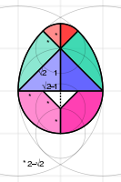 Construction of the Egg of Columbus (tangram puzzle)
 -
 Some models constructed from the 9-piece and 10-piece versions


A recent interaction with David Eppstein got me interested in colour blindness. Color blindness#Classification taught me that supporting deuteranomaly, protanomaly, protanopia and deuteranopia makes my diagrams accessible to 99.97% of the sighted. Using simulations from http://color-blindness.com/coblis-color-blindness-simulator, I wrote a Python script to come up with a websafe palette of four hues (plus grey) that maximises differences for these groups and people with normal vision, and found the best compromise
| #ff0099 | #ff0000 | #00cc99 | #3333ff | #999999 |
UPDATE 19 SEP 2021: The WCAG guidelines give 4.5 as the minimum contrast ratio for AA rating for normal text (or AAA for large text). Curiously, a colour of ratio around 4.6 against white is also around 4.6 against black. I've thus found 5 such colours mostly distinguishable by the colourblind and representable with 3 hex digits:
| #c0d | #e00 | #085 | #46f | #777 |
counterintuitive orbital mechanics.svg ☎ 3 Feb 2021 edit

While debugging a librsvg bug, I learnt about the use of currentColor (case-insensitive) to inherit colours in CSS.
Suppose we have some objects of different colours, but each one's fill colour is the same as its stroke colour, as for the spots and orbits in this diagram.
<style type="text/css">
.toward  { fill:#0000ff; stroke:#0000ff; }
.forward { fill:#999999; stroke:#999999; }
.orbit   { fill:none; }
.object  { stroke:none; }
</style>
<g class="toward">
 <use class="orbit"  xlink:href="#orbit"/>
 <use class="object" xlink:href="#object"/>
</g>
works but repeats the colour codes, possibly leading one instance being updated but not the other. currentColor avoids it:
.toward  { color:#0000ff; }
.forward { color:#999999; }
.orbit   { fill:none; stroke:currentColor; }
.object  { fill:currentColor; stroke:none; }
At the top of the diagram, a satellite in a clockwise circular orbit (yellow spot) launches objects of negligible mass:
- (blue) towards Earth
- (red) away from Earth
- (grey) in the direction of travel
- (black) backwards of the direction of travel
Dashed ellipses are orbits relative to Earth. Solid curves are pertubations relative to the satellite: in one orbit, (1) and (2) return to the satellite having made a clockwise loop on either side of the satellite. Unintuitively, (3) spirals farther and farther behind whereas (4) spirals ahead.
2020 edit
Template:solar system bodies rotation animation.svg ☎ 31 Dec 2020 edit


SVG provides a useful displacement map filter allowing an image to be "refracted" by another. The animated underwater scene on the left employs the idea from [1] and [2] but cycles the hue of the map to avoid back-and-forth artifacts.
Instead of animating a filter, I experimented with animating the object on which is applied a filter which "spherises" a square into a circle, simulating orthographic projection. I picked nine astronomical objects with textures from commons:category:Solar_System_Scope. Each texture was repeated and horizontally scrolled at the correct speed. After applying the filter, calculated using formulae from orthographic_map_projection#Mathematics, the result was cut out and shaded with a mask, and rotated to the correct axial tilt. Pity that I couldn't mimic flattening, as Firefox gave artifacts when trying to scale filtered images.
Lastly, with help from Wikipedia:SVG_help#Thumbnail_completely_black, I added an undistorted texture which is immediately hidden when the animation starts, as the thumbnail renderer doesn't recognise feDisplacementMap.
The animation shows that the gas giants rotate faster than the terrestrial planets, so much so that they are substantially flattened. Venus at the other extreme rotates so slowly that I had to settle on a compromise of 10 000× speed (and put in a marker) to visibly show movement while not making Jupiter and the Earth spin too quickly. I also find it interesting that Mercury has almost no tilt or flattening, yet its orbit is 7° inclined to the ecliptic plane.
UPDATE 20 JUN 2021: While adding the Turkish translation as Harald the Bard requested, I updated the dict2class class in my generator Python script to recursively work with nested dicts:
class dict2class(dict):
 def __getattr__(self, k): return dict2class(self[k]) if isinstance(self[k], dict) else self[k]
Everest-3D-Map-Type-EN.jpg ☎ 30 Nov 2020 edit

Serendipity led me to this attractive 3D map and I was pleased to see that its author, Tom Patterson had generously shared it and other superb maps in the public domain.
I thus uploaded its three versions to Commons and nominated the English version as a Featured Picture. I'm glad that several other editors and admins concurred, and it's now the newest featured map.
I've emailed to congratulate Mr Patterson and asked if he might be interested to do one of Challenger Deep or the Tharsis region. Keeping fingers crossed!
commons:category:SVG orb ☎ 18 Oct 2020 edit

In the early days of the Web, web developers loved using images of glassy orbs as bullets in unordered lists. One style I liked was Apple's shiny translucent orb effect, which could be recreated using two gradients and a filter (without which the "reflection" is sharper):
  <filter id="filter_blur"><feGaussianBlur stdDeviation="4"/></filter>
  <radialGradient id="grad_sphere" cx="50%" cy="50%" r="50%" fx="50%" fy="90%">
   <stop offset="0%"  stop-color="#000000" stop-opacity="0"/>
   <stop offset="99%" stop-color="#000000" stop-opacity="0.3"/>
  </radialGradient>
  <linearGradient id="grad_highlight" x1="0%" y1="0%" x2="0%" y2="100%">
   <stop offset="10%" stop-color="#ffffff" stop-opacity="0.9"/>
   <stop offset="99%" stop-color="#ffffff" stop-opacity="0"/>
  </linearGradient>
  <g id="orb" stroke="none">
   <circle  cx="0" cy="0" r="100"/>
   <circle  cx="0" cy="0" r="100" fill="url(#grad_sphere)"/>
   <ellipse cx="0" cy="-45" rx="70" ry="50" fill="url(#grad_highlight)" filter="url(#filter_blur)"/>
  </g>
As I have since made several diagrams with this effect, I decided to put them in commons:category:SVG orb, analogous to commons:category:4-3-2_trimetric_projection.
Template:Anomalous cancellation in calculus ☎ 28 Sep 2020 edit

This month's post is about mathematical jokes and coincidences.
40,000 km (25,000 mi) curiously turns up repeatedly in statistics about Earth:
The radius of geostationary orbit, 42,164 kilometres (26,199 mi) is within 0.02% of the variation of the distance of the moon in a month (the difference between its apogee and perigee), 42,171 kilometres (26,204 mi), and 5% error of the length of the equator, 40,075 kilometres (24,901 mi). Similarly, Earth's escape velocity is 40,270 km/h (25,020 mph).
On the other hand, I find some fallacious reasoning amusing, such as the above anomalous cancellation that trumps
.

Also funny is this true observation:

I was tempted to make the density η – arranging e t a, the mass becomes eat pizza. Additionally, its weight is pizzagate – this reference might become dated very soon, though!
Ohm law mnemonic principle.svg ☎ 23 Aug 2020 edit

It can be adapted to similar equations e.g. F = m a, v = f λ, E = m c ΔT, V = π r² h and τ = r F sin θ. When a variable with an exponent or in a function is covered, the corresponding inverse is applied to the remainder, i.e. r = √V/πh and θ = arcsin τ/r F .
I was reminded of "formula triangles" I devised to remember simple formulas at school, and found Wikipedia hadn't a diagram showing their use, so drew this. Though it's most well-known for Ohm's law, it can be applied to any formula in the form a = b · c · d · … (each parameter can be a function, but one must take the inverse of the remainder). I thus drew a chart for high-school physics students below. The exact selection depends on the syllabus, but I think I've covered the common ones.
-
 Image mnemonics in the style of the Ohm's law formula triangle for high-school physics
 -
 Comparison of the spectra obtained from diffraction and refraction


On the subject of mnemonics, I recently discovered one to remember the order of the colours (I know Roy G Biv, but in which direction?) in refraction and diffraction spectra: Red Refraction Reduced. I struggled to find an equivalent for diffraction until I noticed the follow-up: Diffraction is Different!
It seems the reverse in rainbows: one might expect red to be inside, but there is one reflection in the raindrops for primary, and two for secondary rainbows. An apt mnemonic is Red Rainbow Rim!
historical trigonometric functions graph.svg ☎ 4 Jul 2020 edit

I've just found a way to further enhance SVGs as teaching aids by highlighting two different parts of a diagrams to compare them using only CSS (SMIL allows highlighting any number of parts, but the code is more unwieldy and there were plans to deprecate SMIL). In this example graphic, suppose a tutor wishes to point out that the vercosine function is just the cosine function plus one. On mouse-enabled device, he or she can click on cos graph to highlight it (other graphs are faded out) then mouse-over the vercosin graph to unfade it and put a yellow glow around it.
My method hacks hyperlinks by linking to the same file using a blank anchor (#). When a link is clicked, its state becomes focus (as opposed to hover when hovered on). Below is the stylesheet – outline:none; hides the outlining of a focused link. As before, the glow is achieved with a filter:
<style type="text/css">
.main:hover   { fill-opacity:0.2; stroke-opacity:0.2; }
.active:hover { fill-opacity:1;   stroke-opacity:1; filter:url(#filter_glow); }
.active:focus { fill-opacity:1;   stroke-opacity:1; outline:none; }
.nofade       { fill-opacity:1;   stroke-opacity:1; }
</style>
<filter id="filter_glow">
 <feGaussianBlur in="SourceAlpha" stdDeviation="2"/>
 <feColorMatrix in="blur" type="matrix" values="0,0,0,0,1 0,0,0,0,1 0,0,0,0,0 0,0,0,2,0"/>
 <feBlend in="SourceGraphic"/>
</filter>
Finally, each interactive part is defined as follows:
<a class="active" xlink:href="#">...</a>
Another use might be multi-stage revelation of information. For instance, a puzzle may show a clue on hover, and an answer on click. I wonder what other uses there are for this mechanism...
Fourier series square wave circles animation.svg ☎ 28 Jun 2020 edit


I had previously created a series of GIF animations visualising Fourier series and wanted to convert them to SVG animations, but didn't know how to make smooth nested animated objects then; my File:Rolling_circle_optical_illusion.svg was pretty jerky.
When I encountered the coin rotation paradox, I gave it another go. It contains two animations: a circle rolling along a line, and another around another circle. I found that nesting transforms without any other transforms in between worked well:
<g class="move2">
 <use class="rot1" xlink:href="#r"/>
</g>
...
<g class="rot2">
 <g transform="translate(0,-944)">
  <use class="rot1" xlink:href="#r"/>
 </g>
</g>
where move2, rot1 and rot2 are CSS animations, and r is the circle to animate.

On its success, I decided to tackle the Fourier transform problem. The hardest part was synchronising the animations. Unlike animating in, say, JavaScript, in which the rotations and translations of each frame can be specified, CSS animation requires specifying the period of each animation. Rounding errors accumulate, e.g. if circle A has a period of 1 s, and B of 0.33 s, while initially A appears to rotate 3 times faster than B, after 300 rotations, B will lag by one rotation. A solution I found was to make all the periods be fractions of their least common multiple. The θ multipliers are 1, 3, 5 and 7. Additionally for the combined figure, I needed another period to subtract the rotation of the green circle from the yellow circle etc, thus an effective multiplier of 2. Being coprime, their LCM is 2×1×3×5×7 = 210. I thus picked 21 s for the yellow circle, giving 7 s, 4.2 s and 3 s for the other circles, and 10.5 s for the difference. (I know that fifths e.g. 4.2 cannot be defined exactly in binary (as 1/3 cannot be in decimal), but think that the error is negligible.) After a lot of trial and error, it worked!
UPDATE 1 JUL 2020: Made this animation of planetary gears...
UPDATE 26 JUL 2020: ...and this animation of trigonometric functions on a unit circle.
Template:cubic_interpolation_visualisation.svg ☎ 7 Jun 2020 edit


Back in 2012, I drew the diagram on the left to illustrate linear interpolation. I think it makes the formula much clearer. For eight years, I've sought an equivalent for cubic interpolation. After enquiring on the maths reference desk and reading up Lagrange polynomial and Cubic Hermite spline, I think I've finally found one.
I learnt that cubic interpolation is not unique as there is one unconstrained degree of freedom: Polynomial interpolation discusses various approaches. One I found suitable to visualise is the Catmull-Rom, which passes all four control points, and can thus be expressed using Lagrange basis polynomials. That's an algorithm I'll be using in my daily work!
comparison 7 bridges of Konigsberg 5 room puzzle graphs.svg ☎ 17 May 2020 edit

A 3D-printing discussion revived my longtime interest in Euler walks – how to draw a path in one continuous stroke without double-backing. Many know that the key is having two or fewer vertices with odd edges.
Back in 2015, I found that the Eulerian path, Seven Bridges of Königsberg and Five room puzzle articles lacked diagrams that actually showed the edge count, so drew this diagram. After drawing File:Eulerian_path_puzzles.svg, I revisited it and thought the edges of the "9" vertex messy. At the time, I couldn't tell what was objectionable. I've just realised that it was likely the gaps between the paths not monotonically increasing or decreasing. I redrew them as on the right, making them start almost parallel then diverging.
A side benefit is that it looks like a small mammal like a cat or fox, with ears and whiskers 🐱
Corsica-geographic map-style no hash-en.svg ☎ 26 Apr 2020 edit

I joined a discussion on Commons_talk:SVG_Translate_tool about the SVG Translate tool. I helped User:Ikonact debug why the tool did not show any strings to translate on File:Corsica-geographic_map-en.svg and found that having a stylesheet with an ID selector style (those starting with #) causes the tool to fail. I reported it as a serious bug, as many SVGs use them. To work around the issue, I've decided to change id="main" to class="main" in my new ones.
Another problem with the tool is that it doesn't refresh the file cache, so if a new version of a file is uploaded, it does not see it until several hours later, making it very difficult to get anything done! I resorted to sequentially numbering the uploads, putting them under a category requesting that they be deleted appealing for an admin to delete them.
A really useful takeaway from the activity was learning about the Commons SVG Checker. It's so useful to be able to see the rendered thumbnail and discover SVG errors before uploading it. A hack is to use it to render a PNG file from an SVG without uploading it – I know I can download tools to do that, but this works from any computer without installing anything!
extract_lang.py ☎ 22 Mar 2020 edit
I had a brief collaboration with @Juandamec: and @Kirill Borisenko: about my Seven Wonders of the Ancient World timeline infographic after they kindly translated it into Spanish and Russian, respectively.
Deciding to turn it into a multilingual SVG, I found no simple way to view the non-default languages in a browser before uploading them. One way is to install and change the language of the browser and restart it, but that's a pain and it affects the whole browser interface.
I thus wrote a Python3 script to extract and write a monolingual SVG file from a multilingual SVG file. As I couldn't upload a Python file, I copied its source code to user:cmglee/extract_lang.py for anyone to copy-paste.
-
 Find the 50% clay line
 -
 Find the 20% silt line
 -
 The intersect coincides with the 30% sand line
 -
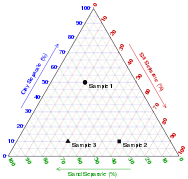 Other points plotted
 -
 USDA soil textural triangle


My first use of it was to hack the multilingual feature to create an SVG showing steps in making a ternary plot, as above. The nice thing about this technique is that editors can update common elements, e.g. the grid and axes in one file instead of several. Sadly, the choice of language codes is limited, so I picked aa, ba, ca and da to make a reasonable sequence.
Mapquiz USA states SMIL.svg ☎ 9 Feb 2020 edit

I've just discovered (I think) a new application for interactive SVG without JavaScript: a quiz to let students learn the locations of geographic features, components of a system etc (basically any 1-to-1 mapping). My first example concerns the states of the USA.
I wonder if anyone here knows of an elegant way to implement counters without JavaScript. In my example, a student could start with, say, three lives. Every wrong answer (triggered by the "reset" element) deducts one life. When all lives are lost, the game is over. A workaround is to have as many reset elements as lives and delete the elements as lives are used up. That would however lead to much redundant code :-(
A less strict version just counts the number of wrong answers and shows it at the end when all states have been identified.
Alternatively, I could implement a timer that counts the number of seconds (as in my morphing demo) but pause it when all states have been identified, to show how long the student took. A workaround is to add
onmousemove="document.getElementsByTagName('svg')[0].pauseAnimations();"
on the win screen, but:
- Wikimedia now rejects files with
on*attributes - The mouse must be moved to stop the timer
(I can make a version where a timer counts down to zero, the game ending if the student fails to identify all states in time, as in my missile game, though a time limit may frustrate students.)
Would you be able to help?
2019 edit
http://commons.wikimedia.org/w/index.php?search=cmglee+aerial 31 Dec 2019 edit
A joy on flights is seeing and photographing aerial views. One tip I found is to shoot as perpendicular to the window as possible, and avoid the turbulent exhaust. To remove the haze, use GIMP's quick mask to create a gradient selection from near to far and use the Curves tool to fix the colour channels, especially blue, and adjust the brightness and contrast. Reducing the colour saturation lessens the yellowness of clouds. When the air's clear, though, the results are spectacular.


SVG highlight on hover template.svg ☎ 17 Nov 2019 edit

User:Дрейгорич informed me that the trans-Neptunian object Ultima Thule had been renamed Arrokoth. While checking user:Mrmw's update to file:interstellar_probes_trajectory.svg, I thought that hovering over an interstellar probe ought to highlight all the astronomical objects it interacted with, and vice versa. Classifying the hovered object as active and its associated objects as associated, I realised that each active group could contain copies of the associated objects with pointer-events:none set, e.g.
<style type="text/css">
 #main:hover            { stroke-opacity:0.05; fill-opacity:0.05; }
 .nofade, .active:hover { stroke-opacity:1;    fill-opacity:1;    }
 .nofade, .associated   { pointer-events:none; }
 ...
</style>
...
<g class="active">
 <g class="associated">
  <use xlink:href="#p1"/><!-- Pioneer 11 -->
  <use xlink:href="#v1"/><!-- Voyager 1 -->
  <use xlink:href="#v2"/><!-- Voyager 2 -->
 </g>
 <use xlink:href="#s"/><!-- Saturn -->
</g>
...
I made this toy example so that editors can reuse this technique, and updated file:interstellar_probes_trajectory.svg accordingly.
Collins Scrabble Words 2 letters history.svg ☎ 29 Oct 2019 edit

This year, the English Scrabble authorities added three two-letter words to the list of valid words: EW, OK and ZE – which I read as "ZE EWOK!" To mark the occasion, I made this table showing all valid two-letter words starting and ending in each letter, noting years of changes (it's a wonder PH got in).
Sadly, there's still none with V ☹ – if any of you ever become famous and invent some technology or concept involving vision, please please please call it a VI ☺
Primrose field peripheral drift illusion.svg ☎ 23 Sep 2019 edit
Commons:User:Cwtyler messaged me about a peripheral drift optical illusion I made five years ago; he or she discovered that the colours fade out after staring at it.
Curiously, the Wikimedia thumbnail doesn't show what I had originally intended: it should've looked like the fixed version below. When I had trouble with an SVG linear gradient being transformed incorrectly for my landing systems diagram below, User:Glrx taught me to add gradientUnits="userSpaceOnUse" to make librsvg match modern web browsers. The drawback is that x and y values can't be specified in percentages.
-
 Illusion similar to Kitaoka Akiyoshi's Primrose Field
 -
 Sunburst illusion with broken thumbnail
 -
 Sunburst illusion with fixed thumbnail
 -
 Comparison of visual landing systems


After fixing the thumbnail, I decided to render a very strong peripheral drift illusion. I found that colour is irrelevant: only luma is. Amazingly, I found that if I rotate it (e.g. on my phone) 45° in either direction, the drift stops! Can anyone explain why?
Catan Universe fixed setup.svg ☎ 14 Sep 2019 edit


Continuing my experimentation with SVG filters, I enjoyed making textures for Catan terrain types with feTurbulence:
- Mountains using dense cells to simulate a stone texture
- Forests using a low frequency and large amplitude
- Hills with a higher frequency in the vertical direction
- Fields and pastures with higher horizontal frequency
- Desert and water using added lighting effects
Sadly, the texture intensity on Firefox and Chrome doesn't match that of the Wikimedia (librsvg) thumbnail, textures with lighting effects to faint, and vice versa. Nevertheless, the graphic depicts the starting map of Catan Universe, the main point being the relative probability of each settlement location in yielding produce. It appears a little unbalanced, the northeast corner having several 12s and the only generic port bordered by two terrain hexes.
UPDATE 17 NOV 2019: A more real-world use of SVG textures is in file:Brooklyn_bridge_section.svg.
Template:roll_pitch_yaw_mnemonic.svg ☎ 18 Aug 2019 edit

Greetings from Stockholm Wikimania 2019!
I had previously struggled to remember which rotations roll, pitch and yaw referred to, and came across a mnemonic of a baseball pitcher doing an overhand pitch. As sidearm pitches are more yaw instead, I thought of a water pitcher: only one sensible rotation avoids spilling water everywhere! Next, roll is unambiguous when applied to a dog or cat.
Finally, there's yaw. Sadly, a yawn, or nodding one's head to signal "yes" is more pitch-like. I then looked for words rhyming with "yaw". "Draw" describes the motion of an artist's forearm. But clearest is "door" (which rhymes in British English, without rolling the "r": /dɔː/) – not the garage variety, of course. Hence the drawing...
Nothing's special on the SVG side, except maybe using scale and rotate transforms, and stacking shapes to make the pseudo-3D arrow.
The Boat Race cumulative results.svg ☎ 29 Jun 2019 edit

| 1. | Simplified graphs |
| 2. | The region below each graph |
| 3. | The region above each graph |
| 4. | Applying the region above as a clip-path to the opposing region below |
| 5. | The appropriate intersections |
| 6. | Putting it all together |

While updating this graphic, I thought of shading the gaps between the graphs of competing teams to show who's leading at any moment but couldn't think of an elegant way in SVG. This year, it occurred to me to use two clip-paths: Applying a clip-path which selects the region above graph A to the region below the graph B leaves only regions above A but below B, and vice versa. The figure on the right explains the steps visually. To avoid overlapping regions, I decided to do it for only the Blue Boats.
To complement the dates shown on hovering over a graph or the legend, I made hovering over a blank region show the results for nearest year. Wonder how I can draw attention to the dead heat in 1877...
User:Cmglee/T symptoms man ☎ 5 Jun 2019 edit

of breath
Ian Furst contacted me for help on a video he's working on. He wanted a template showing an outline of a human body with various symptoms overlaid on the relevant parts. Editors can easily specify the combination of symptoms shown using Wikitext.
After some deliberation, I decided to create a template wrapping around template:Location mark+. I also learned about the use of
{{#invoke:String|find|haystack|needle}}
to check whether a string contains another. Any combination of the supported symptoms can be specified like this:
{{User:Cmglee/T symptoms man|Bieberitis|nausea,shortness_of_breath,tingling,muscle_weakness}}
It would have been much better if SVG supported the ability to enable and disable its parts without JavaScript. Previously, I discovered the ability to hack the systemLanguage functionality, but with only 443 supported languages, complete freedom to support all 2n combinations allows only n=8 symptoms, despite extremely unintuitive mapping between language codes and combinations. There must be a better way...
commons:category:Cambridge Central Mosque ☎ 23 May 2019 edit

I had a most unexpected visit to the new mosque in Cambridge. I'd been fascinated by its modern wood architecture since it opened, and was having an evening stroll when I decided to venture through the gates. A gentleman invited my companion and me inside to join the breaking of fast.
It was a very pleasant experience meeting the friendly people there and getting a brief tour of the place. Wish people could be civil to one another as they were to me on my visit...
Needless to say, the architecture was truly amazing, in particular the abstract trees and pixelated Arabic in the brickwork. Must go back at day time!
Cambridge libraries opening times.svg ☎ 28 Feb 2019 edit

Cambridge public libraries have very complicated opening times, so I made this chart to show both when each library opens (left column), and for a given day and time, which libraries are open (right column). The latter is useful particularly when I suddenly remember that I have an overdue book and need to rush to an open library to return it a.s.a.p. ∗ahem∗
In making it, I updated my Python 2 function to read and cache web pages, images etc:
# do_refresh_cache = True
import os, urllib2, time
def read_url(url, headers={}, path_cache=None, is_verbose=True):
 if (path_cache is None):
  file_cache = os.path.basename(url)
  path_cache = os.path.join('%s.cache' % (os.path.splitext(__file__)[0]),
                            file_cache if (len(file_cache) > 0) else
                            '%s.htm' % (os.path.basename(url.rstrip('/'))))
 if (('do_refresh_cache' in globals() and do_refresh_cache) or
     (not os.path.isfile(path_cache))):
  request = urllib2.Request(url, headers=headers)
  try:                           html = urllib2.urlopen(request).read()
  except urllib2.HTTPError as e: html = ''; print(e)
  try:            os.makedirs(os.path.dirname(path_cache))
  except OSError: pass
  with open(path_cache, 'wb') as f_html: f_html.write(html)
  if (is_verbose): print('%s > %s' % (url, path_cache))
  time.sleep(1) ## avoid rate-limit-exceeded error
 else:
  with open(path_cache) as f_html: html = f_html.read()
  if (is_verbose): print('< %s' % (path_cache))
 try:                       html = html.decode('utf-8')
 except UnicodeDecodeError: pass
 return html
The resource is cached to a given path [if unspecified, the basename of the URL (if blank, the name of the last folder in the URL followed by .htm) in a folder called the name of the Python script with the extension replaced with cache] so that subsequent runs need not fetch it again. If the global variable do_refresh_cache is True, it is always fetched. A one-second delay is added to avoid overwhelming the webserver. The resource is then returned as a Unicode string.
The following example fetches the Cambridgeshire County Council library opening times page using a simple fake header – I found that the webserver refuses requests without a sensible user-agent. html_all can then be parsed as needed with xml.etree.ElementTree or regular expressions.
url      = 'http://cambridgeshire.gov.uk/residents/libraries-leisure-%26-culture/libraries/library-opening-hours/'
headers  = {'User-Agent':'Mozilla'}
html_all = read_url(url, headers=headers)
I hope to talk about this and other techniques to automagically generate SVG using Python at Wikimania 2019 – fingers crossed!
interstellar probes trajectory.svg ☎ 9 Jan 2019 edit

Plot 1 is viewed from the north ecliptic pole, to scale.
Plots 2 to 4 are third-angle projections at 20% scale.
In the SVG file, hover over a trajectory or orbit to highlight it and its associated launches and flybys.
It seems there's a certain fascination with my old graph file:Voyager_2_velocity_vs_distance_from_sun.svg – it regularly turns up at random places on the Web. I thought it'd be super to have a map of the five current interstellar probes, too, but that's surprisingly hard to find. Even NASA had only one up to the early 90s before New Horizons launched. So with some difficulty, I managed to find two sites that gave heliocentric coordinates of these spacecraft and the planets for each day over a period of several decades: COHOWeb and Horizons On-Line Ephemeris System.
On a long transit, I wrote a Python script to collate the data into a table, for the first of each month. I then updated my usual near-polyglot script to plot orthographic views, hopefully clearly showing each trajectory, especially the gravity assists.
Wonder if it's the first map showing all five probes to date?!
22 JAN 2019 UPDATE: I added Ultima Thule to the graphic. Guess that's one nice thing about rendering the SVG in Python: it's easy to add new bodies that New Horizons encounters in the future.
2018 edit
Inscribed cone sphere cylinder.svg ☎ 6 Dec 2018 edit


I had long known that the ratio of the volumes of a cone, sphere and cylinder of the same radius and height was 1:2:3, Archimedes considering his discovery of the 2:3 ratio his masterstroke.
I was thus amazed to independently discover that the ratio of their total surface areas, including caps, was ϕ:2:3 (OK, Archimedes discovered the 2:3 bit).* That's a completely unexpected appearance of the golden ratio, so I just had to update my old drawing with my finding. An equation with both ϕ and π – how cool is that?
* The cone's curved surface can be flattened into a sector of radius r√5 (using Pythagoras' theorem) and arc length 2πr (the circumference of the cap). As a full circle of radius r√5 has circumference of 2πr√5, our sector subtends 1/√5 of a revolution, giving an area of 1/√5 · π(r√5)² = πr²√5. Add the cap and the total area is πr²√5 + πr² = √5 + 1/2 · 2πr² = ϕ · 2πr².
P.S. Another coincidence is that ratios of both the volumes and surface areas of the sphere and cylinders are 2:3. As in the graph on the right, the surface-area-to-volume ratio of an object decreases with increasing roundness and volume. It's curious that, going from the sphere to the cylinder, the roundness decreases while the volume increases at exactly the same rate such that the ratio is maintained!
Cambridge Wikidata Workshop – Image Workshop ☎ 21 Oct 2018 edit

Charles Matthews persuaded me to speak about images on Wikidata at yesterday's workshop. A night's mugging yielded this scrappy presentation touching on
- Wikidata properties related to images
- Adding images to SPARQL queries
- Use of WikiData Free Image Search Tool
- Use of WikiShootMe!
- Tracing bitmaps in Inkscape
Magnus Manske kindly sat in, answered questions and pointed out mistakes in my understanding.
I also showed a few of my SMIL SVG – The Corpus Clock animation was especially popular.
All in all a superb little knowledge-sharing day!
Cambridge free tennis courts.svg ☎ 16 Sep 2018 edit


SVG filters allow fun effects as in the animated light in the snow animation below, but I found some practical uses for them, too. The simplest may be drop shadows to make pseudo-3D scenes more realistic, such as the soft drop-shadows in the Plato's number graphic. To keep the filter as simple as possible, one can make two copies of the objects; applying the filter to the lower copy turns opaque areas black and blurs them:
 <filter id="filter_blur">
  <feGaussianBlur in="SourceAlpha" stdDeviation="2"/>
 </filter>
Conversely, one could blur and turn opaque areas white to make a glow around objects, such as text, to make it easier to read. The feColorMatrix tag both colours the blurred areas white and makes them less transparent, so that the outline is more distinct. Blending with the SourceGraphic avoids needing two copies of the object:
 <filter id="filter_glow">
  <feGaussianBlur in="SourceAlpha" stdDeviation="1" result="blur"/>
  <feColorMatrix in="blur" type="matrix" values="0,0,0,0,1 0,0,0,0,1 0,0,0,0,1 0,0,0,8,0" result="white"/>
  <feBlend in="SourceGraphic" in2="white"/>
 </filter>
The final example is something I'd wanted to do since I posted this question about applying a graduated outline on a shape, in particular the second case. A filter solves it elegantly; after blurring, the outline is eroded to bold the boundary then composited using the out operator:
 <filter id="filter_outline">
  <feGaussianBlur stdDeviation="4" result="blur"/>
  <feMorphology in="blur" operator="erode" radius="4" result="erode"/>
  <feComposite operator="out" in="SourceGraphic" in2="erode"/>
 </filter>
This free-tennis-court image shows my first use of the last two techniques, on the text labels and ward boundaries. Fun with filters!
Bible code example.svg ☎ 2 Sep 2018 edit

This question made me wonder about the likelihood that profanity appears in Base64 strings which I use to embed bitmaps in my SVG. As an order-of-magnitude estimate, suppose the string comprises only letters and case doesn't matter, a random four-letter string has 1/264 ≈ 1/456 976 chance of matching a given four-letter word. A 1 MB string has about 1 million of these strings, so I expect about two matches. I did a case-insensitive search of the F-word in my 1.9 MB File:Leonardo_da_Vinci_monument_in_Milan.svg (which had separate strings, but that's close enough) and indeed got three instances. Hope noone's offended by my SVG!
It reminded me of the Bible code debunking craze in Cambridge around 2010. Looking up its article, I found the PNG on the right hard to read as the text was in all-caps and the "codes" went from bottom right to top left. I thought I could make it more legible, and vectorise it at the same time: I made alternate words bold. Coincidentally, in the proper case, only the initial B was capitalised. But the best change was using 21 columns instead of 33; with the correct offset, this made the "code" left-to-right and not cross.
Since I'd written Python that actually searches through text, I decided to make a locally branded version with "wiki" and "pedia" (I couldn't find "wikipedia"). Genesis had many matches, so I picked one where they were densely packed. I couldn't avoid the crossing without distorting the "codes" too much or making them right-to-left. See below...
-
 21-column version
 -
 "Wikipedia" version


Template:Comparison of Revised Julian and Gregorian calendar century years ☎ 30 Aug 2018 edit
| Century year |
Remain- der on divide by 900 |
Is a Revised Julian leap year |
Is a Grego- rian leap year |
Revised Julian is same as Grego- rian |
|---|---|---|---|---|
| 1000 | 100 | ✗ | ✗ | ✓ |
| 1100 | 200 | ✓ | ✗ | ✗ |
| 1200 | 300 | ✗ | ✓ | ✗ |
| 1300 | 400 | ✗ | ✗ | ✓ |
| 1400 | 500 | ✗ | ✗ | ✓ |
| 1500 | 600 | ✓ | ✗ | ✗ |
| 1600 | 700 | ✗ | ✓ | ✗ |
| 1700 | 800 | ✗ | ✗ | ✓ |
| 1800 | 0 | ✗ | ✗ | ✓ |
| 1900 | 100 | ✗ | ✗ | ✓ |
| 2000 | 200 | ✓ | ✓ | ✓ |
| 2100 | 300 | ✗ | ✗ | ✓ |
| 2200 | 400 | ✗ | ✗ | ✓ |
| 2300 | 500 | ✗ | ✗ | ✓ |
| 2400 | 600 | ✓ | ✓ | ✓ |
| 2500 | 700 | ✗ | ✗ | ✓ |
| 2600 | 800 | ✗ | ✗ | ✓ |
| 2700 | 0 | ✗ | ✗ | ✓ |
| 2800 | 100 | ✗ | ✓ | ✗ |
| 2900 | 200 | ✓ | ✗ | ✗ |
| 3000 | 300 | ✗ | ✗ | ✓ |
| 3100 | 400 | ✗ | ✗ | ✓ |
| 3200 | 500 | ✗ | ✓ | ✗ |
| 3300 | 600 | ✓ | ✗ | ✗ |
| 3400 | 700 | ✗ | ✗ | ✓ |
| 3500 | 800 | ✗ | ✗ | ✓ |
| 3600 | 0 | ✗ | ✓ | ✗ |
| 3700 | 100 | ✗ | ✗ | ✓ |
| 3800 | 200 | ✓ | ✗ | ✗ |
| 3900 | 300 | ✗ | ✗ | ✓ |
| 4000 | 400 | ✗ | ✓ | ✗ |
Comparison of Revised Julian and Gregorian
calendar century years. (In the original Julian
calendar, every century year is a leap year.)
I've just learnt about the Revised Julian calendar which improves on the Gregorian calendar. Its formula to decide whether a century year (year number ending in "00") is a leap year wasn't obvious, so I decided to draw this table, which makes it obvious how there are 2 leap years every 9 century years, as compared to 2 every 8 in the Gregorian one. Its designer cleverly arranged the two in the current span of 900 years to coincide with 2000 and 2400, meaning that the calendars will perfectly agree for years 1601 to 2799, notwithstanding the Gregorian calendar reform. That should be enough for a while!
The Wikitext itself isn't terribly exciting, just wrapping the table in a div floated right to simulate an infobox. I couldn't use the infobox class as the table cells stopped being centre-aligned. I also learnt the use of template:navbar to let editors more easily edit templates and was amused by the large number of tick and cross mark templates.
demo rotation centre using CSS and SMIL.svg ☎ 30 Jun 2018 edit

I'm delighted that Vincent Mia Edie Verheyen recently contacted me for help with interactive and animated SVG – finally found someone who shares my interest in dynamic SVG!
He found that many CSS or SMIL techniques still don't work with Internet Explorer/Edge. The only reliable interactivity seems to be hover, tooltips, hyperlinks and changing the pointer (cursor). Apparently, the :active selector also allows clicking, but the user must continuously depress the button. It seems the industry has shifted to JavaScript (no surprise really) – is there any hope of Wikimedia allowing at least some Javascript in file uploads? :-(
Anyway, I was glad to learn from Vincent of the symbol tag, as used in this animated SVG. It can do more than named objects in defs which I've been using, such as scaling the object to fit a given width and height (optionally preserving the aspect ratio). It also supports viewBox attribute like the svg tag. http://sarasoueidan.com/blog/structuring-grouping-referencing-in-svg/ has a tutorial.
One limitation is that parts of the symbol with negative coordinates get cropped. A solution is to add overflow="visible", e.g.
 <symbol id="stuff" overflow="visible">
  <rect x="-10" y="-20" width="30" height="40"/>
 </symbol>
 <use xlink:href="#stuff" x="50" y="60"/>
Additionally, one can move the symbol by specifying x and y attributes in the use tag, where I might have previously used transform=translate(50,60). Three cheers for two-way knowledge exchange in Wikimedia!
Mars elevation.stl ☎ 1 May 2018 edit

I've been experimenting with STL over the last month. User:Romanski reminded me that most of what I've made, including fractals, can already be done with other tools. Nevertheless, one area to which I think I can add are planetary elevation models, such as this one. To me, a 3D model, particularly a physical one, makes the shape much clearer than a topo map, especially features in polar regions. (Perhaps one thing lost is that the northern hemisphere is significantly lower than the southern one.) It's a shame that most STL viewers, including the Mediawiki one, doesn't support colours; that would definitely open a whole new world of possibilities.
Anyway, looking at the file's history, one can see how my technique evolved:
- The naive way was to make rectangles along latitudes and longitudes. The drawback is that they become thinner towards the poles, wasting polygons and giving strange star shapes around the poles. (As STL works with triangles, I had to split each rectangle into two triangles – a good thing, actually, as by splitting along the diagonal with the smaller elevation difference, I could get a smoother shape, a trick I discovered while making File:Penang_island.stl.)
- I thus tried an octahedron with each face recursively subdivided into four triangles. Each vertex is then projected to the appropriate radius. Though the resolution has increased despite using around the same number of polygons and the polar artifacts have disappeared, the surface looked very jagged, perhaps due to the triangles' acute angles.
- Deciding to go back to rectangles in order to use the rectangle-splitting trick, I settled on projecting a subdivided cube onto a sphere. This article explains the maths well. Unfortunately, I oriented half of the polygons the wrong way! That was to be corrected in my final version...
- In addition to fixing the orientation, I made the base model an oblate spheroid with different polar and equatorial radii. But the biggest improvement was to calculate the elevation of the centroid of each rectangle. If it was lower or higher than all four vertices, i.e. a peak or pit, I divide the rectangle into four triangles like the sides of a pyramid. Otherwise, I divide it into two as before. This considerably sharpened areas with a lot of detail at the expense of around 10% more polygons.
I made two other models with the final method:
The next step may be to use a triangulated irregular network, but that will need to wait for another day...
Template:gallery remainders ☎ 21 Apr 2018 edit
c p |
1 | 2 | 3 | 4 | 5 | 6 | 7 | 8 | 9 | 10 | 11 | 12 | |||||||||||||||||||||||||||||||||||||||||||||||||||||||||||||||||||||||||||||||||||||||||||||||||||||||||||||||||||||||||||||||||||||||||||||||||||||||||||||||||||||||||||||||||||||||||||||||||||||||||||||||||||||||||||||||||||||||||||||||||||||||||||||||||||||||||||||||||||||||||||||||||||||||||||||||||||||||||||||||||||||||||||||||||||||||||||||||||||||||||||||||||||||||||||||||||||||||||||||||||||||||||||||||||||||||||||||||||||||||||||||||||||||||||||||||||||||||||||||||||||||||||||||||||||||||||||||||||||||||||||||||||||||||||||||||||||||||||||||||
|---|---|---|---|---|---|---|---|---|---|---|---|---|---|---|---|---|---|---|---|---|---|---|---|---|---|---|---|---|---|---|---|---|---|---|---|---|---|---|---|---|---|---|---|---|---|---|---|---|---|---|---|---|---|---|---|---|---|---|---|---|---|---|---|---|---|---|---|---|---|---|---|---|---|---|---|---|---|---|---|---|---|---|---|---|---|---|---|---|---|---|---|---|---|---|---|---|---|---|---|---|---|---|---|---|---|---|---|---|---|---|---|---|---|---|---|---|---|---|---|---|---|---|---|---|---|---|---|---|---|---|---|---|---|---|---|---|---|---|---|---|---|---|---|---|---|---|---|---|---|---|---|---|---|---|---|---|---|---|---|---|---|---|---|---|---|---|---|---|---|---|---|---|---|---|---|---|---|---|---|---|---|---|---|---|---|---|---|---|---|---|---|---|---|---|---|---|---|---|---|---|---|---|---|---|---|---|---|---|---|---|---|---|---|---|---|---|---|---|---|---|---|---|---|---|---|---|---|---|---|---|---|---|---|---|---|---|---|---|---|---|---|---|---|---|---|---|---|---|---|---|---|---|---|---|---|---|---|---|---|---|---|---|---|---|---|---|---|---|---|---|---|---|---|---|---|---|---|---|---|---|---|---|---|---|---|---|---|---|---|---|---|---|---|---|---|---|---|---|---|---|---|---|---|---|---|---|---|---|---|---|---|---|---|---|---|---|---|---|---|---|---|---|---|---|---|---|---|---|---|---|---|---|---|---|---|---|---|---|---|---|---|---|---|---|---|---|---|---|---|---|---|---|---|---|---|---|---|---|---|---|---|---|---|---|---|---|---|---|---|---|---|---|---|---|---|---|---|---|---|---|---|---|---|---|---|---|---|---|---|---|---|---|---|---|---|---|---|---|---|---|---|---|---|---|---|---|---|---|---|---|---|---|---|---|---|---|---|---|---|---|---|---|---|---|---|---|---|---|---|---|---|---|---|---|---|---|---|---|---|---|---|---|---|---|---|---|---|---|---|---|---|---|---|---|---|---|---|---|---|---|---|---|---|---|---|---|---|---|---|---|---|---|---|---|---|---|---|---|---|---|---|---|---|---|---|---|---|---|---|---|---|---|---|---|---|---|---|---|---|---|---|---|---|---|---|---|---|---|---|---|---|---|---|---|---|---|---|---|---|---|---|---|---|---|---|---|---|---|---|---|---|---|---|---|---|---|---|---|---|---|---|---|---|---|---|---|---|---|---|---|---|---|---|---|---|---|---|---|---|---|---|---|---|---|---|---|---|---|---|---|---|
| 1 | 0 | 1 | 1 | 1 | 1 | 1 | 1 | 1 | 1 | 1 | 1 | 1 | |||||||||||||||||||||||||||||||||||||||||||||||||||||||||||||||||||||||||||||||||||||||||||||||||||||||||||||||||||||||||||||||||||||||||||||||||||||||||||||||||||||||||||||||||||||||||||||||||||||||||||||||||||||||||||||||||||||||||||||||||||||||||||||||||||||||||||||||||||||||||||||||||||||||||||||||||||||||||||||||||||||||||||||||||||||||||||||||||||||||||||||||||||||||||||||||||||||||||||||||||||||||||||||||||||||||||||||||||||||||||||||||||||||||||||||||||||||||||||||||||||||||||||||||||||||||||||||||||||||||||||||||||||||||||||||||||||||||||||||||
| 2 | 0 | 0 | 2 | 2 | 2 | 2 | 2 | 2 | 2 | 2 | 2 | 2 | |||||||||||||||||||||||||||||||||||||||||||||||||||||||||||||||||||||||||||||||||||||||||||||||||||||||||||||||||||||||||||||||||||||||||||||||||||||||||||||||||||||||||||||||||||||||||||||||||||||||||||||||||||||||||||||||||||||||||||||||||||||||||||||||||||||||||||||||||||||||||||||||||||||||||||||||||||||||||||||||||||||||||||||||||||||||||||||||||||||||||||||||||||||||||||||||||||||||||||||||||||||||||||||||||||||||||||||||||||||||||||||||||||||||||||||||||||||||||||||||||||||||||||||||||||||||||||||||||||||||||||||||||||||||||||||||||||||||||||||||
| 3 | 0 | 1 | 0 | 3 | 3 | 3 | 3 | 3 | 3 | 3 | 3 | 3 | |||||||||||||||||||||||||||||||||||||||||||||||||||||||||||||||||||||||||||||||||||||||||||||||||||||||||||||||||||||||||||||||||||||||||||||||||||||||||||||||||||||||||||||||||||||||||||||||||||||||||||||||||||||||||||||||||||||||||||||||||||||||||||||||||||||||||||||||||||||||||||||||||||||||||||||||||||||||||||||||||||||||||||||||||||||||||||||||||||||||||||||||||||||||||||||||||||||||||||||||||||||||||||||||||||||||||||||||||||||||||||||||||||||||||||||||||||||||||||||||||||||||||||||||||||||||||||||||||||||||||||||||||||||||||||||||||||||||||||||||
| 4 | 0 | 0 | 1 | 0 | 4 | 4 | 4 | 4 | 4 | 4 | 4 | 4 | |||||||||||||||||||||||||||||||||||||||||||||||||||||||||||||||||||||||||||||||||||||||||||||||||||||||||||||||||||||||||||||||||||||||||||||||||||||||||||||||||||||||||||||||||||||||||||||||||||||||||||||||||||||||||||||||||||||||||||||||||||||||||||||||||||||||||||||||||||||||||||||||||||||||||||||||||||||||||||||||||||||||||||||||||||||||||||||||||||||||||||||||||||||||||||||||||||||||||||||||||||||||||||||||||||||||||||||||||||||||||||||||||||||||||||||||||||||||||||||||||||||||||||||||||||||||||||||||||||||||||||||||||||||||||||||||||||||||||||||||
| 5 | 0 | 1 | 2 | 1 | 0 | 5 | 5 | 5 | 5 | 5 | 5 | 5 | |||||||||||||||||||||||||||||||||||||||||||||||||||||||||||||||||||||||||||||||||||||||||||||||||||||||||||||||||||||||||||||||||||||||||||||||||||||||||||||||||||||||||||||||||||||||||||||||||||||||||||||||||||||||||||||||||||||||||||||||||||||||||||||||||||||||||||||||||||||||||||||||||||||||||||||||||||||||||||||||||||||||||||||||||||||||||||||||||||||||||||||||||||||||||||||||||||||||||||||||||||||||||||||||||||||||||||||||||||||||||||||||||||||||||||||||||||||||||||||||||||||||||||||||||||||||||||||||||||||||||||||||||||||||||||||||||||||||||||||||
| 6 | 0 | 0 | 0 | 2 | 1 | 0 | 6 | 6 | 6 | 6 | 6 | 6 | |||||||||||||||||||||||||||||||||||||||||||||||||||||||||||||||||||||||||||||||||||||||||||||||||||||||||||||||||||||||||||||||||||||||||||||||||||||||||||||||||||||||||||||||||||||||||||||||||||||||||||||||||||||||||||||||||||||||||||||||||||||||||||||||||||||||||||||||||||||||||||||||||||||||||||||||||||||||||||||||||||||||||||||||||||||||||||||||||||||||||||||||||||||||||||||||||||||||||||||||||||||||||||||||||||||||||||||||||||||||||||||||||||||||||||||||||||||||||||||||||||||||||||||||||||||||||||||||||||||||||||||||||||||||||||||||||||||||||||||||
| 7 | 0 | 1 | 1 | 3 | 2 | 1 | 0 | 7 | 7 | 7 | 7 | 7 | |||||||||||||||||||||||||||||||||||||||||||||||||||||||||||||||||||||||||||||||||||||||||||||||||||||||||||||||||||||||||||||||||||||||||||||||||||||||||||||||||||||||||||||||||||||||||||||||||||||||||||||||||||||||||||||||||||||||||||||||||||||||||||||||||||||||||||||||||||||||||||||||||||||||||||||||||||||||||||||||||||||||||||||||||||||||||||||||||||||||||||||||||||||||||||||||||||||||||||||||||||||||||||||||||||||||||||||||||||||||||||||||||||||||||||||||||||||||||||||||||||||||||||||||||||||||||||||||||||||||||||||||||||||||||||||||||||||||||||||||
| 8 | 0 | 0 | 2 | 0 | 3 | 2 | 1 | 0 | 8 | 8 | 8 | 8 | |||||||||||||||||||||||||||||||||||||||||||||||||||||||||||||||||||||||||||||||||||||||||||||||||||||||||||||||||||||||||||||||||||||||||||||||||||||||||||||||||||||||||||||||||||||||||||||||||||||||||||||||||||||||||||||||||||||||||||||||||||||||||||||||||||||||||||||||||||||||||||||||||||||||||||||||||||||||||||||||||||||||||||||||||||||||||||||||||||||||||||||||||||||||||||||||||||||||||||||||||||||||||||||||||||||||||||||||||||||||||||||||||||||||||||||||||||||||||||||||||||||||||||||||||||||||||||||||||||||||||||||||||||||||||||||||||||||||||||||||
| 9 | 0 | 1 | 0 | 1 | 4 | 3 | 2 | 1 | 0 | 9 | 9 | 9 | |||||||||||||||||||||||||||||||||||||||||||||||||||||||||||||||||||||||||||||||||||||||||||||||||||||||||||||||||||||||||||||||||||||||||||||||||||||||||||||||||||||||||||||||||||||||||||||||||||||||||||||||||||||||||||||||||||||||||||||||||||||||||||||||||||||||||||||||||||||||||||||||||||||||||||||||||||||||||||||||||||||||||||||||||||||||||||||||||||||||||||||||||||||||||||||||||||||||||||||||||||||||||||||||||||||||||||||||||||||||||||||||||||||||||||||||||||||||||||||||||||||||||||||||||||||||||||||||||||||||||||||||||||||||||||||||||||||||||||||||
| 10 | 0 | 0 | 1 | 2 | 0 | 4 | 3 | 2 | 1 | 0 | 10 | 10 | |||||||||||||||||||||||||||||||||||||||||||||||||||||||||||||||||||||||||||||||||||||||||||||||||||||||||||||||||||||||||||||||||||||||||||||||||||||||||||||||||||||||||||||||||||||||||||||||||||||||||||||||||||||||||||||||||||||||||||||||||||||||||||||||||||||||||||||||||||||||||||||||||||||||||||||||||||||||||||||||||||||||||||||||||||||||||||||||||||||||||||||||||||||||||||||||||||||||||||||||||||||||||||||||||||||||||||||||||||||||||||||||||||||||||||||||||||||||||||||||||||||||||||||||||||||||||||||||||||||||||||||||||||||||||||||||||||||||||||||||
| 11 | 0 | 1 | 2 | 3 | 1 | 5 | 4 | 3 | 2 | 1 | 0 | 11 | |||||||||||||||||||||||||||||||||||||||||||||||||||||||||||||||||||||||||||||||||||||||||||||||||||||||||||||||||||||||||||||||||||||||||||||||||||||||||||||||||||||||||||||||||||||||||||||||||||||||||||||||||||||||||||||||||||||||||||||||||||||||||||||||||||||||||||||||||||||||||||||||||||||||||||||||||||||||||||||||||||||||||||||||||||||||||||||||||||||||||||||||||||||||||||||||||||||||||||||||||||||||||||||||||||||||||||||||||||||||||||||||||||||||||||||||||||||||||||||||||||||||||||||||||||||||||||||||||||||||||||||||||||||||||||||||||||||||||||||||
| 12 | 0 | 0 | 0 | 0 | 2 | 0 | 5 | 4 | 3 | 2 | 1 | 0 | |||||||||||||||||||||||||||||||||||||||||||||||||||||||||||||||||||||||||||||||||||||||||||||||||||||||||||||||||||||||||||||||||||||||||||||||||||||||||||||||||||||||||||||||||||||||||||||||||||||||||||||||||||||||||||||||||||||||||||||||||||||||||||||||||||||||||||||||||||||||||||||||||||||||||||||||||||||||||||||||||||||||||||||||||||||||||||||||||||||||||||||||||||||||||||||||||||||||||||||||||||||||||||||||||||||||||||||||||||||||||||||||||||||||||||||||||||||||||||||||||||||||||||||||||||||||||||||||||||||||||||||||||||||||||||||||||||||||||||||||
| 13 | 0 | 1 | 1 | 1 | 3 | 1 | 6 | 5 | 4 | 3 | 2 | 1 | |||||||||||||||||||||||||||||||||||||||||||||||||||||||||||||||||||||||||||||||||||||||||||||||||||||||||||||||||||||||||||||||||||||||||||||||||||||||||||||||||||||||||||||||||||||||||||||||||||||||||||||||||||||||||||||||||||||||||||||||||||||||||||||||||||||||||||||||||||||||||||||||||||||||||||||||||||||||||||||||||||||||||||||||||||||||||||||||||||||||||||||||||||||||||||||||||||||||||||||||||||||||||||||||||||||||||||||||||||||||||||||||||||||||||||||||||||||||||||||||||||||||||||||||||||||||||||||||||||||||||||||||||||||||||||||||||||||||||||||||
| 14 | 0 | 0 | 2 | 2 | 4 | 2 | 0 | 6 | 5 | 4 | 3 | 2 | |||||||||||||||||||||||||||||||||||||||||||||||||||||||||||||||||||||||||||||||||||||||||||||||||||||||||||||||||||||||||||||||||||||||||||||||||||||||||||||||||||||||||||||||||||||||||||||||||||||||||||||||||||||||||||||||||||||||||||||||||||||||||||||||||||||||||||||||||||||||||||||||||||||||||||||||||||||||||||||||||||||||||||||||||||||||||||||||||||||||||||||||||||||||||||||||||||||||||||||||||||||||||||||||||||||||||||||||||||||||||||||||||||||||||||||||||||||||||||||||||||||||||||||||||||||||||||||||||||||||||||||||||||||||||||||||||||||||||||||||
| 15 | 0 | 1 | 0 | 3 | 0 | 3 | 1 | 7 | 6 | 5 | 4 | 3 | |||||||||||||||||||||||||||||||||||||||||||||||||||||||||||||||||||||||||||||||||||||||||||||||||||||||||||||||||||||||||||||||||||||||||||||||||||||||||||||||||||||||||||||||||||||||||||||||||||||||||||||||||||||||||||||||||||||||||||||||||||||||||||||||||||||||||||||||||||||||||||||||||||||||||||||||||||||||||||||||||||||||||||||||||||||||||||||||||||||||||||||||||||||||||||||||||||||||||||||||||||||||||||||||||||||||||||||||||||||||||||||||||||||||||||||||||||||||||||||||||||||||||||||||||||||||||||||||||||||||||||||||||||||||||||||||||||||||||||||||
| 16 | 0 | 0 | 1 | 0 | 1 | 4 | 2 | 0 | 7 | 6 | 5 | 4 | |||||||||||||||||||||||||||||||||||||||||||||||||||||||||||||||||||||||||||||||||||||||||||||||||||||||||||||||||||||||||||||||||||||||||||||||||||||||||||||||||||||||||||||||||||||||||||||||||||||||||||||||||||||||||||||||||||||||||||||||||||||||||||||||||||||||||||||||||||||||||||||||||||||||||||||||||||||||||||||||||||||||||||||||||||||||||||||||||||||||||||||||||||||||||||||||||||||||||||||||||||||||||||||||||||||||||||||||||||||||||||||||||||||||||||||||||||||||||||||||||||||||||||||||||||||||||||||||||||||||||||||||||||||||||||||||||||||||||||||||
| 17 | 0 | 1 | 2 | 1 | 2 | 5 | 3 | 1 | 8 | 7 | 6 | 5 | |||||||||||||||||||||||||||||||||||||||||||||||||||||||||||||||||||||||||||||||||||||||||||||||||||||||||||||||||||||||||||||||||||||||||||||||||||||||||||||||||||||||||||||||||||||||||||||||||||||||||||||||||||||||||||||||||||||||||||||||||||||||||||||||||||||||||||||||||||||||||||||||||||||||||||||||||||||||||||||||||||||||||||||||||||||||||||||||||||||||||||||||||||||||||||||||||||||||||||||||||||||||||||||||||||||||||||||||||||||||||||||||||||||||||||||||||||||||||||||||||||||||||||||||||||||||||||||||||||||||||||||||||||||||||||||||||||||||||||||||
| 18 | 0 | 0 | 0 | 2 | 3 | 0 | 4 | 2 | 0 | 8 | 7 | 6 | |||||||||||||||||||||||||||||||||||||||||||||||||||||||||||||||||||||||||||||||||||||||||||||||||||||||||||||||||||||||||||||||||||||||||||||||||||||||||||||||||||||||||||||||||||||||||||||||||||||||||||||||||||||||||||||||||||||||||||||||||||||||||||||||||||||||||||||||||||||||||||||||||||||||||||||||||||||||||||||||||||||||||||||||||||||||||||||||||||||||||||||||||||||||||||||||||||||||||||||||||||||||||||||||||||||||||||||||||||||||||||||||||||||||||||||||||||||||||||||||||||||||||||||||||||||||||||||||||||||||||||||||||||||||||||||||||||||||||||||||
| 19 | 0 | 1 | 1 | 3 | 4 | 1 | 5 | 3 | 1 | 9 | 8 | 7 | |||||||||||||||||||||||||||||||||||||||||||||||||||||||||||||||||||||||||||||||||||||||||||||||||||||||||||||||||||||||||||||||||||||||||||||||||||||||||||||||||||||||||||||||||||||||||||||||||||||||||||||||||||||||||||||||||||||||||||||||||||||||||||||||||||||||||||||||||||||||||||||||||||||||||||||||||||||||||||||||||||||||||||||||||||||||||||||||||||||||||||||||||||||||||||||||||||||||||||||||||||||||||||||||||||||||||||||||||||||||||||||||||||||||||||||||||||||||||||||||||||||||||||||||||||||||||||||||||||||||||||||||||||||||||||||||||||||||||||||||
| 20 | 0 | 0 | 2 | 0 | 0 | 2 | 6 | 4 | 2 | 0 | 9 | 8 | |||||||||||||||||||||||||||||||||||||||||||||||||||||||||||||||||||||||||||||||||||||||||||||||||||||||||||||||||||||||||||||||||||||||||||||||||||||||||||||||||||||||||||||||||||||||||||||||||||||||||||||||||||||||||||||||||||||||||||||||||||||||||||||||||||||||||||||||||||||||||||||||||||||||||||||||||||||||||||||||||||||||||||||||||||||||||||||||||||||||||||||||||||||||||||||||||||||||||||||||||||||||||||||||||||||||||||||||||||||||||||||||||||||||||||||||||||||||||||||||||||||||||||||||||||||||||||||||||||||||||||||||||||||||||||||||||||||||||||||||
| |||||||||||||||||||||||||||||||||||||||||||||||||||||||||||||||||||||||||||||||||||||||||||||||||||||||||||||||||||||||||||||||||||||||||||||||||||||||||||||||||||||||||||||||||||||||||||||||||||||||||||||||||||||||||||||||||||||||||||||||||||||||||||||||||||||||||||||||||||||||||||||||||||||||||||||||||||||||||||||||||||||||||||||||||||||||||||||||||||||||||||||||||||||||||||||||||||||||||||||||||||||||||||||||||||||||||||||||||||||||||||||||||||||||||||||||||||||||||||||||||||||||||||||||||||||||||||||||||||||||||||||||||||||||||||||||||||||||||||||||||||||||||||
| Green: ideal, Yellow: under half full, Red: orphan Number of pictures on last row of gallery with c columns (browser-dependent) and p pictures (editor can control) i.e. good number of pictures to have in a gallery: 1, 2, 3, 4, 6, 8, 12, 14, 18, 20, ... | |||||||||||||||||||||||||||||||||||||||||||||||||||||||||||||||||||||||||||||||||||||||||||||||||||||||||||||||||||||||||||||||||||||||||||||||||||||||||||||||||||||||||||||||||||||||||||||||||||||||||||||||||||||||||||||||||||||||||||||||||||||||||||||||||||||||||||||||||||||||||||||||||||||||||||||||||||||||||||||||||||||||||||||||||||||||||||||||||||||||||||||||||||||||||||||||||||||||||||||||||||||||||||||||||||||||||||||||||||||||||||||||||||||||||||||||||||||||||||||||||||||||||||||||||||||||||||||||||||||||||||||||||||||||||||||||||||||||||||||||||||||||||||
As in last month's entry below, Wikipedia allows collections of images that wrap to the browser width using the <gallery> tag. My aspie side gets annoyed when there's just one lonely image on the last row, though ☹
I realised that, though I can't control how many columns there will be, I can control how many images are in the gallery, so made a little Python script to generate a table highlighting "good" numbers. Obviously, it's inevitable that there will be one left over when p = kc + 1 for any integer k, but what about other numbers?
Besides highly composite numbers like 6, 12 and 60, there are surprisingly "good" numbers like 14, 38 and 44. On the other hand, 10 and 36 are "bad" as they leave 1 remainder with 3 and 5, respectively. And numbers after highly composite ones, like 13 and 25 are especially "bad"...
As a footnote, I learned that in typography, a single word on a line at the end of a paragraph is called an orphan. Looks like I'm not the only one who finds it annoying!
commons:category:STL_files_by_cmglee ☎ 29 Mar 2018 edit
I was delighted to learn from Charles Matthews that Wikimedia Commons now allows upload of 3D files, in the form of STL – if only it supported colour, transparency, animation etc.
As I'd enjoyed 3D modelling in a past life, I set about creating the models below using Python scripts. Since STL files don't allow embedding the scripts as comments, I added them to their file description pages. Sadly, I came across artifacts in the Wikimedia viewer and occasionally the thumbnail. I've checked that the direction of facet vertices is anticlockwise, the normals are sensible and polygons are not duplicated. It seems to happen more where the polyhedron is thin. All these polyhedra render correctly on http://viewstl.com . Let's see if they're fixable...
-
 My very first STL, modelling a solid that rolls in a very curious manner
 -
 Visualising the diamond cubic lattice, hard to picture in 2D
 -
 One of my favourite shapes, with a frame to match
 -
 This tetrix collection's 87 380 facets don't seem to tax modern computers
 -
 From my biggest to my smallest STL, the Császár polyhedron is sheer elegance
 -
 The Szilassi polyhedron is another beauty – though not the rendering of my STL!
 -
 My first terrain model, with even worse Z-fighting...
 -
 Eight of the half-cubes can be 3D-printed and taped together to make the curious Yoshimoto Cube
 -
 Another model for 3D-printing: 6 panels slot together around a cubic hole to form a rhombic triacontahedron
 -
 The first of my models of celestial bodies with exaggerated terrain: Mars
 -
 The moon
 -
 Earth without liquid water (but with ice caps)


Foucault pendulum precession vs latitude.svg ☎ 31 Jan 2018 edit

I had the good fortune to visit the Griffith Observatory and had a personalised explanation of its Foucault pendulum. Seeing the marks from 0 to 41 around the rim, I asked how long it takes to rotate 360° for a given place and was told it's the sine of the latitude.
Checking Wikipedia, the angle a Foucault pendulum precesses is indeed linearly proportional to sin(latitude), but there was no illustration showing the precession period. I thus drew this graph showing both the precession per day and its period. Curiously, at the axes' scales, 24 hours coincides with −360° and 4 days with 360°, letting me share the gridlines.
Footnote: I found out that the "day" is a sidereal day; the earth itself orbits the sun, so the direction of noon changes from day to day. Instead of 24 hours, it's ~23.93447 hours, but that's indistinguishable on the graph. Griffith Observatory's 34.11856°N yields a precession period of 42.67 hours, a bit more than the markings!
2017 edit
commons:Template:source thumb ☎ 8 Dec 2017 edit
When uploading a derived image, I previously found specifying the file(s) from which it wad derived a bit clumsy; I could use, for instance,
- Its upload.wikimedia.org URL,
- Its file description page URL,
- Its filename,
- A link like [[:File:FILENAME]], or
- A thumbnail like [[File:FILENAME|thumb]],
none of which simultaneously lets
- The user see an inline preview of the image,
- The user see its filename,
- The uploader not having to bother with wikitext, and
- The code and presentation to be consistent among uploads perhaps years apart.
I thus decided to create a template on Commons:
<table style="display:inline;border-collapse:collapse;"><tr><td>[[File:{{{1}}}|thumb|none|[[:File:{{{1}}}|{{String replace|{{{1}}}|_| }}]]]]</td></tr></table>
This automatically generates a thumbnail with the filename as a caption linking to the file description page (I'd have preferred it to link directly to the actual file, but couldn't find a way to derive its URL from just the filename):
 |
The uploader can now simply transclude the template with the filename (without "File:") as the first parameter:
{{source thumb|FILENAME}}To make the caption more readable, I replaced underscores with non-breaking spaces. I also enclosed the thumbnail with an inline table, so that multiple thumbnails can flow side by side instead of being stacked one above another.
If there's demand, I'll add more parameters to fine-tune the thumbnail.
UPDATE 14 MARCH 2018: {{filepath:FILENAME}} gives the file URL, hence
<table style="display:inline;border-collapse:collapse;"><tr><td>[[File:{{{1}}}|thumb|none|link={{filepath:{{{1}}} }}|[[:File:{{{1}}}#filelinks|{{String replace|{{{1}}}|_| }}]]]]</td></tr></table>
UPDATE 21 OCTOBER 2018: I added the option of specifying the language for internationalised SVG using a second parameter, as in these thumbnails:
{{source thumb|FILENAME|LANG}}Template:Earth Impact Database world map.svg ☎ 17 Nov 2017 edit

I've finally found out how to have "inline" tooltips in an SVG which appear when hovered, yet allow fill and stroke opacity to be fully controlled on hover: set the unhovered font-size to a tiny value, say, 0.1 px, and the hovered one to the normal size. In this world map of confirmed impact craters, this allows both stroke and fill of a circle to fade when the user hovers over the map, but not the circle. The advantage of "inline" text is that it appears immediately on hover, unlike a regular tooltip, and allows limited styling, such as 2-columns or left and right-aligned text.
I also found that using the link paramter of the thumbnail directly loads the SVG on clicking the thumbnail, instead of the file description page. The file description page can still be accessed by clicking the icon at the right of the caption.
North West Cambridge Development ☎ 1 Oct 2017 edit


It's great that Cambridge has an annual event where private establishments open their doors, normally a weekend before London Open House.
This year's Open Cambridge saw the public opening of Eddington, the centre of the North West Cambridge Development.
Being the resident village busybody, I couldn't help visiting, joining some tours and capturing the sights. My favourite was Fata Morgana, a "tea house" made almost entirely from steel mesh. The semi-transparent surfaces made the experience surreal. I got to chat with its artists, too, and learn about its creation.
Not realising that someone had just created an article on Eddington itself, I created North West Cambridge Development and nominated it for Did You Know. (Well, at least I didn't know how many hoops one had to jump through to get an article into Did You Know.)
And when I have more time and inclination, I'll try merging both articles...
One million dots 1080p.png ☎ 28 Aug 2017 edit


I noticed that a full HD screen has just over 2 million pixels (1920 × 1080 = 2 073 600) and had the idea of a two-dimensional visualisation of the size of one million to complement my three-dimensional one to the left.
By using a checkerboard pattern, I could show one dot for every two dots. The naive approach would result in a big blob of a million dots without any grouping, so I wondered if there might be a way to separate them into 1000 tiles of a thousand each. Having 10 rows of 100 columns would "use up" 9 rows and 99 columns of pixels to separate the tiles, resulting in 1821 × 1071 = 1 950 291 pixels, just shy of the 2 million pixels needed. However, 10 rows of 10 columns gives 1911 × 1071 = 2 046 681 pixels, so I'm on the right track...
I could use the background of the dots to separate tiles of 1000 dots. I settled on white and very light grey to make the difference just visible yet not too distracting. Interestingly, 19 × 106 = 2014, i.e. 1007 dots, so each group of 10000 dots can be 190 pixels wide and 106 pixels tall. A 10×10 matrix of these would leave a neat 20 rows and 20 columns of pixels to separate the groups. To make the groups easier to count, I divided them as follows: 2_1_2_1_2_4_2_1_2_1_2, where _ represents a group, in both dimensions. As 7 dots had to be removed from each tile, I removed 3 from one corner and 4 from another, conveniently resulting in ticks appearing in each group.
Hacking up the Python script (which uses the png.py module) on file:one_million_dots_1080p.png, a bit of tweaking to make the graphic symmetrical, and ta-da – 1 million black dots in full HD!
Universe blocks timeline visualisation.svg ☎ 31 Jul 2017 edit

magine a 138-page book chronicling the history of time. Each page has exactly 100 lines, and each line, exactly 100 letters. The first letters on the first page describe the most recent events; the last letters on the last page, the beginning of the Universe as we know it. If the amount of text is linearly proportional to time, how much of this tome narrates written human history?
Well, with 13.8 billion years denoted by 138 pages of 10000 letters, each letter represents 10000 years. Thus, written history is worth about half a letter!
This graphic shows where some other notable events lie. Note that everything involving humans lies on the first line, representing the most recent 1 million years.
Going down two-thirds of a page, we come to the big die-off of the dinosaurs 66 million years ago. At the end of the first page, 100 million years ago, we're firmly in dinosaur and reptilian territory. Just five pages later (500 million years earlier), complex animals hadn't evolved. After the tenth page (1 billion) years, the most complex lifeforms were green algae.
A third of the book in, the 45th page marks the formation of the Earth, the Sun and much of the rest of the Solar System. Most is unknown about the Universe until perhaps the last 8 or so pages when the first galaxies formed.
The final page, likely the 138th, is once again a hive of activity, where much of the early Universe takes place. Exactly how many lines and letters it has, noone knows...
I hope this analogy gives another perspective on the timeline of the Universe. Though one might bemoan our insignificance in the big picture, I find it amazing that scientists were able to discover these milestones in just the first half-letter.
P.S. At the same scale, how long is the Diary of the Universe to people who think it started in 4004 BC? Six-tenths of a letter! ୯ ͡° ͜১͡° ੭
horizon distance graphs.svg ☎ 24 Jun 2017 edit


The graph on the left employs a clever technique to have gridlines in different units, such as metric and imperial, on the same graph: by having them straddle the line!
I wondered if it might work for any odd number of graphs, and drew this month's graphic. Getting the gridlines to alternate between the curves was tricky, but creating clip-paths by alternating the directions of the paths worked. Each set of gridlines could then be made up of rects textured with their corresponding patterns. I even managed to reasonably smoothly transition from feet to miles for imperial altitude. And of course, multiplicative factors between units appear simply as translations on a logarithmic scale.
It was fun picking reference altitudes, though I couldn't find a good one between ISS and GPS orbits. It's also rather surprising how good the approximation is, and how similar the straight-line and along-Earth's-surface distances are, all the way to the official boundary of outer space.
North Korean missile range.svg ☎ 20 May 2017 edit

User:Ethanmayersweet suggested that I update my unexpectedly popular graphic and I thought it would be the perfect opportunity to update the map to an azimuthal equidistant projection – I'd found it mildly annoying that the radii of the rings weren't to scale, and much of the globe (especially mainland USA, whose readers would most likely be interested in) was hidden.
User:Jason Davies had usefully uploaded File:North-korean-missile-ranges.svg, but I preferred a coloured globe without coastline shading. The other thing I wasn't so keen about was the 5 MB file size. So I wrote this Python script to
- convert absolute to relative coordinates in the SVG path,
- round to the nearest integer, and
- simplify horizontal and vertical movements to "h" and "v" commands, respectively.
The script could have combined multiple "h" and "v", and handle commands other than "M", "L" and "Z", but that will have to wait until another day. That reduced the total file size (even after "beautification" and updating the ranges) to 162 KB, a reduction of 97%!
By the way, I found it curious that UK and mainland USA (and Africa) are just beyond 8 000 km – coincidence?
Menger sponge diagonal section.gif ☎ 29 Apr 2017 edit


After hearing about the Menger sponge at a talk about fractals in this year's Cambridge Science Festival, I challenged my companion to guess what a cross-section along a space diagonal and passing through its centroid looks like.
Back home, it occurred to me that I could use the constructive solid geometry feature of POV-Ray to automatically generate cross-sections, and decided to make an animation of the cross-sections along the space diagonal similar to http://youtube.com/watch?v=fWsmq9E4YC0 but viewed perpendicular to the section so that each section is a true view.
The biggest challenge was coming up with an efficient way to create the sponge. The method I used to render the level-4 tetrix on the left would result in 204 = 160 000 cubes – far too strenuous for my measly computer!
I eventually decided to subtract three orthogonal sets of long holes from a simple cube. My initial arrangement resulted in artifacts due to holes from different levels overlapping, but I managed to find a set without overlap – see my POV-Ray source code below if you're interested.
Additionally, I wanted to use a perspective projection for a more realistic look, but still wanted to keep every section at the same scale, so I had to translate the cube at exactly the rate which keeps the cross-section plane in place. To confirm that I got it right, I replaced the sponge with a simple cylinder with its axis perpendicular to the plane.
After a day rendering the 55 frames (27 × 2 + 1 – chosen so that every vertex has a plane passing through it), I thought the colour was a bit bland, so modified the palette after converting them into GIF in XnView's batch mode. Good thing I decided to turn off anti-aliasing to increase rendering speed.
I also decided to add pauses at the level-0 vertices, and of course, a longer one at the cross-section through the centroid.
Lastly, I came up with a tidier presentation of my POV-Ray source on the file description page, so that anyone can continue my work:
| Menger_sponge_diagonal_section.pov | Menger_sponge_diagonal_section.ini |
|---|---|
#declare HOLE1 =
 box { <1/6,1/6,0.50001>,<-1/6,-1/6,-0.50001> }
#declare HOLE2_8 =
 union {
  object { HOLE1 translate < 1, 1,0> }
  object { HOLE1 translate < 0, 1,0> }
  object { HOLE1 translate <-1, 1,0> }
  object { HOLE1 translate <-1, 0,0> }
  object { HOLE1 translate <-1,-1,0> }
  object { HOLE1 translate < 0,-1,0> }
  object { HOLE1 translate < 1,-1,0> }
  object { HOLE1 translate < 1, 0,0> }
  scale <1/3,1/3,1>
 }
#declare HOLE3_8 =
 union {
  object { HOLE2_8 translate < 1, 1,0> }
  object { HOLE2_8 translate < 0, 1,0> }
  object { HOLE2_8 translate <-1, 1,0> }
  object { HOLE2_8 translate <-1, 0,0> }
  object { HOLE2_8 translate <-1,-1,0> }
  object { HOLE2_8 translate < 0,-1,0> }
  object { HOLE2_8 translate < 1,-1,0> }
  object { HOLE2_8 translate < 1, 0,0> }
  scale <1/3,1/3,1>
 }
#declare HOLE4_8 =
 union {
  object { HOLE3_8 translate < 1, 1,0> }
  object { HOLE3_8 translate < 0, 1,0> }
  object { HOLE3_8 translate <-1, 1,0> }
  object { HOLE3_8 translate <-1, 0,0> }
  object { HOLE3_8 translate <-1,-1,0> }
  object { HOLE3_8 translate < 0,-1,0> }
  object { HOLE3_8 translate < 1,-1,0> }
  object { HOLE3_8 translate < 1, 0,0> }
  scale <1/3,1/3,1>
 }
#declare HOLE4 =
 union {
  object { HOLE1 }
  object { HOLE2_8 }
  object { HOLE3_8 }
  object { HOLE4_8 }
 }
#declare SPONGE4 =
 difference {
  box    { <0.5,0.5,0.5>, <-0.5,-0.5,-0.5> }
  union {
   object { HOLE4 }
   object { HOLE4 rotate <0,90,0> }
   object { HOLE4 rotate <90,0,0> }
  }
 }

#declare CLOCK       = 1 - 2 * clock;
//#declare CLOCK       = 0;
#declare CLOCK_PLANE =  1.5 * CLOCK;
#declare CLOCK_ALL   = -0.5 * CLOCK;
#debug concat(str(CLOCK, 8, 3), "\n")
difference {
 object {
  //cylinder { <1,1,1>, <-1,-1,-1>, 0.5 } /// check scale constant
  SPONGE4
  pigment { rgb <0.5,1,1> }
 }
 plane  { <-1,-1,-1>, 0 translate <CLOCK_PLANE,0,0> }
 translate <CLOCK_ALL,CLOCK_ALL,CLOCK_ALL>
 rotate    <0,45,degrees(-atan(1/sqrt(2)))>
 no_shadow
}

background { color 1 }
camera {
 right x * image_width / image_height
 location <3.1,0,0>
 look_at  <0,0,0>
 angle    30
}
light_source { <0,9,0> color 1 parallel }
light_source { <9,0,0> color 2 parallel }
|
; POV-Ray animation ini file
Antialias=Off
;Antialias=On
Antialias_Threshold=0.1
Antialias_Depth=1

Input_File_Name="Menger_sponge_diagonal_section.pov"

Initial_Frame=0
Initial_Clock=0
Final_Frame=54
Final_Clock=1

Cyclic_Animation=off
Pause_when_Done=off

Debug_File=on
|
Now I'm tempted to make more animated cross-sections, and one that comes to mind is a rotating double cone to generate conic sections!
nucleosynthesis periodic table.svg ☎ 29 Mar 2017 edit

Three years on from its first publication, I've updated my periodic table of the origin of the chemical elements, made infamous by NASA choosing it as Astronomy Picture of the Day. I was surprised by its selection (it wasn't me who submitted it for consideration – I wasn't even particularly proud of it, as I'd quickly hacked it together after attending a talk showing the figure from which it was derived) and the subsequent criticism of its veracity.
Since then, astronomer Jennifer Johnson created a more well-researched version and I decided to combine with her data with some "improvements":
- The percentages of each origin are represented by squares (out of a hundred) instead of oblique areas to make it easier to estimate proportions – hovering over the SVG gives precise figures as tooltips, too.
- It uses a light colour scheme to aid printing.
ancient seven wonders timeline.svg ☎ 21 Jan 2017 edit

I became interested in the Seven Wonders of the Ancient World after watching a documentary and read the Wikipedia article. Seeing room for improvement of their timeline, I set about drawing one.
It felt a little clumsy as the massive range of the Great Pyramid of Giza compared to the others caused huge gaps to appear.
I wondered, "Why not fill them with useful information?" and thus added a map and silhouettes to scale, with dimensions obtained as far as possible from their respective Wikipedia articles.
The outlines show how amazing an achievement the building of not one, but two pyramids of comparable size was, 2000 years before the other wonders.
Lastly, from the scale of the timeline, it seems a shame that we just missed living in a time when three wonders existed. If only they hung on for 600 more years!
2016 edit
snow css3 animation example.svg ☎ 31 Dec 2016 edit

I learnt that SVG filters can be animated using SMIL and added an ambigram that reads Merry/Happy and Christmas/New Year to my CSS snow animation. Happy 2017!
block stacking problem.svg ☎ 6 Nov 2016 edit


I had just realised that the block-stacking problem article lacked an illustration despite my interest in harmonic series. This presented a good opportunity to experiment with an idea to use affine transformation matrices (which I explored last month) to transform bitmaps to make more realistic pseudo-3D graphics.
In the SVG, the upper-right 3×3 swatches in the image on the left were split into individual textures, each assigned to a pattern. Appropriate affine transformations were applied to the faces of each block, some overlaid with semi-transparent black to simulate shading, and defined as a group. The fill parameter of each group was assigned a texture pattern, and the block moved into position.
It's a shame that SVG doesn't do perspective transforms (even though CSS does), so I'm limited to parallel projection. Still, that suits technical illustrations where conceptual clarity takes precedence over geometric fidelity.
Expect to see more textured SVGs!

UPDATE 24 FEB 2020: This example simulates wood textures with SVG filters – uniting blur-filter shadows, turbulence-filter textures, affine transforms and my 4-3-2 projection ideas.
cmglee trimetric template.svg ☎ 21 Oct 2016 edit

Back in 2012, I discovered an aesthetically pleasing 3D trimetric projection that lets one construct semi-realistic-looking scenes using vectors with components comprising small integers, namely
- (4
−2) for the x-axis (up and right) - (−3
−3) for the y-axis (up and left) - (0
−4) for the z-azis (directly upwards)
assuming the image y-axis is positive downwards. An added advantage over dimetric or isometric projections is that the rear edges and vertex of a cube does not overlap with a front one, so that they can be clearly shown. Curiously, a 2 × n × 1 block has the same width and height.
I also found some useful affine transformation matrices to automagically apply rectangular textures onto the three faces of a cuboid:
- Top face: matrix( 4,-2, -3,-3, 0,0)
- Left face: matrix(-3,-3, 0, 4, 0,0)
- Right face: matrix( 4,-2, 0, 4, 0,0)
As can be seen from the "F" pattern, I had to mirror the left face horizontally and the top face vertically so that they could all start at the nearest vertex. This has negligible effect on symmetrical patterns such as gridlines, but asymmetrical ones have to be either pre-flipped or the matrices must be changed.
With this useful shape, I drew a variety of illustrations including these:
-
 Parts-per-million diagram of water distribution on Earth
 -
 Model of Container City I and II
 -
 Visual proof of the Nicomachus theorem
 -
 Solution to the five-room puzzle


27 SEP 2019 UPDATE: commons:category:4-3-2 trimetric projection created.
Template:quadratic_function_graph_complex_roots.svg ☎ 30 Sep 2016 edit


- Roots and y-intercept in red
- Vertex and axis of symmetry in blue
- Focus and directrix in pink
A few days ago, I found that Wikipedia lacked an illustration showing the key values of the general univariate quadratic function y = ax² + bx + c and so drew the graphic on the left. Just as I thought my work was done, I found out about a method to graphically find the complex roots of such a function without real roots – eons since I left high school!
Back to the drawing board, I modified my earlier graphic to visualise the method and created the template on the right for easy inclusion in Wikipedia articles.
The trickiest bit was creating the text objects containing mathematical expressions. I employed a neat device in which a fraction is constructed from
- A set of tspans containing the numerator,
- Another tspan resetting the x-coordinate and containing as many "_" characters as needed – harking back to the original function of the underscore on typewriters!
- A set of tspans resetting the x-coordinate, incrementing the y-coordinate by 1em and containing the denominator. For a middle-aligned text object, Firefox and Chrome browsers middle-align the entire denominator, but the Wikimedia renderer middle-aligns only its first tspan. To get "2a " to align correctly, the x-coordinate had to be specified for each tspan.
For example, −b/2a is created with the following SVG code (note the wrapping of the line before the ">" character to avoid introducing meaningful whitespace):
<text transform="translate( 130, 40)" x="0" y="0"
><tspan>−</tspan><tspan font-style="italic">b</tspan><tspan x="0">__</tspan
><tspan x="-10" dy="1em">2</tspan><tspan x="10" font-style="italic">a</tspan></text>
I would have preferred the minus sign outside the fraction: −b/2a , but that would have required the extra hack below...
For the coordinates (−b/2a, −(b²−4ac)/4a) , I had to manually create a separate "( , )" text object in larger font (with some stretching in the y direction to avoid the brackets looking too thick) to wrap around the two functions. Is there a better way? Let me know!
http://wikimania2016.wikimedia.org/wiki/panoramas ☎ 8 Aug 2016 edit


I thought I'd do a little part of documenting Wikimania 2016 and the village of Esino Lario by shooting 360° spherical panoramas of notable places using the Photo Sphere feature of the native Android camera app of my Nexus 7:
http://wikimania2016.wikimedia.org/wiki/panoramas
The page also features Dschwen's Pano360 panoramic viewer and "Tiny Planets" generated by the same app.
For optimum results, one should really use a tripod or a specialised camera, as doing it by hand results in many stitching errors – nevertheless, the poor man's method doesn't require much beyond an Android phone or tablet with gyroscopes, and lots of patience!
As I discussed with user:Pigsonthewing on my Commons talk page, in case anyone wants to shoot some, here are some techniques for better results:
- Choose scenes far from the camera to reduce parallax – best are landscapes, but at least stand up and stay away from railings.
- If possible, choose scenes without obvious geometric patterns e.g. large floor tiles and roof beams – grass, rocks, foliage etc are best.
- Avoid taking a shot when moving people are in the scene to avoid half bodies.
- Pick an identifyable point on the ground and try to keep the camera over it.
- Pivot around the camera rather than standing still and turning the body; I grasp the device around the lens with one stationary hand and use the other to swing it around the pivot.
- Reposition or wait until the sun is not directly visible, to avoid overly high dynamic range and lens artifacts.
Shame I discovered them only as I went along, but I suppose one gets better with practice...
Template:Tallest towers in the world.svg ☎ 17 Jul 2016 edit


I noticed editors adding translations into File:Phase_diagram_of_water.svg and learnt that, using the switch tag and systemLanguage parameter, an SVG file can contain multiple languages. While visiting Milan's Pinacoteca di Brera after Wikimania, I realised that I could hack this mechanism to highlight different parts of an illustration in different articles. Back home, I successfully tested it on File:comparison_of_pyramids.svg as on the left. I'll use another example as I'd written on the pyramids SVG below.
In its SVG, each highlighted version is amended as follows:
<switch><use xlink:href="#id" systemLanguage="CODE"/></switch>
where CODE is one of these codes. As codes must be valid, I picked ones which look similar, yet are relatively rare to not conflict with real use: from left to right, ts, ca, cu, os, or, ml and kl.
To use the SVG, add lang=CODE in the image's Wikitext and it appears as on the right:
[[File:Tallest_towers_in_the_world.svg|thumb|lang=cu|Comparison of the CN Tower with the world's seven tallest towers]].
I create the template:Tallest towers in the world.svg to make it easier to use. The first parameter is the code (set to blank for no highlighting) and the second is a custom caption snippet (set to blank to use the name of the page it appears on, a trick described below):
{{tallest towers in the world.svg|CODE|CAPTION SNIPPET}}.
SMIL missile demo zh-hant.svg ☎ 9 Jul 2016 edit


I had the privilege to share accommodation with user:Shangkuanlc at Wikimania. While chatting about my adventures in dynamic SVG, he was fascinated with this silly little game I made to showcase what could be done with SMIL, and very kindly translated it to Chinese. We talked about other ideas for SVG games – including an Angry Birds parody I named "Anti-Birds", a skeet shooting game where the player tries to snipe, in mid-air, birds about to crash into the usual porcine architecture!
I realised, however, was that games often have random elements but SMIL and SVGs without JavaScript are normally deterministic. After discussion with user:Niedzielski, I thought of a way to simulate random events by rapidly rotating an invisible pinwheel of triggers in front of a button. Due to its rapid rotation and invisibility, the trigger that is clicked is practically random. I created this "wheel of fortune" prototype to demonstrate the concept ("Show triggers" toggles the visibility of the triggers).
The translation effort also revived the idea to rewrite an updated SVG translation tool. I had previously used Jarry1250's SVG Translate but it no longer works, and also requires the user to manually fill in all the fields. I learnt that Pywikibot is a good platform to use, and attended a training session and spoke with user:Yuvipanda. Let's see what I can come up with one of these weekends...
Wikimania 2016 ☎ 22 Jun 2016 edit
... so I'm giving a talk and training at Wikimania 2016. Come join us on Saturday 25 June 2016 if you're in town. For a preview, below is my slide deck...
 |
1 Techniques |
 |
German tank problem graphs.svg ☎ 12 Apr 2016 edit

An advantage I thought Perl had over Python was the ability to interpolate or embed variables directly into a string, such as
print "Hello $name";
where Python uses format or % :
print "Hello %s" % (name)
print "Hello {0}".format(name)
which gets clumsy for long strings or a large number of variables.
That was until I learnt that I could do this (as long as name is a local variable):
print "Hello %(name)s" % locals()
print "Hello {name}".format(**locals())
print "Hello {name:s}".format(**locals())
print "Hello {name!s}".format(**locals())
I wondered if it would be even better if name could be an arbitrary expression and not just a variable e.g. name.upper() to capitalise the whole string or len(name) for its number of characters (zero-padded to eight hexadecimal characters). And so I wrote the following:
import re
def fmt(string): ## string.format(**vars()) using tags {expression!format} by CMG Lee
 def f(tag): i_sep = tag.rfind('!'); return (re.sub('\.0+$', '', str(eval(tag[1:-1])))
  if (i_sep < 0) else ('{:%s}' % tag[i_sep + 1:-1]).format(eval(tag[1:i_sep])))
 return (re.sub(r'(?<!{){[^{}]+}', lambda m:f(m.group()), string)
         .replace('{{', '{').replace('}}', '}'))
which lets me do this:
print fmt("Hello {name.upper()}")
print fmt("characters:{len(name)!08x}")
If there is no format string, 's' is assumed, but if the expression contains !, such as {'differ' if 1 != 2 else 'equal'!s}, the format string must be specified. To escape braces, repeat it: fmt("{{this is not a tag}} {'but this is'}")
It's far from perfect: if the expression contains }, such as {{'a':1,'b':2}['a']!d}, it can't tell which } the closing brace of the interpolation is, as regular expressions cannot count nested brackets, and error messages are quite ugly.
The example graphic illustrates the German tank problem dating back to WW2. As paraphrased for a sporting mate:
| “ | Suppose our badminton club has released a limited-edition series of racquets consecutively numbered starting from 1. You find that your dinner-mates have racquets #3, #19, #42 and #60. If each racquet released had the same chance of being observed, can you estimate how many racquets the club has released? | ” |
| — The answer's in the caption! | ||
Earth lights vs population density.png ☎ 26 Mar 2016 edit

| Red: | dense population | Purple: | dense population + highland | Blue: | highland, shallow water or ice cap | |
| Yellow: | dense population + lights | Green: | lights | Cyan: | lights + highland |
Earlier this year, Cambridge hosted an e-Luminate festival. Among artistic displays of light were talks highlighting the inaccessibility or unaffordability of home lighting in some developing countries.
I thought it would be useful to show the disparity of light usage on a world map, and decided to encode different dimensions of data in different channels of a colour image, as I had done in this heightmap. I found assorted bitmaps in equirectangular projection at NASA, and rescaled and copied them into different channels in The GIMP:
- Lights, having finest structure, in the green channel, the channel which appears brightest
- Population density in the red channel
- Elevation in the blue channel, the channel which appears darkest and is also reminiscent of water
- Coastlines and country borders in the alpha channel, which can be turned on and off in some image viewers
Elevation was derived from topography and bathymetry maps. After some experimentation, I found that each could be independently normalised, with low elevation being dark and vice versa, and added together. This resulted in a sharp boundary between land and sea, and also darkness in lowlands where there is more population and lights. Coastlines and country borders were rendered from a modified blank Commons map after setting the fill and stroke of each SVG path to contrasting colours.
To avoid the Chukchi Peninsula in east Russia from being chopped in half, the map was shifted by 10° west so that it wraps around at the 170th meridian west — I later found that the peninsula is still broken up and could have chosen 168.98°W, passing between the Diomede Islands.
The finished piece shows the stark contrast between developed and developing countries: USA and Europe mostly swathed in green, and India, China, Indonesia and Nigeria in red – as others have pointed out, there is a large shift just across the border between the two Koreas. Large cities, especially in Europe and Japan, glow yellow from both high population density and light output.
As expected, most habitation is in the lowlands, but there are lights in the Rockies and Andes (cyan) and dense population around the lofty shores of Lake Victoria and Ethiopia (purple).
And that's my new wallpaper!
Template:Diagonal split header ☎ 7 Feb 2016 edit
| An HTML/CSS holy grail that I had been seeking for several years is the ability to split a table cell diagonally into 2 triangular halves, so that all the row and column headers can be compactly labelled, as in this simplified version of the template:Table of phase transitions: |
| ||||||||||||||||||||||||||||||||||||||
| Unfortunately, HTML doesn't actually provide such a construct. Workarounds include using non-rectangular tables or arrows: | |||||||||||||||||||||||||||||||||||||||
|
or |
| |||||||||||||||||||||||||||||||||||||
I had tried using a CSS background image of a diagonal line, but this doesn't scale well with arbitrary text.
Then one day, I suddenly thought of using a background gradient, as I had done for the table in Electromagnetic spectrum. The gradient runs from the bottom-left to the top-right of the cell, and is the default header-cell grey everywhere except from 49% to 51% of the way where it transitions to a darker grey:
background:linear-gradient(to top right,#f2f2f2 49%,#aaa,#f2f2f2 51%)
The darker colour and transition width were chosen so that, for typical cell sizes, it looks like a diagonal line running across the cell, similar in appearance to regular cell borders. The cell is really still one entity, so the spacing of the text labels has to be adjusted to straddle the line. Though it works on Chrome, Internet Explorer and Firefox, two limitations are that the labels easily overrun the "line" if the user is not careful, and that the background of the header cell cannot be easily changed. An alternative I tried is to have a div completely fill the cell and overlay a transparent-dark grey-transparent gradient, but my tests resulted in small gaps between the diagonal line and the cell borders, ruining the effect.
To use the template, create a header cell using ! followed by {{diagonal split header|HEADER-OF-ROW-HEADERS|HEADER-OF-COLUMN-HEADERS}}. Pad the header text with to straddle the line. Adding rowspan or colspan attributes allows it to span multiple rows or columns, as in this example for Chinese New Year:
Year Date |
1-19AM# | 20-38AM | 39-57AM | 58-76AM | 77-95AM | 96-114AM | 115-133AM | 134-152AM | 153-171AM | 172-190AM |
|---|---|---|---|---|---|---|---|---|---|---|
| 1912-1930 | 1931-1949 | 1950-1968 | 1969-1987 | 1988-2006 | 2007-2025 | 2026-2044 | 2045-2063 | 2064-2082 | 2083-2101 | |
| … | ||||||||||
| 8 Feb | Rooster Xīnyǒu |
Dragon Gēngchén |
Pig Jǐhaì |
Horse Wùwǔ − |
Ox Dīngchǒu − |
Monkey Bíngshēn |
Rabbit Yǐmǎo |
Dog Jiǎxū |
Snake Guìsì − |
Rat Rènzǐ − |
| … | ||||||||||
Dynamic SVG for Wikimedia projects ☎ 24 Jan 2016 edit
So I've submitted an application for a scholarship and talk at Wikimania 2016 to present my ideas for interactive and animated SVG, and meet potential collaborators who might be interested to further develop them. I wrote up the article
| Dynamic SVG for Wikimedia projects |
|---|
See what you think!
2015 edit
SEA Games logo.svg ☎ 31 Dec 2015 edit

A year ago, my computer died on me and I thought I had lost a useful little tool which shows coordinates of any point in an SVG file under development to allow the user to quickly trace a shape from a bitmap, even when zoomed in. I discovered that I had saved a copy as a comment in File:Descriptive_geometry_lines.svg and took the opportunity to update it with new things I've learnt about JavaScript:
 <script type="text/ecmascript">
  /// SVG coordinate picker by CMG Lee (Dec 2015)
  /// based on http://stackoverflow.com/questions/2930625 and 610406
  function _r(p, c) { return p.replace(/~/, c); }
  function pickCoords(evt, doSave) {
   var pos = document.getElementsByTagName('svg')[0].createSVGPoint();
   pos.x = evt.pageX; pos.y = evt.pageY;
   var ctm = evt.target.getScreenCTM().inverse(), ROUND_TO = 10;
   if (ctm) { pos = pos.matrixTransform(ctm); }
   var x = Math.floor(pos.x / ROUND_TO + 0.5) * ROUND_TO,
       y = Math.floor(pos.y / ROUND_TO + 0.5) * ROUND_TO,
       log = [x,y, x,y].reduce(_r, '#~,~ x="~" y="~"');
   if (doSave) { location.href += log; } else { history.replaceState(null, '',
           location.href.substring(0, location.href.lastIndexOf("#")) + log); }
   document.getElementById('cursor'   ).setAttribute('transform',
    [pos.x,pos.y, ROUND_TO].reduce(_r,'translate(~,~) scale(~)'));
   document.getElementById('crosshair').setAttribute('transform',
    [    x,    y, ROUND_TO].reduce(_r,'translate(~,~) scale(~)'));
   pos = null;
  }
 </script>
 <path id="crosshair" d="M9999,0H-9999V9999H0V-9999H9999 M0.5,0.5H-0.5V-0.5H0.5
         M1,1H-1V-1H1" fill-rule="evenodd" fill-opacity="0.5" fill="#99cc00"/>
 <circle id="cursor" cx="0" cy="0" r="0.1" fill-opacity="0.5" fill="#669900"/>
 <circle cx="0" cy="0" r="99999" fill-opacity="0" style="cursor:none"
         onmousemove="pickCoords(evt)" onmouseup="pickCoords(evt, true)"/>
Now it not only shows the cursor's coordinates in the address bar in Firefox (sadly I couldn't update the window title by setting window.document.title ) but saves points clicked (actually when the mouse button is released). By changing the ROUND_TO value, one can change the granularity of the values, which is reflected by an overlay — leaving the inner 4 squares moves to a different value, of which centre point is the corner of the larger square of the quadrant that will be moved into.
Eager to try it out, I found a relatively simple logo on commons:Top_200_images_that_should_use_vector_graphics and managed to fix the non-uniformity in the rings in no time. As another test, I vectorised a graph from commons:Top_200_graph_images_that_should_use_vector_graphics to avoid the user having to look up the legend.
Not a bad diversion on Christmas week ୯ ͡° ͜১͡° ੭
Bahtinov mask principle.svg ☎ 4 Jul 2015 edit

On a visit to an astronomy observatory, I learnt about the use of a Bahtinov mask to focus a telescope. Invented only 7 years ago by an amateur astronomer, it ingeniously exploits what is normally considered an undesirable artifact: diffraction spikes. As I couldn't find a diagram on the Internet which explains its operation, I decided to draw one while awaiting the airport bus back to Cambridge.
The next time I had some time to kill waiting for another flight to board, I drew the graphic below, which describes the effect of the struts holding up a reflector's secondary mirror on the spikes.
Perhaps I've found a new way to make better use of down time at the airport!

cmglee Cambridge Science Festival 2015 Menger sponge.jpg ☎ 13 Apr 2015 edit


I was delighted to see a model of a Menger sponge made of interlocking folded business card at this year's Cambridge Science Festival, so had to take this interesting perspective through its middle. Learning more about the fractal, I added several tidbits to its article, including an image of its curious cross-section through its middle.
Since the festival had been lacking its own article for many years, I also decided to write it up and include some of my more representatitve shots: Cambridge Science Festival
Inspired by a slide in one of the talks, I drew up this graphic of stellar evolution based on an unannotated rendering from NASA.
SVG animation ☎ 1 Feb 2015 edit
Wikipedia, Wikibooks and Wikiversity are excellent in describing things textually and graphically. However, some concepts are better explained interactively, for example, comparing members of a set or investigating the components of a system, but we are currently limited to video clips and GIF animations.
Now that Scalable Vector Graphics (SVG) is becoming well-supported in web browsers, I believe that we should explore ways to enhance articles with dynamic SVG. JavaScript or ECMAScript allows almost limitless ability for interaction and animation.
A major obstacle is that uploads with JavaScript are barred, understandably for security reasons — on a popular site like Wikipedia, cross-site scripting issues are a concern. Fortunately, SVG provides two other techniques for interactivity and animation: SMIL and CSS.
My project explores them, and aims to create demonstrations and tutorials to allow users to create dynamic content. Here are some demonstrators developed so far:
| Animated (non-interactive) SVG |  |
 |
 |
|---|---|---|---|
| Interactive SVG |  |
 |
 |
2014 edit
Template:Classical mechanics derived SI units ☎ 16 Nov 2014 edit
At the 24th Cambridge meetup, Charles showed us the use of templates to create navigation boxes, so I decided to create one which I would have found really useful when I studied mechanics:

| Linear | Angular | |
|---|---|---|
| — | →: × m ↓: ÷ s |
→: × rad ↓: ÷ s |
| × kg (linear), kgm2rad−1 (angular) |
→: × m ↓: ÷ s |
→: × rad ↓: ÷ s |
The left table has translational properties, common symbols and units, while the right table has rotational ones. They are classified according to the SI base units from which they are derived, according to the scheme on the right. My only gripes about the template are what to title it (it's really more a linear-angular analogy) and the wasted whitespace especially on wide browser windows.
Pete (the wub) also showed me File:London_Underground_Overground_DLR_Crossrail_map.svg which highlights London Underground lines on mouse-click, and I've been experimenting with SVG interactivity lately, but that will have to wait for my next update...
territorial disputes in the South China Sea ☎ 2 Nov 2014 edit
| Area of dispute | Brunei
|
China
|
Indonesia
|
Malaysia
|
Philippines
|
Taiwan
|
Vietnam
|
|---|---|---|---|---|---|---|---|
| The nine-dash line area | ✔ | ✔ | ✔ | ✔ | ✔ | ||
| Maritime boundary along Vietnamese coast | ✔ | ✔ | ✔ | ||||
| Maritime boundary north of Natuna Islands | ✔ | ✔ | ✔ | ||||
| Maritime boundary north of Borneo | ✔ | ✔ | ✔ | ✔ | ✔ | ✔ | |
| Maritime boundary off Palawan and Luzon | ✔ | ✔ | ✔ | ||||
| Maritime boundary & islands in Luzon Strait | ✔ | ✔ | |||||
| Islands in southern South China Sea | ✔ | ✔ | ✔ | ✔ | ✔ | ✔ | |
| Islands in northern South China Sea | ✔ | ✔ | ✔ | ||||
| Land in eastern Sabah | ✔ | ✔ |
| Beaches | ✔ | ✔ | ✔ | ✓ | ||
| History | ✔ | |||||
| Harbour | ✔ | ✔ | ✔ | ✓ | ||
| Medieval town | ✔ | ✔ | ✔ | |||
| Night life | ✓ | ✔ | ✔ | ✓ | ||
| Walking | ✔ | |||||
| Christianity | ||||||
| Landscape | ✔ | ✓ | ||||
| Close to Athens | ✓ | |||||
| Airplane access | ✔ | ✔ | ✔ | ✓ | ||
| Luxury hotels | ✔ | ✔ | ||||
| Honeymoon | ✔ | ✓ |
I attended an educational Cambridge Festival of Ideas talk yesterday and was intrigued by the complexity of the territorial disputes in East and Southeast Asia.
Back home, I found that though Wikipedia's Territorial disputes in the South China Sea article describes the ongoing ones, it was difficult to see which countries were involved in which disputes. I thus decided to add a table to summarise them.
I recycled an idea I'd used on this page on the Greek Islands in Wikivoyage (the table on the right): some column headers are rotated 90° so that the table isn't too wide. I've tested it on Chrome, Firefox, Opera and Internet Explorer. Credit goes to Timwi who was instrumental in helping me developed it.
It's a shame that this technique requires manual tweaking, such as adjusting the width and height of table cells' CSS to avoid the sideways text overflowing its cell. Pity, too, that the 'BLACK FLAG' U+2691 (⚑) and 'CROSSED SWORDS' U+2694 (⚔) Unicode characters don't display correctly on my browsers — either would have made a much more appropriate icon than the tick!
animal hearing frequency range.svg ☎ 26 Oct 2014 edit

Once in a while, I hear or read a comment on the exceptional hearing range (in terms of frequency) of bats, dogs and other animals. Inspired by this interesting BBC article, I decided to compare the ranges of animals for which I could find sources, including humans. For comparison, I added C (musical note) of octaves in the range, calculated from A440 (pitch standard). It seems that while bats can hear very high frequencies, their overall range (in terms of octaves) is poorer than ours. Humans aren't actually too bad, but the overall leaders are porpoises and cats, as well as, surprisingly, ferrets and cows — who would've expected that?!
This was also my first attempt at (almost) polyglot code combining SVG and Python (programming language). I had previously appended the generator Perl and Python scripts in my SVG contributions as a comment. I think that including generator code in the SVG avoids its loss and keeps it up-to-date (storing it on, say, its Commons file description page is liable to cause it to become unsynchronised, as I found with file descriptions).
However, where the static SVG contained embedded images such as File:Volcanic eruption map.svg, this increased the file size horribly. To minimise file size, I divided the SVG into two parts:
- Static SVG — SVG hardcoded into the Python script, such as CSS and object definitions
- Dynamic SVG — SVG generated by Python, such as plotted graphs
Unfortunately, I couldn't make the SVG completely valid Python code as it must start with <?xml which is invalid in Python. My poor-man's solution was to instruct the user to delete the first line. The following is an outline of the SVG file.
The first line ends with an SVG comment to comment out the start of the Python comment plus the note to the user on the second line. When the first line is deleted, the Python script immediately starts with a block comment to comment out all the SVG code:
<?xml version="1.0" encoding="utf-8"?><!--
""" To recover the Python script to generate this SVG, delete the line above -->
<svg version="1.1" xmlns="http://www.w3.org/2000/svg" xmlns:xlink="http://www.w3.org/1999/xlink" width="100%" height="100%" viewBox="[x] [y] [width] [height]">
 <title>...</title>
 <desc>...</desc>
 <defs>
  ...

<!-- BEGIN_DYNAMIC_SVG -->
...

<!-- END_DYNAMIC_SVG -->
 </defs>
 <use xlink:href="#main"/>
</svg>
<!-- Please retain this and other comments, which contain Python code to generate this SVG. """
The BEGIN_DYNAMIC_SVG and END_DYNAMIC_SVG sentinel values tell the Python script where to insert the SVG generated dynamically. The top-level group with id="main" is "used", and the SVG is wrapped up with the Python code proper as an SVG comment.
Anything which the Python script wishes to dynamically output is stored in a string list called outs, which is later "joined" into a string. The final line closes the SVG comment to make it a valid SVG file. Note that the Python script must not have two consecutive dashes, as it appears like the comment is closing; the variable double_dash is a workaround.
# Store output as a group with id="main" in string array "outs"
import re
...

# Code to compile everything into a .svg file follows...
double_dash = '-' + '-' # because SVG comments cannot have 2 consecutive '-'s
myself      = open(__file__, 'r').read() # the contents of this very file
file_out    = open(re.sub(r'\..*?$', '', __file__) + '.svg', 'w') # *.* -> *.svg
try: # use try/finally so that file is closed even if write fails
 file_out.write('''<?xml version="1.0" encoding="utf-8"?><!%s
%s''' % (double_dash,
         re.sub(r'(BEGIN[_]DYNAMIC_SVG.*\n?)[\s\S]*(\n.*END[_]DYNAMIC_SVG)',
                r'\1%s\2' % (''.join(outs).strip('\n')),
                myself))) # replace dynamic SVG block with contents of "outs"
finally:
 file_out.close()
# SVG-Python near-polyglot framework by CMG Lee (Oct 2014) -->
All this seems unnecessarily convoluted; if you can think of a better way, do let me know!
cmglee Cambridge Wikimedia Meetup 23 tour Chesterton Tower.jpg ☎ 23 Sep 2014 edit

I had the honour of meeting 1973 Nobel physics prize winner Emeritus Professor Brian Josephson on Saturday at a walking tour in northeast Cambridge led by Charles Matthews, one of the pioneers of Wikipedia. In conjunction with Wiki Loves Monuments, Charles decided to hold a tour of lesser-known listed buildings in Cambridge, viz. the Cambridge Museum of Technology and Chesterton Tower, before the regular Cambridge meetup.
We also saw the Riverside Bridge, swift tower, Logan Meadow nature reserve and Elizabeth Way Bridge, before returning to CB2 cafe for hot chocolate. Perhaps due to the rain, only 3 people turned up. I suggest that we have more walks, but after meetups, so that attendees may be persuaded to join in!
-
 In front of Chesterton Tower
 -
 At the Museum of Technology


Malaysia tree diagram.svg ☎ 8 Sep 2014 edit


User:Wdcf had contributed an insightful graphic giving an overview of the complicated history of Malaysia. Over three years ago, I coloured the background stripes and added a map to show the locations of these political entities.
After learning SVG, I thought that it could be redrawn as in vector graphics and finally set about the task this weekend. I took the opportunity to add recent developments viz. the formation of the Federal Territories. I also enlarged the text so that smaller thumbnails are legible. Balancing font size, letter spacing and fitting everything in its respective column was quite a challenge! Sadly, MediaWiki has trouble rendering centre-aligned tspan elements on the same line, as can be seen in the Fourier series square wave circles animation.gif animations below, so I had to use uppercase for the place names instead of red text (at least they don't look like links to be clicked).
equidistribution theorem.svg ☎ 9 Aug 2014 edit

(click for detailed view)

Greetings from Wikimania 2014!
These plots were inspired by a question User:Alex_Great asked me on my talk page: how to automatically generate random colours for graphs etc. After referring him to http://martin.ankerl.com/2009/12/09/how-to-create-random-colors-programmatically/ , I became curious about low-discrepancy sequences, and learnt about the van der Corput sequence and the equidistribution theorem.
As I was curious about what the sequences look like on a number line, using a visualisation technique User:Timwi had used on the irregularity of distributions article, I wrote a Python script to render the graphs. It's my first attempt at using Python to output SVG (I had previously used Perl). The unexpected result was that of π, which had distinct bands, because milü, the rational number 355/113 is very close to its value.
I also discovered a 2-dimensional version named the Halton sequence, but instead of plotting a graph, which User:Jheald had already done, I decided to show the evolution of the sequence:

comparison optical telescope primary mirrors.svg ☎ 7 Jul 2014 edit

I had been reading about the Very Large Telescope, European Extremely Large Telescope and Overwhelmingly Large Telescope (when will they run out of adverbs?!) but couldn't picture how much larger each progressively gets, so I drew this graphic comparing the nominal sizes of the primary mirrors of some large existing and future optical telescopes with various objects like tennis and basketball courts, and the Arecibo radio telescope.
The telescopes are colour-coded by country in which they are located, and whether they currently exist. Their dimensions are as found on the Web, though holes in most mirrors are not shown due to insufficient data. Dotted circles show mirrors with equivalent light-gathering ability.
I'm amazed how enormous the cancelled Overwhelmingly Large Telescope would have been, and conversely, how relatively small the space telescopes (even the JWST). Also note that the hole in the E-ELT is as big as the entire mirror of the largest current telescopes!
SVG-wise, this is my first time using CSS in an original SVG. Quite a neat idea — I must do it more often...
- Very nice picture! But I notice that the segmented mirrors show the central aperture, while all the circular mirrors are shown as solid The LSST, for example, has an extremely large central aperture (5116 mm hole in 8360 mm outer diameter), which greatly reduces its collecting area. Likewise, OWL had a very large (33m) central aperture due to the decision to use a flat secondary. Would you like a list of sizes for the various telescopes? 71.41.210.146 (talk) 01:12, 10 July 2014 (UTC)
- Thanks for your comment and compliment (sorry I didn't get your name). I would have certainly preferred to show the apertures, though as I noted in the file description, I could show only those for which I could find published data (Wikipedia discourages original research). If you could link me to the missing ones, I'd most appreciate it! cmɢʟee⎆τaʟκ 17:57, 25 July 2014 (UTC)
- Yes, sorry, I saw that after I wrote the above comment and didn't want to delete it two days later. I'll see what I can do. 71.41.210.146 (talk) 15:20, 26 July 2014 (UTC)
- A list of central hole sizes for all the depicted solid mirrors is now at File talk:Comparison optical telescope primary mirrors.svg 71.41.210.146 (talk) 09:28, 28 July 2014 (UTC)
- Thanks for your comment and compliment (sorry I didn't get your name). I would have certainly preferred to show the apertures, though as I noted in the file description, I could show only those for which I could find published data (Wikipedia discourages original research). If you could link me to the missing ones, I'd most appreciate it! cmɢʟee⎆τaʟκ 17:57, 25 July 2014 (UTC)
UPDATE 23 SEP 2014: User:71.41.210.146 brought to my attention this very graphic appearing in Gizmodo/Sploid. Cheers!
Titanic casualties.svg ☎ 14 Jun 2014 edit


I recently decided to explore a sometimes-derided type of statistical chart: Pictograms.
Often considered eye-candy, particularly when used where a bar chart is more appropriate, pictograms are usually relegated to infographics in mass media.
I wondered in which use cases pictograms were superior. One example I could think of was where the reader might want to count the number of icons, instead of looking up a scale. This fits well with small discrete numbers, especially where each icon naturally represents a single unit.
To that end, I drew these pictograms, which I think gives a better picture (mind the pun!) of the subject than any other type of chart. Any thoughts?
Fourier series square wave circles animation.gif ☎ 4 May 2014 edit
This video has an excellent visualisation of the effect of taking progressively more terms in a Fourier series. I wish I had seen it when I was learning about Fourier transforms etc, and so, to help future students, I decided to compare four functions using the same technique:
-
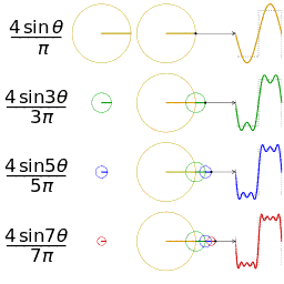 Visualisation of an approximation of a square wave by taking the first 1, 2, 3 and 4 terms of its Fourier series. θ is 2πt.
 -
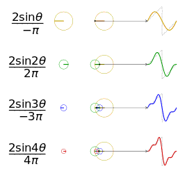 Visualisation of an approximation of a sawtooth wave of the same amplitude and frequency for comparison


-
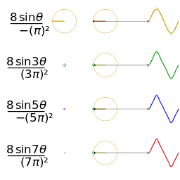 That of a symmetric triangle wave of the same amplitude and frequency (note the much faster convergence)
 -
 That of the cubic function θ³ for -π < θ < π (compare with the sawtooth wave)


The animations were made by first creating SVGs of their 60 frames and uploading them to Wikimedia Commons to render them into PNGs, which unfortunately centre-aligned the first tspan (instead of the entire row) of each denominator. They were then downloaded, and sliced and combined into GIF animations with these ImageMagick commands:
convert.exe Fourier_series_square_wave_circle_animation.svg.png -crop 1x60@ +repage +adjoin Fourier_series_square_wave_circle_animation_%%03d.png
convert.exe -delay 10 -loop 0 -page +0+0 ^
 Fourier_series_square_wave_circle_animation_000.png ^
 Fourier_series_square_wave_circle_animation_001.png ^
 Fourier_series_square_wave_circle_animation_002.png ^
 Fourier_series_square_wave_circle_animation_003.png ^
 Fourier_series_square_wave_circle_animation_004.png ^
 Fourier_series_square_wave_circle_animation_005.png ^
 Fourier_series_square_wave_circle_animation_006.png ^
 Fourier_series_square_wave_circle_animation_007.png ^
 Fourier_series_square_wave_circle_animation_008.png ^
 Fourier_series_square_wave_circle_animation_009.png ^
 Fourier_series_square_wave_circle_animation_010.png ^
 Fourier_series_square_wave_circle_animation_011.png ^
 Fourier_series_square_wave_circle_animation_012.png ^
 Fourier_series_square_wave_circle_animation_013.png ^
 Fourier_series_square_wave_circle_animation_014.png ^
 Fourier_series_square_wave_circle_animation_015.png ^
 Fourier_series_square_wave_circle_animation_016.png ^
 Fourier_series_square_wave_circle_animation_017.png ^
 Fourier_series_square_wave_circle_animation_018.png ^
 Fourier_series_square_wave_circle_animation_019.png ^
 Fourier_series_square_wave_circle_animation_020.png ^
 Fourier_series_square_wave_circle_animation_021.png ^
 Fourier_series_square_wave_circle_animation_022.png ^
 Fourier_series_square_wave_circle_animation_023.png ^
 Fourier_series_square_wave_circle_animation_024.png ^
 Fourier_series_square_wave_circle_animation_025.png ^
 Fourier_series_square_wave_circle_animation_026.png ^
 Fourier_series_square_wave_circle_animation_027.png ^
 Fourier_series_square_wave_circle_animation_028.png ^
 Fourier_series_square_wave_circle_animation_029.png ^
 Fourier_series_square_wave_circle_animation_030.png ^
 Fourier_series_square_wave_circle_animation_031.png ^
 Fourier_series_square_wave_circle_animation_032.png ^
 Fourier_series_square_wave_circle_animation_033.png ^
 Fourier_series_square_wave_circle_animation_034.png ^
 Fourier_series_square_wave_circle_animation_035.png ^
 Fourier_series_square_wave_circle_animation_036.png ^
 Fourier_series_square_wave_circle_animation_037.png ^
 Fourier_series_square_wave_circle_animation_038.png ^
 Fourier_series_square_wave_circle_animation_039.png ^
 Fourier_series_square_wave_circle_animation_040.png ^
 Fourier_series_square_wave_circle_animation_041.png ^
 Fourier_series_square_wave_circle_animation_042.png ^
 Fourier_series_square_wave_circle_animation_043.png ^
 Fourier_series_square_wave_circle_animation_044.png ^
 Fourier_series_square_wave_circle_animation_045.png ^
 Fourier_series_square_wave_circle_animation_046.png ^
 Fourier_series_square_wave_circle_animation_047.png ^
 Fourier_series_square_wave_circle_animation_048.png ^
 Fourier_series_square_wave_circle_animation_049.png ^
 Fourier_series_square_wave_circle_animation_050.png ^
 Fourier_series_square_wave_circle_animation_051.png ^
 Fourier_series_square_wave_circle_animation_052.png ^
 Fourier_series_square_wave_circle_animation_053.png ^
 Fourier_series_square_wave_circle_animation_054.png ^
 Fourier_series_square_wave_circle_animation_055.png ^
 Fourier_series_square_wave_circle_animation_056.png ^
 Fourier_series_square_wave_circle_animation_057.png ^
 Fourier_series_square_wave_circle_animation_058.png ^
 Fourier_series_square_wave_circle_animation_059.png ^
 -coalesce -depth 3 -colors 32 -dither FloydSteinberg Fourier_series_square_wave_circle_animation.gif
nucleosynthesis periodic table.svg ☎ 31 Mar 2014 edit
As Neil deGrasse Tyson movingly put it [3], an astounding fact is that we are star dust — most of the elements in our bodies (barring some recent radioactive-decay products) were created in stars, by cosmic rays or during the Big Bang itself.
At a talk at the Cambridge Institute of Astronomy, the speaker presented a slide similar to this periodic table showing the origins of the elements. I was surprised to find Wikipedia without an equivalent graphic, so decided to make one!

The SVG itself is straightforward, the only interesting bit being the Appley skeuomorphic gradient shading I "invented" when making the Git chart on the left:
<linearGradient id="grad_shade" x1="0%" y1="0%" x2="0%" y2="100%"> <stop offset="10%" stop-color="#ffffff" stop-opacity="0.5"/> <stop offset="90%" stop-color="#000000" stop-opacity="0"/> </linearGradient> |
Applying this to a shape makes its top 10% half-transparent white, and its bottom 10% black but fully transparent. The middle region has a curious gradient which, in my opinion, looks quite attractive when overlaid on a copy of the shape filled with the intended solid colour.
comparison ISS HST orbits globe centered in Cape Verde.svg ☎ 28 Feb 2014 edit

I caught Gravity on a flight and marvelled at the amazing special effects and way-above-average accuracy of its portrayal of space travel, particularly how the alarm sounds came back when the hallucination turned up the air pressure and how the Soyuz righted itself during reentry.
Nevertheless, one of the popular gripes is how easy it was to travel between the Hubble, ISS and Tiangong. Of course, one could imagine an alternate universe where they are put into almost identical orbits. When the film first came out, I drew this graphic to show how different the real ISS and Hubble's orbits are. Even if they were at the same height and almost the same longitude/latitude, their orbital inclinations would require huge change in delta-v which I doubt a backpack could provide.
As for the creation of the image, I faced the classic problem of "drawing Saturn with its rings": How to draw a circle with an ellipse both behind and in front of it?
The solution I used was to erase half the ellipse using an SVG clip-mask, and draw it over the globe which already has the full ellipse drawn under it. Because of anti-aliasing, the twice-drawn half is slightly thicker than the other half, but it's not noticeable at normal resolutions. I could have made the ellipse below also a half-ellipse but thought that any gap in the joint would look even worse...
Burj Khalifa floors.svg ☎ 14 Jan 2014 edit
This dimetric projection of the tallest building in the world is my first SVG animated using CSS3. I had previously used JavaScript/ECMAScript to animate SVG but the Wikimedia uploader rejected it as JavaScript was considered a security risk. Using CSS3 is more limited, allowing noninteractive animation of various attributes, the transform attribute in this case.
Using the technique to simulate 3D rotation below, I rotated each different floor plan, replicated it in the appropriate colour as many times as needed, and scaled the whole group vertically by half. The illusion was reinforced by the sheer number of floors. The only niggles were...
- The framerate of the animation: each floor being made of 12 elements (6 for each fill and stroke — combining both resulted in an ugly redundant line at the apex of each lobe) and there being over 200 floors meant that there were over 1200 elements to animate in each frame,
- The sharp angles of the base and spire "floors" giving a jagged appearance in silhouette, and
- The Mediawiki renderer ignoring the CSS3 — it would have been perfect if it rendered an animated GIF (animated PNGs being less well-supported).
I was so satisfied that I retroactively applied it to the Absolute World Tower model and was even more impressed with the quality of the rendering. As there were fewer elements and the floors were more rounded, both the animation and the silhouette were much smoother. That the Mediawiki renderer ignores CSS3 was used to show the rightmost text label only in a static thumbnail.
Sadly, browser support for CSS3 is still patchy: the test animation of falling snowflakes works in Chrome, but not in Firefox 26.0. At time of writing, noone has suggested a fix or workaround for this bug :-(
Incidentally, it's now been 2 years since I started this behind-the-scene look at my work with Wikipedia/Wikimedia. Does anyone actually look at this? If so, I'd love to hear from you — cheers!
UPDATE 26 JAN 2016: user:RaphaelRBarbosa reminded me that the snowflakes animation now works in Firefox — thanks, Raphael!
2013 edit
coupon collector problem.svg ☎ 28 Dec 2013 edit

I play a game which has characters making various sculptures, each attempt generating 1 of 12 possible sculptures at random. Every time I complete a "collection" of 12, I get a bonus and get to start a new collection.
I wondered how many tries I need, on average, to complete a collection from scratch. A search introduced me to the Coupon collector's problem. Paraphrasing the article,
- In probability theory, the coupon collector's problem describes the "collect all coupons and win" contests. ... Given n coupons, how many coupons, E (T ) do you expect you need to draw with replacement before having drawn each coupon at least once?
The answer uses a series which I had read about but never known an application for: the Harmonic series, in the form
- Hn = 1/1 + 1/2 + 1/3 + 1/4 + 1/5 + ... + 1/n
Mathematical induction gives E (T ) = n Hn , which I've plotted for n from 1 to 60 (to cover the case of 52 playing cards — I'd have preferred 100, but that makes the smaller bars too hard to see).
I added dotted lines to show the number of tries needed for each coupon. Though this value increases, it increases rather slowly, as E (T ) being linearly proportional to n logn implies.
Back to my game, my 12 sculptures would thus require 38 attempts, on average. In practice, I found that it takes fewer tries, perhaps because it wasn't as random as I'd thought.
By the way, I love the elegant proof that the harmonic series diverges (goes to infinity as n approaches infinity), unlike a geometric series with a ratio between -1 and 1 (not inclusive). I'll consider drawing a proof without words of it one day...
rolling shutter effect.svg ☎ 10 Nov 2013 edit


I used to be baffled by photographs like the one of the helicopter on the left, wondering what on Earth could have caused such distortion on the blades! I recently learnt that it is an effect of the rolling shutter on many digital cameras, especially those on mobile phones.
Unlike film cameras which expose the entire frame at the same time (actually they have rolling blinds too, but the effect is only apparent at very fast shutter speeds), cameras without a mechanical shutter expose and read off a line at a time. This means that by the time the last row is captured, a fast-moving subject will have moved significantly from where it was when the first row was captured.
To illustrate the warping more precisely, I came up with a sequence of 24 frames of a rotating disc and simulated a rolling shutter scanning a row at a time. In each frame, the left half shows the state of the disc and the position of the captured row, while the right half shows the image captured until that point. Sadly, there is a bug in Mediawiki (not in Firefox or Chrome) that renders some artifacts in the top rows; I guess it didn't like my 24 levels of nesting to generate the captured image sequence, the most I've used to date.
Nevertheless, it's now clear to me that the part of the disc moving in the direction of the scan (the right side) is smeared out into large shapes while those moving the other way (the left side) is compressed. The small number of rows cause the jagged appearance; more rows in a real camera lead to smoother curves.
To complete the simulation, I sliced the image into 24 layers in Gimp and stitched them into GIF animation.
I later found this video which explains it even better. I might make a similar animation in the future...
UPDATE 31 MAR 2014: Really proud to see my animation not only used on Vsauce, but host Michael Stevens even built on it to explain that our view of the Andromeda Galaxy suffers from a rolling-shutter effect.
Hipparcos Catalogue equirectangular plot.svg ☎ 21 Oct 2013 edit
File:Hipparcos_Catalogue_equirectangular_plot.svg marked the completion of my trio of charts of objects in the night sky, all of right ascension against declination in an equirectangular grid:

|
The first plot is of the 88 modern constellations. Surprisingly, constellations are now defined as regions of the sky rather than groups of stars, so the graphic shows their boundaries rather than the traditional lines-between-stars. I also added the ecliptic and a negative bitmap to show the Milky Way. User:Timwi kindly helped me shade the regions using the four-colour theorem, which help tell adjacent ones apart. |

|
The next graphic is of the fuzzy things catalogued in the 18th century by astronomer Charles Messier. As science progressed, it was discovered that they were very different objects, some being clouds of gas while others being clusters of stars. Yet others were whole galaxies far, far away... (but that was a long time ago!) |

|
The finale is a chart of the 2000 or so brightest stars more recently catalogued by the Hipparcos project. That was an opportunity to revive the lines-between-the-stars, which was obtained from data files of the excellent virtual planetarium, Stellarium. I'm tempted to draw them on the first plot, too, but that will have to wait for another day... |
cmglee London FCO Grand Staircase.jpg ☎ 28 Sep 2013 edit

Another year, another Open House London!
This time, I managed to win the ballot for a place on the Arriva Heritage Bus Tour, which used the last classic Routemaster, RM2217 to take us to 5 landmarks:
- The Royal Society,
- Apothecaries' Hall,
- Maughan Library of King's College London,
- Middle Temple, and
- One Bishops Square.
I also visited the Foreign and Commonwealth Office (FCO), and the Brunel Museum and its recently-reopened entrance shaft of the Thames Tunnel.
Of course, my trusty camera came along, so here's another batch of photos for your viewing pleasure...
-
 Driver's cab of Routemaster RM2217
 -
 Great Hall of the Apothecaries' Hall
 -
 Weston Room of the Maughan Library
 -
 Middle Temple hall
 -
 View of Spitalfields from One Bishops Square
 -
 FCO Durbar Court


million award logo.svg ☎ 27 Aug 2013 edit
| This user has not won a Million Award but is nevertheless proud to have designed a logo for it! |
Today, I got my first Wikimedia request for a logo design (a very old hobby) for the so-called Million Award, which I think is a good idea — much as I enjoy drawing pretty pictures of my interests, I've long thought that my efforts benefit society most when spent on popular topics which are somehow lacking.
The requester, User:Khazar2 had adapted my visualization of 1 million graphic (see below), so I continued in that direction. Befitting the theme of "million", the middle cube has 1 millionth the virtual volume of the large cube, while the CMYK colours evoke the idea of "articles" in the traditional printing sense. "1M" is hopefully language-independent and the star is a common motif for awards such as the Barnstar.
The skewed text is also my first use of SVG matrix affine transformation, and I was delighted that the bottom-right edge of the star (simply Unicode character U+272A) lined up with the bottom-right side of the cube. It was also my first attempt to specify a particular font, in this case, one with tapering (not slab) serifs so that the "1" and "M" look more elegant and reminiscent of printed text.
All in all, it was a fun little project for the day!
cmglee Horniman London skyline.jpg ☎ 25 Jul 2013 edit
I revisited the Horniman Museum, one of my favourite museums in London because of their approach to education by comparing artifacts from different cultures. I also love their skeleton-skin preparations, which show just the skeleton in half of a stuffed animal, as it shows how the bones (and consequently, muscles and internal organs) fit in the body. These are some examples:
-
 Pigeon
 -
 Fruit bat
 -
 Rabbit
 -
 Hedgehog
 -
 Dolphin
 -
 Turtle


I also reshot the London skyline from Forest Hill to show a completed Shard. Sadly, the summer air was quite hazy, but some image-processing helped. In the style of Horniman, see how the city has changed in 1½ years!


Template:Alcohol metabolism formulae ☎ 25 Jun 2013 edit

The Laboratory of Molecular Biology opened its doors to the public on Sat, 22 June, so my friends and I attended some talks, exhibitions and a tour of their new home. (I also used the opportunity to take some photos!)
One of the speakers talked about a mutation causing possibly the greatest cancer risk in the world: ALDH2*2
With China rapidly adopting a drinking culture, about 25% of the East Asians (perhaps 300 million people) face increased risk of esophageal cancer. If I understood correctly, the risk of an affected person drinking, compared to an unaffected one, is greater than that of lung cancer from smoking (of course, the quantity matters...)
I couldn't find a graphic of the breakdown of alcohol in the alcohol flush reaction page, so tried to create one. I could have done it in SVG, but thought it was an interesting experiment to do it in the LATEX-like maths "equation editor". I had to tweak the spacing quite a bit and couldn't draw diagonal double bonds, but managed the following:

Whatjsay? :-)
perpetual calendar cycle.svg ☎ 14 Jun 2013 edit

Timwi's image at http://imgur.com/gallery/eUMMCtb got me interested in calendars again — I must be getting old!
His most amazing find was that the 400-year cycle of the Gregorian calendar (the one in everyday use today) has a multiple of 7 days, meaning that the cycle repeats exactly every 400 years. But interesting and colourful as his graphic was, it didn't help with my understanding of how the 14 possible calendars actually change, so I decided to draw my own...
While on holiday, I wrote a quick program to output into a simple text file as one line separated by spaces:
- The day-of-week of January 1st of each year from 2001 to 2400 (unlike Timwi's choice of 2000 to 2399, I started with 2001 so that the rare 400-year leap on 29 Feb 2000 after 1 Jan wouldn't disrupt the pattern), and
- Whether the year was a leap year.
Changing the width of my text editor window let me see in how many years the pattern more-or-less repeated.
The answer was 28, not surprisingly the lowest common multiple of 7 (days in a week) and 4 (almost every 4th year is leap), the pattern disrupted only by the non-leap years 2100, 2200 and 2300. 28 columns would, however, be too wide, so I decided to go down then across, instead of across then down.
The pattern appeared more regular now, but the non-leap century years still played havoc, until I got the idea of skipping the necessary number of cells until the pattern resumed. There are actually 2 possible places each non-leap century year can go. I chose the later one so that 2300 doesn't end up at the top of its column.
This resulted in the graphic on the right. It's now much clearer to me how the calendars cycle — one day forward each non-leap year, and two days forward each leap year, except for the non-leap century years which leave large gaps.
P.S. I redrew the graphic in Wikitext below, if anyone wants an HTML copy.
| Day of week of Jan 1 | Leap year | Gregorian calendar for years from 2001 to 2400 | |||||||||||||||
|---|---|---|---|---|---|---|---|---|---|---|---|---|---|---|---|---|---|
| Monday | 2001 | 2029 | 2057 | 2085 | 2125 | 2153 | 2181 | 2221 | 2249 | 2277 | 2317 | 2345 | 2373 | ||||
| Tuesday | 2002 | 2030 | 2058 | 2086 | 2126 | 2154 | 2182 | 2222 | 2250 | 2278 | 2318 | 2346 | 2374 | ||||
| Wednesday | 2003 | 2031 | 2059 | 2087 | 2127 | 2155 | 2183 | 2200 | 2223 | 2251 | 2279 | 2319 | 2347 | 2375 | |||
| Thursday | ✔ | 2004 | 2032 | 2060 | 2088 | 2128 | 2156 | 2184 | 2224 | 2252 | 2280 | 2320 | 2348 | 2376 | |||
| Saturday | 2005 | 2033 | 2061 | 2089 | 2101 | 2129 | 2157 | 2185 | 2225 | 2253 | 2281 | 2321 | 2349 | 2377 | |||
| Sunday | 2006 | 2034 | 2062 | 2090 | 2102 | 2130 | 2158 | 2186 | 2226 | 2254 | 2282 | 2322 | 2350 | 2378 | |||
| Monday | 2007 | 2035 | 2063 | 2091 | 2103 | 2131 | 2159 | 2187 | 2227 | 2255 | 2283 | 2300 | 2323 | 2351 | 2379 | ||
| Tuesday | ✔ | 2008 | 2036 | 2064 | 2092 | 2104 | 2132 | 2160 | 2188 | 2228 | 2256 | 2284 | 2324 | 2352 | 2380 | ||
| Thursday | 2009 | 2037 | 2065 | 2093 | 2105 | 2133 | 2161 | 2189 | 2201 | 2229 | 2257 | 2285 | 2325 | 2353 | 2381 | ||
| Friday | 2010 | 2038 | 2066 | 2094 | 2106 | 2134 | 2162 | 2190 | 2202 | 2230 | 2258 | 2286 | 2326 | 2354 | 2382 | ||
| Saturday | 2011 | 2039 | 2067 | 2095 | 2107 | 2135 | 2163 | 2191 | 2203 | 2231 | 2259 | 2287 | 2327 | 2355 | 2383 | ||
| Sunday | ✔ | 2012 | 2040 | 2068 | 2096 | 2108 | 2136 | 2164 | 2192 | 2204 | 2232 | 2260 | 2288 | 2328 | 2356 | 2384 | |
| Tuesday | 2013 | 2041 | 2069 | 2097 | 2109 | 2137 | 2165 | 2193 | 2205 | 2233 | 2261 | 2289 | 2301 | 2329 | 2357 | 2385 | |
| Wednesday | 2014 | 2042 | 2070 | 2098 | 2110 | 2138 | 2166 | 2194 | 2206 | 2234 | 2262 | 2290 | 2302 | 2330 | 2358 | 2386 | |
| Thursday | 2015 | 2043 | 2071 | 2099 | 2111 | 2139 | 2167 | 2195 | 2207 | 2235 | 2263 | 2291 | 2303 | 2331 | 2359 | 2387 | |
| Friday | ✔ | 2016 | 2044 | 2072 | 2112 | 2140 | 2168 | 2196 | 2208 | 2236 | 2264 | 2292 | 2304 | 2332 | 2360 | 2388 | |
| Sunday | 2017 | 2045 | 2073 | 2113 | 2141 | 2169 | 2197 | 2209 | 2237 | 2265 | 2293 | 2305 | 2333 | 2361 | 2389 | ||
| Monday | 2018 | 2046 | 2074 | 2114 | 2142 | 2170 | 2198 | 2210 | 2238 | 2266 | 2294 | 2306 | 2334 | 2362 | 2390 | ||
| Tuesday | 2019 | 2047 | 2075 | 2115 | 2143 | 2171 | 2199 | 2211 | 2239 | 2267 | 2295 | 2307 | 2335 | 2363 | 2391 | ||
| Wednesday | ✔ | 2020 | 2048 | 2076 | 2116 | 2144 | 2172 | 2212 | 2240 | 2268 | 2296 | 2308 | 2336 | 2364 | 2392 | ||
| Friday | 2021 | 2049 | 2077 | 2117 | 2145 | 2173 | 2213 | 2241 | 2269 | 2297 | 2309 | 2337 | 2365 | 2393 | |||
| Saturday | 2022 | 2050 | 2078 | 2118 | 2146 | 2174 | 2214 | 2242 | 2270 | 2298 | 2310 | 2338 | 2366 | 2394 | |||
| Sunday | 2023 | 2051 | 2079 | 2119 | 2147 | 2175 | 2215 | 2243 | 2271 | 2299 | 2311 | 2339 | 2367 | 2395 | |||
| Monday | ✔ | 2024 | 2052 | 2080 | 2120 | 2148 | 2176 | 2216 | 2244 | 2272 | 2312 | 2340 | 2368 | 2396 | |||
| Wednesday | 2025 | 2053 | 2081 | 2121 | 2149 | 2177 | 2217 | 2245 | 2273 | 2313 | 2341 | 2369 | 2397 | ||||
| Thursday | 2026 | 2054 | 2082 | 2122 | 2150 | 2178 | 2218 | 2246 | 2274 | 2314 | 2342 | 2370 | 2398 | ||||
| Friday | 2027 | 2055 | 2083 | 2100 | 2123 | 2151 | 2179 | 2219 | 2247 | 2275 | 2315 | 2343 | 2371 | 2399 | |||
| Saturday | ✔ | 2028 | 2056 | 2084 | 2124 | 2152 | 2180 | 2220 | 2248 | 2276 | 2316 | 2344 | 2372 | 2400 | |||
Dewan Rakyat 2013 Equal Area.svg ☎ 9 May 2013 edit

Once again, I'm honoured to see this cartogram of the parliamentary constituency results of the Malaysian general election, 2013 appearing on the main page of the Chinese Wikipedia.
To be honest, most of the credit should go to User:Hytar who made the cartogram for the Malaysian general election, 2008. I just fixed a few minor cosmetic issues, tidied up the SVG code and updated the data to reflect the 2013 results. Due to his or her judicious use of CSS, the task was pretty straightforward.
I must give kudos to Hytar, too, for being so supportive and polite — a model Wikipedian if there was one!
The next job is to update File:Dewan_Undangan_Negeri_2008_Equal_Area.svg with this year's results. Hytar referred to some spreadsheets going around. Obtaining one would make updating the 505 hexagons much easier.
Template:Blakey_65moll.jpg_K/T_impact_site ☎ 9 Apr 2013 edit
{{Blakey_65moll.jpg_K/T_impact_site}} Today, I discovered a new technique to annotate images, using the Annotated image template. I had previously converted bitmaps to Base64 and embedded them in SVG files. With the template, I could add labels to any image directly in the Wiki markup.
For example, the code below produces the graphic on the right. The template also let me crop the sides of the Mollweide projection, to make the graphic fit inside text and yet allow detail on the map to be clearly seen. To isolate the label from the bitmap, I repeated it twice in black with slight offsets to simulate an outline — an alternative was to use a CSS shadow but CSS support for it is dicey.
I was surprised to find plenty of maps of the Chicxulub crater, the location of the Cretaceous–Paleogene_extinction_event, but no world maps showing this location on Wikimedia. Of course, the world looked a bit different 65 million years ago!
{{ Annotated image
 | image   =
 | caption = K/T impact site on a contemporary world map (65 mya)<ref>[http://www.scotese.com/K/t.htm K/T extinction]</ref>
 | width   = 300 | height = 190 | image-width = 400 | image-left = -45 | image-top = -3
 | annotations = {{Annotation|74|64|* Impact site|font-weight=bold|color=black}}
                 {{Annotation|76|66|* Impact site|font-weight=bold|color=black}}
                 {{Annotation|75|65|* Impact site|font-weight=bold|color=white}}
}}
UPDATE 26 JAN 2016: It seems the maps have been removed due to copyright violation; I'll see if I can redraw them in the future.
chain hoist.svg ☎ 10 Mar 2013 edit


Ever since I learnt about the differential pulley, I have been intrigued by the mechanism. Although it superficially resembles a block and tackle, at least two of its pulleys are sprockets, which engage with a chain, hence its other name, "chain hoist". Additionally, these two pulleys are joined together, and the ratio of their diameters (or radii) determines its mechanical advantage.
Drawing a graphic of it was an interesting exercise in SVG-hacking:
First, the teeth of the sprockets were simply the dotted stroke (outline) of the circle representing the pulley, set to the same colour as its fill, and with the duty cycle, phase and width adjusted to fit.
Next, I needed a path that looked like a chain, and found a way to do it with three dashed lines of different duty cycles, phases, widths and colours, one of them in the background colour to "erase" the hole in the links. This looked fine until I overlaid the chain on the pulleys, making the background colour incorrectly appear over the pulleys. If only clip paths had an inverse function which let one ignore pixels inside the path, rather than outside!
I left the problem for over a year before discovering masks. I could now draw the chain without the holes and overlay the whole thing on any background. The experiment on the left, a world map with borders replaced with chains, proved that this technique was feasible as long as turns were not too sharp. The hack was successfully applied to the differential pulley graphic (right), though I later found that Google Chrome had trouble with my mask. Oh well...
UPDATE 20 AUG 2019: While showing it to Deryck Chan on the NYO airport bus to Wikimania ’19, I remembered two bugs:
- Links thinned where the chain crosses itself
- Links having square cross sections
and fixed them en route back to Cambridge.
commons:Category:Historical images of Penang ☎ 3 Mar 2013 edit


I met User:Charles Matthews, User:Deryck Chan and User:Magnus Manske at the Cambridge Wikimedia Meetup Number 17 again yesterday and they convinced me that artwork from 1850 and before is globally considered public domain. I've therefore completed upload of 50 historical paintings and drawings of Penang housed in the Penang Museum and Art Gallery. The works show a much quieter island compared to the bustling city of today, but likely presents a European colonist's romanticised perspective. Nevertheless, it serves as a good historical record of the island.
There are 11 other pieces dating from after 1850, and 2 with dates unstated. Perhaps someone can upload them as they come out of copyright in the coming years...
- Pinang from Richmond Hill (1852)
- A Sketch on the Penang Hill (1852)
- A Sketch on the Penang Hill (1852)
- Dr Mackinnon's Residence, near the Bermah Village, Penang (1852)
- Penang from the sea (1854)
- Penang from the sea (1854)
- Harbour Scene (1856)
- Waterfall near Penang (1870)
- Edinburgh House occupied by the Duke (1870)
- Georgetown, Penang near Perak in the Malay Peninsula (1876)
- View from Penang Hill (c1924)
- The Duke of Edinburgh at Penang, the Levee at the court of Request (unknown)
- The Duke of Edinburgh at Penang, the Levee at the court of Requests (unknown)

UPDATE 9 SEP 2018: After reading through commons:Commons:Village_pump/Copyright/Archive/2017/03#Cut-off_date_for_the_PD-old_template, I decided it safe to upload all but the last three paintings (1876 is 142 years ago – longer than the most conservative 140 years proposed – but 1924 is only 94)
sexagenary cycle years.svg ☎ 9 Feb 2013 edit


As several Asian cultures celebrate the lunar new year tomorrow, I made a couple of somewhat related illustrations.
I have sometimes wondered how the Chinese decide that a particular year is the Year of the Water Snake (for example). I knew that the 12 animals of the Chinese zodiac go in sequence but the element was a mystery. The Sexagenary cycle article makes it clear: The element cycles in the order wood, fire, earth, metal and water, changing every two years (the first year being yang and the second, yin). With that in mind, I drew the graphic on the right, adding in the numeric years. As it wasn't immediately obvious, I also added a tortuous line to show the progression — hope it's not too messy... I initially laid the years out in a table before realising that they wrap around in both X and Y axes: The surface of a toroid! Alas, drawing a toroidal surface isn't that easy, so the best I could manage was to make an annulus (mathematics) and wrapping the element radially.
The graphic on the left is based on a clever optical illusion which tricks the brain into seeing movement where there is none. The original, named Rotating Snakes, by psychologist Kitaoka Akiyoshi is an example of peripheral drift illusion which works on the viewer's peripheral vision. For best effect, one should use as large an image as possible, such as this one. An even more stunning illusion is found on the cover of the indie album Merriweather Post Pavilion.
Happy lunar new year to all who celebrate it!
comparison of pyramids.svg ☎ 31 Jan 2013 edit


I've just updated my comparison of some pyramidal buildings, adding the collapsed pyramid at Meidum to replace the Bosnian "Pyramid of the Sun" which was forcefully removed due to the misconception that I had tried to promote the Bosnian hill as a building. That was never my intention — I thought that including it in the graphic only served to highlight how ridiculously enormous it was compared to other pyramids. Nevertheless, an editor removed it, leaving an unsightly gap in the labels.
Meanwhile, I had been thinking about including the Meidum pyramid but felt that my SVG skills were inadequate at the time. Now that I had more experience with Bézier curves and a gap to fill, I traced this illustration and added it to the graphic, renumbering the pyramids in the process (I had checked that no pages that used it referred to the numbers).
Guess you can't win every battle, but you can make the most of the outcome!
UPDATE 16 NOV 2014: I've hyperlinked the label and profile of each "pyramid" so that hovering highlights them and clicking opens its Wikipedia article.
Template:Distance from Sun using EasyTimeline ☎ 2 Jan 2013 edit
Today marks the Perihelion of the Earth, the moment in a year that the Earth is closest to the Sun, paradoxically near the coldest time of year in the Northern Hemisphere!
A while back, I discovered the ability to render graphics in an article by just writing some code, instead of uploading an image (such as SVG) and transcluding it: EasyTimeline.
Originally designed to create timelines, it can be repurposed to draw bar charts in general. My first use of it is the chart below graphically illustrating the range of distances some bodies of the solar system can be from the Sun. It can be seen that the inner planets have almost circular orbits whereas the outer dwarf planets and Halley's Comet have very eccentric orbits.

2012 edit
Mesoamerican Long Count Calendar visualization.svg ☎ 21 Dec 2012 edit

I'm pleasantly suprised at the lack of media coverage of the 2012 phenomenon, considering the frenzy when the 2012 movie was released — it's certainly nothing like what accompanied the Y2K scare.
Nevertheless, I was curious to find out the relevance of today's date in the Mayan calendar and read about their units of time. 21st December 2012 marks the end of the 13th (written 12 in their dates as they start counting at zero), and the start of the 14th b'ak'tun, a unit of time 144000 days long (around 400 years).
Using the idea I developed to visualise largish numbers at the same scale (one million in the illustration on the right, and one billion in this one for high-resolution screens), I drew similar blocks representing the Mesoamerican time units up to a piktun (around 8000 years), in principle representing almost 3 million small cubes in the largest block! I added colours and a scale showing equivalent dates on the Western calendar. To reduce the width of the image, I flipped my trimetric projection horizontally.
From this image, I can see that while the date is interesting, it's not exceptional as it occurs once every 394 years. Moreover, nothing major happened at the last few changeovers: 1618, 1224 and 830.
On that note, I'll just wish everyone, "Happy new b'ak'tun!"
Heathrow Airport map with third runway.svg ☎ 17 Dec 2012 edit

The map on the left is my first attempt to combine an SVG export of OpenStreetMap data with annotation to show the terminals of London Heathrow Airport and its proposed extension, although I had previously embedded bitmaps of OpenStreetMap maps in the illustration of the Fukushima Daiichi nuclear disaster (right).
Though I have used Heathrow Airport for many years, I had no idea about its layout, other than the Central Bus Station and Underground station serving Terminals 1 and 3 (and formerly Terminal 2) while Terminal 4 had its own stations. The map now makes it clear how the buildings are laid out with respect to the runways and one another. I took the opportunity to illustrate the controversial third runway and extension, which has garnered plenty of press coverage in the UK.
Technical-wise, I found adding annotations straightforward but modifying existing SVG objects (even just changing their colours) quite difficult, particularly since there were so many objects that I had to hunt down the target object by colour, which was specified as, for instance, rgb(80%,60%,100%) instead of the more common #cc99ff format. I also thought the SVG was extremely inefficient in terms of file size. I would have, for example, grouped all objects of the same style and applied the styling to the group, rather than style each object individually. If I ever need to annotate an exported OpenStreetMap SVG again, I'll consider using an editor like Inkscape.
parallax barrier vs lenticular screen.svg ☎ 30 Nov 2012 edit


Another thing that we talked about at the CUWPS gathering was three-dimensional (3D) displays, such as those in the Nintendo 3DS. I showed the group the drawing on the left to illustrate the principle, and the subject changed to drawing SVG.
We looked at the source code and discussed use of groups, transforms and defined blocks to reduce the effort of producing one, while also saving on file size.
This drawing is one of my forays into simulating a 3D scene in a 2D medium, ironic considering the subject of the drawing is technology to simulate 3D with 2D!
The projection used is the approximate isometric projection used in isometric graphics in video games and pixel art, actually a dimetric projection. It simplifies mapping between 3D and 2D coordinates in this case, so I could work out the coordinates by hand, but traditionally, it allowed pixels to fall neatly into the raster graphics matrix without needing antialiasing. It looks slightly more aesthetic than true isometric to me, too, as more of the sides is visible than the top, just like how I would sketch a 3D object.
Another drawing done with the same projection is the sequence on the right is showing how some canal locks work.
Penang Harbour HMS Magpie 1884 Penang map.jpg ☎ 26 Nov 2012 edit


I have always been interested in the small island of Penang and was over the moon when I found this scan (left) of an ancient map dating from 1799. Though it was only 13 years since Penang's founding, the map had landmarks such as Fort Cornwallis, Penang Road and the grid of streets near Beach Street. It was fascinating that while land to the southeast had been reclaimed to build Weld Quay, land to the north had been lost to the sea, which may explain why the Esplanade was built.
It then occurred to me that Penang being a British colony meant that there must be extensive historical records of early Penang within a stone's throw at the Cambridge University Library. I found that very book from which the 1799 map came, and also a more recent map in the Map Room (right) — how Penang had grown in 85 years!
I spoke of my experience with the Cambridge University Wikipedia Society at their gathering yesterday and discussed with President Deryck about expanding GLAM to include the University Library archives. I know I'd certainly be interested in their ancient maps ୯ ͡° ͜১͡° ੭
| UPDATE 8 MARCH 2024: I superimposed the 1799 map on a modern one. They don't quite line up likely due to old cartographers not being very accurate (and to a lesser extent differences in map projection) but it shows the reclamation of the eastern side of Beach Street well! |  |
Cambridge University colleges timeline.svg ☎ 29 Oct 2012 edit

I attended the 16th Cambridge Wikimedia meetup and inaugural Cambridge University Wikipedia Society meeting yesterday and had the pleasure of meeting several enthusiastic Wikimedians/Wikipedians and learning about the projects and ideas of User:Charles Matthews and User:Magnus Manske. I'm looking forward to the planned collaboration with the University of Cambridge and local museums.
Speaking of Cambridge University, on the right is a chart I made a while ago to illustrate the complex history of the colleges of the University of Cambridge. It shows the years of formation of the colleges, when they changed their names, and most importantly, when they started admitting women (or men, in the case of Girton College and Hughes Hall). Obtaining all this data from disparate sources was quite a challenge, and I'm still missing one crucial date:
When St Edmund's College became mixed.
Repeated emails to various parties in the college were unanswered, so I've shaded the transition to the range of years this could have happened. Anyone got any idea?
UPDATE 28 NOV 2012: User:Deryck Chan managed to get a statement from St Edmund's Emeritus Fellow Dr Michael A Hoskin that he remembered it as 1969. Pending confirmation of historical records, I've tentatively indicated 1969 as the year St Edmund's became mixed.
UPDATE 17 DEC 2012: Thanks to the tireless effort by the St Edmund's College Combination Room Women’s Officer, Miss Maryam Farooq, the year women could be admitted to St Edmund's College, as postgrads, has been established to be 1965.
Container City massing model.svg ☎ 28 Sep 2012 edit


Last weekend, hundreds of establishments in London welcomed visitors for Open House London, and so I took the opportunity to visit a pioneering work of shipping container architecture at Trinity Buoy Wharf: Container City.
The structure consists of two buildings named Container City I and Container City II, made out of 52 old 40-foot shipping containers. Even the lift shaft and stairwell are containers standing on end. I really like the balconies made from the containers' open doors, and the bright colours.
Unlike the exterior, its interior looks pretty much like ordinary flats except for the portholes and occasional glimpses of the exterior, and tall people may find the low ceiling claustrophobic! Being an open house, a studio was open to the public, though I cynically think it's just a ploy to get people to rent it :-)
To better understand its structure, I reused my patented (not!) trimetric projection to depict the containers, one layer at a time. The SVG code was wholly done in Notepad++, believe it or not, though the hardest part was finding out what colour each container was painted!
using watch and sun as compass.svg ☎ 24 Sep 2012 edit

Continuing the theme of clock faces, I recently found out about a method scouts and similar groups learn to locate north and south using the sun and an analogue clock or watch:
As the sun appears to complete one rotation around the sky in 24 hours while the hour hand of a 12-hour clock takes 12 hours, bisecting the angle lets one identify the cardinal directions.
Unfortunately, modern timekeeping complicates matters with time zones and daylight saving. Most countries (except perhaps China and Kiribati) have time zones roughly corresponding to the local time. Daylight saving normally move clocks forward by an hour.
Using this information, the more detailed description at Cardinal_direction#Watch_face and the infamous marketing time, I illustrated these four scenarios:
- In the northern hemisphere, with daylight saving.
- In the northern hemisphere, without daylight saving.
- In the southern hemisphere, with daylight saving.
- In the southern hemisphere, without daylight saving.
The SVG itself is rather straightforward, the only difficulty being calculating the rotational transforms. What I'm a little proud of, though, is the sun rendered with 8 quadratic Bezier curves and a radial gradient!
Template:comparison four face clocks.jpg ☎ 25 Aug 2012 edit

| Top-left: | Metropolitan Life Insurance Company Tower |
| Bottom-left: | Allen-Bradley Clock Tower (previous record holder) |
| Middle: | Abraj Al Bait |
| Top-right: | Big Ben Clock Tower |
| Bottom-right: | Kremlin Clock |

I had read about the Abraj Al-Bait Towers (left) and was curious to know how large its new-world-record clock actually was. The statistics, such as its 46-metre-diameter clock faces don't really do it justice, so I decided to create a photomontage of notable four-face clocks and clock towers, all at the same scale.
I chose the Allan-Bradley (the previous record-holder), Big Ben clock tower and Met Life Tower clocks, and later added the Kremlin one, as I felt that they gave a fair representation of famous large four-face clocks.

Next was sourcing photographs of these clocks. I used the crop tool in Photoshop to orthorectify them, so that they appear like they were taken head-on. This process was simplified by the fact that the faces were nearly two-dimensional and I could assume that they were circular. I had had recent practice orthorectifying images, such as one of The Great Picture on the left.
I then had to find a way to get all the images to the same scale. Using the more common "diameter of dial" was troublesome, as the extent of the dial varied from clock to clock. Instead, I used the published lengths of their minute hands as it is easy to measure and one of the longest measurements specified, to reduce uncertainties.
Composite the montage, write a caption, create a template to present it uniformly, and that was basically it...
Now one can see how enormous the new clock is; the entire Big Ben clock tower (to be named the Elizabeth Tower for the British Queen's 60th year at the throne) could fit in the Abraj Al-Bait spire, and if the new clock had numbers on the dial (it has ticks), each number would be almost as big as one Big Ben clock!
Turning Torso structure.svg ☎ 19 Aug 2012 edit


I met an architect who is a fan of Santiago Calatrava and we started talking about his Turning Torso. I found it difficult to visualise its shape, especially because most photograph show only the view taken from the ground (far left).
A little Googling later uncovered plans at http://www.calatrava.info/imageViewer/turningtorso/stor_plan.gif and http://blogfiles7.naver.net/data19/2006/10/27/22/Turning_Torso_Plans-43rd_Floor_1-jinsub0707.jpg .
With a trick I learnt from Adobe Flash to simulate 3D shapes with 2D ones (rotate then scale horizonatally and vertically by different amounts, and rotate again if needed), I drew this illustration (near left). I can now see the building's shape much more clearly! By the way, guess what influenced the choice of colours...
UPDATE 10 MARCH 2013: The idea was reused for the illustration of Absolute World on the right.
comparison convolution correlation.svg ☎ 10 Jul 2012 edit


I had wondered how to draw the intersection of two SVG shapes, such as the purple areas in the image on the right. One simple method is to set the opacity of the upper (drawn later) shape between 0 and 1, to make it semitransparent. However, this also causes the non-overlapping area to be semi-transparent.
It occurred to me that I could draw that shape twice. Calling the shapes A and B, we can draw A and then B fully opaque, and finally draw a semitransparent version of A on top. The opaque A ensures that the non-overlapping areas remain opaque. In theory, this is slightly different from a single opaque A due to anti-aliasing at its edges, but I haven't found any problems in practice.
The same idea was used in the graphic comparing convolution and correlation functions on two signals. This image additionally uses a more advanced technique with clip paths to shade the common areas under the graphs, but a description of it will have to wait until another day...
Template:CiviltàValleIndoMappa-en ☎ 28 Jun 2012 edit

I've just discovered a way to embed the name of the current page in a transcluded template, using the {{PAGENAME}} system variable.
For example, the caption of the image on the right should read, "Location of Cmglee in the Indus Valley and extent of Indus Valley Civilization (green)." (unless someone has changed the template!)
Of course, that doesn't make much sense! That's because the name of this page is Cmglee (its full name being User:Cmglee).
When the CiviltàValleIndoMappa-en template is used in the articles for the cities labelled, such as Mohenjo-daro and Harappa, it does its magic. For instance, in the Mohenjo-daro article, the caption reads, "Location of Mohenjo-daro in the Indus Valley and extent of Indus Valley Civilization (green)."
This allows the same image with an appropriate caption to be placed in multiple articles without having to copy and paste the same wikitext and then amend the city name in all of these pages. Moreover, updating the template instantly updates all pages using it. Nice!
2012 Summer Olympics torch relay map.svg ☎ 14 Jun 2012 edit


One of the frustrating limitations of SVG is the lack of a feature to automatically draw a smooth curve through a set of points. Sure, one can draw Bézier curves and elliptical arcs between pairs of points, but the coordinates of control points or arc radii must be specified.
Based on an algorithm at Stack Overflow, I developed a Perl function to automatically calculate the control points of cubic Bezier splines to smooth a polyline.
Each point (except the end points) can take up to two curviness values which determine how curvy or straight the curve on each side of the point is. Zero curviness results in a simple polyline. Applied to individual points, this can be used to create sharp corners. Negative curviness is used to create loops. The test curves on the left illustrate its use.
One of the first applications of this function (adapted to gradually change the colour of the curve along its length) is the creation of the simplified torch relay route map to the right. The actual route is far more tortuous than this. To make it easy to trace at this scale, I just wanted the curve to smoothly pass through all the marked places. To make crossings clearer, the curviness of certain points were tweaked until visually acceptable.
Another application, which I shall use more often as the need arises, is the drawing of the smooth curve of many mathematical functions. Currently, I have to generate hundreds of points to get a reasonably smooth curve. With this function, far fewer points will be required.
cmglee ArcelorMittal Orbit.jpg ☎ 7 Jun 2012 edit

I was pleasantly surprised and honoured to see my photograph of ArcelorMittal Orbit appearing on the Wikipedia main page on 17 May.
It was almost an accident that I shot this photo. On that fateful day, I had taken a coach from Cambridge to London to catch a London Prepares test event at the Olympic Park. I had expected to alight at Stratford, as I had done several times before. I was aghast that National Express had changed the 010 coach schedule to bypass Stratford, forcing me to get off at Bow and walk back to Stratford.
I remembered a great view of the Olympic Stadium and Orbit visible from the flyover above the A118 roundabout — I had uploaded a much lower-quality version of the same scene from a coach to London a few months before, as can be seen from the file's history. So, I decided to climb it.
Though there were no signs forbidding pedestrian entry, the overpass was mighty hairy, with nary a footpath to avoid the fast-moving traffic. Nevertheless, I was rewarded with this magnificent view — if you could call the Orbit "magnificent" ;-)
And that's the story behind the picture... Keep tuning in for more behind-the-scenes!
comparison gender life expectancy CIA factbook.svg ☎ 26 May 2012 edit


This BBC News article reminded me of the graphic on the right, which I made to compare the life expectancies (at birth) of males and females in different countries. As is widely known, women generally outlive men, particularly in the Eastern European countries labelled. The BBC article discusses possible reasons for this. There is, however, a reversal of this trend in sub-Saharan Africa. It is even more extreme in Montserrat, where (if the figures are to be believed), men live a whole 3¾ years longer than women, on average.
I initially found it a challenge to depict the size of the countries' populations, ranging from about 5000 to almost 7 billion. I could have used a logarithmic scale, but decided to imagine the markers as 3-dimensional "bubbles" with volumes proportional to their population. That let me cover the 6 orders of magnitude with radii covering 2 orders of magnitude, so that if, for example, the smallest bubble were 1 pixel wide, the largest would be a manageable 100 pixels wide.
Additionally, the transparent bubbles let multiple bubbles overlap and still be visible. A small dot at their centres allow the reader to read off the life expectancies in years.
The same idea was reused for the graphic on the left, showing fatalities in earthquakes of magnitude 8 and greater since 1900.
comparison of highest mountains.svg ☎ 9 Apr 2012 edit


A recent exchange I had with RacerX11 reminded me of the benefits of constructive cooperative editing.
I (and presumably some others) have wondered how the famous tall mountains around the world, such as Aconcagua and Kilimanjaro compare with the giants of the Himalayas. Of course, I could look up their heights to the metre in various tables, but there's nothing like a scale image to provide instant understanding, as in the comparison of skyscrapers on the left.
So I decided the compare the Eight-thousanders, Seven Summits and Seven Second Summits in the top-right graphic. Sadly, I had to use triangles as I did not have the actual elevation profiles of the mountains.
Neither RacerX11 nor I were satisfied with my use of symbols to show which list each mountain belonged to. There were actually 5 lists:
- The Eight-thousanders
- Bass's Seven Summits
- Bass's Seven Second Summits
- Messner's Seven Summits
- Messner's Seven Second Summits
After throwing ideas at each other, I realised that I could group their labels as in the bottom-right graphic. RacerX11's finishing touch was to use symbols to distinguish just the 4 mountains in the Bass and Messner lists.
It would have been superb to add the Volcanic Seven Summits and Volcanic Seven Second Summits, too, but the image was already a bit cluttered, and there is controversy on the membership of the list itself.
UPDATE 31 JAN 2013: I just found out that Thomas Laussermair has written on http://visualign.wordpress.com/2012/06/04/graphic-comparing-highest-mountains/ very kind words about the image and a mod I made for him — thanks, tlausser/visualign!
Cambridge Kings Hedges Jenny Wren bus stop RL.jpg ☎ 29 Feb 2012 edit
| Stereo image | |||
|---|---|---|---|
| |||
| |||
| |||
| |||
| The Jenny Wren pub and bus stop with an approaching Citi 1 bus. | |||

I borrowed a Fujifilm FinePix Real 3D W3 and went around taking photos of Cambridge in the summer of 2011.
I then developed the stereoscopic image template to let the reader view the pictures in various arrangements — though cross-eye viewing lets one view much larger images, some people find parallel viewing more comfortable. The template supports side-by-side sterescopic images in both parallel and cross-eye formats.
The first stereoscopic photograph I've uploaded to Wikimedia shows a Stagecoach Citi 1 bus in King's Hedges, a residential suburb to the north of Cambridge city centre.
ideal projectile motion for different angles.svg ☎ 25 Feb 2012 edit

Being a markup language, SVG code can be easily generated using a program or script, as contrasted with, say, a Microsoft PowerPoint or Adobe Illustrator drawing.
As I'm already familiar with Perl (the less-abstruse constructs, at least!) I wrote scripts to automatically generate SVG code which would otherwise need lots of calculator work, such as drawing graphs. Labels and other decoration can then be manually added to complete the illustration. So that a future editor can easily tweak the code, the Perl code appends itself to the SVG as a comment.
An example is this diagram which shows how a projectile behaves when launched at different angles of elevation, in the absence of air resistance.
As is often taught in high school, a 45° angle indeed gives the greatest range. What is less known is that the time of flight increases with the angle. Since there are two complementary angles giving the same range (other than the maximum), it is possible for artillery to fire a shell at the larger angle, then another at the smaller one after an appropriate delay, so that both shells hit the target at the same time — a basic form of Multiple Rounds Simultaneous Impact.
moon names.svg ☎ 17 Feb 2012 edit


One of the features of SVG which initially attracted me was the ability to embed a bitmap, such as a JPEG or PNG image.
This allows labels to be relatively easily updated or translated into different languages, by simply replacing the English terms in its SVG file with a text editor, as Timwi has done with the lower image on the right.

Before I learnt this, I had to tediously edit the image on the left to correct "sea of storms" to "sea of crises" (unable to find a matching font, I manually cut and pasted individual letters from other labels).
Even after doing so, saving the file slightly reduced the image quality, due to the lossy compression JPEG uses.
UPDATE 31 JAN 2013: http://www.motobit.com/util/base64-decoder-encoder.asp provides a useful facility to convert an image to Base64 which can then be embedded in an SVG as follows (replace png with jpeg, gif etc as needed):
| <image x="0" y="0" width="WIDTH_IN_PIXELS" height="HEIGHT_IN_PIXELS" xlink:href="data:image/png;base64,IMAGE_BASE64_DATA"/> |
tensegrity simple 3.gif ☎ 21 Jan 2012 edit
| Stereo image | |||
|---|---|---|---|
| |||
| |||
| |||
| |||
| Animation Each compression member (green) is symmetric with the other two, and symmetric from end to end. Each end is connected to three cables (red) which provide compression and define the position of that end. | |||


I had once toyed with the POV-Ray raytracer. Similar to SVG, one writes code to render an image, but in this case in 3D!
As I thought that the tensegrity article could benefit from an animation to better show the spatial relationship of structural parts, I decided to create a GIF animation of a rotating structure, as on the left.
Alas, a reader found the animation distracting, so we settled on a static image with a link to the animation. It then occurred to me to use the stereoscopic image template I had once written to display the static image, as on the right...
Herbert Backstage Pass cmglee 65.jpg ☎ 2 Jan 2012 edit

Following the success of Derby Backstage Pass, the UK chapter of the Wikimedia Foundation and Herbert Art Gallery and Museum, Coventry organised Herbert Backstage Pass on 1 October 2011. The first major Wikipedia-related event I've attended, it seemed a perfect collaboration: The museum giving Wikimedia members access to parts not normally accessible to the public as well as time and attention of curators and other staff, while the members contribute to Wikipedia articles relevant to the collection.
This photograph (right) was taken at the end of the day, sadly after several attendees had left. More photos of the event can be viewed here.

UPDATE 15 OCTOBER 2013: My visit to the Coventry Transport Museum to see ThrustSSC on that Coventry trip has just resulted in my third (as far as I can tell) image to appear on the Wikipedia main page (today's). ☻✌
symmetrical 5-set Venn diagram.svg ☎ 1 Jan 2012 edit

This image marked the start of my regular contribution of SVG drawings to Wikipedia. I found using SVG to mark up images (especially by hand or with a script) rather fascinating, albeit at times frustrating due to
- Some design decisions of the SVG syntax (e.g. specifying label text colour with fill but line colour with stroke), and
- Limitations of the Wikimedia SVG renderer (e.g. not properly supporting markers making arrows hard to code, and differences in text size and alignment between the rendered PNG and browser render, as can be seen by the image's long editing history).
Making this image taught me various SVG basics, such as setting the viewport, creating and transforming primitives, and using defined blocks. A trick I found is how to properly outline overlapping shapes with semi-transparent fills (the naive method causes strokes (outlines) to be overlaid, giving outlines of inconsistent colour):
- Make the collection of shapes a block, and use it once with zero stroke-opacity to paint the fills, then again with zero fill-opacity to paint the strokes.
The Venn diagram itself is an aesthetic solution to the puzzle of how to represent, with just ellipses, all possible combinations of five sets with each combination appearing exactly once.[3]
Do you still have the code you used to generate the 5 way Venn diagram? I would like to know the center of the ellipsis; hence I'm asking. Thank you. Carstensen (talk) 10:00, 16 April 2013 (UTC)
Kudos for this, capturing all 31 possibilities (2^5-1). @Carstensen the code is closer than you might think. Go to the svg file and use your browser to View | Source. The bulk is the text markers. The essence is six lines: one <ellipse> and three <use>s. The center of rotation appears to be offset 17.5% of the major radius, and 22.5% of the minor radius. Very smartly crafted SVG code. Bob Stein - VisiBone (talk) 19:23, 28 October 2014 (UTC)
Sweet! Thanks! Carstensen (talk) 11:09, 10 December 2014 (UTC)
UPDATE 18 APRIL 2016: Appeared in The Guardian[4] on John Venn's 180th birthday!
- ^ Cubic interpolation is not unique: this model using a Catmull-Rom spline and Lagrange basis polynomials passes through all four points. Note: If the black point is left of the yellow point, the yellow horizontal distance is negative; if the black point is on the right of the green point, the green horizontal distance is negative.
- ^ "Complex Roots Made Visible – Math Fun Facts". Retrieved 1 October 2016.
- ^ Grünbaum, Branko, "Venn Diagrams and Independent Families of Sets." Math. Mag. 48, 12-23, 1975.
- ^ "John Venn Google doodle: the right way to do a Venn diagram". The Guardian. Retrieved 18 April 2016.