File talk:GINI retouched legend.gif
Colouring edit
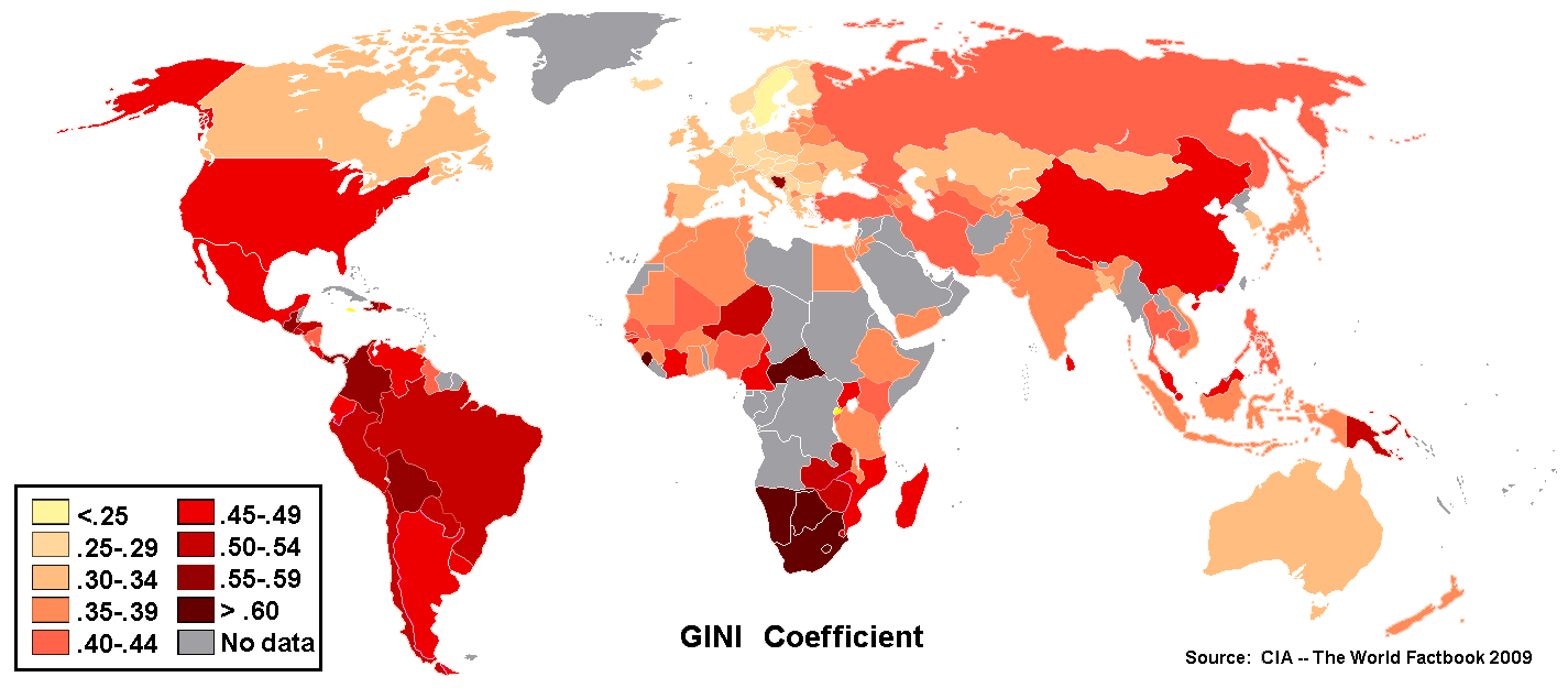
I highly discourage using one colour for different values, it makes it impossible to read map correctly, I also recommend using shades of one colour, when it is not clearly statet which values are (in this case moraly) possitive and negative, and also there are no thematic clusters.
Here is sample correction I made (it is under CC) (on devaintart.com server) http://fc05.deviantart.net/fs70/f/2012/351/6/9/gini_alt_by_deceneace-d5odhon.png
With one colour gradient (or two adjecent with many unique values) in same order as numerical values, it is easy to pick values directly and see spatial relations without chceking map legend all the time.
Source: This topic is covered very good in the book: VOŽENÍLEK, V., & KAŇOK, J. (2011). Metody tematické kartografie: vizualizace prostorových jevů. It is also my field of study and I'm writing academic thesis on thematic mapping in social and human science.
Written by Jaroslav Horvát, 17th December 2012, 5:16 CET
— Preceding unsigned comment added by 91.127.95.103 (talk • contribs) 04:19, 17 December 2012 (UTC)
- I have copied the above comment to commons:File talk:GINI retouched legend.gif#Colouring, because the file is actually located on Commons (the enwiki page is only an access point). Please continue any discussion on the Commons talk page. — Richardguk (talk) 07:52, 17 December 2012 (UTC)
- Russian 2012 — 84% (Global Wealth Report). 83.149.2.30 (talk) 12:31, 17 January 2013 (UTC)
File updated. Thank you! edit
Totally agree with your comment. Thanks for the edit. I changed it accordingly. FMalan (talk) 14:24, 18 January 2013 (UTC)
The Rwanda Gini index is wrong edit
Coloring for Bosnia is incorrect. edit
It's a mistake or intentional fabrication on the map.
The article lists the CIA World Factbook as the source for all data. However, the CIA World Factbook(https://www.cia.gov/library/publications/the-world-factbook/geos/bk.html) lists the nation's Gini as 36.2, which would be green on that map's scale.
The main Wikipedia article on Bosnia(http://en.wikipedia.org/wiki/Bosnia) even lists the Gini as 36.2 (and also uses CIA as its source).
So...somebody colored Bosnia in red, despite their source making it "green". — Preceding unsigned comment added by 59.13.122.26 (talk) 10:24, 29 May 2013 (UTC)
 Done. Thanks for noting that; I've gone ahead and corrected it. This image is hosted on Wikimedia Commons, so actually the best way to suggest comments on the image is to link it to Commons:Help desk with changes that you would request. Best, SpencerT♦C 12:17, 29 May 2013 (UTC)
Pre-tax and post-tax edit
Would it be possible to redo this with all countries as pre-tax or post-tax numbers? As it is, there are some very misleading conclusions someone could come to based on these figures. For example, the US and UK have very close coefficients for both pre and post tax, but the US appears to be labeled for pre-tax and the UK for post-tax. Since both countries have progressive tax systems, this makes the US look much worse than the UK.