File talk:2004 US elections purple counties.png
Where are Hawaii and Alaska? --Fallout boy 08:42, 21 March 2006 (UTC)
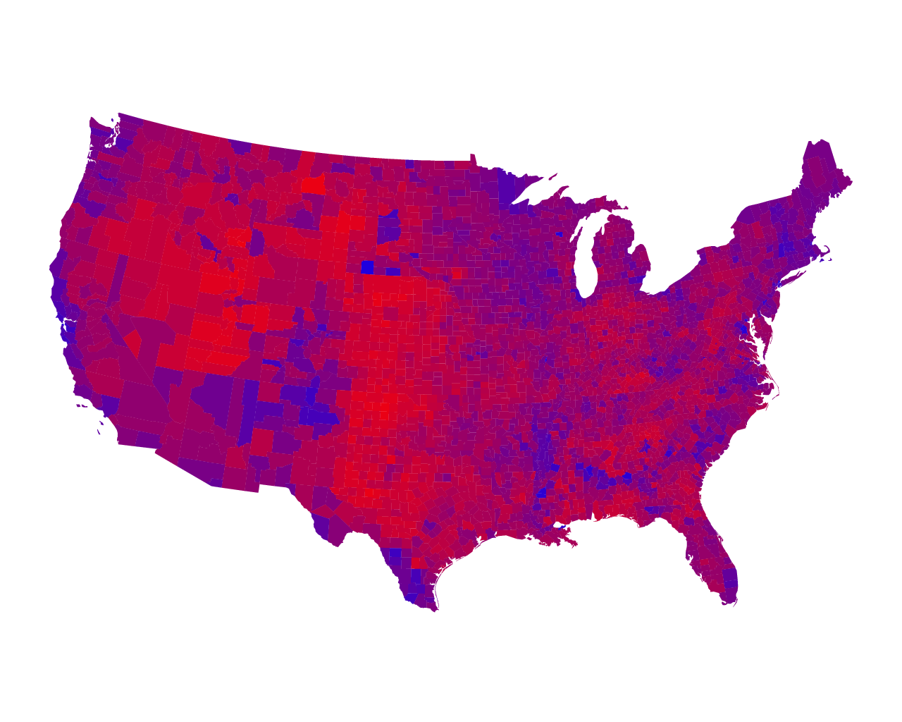
Also, this map is wrong! Although I have not checked every single county, the county in which El Paso lays voted Democratic in 2004 (you can check me at http://uselectionatlas.org, or more directly at http://uselectionatlas.org/RESULTS/img.php?year=2004&st=TX&type=map&off=0). This picture should either be altered, or removed entirely for its suspect accuracy. --Officer Klo, NJ
- Yes, i have seen the real picture before, and this is not it. It suspiciously seems to favour Red states, as in the real one i saw, only one state was red, and that was Utah (with the rest being purplish, and none being actually blue). It seems that is not based on states to begin with (here the one based on states http://www.turnoffyourtv.com/commentary/election2004/purpleUSAsm.jpg). Bush won by a roughly 2% margin, and that map right there makes it look like if he won by a 80%.
- This is a map of individual counties, not states. Even so, it appears to be roughly equivilant to the map you linked to. MarkKB 10:13, 6 October 2006 (UTC)
- There are certainly problems with this image. Republican control in particuarly rural areas mean that large tracts of land with relatively few inhabitants will appear red. The result of this is plain to see. While major cities and their surrounding suburbs will tend to appear blue, the rural counties lying further outside of the cities will tend to appear red. The image is decieving due to the fact that the population of one urban county might equal the population of ten rural counties, for example. To compensate for this, the University of Michigan has posted a cartogram comparing county by county election results with population(as calculated with the 2000 census). I believe this map to be less misleading and closer to the truth of the 2004 election. http://www-personal.umich.edu/~mejn/election/countycartlinearlarge.png
Ravensfan5252 08:36, 7 August 2006 (UTC)
- I wish to reiterate that this map is wrong. No one has done anything to console my original complaint of FACTUAL ERRORS in this map. The last I checked the county in which El Paso lays still voted Democratic in 2004 (as you can still see here and here). To keep this map with even one error is an affront to what wikipedia stands for, and I suggest it either be replaced or removed.Aufs klo 20:39, 21 January 2007 (UTC)
As has been stated several times above, there are errors in this image. As can be seen on the source page of the image, there has been several updates correcting (all of these?) errors. The file that is used here is an older version without the corrections applied. An updated map can be downloaded here. The FAQ also has an answer to why Alaska and Hawaii are not included, as asked above. Similar maps for the 2008 election can be found here I note that when editing the discussion page it is stated that "This page should not be used to: * Request deletion; * Contact the photographer or uploader; * Request corrections to the image;", but I can't find any information about how to go and fix this myself or a better channel for such things, and since the discussion about this is already on this page I chose to post this here, and it will probably be my only help(?) in this matter. As you probably can figure out I'm not much used to editing wikipedia/any-wiki-at-all and I don't have an account here, sorry about that. 130.241.2.244 (talk) 10:54, 8 August 2009 (UTC)